Search the Community
Showing results for tags 'espresso'.
-
Diamine Espresso (150th Anniversary II) The ink maker from Liverpool is one of the staple brands in ink-land. They consistently produce solid inks for a very reasonable price. In 2017, Diamine released their second ink series to commemorate their 150th Anniversary. I obtained my set shortly thereafter, but more or less forgot about them when my attention drifted to Japanese inks. About time to do the reviews. Fortunately, these anniversary inks are still easily obtainable, so if you like what you see you can still get them. The ink’s name was well chosen – Diamine Espresso is a fairly dark cool brown, definitely not a latté. Espresso can handle all types of papers and all nib sizes equally well. Good flow and lubrication – in that respect a typical Diamine ink. Being a dark brown, the ink shows good contrast even with the extra-fine nibs. It also looks quite serious and businesslike, which makes it a perfect choice for use at the office. Nothing exceptional, but more of an all-round workhorse that you can depend on. The ink itself is on the wet side: combine it with wet pens, and you get a deeply saturated line of very dark – almost black - brown. With dry pens, lighter brown tones appear, and you also get that subtle shading that gives some extra punch to your writing. Personally, I prefer this Espresso in combination with a dry pen – it just looks better. Espresso can handle all types of paper, even the lower quality ones. That’s a good thing for use at the office, where you usually need to cope with that lower-quality copy & printing paper. To illustrate the colour span of this Diamine ink, I did a swab on 52 gsm Tomoe River paper, where I really saturated portions of the paper with ink. Espresso has a fairly small colour span, with low contrast between the light and darker parts. This translates to soft shading when writing with dry pens. With wet pens, the increased saturation means that you lose most of the shading – there is just not enough distinction left between light & dark parts on the strokes. On the smudge test – rubbing text with a moist Q-tip cotton swab – the ink behaved well. There is smearing, but the text itself remains crips and clear. Water resistance is only so-so: most of the dyes disappear, but a faint-brown ghost image of your original writing remains, which is still readable with some effort. I’ve tested the ink on a wide variety of paper – from crappy Moleskine to high-end Tomoe River. On each scrap of paper I show you: An ink swab, made with a cotton Q-tip 1-2-3 pass swab, to show increasing saturation An ink scribble made with a Lamy Safari M-nib fountain pen The name of the paper used, written with a Lamy Safari B-nib A small text sample, written with the Lamy Safari M-nib Source of the quote, written with a wet Gazing Far tm2 pen with M-nib Drying times of the ink on the paper (with the M-nib Safari) The multi-paper writing test shows that Diamine Espresso interacts well with all paper types. It’s surprisingly good with crappy paper – like Moleskine – with only minimal feathering, and just a tiny amount of bleed-through. Use it with a fine-nib EDC pen (like a Kaweco), and you’ve got a great office ink. Drying times are mostly in the 10-15 second range, with some increases to 25 seconds on very hard-surfaced paper (like the Tomoe River and Kobeha GRAPHILO). Because scans don't always capture an ink's colour and contrast with good precision, I also add a photo to give you an alternative look on this Diamine ink. In this case, both scan & photo capture the ink well. The photo seems to give the best colour indication. Writing with different nib sizes The picture below shows the effect of nib sizes on the writing (written on Rhodia N°16 80 gsm paper). All samples were written with a Lamy Safari. I also added a couple of visiting pens: a TWSBI Micarta v2 with F-nib, and a Pelikan M800 with F-nib. As you can see: not much shading going on. It’s mostly with the calligraphy nibs that the whole saturation spectrum is used, ranging from light to dark brown, with some expressive shading as the result. Related inks To compare Diamine Espresso with related inks, I use my nine-grid format with the currently reviewed ink at the center. This format shows the name of related inks, a saturation sample, a 1-2-3 swab and a water resistance test – all in a very compact format. Espresso manages to look different from my other browns of the same style. It sits somewhere between iroshizuku yama-guru (more gray) and Pelikan Edelstein Smoky Quartz (more yellow). Inkxperiment – a Day at the Races As a personal challenge, I try to create interesting drawings using only the ink I’m reviewing. For me, that’s where the fun starts: I really like playing and experimenting with my inks in a more creative context. These little one-ink drawings are always a great way to push my creativity. I love doing them! A major news event this week was the passing away of Queen Elizabeth of England. During her life, she got to experience the rapid technological progress of the past century. Which, if you think about it, has been truly amazing. Elizabeth also loved her horses, and especially the Royal Ascot Races. A horse race drawing would have been awesome, but that’s beyond my capabilities. But cars I can draw, so that’s what you’ll get. I started with an A4 piece of 300 gsm watercoulor paper. I penciled in the outlines of the drawing, and used water diluted ink for the background. I then used Q-tips and multiple water-ink ratios to draw the grandstand, and added the audience with my fountain pen. Finally I used a piece of cardboard dipped in pure Espresso to draw the checkered flag pattern. Final touches to the drawing were done with my B-nib Lamy Safari. Espresso worked better than expected in this more artistic context. I had not expected that much variation in contrast, but with some water added you can coax a lot of brown tones from this Diamine ink. Inkxpired – computational art I love experimenting with pen/ink/paper, and have added another layer as part of the hobby. I’m exploring computational art, inspired by the ink drawings I do during ink reviews. Another fun offshoot of the hobby… and all that starting with a few drops of dye-coloured water on paper. Starting from the car race inkxperiment, I cropped the drawing to a square form, and applied a filter that adds some green/red tones to the drawing. The resulting colours work well for this racing theme, and the result is a bit more expressive than the original inkxperiment. Conclusion Diamine Espresso is a saturated cool & dark brown, that works well with all nib sizes and with all types of papers. Not a very expressive writing ink (my opinion), but a good all-round workhorse that is a very fine choice for an EDC pen that sits in your pocket. In a more artistic context, it worked much better than expected. With some water dilution, you can coax a wide range of brown tones from Espresso, that combine really well together. Technical test results on Rhodia N° 16 notepad paper, written with Lamy Safari, M-nib Backside of writing samples on different paper types
- 16 replies
-
OK, here is an ink that lovers of brown ink will take delight. It's somewhat old hat now, but Sailor makes ink and pens. They are a Japanese company. They also have a master ink maker who blends custom inks for certain special shops in Japan carrying Sailor products. For a while, these inks were available with some diligence as these shops did not have international ordering on their web sites. But now however those days are gone with the rise of the "ink speculator" and the "jewel bottle shortage". Some shops now only sell to someone in person, and other popular ones are sold out within hours, while another has raised prices 50%. Accept my apologies for posting a review of an ink you may not be able to purchase anytime soon. And I have further bad news for you, dear reader: this ink is a close match for Parker Penman Mocha. So I am unsure if I should just always have a pen filled with this ink until the bottle is empty, then place it upon the shelf, and remember the good "inky times" we once had. Or whether I should save it, preserving it for the future. Alas, why wait for a future that may never come? It will be used. With that introduction, the review. As typical for me, the papers used are Mohawk via Linen, Hammermill 28 lb Inkjet, and as long as this book has a blank page, Clairefontaine. As typical, these iPhone photos show the ink as darker than it really is. It is not black, but a dark brown. I'm not sure whether Sailor's Do-you is darker, it may well be. Not sure how this will wash. An ink smear is a brown, but here some dirty red was showing up. Some experimentation would be in order. The ink did not spread very much, but you can see a number of colors at the edges. A close-up.
-
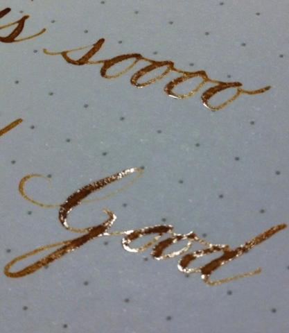
Ok, so a poster elsewhere on FPN asked about coffee as ink, in particular, ristretto (short espresso). It was freshly shot through a semi-commercial machine with the right grind. I tried it in a dip pen but would never put it in a FP due to acidity, caramelisation, solidification, and oils. I was going to leave it there, however it ended up having a sheen/shine that was unexpected so thought it might be of interest to inky recipe makers. It didn't feather on Rhodia at all. It did bleed through but didn't seep on to the next page. It has a certain amount of permanence - wetting the page and rubbing across it with my finger caused an initial light smear but then the paper wore away before the 'ink' did. The ristretto was too fluid really. I put some in a vial and added a xanthan concentrate I use experimentally for viscosity adjustment but it caused a synergistic reaction I've never seen before that turned it into a thick gel. Unexpected. Perhaps acacia might work better to increase viscosity if anyone ever got that curious. edit: forgot to mention that the 'ink' is completely dry in these pics. That's sheeny/shiny dry ink. Here are the pics I posted elsewhere.


