Search the Community
Showing results for tags 'de atramentis'.
-
De Atramentis Document Blue Grey (formerly Document Fog Grey) According to Vanness this was formerly Document Fog Grey. Another Document ink by De Atramentis, with an uninspired name. Ink has below average lubrication, is wet with very fast dry times on Rhodia. Ironically I most enjoyed writing/ sketching with the Japanese Ef nib. I would say, it’s a better option than Akkerman #09 Laan van Nieuw Oost-Indigo. Cleaning was easy but for longer use you might need a pen flush nearby. Chroma is interesting, purple at the core and lighter blue at the edges. It's also a fast drying ink, so it's good for lefties on Rhodia. Writing Samples: Photo: Comparison: Water test: and finally an artwork. Lady sings the Blues... · Pens used: Pilot Kakuno Ef, Lamy (EF/F/M/B, 1.1), Kanwrite with an Ahab nib · What I liked: Sketching and writing with a Japanese Ef nib. · What I did not like: The ink didn’t sing for me. Too wet, low lubrication and long name. · What some might not like: It’s pigment ink. · Shading: Not much. · Ghosting: With wet flex nib. · Bleed through: Same as above. · Flow Rate: Wet · Lubrication: Below average. · Nib Dry-out: Did not notice. · Start-up: No. · Saturation: Not really. · Shading Potential: · Sheen: Did not notice. · Spread / Feathering / Woolly Line: Did not notice. · Nib Creep / “Crud”: Did not notice. · Staining (pen): Did not notice. · Clogging: No. · Cleaning: Easy for a pigment ink, though having a cleaning solution would be wise. · Water resistance: Excellent. · Availability: 45 ml bottles. Please don't hesitate to share your experience, writing samples or any other comments. The more the merrier
-

-
Diamine Majestic Blue Vs De Atramentis Steel Blue - An Ink Comparison For A Somewhat Peculiar Reason
Morbus Curiositas posted a topic in Ink Comparisons
Diamine Majestic Blue vs De Atramentis Steel Blue An Ink comparison for a somewhat peculiar reason Notice Diamine and De Atramentis use similar lids There is of course nothing so special about comparing two inks especially then they are both blue inks. What is peculiar though that they are both very talented at smudging and staining. But I will come back to this later first have a look at the colours. I will enter in the links to the more extensive reviews of both inks at the end of this review Handwritten text comparison Let me "throw up" another comparison Q-Tipp comparison Sheeny Shiny happy Inks yeah How great both inks sheen The De Atramentis Ink sheen very well but is topped by Sheen Master Majestic Blue Judge Smudge Down here is the reason that gave me the idea for this comparison Both inks smear even after days of drying time. Just a drop of spit on the finger tip can cause this smudging It seems to be quite normal though, some inks tend to smudge alittle more, they are no IG or document inks after all In this comparisonThe Diamine seems to be the most talented when it cooms to smudging smudging. I once had Dr. J of De Atramentis test the Diamine Majestic Blue. Dr J Lsaid that the ink was perfetly well... He liked it a lot! Availability La Couronne du Comte I guess Dennis and Rik would even travel to the moon to get it for you (just pay them a million or 2) Well it is safe to say that they do almost everything to satisfy their customers… Considering http://www.lacouronneducomte Bankers have Rothshield Ink lovers have the Goulet Pen Company. Rachel and Brian carry the almost* largest assortment of ink on earth an it's near surroundings http://www.gouletpens.com (*almost Dear Amberlea Davis carries the largest assortment in the universe but is not a seller Larry Post of Australia is a Great Supplier of Stationary and Artist Equipments. They carry a lot of De Atramentis Inks http://www.larrypost.com.au/ The same applies to Singapore based Arters of the utterly friendly Yitpeng and WeetekOng http://arters.com.sg Conclusion I really do like both inks. They both are lovely blues. Normally I am not so fond of blue inks because they are so standard that i believe that they are mor sommething for boring biro writers these inksmade me change my mind and I now use blue inks quite often The Diamine is the better sheener therefore the De Atramentis seems to " hold his liquor" better https://www.fountainpennetwork.com/forum/topic/352616-diamine-majestic-blue/ https://www.fountainpennetwork.com/forum/topic/352615-de-atramentis-steel-blue/ -
De Atramentis is german manufacturer of calligraphy and writing ink. The inks are hand made (the entire production process is done manually in their manufacturing center) by i's founder - Dr. Franz-Josef Jensen. I believe he uses high quality dyes from well established European companies like BASF and Bayer. De Atramentis offers a variety of "traditional" fountain pen inks and a broad selection of special and scented inks. I believe they should get more attention as the quality od these fluids is mostly good and some colors are simply stunning. Ultramarin however is not only ugly but also it behaves bad in fountain pens. It tends to dry out really fast and it doesn't help in making writing enjoyable. It's first DA ink I consider as bad quality ink. http://imageshack.com/a/img673/6746/PIjeec.jpg http://imageshack.com/a/img901/9531/UKPyyv.jpg Oxford Recycled 90g - Kaweco Sport Classic, B http://imageshack.com/a/img537/3750/IJM0hw.jpg http://imageshack.com/a/img661/3497/Up0Fo3.jpg http://imageshack.com/a/img633/9480/MjqZb6.jpg
-
I really wanted to like this ink, but it didn't sing for me. Before writing I had to smudge the ink to make sure it was the right ink. That's when you have too many pens inked But as you will see, in scans it's clearly a brownish/ reddish ink and looks very elegant. The cleaning was a bit of pain. I was really disappointed when I had smudging during the water test. That's not something I was expecting from a document ink. I got my sample from Goulet's, but couldn't find this ink on De Atramentis's website. Maybe it's discontinued or maybe renamed? 😛 Let's start with the chroma: Writing samples: It seems I forgot to write with a sample with Japanese Ef and forgot to crop the first image. Ah well, nobody's perfect Maybe @LizEF will do a review in 2025 😜 Midori Very well behaved on Hammermill... Photo (TR 68gr) Comparison: Water test: (quelle horreur!) And finally an artwork, entitled fall. The red ink, is De Atramentis Document Red with a bit Black Red mixed in, · Pens used: Pilot Kakuno Ef, Stub, Lamy Safari (EF/F/M/B/Stub 1.1), Osmiroid Nib · What I liked: I wasn’t enamored with the colour but found it enjoyable with a broad nib. · What I did not like: Not an interesting colour with finer nibs, might as well stick with black. Not 100 percent waterproof. · What some might not like: The same as above and cleaning. · Shading: With M/B nibs. · Ghosting: No. · Bleed through: No. · Flow Rate: Wet · Lubrication: Lower than average. · Nib Dry-out: Didn’t notice. · Start-up: No. · Saturation: Saturated. · Shading Potential: Only with M/B nibs. · Sheen: No. · Spread / Feathering / Woolly Line: Did not notice. · Nib Creep / “Crud”: Did not notice. · Staining (pen): No. · Clogging: No. · Cleaning: I didn’t have the patience to soak it overnight in water and went the easy way, with a cleaning solution. · Water resistance: Good. I was surprised that some of the ink came off. · Availability: 45 ml bottles. Please don't hesitate to share your experience, writing samples or any other comments. The more the merrier
-
De Atramentis Document Red Grey I really enjoyed using this ink. It’s an improved version of Noodler’s Red Black with the added full waterproofness, until I reached the cleaning part. It was not as straightforward as I thought. The ink managed to stain my Lamy convertor and in the end after soaking for few hours in water, the red dye was more than tenacious. So, I simply dunked it in my Monteverde cleaning solution and the problem was solved. However it didn't stain the Pilot CON-40 nor the cheap nonane Chinese convertor. This is not a deal breaker for me. The worst thing is when ink smudges or refuses to dry, then bleed through. The rest I can live with, if I really like the ink. It also doesn't like cheap thin papers. Let's start with the chroma: Writing samples: It doesn't like thin copy paper. Photo: Comparison: Water-test: (Nothing budges) and finally an artwork. from a drawing challenge, entitled Solar System with my cat and mouse characters Fountain pen inks De Atramentis Urban Grey / Red Grey Kuretake brush pen (black) Water colour (blue), Silver marker · Pens used: Pilot Kakuno Ef, (Lamy EF/F/M/B/Stub 1.1), Osmiroid Copperplate nib · What I liked: Well lubricated, intriguing colour. · What disappointed me: Staining of Lamy convertor (a first for me), and cleaning. · What some might not like: High maintenance cleaning, staining convertor, doesn't like cheap thin paper. · Shading: Yes · Ghosting: No. · Bleed through: · Flow Rate: Wet · Lubrication: Excellent - Cushiony · Nib Dry-out: No. · Start-up: No. · Saturation: No. · Shading Potential: Yes · Sheen: No. · Spread / Feathering / Woolly Line: No. · Nib Creep / “Crud”: Didn’t notice. · Staining (pen): Yes, Lamy convertor! · Clogging: No. · Cleaning: The red dye is tenacious. · Water resistance: Excellent. · Availability: 45 ml bottles. Please don't hesitate to share your experience, writing samples or any other comments. The more the merrier
-
This is an excellent sepia ink by De Atramentis. I loved using it over and over again. Very well behaved, easier to clean than blue inks Let's start with the chroma: Writing Samples: Photo: Comparison: Water test: Left side was dabbed with water. The smudge beside the kitty was there before the watertest And per usual an art work, part of the Inktober yearly challenge, prompt was Camel: Paper is a Talens square notebook. · Pens used: Pilot Kakuno Ef, Stub/ Kaweco (EF/F/M/B/Stub 1.1), Osmiroid Copperplate nib · What I liked: Really well-behaved ink. Very well-behaved ink. Excellent for sketching! And easy to clean! · What I did not like: Nothing · What some might not like: It’s a nano pigment ink · Shading: Yes, with wider nibs. · Ghosting: No. · Bleed through: No. · Flow Rate: Lovely. · Lubrication: Nice, thought best with European pens. · Nib Dry-out: No. · Start-up: No. · Saturation: Nice. · Shading Potential: Only with flex nibs · Sheen: No. · Spread / Feathering / Woolly Line: No. · Nib Creep / “Crud”: Didn’t notice. · Staining (pen): No. · Clogging: No. · Cleaning: Very easy · Water resistance: Excellent. · Availability: 45 ml bottles. Please don't hesitate to share your experience, writing samples or any other comments. The more the merrier
-
Like it’s document sibling, Artist red reminds me of watermelon juice or coral red to quote @lapis I honestly cannot see much of variation between the two. If you need a document red ink go for the sibling, if not Artist is fine. The bottles are different, Artist is 50 ml. Let's start with the chroma: Writing samples: I used the same poem by Mark Nepo, which you find here. If you use a wet flex pen on this paper, you'll have a bit of ghosting and bleed through. Photo (Tomoe River Paper) Comparison with De Atramentis Document red Comparison: Watertest And finally some art work: Prince of Cards... Pentel brush pen - De Atramentis Artist Red.. Happy birthday Pentel brush pen. J Herbin Bouton d'or and De Atramentis Artist Red · Pens used: Pilot Kakuna Ef/Stub, Kaweco (EF/Reverse BB/M/B/BB), Kanwrite Ultraflex, · What I liked: Teaching me to write with a feather hand, very easy to clean. Worked well with the pilot stub... · What I did not like: Not much lubricated, palish red, good for art work · What some might not like: Dryish, the colour. · Shading: None. · Ghosting: Faint on copy paper. If you're heavy handed. · Bleed through: None · Flow Rate: Wet. · Lubrication: It won’t make your scratchy nib glide. · Nib Dry-out: No. · Start-up: No. · Saturation: No. · Shading Potential: Dismal · Sheen: None · Spread / Feathering / Woolly Line: None. · Nib Creep / “Crud”: A bit · Staining (pen): No. · Clogging: No. · Cleaning: Easy. Like most pigment inks the more it stays in the pne the more you need to soak. But I didn’t need to use pen flush. · Water resistance: Excellent. · Availability: 50 ml bottles. Please don't hesitate to share your experience, writing samples or any other comments. The more the merrier
-
De Atramentis – Document Dark red Delightful pigment ink, well behaved by De Atramentis. A pleasure to write or sketch with, compared to the disastrous Cyan and Turquoise inks, I reviewed recently. I honestly don’t see much difference between this or De Atramentis Artist Dark Red. They’re quite similar. Document is supposedly slightly more “archival”. All Document and Artist inks can be mixed. Lets start with the chroma: Writing samples: Photo Watertest: Left side was held under running water for 10 minutes. Comparaison: Comparison with De Atramentis Artist Dark Red: I didn't test it with Stub, flex or fude nibs, but you can get a general idea from the De Aramentis Artist ink review. And finally a sketch. My model, who is quite fidgety was for once rolled in her basket. Paper is Fabriano Sketch book, a very absorbent paper. · Pens used: Pilot Elite (Ef) Lamy Safari (Ef/F/M/B) · What I liked: Very well-behaved ink, unlike its blue siblings. If you’re looking for a nice dark red, this is a good one. Get a sample. · What I did not like: Nothing. · What some might not like: It’s a pigment ink. · Shading: Yes with some nib. · Ghosting: None. Possible on cheap papers. · Bleed through: None. Possible on cheap, absorbent papers. · Flow Rate: Excellent · Lubrication: Excellent · Nib Dry-out: None. · Start-up: None · Saturation: Dark · Shading Potential: None. · Sheen: None. · Spread / Feathering / Woolly Line: None · Nib Creep / “Crud”: Nope. · Staining (pen): No. · Clogging: No. · Cleaning: Easy. Like most pigment inks, if you have a well-sealed pen or using your pen regularly it should be fine. If you forget the ink in a pen, there’s no need to panic. An overnight soaking in water, and 15 minutes of soaking in cleaning solution will clean thefeed. · Water resistance: Excellent · Availability: 45 ml bottles. Please don't hesitate to share your experience, writing samples or any other comments. The more the merrier
-
De Atramentis Document Cyan According to Oxford Dictionary, cy·an | ˈsīən, ˈsīˌan | noun a greenish-blue color which is one of the primary subtractive colors, complementary to red. ORIGIN late 19th century: from Greek kuaneos ‘dark blue’. There's no green in the Chroma: I dislike this ink. As a blue it has no character. The colour blue, despite its connotation, make me happy. This one, no. Normally, when I finish a review, I enjoy taking notes until the ink is finished. This one and its Artist Cyan sibling, when down the drain, right after. Pity such a lovely vibrant blue, looks so fad on paper. Maybe it's only saving grace, is filling vials / bottles and lining them on a shelf 😛 I am used to badly behaving permanent inks by several brands, especially you know who brand I manage to tame them by using a drier pen, finer or sometimes wider nib, good paper, or all the above. This ink loves to ghost and bleed on anything paper. It’s the ultimate Alien/ Borg for paper. It can rejoin Artist Turquoise for the Razzie awards in inks. However, It's the only ink that can dry on Tomoe River 68 gr in less than 2 seconds. I've never seen anything like that.. I didn't bother using a flex nib. It was pointless. Ironically, Rhodia fared decently. While it bleeds, ghosting is acceptable. I cannot recommend it for writing. You can probably tame it, with a dry pen, and a light touch on Rhodia, if you insist. If you like the colour, get a sample of Artist Cyan. It’s slightly better. Here's a comparison. My apologies for the upside down swatches. Top Right is Kakimori Karari. Bottom Right is Monteverde Horizon Blue. · Pens used: Pilot Kakuno (Ef) Lamy Safari (Ef/F/M), Jinhao 450 Fude nib · What I liked: Very fast dry time. · What I did not like: Bleeding/ghosting through everything. Colour is flat. Ink is too wet. · Shading: None · Ghosting: On every single paper. · Bleed through: Same as above. · Flow Rate: Excellent · Lubrication: Excellent · Nib Dry-out: None. · Start-up: None. · Saturation: Saturated · Shading Potential: None · Sheen: None. · Spread / Feathering / Woolly Line: Yes · Nib Creep / “Crud”: Yes. · Staining (pen): Yes. It did stain my Pilot Section only, however, after 6 hours of soaking, the stain was removed. Convertors were fine. · Clogging: No Please don't hesitate to share your experience, writing samples or any other comments. The more the merrier
-
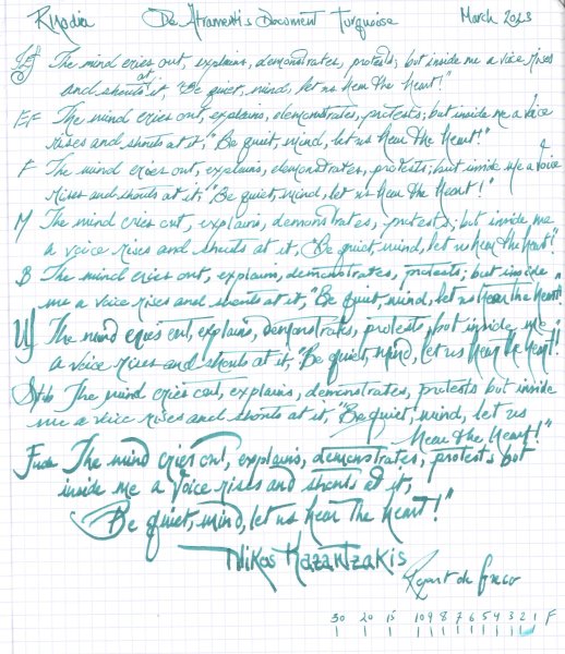
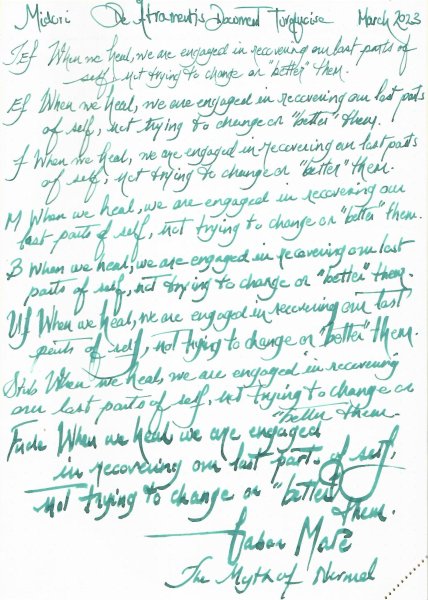
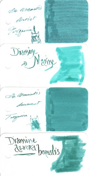
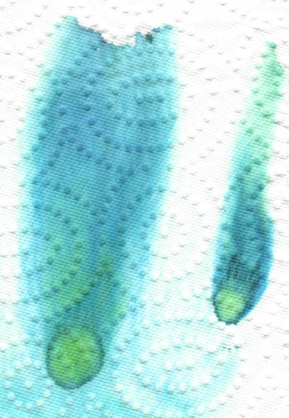
As I had samples of both Document and Artist Turquoise I decided to review them simultaneously. I cannot recommend this ink for everyday writing, with this ink I gave up after testing with the M nib. It can be crowned as the king and queen of ghosting and bleeding through every single paper I used. The only paper, that it was almost ok, was surprisingly Mnemosyne. There was ghosting, and some bleed through if I dared to doodle in the corner of page. But I only used a broad nib so I don't know how it would have behaved with the other nibs. I was really disappointed and was wondering maybe because it’s an “Artist” ink, it should be used for art and specific papers. That inspired me to do an experiment. As all Document and Artist series can be mixed I decided to mix this one with Artist Sepia, which is extremely dry and awful ink. The result was magical. I managed to create a shade of green which was pleasant to write with, the ink behaved decently, the colour was pleasing and I was sad when the pen ran dry. Moral of the story: These inks are best for people who love ink mixing, are adventurous or are artists. Chroma quite similar to Document Turquoise: Writing samples: Midori (quote is by Gabor Maté, from his excellent book, (The Myth of Normal) Note how the Lamy EF is thicker than the F. Back. Tomoe River 68gr Quote is by Aeschylus I've rarely if ever seen anything like this on Tome River 68gr paper: Quotes is by Nikos Kazantzakis, Report to Greco Water test: Ink is waterproof under running water. Left side was held under running water. Comparaison: I got inspired by Nick Stewart's work, by brushing water on CANSON watercolour paper: Nothing special but fun to do: As I said, I mixed a few drop of Artist Sepia with this one, this is the result: Here a couple of scans and photos: Midori scan: TR 68gr Photo: (TR 68gr, left - Midori, right) · Pens used: Pilot Kakuno (Ef) Lamy Safari (Ef/F/M) · What I liked: Ability to mix with other Document/ Artist inks. · What I did not like: Too many to name. · Shading: None · Ghosting: On every single paper. . · Bleed through: Same as above. · Flow Rate: Waterfall · Lubrication: Excellent · Nib Dry-out: None. · Start-up: None. · Saturation: Who cares? · Shading Potential: You must be kidding me! · Sheen: None. · Spread / Feathering / Woolly Line: It feathers on cheap paper. · Nib Creep / “Crud”: A bit. · Staining (pen): I don’t know. I won’t be using it for long, thankfully. · Clogging: No · Cleaning: It’s a pigment ink. It was relatively easy to clean. But I had it for less than a week in my pens. · Water resistance: Excellent · Availability: 50 ml bottle. Please don't hesitate to share your experience, writing samples or any other comments. The more the merrier
-
This is the review of Document Turquoise, which will be soon followed by its Artist sibling. If you were to choose one for writing purposes, get a sample of this one. I am not enamoured by this ink. I don't know if it's the colour, or it's behaviour, or simply it's lack of character. Or maybe I'm inky saturated It is decent document ink, too wet with wet/wide nib combos. With fude (bent Chinese /Japanese nibs) it wrote like flip-flops on ice Ink won't work with cheap/absorbent paper and it will feather and fly away. Colour is slightly lighter than Artist Turquoise, and less wet. Document and Artist inks can be mixed, so they are perfect for Artists or those who like to mix their own inks. Document inks are slightly “more” archival than Artist inks, in my correspondence with De Atramentis. Chroma: Writing Samples Scan for Midori is too green. And a couple of photos of Midori: Comparison: Nothing did budge the ink under running water: I wasn't really inspired to do a sketch. This is done on a Canson watercolour paper. By wetting the paper with a brush adding ink, and removing extra colour with a paper towel.... · Pens used: Pilot Kakuno (Ef /Stub) Lamy Safari (Ef/F/M/B) / Jinaho 450 with an Ultraflex nib/ and fude nib · What I liked: Writing with a broad nib only. I was taking notes and had my pen uncapped for 5 minutes, no dry outs. Very fast dry time on coated paper, especially with Fine nibs. It’s good for dry pens. · What I did not like: Very wet, no character. · Shading: none · Ghosting: This ink is best for coated paper, with Ef – Broad nibs and dry pens. Don't use it with ebonite feed. · Bleed through: Same as above. · Flow Rate: Very wet · Lubrication: Excellent · Nib Dry-out: None. · Start-up: None. · Saturation: Eh · Shading Potential: None · Sheen: None. · Spread / Feathering / Woolly Line: With a primed nib, you can have some feathers, even on coated papers. · Nib Creep / “Crud”: No. · Staining (pen): It didn't stain my convertor. But I used it only for a week. · Clogging: No · Cleaning: It was fairly straightforward, like "normal" inks. However, long term I don't know. · Water resistance: Excellent · Availability: 45 ml bottles. Please don't hesitate to share your experience, writing samples or any other comments. The more the merrier
-

-
-
-
-
-
This ink belongs to the Artist series and is slightly less archival than the Document series. In a nutshell: I would recommend this ink only to those who either used broad nibs, wet medium/fine nibs without feedback and excellent smooth paper. For those who don't use these options, mindfulness is obligatory. 😇 Longwinded version: This is a high maintenance ink in a nonconventional way: It demands the right nib/paper combination! The Pilot Kakuno Ef wrote with a smoothness of fingernails on chalkboard. The perfect self-torture implement. The Stub like a blunt knife. With Lamy Safari F/M, while the line was nice and juicy, I recoiled each time I reached for the pen. Some one had mixed sand in the ink. It’s a good option for those who have serious pen /ink addicts. You will be pen sober in no time. However, writing with a Pilot M/Safari B/Kanwrite was surprisingly enjoyable. And with the fude nib acceptable. So be forewarned. Chroma Ink comparison: Writing samples: Rhodia TR 68gr Midori Cheap/ absorbent paper Back Photo: TR 68gr Close up: I challenge myself with the yearly inktober. This sketch was done with the Ef nib. I can blame the mediocrity of my talent to the ink... but surprisingly the experience was acceptable... The left to right motion worked fine. Water test: A bit of excess ink is removed, but other than that respectable. · Pens used: Pilot Kakuno (Ef/M/stub) Lamy Safari (Fine/ /Medium /Broad) / Kanwrite Ultraflex (wet) / Jinhao 450 fude (wet) · What I liked: Writing with a broad nib, and Kakuno M and sketching · What I didn’t liked: Writing with Ef, F, medium and stub. It needs a wet pen and a smooth nib. · Shading: From medium to broad · Ghosting: Yes, On cheap paper · Bleed through: Yes, with absorbent papers. · Flow Rate: Good · Lubrication: If you write with wet nib. · Nib Dry-out: Not noticed. · Start-up: No problem. · Saturation: Dark. · Shading Potential: Bleak. · Sheen: Nonexistent · Spread / Feathering / Woolly Line: Not noticed · Nib Creep / “Crud”: No · Staining (pen): No · Clogging: No. · Cleaning: Easy. Though it might stain transparent sections. · Water resistance: Excellent · Availability: 50 ml bottles Comments appreciated but not obligatory
-
.jpg.cc15b0c2544de11aa2bf7ea21437bb7e.jpg)
-
Artist inks are made with nanoparticles fountain pens, brushes etc. to paint and draw. Inks are lightfast and waterproof. However, when I contacted De Atramentis they told me that Document ink is more lightfast than Artist line. The Artist Dark Red ink looks especially nice on white paper. TR 68gr paper - Photo in direct sunlight - Fude nib. same text scan (text is famous French renaissance poem/ pavane by Thoinot Arbeau, you can listen to the music here) Hammermill paper - 90 - Medium nib HP 32 Rhodia - Medium nib and Ahab flex Dry time on TR 68gr paper is very long, as you can see. But it is acceptable on Rhodia (45 seconds). If the paper is absorbent it's almost immediate. Unlike cellulose reactive inks, this one preforms fairly good on cheep/ thin paper. However, cellulose reactive inks dry much faster. The bottles are different from the typical De Atramentis bottles (photo curtesy of Jane Blundell) When I was preparing my swatches, I thought both Document and Artist inks are the same, as you can see below. But in practice they are dissimilar in colour and behavior. Document Dark Red is lighter and surprisingly drier. However, Document and Artist inks can be mixed interchangeably ( I asked from the folks at De Atramentis) Comparison on Midori. Water resistance: (right side was held under water)- Paper Mnemosyne · Pens used: Jinaho 450, Fude/ Medium, Ahab flex · Shading: Yes. Depending pen paper combo. But more visible on screen than to the naked eye · Ghosting: None · Bleed through: On rare instances. · Flow Rate: Good · Lubrication: Decent · Nib Dry-out: Not noticed · Start-up: Not noticed · Saturation: Dark red · Shading Potential: Depending Paper. · Sheen: None · Spread / Feathering / Woolly Line: Not noticed on paper. With heavy application there might be some. · Nib Creep / “Crud”: No · Staining (pen): Time will say. · Clogging: Only time will say. But none so far. · Water resistance: Excellent · Availability: 50 ml bottles
-
I guess it goes under the same heading as "Cynical Cyan," "Fawning Forest Green," and "Grumpy Grape."

-
Comparison of Pearlescent Violet-Copper (De Atramentis) & Hayabusa Glistening (Colorverse)
Audrey T posted a topic in Ink Comparisons
-
De Atramentis is german manufacturer of calligraphy and writing ink. The inks are hand made (the entire production process is done manually in their manufacturing center) by i's founder - Dr. Franz-Josef Jensen. I believe he uses high quality dyes from well established European companies like BASF and Bayer. De Atramentis offers a variety of "traditional" fountain pen inks and a broad selection of special and scented inks. I believe they should get more attention as the quality od these fluids is very good and some colors are simply stunning. Lachs (Salmon) is rather boring ink with average flow and rather weak saturation. It's not really bad but there's just so many interesting inks on the market that you can skip this one. http://imageshack.com/a/img538/3497/GYPb57.jpg Drops of ink on kitchen towel http://imageshack.com/a/img661/8274/RNmbYr.jpg Software ID http://imageshack.com/a/img661/1904/GtvZw5.jpg Waterproofness http://imageshack.com/a/img661/1280/6Ex14a.jpg Calendar - Lamy Al-Star, Medium nib http://imageshack.com/a/img540/4175/aF1xxN.jpg http://imageshack.com/a/img909/4679/75QsAL.jpg http://imageshack.com/a/img911/5920/VcxrPn.jpg
-
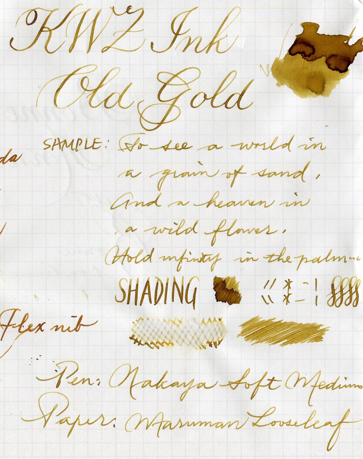
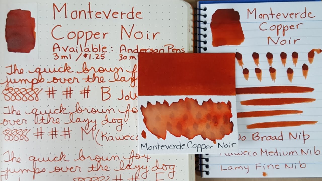
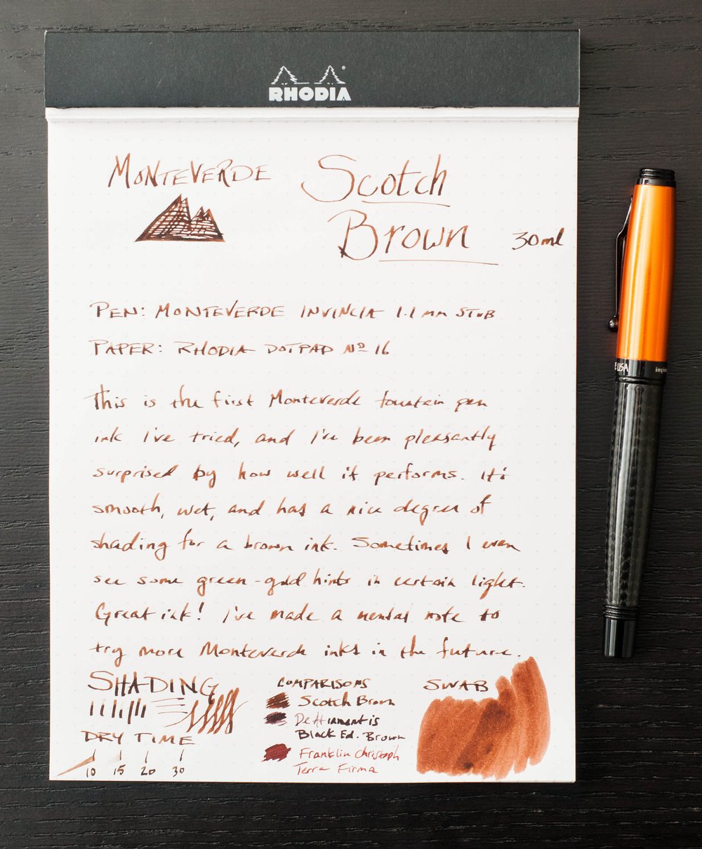
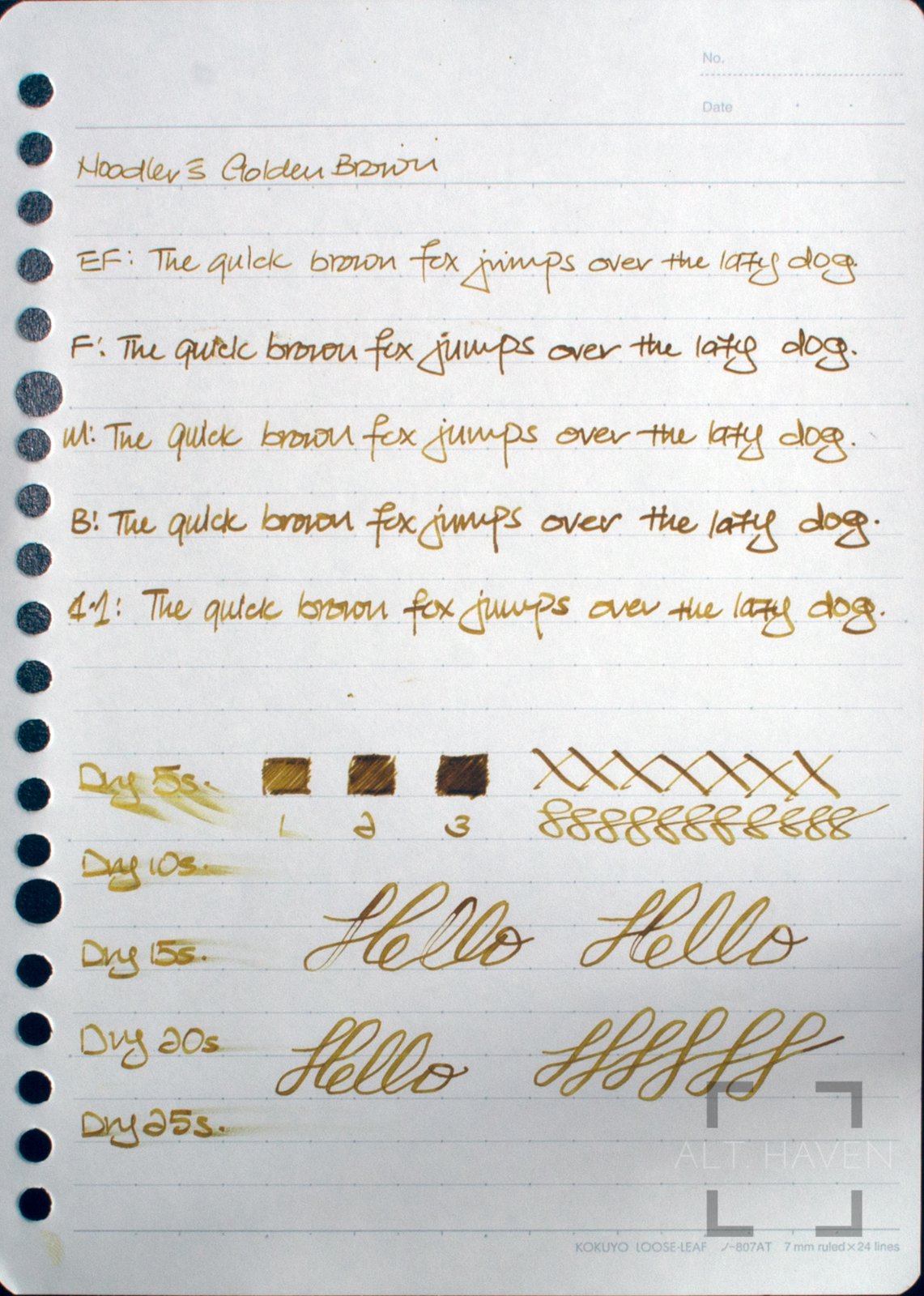
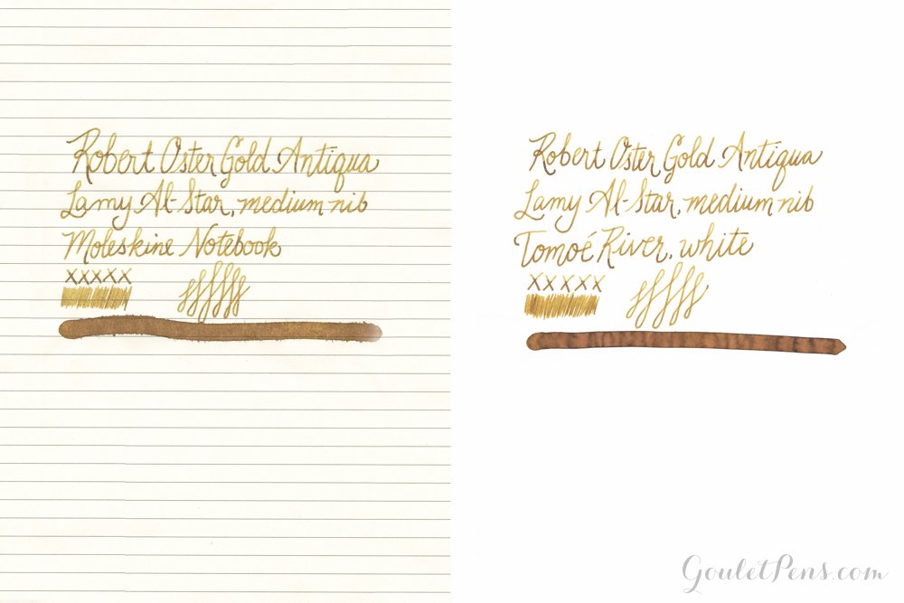
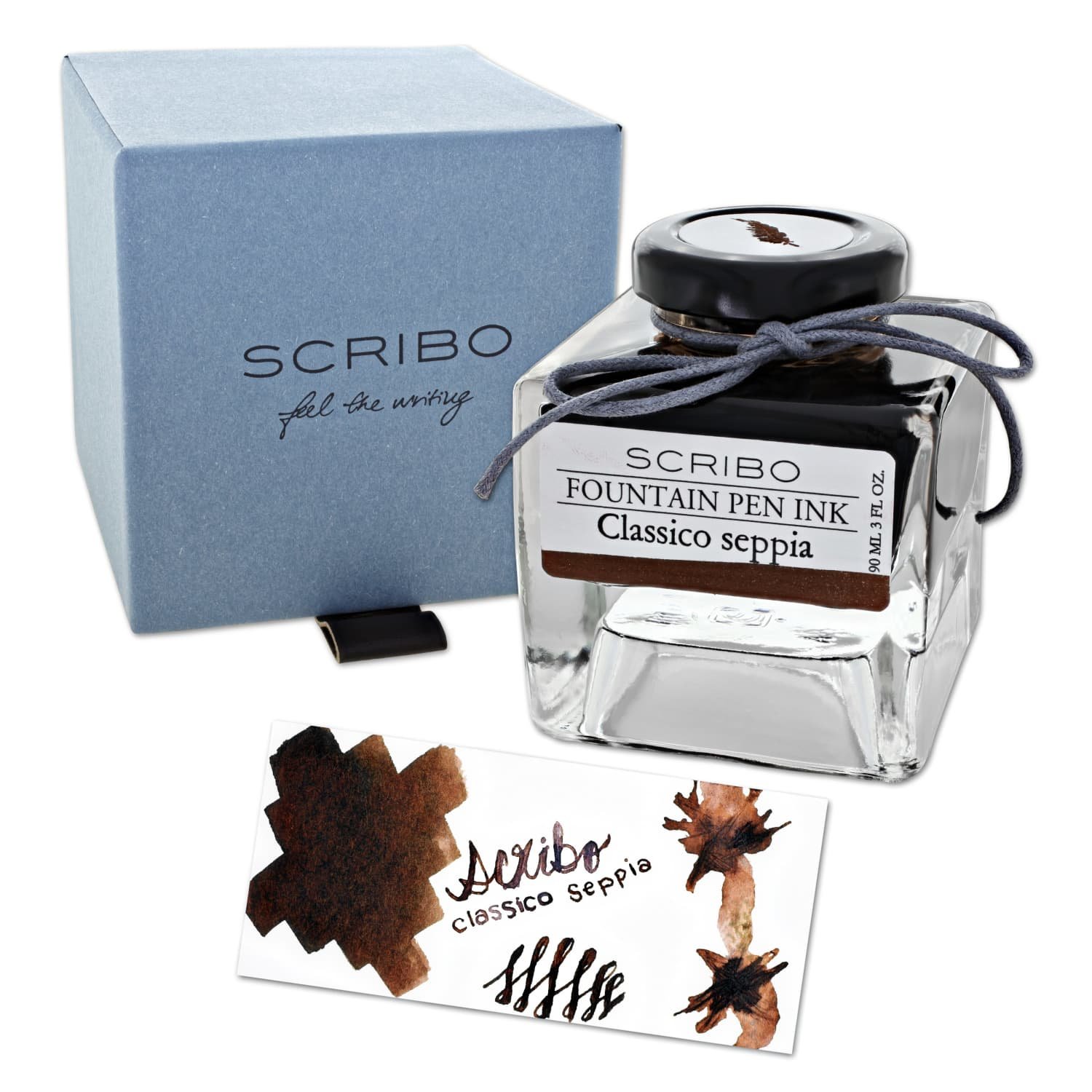
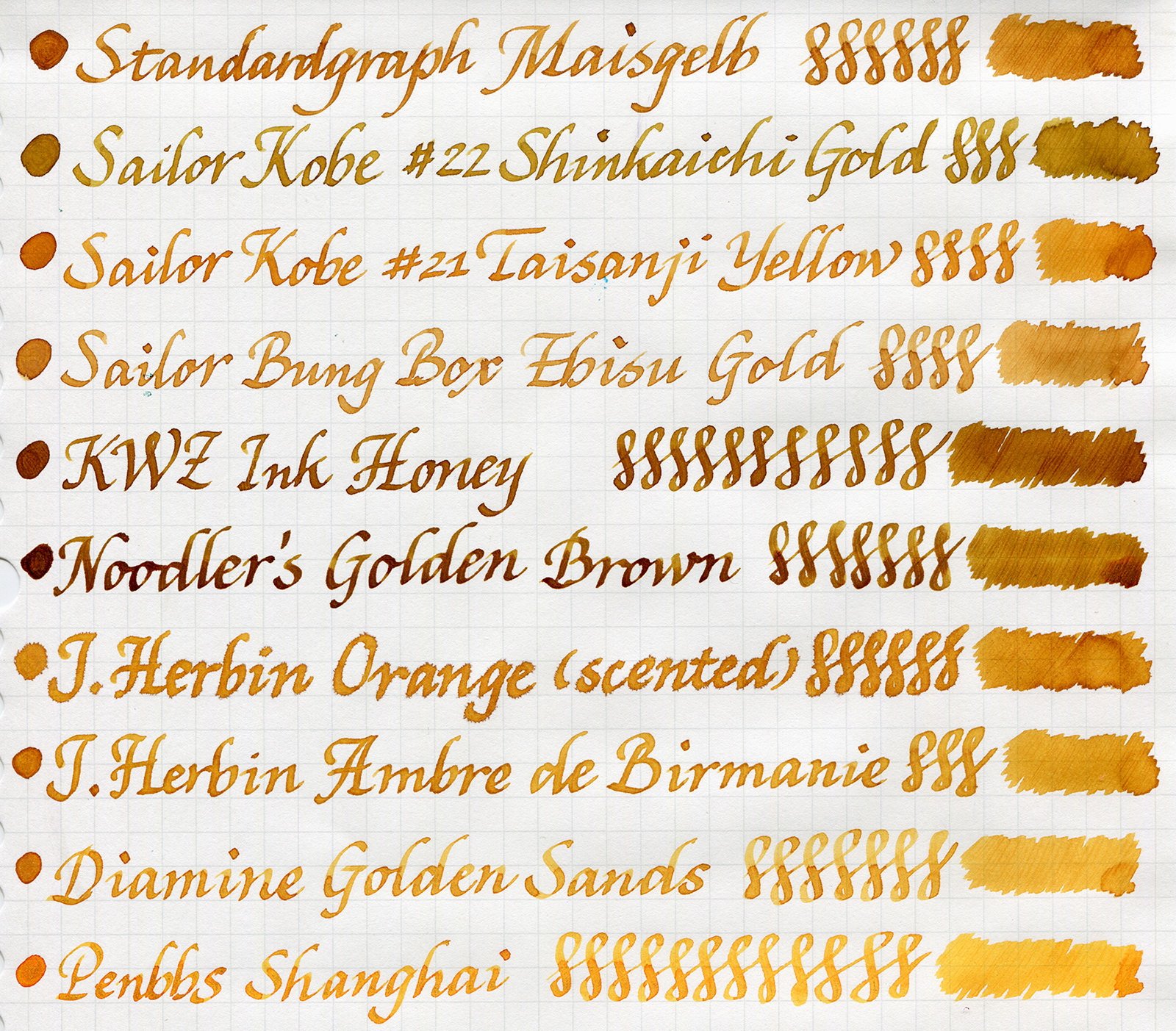
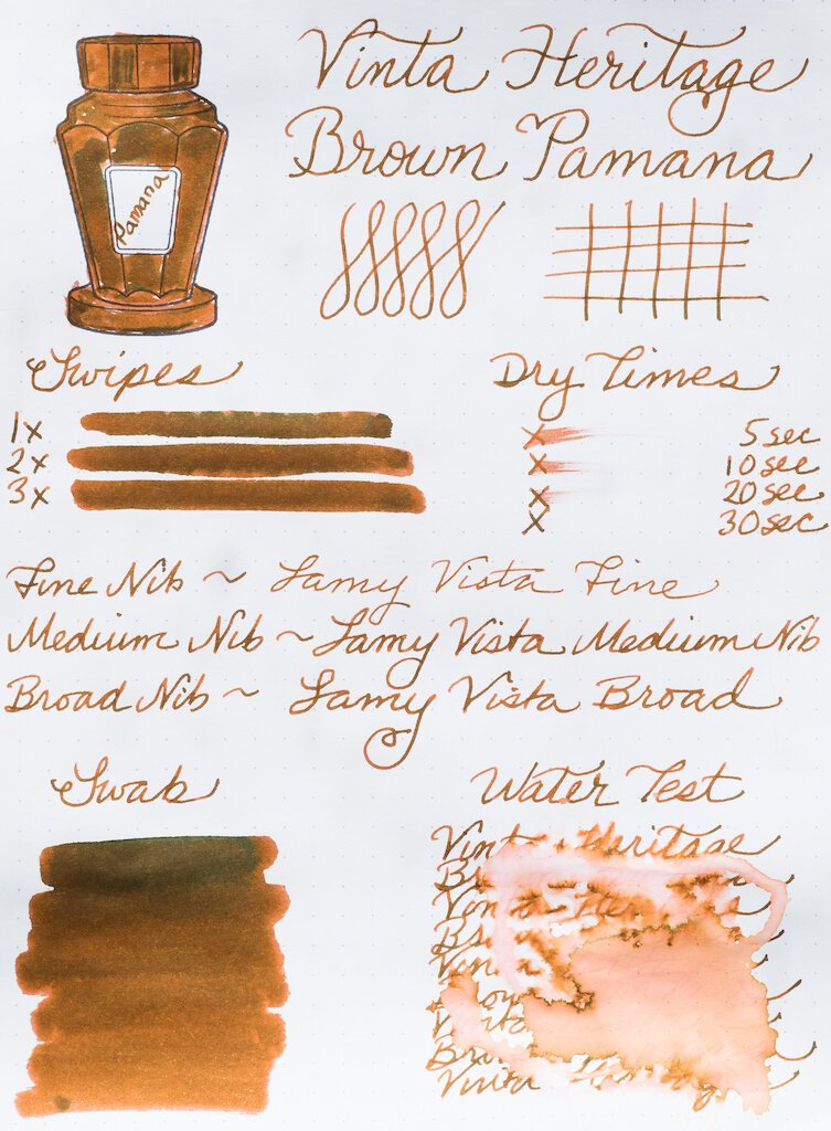
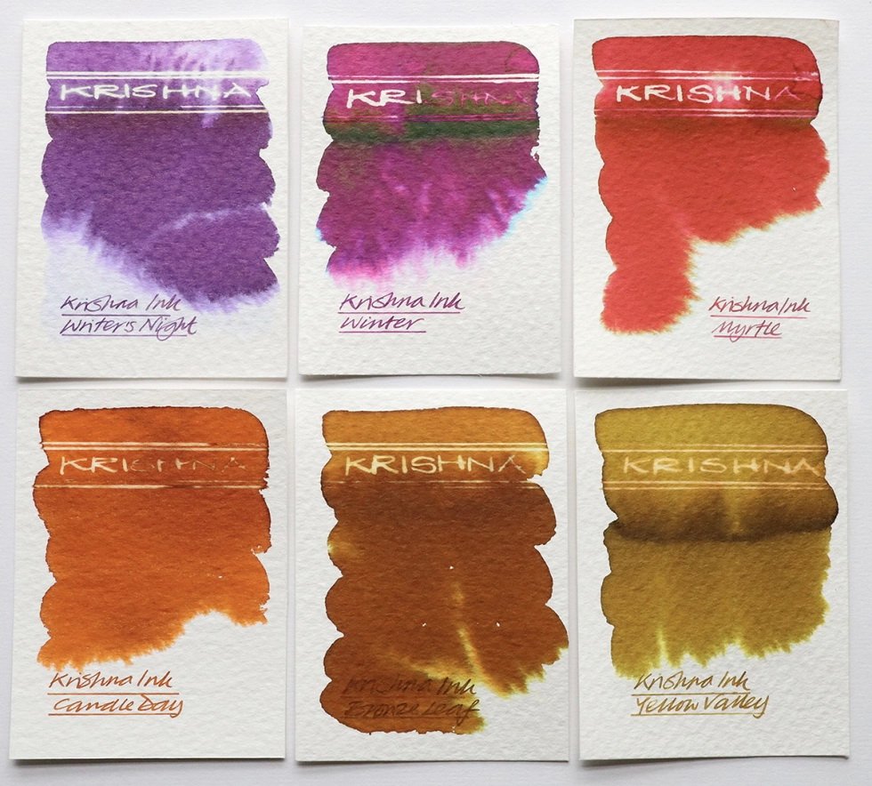
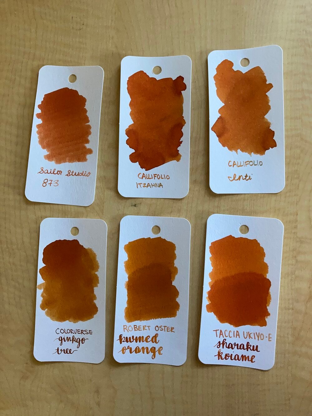
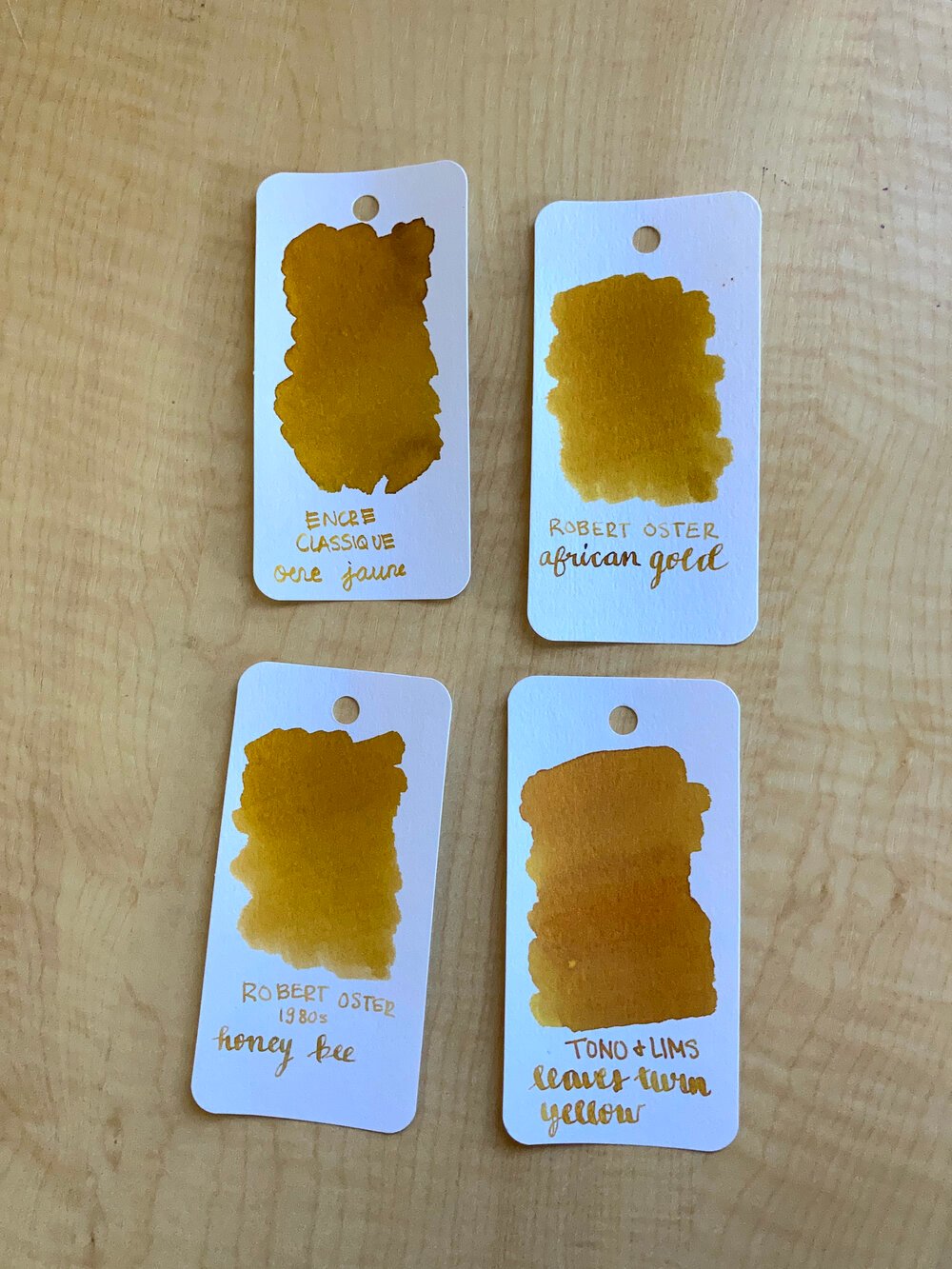
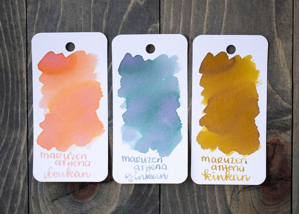
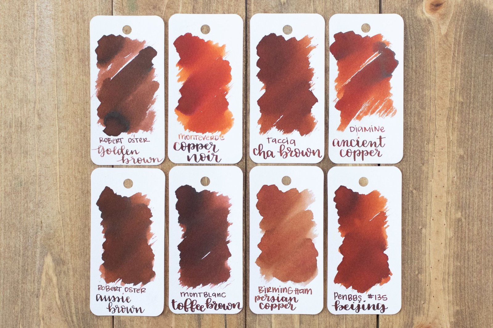
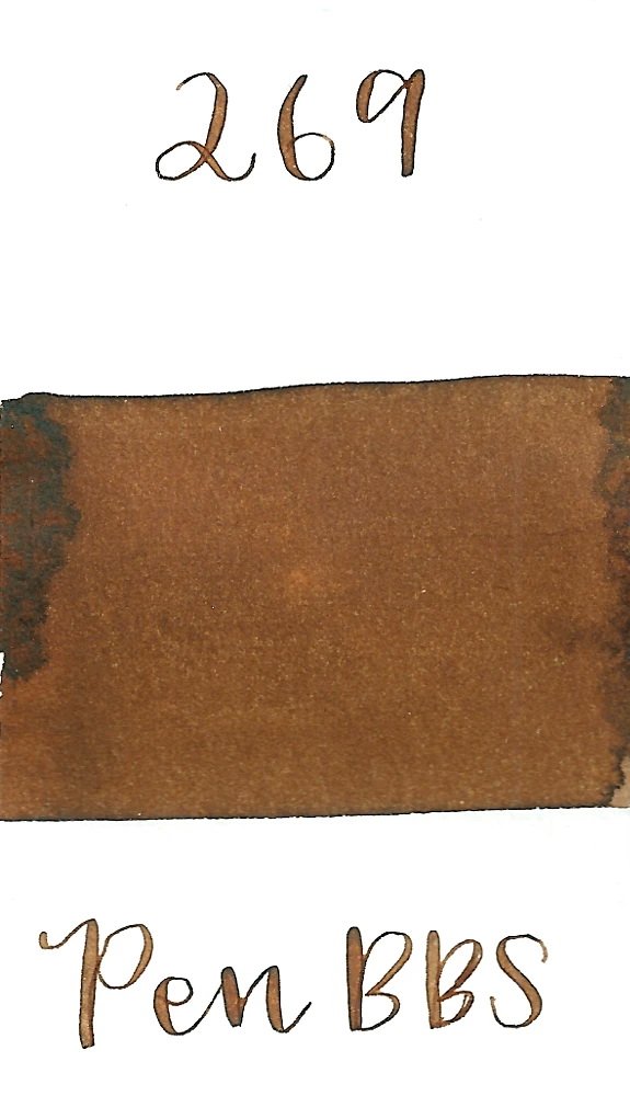
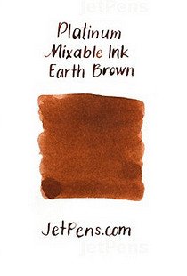
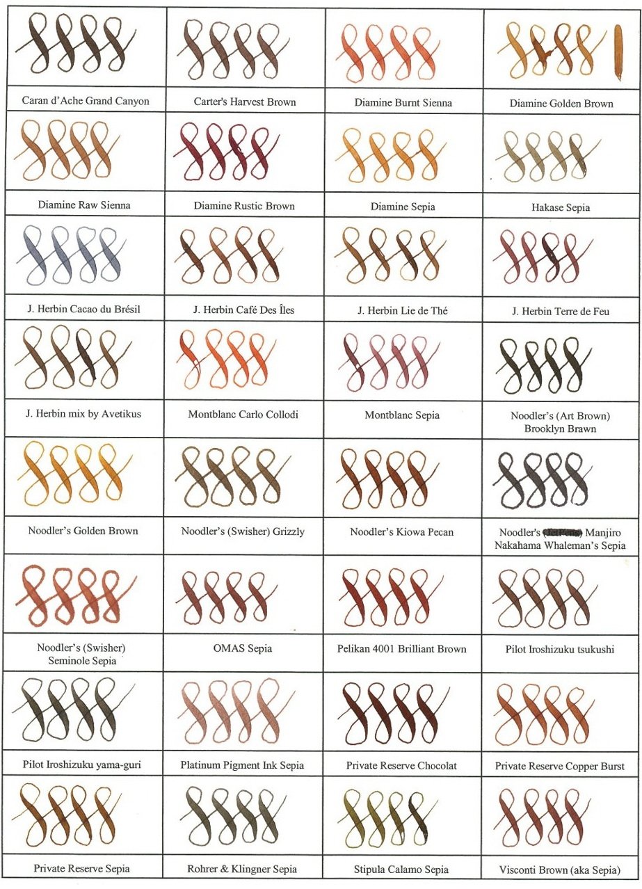
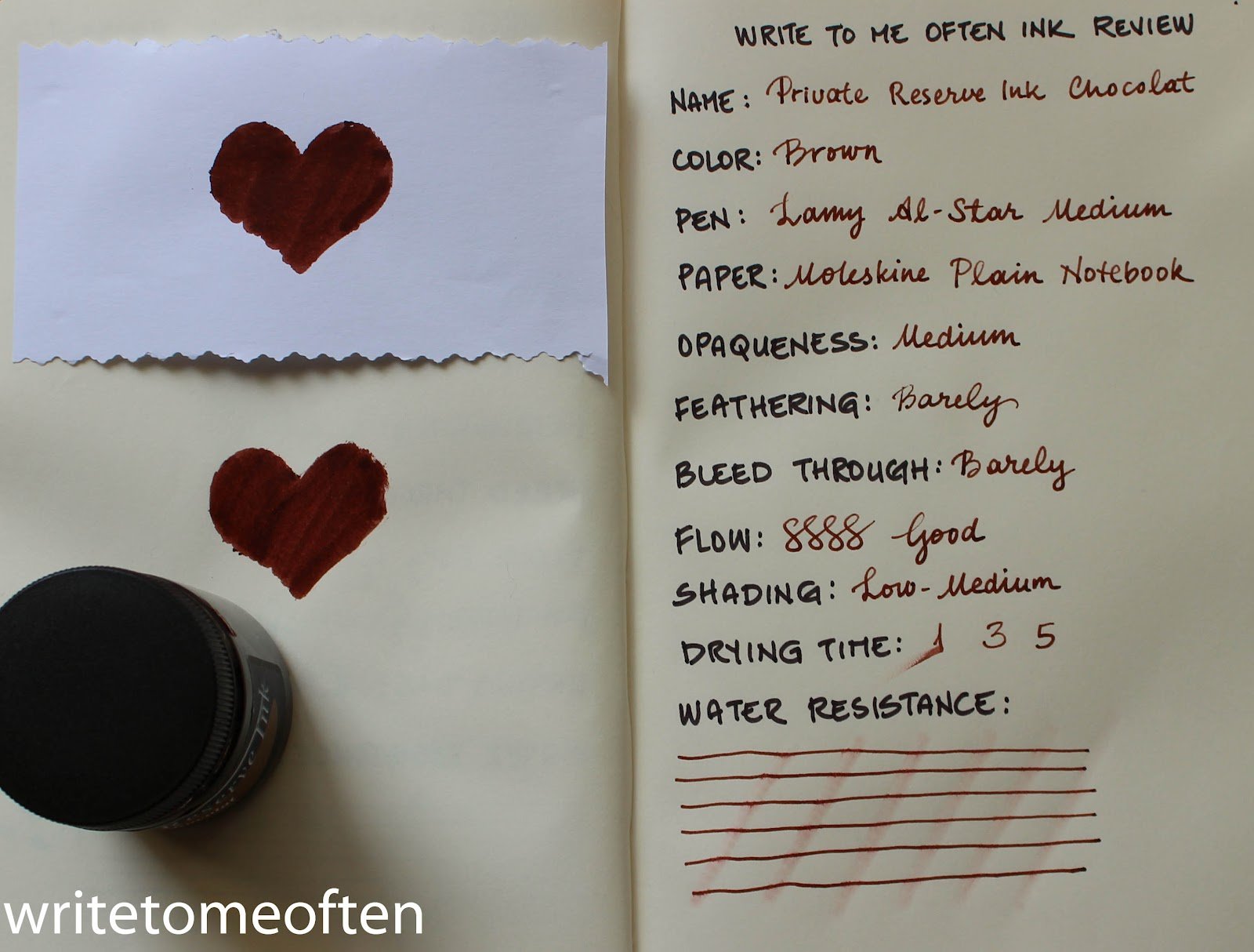
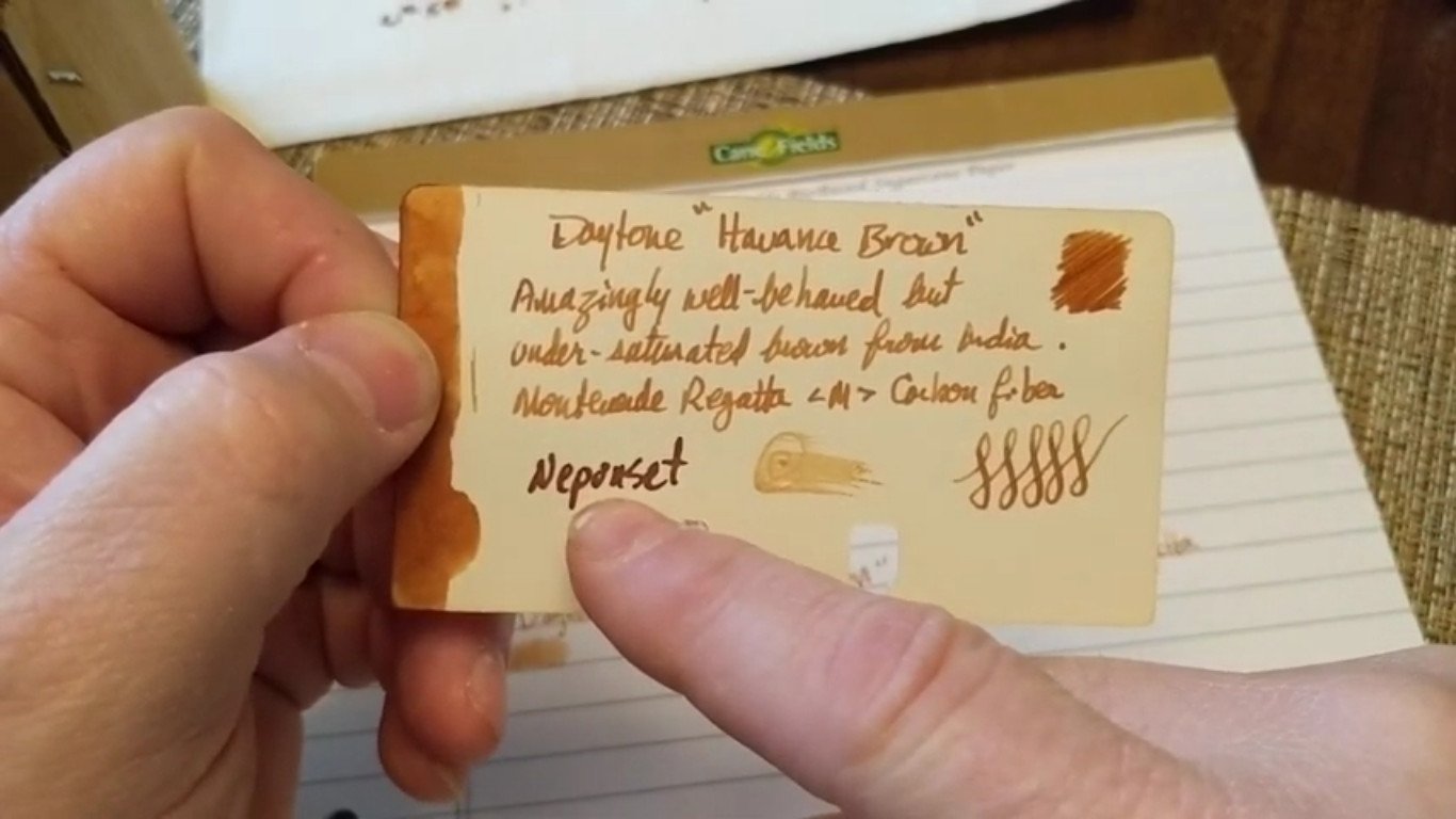
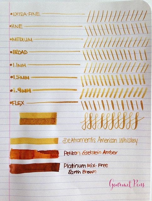
This collection has been made in an intensive attempt to find the most ideal and complete shades of brown color fountain pen inks over the internet and as long as writing with a medium size fountain pen is what I'm concerned of, the "infinity symbol" on a regular paper is the thing I've considered saving these samples. I've also benchmarked the index card samples for those which were not available in infinity sample. All the top-rated fountain pen inks – even those which are not mentioned here probably for the lack of a quality brown ink – have been taken into account. ~ Here's the list ~ Akkerman Hals Oud Bruin Akkerman SBRE Brown Chesterfield Antique Copper Colorverse #25 String Colorverse Coffee Break Daytone Havana Brown De Atramentis American Whisky Brown Gold De Atramentis Havanna De Atramentis Scottish Whiskey Diamine Ancient Copper Diamine Chocolate Brown Diamine Desert Burst Diamine Golden Brown, Carter's Harvest Brown, Diamine Raw Sienna Diamine Ochre Diamine Terracotta Diamine Tobacco Sunburst Faber Castell Hazelnut Brown J. Herbin Café Des Iles J. Herbin Caroube De Chypre J. Herbin Lie de The J. Herbin Terre d'Ombre KWZ Honey KWZ Iron-gall Aztec Gold KWZ Iron-gall Mandarin (Corrected Version) KWZ Old Gold L'Artisan Pastellier Callifolio Cannelle Leonardo Sepia Classico Monteverde Copper Noir Monteverde Joy Sepia Monteverde Scotch Brown Noodler's Golden Brown Noodler's Kiowa Pecan OMAS Sepia Private Reserve Chocolate Private Reserve Copper Burst Private Reserve Sepia Robert Oster African Gold Robert Oster Antelope Canyon Robert Oster Caffe Crema Robert Oster Gold Antique Robert Oster Toffee Sailor Kobe #22 Shinkaichi Gold Sailor Storia Lion Light Brown Scribo Classico Seppia Standardgraph Maisgelb by @lgsoltek Taccia Tsuchi Golden Wheat Vinta Heritage Brown Vinta La Paz Diplomat Caramel Krishna Bronze Leaf, Krishna Yellow Valley L'Artisan Pastellier Callifolio Anahuac L'Artisan Pastellier Callifolio Itzamna L'Artisan Pastellier Encre Classique Ocre Jaune Maruzen Athena Kinkan PenBBS #135 Beijing PenBBS #269 45th POTUS PenBBS #504 Vernal Equinox Platinum Mix-Free Earth Brown Taccia Ukiyo-e Hokusai Benitsuchi Tono & Lims Kela Nuts Vinta Terracotta Vinta Ochre Note: the absorption of the ink to the paper could vary. Before purchasing any of the inks above be aware some of them are dry while the others are wet. Plus, based on the fountain pen model and paper you use, the colors could look different. Make sure to use fountain pen inks only, otherwise your fountain pen will clog. Stay away from drawing, calligraphy, lawyer, and India inks. They are not designed for the fountain pens. Platinum and Sailor have some pigmented-based inks; avoid them. Take all these into account.
-

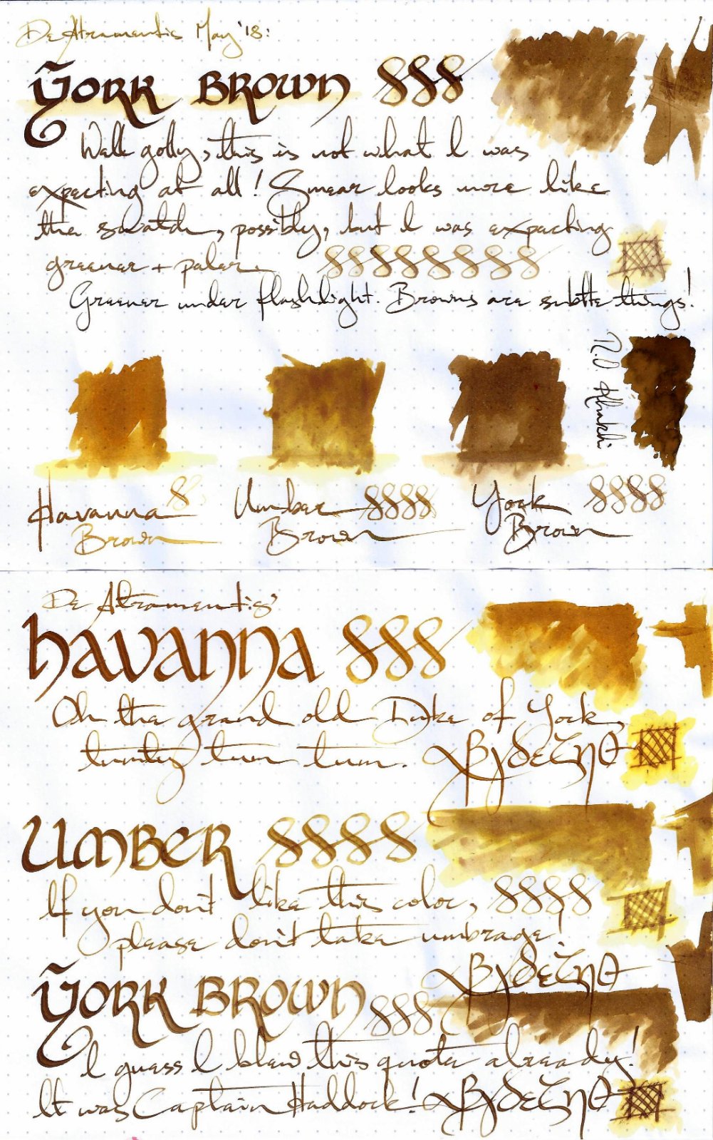
Six De Atramentis Brown Inks (And One Additional Curiosity)
pgcauk posted a topic in Ink Comparisons
I have been trying to figure out the De Atramentis Brown Inks (especially the cooler end) for a while. An earlier thread is here. Having added a few more since, including, to me, a couple of real winners, and having found it impossible to find reviews for some of these elsewhere, I thought it worth making an updated record here. The De Atramentis inks are numbered, the marginalia are for reference. Being De Atramentis, each of these may be available under a variety of names, and some of the names may even get switched around - my only goal here is to provide a "first taste"!


desaturated.thumb.gif.5cb70ef1e977aa313d11eea3616aba7d.gif)


.jpg.e953d46aa30a670f20d0ff630c1e945c.jpg)