Search the Community
Showing results for tags 'dark blue'.
Found 14 results
-

Ink Shoot-Out : Rohrer&Klingner Verdigris vs Callifolio Equinoxe(6)
namrehsnoom posted a topic in Ink Comparisons
Ink Shoot-Out : Rohrer & Klingner Verdigris vs L’Artisan Pastellier Callifolio Equinoxe(6) A couple of months ago, I did a review of R&K Verdigris, and was pleasantly surprised by the ink’s colour and performance – it’s truly a classic. When looking at related inks, I noticed that L’Artisan Pastellier Callifolio Equinoxe(6) showed a similar vibe. Both are fabulous inks with great aesthetics and a solid presence on the page. This deserves a more in-depth comparion: I wonder if one of them outshines the other. The morning sun rises above the desert, its first golden rays illuminating the central square of Bartertown. Despite the ungodly hour a large crowd has gathered, and bookmakers are already taking bets. A big fight is on its way. Today, fate and fighting skills will determine who gets to be the new sheriff in town. Two candidates remain: on the left side the giant from Leipzig – Hans “The Crusher” with his ball chain flail. On the right side, the muscleman from France – Jean-Paul “Bone Breaker” carrying his 2m steel pipe. Silence descends when Aunty Entity appears: “Today we choose our new champion, and the Thunderdome will decide. Two men enter, one man leaves!” Enter... the Ink Shoot-Out. A brutal fight spanning five rounds, where two inks engage in fierce battle to determine who is the winner. Today’s fight is a gladiator spectacle: a brutal fight within the confines of the metal cage of the Thunderdome. A huge crowd clings to the dome’s bars… expectations are high for what promises to be a brutal and bone-breaking event. Aunty Entity drops her handkerchief, signaling the start of the first round. May the best ink win… Round 1 – First Impressions This first round is all about peacocking. The champions strut across the ring, impressing the public with their strength and showcasing their weapon mastery. Attacks are meant to explore weaknesses, and to express dominance over the opponent. It’s a wonderful display of battle skills! Both inks show wonderful qualities. Their dark blue colours are simply amazing, with a solid presence on the page and showing lots of depth and character. Both are muted dark blues with good saturation and some lovely shading that is never overdone and always aesthetically pleasing. The force is strong in these two! In this first round, both champions showcase their ability, and both throw serious punches, trying to impress their opponent and explore weaknesses. These champions are on fairly equal footing, but there are obvious differences: Verdigris is what I would call a teal dark-blue – it’s a blue-black by nature, that has strong teal influences. The resulting colour is simply beautiful and great-looking on paper. Equinoxe(6) is more of a dark-blue teal – first and foremost a teal colour, with strong dark-blue leaning undertones. A bit more heavy in the shading, and with a similarly strong presence on the paper. Verdigris is serious and business-like, while Equinoxe(6) expresses more emotion and playfulness. It’s Mr Spock vs Mc Coy … both equally valuable to Kirk, but having totally different characters. This is a great first round, and both inks effortlessly impress the crowd. But neither one manages to outshine its opponent. Starting from wildly different backgrounds, both inks lean towards the dark-blue, showcasing mastery of the paper – saturation, wetness, shading, colour … all combine to make these great inks to use. But in the end, neither ink dominates. As such, this first round ends in a draw. Round 2 – Writing Sample The writing sample was done on a Rhodia N°16 Notepad with 80 gsm paper. Both inks behaved flawlessly, with no feathering and no show-through nor bleed-through. With the EF nib, Verdigris feels a bit wetter-writing, and looks just a little bit more solid on the page. With broad nibs, Verdigris tends to over-saturate – it’s a bit too wet-writing, and leaves a bit too wide a line. Equinoxe(6) is more consistent and shows a same level of wetness and saturation across the nib range. This is especially noticeable in broader nibs. With the EF-nib, Hans The Crusher strikes a glancing blow on his opponent's shoulder. The French champion stumbles a bit, but quickly recovers. With the broad nib, Equinoxe(6) swings his steel pipe at Verdigris’ legs, causing the German giant to fall. But Verdigris turns the fall into a roll, quickly regaining its footing before the French champion can press for an advantage. The crowd is going wild… the fight is getting serious. Hard blows are exchanged. A good thing these fighters are wearing armour, or bones would have been crushed. Both inks work wonders with the paper, writing really well without any technical difficulties. Wetness, saturation, shading … all these are present and work nicely together to enhance your writing. I noticed no feathering, nor any hints of show-through or bleed-through on the Rhodia paper. As such, these inks really measure up to one another. This was a satisfying round, where both champions clearly show what they can do. Either one would make an excellent sheriff, that single-handedly could control a crowd. And the public agrees… they roar their approval, with equal enthousiasm for both inks. Again, no clear winner emerges, and this round also ends in a draw. Round 3 – Pen on Paper This round allows the battling inks to show how they behave on a range of fine writing papers. From top to bottom, we have: Midori notebook paper, Tomoe River 52 gsm, Original Crown Mill cotton paper, Clairefontaine Triomphe 90 gsm and Paperblanks 120 gsm journal paper. All scribbling and writing was done with a Lamy Safari B-nib. Both champions did well, with no show-through nor bleed-through. But this round is not about technicalities, it is about aesthetics and beauty. Are the fighters able to make the paper shine? One thing is immediately apparent: these inks work well with both white and creamy paper. A slight advantage goes to Verdigris: on creamy paper, it just looks a bit more solid. The Callifolio ink feels a bit more playful, more suited for personal journaling. When seriousness is needed, Verdigris seems the obvious choice to me. I also tested the inks on crappy Moleskine paper. Both inks handle that paper really well, with only a tiny amount of feathering. But there is quite some bleed-through – for both inks. I would say that they handle lousy paper equally well: really good behaviour in the writing department, but you will not be able to use the backside of the paper. With that creamy paper, the Rohrer & Klinger ink manages to swing its flail under Equinoxe(6)’s defenses, delivering a bone-crushing blow to the left leg. That clearly hurts! The public groans in empathy. But the French fighter ignores the pain, and continues to nimbly dance around his opponent, using blindingly fast strikes with its steel pipe to explore for weaknesses, which Verdigris masterfully evades. When the bell sounds the end of this round, it’s still clear that both champions have some fight left in them. But in this round, there was that slight breakthrough for Verdigris on the creamy paper. Not a huge thing, but enough for Aunty Entity to grant this round to Verdigris on points. Round 4 – Ink Properties Both inks have fairly long drying times, but for the first time we see a real difference: 20 seconds for the Callifolio ink, but a really long 30 seconds for Verdigris (with M-nib on Rhodia N°16 80 gsm paper). That difference is significant! From the chroma, it’s also obvious that Verdigris has less water resistance. To test this, I dripped water on the grid and let it sit there for 15 minutes, after which I removed the water with a paper towel. In reality, the difference turns out to be less prominent than the chroma suggests. Equinoxe(6) is definitely NOT a water-resistant ink, but there remains a faint grey residue that allows you to reconstruct your writing. With Verdigris, all dyes are flushed away with the water, leaving nothing readable on the page. During this round, the French fighter is in the lead, with solid strikes from his steel pipe that Verdigris can barely avoid. Drying times… bang! The steel pipe connects with Verdigris’ shoulder armour. That hurts! Water resistance… klaboom! The German barely manages to parry a solid steel pipe blow with his flail. He’s clearly on the defensive, and Callifolio Equinoxe(6) totally has the initiative. When the bell sounds, both inks remain standing. But this round is without any doubt a clear win for the French fighter. No bone-breaking hits, but Verdigris has certainly felt the pain. The crowd is going wild… at last the fight is becoming serious. Which ink will remain standing in the end? Round 5 – The Fun Factor Welcome to the final round. Here I give you a purely personal impression of both inks, where I judge which of them I like most when doing some fun stuff like doodling and drawing. And for this round, both inks are simply amazing. I did the drawing on HP Permium Plus Photo paper. The background uses heavily water-diluted ink, applied with a Q-tip. I then painted in the trees, adding more and more ink for the trees in the foreground. For the details in the first row of trees, I used pure ink in a B-nib Safari. The photo paper tends to enhance the ink’s characteristics, and this shows. Verdigris displays a more strongly present blue-black vibe. With Equinoxe(6), the green influence come to the surface and the ink looks definitely more like a teal. Both inks are lovely to draw with, but the Verdigris side of the painting simply looks more beautiful and balanced. At the end of this fifth round, Verdigris’ steel-ball flail extends with tremendous force, hitting the Frenchman squarely on the breastplate. Equinoxe(6) staggers to his knees, clearly suffering from this tremendous blow. The bell sounds, saving the Frenchman from certain defeat. This round is a solid win for Verdigris, and Aunty Entity agrees. The Verdict Both inks are great-looking dark blues, which work well with any type of paper: saturated, wet-writing, lovely shading, beautiful looks. Totally different characters, but true champions each. You can’t go wrong with either of these. But that final round really sealed the deal … Verdigris will be the new sheriff in town and is the winner of this exciting shoot-out. And Equinoxe(6) … well, Aunty Entity decides to be merciful. The Frenchmen can live: you should never waste a good ink! -

Informal Review - Noodler's - Blue Steel - Dallas Pen Show 2013 - Dromgoole's
amberleadavis posted a topic in Ink Reviews
http://sheismylawyer.com/She_Thinks_In_Ink/Inklings/2013-Ink_700.jpg http://sheismylawyer.com/She_Thinks_In_Ink/Inklings/2013-Ink_701.jpg
-
Mont Blanc – StarWalker Blue Planet The 2020 Mont Blanc StarWalker Blue Planet fountain pen pays homage to our home in the universe, and calls attention to the dark blue water in earth’s oceans. Not surprisingly, Mont Blanc also released an accompanying dark blue ink, that is the subject of this review. The ink’s packaging looks lovely, with a design that provides an inspiring view of Earth as seen from space, with swirling clouds over blue oceans. In the box you’ll find a very nice 50ml bottle of StarWalker Blue Planet. StarWalker Blue Planet is a dark blue ink that moves towards blue-black territory, without actually getting there. It’s still without question a blue ink, but quite a dark one. I like blue-black inks a lot, and this one charmed me by keeping its blue origins, while at the same time being dark enough to offer a nice alternative to the more traditional blue-black. It’s also different enough from my other blue inks to make it stand out from the pack. I personally like the way it looks! The ink is well-saturated, and looks great in all nib sizes. This dark blue ink fits perfectly in the workplace, looking serious while still standing out from the standard blue and black crowd. A great everyday writing ink. Blue Planet has a limited dynamic colour range, without much contrast between the light and darker parts. The result is soft shading that – while very present – is never harsh, but looks elegant and pleasing to the eye. The shading is most prominent in nib sizes M and above, but even with EF/F nibs you see hints of shading that lend some character to your writing. I personally think this ink’s shading works brilliantly. On the smudge test – rubbing text with a moist Q-tip cotton swab – the ink shows a bit of weakness. Lots of visible smudging, but the text itself remains very legible. Further water tests show Blue Planet’s total lack of water resistance. All that lovely dark blue quickly dissipates, leaving next to nothing on the page. This is also apparent from the lower part of the chromatography, which shows that only some shadows of the ink remain on the paper. Drying times are close to the 5-second mark with the Lamy Safari M-nib test pen, making Blue Planet a relatively fast-drying ink. I’ve tested the ink on a wide variety of paper – from crappy Moleskine to high-end Tomoe River. On each scrap of paper I show you: An ink swab, made with a cotton Q-tip 1-2-3 pass swab, to show increasing saturation An ink scribble made with a Lamy Safari M-nib fountain pen The name of the paper used, written with a Lamy Safari B-nib A small text sample, written with an M-nib Source of the quote, with a Pelikan M400 F cursive italic Drying times of the ink on the paper (with the M-nib) Since this is my first review of 2021, I start with a new set of quotes for the writing samples on different types of paper. After giving it some thought, I decided to go with quotes from Isaac Asimov and his Foundation Series. I personally think these are relevant in the current geopolitical climate. Coming from a computer science background, I also appreciate Asimovs strong belief in the power of science. Since scans alone don't give a complete picture, I also add some photos to give you an alternative look at the ink. Mont Blanc StarWalker Blue Planet looks great on all my test papers, both the white and more yellow ones. The ink behaved almost perfectly. Only with Moleskine paper and printing paper did I notice a tiny amount of feathering. See-through and bleed-through are visibly present with Moleskine paper, but not an issue with the other papers in my test set. Like most Mont Blanc inks this is a well-behaving one. Writing with different nib sizes The picture below shows the effect of nib sizes on the writing. All samples were written with a Lamy Safari, which is typically a dry pen. I also added a visiting pen – a wet Pelikan M405 Stresemann with an F cursive-italic nib. In all cases, Blue Planet leaves a well-saturated line and wrote fluently with good lubrication. I also enjoy the soft shading of this ink, which looks really elegant. Shading is hinted at in EF/F nibs, and is very present in M-nibs and above. An excellent writing ink! Related inks To compare this StarWalker Blue Planet with related inks, I use a nine-grid format with the currently reviewed ink at the center. This format shows the name of related inks, a saturation sample, a 1-2-3 swab and a water resistance test – all in a very compact format. The grid format makes it easy for you to compare the Mont Blanc ink with similarly coloured inks. The ink looks different enough from my other dark blues to stand out from the pack. Inkxperiment – Yin & Yang As a personal experiment, I try to produce interesting drawings using only the ink I’m reviewing, keeping things simple and more-or-less abstract. Making these single-ink mini-pieces allows me to show what the ink is capable of in a more artistic context. For this drawing I started with a 10x15 cm piece of HP photo paper, on which I drew the background using a piece of foam and heavily water-diluted ink. I then drew in the dividing line, and darkened up the bottom part of the background. Using a yin&yang theme, I drew in some opposing features on the day & night side: sun vs moon, cityscape vs treeline. The resulting drawing shows quite well what can be achieved with this StarWalker Blue Planet as a drawing ink. Conclusion Mont Blanc’s StarWalker Blue Planet is a serious-looking dark blue ink. It’s hinting at blue-black territory without crossing that line. And it manages to do this well. This ink is a nice alternative for blue-black ink lovers. The ink works well with all types of nibs and a broad range of papers, showing some really nice and soft shading. Unfortunately: no water resistance. I quite enjoyed this Mont Blanc ink. Just be aware that it is a Limited Edition ink, so if you like it, now is the time to grab a bottle. Technical test results on Rhodia N° 16 notepad paper, written with Lamy Safari, M-nib Backside of writing samples on different paper types
-
➤ Please take a moment to adjust your gear to accurately depict the Grey Scale below. As the patches are neutral Grey, that is what you should see. • Mac http://www.computer-darkroom.com/colorsync-display/colorsync_1.htm • Wintel PC http://www.calibrize.com/ http://i783.photobucket.com/albums/yy116/Sandy1-1/FPN_2013/27ddb717.jpg ➤ As Photo*ucket has lost the functionality to display linked files as required and includes advertising with linked images, the HiRes images are embedded. I apologise should that choice slow your display times. -|=|- Fidelity I was not able to find a depiction of this ink on an 'official' Sailor site, so fidelity cannot be evaluated. Figure 1. Swabs & Swatch Paper: HPJ1124. http://i783.photobucket.com/albums/yy116/Sandy1-1/FPN_2013/Ink%20Review%20-%20Sailor%20Jentle%20Blue/INK181_zps45623fd1.jpg Figure 2. NIB-ism Paper: HPJ1124. Depicts nibs' line-width and pens' relative wetness. Distance between feint vertical pencil lines is 25mm. http://i783.photobucket.com/albums/yy116/Sandy1-1/FPN_2013/Ink%20Review%20-%20Sailor%20Jentle%20Blue/INK180_zps4ae4e4ae.jpg L ➠ R: 45, M200, Symphony, 330, Somiko, NNPS. WRITTEN SAMPLES - Moby Dick Ruling: 8mm. Figure 3. Paper: HPJ1124. http://i783.photobucket.com/albums/yy116/Sandy1-1/FPN_2013/Ink%20Review%20-%20Sailor%20Jentle%20Blue/INK188_zpsfcbb9196.jpg Figure 4. Paper: Rhodia. http://i783.photobucket.com/albums/yy116/Sandy1-1/FPN_2013/Ink%20Review%20-%20Sailor%20Jentle%20Blue/INK187_zps6a772bab.jpg Figure 5. Paper: G Lalo. http://i783.photobucket.com/albums/yy116/Sandy1-1/FPN_2013/Ink%20Review%20-%20Sailor%20Jentle%20Blue/INK186_zps9fc0a794.jpg Figure 6. Paper: Royal. http://i783.photobucket.com/albums/yy116/Sandy1-1/FPN_2013/Ink%20Review%20-%20Sailor%20Jentle%20Blue/INK185_zps0dc6fb93.jpg Figure 7. Paper: Staples. http://i783.photobucket.com/albums/yy116/Sandy1-1/FPN_2013/Ink%20Review%20-%20Sailor%20Jentle%20Blue/INK183_zpsea355926.jpg OTHER STUFF Figure 8. Smear/Dry Times & Wet Tests. http://i783.photobucket.com/albums/yy116/Sandy1-1/FPN_2013/Ink%20Review%20-%20Sailor%20Jentle%20Blue/INK182_zpsb3f3a48a.jpg Figure 9. Bleed- Show-Through on Staples. (Reverse of Figure 7.) http://i783.photobucket.com/albums/yy116/Sandy1-1/FPN_2013/Ink%20Review%20-%20Sailor%20Jentle%20Blue/INK184_zpsef275c8a.jpg HiRes Scans 45 on HPJ1124 http://i783.photobucket.com/albums/yy116/Sandy1-1/FPN_2013/Ink%20Review%20-%20Sailor%20Jentle%20Blue/INK189_zpse3ba5cd1.jpg Symphony on Rhodia http://i783.photobucket.com/albums/yy116/Sandy1-1/FPN_2013/Ink%20Review%20-%20Sailor%20Jentle%20Blue/INK190_zps53333831.jpg 330 on G Lalo http://i783.photobucket.com/albums/yy116/Sandy1-1/FPN_2013/Ink%20Review%20-%20Sailor%20Jentle%20Blue/INK191_zpscb11aa83.jpg NNPS on Royal http://i783.photobucket.com/albums/yy116/Sandy1-1/FPN_2013/Ink%20Review%20-%20Sailor%20Jentle%20Blue/INK192_zps2f696f69.jpg GENERAL DESCRIPTION Type: Dye-based fountain pen ink.Presentation: Bottle with filler widget.Availability: Available when Topic posted.Daily writer? No doubt.A go-to ink? When a solid Dark Blue is desired.USE Business: (From the office of Ms Blue-Black.) Suitable for the vast majority of business writing, with more than a modicum of gravitas.The writing experience was quite good, even with the very narrow Parker 45 nib on the copy/print papers.Readability is very high across the range of values (light - dark), so embraces a wide range of pen+paper combos. Can be a bit 'weighty', so for the long read I'd prefer to run it in a moderately dry pen. (Those who use Black ink are likely to feel otherwise.)Line quality was good, and will do for a bit of marginalia on smooth papers.Not enough snap for dedicated forms use, mark-up or annotation of material printed in Black.Not enough zap for error correction or grading.Illustrations / Graphics: Quite possible for most charts & graphs where a quite Dark Blue is desired for both line and area formats.Will retain its hue across a range of values.As a watercolour, the dye/s appear to act in harmony, so mono-colour washes should be do-able. Water resistance is quite impressive, as is the sharpness of the remnant line after being wet sponged or over worked with wet media.Students: Will do quite well indeed.May not be sparkly enough for those who enjoy sequins rhinestones & chromed accoutrements before 10PM.Has a very good chance to be run two-sided on 'lowest bidder' copy/print papers.Those who do a lot of start-stop note taking might find it worthwhile to modify the ink just a bit to avoid nib-tip dry-out.Admirable water resistance for a simple aniline dye ink.Another good pick for assignments.Personal: Of course.This one fits into a niche in my inky array: a Dark Blue that is not so low-chroma as to be mistaken for yet another of my Blue-Black inks, and leans away from Sapphire / Indigo.Will do the necessary for pro forma business writing, and brings firmness to a one-page despatch.For personal writing I prefer SJBl for the somewhat shorter letter of less than ten A4s.If I choose to enliven the line, use of nibs of various shape & flex are more than welcome.The Red Shimmer achieved by some practitioners eludes me. Alas, such is my experience with other inks said to have that property. PHYSICAL PERFORMANCE & CHARACTERISTICS Flow Rate: Middling.Nib Dry-Out: Nib tips dried-out in the open air about as fast as iron-gall inks.*Start-Up: Quite reliable from capped pens, even after several days at rest.I'd nudge the nib prior to writing something that needs a very clean start, such as a signature.Lubricity: Very nice.Smooth glide yet does not muffle feedback necessary to keep nibs running on their sweet spot.Nib Creep: Not seen.Staining (pen): Not seen after three days.Clogging: Not seen.Seems unlikely.Bleed- Show-Through: HPJ1124: Symphony. (I was using higher pressure and a lower rate of travel than usual to get a bit of flexi line variation.)Staples: A bit unusual to have freckles from the M200, yet the wide wet NNPS was OK. (?)All other pen+paper combos were fine for two-sided use.Feathering / Wooly Line: Not seen on papers used.Aroma: A bit sharp on the nose.Not noticed whilst writing.Hand oil sensitivity: Possibly: The NNPS flickered once on the HPJ1124, which might've been due to hand oil or some surface anomaly.Clean-Up (pen): Exceptionally fast & thorough with plain water.For recently charged pens, the use of a DIY pen cleaning solution of dilute ammonia+surfactant did not release any visible residue after my fussy water-only cleansing regimen.One to consider if one needs to change ink on-the-fly or in the field.Mixing: No stated prohibitions.Archival: Not claimed.___ ___ * Such misbehaviour was unexpected, is not typical of Sailor inks, nor was it mentioned in preceding Reviews, so may be a quirk. If encountered, very slight dilution or addition of a whisper of pure glycerol could be considered. THE LOOK Presence: Firm.Likely to have a Rockwell Number.Saturation: Typically high.Shading Potential: Quite low indeed.Line quality: Very good on smooth papers.A bit choppy on textured papers.Variability: Pen+nib combos used:Quite high for such a saturated ink.SJBl responds well to changes of pen characteristics, but doesn't go masquerading as some different Blue ink.Papers used:A bit higher than expected.The hard laid surface of the G Lalo was no more challenging than usual.Line-width variation was a bit high, and depended more on the absorbency of the paper than wetness of the pen. Malleability: Really quite high for such a simple-looking ink.The performance envelope is very generous, so a wide range of pen+paper combos can be used without returning an unacceptable result.PAPERS Lovely papers: Smooth crisp whites.Trip-wire Papers: ☠ Not seen.Copy/Printer Paper: Very good for a simple aniline dye ink.One may well not need to use a dry narrow nib to use both sides of such papers - a light hand should suffice.Tinted Papers: Certainly.Limited only by good taste.Is high-end paper 'worth it'? Not so much.As ever, coated writing papers are worthy of consideration if one chooses a flexi nib, wants to generate the narrowest of lines, or tries to wring some shading from SJBl.ETC. Majik: Not sufficiently malleable to overcome the inherent firmness.Billets Doux? Impossible from yours truly.Personal Pen & Paper Pick: The Eversharp Symphony on Rhodia.The nib has just enough flex to enliven the line, and the flow is lean enough to keep the colour from submerging.The base-tint of the Rhodia brings warm neutrality, and the coated surface gives great line definition and supports smooth travel of the nib as it flexes. Yickity Yackity: Certainly not a 'wow' ink or one that would cause one to drop everything then charter an aircraft to get a bottle, but once SJBl has been in a few pens, a second bottle may well find its way into your shopping cart before the first bottle reaches the half way mark.Now if I could just get some shading . . .Ah kushbaby, too sober to dance with Ghandi?= ==== = NUTS BOLTS & BOILERPLATE Pens - Written Samples: A. Parker 45 + 14K XF nib. B. Pelikan M200 + g-p steel EF nib. C. Eversharp Symphony + 14K F flex-ish nib. D. Sheaffer 330 + steel M nib. E. Sailor Somiko + TIGP B nib. F. Non-Nudist Pink Safari + goosed 1.1 steel nib. - Lines & labels: R&K Sepia from a Pilot Penmanship. Papers: HPJ1124: Hewlett-Packard laser copy/print, 24lb.Rhodia: satin finish vellum, 80gsm.G. Lalo Verge de France: natural white, laid, 100gsm.Royal: 25% cotton, laser/inkjet copy/print, 'letterhead', 90gsm.Staples: house brand multi-use copy/print, USD4/ream, bears FSC logo, 20lb.Imaging An Epson V600 scanner was used with the bundled Epson s/w at factory default settings to produce low-loss jpg files.No post-capture manipulation of scanner output was done, other than dumb-down by Epson, Photobouquet, IP.Board s/w, and your viewing gear.Other Inks This Review uses the same Written Sample format, atrocious handwriting and some pen+paper combos common to most of my previous Reviews of Blue inks. Consequently, ad hoc comparisons through manipulation of browser windows is supported. Should that functionality not meet your requirements, I welcome your PM requesting a specific comparison. Additional scans may be produced, but the likelihood of additional inky work is quite low. Fine Print ◊ The accuracy and relevance of this Review depends in great part upon consistency and reliability of matériel used. ◊ Ink does not require labelling/notice to indicate (changes in) formulation, non-hazardous ingredients, batch ID, date of manufacture, etc. ◊ As always YMMV, due to differences in materials, manner of working, environment, etc. ◊ Also, I entrust readers to separate opinion from fact; to evaluate inferences and conclusions as to their merit; and to be amused by whatever tickles your fancy. -30- Tags: Fountain Pen Ink Review Sandy1 2013 Sailor Jentle Blue Dark Blue
-
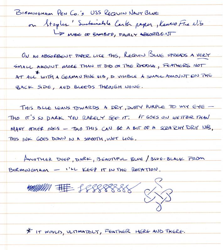
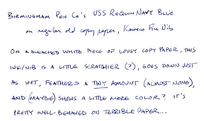
I initially thought this ink leaned towards the purple but see now that it dries to a deep navy / blue-black. It's a very well-behaved ink, and I've since loaded it into a piston-filler (Lamy 2000), run through it, and had it clean out entirely with around 10 flushes, so -- as good as any of the easiest-cleaning inks (for me, anyway). I ran through the testing rubric on Tomoe River Paper, so it gives great line definition and nice, true color -- but dry times are off the chart. Regular paper offers an under-ten-second dry time with a European medium nib (Kaweco medium tested). If you like the color -- or are, like me, forever in search of more blue-blacks -- it's a great everyday ink: almost black in a bold nib, true navy in a fine-medium, and a steely-gray-blue in an extra-fine, and office-friendly in all three. On TRP: And on my everyday office paper, Staples' Sustainable Earth (bamboo) paper: On fancy-shmancy letterhead paper (unsure of bond designation, but like the vast majority of mass-market consumer products it probably wouldn't mean anything anyway - in any case, this is a custom letterhead from Crane's): And on a piece of paper I pulled out of the laser printer: All told, it's a very versatile ink - works well on any paper provided you choose an appropriate nib and has nice variation in color with different nib sizes; I'll be putting it into the rotation, as it has all the right qualities and it actually adds something to my blue-black collection... [edit: to repost pictures, as I believe I musta bunged it up somehow]
-
In the past six months I've been on an acquisition spree of OMAS pens (which is good timing considering the possible trouble the company's in nowadays), and with the three old-style Paragons came three different colors of ink: the Arco Verde came with OMAS Green; the Bronze Arco came with OMAS Blue, the darker, old version***, apparently; and the Burlwood model came with OMAS brown. So far OMAS Blue is by far my favorite of the three. ***this is based on internet research speculation and a video by the Goblets explaining the difference between old and new.
-
http://www.rdwarf.com/users/wwonko/images/fpn/iro/03-Shin-kai-header.jpg Shin-kai (Deep Sea) - CRV - Group Review - 2014-12 The Iroshizuku Group Review color for December 2014 is Shin-kai "Deep Sea". It is dark, dark blue, so dark that it might be a blue-black, with some shading and a hint of sheen. It is a very deep, serious color indeed, and to does remind one of the darkness of the deep ocean that it its namesake. Please post your reviews and scans of the ink in this thread. This month will be a little hard for me to arrange review partners, as I will be traveling almost the entire month of December. If you mail me something, it will likely be seriously delayed! Instead of the mail - even though the mail is way more fun - if you want to CRV with someone, perhaps you can PM each other scans, or decide to trade addresses on your own. If you're not comfortable trading addresses, then please feel free to do a CRV on your own, and share that with everyone! Other reviews are welcome, too. You can look at the full description of the Iroshizuku Group Review to see how this should work and what we’re doing. http://www.rdwarf.com/users/wwonko/images/fpn/iro/03-Shin-kai-product.jpgThanks to Rachel Goulet, who gave permission to me to use their beautiful product photo and swab.More thanks to Amberlea who is always such an inky enabler. Please PM me with any questions. I look forward to seeing everyone's results!
-
Rather than hijack either the Diamine thread or the "shading blues" thread for my ink searches, I decided to start my own. OK, fade resistance is clearly the first of my go/no go characteristics. I want my blue to have it. I will want decent flow and feather resistance on cheap paper (which is all I use). I also want it to be resist ink eradicators. I think I'd prefer a pretty dark blue ... say, not too far from the menu immediately below the banner on this site. I don't want it to be too purplish (e.g., Diamine Imperial Blue). And let's face it, I want a darkish purple with the same virtues -- fade resistance, feather resistance, decent flow, and ink eradicator resistance. Bilberry is plenty purple enough, but I don't know about its fade resistance. Diamine Grape is probably as reddish/plum a purple as I'd want. Waterman Violet/Tender Purple, which I have, isn't dark enough to suit me.
-
Yesterday I posted a quick look at De Atramentis' Atlantic Blue. Here's the other ink I picked up - Indigo Blue. Photo http://i200.photobucket.com/albums/aa163/roomdog/Ink/DeAtramentisIndigoBluePhoto_zps71d44c50.jpg Photo Cropped http://i200.photobucket.com/albums/aa163/roomdog/Ink/f0142b44-b82d-4c1b-ad1d-c9052676b615_zpsfe27c300.jpg Scan http://i200.photobucket.com/albums/aa163/roomdog/Ink/DeAtramentisIndigoBlueScan_zps12c313fd.jpg Scan Cropped http://i200.photobucket.com/albums/aa163/roomdog/Ink/1126bb31-b079-469d-b1ad-ad3170692515_zpse439adb1.jpg
-
Damn that Brian Goulet and his cornucopia of ink scans! He got me again... I'm becoming more and more fond of De Atramentis inks, and I have a particular penchant for dark blues. Based on the scans on Goulet's website, I picked up a couple (one of which is Atlantic Blue). Since there doesn't appear to be a review of this ink on the site, here's a quick one with some pics. Performance is typical De Atramentis. A wetter ink with good saturation and overall behavior. It has good lubricity, and the stock Lamy nibs glide easily across the paper. The curious thing about this ink is the shade. It's very, very dark; but I almost wouldn't consider it a "blue black" (although that's probably what it is in common vernacular). It can appear a little chalky in a dryer nib, but very rich in a wetter one (I really like the way it comes out of the Edison). Clearly suitable for business use. Another characteristic I find interesting is the smooth gradient it makes when it does shade. Unlike many inks where there is a stark contrast between the initial stroke and the end stroke, this ink blends smoothly across the stroke (you don't watch the ink rush back up to the beginning). Dry time is reasonable, but it's not water resistant/proof (although Rhodia paper is not conducive to either property). PHOTO http://i200.photobucket.com/albums/aa163/roomdog/Ink/DeAtramentisAtlanticBluePhoto_zps5e6b8629.jpg Crop for shading closeup http://i200.photobucket.com/albums/aa163/roomdog/Ink/51085f12-6b3b-4a2b-886e-b690f52f4384_zps0c30e422.jpg SCAN http://i200.photobucket.com/albums/aa163/roomdog/Ink/DeAtramentisAtlanticBlueScan_zpsf847ed6b.jpg Crop for shading closeup http://i200.photobucket.com/albums/aa163/roomdog/Ink/82d53ea5-cbb8-4241-aabc-25bda1a809fe_zpsf7b246e6.jpg
-
Hello, Over the past few months I've been desperately trying to find a suitable blue(ish) ink for my Cedar Blue "51" Vacumatic with a fine nib...The thing is that I don't particularly like/use fine nibs (it's my only fine nib besides the Konrad flex nib), but this one writes more towards a medium than an extra-fine, is pleasantly wet, and was my college graduation gift (couldn't part with it in a million years)... so I use it for cursive writing (I usually write in print). I've tried a large variety of blue inks (oh yes, forgot to mention...blue isn't really my favorite ink color), starting with Waterman Florida Blue (too pale), Pelikan Blue-Black (too grey when it comes out of a fine nib), Pelikan Turquoise (pale and had some bleedthrough), Pelikan Edelstein Topaz (beautiful color but takes quite some time to rinse it out of a "51" Vacumatic), even Noodler's Bad Belted Kingfisher for a very short while (I like the color and saturation in the fine nib...but I can't keep it for too long in a vintage pen). So now, after trying some blue inks, some turquoise inks, I want to try a Blue-Black/dark blue ink. I've listed 3 particular inks in the poll and now I would like to know your personal opinion on the matter...what kind of blue(ish) ink could surprise a person that doesn't like blue inks As a side note, you may wonder why I don't just abandon my quest for THE blue ink and go for the greens, the browns, the purples...since I don't particularly like blue. Well...let's say I want to give blue a second chance before I give up completely. Cheers!
-
Informal Review - Pilot Iroshizuku - Shin Kai - Deep Sea - Picture Heavy
amberleadavis posted a topic in Ink Reviews
http://sheismylawyer.com/She_Thinks_In_Ink/Inklings/slides/2013-Ink_696.jpg http://sheismylawyer.com/She_Thinks_In_Ink/Inklings/slides/2013-Ink_696b.jpg -
I think the current name is Manganese, instead of Manganate. Is an ink with two names twice as interesting? I like this one. Very similar in depth and saturation to my De Atramentis Sherlock Holmes ink, which is just a little bit more vibrant blue hue. This one flows well, really smooth. Has a bit of shading, but it's pretty dark so it's not going to show in a fine nib. Dry time is on the long side of average.
-
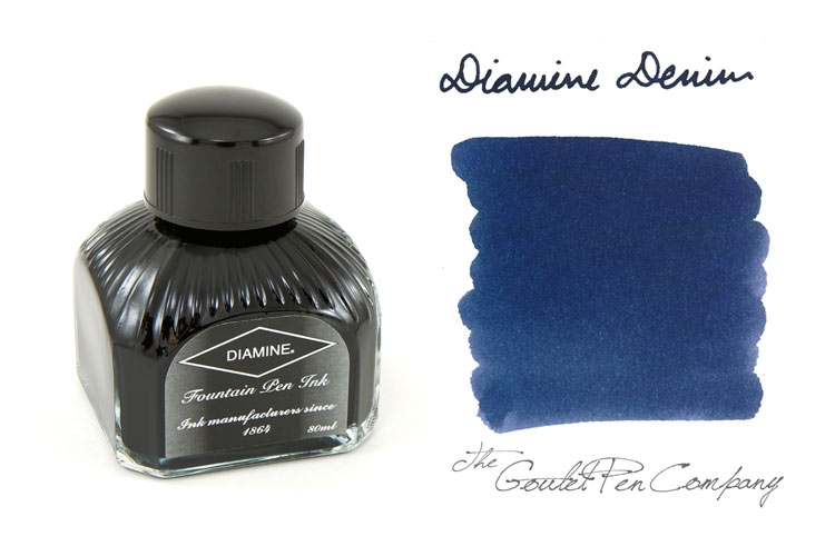
What is a good dark blue ink that you like to use? To distinguish: I'm not talking about a blue-black. I want a darker blue (Diamine Denim is a very good example of the type of thing I am looking for). Bonus if it's fairly easy to clean. Thanks Mike Picture shamelessly taken off of Goulet Pens