Search the Community
Showing results for tags 'danitrio'.
-
Urushi Studio India Goldfish pen impressions and comparisons
jandrese posted a topic in India & Subcontinent (Asia)
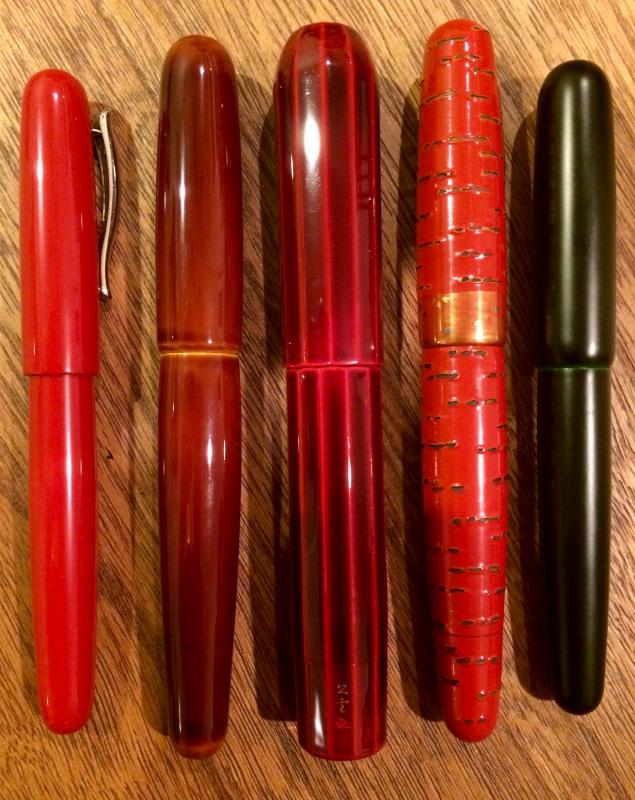
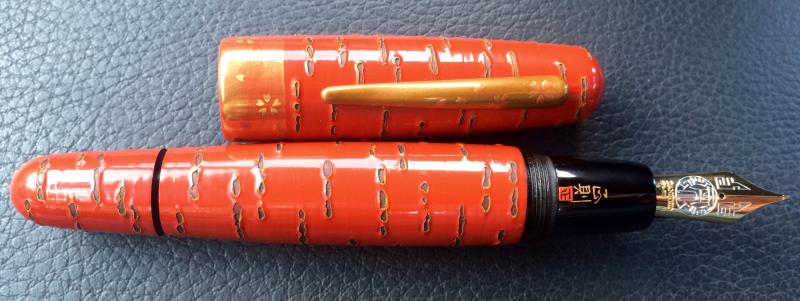
I collect urushi and maki-e pens some of which are from India. Here is my Urushi Studio India Goldfish pen impressions and comparisons. First, I show below photos of the pen by itself then photos alongside Japanese pens with the same theme. 398CB59A-8CF7-4757-86E2-23AC7032FC21 by Ja Ja, on Flickr DDD9A3DA-A5A4-482E-87B8-EB2F9251CDF4 by Ja Ja, on Flickr 0AB601B8-1C2D-4B71-8201-AAB972792F21 by Ja Ja, on Flickr 2BE10825-8A09-4EE9-AE61-0F210CF727A9 by Ja Ja, on Flickr D0113742-49BC-4DC8-B125-F1D9C168B868 by Ja Ja, on Flickr Overall, the Urushi Studio India pen is an attractive and unique take on the traditional kingyo (goldfish) theme. The blue base color is remarkable for both the seeming obviousness of using blue when the Japanese use black, and for the difficulty of producing blue urushi. The rocks and goldfish are pleasantly raised urushi especially so the goldfish—the technique is subtle reminding one of the shishiai-togidashi maki-e oft used by Japanese artists when painting kingyo. Comparing the work to three examples of kingyo theme pens from Japanese manufacturers provides some informative contrasts. The three Japanese works are a Danitrio Hyotan by Yusai, a Stylo Art pen featuring Wajima-nuri, and a Namiki Emperor by Seiki. In ascending order of retail price the pens are Urushi Studio India, Stylo Art, Danitrio, and Namiki. The Stylo Art pen is priced only about 15% more than the Urushi Studio India pen whereas the Danitrio is ~2-fold the price and the Namiki tops the scales at nearly 10-fold. 1ED931C6-FA40-4F1A-B873-B8AC7EBE52B5 by Ja Ja, on Flickr The base color of all three Japanese pens is black, that is, polished black oil-free urushi (kuro roiro). The polished black base is highly traditional, glossy, and has a preternatural sense of depth. The Danitrio pen makes this finish a feature, which works well with the curvy shape of the pen, showcasing the perfection of the finish. The other two Japanese pens make use of the black surface more as backdrop for subsequent maki-e work. The black contrasts with the colorful maki-e work but being black does so equally for all colors. Black and gold can also combine to look brown-ish or form a stunningly rich contrast. The polished blue of the Indian pen immediately signals a non-traditional approach while the glossiness of the finish advances its quality. It is said that obtaining consistent blue urushi finishes are difficult so those in the know may appreciate some added difficulty in the preparing the base finish. There are, however, spots of inconsistency in color/gloss speed throughout the blue base coat that are apparent on close inspection. The blue color suggests a realistic depiction of an underwater scene although a more naturalistic color scheme would make use muted earth tones. Being opposite on the color wheel from orange the blue base forms a strong color contrast with the colors used on the goldfish. This is simultaneously attractive and sharply obvious. 21646BA8-3343-4208-9435-A29197FC664D by Ja Ja, on Flickr A bed of rocks are key elements on both the Urushi Studio India pen and the Namiki Emperor. On the Namiki the results are splendid with a multilayered, multicolored believably realistic depiction of a rocky bottom interspersed with foliage. Many maki-e techniques are on display including raised and polished work, multiple metal powder gradients, colored urushi, nashiji, and kirigane (inlaid gold foils). The Urushi Studio India pen also uses multi layered maki-e to depict the rocks yet has a comparative lack of details. The rocks are thickly layered rendered in black with a simple gradient of silver metal particles the texture of which can still be felt. The Namiki better integrates foliage amongst the rock and extends the subsurface to the very end of the pen with nashiji whereas the Urushi Studio India pen leaves a tip of blue at the end of the pen. 2A355D6C-A762-4827-8F2D-92AFAD973A7B by Ja Ja, on Flickr All four pens employ depictions of aquatic plants with the Namiki and Danitrio elevating the work to the highest levels. This is especially so on the Namiki but the clever placement of the plants on the Danitrio along with the the thickness of the lines as well as their subtle color shifts indicate high quality workmanship. The plants are more two dimensional on the Stylo Art pen but the shapes and colors are in keeping with the Namiki and Danitrio pens. The Urushi Studio India pen takes some liberties with its depiction of aquatic plants. The centerpiece looks more like a coral than a freshwater species and the overall color scheme is not as cohesive. The plant colors include silver, red, green, pink, and yellow that lack a sense of being clearly freshwater species that live in the same environment. Two of the pens use bubbles to enhance the underwater scene whereas the other two use gold particles. The bubbles on the Danitrio are rendered with raden, which adds to the visual and textural complexity. On the Urushi Studio India pen the bubbles are silver circles. Rendering the bubbles on the Danitrio is both a higher skill and a more time consuming process. On the Stylo Art and Namiki pens gold particles are used to indicate sand, texture, particles suspended in the water column, and light (the Namiki adds silver particles to enhance the sense of light). The maki-e work on these two pens adds a great deal of dimensionality and dynamism to the scene that is lacking on the less complex pens. 5A787263-2B46-4780-836B-A4F92E5238E5 by Ja Ja, on Flickr Now for the main attraction, the goldfish or kingyo. These pens depict Wakin kingyo, which is the most common kind of Japanese goldfish and the one that forms the basis for all the other types. Kingyo traditionally symbolize wealth, prosperity, and abundance. The red and shimmering gold colors of the goldfish are Summer colors as is green and blue. All four pens offer different depictions of the goldfish. Namiki’s is the most complex visually and artistically. The color scheme of the Danitrio goldfish matches that of the Namiki, and the artwork is similarly delicately raised but the overall approach on the Danitrio is less involved. The fish on the Stylo Art and Urushi Studio India pen are similar to each other although the Stylo Art proves the richer and more complex execution. FF8D6A9A-7FBF-4C15-8031-14E482642850 by Ja Ja, on Flickr Focusing just on the Urushi Studio India pen the goldfish are not shiny as they are on the other three pens. At the risk of anthropomorphizing the goldfish the expression is a frown on the Urushi Studio India pen whereas the others have a neutral expression. The scale lines and the lines on the fins are not regular, which affects the flow of the design causing the eye to wander. The Japanese work is typified by precise, regular, and delicate line work. The micro surface of the Urushi Studio India fish is uneven, which contrasts with the smoothly polished surface of the fish on the other pens. Diffuse and gradient gold particles are used on the Japanese pens to give texture and increase the color depth of the fish. The Urushi Studio India pen does not make use of gold particles except on the lines. The delicate flow of the goldfishes fins are rendered splendidly on the Namiki pen followed closely in effect by the Danitrio then the Stylo Art. The Urushi Studio India pen gives a large surface area to the fins, which is in keeping with the Namiki design but lacks the textural complexity and wispy sense of motion imparted by the Namiki and Danitrio depictions. Uniquely, the Stylo Art pen uses raden for the goldfish eyes, which is an inspired choice that elevates the artwork that otherwise lacks some of the complexity shown by the Danitrio and Namiki fish. In summary, Danitrio goes for simplicity and executes to perfection. Namiki uses complexity and executes to perfection. Neither are easy to accomplish. The Stylo Art and Urushi Studio India pens are in between those extremes although in design terms the Stylo Art is most akin to the Namiki whereas the Dantirio and the Urushi Studio India take a similar similar approach. That the Urushi Studio India pen can comfortably sit beside the Japanese works is impressive. Taken on its own, and seen with the eye not an unrelenting macro lens, the Urushi Studio India pen is a vibrant joy to behold. It has all the visual and textural appeal of good raised maki-e. Given time and increased experience no doubt the relative unevenness in design and execution will improve. It is exciting to see the development of new urushi and maki-e artists outside Japan that are creating new works in their own styles using these traditional techniques. -
Danitrio seems to have duplicated LE numbers of the same pen in separate “LE” runs
jandrese posted a topic in Japan - Asia
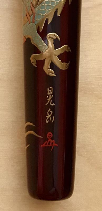
This has been a hot topic on the FPN facebook group but for those not part of that here goes. This is the Danitrio F-49 Blue Dragon on Hyotan LE by the artist Yuji. It is, or was, an LE of 30 pens. Mine is #30. I bought mine in 2018 and it was not a new model then. Pen Venture recently posted a YouTube video of an exactly identical pen with the same LE number by the same artist. No changes at all that I can see. The vendor confirmed to me a second edition of the same pen design was run at some point recently due to popularity. This totally undermines the concept of an LE and devalues every pen made in both (only two?) runs. Pretty much dishonest too. What do y'all think? Untitled-1 yes logo by Ja Ja, on Flickr -
Yesterday, I stopped at my local Danitrio fountain pen dealer and stumbled upon a parade of stratospheric pens. I just had to snap some pictures. Unbelievably, these pens represent but a fraction of the hyper pens available in the same trays. First up is the Genkai style 100 Kids design--it is truly extraordinary. I have several from the same artist but none like this! Next a Kaijin style Ebisu (A god of seven) design by Kogaku Then a Yokuzuna aka kyokuchi style emperor dragon design--indescribable beauty and technical prowess The self described #50 gigantic nib, which looks like custom work.
-
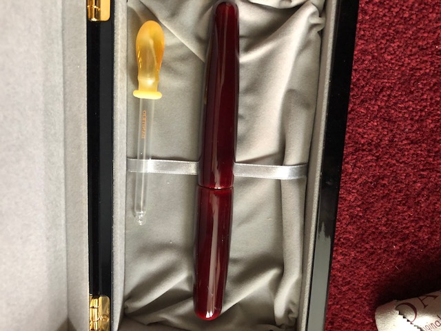
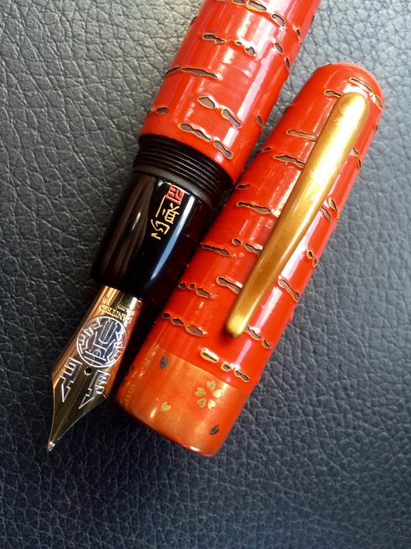
This is my Danitrio Hyotan Special edition Maki-e F-49 Blue Dragon LE. There are only 30 of these pens produced by the artist Yuji. This dragon does, however, appear on another pen, a Mikado model with more involved maki-e that retailed for far more than this pen. Untitled-1 yes logo by Ja Ja, on Flickr closeup yes logo by Ja Ja, on Flickr
-
Danitrio Maki-e Ancient Dragon with Flowers by Kogaku on Hyotan
jandrese posted a topic in Japan - Asia
I've had this pen for awhile. Since it's attractive I thought I'd capture a good picture of it. Danitrio really does tamenuri well and the curvy shape of this pen lets the light play off of the tamenuri. working image full yes logo by Ja Ja, on Flickr -
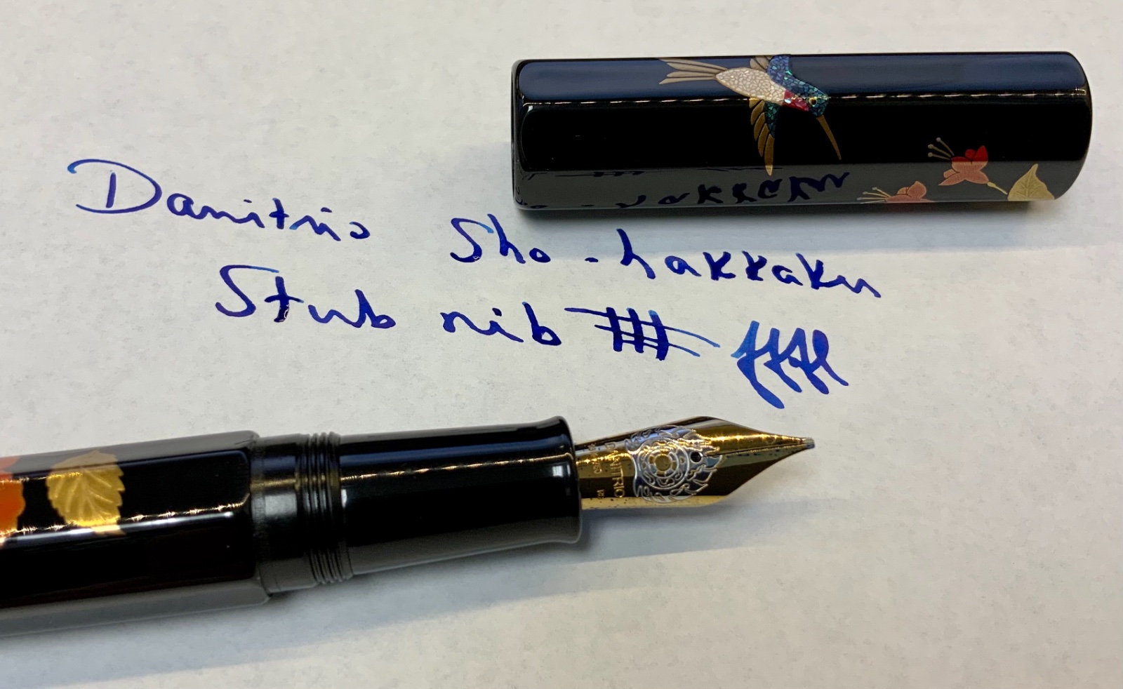
Dantrio Hakkaku with dragon Maki-e and a 18k #6 size stub nib full macro glory
jandrese posted a topic in Japan - Asia
Here I present the Dantrio Hakkaku with dragon Maki-e and a 18k #6 size stub nib. I don't know anything about this pen other than I bought it in 2017. I've never seen the design on another Danitrio pen. Danitrio does not offer any story or explanation of the artwork. I posted about this pen in the fountain pen review pages back in 2017 but since then I've gained the ability to take good photos so I'm sharing again. Let me know what you think. I could be tricking myself but the tamenuri seems to be changing in a most enjoyable way. The artwork on this pen is rather nice and involved and also makes good use of the space on the pen. _SON4588 by Ja Ja, on Flickr _SON4593 by Ja Ja, on Flickr _SON4597 by Ja Ja, on Flickr _SON4598 by Ja Ja, on Flickr _SON4599 by Ja Ja, on Flickr -
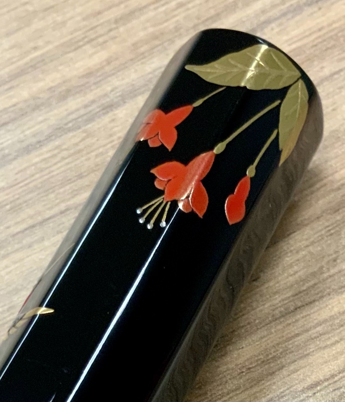
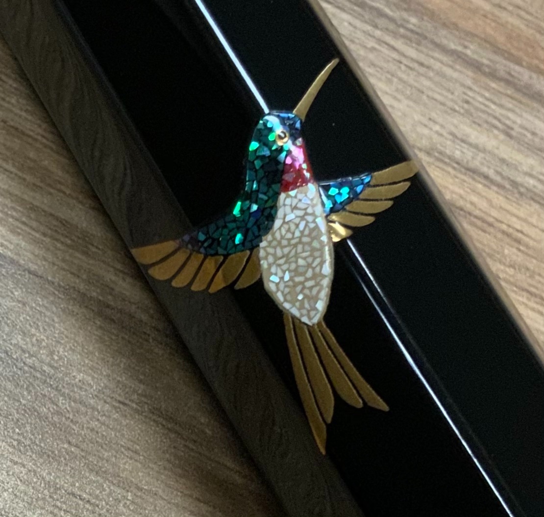
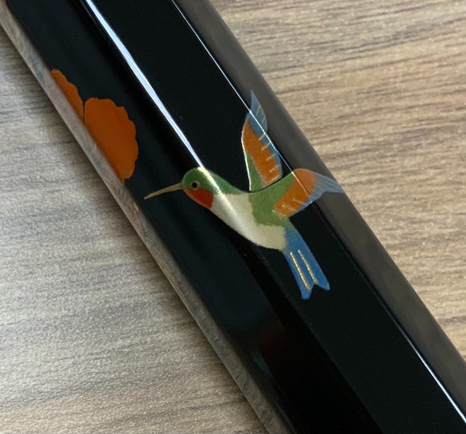
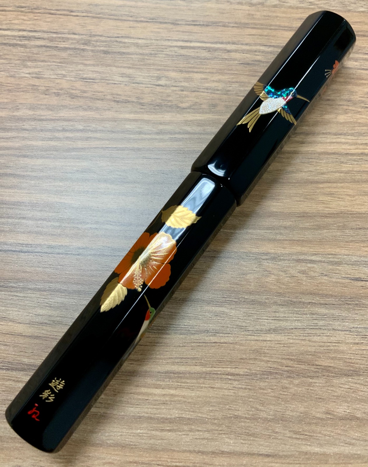
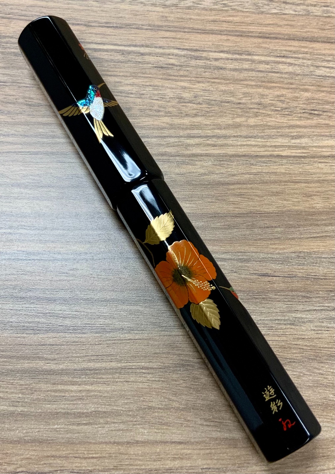
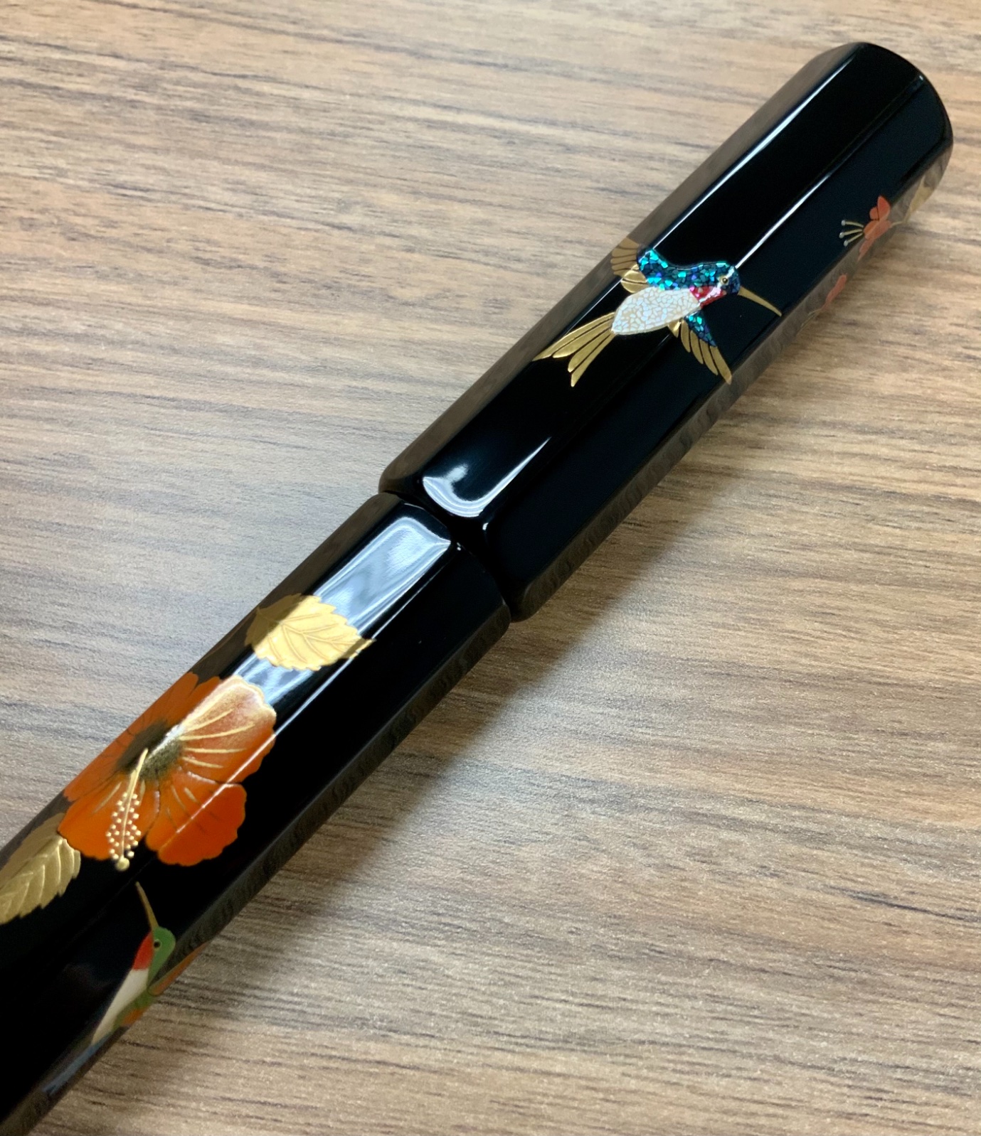
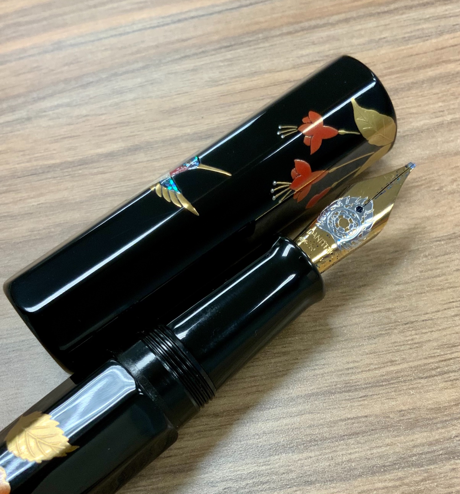
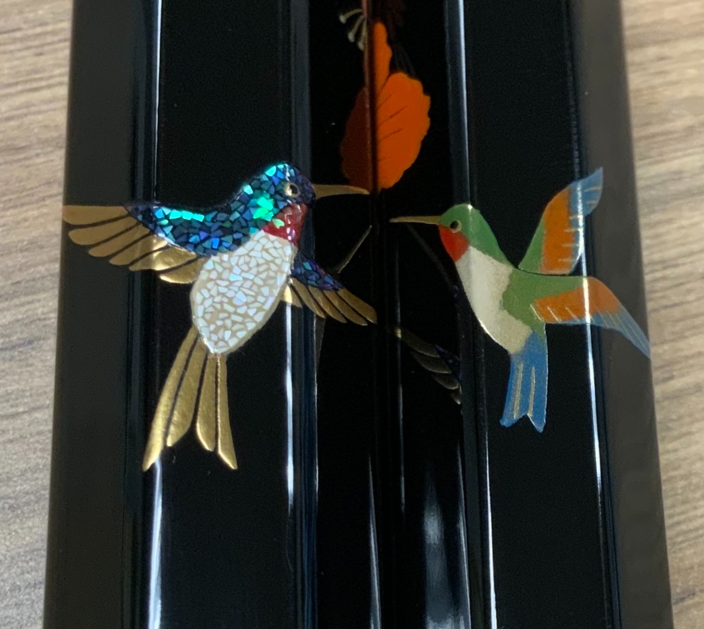
Sharing my new Danitrio Sho-Hakkaku Hummingbirds maki-e pen with stub nib. Danitrio made some major changes in 2020. That is, they pulled pens from most retailers in the USA and started selling exclusively (?) through urushipens.com. As a Danitrio collector with a favored brick and mortar AD this move was not welcome. It did, however, give me the opportunity to purchase many other urushi and maki-e pens from other companies such as Namiki, Taccia, and more. While I’ve enjoyed expanding my horizons I was hankering for another Danitrio. I previously had dialogue with Jason at urushipens.com, and had more or less resolved to one day purchase from them, but when I saw this pen on instagram I had to have it. For one thing it was made by one my most favorite Danitrio artists, Yusai, but I had narrowly missed out on a Hyotan model with similar artwork by the same artist and was always thinking about it. A message to Jason via instagram and I was able to snag this pen before it even hit the website. It’s worth mentioning that there are no hummingbirds in Japan, they are endemic only to the Americas. Nevertheless, they are depicted in the most animated and attractive fashion on an absolutely perfect black gloss background. The flowers are no less a feature than the hummingbirds but really, the birds steal the show. There are hummingbirds where I live and we love seeing them twice a year as they migrate. The mix of technique and and artistic rendering rises to the level of the sublime. If one were so inclined this could be an exit pen. Sometimes I wish I were so inclined. The nib is a stub, which is my wont on Danitrio pens and it characteristically writes a juicy line. While I do enjoy writing with this pen for me it is a work of art. I have more than enough pens that write well. I shall never stop adding art to my life. Danitrio now has a new website and more pens are being added to urushipens.com all the time. Personally, I do not prefer to buy these types of pens online sight unseen and nib untested. In my opinion it is a poor business choice and is damaging to relationships with collectors. Urushipens.com seems like good people so I will probably continue to support them but my Danitrio collecting will dramatically slow. There are other pens I can see and touch before buying from an AD I have a long-standing relationship with. The Danitrio pens, as always, satisfy.

-
Recently picked up these two super cool Danitrio maki-e fountain pens. Where I shop, Dromgooles in Houston, I have a very large selection of urushi fountain pens. I considered the new and very well made Sailor tamenuri midore-dame King of Pen but rejected it for a variety of reasons. IMG_4295 by Ja Ja, on Flickr Among those reasons was the there were other pens I was more interested in. These pens I purchased were certainly among them! IMG_4296 by Ja Ja, on Flickr IMG_4297 by Ja Ja, on Flickr IMG_4298 by Ja Ja, on Flickr The first is a sho-hakkaku (short/small octogon) based maki-e piece by Hironobu, who is the son of Okazaki. Some of my favorite Danitrio pens are by Okazaki including my sublime shu tamenuri flat top Mikado so I was happy to collect the son's work too. The theme is Aka Fuji (red Mt. Fuji). It is really very beautiful and features many different finishes. The cap base is shu tamenuri whereas the body is kuro-roiro. There are at least 5 different metal powders and no less than 3 different colors of urushi in the maki-work. Then there is the rankaku or egg shells for the snowy peak. The nib is a medium flame decoration 18k piece with plastic feed. Ink is held in a CC. It is a smooth and consistent writer. IMG_4307 by Ja Ja, on Flickr IMG_4306 by Ja Ja, on Flickr The second pen is really something special in my collection. Sure, the maki-e work is very nice, but the colors are really very unusual. The base of the Hyotan (gourd) shaped pen is all of rose pink urushi. Not manly perhaps but I love it for its uniqueness and because my daughter really digs it. The colorful maki-e features a stylized mythical Asian phoenix. There is yellow, red, orange, black, and green colored urushi in the flamboyant bird. There appears to be only one type of gold powder used in the design. Wish there was some information on the design, there never is, but I'm interested and my searches thus far have not turned up any answers. Probably a very specific reference to a tale involving a particular phoenix. The artist is another new one to me and one I am very happy to collect, that is, Yuhaku. The nib is a broad 18k with plastic feed and CC filler. The flame design nib is spectacular, it's an amazing writer. IMG_4305 by Ja Ja, on Flickr IMG_4304 by Ja Ja, on Flickr Super happy to have these cool new Danitrio pens.
-
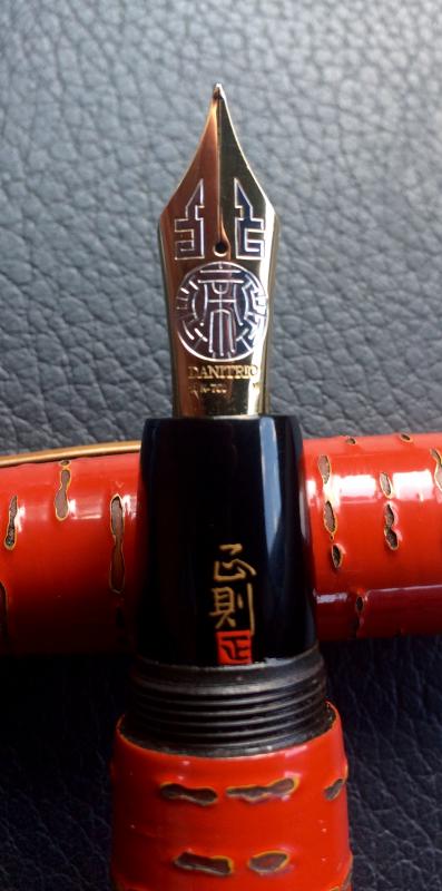
This is the Danitrio Hyotan special edition maki-e F-49 Blue Dragon LE. Hyotan refers to the water gourd and the pen clearly mimics the Calabash shape. Due to its curvaceous nature the Hyotan has been dubbed the “Mae West”. One might think the pen awkward to grip but that is not so, it settles nicely in the hand and is a good writer. Lots of pens write well though. The standout feature of this pen is clearly the large, detailed maki-e dragon and it’s a beauty. Normally, this dragon is featured on larger pens like the Mikado and Genkai along with a more involved maki-e design. This pen brings the central figure down to a more accessible price point. Relatively accessible that is. Dragons are common features of traditional Japanese (and Chinese etc.) artwork. Sometimes it is said that the number of toes or the horns has some meaning, and this may be so here, but for the most part one cannot distinguish Japanese and Chinese dragons by these features. Japanese dragons are often water dragons but can exist in the clouds. Unlike Chinese dragons, Japanese dragons can be good or bad. Chinese dragons are basically benevolent. I really wish I knew the back story on this dragon; there is definitely a story here, something cultured and cultural. Regardless, the multifold maki-e techniques are a joy to study and the sophisticated artistic sensibility is moving. It really is an impressive piece of work. For Danitrio this is a medium sized pen but fully qualifies as large. Since the base is ebonite it’s not heavy. I reckon one could force the pen to post but that would be foolish. Posting would eventually disfigure the maki-e finish and that would be a tragedy. The 18k #6 nib is supplied by a plastic feed and a cartridge converter. These Buddhist flame style nibs are a bit soft sometimes bordering on springy. This one is a little bit soft and while it writes a nice consistent line it tends to make some noise, kind of like a squeaky sound. Odd but not off putting. The artist is Yuji Ohkado and this is the only pen I have from him. I’d say it’s a pretty good start ha ha!
-
Hi all, Coming to seek wisdom on a problem I can't solve. A few months ago, I tracked down an old Danitrio Cum Laude. I love almost everything about the pen, but I found that after sitting overnight (or even for a few hours) the nib would be dry and need help to start back up. At first I thought this was a nib/feed issue, but after replacing both, I get exactly the same problem. On doing a little digging, I found that this is a problem on some Cum Laudes. Some apparently don't have an inner cap, which covers the hole where the clip inserts into the cap. But here's the mystery — my Cum Laude does have an inner cap, the usual small black insert. From shining a light through the cap, I was able to determine that my inner cap is not all the way at the back of the outer cap. It sits below the clip hole but above the nib. I'm not sure if this is the proper placement, but I didn't want to try shoving it back farther for fear of damaging the celluloid. Either way, the seal clearly isn't working, because the pen hard starts every time I pick it up. All of which is a long way to ask: is there anything I can do? I'm not an expert repairman, nor do I have much hope of tracking down a fresh cap. With the inner cap in place, I can't even reach the hole from the inside to plug it with sealant. I'm stumped. I'm also sad, because I really like this pen in all other ways. Thanks in advance for any help or insight. I hope everyone is staying healthy and sane — writing by hand has been a source of stability for me these days.
-
There are times when pens surprise you and you just have to purchase. This was one of those times for me. I have three or four other Mikado size pens from Danitrio but when I saw this flat top Mikado I had to have it. The flat top shape is new to my collection but that's not what sold me. The tamenuri finish is neigh on perfect. It's radiant and luxurious. The pen feels like a precision instrument, yet, looks like fine art. Something for the left and right sides of the brain. IMG_2760 by Ja Ja, on Flickr IMG_2765 by Ja Ja, on Flickr IMG_2763 by Ja Ja, on Flickr Like all Mikdo pens there is a #8 Bock nib and an ebonite feed. Filling by eyedropper it holds a massive bunch of ink. The blind cap screws down and is almost seamless such is the perfection of the urushi finish. Marked "B" for broad the nib looks and writes like a stub perhaps a bit less wide than a frank Danitrio #8 stub. The confident signature is by Kogaku (Koichiro Okazaki) who also lacquered my freaking perfect shu roiro-migaki Densho. IMG_2764 by Ja Ja, on Flickr IMG_2762 by Ja Ja, on Flickr IMG_2761 by Ja Ja, on Flickr I really considered the recently release Sailor KOP with tamenuri finish. The photos made it look beautiful but this Danitrio makes me happier. I don't know why but Danitrio pens have that effect on me. For extra enjoyment the last photo shows on of my Grand Seiko watches next the pen. The Japanese really know how to treat the senses. IMG_2766 by Ja Ja, on Flickr IMG_2769 by Ja Ja, on Flickr
-
How does one come up with superlatives to describe something? What I’ve got here almost belies description; it must be experienced. This is a Danitrio Hyotan or calabash/gourd shaped pen with dragon and flower maki-e. I don’t even really know the real name of the pen or the model number. The artist is Kogaku and I’ve two other magnificent pens by him but this one is beyond. Like my new flat top Mikado the base is shu-tamenuri but that is where similarities end save the quality of the work. IMG_2897 by Ja Ja, on Flickr IMG_2903 by Ja Ja, on Flickr IMG_2906 by Ja Ja, on Flickr On the cap there is a cloud dragon. I assume that because there is a dragon and some clouds. The dragon is a large piece of contoured maki-e work that utilizes a gold powder so fine individual particles cannot be made out with the naked eye with what appears to be a raden eye. The clouds are bordered in gold and filled with finely grained silver powder for extra sparkle and texture. So now we are up to two or three different metal powders and many coats of urushi of different color/composition. IMG_2904 by Ja Ja, on Flickr IMG_2900 by Ja Ja, on Flickr The body has a flower motif rendering what I believe is Tsubaki or Camelia, but I could be wrong. One flower appears more “realistic” whereas the other one appears to be symbolic of something perhaps a Buddhist symbol, or not. Anyway, it is a (symbolic?) flower encircled by symbolic waves. The whole of the flower uses at least 5 different sizes of metal powders of gold and what appears to be copper and at least two difference colors/compositions of urushi including green and red. There is also raden on each flower. The amount of work here is astonishing. IMG_2899 by Ja Ja, on Flickr IMG_2902 by Ja Ja, on Flickr IMG_2901 by Ja Ja, on Flickr Almost forgot this was a pen. It sports a #6 “Buddhist flame” nib and plastic feed that is supplied by a CC filer. I like a CC filler on Danitrio pens. It means that I get to change inks more often. This is a broad nib and an excellent writer with just the barest amount of pressure. Ink glides across the page. IMG_2905 by Ja Ja, on Flickr The packaging is old school Danitrio in that the pen comes in a fabric pouch encased in a large, mirror black lacquered box. It’s not urushi but it looks great and feels substantial, special, and presents this pen as an occasion. The only other Danitrio pen I have that came with this big box is my very first from four years ago, which is just (just!) a tamenuri finished Mikado. All the others have come in simple Paulownia wood boxes, even the maki-e pens. Not sure what dictates the packaging. IMG_2896 by Ja Ja, on Flickr IMG_2893 by Ja Ja, on Flickr IMG_2894 by Ja Ja, on Flickr IMG_2895 by Ja Ja, on Flickr
-
This is a Danitrio Takumi pen with byakudan-nuri or sandalwood maki-e with the design of shishi (Chinese) or perhaps komaniu (Japanese version). These are the the so called lion-dogs or lion-like creatures that guard things like shrines and tombs. They are always represented in pairs, yin and yang. In this case I reckon the male is on the cap with his mouth open and the female on the pen body with her mouth closed. IMG_2642 by Ja Ja, on Flickr IMG_2646 by Ja Ja, on Flickr Despite having turned into a collector of urushi and maki-e pens, especially Danitrio pens, I was first introduced to byakudan-nuri by a watch, the superb 2018 Seiko Presage limited edition Presage Ururshi Byakudan-nuri SPB085. The subdials on that watch have an inner glow thanks to the byakudan-nuri technique of using semi-transparent urushi over a gold/sliver/copper foil/very fine metal dust base. Sure, I had seen byakudan-nuri pens before, Danitrio in person, Nakaya online, and Platinum online but I guess I was not ready for that finish until now. Supposedly, the byakudan-nuri technique was reserved exclusively for use in places and on objects of high status, including temples, shrines and on the armor of Shogun warlords. Well, if that’s true my tastes, which are that of a commoner, took some time to catch up. IMG_2641 by Ja Ja, on Flickr IMG_2640 by Ja Ja, on Flickr It’s easy to forget that the Takumi is a big pen on the order of a Pelikan M1000. Many Danitrio pens and indeed other high end urushi pens are as large or larger but the Takumi has a manageable size and weight. Due to the ebonite construction the weight is not much at all and the #6 gold nib is well suited to long writing sessions. IMG_2639 by Ja Ja, on Flickr IMG_2637 by Ja Ja, on Flickr From a distance the smooth glossy finish is a bit brown and unassuming. Up close the features nearly explode seemingly with a light from within. With a little sensitivity this finish is remarkably beautiful and enjoyable. I like the finish so much I turned around immediately and bought a Platinum Izumo with byakudan-nuri that I was on the fence about. I care to know who painted my Danitrio pens but I cannot match the signature to craftsman despite having the Danitrio maki-e book that shows the signature of most of their artists. Nor can I find a reference online. Same person made my other Takumi so if you recognize the signature and know the artist please comment below. IMG_2645 by Ja Ja, on Flickr IMG_2644 by Ja Ja, on Flickr When I bought the pen I had the fine nib swapped for stub. In this case a RS “flame” nib that are/were made by Bock for Danitrio. RS is for regular stub so there is no appreciable flex or even softness. That said, it is not a nail either, there is some give if you press down some. The pen was a bit of a hard starter at first whereby I had to press down harder than I wanted to to get the ink to flow. This behavior is a clear sign of the tines too tight so I gently faired the nib to spread the tines a tiny amount and viola it writes beautifully now. Ink flow is just right, not too little, not too much and the line variation has about a three-fold difference between down and cross-strokes. Very nice. IMG_2647 by Ja Ja, on Flickr writing samples by Ja Ja, on Flickr In short this is a beautiful, functional, and nicely sized pen that should age very gracefully. Highly recommended. Indeed, I hope Danitrio will be with us long term.
-
Hellow, I'm trying to determine whether or not current Danitrio Densho models come with ebonite feeds. There are ancient (by site standards: over a decade) reviews for those long extinct raw ebonite models that mention ebonite feeds, but I've not managed to find anything definite about recent stuff. After all, it's been a while and things might have changed over at Danitrio. I know the larger #8 nibs on the Mikado et. al. are ebonite still, but that model doesn't concern me currently. Anyone here have a recent - say, in the last year or two? - Densho with an ebonite or a plastic feed? Thank you berry much.
-
Just picked up this Danitrio Cosmos (Choo) by Kenji Yamamoto. Marugane chirashi, raden, hirame-ji, and kingi maki-e. The section is stamped Grand Trio, which is the name the Hyotan model used to go by I believe. Amazing pen, super hard to photograph. I've been wanting an example of this artists work for some time. Good writer and gorgeous. This is an older model but I picked it up new and the LE number is 1/50. IMG_1527 by Ja Ja, on Flickr IMG_1528 by Ja Ja, on Flickr IMG_1529 by Ja Ja, on Flickr IMG_1530 by Ja Ja, on Flickr IMG_1531 by Ja Ja, on Flickr danitrio Cosmos by Ja Ja, on Flickr
-
Presenting my new Danitrio Bamboo Story in modern negoro-nuri in shu roiro-migaki. This is a model I’ve considered for a long time. One that held me back before is the cap band, I used to think it was a bit out of place. Then there is the size, which is…not small ha ha. Also perhaps the finishes I’ve seen were not compelling enough to win me over some other pen. Lately, however, I’ve done a deeper dive into Japanese pen history and Danitrio history, in particular. One thing I found was that cap bands like the one seen here were/are quite common on high-end urushi pens. Somehow that settled me on that matter; it’s a conscious design choice not some compromise to protect the cap on a suboptimal design or something. Even more recently, I stumbled upon a page on Dantrio’s website showing all the finishes available in the Bamboo style pen range. My eyes immediately settled on this very finish, the modern take on authentic wabi-sabi wear patterns. Then, incredibly, not a few days later on an unplanned visit to my AD this very pen was available! I’ve you’ve ever seen vintage urushi, especially food dishes, they will show wear similar to this but honestly earned. The Japanese admire these changes in appearance due to honest use thus the aesthetic concept of wabi-sabi. I’m also quite fond of the red or shu polished urushi color and luster as well as its variants. The Japanese also admire bamboo and its many fine properties so this pen is Japanese aesthetics through and through even though there is not a more immediately accessible pictorial maki-e design on the pen. Let’s get this size thing out of the way right away. It’s a big pen, a huge pen even. But it’s not heavy due to the ebonite body and the section is cleverly designed to give an easy grip. And don't get excited by the clip as it won't fit in any normal shirt pocket. Maybe pants pockets. One really can write very easily with this pen. Interestingly, I talked with someone recently who mentioned that they were so used to the size the Pelikan M800 grip section their smaller diameter pens had fallen out of favor. I echo this sentiment but on a pen like this, which could swallow an M800 whole the concept of a large grip section takes on new meaning. I’m not sure but I reckon small hands need not apply, but your mileage may vary. You can see the Bamboo Story resting next too another colossus of a pen, the Danitrio Junikaku. Almost unbelievably the Bamboo Story is bigger, longer anyway. The section has a smaller diameter and the barrel is also not as girthy. Both pens hold about 5 ml of ink so not much chance of running out soon. Interestingly, this pen did not come with a glass eyedropper as had been the standard. The paulonia wood box contained instead a 5 ml syringe fitted with a long blunt tip needle, which is actually a nice swap. A ummm bigger issue than the size for writing is that neither pen fits a standard pen pouch or case. Luckily, I have a bunch of large size Danitrio and Taccia cloth pen pouches that will accommodate this pen. Typical for the larger Danitrio pens it is an eyedropper filler, that is, it’s a Japanese eyedropper filler with a removeable section that can be sealed by a piston that runs through the barrel to a blind cap. The blind cap is truly invisible on this pen when screwed in, which is a testament to the design and execution of this handmade and hand finished pen. Unscrew it a few turns and ink flows freely to the ebonite feed that supplies the large #8 nib. This nib is a stub that writes a juicy but not too wet line. The urushi-shi is Kosetsu (Tatsuya Todo). I have several pens from this master and find his signature and kao elegant. His high-end work is truly spectacular and awe inspiring. I’m honored to have some of his work even if more modest.
-
This is one of my latest urushi pen additions. It is the Danitrio Hanryo Maki-e Akigusa ni Suzumushi. Hanryo is the pen model and it means companion. Maki-e refers to sprinkled (with gold particles etc.) picture painting using urushi lacquer. Akigusa is autumn grass and Suzumushi is the bell cricket aka Meloimorphia japanicus. All the elements of this design, the cricket, autumnal grasses, chrysanthemum etc. reference the Autumn season. These crickets are well known in Japan and there is even a temple in Kyoto, the Kengonji temple that raises these crickets. People come to pray accompanied by their sound known as the voice of Buddha. This is/was the smallest pen Danitrio makes/made—I’ve read it’s out of production, but all the photos online show a slightly different pen that has a clip, mostly different for having a clip. This pen was new at the AD but I reckon that does not necessarily mean it was made recently. Two versions of this pen with the same maki-e design were available to me to choose from including this one in purple and another in red. Both were quite fetching, but I chose the purple model because I did not have an urushi pen with purple color. Regardless of the base color the maki-e work is beautiful and beautifully done with minor variations between the two pens. The basecoat is at first glance simply polished purple urushi but closer inspection reveals diffuse addition of gold powder, so I suppose the entire pen is technically done with maki-e techniques. On the cap is found an insect and plants. Delicate single lines define the grasses whereas the cricket features raden or shell inlay as well, which is a brilliant choice to represent folded up insect wings. The body depicts flowers, mainly chrysanthemums in two colors/effects but also shows other plants with raden and alternative maki-e techniques—I’ve not been able to identify the other two plants although they are likely familiar to Japanese people. All in all, this Autumnal scene is familiar in Japanese artwork and is found on paintings and screens as well as pens and other craftworks. The small #5 nib is branded with a T shape imprinted with the word “trio”. It’s an 18k stub nib fed by a plastic feed and a cartridge converter filling system. Size wise the nib fits the pen and while it is a petite pen for Danitrio it’s really a midsize pen and is comfortable to write with. The nib requires some pressure to write and it’s certainly no gusher but is not stingy with ink flow either. The cap does not post well and should not be posted. As it is turned from ebonite the pen is lightweight and well balanced. The artist who signed the pen is Masanori (Masanori Omote) and I’m proud to have several pens from him. He is a master.
-
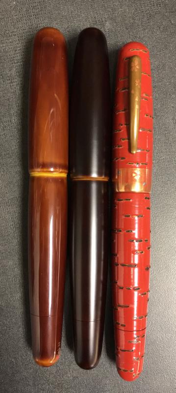
Realized I was carrying three Danitrio Mikado pens today and thought I'd share some pics. From left to right: tame-nuri in light bengara (reddish brown) and ki-dame (yellow), irokeshidami-nuri (matte finish) in dark bengara and ki-dame, sakurakawa-nuri (cherry tree bark pattern). Nibs left to right: broad, stubbish broad, and medium. All #8 nibs with ebonite feeds.
-
This week I picked up two urushi pens, a Danitrio Junikaku tame-nuri kama-nuri and a Nakaya Portable Writer araishu. I’m posting separately but there is overlap in the photos. The Junikaku (12 rectangles) is an oversized pen in terms of both length and girth. Dimensions are as follows: Overall length capped: 15.7 cm or ~6.5” Length un-capped: 14.0 cm or ~5.5” Cap diameter: 2.3 cm or ~7/8” Body diameter: 2.1 cm Grip section: max. 1.6 cm, min. 1.3 cm or ~5/8” to 0.5” So, it’s a big pen. Nevertheless, it is an excellent writer and comfortable to use. It positively dwarfs the Nakaya Portable Writer, which itself is simply a full sized pen on the order of a Pelikan M800. This pen has a little flair at the end of the section reminiscent of vintage pens. My other Junikaku has a section that simply tapers without the flair. Both offer a positive grip but the flair is really a nice touch in terms of appearance and function. Filling is via eyedropper and as a Japanese eyedropper it has a shutoff valve. Just twist open a little for an extended writing session. As you imagine it holds a lot of ink. I think I stopped at 4 ml but maybe could have gotten more inside. Nib is the #8 size 18k gold found on many a Danitrio pen. Size is broad with a slightly stubbish shape that makes me think of the finishing on older Montblanc nibs. Gives a bit of style to the lines making it more interesting to use. Feed is ebonite and flow is ample. The nib is not flexible at all but it’s not hard as a nail either. Just enough softness for a luxury feel. The base material is ebonite that is given a tame-nuri urushi finish before carving all the divots. Imagine the time and concentration it took to make this pen. The carvings are a type of kamakuri-bori technique with a long tradition in Japan. Here is a link to a most excellent article on the technique. This is the first time I’ve seen this this technique on a junikaku body and it is perhaps the ideal canvas. The facets provide a natural ground for the carvings that deliver texture and color variation. The corners of the facets then allow the light to play with the urushi layers in a most pleasing fashion. I especially like the carvings on the ends, the radial pattern just looks cool. In the light this pen is bling bling. Packaging is a paulownia wood box including a pen sleeve and an eye dropper. Focus is on the pen, not the packaging.
-
Hi, I was hoping some of you will be able to help me. My father had a collection of fountain pens which are now in my possession. His collection includes a few very prestige pens (from what I gather), including a Danitrio. I know nothing about fountain pens, so I need some help identifying the model of this pen (pics attached). I'd like to sell this pen, however knowing nothing about it, this is pretty difficult! I'm looking for the specific name & model, and perhaps even an estimate of how much this pen was purchased for so I can gauge the price I should sell at. Saying that, should anyone be interested in purchasing, do let me know. Many thanks in advance! J
-
Just picked up a Dantrio Hakkaku with dragon Maki-e and a 18k #6 size stub nib. The basic pen shape is an octagon, which is the name of the pen style, hakkaku. There is no clip. The base color is shu tame-nuri, that is, red urushi with translucent top coat. Many urushi pens stop at this stage as it is highly polished and very beautiful changing look over time slightly, an effect that is enhanced by the facets of the octagonal pen body. This pen has had decorative urushi painting applied over the shu tami-nuri base using various maki-e techniques and several urushi colors. The design is of a 5-toed dragon, a Chinese dragon, with Buddhist fire symbol all underneath some flowers. While I'm not aware of the significance or meaning of the design it is very cool. The dragon is animated and threatening!. The level of artistry is really rather extreme. Flat, raised, polished, burnished, multiple colored urushi with details sprinkled with gold powder. Many steps, much time and patience, and advanced skills are needed to produce artwork such as this. Functional art; the stub nib writes as nicely as one might expect and feeds from a cartridge converter. This Danitrio is not set up for eyedropper filling. Pen comes in a Pawlonia wood box with a decorative fabric pen sleeve. The pen is signed by the artist with his imprint or kao, a Mr. Koichiro Okazaki I believe.
-
Some new Danitrio pens arrived with a new finish : the Kama nuri ! It is a techniek developed by the Danitrio artisans. It finds some similarity in the Kamakura-bori and Cho-Shitsu techniques. The result is a beautiful handmade structured surface. Available on Genkai, Sho-Genkai and Mikado. http://www.sakurafountainpengallery.com/en/boutique/detail/new-kama-nuri-red-genkai All welcome to take a look at these pens ! Catherine
-
So I just spent a long time late a night typing up a detailed review of my new pen, the Danitrio mikado (with clip) eyedropper filling, medium18k nib with ebonite feed, red color sakurakawa-nuri fountain pen, but I accidentally closed the browser window and lost the content. Bummer right, yeah pretty much, but maybe better for you dear reader. I'm tired and maybe had one extra glass of wine too many so here is the short version. Here is what I really want you to know. Sakura=cherry tree, kawa=bark, and nuri=lacquer (urushi) work This pen is: Very beautifulVery bigVery good writerHigh art There, that is the shortest I can make it. This is an awesome pen made by a true artist. Functional art. I've carried it everywhere and it never disappoints either artistically or in terms of writing performance. I'm lucky to posses it. Just look at it. Look. See that? Intense right? You bet.
-
So, here I am, on the edge of getting a Danitrio Mikado (midori-dame) and trying to decide what nib should I arm it with. If I understand correctly, from what I have read these days, it seems that Danitrio used to offer 'soft' (semi-flex) and 'stiff' #8 nibs. But apparently they don't do that any more (since when? Why?). Their catalog, today (August, 2016), states: "#8, 18k gold nibs for Mikado, Genkai, Sho-Genka, are available with F, M, B, and Stub". I have asked the lovely people at nibs.com about adding some flex to one of these nibs and they answered that "adding flexibility (to a 18k gold nib) is not something we can do that well". So, here I am, trying to decide what stock nib to get... I love line variation. Normal writing, for me, must have some "calligraphic options". And in such a pen (wow! I'll include some pics) you better have the right nib to help your wild calligraphic fantasies blossom. So, does anyone have experience with the nibs Danitrio is currently using (that is August 2016)? Are they super-stiff? How wide is their stock stub? Could you get some line variation from the M or F nibs by applying some pressure? For comparison purposes, I have a Nakaya cursive italic that was grind by John Mottishaw from a BB. I love it (and it writes like a dream), but it is stiffer than I'd like it to be. Can someone tell his/her experience with customized Danitrio nibs? Thank you for your feedback Salute! pd. I took the photos from nibs.com (and thank them) with the sole aim of sharing the beauty of this pen. http://www.nibs.com/www/WEBSITE%20PICS/Danitrio/danitrio-mikado-without-clip-midori-dame-uncapped.jpg http://www.nibs.com/www/WEBSITE%20PICS/Danitrio/danitrio-mikado-without-clip-midori-dame-nib-detail.jpg
-
Chinkin is a technique where a special set of very fine chisels are used to carve a pattern or design into layers or urushi (lacquer). The indentations are then rubbed with sticky urushi and gold powder or foils are placed over it to fill in the marks made by the chisels. Sometimes colored urushi powders might be used instead of gold. Once they are applied the pen is often cleaned by a Japanese paper called washi. Traditionally much of this art originated in Waijima starting around the 13th century, but today it is produced in many Japanese prefectures and even other countries like China. As this is a carving technique at its heart, there is little room for error so quality work often takes many focused hours to complete. Doing some research, I came across the Danitrio website that lists 5 chinkin techniques: 1. Ten-bori (carving by point): The size of points could be as small as only 0.1mm, and it is the only way to make the surface for the design by chiseling points one by one. 2. Ten-bori no Bokashi (Gradation of point carving): Reducing the chisel points and changing the space between the points to make the design with gradation. 3. Ten-bori no Henka (Variation of point carving): To push (Tsuki-nomi) or draw (Hiki-nomi) the chisel from a point to carve various short lines in a small space. 4. Suji-bori (Line carving): Short or long, straight or curved lines can be carved by skillful craftsmen. 5. Katagiri-bori (Carving sharp curved or angle lines): Use a special chisel to carve strong contrasting lines. I find any of these techniques can yield some very stunning results. I would like for anyone with pens decorated with the chinkin to post some photos in this thread and share any thoughts on the art form – whether you like it or not. If you can add more nuances to the history of the art, please do so and we can make this thread into a learning opportunity.