Search the Community
Showing results for tags 'comparison'.
-
Which of the three fountain pens is the best, overall, in your opinion? (Do not keep the price in mind, as for some abnormal reason each of them costs almost the same here, with Jinhao 65 being just a little cheaper than the rest.)
-
I have 2 black inks that I like a lot. Aurora Black and Pilot Iroshizuku Take Sumi. I've decided to compare them and figure out which one is my favorite, because I rarely use black ink and technically just want one. As a result of the comparison, I'm more confused than before I started. They both have their strengths and weaknesses. The posted samples below are limited to very fine nibs for writing and sketching. Take-Sumi shows more obvious shading with broader cursive italic nibs. Aurora is highly lubricated but has more conservative flow vs velvety but free-flowing Take Sumi. It's easier to control line width with Aurora. Take-Sumi washes off more easily with water / water brush, smearing off a heavier amount of loose dye. The remaining dark line is more smeary looking and also feathery with Take Sumi, whereas Aurora Black keeps a neat black line under the smeared dye. Take-Sumi can be a deeper black in the dark areas, but it's slightly blue-tealy tinted, and also there's a beautiful gentle shading gradient visible even with Extra Fine Japanese nibs! Aurora Black is pretty much just a flat black, almost no shading, looks a bit like black laser printer ink. I'm describing this qualitatively, because it's difficult to tell from the scans, but Take-Sumi definitely has a more watercolor look with deeper dark areas, where Aurora is either straight black or a grayish solid color depending on amount in a line. Take-Sumi is more difficult to wash out of a pen: takes longer, quite a few flushes. Take-Sumi sheens readily, whereas Aurora generally doesn't show sheen unless in large amounts. For writing: I love Take-Sumi For drawing and Calligraphy: Aurora might have the edge. I like that it's a bit more neutral and much easier to control with a water brush for gradients, where Take Sumi just smears off more heavily with a water brush. Pens used: Aurora Black - Pilot Vanishing Point EF Take-Sumi - Sailor Pro Gear Slim EF On Fabriano Bioprima, lightly textured uncoated paper: Tomoe River 52g in a Hobonichi Techo Cousin planner:
-

rollerball Pilot V-Ball Vs Uni-ball Eye
Asteris posted a topic in It Writes, But It Is Not A Fountain Pen ....
When not using my Fp, my choice of writing on good paper has always been the Pilot V-Ball 0.5mm Blue . Yesterday I was in a stationery store and I picked up the Uni-Ball Eye Fine Blue, since i wanted to try it out and compare to the pilot's single use rollerball. I do not have any good photos, so I will explain the best way I can. ■External factors: ● Uni-ball Eye is thicker than the Pilot V-Ball and looks like it hold more ink ● Eye has softer plastic on the cap and tail than the V-Ball. ● Eye's clip, although is a little more dificult to use, secures the pen better than the V-Ball's clip. ■Internal factors: ● Eye's grip is a little bit larger than the V-Ball's ■Ink and writing ● V-Ball's ink is dark. Navy dark almost like blue-black. On the othe hand Eye has a lighter shade of blue, almost azure. ● V-Ball's line is as thin as expected from a 0.5mm pen. Eye's line is a tad thicker, which in return make the a pen a little smoother. ● In the particular paper I used Eye feathers more than the V-Ball and bleeds more, although this might be because of the thicker line it lays down. ■Waterproofness ● The Uni-Ball, just as advertised, performed well in my water test and less ink was displaced than the V-Ball, which also held quite good (although worse than the Eye) Which one do you prefer? I will do more testing to see which one works better for me. -
-
-
So, at one point of another... we have all said.. "Wow, I wish I could get THAT ink".. but is discontinue/expensive/unobtanium .. etc So, here is the place where you should come and check if "THAT" ink has a Doppelgänger (look-alike, double, one who nearly or completely resembles another).. I will start... I will remind you, that even the same ink looks different depending on nib/flow/paper .. so these are examples inks with the same/similar hue.. that depending on your nib/flow/paper it might look identical.. Have you heard of Sailor Tanna Japonensis (Evening Cicada).. what about Sailor Shin Zan (Deep in the Forest).. well if you can't get those, you can grab a bottle of Safari.. is cheaper, not exclusive, and easy to find. photo below... (in real person they look almost identical) Knowing how famous scanners and pictures are for not completely represent what your eyes perceived, you get both... and take my word for it.. With the right pen you can get the exact look. C.
-
Some people can wield a big, fat stub and get amazing results. Not me. I'm a sloppy writer and still learning basic penmanship. I rotate my pens and stubs don't like that. I write fast, and stubs don't always forgive me for it. Just for fun, I made a quick comparison of the stubs that I have in my collection at the moment. ^---normal writing speed at left, slow in the middle, fast at right The TWSBI 1.1 stub I've personally got three of those, in two pens: the Eco and the Go. One is nice (in the Eco), one is okay (in the Go), one is sharp, scratchy, dry, unusable and out of rotation. They're the only ones in this comparison that have a small amount of bounce and they're not very sensitive to rotation (which is good news for me). They're dry-ish when writing at speed, as can be seen in the writing sample. In terms of line thickness, both their vertical and their horizontal strokes are the widest of the 1.1 nibs in this comparison. Crispness is OK but not exceptional. No hard starts (good). No railroads (good). Pens: TWSBI Eco with 1:1 mixture of J. Herbin Rouge Caroubier and Diamine Sunshine Yellow and TWSBI Go with Noodler's Burgundy. Verdict: a nice, all-round, rather forgiving stub. The Lamy 1.1 italic Lamy offers cheap 1.1, 1.5 and 1.9 replacement nibs that you can slide on to your Safaris and such. I can't even wield a 1.5 (see below under Kaweco) and therefore a 1.9 is way out of my league, so I bought the 1.1. This nib, which is an italic, offers you a hard deal: absolutely wonderful crispness at the cost of rotation sensitivity and scratchiness. I love the look of the text on paper, it's so nice, so crisp, so disctinctive... But with my unsteady hand, I can only use it with pleasure when writing slow. At normal writing speeds, I can tolerate it. When writing fast, it feels like an abomination. This nib could be a true gift to people who have a steady hand and good penmanship. No hard starts (good). No railroads (good). Pen: Lamy ABC with Lamy Blue ink, but it will also fit the Safari and some other Lamy pens (and supposedly even a Platinum Preppy!) Verdict: amazing crispness at the cost of forgiveness... Choose, because you can't have your cake and eat it too. Kaweco #2 1.1 stub One of the many charms of the Kaweco family is that the Liliput, the Sport, the Dia2 and the Special all sport the same #2 screw-in nib/feed collar, so instead of buying a dedicated pen for each nib size you can buy one nice pen and swab nibs in under 60 seconds. I'm not exaggerating: pull out the converter, unscrew the nib/feed collar, screw in the new one, pop in the converter, prime the feed and you're off to the races. Among other models I have a Dia2, which in my opinion is one of the best modern pens being sold today around its price point, and I've got several nibs to use with it, including the 1.1 stub. Its line width is slightly less than that of the TWSBI 1.1, in both directions. It's also slightly more crisp than the TWSBI, which I like, especially since this crispness does not come at the expense of smoothness or rotation sensitivity. Compared to the Lamy, the downstroke is slightly wider and the sidestroke slightly more thin. This is a nib that offers both smoothness and good crispness (though nothing near the exceptional crispness of the Lamy). In fact, it's smoothness is incredible and needs to be felt to be believed. Performance is flawless: it always starts, it doesn't railroad. The TWSBI stub seems to offer more shading, though. Pen: Kaweco Dia2 GT with Iroshizuku Shin-Kai. Verdict: an amazingly smooth and forgiving stub without sacrificing too much crispness, solid performance, a good mix of qualities and clearly a notch above the TWSBI. Kaweco #2 1.5 stub This stub matches the smoothness of its smaller cousin, but that's where the similarities end. Perhaps it's me; perhaps I'm not ready to play with the grown-ups yet. After all, I also couldn't really befriend the Pineider La Grande Bellezo stub, nor the Leonardo 1.5 stub. To me, 1.5 feels as wide as the Grand Canyon and I really struggle to get something nice out of it. This Kaweco 1.5 is no exception to that, despite its amazing smoothness. Personal shortcomings aside, I do notice less crispness in the lines (the worst of this sample) and it's a severe hard-starter. To be specific, after capping the pen and putting it away, it doesn't write when you want to continue, especially on smooth paper. Not just on downstrokes either, it just doesn't write at all after a pauze and takes quite some effort to get going again. In terms of line width, this stub is wide enough to make standard line spacing in a notebook too small (in this case an Oxford 90 g/m^2 notebook with 8 mm line spacing). This is one big nib and it requires lots of space - that's how it was designed, so no criticism there. Pen: Kaweco Dia2 GT with Iroshizuku Shin-Kai. Verdict: very smooth and forgiving stub, but at the expense of crispness (at least when writing at normal and fast speeds). Obnoxious hard-starter, prefers rough paper. Should not be confined to the limitations of ordinary notebooks - this nib really wants to do calligraphy. The outsider: 1948 Onoto 5601 with #3 ST nib I added this Onoto for the sake of reference and comparison, not as a contender. This is a wonderful, narrow stub and they just don't seem to make 'em like that anymore. This is one of the few stubs that make me forget about the pen so that i can just focus on writing. Ink: J. Herbin Lierre Sauvage, Summary: Those who can handle the Lamy 1.1 italic will be highly rewarded by its amazing crispness. As an all-round, forgiving, wonderfully smooth steel stub that does not sacrifice much in terms of crispness, Kaweco's 1.1 is a thing of beauty and as such is the overall "winner". The TWSBI 1.1 is a solid all-round stub that lacks some of the finesse and smoothness of the Kaweco 1.1. The Kaweco 1.5 might be the ticket for those who require a really smooth nib for calligraphy purposes. (When I find the ultimate stub for me, I'll let you know. At the moment the chase seems to be even better than the catch.) EDIT: corrected the text about the Lamy 1.1, which is an italic.
-

comparison COMPARISON: Platinum Curidas vs Lanbitou 3088
donnweinberg posted a topic in Fountain Pen Reviews
This is a review and comparison of competing brands of essentially the same fountain pen -- the Platinum Curidas and the Lanbitou 3088. After Platinum began selling its relatively recent Curidas model in 5 transparent colors, the Chinese pen maker, Lanbitou, came out with it's version of the Curidas, which Lanbitou designated the "3088." In virtually all respects, except the badging, the two brands offer identical pens. The biggest difference is the retail pricing; the Curidas sports an SRP of $90, but the 3088 can be purchased within a range, in USD, of around $9 and a bit more. The question is whether the Curidas is 10-times better than the 3088. It is not. In fact, in my estimation, the two pens are so comparable in appearance, build quality, and performance that the 3088 is the much better value. However, the 3088's resale value, if you try to sell one, will be much less than that of the Curidas, primarily because the Curidas is a Platinum product. I recently purchased all 12 color options of the 3088, but will compare its transparent teal version with the transparent teal version of the Curidas. Notwithstanding the color variation in the first two photos, in fact the color of each pen is virtually the same, and I would describe it as a greenish-blue or teal. Held to the light, it appears that the Curidas' color is a bit more saturated than that of the 3088. The third photo of the middle-inside of each pen is provided to show one (surprising?) difference between the pens. Notice that the Curidas has a plastic sleeve over its converter, while the less-expensive 3088 has a metal (brass? copper?) sleeve in the same location. Perhaps the metal on the 3088 accounts for the 1 g weight difference. Other than that difference, the pens work exactly the same inside in terms of filling by converter. Here are some objective comparisons: Weight empty: Curidas 24 g ; 3088 25 g. Weight after filling, expelling air and filling twice: Curidas 28 g ; 3088 26 g ; did the 3088's converter not work as well as the Curidas'? Length: exactly the same -- approximately 5 7/8 inches. (Sorry to mix metric and English systems) After filling each pen, each with a fine nib, each wrote immediately. The Curidas writes a bit wetter-thicker than the 3088. There is no question in my mind that the Curidas' fine stainless steel nib has more give (albeit limited) and feels better than that of the 3088, the nib of which is extremely firm and perhaps nail-like. When clicking the button to hide the nib, the Curidas manifested some hesitation (even after I removed and returned its spring), but did close, whereas the 3088 clicked closed immediately. If price is no object, I prefer the Curidas for its slightly more saturated color, its better-feeling nib, and its higher market value. However, for those not concerned with market value and slight color saturation difference, the 3088 is a superior value by far. As I mentioned earlier, I purchased one of each of the 12 colors of the 3088. In addition to the four transparent colors (whereas the Curidas offers five transparent colors, also including a true blue), the 3088 offers 8 solid colors (not offered at all in the Curidas line). The Curidas transparent colors offered are: clear, grey, red, teal, and blue. The 3088 transparent colors offered are: clear, grey, red, and teal (why not blue?). The 3088 solid colors offered are: black, grey, white, blue, red, pink, cocoa, and light green. I purchased my twelve 3088s on Ebay from a seller who shipped for free. When I checked today on Ebay about pricing, it appeared that the price of the 3088s increased, but that impression may have been mistaken. I noticed that just about every Ebay seller of the 3088s from China "advertised" a lower price than actually is charged when one "selects" the color and nib (either EF or F), which is disturbing; one cannot actually find the pen with the advertised price. On the other hand, the real price was so inexpensive for what I got that I didn't quibble.
-

Leonardo Officina Italiana Momento Zero vs. Ensso Italia - SHOOTOUT
lfmarsan posted a topic in Fountain Pen Reviews
Hi all, These two models have already been reviewed in the forum, much better than I would be able to do. However, after having acquired the Ensso Italia Aluminum recently I’ve realized that both are veeery similar and I wanted to make a short shootout (I’m borrowing the term from Stephen Brown, thanks sbrebrown for your great reviews, by the way”). I'll show you some pictures side by side: Which one is the “original” and which one is the “copy” is something I do not know, although I believe that the Leonardo was issued (2018?) before the Ensso (2019?). May be this answer the question? 😏 However, we all know that Salvatore Matrone did a kind of mix of the shape of a Delta The Journal plus the characteristic Omas clip and pointy barrel/cap ends to design the MZ. So I guess it makes no sense to use the words “original” and “copy” if there are so many fountain pens with this shape since a long time ago. Both pens share the exact shape, sizeand nib (steel Bock nibs, F in my MZ, M in my Ensso). Apart from the material (acrylic in the MZ, aluminum in the Ensso) and the corresponding weight, the main differences are: - The end of the MZ barrel unscrews to access the end of the converter while the barrel of the Italia is made in one piece. - The clip of the MZ is more elaborated and has a wheel and the clip of the Italia is simpler. - The MZ has metal rings and the Italia has two bands with Greek motives. - The MZ has Leonardo Officina Italiana and the number of the pen engraved in the barrel. - The cap of the MZ screws flawlessly while the Italia suffers from crossing threads and you must be very careful not to damage the pen when you close it. - I bought my MZ new for 120 Euro and the Italia used for 25 Euro (I think the price of a new Ensso Italia was about 65 Euro, now it is out of stock). My writing experience has been also different: the nib in my MZ worked perfectly from the beginning while my Ensso is very dry. Nothing too difficult to solve, but still. Is the MZ worth the price difference? Well, the material is nicer, and it feels more solid and pleasant. It writes better than the Italia, but I’ve heard of bad experiences with other MZs so it may depend on your specific pen. Bottomline, I really like the Leonardo Momento Zero so I’m very comfortable using the Ensso Italia and it can become a similar good writer at a lower cost, or a better alternative if you prefer metal pens (the aluminum has texture, so it is not slipery). My recommendation: try yourself both and make your own opinion… you will hardly be disappointed.
-
Montblanc Legrand VS Inoxcrom Caravel This is a traslation that I did (sorry for my english) from the original post of a friend called Manuleon in a different forum. I have his authorization to put this translation here.
-
Japanese Pen Nib Widths Comparison Reference Table
Intensity posted a topic in Fountain & Dip Pens - First Stop
On my recent trip to Japan I was able to play with fountain pen tester displays by Platinum and Pilot with pre-filled pens and supplied paper. Upon returning, I had been meaning to make a comparison with some Western nibs and generic writing implements. Unfortunately I only have a Sailor EF nib at the moment, but will soon get a Sailor 14K music nib to add to the comparison. These were scanned at 600DPI for more detail, so the images are pretty large if you zoom in on them. Not sure if this post should go here or to Regional Focus -> Japan - Asia. First, the spliced comparison table (courtesy of Photoshop) using scanned sheets: And these are the individual sheets, scanned at identical size setting, from which this comparison was made: -
KWZ IG Blue-black and R&K Salix fading and aging...and other blues.
Dimy posted a topic in Ink Comparisons
Disclaimer first: This test does not focus on fading under direct sun or UV exposure, it focuses on normal change in color that will be observed on these inks in what I assume is how most keep their work. Also I will try to keep things as consistent as I can but some variations may occur during the span of testing. I will try to update on any key variations other then weather outside. Storing and approach taken (inputs appreciated) The way the pages will be kept will be as follows : the pages will be kept in closed notebooks and will be used from time to time to see or check for color or such changes, the notebooks themselves will be kept outside the wardrobe in a well lit room. The works will mostly be closed for the test period otherwise. The results will be posted every month to see the change on all papers, point being to observe if page type will lead to any significant change. Any new ideas for the keeping of pages and such are welcomed and appreciated as it is long term test. Introduction and Idea The idea comes from general fading of IG inks and the way it becomes worry for obvious reasons. The subjects under analysis are KWZ IG Blue-black (the ink also is subject to more thorough analysis in other test, pls refer to ink review for that one) and other being R&K Salix as said in intro. The R&K Salix is not being analyzed the same way here as KWZ IG mostly due to net result being known, but the inks performance variation on different papers is not known so the test still serves some purpose (for me at least). Now the net result will also be published and matched along with other test result if someone wants to see them, else not much point as inks analysis is being done anyway. inks nature ( a personal take here on how each write) KWZ IG blue-black - A wet ink in all sense, minor bleed on cheap papers and no feathering seen. Very high water resistance. R&K Salix - Dry ink. Flow sees no issues, no hard starts or skipping seen during writing despite being dry ink. Works on all papers and shows no bleed or feathering on any paper. Pretty much water proof and sees no sign of even discoloring. Krishna Paakezah - Balanced flow ink, no skips or hard starts seen, no bleed or feathering on normal papers. Waterman Serenity blue - Balanced flow ink, no skips, hard starts. no bleed or feathering on normal papers. Some have noted bleed on very cheap papers and that is the case. Pilot Iroshizuku Shin-kai - Balanced flow, tending to wet. No bleed or feathering on papers. No skips or hard starts. The ink shows some feedback of nib and gives pencil like effect in nibs I tested, its very nice feeling when writing. Pens used the pens in order from left to right along with their respective characteristics rough idea Platinum preppy 'fine nib' - Writes dry, no skips and such just dry (some tuning was done to get such result thus statement of tuned in writing). Ink here is KWZ IG blue-black. Wality 69 EB Fine nib- Writes balanced and is and ED pen. Ink here is Krishna Paakezah. Oliver Exam demonstrator, Kanwrite FIne nib - writes wet. Ink used is R&K Salix. Camlin Trinity Fine nib- Feed modded for very wet flow. Ink used is KWZ IG Blue-black Ranga Slim Bamboo, Ranga Fine nib- 3in 1 using convertor in this test. Writes Balanced with tending to wet. Ink used is Pilot Iroshizuku shin-kai. Kanwrite Heritage, Fine Flex nib- Piston filler. Writes wet. Ink used in Waterman Serenity Blue. Intent behind using a dry and wet pen for KWZ ink is to create some level field for testing as direct comparison R&K Salix runs dry even on wettest of pens, the test aims to see what happens if ink on paper is reduced by significant margin and what happens if a wet ink is given a very wet pen, and if same ink is given dry pen. R&K Salix, being a dry ink as it is, I feel will yield poor result on dry pens in terms of ink quantity on dry nibs, I have not tested the ink on dry nibs and I won't either as chances of poor results in long term testing are feared, making idea of aging redundant. Papers used (and their respective nature) From poorest performing paper to best (pages from Nightingale are in no particular order as they all are good in their own way, my ranking thus comes from my requirement of no bleed or ghosting as top priority over other characteristics) I have or will add withing span of a week. Also companies are good at marketing and skipping important details.....that is to say they in many have not given GSM of notebooks 😠 I will approx for those pages, from what I know about them, corrections are welcome. Classmate copy register (50 approx GSM)- not FP friendly paper, highly absorbent nature, no sheen or shading seen here....this was really a disappointment considering all the marketing they do.... Taj White copy register (approx 60 GSM) - OK paper for FP for normal use only. Absorbent in nature, sheen and shade is minimal to absent. Nightingale 70 GSM- FP friendly to some extent, its quite smooth to write on, in a way that half decent inks don't bleed here. Absorbent paper and shows, low shading seen and sheen is seen but not much. 75GSM A4 spectra (office paper in all honesty) - OKish for ink pens...I guess. Bleed and feathering is not seen for normal inks. Absorbent paper by nature. Sheen is seen, not too high but present and Shade is low....(the result will be added in 2 days or so...I need to buy them, my bundle is finished so will add them later). Results added. Navneet youva (approx 60 GSM)- This one surprised me to some extent as I did not expected it to behave properly. Ranks higher for not showing bleed or ghosting on most inks. Still absorbent nature. Sheen is not seen, shade is minimum. It could be near 70 GSM by thickness of paper...they don't mention it so will give benefit of doubt. JK Cedar 100 GSM - FP friendly paper to good extent here. No bleed or feathering on any inks I have tested so far. Not too absorbent in nature. Sheen and shade are visible nicely. Its also my personal standard testing and using paper. Most I have are non standard papers so I apologies for that, thus is the reason for adding this section in particular. If anyone cares among these pages for daily, my recommendation is to go with higher GSM pages of nightingale or Classmate if wanting one of them, the option is there one has to look for it. Test itself All tests in this post are 5 min dry except for JK Cedar which was given 2 hrs to dry. All images are done with pea shooter camera and corrected to as close as possible. Images are quite close to real, not exactly same but close. 50 GSM Classmate copy test, dry time 5 min. pic taken on 7 jan 2021. Taj White 60 GSM approx paper. 5 min dry time. Pic taken on 7 jan 2021 Nightingale 70 GSM paper, dry time 5 min. Pic taken on 7 jan 2021. Navneet youva, 60 GSM approx, could be 70 GSM. dry time 5 min, Pic taken on 8 jan 2021 75 GSM Spectra copy paper. Dry time 5 min. Sheen is visible here, not too much but visible nonetheless for shading its still low. Black lines are Platinum carbon black. JK Cedar 100 GSM. dry time 2 hrs. Pic taken on 7 Jan 2021. Some Niccolo Machiavelli quotes just for fun of it and give some idea of writing (i know my writing is not good but its improving I promise...its now readable from whatever it was before 😅) Whats next and my limitations Apart from office page which I will add this week. I plan to write some more pages with both ink on JK cedar and keep them the same way I am testing if someone is interested I will do them, else not much of personal interest. I have never done a swatch sample before but I want to ask if I should add one for at least R&K Salix and KWZ IG Blue-black.....I probably wont do that for others, too much of personal hassle, but 2 main IG should be fine. Do tell if interested. My limitations are quite obvious, I lack any other nib variation apart from fine nibs and EF nibs so thats one main down. Second is lack of most common FP papers used like tomoe, Rhodia,etc. They are not economical here for me at least and I write a lot so I never bought them personally, I did have some in past but all are used now. Thank you for sticking with this one. -
Every fountain pen enthusiast have a happy day, when his/her getting the door ring or call that the package with fountain pen is delivered I had such DAY earlier this week, when my new vintage Pelikan 100N with short cap top was delivered.. Short prehistory. I collecting vintage pelikans more then 3 years and was sure, that for 100N (in general) series pens short cap top options are available only for 101N Tortoise brown model and cousin from Portugal -"Emege", but couple weeks ago on one web store I noticed Pelikan 100N with black sleeve, hard rubber piston knob, teardrop clip, but with short cap/long cap. Seller is well reputable, so I skip thoughts that this could be frankepen. I started to search information on the web, but didn't found any confirmation about existence specific Pelikan. Then started to flip book "Pelikan Schreibgerate" from J.Dittmer and M.Lehmann and on the page 36 found short paragraph: " On March 25, 1937 a new fountain pen was announced for the market outside Germany: The Pelikan fountain pen no. 100N.... Model 100N was also produced for certain countries with a shortened cap-top and in different colors." That was enough for me. Short negotiation with dealer and.. (start reading from the begining) English is not my native language, so enough words- I make some comparison photos with measurements for this 100N and mine100N from the same year, but with "standard" cap. Comparison of two 100 N series Pelikans with measurements: Uncapped (barrels are identical in size): Angle view: Best wishes from Lithuania, Giedrius
-
If you had the chance, which pen would you get so that you enjoy writing and call it a "keeper"
-
Since J. Herbin released the beautiful Rouge Hematite as the first in their the-new 1670 Anniversary line it has been through several iterations. The first release was, in my eyes, as close to perfection as Rouge Hematite could ever be; deep and rich without being dark or dull, shimmery and sparkly without being garish or gaudy. The ink's sheen was not simply caused by what we're all familiar with, which is sheen induced by (according to Nathan Tardif) drying ink crystalizing. Rouge Hematite had its sheeny component resting at the bottom of the gorgeous bottle waiting to be shaken—a minutes-long process with the bottom new and full. It looked not gold or red, but almost like a maroon-tinted wax (until shaken). And then, from the inky shadows (see what I did there?), came the whiners. The ones who know not how to maintain a good hygiene schedule for their pens. And with their ignorance came the clogging. With the clogging, complaints. So J. Herbin, listening to their customers (which is usually a good thing), took a good portion of the heavily-sheening component out. The second formulation still has the same type of sheeny bits, but just way less than the original. But since haters gonna hate hate hate, the third iteration of the once-perfect ink came soon after, with barely any of the gold-inducing sediment at all. This, as Henry Hill once said, is the bad time. The third iteration was sheen-less. The third iteration was boring. The third iteration was wrong. And thankfully, J. Herbin heard RH's faithfuls' complaints. They made the announcement that they re-instituted the sheening component to match the good ol' days. Or did they?… Yes. Well, sort of. But first, I'll backtrack. When the company released the second ink in the Anniversary series, Bleu Ocean, a lot of people, including myself, were disappointed that the ink lacked any sort of sheen. Many had wished it would be given a similar, but silver-colored, sheen component. When I tried it I couldn't even coax any good old crystal-based sheen from it. It was a nice shade of blue, but without the signature sheen, and coupled with the fact that it wasn't half as well behaved as Rouge Hematite—RH can be used with a flex nib on cheap paper and still retain its sheen and shading—it was a bust for many. More recently, us sheenoholics have praised the release of J. Herbin's Stormy Grey 1670. In contrast to the earlier Rouge Hematite, Stormy Grey has a blatantly golden pigment component to impart its sheen. With the original RH, once the sediment was shaken and integrated into the ink the only difference was that the ink took on a bit of a chalky look in the bottle; it also took quite a while for the sheen component to settle back down to the bottom of the bottle. Stormy Grey's golden component, whatever it really is, is very consistent and exceedingly easy to see as it swirls around in the ink after shaking it. It also settles back to the bottom MUCH quicker. Now, back to the most recently released Rouge Hematite version (what I dub the fourth version). The fourth version of RH seems to have the same sheening component in it as Stormy Grey. It's obviously metallic when it's at the bottom of the bottle (not waxy looking, like the original), and it settles very quickly like Stormy Grey. Instead of the original formulation's smooth "fog" of gold/green sheen that would settle over the red ink when spread with a q-tip, the newest version has star-like "pinpoints" of gold spread fairly evenly over the entire q-tip sample. I'm not going to say it's inferior to the original version (mainly because I haven't even done a writing sample with it yet), but it is different, and I think people buying it with the understanding from the company that the original formula is back need to know the differences. I'll be doing a new review of the most recent version in the next few days. When it's out I'll link to it from this thread. Now for the comparison pictures! Left to right: Original version, Second version, Fourth version: http://imagizer.imageshack.us/v2/xq90/538/1GzS1a.jpg http://imagizer.imageshack.us/v2/xq90/661/7vDUYL.jpg Original Version: http://imagizer.imageshack.us/v2/xq90/661/2RoPFk.jpg Second Version: http://imagizer.imageshack.us/v2/xq90/537/ujBGrt.jpg Fourth Version: http://imagizer.imageshack.us/v2/xq90/673/ovuTGg.jpg Left to right: Original version, Second version, Fourth version: http://imagizer.imageshack.us/v2/xq90/673/rorNxl.jpg Original Version: http://imagizer.imageshack.us/v2/xq90/661/dZq7Ha.jpg Second Version: http://imagizer.imageshack.us/v2/xq90/661/4iJYeo.jpg Fourth Version: http://imagizer.imageshack.us/v2/xq90/538/xs7Eq2.jpg Original Version: http://imagizer.imageshack.us/v2/xq90/905/8O3cbM.jpg Fourth Version: http://imagizer.imageshack.us/v2/xq90/673/q6ILau.jpg http://imagizer.imageshack.us/v2/xq90/673/XSNAOZ.jpg Here's what Stormy Grey's sediment looks like: http://imagizer.imageshack.us/v2/xq90/746/ofYoGc.jpg And now on the page: http://imagizer.imageshack.us/v2/xq90/908/GYZE0R.jpg Left to right: Fourth version, Second version, Original version: http://imagizer.imageshack.us/v2/xq90/661/I7UZzn.jpg Again, this comparison is just about the inks' properties in general; I still haven't filled a pen with the newest version yet. I'll post back when I have some more to say about the most recent version.
-
Hello again to all my FPN friends, I happened to have 2 pens of similar flow and nib size inked with these and thought it might be helpful to compare them. Both are iron-gall inks and somewhat similar in color. However, at least in my experience, Hero 232 is much drier than Pelikan 4001 Blue-Black. It's so dry that it stopped flowing at all in the pen I used for this comparison once the converter wasn't completely full. The dryness may be due to high iron gall content. I assume this because when I flushed the pen, there was a notable strong smell of fresh blood that I've only experienced before with the super-charged iron gall ink ESSRI. Hero 232 usually has the same smell many other Chinese inks, as well as Pilot Blue-Black, but when mixed with water in the sink the iron smell took over. So all you vampires out there will probably enjoy Hero 232. General observations: - The Hero is drier than the Pelikan. - The Hero is darker and more saturated than the Pelikan. - The Pelikan shades easier than the Hero. - The Hero can produce a nice, deep indigo when fully saturated, slightly reminiscent of my favorite Kung Te-Chung. - In China, the Hero is one tenth the price of the Pelikan. - Both are iron gall inks, but not so much as to harm your pens or leave sediment behind. - On absorbent paper, both are almost completely waterproof. The Hero looked completely unchanged, but some slight fading with the Pelikan. - Both are great inks if you have wet pens. The pen used for the Hero 232 writing is a Pelikan P30 with soft 14k broad nib. The pen used for Pelikan Blue-Black writing is an ebonite FPR Himalaya fitted with an extremely flexible steel Artus/Degussa oblique broad ("BS") nib and feed. I just scribbled this out on a cheap notepad, so I don't know how different they would look on better papers like TR or Rhodia. Comparison Close-ups: Hero 232 Close-up: Pelikan 4001 Blue-Black Close-ups:
-

Review: Platinum 3776 Century Sf (Soft-Fine) Versus A Field Of Flex Comparison
terminal posted a topic in Fountain Pen Reviews
Platinum 3776 Century Black with a Soft-Fine nib Is the Platinum soft-fine a 'real' flex nib? I seek to answer that question... I can trace my purchase of this pen to a seed planted by Leigh Reyes and her enthusiasm for the Platinum SF. She named it one of her 2012 pens of the year, and then posted this writing sample, which really impressed me (of course, she has good handwriting...). There are no shortage of reviews of Platinum pens. There's even a great review of this exact pen by APHK. Not only that, but I think APHK's review is spot-on and really well done (in fact the pens were even purchased from the same ebay seller, kendo-karate). The information I'm trying to add here is how this nib fairs against a variety of 'flex' pens. I'm also going to add my own photographs (since APHK's review doesn't have macro shots... and macro is how I roll). Therefore, this is a review with my perspective of this Platinum followed by a comparison between this pen and a bunch of other pens. I will be comparing the Platinum Soft-Fine nib to these pens: http://suramar.org/fpn/flex_platinum/intro-1.jpg From left to right: Stipula Duetto Lemoncello, Parker Victory, Noodler's Ahab, Waterman 52, Pendleton Brown bad boy with angel wings, Pilot/Namiki Falcon, Eversharp Symphony 713, Pyralin, Non-stop, Ambassador. http://suramar.org/fpn/flex_platinum/intro-2.jpg For these tests, I used a Rhodia #18 pad and Iroshizuku Syo-ro. http://suramar.org/fpn/flex_platinum/intro-3.jpg I used these supplies because I think they are fairly mainstream and well behaved. The ink also does a good job of showing how thick it is on the paper with both sheen and shading. Plus it's one of my favorite inks (at the moment). I've decided to break this up in to multiple posts to function as a table of contents. Review: Platinum 3776 Century SF Stipula Duetto Lemoncello Parker Victory Noodler's Ahab Waterman 52 TWSBI 540 with a Pendleton Brown bad boy with angel wings Pilot/Namiki Falcon Eversharp Symphony 713 Pyralin ball flex Non-stop extra fine Ambassador extra fine Conclusion -
So I was planning to buy a nakaya medium nib, then I saw this review https://www.youtube.com/watch?v=uQSfX91oAC4 by Mr. Brown. As you can see in the video the regular medium seems very dry and hard as a nail. Then I saw the soft medium, it seems like it is the nib I really want. A little bit flexible and pretty wet. But still I can't be so sure just from watching a video. So I'd like to ask anyone that has experienced it firsthand how the soft medium feel compared to the regular medium nakaya nib (is the medium really that dry? because I'm a little bit shocked at how dry and hard it is). My favorite kind of spring is the m200 fine steel nib. It is springy but not to springy. I don't like a nib that is too springy like the soft fine 14K platinum nib. Please share your experience on the nakaya soft medium and medium nib! It'd be much better if there is a comparison of those nakaya nibs to pelikan m200 fine nib and platinum soft fine nib. Thanks in advance! Edited: seems like I provided a wrong link to an anime video, I've corrected the youtube link
-
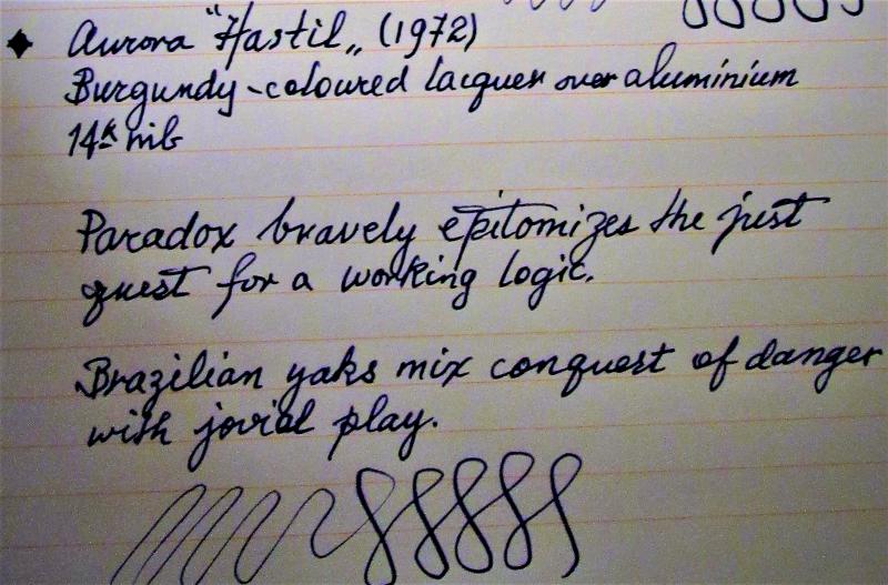
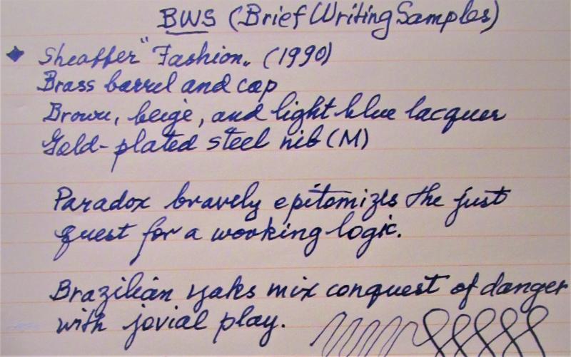
To celebrate the act of writing, here are photo reviews of two 'slim' pens (under 10 mm around at the grip). Notice that, with slip-on caps, 'threads' at the grip are not an issue, so the pens are equally smooth to hold. Also, though the pens may vary in size and shape, they are all about the same in girth, so the feeling of control as one grips the pen is about the same. Performance in this case it seems to me is in the nib itself. Both pens are aging beauties but are still manufactured (the Hastil) or available (the Fashion). The pangrams used are courtesy of Wits 'n Wisecracks: 251 Pangrams for Everyday Use by Millard Port, via Amazon Books. Enjoy this holiday excursion into thinness.
-
This is one of my favorite recent nib comparison shots - I guess because it has my favorite pen in it, and shows off its massive scale! Anybody prefer the size of a Platinum or similar pen, or is bigger always better, like the Pilot Namiki Emperor here??
-
Could someone offer a brief or comprehensive comparison of nibs that come with flagship pens from the popular premium brands? Say, Montblanc 149, Pelikan M1000, Sailor Custom Urushi etc.
-
Hello guys, Hope all of you are having a lovely day! I've been wanting to experience some Chinese pens and I really liked the design of these two pens. However, in regards of performance, which one would you recommend? If you have any other suggestions, I'd really appreciate your help! )
-
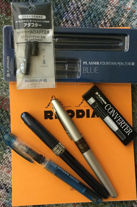
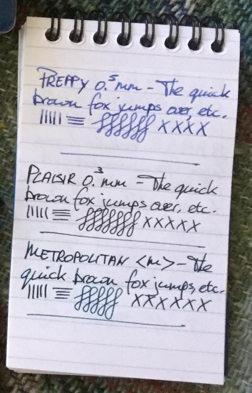
Quick Comparison: Platinum Preppy Vs Plaisir (Vs Pilot Metropolitan)
TheDutchGuy posted a topic in Japan - Asia
Being the happy owner of two Sailor fp's (1911 Standard GT & Pro Gear Slim CT, both 14k H-M) and two Pilot fp's (Custom 823 F and Metropolitan M), I was curious what Platinum would bring to the gathering of Japanese pens. As I did with Pilot, I decided to buy a cheap pen first, with the possibility to "upgrade" to a gold-tipped model later on. So I got a blue Plaisir with 0.3 mm nib (18 euros) and a blue Preppy with a 0.5 mm nib (3 euros). I compared them to each other as well as to the Pilot Metropolitan (19 euros). The 3 euro Preppy doesn't come in any kind of box. Based on look and feel, I would expect the pen to be somewhat more expensive (i.e. around 8 euros). It's a plastic pen and it will probably not live to see its first birthday, but it doesn't appear flimsy. I bought one with a 0.5 mm nib. Popped in the included Platinum blue cartridge and off I went. It's somewhat weird to see the ink flow across the section-enclosed fins of the feed. There are no fins outside of the section. The pen wrote straight away and puts a big, fat, confident line on paper. It's not a stub, so line width is more or less the same in downstrokes as well as sidestrokes. The nib is very, very smooth. On a scale of 1 to 10, scratchiness zero, tooth zero, feedback 2. It's like skiing over fresh snow. Very impressive, though purely as a matter of personal preference I'd like more feedback. The 18 euro Plaisir comes in a cheapish plastic box with instructions and an included black cartridge. The instructions claim that the pen won't dry out for a year, even though it is a click-on cap. If that's true, then it's impressive. The barrel and the cap seem to be made of aluminium. Even though it's made of metal, somehow the design looks cheapish to me. Being 6 times as expensive as the Preppy, I'd say it looks only slightly more upmarket but definitely feels more upmarket. I bought one with a 0.3 mm nib, and after popping in the cartridge the pen wrote straight away. Being narrower, the nib offers more feedback than the 0.5 mm but is still incredibly smooth. On a scale of 1 to 10, scratchiness zero, tooth 1, feedback 4. Very impressive. I like this nib. Both pens are nice to write with, in terms of ergonomics. I can use them unposted and the sections aren't slippery at all (even though I tested them on a hot summer day). I could easily do long sessions with these pens. I feel that both Platinums offer exceptional value for money, with the expected longevity of the Plaisir being the main reason for its higher price. The fact that the nibs are easily exchangable between the Preppy and the Plaisir is a great bonus. Want another nib in your Plaisir? Buy a Preppy. Both pens use Platinum's proprietary cartridge system. A converter is available (see photo). Also available is a small item that facilitates the use of standard international cartridges (see photo). For fun, I compared them to my Pilot Metropolitan M. In terms of price, size and shape, the Plaisir and the Metro are very very similar, with the Plaisir being about 4 mm longer and 1 mm wider. A big difference is the feel of the section. The Plaisir has a very small step-down from barrel to section and no ridge at the low end of the section. The Metro does have such a ridge and a pronounced step-down. I like the Metro just fine, but the Plaisir is much easier to grip and feels more comfortable. In terms of writing, both are excellent pens. My Metro has a touch of baby's bottom; it's very subtle but it's there. It also offers slightly more refined feedback, of the pleasant kind, than the Plaisir. It's a tie, both pens writing very well, very smooth and very reliable. Heck, I've had issues getting 200-euro pens to write this good. Count me impressed.
-
 Curious about this because I've been wanting to know whether I'm missing out on anything by not using Tomoe River or Rhodia. I've felt (not written on) Rhodia paper and it feels about the same as JK Cedar. Of course, Rhodia being imported it's expensive (at Makoba Chennai, 1 Rhodia notebook is Rs. 1060). By the way, I haven't written on TNPL Platinum or Excel Bond but I've heard those are FP-friendly so I wrote those as well.
 -

Diamine Sunshine Yellow, Robert Oster Yellow Sunset, Diamine Amber, Robert Oster Peach
Jan2016 posted a topic in Ink Comparisons
Not the same, but all 4 pretty close to each other, see the chromo's