Search the Community
Showing results for tags 'chinese pens'.
Found 25 results
-
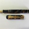
Part of the pleasure of vintage pens is thinking about what it was like to experience the the golden age of fountain pens. The drawback is it’s an impossible task. That’s what makes the Wing Sung 626 interesting. Squint your eyes and you can imagine that you have your hands on a brand new Sheaffer Balance, circa 1929. Or at least a facsimile of the Balance revival series Sheaffer offered 1997- 2003. That’s what I tell myself. My experience with this pen has been been positive. The acrylic is fantastic. Construction, fit and finish on the one I got is top-notch. It is a wonder to hold and write with. Long writing sessions are a pleasure. The nib is smooth and generously wet. It performed flawlessly out of the box with no tuning required. The sweet spot is large and easy to master. The pen is an intuitive and rewarding writer. An easy 10 pages on a fill That said, the Wing Sung 626 is a pen that fits a role. It's not perfect. The nib does tend do dry out, causing hard starts if the pen has been uncapped for an extended period. The phenomenon is ink dependent. Rohrer & Klingner Scabiosa (an iron gall ink) made things worse. Diamine Majestic Blue minimized the problem. Private Reserve DC Supershow Blue was somewhere in between. The cap takes something under two full turns to remove. That makes the pen less than ideal for jotting incremental notes, in meetings for example. This pen is best suited for dedicated writing. The nib is on the delicate side. Too much pressure and it will bend. Reasonable care is in order. The nib is also a proprietary size. It's smaller than a standard No. 6 but larger than a No. 5. Nib swapping doesn't appear to be in the cards at this time. There is a gold nib version available but it's quite a bit dearer. The nib is only available in fine width (0.5mm). The Wing Sung 626 fits admirably among my current writers. I'm still in the thrall of my Aurora 88, but the smaller size and lighter weight of the 626 make it a close competitor. Plus I love looking at it in my hand. Left to right: Lamy 2000, Aurora 88, Wing Sung 626, PenBBS 308 At under US$18 from Taobao, the Wing Sung 626 is easily accessible, though it is edging toward the higher end of the new crop of Chinese pens. However, I wouldn't recommend this pen to a complete newbie. There's a risk they'd throw up their hands in frustration the first time it didn't write directly after sitting open for 15 minutes. Then there’s the chance they’d spring the nib. But for someone who's been in the hobby a bit, the Wing Sung 626 can be something of a revelation. It really is possible to close your eyes and imagine you're back in time. If you haven't guessed yet, I'm a sucker for the historic connection. More photos and comments here.
-
Kaigelu 316 Modification (250 #6 Bock Nib / Beaufort Ink Converter)
Frank66 posted a topic in Of Nibs & Tines
1. TITLE Modification of Kaigelu 316 fountain pen using Bock type 250 nib unit (EF, stainless steel, 2-tone) and Beaufort Ink premium Ink Converter. 2. INTRODUCTION Recently, I acquired two Kaigelu 316 fountain pens which I adore, one is ivory or pearl colored with black swirls and the other is brownish colored with orange waves. The pens seem to be imitations of the more expensive Parker Duofold fountain pens. I bought them without their box from an ebay store in China, for under 20euros each (1). Figs 1a-1b 3. OBJECTIVE However, I was a little disappointed by the nib of the Kaigelu pens, which although smooth, write too broad for my liking. My one option would be to grind the pen nib, which I am currently learning how to improve at, however I am not adept at it yet. My other option would be to find a high quality replacement nib. A little web search proved that it has been difficult to find a replacement nib for this pen.(2-4) It would be great if I could fit an extra fine (EF) Bock or Jowo nib into my Kaigelu 316. 4. METHODS AND MATERIALS Unfortunately, I was unsuccessful in seperating the nib from the feed in my Kaigelu, however in trying to do so, I managed to completely remove the nib housing from the inside of the pen barrel. Please note that the Kaigelu 316 nib housing does not have any threads on its outer surface, the nib housing and the section are actually held together by friction-fit. Interestingly enough, the Kaigelu pen section does have internal threads at approximately 10mm from its nib-end, which, alas, are not engaged with the nib housing at all. It could have been that I accidentally have torn the housing threads myself, in my attempt to remove it from the pen section, but there appears to be no remnants of torn threads on the external surface of the Kaigelu nib housing at all. For owners of other Kaigelu pens, which have the nib housings attached firmly in the pen sections, it is recommended to place the pens in hot water for 4-5 minutes, and then to attempt to unscrew or remove the two pieces apart. Fig 2a-2d After measuring the nib housing dimensions, I contacted both Jowo and Bock companies. The Jowo nib housing dimensions (7.5mm in diameter) differed significantly from the Kaigelu one as pictured in the Fpnibs website (5), I was finally referred to Phil at Beaufort Ink (6), which is the Bock representative in UK (no affiliation, just a happy customer). Phil suggested that the Bock type 250 nib housing (8 mm in diameter), with a stainless steel, 2-tone nib, could perhaps fit this pen's barrel. He even emailed me a diagram with the dimensions of this nib unit which proved that this might be a good replacement option to try. Fig 3a-3c. I ordered two Bock units type 250, in EF and F nib size, in stainless steel and 2-tone color. Furthermore, I ordered the Beaufort Ink's own-marketed ink converter, which in retrospect proved very thoughtful, as the Kaigelu screw-type ink converter dimensions would not match the Bock housing's ink inlet. When the package arrived, I saw that Phil was kind enough to include some other Bock housings so I could experiment in other pen modifications too. Fig 4a-4d. Side by side comparison of the nib housings reveals that the original Kaigelu units are slightly shorter than the Bock ones. However, I was able to insert the Bock nib unit into the Kaigelu pen barrel, where it would fit perfectly. Even though the nib housing's and the barrel's threads did not engage at all, the two parts would be retained by friction fit in an excellent manner. Although Phil had suggested that I could use transparent nail polish to retrievably attach the nib housing to the pen barrel, I was amazed to find that the pen was secure enough to be used only with the two parts retained snugly together with friction fit. Alternatively, I guess I could have used shellac too, but I did not find this necessary, as it allowed me to change nib units at my own will. As far as the ink converter is concerned, it was also retained by friction-fit inside the top of the pen section in a perfect manner. The Beaufort Ink premium ink converter was not screw-retained as the original Kaigelu ink converter used to be, but it was tight enough and matched perfectly in size, so that I did not have any problem with ink leakage whatsoever. Although I am sure they had not intended on purpose, it seems as if the Beaufort Ink premium Ink Converter was perfectly crafted for this Kaigelu pen, I feel so lucky! Fig 5a-5f. 5. DISCUSSION It might also be interesting to note that the Bock nib can easily be removed from the its housing and occasionally be replaced with a Jowo EF or any other size Jowo nib, if one so desires. Here is the same Kaigelu pen with a EF Jowo nib purchased from Anderson Pens (7) in Milwalkee (no affiliation, just a happy customer). I could easily interchange the Jowo nib taken from the pictured Jinhao x450 and transfer it, back and forth, to the Kaigelu 316. Fig 6a-6b. In my experience, both EF and F Bock nibs write 'buttery' smooth, however the Jowo nib pleasantly gives a little more feedback which I personally like. This is consistent with similar findings by other fountain pen users on Fountain Pen Network (FPN) threads (8). One can write ever so slightly finer lines with the EF Jowo nib compared to the EF Bock one, using the same ink and paper, at least with the Bock and Jowo nibs at my hands. One explanation for why a Jowo nib writes a little crisper than a Bock nib might be the slightly different nib geometry at their tips. Under magnification, the Bock EF seems to have a slightly broader nib-paper contact area than the Jowo. However, if it wasn't for the Bock housing, no other high quality nib could be substituted for this pen. According to my personal experience, I can write easier with the Bock EF nib on plain paper, compared to the Jowo EF nib which somewhat “catches” on cheaper paper, and seems to write smoother on better quality paper only. Here are writing samples with the Kaigelu pen with EF and F Bock nibs and also with the Kaigelu original nib. I only wish I had a better macro lens so I could take better closeup shots of both Bock and Jowo nibs, the nib on the left is the Bock, the one on the right is the Jowo. Fig 7a-7b. Finally, other users have described the Kaigelu 316 as a heavy pen, however, I personally do not find it cumbersome to hold, as it fits my style of writing perfectly. However, if one does want to modify the weight of the Kaigelu, richardandtracy's thread on finial replacement at FPN discussing this matter might be useful.(9) The modified Kaigelu pen also seems to be 1.5 to 2 mm longer with the Bock nib compared with the original nib but this, combined with the fact that the pen is slightly back-heavy, helps with the pen's weight balance more so than not. Fig 8.1-2 Here are a quick writing sample with the Kaigelu 316 with Bock 250 EF nib, please excuse my terrible handwriting... Fig 9 6. SUMMARY A 250 Bock nib housing could be fitted inside the Kaigelu 316 fountain pen section and a Bock or Jowo nib could used alternatively, along with a Beaufort Ink premium ink converter. I have been using my modified Kaigelu 316 for three weeks now without any issues. Now that the Bock or Jowo nibs has been proven that can be fitted into this pen, other high quality #6 nibs like Edison, Goulet, Anderson, Monteverde or Franklin-Christoph could potentially be fitted successfully into this pen. I hope this was useful to other pen enthousiasts possessing or interested in acquiring a Kaigelu 316 pen. 7. DISCLAIMER As quality control varies with chinese pens in general, no warranty is given that results can exactly be reproduced with all other Kaigelu 316 fountain pens. The techniques described above are given as a guideline and can be replilcated at each one's own discretion and responsibility. There is no commercial relation or affiliation with the pen brands / stores mentioned in this article. My respects goes to all pen enthusiasts, both professional and amateur, who have toiled for the improvement of the fountain pen experience. Regards, Photios 8. REFERENCES (1) ebay store jewelry mathematics http://www.ebay.com/usr/jewelrymathematics (2) Matt Armstrong / The Pen Habit http://penhabit.com/2014/06/04/pen-review-kaigelu-316 (3) Matt Armstrong / youtube https://www.youtube.com/watch?v=5cDfBdjSaN8 (4) Stephen Brown / Writing with the Kaigelu Century Star 316, youtube https://www.youtube.com/watch?v=X_kZKo-8Pyw (5) FPNibs, Official Jowo representative in Spain, diagram with dimensions of #6 Jowo Nib Unit, and #6 EF Jowo Nib Unit, http://www.fpnibs.com/en/size-6-jowo/85-plumin-de-acero-tamano-5.html (6) Phil at Beaufort Ink / Bock UK representative, http://www.beaufortink.co.uk (7) Anderson Pens, 10 E. College Ave. Suite 112A, Appleton, WI 54911 http://www.andersonpens.com/ (8) dsolmei at FPN thread, Jowo Vs Bock - Which Do You Think Is Better And Why? https://www.fountainpennetwork.com/forum/topic/252283-jowo-vs-bock-which-do-you-think-is-better-and-why/ (9) richardandtracy's thread on FPN- https://www.fountainpennetwork.com/forum/topic/245065-kaigelu-316-acrylic-barrel-finial/ -
Hi all, After 20 years in our home in Allentown, PA (and coming up on 24 years of HisNibs.com), my wife Teresa and I have decided that it's time to downsize. Although there are many joys of home ownership, maintenance is not particularly one of them ! Most of the upkeep of the house has fallen to Teresa over the years, in large part due to certain physical limitations due to my disability (physical, and perhaps mental as well ). Consequently, she's laid down the law that we need to find a housing situation where this is taken care of for us (I suggested taking on a staff of servants, but for some reason she didn't go for it). I don't plan on closing HisNibs.com, but I do need to significantly reduce a quarter-century of writing instrument stock -- to make a move over the next couple of months more manageable. Once we're situated in a new castle, http://hisnibs.com/images/HisNibsCastleFinal72.JPG I can then reassess how much inventory I want to carry and which brands, etc. With the current unfortunate situation brought about by the Covid-19 virus, importing from China is at least temporarily problematic, so I'll be starting my inventory-reduction endeavors with Chinese pens-on-hand. To make this more manageable for me, I'll be sending out more frequent newsletters to my regular customers (feel free to ask to be added to the newsletter list), with subsets or brands or individual items on sale at a deep discount. So, to kick off this Inventory Reduction and Relocation Sale (IRRS for those in the 'know' ), let's start with...DUKE pens and Pen Storage...and what's a pen without INK!? Rather than update the prices on each model's page, just take 50%-off of the published price on any Duke pen, pen case or ink on the linked pages. So, not to be too obvious about it, but the 12-pen wallet is priced at $24.00. It's now yours for only $12.00, etc. Please see more details here. As always, please email me directly at stonebri@verizon.net with your order. Regards, Norman Haase
-

Jinhao 650 - 'deep Sea Bright Pearl' – The Brass Behemoth
TheVintagelife posted a topic in Fountain Pen Reviews
While I do not write too many reviews, posting this here, since I thought this is an interesting pen and there are very few reviews online, unlike the more common Jinhao models like the x450/750/159/992 etc. General notes: This is one of the variants of the Jinhao 650. As far as I can tell, there is another in a red wood variant. This pen cost me the equivalent of $15. Not the cheapest Jinhao or indeed, Chinese pen out there, but still lower than most offerings of ‘upper end’ Chinese brands like penBBS, Moonman, Kaigelu, Lorelei etc., so firmly ‘mid range’ as Chinese offerings go. The pen in this review, therefore, will be judged according to the standards expected of this price range. The entire pen appears to be constructed of brass. The cap has a black laquer paint with gold-color plated clip and ring; the barrel is the same black laquer paint with the signature feature of this pen – the mother of pearl and abalone strips cut in small rectangular stripes(longer side arranged along the length of the pen) and arranged neatly in rows – 3 down and 6 around – 18 in total. The section appears to be plastic coating on a brass base. As regards the hardware – the clip is a sword and shield design, with the shield carrying the jinhao logo of a horse drawn chariot. The shield part of the logo is chrome while the rest of the clip (basically the sword part) is gold-color plated. The pen is a cartridge converter and comes with a aged-brass accented converted. the clip-ring is visible. There are other gold-finsihed rings at various places in the pen - namely - bottom of cap; joint between the thicker middle portion of the barrel and the thinner tail-end, and at the top of the section. the cap is a push-to-lock/ pull to open variety. It has a standard #6 two tone jinhao nib with 18KGP printed and the jinhao chariot motif. The nib was advertised as a 0.7mm line (which I’d say is on the broad side of medium or a Japanese broad). However, I find it to be provide a thinner line – about 0.5mm Now, on to the qualitative review and some comparisons. Build quality : 3.75/5: For $15, you get a really well built tank of a pen. Nothing rattles and everything feels solid. The execution is almost at par with plus $100 except for a couple of minor points: 1) The gold plating, while otherwise very well executed, appears to scuff easily. I already have some scuff marks around the bottom of the clip despite handling the pen very gently till date. It appears that the underlying chrome/brass will eventually show through in places sometime in the future 2) The ring at the bottom the barrel rotates freely and is not fixed to the barrel. I do not know if this is by design or just my piece, but I don’t think this should be the case. (The top finial is the same gold finish as the clip and bands. It looks pink in this picture, probably because of the uneven lighting) Dimensions and Ergonomics 3.5/5: the pen is bloody heavy. Like really. Heavy. It is 65gms (2.2 oz) with cap on, and 36 gms (1.2 oz) without the cap. It is not overly lengthy though – at about 142mm with capped, 124mm uncapped, and 170mm posted. It posts securely but not deeply. The disappointing thing about the posting is that the cap does not travel all the way to the ring at the bottom of the barrel where there is a step up to the middle part of the barrel (see pic below). If the ring on the cap ended up flush with this step up point, I think it would have both looked neater and been a more comfortable length. As it is, I wouldn’t recommend posting as it backweights the pen too much. Having said that, I do not find the weight overly uncomfortable (when un-posted). I like bigger (though not necessarily very heavy) pens, and while this is certainly the heaviest pen I own, it is surprisingly usable. This is mainly because the weight is mostly in the middle of the barrel (when un-posted) and this makes the pen very well balanced with the webbing between the thumb-forefinger taking the weight naturally. Here is the pen next to the decidedly mid-sized Moonman M600s which also has the same general shape and price range (plus black finials and section). The length of the two are almost similar (with the 650 edging it slightly). But the 650 is appreciably thicker and more than twice as heavy (note that line width of the Jinhao's writing is very close to that of the 'F' nib in the Moonman - more of that later). As you can see from the un-capped pictures - it has a short section with a step down from the barrel. However, I did not experience any discomfort in gripping the pen on this account (note: I do hold the pen quite low down - very close to the nib). It helps that it is a push to lock design and hence there are no threads. the section has a plastic feel and therefore is not very slippery. However, it can get slippery on prolonged use. Appearance – 4.25/5 : it is an attractive design, which is bold but (in my opinion) just short of loud. The gold-accents are done extremely well for a pen of this price range. This is usually what looks cheap in most low end pens, but that is not the case here. The mother of pearl and abalone strips look the real deal – they have great depth and chatoyance and vibrancy of color – held up against the light, they look 3D – the pictures do not come close to doing them justice. It is amazing that this kind of material is being used a on $15 pen. My only nitpick in this category is that that the drop in diameter between the middle of the barrel and the section on one end, and the bottom finial on the other, gives this almost a ‘kit pen’ type of appearance. This is personally off-putting though many won’t care. If the reduction in diameter served a purpose in helping the pen post flush with the bottom ring, it could be forgiven, but that is not the case, as discussed above. Writing performance: 4/5 The standard #6 jinhao nib is a very smooth and wrote smoothly out of the box. The ink flow was not the wettest, but not overly or unusably dry either; just on the dryer side of medium. By this I mean, medium blues like the Lamy blue I used for this review showed up lighter than the really wet pens, but amazingly, the nib kept up very well to fast writing, never skipped; and only rarely had a false start (that too if kept uncapped for a while). If used after a couple of days, the first stroke of the first letter may be a little thinner and then the pen immediately reverts to its normal line. Overall, I would say a really good writing experience out of the box. Jinhao feeds are known to take a bit of time to really be primed, so, as expected, it became slightly wetter (about medium wetness) in a couple of days. It also helped that I ran a razor along the slit of the feed (just once was enough). Now I feel that the nib performs just as I would like. Quite happy really. I was considering using one of the ‘wet Taiwan nibs’ from Bobby at esty; but after a few hours of trying one, I reverted to the Jinhao. I have too many ‘gushers’ already and the line was too fat for my liking, talking of which… As mentioned above, this nib is finer than some of the other Jinhaos I have used, which is pleasant surprise (for me- personally like a medium-fine rather than a medium-broad). The supplied cartridge converter does not have the greatest suction – I struggle to fill the entire tube despite repeated tries, which is a pity since it doesn’t have a great capacity to begin with (I’d say about 0.8 ml). However, it seems to be supplying the feed adequately as the feed has never dried up amidst writing, which has happened in a couple of my Moonmen/penBBSes. A small written sample is below. Notice how the Lamy blue shows up into its 'middle' darkness for most part. Value: 4.5/5 : Are you kidding me – actual abalone and mother of pearl strips in a $15 pen and a build quality this good, makes the pen absolutely worth the money spent. I am deducting half a point since it may be a bit too heavy to be a daily writer for some and hence may find itself in a weird middle space of being too weighty for copious writing, but not a ‘posh’ enough to be a signature pen. However, as an occasional dalliance and a conversation piece (I lost count of how many colleagues asked me how expensive this pen was only to be shocked when I told them), it’s a great bargain. -
I like the PenBBS 350 aluminum pen, especially since I swapped a #6 M nib for the standard PenBBS one. It's a great writer and very comfortable in the hand. I can safely say, however, I like the PenBBS 380 even more. And it comes with a sweet M nib. No nib swapping required. Where for me the PenBBS 350 is like a full-sized pocket pen, the PenBBS 380 comes off as nothing less than a luxury writing instrument. It has the size, heft and design I associate with expensive Italian pens I don't own and probably never will. Spiral Facets? Nice! The ten facets both spiral and taper toward the end. The clip is planted squarely at the peak of two at the top but rests in the middle of one facet at it's base. When closed, the cap and body line up just as they should. Hats off to PenBBS for designing and executing a heck of a pen. Capped, the pen is 146mm, so just a hair shorter than the PenBBS 355 Bulkfiller. Uncapped, it's 128mm, again just a little smaller than the PenBBS 355. At 14.5mm at its widest point, it's bigger around than the 355. The PenBBS 380 uses the same quality converter as the PenBBS 350 (and 309). It works very well. To the touch the matte aluminum finish is the right combination of tactile and smooth and the bead blasted finish of the clip (which I assume is also aluminum) magically transforms it it from coffinesque to sword-like. The clip fits the design of the pen. The section, body and cap all share the same finish. The cap comes off in just under 3 turns, which is more than some may like. The threads are relatively fine, and like the PenBBS 350 there is a plastic insert in the cap to eliminate any metal-on-metal scratchiness. So far, I haven't had any issues with the thread insert in my 350 so hopefully there will be none here either. There is a ledge in the cap to seal the nib which may be machined or could be a plastic insert, I can't tell. The finial and clip are held in place in the cap by a very sturdy looking Philips-head screw that I don't plan to mess with. The cap and body fit flush so there is a significant step down from the body to the section. The edges are soft enough to not feel sharp when writing. The cap does post relatively deeply and securely enough, but it makes the pen larger than I like so I'm not tempted to write with it that way. The 380 has been released in black and silver finishes with either with either a standard (bent) PenBBS F nib or a rounded M nib.The F nib models come with a two-tone nib and a gold colored clip. The M nibs are silver, as is the clip. My guess is that the F-nib models (with gold clips) target the local China market while the M nib versions are geared more for Western consumers. The pen also comes with a rollerball nib which adds versatility. I keep a rollerball on one end of my PenBBS 469 but that's as many as I need for now. In the Hand The PenBBS 380 is a great writer. It's just the right size and weight. The slightly larger barrel behind the section makes the pen feel substantial while the taper at the end gives it an agile feeling I really enjoy. This is my second pen with a PenBBS "round" M nib. My first was the PenBBS 355. If anything, it's smoother and wetter than the 355, but that may be the Monteverde Horizon Blue ink I chose. (Shoutout to OCArt for planting the seed for this ink in this thread on favorite new inks of 2018!) At just under US$30 plus shipping on Taobao, the PenBBS 380 is one of the more expensive PenBBS pens I've bought. But it feels like more. As soon as I picked it up I was struck by the feeling that with a different pedigree, it could be a very expensive pen. Its both simple and stylish, modern and in line with the great pen traditions. More photos and comments here.
-
I like Frank Underwater's name for this filling mechanism so that's what I'm using. This has been my go-to pen for about a month now. The Wing Sung 601 is a high-quality writing instrument. I recommend it highly. Having said that, my first impressions were less favorable. This is a pen that's grown on me. It's short on bling. From Wing Sung, that goes to the 618 which I find miles more fun to look at.It's not particularly big or chunky, so no check there.It’s not unique like the Moonman M1 Wood and Brass or the PenBBS 308. Let alone anything from TWSBI.The design is clearly a throwback to the Parker 51 via the Hero 616. I have more than one 616 in pen storage.It’s another hooded nib pen. That puts it on the tame side of the street. For me, hooded nib pens don’t invite tinkering the way regular nibs do. I’m always concerned I won’t be able to get them back together again correctly.It's the filling mechanism. Wing Sung has taken it upon themselves to resurrect the Vacumatic filling mechanism. And they’ve improved the design. And they sell the pen for under US$10 on taobao . I like the idea that Wing Sung actually made two generations of this filling mechanism. The first used a rubber diaphragm which, while close to the original Parker design, was less efficient and potentially less durable. The revised design uses a piston which performs better and should last longer à la Edison's Draw Filler. Wing Sung moves beyond the Edison design by included a spring in the mechanism, making it possible to fill the pen with one hand. (Two hands if you keep one on the bottle of ink.) The pen is very similar in length to the Wing Sung 618 but a bit slimmer because the cap isn't threaded. Left to Right: Wing Sung 601, Hero 616 Jumbo, Wing Sung 618, Hero 338, Hero 565 Length: 138mmUncapped: 128mmPosted: 152mmSection diameter: 11.2mmWeight inked: 20g capped / 12.9 uncappedUpon closer inspection, it looks as if the 601 may share the same section as the Wing Sung 618. The two pens already share common nib and feed. Perhaps the collector assembly is also shared. It would make sense. Wing Sung 618 Left/Black - Wing Sung 601 Right/Gray My writing experience with this pen has been outstanding. The pen is reliable and fits well in the hand. I prefer writing with the pen unposted, but the cap is light enough and posts deeply so that writing with the cap posted is certainly doable. The 601 is comfortable for quick notes or extended writing. It’s not particular about writing angle and offers a solid sweet spot with just a bit of feedback. The nib is hard so there’s no line variation to speak of, but that’s to be expected. It does reverse writing pretty well. The nib and feed write moderately wet and put down a fine line. The nib feels finer that than the nib on my Wing Sung 618 but that is likely the ink. Or just me. I’d expect the 618 to write more boldly than the 601 just on looks alone. At the end of the day, the pen is on the conservative side of the spectrum. One might even say boring. Maybe I didn’t help things by getting it in gray. But I love that it is very good at its intended purpose and advances the art in ways that aficionados can appreciate but regular users just find useful. More pictures and comments here.
-

The Jinhao 599 – A Stylish Chinese Pen With Strangely Familiar Germanic Leanings…
Jamerelbe posted a topic in Fountain Pen Reviews
Several months ago now, as most FPN regulars will know, a ‘new’ pen was released onto the market by the Hero Pen Company – a new pen which, like so many other Heroes in the past, looked somehow familiar… The ‘Hero Summer Colors’ had arrived, and is it just me, or did that sucker look just a little too much like the Lamy Safari? At the time, I’d recently begun buying pens (and ink) from a local Australian distributor (Kevin from www.justwrite.com.au), who among other things stocks a wide range of pens from China. I asked the question – more out of idle curiosity than anything else – had he heard of the Hero Summer Colors? He had… but had heard the build quality wasn’t fantastic, and they weren’t on his radar. However… his suppliers had recently provided him with a stash of Jinhao pens that seemed to owe a debt to the design of the same German ‘progenitor’: would I like to take a look? So, in return for an impartial review , Kevin sent me a Jinhao 599 – in fact, for good measure, he sent me two! And what can I say? From the moment they fell out of the envelope, encased each encased in its own plastic sheath, I was blown away! These are sleek, stylish pens – at least in the black glossy finish; they look good on the desk, feel great in the hand, and write sweetly on the page. It will almost be impossible to review this pen without comparing it to the Lamy Safari – so you’ll see comparison shots littered throughout. But let me say up-front, most of the design changes Jinhao have made in producing this pen are, in my view, design enhancements. If you’re squeamish about using pens that appear to have blatantly copied someone else’s design brief, then this may not be the pen for you – personally, I think it’s different ENOUGH to be forgivable – but you’ll have to judge that for yourself. ______________________________________________________________________ Appearance & Design (8/10) – A sleek, stylish looking pen If you’re a fan of the Lamy Safari’s design, you won’t have any issues with this pen – the overall profile, including the grip section, is very similar. The 599 pens I received came in a black glossy lacquer finish, with ‘Jinhao’ imprinted proudly at the end of the pen barrel/body in a contrasting colour (white) – the company name is also found on the nib, and on the cartridge converter inside. No mistaking who this pen is from – and unlike its German ‘predecessor’, the barrel only threads on to the grip section one way: you can’t hide the printing on the underside of the pen as you write! http://i.imgur.com/k5xcqDW.jpg No ‘ink window’ with this particular version of the 599 – which may bother some users, if you like to know at a glance how much ink capacity you have remaining. The clip is also styled somewhat differently – still a large clip, but to my eyes more aesthetically pleasing. It looks a little less like an oversized paperclip! The design of the grip section is ‘vintage’ Lamy (à la Safari) – the nib, on the other hand, looks more like what you’d find on a Pilot VPen, but more on that later… Only one real negative (if you can call it that): the glossy cap and barrel tend to show fingerprints – if you care about that kind of thing (or if you’re planning to take photos for an FPN review), you’ll need to give it a quick polish every now and then. Construction & Quality (8/10) – A pretty sturdy pen It’s hard to find fault with the construction and quality of this pen – it appears well-made, the grip section and barrel thread together nicely, the metal (brass, I think?) and plastic on the pen all appear durable, the clip is nice and tight without being hard to use… Everything I like about the Safari, this pen will put up its hand and say ‘me too’ – with one or two small exceptions. Because the pen is made of metal, it will probably be more prone to ‘dings’ and dents than the ABS material of the Safari – but that would also be true of the Lamy AL-Star. The rubber O-ring that sits between the grip and body of the Safari – and provides a better air seal between body and cap – has been replaced with a metal ring that comes loose and rattles around every time you unscrewing the body. That’s probably my only real gripe with this pen: the metal ring is needed for the cap to snap on securely, and could be easily lost if care is not taken. http://i.imgur.com/QTMvoUm.jpg Weight & Dimensions (8/10) – A good weight – sits comfortably in the hand The pen sits very comfortably in my hand, and writes well unposted. You can, if you want, write with the cap posted – if you’re self-conscious about the branding on the pen, that’s the only way you’re going to be able to hide it! – but I found that made it a little unwieldy. Capped, the pen is about 138mm long; uncapped it’s closer to 127mm; posted, it extends to 170mm. Tipping the scales at 25g, this is just a little more substantial than the Safari (17g) – heavy enough to know you’re holding it, light enough to be supremely comfortable (as long as you like the standard Lamy grip section!). Nib & Performance (7/10) – A very smooth writer, but only one nib size… The nib on this pen is one of the few things Jinhao have not copied directly from Lamy – but I have seen this profile before, on a number of pens. The Pilot VPen (pictured – from Japan); the Hero 358 ‘Schedule Note’ kids’ pen; and the Sellner Marchtrenk plastic fountain pen (from Germany) to name a few. http://i.imgur.com/MIMElD1.jpg http://i.imgur.com/r91pzRv.jpg The nib is made stainless steel (duh!), with no discernible ‘spring’ or line variation. Writing is nonetheless a very pleasant experience –and if your preferences naturally run to finer nibs (as mine do), then this pen will be right up your alley: slightly finer than the Lamy Safari (which writes a little wetter); directly comparable to the Pilot VPen / Varsity and the 0.3mm Platinum Preppy nib. See the writing samples below: http://i.imgur.com/u0sljSJ.jpg http://i.imgur.com/Bre4kli.jpg http://i.imgur.com/EuwOBls.jpg Filling System & Maintenance (9/10) – Custom-Designed Cartridge Converter... or Standard International Cartridges! For me, this is one of the real selling points for the 599 over the Lamy Safari: the pen is built for compatibility with standard cartridges, and will therefore take any of the cheap cartridge converters you can buy on the market. However, it comes supplied with a cartridge converter, that looks very similar in design to the Lamy cartridge converter (the Z26) – except for the narrower ‘mouth’, to accommodate a standard international fitting. A Lamy-style pen – without the constraints of a proprietary cartridge / converter system? Now that’s smart thinking on Jinhao’s part. http://i.imgur.com/vU5AJMH.jpg Cost & Value (10/10) – Full marks from me! OK, OK, this is not the best fountain pen available on the market – it would probably not stack up well against a Pelikan M1000, or Montblanc Meisterstück 149, or a Yard-o-Led Viceroy Grand Victorian (not that I’ve ever handled any of those!)… In fact, I’d probably rate it behind the TWSBI Diamond 580 and the Diamond Mini, the highest-end pens currently in my collection… But for AU$11.50 (that’ll be the asking price at www.JustWrite.com.au, when they go up on the website!) I’d buy one of these ahead of a Lamy Safari or AL-Star (unless I wanted a stub nib) – in fact, I could buy at 3-4 of these for the price of a Safari! – and I’d happily give this away as a gift pen to anyone I’m trying to convert to the pen habit. Conclusion (Final score [sUM/6]: 8.16666667) – A really good quality pen, for the price! I guess the scoring system above is somewhat subjective – and certainly takes into account the fact that this is an inexpensive pen. But for the price, and for its ‘place’ in the market, this is a really good value pen. Looks good, a pleasure to write with – I’d have no hesitation recommending the Jinhao 599. Disclaimer: I was provided two free ‘samples’ of the Jinhao 599 by Kevin from www.justwrite.com.au in return for an impartial review. -
Fuliwen is not a pen brand I'm overly familiar with. It's been covered in Frank Underwater's blog and this particular pen, dubbed the Sceptre, has been reviewed by chrisrap52, WaskiSquirrel and Aaron's Pen Videos on YouTube. The pen was just over US$18 plus shipping on Taobao. It comes in cracked-ice style acrylic in red, orange, white and black. I went for the koi red on a lark as a follow-on to the Moonman N3 I recently added to my collection (and like very much). The pen is so similar to the Moonman N3 I thought the parts might be interchangeable. Turns out the nib units swap no problem. No luck with the caps and barrels. One of the strong points of the pen is how well it posts. No wiggle at all. That and the facets. I'm a sucker for facets. The nib is a #5, presumably of Fuliwen's own make. Somewhat unusually, it's available as an M. There's also a 14K gold nib option but that's outside my consideration. The nib proved pickier than I expected when it comes to ink. I initially tried J. Herbin Orange Indien but found it stingy. I then tried Noodlers Air Corps Blue Black to much better effect. Smooth and generous. In the mean time I was successful in getting the nib unit apart so it's easy to clean. (I also did floss the nib so that may have helped the flow.) Finally, I picked up some Diamine Vermillion as something that would fit the pen and hopefully write well. It's been a happy pairing. For a slim pen, the Fuliwen 016 feels great in the hand. Everything is smooth. The edges of the facets are rounded to the point that they are easy to miss. The section is long and the metal threads above the section are not sharp in the least. This is a pen that's easy to grip just about anywhere. It has a refined, welcoming feel in the hand and it's big enough to write with unposted. Posted it's an excellent size for me. Weight (inked) Uncapped: 14.22gPosted: 18.53gLength 137.5mm capped126mm uncapped156mm postedIn short, the Fuliwen 016 has much to like. Over the past couple of weeks, I've come to regard it as a near perfect exemplar of a slim pen. It is extremely comfortable in the hand and writes equally well posted and posted. I love how securely it posts. The lack of a clip is of no matter to me. Even a plus. Style-wise, the koi pattern was something of a personal leap but I don't have any regrets. In fact, another koi pen landed on my doorstep just today! If you're interested in something in this neighborhood, give this pen a look! More comments and photos here.
-
The Wing Sung 627 is a release that’s flown under the radar. Still, it has a lot going for it: It uses the same excellent No. 28 nib as the Wing Sung 626.627 nib/section units fit on the 626 barrel (but not vice versa).It comes in three nib sizes: EF, F and M.A fine nib is standard but each pen also includes a second nib unit.The pen is a great size and the wood construction is superb.Swappable nib-section units (almost) The Wing Sung 627 nib and feed are pressed into a plastic sleeve that is itself fit in the section, the same construction as the 626. The sections on the two pens are the same length. The materials are different obviously and the 626 section has an hourglass curve where the 627 section is simply tapered. The threads on the sections are the same for both pens (though the threads on the 626 section are a bit longer) so, yes, the 626 barrel fits on the 627 section. Perfectly in fact. I’m not sure if I’m ready for that frankenpen, but … Conversely, the 627 barrel doesn’t fit the 626 section. Not enough threads. Swapping is a one-way street. A medium nib? That’s news Left to right: Wing Sung 627 EF, PenBBS 306 F, Wing Sung 627 M, TSWBI 580 F & Wing Sung 626 F One gripe about the Wing Sung 626 is that it’s only available with an F nib - despite pictures on selling websites of a medium nib in the same two-tone style with a heart breather hole. Sadly, the 627 nibs are neither two-toned nor do they have heart-shaped breather holes (the extra-fine has no breather hole at all). But at least the 627 lets you see how a 626 M nib would write if one day it were to become available. And the 627 with an M nib is a great pen in its own right. The EF is no slouch either. At 32mm, the No. 28 Wing Sung nibs, while proprietary in size, are just about as big as a standard No. 6. They use a traditional tip angle rather than the slight upturn found on PenBBS nibs. Sadly, the aftermarket for No. 28 nibs is tiny so they are tough to come by. Goulet isn’t an option. One pen, two nibs. Not bad. Throwing in an extra nib is also a way to get you to order two pens. So that’s what I did. Now I have the whole set of nib options: a pair of F units and one each EF and M. Wow, that wood! The 627 is offered in nine finishes: five resin models and four in wood. I was interested in the darker woods and picked rosewood and ebony. The wood appears to be the genuine article. A look inside the barrel shows unfinished wood that’s different for the two pens. The barrel is made of a solid chunk of wood with the finial chrome ring pressed over the end and plastic threads inserted and glued into the top. The construction feels solid, similar to the Delike Brass and Wood pen. The wood on both pens is smooth with a semi-matte finish. All really nicely done, actually. Much better than I expected. Over the couple of months that I’ve had these pens, my appreciation for the wood construction has gone through the roof. Since I don’t have any of the resin-finished models I can’t speak to that except to say that the wood models are lighter by 10g. But what about the pen itself? The Wing Sung 627 feels like it’s coming from a different tradition from the majority of other pens I’ve been using recently. European? Or a throwback to an older Chinese style? It has a retro vibe that I have a hard time putting my finger on. Maybe it’s the wood. Or the chrome section. One thing I am sure of is that the pen is a good size. Excellent in fact. It feels substantial - a nice change from the very light acrylic pens I’ve been using lately. Uncapped, the pen is 125mm in length and 21.4g (inked). That’s 4g heavier than a Lamy 2000 and 7g heavier than a TWSBI 580 (uninked). Those two pens are similar in length and diameter. The pen is very comfortable in the hand. The contour of the barrel is excellent. The section feels natural and not too narrow. It posts securely and fits well enough in the hand posted. At 33.6g and 165mm posted, it’s heavier than I like but not overly large. The chrome section hasn’t proven slippery and the barrel threads are fine and unobtrusive. The cap comes off in 2¼ turns. Maybe a bit much but not overly annoying. Back to the nibs If I had to choose just one, I’d probably go with the fine nib. Picking two is tough. I just haven’t made up my mind. Extra Fine A true extra fine. While the nib is not overly wet, it’s not at all stingy. Just about right. I hadn’t written with this fine a nib in some time. It was fun to rediscover one of the things that drew me to fountain pens in the first place. The EF offers the greatest line variation of the group. Fine The fine is an excellent nib, the smoothest of the lot. It is generous with a great sweet spot. The line is significantly bolder than the EF. For me, it’s perfect for general writing purposes. Medium True to form, the medium nib gives yet a broader and wetter line. Oddly, it’s not as smooth as the fine. Maybe it’s just the example I received. I think I still need more time to appreciate this type of nib and the more expressive writing it lends itself to. So why isn’t everyone talking about this pen? I guess wood pens are a tough sell. For Chinese pens, acrylic is the material of the moment. Maybe it’s the chrome section. Too much of a throwback? I’ll admit that I wasn’t thrilled about it when I first spotted this pen. Now I’m not bothered and actually like the extra bit of weight it gives to the front of the pen. To my mind the Wing Sung 627 hits it out of the park. It’s a great size, feels wonderful in the hand and writes superbly. I’ve come to think of the the style of the pen as understatedly successful. This pen is a sleeper. At US$13 plus shipping on taobao, it’d be a fine value with just one nib. But you get two. More photos and comments here.
-

What Chinese Fountain Pens Should I Buy?
DilpreetSingh posted a topic in Fountain & Dip Pens - First Stop
I wanted to buy some Chinese pens and I can't decide between the following choices. I want smooth nib which can write consistently for quite a long time( as I will take high school notes with it) JINHAO X750 JINHAO 159 JINHAO 886 JINHAO 599 JINHAO 601 JINHAO 992 BAOER 388 Suggest which one should I go for. You can also suggest pens other than the above listed. Thanks. -
For a moment there, orange was my color of choice. I think I was coming off a sepia phase, but don't rightly recall. I got myself some Diamine Autumn Oak and took a flyer on J. Herbin Orange Indian. J. Herbin Orange Indien The Autumn Oak was a great success but I could never get the J. Herbin to work for me. None of the pens I tried would make a go of it. It was my first out-and-out ink failure. So when I unboxed the PenBBS 350, I did two things. First, I swapped out the fountain pen nib for the rollerball. Then I filled the pen with Orange Indien. I was being a little perverse. Like many, I write with a fountain pen unless I can't help it. You know the type. (You may be one yourself.) But I was impressed by the moxie PenBBS was showing by including a rollerball with the pen. They were thinking outside the box. To reward the daring, I gave the pen the hardest ink I have. To my surprise, it worked. Truth be told, I think the J. Herbin ink has darkened over time. Looking at some old notebooks, it looks a bit brighter. Conceptually, the PenBBS 350 combo hits it out of the park. I love the idea of including a rollerball in the mix. It fits the style of the pen and it writes very well. The line is satisfyingly bold and the rollerball is smooth, agile and consistent. Ergonomically, however, the rollerball isn't a complete success. The rollerball tip is much shorter than the the fountain pen nib - making the pen just that little bit smaller in the hand. The balance between the girth, length and writing experience is slightly awkward. After writing with the rollerball for a bit, I swapped in the fountain pen nib and felt much better. In its fountain pen configuration, the PenBBS 350 rocks: The size is perfect. The diameter is fat enough to be substantial and the unposted length is just right for my hand. The pen posts well enough but that's not how I use it.The weight is spot on. Weighty enough to feel intentional while remaining nimble. Long writing sessions are no problem with this pen.The texture of the pen is light but real: a matte finish with just little grip. Nice.The threads are fine and not bothersome. They work as a midpoint reference for keeping the pen oriented in the hand by touch.The cap comes off in under 1 1/4 turns making this a fast pen to cap and uncap.The cap facets keep the pen from rolling about when not in use and, of course, mean the cap is less likely to wind up on the floor when using the pen.The cap uses plastic interior threads so you don't have the potentially annoying metal-on-metal feeling when capping/uncapping the pen. The action is nicely smooth and precise.There's no clip but that's not a bother for me. I don't need one.The nib is the same PenBBS F No. 6 that comes with their other pens. It's a great nib and performed up to expectations out of the box. Given the aluminum construction and minimalist, industrial design, I put the PenBBS 350 in the workhorse camp. It's durable and functional and could easily serve as a beater pen for everyday use. It works as a full-sized pocket pen. Length capped: 130mmUncapped Rollerball: 117mmUncapped Fountain Pen: 122mmWeight capped (inked): 23.1gWeight uncapped (inked): 15.7g I like the style of the pen. It feels modern. I'm becoming a bigger fan of the PenBBS brand. It could easily be the best Chinese pen brand today. At under US$15 on Taobao, it's a heck of a value. Would I recommend this as a first fountain pen? Yes. If someone is going to catch the bug, this is as good a vector as any.Could this be someone's only fountain pen? Well, it could. If there are folks out there who can eat just one.Would this make a cool gift for a fountain pen friend? I think so. It fits the ideal of something different that lots of people might not pick for themselves.More pictures and comments here.
-
This pen works really well. It's an achievement in terms of design and functionality. The more I use and understand it, the more I appreciate what the Parker 45 accomplished. Size - For everyday school/business use, the size works. It is unobtrusive but sturdy. Easy on the shirt pocket. The pen is big enough to use unposted but is just that much more comfortable posted. It is a slim pen.Weight - Unposted the pen is light and agile. Posted it feels solid but still a very easy writer.Nib - The semi-hooded nib ensures the pen stays ready to write. The screw-in nib-feed assembly locks in alignment and takes the guesswork out of nib maintenance.Cap - The friction cap is as simple and fast to use. The cap posts deeply so the posted length feels hardly longer than unposted. I haven't found that posting the cap scratches the barrel.Section - The section is long and smooth making it easy to grip anywhere that's comfortable.Filling mechanism - The pen uses cartridges or a converter, i.e., the modern standard. Here's my take on why Parker made the 45. I'd love to hear what people more familiar with the story have to say. By the mid 60s the Parker 51 was also showing its age. Nib maintenance on the Parker 51 was non-trivial and beyond what most owners could manage. If you wanted to change or repair a nib, you had to send the pen away for the work.The Parker 51 filling system required owners to have bottled ink on hand. If you were away from your desk when the pen ran out, you had a problem. I suspect lots of people carried a couple of pens to make sure that didn’t happen.The Parker 45 solved both of those problems. The screw in nib/feed unit made swapping nibs trivial. In a pinch, owners could do it themselves. Parker advertised a free nib swapping service for 30 days after purchase.The Parker 45 used ink cartridges. This meant users could easily bring along spare ink and never have to worry about the pen running dry. (It could also use a converter for bottled ink.)Parker also found ways to make the pen cheaper through new materials and improved manufacturing. The Parker 45 was a huge hit. It caught the market at just the right moment when people were looking for better, cheaper solutions. It was only discontinued in 2007! And Moonman? So why does this pen exist from a Chinese company? Blame it on Deng Xiaoping. National Archives and Records Administration [Public domain], via Wikimedia Commons In the late 70s Parker decided they wanted to go to China. The market was showing signs of opening (thanks to Deng) and China offered interesting OEM possibilities. So they paid a visit and set up an exploratory project with Hero. As part of the deal they transferred the design and manufacturing process for the 45. Parker ultimately abandoned the effort but left the IP behind as compensation for Hero’s investment. Frank Underwater tells the story from the Chinese side of things. Hero didn’t let the knowledge go to waste. They made pens, notably the Hero 800 and now, it seems, the Moonman 80 as an OEM project for Shanghai Jindian 上海晶典. So the Moonman 80 is based on the original Parker 45 design but is produced as an authorized clone. Moonman 80 Writing Experience With the F nib (the pen also comes with an EF nib that I don't care for), the pen is a wet and generous writer. It requires little or no pressure. In fact, the less the better. The nib offers a useful sweet spot gives moderate feedback. Waterman Absolute Brown looks great with the F nib. The Moonman 80 costs ¥49.00 on Taobao or less than US$7.50. It is also available in lower-cost 80s variants that come with plastic caps. (The 80s mini looks alot like a Pilot 95 Elite.) All of the Moonman 80 models use the same nib units so they should write the same. Since I experienced the vintage Aurora 88, I’ve come to appreciate semi-hooded nib pens. The design represents an interesting approach to the problem keeping pens ready to write. If you're a Parker 45 fan, you probably know about the Moonman 80 already. If you are just getting into fountain pens and want to see what the business was up to in the 60s, the Moonman 80 can help shed some light. More photos and comments here.
-

Ordering Chinese Pens: Need Advice Regarding Sellers And Shipping
raghavtlwr posted a topic in India & Subcontinent (Asia)
Hi everybody! I'm new here, and am on my way to becoming a proper fountain pen nerd. Although I do have a long way to go. I'm looking to buy some Chinese pens, and need some help with how to choose sellers and which delivery options to choose. I'd also like to know which e-commerce sites to go for. I only know of ebay and banggood. Here's the pen that I'm smitten with right now: https://www.ebay.com/itm/Full-Brass-Iraurita-Fountain-Pen-Metal-Retro-Travel-Pocket-Short-Ink-Pens/263592406528?hash=item3d5f54ee00:m:mo1axuQgxTBa7SO5_qmBFOg The seller has close to 99% rating, and ships to India free through "economy international shipping". Should I go for it? Would love to hear from experienced Indian members. There's another listing: https://www.banggood.com/Vintage-Brass-Iraurita-Fountain-Pen-0_51mm-Fine-Nib-Travel-Pocket-Writing-Pen-Office-School-Supplie-p-1323856.html?rmmds=search#customerQA and another pen: https://www.banggood.com/LANBITOU-3059-Piston-Transparent-Fountain-Pen-0_38mm0_5mm-Fine-Nib-Smooth-Writing-Pen-p-1273824.html?gmcCountry=IN¤cy=INR&createTmp=1&cur_warehouse=CN&ID=533752&utm_source=googleshopping&utm_medium=cpc_elc&utm_content=2zou&utm_campaign=pla-all2-in-pc&gclid=Cj0KCQjwn4ncBRCaARIsAFD5-gUqSDuR3CyJRy-nwHMcz9KZqgOn9kJTpMHV5j4c_syJa-_vjfTMG2YaAq5eEALw_wcB#jsReviewsWrap Would love to have your ideas. -
I received a number of Jihnao X750 as gifts and all came with medium nibs that produce too fat of a line for my left-handed scrawl, leaving open loops closed when writing script/ I ordered abd waited for a Jinhao .38 fine nib and it is OK. But I got some Wing Sun fine nibs and find them scratchier, but leaving open loops and finer lines. How might I change -- without a lot of cost - my 7 Jinhao Medium nibs to fine. buying nibs from Goulet, etc. would cost more per item than the pens cost in lots of 5 and my budget is retired miniscule. I have never ground a nib but have seen some theoretical methods on You-Tube, own some Arkansas Stone and nib tuning grit. Any suggestions or technique you can share with this naive newbie? Where do I start, when is it finished, what are the steps to create a new tip from the blob that now makes medium lines. THNX
-

Jinhao 599 Demonstrator: New Ver. W/ Transparent Feed?
SoresuMakashi posted a topic in China, Korea and Others (Far East, Asia)
First post because I actually have something interesting to share. I've always liked the Jinhao 599 demonstrators. I admit they're not durable and they have that entirely useless hole for checking the ink level/color, but they write decently and they're cheap, which is exactly what a student needs. Today I received 2 of them from eBay ($2 each, listing no longer available) and immediately noticed that the feed was transparent (I forgot to take a picture, sorry). This has never happened to me before; I have owned several previously and the feed was always black. When filled with ink, the feed is both visually appealing, and it clearly tells you what color your ink is (when it's just in the converter, it can be very hard to tell the difference between, say, blue-black, black, and brown). I think it's awesome! Here are some pictures with Waterman's Absolute Brown and Inspired Blue (please excuse the bad quality, the colors are more vibrant IRL). As you can see, the cap piece is still black, hiding the nib itself. Anyone else got one of these? Has Jinhao updated their design? P.S. I also think the thread spacing on the provided converted has been increased.
-
Help Me To Identify This Pen !
Stefan-Ionut-Marius posted a topic in China, Korea and Others (Far East, Asia)
I need help to identify, the pen from my schooI years, i found pictures of him but I could not find information about the company that produced the pen or model number. However i have a vague suspicion that this pen was produced by Golden Star .
-

For Chinese Pens -- Ebay? Taobao? Alipay?
bobje posted a topic in China, Korea and Others (Far East, Asia)
Most of the Chinese pens I own have been purchased on eBay. There are a few sellers I use most frequently because they've been extremely reliable. One seller, "jewelrymathematics", used to contribute to FPN. But almost all of my Chinese pen transactions on eBay have been positive, regardless of seller, and particularly when they have extremely high satisfaction ratings. During the last year I've become more comfortable with Rakuten when purchasing inks from Japan. But I have had a difficult time understanding Taobao, and have not yet tried to experiment with Alipay. Even with an English-language intermediary, such as Mr. Taobao, the Taobao service seems difficult to navigate. What has been your experience with the purchase of Chinese pens? Who has a high comfort level with Taobao? Advice? What about Alipay? I'm placing the thread on this forum because the question focuses specifically on the Chinese pen purchasing experience, not on all marketplaces in general. -
The Hua Hong blue belter, vaguely Pelikanesque, stands on its own design. Also available in red The Hua Hong blue belter raises as many questions as it answers. We can start with the answers, because that’s a shorter list. The Hua Hong is a medium-sized, cartridge-converter pen with a black lacquer barrel and a snap cap. The barrel is lightweight, probably brass, and provides nice balance while writing. The manufacturing standards are high, with tight tolerances, and the finishes are smooth, glossy, and durable. I’ve had the pen for nine months, and it holds up well. The pen's proportions are vaguely Pelikanesque, but it stands on its own design. The cap's blue twisting pattern offers the pen’s most striking visual element. The sword-like chrome clip is thick and well-constructed in two pieces, and does not seem to have been stamped. Capped and uncapped, the belter is about the size of a Platinum Preppy. The Hua Hong sword-like clip is constructed from two pieces, and does not appear to be stamped. The Hua Hong’s medium nib writes beautifully and bears a charming imprint of a joyous human with outstretched arms. The imprint is even more impressive because the human figure is created with just two simple versions of the letter “H”, one nestled inside the other. And more impressive still -- this imprint was probably conceived by a Chinese designer operating in a foreign language. The Hua Hong imprint combines two versions of the letter 'H' The small letter H of the human's head also resembles a stylized version of the circular “shou” motif common in Chinese art and design. A Chinese scholar friend points out that this character, representing longevity or immortality, regularly appears throughout China, on bowls in restaurants, on pottery, placemats, clothing, wall hangings, and in other places. A translation obtained by brg5658, another FPN contributor, indicates that the Chinese characters for “Hua Hong” mean “China Grand.” Unfortunately, some versions of the Hua Hong logo now resemble an alarming combination of a gas mask from World War I, a warning exclamation point, and the symbol for a nuclear fallout shelter from the Cold War. This rendition, anything but joyous, raises one of the first unanswered questions -- does the company understand the designer's original intent? Recent version of the Hua Hong logo Translation of characters from another Hua Hong pen model, presented in a review by FPN contributor brg5658 Like many Chinese fountain pens available recently on eBay, the Hua Hong is extremely reasonably priced. It typically sells for between $2.5 and $5 – about the price of a Preppy. The blue belter is also offered in red. I use the pen almost daily because it writes so reliably and well, and the nib imprint is so contagiously happy. The cap is too heavy, but unposted, the pen is nicely balanced. This is where the bulk of the unanswered questions start. A Scottish contributor to the Fountain Pen Network, Ian the Jock, is one of Hua Hong’s greatest brand ambassadors. This is important, because no one seems to have any idea of the company’s back story or marketing strategy. What is the name of the pen? Ian named the pen “blue belter,” because this, in Scottish, signals something that punches above its weight. But the belter doesn’t really have an official name, and its model numbers change regularly. Right now, it’s going by HH-8, but it was previously sold as Y-7, Y-5, and Q-5. Are the pens new, or new old stock? We think they are new old stock, because they are not available in a Hua Hong current catalog. But we honestly have no idea. How does one buy the pen? We know of only two sales outlets, both on eBay. There are no other Western retailers. Who are the eBay retailers? One eBay seller, xiongfu1990, was based in Hangzhou for most of 2015, and the name on the return address of the shipping bubble envelopes was Wang Wei Jie. But in 2016, the name changed to Wu Kun, with a return address in Shanghai. The other eBay sales outlet, mizukushi, is based in Hong Kong, and lists similar pens at much higher prices. How can the quality standard of the pen be so high? The pen exceeds recent Jinhao standards, which are high to start with. The Hua Hong has a smooth, custom-imprinted nib, a high-quality clip, a smooth lacquer finish, and an efficient feed and converter. We realize that shipping is subsidized by the Chinese government (and, by extension, the postal service of the receiving country). But even at the low recent prices of Chinese pens, $2.5 is extraordinarily low for this pen. Who was the designer of this nib imprint? Where did she or he learn graphic design? Why is it so difficult to learn about these pens? Why does the company appear to be so clueless about marketing? Does the company realize that, with some reasonably authentic marketing shtick, it could quadruple its prices? These questions could continue, but what we do know is that Hua Hong offers a well-crafted pen at an astonishingly low price. The other models in the Hua Hong portfolio, none of which are named (except by Ian and by other soldiers in the Honger army) are equally well-made. Some are in beautiful, ruby-like resin, some come with twist caps, and some with elaborate illustration. Thank you, Hua Hong, Wang Wei Jie, Wu Kun, and Mizukushi, for offering these great pens. If you can hear us, we would like to learn more about you. Writing sample from the Hua Hong blue belter, inked with Rohrer & Klingner verdigris
-
Baoer 79 ‘Starwalker’ – Another Familiar-Looking ‘Homage’ Pen: German Design At Chinese Prices!
Jamerelbe posted a topic in Fountain Pen Reviews
I have owned this pen for a few months now, and noticed that it’s a little under-represented in terms of reviews – so thought I would do something to help rectify that situation. This is a pretty classy looking pen – deliberately styled to resemble the Montblanc Starwalker range, but at a significantly lower price point! Please be aware that the ranking I give the pen is relative. This is an inexpensive pen, made in China – I doubt it would stack up this well if it was sitting next to the German-made pen that ‘inspired’ its design and manufacture! ______________________________________________________________________ Appearance & Design (8/10) – A Classy looking pen The Baoer 79 would probably have to be classed as a ‘mid-size’ pen – not too large but not too small – mostly black with a chrome clip and trimmings. The cap, barrel and gunmetal coloured grip section all appear to be made of brass, though the cap is topped off with a glass ‘ball’ and the base of the pen body (below the threads) also appears to be made of plastic. I like the look of the clip, the bottom of which slightly overhangs the cap of the pen – which means it doesn’t stand upright so well, but it appears to be hinged (and sprung) at the top, which is pretty classy for a pen in this price range. As mentioned above, the pen mimics the style (though not the build quality) of the Montblanc Starwalker range. I’m not a particular fan of the glass ‘finial’, but otherwise I quite like the look of the pen! http://i.imgur.com/3mXmspj.jpg http://i.imgur.com/W2LBkto.jpg Construction & Quality (7.5/10) – Well built, but potentially fragile. The pen appears to be made primarily of brass – it feels sturdy in the hand, with a good amount of weight to it. There’s quite a noticeable step up between the grip section and the body of the pen – just below the threads for the cap – and I find myself naturally wanting to hold the pen precisely at that transition point. I don’t find that uncomfortable, at least for short writing spells – but the threads and/or the step may dig in a little during extended writing sessions. I love the way the cap can be threaded onto the back of the pen – it writes well enough unposted, but when posted the length of the pen is comfortable rather than excessive, and the pen remains nicely balanced. One quibble, though: the inner lining of the cap is plastic, all the way from the base of the cap to the inner rim – which means that the metal threads on the grip section screw in to grooves on the plastic. There may be no problem with this at all – but I’m a little concerned that over time the plastic lining will wear away. http://i.imgur.com/YkiI5mS.jpg Weight & Dimensions (8/10) - Long, slender, and lightweight Being made mostly of brass (I think), the pen has a comfortable heft in the hand, weighing in at 28g (17g without the cap). It writes well unposted (128mm) or posted (152mm) – when capped the pen is 141mm from end to end. The gun-metal coloured grip section of the 79 is slightly flared at both ends – but roughly 9mm in diameter. This steps up to the cap threads (around 10mm), while the pen barrel is about 11mm in diameter. As mentioned above, I find myself naturally gravitating towards the ‘step-up’ between pen and barrel – there’s a definite sharp transition, but (perhaps because my fingertips sit on the cap threads) I don’t find it bites into the fingers at all. Nib & Performance (7/10) – A delightfully smooth writing experience – but watch out! The nib on this pen is simple, stylish, a shiny monochrome metallic colour – which is a pleasant change from the two-tone appearance of many Baoer nibs. It’s probably best classed as medium thickness, though it tends to err on the side of “fine-medium”. http://i.imgur.com/r1r5l3b.jpg http://i.imgur.com/hR5whJk.jpg The nib on this pen is smooth as butter – an absolute pleasure to write with, as it glides across the page. One caveat, though – on the basis of which I couldn’t give the nib a higher rating: I saw a Youtube clip that described this nib as being capable of significant line variation, and it’s certainly possible to spread the tines with moderate pressure. BUT… the metal the nib is made from is fairly soft and malleable, and I’ve found that if I’m not careful the tines spread somewhat too far and don’t spring back! Thankfully, it’s not too hard to turn the nib over, and press the tines back into place- but do that too often and I fear the metal will become fatigued over time. I’ve taken one point off the score for that reason –but honestly, as long as you don’t press down too hard, the softness of the nib is probably as much an asset as it is a potential problem. http://i.imgur.com/klVjS1E.jpg Filling System & Maintenance (8/10) – Standard International Cartridge Converter – all plastic I’m quite content to use pens that come with a cartridge converter – they’re easy to clean and I get to change out the inks more often. This pen comes with a cheap Jinhao cartridge converter, all plastic, which does its job admirably – but it can be swapped out for standard international cartridges if you prefer, or your favourite converter from another pen. Cost & Value (9/10) – A great price for a really decent pen Here is where the Baoer 79 really comes into its own: as a cheaper pen (<US$10 on eBay, I believe – though I paid AU$12.80 from an Australian-based online retailer, www.justwrite.com.au). Conclusion (Final score: 7.917) – A Solid All-Around Performer This really is a classy looking pen – especially If you’re a fan of the Montblanc pen it’s designed to emulate (copy? rip off??). The main drawback, for mine, is the glass ‘bubble’ – I’ve heard at least one story of the glass shattering when the pen was dropped. The main appeal is the thread on the rear of the pen, which enables the pen to be securely posted. Given the price, I don’t think you can go too far wrong with this pen – especially for the smooth writing experience! -
The Jinhao 599 Fountain Pen Range
Jamerelbe posted a topic in China, Korea and Others (Far East, Asia)
A few months ago now, I did a review of the black metal version of the Jinhao 599 - a pen which, for the price, was not only of surprisingly good quality but also a very comfortable writer. It was provided to me for free by Kevin of JustWrite pens (www.JustWrite.com.au), in return for a review. Two weeks ago, the plastic versions of the same pen became available from his store - and I was so excited at the look of them that I decided to order several (and yes, I paid full price for them!). Look and feel: Two weeks on, I have to say I LOVE these pens. The colours are vibrant, the plastic is cheap but I don't find it nasty (!); and I especially like the translucent colours (smoke-coloured, 'amber' and blue). I know this is a matter of personal preference, but I much prefer the clips on these pens to the Lamy Safari they emulate - that, and the fact that they'll take standard international cartridges, are two significant 'pluses' for these pens. [Add to that the fact that a cartridge converter comes standard - with a Lamy Safari, you're paying $5-10 extra). The plastic pens are lighter than the metal pen - but I like both options. All the different varieties post securely - though the metal pen becomes more noticeably back-heavy when doing so. The following is a 'sample' of the different varieties available - metal on top, then solid plastic, translucent plastic, and hooded nib varieties: http://i.imgur.com/R6aUl1P.jpg Nib Options: As you'll see from the photo above (and below), the Jinhao pen comes with three different nib options. The metal variety comes with a flatter nib, and a proprietary feed that mimics the Safari (I think) - though it's fairly easy to remove from the grip section. On the JustWrite website there are pictures of plastic 599s with the same flat nib, but all of mine came with the curved nibs you see in the photos. Then there's the hooded nib - or as a fourth option (which I passed on), you can buy a 599 rollerball pen. http://i.imgur.com/ixhb3pD.jpg Aesthetically, I probably like the distinctive nib on the metal 599 best - maybe because it's the most similar to a Lamy nib? [No, as far as I can tell, they're not interchangeable with Lamy!]. I also like the fact that it lays down a fairly fine line. The curved nibs look fairly similar to the #5 nibs you'll find on some other Jinhao pens - though as with the rest of the Jinhao range, I'm not convinced by the 18KGP markings! So far I've found all of these nibs to write very smoothly, and to lay a fine-to-medium line. The hooded nib pen, to me, looks ugly - I'm not a fan of the black plastic casing that holds them into the grip section, and wonder if Jinhao would have been smarter to match the casing to the colour of the pen. The big advantage of these nibs, though, is the smooth fine line they produce (very much in my 'sweet spot'!), and the fact that hooded nibs TEND to be less prone to ink dry-out (though I've yet to confirm that). For AU$6.99, these pens are a fantastic buy - yes, I know you can buy them cheaper online, but I prefer to support my 'local' online business! - and I really don't think you can go wrong. The one downside is the fact that there are no nib-size options - you get what you get with these pens. However... Interchangeability For me, this was the most exciting thing about the plastic pens: when I pulled the nib and feed out of one of them, I immediately noticed that the feed on the pen is identical (yes, IDENTICAL) to the feed in my Dilli pens from Fountain Pen Revolution: http://i.imgur.com/8JhYY7Q.jpg Dilli nib and feed on top; Jinhao nib and feed on bottom Which means, in theory at least, that the nibs for these pens should be interchangeable - and that's great news, because Fountain Pen Revolution sell a range of inexpensive nibs (and I have plenty of spares) for US$3-7. But are they interchangeable in practice? Umm... Well... Yes, and no. If you look at the above picture, you'll see that the wings on the FPR nib are a little wider - and that makes it a bit of a squeeze, trying to fit these nibs into the 599 housing. It's doable - and the one time I installed a flex nib it seemed to work really well! - but I've found the nibs won't push in as far as I'd like. The flow is fine, once you get it started, but the distance between the end of the feed and the end of the nib seems to increase the incidence of hard starts. In one pen, the nib sat 'proud' enough that it prevented the cap from sealing properly, too - maybe I could have rammed the nib in harder, but I didn't want to risk damaging the grip section (I know, I know, only $7 - but I'm a cheapskate!). Even so, I thought it was worth reporting the above findings - I love the FPR nibs, but have not been overly thrilled with the Dilli pens (too hard to clean), and find that some of the other cheaper pens they sell are prone to dry-out. So here is another use for the nibs that came with my Dilli (and Serwex 101) pens. Also, I thought this might prompt others to have a go, with #5 nibs that YOU have laying around - and let me know if you find a better alternative. -
I’ve been accumulating a fair few Jinhao pens recently – though not yet as many different varieties as I’d like! – and on the whole I’ve been pretty impressed with them. The x450 and x750 were my first purchases, nearly a year ago now, and are still fairly regular in my rotation; likewise the more massive 159. Most recently I added a few Jinhao 599s, which I’ve reviewed previously – a very impressive pen that takes its design cues from the Lamy Safari (and/or the AL Star). This pen I hadn’t seen before – though I’ve managed to find a review on FPN that dates back to 2010, so obviously it’s been around a while! This pen came into my hands courtesy of the JustWrite Pen Company, who provided it free in return for an impartial review. I have no affiliation with JustWrite except as a customer and the recipient of pens for review – and the views expressed below are entirely my own! ______________________________________________________________________ Appearance & Design –Another classically-styled (cylindrical) pen Like its more well-known ‘cousins’, the x450 and x750, the 500 is solidly constructed. The cap and barrel are made of metal (brass?), and coated in black lacquer – though an online search will show it comes in a number of other colours as well (black cap and base, different coloured bodies). JustWrite currently stock a swirled ‘Pearl’ finish and a black-and-white ‘Checkerboard’ option. http://i.imgur.com/8ZfH3WX.jpg The trim on the pen is consistent for all colours, though: a gold-coloured ring at the top, middle and bottom of the pen, a gold-coloured band at the tapered end of the grip section, and a duotone (gold and chrome) nib. The centre band is laser-etched with the brand (Jinhao) and the style (500) of the pen. http://i.imgur.com/7xXJC7M.jpg Much as I like the overall design of the more ubiquitous mid-sized Jinhao pens, I like the fact that this pen is more cylindrical, with flattened top and bottom. I also like the fact that this pen appears designed to be posted – the cap fits comfortably onto the end-section of the barrel, which has a slightly narrower diameter than the main body of the pen. Construction & Quality – A well-made pen I think I kind of covered this above – a solid, substantial pen! The only thing I’m not so keen on is the clip –it’s pretty stiff, and a little challenging to clip into a suit jacket. Then again, that’s true for all of my other mid-sized Jinhao pens, so it didn’t come as a surprise. I will add this, though: I left the pen inked up for a few weeks without use – at the end of which the nib had dried out a little and needed to be dipped in water to restore flow. That’s pretty normal, especially with Noodler’s Liberty’s Elysium – an ink that I’ve noticed tends to dry out more quickly than some other inks! I was heartened to discover, though, that the volume of ink in the cartridge converter had not diminished – which suggests that the cap of the pen (with its plastic inner cap) does a pretty good job of providing an airtight seal. Weight & Dimensions – A mid-sized pen, not light but not uncomfortably heavy The dimensions of this pen would place it in the ‘mid-sized’ category, for me – capped, the pen sits around 138mm; uncapped the rear of the pen sits comfortably on the webbing of my hand, and comes in at around 120mm. It’s a monstrous 165mm capped (or thereabouts) – but surprisingly, though it’s somewhat back-weighted, I don’t find it too uncomfortable to write with it like that. The pen weighs in at 38g, or 25g minus the cap – which is not light, but I don’t find it uncomfortably heavy. Then again, I don’t mind writing for extended sessions with my Jinhao 159, which is a true monster of a pen… The grip section is 11mm at its widest point (where I tend to hold the pen), and tapers down to around 9mm towards the nib. Nib & Performance – Medium nib, consistent flow As with the Classic 717 I reviewed earlier this evening, the Jinhao 500 has a smaller stainless steel nib – a #5 (I think), rather than the more substantial #6 nib sported by its ‘cousins’. That may also help to explain why this nib is more rigid – it provides very little line variation. It looks a little small on the pen, but not wildly disproportionate – and I like the duotone gold-and-chrome finish. http://i.imgur.com/fY4Mrpt.jpg Don't believe the '18KGP' inscription - this is a firm stainless steel nib! That said, the first thing I noticed about this pen was how smoothly it wrote. The line it lay down I’d characterise as a pretty standard Medium – with no skipping and no hard starts. http://i.imgur.com/4qF59L8.jpg Filling System & Maintenance– Standard International Cartridge/Converter Like most pens in Jinhao’s range, the 500 is designed to take standard international cartridges – and comes with a cheap plastic converter supplied. I tend to have multiple pens inked up at a time (with a variety of colours), so I don’t mind the limited ink capacity. No complaints here? http://i.imgur.com/eJDgVnr.jpg Cost & Value/Conclusion – A pretty good pen, for a reasonable price I really like this pen – if I were to buy another, I’d go for a different colour (I have waaaay too many black pens now!), but it looks stylish and writes nicely – and is a comparable price to the better-known x450 and x750 pens. At the price, you really can’t go wrong! Thanks again to Kevin and JustWrite Pens for the generous provision of this and other pens for review.
-
It’s been a while since the last time I put up a pen review, but I’m hoping to publish a couple tonight – another two Chinese pens that fit into the ‘classic’ black-and-gold slot that seems to be so common. Both pens were provided to me free, in return for an impartial review, by Kevin at JustWrite Pens (www.JustWrite.com.au). According to the JustWrite website, the Classic 717 is manufactured by Shanghai BAOER Stationery – which is a little odd, given the striking resemblance of this pen to two of the better-known offerings by rival company, Jinhao. It’s an attractive pen in its own right, though. ______________________________________________________________________ Appearance & Design –Jinhao x750 styling, with x450 trim The first thing you’ll notice, if you place the Classic 717 side-by-side with its ‘cousins’, is how closely it resembles the x750, at least in terms of its overall shape. A sleek, cigar-shaped pen, with a large branded band at the junction between cap and barrel. http://i.imgur.com/m1CAX3r.jpg From top to bottom: Jinhao x750, Classic 717, Jinhao x450 The main difference, until you uncap the pen (more on this later!) is the colour of the trim. Here the Classic 717 more closely resembles the x450 – mostly gold-coloured, although in a nice touch the clip is a gold-chrome duotone. http://i.imgur.com/ffBVoUw.jpg Construction & Quality – A well-made pen As with the Jinhao pens, it’s hard to fault the construction of the pen. I know Jinhao has some quality control issues, but the basic design of the pens are pretty good, and they feel substantial in the hand. The same is true for the Classic 717 – the body and cap are made of metal (brass?), and covered in a black lacquer that seems fairly scratch resistant; while the grip section and feed and cartridge converter are reasonably sturdy plastic. http://i.imgur.com/CGJRWYJ.jpg Weight & Dimensions – Weighty – but a good size The Classic 717 weighs about 40g with inked-up cartridge converter – or 25g uncapped. So it’s not a lightweight pen, but I didn’t find it too heavy to write with. Capped, the pen is about 141mm long, or 124 uncapped. It’s not really designed to post, and would be over 160mm if you tried to do so. The diameter of the pen barrel along most of its length is around 13.5mm, while the grip section tapers from 11mm at its widest to around 10mm near the nib. For me, anything under 10mm is getting a little slender , so this pen was a good ‘fit’ for me. The grip section is a little more tapered than for the Jinhao x750, and the plastic has a shinier finish. Nib & Performance – A fairly wet, broad pen When you uncap the pen, you find the most obvious difference between this pen and the Jinhaos: the nib is somewhat smaller, maybe a #5 (?) compared to the Jinhao #6’s. It’s also gold-plated around the edges, but chrome-plated in the centre, with fairly simple scrolling, a single Chinese character and the word ‘Classic’ inscribed towards the centre. I like the #6 nibs in the Jinhao pens (and the fact that you can easily buy replacements!), but I didn’t feel that the smaller nib was out of proportion for the pen. Perhaps it helps that the grip section is that little bit more tapered than on the x750. http://i.imgur.com/gRxWJjl.jpg Comparison: Jinhao x450 (top) vs Classic 717 nib (bottom) The performance of the nib was not exactly stellar straight out of the box (well, plastic sleeve) – I had some hard starts, and the flow was a little inconsistent. This was easily fixed, though, by giving the nib a good rinse, and flossing the tines with brass sheets for good measure. The nib lays a fairly broad line – broader than the Jinhao pens I’ve been constantly referencing – though I’d probably still call it a ‘broad medium’ rather than a ‘broad’. My handwriting is fairly small, so I tend to prefer finer nibs – but if you find the Jinhao nibs a little too narrow for your taste, this might be a good alternative to try out. http://i.imgur.com/gYmd4rg.jpg http://i.imgur.com/VHi9SCb.jpg http://i.imgur.com/mqQ6vdY.jpg Filling System & Maintenance– Non-Standard Cartridges Converter The pen comes supplied with a cartridge converter, and I confess I didn’t notice this at first that its aperture is non-standard – but when I tried to swap in a standard international converter, I discovered it wouldn’t fit! I don’t know why Baoer would do this, but it appears that this pen is designed to take Parker-style cartridges. No big deal, I guess, especially if you only intend to use the supplied converter – but for me it’s always a bit of a disadvantage when a Chinese pen requires the use of proprietary cartridges. Cost & Value/Conclusion – A pretty good pen, for a reasonable price The Classic 717 is a solid pen, that writes well and lays down a nice broad line of ink. It’ll suit those who like a more substantial pen, and like to lay lots of ink on the page. You’ll pay a little more for it, though – at least on the JustWrite website – it’s AU$22.95 compared with AU$11.90 or AU$13.90 for the comparable Jinhao pens.
-
Yiren 3156 – Russet Brown version Standard disclaimer first: I received this pen from Kevin at JustWrite Pens (www.JustWrite.com.au), in return for an impartial review. I initially wasn’t going to put up a post about it, because it just didn’t ‘grab’ me – but figured others might benefit from the review regardless, even if it’s not entirely favourable. I’m also doing this because Kevin stressed that he’d rather I didn’t “pull my punches”, by only reviewing the pens I can wholeheartedly recommend. So here it is, the Yiren 3156 – I won’t be scoring this out of 10, just trying to give you a clear idea of what you’re getting if you buy this pen. ______________________________________________________________________ 1. Appearance & Design – A lovely looking pen, until you uncap it… (!) When I received my shipment of pens for review from JustWrite (most of them valued under AU$20, though a few were priced in the $40s and $50s, and one was valued at $105!), this was one of the pens that immediately caught my eye. There’s something about the colour that I really like – a kind of warm ‘russet’ brown, almost a reddish-brown, with gold accents that blended in nicely. I really wanted to try it out… Until, that is, I removed the cap of the pen. It was one of those, “Oh, that’s not quite what I was expecting” moments. Under the cap, I found a chrome-accented grip section, with a hooded nib. Matching gold colour would probably have looked better – though I suspect that the chrome / stainless steel will be less susceptible to corrosion with use – but that wasn’t the main concern. The diameter of the grip section is seriously small – with a significant ‘step up’ to the barrel. http://i.imgur.com/sSIzFIr.jpg http://i.imgur.com/IMJil3Z.jpg OK, OK, I’m probably overstating my reaction – I was surprised, rather than disappointed. And I actually quite like hooded nibs on my pens, as I find they tend to be finer writers, and less prone to drying out than for other pens. So in itself, this is not a deal-breaker. … 2. Construction & Quality – Seems solidly built, and durable Overall the pen is well-designed, composed mostly of metal and plastic. There are no obvious blemishes or flaws, and (as indicated above), I think the colour of cap and barrel go nicely with the trim. The clip is sturdy, and will hold well in a pocket. The grip section threads securely into the barrel, and the slip cap ‘clicks’ securely into place. … 3. Weight & Dimensions – A typical ‘mid-sized’ pen – at least outwardly! This is another ‘mid-sized’ pen, that weighs in at around 34g (including converter). It’s 141mm when capped; 116mm uncapped; and 161 when posted. It posts reasonably securely, too, though you wouldn’t want to ram the cap on too hard! The main ‘problem’ with this pen is the grip section. While the diameter of the pen barrel sits at a comfortable 11.5mm, that ‘steps down’ to around 9.5mm. The section also boasts three ‘facets’, though (see below), which probably reduce the ‘effective’ diameter (in terms of pen grip) to maybe 7mm. … 4. Nib & Performance – A smooth, fine nib, that writes nicely – the grip section is the problem here! Inked up with Visconti Sepia Brown, this pen laid down a fine line, and wrote very smoothly. I really enjoyed that aspect of the writing experience. My main problem with this pen, though, is with the grip. Because the grip section is comparatively narrow – and maybe because it’s metallic? – I find myself having to grip tighter than I’m accustomed to. To make it worse, the grip is ‘faceted’ to accommodate a tripod grip. Not sure how to describe it any better than that – hopefully the pictures will make it clear what I mean! This made the ‘effective’ diameter of the grip even narrower. From that point of view, my children might find this pen more comfortable to write with – for me, it was a bit of a strain. Maybe I could TRAIN myself to hold the pen more loosely? But after a page of writing, I was beginning to feel a bit of cramping in my fingers and hand… http://i.imgur.com/vm1a8ZZ.jpg … 5. Filling System & Maintenance – A standard cartridge/converter pen To give the Chinese manufacturers their due, more often than not their pens are designed to take standard international cartridges – and come with a cheap cartridge converter (Hero is the main exception on this score). The Yiren came with a ‘slider’ converter – I normally prefer the ‘twist’ type converters, but this converter operated smoothly and worked well – so full points on that score. http://i.imgur.com/gy807GO.jpg … 6. Cost & Value / Conclusion – An inexpensive pen – but won’t be everyone’s cup of tea Priced at around AU$20, this pen won’t be everyone’s cup of tea – there are other pens that are better value for money, especially (for example) the Baoer 388, or the new Jinhao 599s. If you like hooded nib pens, though – and don’t mind the smaller grip section – this pen could be for you.
-

Chinese Pens -- Too Many Look Like Counterfeits!
Moshe ben David posted a topic in Fountain & Dip Pens - First Stop
This may rile up some folks. I've noted that when the subject of low cost pens comes up, more and more members will now advocate the Chinese pens. I've also seen where some posts voice an uneasiness regarding whether or not the pens from China are out and out counterfeits. On the one hand, I do know and recognize that some of the Chinese manufacturers are not in the legal sense counterfeiters. Many we are told have or had licensing agreements with say Parker. Plus, given that they market under their own brand name, I'd concede that they may not be legally counterfeits. Counterfeiters typically try to name their products so that a purchaser thinks these fakes are the legitimate product. But not always. Back in the 80's Iived in Asia when it seemed every taxi driver wore what appeared to a 'Rolex' (but wasn't). Every shop keeper it seemed had what appeared to be an Apple II computer but wasn't. Yes, I know I exaggerate -- did so on purpose. I myself at that time had a 'pineapple' computer linked with a couple of 'orange' floppy disk drives. At the time I had no choice where I was; when I came back to the US I did not bring the fakes with me! What I am bothered about from surveying offerings on e-bay as well as websites from some sellers/importers (several of whom are active members of FPN) is that this approach is being used by the Chinese pen manufacturers. Think of how many of the Chinese pens not only look like Parker 51's in general body shape, but also use the Parker arrow clip of the same design as the P-51 era. Also how many pens are using what appear to be Sheaffer or Waterman clips. I've seen quite a number of pen offerings that have the pen cap bevel that look like Waterman. As well as pens having the conical cap ends looking like Cross products. In short, to me these imports smack of the same approach to counterfeiting as I described above for watches and computers in the 80's. And yet all too many of us moan about the industry dying or going off shore, while we buy the products that are stealing the legitimate manufacturers' markets. I don't object to the imported products. But let the overseas manufacturers use their own design elements, rather than try to fool purchasers. And we, as enthusiasts, should vow not to support these imports pretending to be what they are not. Anyone else feel this way? Comments? -
The Hero 358 ‘Schedule Note Kkokoma Bakery’ – A Cheap Children’S Starter Pen
Jamerelbe posted a topic in Fountain Pen Reviews
Full disclosure up-front: I received these pens for free, from Kevin of JustWrite Pens. He’d unexpectedly received a consignment of these pens from one of his suppliers, and wasn’t sure what to make of them. I’d mentioned I was trying to get my kids into fountain pens, so he asked me to have a look at them, to see what my kids thought of them – and let him know if I thought they were marketable. I wasn’t asked to review the pens – but figure they’re not going to be at the top of anyone else’s list of priorities… So I figured I’d do my best to make an honest assessment of them. I’m not going to try and score this pen – that would be to do it a disservice. It is what it is – a cheap plastic pen, aimed as a starter pen for children, and is NOT likely to appeal as an Everyday carry pen for anyone over the age of 12 – but for all that, an extremely smooth writer that will surprise and impress on that score, if not on any other! ______________________________________________________________________ Appearance & Design – Cheap and Cheesy – with cutesy cartoon designs This pen presents clearly for what it is – a ‘cutesy' pen, that will look best in the hands of a young child (or tucked away in a 'Hello Kitty' pen case - remember those?). The pen comes in four different pastel colours (pink, purple, yellow and pale blue) – each colour adorned with a different cartoon animal. What the four colours have in common, though, are a whole lot of Chinese characters I can’t read… and a couple of saying in English which, unfortunately, I CAN read… but that make little sense. “I’m… Happy Every Day”? OK, that one’s straightforward enough – but emblazoned boldly on the packaging, and in somewhat smaller text on the pen, is the enigmatic couplet, ‘Sweet dreams come true, Good tuck is only for you”! http://i.imgur.com/qciPsey.jpg Construction & Quality – Well put together – but very cheap plastic There are a few things that are surprisingly good about this pen: the nib (which I’ll come to), a comfortable grip, a barrel that has no holes or gaps (eyedropper conversion anyone?)… and an inner cap that should keep the nib from drying out. The cap 'snaps' on and off, and posts snugly on the rear of the pen - but be careful not to post too firmly! The pen is big enough to write without posting (especially in a child’s hand), but the cap fits comfortably onto the end of the pen without affecting its balance. http://i.imgur.com/W5oit71.jpg http://i.imgur.com/pc5Ki0T.jpg The pen’s biggest downfall, potentially, is the cheap plastic used in its construction. My son has already managed to crack the cap of his (blue) pen - though it was easy enough to repair with clear sticky tape (and, thankfully, not too unsightly!). Obviously, this is an occupational hazard with any pen made of plastic – but I’d have been happier if the clear pen that the bulk of the cap is made from were less brittle. On the upside… this is a cheap (almost throwaway) pen – so not too many tears if something DOES break! Weight & Dimensions – Designed for children, but fits comfortably in an adult hand. Weighing in at roughly 10g, the Hero 358 pen is 138mm capped, 119mm uncapped, and 152mm posted. The pen barrel is 11mm in diameter - which steps down to a grip section with a 10mm diameter. Not too large for a child's hand - but fairly comfortable for an adult to use. … Nib & Performance – A REALLY smooth writer This really was the most unexpected thing about the Hero 358 for me – clasp the pen, hold your eyes and just write… and you could be excused for thinking this was a much higher-end pen (apart from the feel of cheap plastic - but you get my drift!). The cheap (Pilot Varsity/VPen-like) steel nib just glides across the page, laying a consistent fine-to-medium line. The build quality of this pen, let’s be honest, is inferior to the Pilot Varsity and the Platinum Preppy – both of which I’m more than happy with – but IMHO the nib on this pen is (marginally) better than both of them. http://i.imgur.com/B2l1ipG.jpg[Going clockwise, from bottom left: Hero 358, Sellner Marchtrenk, Jinhao 599, and Pilot VPen] A careful inspection of the pen reveals that this operates on a wick feed – much like the Pilot Varsity. At first, I thought this might be a deal-breaker – but after some months’ experience writing with these pens (and others that use a similar system), I’m becoming persuaded that this helps to explain their consistent moderate flow. And yes, you can wash out one ink colour and swap in another – I had to soak the nib and feed for a while between inks, but the new ink flowed through without troubles… Filling System & Maintenance – Proprietary Cartridges only – though there ARE some workarounds The Hero 358 comes with four fairly generous-sized cartridges, which easily snap in to the pen. The ink in these pens is a rich, dark black that borders on blue-black – though a little prone to spread on the paper, and to show through on cheaper paper. [The pen is a straight medium with the Hero dark blue ink, but closer to a Fine with the other inks I’ve trialled.] http://i.imgur.com/HDv1neY.jpg Close inspection revealed, somewhat to my disappointment at first, that the cartridges are a proprietary design. The ‘aperture’ of the cartridge is of similar diameter to a Parker cartridge – but the barrel of the pen is far too short to accommodate a standard Parker cartridge or cartridge converter. That said, if you’re not a fan of the ink that comes with these pens (or if your pen outlasts the four cartridges that come with it) there are a couple of workarounds. For starters, the cartridges are made of sturdy plastic – they could easily be flushed and refilled multiple times with the ink of your choice. If that sounds too much like hard work… I’ve found that with a bit of ‘encouragement’ a standard international cartridge CAN be fitted into these pens, and work well. http://i.imgur.com/inZ9mJD.jpg Cost & Value –A Cheap, Semi-Disposable Pen at a Competitive Price Make no mistake, this is a cheap pen – but available at a very cheap price and, as I say, it’s really smooth writer. This is NOT a pen you’d take to work (unless you’re a preschool teacher?!) – but I happily write with them at home, and more importantly, so do my kids. Conclusion The Hero 358 ‘Schedule Note’ is not the world’s greatest pen – and I’m not going to pretend otherwise. But for the low price, it writes amazingly well. If you’re wanting a fun-looking ‘starter-pen’ that'll give your kids a good first-up experience with fountain pens - and that you won’t get too upset over if you lose or break it… this is certainly worth a look.