Search the Community
Showing results for tags 'burgundy'.
-
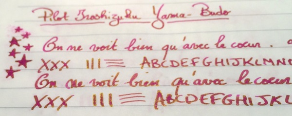
I have a new vintage Mentmore. It is a burgundyish/brownish marble pattern. I would like to ink it with something in the burgundy brown family, and I'm not a big fan of watery-looking inks(I know, then I should stay away from vintage, but the vintage are lovely writers and better values at this point). Has anyone had any luck with inks in this family that they have used in vintage pens for more than one or two fills, without incident? I have many brown around the home and I know my Yama-budo will be a no-no, though it would be aesthetically a good match. But form follows function...
-
Hello. I have acquired a very used Parker B5 Big Arrow on the Japanese used goods market. Reading the description on Parkerpens.net, it was offered in "black" (body color) for the period 1979-1981. However, the one I have acquired is an English "burgundy" with English black F refills (a black body color B5 must have American black F refills). I could not see any B5s other than "black" on ebay or in any other online vintage pen store. If you have any information on the standard color versions of this pen, refills, or other specifications, please provide them. My post will serve as a case report, but I would also like to know if the B5 is a model that specifies a black body color, refill country of manufacture, size, etc. Any and all information is most welcome and appreciated in advance. https://parkerpens.net/parkerb5.html *This is a reference video about B5. You can read the instruction manual for B5 in the program. (around 8 min 10 sec) https://youtu.be/SzhJTwD8Q3A
-
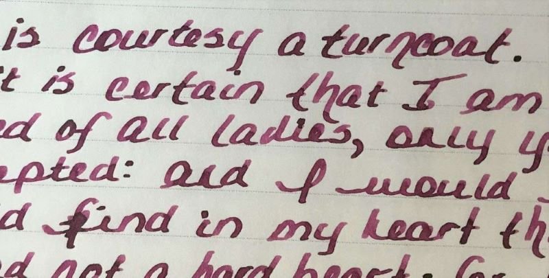
Hello FPNers - I’m searching for a burgundy ink that tends more toward purple than red. Purgundy? Burple? I like wet inks that are highly saturated, rather than milky or murky in appearance. Shading is nice, but not required. Thanks! GNL
-
TAG Kyoto – kyo-no-oto adzukiiro TAG is a stationary shop in Kyoto (Japan) that produces some interesting soft watercolour-style inks. With the kyo-no-oto series they produce a line of inks that replicates traditional Japanese dye colours. According to available online info, the manufacturing process of the kyo-no-oto inks follows traditional dying techniques dating back to the Heian era between the years 794 and 1185. The inks come in 40 ml bottles, packaged in luxurious thick paper with a texture that feels like heavy watercolour paper. In this review the spotlight shines on adzukiiro, a burgundy wine-red ink that really succeeds in its implementation of this fairly difficult colour. Often too red, too purple or too brown, but with adzukiiro the balance is just right - I like what I see! A fine ink for the autumn/winter season, and one that works well with all pens and nib sizes. I especially liked this ink in broad stubs, where the shading becomes truly beautiful … a really classy look. The ink is named after the colour of adzuki beans, which are the most important legume in Japan after the soy bean. Red-coloured adzuki beans were believed to have the effect of quelling negative vibes and bad luck, and were frequently used during ceremonial activities. The ink writes with good lubrication in my Safari test pens, not at all dry like some other kyo-no-oto inks. It easily handles the complete range of nib sizes, and manages to look well-saturated even with the finest nibs. Shading is subdued but definitely present, especially in the broader nibs. With wet pens and broad nibs, the dark parts look almost black, contrasting nicely with the burgundy lighter parts. The result just looks stunning! This is one ink that I will use primarily with very broad nibs. I’ve tested quite a number of TAG Kyoto inks to date, and most of them operate well above the average. With the kyo-iro and kyo-no-oto inks, TAG Kyoto has two well-performing ink families, that continue to impress me. Wonderful inks that totally fit my tastes. I’m really glad that I discovered them. To show you the impact of saturation on the ink’s look & feel on paper, I made some scribbles where I really saturated portions of a strip of 52 gsm Tomoe River paper with ink. This gives you a good idea of what the ink is capable of in terms of colour span. As you can see, adzukiiro has a medium colour range. The ink moves from a fairly light burgundy to a much darker – almost black – wine-red, while keeping a nice balance between these extremes. In writing, this translates to subtle shading which is aesthetically very pleasing. Shading keeps in the background with finer nibs (up to M-size). You really need broad and broader nibs to get the great-looking prominent shading that is – in my opinion – the selling point for this ink. The ink’s chromatography shows a wonderful complexity with different hues of blue, purple and red in the mix. The grey-blue dyes fix more readily to the paper, while the red dyes are much less water-resistant. The bottom part of the chromatography seems to indicate a small measure of water-resistance. But no… the water test clearly shows that what’s left on the paper is unreadable. Adzukiiro is not water-resistant at all. I’ve tested the ink on a wide variety of paper – from crappy Moleskine to high-end Tomoe River. On every small band of paper I show you: An ink swab, made with a cotton Q-tip 1-2-3 pass swab, to show increasing saturation An ink scribble made with an M-nib Lamy Safari The name of the paper used, written with an Esterbrook Estie with 1.1 stub nib A small text sample, written with a TWSBI VAC Mini with M-nib Source of the quote, with a B-nib Lamy Safari Drying times of the ink on the paper (with the M-nib Safari) This TAG Kyoto adzukiiro looks great on all my test papers. There is a tiny amount of feathering on the more absorbent papers, but you almost need a magnifying glass to notice it. See-trough and bleed-through are no issue – except with the Moleskine paper, but even here it is quite acceptable. Drying times vary widely with paper type: close to the 5-second mark with absorbent paper, close to the 15-20 second mark on paper with a harder surface. The ink looks great on both white and more yellow paper. Like many inks in this colour range, it’s difficult to capture adzukiiro’s true colour with a scan – it just looks too purple! For this reason, I decided to use photo’s of the writing samples – these best capture the ink’s natural colour. Below a more close-up photo of the ink. Just look at that beautiful shading in the word “Paperblanks” – black and dark burgundy from a 1.1 stub nib. This ink simply shines with extra-broad nibs! Writing with different nib sizes The picture below shows the effect of nib sizes on the writing. Kyo-no-oto adzukiiro can handle all nib sizes without a problem. With the EF nib, you still get a nicely saturated and lovely-looking line. For prominent shading you need the broader nibs though – B and above. Really worth it … adzukiiro looks at its best with these very broad nibs. Related inks To compare the wine-red adzukiiro with related inks, I use my nine-grid format with the currently reviewed ink at the center. This format shows the name of related inks, a saturation sample, a 1-2-3 swab and a water resistance test – all in a very compact format. This kyo-no-oto ink looks like a slightly more saturated version of Papier Plume Red Beans and Rice. Note that in this scan, both Super5 Australia Red and Diamine Merlot look too brown. In reality they are a much better match with adzukiiro … like I said before, these ink colours are devilishly difficult to capture with a scan. Inkxperiment – zen in the city With every review, I try to create an inkxperiment using only the ink I’m working on. Such a one-ink drawing is a great way to show off the colour-range nuances that are present in the ink. These inkxperiments are the favourite part of my reviews: always great fun and a good way to stretch my creativity and drawing skills. Modern life can get really hectic and stressful at times. I’ve just come to the end of such a period… we started this academic year at Leuven University in on-campus mode. After more than a full year of remote learning (a result of the covid19 virus), that meant there was quite a lot of IT-work to get our campuses ready for on-site mode… installing extra WiFi, CO2 sensors, … – as always – most of this last-minute 😉 At the end of such a busy work-day, I often take a walk at the nearby “Abdij van Park” … an oasis of zen, and an ideal environment to unwind. I tried to capture this zen-like moment in this inkxperiment… with the fisherman finding his place of quiet in the busy cityscape. I started with a quick outline sketch of the drawing I wanted to make. I used an A4 piece of 300 gsm rough watercolour paper, on which I drew a background with water diluted adzukiiro. For the city buildings, I used Q-tips and multiple water-ink ratios. The rest of the painting was drawn with an M- and B-nib Lamy Safari. For the darker subjects (train and electricity wires), I used an Esterbrook Estie with a 1.1 stub nib. Because adzukiiro scans badly, I used a photo to capture the true colours in this inkxperiment. The resulting drawing shows really well the colour-range nuances that can be achieved with this TAG Kyoto ink. I’m quite impressed with the broad tonal range that can be extracted from this one ink. A fine drawing ink! Conclusion TAG Kyoto kyo-no-oto adzukiiro is a well-executed wine-red burgundy ink. This one works with all nib sizes and with all types of paper. I especially liked this ink with super-broad nibs, where the shading becomes truly beautiful. Adzukiiro is also a great drawing ink, with a broad tonal range. Overall, another fine example of the craftsmanship of TAG Kyoto’s inkmasters. Technical test results on Rhodia N° 16 notepad paper, written with Lamy Safari, M-nib Back-side of writing samples on different paper types
-
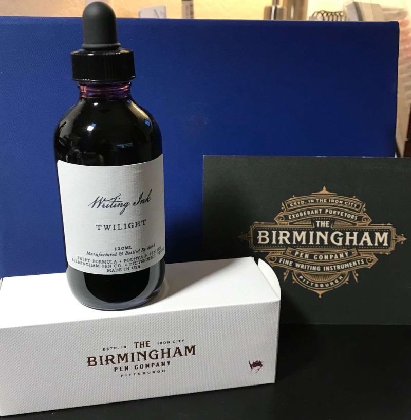
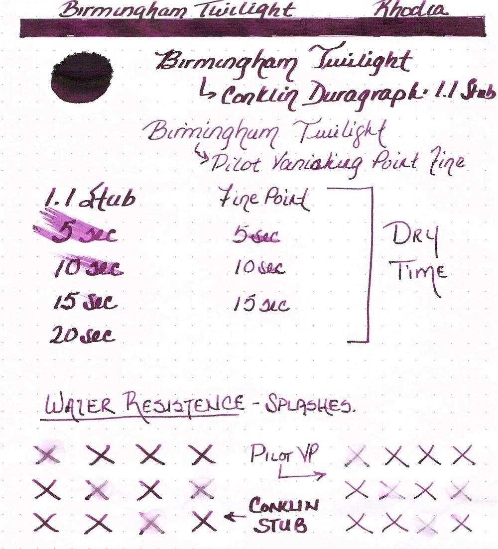
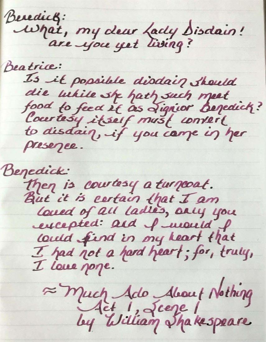
Ink Review: Birmingham Pen Company Twilight Background: Birmingham Pen Company (BPC) started as the brainchild of two brothers – Nick and Josh. Initially, Nick and Josh worked with third party ink producers in England and Germany to produce their inks. BPC started making their own inks over a year ago. While some changes have been made, their new formulations include “Crisp” inks designed for everyday use on all papers, “Swift” inks that are a bit wetter, starts up quickly and works well on premium papers, “Rich” inks which have high sheen and saturation, “Everlasting” inks that have high water resistance, “Twinkle” inks with shimmer and “Wishy-Washy” inks that are designed for performance but a washable from fabrics and surfaces. The glass bottles with tight-fitting plastic lids bottles are very nice and functional. My largest pen fits nicely into the bottle for a full fill. BPC offers three sizes: 30ml, 60ml and 120ml for all inks except the Twinkle inks which are only available in 60ml. The 120ml bottles have an eye-dropper lid instead of the regular lid. Review in Brief: Saturation: moderate saturation Sheen: some nice green sheen Shading: medium shading from fine to wider nibs Haloing: low Lubrication: medium lubrication Wetness: moderately wet Water Resistance: Moderately water resistant Feathering: minimal feathering on lower quality papers Bleedthrough: minimal only on lower quality papers and with high ink application Showthrough: medium showthrough on 52gsm TR paper, minimal on Rhodia and Apica Price: reasonable for 30mls, very good for 60ml and exceptional for 120ml which is the best value. While some inks retained the same name (or an abbreviated version), they may be slightly different. Ana at the Well Appointed Desk discussed this very well in her January 2021 blog (https://www.wellappointeddesk.com/2021/01/ink-brand-overview-the-new-birmingham-pen-company-inks/) The older version of this ink, known as Allegheny River Twilight, was review by craptacular in 2018. You will note that there is a difference between the older version and the new “Swift” formula. Pens: a Pilot Vanishing Point with a fine nib, and a Conklin Duragraph with a 1.1 stub nib. Papers shown: Rhodia, Tomoe River, Cosmo Air Light; Not shown: Apica CD Premium, Advantage 24 lb copy paper; Cambridge Premium Notebook paper. Rhodia Dot Grid Paper The ink is nicely saturated with some green sheen when pooled. The ink flows wonderfully in both pens. The Pilot VP has a very dry nib and is very particular about the ink it uses. This pen glides effortlessly with this ink. The Conklin Duragraph, on the other hand, is a very wet pen. The Twilight ink is almost too wet to use in this pen. The ink does dry fairly quickly on all papers tested but is slower on Tomoe River and Cosmo Air Light (20-25 seconds). he ink is surprisingly quite water resistant although it is not known as an “Everlasting” formulation. Feathering and bleeding are not seen on Rhodia, Tomoe River, Cosmo Air Light. There is some feathering on the 24 lb. copy paper, and minimal feathering on the Apica CD and premium notebook paper, and the three papers showed small amounts bleedthrough in heavy applications of the ink. Because this is a fairly saturated ink, there is showthrough on Tomoe River, Rhodia and Apica as well as the copy and notebook papers, especially with the 1.1 stub nib. Tomoe River Ivory Paper Tomoe River Ivory Paper Cosmo Air LIght Paper Apica CD Premium Notebook Paper The chromatography was simply done with a coffee filter. It shows how the ink color breaks down in to a complex variety of yellow, blue and red. Here are some color comparisons. Overall this is a very nice ink that behaves very well. I highly recommend giving this ink a try. Disclaimer: I purchased this ink directly from Birmingham Pen Company. Any photos, opinions and thoughts regarding the ink are my own and are not sponsored by Birmingham Pen Company and do not necessarily reflect their opinions.

-
Here is another sort-of pink ink that was generously donated by amberleadavis, famed Inky! En-Abe-Lawyer. Wancher is a Japanese concern dealing in pens and inks since 1987. This particular ink comes in a rectangular plastic bottle and is my first experience with the brand. With a heavier swab application, Evine can appear more burgundy. In the Kaweco lookalike Wing's 3007 it's more a soft, dusty pink. In contrast with De Atramentis Goat, Ebine seems a bit more dry going onto the paper, but not to the point of an unpleasant writing experience. Not at all water-resistant ... dries quickly enough for southpaw use. http://extras.ourpatioparty.com/files/2415/8933/0899/Wancher-640p.jpg The chroma seems to show a single component, but...is that a teeny turquoise halo at the very edge? http://extras.ourpatioparty.com/files/4415/8933/0899/Wancher_Chroma-640p.jpg It's perfect for spring.
-
Another quickie ink review, on one type of paper only, while I'm testing my (Extra) Fine-nibbed pens and trying to figure out what I want to do with my full ink reviews... Flow: Well/'wet' enough, such that writing produced with the Platinum DP-1000AN with EF nib does not appear dry, and the differences in colour intensity from the various EF nibs I used are not as pronounced as with other inks. Feathering: Effectively none on the Rhodia paper I used, even though the nib on the Sailor 11-0073-120 desk pen is so rough it tore through the coating on the surface of the paper, and got some fibres caught up between the tines a few times: Bleedthrough: Effectively none on the Rhodia paper I used. Drying time: Quick. After 10 seconds, smearing from rubbing with a dry fingertip was negligible. Water resistance: Not much. Shading: Not a whole lot from EF nibs, which is another testament to the ink being 'wet'. Sheen: There is a much darker outline visible when excess ink dries on the page, but not so different in hue than the ink itself that I'd call it sheen.
-
I recently acquired a 146 Bordeaux and that has a scratchy nib. I took a look at the nib with a 10x loupe and it appears the tines are not properly aligned. Does anyone know if Montblanc will tune the nib if I send it in for servicing? Or will they consider the nib damaged and require me to do a nib exchange? Note: I'll be sending it in for servicing anyways since it's scratched all over the pen, just worried they'll write-off the nib and make me get a new one. In which case, it would be better to send it off to get adjusted and ground down to a fine first.
-
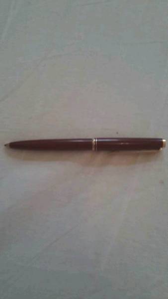
Hi all, can anyone help me to identify the following pen. A slim, burgundy pen with silver cap, having an ink window and piston filler... (I taped the filler because it was slightly leaking because of some small cracks) For further details please check the pictures. I'm rather new to fountain pens and have no clue about the brand, country of origin, age... there's no sign of any brand on the pen itself. I'm suspecting there might be some clue on the nib itself, but since I'm rather new to fountain pens I don't really know if/how I can remove the nib. Unscrewing the nib/feed section was not successful, I'm worried I would break something if I would try too hard to get it loose. (It came in my possession together with a Parker 45 Arrow) I would really appreciate getting any info about this pen. Kind regards, Pluym.
-
Hi All, Since Noodler's Waterproof Burgundy is no longer around, is there any waterproof (or incredibly water-resistant) burgundy ink on the market?? I've got waterproof inks in every major color except burgundy and it's driving me crazy! I'm also dreading the thought of having to mix my own with De Atramentis Document inks. Thanks!
-
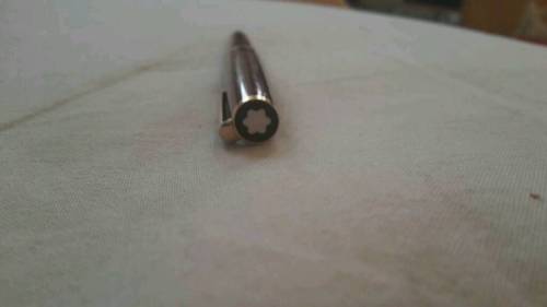
Hello everyone, thanks for the help. I recently won an Ebay auction for a burgundy Montblanc No. 12 and wanted to know if this model even comes in burgundy.
-
Early last year when my interest in the Japanese store-exclusive inks by Sailor began, and the inks were generally available, a generous FPN member sent me a sample of this ink. I think I'd seen a review or two and thought it looked very good. I didn't get a chance to try it out until recently, as reds are not my favorite. But this one is a nice deep burgundy color and quite pleasant. Pen and Message used to take reservations for the custom inks, but have abandoned that as it was taking too much of their time. Now, it'll just show up on the website (maybe) someday when it's back in stock. They have a poorly translated quote supposedly from Ernest Hemingway "Now is no time to think of what do not have. Think of what you can do with that there is." I think this means don't hold your breath. Sorry to post a review of an ink that nearly everyone will not be able to get. This is probably as bad as posting a review to a long gone MB LE ink. For this, I apologize. Tested on papers MvL=Mohawk via Linen, Hij=Hammermill 28lb inkjet paper, TR=Tomoe River. The color seems reasonably accurate in these iPhone 4 photos. Unusual I know. The ink has a bit to water resistance, but given the heavy dye load, that tends to run and create something of a mess. As typical for Sailor, a most unusual wet-paper-towel chromatography. But when washed, the main dye seems to overpower everything else.
-
Has anyone tried heat setting the Aurora optima feed? Technically it should be possible because the feed is made of ebonite. Are there any caveats, warnings that you guys have run into while trying to heat set the feed? I have heat set several other pens like my piston filled OMAS milord and Indian pens like the Airmail 71J and 69EB with good results, so I know the process. I just want to make sure I'm not doing something that could harm the pen's finish, material etc. as this is my first Aurora. Thanks in advance!
-
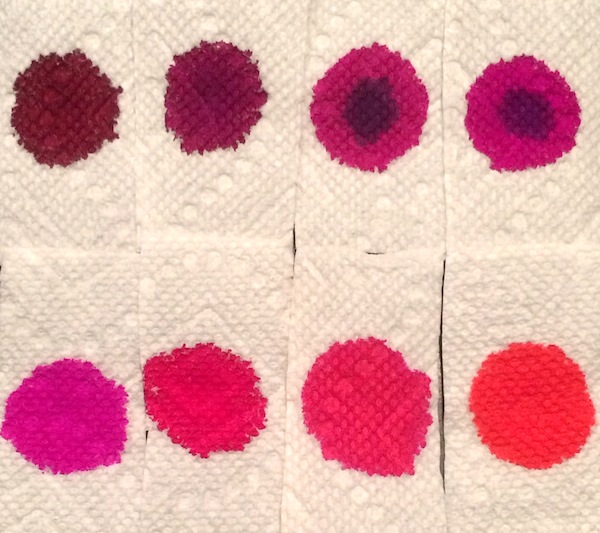
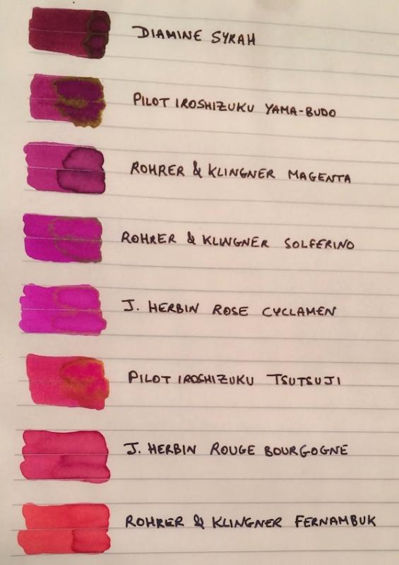
I've been wanting to try some kind of pinkish ink for a while. I didn’t want a pastel or cotton-candy pink, but other than that I was pretty open, so after going through the FPN boards and using the Goulet swatch tool, the eight finalists ranged from burgundy to magenta to purplish and reddish pinks: Diamine Syrah, Pilot Iroshizuku Yama-Budo, Rohrer & Klingner Magenta, Rohrer & Klingner Solferino, J. Herbin Rose Cyclamen, Pilot Iroshizuku Tsutsuji, J. Herbin Rouge Bourgogne, and Rohrer & Klingner Fernambuk. Although I liked some of the colors, I didn’t see myself using pink enough to warrant buying a full bottle (given that I am trying, though not very well , to stick to a stricter ink budget). I didn’t want the samples to go to waste though so I thought it might be helpful to post a comparison on here for anyone else who might also be thinking of going “pink.” The writing samples were done on Rhodia using a random steel nib pen (that I use as a dip pen) and a Pilot Custom 74 B nib ground down to a smooth stub by Mike Masuyama (also used as a dip pen to be able to test all the colors quickly). I’ve included a second set of samples on Tomoe River Paper, since some of these inks (especially given their sheen) could make for beautiful options for special letters, cards or notes on heavily "sheening" paper. PS I would need to ink a pen with it to accurately test its smoothness and flow, but if I had to pick one pink ink that I could see myself using often enough to purchase a full bottle it would be R&K Magenta. Which one of the eight would you pick? 1. On Rhodia: Closeups Ink Swabs 2. On Tomoe River Paper: Closeups Highest "Sheening" Ink Close-up Ink Swabs 3. Ink on Paper Towel: Top Row: Diamine Syrah, Pilot Iroshizuku Yama-Budo, Rohrer & Klingner Magenta, Rohrer & Klingner Solferino Bottom Row: J. Herbin Rose Cyclamen, Pilot Iroshizuku Tsutsuji, J. Herbin Rouge Bourgogne, Rohrer & Klingner Fernambuk
-
This is a review (full review here) of the old Monteverde Burgundy. The new bottles are not available in my country (still looking for someone visiting America who I can ship it to economically) so I cannot compare the old with the new. I bought this bottle early last year (when our currency didn't bottom-out yet against the USD) to use for annotation—I'm a law student. For this purpose it is quite good with excellent dry times paired with a Plumix and it contrasts well with black printed text. It is quite a muted colour though, so its usefulness in annotation work relies more on colour contrast than brightness. It has no problem being used to write the main text and I would have no worries using it for my notes, but I haven't yet tried. It will not pair well as an alt-colour with a bright blue or an ultramarine. It goes great with blue-black or black. Comments on how to improve the review (especially what you want to see) are quite welcome. All I know is that I need to desperately improve my handwriting.
-
Long ago, back in 2013, I traveled to visit friends and didn't want to take ink on the plane. So I bought a bottle at a local shop. I'd only had one ink at that time, a black, so I wanted something different. The shop didn't have a large selection but there were maybe a dozen Noodler's inks to choose from. So I ended up with Noodler's Beaver. This isn't an ink that you hear much about on the forum. I don't really know why. A lot of times when I look at my writing with this ink it almost looks like a muted burgundy than a brown. It almost reminds me of KWZ Brown Pink, but it doesn't have the kind of shading that ink has. Anyway I've always liked this ink, and finally have gotten around to actually reviewing it. The usual papers: MvL=Mohawk via Linen, TR=Tomoe River, Hij=Hammermill 28 lb inkjet. Not water resistant, but that wasn't expected. A most unusual droplet color.
-
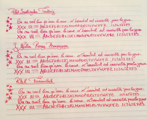
This is my second favourite ink from Pen & Message shop after, obviously, Cigar. I have been wanting to use this for a while now, but kept using other inks that i have. Writing Sample: http://i.imgur.com/MfwZVGE.jpg Close-up: There is some sheen, but if you use a hosepipe BB nib, you should be able to get more sheen out of it. Due to my handwriting being relatively small, i cannot use such nibs. http://i.imgur.com/05Ihxnm.jpg They recently changed the label of on the boxes, so here is an obligatory picture of both the boxes. http://i.imgur.com/9Pz2h4D.jpg This is my favourite burgundy ink, unless of course i manage to get something else from sailor, and i do have 3-4 burgundy inks waiting to be used. Only thing I do regret is not choosing a better Graphilo notebook. This one is so thick (188 pages 80gsm) that by the time i reach the end of the page, i find it hard to support my hand for writing. Hence, the irregular writing at the end. Waterproofness and drying times isn't much of an issue for me, so I've skipped that. In case anyone is interested in that, I'll be happy to add them. Thank you.
-
I found this one for a suspiciously good price... it looks like a Burgundy Cruise Collection but the trim is gold, none of the Cruise Collection have gold trim. And yet... here's what looks like a genuine (but vintage) Montblanc burgundy with gold trim that has a similar shape: http://www.ebay.com/itm/EUC-BOX-Montblanc-Classic-Burgundy-Bordeaux-Gold-Ballpoint-Pen-VINTAGE-RARE-/172121724109 So -- what are your thoughts. Is the 'mystery' pen real or fake?
-
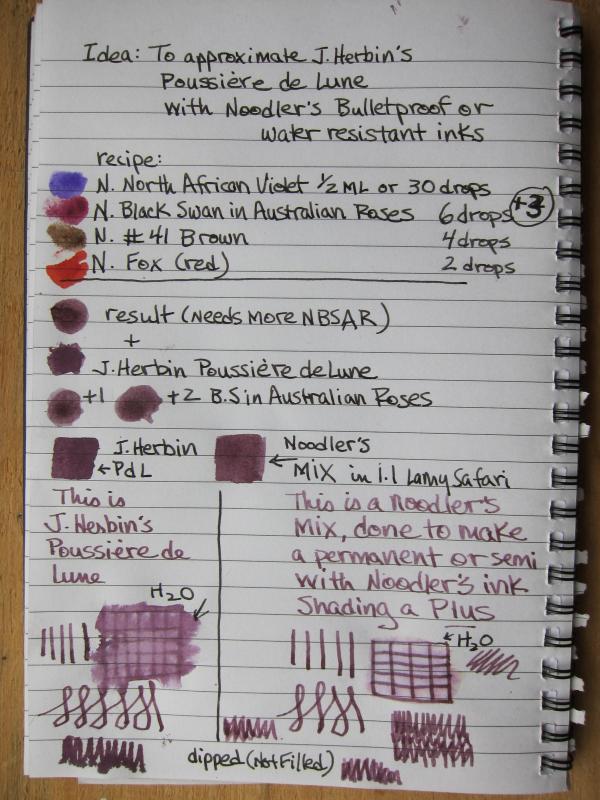
Hi there. This is my first post and effort, so please excuse any mistakes or errors. It is on the cheapest notebook paper. Like many, I've been seduced by J. Herbin's Poussiere de Lune, but was disappointed with its lack of waterproofness. Having a selection of Noodler's bulletproof, waterproof and semi-waterproof inks on hand as well as a painter's eye, I thought, why not? Here is my first effort at trying to replicate JHPDL with 4 Noodler's inks, a sample vial and blunt tipped syringe. the recipe (ALL Noodler's): North African Violet - 30 drops (or 1/2 ml) Black Swan In Australian Roses 9 drops #41 Brown 4 drops Fox (red) 2 drops It appears to be nice and shady, nearly waterproof, and no problems with the mixture itself. All can be done with a syringe, empty sample bottle and the four colors (in sample form) I think it's pretty close. (please note: I used a Lamy Safari with a 1.1 nib, dipped, not filled) What say you?
-
On the 30th of October, I received an email from Brian Gray saying my pen was dispatched. I was waiting desperately for it since then. However things took a wrong turn when I saw that my pen went to Brazil instead of meeting me here in India. I waited for a couple of days and called Brian and requested him to take a look at it. He immediately contacted USPS and found that they filed their paper work to Brazil instead and asked me to wait for a couple of days more. He asked me not to worry about it and if required he said he will make another pen for me from the same material or will offer me the Artist Proof of the Glenmont 2014 LE. I waited for a week and there was no change on the USPS website. I called up Brian again, and he asked me which option I preferred. I said I am fine with the Artist Proof (LE AP). He dispatched the pen on the 26th of November and it arrived today, on the 17th of December. Wow...what a pen!!! Words can't do justice to the beauty. One has to look at the pen in person to appreciate it. Craftsmanship is amazing with great attention to detail. In short, the pen was oozing quality. Usually pens that look great end up not writing that great and that shatters the experience, but this one wasn't like that. It wrote perfectly out of the box, I had asked Brian for a 1.1 mm stub and it writes exactly the way it should. Nib has just the right amount of tooth that I like. My apologies for the horrible photography. I miserably failed to capture the beauty of the pen (this is from the mobile phone). Writing sample: Engraving: The Point: Pen chilling out: I love the pen so much for the following reasons (it deserves anywhere between 9.5 and 10 out of 10 points)- Pen looks and feels rock solid, yet surprisingly light for its proportions. The stress points like the cap lip etc. are made very thick and won't break easily. The stub nib tuned by Brian is a dream to write with. Brian's customer service is top notch, probably the best I've seen till now. I already see some people staring at the pen in envy! Whatever the reason is, I got the Artist Proof of the Limited Edition which is a special thing, sounds more unique to me. I take the opportunity to thank Brian for the very very special pen and the best customer service for which he is well-known across the world. Will post better pictures once I have them.
-

K W Z I - Konrad - #81 - Iron Gall - Ig Cherry
amberleadavis posted a topic in Th-INKing Outside the Bottle
http://sheismylawyer.com/She_Thinks_In_Ink/2014-Inklings/slides/2014-Ink_2068.jpg -
First review. This is of Papier Plume's hand-bottled ink, Burgundy, which can be found at papierplume.com or in their shop in New Orleans. It's a nice ink that performs well in italic or flex nibs. My review was color-corrected to represent an accurate scan of the ink. Feathering of the ink is actually zero to very minimal, but my image resolution makes it look a little higher, unfortunately.
-
Shawndo Sample Mayhem - De Atramentis - Saint Laurent - Wine Red
amberleadavis posted a topic in Co-Razy-Views
http://sheismylawyer.com/She_Thinks_In_Ink/2014-Inklings/slides/2014-Ink_1880.jpg -
Think of Co-Dependent Ink Enablers. Hi, I'm Kettle. I'd like to introduce you to my buddies. My fellow FPNers have been kind enough to indulge me in this latest Crazy-Review by Two. I'll let you see the damage. http://sheismylawyer.com/She_Thinks_In_Ink/2014-Inklings/slides/2014-Ink_507.jpg http://sheismylawyer.com/She_Thinks_In_Ink/2014-Inklings/slides/2014-Ink_507b.jpg
-
http://sheismylawyer.com/She_Thinks_In_Ink/Inklings/slides/2013-Ink_736.jpg http://sheismylawyer.com/She_Thinks_In_Ink/Inklings/slides/2013-Ink_736b.jpg


desaturated.thumb.gif.5cb70ef1e977aa313d11eea3616aba7d.gif)