Search the Community
Showing results for tags 'blue-black'.
-
Manufacturer: Parker Series, colour: Super Chrome Blue-Black Pen: Waterman Hemisphere „F” Paper: Image Volume (gramatura 80 g / m2) Specifications: Flow rate: good Lubrication: good Bleed through: unnoticeable Shading: noticeable Feathering: unnoticeable Saturation: very good A drop of ink smeared with a nib The ink smudged with a cotton pad Lines Water resistance Ink drying time Ink drops on a handkerchief Chromatography Sample text in an Image Volume (80 g / m2) Sample text in an Oxford notebook A5 (90 g / m2) Sample letters in a Rhodia notebook No 16 (90 g / m2) Sample letters in a Clairefontaine (120 g / m2) Palette of shades
-

Four Ostrich iron gall blue-black inks: A Serial Review
PithyProlix posted a topic in Ink Comparisons
What’s a ‘Serial Review’? Instead of tackling a comprehensive review of four inks in one shot with the result that I’d probably never do it, I’m creating a review with smaller, bite-size chunks. I plan to add more parts of the overall review in the future, all in this thread. In future ‘episodes’ I plan to show writing examples with fountain pens (Japanese fines, most likely, and perhaps some flex nibs) and on different papers, examine each ink’s properties (flow, feathering, sheen, etc.) with some detail, color change over time, and compare with other iron gall inks I have. Episode 1: Background & First Impressions I have several PenBBS inks and inks from the Ostrich Flower series and I've been very happy with those products, with very few exceptions. I have been super-curious about inks that are not widely available outside of China and have been exploring various brands the past few months. The latest exploration is four Ostrich blue-blacks, supposedly all iron gall, made by the Tianjin Ostrich Ink, Co., an ink maker that has been in business since 1935: 223 (48 ml bottle) 313 (55 ml bottle) 553 (60 ml bottle) 903 ‘Tianjin Museum’(60 ml bottle) I’m not sure but I believe this may be the first non-Chinese review of these inks. Background I noticed Ostrich’s four blue-black inks online when researching their Flower series inks a couple years back. I wrote the company, asking which of their blue-blacks are iron gall. The somewhat vague initial response was, in part, “We have two types of blue black ink.” so I replied with the same question. This time, the response was “All blue black of ours are made of iron gall. Only the differences of formulations.” [sic] Many of their ‘normal’, workhorse writing inks – blues, blue-blacks, blacks, reds, and a green – have been available off and on from the Lazada and Shopee shopping sites here in Thailand. Lazada and Shopee are Amazon.com-like sites, with country-specific sites in many SE Asian countries (and I see that Shopee has spread to some South American countries plus Mexico & Poland). The price has been OK – while low, still a bit expensive for workhorse Chinese inks – and it wasn’t until recently that I saw prices that were low enough that my curiosity could be satisfied with minimal guilt about spending money on ink I really don’t need. I ordered from Lazada, here. (Link is not an affiliate link - I make no money.) The lower price bottles – 223, 313, & 553 – range from about $2.50 to $3.00 USD, with a fairly similar price per ml. 903 is about $5.25 USD, with a significantly higher price per ml than the others. The total for the four bottles shipped and after a small promotional discount was the equivalent of ~$13.25 USD - approximately $0.06 USD per ml, which is quite low (and with proportionally low guilt). You can find at least some of these inks on AliExpress, but at higher prices. I put in the order 7 days ago, the inks shipped from China, and they arrived today, which is a typical amount of time for goods purchased on Lazada and imported from China to arrive here. Since I live way out in the country, about as far away in Thailand from Bangkok as I possibly could, it typically takes an extra day or two. Packaging The boxes look ‘classic’, not cheap, with professional-looking labelling that is nothing like many of today’s ‘boutique’ inks. Same for the bottles, all of which are classic-looking stout, glass bottles that are unlikely to tip over. Each bottle has a single label. You might have noticed that there are emus rather than ostriches on the labelling. (While I do like the name ‘Ostrich Ink’, I think ‘Emu Ink’ has a better ring to it. That said, the Chinese word for emu is a bit drab …). 223 and 313, which have similar caps that come off with a mere 2/3 of a turn, were packaged in clear plastic, zip-lock bags inside their boxes. Packing was adequate - the boxes arrived with no damage and there was no leakage. Box Front & Back Box Top & Bottom Box Sides Bottle Front & Back Bottle Side & Top Odor Note: I have a slight cold so take these with a grain of salt, please: 223 – To my nose it is a pungent & sweet odor very similar to the smell of Hero 232, another Chinese iron gall blue-black ink. 313 – Not very pungent and sweeter than 223 but not as sweet as the Rohrer & Klingner iron galls, Salix and Scabiosa, and Pelikan 4001 blue-black, another iron gall ink. (These German-brand iron gall inks all smell like some kind of sweet liqueur, at least to me.) 553 – Same odor as 223. 903 – Supposed to be “teak” scented but my nose isn’t picking that up. The least pungent and most sweet of these four Ostrich inks. But not as sweet as the Germans. Enough Boring Stuff: On With the Show I pulled out a dip pen with a “1” nib, a glass pen, a piece of Kokuyo Campus loose-leaf paper (WCN-CLL1110 – I believe this might be the old version of Kokuyo’s Sarasara, their smoother paper. It’s a fairly creamy color.), and a Rhodia pad and went to town. You can see the results below. Mobile phone photos in indirect afternoon sunlight. (I believe I must have had Hero 232 on my mind …) Kokuyo Rhodia Color and Behavior on Paper: Initial Impressions Notice that 223, 313, & 553 look the same! My initial impression is that there might be some differences in flow between these three and then there’s the different odor of 553 but, given that the Ostrich rep indicated to me that there are two types of blue-blacks, it very well could be that they are pretty much the same. I’m confident we will find out more about this in a future episode of this serial. 903 is, however, very different. While much darker it seems much more a very rich blue than a blue-black. Not a stealth black, however. Note 903’s feathering, which is unacceptable on the Rhodia paper and a little on the Kokuyo. There’s also lots of bleed-through (not shown here) and 903 has a thicker line than the others, even with the glass pen. Don’t be quick to judge - the dip pen really lays on the ink, as can the glass pen. And, on initial impression, 903 has a quick flow. Again, we’ll see more about the feathering, bleed-through, etc. in a future episode. Fading I am writing this review episode about 3 hours after I used the ink and there is very little, if any, fading of the blue color in any of the inks. I think this may be quite different than the other iron gall inks that I have experience with. Hero 232 fades towards grey much more quickly, for instance. Sheen All these inks have visible rosey gold sheen, much more prominent on the Kokuyo than Rhodia, as expected. 903 has relatively much brighter sheen, which, unlike the others, seems to tend to spread out and make more of a halo effect. All the images below are from the Kokuyo example. 223 313 553 903 [Lighting conditions changed during the last photo.] Chromatography Just ‘poor man’s’ chromatography for this pilot episode: a drop of ink on a napkin. Again, 223, 313, & 553 look the same. Also, based on this rough chromatography, I believe there is a good chance that all these inks use a single dye. Water Solubility Iron gall inks have a reputation for permanence. About an hour after I finished writing the Rhodia sample I got a small paintbrush, repeatedly dipping it in water to keep it wet, and I brushed the large numbers written with the dip pen and all the glass pen writing. Only a slight bit of 223, 313, & 553’s dye is moved – pretty amazing. More of 903’s dye is moved by the water but plenty of the ink remains in place. Watch this thread for new Ostrich blue-black review episodes! -
Hello! I have come to all of you for assistance, dear pen friends! I have been on the search for the perfect Blue-Black, one that behaves well on poor paper, one that doesn’t fade(like Salix), one that has a nice, saturated colour, and one that doesn’t make your nib size larger. (like Noodler’s 54th Massachusetts from what I have read) Thank you for all your help in advance! Cheers, Ian
-
Here is a brief review of a double concentrated Pilot Blue-Black ink. A prelude. Or a kind of I have always been fascinated with this ink. For a bunch of reasons except one: it is rather lifeless. Then I used it in my modern Duofold (with the damn hole in the cap causing evaporation) and found out this ink can be gorgeous with a lot of gravitas, beautiful shading and some sheen... if evaporates a bit. Pilot Blue-Black standard concentration properties summary A couple of positives of this ink (in the normal 100% concentration): 1) VERY cheap if you get a 350ml bottle from Japan, it costs there roughly $12, 2) VERY water resistant, 3) (unlike most Blue-Black inks) when exposed to water it stays purely blue instead of black/grey, 4) flows well in any pen, 5) safe, 6) no strong smell, 7) while it stains, the stains disappear fully if well soaked/filled with a soapy (dish detergent) water with no other treatment required at all; it is also very easy to wash from clothes, leaving no stains. Aren't these 7 wonders of the ink? Well, yes, but despite all the positives this ink normally isn't what one would expect of a solid blue black. Honestly, it is quite dull. Say no to the dullness - let it evaporate So what did I do? I bought a 350ml bottle, filled my empty Edelstein Sapphire bottle (actually not the most lively ink either), folded a kitchen paper towel in 8 layers and fixed it with a rubber band to the bottle. Then put it in my desk (the place that is dark and dry - just like my soul). I had been checking it regularly, but cannot remember how long did it take to evaporate a half of the bottle, but roughly 2 weeks. And... see the result below. A lovely navy ink, very water resistant, with a sheen and shading. With no misbehaviour. And still very cheap. For this process the wider the open surface of the bottle is the faster is the evaporation. Sailor old style 50ml round bottle (reminding jar) would fit the best. On the contrary heating or exposing to sunlight would not be the best idea. Testing The paper used is Oxford 90g A4 optikpaper notepad (a coated paper like Rhodia etc.). The pen used is MB 146 from early 90s (1st gen. plastic feed) with M(edium) feed - a bit broadish but not the wettest. The photos were taken in a natural light (direct sunlight/2 sorts of a shadow). You can see the comparison of the ink in 100% and 200% concentrations, written with the same pen. The writing sample was kept in the notebook for 24 hours before performing the water test. It was left for 30 second under a tap. I went quite hard with cotton swabs, it even damaged the paper surface. UV resistance results (notebook vs. summer window) will be updated in 2 weeks. The inks does not bleed (except the cheapest paper in almost a toilet paper quality), does not feather. Conclusion While the standard Pilot Blue-Black is a very good ink it is not the best choice if you need a serious business ink. The double concentration will do the job. What a lovely colour, isn't it?! What a performance! And very, very cheap. As for the price, while the ink is cheap the shipping is tricky but for instance Mercari now and then offers discounts on shipping or even a free international shipping, like recently.
-

Inky T O D - Color Swatches - Blue/black - Please Post Your Pictures And Tell Us Your Thoughts
JimCouch posted a topic in Inky Thoughts
I was surprised to not find a samples topic for my favorite in color - Blue/Black. So here it is, post your Blue/Black swatches & thoughts here! -
.jpg.b08740b6c6188efe8ee4b9453b3b6be7.jpg)
-
.jpg.c57699dcc9f3a01a84a3977c044a67ee.jpg)
-
-
desaturated.thumb.gif.5cb70ef1e977aa313d11eea3616aba7d.gif)
Sheen from Platinum Blue-Black ink, in comparison
A Smug Dill posted a gallery image in FPN Image Albums
-

Informal Review - Noodler's - Blue Steel - Dallas Pen Show 2013 - Dromgoole's
amberleadavis posted a topic in Ink Reviews
http://sheismylawyer.com/She_Thinks_In_Ink/Inklings/2013-Ink_700.jpg http://sheismylawyer.com/She_Thinks_In_Ink/Inklings/2013-Ink_701.jpg
-
~ Fritz Schimpf & Pelikan: Höchste Qualität One of the pleasures of being active in the fountain pen and handwriting community is getting to know fine persons and organizations worldwide. After a day in the classroom I returned home to find a box from Fritz Schimpf in Tübingen, Baden-Württemberg, Germany. The excellent packaging and wrapping matched the equally high quality contents, including ink, paper and a fountain pen. A quartet of bottles of my beloved L’Artisan Pastellier Callifolio ink from Albi, Tarn Department, France. Fritz Schimpf Feinpost paper with envelopes and Fritz Schimpf Fritzrot ink, all special favorites of mine. A Pelikan Souverän M805 Blue-Black Italic Broad nib with a Fritz Schimpf Italic Grind. All arrived in top condition. The pen inked in Fritzrot writes as smoothly as melted butter on Feinpost paper. A wonderful start to the 2022 writing and sketching year. Tom K. Box from Tübingen Protective Wrapping Direct from Baden-Württemberg Ink Bottle Quintet Souverän M805 Blue-Black Pelikan Artistry Italic Broad Nib FS Italic
-
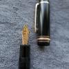
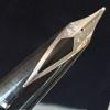
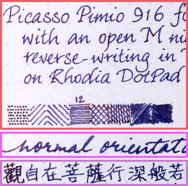
When it comes to cheap inks — both in terms of price per retail bottle and price per unit volume — from brands a fountain pen user outside of their countries of origin probably has heard of, it's hard to go past Hero inks. They even manage to "tick the box" when it comes to being primarily a manufacturer of fountain pens that also sell inks; some users seem to trust that inks would be safer to use if those are made by a "fountain pen brand". Out of the Hero inks, Hero 232 (iron-gall) blue-black and Hero 234 (carbon) black are probably the most well-known in the Western world. Now, of course some people think iron-gall or carbon/pigment inks implies high-maintenance and/or "damaging" to pens, and paradoxically trust inks of that type even less when they're cheap (and, well, Chinese). However, when I saw I could get some 56–60ml bottles of those Hero inks at prices per bottle of less than US$4 for Hero 232 and less than US$2 for Hero 234, I couldn't resist and wanted to satisfy my curiosity... by ordering a combined total of a dozen bottles — because the minimum shipping charges eclipse the bottle prices, but I found one seller on AliExpress with one (out of many listed) delivery method that carried a fixed charge for up to 11 bottles. (Just in case that didn't make sense, I paid for two lots of shipping charges — one per ink colour — even though they were from the same seller and in the same shopping basket. The total of twelve (4+8) was chosen because of my assumptions on the few sensible/viable options the seller had for packaging the items. Of course, my assumptions were subsequently proven wrong!) That was before COVID-19 turned the whole world upside down big time. Long story short, months went by and there was no sign of my order ever going to actually be delivered even though it was purportedly sent (in two separate shipments, with distinct tracking IDs, dispatched on the same day, so I didn't get "dudded" into paying two lots of shipping charges per se). The period of inactivity was so long that the tracking IDs disappeared, and were invalidated in Australia Post's system that once had visibility of them. AliExpress gave me a full refund for the order, including the shipping charges. Then, some weeks later, some of the bottles showed up. Not eight, not four, but nine in total over two packages, with no sign of tampering, or having been opened by Customs for inspection and packaged, etc. Given I'd already received a full refund, I didn't pursue why three bottles were missing and probably never sent in the first place. So, for readers who demand to know whether a reviewer got received the products being reviewed at no out-of-pocket expense on his/her part, I got my Hero 232 ink effectively 'free'. Not that it's any of their business; the colour, water resistance, etc. of an ink wouldn't differ on account of commercial circumstances. Now, onto the lazy review: Ink flow or 'wetness': All I can say is it's 'wetter' than Diamine Registrar's Ink, and it seems to flow fine in the EF-nibbed Faber-Castell pen I used when in normal orientation (as opposed to reverse-writing). Without filling the same pen with different blue-black iron-gall inks, I can't really tell you whether it's 'wetter' or 'drier' than Pelikan 4001 Blue-Black ink, for example. Drying time: Longer than I expected from an iron-gall ink. Feathering: None that I could see. Show-through: None that I could see. Bleed-through: None that I could see. N.B. I pressed really hard on the pen to get the broader lines onto the page, and every stroke is clearly visible from the verso side because I put deep creases in the paper with the nib doing so. Even so, there is no apparent feathering, show-through or bleed-through. Shading: Moderate within the first hours of laying ink onto the page, but I don't know whether it'll hold true in a day or a week after the iron-gall component 'cures'. Water resistance: Excellent, even after just a minute or two of getting onto the page, and notwithstanding that Rhodia Dotpad paper is somewhat coated (which really makes a difference to the apparent water resistance of such inks as Pelikan Edelstein Smoky Quartz). How much would I trust this ink not to 'eat' my pens? I see no indication that would lead me to suspect this ink would be any more unsafe than say Diamine Registrar's Ink, ESSRI, or KWZ Ink IG Blue-Black. How expensive a pen would I fill this ink with, then? My gold-nibbed Parker Duofold Centennial Big Red Vintage, for one; but then it's no secret that I regard that pen with disdain, and I see it analogously to someone unrefined but was born with a good family name, albeit the family has been two or three generations into its spectacular decline in achievement and community standing. I can still trust it's hardy and of good stock, and the pen and nib's material should stand up to the ink just fine, even if Parker can't make a fine, precise nib these days if it must to save its life.
-
KWZ IG Blue-black and R&K Salix fading and aging...and other blues.
Dimy posted a topic in Ink Comparisons
Disclaimer first: This test does not focus on fading under direct sun or UV exposure, it focuses on normal change in color that will be observed on these inks in what I assume is how most keep their work. Also I will try to keep things as consistent as I can but some variations may occur during the span of testing. I will try to update on any key variations other then weather outside. Storing and approach taken (inputs appreciated) The way the pages will be kept will be as follows : the pages will be kept in closed notebooks and will be used from time to time to see or check for color or such changes, the notebooks themselves will be kept outside the wardrobe in a well lit room. The works will mostly be closed for the test period otherwise. The results will be posted every month to see the change on all papers, point being to observe if page type will lead to any significant change. Any new ideas for the keeping of pages and such are welcomed and appreciated as it is long term test. Introduction and Idea The idea comes from general fading of IG inks and the way it becomes worry for obvious reasons. The subjects under analysis are KWZ IG Blue-black (the ink also is subject to more thorough analysis in other test, pls refer to ink review for that one) and other being R&K Salix as said in intro. The R&K Salix is not being analyzed the same way here as KWZ IG mostly due to net result being known, but the inks performance variation on different papers is not known so the test still serves some purpose (for me at least). Now the net result will also be published and matched along with other test result if someone wants to see them, else not much point as inks analysis is being done anyway. inks nature ( a personal take here on how each write) KWZ IG blue-black - A wet ink in all sense, minor bleed on cheap papers and no feathering seen. Very high water resistance. R&K Salix - Dry ink. Flow sees no issues, no hard starts or skipping seen during writing despite being dry ink. Works on all papers and shows no bleed or feathering on any paper. Pretty much water proof and sees no sign of even discoloring. Krishna Paakezah - Balanced flow ink, no skips or hard starts seen, no bleed or feathering on normal papers. Waterman Serenity blue - Balanced flow ink, no skips, hard starts. no bleed or feathering on normal papers. Some have noted bleed on very cheap papers and that is the case. Pilot Iroshizuku Shin-kai - Balanced flow, tending to wet. No bleed or feathering on papers. No skips or hard starts. The ink shows some feedback of nib and gives pencil like effect in nibs I tested, its very nice feeling when writing. Pens used the pens in order from left to right along with their respective characteristics rough idea Platinum preppy 'fine nib' - Writes dry, no skips and such just dry (some tuning was done to get such result thus statement of tuned in writing). Ink here is KWZ IG blue-black. Wality 69 EB Fine nib- Writes balanced and is and ED pen. Ink here is Krishna Paakezah. Oliver Exam demonstrator, Kanwrite FIne nib - writes wet. Ink used is R&K Salix. Camlin Trinity Fine nib- Feed modded for very wet flow. Ink used is KWZ IG Blue-black Ranga Slim Bamboo, Ranga Fine nib- 3in 1 using convertor in this test. Writes Balanced with tending to wet. Ink used is Pilot Iroshizuku shin-kai. Kanwrite Heritage, Fine Flex nib- Piston filler. Writes wet. Ink used in Waterman Serenity Blue. Intent behind using a dry and wet pen for KWZ ink is to create some level field for testing as direct comparison R&K Salix runs dry even on wettest of pens, the test aims to see what happens if ink on paper is reduced by significant margin and what happens if a wet ink is given a very wet pen, and if same ink is given dry pen. R&K Salix, being a dry ink as it is, I feel will yield poor result on dry pens in terms of ink quantity on dry nibs, I have not tested the ink on dry nibs and I won't either as chances of poor results in long term testing are feared, making idea of aging redundant. Papers used (and their respective nature) From poorest performing paper to best (pages from Nightingale are in no particular order as they all are good in their own way, my ranking thus comes from my requirement of no bleed or ghosting as top priority over other characteristics) I have or will add withing span of a week. Also companies are good at marketing and skipping important details.....that is to say they in many have not given GSM of notebooks 😠 I will approx for those pages, from what I know about them, corrections are welcome. Classmate copy register (50 approx GSM)- not FP friendly paper, highly absorbent nature, no sheen or shading seen here....this was really a disappointment considering all the marketing they do.... Taj White copy register (approx 60 GSM) - OK paper for FP for normal use only. Absorbent in nature, sheen and shade is minimal to absent. Nightingale 70 GSM- FP friendly to some extent, its quite smooth to write on, in a way that half decent inks don't bleed here. Absorbent paper and shows, low shading seen and sheen is seen but not much. 75GSM A4 spectra (office paper in all honesty) - OKish for ink pens...I guess. Bleed and feathering is not seen for normal inks. Absorbent paper by nature. Sheen is seen, not too high but present and Shade is low....(the result will be added in 2 days or so...I need to buy them, my bundle is finished so will add them later). Results added. Navneet youva (approx 60 GSM)- This one surprised me to some extent as I did not expected it to behave properly. Ranks higher for not showing bleed or ghosting on most inks. Still absorbent nature. Sheen is not seen, shade is minimum. It could be near 70 GSM by thickness of paper...they don't mention it so will give benefit of doubt. JK Cedar 100 GSM - FP friendly paper to good extent here. No bleed or feathering on any inks I have tested so far. Not too absorbent in nature. Sheen and shade are visible nicely. Its also my personal standard testing and using paper. Most I have are non standard papers so I apologies for that, thus is the reason for adding this section in particular. If anyone cares among these pages for daily, my recommendation is to go with higher GSM pages of nightingale or Classmate if wanting one of them, the option is there one has to look for it. Test itself All tests in this post are 5 min dry except for JK Cedar which was given 2 hrs to dry. All images are done with pea shooter camera and corrected to as close as possible. Images are quite close to real, not exactly same but close. 50 GSM Classmate copy test, dry time 5 min. pic taken on 7 jan 2021. Taj White 60 GSM approx paper. 5 min dry time. Pic taken on 7 jan 2021 Nightingale 70 GSM paper, dry time 5 min. Pic taken on 7 jan 2021. Navneet youva, 60 GSM approx, could be 70 GSM. dry time 5 min, Pic taken on 8 jan 2021 75 GSM Spectra copy paper. Dry time 5 min. Sheen is visible here, not too much but visible nonetheless for shading its still low. Black lines are Platinum carbon black. JK Cedar 100 GSM. dry time 2 hrs. Pic taken on 7 Jan 2021. Some Niccolo Machiavelli quotes just for fun of it and give some idea of writing (i know my writing is not good but its improving I promise...its now readable from whatever it was before 😅) Whats next and my limitations Apart from office page which I will add this week. I plan to write some more pages with both ink on JK cedar and keep them the same way I am testing if someone is interested I will do them, else not much of personal interest. I have never done a swatch sample before but I want to ask if I should add one for at least R&K Salix and KWZ IG Blue-black.....I probably wont do that for others, too much of personal hassle, but 2 main IG should be fine. Do tell if interested. My limitations are quite obvious, I lack any other nib variation apart from fine nibs and EF nibs so thats one main down. Second is lack of most common FP papers used like tomoe, Rhodia,etc. They are not economical here for me at least and I write a lot so I never bought them personally, I did have some in past but all are used now. Thank you for sticking with this one. -
Colour-wise, the comparison reminds me of Sailor Souboku vs Sailor Seiboku. Christine exhibits sheen, but not nearly as flamboyantly as Herbert.
-
-
-
-
Mont Blanc – StarWalker Blue Planet The 2020 Mont Blanc StarWalker Blue Planet fountain pen pays homage to our home in the universe, and calls attention to the dark blue water in earth’s oceans. Not surprisingly, Mont Blanc also released an accompanying dark blue ink, that is the subject of this review. The ink’s packaging looks lovely, with a design that provides an inspiring view of Earth as seen from space, with swirling clouds over blue oceans. In the box you’ll find a very nice 50ml bottle of StarWalker Blue Planet. StarWalker Blue Planet is a dark blue ink that moves towards blue-black territory, without actually getting there. It’s still without question a blue ink, but quite a dark one. I like blue-black inks a lot, and this one charmed me by keeping its blue origins, while at the same time being dark enough to offer a nice alternative to the more traditional blue-black. It’s also different enough from my other blue inks to make it stand out from the pack. I personally like the way it looks! The ink is well-saturated, and looks great in all nib sizes. This dark blue ink fits perfectly in the workplace, looking serious while still standing out from the standard blue and black crowd. A great everyday writing ink. Blue Planet has a limited dynamic colour range, without much contrast between the light and darker parts. The result is soft shading that – while very present – is never harsh, but looks elegant and pleasing to the eye. The shading is most prominent in nib sizes M and above, but even with EF/F nibs you see hints of shading that lend some character to your writing. I personally think this ink’s shading works brilliantly. On the smudge test – rubbing text with a moist Q-tip cotton swab – the ink shows a bit of weakness. Lots of visible smudging, but the text itself remains very legible. Further water tests show Blue Planet’s total lack of water resistance. All that lovely dark blue quickly dissipates, leaving next to nothing on the page. This is also apparent from the lower part of the chromatography, which shows that only some shadows of the ink remain on the paper. Drying times are close to the 5-second mark with the Lamy Safari M-nib test pen, making Blue Planet a relatively fast-drying ink. I’ve tested the ink on a wide variety of paper – from crappy Moleskine to high-end Tomoe River. On each scrap of paper I show you: An ink swab, made with a cotton Q-tip 1-2-3 pass swab, to show increasing saturation An ink scribble made with a Lamy Safari M-nib fountain pen The name of the paper used, written with a Lamy Safari B-nib A small text sample, written with an M-nib Source of the quote, with a Pelikan M400 F cursive italic Drying times of the ink on the paper (with the M-nib) Since this is my first review of 2021, I start with a new set of quotes for the writing samples on different types of paper. After giving it some thought, I decided to go with quotes from Isaac Asimov and his Foundation Series. I personally think these are relevant in the current geopolitical climate. Coming from a computer science background, I also appreciate Asimovs strong belief in the power of science. Since scans alone don't give a complete picture, I also add some photos to give you an alternative look at the ink. Mont Blanc StarWalker Blue Planet looks great on all my test papers, both the white and more yellow ones. The ink behaved almost perfectly. Only with Moleskine paper and printing paper did I notice a tiny amount of feathering. See-through and bleed-through are visibly present with Moleskine paper, but not an issue with the other papers in my test set. Like most Mont Blanc inks this is a well-behaving one. Writing with different nib sizes The picture below shows the effect of nib sizes on the writing. All samples were written with a Lamy Safari, which is typically a dry pen. I also added a visiting pen – a wet Pelikan M405 Stresemann with an F cursive-italic nib. In all cases, Blue Planet leaves a well-saturated line and wrote fluently with good lubrication. I also enjoy the soft shading of this ink, which looks really elegant. Shading is hinted at in EF/F nibs, and is very present in M-nibs and above. An excellent writing ink! Related inks To compare this StarWalker Blue Planet with related inks, I use a nine-grid format with the currently reviewed ink at the center. This format shows the name of related inks, a saturation sample, a 1-2-3 swab and a water resistance test – all in a very compact format. The grid format makes it easy for you to compare the Mont Blanc ink with similarly coloured inks. The ink looks different enough from my other dark blues to stand out from the pack. Inkxperiment – Yin & Yang As a personal experiment, I try to produce interesting drawings using only the ink I’m reviewing, keeping things simple and more-or-less abstract. Making these single-ink mini-pieces allows me to show what the ink is capable of in a more artistic context. For this drawing I started with a 10x15 cm piece of HP photo paper, on which I drew the background using a piece of foam and heavily water-diluted ink. I then drew in the dividing line, and darkened up the bottom part of the background. Using a yin&yang theme, I drew in some opposing features on the day & night side: sun vs moon, cityscape vs treeline. The resulting drawing shows quite well what can be achieved with this StarWalker Blue Planet as a drawing ink. Conclusion Mont Blanc’s StarWalker Blue Planet is a serious-looking dark blue ink. It’s hinting at blue-black territory without crossing that line. And it manages to do this well. This ink is a nice alternative for blue-black ink lovers. The ink works well with all types of nibs and a broad range of papers, showing some really nice and soft shading. Unfortunately: no water resistance. I quite enjoyed this Mont Blanc ink. Just be aware that it is a Limited Edition ink, so if you like it, now is the time to grab a bottle. Technical test results on Rhodia N° 16 notepad paper, written with Lamy Safari, M-nib Backside of writing samples on different paper types
-
Source: AliExpress PenBBS is mostly known for its pen models on English-language fountain pen hobbyist forums, but it also makes a heck of lot of different inks — including some pigment inks and shimmer inks besides dye inks — and releases sometimes ten, sometimes a dozen, or even two dozen new ink colours at a time in batches it refers to as ‘seasons’. Their relative obscurity in the Western world is understandable, though. Each ink is both numbered and named, but from what I've seen, the name of a particular ink is usually given either only in Chinese or only in English, never both. There isn't any apparent rhyme or reason in the product numbering, either; the twelve inks in the 18th Season are consecutively numbered from 290 to 301, while the ten inks in the 19th Season are numbered from 269 to 278, and the twelve inks in the 20th Season from 310 to 321. Then, some come only in 60ml bottles, some only in 15ml bottles, and some only in 35ml bottles. There is just no making sense of all that, which could serve to snuff out idle curiosity in the products. Furthermore, there seems to be some Customs regulations in China to prevent the export of ink by post, even though there has been some talk online about how cheap and easy it is to order PenBBS inks on Taobao. I have no idea how that works; I ordered mine on AliExpress — but, unlike for other Chinese brands of inks, there seems to be only one seller of PenBBS inks using that marketplace platform — and Customs in China intercepted the shipment on the seller's first attempt to ship my order (by EMS ePacket) and returned it to the sender. The seller made a second attempt at shipping, and the order eventually made its way to me in Australia the long way around moving through Europe. Anyway, here it is: PenBBS Fountain Pen Ink No.406 幽月繁星 is a shimmer ink from the 29th Season, and comes in 60ml bottles (with the labels stating “60±5ml”). 幽月 = dark moon; faint moon; pale moon 繁星 = myriad stars; metonymically a starry sky The marketing image for the ink depicts the colour and complexity of the ink pretty accurately, and I wasn't disappointed. (Scanned image of the writing sample sheet, downsized to match my MacBook Pro screen's pixel density of 114dpi) Sometimes sheen will show up even in scans; but not for this ultra-sheening ink! On Rhodia Dotpad 80g/m² paper: Drying time: If the ink mark is wet enough to exhibit sheen, then 20 seconds is just short of what it takes for the ink to dry Smudging after drying: It (turned out, after I had occasion to handle the the test sheet a fortnight or so after writing it, that it) can smudge, as the sheen component can be reactivated with just the microscopic beads of sweat on one's fingertips, but not quite as readily or badly as some Diamine ultra-sheening inks (e.g. Skull & Roses, Iridescink Herbert) Feathering: Not observed Show-through: Low to nil Bleed-through: Not observed Shading: Very little that can be observed, because when it's wet enough to show shading, it's also wet enough for sheen to manifest and cover up the darker shade(s) of blue-black Sheen: A crazy amount of bronze sheen, even on extremely fine hatching lines Shimmer: There appears to be at least two, if not three, different colours of shimmer particles in this ink: light metallic blue, silver, and perhaps (more sparsely) gold. It's pretty hard to tell, because I think the sheening component of this ink is so dense, it's outright obscuring some of the shimmer particles, and possibly making some others close to the surface appear to take on a different hue. It might not look as if there is a lot of shimmer in the writing in the photo above, but: shows a bit more, and then, once some of the colourants in the ink have been washed away: Water resistance: poor I think this ink certainly gives the sheening-and-shimmering inks in Diamine's Inkvent (aka Blue Edition) range some stiff competition. Unfortunately, this ink also makes my Sailor Fude de Mannen pen hard-start a lot, if I just pause for 30 seconds without capping it. You can see the letter l next to ‘20s’ in the drying time test being thin and pale, compared to the letters o and (more so) t next to it on the opposite side. I had to scribble on a scrap piece of paper and get the pen writing again, before putting down ‘lot’ next to ‘25s’ on the line below that. (How this came to be not quite a ‘lazy’ review: I put the remainder of the fill of ink into an F-nibbed Sailor pen later, by moving the converter across, to see if it has more of a problem with hard-starting or less. But, unless I can prove that the pen won't hard-start after a 60-second pause, I'll have to relegate this ink to the list of fun inks to use for calligraphy practice and/or writing on greeting cards, but not something I can use for putting my thoughts in a journal or jotting down notes on a notepad.) Putting PenBBS ink No.406 in a Sailor pen with a steel F nib, the colour looks remarkably similar to Diamine Iridescink Herbert, although the latter exhibited rather more sheen: and I was only able to get a tiny bit of shimmer from writing with the ink using such a fine nib: I still got far more hard-starting with the F nib than I would like; it would write after a 60-second pause, but resuming after a 90-second pause was an absolute struggle. I've since swapped a Sailor steel Music nib onto the pen, and it performs a little better in that regard. Still, this just isn't going to cut it as a general-purpose ink.
-
.jpg.df5e36d00ee52f782c2f0ecf3a263ac8.jpg)
-
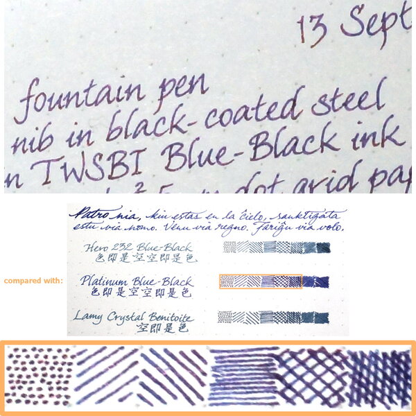
Close-up: Colour: Blue-black, as advertised; without being goes-down-blue, then-turns-black like iron-gall blue-black inks typically would, because as far as I'm aware this is a plain/standard dye ink without any iron-gall component (and with no water resistance) Flow: Slightly on the dry side of moderate, perhaps, on account of my being able to see a fainter line being left by the nib's slit along the broadest strokes Feathering: Not observed on Rhodia Dotpad 80g/m² paper, looking closely at the thinnest hatching lines, and words/glyphs ‘reverse-written’ with the nib upside-down (i.e. the bottom of the feed facing up) Show-through: Low to nil Bleed-through: Not observed Drying time: 11–12 seconds, which is relatively quick compared to most of the other inks I've tested or reviewed lately Smudging after fully dry: Didn't happen when I rubbed my thumb over the hatching/stippling panel and the largest Chinese hanzi characters Water resistance: So apparently poor that I don't think I need to soak some part of the sheet for an hour or so, to establish whether that would completely obliterate the marks made with this ink Shading: Moderate, without having too drastic a delineation between lighter parts and darker parts along the same pen stroke; can be seen even in very narrow ink marks (i.e. when writing with the equivalent of an Extra Fine nib) Sheen: None observed — and I checked with a loupe and a bright LED light Shimmer: None My thoughts: I can't imagine why I'd want to use a sombre blue-black ink that offers neither sheen nor water resistance, notwithstanding that this ink has a nice Delftware kinda colour as far as blue-black goes; but I suppose if someone wanted a blue-black that is cheap, and easy to clean from pens and/or after accidental spillage, this may well fit the bill nicely.
-
Manufacturer: Hero Series, colour: Blue-Black Pen: Waterman Hemisphere „F” Paper: Image Volume (gramatura 80 g / m2) Specifications: Flow rate: good Lubrication: medium Bleed through: unnoticeable Shading: noticeable Feathering: unnoticeable Saturation: good A drop of ink smeared with a nib The ink smudged with a cotton pad Lines Water resistance Ink drying time Ink drops on a handkerchief Chromatography Sample text in an Image Volume (gramatura 80 g / m2) Sample text in an Oxford notebook A5 (90 g / m2) Sample letters in a Rhodia notebook No 16 (90 g / m2) Palette of shades
-
Manufacturer: Parker Series, colour: Quink Blue-Black Pen: Waterman Hemisphere „F” Paper: Image Volume (gramatura 80 g / m2) Specifications: Flow rate: very good Lubrication: good Bleed through: unnoticeable Shading: noticeable Feathering: unnoticeable Saturation: good A drop of ink smeared with a nib The ink smudged with a cotton pad Lines Water resistance Ink drying time Ink drops on a handkerchief Chromatography Sample text in an Image Volume (80 g / m2) Sample text in an Oxford notebook A5 (90 g / m2) Sample letters in a Rhodia notebook No 16 (90 g / m2) Palette of shades
-
Manufacturer: Cross Series, colour: Blue-Black Pen: Waterman Hemisphere „F” Paper: Image Volume (gramatura 80 g / m2) Specifications: Flow rate: very good Lubrication: good Bleed through: unnoticeable Shading: noticeable Feathering: unnoticeable Saturation: good A drop of ink smeared with a nib The ink smudged with a cotton pad Lines Water resistance Ink drying time Ink drops on a handkerchief Chromatography Sample text in an Image Volume (gramatura 80 g / m2) Sample text in an Oxford notebook A5 (90 g / m2) Sample letters in a Rhodia notebook No 16 (90 g / m2) Sample letters in a Clairefontaine (gramatura 120 g / m2) Palette of shades
-
Thorough coverage of a range of blue-blacks. Well worth the watch. English subs.