Search the Community
Showing results for tags 'bleu austral'.
Found 6 results
-
desaturated.thumb.gif.5cb70ef1e977aa313d11eea3616aba7d.gif)
How-to: Set, or change, personal info that others can see about me
A Smug Dill posted a blog entry in Sus Minervam docet
It helps to explore this yourself, revisiting once in a while if need be, and keep in mind where each of those personal info fields are entered. Don't leave it until the urge to change something specific to come upon you, and only then bother to ask the question! Invest the time surveying upfront, instead of waste it later waiting for an answer from nobody in particular. Most of the fields shown above are self-evident as to what they are. I think the only ones that could do with explanation are: Security and Privacy: There is only one setting under there, and that is a toggle for whether your online status (including ‘last active’ date or time) is visible to others Content View Behavior: That has nothing to do with what others can see about you, but only where you would like to start reading when accessing content Enable status updates: This toggle enables/disables the public feed on your profile page; if you disable it, then nobody (including you) can post publicly visible ‘status updates’ or any other message against your profile, but if you enable it, then anyone — friend, foe, or complete stranger — can post something there whenever, without waiting for you to initiate and then only reply to what you wrote Notification Settings have nothing to do with what others can see about you, and so is out of scope for this article, and I'm not going to delve into those right now. (You can look here, here, and here to wrap your head around how notifications work with respect to followed content.) N.B. There is a possibility that some of the above settings and data fields may not be available to Bronze members and/or Silver members, but I have no way of testing that or scoping it out. — • — Another way of getting to the Edit Profile dialog, and the way to change your profile photo (or ‘avatar’), is here: — • — Freeform, custom member titles that one enters for oneself are long gone, and have not been a thing since FPN came back from a long hiatus and platform upgrade late in 2020. -
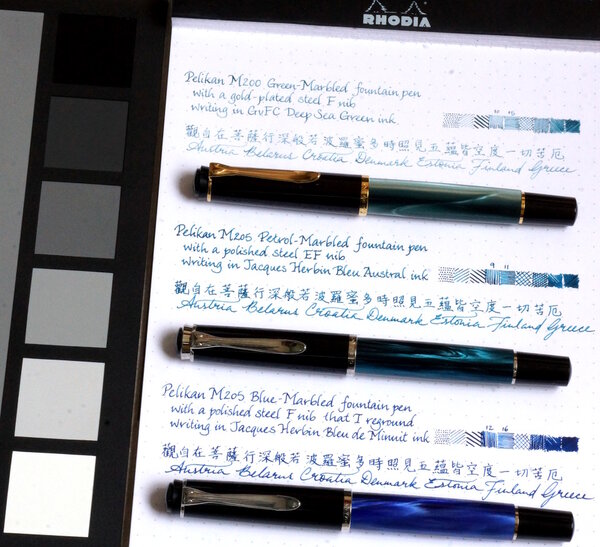
Matching inks to Pelikan Classic M20x pens - shortlist
A Smug Dill posted a gallery image in FPN Image Albums
From the album: Shades of colour
Shortlist of inks with which to fill some of my Pelikan M20x pens© A Smug Dill
- 0 B
- x
-
-
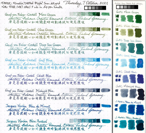
Jacques Herbin – Bleu austral La Société Herbin, Maître Cirier à Paris, was established in 1670. This makes J. Herbin probably the oldest name among European ink makers. Today, Herbin produces a range of beautiful fountain pen and calligraphy inks, writing instruments, gift sets and accessories. Herbin inks are made in France, and the finishing touches on the bottles are still done by hand in Paris. Like so many others, the company jumped on the premium product bandwagon, and started to release more high-end inks under the Jacques Herbin “Les encres essentielles” label. Nicer boxes, nicer packaging, much higher price (18,50 EUR versus the 7,50 EUR for the J. Herbin inks from the “La perle des encres” series). Nevertheless, I couldn’t resist and decided to test these new inks – are they really better than the standard J. Herbin inks? In this review, the spotlight is on Bleu austral, a strong blue leaning teal. The colour is really nicely done, and looks great on paper. The ink itself is wet-flowing and heavily saturated – in broad nibs it can even turn into a gusher. In my opinion, this is more of an ink for finer nibs and/or dry pens. Technically, the ink disappointed: it has a tendency to feather on more absorbent paper (even the one of high quality). You really need hard-surface paper for acceptable writing performance. Bleu austral is a heavy shader, and this in all nib sizes. Shading is never harsh and always looks aesthetically pleasing, due to the fairly small contrast range between light and darker parts. With wet pens, the ink really tends to oversaturate, which pushes away the shading. I therefore recommend using Bleu austral in combination with drier pens and/or fine nibs. To illustrate the ink’s colour span, I did a swab on 52 gsm Tomoe River paper where I really saturated portions of the paper with ink. This clearly demonstrates the ink’s dynamic range. On the smudge test – rubbing text with a moist Q-tip cotton swab – there was lots of smearing. The text itself remains very readable though. Water resistance is fairly low. There remains a greyish residue of the text on the page, that is still easily readable, but most of the colour disappears. This is clearly visible in the chromatography: the blue colour dissipates with the water, leaving only a grey residue behind. Not what I would call a water-resistant ink. Drying times for this Jacques Herbin ink vary with the type of paper, ranging from less than 5 seconds on absorbent paper to 10-20 seconds on hard-surfaced paper (all with my Lamy Safari M-nib test pen). With the absorbent paper, I see quite some feathering – even on higher quality paper. You also get a fair amount of see-through and bleed-through. This ink is definitely picky in the type of paper it prefers. I’ve tested the ink on a wide variety of paper – from crappy Moleskine to high-end Tomoe River. On each scrap of paper I show you: An ink swab, made with a cotton Q-tip 1-2-3 pass swab, to show increasing saturation An ink scribble made with a Lamy Safari M-nib fountain pen The name of the paper used, written with a Lamy Safari B-nib A small text sample, written with the M-nib Lamy Safari The source of the quote, written with an Edison Collier with 1.1 stub Drying times of the ink on the paper (with the M-nib Safari) Bleu austral looks equally good on white and more creamy paper. For my personal taste, it is way too saturated though – I definitely prefer a softer look in my inks. Since scans alone don’t tell the complete story, I’ve added some photos of the same writing samples to give you another view on the ink. Writing with different nib sizes The picture below shows the effect of nib sizes on the writing. All samples were written with a Lamy Safari, which is typically a dry pen. I also added a visiting pen – a wet-writing Edison Collier with a 1.1 stub. With the wet pen or with broad nibs in dry pens, the ink leaves an overly saturated line, and loses much of the shading. I personally prefer this ink in combination with a dry pen (M-nib or below) – it simply looks nicer: a blue-heavy teal with subtle shading. The wetter the pen, the darker and more one-dimensional the ink becomes. Related inks To allow for a good comparison with related inks, I employ my nine-grid format, with the currently reviewed ink at the center. Each grid cell shows the name of the ink, a saturation sample, a 1-2-3 swab and a water resistance test – all in a very compact format. As you can see, there is quite some competition in this colour segment. Personally, I would rather avoid the technical issues of this Jacques Herbin ink, and go for one of the other options. Inkxperiment – river goddess As a personal challenge, I try to create interesting drawings using only the ink I’m reviewing. With these monochromatic pieces, I get to explore all the colour-range nuances that are present in the ink. This is my favourite part of the review: experimenting with the ink, and trying to be creative… pure quality time! We recently had some severe flooding in our part of Europe. Rivers, that are normally leisurely meandering in a peaceful landscape, turned into wild and angry monsters that threatened lives and property on their shores. In ancient times, such behaviour was usually attributed to the whimsical mood of the river goddess. Wild waters were a sure sign that the goddess was displeased with her people. I tried to capture this idea in the inkxperiment, that shows the goddess against the background of a wild and choppy river. For this drawing I used an A4 piece of HP photo paper, which is my favourite medium for doing inkxperiments. The photo paper really brings out the best from the ink. I first created the river background with the wood flotsam. I used painter tape to cover up the flotsam part, and used a cut-out piece of kitchen towel to paint in the choppy river. For this I sprinkled different water/ink ratios on top of the kitchen towel, which then pressed through to the underlying photo paper. I then used a piece of cardboard and pure Bleu austral to paint in the flotsam. Next, I painted in the river goddess with a fine brush, and used a small triangular potato cut-out to stamp in the different triangles. I finally used my B-nibbed Safari pen to add some finishing touches. The resulting piece gives you an idea of what can be achieved with Bleu austral in a more artistic setting. Conclusion Jacques Herbin Bleu austral is a nice blue-leaning teal. The ink is very saturated though, and – in my opinion – too much so in wet pens or with broad nibs. The ink also has technical shortcomings, and doesn’t cooperate with more absorbent paper. For a premium product, I had higher expectations. In my opinion, this ink is not really worth the premium price: there are lots of other inks to choose from in this colour spectrum. Technical test results on Rhodia N° 16 notepad paper, written with Lamy Safari, M-nib Backside of writing samples on different paper types
-
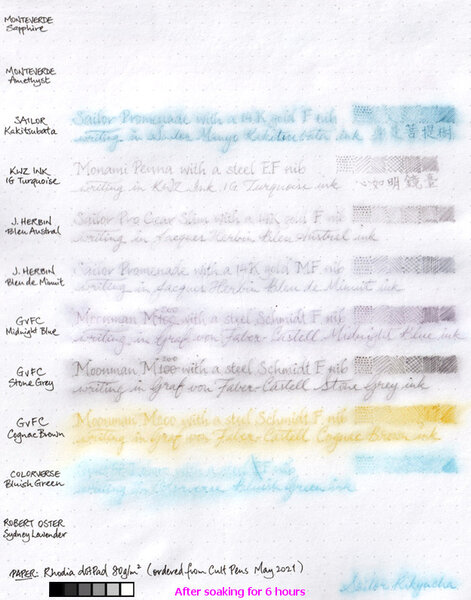
From the album: Ink performance testing
I didn't really set out to test the water resistance of these inks; I'd wanted to compare the paper in two different Rhodia dotPad No.16 notepads ordered a couple of years apart, and these inks just happen to be in pens that are on hand and ready to write. Graf von Faber-Castell claims its inks are indelible. Well, I guess the water resistance of the three I tested here aren't bad. Even though it'd be a struggle to read what was written in GvFC Cognac Brown after a long soak, I must say what's left of the marks on the page are distinct enough to make the text legible if one really tries. I am pleasantly surprised by the water resistance of the two Jacques Herbin inks, even if they aren't are good in that regard as GvFC. I'm disappointed to the same extent that the two Monteverde inks were washed away without leaving a trace.© A Smug Dill
- 0 B
- x
-
I find this ink mesmerizing, even though my first thought with interior lighting was: oh no, another green! In sunlight it seems to sit precisely at the border between green and blue. It's expensive, luckily it was a gift, there are probably quite a few alternatives. If you need an excuse: sure, similar, but never quite the same... http://i68.tinypic.com/ev99oi.jpg I really appreciate thorough reviews but I think writing samples are more useful (to me!). Wetness? Well, it's an ink... Not as thick as say Rouge Hematite or Verde Muschiato, on par with everything else I have tried. Does it dry quickly? As slowly as other inks, particularly on better paper. Don't write with swabs either, sorry. Tissue paper splotches look cool but I use this for writing. The bottle is quite elegant, but there is no indentation at the bottom like on Iroshizuku bottles to hold the nib in place (groans of exasperation allowed). http://i68.tinypic.com/2gw8d4p.jpg The pen does have the cellophane hack as described here, just because I'd had enough of my blue inks ending up way darker; Lamy Vista with an M nib. The ink was originally for sale only at Le Bon Marché in Paris but might be available elsewhere now, at least in France. So for those of us not there, it's a bit of unobtanium, like those Japanese special editions. What comes to mind when I look at it is: depth, elegance. It does what it says on the tin, in the sense that it looks like the label on the bottle (while say Ina Ho looks green, not brown like on its label).

