Search the Community
Showing results for tags 'black'.
-
Hi everyone, Is anyone else getting more practical with their ink choices? Although I have dozens of ink options, brands, and colors I find myself wanting to ink more with blues, blacks, greens and useable colors over the more whimsical colors like pinks, purples, reds, yellows or oranges. Don't get me wrong, I still love and use a sheen or shade (no shimmers). I just find myself wanting more suitable ink colors for day-to-day usage. Is it just me? My favorite inks to fill pens with recently are Organic Studios Nitrogen, Noodler's Heart of Darkness, Monblanc Irish Green, Diamine Salamander and Diamine Majestic Blue. I also have a Lamy Studio with a fine 14k nib filled with Baystate Blue that I use regularly. I have other pens filled with reds, browns and the purple/pinks, however, they rarely get used and I find aren't practical for everyday writing. I also happen to like Diamine Wagner that my Bordeaux LeGrand is inked with. It's a yellow-ish light/medium green (think olive) and I'd love to find more times to use it. Am I going nuts to want to resort to more basic colored inks? Like I mentioned above, I still use inks with sheen and I really like to see shading. Yet, when it come to colors and situations, the blues, blacks and greens are what I'm reaching for over the (to me) much less useful colors. Don't get me wrong, I love me some Claret and Apache Sunset. Who doesn't like a bit of Imperial Purple or a ribbon of Honey Blast? I just can't find a daily use for them. Sure, I can use them when I do some of my transcribing. But I don't feel the color when I'm doing so. A color switch would be more of a function of a change for the sake of the change. How do I make a color fit what I'm doing? Even if it's just the few times I write for pleasure. What do you think? Where are you at? Has anyone else here moved to more practical ink colors? Happy Holidays
-
I have 2 black inks that I like a lot. Aurora Black and Pilot Iroshizuku Take Sumi. I've decided to compare them and figure out which one is my favorite, because I rarely use black ink and technically just want one. As a result of the comparison, I'm more confused than before I started. They both have their strengths and weaknesses. The posted samples below are limited to very fine nibs for writing and sketching. Take-Sumi shows more obvious shading with broader cursive italic nibs. Aurora is highly lubricated but has more conservative flow vs velvety but free-flowing Take Sumi. It's easier to control line width with Aurora. Take-Sumi washes off more easily with water / water brush, smearing off a heavier amount of loose dye. The remaining dark line is more smeary looking and also feathery with Take Sumi, whereas Aurora Black keeps a neat black line under the smeared dye. Take-Sumi can be a deeper black in the dark areas, but it's slightly blue-tealy tinted, and also there's a beautiful gentle shading gradient visible even with Extra Fine Japanese nibs! Aurora Black is pretty much just a flat black, almost no shading, looks a bit like black laser printer ink. I'm describing this qualitatively, because it's difficult to tell from the scans, but Take-Sumi definitely has a more watercolor look with deeper dark areas, where Aurora is either straight black or a grayish solid color depending on amount in a line. Take-Sumi is more difficult to wash out of a pen: takes longer, quite a few flushes. Take-Sumi sheens readily, whereas Aurora generally doesn't show sheen unless in large amounts. For writing: I love Take-Sumi For drawing and Calligraphy: Aurora might have the edge. I like that it's a bit more neutral and much easier to control with a water brush for gradients, where Take Sumi just smears off more heavily with a water brush. Pens used: Aurora Black - Pilot Vanishing Point EF Take-Sumi - Sailor Pro Gear Slim EF On Fabriano Bioprima, lightly textured uncoated paper: Tomoe River 52g in a Hobonichi Techo Cousin planner:
-
TACCIA Ukiyo-e Utamaro usuzumi TACCIA is a Japanese stationery company, that - as far as I know - is now part of the Nakabayashi group. They offer high-quality fountain pens, inks, pen-rolls, notebooks, etc. More specifically, TACCIA produce a line of inks, inspired by the unique look of Ukiyo-e paintings from Japan’s Edo period (17th century). Ukiyo-e prints are woodblock prints where the work of an artist is carved into wood by woodworkers, and pressed onto paper by printers. This allows the production of multiple prints of an artwork with some different colours as well. In this review, the center stage is taken by usuzumi, a well-behaved and good-looking black ink with a bit of a purple-brown undertone. The ink’s inspiration comes from a woodprint carving by the Japanese artist Kitagawa Utamaro, the leading ukiyo-e artist in the 1790’s in the bijin-ga genre of pictures of female beauties. He was known for his technique that focuses on the heads of his subjects. In the picture, the triangular composition depicts the profiles of three celebrities of the time: geisha Tomimoto Toyohina (middle), and teahouse waitresses Naniwaya Okita (right) and Takashima Hisa (left). The colour of usuzumi is based on the clothing of Naniwaya Okita’s kimono dress. Usuzumi is a well-executed black ink, with some intrinsic complexities that raise it above the average uninspired black. The ink has some purple-brown undertones shimmering below the surface. These are most visible in swatches and when using the ink for drawing. This black also has a bit of a golden-brown sheen when using the right kind of paper (e.g. Tomoe River, Kobeha GRAPHILO). I also like the soft & gentle shading that is present even when using fine nibs – really elegant and it gives some extra depth and character to your writing without being immediately obvious. Usuzumi is fairly water resistant, and can handle all types of paper (even crappy ones). If you’re looking for a good office ink, no need to look further. This one fits the bill perfectly. The ink comes in a 40 ml bottle, that is packaged in a beautiful box showing the corresponding Ukiyo-e print. Lovely packaging for an excellent ink. To show you the impact of saturation on the ink’s look & feel on paper, I made some scribbles where I really saturated portions of a strip of 52 gsm Tomoe River paper with ink. This gives you a good idea of what the ink is capable of in terms of colour range. Usuzumi has a narrow dynamic range, with limited contrast between the light and darker parts. This translates to very gently shading, almost invisible but still present. With wet pens, the increased saturation tends to burn away most of the shading though. With the right kind of paper and the right kind of lighting, usuzumi shows a quite strong golden-brown sheen. The picture below is taken in extreme conditions (sunlight and a low angle) to give you a somewhat exaggerated view. In everyday circumstances, the sheen is much less prominent, but still there (especially in the saturated parts of your writing). The ink’s chromatography shows the complex nature of usuzumi: a black ink with purple components floating beneath the surface and even some sky-blue tones in the mix. Lovely stuff! The bottom part of the chroma shows that a strong dark-grey residue remains on the paper. This clearly indicates that usuzumi is a fairly water-resistant ink, which is confirmed by the water test at the end of this review. I’ve tested the ink on a wide variety of paper – from crappy Moleskine to high-end Tomoe River. On every small band of paper I show you: An ink swab, made with a cotton Q-tip 1-2-3 pass swab, to show increasing saturation An ink scribble made with an M-nib Lamy Safari The name of the paper used, written with a B-nib Lamy Safari A small text sample, written with the M-nib Safari Source of the quote, written with an M-nib Kaweco Special Drying times of the ink on the paper (with the M-nib Safari) This black usuzumi works well with both white and cream paper. It’s also really well-behaved across all paper types in my test set. It surprised me in the way it can cope with really crappy paper like Moleskine: no feathering and almost zero see-through and bleed-through. Really impressive! This alone makes it an excellent office ink. Usuzumi is also well-saturated, and works great with all nib sizes. I’m currently using it at the office with a Pilot Capless with F-nib – a perfect business ink: writes well on all surfaces, and has that neutral unobtrusive look that fits the office setting. Drying times are good all across the board: in the 5 to 10 second range for most paper types (with the M-nib Safari). For the sake of completeness, I also add a photo of text written on a number of different papers. Writing with different nib sizes The picture below shows the effect of nib sizes on the writing. The ink’s saturation makes for a good contrast with the paper across all nib sizes. Shading is soft & gentle, almost undetectable in the EF nib, but easily visible in F-nibs and above. It really adds to the character of your writing. Beware that wet pens will shift the ink to the saturated portion of its dynamic range, where the shading is mostly burned away (like in an overexposed photograph). Myself, I prefer this black in combination with drier pens. Related inks To compare usuzumi with related inks, I use my nine-grid format with the currently reviewed ink at the center. This format shows the name of related inks, a saturation sample, a 1-2-3 swab and a water resistance test – all in a very compact format. The ink is different from other blacks in my collection - the closest I have is Kaweco Black Pearl, which is a bit less saturated and shows less depth and complexity. Looking at the grid, it’s truly amazing that black inks can show so much differences when you put them side-by-side. You might think that black-is-black, but no, there is an unbelievable amount of diversity across implementations by different ink makers. Inkxperiment – Modern Times With every review, I try to create an interesting drawing using only the ink I am reviewing. These small one-ink pieces are an excellent way to show the colour-range nuances that are hidden within the ink. And I totally enjoy the fun couple of hours these inkxperiments provide me. Inspiration for this drawing comes from the overly busy & hectic period I’m currently experiencing at work. My agenda is ruling the day, and work life is dictated by urgent stuff with near impossible deadlines. Not fun, but it happens from time to time 😉 This reminded me of the old black&white movie “Modern Times”, a masterpiece of Charles Chaplin that shows the pressures of modern work life at the time. I tried to capture this feeling in the painting. But also… it’s springtime in my part of the world, and a view out of the window shows nature awakening. This yearly pattern of rebirth in nature works wonders to re-energize my morale! So, when feeling overwhelmed in work, I tend to pause for a few minutes, and simply stare outside the window to the couple of trees in the courtyard with the sun playing through the branches. Excellent for recharging the batteries a bit! For this drawing, I started with a piece of A4 HP photo paper. I first drew the background, keeping some space for the window. Next I drew in the conveyor belt with the exhausted workers executing their daily tasks. With a plastic card dipped in ink, I drew the window frame. I then added the factory background with its geometric shapes. Lastly, I used my fountain pen to paint in the trees and birds in the courtyard. The final painting gives you a good idea of what can be achieved with TACCIA usuzumi as a drawing ink. Personally, I give it high marks – I really enjoyed the range of shades you can get with this ink, and the purple & brown undertones that appear in parts of the drawing. Inkxpired – computational art I love experimenting with pen/ink/paper, and have added another layer as part of the hobby. I’m exploring computational art, inspired by the ink drawings I do during ink reviews. Another fun offshoot of the hobby… and all that starting with a few drops of dye-coloured water on paper. For this computational derivation, I started with applying an urban art filter to the scene. I then added the sparkling sun to the nature scene in the window, which combined well with the urban art filter, creating the illusion of a ray of sunshine falling through the window and illuminating the workplace. I next used a colour filter to create a more somber & industrial-looking colour palette, that fits with the subject of the drawing. I’m really pleased with the end result, which in my opinion enhances the original inkxperiment. Conclusion TACCIA Ukiyo-e Utamaro usuzumi is a near perfect black office ink: good saturation & contrast, water-resistant, can handle all types of paper. And as extras: a bit of added complexity with purple-brown undertones and a lovely golden-brown sheen. Also a great ink for drawing. In my opinion, this is a black ink that’s well worth getting. Technical test results on Rhodia N° 16 notepad paper, written with Lamy Safari, M-nib Back-side of writing samples on different paper types
-
Teranishi Guitar – Antique Black Teranishi Chemical Industries was founded during the Taisho period in 1918, and got quite some fame as one of the earlier ink producers in Japan. The Taisho period is often remembered as a romantic era. For their 105th anniversary, the company introduced some stylish retro-inks, hinting at this exciting start-up period. The inks come in stylish – almost art deco – boxes, containing a nice-looking 40ml bottle of ink. I discovered the Teranishi inks in 2022, so it’s time to do the reviews. These inks are well saturated, but at the same time manage to look muted and toned-down. This combination works quite well, and I’m becoming very fond of this brand. In this review, the center stage is taken by Antique Black. I’m not really into black inks, so I had no great expectations when trying out this colour. But boy, was I wrong. Turns out that this is not a black ink at all, but more of a very dark brown. The emphasis is clearly on “Antique” – a black faded with age that has acquired a dark brown patina. This Teranishi ink is also wonderfully complex with lots of colour hints below the surface … brown, blue, green… they are all present, and combine to give this ink a lovely depth and complexity. A big thumbs up for Teranishi’s ink masters! When scanning the ink, the brown tones seem to disappear, leaving more of a pure black image. See the line of text below, written with a B-nib. First the scan, and below that the same text captured with my camera. It’s only in the photo that the brown nature of the ink becomes apparent. Because of this, I exclusively use photos during this review. Antique Black writes wet and well saturated. When using a wet pen, a fairly black line is laid on paper, that ages to a deep dark brown while drying. On its own, it might be mistaken for a black ink, but that’s just a trick of the eye. Put a real black ink beside it, and the dark brown nature of the ink becomes obvious. Antique Black can handle all nib sizes with ease – from extra-fines up to the broadest stub – and it is at home on both white and yellow-cream paper. A great writing ink, that I enjoyed using. To illustrate the colour span of this Teranishi ink, I did a swab on 52 gsm Tomoe River paper, where I really saturated portions of the paper with ink. Antique Black has a narrow dynamic range, without too much contrast between the light and darker parts. This translates to really subtle shading. With fine nibs or wet pens, shading is barely present. But enough of it survives to give depth and character to your writing. It is still obvious that you’ve used a fountain pen instead of a ballpoint. With drier pens and broader nibs, both shading and the brown nature of the ink become obvious. Personally, I like the ink the most in the broader stub nibs. With these you really get that faded antique look! On the smudge test – rubbing text with a moist Q-tip cotton swab – a lot of the dyes get displaced, but the text itself remains quite readable. Water resistance turned out to be quite good. The darker dyes will be flushed away, but a very readable blue-grey image of your writing remains. I was fairly impressed by this. Water resistance is certainly good enough to survive most accidents, making this a good office ink. This is also evident from the chromatography that shows the grey-blue dyes clinging to the paper at the bottom part. The chroma also shows the complex mix of dyes used to create this antique brown-black. There really is a lot going on here! No wonder that this Antique Black shows such depth and character. I’ve tested the ink on a wide variety of paper – from crappy Moleskine to high-end Tomoe River. On each scrap of paper I show you: An ink swab, made with a cotton Q-tip 1-2-3 pass swab, to show increasing saturation An ink scribble made with a Lamy Safari M-nib fountain pen The name of the paper used, written with a Lamy Safari B-nib A small text sample, written with the Lamy Safari M-nib Source of the quote, written with a Pelikan M405 Stresemann with F cursive italic nib Drying times of the ink on the paper (with the M-nib Safari) The multi-paper writing test shows that Teranishi Antique Black handles all types of paper well. It even behaves very good on the low-quality Moleskine paper: no visible feathering, and only some see-through and bleed-through. With the Kobeha GRAPHILO paper, there was clearly a chemical mismatch – on this paper, the ink shows a dark murky green. Not bad at all, but certainly not black or brown. Drying times are in the 5 to 10 second range on absorbent paper, and really really long on high-quality hard surface paper. For the sake of completeness, I also add a scan of text written on a number of different papers. You get mostly black tones (as I indicated earlier), but some papers (like Midori) really emphasize the brown. Writing with different nib sizes The picture below shows the effect of nib sizes on the writing (written on Rhodia N°16 80 gsm paper). All samples were written with a Lamy Safari. I also added a couple of visiting pens: a wet-writing Pilot Capless with M-nib, and my Pelikan M405 Stresemann with F ci nib. As you can see, Antique Black can handle all nib sizes with ease, but the faded antique feel emerges mostly when using broad italic nibs. Related inks To compare Teranishi Antique Black with related inks, I use my nine-grid format with the currently reviewed ink at the center. This format shows the name of related inks, a saturation sample, a 1-2-3 swab and a water resistance test – all in a very compact format. Antique Black really stands on its own among my other black inks. The comparison grid also clearly shows the wide tonal variety among black inks: pure black inks are rare, and most have coloured undertones… blue, purple, green, brown… The dark brown nature of the Teranishi ink is really obvious when it sits next to its other black ink cousins. Inkxperiment – Wednesday With every ink review, I challenge myself to create a monochromatic drawing using only the ink I’m reviewing. I always enjoy this part of the review the most: playing with the ink, and seeing how it behaves in a more artistic context. More often than not, an ink surprises me with its expressiveness. Inspiration for this drawing comes from the Nexflix series “Wednesday”, which made quite some waves in the internet ether. I readily admit that I binge-watched this series … twice! I totally dig its sense of dark humour. And a girl with an allergy for colour seemed like a good theme for this Antique Black inkxperiment. I started with an A4 piece of HP photo paper. I taped out a square, and stamped in a background using heavily water-diluted ink. Next I used a piece of cardboard (bent into a rectangular shape) to add the film perforations. Next I painted in the spider in its web, and added the figure of Wednesday Addams to the square. To finish the painting, I darkened up the sides a bit, to put the spotlight on the girl and the spider. This little painting really succeeds in showing the faded antique brown-black of this Teranishi ink. It also surfaces the blue undertones in parts of the painting. I really like the end result, and this Antique Black definitely is a superb drawing ink. Lovely stuff! Inkxpired – computational art I love experimenting with pen/ink/paper, and have added another layer as part of the hobby. I’m exploring computational art, inspired by the ink drawings I do during ink reviews. Another fun offshoot of the hobby… and all that starting with a few drops of dye-coloured water on paper. I started by applying an “antique paper” filter to the original, while also turning up the brightness. This emphasizes the movie rail feeling. Next I used an urban art filter to add some colour to the picture. In a final step, I applied a colour shift filter to create the final inkxpired picture. Conclusion Teranishi Antique Black is a great ink. I’m not a black ink person, so I had no high hopes for this ink when I opened up the bottle for the first time. But the faded, antique dark-brown looks of this Antique Black quickly seduced me. It’s a beautiful ink with tons of character, both in writing and in drawing. In my opinion, this ink is well worth your attention. Check it out! Technical test results on Rhodia N° 16 notepad paper, written with Lamy Safari, M-nib Backside of writing samples on different paper types
-
Hello to everyone. I found three really similiar looking fountain pens at my love's flat. I wonder what brand they could be or how old they must be, what their engraved subtitles refer to and so on. I took photos and luckily I can read small letters from close, so I can write what I found engraved on their tips. I will describe them according to their order on both photos, they are in the same order on both. On the left, no pattern: has a "Spirit of St Louis" graving at the bottom edge of the lid. On the point "Iridium point" and Germany are engraved with some nice spiral-decorated "frame" like pattern. It seems to be made of steel or some other lighter metal. Middle one, "stripy": on the tip it says "Radiant tipped" and "Made in USA". It has a very light, plastic feeling, especially the lid. The other two have more metal weight and feeling. On the right, with black shapes: on the tip it says "Matador", below that is an encircled "1" and below that is New York. The lid and body are made of metal. Thank you in advance Update: Found one more, it was in a Marksman titled case, but I'm not sure if it is one. It says "Iridium point" on the tip as well with the same nice swirls, but no "Germany" is engraved. It must have been a company gift, since there is a Philips logo on its lid. There is a very little figure on the golden clip which looks like a winged human figure standing on one leg and holding a stretch-out bow. Naturally the last photos with the dark blue pen count here.

-
I’ve just read a note from my wife, written using Diamine Monboddo’s Hat. It looked black to me, so we had a discussion and she is still only using Monboddo to ink that pen. Further investigation showed this: (The contrast has been heavily reduced to show the effect on-camera, but the original is merely a more intense version of this) Horizontal lines come out as purple-ish, but the vertical ones - and cursive writing - show as totally black. Is this merely an example of extreme shading? The pen is a Jinhao clone (with Arrow clip) of the Parker Sonnet Silver Fougere, with bi-tone coated steel Jinhao F nib.
-
This is the third part of a series of reviews I’m doing on Chinese Boss inks. So far I’ve found this brand of ink to be the most prevalent in China, but totally unknown in the West. They are great cheap inks and all are scented as well. Boss Enterprise “Laoban” ink (not to be confused with the Boss line of inks made by Ostrich in Tianjin) is produced in Guiyang by Guizhou Boss Chemical Industry Co., Ltd. More information about the company can be found here [http://www.made-in-china.com/showroom/gzboss/companyinfo/Guizhou-Boss-Enterprise-Guiyang-Boss-Chemical-Industry-Co-Ltd-.html] and their descriptions of their inks here [http://www.made-in-china.com/showroom/gzboss/product-detailsxmJCnEToQlW/China-Handwriting-Ink.html]. Boss inks are available in the following standard colors: 1. Black 2. Carbon Black 3. Blue-Black 4. Blue 5. Red Close up of ink comparisons taken in natural light: Close up comparing Boss Carbon Black and Noodler’s Black (B = Boss, N = Noodler’s): As you can see, it's completely waterproof: Boss Carbon Black is deep, dark and permanent. It also flows well and lays an excellent line. The only drawback to this ink what's typical for carbon pigmented inks: its ability to stain refilled cartridges or converters and potential clogging if left to dry in the pen. This ink requires regular use and cleaning of whatever pen it is in. If you need a decent permanent black and can find this ink for sale, it’s worth your consideration. Boss inks are only 4 RMB (US$0.62) per 52ml bottle in China. Thanks for reading!
-
-

Which 'permanent' black ink would you recommend for use in EF nibs?
Mercian posted a topic in Inky Thoughts
Hi all, I mostly use western 'F' nibs, but have recently bought two LAMY Z50 nibs in EF, and I want to find a 'permanent' black ink that will work well with them. For the last several years I have used Noodler's Black as my 'permanent' black ink - it is very black, and very permanent, and I have always found it to be very good. Its only 'flaw' was its penchant for nib-creep. In the last few months though, I suspect that the ink in my bottle (which has been open since 2014) may have 'denatured' or 'gone off'. I found that the aerometric Parker "51" in which I have always used my Noodler's Black would no longer write when I put the ink in to it. It seemed to have dried-out in the nib. I tried my ink in one of my new EF Z50 nibs, and the ink gave me its usual nib-creep. But, after sitting in the capped pen unused for only two hours, it had dried-out to the point that the nib wouldn't write. The nib does write with Parker Quink Blue, so I am fairly certain that my bottle of the ink has come to the end of its usable life. After seven years, I'm not complaining. Anyway, it occurred to me that my need to replace my Noodler's Black is actually an 'opportunity' for me to try a new ink 😀 So, I am now asking for your recommendations for a 'permanent' black ink; one that I will be able to use in my pens with 'F' (and now also 'EF') nibs. I live in the UK, so my options are: De Atramentis Dokumentus Black; Platinum Carbon Black; Rohrer & Klingner Document Black; Sailor Kiwa Guro (carbon nano-particle ink); Or, if none of those are likely to suit my needs, a fresh bottle of Noodler's Black. I have read the reviews of those inks on here, and have seen reports of disturbing nib-creep and clogging for the R&K ink, disturbing bleed-through for the De Atramentis ink, and conflicting accounts for the Sailor and Platinum inks. Several of my pens are NOT easy to clean (especially the "51", but also the Safaris), so I would like an ink that is fairly easy to clean out of a pen, and won't clog up/dry out in a pen very quickly. So, do any of you out there in FPN-land have experience of using these inks in pens with F/EF nibs? If so, which of these inks would you recommend to me? Would you actually recommend something else entirely? My thanks to you in advance for your answers 👍 Slàinte, M. -
Hello all, hope you and yours are doing well during these odd times. I am reevaluating my ‘desirables’ list of pricier fountain pens and attempting to narrow down my choices a good deal. For example, I’ve recently removed the Montblanc l’Aubrac after finally getting a chance to try one and being disappointed by the slippery metal section. (Why, Montblanc? Also, why do I trick myself into thinking I won’t mind it, every time?) The basis for my pruning of the list is that I want a pen I can use. I write a lot, usually for several hours everyday. I’d told myself that this ought to limit my quiver of pens to only the most utilitarian models. Nakaya is out, on account of their tiny ink capacity. Sailor—whose nibs are my absolute favourites—is also out, unless I put their nibs in a Conid. However, the Con-70 is a fair capacity converter, and much easier to clean than an eye dropper, so the Yukari Royale remains on the table. Why can’t I have a pen that’s gorgeous and practical? As I try to inject some majesty back into my rotation of pens (all delrin Conids and ‘precious’ plastic Montblanc) I see myself drifting further towards the Yukari Royale. It is beautifully lacquered, yet tastefully subtle, black with reserved furniture. It is unassuming, which for me is a huge plus. The last thing I want is someone to ask me about my pens. I have to work hard to hide the Montblanc snow cap if ever I leave the house with one of them. I’m counting on the uninitiated not recognizing the Namiki clip, as no one ever makes a fuss about the Conid final. The review on this forum have been wonderful, by the way. There are some effective reviewers and spectacular photographers in this community. For that, I owe you all my thanks. So, all told I am simply looking for opinions on the viability of the Namiki Yukari Royale as a moderate to heavy use daily writing pen. It’s hefty, but only seven grams more so than my Conid inked and uncapped. It’s lacquered, but urushi’s withstood more abuse over the centuries than I ever intend to throw at it. Does anyone actually use this pen to get some decent chunks of writing done? Any insight, advice, or words of caution would be greatly appreciated. Stay healthy, stay happy, folks.
-
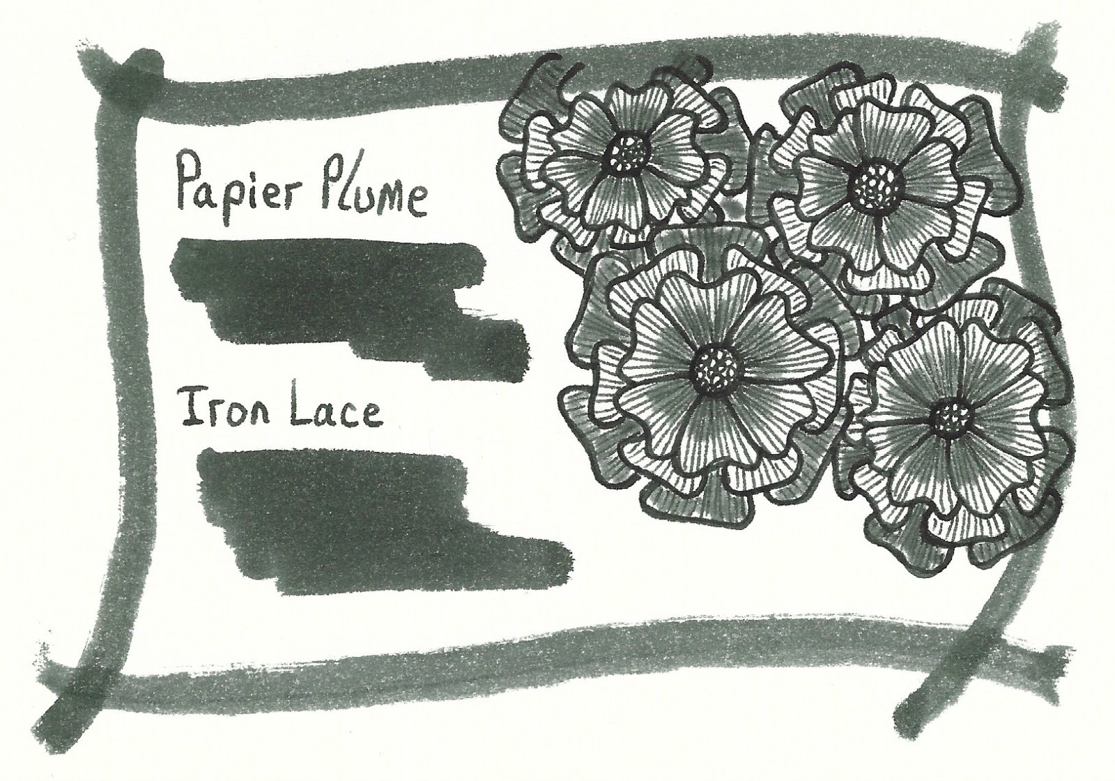
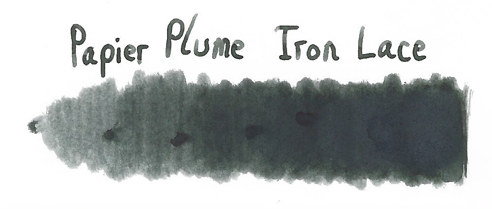
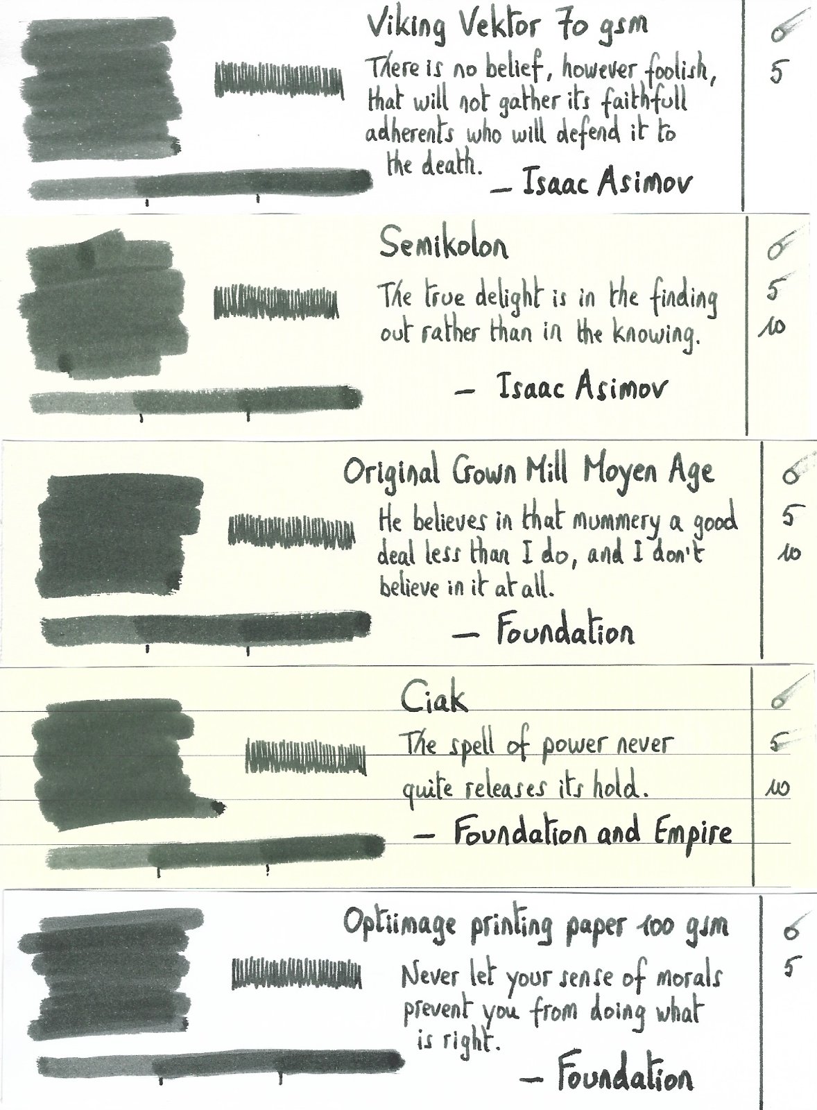
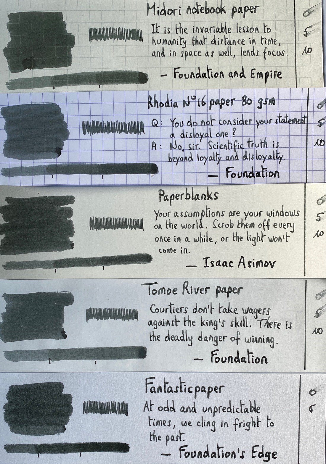
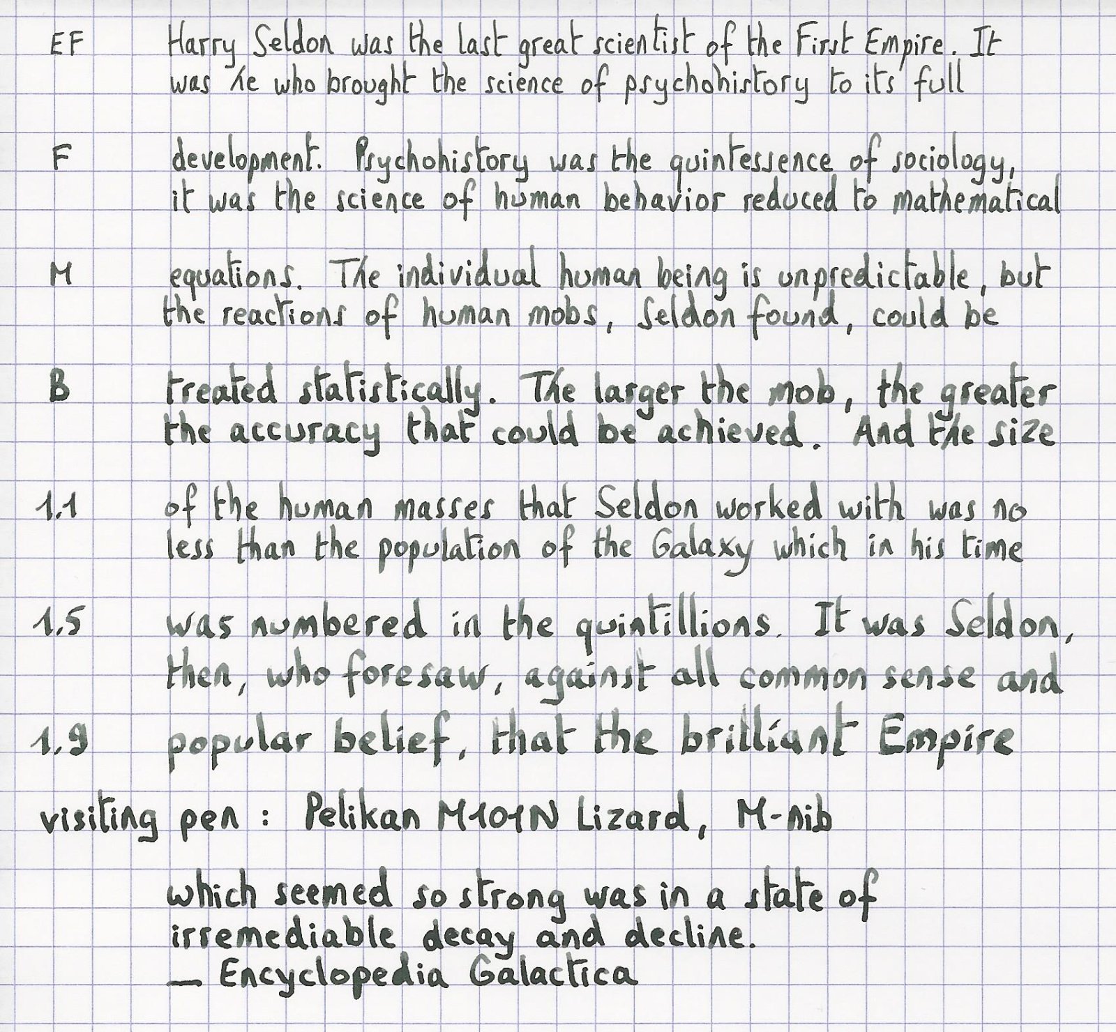
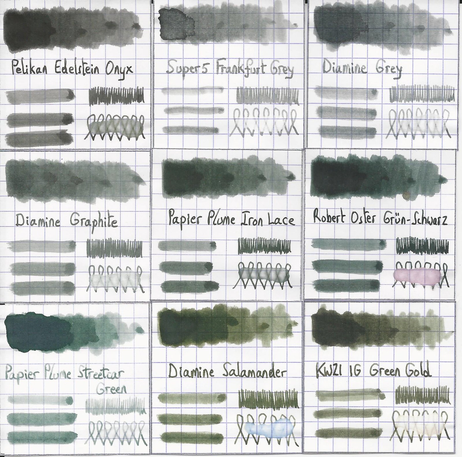
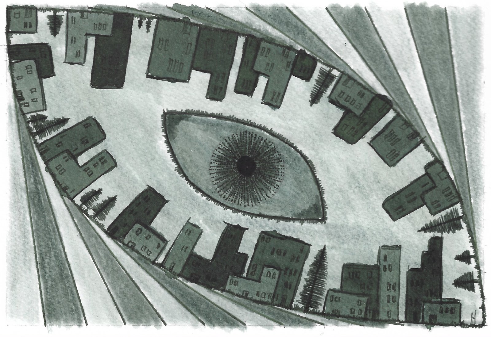
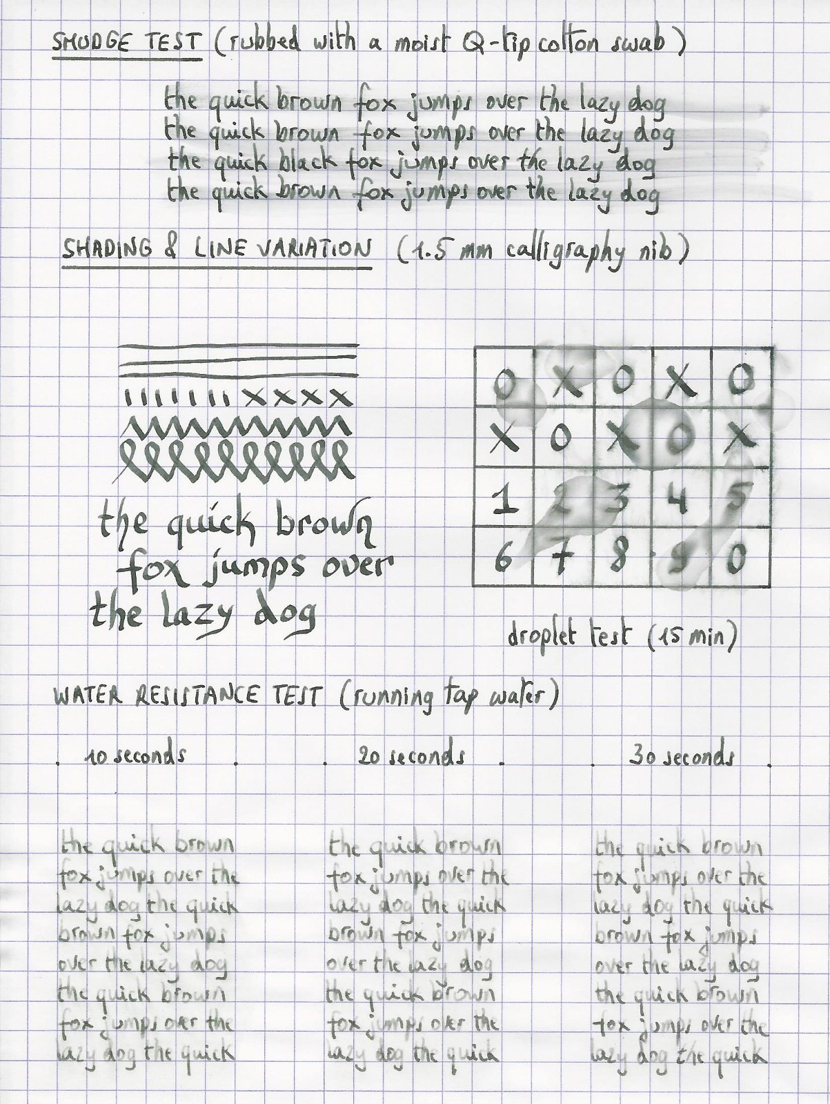
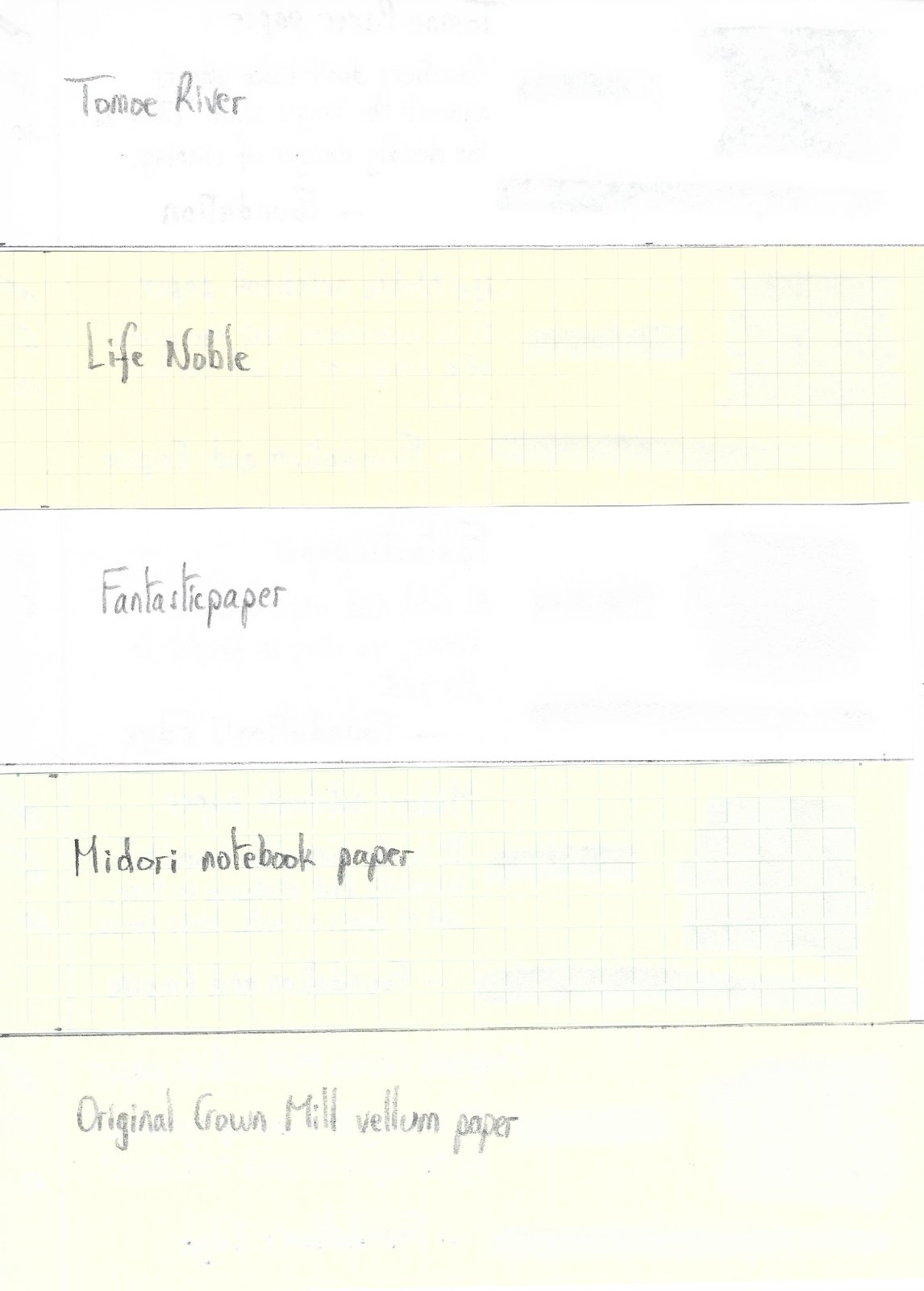
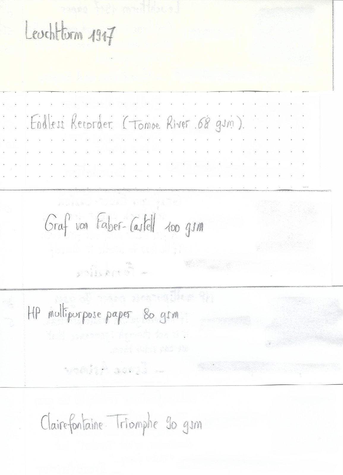
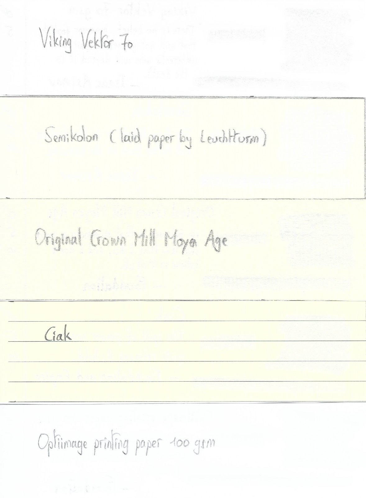
Papier Plume – Iron Lace (New Orleans Collection) Papier Plume is a stationary shop in New Orleans, that’s best known on this forum for their “New Orleans Inks”, that celebrate the rich colours and history of the city. One of their inks in this series is Iron Lace, a black ink with a strong green undertone. This ink from the New Orleans Collection is inspired by the iron lace galleries and balconies in the French Quarter. These intricate designs from wrought or cast iron can shift from black to green depending on the oxidation level of the iron. The Iron Lace ink captures this aspect just right: it’s a black ink at heart, but with a strong green component, that surfaces mostly in swatches. On the bottle it says “A Not-So Basic Black”, and they are totally right. This is not a dull and boring black, but one with layers of complexity that makes it a very interesting ink to write & draw with. The ink itself writes fairly wet with good lubrication in my Lamy Safari test pens. Quite a contrast with some of the other New Orleans inks. Saturation is excellent, even with EF nibs. The ink has a small dynamic range, without much contrast between light and dark areas. To illustrate this, I did a swab where I really saturated portions of the Tomoe River paper with ink, pooling it on. The limited contrast range translates to soft & elegant shading that looks aesthetically pleasing. Shading is just visible with the EF nib, and becomes more prominent with M-nibs and above. But it’s always subdued, giving just that extra touch of elegance to your writing. On the smudge test – rubbing text with a moist Q-tip cotton swab – there is quite some smearing, but the text itself remains crisp and clear. Water resistance is surprisingly good, both with my still water test (letting drops of water sit on the page for 15 minutes) and with a running water test. The ink easily survives watery accidents, making it an excellent ink for use at the office. The chromatography confirms this: the dyes remain firmly attached to the paper in the bottom part. I’ve tested the ink on a wide variety of paper – from crappy Moleskine to high-end Tomoe River. On each scrap of paper I show you: An ink swab, made with a cotton Q-tip 1-2-3 pass swab, to show increasing saturation An ink scribble made with a Lamy Safari M-nib fountain pen The name of the paper used, written with a Lamy Safari B-nib A small text sample, written with the M-nib The source of the quote, written with a Pelikan M101N with M-nib Drying times of the ink on the paper (with the M-nib) Iron Lace has a slight tendency to feather on the lower quality papers in my test set, most obvious when using a wet pen (see e.g. the source of the quote on the HP and Optiimage printing paper). I noticed no issues with better quality paper or when using finer nibs (M-nib or below) on paper of lesser quality. The ink writes smoothly with good lubrication, and provides excellent contrast with the page. Writing looks good on both white and more yellow paper. Drying times are fairly low – in the 5 second range with my Lamy Safari M-nib. All in all a fine ink for use in an EDC pen. At the end of the review, I also show the back-side of the different paper types, in the same order. A small amount of bleed-through is present on some of the lower-quality papers (Moleskine, generic notepad paper), but nothing too bad. Since scans alone are not always enough to give you a complete picture of the ink, I also provide you with a few photos for an alternative look at Iron Lace. Writing with different nib sizes The picture below shows the effect of nib sizes on the writing. Papier Plume Iron Lace manages to look good in all nib sizes from EF up to the 1.9mm calligraphy nib. With the very fine nibs shading is just visible, but starting at F/M and above the soft and eye-pleasing shading adds extra character to your writing without being overdone. I personally prefer Iron Lace in drier pens, where it writes a bit less saturated, and where the ink’s subdued shading is much more prominently visible. With wet pens, the more heavy saturation tends to overwhelm the ink’s shading, making your writing look more flat (my opinion). Related inks To compare Iron Lace with related inks, I use my nine-grid format with the currently reviewed ink at the center. This format shows the name of related inks, a saturation sample, a 1-2-3 swab and a water resistance test – all in a very compact format. I added Pelikan Onyx – which is a pure black – as a reference point. This clearly shows the green undertones that are present in Iron Lace. Diamine Graphite comes close in colour, but is lighter in nature (dark grey instead of black). Inkxperiment – Eye in the Sky With every review I try to do a single-ink drawing that shows what the ink is capable of in a more artistic setting. The most fun part of the ink review, and I quite enjoy brainstorming and then implementing these little pieces. Inspiration comes from the Alan Parsons song “Eye in the Sky”, with the lyrics: “I am the eye in the sky … Looking at you … I can read your mind”. I used these elements as the theme for the drawing. For this inkxperiment I used a piece of 300 gsm rough watercolour paper. I started by drawing in the outer eye surrounded by a geometric pattern. I then added the inner eye looking over the cityscape. Everything was drawn with Q-tips using different water/ink ratios. I finally added the details to the eye and the houses using a Lamy Safari pen filled with Iron Lace. In this more artistic setting, Iron Lace beautifully shows its green undertones. Conclusion Iron Lace from Papier Plume is a very well executed addition to their New Orleans line. A beautifully complex black with green undertones, that deviates enough from true black to make the ink quite interesting. Technically the ink is near perfect: good flow, well saturated, subtle shading, looks good in all nib sizes and on all paper types. I personally prefer the ink in drier pens, where the shading is more present. If you like off-black inks, this one is definitely worth your attention. Technical test results on Rhodia N° 16 notepad paper, written with Lamy Safari, M-nib Backside of writing samples on different paper types
-
Just before pressing the "buy now" button, I went thru the reviews and found that it is a PLASTIC pen!! Wouldn't mind paying 10, 15 or 20 dollars for a plastic pen, but $50? And, since when the iconic Century has been made out of cheap plastic? All the Century pens I own (made in USA) are metal. Why did Cross thought using plastic was a great idea? I really wanted to get back to the brand, but the more I try, the more disappointed I become. The Century Classic Black pen is just lovely looking. What a waste of design.
-
Manufacturer: Parker Series, colour: Quink For V Mail Black Pen: Waterman Hemisphere „F” Paper: Image Volume (gramatura 80 g / m2) Specifications: Flow rate: low Lubrication: good Bleed through: unnoticeable Shading: noticeable Feathering: unnoticeable Saturation: good A drop of ink smeared with a nib The ink smudged with a cotton pad Lines Water resistance Ink drying time Ink drops on a handkerchief Chromatography Sample text in an Image Volume (80 g / m2) Sample text in an Oxford notebook A5 (90 g / m2) Sample letters in a Rhodia notebook No 16 (90 g / m2) Sample letters in a Clairefontaine (120 g / m2) Palette of shades
-
I use black ink from Bril or Camlin and write with a fine nib. I feel that they give a lighter shade on paper than I expect, especially when soft pressure is applied. I need more darker hue to my ink. Are any other brands of ink available in India that have very dark black colour?
-
I've just decided. My main writing pen - which has only seen black since I've had it - has just been inked up with blue-black and I doubt that it will ever see black again. It's not like black is inherently ugly, it's just that I think 'Why?' when there are many other dark, conservative-looking, legible ink colors that don't call attention to themselves when reading or taking a glance at the page. And, when you actually do pay attention to the color and texture of the written words, they provide some beauty and interest. I can't think of a situation I've been in in many years that requires black, I don't expect I'll encounter one, and, if by chance I do, I still have a few black Pilot Varsity's. I probably won't use my remaining black ink for anything other than mixing with other colors.
-
Manufacturer: Parker Series, colour: Quink Washable Black Pen: Waterman Hemisphere „F” Paper: Image Volume (gramatura 80 g / m2) Specifications: Flow rate: very good Lubrication: good Bleed through: possible point Shading: noticeable Feathering: unnoticeable Saturation: good A drop of ink smeared with a nib The ink smudged with a cotton pad Lines Water resistance Ink drying time Ink drops on a handkerchief Chromatography Sample text in an Image Volume (80 g / m2) Sample text in an Oxford notebook A5 (90 g / m2) Sample letters in a Rhodia notebook No 16 (90 g / m2) Palette of shades
-
Manufacturer: Parker Series, colour: Quink Black Pen: Waterman Hemisphere „F” Paper: Image Volume (gramatura 80 g / m2) Specifications: Flow rate: good Lubrication: good Bleed through: unnoticeable Shading: noticeable Feathering: unnoticeable Saturation: good A drop of ink smeared with a nib The ink smudged with a cotton pad Lines Water resistance Ink drying time Ink drops on a handkerchief Chromatography Sample text in an Image Volume (80 g / m2) Sample text in an Oxford notebook A5 (90 g / m2) Sample letters in a Rhodia notebook No 16 (90 g / m2) Palette of shades
-
Manufacturer: Cross Series, colour: Black Pen: Waterman Hemisphere „F” Paper: Image Volume (gramatura 80 g / m2) Specifications: Flow rate: good Lubrication: good Bleed through: possible point Shading: unnoticeable Feathering: unnoticeable Saturation: very good A drop of ink smeared with a nib The ink smudged with a cotton pad Lines Water resistance Ink drying time Ink drops on a handkerchief Chromatography Sample text in an Image Volume (gramatura 80 g / m2) Sample text in an Oxford notebook A5 (90 g / m2) Sample letters in a Rhodia notebook No 16 (90 g / m2) Sample letters in a Clairefontaine (gramatura 120 g / m2) Palette of shades
-
Manufacturer: Aurora Series, colour: Black Pen: Waterman Hemisphere „F” Paper: Image Volume (gramatura 80 g / m2) Specifications: Flow rate: very good Lubrication: good Bleed through: unnoticeable Shading: unnoticeable Feathering: unnoticeable Saturation: very good A drop of ink smeared with a nib The ink smudged with a cotton pad Lines Water resistance Ink drying time Ink drops on a handkerchief Chromatography Sample text in an Image Volume (gramatura 80 g / m2) Sample text in an Oxford notebook A5 (90 g / m2) Sample letters in a Rhodia notebook No 16 (90 g / m2) Sample letters in a Clairefontaine (gramatura 120 g / m2) Palette of shades
-
An FPN inky friend sent me some inks, and this one, Diamine Eclipse, was one. As you may know Diamine has been around since the 1860s, and has a large range of inks, solid reputation, favorable prices, and ready availability through out the US, EU. Perhaps even the major markets in Asia as well. The handling for this ink was really excellent, not too wet, not too dry, very good flow. There seems to be some divergence of opinion as to the actual color of this ink amongst the various vendor web sites; one calling it purple, another saying blue-black leaning to black. In the converter it has a violet cast, but the writing appears as black, or, perhaps to some, dark grey. It's not really a grey ink, but depending on the pen and paper your may not get as dark a line. I didn't have this problem. I did have some show through and a bit of bleed through on the cheaper inkjet paper. Whether that's acceptable to you depends on what paper you have and how it responds to this ink. Diamine Eclipse is not water resistant, but a decent amount of ink stays behind when blotted, and when washed with water. So there is a sliver of hope for recovery of your writing. Overall a very well behaved ink. If you don't want to use a boring black at work or school, you can get away with using this ink. Pen: Edison Premiere (F-steel) Papers: MvL=Mohawk via Linen, TR=Tomoe River, Hij=Hammermill 28 lb inkjet, Rhodia=Rhodia 90g ivory. Camera: iPhone 7
-
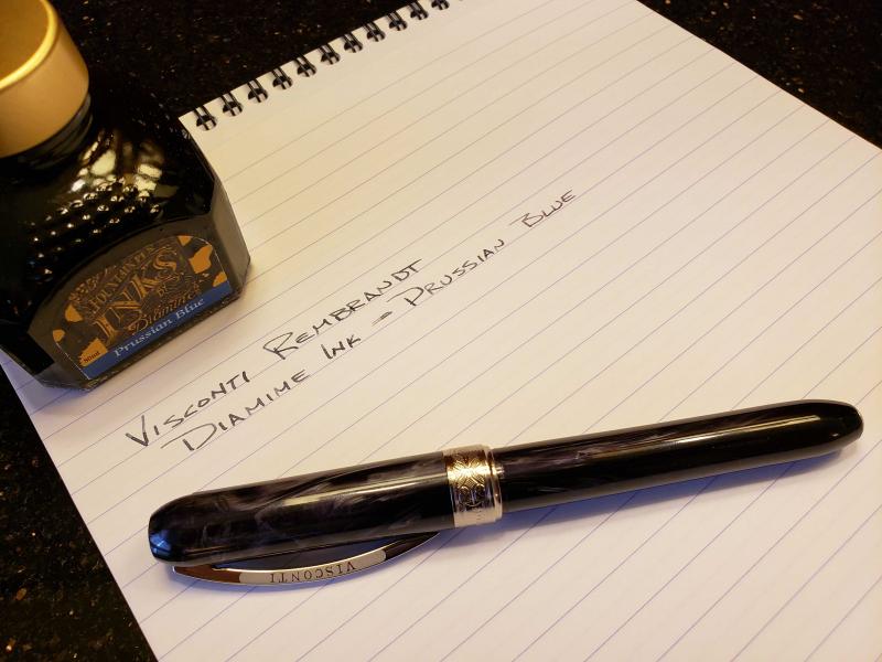
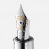
The Visconti Rembrandt fountain pen is appropriately named. It is truly a work of art. The variegated resin is a deep black with ominous swirls of silver. Every time I hold it in my hand, it reminds me of a dark and stormy night. The end caps, clip and center ring are all chrome plated metal. It came well presented in a rigid, two piece box with a carton board sleeve. Aside from the pen, the box also contained the warranty fold-out sheet and a single ink cartridge. The standard international converter needed to be purchased separately. The pen has some weight to it, over an ounce. The single-piece, spring loaded clip is a great design and holds firm. The cap is magnetic and fits well without any play. There is a metal insert in in the body to accept the nib assembly. Although I don't plan on dropping it, I'm sure it would be fine if I did, as long as it was capped. The pen is well made without a single visible flaw. The pen measures 5.50", 6.25" posted and is 0.625" in diameter. It fits well in my hand and it does not require posting. I choose pens that fit well enough in my hand that do not require posting. This pen lands somewhere in the medium size range. It isn't huge, but it isn't a toothpick either. The nib is a medium, stainless steel. It is decorated with intricate scroll work with the words "Visconti", "Firenze" and the "M" referencing the size. The nib writes as smooth as silk with no noticeable feedback on Rhodia paper. The feed looks like a standard plastic feed, nothing too special there. It isn't an overly wet nib, but it does lay a nice line of ink. It uses a standard international converter. Like other pens, it takes a few times to fill it completely. This pen was purchased at The Pen Place in Kansas City, MO. The online stores sell this pen for around $148. I didn't mind paying slightly more to support a brick & mortar pen store. When compared to my other pens in this price range, I would rate the Visconti Rembrandt as being less of a value for two different reasons: #1 At the nearly $150 price range, a gold nib would be appropriate. #2 No converter was included. However, I did not buy this pen for its value. I bought it because I've wanted a Visconti pen in my collection for quite a long time. And it was worth the wait! Although it will never be my everyday carry, it is a beautifully crafted addition to my addiction.
-
Blackstone Barrister Black is a new ink from Australian Vendor Justwrite It is a nano-carbon pigmented black that, like others of its class, is permanent, solvent-resistant/proof, and very well behaved. When I first got the ink for testing, it was labelled under it's pre-release name of Black 11.40, but having been released it is now called Barrister Black. On even poorer quality paper (old stock Reflex) there was no bleeding or feathering, so this is a very well behaved ink. As you can see, it is a deep, solid black, less matt and more glossy than the normal nano-carbon ink like Sailor Kiwaguro. On paper it looks more like Noodler's Heart of Darkness. I was able to test it by soaking samples in various household solvents, as below. So, for those of us in Australia who find that Sailor Kiwaguro or Noodler's Black/HOD are too expensive, or for those who want a carbon black ink that has an almost glossy look, this is a good alternative.
-
Left hand paper: 90gsm Oxford Optik Right hand paper: 80gsm Pukka Dry time before water test: 12h Test Pen: Jinhao x250 - 1.1mm Jinhao stub nib Opinions: I remember always hating this ink before I "got in" to fountain pens, and simply used a fountain pen to write with, but I couldn't remember why, so comes on to cracking into my bottle for the first time in probably 15-20 years (I left school in 1999 and promptly stopped "having" to write). Ahh, yes, I remember now, the greyest excuse for black there is, that's why I hated it. But, perhaps with the extra knowledge and appreciation I have gained over the past two or so years of the fountain pen hobby offers some redeeming features for Quink "Wishy-Washy" black? Well, firstly, it is very well behaved, as in it doesn't spread or feather even on the Pukka paper, which is fairly absorbent. Bleed is minimal even using the stub, 'tis a dry, dry ink! This may be to your like or dislike depending on how you like your pens to write and in what circumstance you find most of your scribbling taking place. Personally? The majority of my scribbles happen on extremely cheap & nasty copier paper, so I'm all about those dry inks at work. Dry time is also excellent even on the Optik paper (which, IMHO, is way better than Rhodia...don't throw things at me!) which usually lets ink pool for some time (doing the water test on the Optik paper? The water droplet will just sit there for anywhere up to 30-40 minutes before drying/absorbing). Now, this one surprised me. Which it shouldn't. But, there is some permanence to it. Yes I know it is called "PERMANENT Black", but somehow that slipped my mind. The black dye washes away almost instantly but the remaining, largely blue, ink is still very legible. Looking at pricing you can be paying anywhere from £5 to £7 per 57ml bottle which is, pretty reasonable. Summary Being a bit of a sucker for dry inks, I am starting to re-appreciate Quink Black, I also have a penchant for permanence in my inks, because accidents can and do happen (often!). I would say that Quink Black is actually a pretty decent, reliable "everyday" ink if you are having to suffer "less-than-optimal" papers or have a gusher of a pen. Just wish there was more black in this black!
-
do you have any recommended FP/ink deal for 2019 black Friday ? Mustafa
-
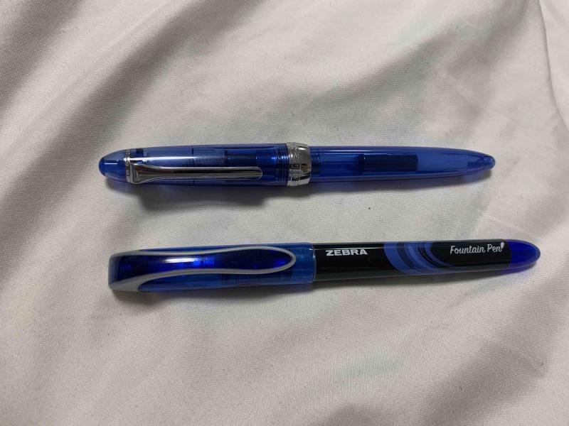
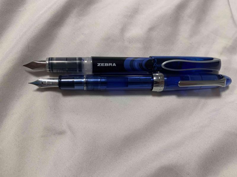
Hello people of FPN! It’s been over a year since I’ve last posted here, I’ve been busy with my first year and a half of college. In the last month or so, though, I’ve started lurking around reading the forums again, and I’ve been wanting to write another review. I just needed to find a pen that was the right balance of inexpensive and interesting, and luckily I found just the thing. As I was browsing the shelves of my college’s bookstore, procrastinating studying for my final exams, the blister pack these pens came in caught my eye. Zebra fountain pens. “An easier fountain pen” the box proudly states. I wasn’t aware that writing with pens was difficult, but that’s neither here nor there. I bought them (obviously, who wouldn’t buy a pack of 4 fountain pens you’ve never seen before for $8), and rushed them home to see what was in store. The single most important and obvious thing about these pens is that they were clearly designed to be a direct competitor to the pilot varsity. They’re made of the same materials with even the same shaped nib. They come in the same colors, and they’re sold on adjacent shelves. Zebra wanted to have a product in the disposable fountain pen market, so they emulated the most popular example of that market. Personally, I’m a huge fan of the varsity, so I’ll always be happy to see more Varsity-style pens enter the market as simple starter pens to help people make the switch and understand what fountain pens are all about. Because these pens were clearly designed to emulate the varsity, and most people have used a Varsity at some point, I’ll be comparing the pens to Varsities for the majority of this review. First off, in terms of appearance these pens aren’t terrible, but they fall short of the Varsity’s design in my opinion. There’s certainly nothing hideously ugly about them, and beauty is subjective so you’ll be able to see the pictures and make your own conclusions about the appearance, but for me the design on the Zebra’s just seems cheap. They are cheap, so that’s fine, but it would have been nice to have a design that’s a bit more clean and polished. The pen compared to a sailor procolor as a reference for size. The pens come in at least four colors (they were only offered in a four pack of purple, pink, blue, and black where I bought them, I’m not sure if more colors exist). The black is a fairly standard black, reminiscent of Parker Quink in shade. It’s not particularly dark, but it is definitely a black. The blue ink is very reminiscent of the typical blue ink you’d find in the average blue ballpoint pen. At first glance of writing with the blue pen, you might expect that it came from a ballpoint. I’m not familiar enough with pink inks to make a good comparison, but it’s what I would call a fairly standard, not too bright but not too pastel pink. As someone who doesn’t usually like pink things, I actually really like this ink color, and I plan on using it in the future. The fourth color, purple, is a pretty dark purple. It’s not so dark that it could be considered a purple-black, but it is definitely a very deep color, and in poor light conditions it can even look black. By now, you may have noticed that I’ve used a lot of words and still haven’t mentioned the most important part of any pen: how it writes. It’s complicated. Pilot Varsities are, in my experience, remarkably consistent. Especially within a particular color, every pen is exactly the same in how it writes and feels. Throughout my freshman year of college, I worked through a box of 12 Varsities, and all 12 felt exactly identical. These pens are not that. Don’t get me wrong, they all write well, and none of them are bad pens by any means, but the nibs on the four pens from the same blister pack offer vastly different writing experiences. Here is a writing sample with the four pens. Please excuse my horrific handwriting and cursive. The black and pink pens are the most similar to each other, and I have the least to say about them. They are pretty much a drier version of a Varsity. Slightly less smooth (probably because they’re more dry) but around the same width and writing behavior. The width is marked on the box as 0.6mm, and I’d call it around a Western Fine / Japanese Medium. The purple pen is wildly different from the black and pink pens. It is a very wet nib, more than a pilot varsity, and the thickness is equivalent to a western medium. Additionally, the purple pen came out of the box with ink on the inside of the cap and some ink on the grip, which may be due to a mix of the pens wetness and being moved around during shipping, but none of the other pens had that happen. There is some texture to the way it writes, it is not perfectly smooth, but the wetness makes up for any scratchiness in the nib itself and offers an enjoyable writing experience. The purple pen arrived with ink on the inside of the cap, the nib, and the grip. The blue pen is again, wildly different. This time, though, it is absolutely exceptional. The width of the pen is what pretty much every manufacturer would call an Extra Fine, and it’s incredibly smooth. I own a number of pilots with 14k fine nibs, and a number of western pens with extra fines of around the same width. This is unequivocally the best writing pen I’ve ever seen at this width. The problem is, these pens are so inconsistent that I don’t think I’d ever find another pen like it from them, no matter how many packs I opened. Still, I plan on using this pen for as long as I can (which I think will be a while with how thin the nib is and how large the ink reservoir is), and then hoping I can find another nib like it sometime in the years to come. All in all, I would recommend these pens. I would have paid the full $8 (and then some) for just the blue pen, but even without that likely fluke, these pens are a solid disposable pen. I plan on buying another pack at some point, and if the blue is like the blue in this pack then I would recommend these pens 100 times out of ten over the Varsity. That being said, if the blue I got really was a fluke, and you have a choice between these and some Varsities for around the same price, I’d probably take the Pilots.