Search the Community
Showing results for tags 'bexley 58'.
Found 2 results
-
First impressions I like big pens, ideally those that aren't expensive It was while browsing Richard Binder's website that I chanced upon the Bexley 58. I liked the brief description that he had for it and the natural thing to do was to look around for reviews. I found none, rather surprisingly. I went ahead and bought it regardless, knowing from a previous purchase that if nothing else, the nib would perform to a tee Apologies for the quality of the pictures. Appearance and Finish 4 out of 5 This isn't a pen for everyone. It's plain, simple and funny as this might sound, it's actually at once elegant and gawky. The finish is good and as is to be expected from a Bexley. Design, Size and Weight 3.5 out of 5 I don't normally post while I write - Jean Pierre Lepine Indigo excepted, which is a pen that can't be used by anyone over 3 years without posting - and the 58, with my average-sized Indian hand, fits and feels great. It's just a straight, no-frills barrel and light. The section transitions well from the barrel and I didn't notice it during its use. Bexley has got the ergonomics right, at least for my dimensions What I don't like about the pen is the design of the cap. It's about 35 mm longer than it needs to be and while the well-designed springy clip fits nicely in a shirt pocket, the cap sticks out awkwardly above the pocket. I wish the threads weren't as deep inside the cap as they are because that could've reduced the currently unnecessary length. Nib and Performance 5 out of 5 The Binderized nib is adorable. With its two tones and curvy art, it looks neat. I've spent a lot more hours doodling, scrawling and writing with this than I actually needed to, just so that I could write with this gorgeous Broad nib Filling System 5 out of 5 It came with a converter that I didn't use because what can be made an ED I do, and this one could. I didn't use any silicone grease and there hasn't yet been the slightest leak. What I haven't checked is whether the converter is long enough to optimally utilize the barrel length; if correctly done, this pen has the potential to hold a lot of ink and satisfy fans of the cartridge converter. Value for Money 3.5 out of 5 Call me opinionated but I've found more than half the FPs in the market today overpriced. This one's no different. It cost me about $150 and that's about $50 too much. Intriguingly, the 58 retails today for about $100 on Richard's site. I wish it had when I bought it :/ Conclusion Going by the paucity of reviews on the web and particularly this site, the 58 isn't exactly popular. And that's a shame. It's not a looker but is an acquired taste. It's simple, well built and performs beautifully; to me, there's not much else that one can ask for in a pen. A touch low on the value-for-money scales but that's okay. An under-appreciated gem, IMO.

-
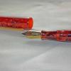
Bexley 58 Fire Engine Red, Medium Stainless Two-Tone Nib
boybacon posted a topic in Fountain Pen Reviews
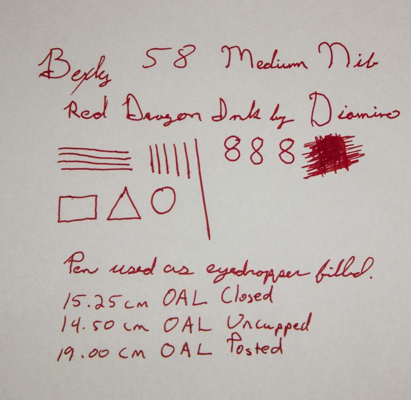
This is my Bexley 58 in Fire Engine Red. This pen was purchased on eBay as an NOS Bexley from a discontinued line. This is the second pen that I purchased after my Edison, and my second "Made in the USA" pen. The pen arrived well packaged with a larger sized box in a sleeve. Good thing that the box was larger than the Edison...because this is a big pen! 15.25cm / 6 inches when closed/capped. The box was very nice, again in contrast to the box that Conklin uses. Generally speaking, I take a pen out of it's box and keep it in a cigar box with pen trays, then put the box in storage. I know that some people store their pens in boxes, so I try and leave a review of the box as well. This pen is a pretty red acrylic, described as Fire Engine Red. It came with a cartridge converter, and also an o-ring so it could be used as an eyedropper. Originally I had planned on doing the review using the converter, but due to circumstances beyond my control, you get the eyedropper review (with a different ink than intended, also!). The cap fits well, and the overall look is nice. For some reason, the gold band looks a little "meh". Not sure why, or what it is about the band, but, to me, it just looks a little chintzy (hard to explain, and probably a personal preference). Maybe it's too wide for my tastes. The clip is nice, and holds the pen in the pocket. It's a tight clip, so it is usable with a thinner dress shirt...with one caveat. There is about 1.75cm / .67 inches of pen cap that stick up above the pocket line. It's a little more than I like peaking up out of the pocket. If your pockets have flaps, then it's an awkward pen to to carry, as it props the pocket flap open. For as big as this pen is, it's not a heavyweight. It's fairly light, and if you write unposted it's nimble, as well. Posting the pen while writing makes it a little unbalanced (in my hand). The nib is nice, and lays down a wet line. This is noticeably wetter as an eyedropper with the Diamine ink than with the converter and Noodler's Purple. With the Noodler's ink, I had some dry starts and a little skipping until it settled down. Not the case with the Diamine ink. I let the pen sit capped for 5 days, and it started without even hesitating. The medium is smooth and writes well for me. I would put it on par with my Edison nib but a bit wetter. It fits well in my hand unposted and you definitely notice the pen's girth. It's not uncomfortable to write with, and it mimics the old Waterman pens of yore, according to the Bexley website. I don't have an old Waterman pen, so I cannot speak to that. The writing sample in the photo was done in a hurry, due to the dreaded disease called "lack of time". In summary: Appearance: 8/10 - The gold band isn't quite right for my tastes. Not sure why. Clip is nice, but there is a fair amount of cap above the clip. Wetness: 9/10 - It writes wet. Noticeably wetter with the Diamine ink as an eyedropper than the Noodler's with a cartridge converter. Smothness of nib: 9/10 - It's a JoWo nib, I think, like the Edison nibs. I'm guessing that it gets tuned before it leaves the Bexley factory, though. Very nice. Ergonomics: 9/10 unposted, 8/10 posted: Posted this pen is too long. Unposted, it's about right and fits my hand without any issues. Sealing: 10/10 as an eyedropper. Cap keeps the pen sealed against drying, no issues. Weight: 10/10 - For it's size, it's not a heavy pen. My Conklin Duragraph is a heavier pen. Overall: 8.75/10 - Because I wear casual clothing to the office, many of them have pocket flaps, and the cap is just too long for those. It's a nice, big pen and would probably be better in a desk drawer, or on a desk display than in the pocket. The red color is nice, and the gold clip goes good with the two-toned nib. It's in my regular pen rotation, that's for sure.