Search the Community
Showing results for tags 'aurora'.
-
Dear community, I need your advice. I almost bought the Pilot VP Raden but then I saw the Aurora Optima 2024 and now I can’t stop thinking about this most beautiful pen in the world. The only thing that stops me is information from everywhere that Auroras break easily without a serious reason. I know that I can buy Raden and most likely, if I take care of it, the pen will last me a lifetime. But what about Aurora? What is the probability that the Optima will fall apart? Which pen would you choose? This is a lot of money per pen for me and I can't buy both.
-
First my request, then some background. I am asking you please to post, for each vintage Aurora 88 / 88K / 88P that you own, - the model and the serial number - if it is an unserialised 88P, please state that. - if you have documentary evidence of it, the year of manufacture / sale (not a seller's opinion please). Background I have collected quite a few models and serials from FPN, fleabay and my own few pens, and have compared this with the information in the Aurora 88 Dynasty and other threads. Now, I am seeking more data to improve upon it. I have concluded from looking at existing pens that the serial number offers a useable source for dating the pens. It appears that they were applied as would be expected to each successive pen, regardless of model. The lowest serial I have found to date is under 47000, so we know that they did not kick off the process somewhere in the hundred thousands. From the Dynasty thread, one would expect to see 88 and 88K serials intermingled for the period 1951 to 1953, and this happens. One would also expect from that source to see no overlap between the 88K and 88P and so far this too is the case. However, based on total production information in the Dynasty, taking that as cumulative, one would expect a serial in the 2.5 M range to appear only on an 88K, but it appears on an 88 which ceased production in 1953. That implies that either fewer 88P were later produced to stay within 3.8 M total, or else more than 3.8 M were later produced if the inferred 1.3 M 88P were made. An alternative that practically no 88K were produced during 1954-57 seems unlikely! However, no 88P so far has a serial as high as 3.3 M, far from 3.8 M. Casual reading also suggests there are more unserialised 88P around than the small number expected (I have one myself). This may account for the gap, if serialising ceased around 1961. For these reasons I am asking for the above data to try to fill in some gaps. I am already close to having a fairly good translation from serial to year, to counter optimistic sellers and simply for one's own entertainment. To do this I am obliged to make an assumption about non-linear production patterns in which production for each model ramps up quickly in year 0-1, plateaus around 2-4 years and declines in years 5-7. These mild curves are assumed but appear to give better results on known data than assuming flat production rates. edit:minor and formatting
-
Hello, I recently managed to purchase what I thought to be Aurora Archivi Storici 022 pen (which is a re-edition of a failed late production Aurora 88P brushed version). Upon close inspection I noticed that my pen lacks the brushed band on a cap lip that all other Archivi Storici including AS 022 pens seem to sport. My pen's cap lip terminates with the shiny band. When compared to my Aurora 88P cap, the dimensions are identical - the length is 64,7mm (measured between the cap lip and the most extreme raised part of the cap opposite the clip) and width at the cap lip is 12mm. The shiny cap band of AS 022 is ~1,5mm thick. The cap fits snugly and the cap lip is gold plated from the bottom - I do not think it has been cut or shortened, but I can be wrong. The picture comparison is available in the imgur gallery. Aurora Archivi Storici 022 owners - can you please share the dimensions of your caps? Do I have a defective cap on my hands, or is it a normal production run piece? Edit: I bought the pen used without any packaging nor paperwork.
-
I have 2 black inks that I like a lot. Aurora Black and Pilot Iroshizuku Take Sumi. I've decided to compare them and figure out which one is my favorite, because I rarely use black ink and technically just want one. As a result of the comparison, I'm more confused than before I started. They both have their strengths and weaknesses. The posted samples below are limited to very fine nibs for writing and sketching. Take-Sumi shows more obvious shading with broader cursive italic nibs. Aurora is highly lubricated but has more conservative flow vs velvety but free-flowing Take Sumi. It's easier to control line width with Aurora. Take-Sumi washes off more easily with water / water brush, smearing off a heavier amount of loose dye. The remaining dark line is more smeary looking and also feathery with Take Sumi, whereas Aurora Black keeps a neat black line under the smeared dye. Take-Sumi can be a deeper black in the dark areas, but it's slightly blue-tealy tinted, and also there's a beautiful gentle shading gradient visible even with Extra Fine Japanese nibs! Aurora Black is pretty much just a flat black, almost no shading, looks a bit like black laser printer ink. I'm describing this qualitatively, because it's difficult to tell from the scans, but Take-Sumi definitely has a more watercolor look with deeper dark areas, where Aurora is either straight black or a grayish solid color depending on amount in a line. Take-Sumi is more difficult to wash out of a pen: takes longer, quite a few flushes. Take-Sumi sheens readily, whereas Aurora generally doesn't show sheen unless in large amounts. For writing: I love Take-Sumi For drawing and Calligraphy: Aurora might have the edge. I like that it's a bit more neutral and much easier to control with a water brush for gradients, where Take Sumi just smears off more heavily with a water brush. Pens used: Aurora Black - Pilot Vanishing Point EF Take-Sumi - Sailor Pro Gear Slim EF On Fabriano Bioprima, lightly textured uncoated paper: Tomoe River 52g in a Hobonichi Techo Cousin planner:
-
Montegrappa advertises that it was founded in 1912 and is the oldest Italian pen manufacturer. Aurora advertises that it was founded in 1919 and is the oldest Italian pen manufacturer. To the subtle Italian mind there may be no contradiction here. But to me, an American, having a simple, childlike mind, there does seem to be a contradiction. Can anyone help me resolve my confusion about this?
-
Hi, everyone! I wanted to introduce myself to this network. I have been a long-time pen enthusiast, and am the owner of luxury pen retailer Truphae, Inc. We specialize in high-end luxury pens from companies like Aurora, Montegrappa, ST Dupont, Visconti, etc...and have great relationships with them as well. We also carry brands such as Pelikan, Cartier, and many others. Our goal is to find the coolest pens around, particularly rare ones that many other people would have a hard time sourcing. We not only sell, but buy and consign as well. Looking forward to getting to know you all better! ~Chris
-
desaturated.thumb.gif.5cb70ef1e977aa313d11eea3616aba7d.gif)
How-to: Set, or change, personal info that others can see about me
A Smug Dill posted a blog entry in Sus Minervam docet
It helps to explore this yourself, revisiting once in a while if need be, and keep in mind where each of those personal info fields are entered. Don't leave it until the urge to change something specific to come upon you, and only then bother to ask the question! Invest the time surveying upfront, instead of waste it later waiting for an answer from nobody in particular. Most of the fields shown above are self-evident as to what they are. I think the only ones that could do with explanation are: Security and Privacy: There is only one setting under there, and that is a toggle for whether your online status (including ‘last active’ date or time) is visible to others Content View Behavior: That has nothing to do with what others can see about you, but only where you would like to start reading when accessing content Enable status updates: This toggle enables/disables the public feed on your profile page; if you disable it, then nobody (including you) can post publicly visible ‘status updates’ or any other message against your profile, but if you enable it, then anyone — friend, foe, or complete stranger — can post something there whenever, without waiting for you to initiate and then only reply to what you wrote Notification Settings have nothing to do with what others can see about you, and so is out of scope for this article, and I'm not going to delve into those right now. (You can look here, here, and here to wrap your head around how notifications work with respect to followed content.) N.B. There is a possibility that some of the above settings and data fields may not be available to Bronze members and/or Silver members, but I have no way of testing that or scoping it out. — • — Another way of getting to the Edit Profile dialog, and the way to change your profile photo (or ‘avatar’), is here: — • — Freeform, custom member titles that one enters for oneself are long gone, and have not been a thing since FPN came back from a long hiatus and platform upgrade late in 2020. -
Hi FPN, I know a lot of you folks are fans of Aurora and are very excited about the new 365 Optima Abissi this year. Since this year is a leap year, Aurora made 366 pieces. According to nibs.com, the color is described as: "The Aurora Optima 365 Abissi Limited Edition fountain pen is made from green marble Auroloide and flecked with flakes of blue. Deep black on the section and flat cap ends provides luxurious design, while gold trim highlights the warmth of this quality writing instrument. This is a pen that must truly be seen in person to appreciate the complexity of the subtle color shifts." nibs.com link: http://www.nibs.com/aurora-optima-365-abissi-limited-edition.htm And from http://luxuryadvisor.online/2016/02/tribute-to-a-classical-time-aurora-optima-365-abissi/ they are beautiful! The 000 number is shown as below. And also in reddit, it is claimed that the last photo was shot without camera shy: https://www.reddit.com/r/fountainpens/comments/402wq5/not_camera_shy_at_all_the_aurora_optima_365/ When I first saw the picture, I was simply stunned and decided to go for one. So I purchased one from novelli.it and I have to say, Novelli is very pleasant to deal with, they put the order and packed very securely and shipped very fast. However, I am very disappoint by the Aurora changed their color. As you can see, the 000 is rich blue-green color with green base and blue strip. However, mine is blue and green strip with grey color base. I am very very disappointed that Aurora made a color change when they put the pen into production. Please check the picture of the actual pen below and see the differences! I compared this pen to one of my old style Optima and you can see how bad the pen actually looks. Again, I am very pleased with Novelli's service and I will contact them to figure the next step. But for further potential buyers of this pen. Be aware of this!
-
In the last few months, I have purchased: Aurora 88P, black (1950s) Aurora 98, black (1960s?) Aurora Duo Cart, green (modern) Aurora Optima Auroloide, Rossa (modern) Montegrappa Zero Chrysocolla Pen Venture Exclusive (limited edition of 30) Leonardo Momento Zero, Blue Hawaii (2021) And, I just placed an order for a Momento Zero Coral from Pen Venture, as that color is not as easy to find as it used to be - and I have wanted it for awhile. I didn't expect this of myself. Apart from Leonardos, I have always kind of looked the other way on most modern Italian pens, pretty as they are. All the Visconti horror stories, I guess. But at this point, I am even considering giving a Van Gogh a shot, as long as I order from somewhere that will tune it first.
-
I've recently acquired four Optimas. They're beautiful pens and all write very nicely but I'm having a slight problem with one and was wondering if anyone else has experienced this. While all have F nibs, it seems, like Pelikans, the size varies a bit, from almost EF on one, to F on two, to almost M on the 4th. The EF one has a problem with ink starvation - after writing a couple lines, the ink starts to fade and I have to unscrew to piston knob very slightly (barely loosening it) and screw it back, then it's fine until the next go 'round. None of the others exhibits this. I have this one inked with Yama-guri but I'm using Take-sumi in another so I don't think its's an ink issue. For now, I'll try leaving it screwed down not so tightly to see if that helps
-
I found here one review of an Onoto K series pen. It is excellent, worth reading as a companion because I do not plan to repeat most of that information. This is more of a comparison and notes on the pens. However, I will recap the series briefly. In 1955, just three years before they gave the pen game away entirely, Onoto released a series in a new style for them, being fairly plain plastics, piston fillers, mainly with hooded nibs, and barrels in the vogue cigar style. They proved to be good pens but, too little, too late as the British were wont to say. The pens were: K1 - Gold clutch cap, ink window, hooded nibK2 - Same as the K1 except with body coloured capK4 - Same as the K2 except the cap was screw rather than clutchK3 - The odd one. It is slimmer (by about 1 mm), slightly shorter in barrel and cap with flattened ends to both, an open No 3 nib, no ink window, and the piston mechanism is able to be serviced, unlike the other three. In remaining respects it was somewhat like the K2 with body coloured clutch cap.Onoto's marketing of the time profiled the pens like this: The K3 and K4 were the same price despite their obvious differences, with the K4 described as a basic pen and the K3 as a conventional pen. The K1 stepped up the price 7% for its gold cap.The most expensive was the K2, up another 12% in price, distinguished as having "extra iridium". So, the numbering follows no price or feature pattern, and the K3 remains quite an oddball among them when you get to the detail. In the following photo I have placed an Aurora 88 and Lamy 2000 for comparison, being similar hooded piston fillers of the era and shortly after. From left to right, Aurora 88, K1, K3, K4, K4, Lamy 2000. Note also clip differences in the K1, K3 and K4. I have not purchased a K2 because its features all exist elsewhere in the K models. Buying a second K4 was somewhat accidental. The Lamy looks huge next to the others, the Aurora (an original 88 with Nikargenta cap) quite comparable if slightly bigger over all. I speculate that the Aurora 88 may have been Onoto's principal model for their pen. Here are the pens with nibs exposed. From left to right, K1, Lamy 2000, K3, Aurora 88, K4 underside of nib, K4 with shroud removed. Note slimness of the K3's section compared with the others. The K3 has a conventional section which unscrews to reveal the barrel internals and piston. The other three pens have a friction fit section which is concealed under a screw-on plastic shroud. Note that after removing the shroud on the K1 on the left, I have not quite re-aligned it correctly. In this case I can screw the shroud a shade tighter. If you have removed the section (you can grease the piston, needed maybe once if ever, but you can not remove or replace it) then unless you have marked carefully you will be up for some repeated un- and re- screwing of the shroud while you rotate the section fractionally until the tightened shroud lines up with the nib. A touch of silicone grease on the friction fit is useful simply to make that a little easier. The K1 nib and feed I own do not appear to be set correctly, or else the K1 is different in one respect. On removing the shroud I can read the nib down to where it says K1 on it, below "De La Rue // 14 ct // Onoto". This part of the nib is inset further on the K4 pens so I can not read below 14 ct. I have not thought finding out a sufficient reason to pull the nib. The K3 sports a standard Onoto No 3 nib, saying "Onoto // 14ct // 3" as usual. I have inked two of these pens and dipped the other two. Pelikan 4001 Königsblau was used in both of the filled pens, for comparison. I dipped the other two in my Random Mix Bottle as an afterthought. Both of the K4 models display a heavier line but the inked grey K4 needs a little tine adjustment (closure), I think. Note the railroading in the closing bracket of "grey". At first that happened to the "i" in Pelikan as well, but enough ink was laid that it soon filled the gap with bleed in the paper. Used after dipping, the maroon K4 seems better behaved. The K1, dipped only and unadjusted at all so far, also looks a bit dodgy with bleeding. Hands-down winner here for me is the K3, the No 3 nib gliding softly to produce a beautiful line, as these nibs usually do. I do not normally post pens, including these Onotos, although to be fair they look elegantly longer if you do. You might gather the K3 is my favourite although I think I will get good service from the others with a little nib work, which is not unexpected in a 60 year old pen. Comparing the Aurora 88, and Lamy 2000, the lack of an ink window is a deficiency of the K3, and I am not keen on the heavy hooding of the other K models. I prefer to see the nib at least a bit, if only not to have to think about rotation alignment of the pen at the first stroke of writing. Writing, none of these nibs (all 14 ct) could be called soft so far as the metal goes. The Lamy is well known to people, a smooth nail. Closest comparison would be with the K1 and K4 Onotos. The Aurora 88 has its characteristic slight toothiness and little in the way of softness either, really, so my narrow writing winner is the K3 even though that too is not a soft nib. This is purely a personal preference. Subject to a little work on two of them, I think all of these will be found to be excellent. The Onoto K-series pens are good buys in that they are simple, robust, light, discreetly elegant and capable of writing very well. The fact you can not service the piston seal other than on the K3 does not seem to have been a problem anywhere to date. Like the two comparison pens, A88 and L2K, they will serve as workhorse pens that no-one should be afraid to take anywhere. They are also inexpensive. Oh, and my favourite colour is the maroon. They also come in black. eta: a couple of extra notes
-
Does anyone happen to know whether the Aurora Hastil takes conventional Aurora cartridges and converters? I’ve inherited one and it seems to have a different, narrower nipple at the back of the feed (closer to standard international) than my Aurora 98 which does take the normal cartridges. many thanks!
-
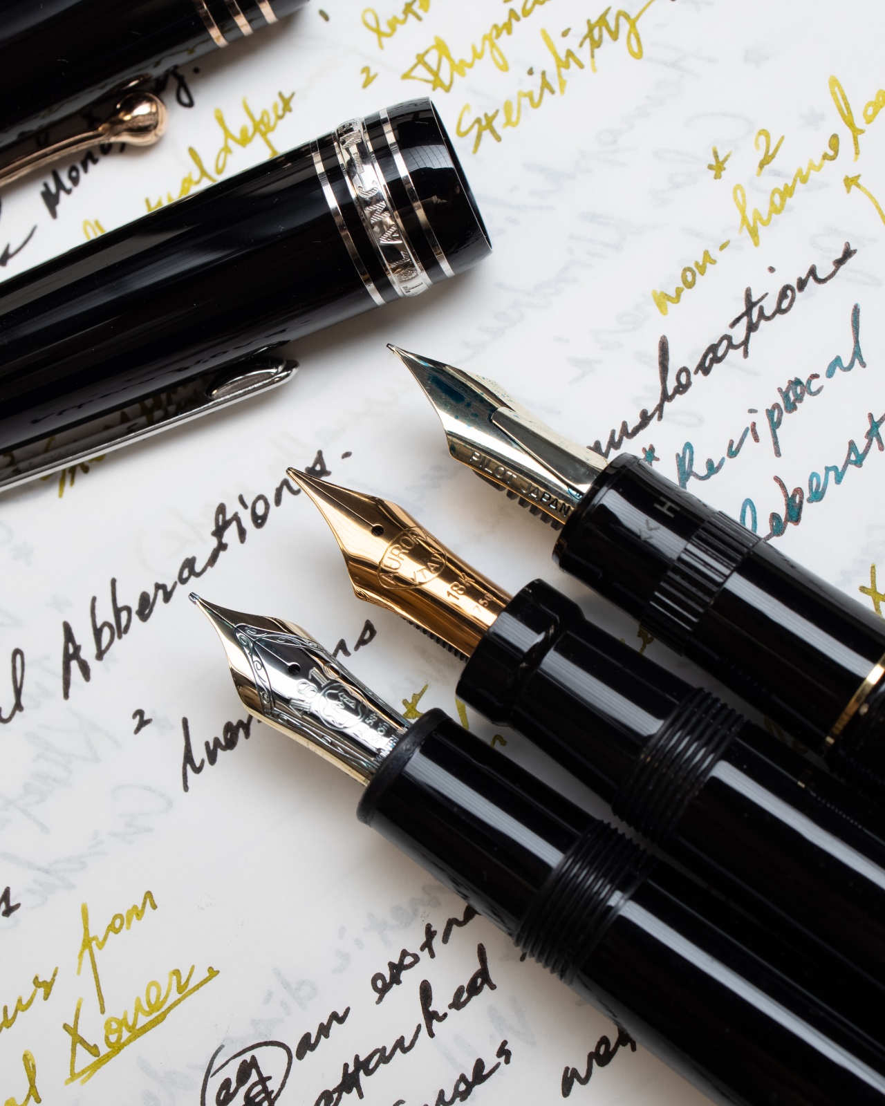
Here are some of my favorite fine/extra fine nibs, which I use to take notes daily. What is/are your favorite fine nib(s)? 1. Montblanc EF, 14K (as I heard a recently updated grind). Precise, sharp, and smooth at the same time. Feel like a simi-italic. I wish it could be a bit wetter (I prime it once in a while with most inks. Sailor Kobe #7 Kaikyou Blue, however, write as wet as I wish it to be). 2. Aurora F, 18K. “Responsive” to slight variations in pressure, giving a very subtle amount of line variation that won’t ruin its purpose for taking notes. Aurora pens also have the best weight-and-size balance for me, which just adds on to my love for their nibs. 3. Pilot Justus 95 F, 14K. Smooth and bouncy. Extremely reliable and present to write with. My dream pen would have a nib like this and a piston filling mechanism.

-
What types of ends/finials do you like? (Poll)
collectorofmanythings posted a topic in Fountain & Dip Pens - First Stop
So, what do you like? I’d just like to know your opinion. I personally prefer flat ends, but tell me what you like! -

Regarding the Reapair of two Aurora Internazionale
AlphabetZeta posted a topic in USA - North America
Hello everyone, apperciate your kindness and input here. I bought two Aurora Internazionale on my trip to Japan a while ago, but I think due to all kinds of accidents, and the bank I kept them in got water damage in the vault. I observed some wear and scratches created by shipments. (Which is like a small amount on the and the end of the pen) So I would like to send my pens through Kenro to Aurora, I asked Kenro if Aurora could offer a repolishing of the pen, and they said yes. But I do not know if Aurora is willing to do an overhaul for the two Internazionale since they are sitting in a moistured environment for a while, so there may be something terrible happening to those metal components on the cap or so. And got some minor wear and scratches on the surface. I was just wondering if anyone would help me with this question. I also wonder what kind of packaging I should do when I ship them to Kenro, and in what type of packaging will they send back? Well... Although Internazionale may not be the most valuable Aurora, its old Duofold appearance and limited nature are indeed leveling up my concern and cause me to worry about these issues. -
Aurora 8"88" Giove, closed and sitting on tonal reference card.jpg
A Smug Dill posted a gallery image in FPN Image Albums
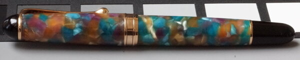
From the album: European pens
This pen is rather tricky to photo and show off its true colours, so I placed it on top of a reference card to help you better calibrate your perception of the colours in its aurolide body.© A Smug Dill
- 0 B
- x
-
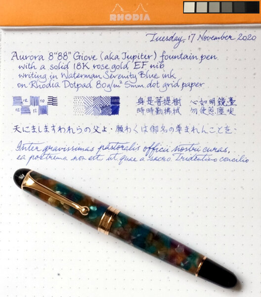
Aurora 8"88" Giove 18K rose gold EF nib writing sample.jpg
A Smug Dill posted a gallery image in FPN Image Albums
-
Manufacturer: Aurora Series, colour: Blue-Black Pen: Waterman Hemisphere „F” Paper: Image Volume (gramatura 80 g / m2) Specifications: Flow rate: good Lubrication: good Bleed through: unnoticeable Shading: noticeable Feathering: unnoticeable Saturation: good A drop of ink smeared with a nib The ink smudged with a cotton pad Lines Water resistance Ink drying time Ink drops on a handkerchief Chromatography Sample text in an Image Volume (gramatura 80 g / m2) Sample text in an Oxford notebook A5 (90 g / m2) Sample letters in a Rhodia notebook No 16 (90 g / m2) Sample letters in a Clairefontaine (gramatura 120 g / m2) Palette of shades
-
Manufacturer: Aurora Series, colour: Black Pen: Waterman Hemisphere „F” Paper: Image Volume (gramatura 80 g / m2) Specifications: Flow rate: very good Lubrication: good Bleed through: unnoticeable Shading: unnoticeable Feathering: unnoticeable Saturation: very good A drop of ink smeared with a nib The ink smudged with a cotton pad Lines Water resistance Ink drying time Ink drops on a handkerchief Chromatography Sample text in an Image Volume (gramatura 80 g / m2) Sample text in an Oxford notebook A5 (90 g / m2) Sample letters in a Rhodia notebook No 16 (90 g / m2) Sample letters in a Clairefontaine (gramatura 120 g / m2) Palette of shades
-
Manufacturer: Aurora Series, colour: Blue Pen: Waterman Hemisphere „F” Paper: Image Volume (gramatura 80 g / m2) Specifications: Flow rate: very good Lubrication: very good Bleed through: unnoticeable Shading: noticeable Feathering: unnoticeable Saturation: very good A drop of ink smeared with a nib The ink smudged with a cotton pad Lines Water resistance Ink drying time Ink drops on a handkerchief Chromatography Sample text in an Image Volume (gramatura 80 g / m2) Sample text in an Oxford notebook A5 (90 g / m2) Sample letters in a Rhodia notebook No 16 (90 g / m2) Sample letters in a Clairefontaine (gramatura 120 g / m2) Palette of shades
-
Today I took delivery of this Aurora Optima 365 in brown marble. It appears to be in excellent condition, though I have not yet inked it up after an initial flushing. The pen came to me in a box for an entirely different Aurora pen which, while annoying, was not horrible. I pretty much expected that from the sales listing anyway, and I've been on the lookout for just this model so it didn't bother me. What I didn't expect was the deep red ebonite feed. Is this feed color correct for this pen? Does it matter. It does have the correct 18k gold nib. Thanks. EDIT UPDATE -- I asked this question after quite a bit of searching first and not finding an answer. Subsequently, of course, I found the Nibsmith video review which showed the red feed. Got my answer. Thanks anyway. Very happy to have this pen, needless to say. Marc
-
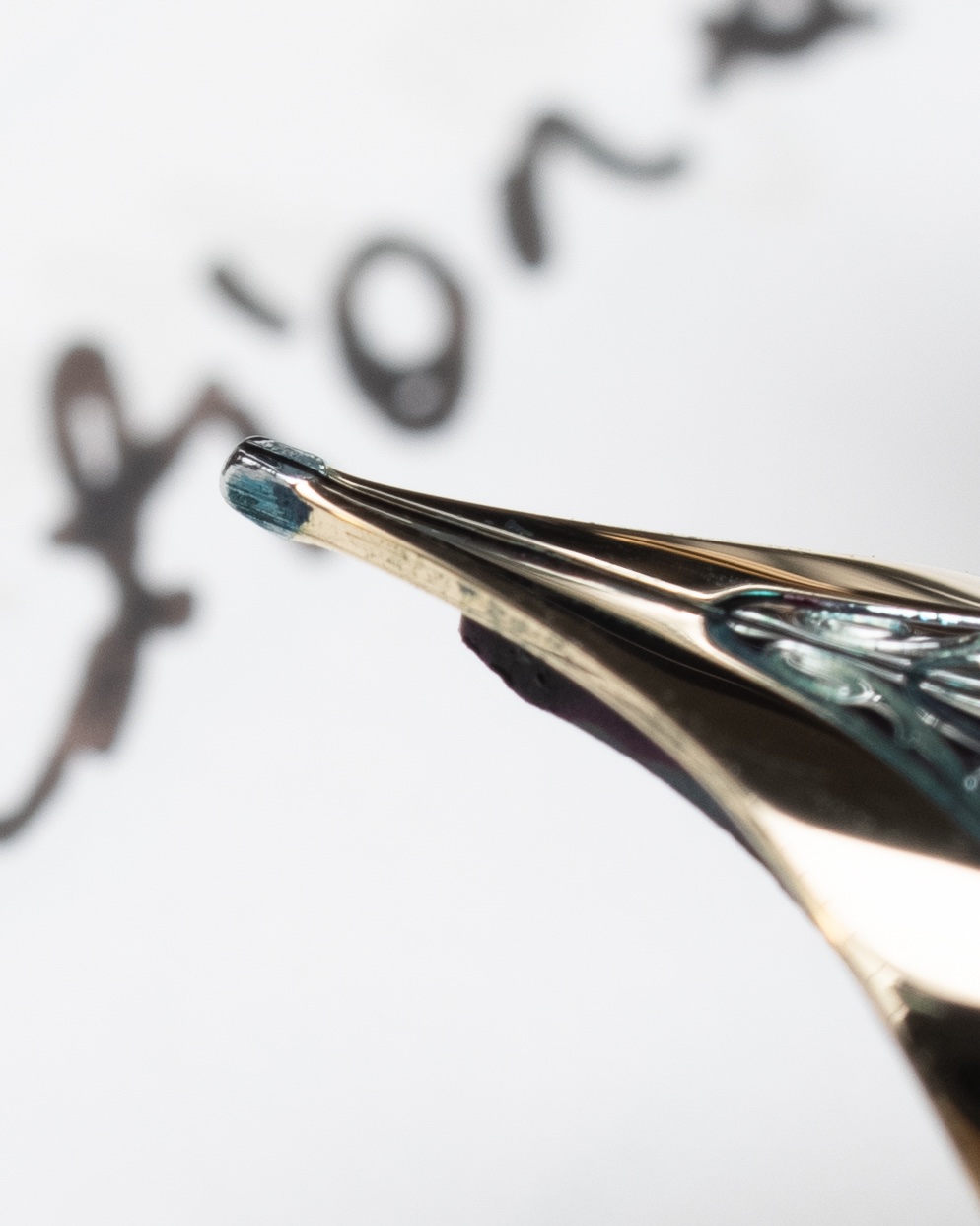
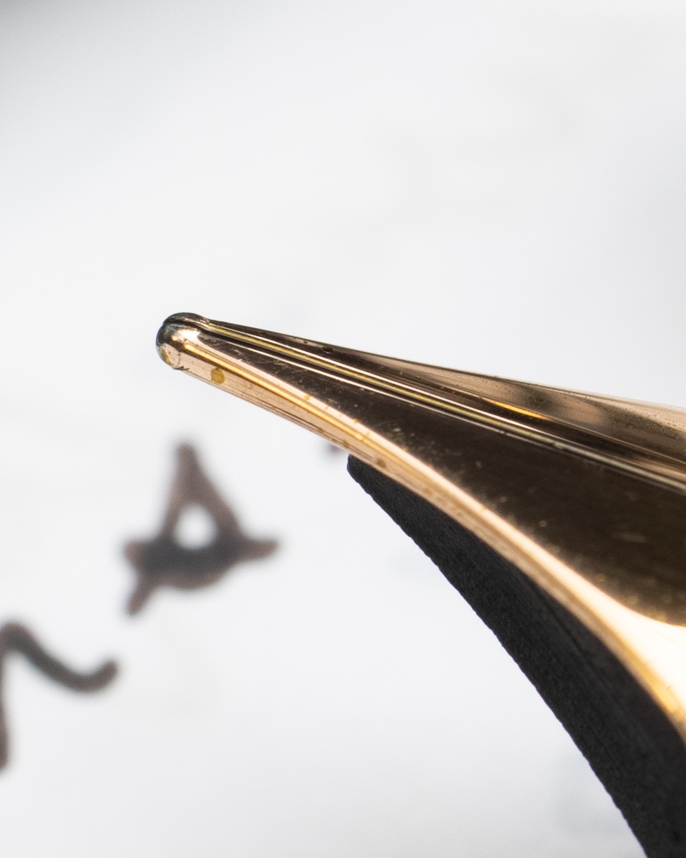
Silly curiosity, this. Cleaning my 88 from the 8o's sometime (first pen I ever bought) I see some really, really tiny figures at the bottom of the nib just before entering the section. I haven't found anything on these tiny markings, any ideas? From the top the nib reads 14k, 585, Aurora, that's all well and good, now here's the tricky bit, in an oval: a five pointed star, numeral 5, _space_ TO. They are so tiny I don't think I have anything that could provide a good photo. Now that I've spotted them, I can't let it go. Thanks kindly.
-
It's a hot, sunny Sunday here in Auckland, New Zealand. The palms are rustling in the garden and the paddling pool is set up on the deck. It sure feels like we're in for a long summer. I've only just gone back to work after my longest holiday in four years - a full three weeks! - and escapism has already been tempting my mind away again. Hence, two new pens recently arrived after days of enjoyable reading, watching reviews, considering comparisons, weighing options, and finally hunting for the perfect specimen at the right price. That process, and my thorough enjoyment of it, made me realise just what a wonderful resource the Fountain Pen Network is. I've been a member for only a few months, and before that made casual use of the forums and reviews which popped up in Google searches. Now, I feel it's time to repay the use I've made of the knowledge compiled here by adding to it, if I can do so helpfully and modestly. I am hardly any kind of expert. The opposite in fact! I have always loved to write, but I'm not sure I had even touched a fountain pen up until a year ago. As a student, either at the start of the year or around exam time, I would go through a buzz of stationery purchases, in eagerness or desperation. The right coloured notebook or pen can set you up for a perfect semester... or prop up a feverish, last-ditch attempt to cram - right? But I never connected this fondness for smooth writers and cheerful bindings with fountain pens. I had always found fountain pens to be beautiful, but they were an object of prestige and mystique, something a bit niche or for the initiated. Like cigars and champagne; a thing I saw in movies, not in real life. Fast forward a few years to the middle of 2019 when I have a steady job (and income) and a partner who uses his grandfather's fountain pen at work. I get to see one up close. Boom. My interest began to grow, and I've had a challenge reining it in since. Now I have six pens. Some are European, some are Japanese. All are from different makers. They are of varying nib widths. Four are vintage and two were bought new. They are all of reasonably high quality and from known brands (thanks mainly to knowledge gleaned from this very site), except one which was a case of mistaken identity and a good lesson in caution when buying pens online. I have been thinking that I would love to do a post about my small collection so far, but given the diversity of it, does anyone have any pointers on where it should go? I was thinking of doing each pen with photos and writing samples. Not quite full reviews, but with commentary on how I find them to use for sure. I tend to go for good examples from good makers, and have a thing for unusual and beautiful design, materials or nibs. My pens are: - Lamy 2000, new (I'm sure plenty has been said already about this pen!) - Sailor Pro Gear, new (again, plenty said I'm sure) - Pilot Custom, vintage, maple. An unusual model from I assume the 1980s, with the inset nib found on some other pilot pens but not on the Custom anymore. It's design is also different to the current pilot design, more slender. It is also made of solid maple. It's a really interesting and beautiful pen, and I was only able to find one or two other references to this particular version online. - Sheaffer Targa, vintage, sterling silver. Not an uncommon pen, but it was my first and it remains my favourite. It has a fluted design that is beautiful to look at and hold. - Montblanc No. 32, vintage, presumed 1960s. This is the variant with the partially hooded nib, giving a wing-like shape which I find particularly beautiful. It's a fantastic writer, and I love its more minimal, sleek design compared to their top shelf pens and the more modern Montblancs. - Aurora Marco Polo, supposedly vintage. This was my mistake pen. When I was starting out, I saw this advertised as an Aurora Hastil on Etsy, and my research into the Hastil made me incredibly interested to own one. So I bought it, and later, after more research and comparing images, realised that it is NOT a Hastil. I feel like a real fool about this, even though the seller refunded half my money when I pointed out the mistake. If the pen were nice to use, this would have restored it to a place of honour in my eyes, but... well let me know if you'd like a proper post about my pens! If I do write a post about my collection, where should it go? Would it be better split up into individual posts about each pen? Let me know what you think. Thanks for having me! Doug
-
---------- Verbose introduction; hang on to your britches! ---------- I recently bought a used Aurora Hastil (red body, yellow gold nib) on ebay for a very reasonable price. This is my first gold nib fountain pen and first retro pen. The entire pen has a wonderful feel to it! The body seems to be made of a golden metal with a red plastic coating that has a remarkably luxurious feel. The cap clicks to the rest of the body with a reassuring CLICK, and glides onto the rear of the body when posted. The Aurora designers included soft plastic standoffs to prevents scratching when the cap is posted. Overall, the pen is incredibly light and thin, but has a very clean look to it. Once I figure out how to post photos, I will do that. The clip is wonderful as well. It is obviously designed to sit in a shirt pocket, because the clip nearly rests on the cap, indicating that it is intended to clip to a thin fabric. Pants are out of the question, so I think a dress shirt pocket would make sense. As an aside; for those of you who have tried wearing fountain pens in your dress shirt pocket, several bad things may happen (and have for me): 1. If the pen is heavy (think TWSBI), your shirt pocket sags, and your shirt looks terrible. 2. The clip does not have the necessary contact surface area with the shirt fabric, and you simply bending over results in a few curse words as the pen slides out and *SMACK*s into the ground. So, I placed the pen in my dress shirt pocket, and did a hand stand. Done. No sliding, and the pen seems happy to be there with me, fighting gravity. The section, feed, and nib look remarkably well made. The section is stamped with a serial number, the feed doesn't have lines left from the molding manufacturing process, and the nib looks very simplistic but nice. On the side it is stamped with '14 kt'. -------- end of verbose introduction; on to business! ---------- When I unscrewed the pen for the first time, I saw what I had expected, but hoped wouldn't be the case. The pen was still inked; if you can call it that.. The ink cartridge did have ink in it at one point in its history, but the ink had dried, leaving a crusty residue in the cartridge. This of course is not a big deal, what is.. is the feed. I immediately started cleaning out the feed with a bulb syringe (as per Stephen's tutorials). I filled the bulb syringe with room temperature water, and streamed it through the feed from the section side. As expected, a constant flow of dark black ink was expelled from the tip of the pen. I did this with probably 5 or so syringes until I got a clear stream. I dried the nib off and let it set for the next day. The next day, I pushed through another bulb syringe, and sure enough... more dark color. This time a deep violet color. I have repeated this process for 3 days now, and I'm somewhat irritated at this slow process. I took studiohead's recommendation and suspended the section/nib/feed under water. I got the following really cool results: Does anyone know how to take an Aurora Hastil apart? I would like to give the feed a good scrubbing. Does anyone know of a faster way of cleaning the feed?
-
While beginning an Aurora 88K piston replacement I removed the section/nib unit and saw this. I have yet to touch it. It looks waxy. Has anyone seen anything like this? I am hoping the retaining nut and such are there and this is not all that is holding the seals in place... edit- It definitely seems to be wax after touching it. I also touched a razor blade to it lightly and it did nick the substance which is another reason I think it is wax. Once fully extended like this the piston knob keeps turning.


-Copy.thumb.jpg.087fb04c2702c5a13a0150ddb815b340.jpg)