Search the Community
Showing results for tags 'ancient copper'.
Found 8 results
-
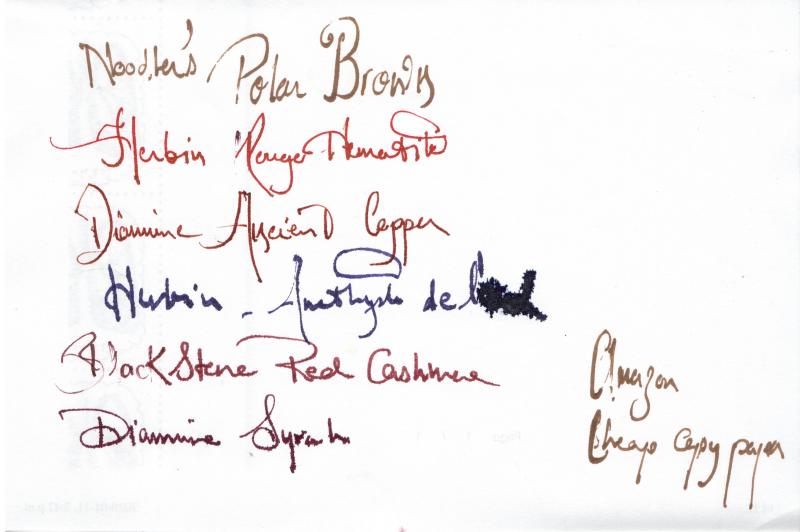
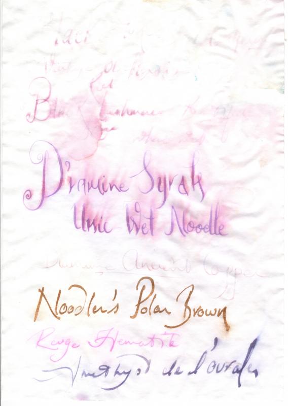
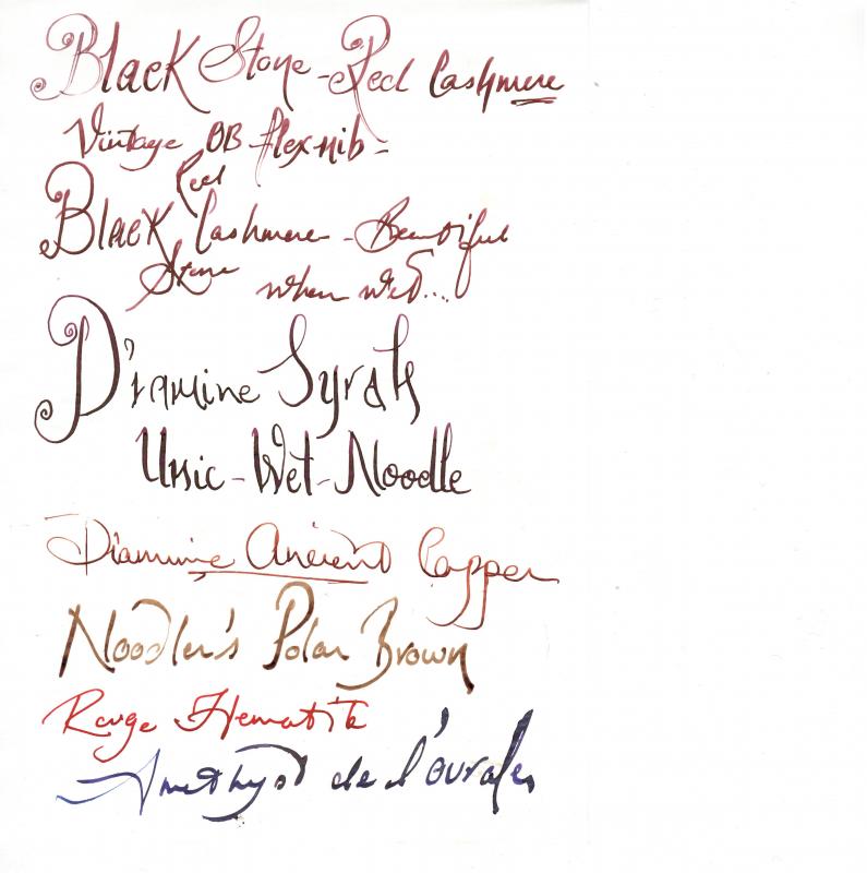
Hello, This is a first and a mini review. To me personally the colour, shading and sensation are important. Yet, I can forgive many things, if the ink has that je ne said quoi factor. In preparing this review, I appreciated many times more, the work of so many reviewers, that I've enjoyed over the years, thank you. From what I understand Red Cashmere, in its powdered form, was the genesis of Black Stone inks, in Australia. I was intrigued by this ink, thinking it would be a nice sheening variation, albeit darker version of Rouge Hematite, but cheaper. My sample came from fountainfeder and it was the first ink I excitedly tried... I was taken aback by the colour as it transformed from a full throated luscious red into dark, almost blackish red. But it grew on me as I played around with it, especially when I could appreciate its shading, which can be quite dramatic, especially in scans. To me it's a reddish version of Ancient Copper. One issue, I found with this ink was startup. Nothing that a dip in a water wouldn't solve, but still. I hope it was a fluke. The ink has low to non water resistance on Tomoe River paper, but can survive pouring taking a short shower on cheap absorbent paper. I used a vintage Conway Stewart with OB flex nib and Jinhao 450, with a medium nib for my testing and Rhodia notebook. I wish I had other dark reds, shading inks to compare with, but I will leave that to the more seasoned members of this forum. Close up photo: Water test on cheap amazon copy paper... Notes that Amethyst de L'Oural with a fude nib, feathered into a bird..... Before After Most survived the water...but with Tomoe River they just washed out..... Before After - Yours ink-ly Bob

-
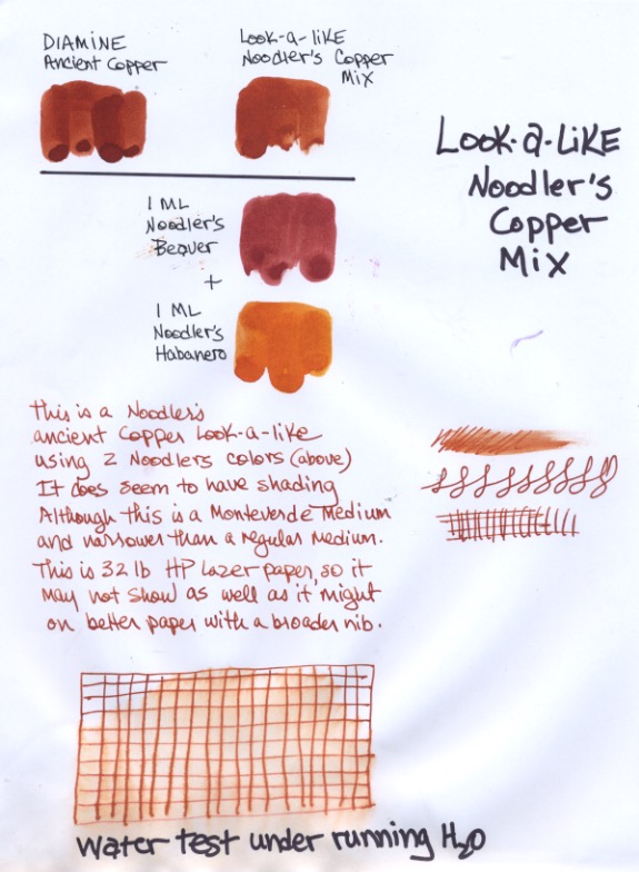
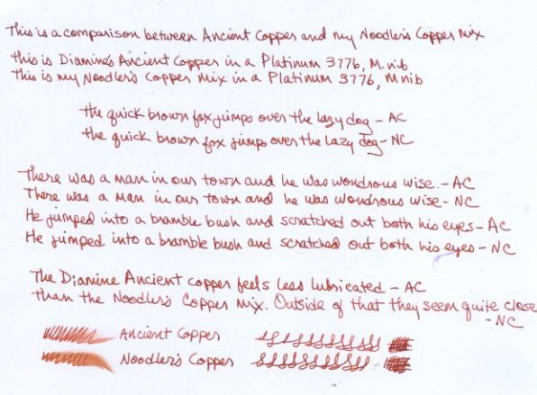
I've been asking for a copper/terra cotta ink from Noodler's (preferably water resistant,) but knowing how Nathan Tardif is a one man business with a lot on his plate, I decided to make my own with his inks rather than wait. With just two, Habanero and Beaver mixed in equal parts, I was able to closely approximate Diamine's Ancient Copper. It seems stable in the vial and pens. It seems to behave well, with little feathering or bleed-through, and surprisingly, it seems to have a bit of water resistance. It's a very pretty rusty brown and a good color for drawing. The Noodler's lineup doesn't really have anything like it. The recipe is: 1 part Noodler's Habanero + 1 part Noodler's Beaver. I've dubbed it Noodler's Copper. Please note: I have no Noodler's affiliation, just a lot of their ink And no. I don't follow Nathan's politics, only my own heart.
-
Recently, I got myself a bottle of Monteverde Fire Opal - because I liked the colour, but also because I hoped that it might finally prove to be that rare ink in this particular colour range to be free of nib crud issues. Alas, I have now found that it suffers from the same sort of nib crud that users of similar-coloured inks like Diamine Ancient Copper will be familiar with. When used in pens with a less-than-perfect cap seal, the usual frothy crud builds up. The same happens during long writing sessions - crud gradually builds up along the length of the nib slit and the nib-section and nib-feed interfaces, and needs to be wiped off every now and then. After having owned and used three inks from different manufacturers in this colour range - Diamine Ancient Copper, Private Reserve Orange Crush, and now Monteverde Fire Opal - and having experienced nib crud issues with all of them, I have now resigned myself to the understanding that, so long as I am using a rusty/coppery-coloured ink of this particular type, there shall be no escaping nib crud. It's just a cosmetic and convenience issue, but still rather annoying.
-
Diamine Ancient Copper has been reviewed at length, I arrived at it looking for an alternative to Montblanc Leonardo and other inks; it's a good looking ink, but it didn't do it for me, so I gave it way; this is what remains in a Lamy Vista with an F nib. The paper is Fabriano Ecoqua, it seems to bring out the best of several inks, it's smooth and dries much faster than Clairefontaine and Rhodia. First row of other colours: Ama Iro, Kon Peki, Souten, Équinoxe 6, Tsuyu Kusa, Asa Gao. Second row: Inti, Ina Ho, Lie de Thé, Yama Guri, Ajisai, Myosotis. Third row: Chiku Rin, Vert Empire, Verde Muschiato, Perle Noire x 2, Verdigris. Fourth row: Orange Indien, Fuyu Gaki, Mandarin, Poppy Red, Rouge Hematite.
-
I have been looking to develop my "Warm Earth" tones in general and my red earths in particular. Diamine seemed to have some good options (I have my "Cold Stone" colors from De Atramentis). I couldn't really find a good comparison so I narrowed it down to the few that I was most interested in and plumped for 30ml bottles rather than samples. It's neither scientific nor thorough, but I thought I would post my initial impressions as I couldn't find anything similar. . . . . which is a scan but the colors for Ochre and Rustic Brown are not true at all. I tried taking a photo, which is a much more fiddly process, but the colors seem truer: Two more bricks that I didn't like on the first page - I thought the Copper was rather strong! The Monaco Red might be a bit too pink in that one? Anyway it seems I have added the following to my "Sub-Tertiary Color Circle": Yellow Earths: Sepia and Ochre Orange Earths: Burnt Sienna and Ancient Copper Red Earths: Oxblood & Monaco Red (both still tending to orange - which is what I was looking for!) I don't have any "True Reds"! Rustic Brown I would count as a Rose - it's really on the purple end (where my sample of Morinda seemed to fit too). On the Orange front I also have Autumn Oak, a decent Coral (house blend!) and an Orange with a cute elephant on the label, but as these aren't anywhere near "brick" they did not seem relevant here. Hmmm, the only thing I might add is that this is my "cheap scribbling" paper (Daiso - great cheap paper for ink work!) rather than anything fancy, so the colors are a bit flatter than they might be elsewhere.
-
My latest ink is Diamine Ancient Copper I haven't used Diamine Ancient Copper for quite a while. I had a sample from Goulet's Ink drop ages ago, and it's an ink I never went back to after using the sample. I was surprised how much I really liked the colour, and wondered why I didn't have it in my collection. It's a rich dark copper colour with plenty of shading. I am aware that some users have had a problem with Ancient Copper drying onto their nibs, so as soon as I received my sample, I filled my Lamy converter in my Lamy Next M pen and left it in there for a few days without using it. I didn't notice any ink on the nib when I came to write with it. I wonder if it depends on how airtight the caps are on the pens that are filled with it? It wrote straight away without any hard starts or skipping. It lubricated the nib well enough, but the flow felt a little dry, as I couldn't see any moist ink as I was writing. However, despite this, it took longer to dry than I thought it would. It's quite a water resistant ink. I could see the writing, even after several minutes, and though I blotted my water test with a piece of kitchen roll, the ink was still legible.Although this isn't a waterproof ink, it shows quite good water resistance, as do many Diamine inks.Bearing in mind the paper I use is thick with a shiny surface, and I used a Lamy F nib and a 1.1mm stub nib, this ink took 17-20 secs to dry. That's slower than some other inks I've reviewed recently.It felt a bit drier than some other inks I've reviewed, but still seemed to lubricate the nib well. I saw no skips or hard starts while I did swabs and dry time tests.It is currently available in 80ml glass bottles or 30ml plastic bottlesDiamine sell it directly to end-users on their web-site.It's a reasonable price.
-
I've seen all these colors when visiting the Grand Canyon except the one ink named Grand Canyon. Oh, this is a Co-Written - Crazy - Comparison - Review. http://sheismylawyer.com/She_Thinks_In_Ink/2014-Inklings/slides/2014-Ink_523.jpg
-

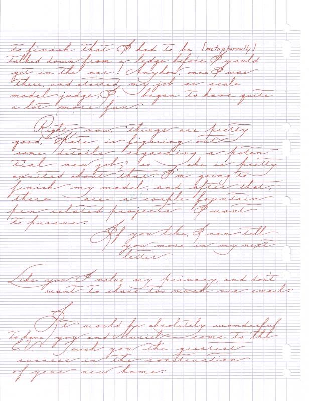
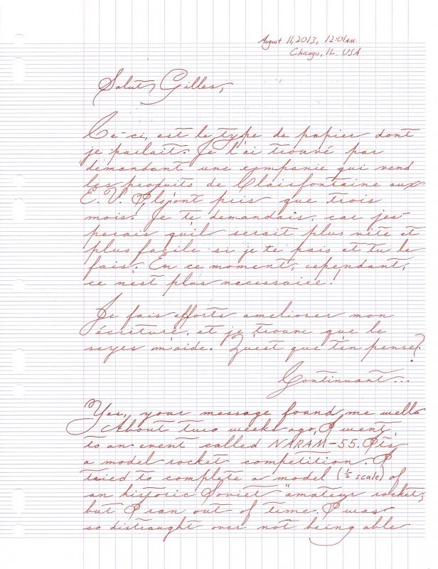
Diamine Ancient Copper Letter In "spencerian"
PrestoTenebroso posted a topic in Calligraphy Discussions
How does this look? I'm trying to learn a pretty handwriting hand. I wrote this with a Pilot Petit with fine nib, and Diamine Ancient copper on Clairefontaine paper Any suggestions are welcome! .