Search the Community
Showing results for tags 'alt-goldgrun'.
Found 7 results
-
Rohrer and Klingner Alt-Goldgrün Rohrer and Klinger – founded in 1892 in Leipzig, Germany – is a company that is mainly focusing on inks for all purposes, including fountain pen inks. Their inks come in very recognizable retro-style 50 ml bottles. R&K have produced a number of truly renowned inks, and this Alt-Goldgrün is one of them. It’s only quite recently though that I got a bottle of it and wetted my pens with it. Probably already reviewed ad nauseum, but I’d still like to take a shot at it and give you my own opinion. The ink’s name – Alt-Goldgrün – fits the colour really well. At its heart it’s a yellow-green ink and a lovely one at that. But what truly adds to its character are the rose-brown undertones that rise to the surface where the ink gets more saturated. Really well executed! The ink lays down a well-saturated line, even when using finer nibs. Shading is on the strong side – a little bit too strong for my personal taste. I also noticed that the ink writes fairly dry, especially in my Lamy Safari test pens. For me, the sweet spot for this ink is a wet-writing pen with an F or M nib. The stronger saturation results in less contrast-rich shading and elevates the rose-brown undertones. The result is pure eye-candy. The chromatography shows a complex mix of dyes – light-blue, yellow and lots of rose. And this combination of dyes works remarkably well. The addition of the rose dye is simply brilliant – this elevates the ink above the level of a run-of-the-mill olive-green and gives it that rose-brown shimmer in saturated parts. Rohrer & Klingner’s ink-makers sure now their craft! To show you the impact of saturation on the ink’s look & feel on paper, I made some scribbles where I really saturated portions of a piece of 52 gsm Tomoe River paper with ink. This gives you a good idea of what the ink is capable of in terms of colour range. Alt-Goldgrün has a fairly wide contrast range with a really light green colour in the non-saturated parts. This translates to relatively heavy shading – a bit too harsh for my taste. This is easily remedied by using a wetter pen – the more saturated line means that your writing moves to the darker part of the contrast range, which tones down the shading. Still very present, but no longer too contrast-rich. Technically, the ink felt a bit dry-writing in my Lamy Safari test pens, especially with the finer nibs. Not so much an issue of wetness, but more of lubrication. With the finer nibs, you definitely feel more feedback from the paper while writing. With broader nibs, lubrication improves, and the ink starts writing much more fluently. In the writing samples below, I use my typical variety of different paper types. This gives you a good feel for what the ink is capable of. On each scrap of paper, I show you: An ink swab, made with a cotton Q-tip 1-2-3 pass swab, to show increasing saturation An ink scribble made with an M-nib Safari fountain pen The name of the paper used, written with B-nib Lamy Safari A small text sample, written with the M-nib Lamy Safari Source of the quote, with a Platinum 3776 with B-nib Drying times of the ink on the paper, with the M-nib Lamy Safari I’ve also added a photo to give you another view on the ink. Scanned images and photos often capture different aspects of the ink’s colour & contrast. That’s why I present them both. In this case, both scan and photo capture the ink’s colour well. The shading is more realistic in the photo though (my scanner often tends to exaggerate the contrast in heavy-shading inks). Alt-Goldgrün looks good on all types of paper, both white and more creamy ones. I personally prefer it on pure white paper, just because there’s more contrast with the page. The ink definitely prefers hard-surface and high-quality paper. On more absorbent and lower quality papers (Moleskine, printing paper), you can see a tiny bit of feathering, and you also get some see-through and bleed-through. Drying times are on the long side on hard-surface paper, ranging from 20 to 30 seconds. Not a problem for me, because I use it mainly for journaling and not in a work-context where faster drying times are a requirement. Writing with different nib sizes The picture below shows the effect of nib sizes on the writing. Alt-Goldgrün can handle all nib-sizes but looks at its best in finer nibs (my opinion). With broader nibs the shading becomes a bit too extreme for me (but then I prefer my shading to be soft and not too visible). In my opinion, you get the best results with wet pens and F/M nibs: the rose undertones will come to the surface, and the shading looks more pleasant. Anyway… it’s worth the time and effort to search for the perfect pen/nib combination, because this Rohrer & Klingner ink certainly deserves it. Related inks To show off related inks, I use my nine-grid format, with the currently reviewed ink at the center. This format shows the name of related inks, a saturation sample, a 1-2-3 swab and a water resistance test – all in a very compact format. This Alt-Goldgrün has no close relatives in my ink collection. As such, I’m glad that I got me a bottle. Inkxperiment – quarky proton As a personal challenge, I try to create interesting drawings using only the ink I’m reviewing. It’s a fun extension of the hobby, and these single-ink drawings often present a real challenge. It also gives you an idea of what the ink is capable of in a more artistic setting. Inspiration for this inkxperiment comes from recent research results in quantum physics, that showed the inherent complexity of the proton. Earlier physics experiments showed that the proton consists of more elementary particles – namely two up-quarks and a down-quark, bound together by the strong force. Reality is more complex though, with more transient particles coming and going in a sea of quantum foam. I tried to capture this idea in my inkxperiment. I started with an A4 sheet of HP photo paper and used heavily water-diluted ink to paint in the spherical contours of the proton. I then added three circles representing the quarks, with strong force lines between them. The quantum foam was added with a piece of carpet anti-slip material. Unfortunately, the drawing failed spectacularly and didn’t come out the way I intended. The more-or-less spherical boundaries of the proton are lost, and there is no dynamic feel in the end result. I don’t see the blazing forces of nature in action. No matter, I still had fun making the drawing. Even though this inkxperiment botched, it still shows quite well the broad spectrum of colour tones you can extract from the Alt-Goldgrün ink. Inkxpired – computational art I love experimenting with pen/ink/paper and have added another layer as part of the hobby. I’m exploring computational art, inspired by the ink drawings I do during ink reviews. Another fun offshoot of the hobby… and all that starting with a few drops of dye-coloured water on paper. For this computational derivation, I tried to steer the inkxperiment drawing in the direction that I intended. To bring out the spherical contours of the proton, I started by applying a fish-eye lens filter to the drawing. That worked surprisingly well – the quarks and strong forces are still there, but the result looks much more dynamic. Next, I applied a solarize filter that resulted in violet-blue & white colours. This worked wonders for the sea of quantum foam. I really like the end result with its futuristic feel of barely contained quantum forces. As far as I’m concerned, this saves the unsuccessful inkxperiment! Conclusion Rohrer and Klingner make some great inks, and this golden-green Alt-Goldgrün is definitely one of them. A beautiful olive-green with rose-brown undertones, and a rather unique colour. A bit too harsh in the shading department for my tastes, but nothing that can’t be solved by the right pen/nib combination. I’m glad that I added it to my ink collection. Technical test results on Rhodia N° 16 notepad paper, written with Lamy Safari, M-nib Back-side of writing samples on different paper types
-
desaturated.thumb.gif.5cb70ef1e977aa313d11eea3616aba7d.gif)
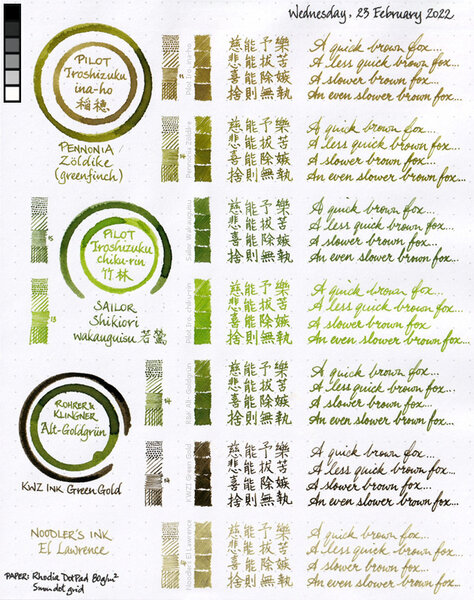
Seven inks colour comparison sheet 2022-02-23
A Smug Dill posted a gallery image in FPN Image Albums
From the album: Shades of colour
My scanner seems to be noticeably deficient in picking up green, with or without the reference greyscale and/or colour patches being scanned alongside a sheet of writing; my eyes certainly see more green on the physical artefact. As a result, Noodler's El Lawrence and KWZ Ink Green Gold both appear in the scanned image as without any greenness, even though there should be some hints of very muted green in both.© A Smug Dill
- 0 B
- x
-
Seven inks colour comparison 2022-02-23 (rearranged)
A Smug Dill posted a gallery image in FPN Image Albums
.jpg.4ac20772527725bffaacdec6fce395c4.jpg)
From the album: Shades of colour
My scanner seems to be noticeably deficient in picking up green, with or without the reference greyscale and/or colour patches being scanned alongside a sheet of writing; my eyes certainly see more green on the physical artefact. As a result, Noodler's El Lawrence and KWZ Ink Green Gold both appear in the scanned image as without any greenness, even though there should be some hints of very muted green in both. The rearranged fragments that appear in this image were taken from this: https://www.fountainpennetwork.com/forum/gallery/image/9891-seven-inks-colour-comparison-sheet-2022-02-23/© A Smug Dill
- 0 B
- x
-
-
KRISHNA GHAT GREEN The review is simultaneously posted at my blog here : LINK Krishna Ghat Green In Indian Fountain Pen industry or Circles, Dr. Sreekumar is quite known for his hand-turned fountain pens and almost 20 types of nib tuning. However recently he has shelved in to making fountain pen inks under the brand name of KRISHNA. These inks are sold on eBay India Page for Rs. 550 (8 USD) each for 5 Nos. 30 ml ink bottle plus shipping. NOTE THAT NEW GLASS BOTTLES HAVE ARRIVED AND THIS WILL RESULT IN BIT OF PRICE INCREASE. The inks that are being produced are currently limited to 28 nos. : GOLD RUSH MEADOW GREEN BLUE MAGIC AFTER DARK SAPPHIRE BLUE LAKE BLUE BRONZE LEAF ORANGE CRUSH AUTUMN SINDHOOR GLORY VINE DARK ROSE NJAVAL WILD CHERRY PURPLE PEACOCK YELLOW VALLEY MELLOW BLUE VIVID VIOLET ORCHARD LILY DARK CHOCOLATE COOL BREEZE SILENT NIGHT SKY FORGET ME NOT SKY BLUE GHAT GREEN PUMPKIN GIRL PINK / BARBIE PINK (discontinued) Krishna Inks – Color Chart 1 Krishna Inks – Color Chart 2 I would like to thank Dr. Sreekumar for sending me the samples and also for the effort that he has put in. I will be reviewing all one by one. This review is about GHAT GREEN ink from KRISHNA. This is one of my favourite inks from the lot. Though Ink drying times were high, however new batch that he has release has massive improvement on ink drying times. Krishna Ink comes in plastic bottles in 30 ml quantity and new lot with INCREASED PRICES will come in glass bottles now. INK SPLASH Krishna Ghat Green – Ink Splash on JK Cedar 100 gsm Oh man I love this colour. Its fantastic. Also it shades subtly, however there is no sheen. DROP ON PAPER NAPKIN Krishna Ghat Green – Ink Drop on Paper Towel COLOR MATCH Krishna Ghat Green – Color Range WRITING SAMPLES Krishna Ghat Green – Writing Sample on JK Cedar 100 gsm Krishna Ghat Green – Writing Sample on JK Cedar 100 gsm – Angled View The ink even shades in fine & medium nib also as good as in stub nibs. INK SWABS Krishna Ghat Green – Ink Passes on JK Cedar Krishna Ghat Green – Ink Swab on Jk Cedar Krishna Ghat Green –Scribble on Jk Cedar WATERPROOF TEST Krishna Ghat Green – Waterproof Test Ink when rubbed with water gives away the colour, however it leaves behind dark lines which are still legible. So I can say its moderately waterproof. INK DRYING TIMES Krishna Ghat Green – Ink Drying Times Ink drying times are massive and I have informed the seller of the same. And he has confirmed me that the new current batch has less drying times of less than 30 sec. BLOW UP WRITING SAMPLES Krishna Ghat Green – Blow up Writing Sample on JK Cedar 100 gsm There is no feathering of this Ink as you can see from this close-up. CONCLUSION: I like the colour, this is absolute lovely colour. The closest ink with same colour that I can think of is R&K Alt-Goldgrun. The ink has amazing flow properties and is moderately lubricated as it writes amazing with my (bleep) nib of Guider Pen, its inexpensive, and yes it doesn't stain. Only hitch is Drying Times. Following are the summation of ink properties: Feathering : NoSheen : NoShading : ModerateLubrication : ModerateFlow : GoodWater Resistance : GoodDrying Times : Very HighNib Creep : NoneClogging : NoneOdor : None Ink can be bought from : LINK (Ebay India Store)
-
I found a stash of old reviews that got misplaced during a house move, so this one's pretty old. http://imagizer.imageshack.us/v2/xq90/540/cKbAUr.jpg
-
Here's another of my favorites. It is incredibly difficult to capture this incredible ink in photos. Forgive the comparison to Verdigris; I have too few green inks. Reasonable care was taken to ensure color accuracy. The Warbler was done with Alt-Goldgrün, J. Herbin Cacao du Bresil and a touch of J. Herbin Terre de Feu in a Stillman and Birn Gamma sketchbook. Any resemblance between the ink swab and le decolletage (or any other anatomical feature) was purely accidental.