Search the Community
Showing results for tags '23ktpdnib'.
Found 1 result
-
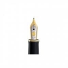
Overview: The Visconti Homo sapiens is a grail pen for many including myself. The Homo sapiens is one of those pens that just screams flashy Italian design. From the basaltic lava that makes up for most of the pen to the bronze accents this is by no means an understated pen. I have the "older" model with the 23 karat palladium Dreamtouch nib which writes very well having been tuned by a nib mister (at first it didn’t write at all). I tend to take the pen on a lot of trips with me because of the high ink capacity convenient mechanism. In addition, the pen is virtually unbreakable under normal war and tear. The pen is defiantly an eye catcher, but it comes at a price. $620 is a hearty price to pay for any pen, however in the grander scheme of Visconti this pen falls on the relatively “affordable” end of the spectrum. The pen is definitely one of my favorites due to the pen's pretty design and good performance. Writing Experience: In the past there have been a lot of QC issues with Visconti Dreamtouch nibs. In June of the last year they transitioned to 18 karat gold nibs made by Bock in Germany. I have a Visconti Opera Crystal with an old style 18 karat gold nib and that may be one of the most pleasant nibs in my collection, so naturally when Visconti announced that they were transitioning to gold nibs again I was quite happy. This pen has quite a bit of spring to it and even though it comes with a warning that states “Don’t push, this nib will follow your dreams” I can get some line variation out of it. The writing is smooth now that the tines are now in alignment and the nib is quite wet. Overall, it was was worth the investment to make the nib write properly. Design: The design of this pen is classic. Compared with many Visconti pens that tend to have pretty over the top designs this pen may look boring. However, this is really not such a boring pen. The pen has an old feeling ascetic with the bronze trim and dark gray material that's warm to the touch, it really adds to my enjoyment of the pen. Now, let’s get into the parts of the pen. On top there is the "Visconti -- Firenze logo as well as some other decorations. The pen utilizes Visconti’s MyPen system which allows you to personalize the finial of your pen by using s strong magnet to take the little metal piece off and replacing it with a gemstone or your initials. The cap is made of the same lava material as the rest of the pen. The cap angles up to two rings just under the clip. The clip itself is molded after the Ponte Vecchio Bridge in Florence. The “Visconti” name is set in enamel in the clip on both sides. From there, the cap just angles up a bit and transitions to a center brand that is on the barrel, not the cap. The cap attaches to the section with Visconti’s hook safe look mechanism, which isn’t really necessary on this pen because there aren’t any facets that need to line up, but it’s still a cool novelty. The barrel is pretty plain. It angles down about a millimeter from the ring to the blind cap. The pen is one of Visconti’s power fillers, which on this pen is just a vacuum filler because it’s a single reservoir power filler. In all, I like the design of the pen and I use it quite a bit. Measurements: Length (capped): 145.0 mm/5.71″ Length (uncapped): 131.0 mm/5.16″ Length (posted): 170.18 mm/6.70″ Diameter (barrel): 13.9 mm/0.55″ Diameter (section): 10.9 – 11.9 mm/0.43″ – 0.47″ Weight (all): 43 g Weight (cap): 17 g Weight (body): 26 g Presentation: Recently Visconti has changed their standard faux leather packaging to a slightly less expensive cardboard box, which is fine. There’s not much to say about it, but it carries the pen and does its job, so I can't complain. The pen comes nestled in a ribbon going diagonally across the box with “Visconti” branded on it. There is really not too much to cover about the box, so I’ll stop here. The Visconti Homo sapiens was a grail pen of mine for quite a while and when I finally got my hands on one it was clearly worth the wait. The issue with the nib really was off-putting considering this pen was the my first from the brand at the time I purchased it. This was a review that I enjoyed writing because I really like the pen. I tend to only review pens I enjoy because I’m not a big fan of hate-reviewing. My name is Charlie and if you have and questions, comments, or concerns please let me know in the comment below. As always, thanks for reading and make sure to tune in soon for another review! Note: Due to the size of the files I’m uploading I have to split some between two pictures to fit the maximum file size on FPN. Bottom part of writing sample