Search the Community
Showing results for tags '2017'.
Found 11 results
-
I find myself gearing up to particiapte in NaNoWriMo (National Novel Writing Month) in November 2017. I'm currently reading No Plot? No Problem and considering logistics. Considering the aim is to produce a 1st draft, I'm considering doing this longhand - probably in pencil and maybe FP. The second draft can be done on a PC Anyone else thinking of participating, or have any thoughts or recommendations? We could use this thread as a support group - or to brag.
-
Hi there. I`ve been collecting and restoring pens for some 40 years but have become more and more disheartened by spare parts being increasingly difficult to find. It was easy in the earlier years. Nowadays, when I ask for something as simple as a Parker 45 shell, all I hear is, "Send us your pen". People who would once sell spares, now want to repair the pen for you; understandable in some ways, as for many of such people, it is their livelihood. Bad news for DIY collectors though. More recently made pens are by far the worst for spares availability; Waterman France being the biggest culprit, I think. For example I need a part for a Waterman pen made here about 15 years ago. No chance to find one either here or in Britain! I think that spare parts are made just to cover faults which develop during warranty periods. After that it`s move on to make new models. It would be interesting to hear what your experiences are on this matter - also your views. Best regards to all. NEV
-
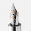
Graf Von Faber Castell Pen of the Year 2017 (Vikings) PVD Edition The version with a tough anthracite-coloured PVD coating has a particularly masculine appeal. Matt-grey smoked oak – the preferred wood for building the Viking ships – stands in exciting contrast to the gleaming metal parts of fountain pen and roller-ball pen, which change their appearance with every movement. A grey shimmering smoky quartz adorns the cap of all writing implements of this edition. Each of these writing implements is presented in a brightly polished black wooden case. A certificate bearing the signature of Count Charles von Faber-Castell confirms that this is a limited edition The name Graf von Faber-Castell is engraved in the end piece in runes Individually numbered writing instruments Exclusive, brightly polished black wooden box with an attractive brochure and the certificate of authenticity An additional insert offers space for six more writing instruments Limited to 500 pieces (230 PVD) For inquiries email us at orders@airlineintl.com or call (915) 778-1234

-
Ink View: Ivy 108 - Papier Plume’s Chicago Pen Show Exclusive! I first came to know about this and the Lake Michigan Summer a couple of weeks ago while conversing with Papier Plume on new upcoming inks. At that point the inks weer already created and I was just at the tail end of it. I was lucky enough to receive a small sample of each. As teh main batch hadn't been done yet, I got what was left from what was sent to other reviewers. Still I was happy to tryout these inks, specially since I dont have an Ink Hookup at the Chicago Show to get me some these ink bottles. Still! Many thanks to Papier Plume for providing the sample. I meant to have this out a few days back but I was tasked with painting our Condo.... and lets say it has been time consuming to say the least. I do hope you enjoy reading this (re)view as much as I enjoyed writing it. A small evident warning: This is a limited ink to 60 Bottles only available at the Chicago Pen Show. I do not know any plans for re-releasing these inks in the future, one can hope Ivy 108 the name, the ink. As noted this (ink) is one of the two exclusive inks for the Chicago pen show , and it is customary , it is inspired in some meaningful aspect of the city or the people, in this case Chicago and what is one of Chicago Passions? The Cubs. I dont claim to be baseball fan , so please bear with me as I go a little bit more into the story of this ink's name The number 108, is number that any a Cubs fan should know, as the Cubs won the World Series in 2016 after 108 years. To quote Fountain Pen Follies from his review: “As for the ivy, the Cubs play in Wrigley Field, an old gem of a ballpark known for its tiny size and its ivy-covered outfield walls.” I later learned that the ivy is called the Wrigley Field Ivy, and was planted in 1937 to make the playing field similar to the Perry Stadium (which had it until 1996). Wrigley field is the 2nd oldest in the United States and the only field that has Ivy in the outfields walls, Every other field has padding as per regulation. Today the Wrigley Field Ivy is part of the Field’s landmark designation and, when in use, ground rules apply to how to handle a ball going in and staying stuck in the ivy. So how does the ivy look? Just like this: http://i.imgur.com/Msi27zG.jpg I couldn’t find a picture of a ball stuck on the Ivy (when is green). I did found a few videos, if you have time here is a link to a recompilation Here is a shot of the bottles for the Ivy 108 ink: http://i.imgur.com/4wFd4Pr.jpg How true is the inkcolor reflecting the actual color of the Ivy? Well .. Pretty, pretty close. This as most of PP’s inks has great shading properties, is medium saturated and with good flow. As for water resistance not the strongest suit for this ink but it looks amazing on paper Let’s see the swab in the Mnemosyne card: http://i.imgur.com/qAq5A23.jpg I found out that the shading does show on medium nibs and broader. I won’t say it can’t work on fine or finer nibs for that matter, but I would recommend a wetter nib in that case. So on to the tools: Pens: Franklin Christoph – Medium Stub and Van Graf FB – Sand – Medium. Paper: Tomoe River, Rhodia, Tomoe River 68 gr, Clairefountaine Thriomphe (CF), traditional copy paper, Velum paper and Oxford Optic 90gsm paper. Tests: Flow, saturation, shading, sheen, bleed-through, see-through/show-through, feathering and pooling. With other tests such as water, bleach and alcohol and dry times. Sometimes it will be a yes/no answer, sometimes 1-5 (1 being poor, 5 being excellent) CrossOver Card As with my other reviews here is the ink behaving across all papers . - PLease note that I poured bleach and alcohol in reverse order http://i.imgur.com/7TgfIuD.jpg http://i.imgur.com/OpwcZdc.jpg You can see that each column is representative of the paper used. Thoughts on the ink-paper behavior Flow: Flow is good, consistent in most papers, some feathering in traditional copy paper I would say this is a wet ink.Saturation: Medium, it will vary on how wet your pen is, but there is not a heavy saturation sometimes it looked more saturated depending on the paper, but it was within my expectations if I was looking for good shading.Sheen: None, Zip, Nada. Even when supersaturated there is no sheen on this ink.Shade: This is where PP’s trade mark all about the shade. with the exception of copy paper,I was able to get shading across the papers used. Bleed-through: Some bleed was observed on the copy paper, under normal writing circumstances. That being said when doing the sketch I was using a really fine nib and some did bleed at that point, but I was also scratching the paper. Extreme pooling will also make this ink bleed.Show-through: There is show through with Tomoe River 52gr and clairefountaine, copy paper and Vellum. in some you wont be able to write both sides .Feathering: The ink was fairly resistant to feathering in all papers but copy paper, and thiss to a point was expected.Pooling: (This is not the shading but more on the pooling on the edges of the letters, I enjoy when the inks provide this). There was none that I could observe in any of the papersWater Resistance: The tests shown on the card were done using an eyedropper, leaving it a few seconds then using a tissue paper to retrieve the excess. with this most of the ink on all papers with the exception of copy paper was almost gone. Alcohol Resistance: Very consistent across. You would be able to recover from this one – almost no effect. (remember that I poured this one where the bleach should have gone )Bleach Resistance: None, Zip , nada. (remember that I poured this one where the alcohol should have gone )Dry Times: As noted this is a wet ink and the drying times were between the 20 and 30 second mark. Cleaning: as with PP's inks fairly easy to clean up from the pens used. Here are some other inks for comparison http://i.imgur.com/yOWt4AG.jpg From the top and then left to right: Ink Name / MakerComparison NotesKingdom Note - Sailorgold like green great shading Jade - Robert Oster an olive ink with good saturation - medium shadingVerde de Rioa lighter green than I was expecting subtly similar to jade, some sheen and medium shadingGreen Bay - Anderson PensOne of the most similar to Ivy 108. has more yellow in it and it is more muted. A very dry ink. Ivy 108 - Papier Plumen/aEmerald - Parker Penmana known ink with shading and red sheen properties more green than Ivy IG Green #3 - KWZIdarker green when dry with good shading even for an IGIG Green #4 - KWZIMore muted than #3 and with a touch more of blackStreet Car Greenanother limited of PP an ash green to better describe it And here is a quick sketch http://i.imgur.com/p2wppXy.jpg and writing samples http://i.imgur.com/SZysHNL.jpg Opinion I Like this ink. it sits on a sweet spot between of all the inks that I have, that I don't have. I always like a big story behind it and this is a nice one, but the ink itself has good things going for it, and it is safe for office use. Availability As noted at the beginning of this view this is an exclusive ink to the Chicago Pen Show and limited to 60 bottles. If you are going to the pen show, or have a friend that can pick up a bottle for you, and you are a fan of greens I strongly recommend it. Thank you again for keeping up with me up to this point ! Papier Plume notifies their ink availability through their newsletter first, then Instagram, then Facebook, and finally twitter (in that order).
-

Ink View: Lake Michigan Summer - Papier Plume’S Chicago Pen Show Exclusive!
Jackokun posted a topic in Ink Reviews
Pictures should be ok now Ink View: Lake Michigan Summer - Papier Plumes Chicago Pen Show Exclusive! I first came to know about this and the Ivy 108 a couple of weeks ago while conversing with Papier Plume on new upcoming inks. At that point the inks were already created and I was just at the tail end of it. I was lucky enough to receive a small sample of each. As the main batch hadn't been done yet, I got what was left from what was sent for review. Still I was happy to tryout these inks, especially since I dont have an Ink Hookup at the Chicago Show to get me some these ink bottles. Still! Many thanks to Papier Plume for providing the sample. I meant to have this out a few days back but I was tasked with painting our Condo.... and lets say it has been time consuming to say the least. I do hope you enjoy reading this (re)view as much as I enjoyed writing it. A small evident warning: This is a limited ink to 60 Bottles only available at the Chicago Pen Show. I do not know any plans for re-releasing these inks in the future, one can hope and I asked! Lake Michigan Summer (LMS) The Name and the Ink When I look at an ink I want to know if there is any story behind it, this could be a simple or could be an elaborate story, but in a way it helps me signal out an ink from many others that could be close in terms of color or properties. The Lake Michigan is the third largest of the Great Lakes (when measured by water surface) and the only Great Lake located entirely in the United States. The Lake Michigan Summer ink was meant to represent the colors of Lake Michigan in the Summer! Which when looking at the pictures you can find if the lake it does look like the ink spoilers I think it does. Here is a couple picture of the Lake Michigan in the summer http://i.imgur.com/qaYhBb1.jpghttp://i.imgur.com/D38WRN7.jpg How does the Lake Michigan gets its colors? As per some research : The blue is the color given by the light hitting the water with hues varying as the light hits sediment brought to the surface when strong winds churned the lakes.In the same way the green tint is the light hitting the algae and sea weed, reflecting the green(from the plants, which are filled with clorophile) from the waterHere is where the name meets the ink, the combination of the reflecting lights gives off a blue-green color. You can see that the LMS would probably be a teal color ink and it is. Here is the picture of the bottles http://i.imgur.com/79VVl8c.jpg Lets see the swab in the Mnemosyne card: http://i.imgur.com/WEkUXu4.jpg This ink looks consistent across different nib sizes (from EF to Stub), with main differences from one side to the other on shading and for some papers pooling. So on to the tools: Pens: Sailor Realo Medium, Franklin Christoph Blade Turk (Mark Bacas), Visconti HS Bronze Stub and Nemosyne Broad Waverly (Mark Bacas) Paper Tomoe River, Rhodia, Tomoe River 68 gr, Clairefountaine Thriomphe (CF), traditional copy paper, Velum paper and Oxford Optic 90gsm paper. Tests: Flow, saturation, shading, sheen, bleed-through, see-through/show-through, feathering and pooling. With other tests such as water, bleach and alcohol and dry times. Sometimes it will be a yes/no answer, sometimes 1-5 (1 being poor, 5 being excellent) CrossOver Card As with my other reviews here is the ink behaving across all papers . http://i.imgur.com/qL2dT6v.jpg You can see that each column is representative of the paper used. Thoughts on the ink-paper behavior · Flow: Flow is good, consistent in most papers, tiny feathering in traditional copy paper. · Saturation: Medium/Heavy, which is in part responsible for the ink color to be consistent · Sheen: there is a slight hint of sheen, it is mostly sheen when the ink is laid down heavily on paper i.e Tomoe River Both and Rhodia. · Shade: Shading is between 3 and 4 not bad shading not super shading and you can see it across most papers, vellum and copy paper excluded. · Bleed-through: I saw bleed through on copy paper and Tomoe River Both. This is a wet ink and if the paper is not well coated or thick you might find some bleed through. It was tiny tiny on the Tomoe River , but worth mentioning. · Show-through: Same as Bleed Through, This is a wet ink and if the paper is not well coated or thick you might find some show through. However in TR paper it is not enough (IMHO) to not be able to write on both sides. · Feathering: fairly good on fathering, with some on copy paper and some on Clairefountaine which incidentally I do get feathering on this paper with some inks. · Pooling: woohoo hoo you can have some pooling! TR being the best and Rhodia being the worst. No pooling on Vellum or CopyP · Water Resistance: Tests (eye dropper and smear ) show that the ink is not waterproof, and what is left id very faint making difficult to recover some of the writing if need be. · Alcohol Resistance: Very consistent across. You would be able to recover from this one almost no effect. · Bleach Resistance: None, Zip , nada. Ink was here and now is gone! Magic! · Dry Times: As noted this is a wet ink and the drying times were high with all, but copy paper, ranging from 20-30 secs. Cleaning was fairly quick and straight forward. Comparison Here are some other inks for comparison, http://i.imgur.com/NX7kmtb.jpg?1 From the top and then left to right: The biggest contendent ,in my opinion, is Diamine steel blue. Steel blue is darker and a little bit more saturated. Ink ComparisonSteel Blue - Diaminevery close to Lake MIchigan Summer - with a darker tone a a little more saturatedBlue Steel - Noodlersa lot more blue than green good shadingLake Michigan Summer- Papier Plumen/aIG. Turquoise - KWZIa good ink close to Blue steel Mentol Green - KWZIpictures does not show it but it is a good teal more close to LMS and Steel Blue than anything else Fire & Ice - Rober Osterlighter blue with red sheen And here is a quick sketch using Lake Michigan Summer http://i.imgur.com/RgeEAyR.jpg Here is some Cursive and Block writing for reference. http://i.imgur.com/hAJ6aJa.jpg Opinion I like teals and I dont have many of them, Im still waiting for Zeeblau from Akkermans Dutch Masters, which is currently in the mail. But teals are in that in between place of not being green or not being blue and for those ink lovers there is no in between for these types of colors : you either like it or you dont. I know some Ink lovers that will sit on either side of this opinion J That being said , from an objective perspective, this ink is okish for using on a work environment, I like it and I can find it to have while Im making notes. Everyday use is also not a bad thing, although I dont see this being an everywhere ink. The shading on this ink is great, whats more, the ink does pool giving that nice border effect and when concentrated and with the right paper it can even give you some hints of sheen. Someone said to me that sheen has to do with oxidization, I dont know how much of that is true, but it makes sense. After all sheen happens as the inks dries up. As always Im very grateful that I got this sample, and would be happy to have this ink as part of my collection even if it just as what is left of my sample Availability As noted at the beginning of this view this is an exclusive ink to the Chicago Pen Show and limited to 60 bottles. Which is an issue for me as I really like this ink, and I got a really small sample (only have a couple of ml left!) and Im actually going to Chicago but a month later! If you are going to the pen show, or have a friend that is picking up a bottle for you, and you are a fan of greens I strongly recommend it. Papier Plume notifies their ink availability through their newsletter first, then Instagram, then Facebook, and finally twitter (in that order). Thank you again for keeping up with me up to this point ! -
Ink View: Papier Plume’S Red Beans And Rice - Now Serving For Your Fountain Pen Taste Buds.
Jackokun posted a topic in Ink Reviews
Ink View: Papier Plume’s Red Beans and Rice - "Now serving for your fountain pen taste buds". Some time back I had the chance of going to New Orleans and in my exploration of the city ( and obvious google search for stationery stores), I stumbled upon Papier Plume, and what transpired out of that moment was the chance to try out one of the then upcoming inks. I had been very fortunate that they have been kind enough to send me samples of the new releases after that and helped me try and hone this world of ink (re)view which can be as wide and large as you want to take it. NOLA is famous in a wide range of things and one is that of food. So I’m not sure if this ink will be the first on a food themed release or just one more example of what NOLA has to offer. So now let’s, as they say, spill the beans! RB&R fair warning: I have shamefully stolen this next photo, its so nice and I'm sure PP wont mind http://i.imgur.com/fyHS7wN.jpg Red Beans and Rice The Dish A traditional creole food of Louisiana, normally served on Mondays. Now to why on Mondays, that is mainly because Mondays was a traditional wash day. Back in the day, and while the women of the house where doing laundry and attending the house, they will slow cook red beans (or kidney beans as per their resemblance in shape and in color to a kidney) with leftovers from the previous day (Sunday à family day à family dinner à family leftovers), normally ham as it was customary. As with any slow cooked dish, you can go about your day and don’t pay too much attention while it is being prepared. Nowadays you can find this dish in both homes and restaurants, the later as Monday specials. Apparently, Louis Armstrong really liked red beans and rice. He would often sign his letters "Red Beans and Ricely Yours, Louis Armstrong" So when I looked at the ink, I was looking forward to a shading reddish brown ink. Lets see! Red Beans with Rice – The ink Food Here is a shot of the bottles: http://i.imgur.com/C20yMTF.jpg This (ink) is part of the First addition to the New Orleans Collection since 2016 (would there be more ? ) and comes after the Chicago Pen show LE inks (which very pretty nice). As with all their NOLA inks Papier Plume ink’s hues are inspired on what they are looking to pay tribute to, in this case one of their traditional dishes and, as you would see later, the ink will vary from a light red/brown to a more blood dark red and brown as it goes down on the paper. So, to those that would be wondering, no this is NOT a scented or flavored ink , although I have yet to see/taste a flavored ink, I have to wonder who will dare to be the first and what would that be. Let’s see the swab in the Col-o-ring card (ran out of Mnemosyne) : http://i.imgur.com/T1Ipofh.jpg?1 http://i.imgur.com/iXSXUVp.jpg This is definitely a burgundy ink, for some it would look very shiraz or a very full body wine, the red and brown tones are evident regardless of the saturation with which the ink goes on to the paper. It is as some had pointed out, “more saturated” that their normal inks. And it comes with its strengths and drawbacks, it does not shade as much as other but it still shades, and you would likely see longer drying times specially on wet nibs. So on to the tools: Pens: Visconti Joon 25th Anniversary LE 18K Medium nib (semi flex <-- I swear), Pelikan Burnt Orange IB 18k Nib, Kaweco Luxe EF semi flex nib 14K. Paper: Tomoe River, Rhodia, Rhodia R, Clairefountaine Thriomphe (CF), traditional copy paper, laid paper and Oxford paper. Tests: Flow, saturation, shading, sheen, bleed-through, see-through/show-through, feathering and pooling. With other tests such as water, bleach and alcohol and dry times. Sometimes it will be a yes/no answer, sometimes 1-5 (1 nothing of that property, 5 a lot of that property) CrossOver Card This is a way for me to see all the types of paper and how the ink behaves across . http://i.imgur.com/1YoOMwp.jpg?1 You can see that each column is representative of the paper used. Thoughts on the ink-paper behavior · Flow: Flow is good, very fluid, consistent across all papers and pens used most of their inks are good on flow · Saturation: Medium/Heavy, sometimes it looked more saturated depending on the paper, because of this doesn’t do much on but it was within my expectations if I was looking for good shading. · Sheen: None, Zip, Nada, sadly no PP ink that I have tried has Sheen · Shade: Despite the saturation this ink does shade, not as dramatic as other but I would say it has low to medium shading and the paper will play a big part. · Bleed-through: Seen only on Copy paper, all other papers tested, no bleeding was noted. · Show-through: with the exception of the oxford all other papers showed show through, with more light showthrough in Rhodia and Clairefountaine. · Feathering: Now I did experience some tiny (and I’m being picky) feathering using a very wet nib, on all papers but tomoe. Now to be fair this was a very wet nib that I was using to see how far I could take it. Please take note that you the paper you are using is sensitive to the oils of your hand this ink will feather where the oils mix with the paper. · Pooling: (This is not the shading but more on the pooling on the edges of the letters, I enjoy when the inks provide this). Only on Tomoe River, but it is expected of this paper. · Water Resistance: The tests shown on the card were done using an eyedropper, leaving it a few seconds then using a tissue paper to retrieve the excess. But offline I did a more smear/spread test. Tests show that the ink had a level of waterproofness that will wash away some of the red leaving a dark but faded residue, completely legible , and this was consistent across all papers, this will let you recover what you write . · Alcohol Resistance: Very consistent across. You would be able to recover from this one – almost no effect. · Bleach Resistance: None, Zip , nada. · Dry Times: As noted this is a saturated but also wet ink and the drying times could be long most on the 20sec mark and on some papers longer than that. Cleaning: Fairly quick and no issues, couple of flushes and my pens very ready to go. Here are some other inks for comparison,http://i.imgur.com/sA0nOnd.jpg?1 From the top and then left to right: Ink NameMakerNotes in comparison RengaMazuren Athenamild shading, lots of sheen and more red tones , hint of yellowUluru RedBlackstone inkdarkish red, more pink on the light side and small hints of the brown , very good sheen when heavy on the paperRed Beans and RicePapier Plumen/aCassis RedPlatinumThe most similar in Color to RBnR, however this one has IG properties and you do have to wait a couple of days for the color to really set inCarnivalDiaminered/dark red with layed down heavy on the paper good shading small hint of sheenWilliam ShakespeareMontblanc a more red ink , less brown tones to it and mild shading OxbloodDiaminea very dark red with more brown tones Maroon 1789Robert OsterFull body red, some purble and brown, good pooling, some sheen And here is a quick sketch and writing samples http://i.imgur.com/xWJh1vT.jpg Cursive and Block writing for reference. http://i.imgur.com/w8dHOF0.jpg http://i.imgur.com/17tklQR.jpg some flexi http://i.imgur.com/1yAvxpj.jpg Opinion This is an interesting ink, it is one that I would be happy to carry on a day to day basis and it is sober enough to use in a work environment. It surprisingly very similar to Cassis black minus the IG properties and if you are a person that is worried about IG I would recommend to try this ink instead. It is also a red similar to full body wine without being too brown to look bloodlike. The use of this on flex nibs will highlight the different shades that definitely are there and will enrich that type of writing. On top of this, the ink will not completely wash away and any writing could be easily recovered. On very cheap paper this ink will feather, so a word of caution. I’m very happy I got to try this ink, and you can bet I have already put a bottle on hold for me J. Availability This will be released at the Miami pen show and online at the same time, so it will be great for those, like me, who cannot attend the show. This ink is, as noted before, part of the NOLA collection, I would not call this LE per se but once the batch rans out, my understanding is that, it will take them a long time to bring out another batch. However they are making a fair number of bottles. The ink is sold in 1 Oz / 30ml bottles. Looking into the story behind the ink’s name, made me wonder on what dishes I used to have growing up which main component was leftovers, and there was a few, all very heavy In substance, and perfect as pick me ups after a long night or like this case to set you up for the week or for some to end your day and straight to be. I’m sure everyone had some sort of leftover dish full of good memories. as always Papier Plume will announce their ink availability and other news through their newsletter first, then Instagram, then Facebook, and finally twitter (in that order). BUT for those that made it this far, this will be the direct link https://www.papierplume.com/product-catalogue/inks/inks-bottled/papier-plume-new-orleans-collection-fountain-pen-ink-red-beans-and-rice.html Live tomorrow (july 14th,2017) after 11:00 am CST Now I'm Hungry! Hope you enjoyed this View. -
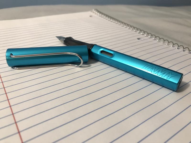
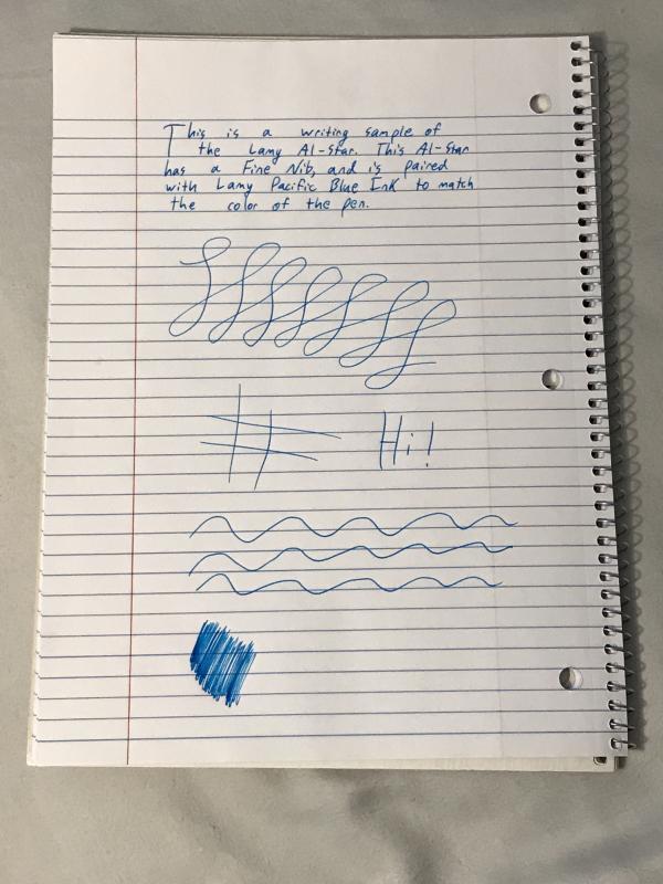
The Lamy Safari is 17 grams and 37 years of design excellence that’s been the beginner’s fountain pen of choice for almost all those years. Its design is one of the most strikingly simple yet modern in the pen world, yet it has proven to be as timeless as any of the classics. The Al-Star is its big brother. Made from aluminum instead of ABS plastic, the Al-Star weighs more and feels more solid in the hand, but is nearly identical to the Safari in every other way. They share the same nib, design, and internal functions. The Al-Star is a way to own the classic yet modern design in a sturdier and slightly heavier body, and it appeals to people who like the feeling of metal in their hand while writing. Each year, a unique color is released as a limited edition for both the Safari and the Al-Star. This year, the Al-Star came in Pacific Blue. The Pacific Blue Al-Star Along with a Regular Blue Safari and a Dark Lilac Safari Appearance and Design The Pacific Blue color of this year’s Al-Star is striking and vibrant, yet light enough to not be overly flashy. The silver coloring of the nib and clip match well with the blue, creating a look of warm ocean waters. One factor of the design to be aware of, if you don’t already know, is that both Lamy Safaris and Al-Stars have a triangle grip, so they can be uncomfortable for some people to hold. For most, though, the grip is perfectly comfortable. As someone who enjoys having slightly unique pens, this limited edition is a truly gorgeous one, and in my opinion Lamy really nailed it with their color choice this year. The Al-Star Alone Construction and Quality This is a solid pen. In preparation for writing this review I used this pen daily for a little over a month, and in the course of use I dropped it countless times on varying surfaces, none of them particularly soft. The pen has yet to get a scratch. (These were all with the cap on however; you may fare far worse if the pen is dropped nib first.) Safaris have a bit of a reputation for being indestructible, and the Al-Star is a Safari but stronger. If you get this pen, you won’t have to worry about breaking it. Additionally, the overall quality of the finish is excellent. Lamy’s quality control is famously excellent (every pen is tested with a bit of blue ink before being shipped) and their care is on display in their pens. The Al-Star Deconstructed Weight and Dimensions If you’ve ever seen a Safari, it’s that but slightly heavier. As someone with large hands, it fits nicely posted in my hand while writing. I asked a friend with much smaller hands to test the pen as well, and she had no issues, although she did prefer the pen unposted. The pen posts easily, and I haven’t had any issues with scratching on the back of the pen from the cap, as I occasionally do on other pens. Nib and Performance So here’s the thing. It’s a steel nail. A very boring steel nail. But is boring so bad? The nib comes smooth straight from the box, and is incredibly reliable and consistent. In short, there’s nothing exciting going on but it’s a real work horse, and it’ll be smooth and ready to go from the get go. The nib sizes on these pens do tend to run broad, so if you aren’t used to Lamy nib sizes (or German sizes in general), I’d get one size smaller than you would usually buy. A Writing Sample with the Al-Star Filling System and Maintenance The Al-Star is a Cartridge/Convertor pen. It fits proprietary Lamy cartridges or a Lamy convertor, which can be purchased for give or take five dollars from wherever you buy the pen. The accompanying ink for this Limited Edition, Lamy Pacific Blue, can be purchased in either cartridge or bottle form, and matches the color of the body of the pen nicely. Cost and Value An Al-Star will set you back just under $40. Is it worth it? That’s up to you. For the same cost, you could have a gold-nibbed Platinum PTL-5000a or most of a TWSBI Diamond 580, both definitively better, or at least more interesting, pens to write with. The Al-Stars price forces it to compete with pens outside the Safaris league when it’s essentially a Safari with fancy skin. For me, the pen was worth it for the color. As a big fan of limited edition Lamy’s, I loved the Pacific Blue. But if you aren’t that into the color, there are other, better options for the price.
-
Hi, I got the ok to note that Papier Plume will be releasing a new ink for the the Miami Pen Show on July 14th. the new Ink is called "Red Beans and Rice" here is a picture of the bottles This would not be a limited ink as they plan to make a large batch of it, BUT they did said that when it's gone, it'll be gone for a while. I'll post a splash of the ink later tonight and do plan to post a review of this ink later this week!. Hope this will be of interest Here are some samples, first glance , good saturation, good texture, mild shading Col-o-ring http://i.imgur.com/iXSXUVp.jpg Rhodia http://i.imgur.com/ItHBsZH.jpg Tomoe River http://i.imgur.com/1yAvxpj.jpg Cheers Jack
-
The 2017 Colors have just been leaked on Amazon.co.jp and fontoplumo. The Safari is a dark teal with black accents (name translates to petrol), and the Al-Star is a light blue named "Pacifica". (images below) (links here: https://fontoplumo.nl/2016/12/12/lam-al-star-pacific-is-the-2017-special-color/, https://www.amazon.co.jp/dp/B01N1GQOFW)
-
Graf Von Faber-Castell Pen of the Year 2017 Admired as daring masters of wind and wave, feared as ruthless invaders and valued as merchants, the Vikings set up a trading network that span across continents. The revolutionary construction of the Viking longboats, the mystic force of the runes and the curly birch as one of the characteristic trees of the Nordic world inspired us in designing the Pen of the Year 2017. Both editions come with an 18-carat gold nib that is run in by hand. An end-cap protects the rotary knob of the plunger mechanism of the plunger-type fountain pen. rchants, the Vikings set up a trading network that span across continents. The revolutionary construction of the Viking longboats, the mystic force of the runes and the curly birch as one of the characteristic trees of the Nordic world inspired us in designing the Pen of the Year 2017. Both editions come with an 18-carat gold nib that is run in by hand. An end-cap protects the rotary knob of the plunger mechanism of the plunger-type fountain pen. Platinum-plated barrel adorned by five slivers of ‘curly’ birch, inserted with great precisionThe name Graf von Faber-Castell is engraved in the end piece in runesIndividually numbered writing instruments18-carat bicolour gold nib, inscribed by handAvailable in the nib widths M, F, B, and BBThe carnelian let into the cap glows an intense redExclusive, brightly polished black wooden box with an attractive brochure and the certificate of authenticityAn additional insert offers space for six more writing instrumentsLimited to 500 pieces We currently have two available ready for immediate shipment. Both with Medium nib. Retail price does not include shipping cost, please message orders@airlineintl.com for shipping calculation. Retail: $3,600 Platinum-Plated Fountain Pen
-
OK - I got tired of waiting for someone else to start the thread - so I figured I'd do it myself. Last year the show fell on on the only weekend that we had significant snowfall - so I missed the show for the first time in many years. Who's going to the http://philadelphiapenshow.com/ and what's on your list? I haven't thought through my list yet - other than the fact that R&K Blue Mare will probably be on it. I also will definitely being looking at http://www.franklin-christoph.com/ and http://stores.rkspens.com/. I think I also need a Lamy Safari - because I think all FP fans should have one. Anyone care to share your list?