Search the Community
Showing results for tags '1864 blue black'.
-

Ink Review : Diamine 1864 Blue Black (150Th Anniversary Ink)
namrehsnoom posted a topic in Ink Reviews
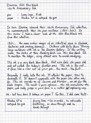
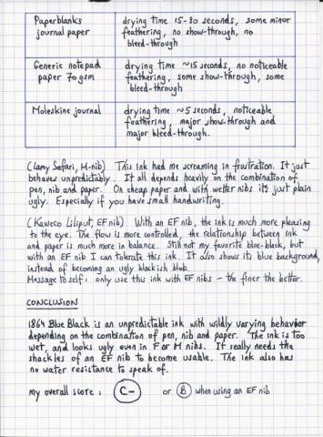
Ink Review : Diamine 1864 Blue Black (150th Anniversary Ink) Pen: Lamy Logo, F-nib Paper: Rhodia N°16 notepad 80 gsm Review In 2014 Diamine released their 150th Anniversary Ink collection, to commemmorate their 150 year existence (1864-2014). In this review I take a closer look at the 1864 Blue Black ink from this collection. 1864 ... the name evokes images of an industrial area in England, factories and smoking chimneys. Children with their dirty faces stirring large cauldrons with ink in the Diamine factory. In the writing room, the clerks at their standing desk use this blue-black ink to maintain the ledger, using utmost care to avoid smudging. This ink is a very dark blue-black, that sure feels 150 years old an not suited for today's fountain pens. The ink is too dark... too wet... it flows like a river out of your pen... too much... too fast... Personally I really dislike this ink. It attacks the paper, tries to dominate it. It doesn't cooperate with the paper like other inks do. This ink reminds me of Sauron and Mordor... an ink for the Dark Empire. The result is pure ugliness... this ink overwhelms the paper, and really jumps in your face in a rather unpleasing way. OK - but how does it behave on paper ? For this, I did some tests: Rhodia N°16 notepad 80 gsm - drying time ~30 seconds, no noticeable feathering, no show-through and no bleed-throughPaperblanks journal paper - drying time 15-20 seconds, some minor feathering, no show-through and no bleed-throughGeneric notepad paper 70 gsm - drying time ~15 seconds, no noticeable feathering, some show-through , some bleed-throughMoleskine journal - drying time ~5 seconds, noticeable feathering, major show-through and major bleed-throughThis ink had me screaming in frustration. It just behaves unpredictably. It all depends heavily on the combination of pen, nib and paper. On cheap paper and with wetter nibs it's just plain ugly. Especially if you have small handwriting. With an EF nib, the ink is much more pleasing to the eye. The flow is more controlled, the relationship between ink and paper is much more in balance. Still not my favourite blue-black, but with an EF nib I can tolerate this ink. It also shows its blue background, instead of becoming an ugly blackish blob. Message to self: only use this ink with EF nibs - the finer the better. Conclusion 1864 Blue Black is an unpredictable ink with wildly varying behaviour depending on the combination of pen, nib and paper. The ink is too wet, and looks ugly even in F or M nibs. It really needs the shackles of an EF nib to become usable. The ink also has no water resistance to speak of. my overall score: C- (or B when using an EF nib)- 17 replies
-
- diamine
- 1864 blue black
-
(and 1 more)
Tagged with:


