Search the Community
Showing results for tags '149'.
-
nib swapping Swapping a regular 149 nib of a limited edition for a flex nib
AYChopp posted a topic in Montblanc
Hi I recently bought a used montblanc limited edition (4810 pieces) 149 by andree putman, which is basically a classic 149 with a special case, I sent it to get serviced. I contacted My Jewlery Repair (montblanc's authorized repair) if i can swap the nib of a regular 149 to the calligraphy flex nib & they said they could. My question is, since its a limited edition set will I totally ruin the pen's value if i would eventually sell it or it will upgrade the pen/set? I've attached stock images of the set, Thank You
-
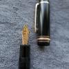
These are my newest purchases this is a beautiful Mozart with OB nib, this is a 80’s split ebonite feed 149 w/ fine nib, can get ef nib also but was afraid be too scratchy and too fine?? Any thoughts on the ef I have a fine in a new “ATW 80 days” , medium in a newer 146 platinum, and Broad in a 80’s split feed 149, I like the fine in the 80 days pen but was afraid of older extra fine? please let me know on the extra fine older nibs please??
-
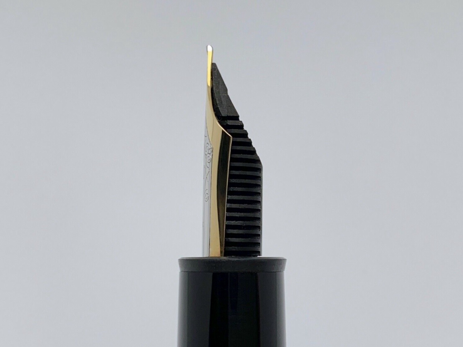
※※ The Expressive ※※ Special Edition Collaboration 149 by Montblanc and Fritz Schimpf ~ Ordered in November, 2019 and Delivered in September, 2020, The Expressive is my fountain pen highlight of 2020. Writing with The Expressive during the past two weeks has been exhilarating, due to the extraordinary fluency possible with the nib. After comments about my sketching and writing experience with The Expressive, a series of images is provided to introduce it to anyone interested. Montblanc in Hamburg, Germany and Fritz Schimpf in Tübingen agreed to develop a special pen to celebrate the 140th anniversary of Fritz Schimpf in 2020. They selected the Montblanc 149 with the nib design used for the 2019 Calligraphy Flex nib, but proceeded to design a unique nib for those who love sketching and writing. Herr Wolfgang Krohn of Montblanc Nib Design, Mr, Axel Nier of Montblanc Nib Production and Herr Sebastian Stolz, Director of Fritz Schimpf, worked together to achieve an ideal design. Although I was aware of the process, I pledged to make no public or private comment about the project, which only ends today with the official introduction of The Expressive. At the close of November of 2019 the pen was ordered with every expectation that it would be on my writing desk in time for the 2020 Lunar New Year. Montblanc did produce the pen and Fritz Schimpf did ship it to my Hong Kong shipping address. Events were such that it was unable to cross the border from Hong Kong into Shenzhen. For well over half a year The Expressive was safely stored in the apartment of my highly reliable and trusted former Peking University medical student, now residing in Hong Kong. Thanks to the good offices of one of my current private students, who operates a major import-export firm, it was brought to me two weeks ago. For two weeks I’ve daily sketched and written with The Expressive, inked with Fritz Schimpf’s outstanding Fritzrot ink. Not only has the experience been entirely trouble-free, it’s been a delight, as the The Expressive’s nib is extraordinarily responsive to the slightest shift in finger pressure. The primary impression I’ve had has been that of incomparable fluency. The ink flow, nib tine flexibility, and the mass of the pen are such that rapid writing or sketching seems effortless. There’s been no skipping, no railroading, no hard starts. Rather, The Expressive has charmed me with its steady performance and elegant style. While the nib has unmistakable flex qualities, it’s more of an all-around easy writing pen, especially suited for those prone to rapid field sketching or jotting quick notes. The only pens on my writing desk which share several of The Expressive’s desirable qualities are a Bespoke 149 Small Signature and a Bespoke Schiller Sketch Nib. The Expressive incorporates all of the qualities one might desire for a pen which is a great writer out of the box, highly responsive to the writing idiosyncrasies of each user. Today The Expressive was inked in Montblanc Royal Blue. The ink shades with striking effect, laying down crisp strokes of varying width achieving a pleasing overall result. Based on my experience, I strongly recommend The Expressive. Montblanc and Fritz Schimpf have utilized their substantial experience to create a lovely writing tool. Technical questions are best addressed to the Fritz Schimpf Web site. What I might offer are the following images, including both sketching and handwriting samples. For those who regularly write East Asian characters, The Expressive is particularly well-suited for producing swift strokes. It’s a joy to use when writing characters. In presenting this information and the images, I’d like to express my gratitude for those whose care and attention to detail made possible The Expressive. Tom Kellie Carefully Packed Initial Unpacking The Expressive Arrives Holding The Expressive Collaboration Pen The Expressive Revealed The Expressive The Expressive Nib Inked in Fritzrot The Expressive Nib Detail Engraved Nib Nib Feed The Expressive At Work Character Pen On Green Glass Writer's Refreshment Inked in Royal Blue Powerful Name for a Splendid Nib Fritz Schimpf
-

Galen Leather's/Walden Woodworkers' Noteboard
RitwijMishra posted a topic in Fountain & Dip Pens - First Stop
If the greater putative of this portable desk - of mahogany, as mine is, or of walnut, as is the preferment of many - is the tang of its somptuosité as opposed to the tawdry affability of our contemporary polymers, it also is putative of a more niche utility - that of a library furniture of utility in a private library (this being denotive of not necessarily a room so delineated; rather, a collection, not necessarily a Yates Thompson's, nor a Graham Greene's), quite as unfailing and quite as crisp an indispensability as shelves themselves. The integument of this can, as can its Chicago screws, ladle trade paperbacks and certain hardbacks as fondly as they can notebooks (head-stapled or otherwise) of A5 or more diminutive proportions. The grotto ordinalis of the pattern on the example I received is gently hermetic, while the pen rest in toto does suffice to cradle my 149. It is, all things brought to the boughs, to not be denied as an inadmissible that the Customs may charge varyingly up to forty percent - this does not, however, diminishes the note board's equipoise of attributes.
-

To grind or not to grind my vintage 149. Need some advice please. Thx!
dmvara posted a topic in Montblanc
So hello to all. It's been awhile since I have posted on here. So here is my tiny question. I have 2 149s. One is the calligraphy and the other is a vintage with the ebonite feed. I was contemplating sending the vintage one in to Nibsmith for a grind to either a stub, CSI, or CI. I guess I am not sure if it is worth changing the M nib in favor of something else when I already have the flex Calligraphy. Will I be let down and gravitate back to the flex more even after grinding down the 149 to a different nib? Should I just leave it as a M nib? I have never written with a CI or CSI style nib. I have only written with a metal stub and I am certain it is totally different experience with an 18k nib. I could just sell it off and just keep my 149 Calligraphy, but it is nice to have a vintage piece. Just trying to decide what is the best course of action. Thank you for any advice you may have and have a great day my fellow writers.
-
Hello all, New to fpn, sorry if this has been answered already. I’ve just ordered my first MB - a 149 in M. However I’m now seriously considering using the nib exchange service for a B. Will use the Bond Street store in London if so. The pen will mostly be used for medium - long writing sessions. (I am a college/uni student). So I will be carrying it around carefully in an MB pouch. So for note taking and studying the M should be fine; the thing is that I’d also like the nib to have some thickness and variation for writing cards and signatures etc. For reference I have a Cross Townsend 18k medium nib, which I find a little too thin for cards Any advice regarding M and B modern 149 nibs would be greatly appreciated. BTW, I’m set on the 149 just to save anyone telling me to buy a Pelikan :) Thanks
-
Greetings, Twenty-five years after seeing this model for the first time in a MB boutique, I was finally able to acquire one, used, on eBay. That was no small feat as it involved (a) finding one that was for sale (b) at a reasonable price, and (c) being financially positioned to make the investment. Since I have long scoured the Internet for videos showing the beautiful luster of this pen and never could find one, I am pleased to share pics from the unboxing here. I haven’t written with it yet as I’m pondering what nib tip to affix, perhaps a custom grind. It came with a medium which is the most boring nib size to me (ironic, I know). While this is certainly the most expensive pen I own, my favorite has always been the blue Waterman Edson which I’ve had for two decades. Have a good day. Thanks for reading.
-
Greetings, I also posted this message in the Introductions forum. Twenty-five years after seeing this model for the first time in a MB boutique, I was finally able to acquire one, used, on eBay. That was no small feat as it involved (a) finding one that was for sale (b) at a reasonable price, and (c) being financially positioned to make the investment. Since I have long scoured the Internet for videos showing the beautiful luster of this pen and never could find one, I am pleased to share pics from the unboxing here. I haven’t written with it yet as I’m pondering what nib tip to affix, perhaps a custom grind. It came with a medium which is the most boring nib size to me (ironic, I know). While this is certainly the most expensive pen I own, my favorite has always been the blue Waterman Edson which I’ve had for two decades. Have a good day. Thanks for reading.
-
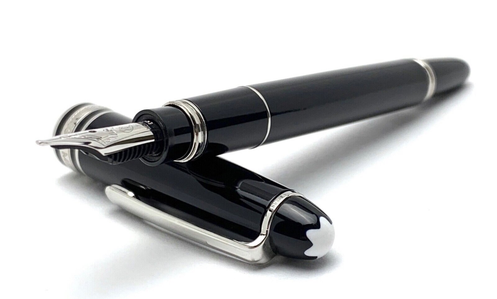
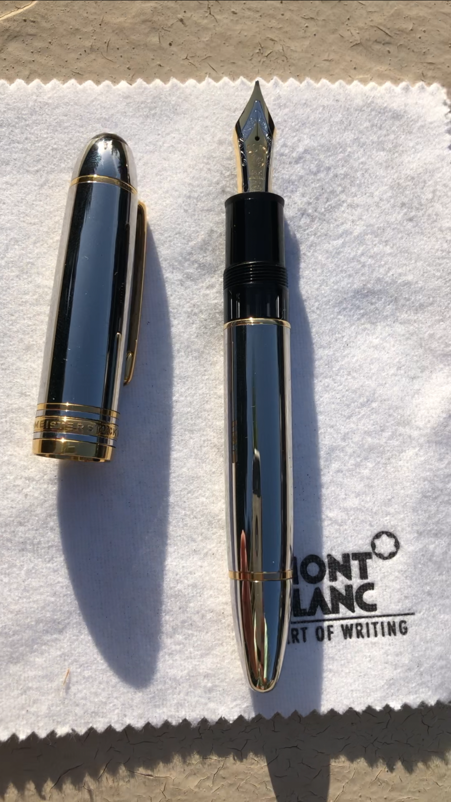
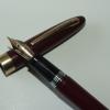
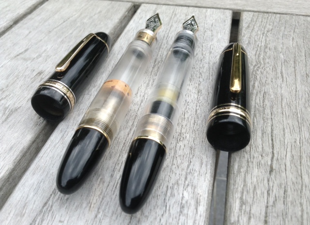
My weekend haul, Montblanc No149, Broad nib, Montblanc No32, medium nib
-
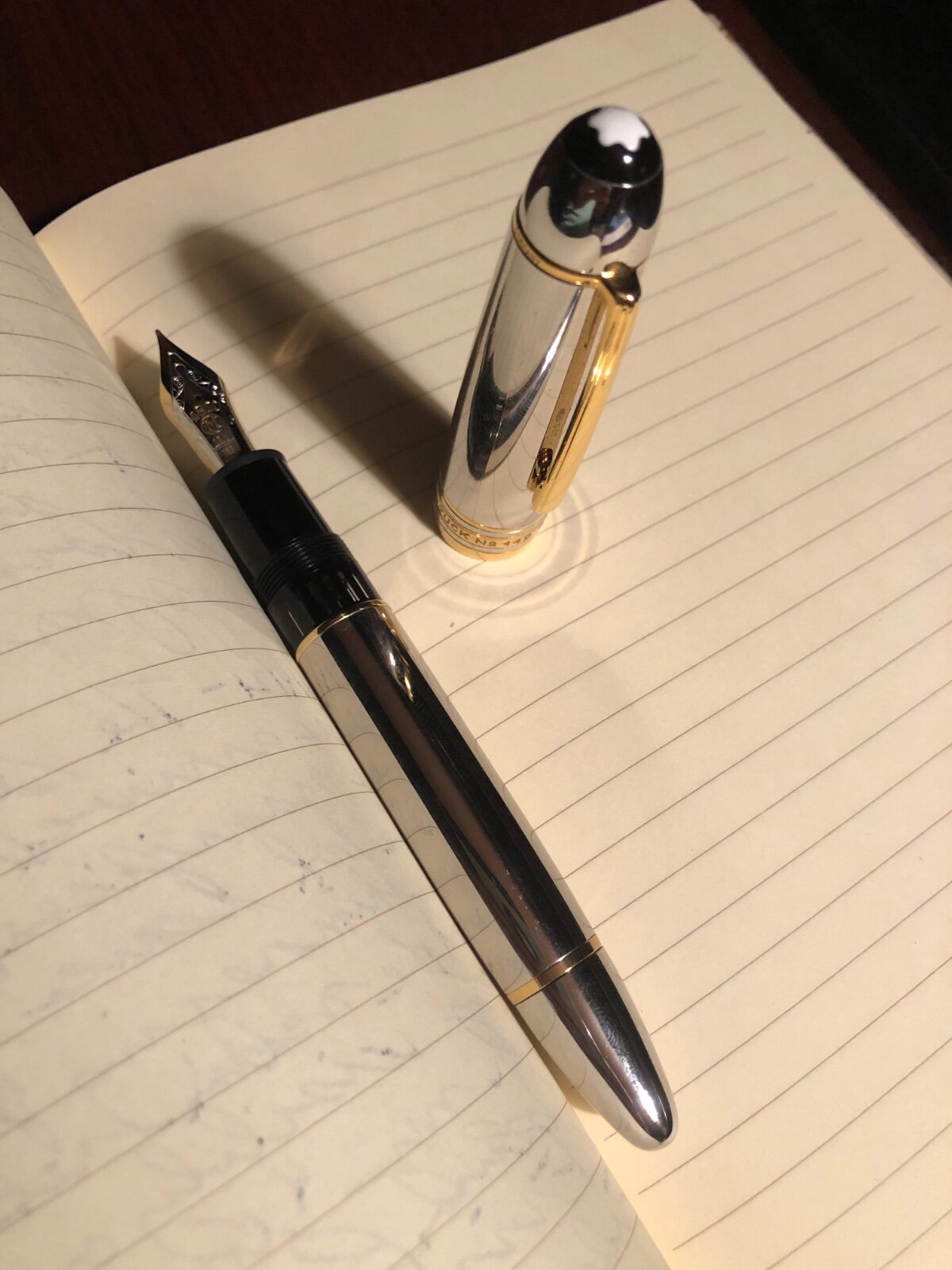
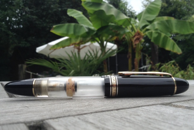
<a data-flickr-embed="true" href="https://www.flickr.com/photos/192670838@N04" title=""><img src="https://live.staticflickr.com/65535/51088053741_90065e7a29_h.jpg" width="1600" height="1200" alt=""></a><script async src="//embedr.flickr.com/assets/client-code.js" charset="utf-8"></script> Hello all. I recently purchased a Montblanc 149 in red gold. What is strange is the piston threads on this pen. The pen has an 18k nib however the threads don't appear to be brass looks to almost be a whitish metal has Montblanc changed the piston threads recently? Any information would be greatly appreciated. Thanks
-
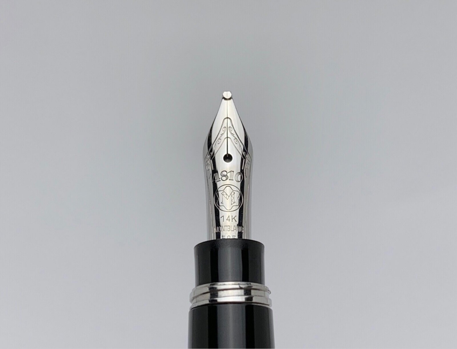
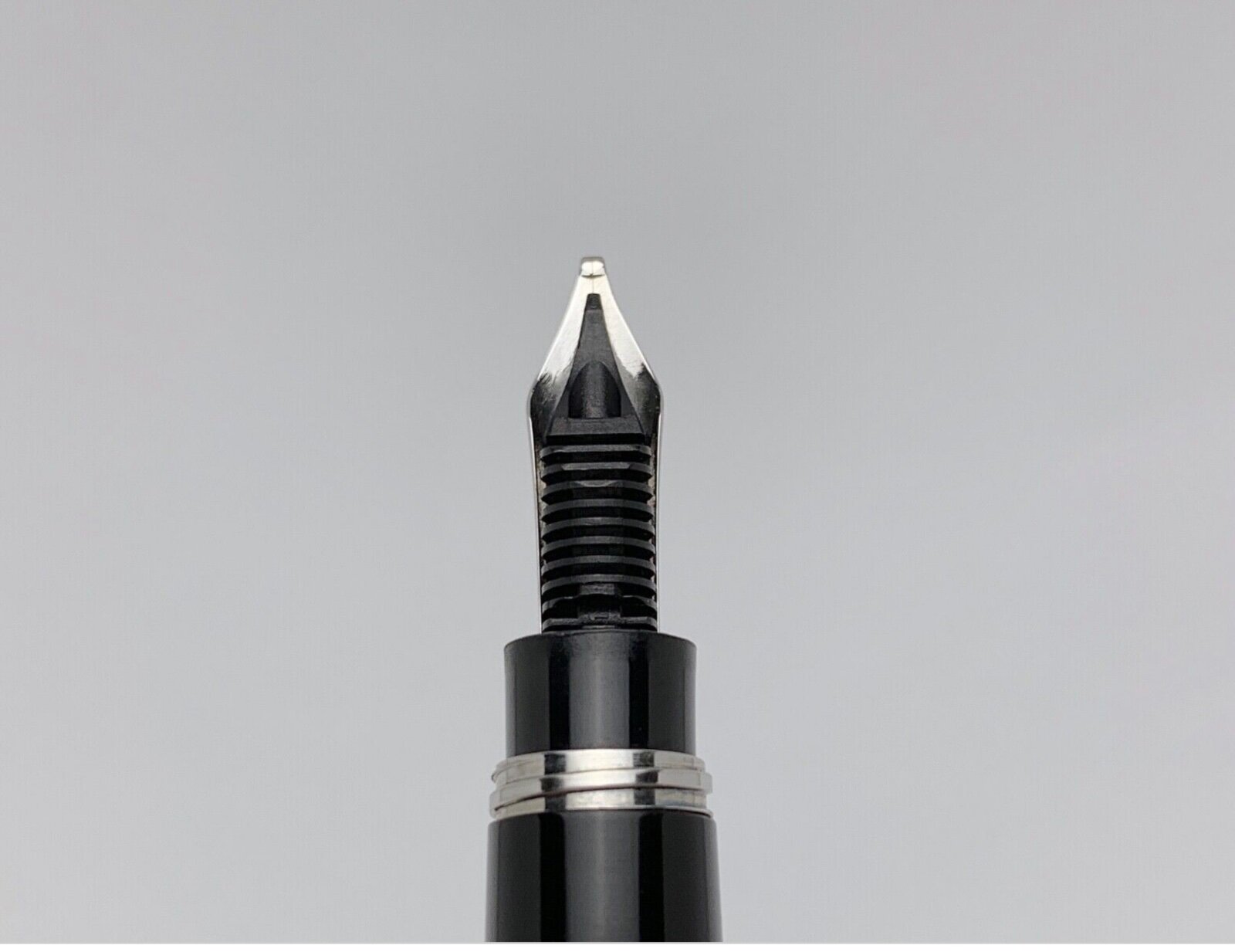
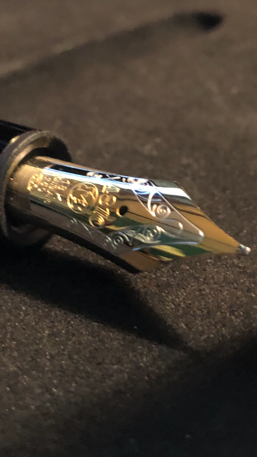
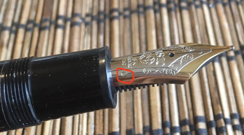
Hello, I have attached an image with a MB 149 18K bi-tone nib another image with the feed (split-ebonite). The nib has a dot sign in the lower right near the 750 mark. See the attached image. Could someone identify the nib and tell me if the sign/dot on the nib is normal and tell me what is the purpose of that sign? Thank you for your time! Best regards, Florian
-
Greetings! I need some advice. I have an early 1990's MB 149 which needs nib work. I'm guessing it's baby's bottom but the tines also seem to be "wanky" and need adjusted at the bare minimum. I'm not comfortable working on a nib and I live in Germany. I've read about MB's service and it seems that they are more apt to replace parts than fix them, and the cost to replace a nib is very expensive. Also, I bought this pen used (the body and cap are in perfect condition), but unsure if I will keep it as I've really fallen in love with some of my other pens. I'd like to know if it's advisable to send the pen to MB for service or if it would potentially be better to send it to a nibmeister. If you are suggesting a nibmeister, do you know of a good one in Europe, preferably in Germany? Thank you so much in advance! Dave
-
I just received a MB 149 platinum body with no nib and feeder since I already had those two items. The collar was already inserted. The feed goes in until it hits the bottom and the horizontal notch on the nib is just above the barrel. The nib goes in very quickly and when it hits the bottom of the collar, the feeder is the same if not little longer that the nib. I have 4 other MBs and changed nib/feeder with the MB platinum resulting in the same situation: the nib/feeder is too loose for the platinum collar. Questions: Do I need to get a different nib or a feeder (I have plastic feeder similar to the pictures of Platinum on websites)? do I need to get a different feeder? if so will it fit into the Platinum? Thank you for considering my questions. Hal
-
Dazzled by the resplendent allure of a Japanese ED (with the concept of a shut-off valve mechanism), the lust for an urushi lacquered pen vis-a-vis plain ebonite ones (seemingly susceptible to lose shine and colour over time) did keep growing on me for some time, before I took this plunge! I have come to know of an unfortunate experience with a Sailor KOP in Ebonite and have felt that without urushi, ebonite just fails to complete itself. These glamorous reviews from shuuemura and rubyeyespenlover should be banned and blamed altogether for pen-monetary crises, which I kept visiting again & again. These reviews did make me aware of huge dimensions of the Emperor more towards a ‘at rest desk-pen’, with a reassurance of writing comfort. I will keep this review unrated, since beautiful things in life do not need logic or mathematics to impart you with joy. So when I was dazzled for long enough, I asked Raul (Engeika/Pensindia) for an opinion regarding the Emperor vs Yukari Royale. Since most of our discussions these days refer to trade economics, Government taxation rather than any real pen discussions, he lazily took two to three days to check with Namiki and confirmed me back with the nib availability for both the pens. He gave me a discounted price (which I shall not discuss) for the Emperor model, more as a friend than a seller. I went ahead with it, because the production of Emperor pen without rings had been stopped by Namiki and it would become difficult to acquire a preferred nib-width. The beauty travelled from Japan and reached me via Pensindia Pune office in less than two weeks. Below links redirects to the same review on my blog with additional eye-candy The Namiki Emperor Review A JUMBO HISTORY OF 85 YEARS In early 1930’s, the Emperor existed in the form of No.50 Jumbo. It was decommissioned a few years later. On one rare occasion as referenced here, Nomura securities (estd 1925) had a specially commissioned No. 50 Jumbo pen made for itself, with Dunhill-Namiki engraved (with the classic M-shape logo) in 1936, for distribution among its employees to celebrate the 10th anniversary of the company. Wow! how many companies would do that today? http://1.bp.blogspot.com/-DOvvGuEJKqs/VpH7jevYvYI/AAAAAAAAFq0/CsZeYqgPhiI/s1600/1DNomuraEmperor.jpg Pilot reintroduced the pen in 1985 to tap the high margin market, as referenced here. The task was left to Sakai Eisuke to create a No. 50 Jumbo prototype based on the 1920s model. The initial model had a 14k nib with the 14 KARAT NAMIKI <NIB WIDTH> REGISTERED PATENT OFFICE 50 inscription, which later got replaced with a 18k nib carrying a similar engraving. http://4.bp.blogspot.com/-s6NfGjeSk8w/VpH7RGtu0QI/AAAAAAAAFqs/GB5ABo05-ZE/s1600/2Dkarat.jpg These days it comes with Namiki’s standard Mt. Fuji inscription. The finish of these Urushi lines is obtained by using non-oil lacquer for the final coat and a polishing method called Roiro Urushi Shiage (Non-oil lacquer finish) as per Namiki. It’s done by rubbing the pen in raw lacquer after a special charcoal polishing process. And if you look at the plain Urushi line of pens (vermillion & black), the artisan’s name would say Kokkokai. Kokkokai is a continuation of the original group of Maki-e artisans formed in 1931, under leadership of Maki-e master Gonroku Matsuda, who had joined Ryosuke Namiki back in 1926 as Chief Maki-e Designer. Matsuda is said to have designed for Montblanc too. URUSHI Urushi, as you know, is the poisonous sap of the urushi or lacquer tree (Toxicodendron Vernicifluum) which grows in Japan, China, and Korea and is primarily brown in colour. The sap of this tree polymerises to form a hard, durable, plastic-like substance, when exposed to moisture/air. Liquid urushi can be applied to multiple materials like wood, metal, cloth, resin, ceramics or ebonite as opposed to the best of synthetic lacquers. When it solidifies, Urushi turns into a very hard coating that is waterproof and protects the coated object from effects of fungus, ambient chemical reactions at surface due to heat or humidity or even from caustic acids. Colored urushi such as black or shu (red) are made by mixing pigments into cured urushi. With natural exposure to air and ultraviolet light (extended UV exposure ends up in discolouration), the urushi layers gradually increase in transparency and the material gradually unveils shades of original bright colours within. The birth of the maki-e decoration technique took place during the Nara period in Japan i.e from 710-794 AD, in which gold ''dust'' was decoratively sprinkled on the lacquer surface. So maki-e utensils, accessories and writing instruments have evolved to their present forms from thousands of years ago. Only direct and prolonged exposure to sunlight will cause urushi to deteriorate. Urushi's hardness and durability makes it an excellent protective coating for any object that will be used continously over a long period of time (Paraphrased from Kyotoguide). This all ends up with a versatile material and with a characteristic hardness, durability, imperviousness and resistance to abrasion. The elegance of ebonite is supposed to endure time and space with the urushi flair. PRESENTED BY NAMIKI The presentation is grand and velvety with a spacious wooden box, capable of packing your sneakers too, which is made out of traditional Paulownia wood. It is protectively packaged inside a cardboard box. The box has a violet thread running across two metal brackets to fasten the upper lid. http://4.bp.blogspot.com/-9i49GFleh2s/VpH8AAE7BbI/AAAAAAAAFrE/_zK1K3OQsuI/s1600/3presentation.jpg Resting inside is a bottle of Namiki Black Ink (Pilot Black Ink - 50 mL), an Ink dropper with a red bulb encased in a black cardboard box, a red velvety polishing cloth and finally the No#50 Jumbo resting on its bed. I did receive a nice surprise gift from Pensindia - it is a Pilot Somes single-pen pouch. Thank you! (PS : The Emperor would not fit inside this standard Pilot Pouch). http://2.bp.blogspot.com/-2WKlYSJpjtU/VpH8ERxDtzI/AAAAAAAAFrM/xbk5oAk0wI0/s1600/DSC_7536.jpg The model number of the pen, in this case FNF-148S-<R/B>-<F/FM/M/B> indicates the launch price and colour within it. The 148 refers to JPY 148,000 whereas the third digit R/B refers to the red/black urushi. DESIGN - CLASSIC This Lacquer No.#50 model comes in two standard colours - Black & Vermillion (Urushi) with gold plated clips. A newer No.#50 Urushi model is available with two concentric rings on the cap, carrying a different model number. The ebonite feels substantial in hand from dual perspectives of dimensions but at the same time the pen does not feel heavy. The classical cigar or rather torpedo shaped geometry with Vermillion hue adores itself with light, which when reflected through multiple layers of urushi takes on a electric red tinge on an otherwise conservative scarlet red hue. The work and finish is impeccable and it does not show any signs of being handmade, whatsoever. The simplistic yet elegant design comes with a single golden accent, provided deftly by the traditional triangular shaped tension fit clip with a sphere to anchor into your shirt pockets, if you have that big a pocket. A marked absence of any other decoration like a clip band or ring or anything else on the entire pen, imparts a continued infinity to modes of convergence. Vermillion is considered as an auspicious colour throughout East Asia, where it’s culturally imbibed. It has four synthetic & natural shades as of today: Red-Orange[sRGB (255, 83, 73)], Orange-Red[sRGB (255, 69, 0)], Plochere[sRGB (217, 96, 59)] and Chinese Red[sRGB (170, 56, 30)]. The shades/hue of the pens in red urushi might vary from one other. http://3.bp.blogspot.com/-0DjoRXVscp8/VpH8UHvolGI/AAAAAAAAFrU/oMSLVGdluQA/s1600/DSC_7544.jpg The cap unravels itself after one and a half turns. It reveals the beautiful nib with the modern Mt.Fuji inscription which is incidentally 1.1 cm longer than the section itself. The seamless grip goes through a fair amount of taper starting from the barrel and ends up with a smoothly carved out bumper, emphasising continuity. The cap threads on the barrel are carved out with sculpted finesse and the grip section ends up with a small but discernible gap between itself and the barrel (common across the Urushi models). The barrel at the other end leads leisurely to the tail where you have the ink-shutoff valve. This picture thankfully captured the tail end, which your eyes might fail to notice, unless you know where you are looking for it. http://1.bp.blogspot.com/-zDgaI9nQ92M/VpH9FEL4wWI/AAAAAAAAFr8/FYWgzXkUHw4/s1600/DSC_7558.jpg I feel, the cap is itself a subtle piece art made from a single ebonite blank. It carries the valour and brevity of the overall smooth curved design with remarkable panache. The finish is impeccable, with the colours varying between bright and dark with the play of light. The clip is traditional triangular Pilot with a sphere at the end, inscribed with Namiki with the Isosceles Triangle within a Pentagon logo. There is a alphanumeric code inscribed on the upper base of the clip, where it delves into the cap. http://3.bp.blogspot.com/-L1s1oI7rJsU/VpH8ms913sI/AAAAAAAAFrc/rv1zcJpmu6k/s1600/DSC_7559.jpg FILLING SYSTEM - The ‘Japanese’ Eyedropper A bit of history on it, there were these traditional non-self filling systems or NSF (without any filling mechanism - piston/button/plunger) and luckily enough fountain pens were compulsory during my junior school days. Since the squeeze converters/cartridges did not last long, we used to bank on fountain pens from Camlin & Chelpark which used to offer the capacity of the barrel itself. However, sometimes we did end up with ink inside the cap and sometimes a blue blot on pockets of our white shirts (our school uniform) due to ink burping & subsequent leakage. If I remember correctly, Surf made all the money those days, using this particular advertisement with an ink blot on white pockets in TV media. Seems the burping had mattered to the Japanese first, thanks to their costly Kimonos made of silk, when they had come up with an ink stop - plunger mechanism in early 1912. The term ED (Eyedropper) came into picture after advent of vacuum driven self filling pens with button, squeeze or plunger mechanisms. Now comes the ink-dropper with the red bulb to make an appearance. The section takes almost eternity (read seven complete turns) to reveal one of the most basic fountain pen filling systems. Most of the times, I fear the section would drop off due to my monotony and laziness during unscrewing the section. Once unscrewed, you can see the conical ink shutoff valve inside the barrel and a similar conical concavity with a crevice inside the section, to make the system work. The insides of the barrel & section are all black. With the dropper filled up with your favourite ink, you are supposed to be fill the barrel, until the visible internal threads. Leave the valve shut while filling the barrel, then unscrew one turn to allow air inside the chamber while writing and then close when finished. The entire rod is to be extracted completely, only when you are cleaning the barrel. It seems to be a delicate system, so one must avoid pulling the rod frequently. While using, you can unscrew the tail by 1 mm or so and start writing, although the feed might have a buffer comparable to a converter. After use, you can follow the instruction of screwing back the tail with the nib turned upside. http://4.bp.blogspot.com/-38ZntEubEJ0/VpH80L-G8JI/AAAAAAAAFrs/hHEZLBvClT4/s1600/DSC_7560.jpg NIB - LORD OF THE NIBS The nib with this Emperor is 18k which weighs more than 2 grams and it came in four stock widths earlier - F, FM, M & B according to the enclosed booklet. It seems F and B nibs have run out of stock for Namiki/Pilot Office in Japan. The nib isn't anything short of grand, but believe me it takes time to get used to it. It’s longer than the section by more than 1 cm. Inscribed is the symbol of Mt. Fuji (also found in #3776 nibs), the upper part symbolic of the snow caps. http://1.bp.blogspot.com/-2GOBuk35mhg/VpH8vZhUZeI/AAAAAAAAFrk/QfublMrzLU4/s1600/DSC_7572.jpg The oval breather hole rests within the snow caps. Below the snow, etched are the Namiki Logo (Isosceles triangle inside a Pentagon), Namiki, gold alloy specs (18k-75%) and Nib width <M>. The nib is sharply curved compared to usual flatter Pilot nibs, at its shoulders & tines, as a continuity of the precision followed by Kokkokai artists, while making the pen. http://3.bp.blogspot.com/-gldtXZdK_9M/VpH9DGm_ZQI/AAAAAAAAFr0/j0aGj4KseZM/s1600/DSC_7573.jpg On the left the #50 nib carries the Namiki Logo Ste PP-F hallmark and on the right it carries the date stamp. Mine is a707, “a” as I understand refers to the machine/plant where the pen was made and 707 as usual refers to July-2007 manufacturing. http://3.bp.blogspot.com/-iuwzbWJ4Bao/VpH9pwLIaLI/AAAAAAAAFsU/KsE1WGTuDXU/s1600/DSC_7584.jpg The semi-lacquered plastic feed (red urushi) converges majestically with the overall design of the pen. The big fins ensure levelling ambient air pressure and give you a really worthy buffer (from underside the nib). You can write a few A4 pages with the shut-off valve/tail closed. When I filled the pen for the first time, the feed took some time to respond, but when it did, it was with a nice and consistent flow, and after that it was pure performance. http://2.bp.blogspot.com/-yw2qJX8g6ns/VpH9YIKs1LI/AAAAAAAAFsM/SDTrU1vB4Z8/s1600/DSC_7585.jpg PHYSICS OF IT – RELATIVELY SPEAKING This is in no way a daily carry pen designed for extensive use as a travel companion. For a daily pen, I assume that a Yukari Royale would fit the bill well albeit with a smaller nib. I take special care and limit the pen to home use only. The ebonite body keeps the pen warm & comfortably balanced for writing. The pen is in fact quite comfortable to write with, even for an extended period of time. The grip is temperate and soothing, showcasing the better qualities of ebonite, with urushi sustaining its demeanour. Posting the pen is probably an impossibility for me, given the size, finish or value of the pen. I really do not have any pen to compare it with, though I strongly feel that the Emperor deserves a place of its own. A slight disadvantage in my experience occurs when I change back to a m605 or a 3776, and I have a funny feeling of missing a nib altogether, for the first few moments. Figures for weight and dimension run below in case you need to compare it with a familiar pen. Length closed ~ 17.3 cmLength open ~ 15.8 cmGrip Diameter ~ 1.4 cmNib Leverage ~ 3.3 cmWeight (without ink) ~ 46 gWeight (without cap) ~ 30 g Capped, uncapped Emperor poses with an MB149 and Izumo Tagayasan with an apparent disdain for their great magnitude. http://1.bp.blogspot.com/-P2lOtIuz804/VpH9wDlNEgI/AAAAAAAAFsc/A3AqaJNd29I/s1600/DSC_7612.jpg http://3.bp.blogspot.com/-_vhLzb4MxWQ/VpH928tQsvI/AAAAAAAAFsk/npW_61zR1go/s1600/DSC_7624.jpg ECONOMIC VALUE The Emperor retailed at around USD 1600 in the US, although you can find it at lower prices in Japan. Moreover, the production of Emperor without rings has been stopped now and Raul was kind enough to arrange one for me. Technically speaking, I bought the pen from Engeika’s Indian Arm - Pensindia. Logically the economic value should be equal to salvage value of the pen after a few years of use and I don't think the price will vary by much even after a few years use with proper care, given that someone decides to sell it off. Having said that, even though the pen is one of its kind and the lacquer finish is impeccable, you should give it a serious thought, before taking this kind of a plunge. It will result in a fair amount of money being locked up within the urushi layers! OVERALL The medium nib is graced with a wet flow. It’s neither butter smooth nor with any noticeable feedback, strictly speaking. You will right away know it’s a Pilot nib, in case you have used any of the Pilot pens with a Size#15 nib like a Custom 823 or Custom 845. And it does share its basic DNA with its cousins. I feel that some characteristic spring and softness comes naturally to the Emperor because of the size & shape of the nib, rather from its gold content. The verticals grow thicker even with a little bit of pressure. With a high buffer capacity of the plastic feed and its magnificent fins for pressure balance, the nib imparts a beautiful shading to the letters in Iroshizuku Tsuki-yo ink. The ink takes around 45 seconds to dry completely on Tomoe River paper. http://1.bp.blogspot.com/-VNBh6tN6-aM/VpH-L4gxzxI/AAAAAAAAFss/MRCp8CXFcjA/s1600/DSC_7656.jpg Thank you again for going through the review. Wish you a prosperous new year. You can find other pen and paraphernalia reviews here. SOME CAUTIONARY GUIDELINES FOR URUSHI LACQUER CARE I felt like including some pointers regarding care of urushi lacquered pens here, since it will help me more than the reader (most of whom are extremely knowledgeable). The points are derived from this FPN Thread. AVOID Ultraviolet light - direct sunlight, UV lamps, halogen lamps.AVOID Continuous exposure to visible light which can alter colour, transparency and appearance.Do NOT soak in water.Store in a dark place to prevent undesirable changes.Do NOT store the pen in an excessively dry or desiccating environment for long periods like inside the fridge, with silica gel etc.Do NOT use abrasive cleaners or polishes, use a soft cloth damp if necessary, to wipe the pen Do NOT have to apply anything to the surface of urushi: oils, stinky tofu, silicone or otherwise. REFERENCES Dunhill - Namiki Jumbo#1930s Gonroku Matsuda About Urushi FPN Thread on Care for Urushi lacquered pens
-
It all started on a very warm summer's day in July of 2016. I was working out of Shanghai at that time, and was going to a mall close by to meet a friend for lunch. It so happened that there was a promotion by Montblanc of their heritage rouge et noir line right on the main atrium on the ground floor of the mall which I completely chanced into. While waiting for my friend, I was browsing around their exhibits and lo and behold, spotted the famous, or rather infamous Axel, Montblanc's resident nib guru. I recognized him by face because Tom K at that time shared his experience getting a bespoke nib. At that time, he was about to finish his one on one sessions which you had to sign up for, and was preparing to head to the airport. I started to just chat with him about various MB nibs and expressed my dream of one day owning their calligraphy nib. He proceeded to invite me to sit down and chat. I started to pull out my notebook and when I showed him some of my writings, he immediately started to show me some of the nibs he could make. Long story short, I ended up with not one, but 2 bespoke nibs that day. One calligraphy nib, and one italic nib. I have seen and tried both the signature nib and calligraphy nib before when Montblanc first rolled out this service. That was at my local boutique in NYC with no guidance from a nib expert about a couple year back. It was super fun to use these nibs, but the bar of entry was high. Not just with the price, but also the process. They had to test you!!! I have always entertained the idea of getting one of these mythical nibs, but the idea of putting a deposit of such a HUGE sum of money sight unseen was not very reassuring. However, this time, with the ability to work with Axel in person, and his guidance, I decided to bite the bullet and commit. I went for the calligraphy nib, and I have to say it was a very good choice. The wait however, was not fun. When I finally got said pens in hand, it's February 2017. The calligraphy nib is nothing short of amazing. There is nothing in my 150+ collection of pens that come even close to it's width and special abilities. The closest I have is the 2.4 Pilot Parallel. It's actually even wider than the 2.4 as Axel called it 3.0 width. Unlike a lot of other very wide fountain pen calligraphy nibs, this nib does not have starting or starvation issues. It writes immediately when you touch the nib to paper. The other very special thing about the nib is it can still work when you lift the nib and write with the corner for thinner flourishes. This unique ability is something other VERY wide fountain pen nibs can't do. That's because this nib has extra channels cut into the corners of the nib that deliver ink to the entire width of the writing surface. Because this is a bespoke nib, I had an option to engrave my name to the nib. I find the idea of a nib with my name so strange because I have always intend to use this pen as a functional tool. I never wanted to get it as a significant occasion pen, which I guess most people do. So I decided to engrave the function purpose of the nib onto the side. Montblanc found this VERY unusual and asked many times whether the words I chose was correct:) I did say I had another nib made. Which was an italic. Perhaps I was caught up in the moment, and thought it might be very special to also get a Montblanc italic nib. On hindsight, it's definitely not as special as this calligraphy nib. In fact other pen makers make italic nibs that are much better without the high price and wait. If I were to do it again, I would only get calligraphy nib. Definitely stratospheric in price, but recommended wholeheartedly!
-
Dear fellow fountain pen lovers, I was recently happy enough to find an early 90s Montblanc 149 online, great condition with the box, papers and original ink bottle for a very reasonable price from a reputable seller. The pen arrived the day after I ordered it and was as promised, except for a nib that seems to be a little quirky. It seems to really struggle with some ink starvation (some skipping but more often startup issues). The tines seem to be a tiny bit out of alignment, though not much because it doesn't feel terribly scratchy (a little perhaps, going left to right). Most of the time though, once it gets going, the pen writes ok. It was sold to me as a medium (it is what it says on the box so I don't blame the seller), but looking at it really makes me suspect it is actually some sort of oblique. I have written with these kinds of nibs before with nu issues so I don't think that I'm using it wrong. I was wondering if someone around here happens to have some experience with these issues and knows what my next step should be. I love the pen and want to use it often, but it just doesn't perform as I want it to. Should I try to find a nibmeister in Europe to have a look at it? If so, any suggestions for one in Belgium/the Netherlands? Should I send it to Montblanc to have the nib exchanged or looked at? Is there anything I can do myself? Thank you very much for any tips!
-
I was wondering if the nib of AH is equal to nib of 146 or 149. (in my knowledge, very few pens have 149 size nibs in montblanc...like the Hemmingway and dumas ) so it is a shout out to all the members to post some comparative shots (comparing nib size, width, height with and without cap etc) of both the pens together. regards Vikram
-
When dedication for the brand and obsession for demonstrators both are present, you eager to combine them... Buying your lath, learning, exercising, being encouraged and trained by a pen authority such as "Fountainbel", someday you reach the satisfaction of realising your dream and making your own pens, this is today ! They contain and represent all visualisation of technique, quality beauty and perfection. Creating and assembling them you understand why they are called "Meisterstück". Generation, system, size, nib... all become "clearely" visual. Maybe the combination of both would be the full perfection, telescoop with nib unit, however no must. Both are joy for the eye. Enjoy with me... Thinking over the post title, came up... Montblanc undressed, Montblanc generations... "Visualised" won and approached mostly my desire of realisation. I look very much forward to your reactions and opinions ! Kind penregards, PENRob Read more about my "penjourney", began 2018, october... https://www.fountainpennetwork.com/forum/topic/340774-making-the-demonstrators-of-my-favorite-pens/page-2?do=findComment&comment=4239401
-
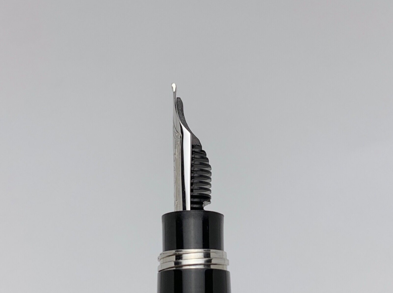
Finally! https://appelboom.com/montblanc-meisterstuck-gt-149-calligraphy-flex-fountain-pen-119699/ Available from september. It seems to have 2 safety restrictions: Under pressure ink flow is cut or starved. Downstroke only. Line width goes from about 0.3 mm (EF) to 1.6 mm (BB). Many of you are more competent than me for commentaries. There are 2 new inks as well. + 2 new decorated pens as well. Good news anyway.
-
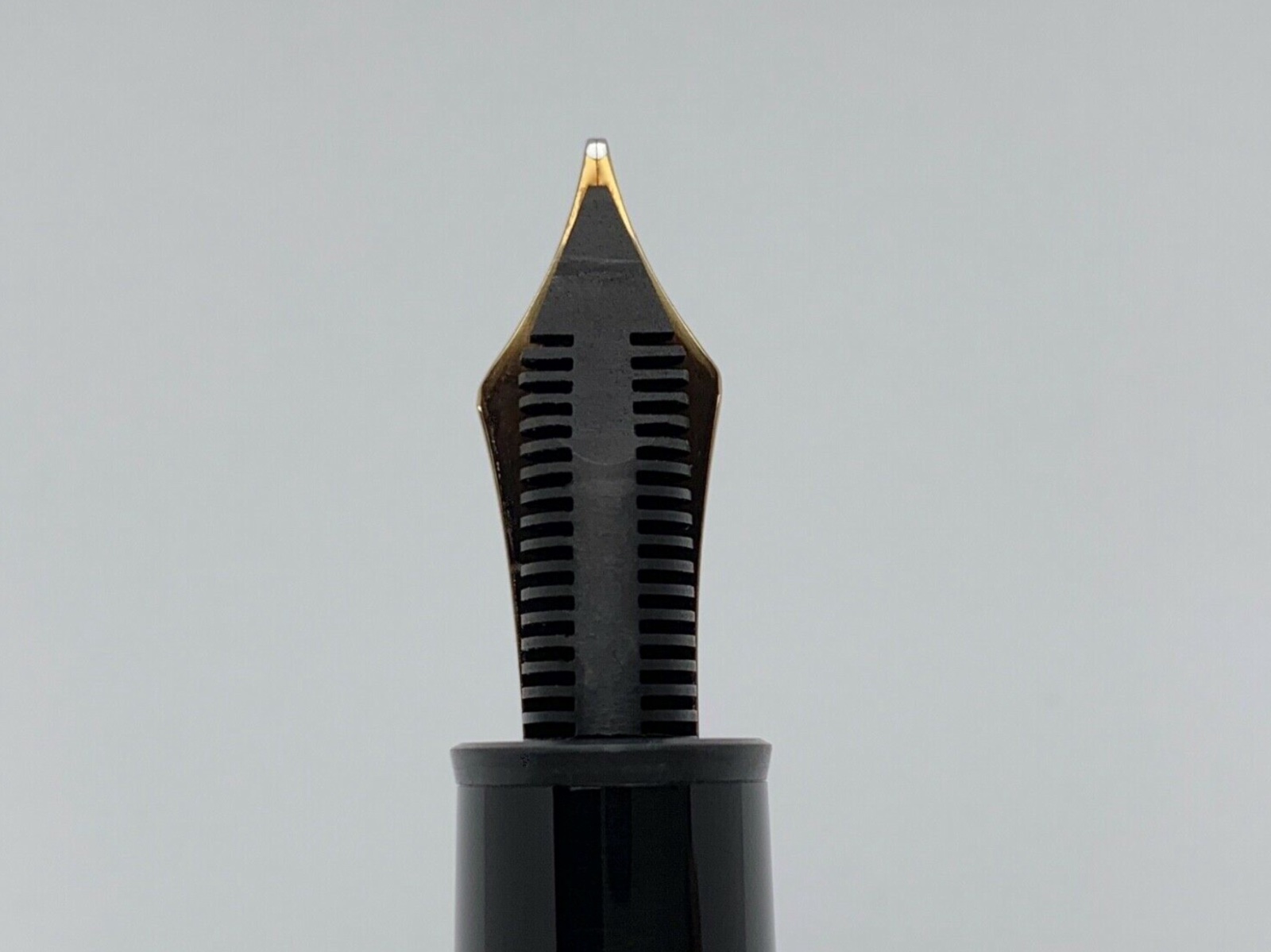
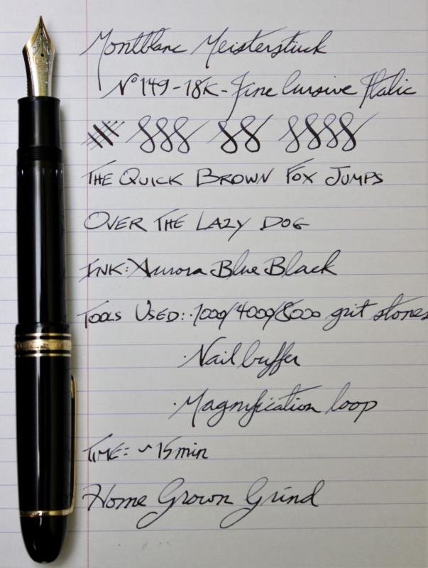
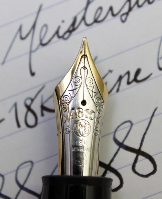
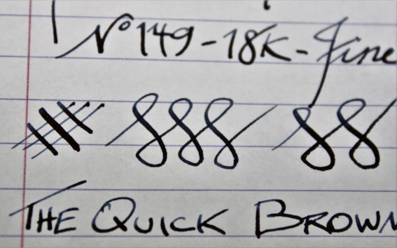
Thought I would post my DIY home nib grind I did on my newly purchased Montblanc 149. I bought the pen on auction for a great price ($300 USD). It was a new old stock (W. Germany made so from 80s-early 90's) never used and in great condition. The nib was a fine & ran VERY dry. I wanted something unique and fun with this pen as I have (too) many fine nib pens. I fixed the flow issues first to get it to write wetter (not too wet as I have some of those too), but it was still just a plain fine nib and was a bit scratchy. I smoothed it to be nice and smooth every which way, but again nothing special. So wanted to make it a fine cursive italic but when I looked into getting it done, there really any places around Vancouver (Canada) that grind nibs. Also, there seems to be a big backlog of pens in the queue for any nibmeisters in the US so pondered doing it myself. I restore & sharpen straight razors as another hobby, and get kitchen knives shaving sharp (I have actually shaved with my Japanese Nakiri knife before). So I looked into how the nib is actually ground and as I have tools to remove material. After doing some reading and watching I thought I would first try it on an super cheap pen that I never used. First up was a Wingsun Hero 590 that I got on eBay for $3.31. The pen had a band fall off right away when I got it and was super cheap. It wrote but nothing special - what can you expect for $3 anyways. So I took it too my stones and within a couple minutes I had a very crisp italic. Then got rid of the smooth edges with a nail buffer and voila, the pen was super fun to write with and performed very well! So then I decided to give the Montblanc a go since this one turned out so well. I spent a little more time on the pen, made sure to go nice and slow and it tuned out great. I had to remove a bit more off the tip as the variation wasn't much at first. But it didn't take much to get it to where I wanted it. Did the same process as on the cheap pen, stones + nail buffer to remove sharpness, and it writes great! Check out the writing samples below of the Wingsun & Montblanc 149. You might not want to grind a high-end pen, but if you've been wanting to play around, order a few cheap pens and see what you can do. I just ordered a Jinhao X750 in broad that I'm going to grind to an italic to see how it goes! Wingsun Hero 590 Writing Sample Montblanc 149 Pen + Writing Sample Nib close up Writing close up
-
Hello Mates, I wish to purchase a large black fountain pen for document signatures. Have narrowed options to two pens: Montblanc 149 Meisterstuck and Sailor King of Pens. I would welcome any comments or recommendations Thank you. Kind regards, Paul
-
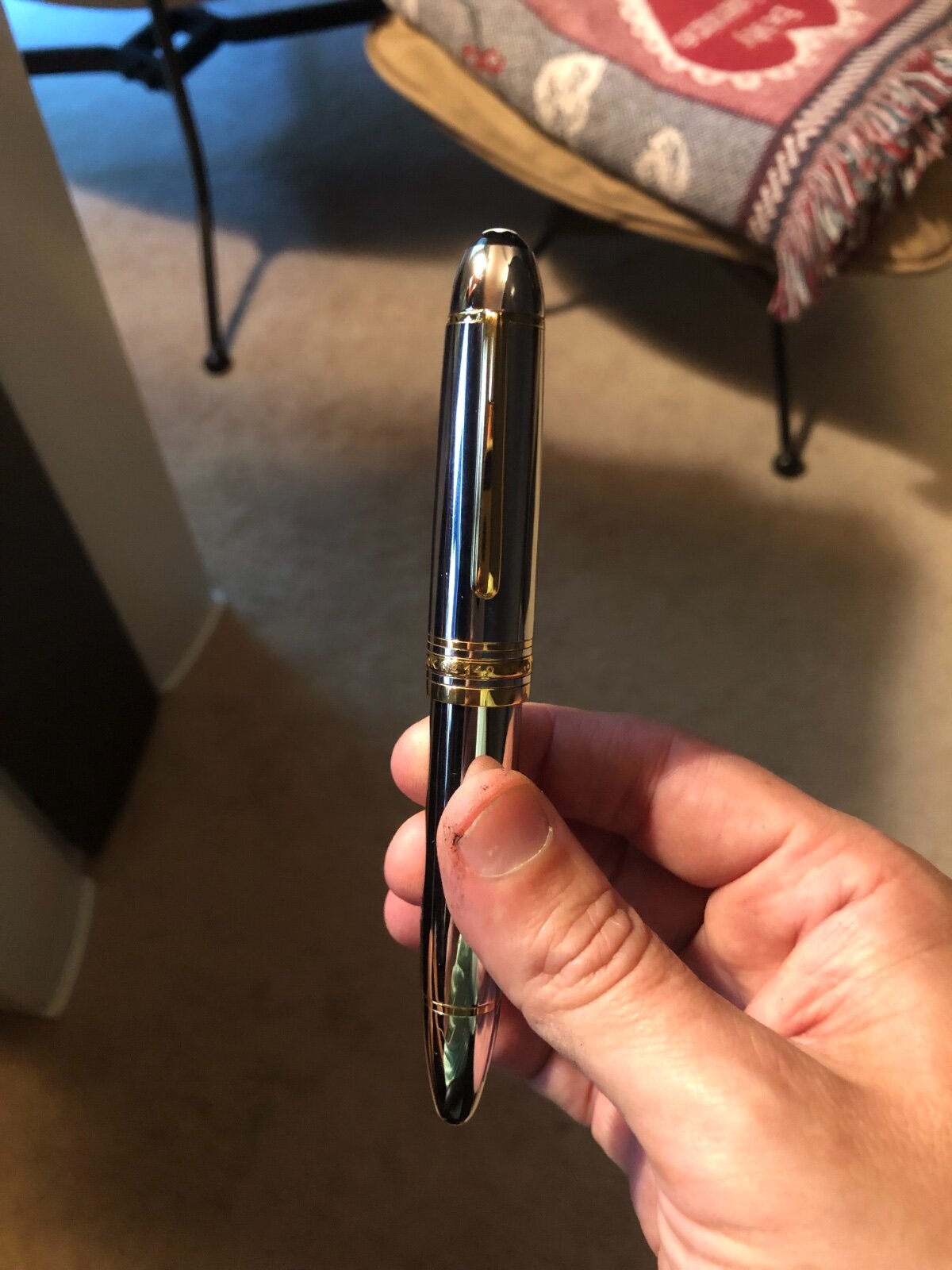
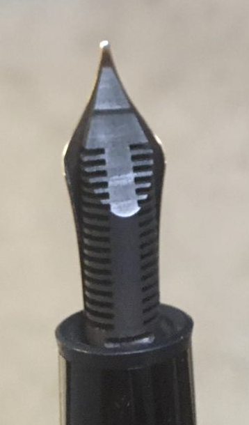
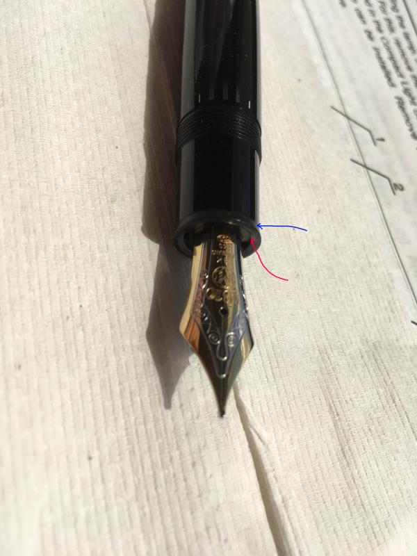
Hi everyone, I am new to the fountain pen network but have already used the large knowledge base here to guide my recent purchase of a used Montblanc 149 from the 90s. I'm very grateful for the the useful information here. Unfortunately, I may not have read quite enough. The pen arrived yesterday from an antiques store in Spain (I'm in NYC). It came with a little ink inside so I used the pen and found it writes wonderfully. However, while flushing the pen for the first time, I noticed there is a considerable amount of ink on the screws of the piston as you can see in the picture I included (that is supposed to be a shiny brass screw!). Also, I noticed that after a day of flushing, it is still not coming out clear, although it is significantly improving. More importantly, I tried to dry it by surrounding the nib with lint free wipes, and it seems like it could be leaking from either the red arrow, or blue arrow region in the picture of the nib, although I am not sure of this. Is this where a leak would/could form? It seems like there is ink everywhere inside. Most importantly, can this be fixed? If I took it apart, and cleaned and greased the different parts, would this fix whatever is wrong? If not, I'll be trying to return this.
-
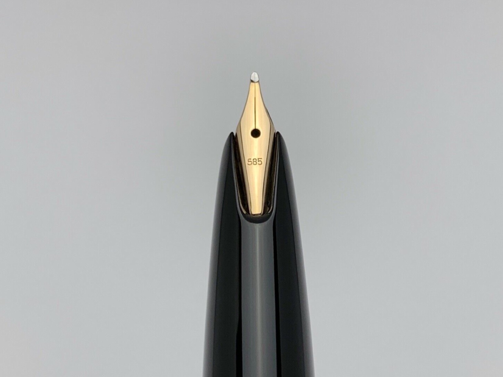
Hi guys, I'm thinking of buying this pen, but the seller doesn't know what nib he has. It looks like an older 14c MB149 nib, but its a bit slanted it seems. Is this an oblique nib? If so, can you speculate which size it could be? Thanks!
-
Its a classic for sure but Im debating adding one to my collection mostly due to cost. I only have one other Montblanc fountain pen, a Starwalker Midnight extreme. Also have a Starwalker Midnight ballpoint. The ballpoint was my first fine pen. Ill never forget the experience of calling up World Lux (now defunct) and placing the order. I even remember the sunlight coming through the window in the morning as I was calling. The call was very short and easy but the aftermath of I spent THAT much on a pen!? I will never forget. Really, the call was only about 5 minutes max. I even got a great deal honestly! Its funny the things that youll never forget and the reasons why. I mean, I remember all the details of that call. I even got up early to make sure I made the sale in time. It was very significant in my pen collection. Well, it was my first fine pen many many years ago and Im now bumping up against 100 pens. I rarely use either Montblanc these days but neither are really a classic Montblanc design. I have a high regard for the brand despite not really owning a significant Montblanc. I kind of feel like I should add a 149 to get the full effect. In FPNs opinion, is it worth picking up a modern 149 for the noted reasons? Is it really a worthy pen? The 149 I would use for sure. The Starwalker extreme is down because of a scratch in the finale plating. The other I rarely use because ballpoint even though its a great pen. The 149 though, I would rock that pen regularly. For my purposes the size is not a concern. I can get away with using unposted Kaweco Liliputs as well as 100g Jinhao dragon pens in the same day so Im not worried about the size of the pen. Im more or less buying the pen for what it is, I guess, but it still has to be a good writer for short sessions.
-
Good evening all! I recently aquired a 1972-75 Montblanc 149 and started to flush it through. I have noticed that the nib and feed are loose - loose enough that with small pressure, I can actually rotate them. I'm wondering, how do I tighten the nib and feed from rotating? Secondly, who is a good place I can send my pen to be properly cleaned/polished? I'm in Australia. Thank you!