Search the Community
Showing results for tags 'writers edition'.
-
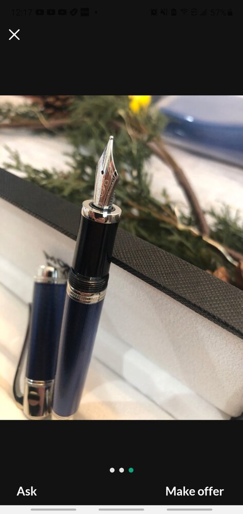
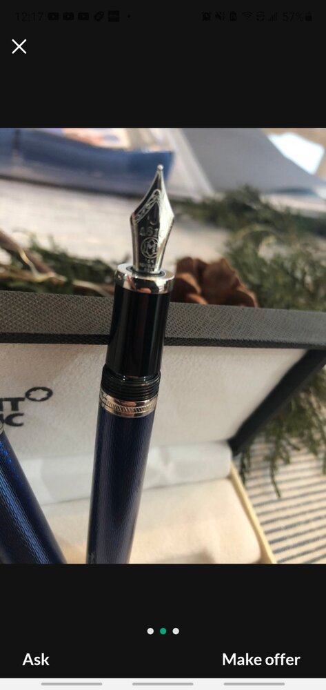
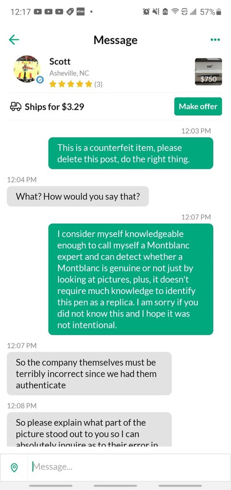
This is my first post on FPN, but I have been seen a lot of scams on OfferUp with fake Montblancs selling for the price of genuine ones. I want to show you guys one particular example of a gentleman selling a Writer's edition "new with original box" including our interesting conversation in which I let him know it is fake, but I would like you all to see for yourselves. I have already reported it but I doubt OfferUp will take action. What should I do if they do not delete the post?
-
- montblanc
- julesverne
-
(and 5 more)
Tagged with:
-
Mont Blanc - Jungle Green (Writer's Edition 2019 - Homage to R. Kipling) The 2019 Mont Blanc Writer's Edition pen pays homage to Rudyard Kipling, the English author who's probably most remembered for his tales centering on Mowgli and the wolf pack. But Kipling was also a poet, best known for the 1910 poem "If—". When a Writer's Edition pen appears, you can be sure that there is an LE ink in its wake. Accompanying this Writer's Edition pen comes the aptly named corresponding LE ink "Jungle Green." The ink's packaging looks lovely, with a design inspired by the famous poem "If—" and images of the wolf pack. The colour of the ink is inspired by the cover of the Jungle book's first U.S. Edition. In the box you'll find a very nice 50ml bottle of Jungle Green. Jungle Green is a blue-leaning green ink that manages to perfectly ride the dangerous edge between blue and green. Not yet a teal, definitely a green ink, but the blue undertones are there simmering just beneath the surface. And this is also toned down green with some grey in it, which gives the ink a faded look and a definite vintage character. This ink immediately charmed me, and made a great first impression... I really like the way it looks. The ink is well-saturated, and looks great in all nib sizes. With really fine nibs, I noticed a bit of a subpar lubrication, resulting in more feedback from pen on paper. With broader nibs or wetter pens, the ink behaved perfectly. Jungle Green's faded grey-green look also fits well in the workplace, and can perfectly replace blue & black inks in a more business-type setting. A great everyday writing ink. Shading is very prominent, due to the ink's wide colour range. A bit strong for my taste, but still tolerable. Jungle Green has quite a broad dynamic colour span. To illustrate this, I did a swab on Tomoe River paper where I really saturated portions of the paper with ink. This beautifully illustrates the ink's really wide colour range. The ink moves from a wispy light blue-green to a very dark green-black. The broad saturation spectrum explains the heavy shading demonstrated by this ink. On the smudge test - rubbing text with a moist Q-tip cotton swab - the ink behaved quite well. There is some smudging, but the text itself remains perfectly readable. Water resistance is remarkably good. The green colour disappears completely, but you are left with a grey ghost image that is still readable without too much effort. This is also apparent from the lower part of the chromatography, which shows that the grey components of the ink remain on the paper. Drying times are close to the 5-second mark, making Jungle Green a relatively fast-drying ink. The fast drying time, combined with the relatively good water resistance make this Mont Blanc ink really well-suited for the workplace. And by deviating from the standard blue & black, your writing will be guaranteed to draw some attention. I've tested the ink on a wide variety of paper - from crappy Moleskine to high-end Tomoe River. On each scrap of paper I show you: An ink swab, made with a cotton Q-tip 1-2-3 pass swab, to show increasing saturation An ink scribble made with a Lamy Safari M-nib fountain pen The name of the paper used, written with a Lamy Safari B-nib A small text sample, written with an M-nib Drying times of the ink on the paper (with the M-nib) Jungle Green looks really nice on all my test papers. This is an ink that looks good on any type of paper, both the white and more yellow ones. The ink behaved perfectly. Only with the fountain-pen unfriendly Moleskine did I notice a tiny amount of feathering, and quite some see-through and bleed-through. Writing with different nib sizes The picture below shows the effect of nib sizes on the writing. All samples were written with a Lamy Safari, which is typically a dry pen. I also added a visiting pen - a wet Pelikan M405 Stresemann with an F cursive-italic nib (from fpnibs.com). Here the ink leaves a much more saturated dark-green line with less pronounced shading. I quite like the faded green character of Jungle Green, and the way the blue undertones remain just below the surface. Mont Blanc created a great writing ink with this release! The ink works well with all nib sizes, and shows off a subdued & serious colour. Combine this with good water resistance and relatively fast drying times, and you have an ink that is quite suited for office-related note taking. Related inks To compare Jungle Green with related inks, I use a nine-grid format with the currently reviewed ink at the center. This format shows the name of related inks, a saturation sample, a 1-2-3 swab and a water resistance test - all in a very compact format. The grid format makes it easy for you to compare the Mont Blanc ink with similarly coloured inks. Inkxperiment – Eye of the Tiger As a personal experiment, I try to produce interesting drawings using only the ink I'm reviewing, keeping things simple and more-or-less abstract. Crafting these single-ink mini-pieces allows me to stretch my drawing skills, while showing what the ink is capable of in a more artistic context. Inspiration for this drawing comes from Rudyard Kipling's Jungle Book. The villain of the story is Shere Khan, who's usually found sneaking through the jungle with its mind set on catching the young wolf-boy Mowgli. I started with an empty sheet of 300 gsm watercolour paper on which I painted a background with heavily water-diluted Jungle Green. I then added the flowers and Shere Khan's eyes, and painted in the jungle with different mixtures of ink&water, applied with a Q-tip cotton swab. Finally I added the palm trees on the horizon line, and added some texture to the jungle with a B-nibbed Lamy Safari and pure Jungle Green. The resulting drawing shows quite well what can be achieved with Jungle Green as a drawing ink. Conclusion Mont Blanc's Homage to Rudyard Kipling is a very nice-looking faded green with blue undertones that has a vintage feel reflecting the time period (early 1900's). Jungle Green works well with all types of nibs and all types of paper. This is an ink fitting my tastes: faded looking, vintage vibes, and very nice for both writing and drawing. And as a welcome bonus: fast-drying and fairly water-resistant. In my opinion, one of the better Mont Blanc inks. Just be aware that this is a Limited Edition ink, so if you like it, grab it while it's still out there. Technical test results on Rhodia N° 16 notepad paper, written with Lamy Safari, M-nib Backside of writing samples on different paper types
- 8 replies
-
- mont blanc
- writers edition
-
(and 2 more)
Tagged with:
-
"Humanity can live without science, it can live without bread, but it cannot live without beauty. Without beauty, there would be nothing left to do in this life. Here the secret lies. Here lies the entire story." Dostoevsky. The Montblanc Writers Edition Dostoevsky fountain pen was released in 1997 with a 'limited' number of 16,300 fountain pens. It is a suitably moody pen for a writer who often plunged the dark depths of the human psyche, yet it's moodiness comes with a terrible beauty too. When Montblanc get their designs right, they really do get them right, producing miniature little works of art that are entirely functional and a true joy to own. I love this pen, but it has had a somewhat tragic history with me that has only recently resolved itself - more on that later. I bought this pen on the second hand market several years ago at what I thought was a very good price. The price of this pen (along with the Voltaire I was eyeing at the same time) seems to have significantly increased over the last couple of years. I'm not entirely sure why that is, but they do seem to be a little rarer than they once were which is perhaps pushing the price up, often well over the thousand euro mark which I would consider to be a little painful on the old purse. The pen came with its original packaging; a cardboard box shaped like a book with a black satin inlay where the pen rests. Many people like the boxes but I can't say I'm a fan. They are fine but not something I can get excited about. I think it's a shame they never include a copy of the author's work. This pen originally came with a fine nib that was quite soft, but didn't offer flexibility and expression, but it did have a curious, very slightly stubbish aspect and was quite different from a lot of other Writer's Edition nibs. I liked it and loved the feel, length, weight and balance of the pen posted. The concave grip is small and a little thinner than most Montblanc's, but comfortable. Sadly, I dropped it one day. The nib didn't appear damaged to the eye, but it did compact the left tine making it a little like an awkward oblique. It wasn't going to be something I could repair and in spite of my attempts to continue writing with it I had to admit defeat. Then someone here on FPN mentioned that they sent off their Agatha for a nib exchange and promptly got one. I decided to risk the same and plumbed for a double broad nib. I didn't have high hopes of getting it, but two weeks later the pen was returned with a double broad nib, re-gilded signature on the cap, re-plated gold on the top of the clip, a blemish removed from a cap ring and the whole pen polished and looking like new and all for less than the price of a Pelikan M1000 nib exchange. I am impressed by their customer service. Now to the pen. It's a back resin pen with an ivory snow peak on the cap (the older WE's in an old fashioned vintage style tend to have ivory coloured peaks rather than a pure white - a nice touch) and has a stormy blue ink window (minus the facets). The cap, grip and piston nob are plain, but the barrel of the pen has an engraved pattern reminiscent of either Imperial Russia or a riff on Russian folk material designs (depending on who you read - Montblanc say it's a nod to Imperial Russia). The furniture is gold plated with similar geometric designs of x's and diamonds that are found on the barrel. The clip narrows down to a ball that houses a rather moody looking sapphire. The screw cap comes off with three turns to reveal an 18K gold nib with an imprinted geometric design that is similar, but different to the barrel and cap bands. The cap is domed in a vintage style and the piston nob is a touch flatter with a metal (brass?) piston mechanism. The pen posts securely. The details are: 5.75 inches capped, 6.30 inches posted and 28g in weight, filled. The author's signature is on the cap, to the right of the clip, and gilded in gold. The pen is a piston filler that is smooth as butter and fills easily - you can fill it by dipping the nib only so you don;t have to immerse the whole nib and section. The double broad nib is quite crisp. On the sample above it was written on slightly poor paper so it soaked in slightly. The BB nibs have a beautiful quality; incredibly smooth and very wet with a stub aspect and a true joy to write with. I normally buy fine and extra fine nibs, but I do love these double broad nibs. Be aware that now and again you can get one that has quite a lot of oils residue in the nib housing that can make the nib either a slightly hard starter or skip slightly when first writing. A good and thorough flush will rid you of the residue and the nib should write like a dream. I am very fond of this pen. I love the old vintage nods that Montblanc really does so well. It's a joy to use and own and a fitting tribute to Dostoevsky. Probably best described as a terrible beauty.
- 13 replies
-
- montblanc
- writers edition
-
(and 3 more)
Tagged with:
-
Hi everyone, thanks for this wonderful place to discuss Montblanc pens. Even though I just registered this account a few days ago, I have learned a lot from this site for quite a long time. I recently bought a writer's edition, Edger Allan Poe, on therealreal.com, (this is not an ad, because I really don't trust much on this web). I can basically determine that it is authentic, but I really want a second opinion. The sticker seems low-quality and the weight is less than what I expected, because I used to believe the out-wear is made of some stone-like material. Thank you very much! The followings are pictures.
-
It's been awhile since I've written a review, my last one being 3 years ago. Of late, I've been making it a habit to rotate my pens, to the tune of every 2-4 weeks. One of the Montblanc Writer's Edition receiving less love than their peers is certainly the Kafka. Hence my choice today Price: I bought this at the London WES in 2013 from a dealer for 450 GBP/560 Euros, being told it was 'mint' but anyone who's bought a pen or two could tell that wasn't true, from the number of micro scratches found on the pens which you would get with use. But the condition was good, the nib acceptable to write with on paper , so I took a leap and was rewarded. Design: The Kafka is a long pen - in length, the main reason I've not used it as frequently as the rest of my pens, simply because it doesn't fit into my shirt pocket, which is a pity, since it actually has a clip that would make Goldilocks proud. Most fountain pens don't anyway, but this one really sticks out as shown. So it's mostly a pen I use for writing out study notes, or in my journal. It's not a pen I would post. The clips stems off the top of the cap, and is neither too tight to the point of frustration or too loose for comfort. Haven't used the pen in awhile, hence the dull silver, but I think it lends character ! After all it is a 2004 pen, a great way of tracking how old your pens are, when it's engraved on the nib directly ! From top to bottom; Kafka, Pelikan M1000, Pelikan M600, Parker 75 The nib is an 18k gold nib, with the familiar 4810m and Montblanc snowflake symbol engraved on the upper half, and a cockroach to represent one of Kafka's most famous publicly known works, Metamorphosis, where the main character well...not to spoil the story...turns into a cockroach. The nib is not particularly stiff, nor does it have any amount of flex to it, as most modern nibs do. As this is a medium, it doesn't have the 'stub' feel you may get with the broader Montblanc nibs. It was a dream to write with, and the feed keeps up very well, I never had to adjust the cartridge converter mid way ,as you would get with some pens. The sometimes misunderstood, maligned and yet reliable cartridge converter. It seems tightly sealed, so I've not tried seeing what happened if I tugged harder. It's not removable from the pen unit. The choice of colour for the body and cap is a dark ruby red, which at most angles, seem to be a deep and dark black. The body and cap of the pen isn't very reflective for all purposes, so even shining a light directly on to the pen doesn't bring out the reds in a more pleasing manner, as seen in the photo with flash below. Glimmers of red, mostly at the tips. It somehow shuns the light and displays its colours best in a dimly lit room, much like the terror of a flying cockroach landing on your face when the power goes out. Not a finger print magnet, which is a huge plus as well. Why red ? I haven't read enough Kafka, but I can only guess that the term Kafkaesque is frequently applied to the bureaucratic red tape we all find ourselves entangled in on a daily basis . Back to the pen, it's mostly seen at both ends of the pen, where the innards of the pen end at. The bottom end of the pen is tapered off with a piece of sterling silver, which you will see is rectangular in shape, but that transits into a the circular shape which we are all familiar with for most pens. Difficult to capture on camera. but the reflection of light of its surface tells you it changes along the way. Running your fingers along them and you'll find a seamless transition of the shapes. Why wasn't this pen more popular ? My guesses: 1) regarded as being cheaper due to the cartridge converter filling mechanism. I've noticed many FP users here regard having non cc's as being more 'premium', so this was probably seen as Montblanc going cheap on a writer's edition. In my opinion cc's are great, much easier to maintain and less of a hassle to repair. (walking into a minefield here..) 2) less trimmings: The entire body of the pen is mostly 'precious resin, aka plastic' besides the silver trimmings, compared to other pens which had more ornately decorated caps, bodies, nib sections etc. 3) simple design: well some of the writer editions can simply be...quite garish. I've a George Bernard Shaw as well, and it can be, sometimes, a bit ostentatious and invites unwanted conversations and attempts to try it... Overall, it's a design I find very pleasing, simple but elegantly done. I was happy to pay the price for a 2nd hand pen. As I slowly move away from broad nibs, but not yet to fine ones, I think this pen will feature more frequently in my daily pens. Hopefully I've convinced you that this is a wonderful pen ! I didn't score the pen out of a 10, because pens are like watches, love them or hate them, someones 10 maybe someone elses 3.75. I'm always taking suggestions for red fountain pens !
- 39 replies
-
Hi everyone, (By the way, I'm fairly new to pen collecting, so I apologize if I say something stupid). My brother wants to buy me a special pen. After a lot of consideration and procrastination, (I think) I have decided on the Montblanc Writers Edition Shakespeare pen. It's a beautiful pen, and given that it commemorates Shakespeare, I don't think it will ever go out of style (of course, it's a gift from my brother, not an investment -- I'm not really expecting to part with it in my lifetime). When I was first looking, I could buy the fountain pen (Fine nib) for around $950 (USD) from the store. Now, I'm led to believe that they are unavailable in stores, and the prices on Amazon appear astronomical (hundreds of dollars more). Did the price really just go up that much? Am I looking in the right place? Is there any chance I could buy it from the store still? If it's really impossible to buy the Shakespeare, I was thinking about the Beatles pen, which appears to still be available in Montblanc stores. Is it available only because it's not popular? Is there something wrong with it? Thank you!
- 7 replies
-
- montblanc
- writers edition
-
(and 1 more)
Tagged with:
-
I have a opportunity to buy one of these WE. I wish I could get both but they aren't normal priced exactly. It's between a Leo Tolstoy or an Antoine de Saint Exupery. I like both of them. Which one would you choose and would there be other reasons you would take into consideration besides personal preference?
- 11 replies
-
- montblanc
- writers edition
-
(and 2 more)
Tagged with:
-
I have been a longtime lurker since last August, when I started using fountain pens, and reading articles here and other's posts have been enough to help me solve a lot of the problems that I've encountered. But now I have a problem that I have found some information on but it is contradicting other posts so I want to ask others from this community for the most up to date information and advice. I have discovered Montblanc's Writer's Edition recently and immediately got hooked. My first purchase was a Dumas with a medium nib, but after inking it up and filling around 10 pages, I've concluded that I can't use a medium nib. From my previous post surfing I thought that the stubbiness of Montblanc nibs would be ok but it is just too thick of a line for my handwriting, so I'm thinking about the nib swap program that they have. So far I have gathered enough info about the nib swap program to know that Montblanc will replace the nib on my pen with my desired nib and if they don't have that specific Dumas nib in stock that they will make one to order. My question is regarding which channel I would go through. I'm in Dallas, Texas and the Fort Worth service center is 11 miles away. But an old post by a former Montblanc reseller specifically said to contact Montblanc service center in Hamburg directly. Does anyone have the most up to date information on who I should contact to get a fine or extra fine nib exchange? Thank you in advance for your help.
- 21 replies
-
- writers edition
- dumas
-
(and 2 more)
Tagged with:
-
Ah, distinctly I remember it was in the bleak December; and each separate dying ember wrought its ghost upon the floor. It is still December here - just about - and the embers in my fire have died completely as the winds of storm 'Frank' run around the corners of my house and rap the doors. There is, however, not a bird in sight; just my cat and nothing more. This pen was a bit of an impulse buy for me but one I am glad I pulled the trigger on as I believe it can be rather difficult to source. It is a limited edition, like all of the Writers Editions, if 14,000 units counts as limited. It takes its inspiration from the author Edgar Allan Poe, the master of Victorian Gothic horror and possibly the creator of the detective genre. Poe lived a rather sad life, plagued by unresolved griefs, bouts of depression and dogged (even in death) by malicious detractors. His short stories are magnificent; a triumph of dark and brooding menace. His poetry.....well,let's just say I quite like The Raven and we will talk of the the others nevermore; especially not 'The Bells'. The Edgar Allan Poe Writers Edition was released in 1998, so is quite an early one in the series. It is a Victorian Gothic masterpiece. It is a large pen at 5.75 inches capped, exactly 5 inches uncapped and exactly 6.5 inches posted. The pen has a very vintage appearance with a significantly large domed cap that is half the length of the body of the pen. The pen has a bit of weight to it, but doesn't feel as heavy as the 149, although there is weight down to the cap. The pen is nicely balanced when writing posted, although some may feel that the weight of the cap is a little distracting. I must say that I don't find that to be the case and I write with it posted. The threads on the cap do tend to grip the piston nob, so care must be taken when removing it or the nob will turn! I allowed someone who normally doesn't post to write with it, on the promise that I would wall them up alive if they did a damage to it. They noted that it felt a little light to them unposted. The marbled resin on this pen is not easily photographed in winter. It is a deep, dark midnight blue that would look good lining a luxury model coffin. It gives the appearance of a crushed velvet and works well with the gold plated accents. The cap bears the signature of the author picked out in gold engraving and also the number of the pen, discretely placed. The clip is a baseball bat shaped clip that is quite tight to the cap, but gives a vintage appearance. Either ends of the cap have black resin, but the end of the cap is a large dome with an off-white snow peak. Towards the opening of the cap (a screw cap) is a thin gold plated band that is a set of finely engraved bands, giving the strange, but pleasing appearance of a coiled spring. This same banded spring effect is repeated under the piston nob on the main body of the pen. It's a nice little bit of attention to detail. The cap also has a significantly large band beautifully engraved with Victorian ornamentation that looks a little like a stylised holly wreath. The cap length is 7cm. The body of the pen itself has the stunning deep blue marbled resin as its central portion with black resin at either end. A small gold fine line engraved band sits beneath the piston nob which works smoothly and well. It is quite a long and slightly tapered piston nob with a rounded top. Towards the grip there is a slight bulge above the threads and the grip itself is concave. The threads are so finely placed and tight that I don't notice them at all when writing. It does force my grip down towards the nib more than I would be used to, but it is a comfortable writing experience. The 18K monotone gold nib is nicely engraved with a raven in reference to the famous poem of the same name, It is a medium in this instance and is silky smooth. Other Montblanc's I own or have tried all have that distinctive touch of feedback (in a very pleasant sense). This one doesn't, which was something of a surprise. It is a wet writer that has a little line expression with a touch of spring, but be aware that it can gush ink if pushed even a little. I like it very much, but it may not be to everyone's taste. It is comparable in line width to the medium nibbed 149, so it is edging towards a broad; at least in my book. This is a very beautiful pen in a very striking deep blue resin. I like the nods to Victoriana and the Gothic touches. The nib is very good and the cap is distinctive and unusual. Overall it is very pleasing to write with. If my desk had a memento mori and a stuffed black bird on a bust of Pallas, the whole effect would be complete. The bad news is that this is not a cheap pen, but then it is no Jinhao. Is it worth it? Well, it is only worth it if you really like it enough to pay for it and use it and enjoy it. I know some people collect these pens, but I buy to use and this review is from the perspective of a user. This was my Christmas gift to myself this year (a work bonus, a generous token gift and a little saving of my own made it happen) in that I was able to exercise the freedom to choose something I liked. I chose this and I am very, very glad I did. I love it very much. I also bought a tablet this year - out of work necessity rather than pleasure - and it also was not cheap. It will in all likelihood be recycled into coke cans in about three to four years. This pen on the other hand will hopefully be with me for the rest of my days and perhaps I shall be more fortunate in my numbers than Mr Poe. But even if it not, a young member of my family might take ownership and if they look after it too, then it may even fall to a next generation. Now; where did I put the black cat?.........
- 19 replies
-
- montblanc
- edgar allan poe
-
(and 1 more)
Tagged with:
-
“Gatsby believed in the green light, the orgiastic future that year by year recedes before us. It eluded us then, but that’s no matter–tomorrow we will run faster, stretch out our arms farther…. And one fine morning– So we beat on, boats against the current, borne back ceaselessly into the past.” Every year, since 1992, Montblanc has been releasing a limited edition pen to celebrate the great writer's of the world of literature as part of its Writers Edition fountain pens (and also sets). Of all pens developed on a theme I find these to be the most successful in terms of producing beautiful pens. There are a few of them I don't like very much, but overall they display great design and pleasing aesthetic qualities. In 2002 the F Scott Fitzgerald was released in 18,500 units. The design aesthetic leans heavily on the Art Deco style of the 1920's. The pen is a piston filler, based on the 146 but having notable differences. Being based on the 146, this pen is not as large as its monstrous father, the 149. Unposted it feels a little short to my hand, but I tend to use large pens. It does post securely and when posted the balance feels perfect to me. The cap is a bulbous shape, heavily tapered to the tip with silver bands inlaid in black resin, deceasing in size running down its length. The cap also bears the signature of the author in question. The cap also bears the pen number, which on some pens can be in quite a bright colour. I find it quite unpleasant and the digital appearance of the number detracts from the look of the pen in my opinion. The clip also echoes the Art Deco design principles in a geometric tapering style. The top of the cap bears the unmistakable snow peak and in this case it is slightly off white in keeping with the faux vintage appearance of the pen. The central section of the body is in a mother of pearl effect that has a deep feeling with visible 'shavings'. It is very effective and very beautiful. It has silver rings at either end and a black resin grip and black resin piston nob that is very tapered to the tip. The piston mechanism works smoothly and well and the pen appears to hold a good amount of ink. There is no ink window. Some may find the cap threads (it is a screw on cap) a little poorly placed and while they are not at all sharp, if you have a high sensitivity in your fingertips, it may irritate as they are placed exactly at the point where you grip the pen. The pen has a handsome girth, even at the grip, so if you have a preference for thin grips then this is something to think about if considering a purchase of this pen. The nib proved a slight problem to photograph so I apologise for the poor picture quality. Hopefully you can see just enough to note that the nib is two-tone and engraved with an urban skyline Art Deco design. It is a very beautiful nib and writes like a dream; silky smooth with the tiniest hint of feedback and nicely wet. The nib on this pen is a medium, 18K gold nib and the engraving reminds me of wall relief designs seen in the 1920's in dance halls and theatres. If I was to be hyper critical I do occasionally look at it and think it is just a little small in relation to the rest of the pen, but perhaps the size is in keeping with the 'vintage; appearance. The slightly spidery hand is the result of a very strong coffee and a demonically possessed kitten threatening to demolish pen, book, lamp and camera all in one fell swoop. I have tried to be as objective as possible about this pen but it is one of my grails and I pen I hankered after for some time. To some it is the ugly duckling of the Writers Edition, but I love its fat and squat appearance and the Art Deco styling and the beautiful nib. It hasn't been un-inked since I bought it. In terms of the Writers Edition this pen tends to sell for a little less than a lot of the others and does appear for sale in various places with reasonable frequency, but do be aware there are quite a number of fakes, some of them quite convincing. I would recommend this pen; I find it very beautiful (although I do understand that the Art Deco styling may not be everyone's taste) and it is a great pleasure to write with. It has a lovely balance when posted (not so much unposted) and a decent weight in the hand without feeling over weighted. If I were to point to any flaws it would be the pen number engraving on the cap and the small nib. I hope that I have covered everything, but do feel free to ask any questions and I will, as far as possible, try to answer. I won't grade it as this pen is one of my grails and my gushing would likely weight a score to the top end.
- 7 replies
-
- f scott fitzgerald
- writers edition
-
(and 1 more)
Tagged with:
-
Hi everyone! I'm new to the network and was wondering if you could help me decide on my next pen purchase. I am currently torn between a 90th Anniversary 149, Miles Davis, Shakespeare and a Jules Verne. Do please explain the pros and cons if you think there are any that I should be aware of. I honestly wish I could purchase more than one but wife life does not allow for it. Thank you in advance! -Linus GC
-
My Collection Of We Pens (1992-2016) & Some Extra Shakespeare Things
BrandonA posted a topic in Montblanc
before the photos, I apologize for the quality of the photos, taking them is not a strength of mine. There are three sets of photos Firstly some photos of the new Shakespeare pen, note book and ink bottle http://i1262.photobucket.com/albums/ii618/brandon_amos/IMG_0059_zpsec1mcfoy.jpg http://i1262.photobucket.com/albums/ii618/brandon_amos/IMG_0060_zpsofjycl4n.jpg http://i1262.photobucket.com/albums/ii618/brandon_amos/IMG_0061_zps9efbf8ww.jpg http://i1262.photobucket.com/albums/ii618/brandon_amos/IMG_0062_zpsgf7d6smp.jpg http://i1262.photobucket.com/albums/ii618/brandon_amos/IMG_0064_zpsz8dxwhmb.jpg- 42 replies
-
- montblanc
- shakespear
-
(and 1 more)
Tagged with:
-
Hi everyone, I'm a fairly new and definitely inexperienced collector (and I'm 21-years-old). I've loved pens for several years, but I don't have a lot of money to spend on pens. However, something amazing happened: long story short, my brother (not a pen collector) wants to give me ~$1,000 to buy the pen of my dreams. This isn't a minor decision for me -- this pen will become, by far, the most expensive thing I own. The problem? I had no clue I'd ever have this much money to spend on a pen. And so I really don't know what to get. My brother and I went to the MB store and we looked at the new Shakespeare WE. It was very nice, and I have a good connection with Shakespeare's work. I went home and looked at the Fitzgerald WE online bc I love the Great Gatsby. It's tough to tell without actually seeing the pen, but it looks a bit less aesthetically appealing than the Shakespeare (also, I don't know much of anything about the symbolism other than the Art Deco design). Anyways, I have a few questions: 1. Can you suggest any pens in the ~1,000 price range? 2. I've read a bit about the Fitzgerald WE online. Does anyone have any reviews? I tend to like a heavy pen that's just a little bit thicker than the Meiserstuck. 3. What is a good price range to pay for the Fitzgerald WE? I'm assuming the best way to buy the Shakespeare is full retail through the MB store? It's not like I'm looking to sell this pen (no matter what it is, it will have a lot of sentimental value coming from my brother), but I don't want to get ripped off or buy at the top of the market.
- 17 replies
-
- montblanc
- writers edition
-
(and 3 more)
Tagged with:
-
I found out from my friendly pen dealer that the 2016 Writers Edition will be William Shakespeare. I believe this is to commemorate 400 years since the death of the writer. This would be an interesting pen to have...
-
I am talking about the diameter size of the nib portion that goes into the feed (the opposite end of the nib tip). The nib feed diameter, not tipping size (fine, broad, italic). What is the diameter in mm of a Montblanc 149 and a Montblanc Writer's Edition? I am interested in both of those nib units but I don't know what the writer's edition sizing is. I know 149s are size 9 and I know the writer's edition is smaller, but how much smaller. I want to know what size the writer's edition sized nib feed can fit into and preferably exact diameter of it and also the exact diameter of the 149. (9.1, 9.3, etc.) I have found places that measured the diameter of them from shoulder to shoulder but didn't even post the feed portion size. That is a huge factor in a nib. Thank you all very much.
-
Here is my Montblanc rotation team (The Oscar Wilde is visiting Germany due to piston issues). The one that have gotten more use over the years is the Agatha, followed by the 149 and Dumas. Jose
- 17 replies
-
- montblanc
- writers edition
-
(and 4 more)
Tagged with:
-
Hello, so after years of "sobriety" from my pen addiction I've gone into a MB writers edition binge. The result of one of these binges was an apparently un-inked (Boxes/papers) Dostoevsky which I received with a broken piston. I attempted to then drown my sorrows with my Oscar Wilde which I've had for many years and the entire piston assembly came off. So the Dostoevsky has been shipped back to the seller while the Oscar Wilde will probably be visiting his birthplace in Germany. By the way I took a photo of the "precious resin" of the Wilde. It appears to be a thin acrylic or maybe celluloid acetate with a solid inner liner (What do you guys and gals think). All the best! Jose Garcia
- 12 replies
-
- montblanc
- dostoevsky
-
(and 7 more)
Tagged with:
-
Hi, I received my MB Edgar Allan Poe fountain pen from GoPens today. It is one of the most beautiful pens I've ever seen. A BLUE Montblanc! I'm in heaven. When I unscrewed the piston, however, I noticed that it didn't unscrew very far. I've inked the pen and am writing with it quite happily. But, I am wondering about the ink capacity of the pen. It just didn't seem like it sucked up much ink with so few turns of the piston. I've looked on the MB website and Googled, but I can't find the specs for this pen. I am afraid to twist the piston past what seems to be the stopping point, though I discovered that my vintage MBs have a sort of two-step turning process. Any help would be appreciated.
- 5 replies
-
- montblanc
- edgar allan poe
-
(and 2 more)
Tagged with:
-
During the past five years or so, I have been watching for, bidding on, and losing eBay auctions for Montblanc Writers Edition Oscar Wilde ballpoint pens. For the latest Oscar Wilde ballpoint pen auction of interest to me, I bid, was outbid, and then bid again, as usual, several times during the duration of the auction. Not expecting to win, since I never have in the past, I bid once again this afternoon before taking my sister to the train station. When I checked the listing for the auction ending price a couple hours ago, I was shocked and surprised to find that I had won the auction! This has never happened before -- that is, I won the auction without any last-second bidding. In fact, my last bid was placed over two hours before the end of the auction! I had managed to buy an Oscar Wide pencil first-hand (with all papers and boxes) from a pen store a few years ago -- the only Oscar Wilde series piece that I had seen in any pen store. After that, I had started watching for the pens on eBay. So, now, I must wait for the delivery of my new Oscar Wilde ballpoint pen! To date, this will be the most expensive single pen that I have ever purchased; my purchase of a four-piece (pencil, ballpoint, fountain pen, rollerball) Caran D'Ache Hexagonal Escalie (sp??) brown lacquer set on eBay is my only purchase for which the price was higher -- about twice as high as for this pen. Yikes! But, truth be told, the Caran D'Ache Hexagonal set is FANTASTIC and each piece writes like a dream, making the set well worth the price and one of my favorites. The Oscar Wilde ballpoint pen that I won has one of the lowest winning auction prices for an Oscar Wilde ballpoint pen that I have ever seen on eBay. It would seem that the other bidders forgot the ending time for the auction based on how rapidly they had outbid my other bids. The only lower-priced listing including an Oscar Wilde ballpoint pen that I have seen was for a ballpoint pen and pencil set listed by a seller that did not have a sufficient long-term feedback rating for my tastes and the pencil (which I did not need anyway) had some condition issued. So, now, I must endure the anticipation of receiving my new Oscar Wilde ballpoint pen! Darn international shipping -- at least five days to wait for the arrival. Of course, it could be longer as my last pen took a detour to another city -- tracking listed the pen as "missent" -- due to the postal service. Stuff happens. LOL! : )
- 46 replies
-
- montblanc
- oscar wilde
-
(and 2 more)
Tagged with:
-
Against common sense, my better nature (and pocketbook), I'm considering bidding on the MB Voltaire FP in this eBay auction. With that said, I know the maxim "If it looks too good to be true, it usually is" applies particularly well to eBay auctions. As I'm more familiar with vintage MBs, can anyone who knows the WEs tell me whether this pen looks authentic and/or how I might decide whether it's just a scam? Thanks in advance for any help/advice/commentary/constructive criticism/slaps-to-the-side-of-the-head!
-
I just received a MB WE Carlo Collodi and am looking for recommendations for an ink. Up to this point, my only inks have been black, blue/black and an occasional blue. I am ready to branch out a little, but still not to far... I would like to find a deep, dark, rich brown similar to the color of the pen. I realize there is a MB Carlo Collodi ink but it appears to be lighter with more orange than the color of the pen. But if anyone does have there pen filled with the matching ink, I would be interested in hearing your opinion too. Thank you in advance.
- 16 replies
-
- montblanc
- writers edition
-
(and 2 more)
Tagged with:
-
I apologize if this has been discussed before, I tried to search through the old threads about WE pens. In every thread about the Writers Edition pens, people talk about how one edition or another has a particularly smooth or soft or springy nib, but I can't find any details on differences between the WE nibs themselves apart from the designs on them. Are the nibs different in a way that would be consistent throughout any given edition (e.g. all properly tuned Poe nibs have X quality)? How much is dependent on the person using the pen? How do they compare to the 146es produced in their year? I would really appreciate any thoughts on WE nibs and the comparative differences between them. Of course, every time I see a WE praised, I think about adding one to my roster. I'm just trying to get a better sense of how they perform.
- 12 replies
-
- writers edition
- nibs
-
(and 1 more)
Tagged with:
-
Noticed a strange looking pen in my *bay feed this afternoon - 171164399891. Seems to have Jules Verne furniture, but is advertised with a "resin" body. This is the first time I've noticed an attempt at a WE - have there been others?
- 7 replies
-
- fake
- counterfeit
-
(and 2 more)
Tagged with:

