Search the Community
Showing results for tags 'waterman'.
-

Waterman Aztec And Absolute Browns Reviews And Comparison
IThinkIHaveAProblem posted a topic in Ink Comparisons
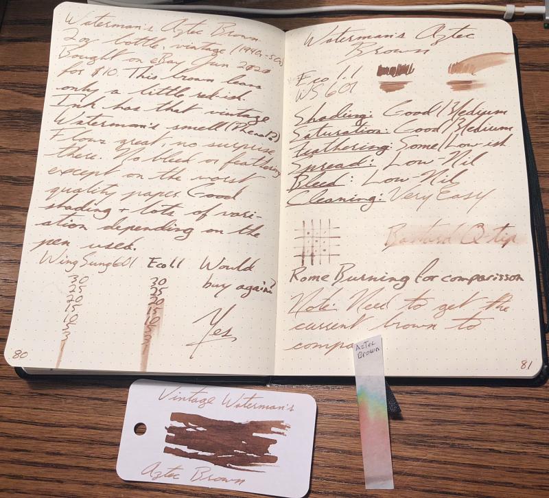
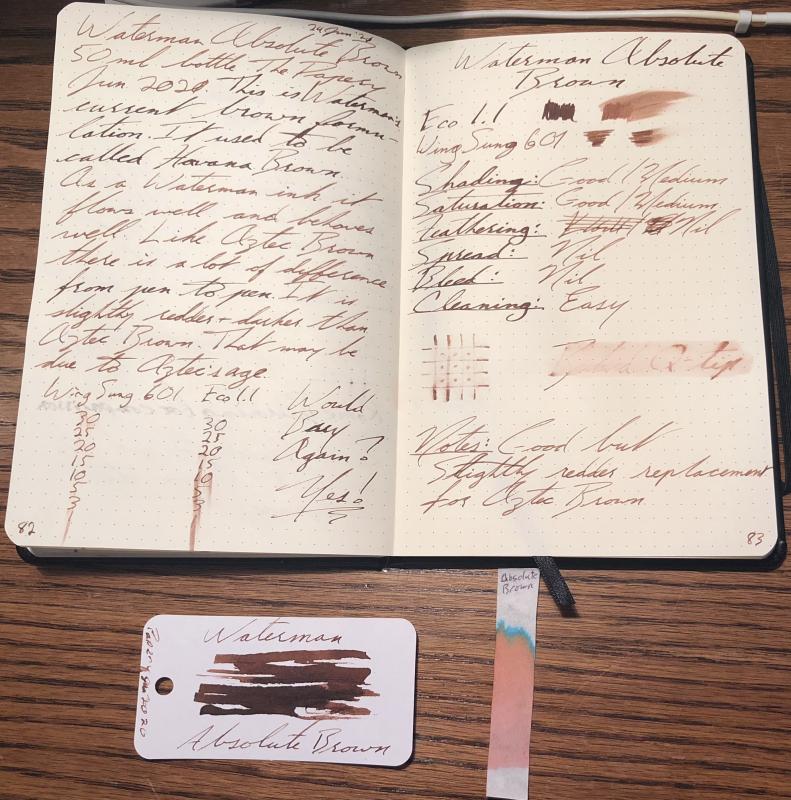
I like vintage ink I like the idea that ink that was made in the 30s, 40s, 50s and 60s HAD TO WORK It had to be relatively trouble free and it had to perform as expected. This was after all, a time when fountain pens were simply PENS. They were expected to write and write well. On that note, I recently bought a bottle of Waterman's Aztec Brown. The bottle is almost NOS. Using it, I found that I really like it. This is a problem as the stuff is getting expensive. So, I decided to get a bottle of the current Absolute Brown and compare them to one another. Here are the results: Waterman's Aztec Brown 2oz bottle, vintage (1940s-50s)Bought on eBay Jun 2020for $10 This brown leansonly a little red-ishInk has that vintage Waterman's smell (Phenol?)Flows great, no surprisethere. No bleed or feathering except on the worst quality paper Goodshading + lots of vari-ation depending on thepen used. (Dry Times) Wouldbuy again?Yes Shading: Good/MediumSaturation: Good/MediumFeathering: Some/Low-ishSpread: Low-NilBleed: Low-NilCleaning: Very Easy Waterman Absolute Brown50ml bottle The PaperyJun 2020. This is Waterman'scurrent brown formu-lation. It used to be called Havana BrownAs a Waterman ink itflows well and behaveswell. Like Aztec Brown there is a lot of differencefrom pen to pen. It isslightly redder + darker thanAztec Brown. That may be due to Aztec's age. (Dry Times) Would Buy Again?Yes! Shading: Good/MediumSaturation: Good/MediumFeathering: NilSpread: NilBleed: NilCleaning: Easy Notes: Good butSlightly redder replacementfor Aztec Brown
-
Hello! I was given this pen by someone who hadn't used it in many years and didn't recall the model. The barrel is slim, with a dark brown marbled color. The nib is stamped with "Waterman 18K 750". Based on photos I think it's an Executive, but I don't know much about Watermans so I could definitely be wrong. Hoping someone here will be able to help. Thanks for looking!
-
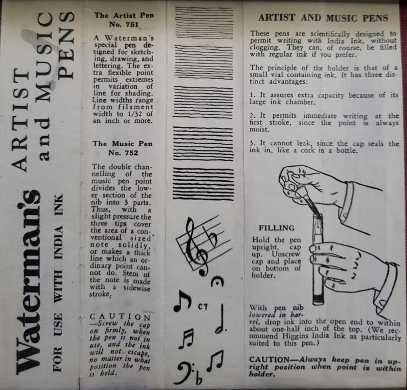
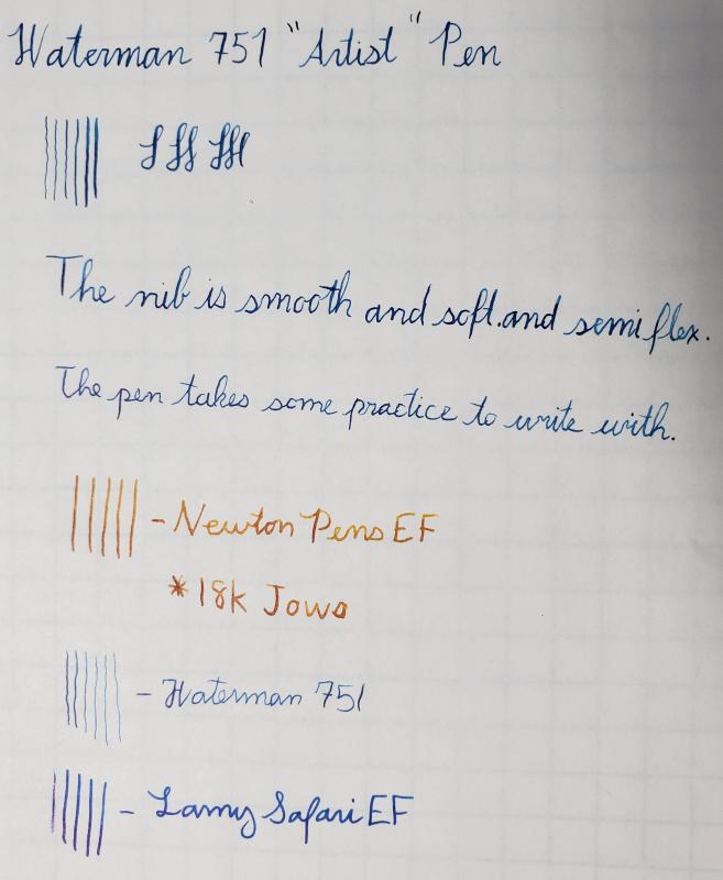
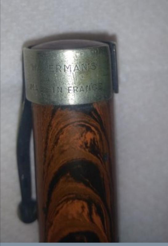
Greetings, It has been a while since I have posted. While I have many pens the focus of my collection is vintage Waterman pens. In particular, I focus on pens with flexible nibs. A few years ago I picked up a Waterman Artist Pen (Model 751) from the Fountain Pen Hospital. I can't remember if it was advertised as "New Old Stock" but it appeared to be brand new. Recently I was looking for more information about it. Having not found much at all, I decide to post my observations from the limited information that seems to be available. If anyone else has any experience with these pens, please feel free to share, as I am curious to find out whether or not my observations are accurate. As you probably know, much like the Pink nib, and the Black nib, the Artist nib has reached mythical status. Over the years there have been posts describing the writing qualities of the Artist nib. They are alleged to be the ultimate "wet noodle" with amazingly soft flexibility and the most delicate hairlines. Furthermore, one of the trends I have noticed is that many of the Waterman nibs that are called "artist" nibs, have unusually long tines. Generally, the long-tined flexible pens do indeed have incredible writing capabilities. While long-tined, ultra-flexible nibs exist, I am not so certain that these had anything to do with being examples of Waterman "artist" nibs. When it comes to the actual pen marketed by Waterman as having an Artist nib, I can only find a few photographs and mentions on the Internet. However, based on the little information I have found, the three examples of legitimate "Artist Pens" seem to have very similarly shaped nibs, and none of them have long tines. If you check the links to two other posts, the nibs seem to have an almost identical shape to mine. However, whereas my pen is not very flexible at all, other examples of "official" artist pens with nearly identical nib shapes are in fact very flexible. https://www.fountainpennetwork.com/forum/topic/98222-watermans-late-hard-rubber-safety-with-artist-nib-box-and-eyedropper/ https://www.fountainpennetwork.com/forum/topic/220347-watermans-artist-pen-882/ As you can see in the photos above and in the examples I have linked ,the nibs seem to have a moderate length, but as it gets close to the tip the taper gets much sharper to form a needlepoint. This aligns well with the pen's documentation that claims it can write lines from "filament width to 1/32nd of an inch" or from hairlines to about .8mm. I initially purchased the pen hoping that it would live up to the legendary status of the "artist" nib. My example is semi-flexible. It feels moderately soft, but the tines only open up very slightly, from XXXF (maybe thinner) to approximately an F. However, the nib is about as smooth as one could hope for such a fine point and it has become one of my favorite pens. I do have a couple of other nibs that are not on Waterman Artist pens that have unusually long tines and have all of the wonderful properties that are typically associated with what is popularly known as an "artist " nib. However, I think perhaps due to a lack of information the times have caused two separate, distinct things to be conflated. Another observation I have from pens from Waterman's Safety / 52 lever filler era is that, generally speaking, nibs that are fine or smaller with round breather holes seem more likely to have excellent flexible writing properties. I doubt its from the breather hole alone. Perhaps the round breather hole on a fine nib indicates that it was manufactured as an artist nib. Finally, if a vintage Waterman nib has unusually long tines, there is a really good chance that it is going to be an amazingly flexible pen. I don't see pens with what I consider abnormally long tines often, but from my experience its the most reliable indicator of flexibility other than the pens that are labelled as such. So in parting I leave some pictures, a writing sample, and a question. It has been a while since I have used any of my fountain pens, so my handwriting with the Artist pen is very shaky. The lines would probably be even thinner if I was able to use it confidently, but right now I'm a bit rusty. Notice that my writing with both EF nibs is much smoother. Does anyone know what era the Waterman 751 was manufactured in? I believe they were from the 1930s but I'm not certain. As you can see from the picture, the clip is rather modern looking compared to a Waterman 52. The paperwork that came with the pen doesn't have a date:
-
Good morning, I'm currently looking for my very first vintage flex pen and my second vintage pen in total. My only vintage pen that I currently own is a Parker Vacumatic with a low to medium flex nib. I love the pen and I've recently been on the hunt for a 'true' flex nib. Although I certainly don't have the budget to go for anything crazy, (like a pink nib) there are way too many beautiful options out there to not get excited and a little bit lost. (All my modern pens have a broad nib) I've been eyeing the waterman's in particular, mainly because of the beautiful nibs with the long tines that some of them have, as well as the gorgeous materials. One of the pens that I've been looking at is this one that I found on ebay. There are some scratches on the material, particularly around the personalization and bite marks at the end, which makes it impossible to read the model. Would this be a good purchase and/or are there any vintage Waterman sellers that you'd recommend? I like the material of this listing and the capabilities of the nib, but I'm not crazy about the condition. https://www.ebay.com/itm/Vintage-Watermans-Ideal-FLEX-fountain-pen-14k-XF-BBB-GORGEOUS-green-gold-RARE/164207465050
-
How To Darken Writing When Using A Cartridge?
Mysterious Mose posted a topic in Fountain & Dip Pens - First Stop
Inspired by a Goulet blog and instructional video, I've discovered a new way to clean Waterman fountain pens which use converters or cartridges. I've always flushed the pen by filling and rinsing, filling and rinsing, etc., with a converter. The new way is to remove the converter or cartridge, then use running water to flush out the nib and feed, and fill and rinse the converter by itself. I've got a bulb syringe on order. However, I've immediately run into a problem. After doing this flushing, if I insert an ink cartridge and start writing, the writing is very faint. It takes a lot of writing before the writing darkens to a usable level. Dipping the pen in ink makes very little difference. Any suggestions on how to speed up the process of getting my writing to be dark enough? Relevant details: Waterman Expert GT and Waterman Phileas pens, Waterman Intense Black and Serenity Blue 75mm cartridges. The Phileas is about 10 years old, the Expert ir 6 months old. I use a variety of inks. -
Hello everybody, does anybody know if this is a Waterman fountain pen? If so which type? Thanks, Stef
-
Hello Everyone, I've been a fan of the first-year Hundred Year Pen for many years, and finally obtained my "grail pen," one in jet black, and restored it last year. I have also held in my hands a transparent red version, and a green version, but never a blue. I have a couple questions for the many who are more experienced than I... 1. Do full-length transparent blue 1939 HYPs exist? Has anyone seen one or owns one (photos?) 2. I specify "full-length" above, because I have seen on several occasions a first-year HYP in jet with transparent blue ENDS -- the tip of the cap under the over-the-top clip, and the rounded end of the barrel. Was this just a variation that was made, and only in blue? I have never seen a corresponding version in red or green. Again, invitations to show off your own specimens are definitely implied. : ) Matt Here is mine, next to the stationery (I believe from Richard Binder's site originally) with which a friend still writes to me, and that first inspired my desire for the pen...
-
Hello, all! My lovely blue Phileas caught the eye of a new coworker (hallelujah, I am no longer the only "weird pen person" on staff) during a meeting. I had to break the news to him that the pen was discontinued, but I decided to help him out with a Google search for a decent replacement. Nothing can replace this lovely little gem, IMO. But the Hémisphère kept popping up in my searches. I know nothing of it; would it be considered a reasonably comparable writing experience? The writer is a relative newbie, and his current workhorse is a Kaweco Sport (black, with a gold clip). I welcome all opinions, highly biased and otherwise! Thanks, Jenny
-
I’m quite keen on Watermans and, interestingly, it’s reciprocal. My first fountain pen was Waterman Hemisphere that I had found on the street. On second thought, though, maybe I should blame them? If I haven’t found that pen I would never got into fountain pens and inks and I would have much more money. But maybe it was a fate and I was destined to get into this hobby, start spreading the word to the unenlightened, making converts? Who knows? Only time will tell. Anyway I’ve received three Watermans from my family members and I acquired two or three of them. Exception Slim was a gift – unexpected and most welcome as I was always interested in this model because of it unusual and elegant design. There’s not many quadrangular pens on the market. Well, there is Nettuno Barracuda but in my opinion it looks really, really bad. Even though at the moment Waterman isn’t the most innovative pen company on the market, their designers and engineers are not afraid of creating some daring designs interesting enough to capture pen enthusiasts attention. In my opinion they manage quite well to merge elegant classic look with intriguing lines. http://imageshack.com/a/img901/8803/msou4X.jpg Waterman launched Exception line in the last quarter of 2005. The Exception first came in two sizes of pen bodies and three different style versions. Night & Day Gold, and Night & Day Black, the Ideal Black - these are the large size pens. In 2006 Blue in the slim line was added, and a number of years later few other colors were added. http://imageshack.com/a/img907/8519/xQTkri.jpg I believe it’s one of those pens that you wouldn’t be embarrassed to pull out in business meeting even if you care a lot about etiquette. Personnally I don’t care about business etiquette and I usually care yellow Van Gogh filled with orange or brown ink to my business meetings but it’s just me. I'm perfectly fine withothers using black or blue so why wouldn't they be ok with me using red or yellow, right? I’ll say it loud – I love the design. It’s eye-catching and exciting while staying “classic” in a way. It feels good in hand. The question arises whether the pen is as exceptional as its name suggests ? http://imageshack.com/a/img537/4954/T0CxgF.jpg http://imageshack.com/a/img540/6206/4bn9Ff.jpg Impressions http://imageshack.com/a/img911/76/JRh60b.jpg http://imageshack.com/a/img913/1558/cO1TKg.jpg http://imageshack.com/a/img537/769/Fj3uKI.jpg The pen comes in a large, elegant box in Waterman’s colors (blue + gold). Nice and impressive but as I always throw the boxes away I won’t really focus on it. Pen is much more interesting. It looks good. Very good. It feels solid, strong and durable. And so it is. I’ve been using it occasionally for a couple of months and I haven’t noticed any signs of use. I enjoy design, substantial feel in the hand and the color – Emerald Green. Color is nice but what makes Exception Slim a looker is its quadrangular elongated shape. It’s both interesting aesthetically and practical – no chances your pen will roll over from the table to the floor as many other pens with suicidal tendencies do. I find its bigger brothers (Day & Night, Ideal) too big and a little ponderous while Slim is proportional but don’t be fooled – it’s not small pen. Quality http://imageshack.com/a/img905/8222/9Jc4jm.jpg http://imageshack.com/a/img909/1181/klAg5z.jpg http://imageshack.com/a/img538/1958/NWPTP2.jpg http://imageshack.com/a/img661/8798/TzeQYu.jpg The pen is made of lacquered metal. The threads are also made of metal, I guess they’ll last longer than me. The lacquer coating works fine and I haven't noticed any chips. Dimensions Closed: 138 mm Open: 129 mm Weight: 45 g Nib http://imageshack.com/a/img538/9418/mrJIK0.jpg http://imageshack.com/a/img673/839/Hl5dCV.jpg http://imageshack.com/a/img537/7904/xvX86M.jpg http://imageshack.com/a/img661/7803/QLOeci.jpg http://imageshack.com/a/img661/7100/ADHDLV.jpg We may like the design but without good nib even the nicest fountain pen won’t make writing enjoyable. Happily Waterman Exception’s nib is one of the smoothest fine nibs I’ve tried. Unhappily it’s fine nib and I dislike fine nibs because they are fine. I’m more into medium and broad. Anyway this one is rather juicy and I’ve never had a hard start or experienced any skipping with it. The Exception uses a rhodium-plated, 18k (750) solid gold nib. There is not much flexibility, but some line variation is possible. One thing that annoys me with Waterman is the fact that – in theory - they offer all nib sizes. There is however one issue – in order to get something more exciting than medium and fine nib, you’ll have to send the pen to the factory. Filling system Waterman designers are not afraid to make daring pen designs yet when it comes to filling system they’re pretty conservative. Really guys, there’s nothing exciting about c/c pens . It’s practical but boring. Summary http://imageshack.com/a/img661/1046/6lWef8.jpg http://imageshack.com/a/img911/8623/hTJa3q.jpg So – is it worth the price? Difficult question to answer. Especially that it was a gift and all gifts offer great price/quality ratio. Waterman Exception Slim is interesting pen with unique design. On the other hand it’s market price (+/- 300 $) isn’t exactly cheap. In this price range one can easily choose interesting pens from Waterman competitors. If I had the the money instead of the pen I would rather buy Conid Minimalistica or steel Lamy 2000. Or maybe some custom pen. This doesn’t mean however that the pen is not worth the price. It’s well crafted, comfortable and unique. Due to good distribution and the fact Waterman is part of bigger group they offer good service. Also in Europe you can check Waterman pens in most of B&M stores, see and try them before buying. Anyway I wish I would get more gifts as this one But with broader nibs. Pros designavailability in Europegood servicequalityCons design (some will like it, others won’t)price
-
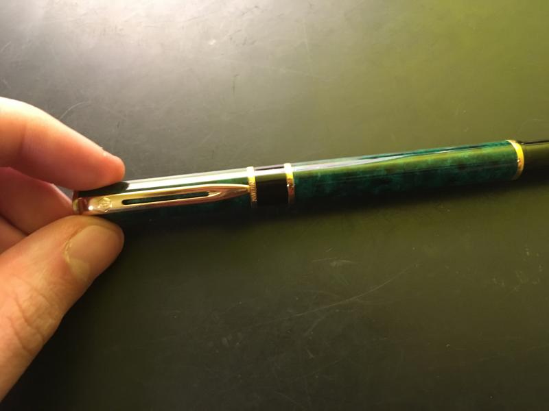
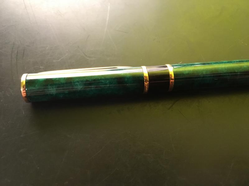
I've had this elegant Waterman pen for at least the last six years. It worked fine when I received it, but I have recently had to replace the sac. As you can see from the writing sample, the pen is working perfectly again. I have no idea of the model. This didn't bother me when I got it, but it does now. I've been unable to find any clues online. A look at the family photo on the Raven's March Fountain Pens website tells me that it might have been inspired by the Citation and Conquest models, and it looks very 'space age' to me (could fit into the Atomium in Brussels). So I'd guess it is a 1950s pen. But I'm an ignoramus when it comes to Waterman pens, and even that could be wrong. I'm pretty sure it's made of plastic. The ring, clip and lever are silver-coloured. The nib is marked "Waterman's" and "18Cts". There is also what looks like the top half of a "7" at the back of the nib where it disappears into the section. The barrel is marked "Waterman's" and "Made in France" across two lines. This is just about visible, but I was unable to take a photo of the barrel markings. Guidance gladly given gratefully received! Here are some photos (apologies for the poor quality). 1. 2. 3. 4. 5. 6. 7. 8. --- END OF POST ---
-
Hi All, I ordered a Waterman Harley Davidson Free Wheel Fountain Pen.The pen will arrive at any moment.Now I would like to know does this Fountain Pen take Waterman standard converter and cartridge.Please help.Thank you. Samba
-
This morning I uncapped my Waterman Le Man 100 Opéra. The nib/feed assembly stayed in the cap, separated from the section. I took everything apart--the nib/feed can be inserted into the section, but it remains loose. There are no threads to screw the nib into the section. There were no loose parts visible when I took the pen apart, like a gasket or O-ring. Anyone have an idea what has happened?
-
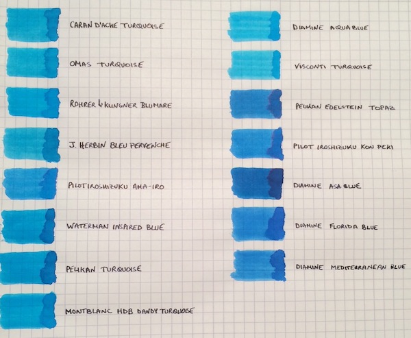
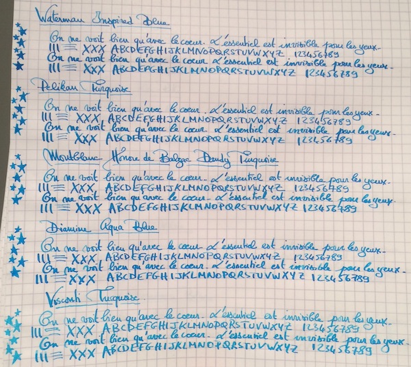
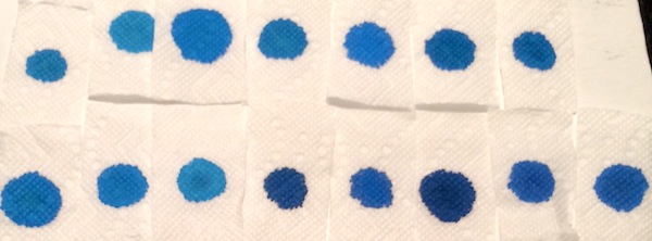
I don’t know if it’s the warm and sunny weather that just hit the northeast after a cold spell, but, more than ever, I’m not ready for summer to end! So to keep the summery vibe going, I thought why not do a comparison of turquoise and “beachy blue" inks. This is by no means a comprehensive review, because I’m missing some great turquoise inks, such as Sheaffer and Lamy Turquoise, but I saw a post come up on the boards with questions about turquoises, so I wanted to share samples of the ones I have. The 15 inks tested are: Caran d’Ache Turquoise, Omas Turquoise, Rohrer & Klingner Blu Mare, J. Herbin Bleu Pervenche, Pilot Iroshizuku Ama-Iro, Waterman Inspired Blue, Pelikan Turquoise, Montblanc Honore de Balzac Dandy Turquoise, Diamine Aqua Blue, Visconti Turquoise, Pelikan Edelstein Topaz, Pilot Iroshizuku Kon-Peki, Diamine Asa Blue, Diamine Florida Blue and Diamine Mediterranean Blue. The writing samples were done using a 1950s 146 and a Pilot Custom 74 B nib ground down to a smooth stub by Mike Masuyama. All samples were tested on Rhodia paper. Ink Swabs: Ink on Paper Towel: Top Row: Caran d’Ache Turquoise, Omas Turquoise, Rohrer & Klingner Blu Mare, J. Herbin Bleu Pervenche, Pilot Iroshizuku Ama-Iro, Waterman Inspired Blue, Pelikan Turquoise Bottom Row: Montblanc Honore de Balzac Dandy Turquoise, Diamine Aqua Blue, Visconti Turquoise, Pelikan Edelstein Topaz, Pilot Iroshizuku Kon-Peki, Diamine Asa Blue, Diamine Florida Blue and Diamine Mediterranean Blue Best Flow and Smoothness: J. Herbin Bleu Pervenche Bleu Pervenche wins hands down for me in this category and is miles ahead of every other ink in this review. With that said, although it has an excellent flow, l wish Bleu Pervenche felt a little smoother (to match the smoothness of my favorite inks). However, this is the only turquoise with a regular spot in my ink rotation. Best Turquoise Color: Rohrer & Klingner Blu Mare This is by far my favorite shade of turquoise. It offers a nice mix of blue and green that leans more towards the blue side (which I prefer). In a wet nib, it is the most vibrant of the turquoise inks tested - so vibrant in fact that it makes me want to pull out a pair of sunglasses . The ink has a good flow (though not as high as Bleu Pervenche) but is missing the high level of smoothness I look for in a go-to ink. However, I love the color so much that I did get a bottle. Best Beachy Blue Color: Pilot Iroshizuku Ama-Iro and Diamine Florida Blue (Tie) I love the color of both of these inks, but I do not own bottles of either. I consider Ama-Iro to a "beachy blue" rather than a turquoise because it needs a little more green to be a true turquoise. I really love its bright, light blue color, which screams summer fun, but didn't enjoy the feeling of writing with the ink enough in the flexy 146 to buy a full bottle especially given its higher price point. I should note that I may have been especially tough on Ama-Iro because I was expecting a higher level of smoothness from an Iroshizuku ink. Florida Blue and Mediterranean Blue are close enough in color that someone looking to keep their ink spending to a minimum wouldn't need to own both. Florida Blue has a better flow, and, since I like wetter inks, I wouldn't think twice about using it over Mediterranean Blue. (Mediterranean blue is not a dry ink but someone looking for less wetness might prefer it; it is also a little lighter and exhibits slightly more shading than its Floridian counterpart.) Highest Sheening Ink (on Rhodia): Pilot Iroshizuku Kon-Peki Kon-Peki is not a monster sheener on Rhodia (like some of the Sailor inks I’ve recently tried) but still offers a subtle and beautiful pink shimmering halo around its blue letters. Some posts have asked how it compares to Edelstein Topaz and, as others have noted, both inks are similar in that they are cerulean blues with pink sheen. (I've noticed that Topaz sheens tremendously on Tomoe River Paper, but in this comparison it barely showed any sheen around the letters.) If I had to choose only one of the two inks, it would be Kon-Peki. The color is brighter and the ink has a better flow. Lowest Performer: Caran d’Ache Turquoise I really did not like this ink and was expecting more from a $30+ ink. It was so thin that it took the fun out of writing with my favorite pen (and I almost stopped the review to change writers). Other notable mentions: Light Turquoise: Visconti and Omas Turquoise (tie) Both inks are on the lighter end of the turquoise spectrum and could be a good option for someone looking for such a shade. I prefer the flow of the Omas but like the color of the Visconti better. (I would have liked for the Visconti to perform more like its brother ink, Visconti Blue, which offers a smoother writing experience.) Dark Beachy Blue: Diamine Asa Blue Asa Blue is a beautiful and interesting color in that it is paradoxically both dark and beachy. It has a good flow but an ok smoothness. Montblanc Dandy Turquoise Alternative: Pelikan Turquoise I love this shade of turquoise and have found that with the right pen and paper combination it can offer wonderful color variation. (I've noticed much more color variation using a Visconti HS.) For anyone who was not able to get a bottle during its limited run, I think that Pelikan Turquoise is a pretty close alternative.
-
Id Help Please: A Waterman Fp In Need Of Repair -- Worth The Effort?
Anderglan posted a topic in Fountain & Dip Pens - First Stop
Can you enlighten me, please? Thank you (This time: I'm really really sure this item is *not* a Targa -- anyways, the tag shall help to find this thread again )
-
As a lefty (with atrocious penmanship), I have a soft spot for Waterman’s Yellow nibs. In turn, the collection has steadily grown. What struck me today when looking them over is how different the nib shape and profiles are from one to another. Additionally, flexibility varies significantly. In the close-up photos of the nibs from left to right: (1) Canadian #5. (2,3) US #7’s. (4) Canadian #7. (5) Canadian 14k #7. (6) US 18k #7. By far, the 18k nib requires the least amount of pressure to spread the tines and lays down a strong wet line. The #5 is quite springy and flexible. The 14k nib is surprisingly the least flexible. So, the moral of the story, when my girlfriend muses why I have 'so many of the same pen', I can now point out that they are in fact quite dissimilar. The madness continues….
-
Hi folks, I am thinking of buying myself a present (ok, I'll be honest - I mean that I wants a new Shiny Thing I does, oh yes!), and I would like some advice from you before I Succumb to the Temptation to blow what is actually rather lot of money for me. I am trying to choose between a current production (2019-2020) Parker Sonnet, and a Waterman Carène. I am (as long as the Mods are happy to let me) putting this thread in to both the Parker forum and the Waterman forum, so that I can get as many well-informed replies as possible. The Carène that I fancy the look of is (happily for me) the cheapest one available, and so it is ‘only’ the same price as a Sonnet with a gold nib. The retailer from whom I am thinking of buying my new toy sells both pens, and in every nib width too They also stock spare nibs, so I could buy any colour of Sonnet and also buy a gold nib to put in to it. Background I already own some Parker Frontiers, so I know that the size and shape of the Sonnet suits my hand (although I don't yet know about the weight). I also like that their nib units can be unscrewed if necessary, because I like to use Rohrer & Klingner's iron-gall inks „Salix” and „Scabiosa”. The ease of removing the Sonnet's nib & feed for cleaning reassures me that I would have less to fear in terms of the consequences of letting any ink dry out in a Sonnet. [i did once let some „Salix” dry-out in a Parker "51", and that was a massive PITA to put right. It took about six weeks! OK, so it has so far only happened on the one occasion, when my mother had to be rushed in to hopsital with acute neurological side-effects from a new heart medication, and was in there for a month. Happily, it hasn't happened since, but since then ease of cleaning is something that I do consider whenever I contemplate a new pen purchase.] Regardless of my penchant for ‘planning for failure’, I am concerned that I have seen many complaints about Sonnets drying-out whilst capped, and complaints of them ‘writing dry’. Neither of those things sounds like anything I want - especially as I like pens that ‘write wet’. So, have you found modern Sonnets to have a drying-out problem? Do you think that there is any point in my buying a Sonnet with a gold nib, or are the steel nibs just as good? Is the gold nib more ‘springy’ than the steel? Are both nibs ‘nails’? With respect to the Carène, I like the look of the beast, and have read many complimetary things about it on here. I have read the advice on how to avoid the problems that can occur when filling it, and how to adjust the rotation angle of the barrel so that the ‘stern’ end of the pen is oriented correctly when the barrel is screwed back on. I have not yet held an example of the pen, so intend to try one out so that I can check its girth, heft, and balance before I buy it. My potential worry with it would be its large and inaccessible feed - if I were to let an ink (but especially an iron-gall ink) dry out in that I expect that it would be a nightmare to clean out. Possibly even worse than the "51"! What are your thoughts, oh Fount of All Wisdom that is FPN? Which of these two pens would you advise me to buy? Do you think that the Carène is the better pen, and that I should buy the Carène and just leave the iron-gall inks for my Frontiers? Or that each pen is as good as the other? Or that the Sonnet is better, and that I should buy one with a gold-nib? Or that I ought to buy a steel-nibbed Sonnet & also some nice inks with the rest of the money? Are there any other ‘problems’ with either pen? Have you found either to have any ‘idiosyncrasies’ that have irked you? My thanks to you all in advance for your answers. Cheers, M.
-
There are few ink brands out there as iconic as Waterman inks. My very first bottle of ink was Waterman South Seas, and many, many years later, Waterman inks are still a favorite brand for me. And Harmonious Green is one of my favorite greens. Many have given the history of this ink currently made in France, so I will dispense with further introductory remarks. Waterman inks feature as stable, glass bottle with an opening large enough for most pens. The bottle contains an ample amount of ink (50mL) and is sold a very reasonable price. I purchased my bottle from Pen Chalet when it was on sale. The ink is a medium green which leans towards blue, and has a lovely burgundy sheen which complements the green very nicely. It is very well behaved and flows smoothly from the pen. For this review, I have used two fountain pens - a Conklin Duragraph with 1.1mm stub nib, and a Pilot Metropolitan with EF nib. The papers used include HP All in One 22 Copy Paper, Tomoe River 52 gsm and Clairfontaine. Waterman Harmonious Green is closer in shade to more emerald greens such as Rohrer & Klingner Smaragdgrun than greener shades such as Leonardo Green. The flow is excellent, and while not heavily lubricated, there is enough lubrication to make even my driest Pilot Metropolitan write smoothly and easily. PROS: Lovely green shade leaning towards blue. Medium saturation Burgundy sheen seen in pooled areas with wider nibs Nice shading in wider nibs; minimal in finer nibs Little to no bleedthrough even on copy paper Minimal showthrough No feathering except on cheap paper Flow is excellent even in dry pens CONS: No water resistance Slightly longer dry time Overall, this is an excellent ink and holds on to its long standing reputation for reliability. If you like this color, I highly recommend getting a bottle. **All photos were taken with an iPhone and the images have not been retouched. You may note a slight pink cast to the paper due to the pink blotter placed behind each page.
-
I find myself in the unusual situation of having received an Amazon (US) gift card, which covers the cost of a Carène, about $165 with rhodium trim with a fine nib, but not pouncing on the opportunity. I seem to have reached the limit of inks I am happy with (about 22) and corresponding pens, so what three inks ago would have been a natural jump... Is no longer there . I do see the Carène as a grail pen but my main interest is seeing inks in their full glory, many of my pens seem to be so wet their inks come out very dark and boring, so I've had to resort to extreme measures which I would not attempt with this pen and its inlaid nib; all my inks do currently look really nice. So if you love your Carène what is it that would make it an obvious or strong choice? What I like from what I've read: Unique design.Comfortable.Smooth. What doesn't seem that nice: Any reliability issues? My le Man 100 has always worked well but a Laureat invariably burped all its ink onto the cap, so I'm not exactly a Waterman fan. Current pens: Cheap but decent: 4x Muji, 7 x Vista, 1 Metropolitan, 1 Penmanship, 1 Sport. Nice even if sometimes quirky: 2 x Sonnet, 2 (another on the way) x Studio, 1 Ambition, 1 Le Man 100, 1 Pro Gear, 1 m600, 2x m205. If you don't see the point of this post which is half in jest, "only you know", "I would never buy sight unseen", "get 165 Chinese pens", please refrain from souring everyone else's day .
-
Hi folks, I am thinking of buying myself a present (ok, I'll be honest - I mean that I wants a new Shiny Thing I does, oh yes!), and I would like some advice from you before I Succumb to the Temptation to blow what is actually rather lot of money for me. I am trying to choose between a current production (2019-2020) Parker Sonnet, and a Waterman Carène. I am (as long as the Mods are happy to let me) putting this thread in to both the Parker forum and the Waterman forum, so that I can get as many well-informed replies as possible. The Carène that I fancy the look of is (happily for me) the cheapest one available, and so it is ‘only’ the same price as a Sonnet with a gold nib. The retailer from whom I am thinking of buying my new toy sells both pens, and in every nib width too They also stock spare nibs, so I could buy any colour of Sonnet and also buy a gold nib to put in to it. Background I already own some Parker Frontiers, so I know that the size and shape of the Sonnet suits my hand (although I don't yet know about the weight). I also like that their nib units can be unscrewed if necessary, because I like to use Rohrer & Klingner's iron-gall inks „Salix” and „Scabiosa”. The ease of removing the Sonnet's nib & feed for cleaning reassures me that I would have less to fear in terms of the consequences of letting any ink dry out in a Sonnet. [i did once let some „Salix” dry-out in a Parker "51", and that was a massive PITA to put right. It took about six weeks! OK, so it has so far only happened on the one occasion, when my mother had to be rushed in to hopsital with acute neurological side-effects from a new heart medication, and was in there for a month. Happily, it hasn't happened since, but since then ease of cleaning is something that I do consider whenever I contemplate a new pen purchase.] Regardless of my penchant for ‘planning for failure’, I am concerned that I have seen many complaints about Sonnets drying-out whilst capped, and complaints of them ‘writing dry’. Neither of those things sounds like anything I want - especially as I like pens that ‘write wet’. So, have you found modern Sonnets to have a drying-out problem? Do you think that there is any point in my buying a Sonnet with a gold nib, or are the steel nibs just as good? Is the gold nib more ‘springy’ than the steel? Are both nibs ‘nails’? With respect to the Carène, I like the look of the beast, and have read many complimetary things about it on here. I have read the advice on how to avoid the problems that can occur when filling it, and how to adjust the rotation angle of the barrel so that the ‘stern’ end of the pen is oriented correctly when the barrel is screwed back on. I have not yet held an example of the pen, so intend to try one out so that I can check its girth, heft, and balance before I buy it. My potential worry with it would be its large and inaccessible feed - if I were to let an ink (but especially an iron-gall ink) dry out in that I expect that it would be a nightmare to clean out. Possibly even worse than the "51"! What are your thoughts, oh Fount of All Wisdom that is FPN? Which of these two pens would you advise me to buy? Do you think that the Carène is the better pen, and that I should buy the Carène and just leave the iron-gall inks for my Frontiers? Or that each pen is as good as the other? Or that the Sonnet is better, and that I should buy one with a gold-nib? Or that I ought to buy a steel-nibbed Sonnet & also some nice inks with the rest of the money? Are there any other ‘problems’ with either pen? Have you found either to have any ‘idiosyncrasies’ that have irked you? My thanks to you all in advance for your answers. Cheers, M.
-
I'm a college student that got hooked or you could say got hit by the curiosity with fountain pens. The last several years I've been studying and since money was tight was satisfied with writing with the pens I already obtained. I already have a thread going on over in the nibs and tines section regarding my hunt for a flexy pen, but also am thinking about a different next pen as well. I should say I haven't decided which pen I will get first and there will be a significant amount of time in-between purchases. I will list the pens I already own as a jumping off point into a discussion of sorts I'm seeking surrounding my hunt for that "next" pen. Pens I own: Lamy 2000 - Fine Lamy Safari - Medium and 1.1 Stub Twsbi Eco - Broad and 1.1 Stub Pilot Metro - Medium, Fine, and 1.0 Stub Faber Castell Loom - Medium Jinhao x450 - Medium Goulet Churchmans Prescriptor - 1.1 Stub Conklin Crescent Filler Demo - 1.1 Stub My last pen purchase was the Lamy 2000 back in 2017. Actually the bulk of my pen purchases occurred at the start of my addiction to pens lol. Anyways the Lamy 2000 was my first big purchase and it really solidified how great it feels to write with a pen that truly speaks to you. I've learned as I grow in the hobby and learn more about pens that one pen isn't necessarily better than another pen; they just provide different experiences. I write with each one of my pens more so than others but nonetheless I reach for each one of my pens when I want to experience that unique experience that only that specific pen can offer. I'll admit my Lamy 2000 gets the most use, it's my favorite among all my pens. Time has passed and I'm starting to get that affinity again and looking at what else I can expose myself too. Here are some possibilities that I'm looking towards for my next possible pen in no particular order. Platinum 3776 Pelikan M200 / M400 Pilot Vanishing Point / Custom 823 / Custom 74 / Custom 912 Edison Collier Franklin Christoph Model 19, 20, 02, Parker 51 Waterman Caréne Diplomat Aero Sailor 1911 / Sailor Pro Gear I'll also admit price is a factor in that the ones I'm leaning towards seem to be easier to find deals, the Platinum's, Pilots, and Sailors especially. I think you can tell I'm honing in on sub $300 in terms of price. I'm leaning towards one of the pens listed with a gold nib, because I enjoyed the gold nib on my lamy 2000 and would like to experience other pens with gold nibs. At some point I probably will own all those pens listed, but for time being I'm leaning towards: Sailor 1911 or Pro Gear Platinum 3776 Pilot Vanishing Point / Custom 823 / Custom 74 / Custom 912 Pelkian m400 Waterman Caréne. Feel free to suggest other pens that you think I should definitely consider. So the discussion I'm hoping to generate is whats that gold nib pen that you think someone who hasn't experienced should definitely take a look at?
-
Hello there, I have found a couple of "old" Waterman pens and I would really like to know the model names and if possible the age. Many thanks in advance!
-
Hi all, first post here. I bought a taperite citation with the hooded nib that needs restoring, but the nib needs replacing. I have been scouring the web for months trying to find a replacement with no success. Having to guess at the nib description as all the engraving says is ‘made in england’ or some such. I have bought other taperites with the intention of nicking their nibs, but they are always in good condition and very saleable, so it would simply leave me with yet another pen needing a nib. Can anyone point me to a nib or provide an accurate description of the nib model so i can continue my search without going bald too quickly? i apologies if i am in the forum, feel free to moderate me. many desperate thanks in advance, Dave C.
-
Hello, I am wondering how rare is that pen, becouse it has been hard to find information, and the pen itself, apart from the history that I guess all waterman lovers know about it which is that the Waterman 13 Stanhope is a legendary rarity; made to commemorate the 35th anniversary of the Waterman factory and produced exclusively for friends and personal customers of Frank D.Waterman's owner. The small viewer made with a magnifying glass and a microscopic photo shows the Waterman building in New York. I would like to know whether that is just a legend or there are any information about that, and I would like to know how many of that model were made, and whether if the model was only produced exclusively for friend and personal customers of Frank D. Waterman as the history tells. Anyone knows why to commemorate the 35th anniversary? Here there are some pics of the actually pen. Thank you in advance for your answers. Happy New year.
-
Hello, My handle is Doc13. I have my grandmothers Waterman “Skywriter” made in Canada. It has a pump lever for the bladder/reservoir, so I would like to restore it to working order. I also came across a bottle of Scripts ink she used and it was sealed enough that it is still half full of ink. I feel blessed with this find and want to treat the family treasure with the respect it deserves. Any advice would be appreciated. Doc13
-

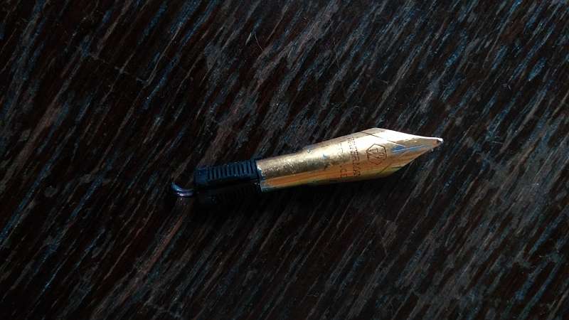
Waterman Exception Nib Section Comes Loose When Removing The Cap
Bytebuster posted a topic in Repair Q&A
Hi there, A few weeks ago I bought a set of Waterman Exception on eBay. According to the seller they were new and never been used. He is not a pen seller and does not know a lot about the pens. Now time to time I have the problem that the nib section comes loose when I try to remove the cap. When I slightly apply downwards or upwards pressure to the barrel and then pull the barrel to remove the cap, the it is OK, but if I pull the barrel directly, most of the time half of the nib section is staying in the cap. I have a photo of it. As you can see in the photo; the black part of the nib section is stucking inside the cap and the golden ring section is coming loose. I have to push it back and then apply downwards or upwards pressure to the barrel and applying pressure pull it back. Anyone any idea how to fix this problem? kind regards, Byte