Search the Community
Showing results for tags 'vermillion'.
Found 6 results
-

A Review Of Namiki Yukari Royale In Vermillion(Red) Urushi
sannidh posted a topic in Fountain Pen Reviews
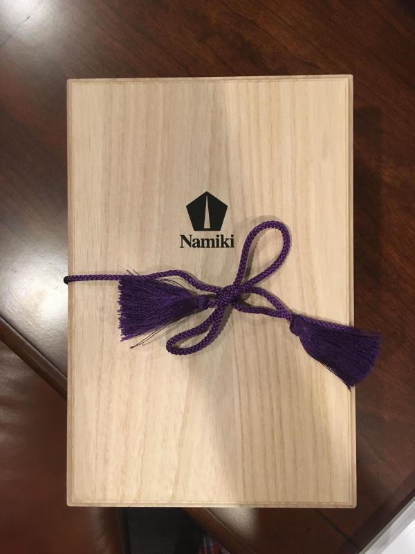
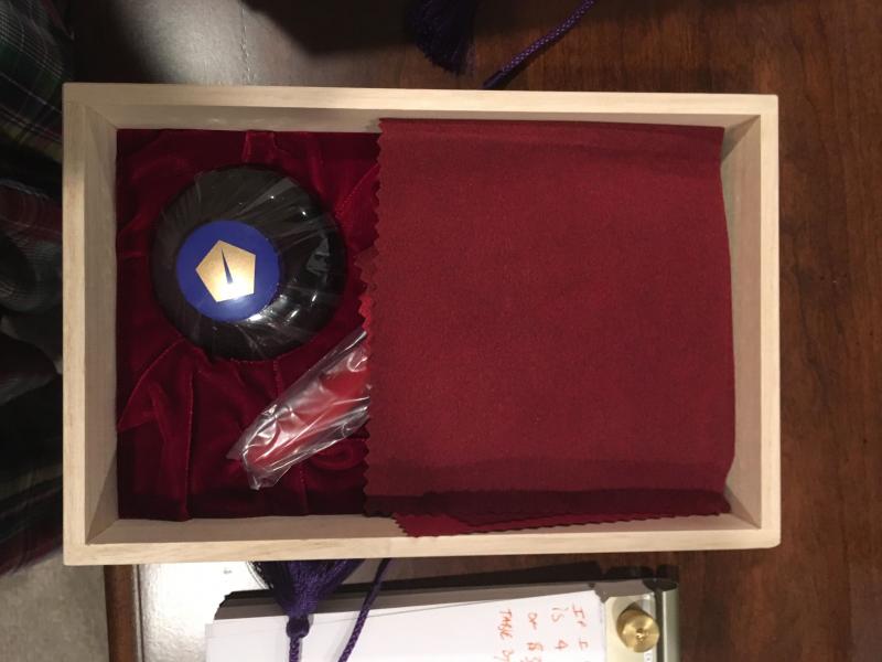
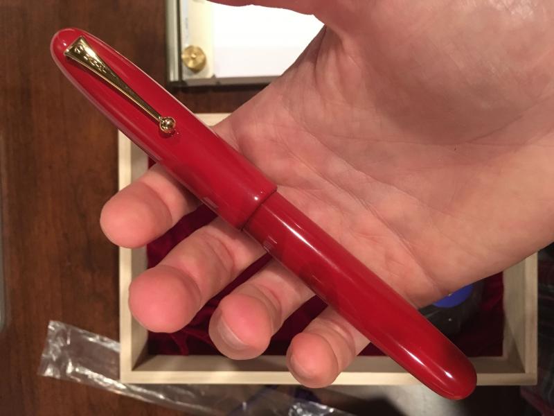
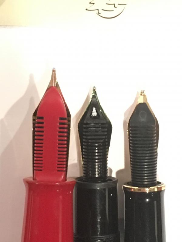
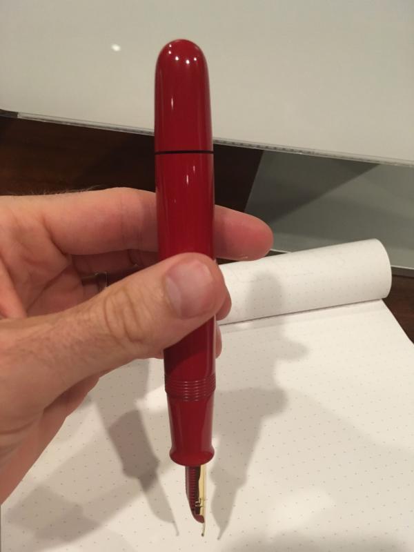
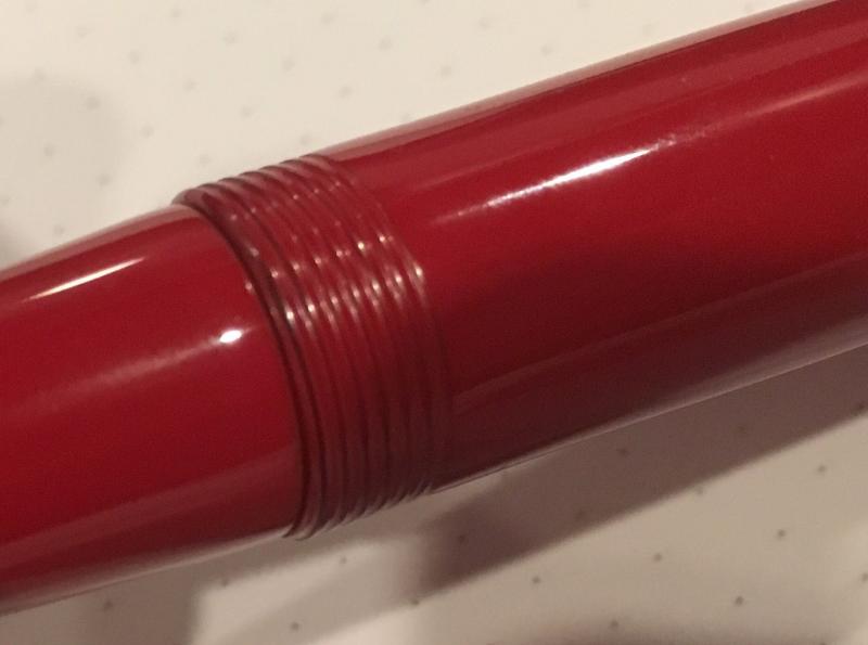
A wait longer than words can define, an Emperor in Red singing a glistening rhapsody, and then a Yukari dazzling in Royale Red glory. The pens, an encompassment of elegance of words, combined with precision of maki-e artisans have been unsurpassed. The Yukari did anxiously waited in my hands to have it's first sip of ink and I had same thoughts with what if clauses! Before getting the Yukari, this is a must read-review by FPNer shuuemura, which is a rather poetic series of pictures with practical words, comparing two pilot beauties in black urushi. This pen, one can find ideal for everyday carry to write or to keep admiring the marvel it is! The doubly magnified and magnificent emperor would be more suitable for the latter though. Having said that, when both are together, it’s more fulfilling than a sumptuous meal. PS. Google says Yukari in Japanese means Affinity (上記) and is feminine by gender. In case you are looking for a review of the Yukari Royale or the Emperor (sized pen), the below links redirect to the necessarily ‘unnecessary’ eye-candies on a blogger optimized view The Yukari Royale Review The Namiki Emperor Review A BRIEF HISTORY The Namiki Yukari Royale more or less derives itself from the 80th Anniversary fountain pen (with only 1918 produced) aka the ShiSen, which was launched in 1998. The cap band was then imprinted with four mythical creatures - Dragon, Phoenix, Tiger and XuanWu (Tortoise). The band decorated with the Shijin (four gods) was finished in Togidashi maki-e. The Chinese fable of these creatures goes like this - Each mythical creature is supposed to guard one particular Earth direction and is Harbinger of a particular season. They are respectively, Shujaku - the red phoenix of the South (Summer), Byakko - the white tiger of the West (Autumn), Genbu - the black tortoise of the North (Winter) and Seiryu - the blue dragon of the East (Spring). The latter four are the Buddhist guardians of the four directions who serve Lord Taishakuten (who represents the center), and are associated with China’s Theory of Five Elements. The 80th Anniversary pen is rather excellently reviewed here by RLD. And later, in 2005, another 50 Seki Shun LE pieces (branded as Dunhill Namiki) were made by Pilot/Namiki for the Elephant & Coral Store which are still available. The clip matches the colour of the main finish in the earlier editions, something which may or may not appeal to all of us. URUSHI Urushi as you may know is the otherwise poisonous sap of the urushi or lacquer tree (Toxicodendron Vernicifluum) which grows in Japan, China, and Korea and is primarily brown in colour. The sap of this tree polymerises to form a hard, durable, plastic-like substance, when exposed to moisture/air. Liquid urushi can be applied to multiple materials like wood, metal, cloth, resin, ceramics or ebonite as opposed to the best available synthetic lacquers. When it solidifies, it turns into a very hard coating that is waterproof and protects the coated object from effects of fungus, ambient chemical reactions at surface due to heat or humidity or even from caustic acids. By mixing pigments into cured urushi, colored urushi such as black or shu (red) are made. With natural exposure to air and ultraviolet light (extended UV exposure ends up in discolouration), the urushi layers gradually increase in transparency and the material gradually unveils shades of original bright colours within. Like the Emperor, the Yukari Royale also comes in a spacious wooden box, made of traditional Paulownia wood. The box is protectively packaged inside a cardboard box. I had to let go of the box, while someone hand-delivered the pen, along with the accessories! The model number of the pen, in this case FNK-128S-<R/B>-<F/FM/M/B> contains the launch price, colour and nib width. The 128 refers to the list price of JPY 128,000 whereas the third digit R/B refers to the red/black urushi. THE TORPEDO This Lacquer No.#20 model comes in two standard finishes - Black & Vermillion (Urushi) with gold plated clips. The brass body feels comfortable in hand, from dual perspectives of dimensions and weight. The torpedo shaped pen in Vermillion/Red is adorable in both light and shadow, and when light reflects through layers of urushi, it renders itself an electric red appearance. I believe the brass substrate is partly responsible for its bright hues compared to a relatively darker scarlet hue off the Emperor’s ebonite. The expected fit & finish seem impeccable. The simplistic yet elegant design comes with two golden accents, provided deftly by the traditional triangular shaped tension fit clip with a sphere and a thin gold ring at the cap lip. Again there is a marked absence of any other decoration like a cap band or ring or anything else on the entire pen, extending infinity to modes of artistic convergence. Vermillion is considered as an auspicious colour throughout East Asia, where it’s culturally imbibed. It has four synthetic & natural shades as of today: Red-Orange[sRGB (255, 83, 73)], Orange-Red[sRGB (255, 69, 0)], Plochere[sRGB (217, 96, 59)] and Chinese Red[sRGB (170, 56, 30)]. The shades/hue of the pens in red urushi might vary. The cap finds itself after two turns, revealing a nib with the modern Mt.Fuji inscription. The seamless grip shows a pronounced taper starting from the barrel and ends up with a smoothly carved out bump, rendering continuity. The cap threads on the barrel are carved out with artistic finesse, deftly spaced and carved out of brass. The barrel at the other end leads leisurely to the smoothest tail. The brass cap again displays the most subtle art, sans any discernible extravagance. It carries the same perseverance and focus with a fluid like finish. The finish is impeccable with a parabolic finial and with colours hovering between bright and dark red, with the play of light. The clip is traditional triangular Pilot with a sphere at the end, inscribed with Namiki with the ‘Isosceles Triangle within a Pentagon’ logo. There is a thin gold ring at the cap lip, the only adornment than the golden clip. There is a alphanumeric code inscribed on the upper base of the clip, where it delves into the cap. FILLING SYSTEM - ‘CON-70 ZINDABAD’ The section unscrews from the barrel with three and half turns, with a metallic clink, given the metallic threads on both the section and the barrel. This exposes the golden metallic threads of the section, which would otherwise remain ever hidden! A special CON-70 converter, in black, is pushed inside. The inner barrel carries the opposite metallic threads. With a short black coating near the threads which contacts with the section, the rest of the brass barrel is all exposed metal on the inside. The pen can take all pilot converters CON-20/40/50 (0.4-0.5 mL) & CON-70 (1 mL) along with pilot proprietary cartridges (0.9 mL). I have used the included ‘special black’ CON-70 converter, which has a push button filling mechanism. Mind you, the ink bottle with have some froth during the otherwise fun filling exercise. Although, for Yukari I have always directly filled the converter from an eye dropper! NIB WITH THE ‘OVAL’ BREATHER HOLE The nib with the Yukari Royale is 18k, Size#20 (similar to Pilot#15) and it comes in four stock widths - F, FM, M & B, across Japan and other distribution countries. Inscribed upon it, is the symbol of Mt. Fuji and the upper part does seems symbolic of the snow caps! Comparatively the nib weighs a tad more than a usual pilot#15 nib (0.78g vs 0.70g), but at the same time it is much less wide at the shoulders. The oval breather hole rests within the snow caps. Below the snow, etched are the Namiki Logo (Isosceles triangle inside a Pentagon), Namiki, gold alloy specs (18k-75%) and Nib width <M> On the left the #20 nib carries the Namiki Logo with Ste PP-F hallmark and on the right it carries a simple date stamp. The red plastic feeder does converge with the overall color of the pen, though I would have preferred a similarly urushi coated feeder, which only the Emperor has! May be it’s a feed size limitation, may be Pilot doesn't want to spend more money, I have no idea. The moderately spaced fins ensure levelling ambient air pressure and give you a good buffer, my experience says it’s a tad better than the usual pilot feed. You can see the three different feeds, Size#50 Emperor, Size#20 Yukari Royale & the Size#15 Custom 823, side by side. PHYSICS AS RELATIVELY IT IS The lacquer somewhat helps in keeping the pen warm which is otherwise metallic, and renders it comfortable for writing. The pen is deftly balanced for writing, even for extended use. The grip, smooth & soothing, showcases both utility and elegance at the same time. I do not post the pen as the cap is not as inlaid with as much felt/velvet as the Emperor. Figures for weight and dimensions run below for the technically minded ones. Length closed ~ 14.9 cm Length open ~ 13.4 cm Grip Diameter ~ 1.1 cm Nib Leverage ~ 2.4 cm Weight (without ink) ~ 45 g Weight (without cap) ~ 27.4 g Capped, uncapped pictures with a Pilot Custom 823 run below for your reference. There is an Emperor posing, just to highlight its relative significance The uncapped Emperor without weighs around 31 grams and the Yukari with an unfilled converter weighs around 27 grams. And this is one of the most comfortable pens, I found. ECONOMIC VALUE The Yukari Royale retails at around USD 1200 in the US, and you can find it at similar prices in Japan. I was able to source the pen at a good bargain. Logically the economic value should be equal to salvage value of the pen after a few years of use and I don't think the price will vary by much even after few years of use, given that someone finally decides to sell it off. Having said that, even though the pen is one of its kind, you should give it a serious thought. It will result in a fair amount of money trapped within the urushi layers! FINAL WORDS IN WRITING The medium nib is graced with a super wet flow, which might put a few of my Pelikans to utter shame! The nib is as smooth as I want it to be, with a slight hint of control, evident in all pilot gold nibs, strictly speaking. I feel that there is some characteristic spring and softness because of the size & shape of the nib, and it does open up with a bit of pressure. The verticals grow thicker with pressure, and this nib runs a tad thicker than a usual pilot medium nib. No skips with fast or normal writing. It writes pretty similar at whether held at a high angle or a low angle. A relatively wet Sailor Nioi-Sumire ink takes around 55 seconds to dry completely on Tomoe River paper with the #20 medium nib. Thank you again for going through the review. You can find other pen and paraphernalia reviews here. REFERENCES Urushi FPN Thread on Care for Urushi lacquered pens Pilot Custom 823 Review The Namiki #50 Emperor Review -
Dazzled by the resplendent allure of a Japanese ED (with the concept of a shut-off valve mechanism), the lust for an urushi lacquered pen vis-a-vis plain ebonite ones (seemingly susceptible to lose shine and colour over time) did keep growing on me for some time, before I took this plunge! I have come to know of an unfortunate experience with a Sailor KOP in Ebonite and have felt that without urushi, ebonite just fails to complete itself. These glamorous reviews from shuuemura and rubyeyespenlover should be banned and blamed altogether for pen-monetary crises, which I kept visiting again & again. These reviews did make me aware of huge dimensions of the Emperor more towards a ‘at rest desk-pen’, with a reassurance of writing comfort. I will keep this review unrated, since beautiful things in life do not need logic or mathematics to impart you with joy. So when I was dazzled for long enough, I asked Raul (Engeika/Pensindia) for an opinion regarding the Emperor vs Yukari Royale. Since most of our discussions these days refer to trade economics, Government taxation rather than any real pen discussions, he lazily took two to three days to check with Namiki and confirmed me back with the nib availability for both the pens. He gave me a discounted price (which I shall not discuss) for the Emperor model, more as a friend than a seller. I went ahead with it, because the production of Emperor pen without rings had been stopped by Namiki and it would become difficult to acquire a preferred nib-width. The beauty travelled from Japan and reached me via Pensindia Pune office in less than two weeks. Below links redirects to the same review on my blog with additional eye-candy The Namiki Emperor Review A JUMBO HISTORY OF 85 YEARS In early 1930’s, the Emperor existed in the form of No.50 Jumbo. It was decommissioned a few years later. On one rare occasion as referenced here, Nomura securities (estd 1925) had a specially commissioned No. 50 Jumbo pen made for itself, with Dunhill-Namiki engraved (with the classic M-shape logo) in 1936, for distribution among its employees to celebrate the 10th anniversary of the company. Wow! how many companies would do that today? http://1.bp.blogspot.com/-DOvvGuEJKqs/VpH7jevYvYI/AAAAAAAAFq0/CsZeYqgPhiI/s1600/1DNomuraEmperor.jpg Pilot reintroduced the pen in 1985 to tap the high margin market, as referenced here. The task was left to Sakai Eisuke to create a No. 50 Jumbo prototype based on the 1920s model. The initial model had a 14k nib with the 14 KARAT NAMIKI <NIB WIDTH> REGISTERED PATENT OFFICE 50 inscription, which later got replaced with a 18k nib carrying a similar engraving. http://4.bp.blogspot.com/-s6NfGjeSk8w/VpH7RGtu0QI/AAAAAAAAFqs/GB5ABo05-ZE/s1600/2Dkarat.jpg These days it comes with Namiki’s standard Mt. Fuji inscription. The finish of these Urushi lines is obtained by using non-oil lacquer for the final coat and a polishing method called Roiro Urushi Shiage (Non-oil lacquer finish) as per Namiki. It’s done by rubbing the pen in raw lacquer after a special charcoal polishing process. And if you look at the plain Urushi line of pens (vermillion & black), the artisan’s name would say Kokkokai. Kokkokai is a continuation of the original group of Maki-e artisans formed in 1931, under leadership of Maki-e master Gonroku Matsuda, who had joined Ryosuke Namiki back in 1926 as Chief Maki-e Designer. Matsuda is said to have designed for Montblanc too. URUSHI Urushi, as you know, is the poisonous sap of the urushi or lacquer tree (Toxicodendron Vernicifluum) which grows in Japan, China, and Korea and is primarily brown in colour. The sap of this tree polymerises to form a hard, durable, plastic-like substance, when exposed to moisture/air. Liquid urushi can be applied to multiple materials like wood, metal, cloth, resin, ceramics or ebonite as opposed to the best of synthetic lacquers. When it solidifies, Urushi turns into a very hard coating that is waterproof and protects the coated object from effects of fungus, ambient chemical reactions at surface due to heat or humidity or even from caustic acids. Colored urushi such as black or shu (red) are made by mixing pigments into cured urushi. With natural exposure to air and ultraviolet light (extended UV exposure ends up in discolouration), the urushi layers gradually increase in transparency and the material gradually unveils shades of original bright colours within. The birth of the maki-e decoration technique took place during the Nara period in Japan i.e from 710-794 AD, in which gold ''dust'' was decoratively sprinkled on the lacquer surface. So maki-e utensils, accessories and writing instruments have evolved to their present forms from thousands of years ago. Only direct and prolonged exposure to sunlight will cause urushi to deteriorate. Urushi's hardness and durability makes it an excellent protective coating for any object that will be used continously over a long period of time (Paraphrased from Kyotoguide). This all ends up with a versatile material and with a characteristic hardness, durability, imperviousness and resistance to abrasion. The elegance of ebonite is supposed to endure time and space with the urushi flair. PRESENTED BY NAMIKI The presentation is grand and velvety with a spacious wooden box, capable of packing your sneakers too, which is made out of traditional Paulownia wood. It is protectively packaged inside a cardboard box. The box has a violet thread running across two metal brackets to fasten the upper lid. http://4.bp.blogspot.com/-9i49GFleh2s/VpH8AAE7BbI/AAAAAAAAFrE/_zK1K3OQsuI/s1600/3presentation.jpg Resting inside is a bottle of Namiki Black Ink (Pilot Black Ink - 50 mL), an Ink dropper with a red bulb encased in a black cardboard box, a red velvety polishing cloth and finally the No#50 Jumbo resting on its bed. I did receive a nice surprise gift from Pensindia - it is a Pilot Somes single-pen pouch. Thank you! (PS : The Emperor would not fit inside this standard Pilot Pouch). http://2.bp.blogspot.com/-2WKlYSJpjtU/VpH8ERxDtzI/AAAAAAAAFrM/xbk5oAk0wI0/s1600/DSC_7536.jpg The model number of the pen, in this case FNF-148S-<R/B>-<F/FM/M/B> indicates the launch price and colour within it. The 148 refers to JPY 148,000 whereas the third digit R/B refers to the red/black urushi. DESIGN - CLASSIC This Lacquer No.#50 model comes in two standard colours - Black & Vermillion (Urushi) with gold plated clips. A newer No.#50 Urushi model is available with two concentric rings on the cap, carrying a different model number. The ebonite feels substantial in hand from dual perspectives of dimensions but at the same time the pen does not feel heavy. The classical cigar or rather torpedo shaped geometry with Vermillion hue adores itself with light, which when reflected through multiple layers of urushi takes on a electric red tinge on an otherwise conservative scarlet red hue. The work and finish is impeccable and it does not show any signs of being handmade, whatsoever. The simplistic yet elegant design comes with a single golden accent, provided deftly by the traditional triangular shaped tension fit clip with a sphere to anchor into your shirt pockets, if you have that big a pocket. A marked absence of any other decoration like a clip band or ring or anything else on the entire pen, imparts a continued infinity to modes of convergence. Vermillion is considered as an auspicious colour throughout East Asia, where it’s culturally imbibed. It has four synthetic & natural shades as of today: Red-Orange[sRGB (255, 83, 73)], Orange-Red[sRGB (255, 69, 0)], Plochere[sRGB (217, 96, 59)] and Chinese Red[sRGB (170, 56, 30)]. The shades/hue of the pens in red urushi might vary from one other. http://3.bp.blogspot.com/-0DjoRXVscp8/VpH8UHvolGI/AAAAAAAAFrU/oMSLVGdluQA/s1600/DSC_7544.jpg The cap unravels itself after one and a half turns. It reveals the beautiful nib with the modern Mt.Fuji inscription which is incidentally 1.1 cm longer than the section itself. The seamless grip goes through a fair amount of taper starting from the barrel and ends up with a smoothly carved out bumper, emphasising continuity. The cap threads on the barrel are carved out with sculpted finesse and the grip section ends up with a small but discernible gap between itself and the barrel (common across the Urushi models). The barrel at the other end leads leisurely to the tail where you have the ink-shutoff valve. This picture thankfully captured the tail end, which your eyes might fail to notice, unless you know where you are looking for it. http://1.bp.blogspot.com/-zDgaI9nQ92M/VpH9FEL4wWI/AAAAAAAAFr8/FYWgzXkUHw4/s1600/DSC_7558.jpg I feel, the cap is itself a subtle piece art made from a single ebonite blank. It carries the valour and brevity of the overall smooth curved design with remarkable panache. The finish is impeccable, with the colours varying between bright and dark with the play of light. The clip is traditional triangular Pilot with a sphere at the end, inscribed with Namiki with the Isosceles Triangle within a Pentagon logo. There is a alphanumeric code inscribed on the upper base of the clip, where it delves into the cap. http://3.bp.blogspot.com/-L1s1oI7rJsU/VpH8ms913sI/AAAAAAAAFrc/rv1zcJpmu6k/s1600/DSC_7559.jpg FILLING SYSTEM - The ‘Japanese’ Eyedropper A bit of history on it, there were these traditional non-self filling systems or NSF (without any filling mechanism - piston/button/plunger) and luckily enough fountain pens were compulsory during my junior school days. Since the squeeze converters/cartridges did not last long, we used to bank on fountain pens from Camlin & Chelpark which used to offer the capacity of the barrel itself. However, sometimes we did end up with ink inside the cap and sometimes a blue blot on pockets of our white shirts (our school uniform) due to ink burping & subsequent leakage. If I remember correctly, Surf made all the money those days, using this particular advertisement with an ink blot on white pockets in TV media. Seems the burping had mattered to the Japanese first, thanks to their costly Kimonos made of silk, when they had come up with an ink stop - plunger mechanism in early 1912. The term ED (Eyedropper) came into picture after advent of vacuum driven self filling pens with button, squeeze or plunger mechanisms. Now comes the ink-dropper with the red bulb to make an appearance. The section takes almost eternity (read seven complete turns) to reveal one of the most basic fountain pen filling systems. Most of the times, I fear the section would drop off due to my monotony and laziness during unscrewing the section. Once unscrewed, you can see the conical ink shutoff valve inside the barrel and a similar conical concavity with a crevice inside the section, to make the system work. The insides of the barrel & section are all black. With the dropper filled up with your favourite ink, you are supposed to be fill the barrel, until the visible internal threads. Leave the valve shut while filling the barrel, then unscrew one turn to allow air inside the chamber while writing and then close when finished. The entire rod is to be extracted completely, only when you are cleaning the barrel. It seems to be a delicate system, so one must avoid pulling the rod frequently. While using, you can unscrew the tail by 1 mm or so and start writing, although the feed might have a buffer comparable to a converter. After use, you can follow the instruction of screwing back the tail with the nib turned upside. http://4.bp.blogspot.com/-38ZntEubEJ0/VpH80L-G8JI/AAAAAAAAFrs/hHEZLBvClT4/s1600/DSC_7560.jpg NIB - LORD OF THE NIBS The nib with this Emperor is 18k which weighs more than 2 grams and it came in four stock widths earlier - F, FM, M & B according to the enclosed booklet. It seems F and B nibs have run out of stock for Namiki/Pilot Office in Japan. The nib isn't anything short of grand, but believe me it takes time to get used to it. It’s longer than the section by more than 1 cm. Inscribed is the symbol of Mt. Fuji (also found in #3776 nibs), the upper part symbolic of the snow caps. http://1.bp.blogspot.com/-2GOBuk35mhg/VpH8vZhUZeI/AAAAAAAAFrk/QfublMrzLU4/s1600/DSC_7572.jpg The oval breather hole rests within the snow caps. Below the snow, etched are the Namiki Logo (Isosceles triangle inside a Pentagon), Namiki, gold alloy specs (18k-75%) and Nib width <M>. The nib is sharply curved compared to usual flatter Pilot nibs, at its shoulders & tines, as a continuity of the precision followed by Kokkokai artists, while making the pen. http://3.bp.blogspot.com/-gldtXZdK_9M/VpH9DGm_ZQI/AAAAAAAAFr0/j0aGj4KseZM/s1600/DSC_7573.jpg On the left the #50 nib carries the Namiki Logo Ste PP-F hallmark and on the right it carries the date stamp. Mine is a707, “a” as I understand refers to the machine/plant where the pen was made and 707 as usual refers to July-2007 manufacturing. http://3.bp.blogspot.com/-iuwzbWJ4Bao/VpH9pwLIaLI/AAAAAAAAFsU/KsE1WGTuDXU/s1600/DSC_7584.jpg The semi-lacquered plastic feed (red urushi) converges majestically with the overall design of the pen. The big fins ensure levelling ambient air pressure and give you a really worthy buffer (from underside the nib). You can write a few A4 pages with the shut-off valve/tail closed. When I filled the pen for the first time, the feed took some time to respond, but when it did, it was with a nice and consistent flow, and after that it was pure performance. http://2.bp.blogspot.com/-yw2qJX8g6ns/VpH9YIKs1LI/AAAAAAAAFsM/SDTrU1vB4Z8/s1600/DSC_7585.jpg PHYSICS OF IT – RELATIVELY SPEAKING This is in no way a daily carry pen designed for extensive use as a travel companion. For a daily pen, I assume that a Yukari Royale would fit the bill well albeit with a smaller nib. I take special care and limit the pen to home use only. The ebonite body keeps the pen warm & comfortably balanced for writing. The pen is in fact quite comfortable to write with, even for an extended period of time. The grip is temperate and soothing, showcasing the better qualities of ebonite, with urushi sustaining its demeanour. Posting the pen is probably an impossibility for me, given the size, finish or value of the pen. I really do not have any pen to compare it with, though I strongly feel that the Emperor deserves a place of its own. A slight disadvantage in my experience occurs when I change back to a m605 or a 3776, and I have a funny feeling of missing a nib altogether, for the first few moments. Figures for weight and dimension run below in case you need to compare it with a familiar pen. Length closed ~ 17.3 cmLength open ~ 15.8 cmGrip Diameter ~ 1.4 cmNib Leverage ~ 3.3 cmWeight (without ink) ~ 46 gWeight (without cap) ~ 30 g Capped, uncapped Emperor poses with an MB149 and Izumo Tagayasan with an apparent disdain for their great magnitude. http://1.bp.blogspot.com/-P2lOtIuz804/VpH9wDlNEgI/AAAAAAAAFsc/A3AqaJNd29I/s1600/DSC_7612.jpg http://3.bp.blogspot.com/-_vhLzb4MxWQ/VpH928tQsvI/AAAAAAAAFsk/npW_61zR1go/s1600/DSC_7624.jpg ECONOMIC VALUE The Emperor retailed at around USD 1600 in the US, although you can find it at lower prices in Japan. Moreover, the production of Emperor without rings has been stopped now and Raul was kind enough to arrange one for me. Technically speaking, I bought the pen from Engeika’s Indian Arm - Pensindia. Logically the economic value should be equal to salvage value of the pen after a few years of use and I don't think the price will vary by much even after a few years use with proper care, given that someone decides to sell it off. Having said that, even though the pen is one of its kind and the lacquer finish is impeccable, you should give it a serious thought, before taking this kind of a plunge. It will result in a fair amount of money being locked up within the urushi layers! OVERALL The medium nib is graced with a wet flow. It’s neither butter smooth nor with any noticeable feedback, strictly speaking. You will right away know it’s a Pilot nib, in case you have used any of the Pilot pens with a Size#15 nib like a Custom 823 or Custom 845. And it does share its basic DNA with its cousins. I feel that some characteristic spring and softness comes naturally to the Emperor because of the size & shape of the nib, rather from its gold content. The verticals grow thicker even with a little bit of pressure. With a high buffer capacity of the plastic feed and its magnificent fins for pressure balance, the nib imparts a beautiful shading to the letters in Iroshizuku Tsuki-yo ink. The ink takes around 45 seconds to dry completely on Tomoe River paper. http://1.bp.blogspot.com/-VNBh6tN6-aM/VpH-L4gxzxI/AAAAAAAAFss/MRCp8CXFcjA/s1600/DSC_7656.jpg Thank you again for going through the review. Wish you a prosperous new year. You can find other pen and paraphernalia reviews here. SOME CAUTIONARY GUIDELINES FOR URUSHI LACQUER CARE I felt like including some pointers regarding care of urushi lacquered pens here, since it will help me more than the reader (most of whom are extremely knowledgeable). The points are derived from this FPN Thread. AVOID Ultraviolet light - direct sunlight, UV lamps, halogen lamps.AVOID Continuous exposure to visible light which can alter colour, transparency and appearance.Do NOT soak in water.Store in a dark place to prevent undesirable changes.Do NOT store the pen in an excessively dry or desiccating environment for long periods like inside the fridge, with silica gel etc.Do NOT use abrasive cleaners or polishes, use a soft cloth damp if necessary, to wipe the pen Do NOT have to apply anything to the surface of urushi: oils, stinky tofu, silicone or otherwise. REFERENCES Dunhill - Namiki Jumbo#1930s Gonroku Matsuda About Urushi FPN Thread on Care for Urushi lacquered pens
-
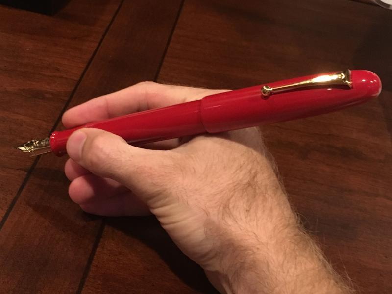
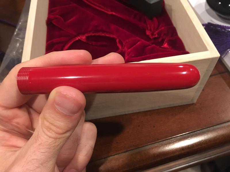
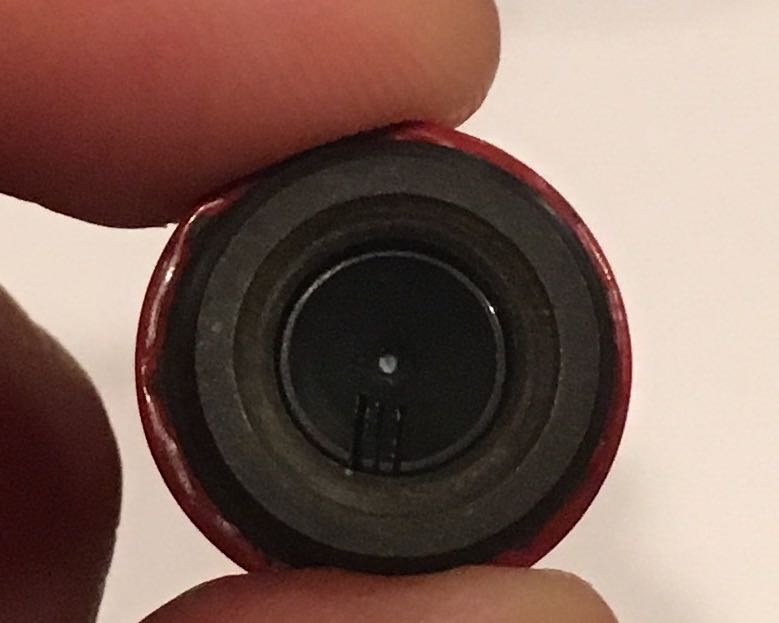
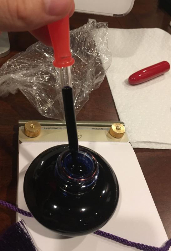
Hello fellow pen enthusiasts, So far I have seen just one review on the internet for this pen and I strongly felt it merited another look. The comments about it being a baseball bat are, though funny and mostly in good humor, about as appropriate as saying Babe Ruth's bat was but a twig to be burned with the chaff. This pen is spectacular, and not just because of it's size. Yes, it sports the #50 nib, which if I understand correctly is the largest production nib around. Yes, its Mount Fuji engraving on the nib is breathtaking to behold, and it also writes smooth as butter. But, seldom have I had a pen where what's outside the cap rivals what is under the cap. This pen is vermilion red urushi. This is not just a "big red pen." This is not a "red injection molded plastic pen." This is a work of art--specifically, the technique is called Roiro Urushi. I suggest searching out youtube and other video or Japanese print sources to admire this technique as a Westerner's written explanation would not do this work justice. In short, this pen begins as a black ebonite barrel and, after countless hours of applying, burnishing, smoothing, and finely polishing the red-pigmented urushi, this whole process is repeating ad neuseam with clear urushi lacquer coats--that is, if my rudimentary understanding is not misinformed. This pen is dazzling to the eye and to the touch. I have red pens. This is not just a red pen. Below are as many photos as FPN size limitations will allow me to post. Pictures truly are worth 1,000 words. The only pic missing due to size limits is the first picture I took that showed the boring outer box (cardboard). Nothing really missed there... I don't want to take away from the photos with endless text. But I will offer these words as first impressions and by way of explanation on a few matters: 1) I liked the simple wood box with the elegant and soft purple tie-strings. Very elegant and very Japanese... 2) I knew the pen was big. When I opened the box I smiled because it was even bigger than I expected--in a good way. The simple elegance of this pen is unmatched. I have chosen the ringless version, but one can get this pen with gold bands around the barrel. 3) Comparison pens left to right are: Namiki Emperor, MB149, Yard O Led Grand Viceroy, and the Pelikan M1000--all very large pens. 4) The red feed is awesome. That is all on that subject. 10 out of 10. 5) There is a brilliantly crafted velvet-ish lining to the cap so if one posts the cap (WHY WOULD ANYONE POST THIS PEN?) it will not scratch the urushi barrel. 6) In the photos I challenge you to find the place where the end cap unscrews from the barrel. This craftsmanship is un-improvable. 7) Once you locate the invisible end-cap, one needs only to hold the pen vertical and unscrew it apx. 1.5 turns to let the ink gush out into the feed. 8) Yes, this is an eyedropper. It should be called eyedroppers as I literally gave up filling it after 4 full droppers. Please see the up close photo of the inside of the section to see how this comes together to form an impressive, leakproof seal. 9) One complaint. In the final pen-photo I posted a picture showing the threads. You can see a small hint of black there where the vermilion urushi was either not applied perfectly or where, perhaps by the unavoidable friction-nature of how threads function, the urushi is rubbed off right out of the box. I'm slightly unhappy about that and submit this as a charge to Namiki to look into that problem if it happens more than on my pen. However, I am so happy with this pen that my enjoyment is not reduced even a little by this minuscule problem. 10) Shout out to Chatterly Luxuries for a good price. This is a beautiful pen and I recommend it highly. Did anyone actually read the writing sample? Conclusion/Scores: Appearance & Design: 8. Small deduction for the black-thread issue. Stunning with a truly "blind" cap--no visible slits on the barrel. Threads do not hurt to use. I personally think it's a 10, but recognize there is not detailed makie-e work, etc. It's the best single color pen I have ever seen. It is not the most beautiful pen I have ever seen. Construction/Quality: 9.5 for the thread issue. There is no perfect pen and they can't all be high scores. But so far there is no squeaking or weak-fitting parts and urushi coverage is stunning. Clip works well. Rare and ingenious felt-lining inside cap for posting (which no one would ever use--but it is there). Weight & Dimensions: 10 or 6.5 6.8" capped length. 0.7" diameter, and a weight of 46.6 grams un-inked. 6ml of ink capacity. The reason for this high rating is that this is an incredibly big pen for those who like that sort of thing. It is not too heavy or too light in the hand and is just-right for people with medium or large sized hands. Clearly, this pen scores a 2 or worse if the subjective criteria is, "how this pen fits small hands." If you hate big pens, this one is terrible. If you want a true rating on the weight and dimensions of this big pen from a big pen lover, it's a 10. For long writing (over 5 pages) I must drop this pen to a 6.5. It's more than a signature pen, trust me, but a 5 page letter may get ridiculous and crampy. Nib/feed: 10. I realize all the high ratings. This pen is that good. Zero scratch. Nib flow is unhampered with any amount of speed writing or even scribbling. No "tapping" to get things moving after opening up the eyedropper end cap each use. The nib is also a little springy, too, because it is gold and huge. If you want flex pen performance, buy a flex pen. This is a wet writer but not out of control. My 10 rating is based on smoothness, flow performance, and superb performance right out of the box. I have many pens and none of them have performed like this right out of the box. Filling system/Maintenance: 8 Friends, I intend to review more pens with lower ratings, I promise. But this one is sweet. The eyedropper filling system is awesome. I wanted to give this a 10 but decided for the sake of some credibility to say something critical. The fact that this holds 6ml of ink is baller. The fact that it takes over 5 pipets full of ink is slow. So, my feeble attempt at a criticism is that this pen should come with a bigger and more efficient pipet. I cannot fault the huge ink capacity. Love it. I will circle back and adjust the score if maintenance becomes an issue. Cost and Value: 7 There are plenty of worse pens out there priced much higher. And yes, it is a work of art. But at its retail price this pen is a bit pricey. If you can get a good deal and appreciate large urushi pens, the value is a 10. If you pay full retail, you will love this pen; however, you will have a lot of money into it. Value is in the eye of the beholder I guess. Conclusion: 8.46 total score. Regrets: 0

-
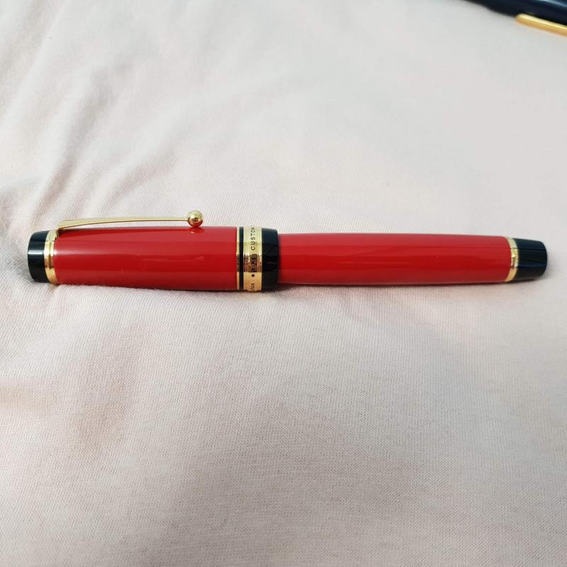
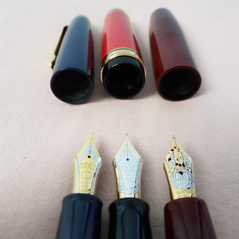
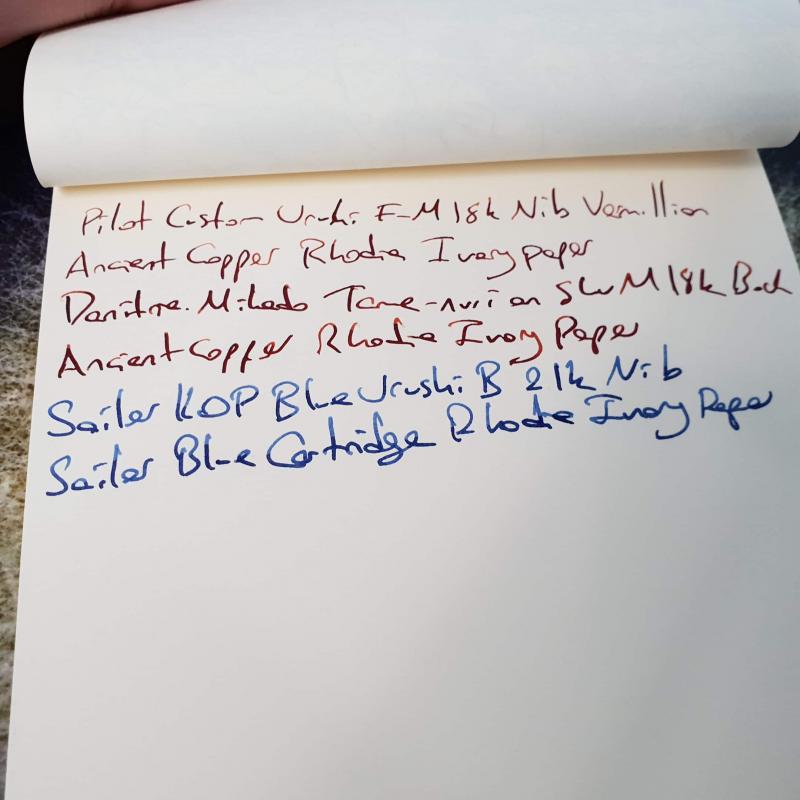
Hi everyone, I've been waiting a little impatiently for this pen to arrive I've started to get interested in japanese urushi pens recently and wanted to stretch out my collection that is mostly made out of european celluloid pens (ie. omas,montegrappa,pelikan etc.) My first urushi pen was a mikado which I really enjoyed, and was unlike any of the 30ish pens I've owned before. But as it was a fairly well known pen in the community I didn't feel the urge to write a review on it. My first review was on a KOP with blue urushi finish, which is my favourite pen still. My second review is this one, on a pen that is fairly underpresented in this medium Imho. Without further ado, I hereby present you the custom urushi in red finish : Appearance & Design : 9/10 I view this pen as the spiritual successor of the 845, as the resemblance between two models are uncanny. This is like the jumbo version of that pen, swollen in size almost everywhere possible. This is a true oversize pen, bigger in size than both KOP and m1000. The design reminds me somewhat of the big red duofold of yore, I really enjoy this shiny red urushi this pen comes in, it's like a toy pen from far away but has the complexity of urushi lacquer up close . Color is a nice contrast to my tame nuri mikado, which towers above even custom urushi in size . In this model, the urushi is applied only to the mid portion of barrel and mid portion of cap, and the remaining parts (section, finneal etc.) are made out of plastic ( at least it feels that way). This somewhat leaves something to be desired, as from my KOP urushi I was used to the whole urushi looks. The gold rings all around give the pen a more professional look, compared to KOP and mikado, both of which are in the understated spectrum of pens imho. This pen looks really wonderful and as always pictures never do justice to the urushi pens and I think from the visuals department this pen fits perfectly to be the flagship of pilot company. I took out only one point from the scale, as I was spoiled by the work of art urushi on my KOP previously, which has a 3d feeling of depth in its paint that is not present in custom urushi. But make no mistake, the shine of urushi on this pen is nothing less than spectacular. 3 sisters Section is plastic, as is with KOP, but it's not painted here, neither are finneals of cap and barrel. Construction & Quality: 10/10 After using a couple of pilot pens, quality control and construction quality both have their ceilings removed in my point of view. The engravings, clip holder ball, gold rings etc. are top notch and everything is made to fit perfectly, even the barrels fit into section creates an airtight closing, which feels extremely sturdy, more so than KOP, which has the same metal on ebonite barrel-section closing but is of lesser quality imo. This pen is clearly made to last, and I don't imagine this pen making any problems in the near future. I think pilot really made a home run in the quality control department, and I wouldn't be surprised if every custom urushi came out this good out of box, as this type of construction quality is usually an all or non endeavour. Weight & Dimensions : 10/10 I am again cheating in this department , as I have not weighted or measured this pen with a proper tool . But the pictures show how it compares in size vs KOP and mikado, and custom urushi is noticeably heavier than KOP but probably lighter than mikado. I know this sounds like stone age calculus but that's all I got unfortunately . The pen feels right in the hand, and the center of gravity is somewhere close to middle of barrel. For those that enjoy pens similar in size to 149 or KOP, this should feel like a natural fit. Nib & Performance : 10/10 This is the part in which I was genuinely surprised. Having used quite some modern gold pens, I was expecting something similar to m1000 characteristics, probably a little stiffer due to shape of nib, but boy how wrong was I . This nib is definitely soft, probably a little less so than m1000, but the similarities end there imho. The snap back is really genuine, and it feels closer to write with a 912 fa nib more than m1000 imho. The feed was always adequate in my short writing sessions but I didn't write a whole lot until now. I feel better writing with this than all of my oversized nibs, and that is a really hard thing to achieve . Pilot has nailed it in the #8 nib department imho, even though they haven't got any experience there before. Here's a writing sample of all three pens; One can notice how line width of custom urushi is much thinner in some places than mikado while almost same width in other places, the feed was able to keep up with nib during my sessions Edit: I think I have forgot to add a compare & contrast between these pens, as if you have an experience with any one of them, it can be easier to understand how the other two writes. Sailor is the one I have most experience with, as I've been using a medium KOP for more than a year now. That nib is really smooth, like probably one of the smoothest nibs I've ever used. It's closer to fines of european nibs, and there's little line variation, though the flow is never interrupted, even if you write fast and push the nib a little. With some push, you can the shading of the ink more apparent, even if line variation is limited. The second pen I use most is the mikado, which has a bock made 18k medium #8 nib. That nib is probably as soft as sailor, but it has a lot more flex at tip than sailor has. This creates very nice line variation although it feels a little mushy and snap back is not as good as I would like, reminding me of the good old m1000s . That pen dries fairly easily after the fill, so I almost always exclusively use it valve open, and sometimes force feed ink into the feed with the valve, creating an oversaturated passage, and that's quite fun . Being able to change the flow of the feed is a very welcome option, and gets the pen a very nice character, even though the nib is probably a run off the mill bock nib. The line width is similar to european pens, as the nib is european, so it runs closer to the broad KOP nib more than medium nib. That leaves the custom urushi to last, and as it is an f-m nib, (japanese characteristics) it is hard to make a direct comparison here. It is very narrow, like at least a size narrower than kop m or two sizes than dani m. However, the nib has the best line variation of the bunch, and I can't say the nib is soft per se, as it is only the tip that bends when applying pressure, the line easily goes beyond medium, probably matching kop in everyday writing, if you have a heavy hand. The feed is wet, and if this was a broad nib I guess it would be wetter than sailor, but with this tipping it makes the ancient copper shade really nice.This nib has really nice characteristics that is hard for a newbie like me to explain, but I've seen some japanese pages comparing this to a 149 nib, both taken out of the pen. Although they have similar sizes out of section and have same gold percentage, they have many differences and it was quite an interesting read. I'll add it to one of the comments if I find that page. Filling System & Maintenance : 8/10 This pen is a cartrdige/converter and comes with the really nice Con-70 proprieatory converter. Although it should be accepting the newer con-40 without any trouble as well. This is one of the largest converters on sale afaik and it is a real sweetheart to fill and empty. So I think this is a real good alternative to pistons or eyedroppers of other oversize pens. The only nitpick I have is that if this pen was a piston filler or ED, with the massive barrel it has, it probably could fit twice the ink no problem. But as everyone ever used a piston filler before those are harder to clean than converters and if something breaks whole pen needs to be serviced, as if the converter here is broken, a new con70 should cost less than $10. I gave it a 9/10 in this regard. The maintenance issue is a little more complex, as I think if it is kept safe, this pen could easily outlast its middle age owners . However if an unfortunate accident occurs, it will be a little harder to clean up the mess. First of all, this pen is not sold anywhere out of japan, so good luck asking for an exchange from your local b&m store . So if you've got an acquintance in japan maintaining this pen could be a lot easier . I took off some points and gave a 7/10 in this regard. Cost & Value : 8/10 I bought this pen directly from japan and the price was less than half of what I paid for KOP urushi. That puts the price/performance ratio of this pen through the roof, as it is a wonderful pen for ~$800. The thing is again good luck finding this pen let alone finding it for that price . In the more commonplace markets such as rakuten, it can be bought closer to $900 but they state a multiple month waiting list for this specific model. And in western retailers, the black model sells for around $1100, sometimes higher. I think pilot managed to hit a sweet spot with the cost & value of this pen, as incorporating low cost production techniques (converter filler, plastic section etc.) with high cost features ( #8 nib, urushi barrel & cap) they created a pen that is not stupid expensive but really has some of the features of stupidly expensive pens. (looking at you namiki ) The thing is, I really hate it when somewhere around the world some other human being pays a lot less to reach the same product as me while the producer earns the same, and the middle man fills their pockets. I mean no harm for the retailers trying to sell japanese goods as they're selling almost at the same price, which makes me think this is probably more due to the large distributors instead of small retailers. I wish japanese pens could settle a street price all around the world, and we could use their awesome pens more often. Final Thoughts & Conclusion : 55/60 When I added up the final score, I noticed it probably was higher than the score I assigned for KOP, which is my favourite pen . I think this is more due to the fact that I think this is a better pen for a larger population than KOP, as KOP has quite a few shortages that can be dealbreakers for many people. As I have written in the review, pilot has hit many home runs with this pen and this specific finish is an underdog in the oversize pen world, which is a shame as it is a solid all-rounder that is quite more fun to have around than the good old & boring 149 or other slew of black precious! resin pens. I am still a newbie in this forum and appreciate all critics, especially if I can improve myself. Thanks for reading.
-
Guider pen works is by now possibly well known on FPN with reviews dating back to 2008. They started in 1946 at Rajahmundry in Andhra Pradesh, India. Since they started under the guidance of their mentor from the famous pen making firm Ratnam and brothers, the firm was named Guider. http://guiderpen.in/about-us/ In addition to Ebonite, Acrylic and Solid Silver, they also have vintage stocks of genuine cellulose nitrate tubes for making pens. Their stocks from the 50s and 60s have now dwindled as nitrocellulose is very hard to come by nowadays. I have a few of their small sized Mandarin Yellow and Red celluloid pens and one Green celluloid pen. I was understandably excited when Mr Rao of Guider offered me some Vermillion Celluloid pens of large size. In the past, I could never quite manage to convince him to part with the few pieces he had remaining. But somehow he decided that I deserved a few of these pens and offered them to me one fine day out of the blue. This was sometime in mid 2017. I have been using the pens since and this is my attempt to document the existence of these pens. I had the choice of no cap band, single cap band or twin cap bands. I opted for one example each of the latter. The other thing he did was to accept my request to install my favourite Schmidt nib units so that I could use cartridges or converter and thus avoid ED mode and potential staining of the celluloid. Here are the pens: The Single band model: The twin band model: With some other Guider nitro celluloids: For size comparison with an English Duofold Maxima and a Big Red. Nitro cellulose is a wonderful pen material. The colors are superb and it is a live material which has the potential to change and age over time depending on how it is cared for. If you have any questions, pls do feel free to ask. Best, Hari
-

Looking To Buy A Namiki Emperor Red Vermillion Urushi Fountainpen, Anyone Help?
dior523 posted a topic in Japan - Asia
Hi everyone, I am looking to buy a Namiki Emperor Red Vermillion Urushi Fountain pen, Anyone help? Please recommand any on line shop and personal seller is fine. Thank you for your help!