Search the Community
Showing results for tags 'urushi'.
-
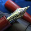
This week I picked up two urushi pens, a Danitrio Junikaku tame-nuri kama-nuri and a Nakaya Portable Writer araishu. I’m posting separately but there is overlap in the photos. The Junikaku (12 rectangles) is an oversized pen in terms of both length and girth. Dimensions are as follows: Overall length capped: 15.7 cm or ~6.5” Length un-capped: 14.0 cm or ~5.5” Cap diameter: 2.3 cm or ~7/8” Body diameter: 2.1 cm Grip section: max. 1.6 cm, min. 1.3 cm or ~5/8” to 0.5” So, it’s a big pen. Nevertheless, it is an excellent writer and comfortable to use. It positively dwarfs the Nakaya Portable Writer, which itself is simply a full sized pen on the order of a Pelikan M800. This pen has a little flair at the end of the section reminiscent of vintage pens. My other Junikaku has a section that simply tapers without the flair. Both offer a positive grip but the flair is really a nice touch in terms of appearance and function. Filling is via eyedropper and as a Japanese eyedropper it has a shutoff valve. Just twist open a little for an extended writing session. As you imagine it holds a lot of ink. I think I stopped at 4 ml but maybe could have gotten more inside. Nib is the #8 size 18k gold found on many a Danitrio pen. Size is broad with a slightly stubbish shape that makes me think of the finishing on older Montblanc nibs. Gives a bit of style to the lines making it more interesting to use. Feed is ebonite and flow is ample. The nib is not flexible at all but it’s not hard as a nail either. Just enough softness for a luxury feel. The base material is ebonite that is given a tame-nuri urushi finish before carving all the divots. Imagine the time and concentration it took to make this pen. The carvings are a type of kamakuri-bori technique with a long tradition in Japan. Here is a link to a most excellent article on the technique. This is the first time I’ve seen this this technique on a junikaku body and it is perhaps the ideal canvas. The facets provide a natural ground for the carvings that deliver texture and color variation. The corners of the facets then allow the light to play with the urushi layers in a most pleasing fashion. I especially like the carvings on the ends, the radial pattern just looks cool. In the light this pen is bling bling. Packaging is a paulownia wood box including a pen sleeve and an eye dropper. Focus is on the pen, not the packaging.
-
Hi, I have a sailor KOP in urushi red but the cap is damaged unfortunately. Does anyone have any experiences with sailor repair of this kind of repairs? Thanks! Lennard
-
I bought PILOT [FD-15SR] deluxe urushi fountain pen. Does anybody know, how to disassemble section? Because I want to clean the feed manually.

-
Hey all. I recently purchased a pair of vintage, Urushi over ebonite eyedropper pens and I've had a heck of a time finding information about them from anywhere. I was hoping someone could provide a little enlightenment. The first is this little Woden: Quite a smallish pen, similar in size to what were often referred to as "Lady's" or "Purse" pens, though it's longer than a ringtop. The imprint says "Woden New Pen, No. 1952". The clip is engraved "Fountain Pen". The pen had the original paper price tag included with a price of 130 yen. From what I could gather the 100+ yen pricing would put it roughly in the decade following WWII, but that's all I could find. The pen was purchased as NOS, unused, and the quality is good, but not outstanding. The lacquer work is good but there are, for example, visible machining marks in the ebonite. The nib is chrome-plated stainless steel with the engraving of "Special Woden Pen M2". All of the trim is chromed as well. The second is this Niole: This pen is quite a bit larger, on par size-wise with a modern MB 146. The barrel imprint says "Niole (with a stylized O) Made in Japan". This pen was used and came with no documentation. The lacquer work is absolutely first rate, with great depth and transparency (possibly a Kuro-Dame type finish?). The ebonite is in perfect condition with no marks, and the lacquer has only minor wear despite obvious signs of usage. The nib is gold plated, and is engraved "Standard Hardest Iridium JIS 3". I understand that the JIS imprint places at least the nib post-1955, but I'm not sure the nib is original. Could anyone out provide some more info? The seller from whom I purchased the pens stated that both pens were pre-WWII, but the price tag on the Woden contradicts that.
-
I am looking at a Carolina Pen Co. urushi. My dilemma is whether the base is ebonite, or acrylic. The transparency of the acrylic is beautiful. I hear the feel of an ebonite and urushi pen is superb. Suggestions?
-
Recently, I visited my not so local local pen shop, Dromgoole’s in Houston, TX and unexpectedly picked up this Taccia pen. I’ve only ever had one other Taccia pen and I can’t remember when it was the last time I inked it up. On plenty of occasions I’ve picked up a Taccia Tanto LE urushi pen only to put it back down again. Not my cup of tea. Then I read in the April 2018 Pen World about Taccia, its founder, and its acquisition by a big Japanese company. The article featured some really good looking urushi pens in normal pen shapes. I did want to see them but was not expecting to see them. To my surprise Dromgoole’s had upwards of a dozen of these new Taccia Reserve urushi pens in various finishes. Oh goodie! These past couple of years my fountain pen infatuation has waxed and waned, but one constant is my increasing preference for urushi pens. For the most part I’ve picked up Danitrio and now have way too many of those. There have also been some Pilot/Namiki and Dunhill and Platinum and Nakaya oh my! Not good for the wallet. Based on my prior experience with Taccia and since I’m accustomed to the likes of Danitrio and Nakaya I was not expecting much from the Taccia urushi lineup. They were, however, very good pens with very competently done urushi in various techniques. Take this pen for instance. Over an ebonite substrate this pen has a base color urushi called bengara, which is kind of a brick red. Pressed into that and polished down are eggshells in a maki-e technique known as rankaku. Could be quail eggs or hens eggs but probably is quail eggs. There is a polished top coat of urushi to seal it all in and the overall impression is of a cracked lacquer surface showing veins of color running throughout the off-white ground. Rankaku is a time-honored maki-e technique but it seems Taccia uses it more than most makers of Maki-e fountain pens save perhaps Namiki. Urushi itself is slightly amber tinted and powered eggshells were/are used to make it white. Anyway, it is a super cool looking pen and unique in my urushi collection. Aside from the urushi quality several other things are surprising to me about this pen. First, is the size. This is a long pen of moderate and very manageable diameter. This is in contrast to many a large urushi fountain pen, for example, the Danitrio Mikado. It is super comfortable to hold and write with and looks smaller than it actually is. Second, is the nib. At least on these Reserve pens Taccia uses Sailor nibs/feeds that are branded Taccia. This pen came with a hard extra-fine (H-EF) 14k gold nib. Normally, I would run away from an EF nib but this one is just perfect. It’s also a small nib compared to many expensive urushi pens, but it fits this particular pen well. A bit of wet writer it lays down a steady line with no pressure, which is good because with pressure this needle of a nib would penetrate and tear up the paper. Third, it seems to have a spring-loaded slip n’ seal cap mechanism. I don’t know this for sure, but it seems to be the case very much like a Platinum 3776 Century pen. Should keep the nib from drying up and indeed I’ve not had any hard starts or ignition issues even though I’m using Noodler’s Texas Black Bat ink. Another cool thing about this particular pen is that it is the artists proof. The LE number is 00/12 and as is normal is signed by the artist. I’m not sure why exactly but I take some satisfaction in having the artists proof. Seems like Taccia should have kept that for themselves or something. While I’m thrilled to have such a nice, unique, urushi pen that is tempered by the foreknowledge that I’m gonna have to spend even more money adding Taccia Reserve urushi pens to my collection.
-
Hello everyone and thanks for having a look. This will be my first review of a pen so all criticism is more than welcome. As this is my first review I wanted it to be of a pen that is special to me and at the same time not one that is beaten to death(ie. m1000). So that I would have a unique addition to the community and maybe the flaws of my review will be less overt . Anyway, without further ado, here is my review on the fabled kop with a blue urushi: Appearance&Design: 10/10 Marvelous! This is the part that excited me most when I got ahold of this pen. Urushi is the type of material which one needs to see to appreciate. The depth of the material is simply not carried into any digital medium. My experience on urushi pens are very limited but I can say that this pen looks very high quality, even those that have seen a fountain pen for the first time can appreciate the uniqueness of it. This is a rare finish in the japanese urushi pen world as far as I'm concerned, As blue pens that I saw was usually in the roiro migaki finishes, meaning they are much more bright and blue in the true sense of word. This pen always feels like it's in a dim lighted environment, and could reveal more color if it was held to brighter light. As this pen is fairly new I don't expect to take it outdoors any time soon but in the pictures, one can see the room is fairly well lit. The ebonite KOP, which became the donor pen to become this beatiful piece of art, is a fairly straightforward pen in terms of design. A torpedo shaped shiny ebonite pen that has a clip coming out of a seamless cap, there are no parts to talk about except the clip itself; which is unique in shape to sailor and is not remarkable per se. The true value of this pen lies in its urushi finish, which I think pictures will do more justice than my words. For the scaling, I don't know what else deserves a solid 10 if not this pen, with its very well made urushi finish and simple yet elegant design. It's much shinier than the ebonite KOP, which is easier to see in next image Construction & Quality: 10/10 The build and quality control of japanese pens are excellent, from the vantage point of the batch I've dealt with at least. The nib adjustments, ornament alignments, inlays, and engravings are simply superb in most if not all of them, including the commonplace platinums, pilot and sailors. This pen is no exception to this and I cannot find anything out of place, and nothing squeaks or wiggles, and every part works as intended. As this is a very delicate pen, I have not witnessed it to any harsh environment (including sunlight and pesky humans ) but having used a regular KOP for around a year I can say this pen is built to last. (I've have had some unfortunate accidents with ebonite KOP in which I've dropped it from my pocket once and from my table another time, no visible marks and scratches are visible, and pen is in mint shape although it's been rarely left uninked in the past year). So it gets a top score from this field as well. Weight & Dimensions: 10/10 I think this part of the review is the most subjective one as dimensions of a pen is hard to critic objectively. So I'll try to keep this part short and to the point. This is a true oversize pen, similar in size to flagship offerings from other major brands. The nib is very similar in size to flagship nibs as well, slightly shorter than a m1000 nib and around the same length as a bock #8 nib. This pen doesn't tire me for extended periods of writing as the ebonite barrel is very light and the brass section keeps whatever the weight pen has very close to paper. The clip is very good in size and helps keep the pen inside a pocket if you have one in adequate size . Nib & Performance: 10/10 I must say this is a fairly subjective part of this review as well. I am in love with the buttery smoothness of sailor nibs, especially in the KOP size. The iridium tipping on this pen seems to be quiet different from other pens, and is actually somewhat position sensitive. This is a broad nib and writes in a nice and juicy line, probably the owners of pens from european brands would call this a medium line. Anyway, this nib wrote perfect out of the box, as did my previous two sailors, and is part of a habit I tend to expect from japanese manufacturers in general. A solid top score from this part as well . Filling System & Maintenance: 6/10 This is the first part of the review that I think the pen has some objective shortcomings of some sort. All KOPs and most of the sailor pens in sale right now come with a cartridge and converter system that is proprieatory to sailor. This is the most pathetic system I've seen in a fountain pen and I include pens from the 2-10$ range as well. The opening of the converter is too large so it cannot be used separately from the pen, or at least requires some serious dexterity to do so. The capacity of converter is pathetic as well, in the waters of .7 ml. I manage to write 6-7 pages with this converter before I feel the urge to refill(with broad nib), this can sound OK, but this size of pen at least requires an alternative filling mechanism(like DVOS), or a higher quality & capacity converter, like those offered by platinum and pilot. Maintenance is fairly simple however, as the converter separates fairly easily and it doesn't take much to clean from there. The nib is friction fit, and can be taken out fairly simply for a major cleaning. The maintenance of body, section and cap should be quite hard if something bad happens(requiring a visit to the penmaker or an urushi master probably) but this sort of pen shouldn't be taken to adventures IMHO. I don't think I'm being harsh with my score here, as I give a good 8/10 for the maintenance and a poor 4/10 for filling system. Cost & Value: 8/10 After having so many nice things to say about this beauty it hurts me not being able to give a top score for the value but I think it wouldn't be a fair review if I gave this pen 10 points after spending so much on it. If someone told me I would spend close to $2k for a fountain pen I would just laugh before I started this hobby. I don't know what's the MSRP for this pen but it can be found for $1900 in nibs.com as of the writing of this review. I bought it for a little less thanks to favorable exchange rates. I truly believe this pen deserves its cost but as is the case with most handmade works of art, one must pay dearly for a nice product. It is around the 2x of price of a regular ebonite KOP, and instead of buying two of those, I think stretching out for this one is a good idea. But then one spends the cost of three KOPs, and then four, and then five... From left to right; DVOS, KOP urushi, KOP ebonite, M1000 in black, W&E Roseweood I like how pelikan nib autocensors itself . Delta's bock nib seems to be wider than others Final Thoughts & Conclusion : 54/60 I did not include any straight measurments for this review, as I'm pretty sure someone interested in this review did some research on this pen as well. I just wanted to show my appreciation of this pen and share the pros and cons of my favourite pen. Topics related to this specific pen is very rare and I've never pictures of this specific finish apart from retailers. It comes with all the shortcomings of a regular KOP, and if someday Sailor decides to release this pen with a much better converter or better yet in a piston or ED build, this pen can easily get much closer to a perfect score. Thanks for your time and have a nice day .
-
Hello everyone, I am Taizo Okagaki. I am from Japan. It’s nice to meet all fountain pen lovers like me in Fountain Pen Network. I used fountain pens since I was in middle high school. The more I use fountain pen, the more I love this amazing writing instrument. I have a brand named Wancher. With Wancher, I want to make my dream come true which is: Making a fountain pen which can make people happy and with this pen I want to bring people together. I have not fulfilled my dream yet and I am working hard to make it come true. Along with Wancher, I also have an online store named Engeika. By Engeika, I want to connect with many more customers in the world, to know more about their life, their dream and their desired pen. And today, with my friend’s recommendation, I joined Fountain Pen Network. I am very glad to meet all of you. Sincerely, Taizo Okagaki
-
Here is a quick review of my new Nakaya Dorsal Fin 1, Ao-tamenuri. Having managed to escape both 2016 and 2017 without a single Nakaya purchase, I was not so lucky in 2018. I bought two Nakaya’s in a frenzy in early February. I was idly browsing the nibs.com website one day when I stumbled upon my grail pen…the Nakaya Dorsal Fin Version 1...and in the discontinued Ao-tamenuri finish! I have been drooling over this pen since 2014. I knew I had to pounce and didn’t have much time to consider nib options. I quickly opted for a ruthenium- plated Broad Stub. I clicked the buy button and waited. After a few back and forths with Classic Fountain Pens about the approximate colour of the Ao on the Dorsal Fin (I was worried it might be green vs teal blue), both pens were shipped within a few days. My Nakaya arrived about a week later. Here is the Dorsal Fin Version 1 in Ao-tamenuri… Very stealthy looking and shark-like. I’m glad I departed from the gold- colour nib and went Ruthinium this time. The shape of the Dorsal Fin 1 is actually much less pronounced in person than in pictures I have seen. It actually looks very similar to my Ao-tamenuri 17mm Portable. *I noticed Nakaya have started calling the 17mm Portable as the Portable “Thick”. I’m not sure thats really selling the design Here is a picture of the pen capped. The Ao-tamenuri colour is perfect, that cool teal that makes you think of deep Japanese waters. The fin allows for a nice sliver of Ao finish to come through. Here it is capped, lounging on another sea creature… In addition to the sharks fin, the other differentiator between the 17mm and the Dorsal Fin 1 is the tapered barrel and pointy end. If it wasn’t for the Fin in the cap, it could actually pass for a beefed up Naka-Ai. Now there’s an idea… Here it is from the rear… Nib: I asked for a hybrid cursive italic/ stub for my Dorsal Fin 1. I had selected the cursive italic, and then elaborated in the “additional comments” section that I wanted it as smooth as a stub. Basically a stub but with a thinner cross stroke. I opted for a “Medium to Heavy” ink flow, then specified 8/10. I’m not sure if that is “Medium- Heavy” or “Heavy”. All I know is I did not want “dry”. Here is a close up of the Ruthinium- plated Broad nib… Here is a moody picture… Verdict: I am extremely happy with this Dorsal Fin Version 1. The Ao-tamenuri finish is exactly as I like it and the barrel is nice and fat and comfortable to write with. Do I wish I got the Dorsal Fin Version 2 instead? Well aside from it not being available and (ahem) more expensive, I quite like the shape of the Dorsal Fin 1 in the Ao-finish, as it more closely resembles a shark. A very expensive Japanese shark. Which is cool. The Version 1 model’s single fin curves outwards like a fat shark fin, whereas the version 2’s double fin model curves inwards to more resemble a Katana, or Japanese sword. The benefit of the 2-fin model however, is you get an extra slice of Ao on the barrel. I may well be tempted by one of these in the future, if it magically appeared at nibs.com, Aesthetic Bay…but hopefully not this year as my pen budget is well and truly spent. The only slightly negative thing I would say about this pen is the cap is much lighter than I expected. It’s much lighter than the 17mm and its shorter too. That seems strange as the Fin is created by adding multiple layers of urushi. I believe this process takes about 6 months to achieve. I would have thought all that urushi would add some weight. To me it seems like it has less urushi on the cap than on the barrel. But I could be imagining things. I will try to get some weight measurements. The nib is perfect with a good flow and the requested additional smoothness to the cursive italic Broad. The ruthenium-plating looks great. All in all, a grail achieved. I will not be parting with this pen I think, ever
-
Platinum Izumo Yagunomuri Ginsen. A Serene Giant Pen.
columela posted a topic in Fountain Pen Reviews
B]First Impressions[/b] (10/10) This is a pen that I have secretly desired for more than a year, since I read some reviews of it with the gorgeous pictures! However it was clearly outside my price range. Fortunately a well known US online retailer put some of these pens for sale at half price earlier this year so I jumped at the opportunity. This is my first true Maki-e pen, as I have another smaller and cheaper Platinum Kanazawa Haku which is mass produced using what is more or less a print maki-e design. One of the incarnations of the Platinum Izumo line. The Ginsen Yakunomuri is one of the 4 designs based in the motif of “sea of clouds” from the shinto Shrine in Izumo province, home of the founder of the Platinum pen company. The pen comes in a nice bamboo box, with a cartridge and a converter, and also a very nice silk pen pouch, wich also has the cloud motif in the band. http://i.imgur.com/9KZ5vdv.jpg http://i.imgur.com/p8mkLIK.jpg http://i.imgur.com/S60bD6E.jpg Appearance (10/10) The serene beauty of this pen comes from the original curved shape, the brilliant gloss of the urushi lacquer and the beautifully crafted and hand painted clouds in green, red and mainly brown, all sparkling with the gold and silver particles that make the pen a truly work of art. My model is the Ginsen or silver wire. The clouds are outlined in a subtle line of silver. I can spend hours looking at the sparkle of gold and silver dust over the clouds. http://i.imgur.com/oAPASPo.jpg http://i.imgur.com/bmpljmo.jpg http://i.imgur.com/VyxoJ0a.jpg http://i.imgur.com/fGQ7TIY.jpg Design/Size/Weight (9/10) The pen is shaped in a very original design, which is a variation of the typical cigar but with noticeable curves in the body and cap of the pen. The size of the pen is huge. You can see here comparisons with other pens in my collection ( Parker Duofold, Platinum President, Pilot Custom 823 and Montblanc 149) which are dwarfed by the legth and width of this beauty. http://i.imgur.com/FnJAeS6.jpg http://i.imgur.com/xuED5LR.jpg Weight 34.7 g Length closed 157 mm Length of the barrel 137 mm On the hand is a very comfortable pen, which is surprising given the size of it. It cannot be securely posted, which is probably a good thing so the delicate maki-e design does not suffer with the constant scratch of the pen and cap. Nib (8/10) The pen has a standard 18 k gold Platinum President nib. As I had a President pen of near perfect performance, I was not sad, but it is too big of a pen to have a nib of this size. In my opinion , this is the only disappointing feature of this model. The nib in itself works really well, although my M nib works really like a thin EF, which is good for my style of writing but it might annoy others. http://i.imgur.com/Ua6kFBy.jpg Filling System (8/10) The usual cartridge-converter system which Platinum uses is also present in this pen. There is nothing special to it, but again it is surprising to have such a large pen with a small ink capacity. http://i.imgur.com/nOAfwiY.jpg Cost and Value (9/10) I got the pen for about 2/3 of the cheapest retail cost that I had seen in different online retailers, including the japanese ones. I find it one of the jewels of my collection for its serene, beautiful decorations in contrast with the large size it has. http://i.imgur.com/Oo6yqyL.jpg Conclusion (9/10) A truly exceptional pen which I am very proud to possess. A larger nib and a piston filler mechanism would have made it the perfect pen. But as it is, is really wonderful and it might my entry pen for more extra large ebonite Japanese pens. http://i.imgur.com/L7YPlwo.jpg Thank you for reading! -
Sailor King of Pen in Crimson Urushi http://farm3.staticflickr.com/2835/9594362537_0c4578f4c5_b.jpg Sailor King of Pen resting on a Nakaya three-pen pillow in Kuro-Tamenuri. Lacquered tamenuri ink bottle rest is from Nagasawa Pen Style Den in Kobe, Japan. Writing pad is from Midori. Having owned this particular pen for four years already, I thought it was high time that I reviewed it. Since many great reviews of the Sailor KOP have already been written, I'll just focus on the aspects of this pen that make it special for me. Introduction Back in 2009, like many fellow FPN-ers I was swept up by the great Nakaya wave, especially after the inaugural Nakaya fountain pen clinic in the Aesthetic Bay shop of Singapore. I bought way too many tamenuri-lacquered Nakaya pens and became enamoured of urushi in general. Then I saw the Sailor KOP in Aesthetic Bay. It was love at first sight - the size, shape and balance of the pen was just perfect. And the crimson urushi was simply sumptuous...! But the price was quite untenable. After dreaming of the pen for a few weeks, I managed to purchase the pen off Tay's Pensinasia.com website for a much better price. My pen originally came with a medium nib. It did not write well out of the box (skipping, hard-starting etc.), so I sent it to John Mottishaw for adjustment. He did his usual nib wizardry and it came back writing much better. Now I could enjoy the pen! Writing Experience (Medium nib) After testing a few inks in this pen, I quickly found Aurora Black to be my favourite ink with the medium nib. With this ink, I would describe the writing experience as being bouncy and forgiving, similar to riding in a Mercedes-Benz rather than in a sports car with very rigid suspension. On certain types of paper (Kokuyo, Rhodia, Clairefontaine), the nib is close to glassy-smooth for me. Although the pen is large by any standard, it is so well-proportioned that it never feels uncomfortable to hold, even for extended writing sessions. The ink capacity provided by the Sailor converter is adequate for my usage. Writing Experience (Crosspoint nib) The medium nib provided a great writing experience, but after a few years I became slightly bored with the predictability of its performance and the fixed width of the line it put down. I thought about selling the pen, but then I had a brain wave! I contacted nibs.com and for a small fee and the cost of the nib John Mottishaw agreed to exchange my medium nib to a Crosspoint nib. Now I had the best of both worlds - the flagship of the Sailor pens, together with one of their legendary nibs! It took a while for me to get used to writing with this nib, but after the learning curve I fell in love with this pen again. Most people here probably know how the special Nagahara nibs work: the line they put down gets broader the more acute the angle is against the paper. At my normal writing angle, the nib writes a medium-to-broad line, just right for my needs. Should I need to highlight something or use my pen like a Sharpie marker, I just write with the nib at a lower angle. Flipping the nib upside-down yields an extra-fine line, perfect for marginalia in scientific papers or very fine corrections in the manuscripts I edit occasionally. After a while, positioning the nib to get a desired line width becomes second nature, much like shifting gears on a bicycle to get to the sweet spot between pedal cadence and effort. I have tested a few inks in this pen and now I prefer to use Sailor Blue-Black with the Crosspoint nib. Performance is no longer glassy-smooth with this ink but I actually prefer having more control over the nib on paper. Crimson urushi finish and pen construction The main reason why I bought this pen was because of the exquisite crimson urushi finish. Having owned several other lacquered/maki-e pens (Nakaya, Namiki, Danitrio, S.T. Dupont), I can confidently say that the urushi lacquer on this pen is of top-notch quality. The fact that Kato Seishou, a famous maki-e artist in Japan, hand-lacquers each pen with twelve layers of urushi lacquer probably adds to the quality of the finish as well. To be slightly more provocative, subjectively I feel that the Sailor urushi finish is slightly superior to that used for Namiki pens. I am by no means an expert on urushi lacquering, but I would describe the urushi finish on this pen as being thicker and more grippy, which gives it a very pleasant feeling in the hand. After four years of ownership the lacquer finish remains as flawless and perfect as the day I bought it, a testimony to the durability of urushi. Moving beyond the finish, overall construction of the pen is beyond reproach. The base material of the pen is ebonite, and the lathe work is excellent. Everything fits together perfectly. One thing I really appreciate about this pen is the inner sleeve within the pen cap. This inner sleeve rotates together with the nib section as the pen is capped in order to ensure an air-tight seal, minimising ink evaporation from the nib. Conclusions Since I bought this pen, it has remained inked and travels with me wherever I go in the world. The fact that I still own it after four years probably means that it will stay in my collection for a long time - much like a treasured companion which I can depend on everyday. It will be interesting to review this pen again after another few years to see how much of the above remains the same. Anyway, I hope you have enjoyed reading this review! http://farm4.staticflickr.com/3777/9597307152_fb05fcd0ff_b.jpg Unveiling the exquisite Crosspoint nib, contrasted against the beautiful depth of the crimson urushi lacquer finish. http://farm4.staticflickr.com/3669/9594516099_93e6544f36_b.jpg Closeup of the Crosspoint nib. http://farm8.staticflickr.com/7454/9597307370_1c53fe3ec3_b.jpg Side profile of the Crosspoint nib. http://farm4.staticflickr.com/3735/9597154920_65b6ef42b2_b.jpg Upside-down view of the Crosspoint nib. Note the "hammered" indentations and rough finishing on the reverse side of the nib. I have speculated on the existence of these indentations and think that it might be to promote ink flow to the tip. Any thoughts? http://farm8.staticflickr.com/7388/9594362445_37fc23f2f2_b.jpg Superlative finish of the Crosspoint nib. I love the cross slit! http://farm3.staticflickr.com/2865/9594516197_8a48a6f142_b.jpg The obligatory writing sample from the Crosspoint nib. Ink is Sailor Blue-Black, paper is Kokuyo Campus. From left to right, the Chinese characters on the bottom read: extra-fine, medium, broad, extra-broad. http://farm4.staticflickr.com/3750/9619554104_43e6bd1a92_b.jpg The Sailor KOP in Crimson Urushi juxtaposed with the Namiki Yukari Royale in Black Urushi.
-
This stupid site; you can't spend any amount of time on it without deciding that you really need an urushi pen. So...that's where I am right now. I've had a little time now with my new Platinum Izumo Sora tamenuri pen and I've decided to write a little review. Obviously, I am not in any way affiliated with Platinum or anyone who sells pens or services them etc etc. http://s24.postimg.org/zdeto75ad/IMG_4717.jpg The Platinum Izumo has been around for a few years now. It is named after a certain prefecture of Japan where they, apparently, make really nice paper. The pen intended to compete (to some degree) with the Namikis, Sailor King of Pens (Kings of Pen?) and Nakayas of the world. It comes in ebonite in four urushi finishes (black -kuro-, red -aka-, greenish -sora*-, and maki-e -yamonoguri-). It also comes in a wooden version (tagayasan) which is apparently much bigger. *as far as I know, sora means 'sky', but the color is pretty green. Go figure. Packaging I don't particularly care about packaging. I would just as soon buy the pen if it came in a blister-and-card package. However, this pen comes really nicely packaged. A textured paperboard outer sleeve contains a nice paulonia wood box with some Japanese writing on it. Inside the box are the usual accoutrements like paperwork I will never read, a cartridge I will never use, and a converter. There is also a nice scroll of blank mulberry paper for your calligraphy projects. The pen itself is in a cute little "pen kimono". All in all, it looks like as much care was taken in packing the pen as in making the pen itself. http://s10.postimg.org/7lbvem2uh/IMG_4714.jpg Dimensions Length, capped: 155mm Length, uncapped: 137mm Length, section (not incl. nib): 32mm Width, at threads: 13mm Width, max.: 18mm Weight, capped (not incl. cart or converter): 33g Here it is in comparison to a Pelikan M800 and a Platinum #3776 Century, two relatively common pens. http://s8.postimg.org/6ngqenjnp/IMG_4722.jpg http://s9.postimg.org/941pfd70v/IMG_4724.jpg Impressions & Design No way around it. This is an enormous pen. That hit me first. However, it's very light, since it's made of ebonite (hard rubber) and has very little metal in it. It's nice and wide at the section and is comfortable to hold. The metal threads are far enough back that they don't interfere with your grip. It is very nicely balanced and hours of writing do not yield any appreciable hand fatigue. (I didn't post the pen, since there was a warning in the box not to do so; plus, if you need to post this pen, you must have hands like Johnny Bench.) http://s21.postimg.org/z3xcuxlbr/IMG_4715.jpg The shape of the pen is superficially like a traditional cigar shape, but it has smooth, dare I say, sensual curves. The body is a deep brown-black with greenish coloring appearing at all the joints and edges. The color is like a much darker version of Nakaya's heki tamenuri finish. The clip is very uniquely shaped and says 'Platinum' on it. It is of moderate stiffness and is made of folded metal. Par for the course for Japanese pens but it would feel cheap on a European pen of this price range. The section and barrel have a metal-on-metal interface with precise threads. http://s7.postimg.org/6qb1mcz57/IMG_4716.jpg The cap screws on and off with a single twist and feels secure. The threads on the section are metal while the threads in the cap aren't. It does not appear to have anything like the Slip-and-seal system. The section and barrel interface with precision-cut metal threads (so no eye-dropper conversions). There's a nice long metal sleeve that the converter or cartridge slips into so you never have to worry about inserting the converter off-kilter. Overall, there is a great feel of a piece that was made with care and precision. Nib The Izumo series uses the nib and feed from the Platinum President series. A plastic feed supplies ink to an 18k gold, two-toned nib. (Mine is a fine.) The nib is stiffer, but it is both wetter and smoother than other Platinum (particularly the 14k #3776 Century) nibs I have used. I read in an article once that the President nib was designed for Western writing, not Japanese writing, but it didn't say how. I don't know exactly they did that, but I can assure you the President nib lays down a nice, wet line and it never has a problem with hesitating or skipping. http://s22.postimg.org/dmkodpkpd/IMG_4720.jpg I can also point out that my Izumo's idea of "fine" is noticeably wider than my 3776 Century's "fine" with the same ink. http://s21.postimg.org/jh63hk7jr/IMG_4725.jpg Straight out of the box, this nib performs better than any Japanese nib I have ever experienced and equals the performance of an OMAS in terms of smoothness and precision. (I am almost at the point where I'd say it actually is better than a lot of nibs I have had tuned by nibmeisters. It is that good.) Its smoothness feels like a cross between the glassiness of a European pen and the feedback-y smoothness of a Sailor. http://s27.postimg.org/6bu9s6rhv/IMG_4721.jpg Filling System You know that converter that Platinum pens come with? Yeah, it's that one. How do you feel about it? Just pretend that I am transcribing in this section of the review what you're thinking about that converter and that you totally agree with me. I like you too. http://s15.postimg.org/z5rz27ajf/IMG_4719.jpg Value This is not a cheap pen. It costs about what a non-custom Nakaya would cost. Is it the most sublime writing experience ever? Of course not. It's just a pen. That said, it's very nice to look at and comfortable to write with, with a truly brilliant nib. If you want to get the same nib for a fraction of the cost, buy a Platinum President. Final Thoughts This is a pen that does not get a lot of love on the forum. Perhaps that is because when you can afford one of these, why don't you get a Nakaya? A lot of pens fall into that trap: if you can afford X, why didn't you just buy X instead of something that costs the same? Personally, I love this pen. It's the best all-around Japanese pen I've ever owned and certainly one of the prettiest regardless of place of origin. Its enormous size makes it a little impractical for taking to the office, but I write more at home anyway. How does it compare to a Nakaya? If you didn't skip ahead, you probably asked yourself this anyway. I've been asked this question more than a few times already. Now, I'm not going to say one is better than the other because that's not fair and there are so many subjective things that go into an opinion like that it would render the answer pointless. However, I will say this. They write differently. The Nakaya uses a tuned #3776 nib and feed, while the Izumo uses a tuned President nib and feed. If you like one over the other, then that difference will be magnified comparing a Nakaya and an Izumo. Nakayas are obviously far more tailored to the individual. That's their point. The Izumo is not. The Izumo is meant to be a flagship pen from a large company. Personally, I like the President nib and the sensual curves of the Izumo more than I value the customization options of the pen body that Nakaya offers me. You may be the opposite. In either case, you are going to be getting a hand-made ebonite-bodied fountain pen with a wonderful nib and lovingly- and expertly-applied coats of lacquer. (And it's STILL just a c/c) You're really choosing between Rolls Royce and Bentley and you can't go wrong. http://s15.postimg.org/aqjr15bmj/IMG_4718.jpg
-
Enjoying The Moon Cat Nakaya Piccolo Review: A Story Of Love, Loss And Restoration
Susan3141 posted a topic in Fountain Pen Reviews
Less than a year ago, after buying several Pelikans and a few other brands of pens, I discovered Nakaya. I blame ethernautrix (who doesn’t?) Initially I bought a neo-standard in heki-tamenuri. But, believe it or not, I didn’t like the pen! I know! It’s blasphemy. But, it’s the truth. I didn’t like it. Besides, I had fallen in love with another Nakaya. Browsing the Nakaya availability chart, I found a pen I hadn’t seen when I first started researching Nakayas. At first sight, I knew I had to have this pen. I had found Enjoying the Moon Cat. Classic Pens decided to name the pen using Japanese syntax, a decision I deeply appreciate since I teach Hebrew. There’s something special about preserving the syntax of a foreign language idiom instead of conforming the language to suit English. Thus, instead of “The Cat Enjoying the Moon” the pen is called “Enjoying the Moon Cat.” I returned the neo-standard and applied the credit to Moon Cat. My husband agreed to pay for half and I paid the other and Moon Cat would be my Christmas present. So, even though Moon Cat arrived in early October, I didn’t open the box. I put the pen of greatest desire in the closet, sight unseen, and waited until Christmas. When Christmas morning 2012 arrived, I was as excited as the kids. I finally got to open Moon Cat, and she was gorgeous. Absolutely gorgeous. I gingerly filled her with Diamine Dragon Red and started writing in my journal, “It’s Christmas morning and I am writing with Moon Cat!” http://farm3.staticflickr.com/2809/8912991415_b5996af6d3.jpg The next day, tragedy struck. Being a photographer, I wanted to take pictures of Moon Cat to post on Facebook and pen forums. I had taken several pictures in the dining room where the light was best. I was almost finished. I placed the pen on my grandmother’s china cabinet to take one final picture, and Moon Cat dropped onto the tile floor. I knew immediately she was broken. In tears, I picked her up and examined her. The pen was intact, but a large chunk had broken from the cap. I was devastated. The pen still wrote, thankfully, but the beautiful aesthetic of the smooth Japanese pen was gone. http://farm9.staticflickr.com/8220/8311885235_f858b94b7a.jpg http://farm9.staticflickr.com/8362/8311882843_01189c9509.jpg I contacted Classic Pens immediately, though I had no idea if they could help. Jonella (bless her to the moon and back) contacted Nakaya and sent them my pictures. They asked me to send the pen to them. I waited at least a month before I heard anything back. Nakaya contacted Classic Pens with two options. (1) I could purchase a new cap ($490) or (2) they could use a special string technique to repair the pen ($90). You can guess which option I chose. As it turns out, the accident turned Moon Cat into an even more beautiful pen, as the pictures below demonstrate. A month and a half later, Moon Cat returned to me. And this is the pen I’m reviewing. 1. Appearance and Design. Enjoying the Moon Cat is an extraordinarily beautiful pen. The pen is ebonite with heki-tamenuri Urushi. But it has a special design. On the body of the pen is a black cat seated next to a mouse. These are created using the Yakoh-Maki-e raised technique, so you can actually feel the figures on the surface of the pen. The cat and mouse are looking up at a reddish-gold moon which is made using the Tame-sukashi technique. Over time, the moon will glow brighter and brighter. http://farm9.staticflickr.com/8091/8601270532_dd0a4e947d.jpg Uncapped, the grip sports little Yakoh-Maki-e kitty paw prints, a feature that immediately endeared the pen to me. Who doesn’t love kitty paws? http://farm3.staticflickr.com/2813/8912932597_628d9a696c.jpg In addition to these features, my Moon Cat has a special addition because of the broken cap. The Nakaya craftsmen used a special string technique to repair the cap. This addition, meant as a repair, actually made the pen even more beautiful and unique. I cannot express how impressed I am at the craftsmanship and creativity of Nakaya. http://farm9.staticflickr.com/8098/8601275706_140f1e375a.jpg I consider this pen a 10 in appearance and design. It is simply stunning. 2. Construction and Quality. I think anyone who has held a Nakaya knows that these pens are well made. The ebonite is hand-turned and the Urushi technique takes months to complete. While the pen looks like it might be quite heavy, it is actually deceptively light. Writing with it creates no fatigue whatsoever. For whatever reason, my Nakaya could not withstand a fall of about three feet. After the accident, I discussed this on forums with others who own Nakayas. Without exception, everyone else said that their Nakayas had withstood drops and accidents with hardly a scratch. I don’t know why my cap broke. It may simply have been due to how it hit the floor. But I have to knock off a couple of points for this. My pen may be the exception to the rule, but when you pay $1000 for a pen only to have it break from a three-foot fall, you have to be concerned. 8. 3. Weight and Dimensions. The Nakaya Piccolo is a small pen (only 5.12 inches long, capped). It isn’t meant to be posted, so it’s even shorter when you write with it. I have small hands, so the fact that this pen is small doesn’t bother me one bit. It fits perfectly in my hand and I love its beautiful proportions. As I said earlier, the pen is deceptively light (22 grams), so people who like large and heavy pens shouldn’t consider the Nakaya Piccolo. For me it is perfect. 10. 4. Nib and Performance. I originally ordered a 14K medium nib ground to a cursive italic. It wrote beautifully that Christmas Day. But after I broke it, and while I awaited Nakaya’s response, I purchased another Nakaya (a Naka-ai in heki-tamenuri) with a nib ground between a cursive italic and a stub along with some other modifications. So, when Moon Cat arrived back at Classic Pens, I asked Mr. Mottishaw to make her a CI/stub “tweenie.” She writes purrfectly, as my sample below demonstrates (though please don’t critique my handwriting; I’m trying; I’m trying). The nib is smooth and the flow is just right. 10. http://farm8.staticflickr.com/7285/8913557038_ebcdc7971b.jpg http://farm4.staticflickr.com/3752/8913560826_be099c2f32.jpg 5. Filling System and Maintenance. All Nakayas are cartridge/converter pens. I’ll admit this is my only real criticism of Nakayas. I much prefer piston fillers. The converters are well made, but they don’t hold much ink (0.9 ml). I’ve found that it’s easier to fill the converter directly rather than trying to suck ink up through the nib. I get a better fill that way. Of course, cleaning is a breeze since you can separate the converter from the nib and flush both. 9. 6. Cost and Value. Well, this is a tough one. I think everyone has different opinions on whether a pen is worth what it cost. For me, Enjoying the Moon Cat Piccolo was well worth $1000. This isn’t just a pen. It is a piece of art. And the art expresses something deeply significant to me: love of nature. I also love cats. But the beauty of the cat and mouse sitting beside one another (harmony) gazing at the moon (appreciation of nature’s beauty) simply speaks to my heart. When I brought Moon Cat to show her to my Honors students, they swooned when I told them what she cost. Does anyone use the word “swoon” anymore? Well, no matter. They swooned. And probably most people would. But Moon Cat is my most treasured pen. 10. Final Rating: 57/60 In conclusion, I think it’s important to express how wonderful Classic Pens and Nakaya were in helping me when Moon Cat broke. Jonella grieved with me. The craftsmen at Nakaya provided options for me. The pen was treated with respect and care. I can’t speak highly enough about my experience. Even if you aren’t a fan of Enjoying the Moon Cat, I recommend any Nakaya pen. They are all works of art and the nibs (especially when artfully worked by Mr. Mottishaw) are simply the best. http://farm9.staticflickr.com/8531/8600175667_d4997de6f1.jpg -
Hi all, I've been wanting to pick up a nakaya portable writer, but I am not sure which finish i should pick. I use and carry all the pens that i own around; even in my shirt pocket sometimes. I usually prefer a matt finish on my pen (lamy 2k, visconti HS), so any micro scratches would be hidden. Don't get me wrong, I do take good care of my pens, but glossy finishes seem to pick up scratches even if you just leave them in the air.. (OCD guy wants a user pen ) However, i am smitten by the aka-tamenuri finish on the nakaya. How does this finish hold up to micro scratches given the high gloss? Shu-nurippanashi seems to be a matt finish and it might require less maintenance. I do love both of them, but aka-tamenuri really makes me want to go for a glossy pen this time. Thanks!
-
Chinkin is a technique where a special set of very fine chisels are used to carve a pattern or design into layers or urushi (lacquer). The indentations are then rubbed with sticky urushi and gold powder or foils are placed over it to fill in the marks made by the chisels. Sometimes colored urushi powders might be used instead of gold. Once they are applied the pen is often cleaned by a Japanese paper called washi. Traditionally much of this art originated in Waijima starting around the 13th century, but today it is produced in many Japanese prefectures and even other countries like China. As this is a carving technique at its heart, there is little room for error so quality work often takes many focused hours to complete. Doing some research, I came across the Danitrio website that lists 5 chinkin techniques: 1. Ten-bori (carving by point): The size of points could be as small as only 0.1mm, and it is the only way to make the surface for the design by chiseling points one by one. 2. Ten-bori no Bokashi (Gradation of point carving): Reducing the chisel points and changing the space between the points to make the design with gradation. 3. Ten-bori no Henka (Variation of point carving): To push (Tsuki-nomi) or draw (Hiki-nomi) the chisel from a point to carve various short lines in a small space. 4. Suji-bori (Line carving): Short or long, straight or curved lines can be carved by skillful craftsmen. 5. Katagiri-bori (Carving sharp curved or angle lines): Use a special chisel to carve strong contrasting lines. I find any of these techniques can yield some very stunning results. I would like for anyone with pens decorated with the chinkin to post some photos in this thread and share any thoughts on the art form – whether you like it or not. If you can add more nuances to the history of the art, please do so and we can make this thread into a learning opportunity.
-
The sixth pen of the Sailor Limited Edition range in a kawari-nuri technique is the "Uchu". It invites you to the endless "Cosmos". Wataru Kurotobi-san expressed the univers by using a hakeme-nuri technique. This pen, limited to 33 pcs, is the King Of Pen with 21kt gold nib in M or B. http://www.sakurafountainpengallery.com/en/boutique/detail/uchu-sailor-limited-edition All welcome to visit the SFPG ! Catherine
-
I am putting out a call to the Nakaya experts. I recently picked up this pen in order to try out the music nib, but I am having trouble determining for sure the name of the model. It is a snap-on cap and it looks like the same form factor used on the briarwood pens and even an older Platinum 3776 I have seen in resin. The nib is clearly marked Nakata like all modern Nakaya pens before they switched nibs to say Nakaya. The pen came in the older wooden box with the hinges used until about 2008 or 2009 (as far as I can tell). The outer paper box was the older golden colored paper, not the off-white paper used now. The pen body is definitely ebonite with urushi. The section is probably resin. the cap is coated in urushi, but I cannot tell over what for sure. I am guessing ebonite, but the inside had a white plastic cap liner to seal the pen when not in use. (Similar to the "slip and seal" system on some Platinum pens.) This got me curious. I found one review which referred to this as the "simple" model but it may not be the proper name. I think the threadded urushi pens like we see now have been around since 2004 or maybe earlier. Perhaps this was an earlier pen, or maybe it was made later as an entry model? Any information would be much appreciated. I like the form factor, regardless of the name. It is a large pen, similar to a Pelikan M1000 as seen below. A snap-cap makes quick notes much easier also.
-
Wataru Kurotobi-san crafted this exceptional yellow Sailor LE “YOU-KOU" fountain pen. He has drawn inspiration from his studies and captured a variation of colour, light and shades of the life-giving “Sunlight”. Yellow urushi (a rare colour) with gold leaf in a hakeme-nuri technique. Limited to 33 pcs worldwide and available with a 21kt gold nib in M and B. http://www.sakurafountainpengallery.com/en/boutique/detail/you-kou-sailor-limited-edition More info : catherine@sakuragallery.com Enjoy ! Catherine
-
http://i.imgur.com/L1KmlxA.jpg The Danitrio Mikado is the only repeat in my collection. And it's for a good reason. The pen is just an amazing writer and it's ebonite construction makes it incredibly well-balanced. I own one Ao (blue) Roiro-Migaki and one Shu (red) Roiro-Migaki Mikados in the flat-top version, clipless. They also available in the round-top version. Both flat- and round-top version are available with and without clips. http://i.imgur.com/JSkqnd0.jpg The signature is of Koichiro Okazaki, also known as Kogaku. He is a master Maki-e artist commissioned by Danitrio to do both urushi pens as well as Maki-e pens. I love that Danitrio's urushi pens are signed by the artist. It really makes a point of the man who put so much skill and work into making these pens a reality. The signature also just looks pretty cool =] http://i.imgur.com/k6ARh3S.jpg Interestingly, the Bock #8 nib, which most of the bigger Danitrio pens use, has changed slightly over time. The blue one has the older version, while the red one has the newer version. http://i.imgur.com/U5ep2cd.jpg From top: Danitrio Mikado in blue urushi, Danitrio Mikado in red urushi, Danitrio Densho in blue urushi, Danitrio Sho-Genkai in raw ebonite, and a Lamy Safari in charcoal. The Densho is an older pen that I got in a trade and the blue urushi is little lighter. The Densho is also an eyedropper but it has a #6-size nib. It's very light and comfortable and the clip makes it more convenient to carry but I much prefer the looks and writing experience of the Mikado. With it's large ink capacity and clip, it would make a great daily carry. http://i.imgur.com/yhABwkY.jpg The Mikado pens are Japanese eyedroppers, which is an eyedropper with a shut-off valve. You fill the pen with an eyedropper or syringe and when you want to write you unscrew the knob at the end and it opens up the valve. Here you can see the seal that meets with the inside of the section, cutting off ink-flow when the shut-off valve knob is screwed down. http://i.imgur.com/US5q6im.jpg The Mikado is a big pen! But it's very light for it's size and the large grip section is very comfortable for long writing periods. Underneath the Mikado is a Nakaya Piccolo. Nakaya pens are more normal-sized in width but for people who prefer oversized pens, I think Dantrio pens would generally be more comfortable. I'm not really qualified to determine the difference in urushi quality, but to my eyes both Danitrio and Nakaka look fantastic. Danitrio's urushi is done by master Maki-e artists though, which is why they have that nifty signature, that I love so much. http://i.imgur.com/oQtbCOo.jpg Even though the Mikado is really big capped, uncapped it's a very reasonable length. The nib is huge and proportional to it's size. http://i.imgur.com/rODHMY5.jpg http://i.imgur.com/sDqiNn0.jpg Danitrio Sho-Genkai with the old-style Bock #8 nib and Mikado with new-style Bock nib. http://i.imgur.com/i32l0to.jpg A trio of Danitrio eyedroppers. http://i.imgur.com/VhpKpZF.jpg A trio of Dantrio #8-size nibs. http://i.imgur.com/RYYol92.jpg http://i.imgur.com/KWdbwsc.jpg The red urushi is so bright and absolutely flawless. Kogaku, the Maki-e artist, who did the lacquer work on both my Mikado pens, did a fantastic job. http://i.imgur.com/ya2MuQk.jpg http://i.imgur.com/GbE1XuW.jpg Writing sample http://i.imgur.com/2ZUQ3Ik.jpg The fine nib has some slight feedback but is very smooth and a fantastic writer. The medium is just a bit bigger in writing width than the fine and has less feedback. The broad nib is ridiculously smooth and ridiculously wet, and much wider than the medium. It's a fun nib and would make a great starting point to a custom grind. http://i.imgur.com/uue0bLm.jpg From top: Blue Mikado, Red Mikado, Lamy Safari, Raw Ebonite Sho-Genkai, and Blue Densho. My next pen is either going to be a Namiki Emperor or a third Danitrio Mikado in a more exotic finish like Nashiji-nuri or one of the Hanazono collection colors. For my hand, it's just the perfect oversized pen.
-
Good day FPN friends! Its been some time since I’ve posted here but perhaps some of you may have read my reviews of Japanese pens in the past. My name is Nicholas and I write at www.inkypassion.com. I’m thankful that my site has given me the opportunity to meet many enthusiasts and enjoy unique pens. Many of you know that I have always had an interest in Japanese pens, and Maki-e was a natural progression – I trimmed my collection of over 40 pens to move to Maki-e because I really appreciate the fine artistry and craftsmanship. You can read some of my pen reviews on my site too! I have been photographing some pens from AP Limited Editions and I thought that I would share some pictures for your viewing pleasure. Anyway, AP was founded in 2006 by Andy and Smita Poddar. The brand produces Maki-e and Russian Lacquer art pens and has four collections which cater to different audiences – they include the Connoisseur (US$9000+), Writer (US$3600 – US$8500), Zodiac (US$2400) and Apprentice (US$800+). http://i175.photobucket.com/albums/w143/nicholasyzh/Zodiac%20R.jpg Recently launched was the Great American Bald Eagle Commemorative Edition, which commemorates the 10th Anniversary of the brand’s founding. The Maki-e version retailed at US$9500 (and it is sold out), but a Russian Lacquer version is available for US$4950. I am enamoured by one Connoisseur masterpiece - the Tree of Life, by artisan Kosetsu. The nine-piece Limited Edition shows how the brand has pushed boundaries (as compared to the traditional brands) and explored different cultural themes from across the globe. That said, not all pens from AP are like the Connoisseur – there are other collections at a more accessible price point. Pens I photographed in the Writer Series included the Chrysanthemum Crest, which features floral reliefs contrasted by gold flakes sprinkled onto lacquer, as well as the Hanakotoba, which is completely covered with delicate flowers. http://i175.photobucket.com/albums/w143/nicholasyzh/Writer%20Compilation.jpg The Writer Series will appeal to many people because of the abstract designs offered. My personal favourite is probably the Boy with the Ox - a depiction of Japanese Zen philosophy, it espouses control of one’s consciousness as the greatest form of mastery. It is fascinating that each pen is not merely aesthetically pleasing but also tells a story and pens like these inspire me each day to strive to high ideals. To cater to a wider audience, AP has launched the Apprentice Series, which the company says will soon be available online at wholesale pricing. These include Urushi models in plain solid colours and Tamenuri, which are perfect for those who wish to own a value-for-money daily writer. http://i175.photobucket.com/albums/w143/nicholasyzh/Apprentice%20Urushi%20Compilation.jpg In case you’re wondering about writing performance, AP feeds are ebonite and their nibs are manufactured by bock. My personal experience is that the nibs are slightly springy, which makes for comfortable writing. The company says they will offer Soft nibs in future and I am excited at the prospect of a wider nib selection. The pens are filled by international converter. I hope that my post has been informative and you enjoyed looking at some of my photos of these pens - I'm not part of the company (I just do freelance photography occasionally), so if you are interested you can look them up on the web. If you have any tips on photographing maki-e pens, I would really appreciate it as well! Good day! Nicholas
-
http://i.imgur.com/wOBHQP8.jpg Edison Pens is one of the most well-known of modern American companies. The company, initially the work of penmaker Brian Gray solely, now has several employees. Together, they turn out custom pens and production pens in wild-colored acrylics and ebonite, and even celluloid, when it was available from American Art Plastics. Now, celluloid pens from Edison are made only when the rod stock is customer-supplied. I got into fountains just about two years ago, and was quite immediately taken with them. Six months or so into my fountain pen journey, I bought a cappuccino Nouveau Premiere. The pen was well-made and beautiful, but was just too thin for me to use comfortably. I ended up gifting the pen to one of my penpals upon learning her birthday was coming up. http://i.imgur.com/gbdmufZ.jpg After coming across photos of the collaboration between Edison and lacquer artist Ernest Shin, I was taken aback by how gorgeous the pens were. Eventually, I caved and made the initial inquiry to Ernest and my order was placed. I went for the the Edison Pearl, in the Black-Gold-Clear Kara-nuri finish. The finish requires many layers and results in a stunning mottled pattern of black urushi, gold powder, and transparent light brown urushi. http://i.imgur.com/GHMW5YE.jpg Edison/Hakumin Pearl and Lamy Safari. This is a simplification of the lacquering process, but this is basically how the process works: 1. A few layers of raw urushi are applied and cured, then black urushi mixed with albumin (as a stiffener) it applied in a random pattern of dots and swirls on the pen. The stiffener in the urushi results in the pen having slightly raised dots of black urushi. 2. A layer of raw urushi is applied and 23.5kt gold powder is brushed over the entire pen. 3. Several layers of transparent, light brown urushi is applied, curing and sanding between each layer. 4. Then finally, the pen is sanded smooth and polished. The result is that that parts where the stiffened black urushi was applied is black and the gold powder shines through the urushi in the other parts. It’s really something to see and it’s impossible to capture it in photographs. This finish was used for a limited edition Pearl between Edison and Hakumin Urushi in 2010 or so, and has long been sold out. Ernest agreed to make me a pen just like the LE, though my pen is only signed without the numbering. Edit: Ernest emailed to say that while the pen is Karanuri, it is applied differently than the LE. http://i.imgur.com/FyE8kI7.jpg From top, Romillo Eo #9, Edison/Hakumin Pearl, Newton custom Gibby, Eboya Kyouka (medium-size) After I ordered I was given an estimate of 6 months for the pen to be finished. Ended up taking around 11 months. While Ernest did update me on the progress of the pen when I asked, he was not very proactive about it, even when he was behind schedule. However, aside from the lack of proactive updates, I’d say the ordering/waiting process was pretty smooth and pleasant. http://i.imgur.com/JoglrkC.jpg Pearl slightly out of a Taccia pen kimono. The packaging is the same as any other Edison, which is fine with me. I do wish, however that a pen kimono was included. I bought a Taccia pen kimono from nibs.com and the Pearl stays in that. http://i.imgur.com/DlAOgmA.jpg Nakaya Piccolo and Edison/Hakumin Pearl. Now to the pen: The Pearl, I’ve read, was inspired by the Nakaya Piccolo. Having the pens side by side, it’s very obvious. The peaked ends aren’t as severe and the Pearl is slightly longer, but major design points are present in both pens. http://i.imgur.com/eDUO0Ru.jpg From top, Nakaya Piccolo, Romillo Eo #9, Newton Orville (medium-size), Eboya Kyouka (medium-size), Edison/Hakumin Pearl, Danitrio Flat-Top Mikado http://i.imgur.com/5SzjJ2l.jpg Edison/Hakumin Pearl and Romillo Sil #9 The urushi models are built on black ebonite pens and everything seems as you would expect from Edison: smooth threads, tight tolerances, no play in any of the threaded parts. The lacquerwork is also first-rate and I love seeing Ernest’s kanji signature on the end of the barrel. http://i.imgur.com/ocalrJa.jpg Edison/Hakumin Pearl and Romillo Sil #9, both uncapped. The nib is a standard 18kt two-tone Edison nib made by JoWo. In my case, a fine nib. This is where we first get to a disappointment. The nib was very smooth — which was the problem. It was so smooth, it had the worst baby’s bottom I’ve ever seen. A little scribbling would get the nib to write and it would continue to write as long as I held the nib to the paper. Lift the pen for more than a second or two and it was back to skipping. I'm sure Brian Gray would have made it right had I asked but I was more disappointed in the fact that nibs being tested is used as a selling point and I can't see this pen as having been filled and tested. You literally could not more than a word or two before you'd get skipping and have to tap the nib onto the paper and get the ink flowing again. http://i.imgur.com/5cKqJT7.jpg Writing sample with Sailor Souten ink on Clairefontaine Triomphe paper. Normally, I wouldn’t feel comfortable enough to work on a pen in this price range myself but I figured I could buy a new gold JoWo nib unit from Mottishaw or someone else fairly easily should I mess up the nib. After an hour or so of very slow and very careful work, being sure to roll the pen as I worked to avoid flat spots, I managed to get rid of the baby’s bottom. Since that time, it’s been smooth sailing with the Edison/Hakumin Pearl. http://i.imgur.com/48EsBTF.jpg The nib was a bit of a disappointment, especially since the fact the nibs are tested is used so often as a selling point of Edison Pens, but I’m pleased with the pen and I would buy it again. Ernest’s lacquerwork truly is amazing and I look forward to seeing what kinds of designs and finishes he comes up with in the future.
-
Dear members, visitors, ... Spring is in the air ! This week I'll receive some new Manupropria pens. On my request Martin will make all small version pens for the Sakura FP Gallery with #6 nibs in stead of #5. The pens are handmade by Martin Pauli in Japanese ebonite and crafted in urushi using kawari-nuri techniques. http://www.sakurafountainpengallery.com/en/boutique/manu-propria-schrijfwaren All welcome to visit the webstore or B&M shop in Diest ) Catherine
-

Tsugaru Nuri (Urushi) Laquered Ebonite Pen With 14K Flexible Eversharp Skyline Nib
Sharksteve posted a topic in Pen Turning and Making
Dear FPN Members, I want to share a piece of urushi laquered ebonite with you: The basis is an indian made ebonite blowfiller, with a very nice vintage flexible Wahl Eversharp Skyline NIb. I painted the pen in the style of the tsugaru nuri technique, with high quality natural japanese urushi laquers. The laquer has been cured in a controlled envirorment, with about 79% humidity. It took about a 2 months to do the pen, The following steps where done: 1.) three base layers of black urushi (cured for 48hrs each), fine sanding in between each layer 2.) adding the splotches with a painting knive 3.) a layer of clear urushi, with 23 karat gold powder sprinkled on the sticky laquer (cured for 48 hrs) 4.) 4 layers of clear urushi (cured for 48hrs each, followed by 14 days of additional curing) 5.) sanding of the clear layers, curing 6.) application of very high refined clear natural urushi with filter paper and wiping 7.) curing, micromeshing, polishing 8.) repeating steps 6&7 9.) polishing by hand 10.) fine polishing by hand The result is a very glossy pen, that writes fantastic with a very flexible nib, superb for drawing as well. Working with urushi is difficult, layers have to be very thin and precautions have to be followed due to the urushiol content of natural urushi. http://www.austrianairports.com/pens/Tsugaru_01.jpg http://www.austrianairports.com/pens/Tsugaru_02.jpg http://www.austrianairports.com/pens/Tsugaru_03.jpg http://www.austrianairports.com/pens/Tsugaru_05.jpg http://www.austrianairports.com/pens/Tsugaru_06.jpg http://www.austrianairports.com/pens/Tsugaru_07.jpg http://www.austrianairports.com/pens/Tsugaru_08.jpg -
What Is Your Favorite Color Of Urushi? And What Kind Of Urushi?
eloquentogre posted a topic in Fountain & Dip Pens - First Stop
In looking at and marvelling at Nakaya, Danitrio, and some of the more expensive Pilot-Namiki and Sailor urushi/lacquer options, I am utterly enraptured by the variety and beauty of even (honestly especially) the most basic options. Not the Maki-e stuff, which is a whole world of wonder unto itself, but the basic, "simple" styles. From the ultra-shiny burnished roiro-migake and tamenuri styles, to the really cool stone-like ishi-me kan-shitsu, to unpolished variants like irokeshi-dame nurippanashi, and all the other cool stuff that can be done with it like brush stroke patterns and the like. So I figure why not start a thread about this wonderful stuff - just all the magic inherent to this style of pen finish. What are your favorites? What colors enthrall you. I am in the process of buying an urushi lacquered pen, and am simply (and most delightfully) lost in all the possibilities. I honestly haven't even settled on a basic color, as I marvel at so many of them. Sanguine sho-dame, golden-brown honey-like ki-dame, and deep, beautiful, dark green midori-dame at the moment are really enrapturing me the most (especially the green midori shades). But then I look at all the beautiful stuff that can be done beyond color and my mind just gets completely blown. So, please, I know you all love to talk about, and marvel in these marvelous writing instruments that draw us together here. Let's talk about the Urushi flavor of awesome! I'm totally not trying to be an enabler here of course. Totally not. Nope! I would never do that! -
I'm Getting A Danitrio Mikado. There Can Only Be One True Color Choice. What Is It! Tell Me!
eloquentogre posted a topic in Japan - Asia
So, I am getting a Danitrio Mikado. It's likely going to be a round top, and with a clip. Gold I believe. I'm getting a urushi basic finish, keeping the price at the minimum. But I am enamoured with so many of the available colors. Tame-nuri, roiro-migaki, irokeshi-dame, all such options are open. At the moment, I think I favor something in green. But Midori-dame tame-nuri, or midori irokeshi-dame (for the different texture).. or Midori Roiro-migake... But then I look at the red/sho or yellow/golden/honey brown ki colors and I'm also stricken with a major case if "I want!" I't's a tough choice, and I figured I'd enjoy seeing your impressions and stories about what danitrio urushi pen is your absolute favorite. Please, don't hold back, tell me about the color/pen you love, the one that's most special to you. The more fanatic you feel the better. Madness is infectious and I want to share your affliction. I know we all can appreciate the beauty of well laid urushi. in all its wonderful colors, but what is THE color for YOU. What pen of yours do you like taking out not only to use, but to simply marvel at. Pictures are more than welcome.