Search the Community
Showing results for tags 'urushi'.
-
Wise old Sailor Bespoke KOP Chikin Owl--incredible pen and more incredible box
jandrese posted a topic in Japan - Asia
I shot this for Dromgooles. Gorgeous chinkin work on the pen but the box is superlative. Expensive but worth every penny. uncapped pen at rest yes logo by Ja Ja, on Flickr Owl pen closeup yes logo by Ja Ja, on Flickr Full capped yes logo 1st choice by Ja Ja, on Flickr box owl yes logo by Ja Ja, on Flickr box yes logo by Ja Ja, on Flickr -
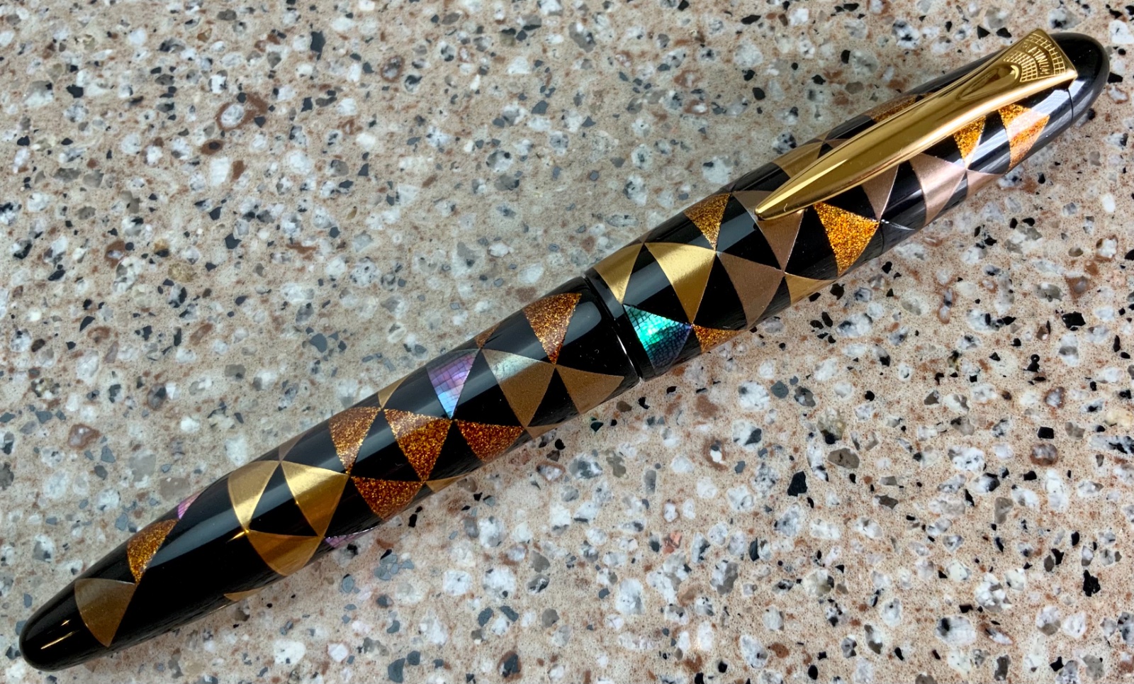
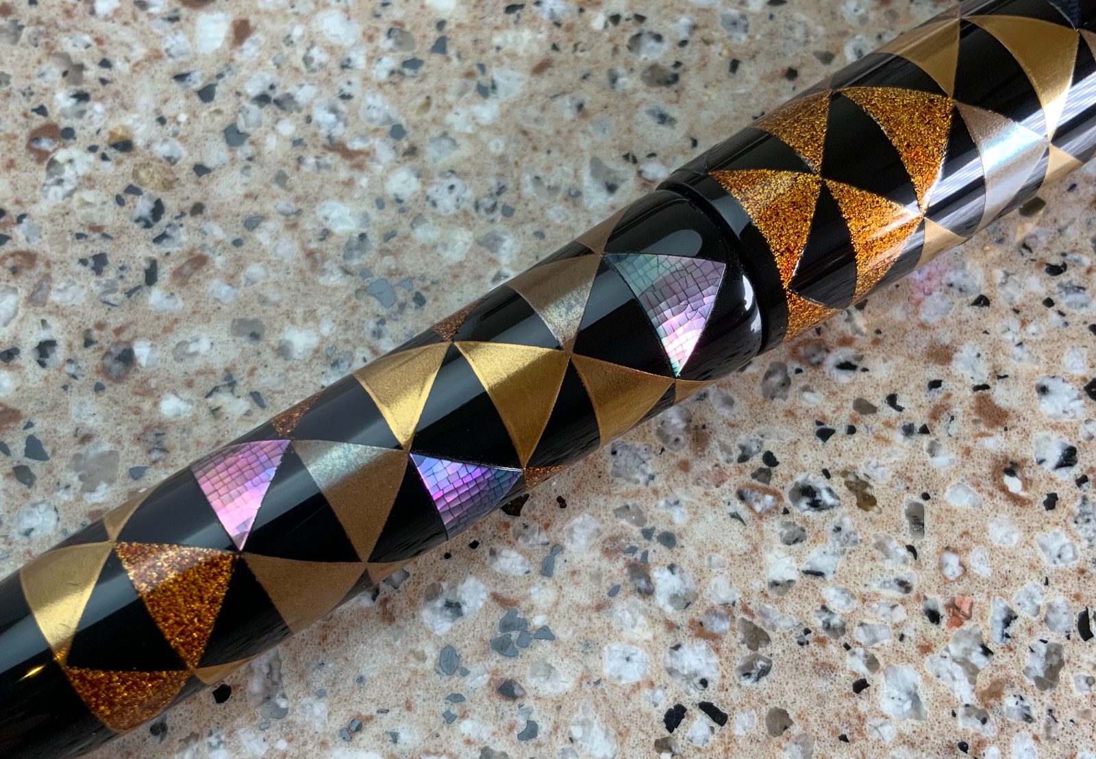
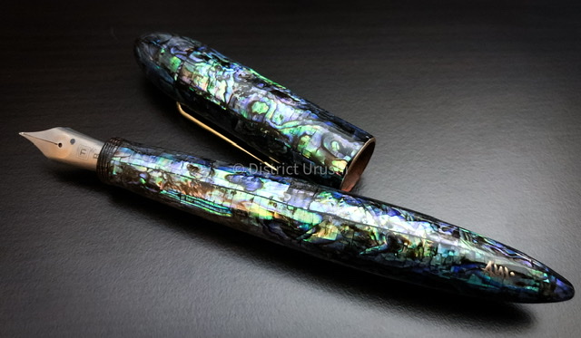
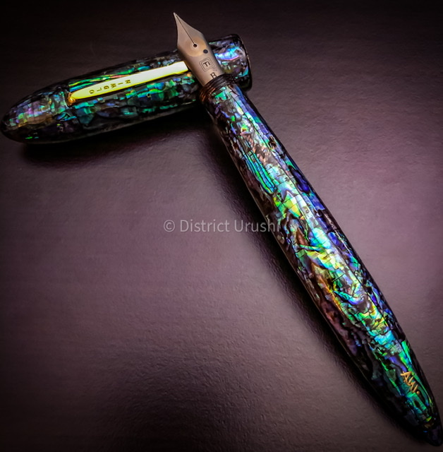
Here I present my newest pen, the Platinum Izumo Galaxy in full macro glory. The surface is smooth with dense raden. The raden particles are not of a uniform size and are densely packed with uniform distribution. While not the most challenging maki-e ever this pen was made by a skilled artist. _SON4648 by Ja Ja, on Flickr _SON4649 by Ja Ja, on Flickr _SON4650 by Ja Ja, on Flickr
-
Dantrio Hakkaku with dragon Maki-e and a 18k #6 size stub nib full macro glory
jandrese posted a topic in Japan - Asia
Here I present the Dantrio Hakkaku with dragon Maki-e and a 18k #6 size stub nib. I don't know anything about this pen other than I bought it in 2017. I've never seen the design on another Danitrio pen. Danitrio does not offer any story or explanation of the artwork. I posted about this pen in the fountain pen review pages back in 2017 but since then I've gained the ability to take good photos so I'm sharing again. Let me know what you think. I could be tricking myself but the tamenuri seems to be changing in a most enjoyable way. The artwork on this pen is rather nice and involved and also makes good use of the space on the pen. _SON4588 by Ja Ja, on Flickr _SON4593 by Ja Ja, on Flickr _SON4597 by Ja Ja, on Flickr _SON4598 by Ja Ja, on Flickr _SON4599 by Ja Ja, on Flickr -
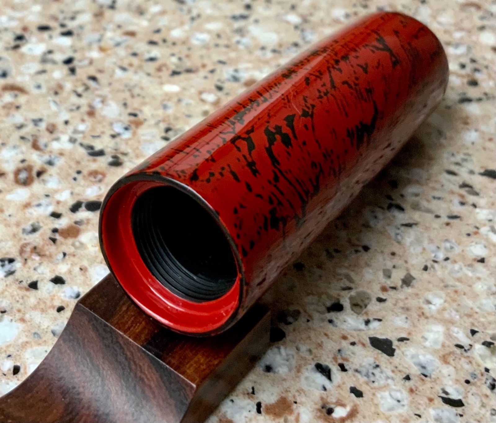
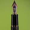
Namiki Limited Edition 2021 Coral Emperor in full macro glory
jandrese posted a topic in Japan - Asia
This is the Namiki Limited Edition 2021 Coral Emperor in full macro glory. Drink it in. This pen is above and beyond in every way possible. _SON4578 by Ja Ja, on Flickr _SON4577 by Ja Ja, on Flickr _SON4580 by Ja Ja, on Flickr _SON4582 by Ja Ja, on Flickr _SON4584 by Ja Ja, on Flickr _SON4583 by Ja Ja, on Flickr _SON4585 by Ja Ja, on Flickr _SON4586 by Ja Ja, on Flickr -
Namiki Limited Edition 2021 Coral Emperor first look and writing sample
jandrese posted a topic in Japan - Asia
Here is the mighty No. 50 size Namiki Emperor in the 2021 Limited Edition Coral maki-e. Words cannot express the amazingly superlative incredibleness of this pen. I have some pretty awesome macros I can share in a followup post if anybody is interested. IMG_8256 by Ja Ja, on Flickr -
Just found this and thought I'd pass along the warning. http://www.hakuminurushi.com/conservation/light.html "Urushi lacquer is very sensitive to light, especially in the range considered ultraviolet light (below 400nm) and can be damaged by overexposure. Avoid exposing lacquerware to direct sunlight or other sources of ultraviolet radiation such as halogen lamps, black-lights and sterilization chambers and avoid exposing lacquerware to strong or direct light over long periods of time. Avoid Light Exposure Avoid Strong or Direct Sunlight, Ultraviolet Light and Long Exposure to Light Unfortunately this fact is urushi's greatest weakness and is one that any owner of lacquerware should know and understand. Overexposure to light can cause noticeable discoloration and loss of lustre and gloss of the lacquer surface. Severe overexposure (especially to that of wavelengths 365nm or less) can cause additional damage including cracking or crazing of the surface, and as a result, exfoliation of the lacquer layers. This type of damage typically will not happen in an average setting but it is clear that care should be taken to prevent such irreversible damage. Preventing damage from over exposure to the most damaging range of ultraviolet light is not a difficult task. Simply avoiding the display and use of lacquerware in and around the strongest sources of this range of light will prevent any severe damage. Sunlight remains the strongest source of ultraviolet light will typically be encountered. Avoid using lacquerware outdoors during daylight hours and do not place or display lacquerware in front of a window or in other places where strong or direct sunlight may enter. Halogen lamps may still be encountered frequently for display lighting in stores and sometimes in the home. Although halogen lamps typically come with UV filters which effectively block a large portion of the emitted ultraviolet light, due its strong intensity and high temperatures, it is still recommended to avoid displaying lacquerware under halogen lamps. In is inadvisable to use a halogen lamp with its UV filter removed. Lacquerware should also never be sterilized in a UV based germicidal or sterilization chamber as these use strong doses of ultraviolet light in the most damaging spectrum (UV-C, 280-100nm) to kill pathogens. Other sources of ultraviolet light include various less common light sources such as high intensity discharge lamps, specialty gas discharge lamps, and certain high intensity LED lamps. Most of these particular sources of ultraviolet light would not be encountered in a normal setting, but should be avoided should the case arise. Ultraviolet light, however, is not the only portion of the spectrum that may damage urushi. Although the level of damage is drastically reduced, light in the visible spectrum can also noticeably deteriorate a lacquer surface. Frequent, extended exposure to the visible spectrum can cause a noticeable change in color and a reduction in luster and gloss in as little as 6 years for transparent or lighter colored lacquer surfaces and 21 years for black lacquer surfaces1. In practice, this type of damage is difficult to achieve in a typical household setting, but it becomes understandable when it is suggested that urushi should not be put on constant display and be illuminated only when they are actually being viewed. Maki-e lacquerware with a heavy layer of exposed metal powder covering the entire surface, as frequently seen in kintsugi repairs on ceramics, will experience very little or no damage from this type of exposure. Heat is also a factor in damage caused by lighting excessive heat over long periods of time also contribute to the surface deterioration in lacquerware. If lighting must be used in close proximity, only low temperature lamps such as fluorescent lamps should be used and they should be arranged to reduce the amount of heat as much as possible. However, at times, unintended damage may still occur. If the layer is severely damaged to the extent of cracking and flaking, little can be done to restore the surface and the only measure that can be taken is to solidify the oxidized lacquer layer and prevent additional damage. However, slight damage can be reversed to some extent. Although changes in color may be permanent, a restoration treatment will typically be able to bring a slightly dulled urushi surface back to its original shine. Nevertheless, this type of restoration effort is best avoided in its entirety and steps should be taken to prevent its need. Avoiding overexposure to light is most important, but a treatment of the lacquer surface is suggested approximately every 20 years. This treatment involves a thorough cleaning, inspection and a re-impregnation of any oxidized or damaged areas with lacquer. However, this type of treatment is not necessary to maintain the beauty of a piece of lacquerware. With proper care, damage caused by overexposure to light is not something that will be encountered over the lifetime of a piece of lacquerware, but knowing how to avoid this damage is important to prevent it from occurring at all. References: • Ogawa, Toshio; Arai, Kazutaka; Osawa Satoshi, "Light Stability of Oriental Lacquer Films Irradiated by a Fluorescent Lamp." Journal of Polymers and the Environment 6:1 (1998): 59-65 • Webb, Marianne, Lacquer: Technology and Conservation (Oxford and Boston, 2000) • Araki, Tadashi; Sato, Hisayishi, "Relationships Between Exhibition Lighting and Discoloration of Lacquered Wares." Scientific Papers on Japanese Antiques and Art Crafts 23 (August 1978): 1-24 1. JRank.org Arts, Conservation - 1. Introduction., 2. Urushi., 3. Insect and associated lacquers., http://arts.jrank.org/pages/9696/III-Conservation.html (21 July 2010)
-

News from Chinese lacquer workshop to pen lovers all over the world
Zhizhai_Lacquer posted a topic in China, Korea and Others (Far East, Asia)
Hello, We are writing to inform you of the service of our Chinese lacquer workshop. Our workshop named "Zhizhai". Our lacquer workshop in Guangdong that introduces traditional Chinese lacquer techniques. At the end of this year, we plan to have a fun project for fountain pen lovers. We are professional lacquer ware craftsmen. Our main works are lacquer ware and furniture, interiors of hotels and luxury cars. From time to time, at the request of a friend, I apply natural lacquer to their private fountain pen. We don't know how to use this site at all. Should I write in this comment section if I have an event for this fountain pen lover? If you know how to effectively inform us of an event, please let us know. We started Instagram with the help of Japanese friends because of internet regulations in China. Because Chinese lacquer techniques are little known in the world. In the future, we will post many rare Chinese traditional patterns on Instagram. And although they are mainly samples of authentic lacquer ware, we can express the pattern with a fountain pen. This is our Instagram account. @zhizhai_lacquer This is our website. We have prepared a basic knowledge page for real lacquer. Chinese lacquer culture uses so many colors, all of which are real lacquer. https://www.zhizhai.shop/ We look forward to your support and advice. Thank you very much for your interest in lacquer culture. Zhizhai Xiao Guan
-
I have been thinking about acquiring a Nakaya in the Araishu (orangish) urushi lacquer for some time. Nibs dot com finally had one in stock when my resistance was low. I ordered it with a BB nib ground to crisp cursive italic. The color is a brownish-orange, which I like a lot more than I would a brighter orange. The aesthetics exceed my expectations. Here are some photos of the new pen, including side-by-side comparisons of the araishu, unpolished shu and shu urushi finishes. Orange you glad I shared this? Happy writing! David
-
Wanted to present my current stable of Stylo Art pens. 1. Akebono/bokashi chinkin butterflies 2. Dragon maki-e 3. Pine tree and cranes maki-e The pen bodies are exclusive to Stylo Art and are large pens being slightly bigger than a Namiki Yukari but are lightweight. I believe the base material is plastic. The akebono chinkin pen has an amazing Pilot #15 nib custom ground by Yukio Nagahara to what is called an N-point. It writes a super smooth and juicy fat line at about 45 degree that gets more narrow as the pen angle is steepened. It's kinda a cross between a Sailor Zoom and Naginata grind sort of, it's doing it's own thing really. The other two pens have stock (?) Pilot stub nibs, which be warned, are really more like cursive italics. Wonderful nibs but a little more demanding than a Western stub. All come with Paulowina wood boxes, pen sleeves, and CON-70 converters. Most excellent pens and more than fairly priced. Highly recommended. capped rotated_SON3728 by Ja Ja, on Flickr capped fan_SON3729 by Ja Ja, on Flickr uncapped_SON3731 by Ja Ja, on Flickr writing sampe by Ja Ja, on Flickr
-
I hope this review will be interesting to some of you since I have not found many reviews of the urushi pens made by Taccia. As soon as I ordered the pen I resolved that I would post a review - good, bad, or indifferent - since this is a less-known brand and it is hard to be confident in advance what the pens will be like. As it turned out, the pen surpassed my highest hopes and I am thoroughly delighted that I purchased it. Background: Taccia is a small fountain pen and ink manufacturer, established in California in 2003. The company was sold in 2016 to Nakabayashi, a Japanese stationery manufacturer, and now offers its pens with nibs produced by Sailor. The pen I bought was the Hyakko-Hisho Kohaku model, and it cost €850. Like many of the Taccia urushi pens it is a numbered, limited edition of 50. There are four other pens in the “Hyakko-Hisho” series with different style urushi finishes. As far as I can determine, the Hyakko-Hisho was a 17th/18th century compendium of Japanese traditional crafts. Kohaku is the Japanese word for amber, which relates to the urushi colour on this model of the series. I am not knowledgeable about urushi but I understand this pen is lacquered using the Wajima urushi style, which incorporates particles of earth or other materials in the lacquer. Perhaps some of you who possess more knowledge of urushi can expand further on this. The pen comes in a pauwlonia wood box along with a black pen kimono with purple lining. The key question for me, as I considered buying this expensive pen from a less-known brand, was: what makes the pen stand out compared to the many good pens from more established brands at comparable prices? To answer this I think I must start with my reasons for ordering the pen so you will understand what I was looking for and whether it met my expectations. Sailors are my favourite nibs because of their precision, feel and consistency, however I find the Sailor pen body designs and materials disappointing. What I wanted was a high-quality pen with attractive materials and a Sailor nib. I haven’t tried a King of Pen urushi but they are in a rather rarefied price bracket and I am less interested in the more affordable plastic or bare ebonite KoP models. I considered the Cross Peerless 125, which has a Sailor nib, and tried one in a local store, but I absolutely could not get along with the convex section shape and it was very uncomfortable for me. My hope was that this Taccia would offer me the high quality feel I was looking for in a pen with a Sailor-made nib. Design and construction: This is a large pen - at least in length - as you can see from the comparison pictures with a Montblanc 149 and a Pelikan M800. The section is much slimmer than either of those pens, and the nib is quite small (a 14k gold hard-medium Sailor with two-tone Taccia design). For me this is perfect. I prefer small nibs and relatively slim sections, even though I have large hands, because of the feeling of precise control that they give me in writing (not that my writing is particularly precise or controlled!). To my eye the nib size looks appropriate because of the slender section, even though the pen body is large. The section has a significant taper and is quite long, flaring out at the nib end. It is the most comfortable section that I have on any of my pens, and the pen almost disappears from my attention when I write. The nib has a plastic feed, I believe, and it writes beautifully - flawless and reliable ink-flow, a consistent line, pleasant feedback, and long, slender tines for precise location of contact to the paper. The urushi lacquer is yellow stripes over black. If you look carefully you will notice that the yellow lacquer incorporates gold metal particles toward the top of the cap and the bottom of the barrel. The finish has some texture and relief, which I find very pleasing. The quality of lacquer work is very high, as far as I can tell, with no flaws. It is even more beautiful and complex than was apparent from the pictures when I ordered it. The pen is made of ebonite and the body is faceted with twelve sides. The cap comes slightly short of lining-up with the body perfectly when fully closed, but this is hardly noticeable on a pen with so many facets. It there were fewer facets or the edge colour had more contrast then it might have bothered me a little. You can see if you look closely at the pictures, and judge for yourself. I like the clip/roll-stopper design in the flesh better than I thought I would. It functions well, with the right amount of flexibility and firmness. It fits to the cap discreetly with only a small aperture and no significant gaps. Perhaps the design is plain but it you think of it as a roll-stopper this design makes complete sense. The pen is a cartridge/converter filler - standard fare for this kind of urushi pen - and uses a regular Sailor converter. I guess Sailor converters are not known for high ink capacity, but it is no problem for me. The pen is 30g in weight, which is noticeably heavier than you may expect from an ebonite and lacquer pen. It feels well-balanced when writing. The ebonite is thicker than on my Nakaya pens and it lends the pen a greater feeling of solidity. The pen is still light enough to cause no fatigue when writing, but it just has such a feel of quality which I believe is due to the thicker ebonite together with the texture and excellence of the lacquer work. You can see that the threads for the cap are well away from where the pen is gripped, and they are un-lacquered ebonite. Leaving the threads un-lacquered is a design choice I thought might detract from the appearance, judging from photos of the pen, but with the pen in-hand I think it works well and it is not jarring at all. I am still unsure about bare ebonite, as this will inevitably discolour over time, but I guess urushi pens are partly about the experience of seeing the pen finish change over time. Coupled with the yellow lacquer I guess it will not look bad. Wabi-sabi. Overall: I was extremely pleased with this pen and I think it is good value relative to other pens with this kind of complex urushi finish. It truly feels high quality throughout. The positive surprises for me were the greater feeling of solidity and gravitas compared to my Nakayas; the beauty, high quality, and pleasing texture of the lacquer work; and the exceptional comfort and control I experience with the long, slender section. For me there were no real downsides and this is absolutely among my most pleasurable pens to own and write with. I love my Nakayas (I have three portable cigars) but overall I feel this Taccia surpasses them in quality and comfort, offers better value, and of course it also has the Sailor nib that I prize. I expect I will buy more Taccia urushi pens in future, following this positive experience. At least as long as they continue to be fitted with Sailor nibs, which is what brought me to this pen in the first place. If, however, you dislike small nibs and slender sections then perhaps this is not the pen for you. Some other Taccia urushi pen models have a larger sized 18k nib, also made for Taccia by Sailor.
-
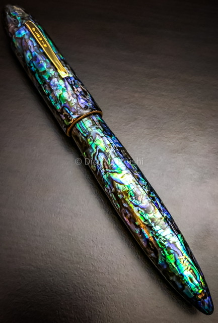
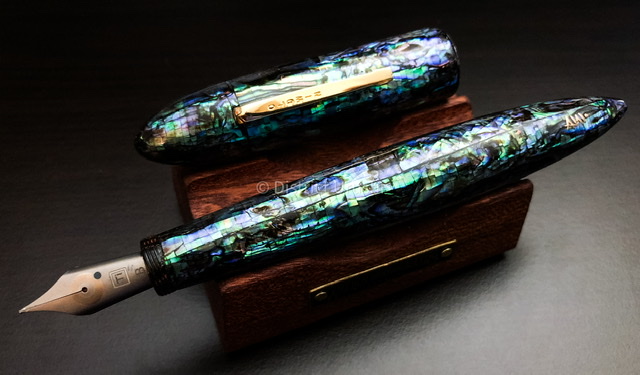
This is the AP Limited Nashiji Red from the Apprentice series of the Urushi and Sakura Lacquer Art lineup. The Apprentice series comprises pens between ~$800 to $2000, that is, AP Limited’s most affordable line of pens. Interestingly, AP sells through dealers and to some extent at least online as well on their own website. This pen lists for $1200 on the AP Limited website. AP Limited was started by Anuj and Smita Podder and features many fantastic art pens of Russian and Japanese aesthetics. Sometimes, the Russian painting and Japanese urushi/maki-e appear on the same pen but for the most part it’s an either-or situation. The higher end pens are well received by the community but having headquarters in Los Angeles they are not either a Russian or Japanese company. Nevertheless, the urushi work is completed in Japan so like Danitrio I think they qualify as Japanese for if it was not for the artwork the pens become uninteresting. IMG_1950 by Ja Ja, on Flickr IMG_1958 by Ja Ja, on Flickr This particular pen is a curious beauty and a good writer. It may be one of the least expensive pens from AP Limited but it is not exactly affordable. The name of the pen, Nashiji Red, is a bit misleading despite their marketing language/wishful thinking. Nashiji is pear and in the art realm refers to the texture of a freshly sliced pear. Japanese swords can have a nashiji texture appearance (due to how the steel was folded and, more importantly, polished) and maki-e work in nashiji typically uses gold or silver powders to create the appearance. This pen uses raden or crushed Abalone and the info from AP Limited acknowledges the schism from tradition. The pen is attractive, which is a large part of why I bought it, but it does not look like nashiji to me, it just looks like densely sprinkled raden. The base color appears to be red or shu urushi upon which the raden is built upon. The shu urushi is visible by itself on the section and on the clip creating a nice and calming visual counterbalance to the intense sparkles of the rest of the pen. I appreciate the pen is signed by the artist. IMG_1952 by Ja Ja, on Flickr IMG_1951 by Ja Ja, on Flickr The ebonite pen body itself is fairly simple tube shape with sharply tapered ends, and a step down to the cap threads. The cap itself features a metal clip with ball termination. The section tapers going down towards the nib before flaring out again in a somewhat vintage fashion. The #8 18k AP branded nib sits on a plastic feed and drinks from a cartridge converter. I’m told that the nib is a medium and that AP Limited is only shipping with medium nibs from now on since minimum orders from Bock are too large (300 units?) to make offering more tip sizes viable. The pen is large but is barely big enough to make the #8 nib appear at home. For a size comparison the Nashiji Red it is pictured next to the Sailor KOP in vermilion urushi, which itself has an oversize nib. The AP nib is not all that well fitted to the feed as there is some play, but it is not loose per se. Perhaps it is more how the nib is fitted to the section, but the Sailor nib/feed/section are much better engineered and fitted. IMG_1959 by Ja Ja, on Flickr IMG_1953 by Ja Ja, on Flickr Compared to the Sailor and indeed just about any other high-end urushi pen, including other AP Limited pens, the finish on this pen can perhaps be found wanting. From arm’s length nothing is amiss. Examining the pen up close one begins to notice some areas that seem to fall short of perfection. For example, the urushi piles up unevenly at the step transitions on either end of the pen. Likewise, there is some unevenness and small-scale roughness at the caps edge and near the section threads. This can be seen to be a flaw, as charming evidence of hand work, or perhaps to an expert as an unavoidable consequence of this type of finish. I suspect that as the name implies this pen was not made by a highly experienced master and/or was made to a price point. If not made by the master himself the master would have approved the work of the apprentice, who may indeed be very skilled. In any event, it seems X amount of effort was put in to the perfection of the finish in consideration of the price paid for the work. I’m not unhappy about the quality or lesser perfection of the finish but some may reject the pen for not having what they believe to be an ultimate urushi/maki-e finish. IMG_1955 by Ja Ja, on Flickr IMG_1970 by Ja Ja, on Flickr The nib is a wet writer and is smooth offering little to no feedback. Putting down a line is effortless, and it is a lux writing experience. There is no line variation, no flex, no nothing interesting in the writing characteristics. It just writes. ap by Ja Ja, on Flickr IMG_1963 by Ja Ja, on Flickr IMG_1964 by Ja Ja, on Flickr IMG_1966 by Ja Ja, on Flickr One of the nice things about this pen is the packaging, which is a lux presentation. The paulownia wood box is as expected for an urushi pen from Japan. There is the addition of an AP branded cleaning cloth and a more interesting card with the artists name as well as the signature of the AP Limited founder. These items contribute to the buying/ownership experience in a positive way. While I have dozens of urushi pens this is first AP Limited. I’m much more impressed with the AP lineup, well, the lineup I can afford, than ever and this may not be my last AP Limited pen. IMG_1965 by Ja Ja, on Flickr
-
Here is my new Sailor Bespoke King of Pen Ebonite Iro-Miyabi Fukaai with broad nib. A most excellent writer with a unique fine stone urushi finish aka ishime-nuri. Fine as in quality but more so in execution; its a fine grained pontilated finish that is pleasantly tactile and mercurial of color. Pictured along with the Sailor is a Nakaya with a much larger grained ishime-nuri finish. The name fukaai refers to dark blue, and it can look that way, but also light blue and greenish blue. Blue is an unusual and modern color for urushi. This pen is most unexpectedly interesting.
-
This is the Penteo Samurai Spirit Negoro made by Teodor in the Czech Republic. The base material is ebonite that has an urushi lacquer finish. The nib is a #6 JoWo steel 1.1 mm stub. Teodor makes the pen by hand by himself. Ordering is easy on the website and Teodor is very responsive. Custom pens are possible. I bought this pen to see what a Western artist can do with urushi. Plus, I enjoy supporting independent pen makers. Packaging was superb and the pen arrived totally safe and sound. To my surprise there was included a branded wooden pen box that contained the pen, an extra converter, a pen rest, and a leather pen sleeve. Nice attention to detail and value. The pen itself is medium large in size with a medium size grip section. Since the material is ebonite it’s a lightweight pen. It does not post, but being urushi lacquer one wouldn’t post anyway. As a nice touch the nib is laser engraved with the Penteo logo. The overall feeling is one of a well made pen with some special touches including the recess of the cap lip that forms a neat junction with the body when the pen is capped. Section threading is long and precise; it may be a good candidate for eye dropper filling. There is a sense of precision and solidity to the construction that is satisfying and reassuring. Regarding the urushi finish I appreciate the color palette, the smoothness of the finish, and the fact that the pen was totally cured before shipping. That is, I cannot detect the funky smell of uncured urushi, which is good because I’m highly allergic. From the standpoint of damage urushi is safe to handle and ship before it’s completely cured. That has caused problems for me more than once. While the pen is named Samurai Spirit Negoro it is not reminiscent of Japanese pens to me. The shape is unique to Penteo and while the finish is urushi it is qualitatively distinctly different from Japanese work. Negoro is a very specific style of urushi work that, in a nutshell, represents actual usage wear to the surface or a contemporary recreation of what a wear pattern might look like. Normally, red undercoating shows through as black is worn away. I have a Negoro finish Danitrio pen with reverse color scheme. Various interpretations of negoro finish exist but this pen does not conjure any of them for me. I’m also not sure what else to call the pattern. The tactile feeling of the finish is also not Japanese. This is much harder to describe, but I’d be surprised if this pen was polished with traditional materials and methods. The finish is of high quality, but it’s (naturally) not Japanese. The pen is comfortable to write with but the nib needed some attention before becoming a good writer. I expected this. In my experience 1.1 mm stubs from JoWo are rounded effectively wasting most of the width of the nib. Some careful shaping with 8000 and 12000 grit sandpaper did the trick. Now it writes fat and wide on the downstroke and thin on the horizontal with sufficient ink flow. Overall, this is a beautiful pen that is comfortable to use and a pleasure to operate. It’s not a cheap pen but there is value for money in the overall package and buying one make you a patron of the arts as it were. Highly recommended.
-
This is the Platinum Izumo Urokomon with cosu nib. A most excellent pen and nib. A fantastical, comfortable writer. Not a cheap pen but most impressive and indeed value for money. The display of urushi/maki-e craft is a wonder to behold. Photos do not do this pen justice. Uroko mon are diamond shaped Japanese family crests that are meant to evoke animal scales. These are hand drawn and finished in a variety of techniques. Platinum has done this pattern on several pen lines including the President, 3776, and this Izumo. The Izumo pens are really incredible sleeper hits. I have quite a few and in my opinion they are beautifully made superb writers and are value priced.
-
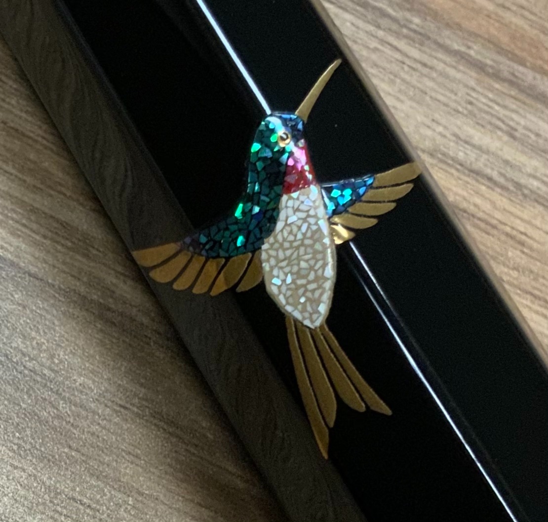
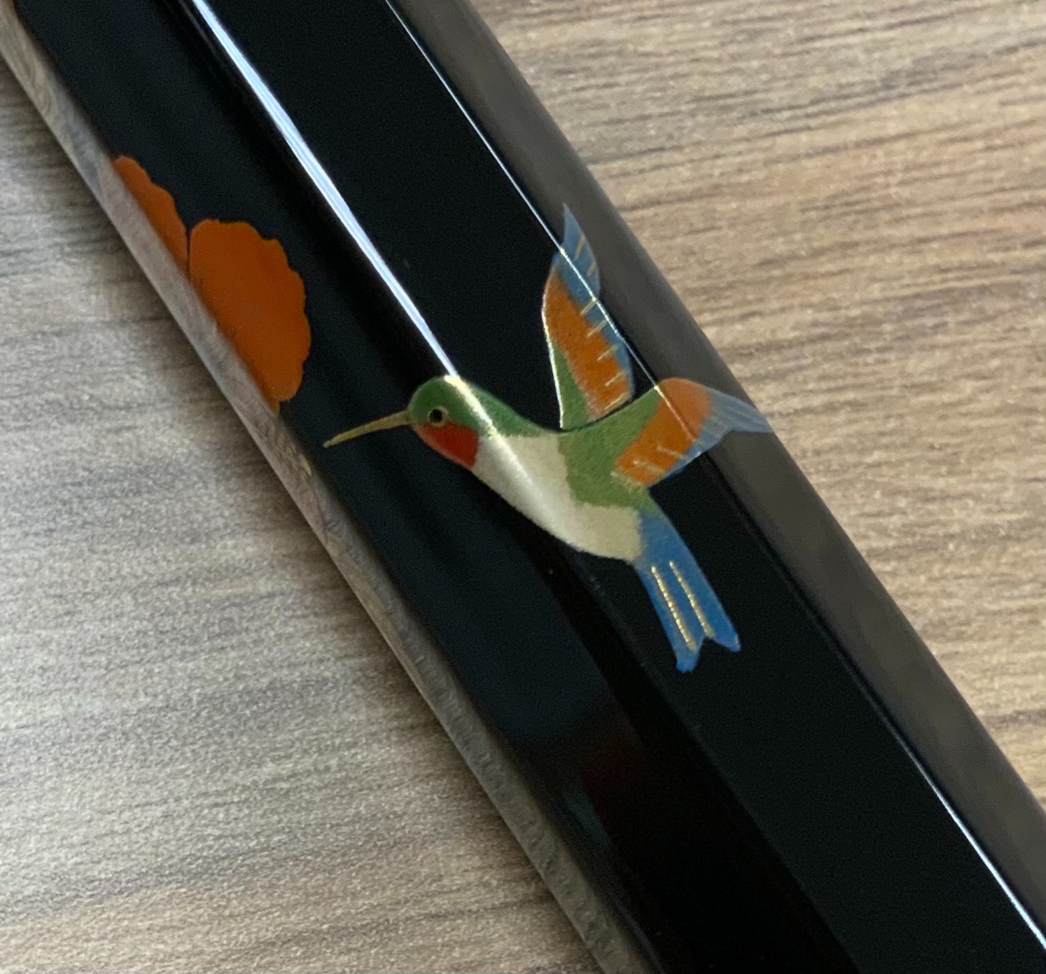
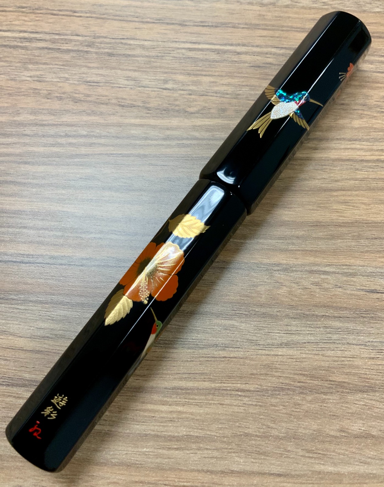
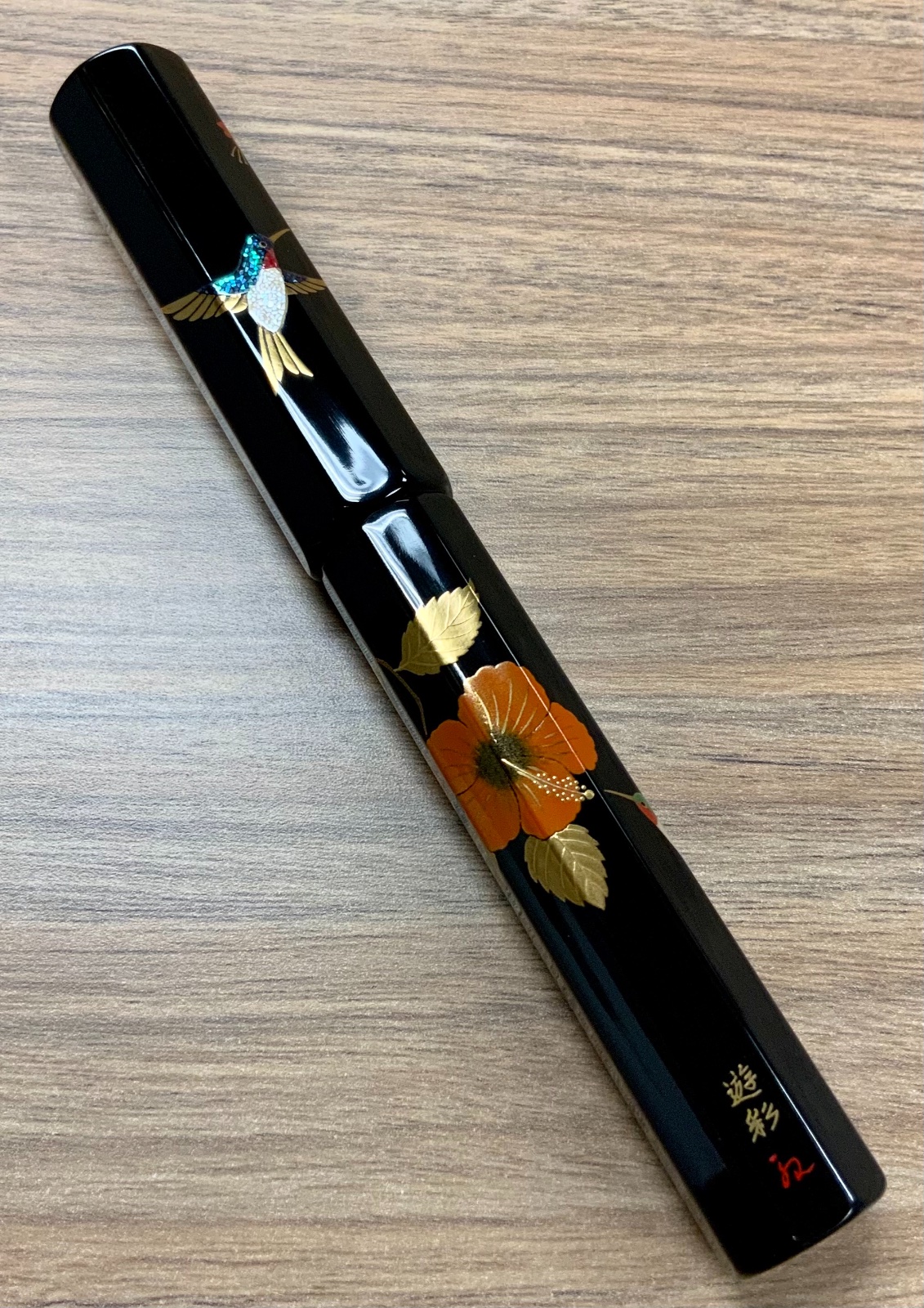
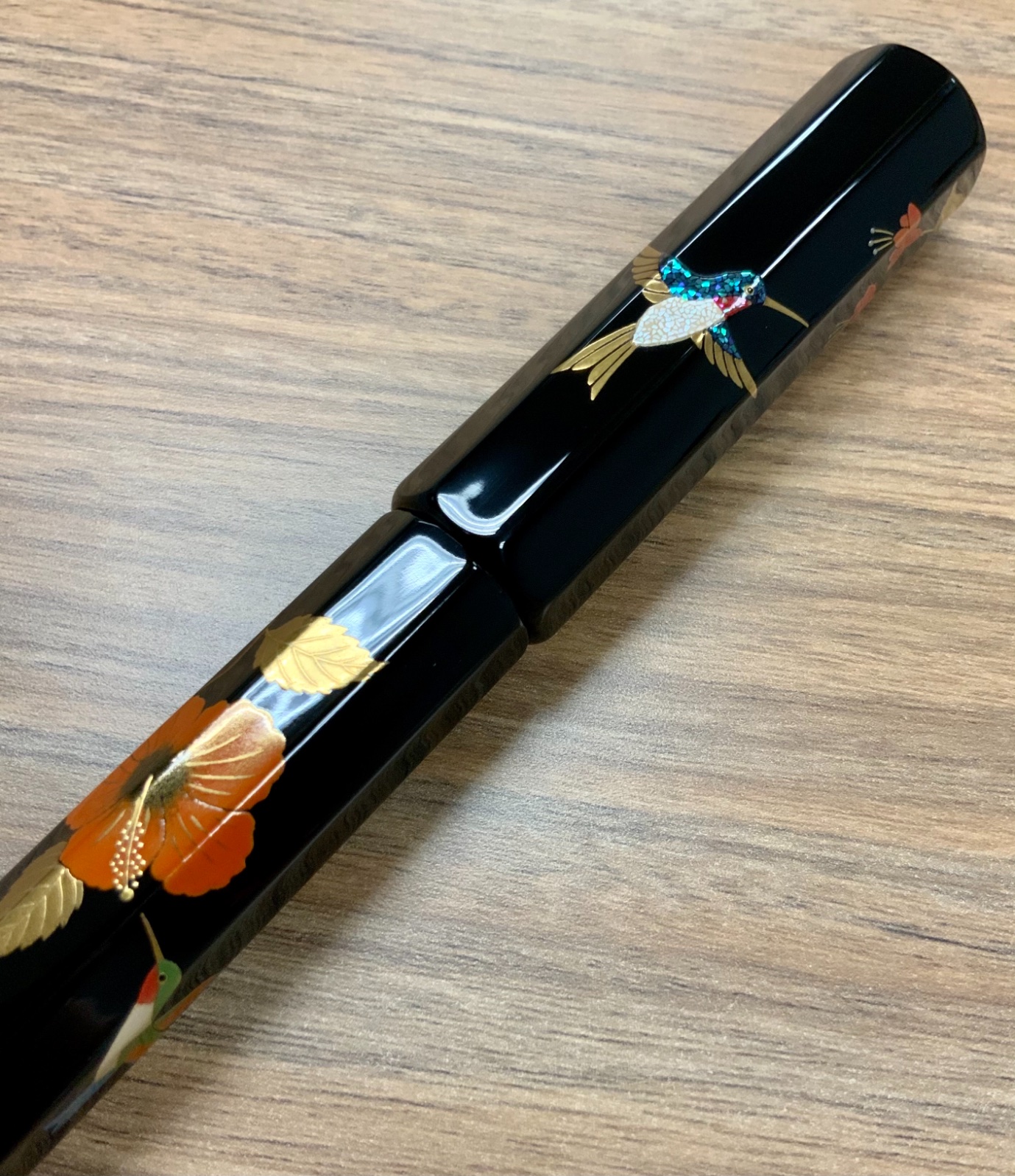
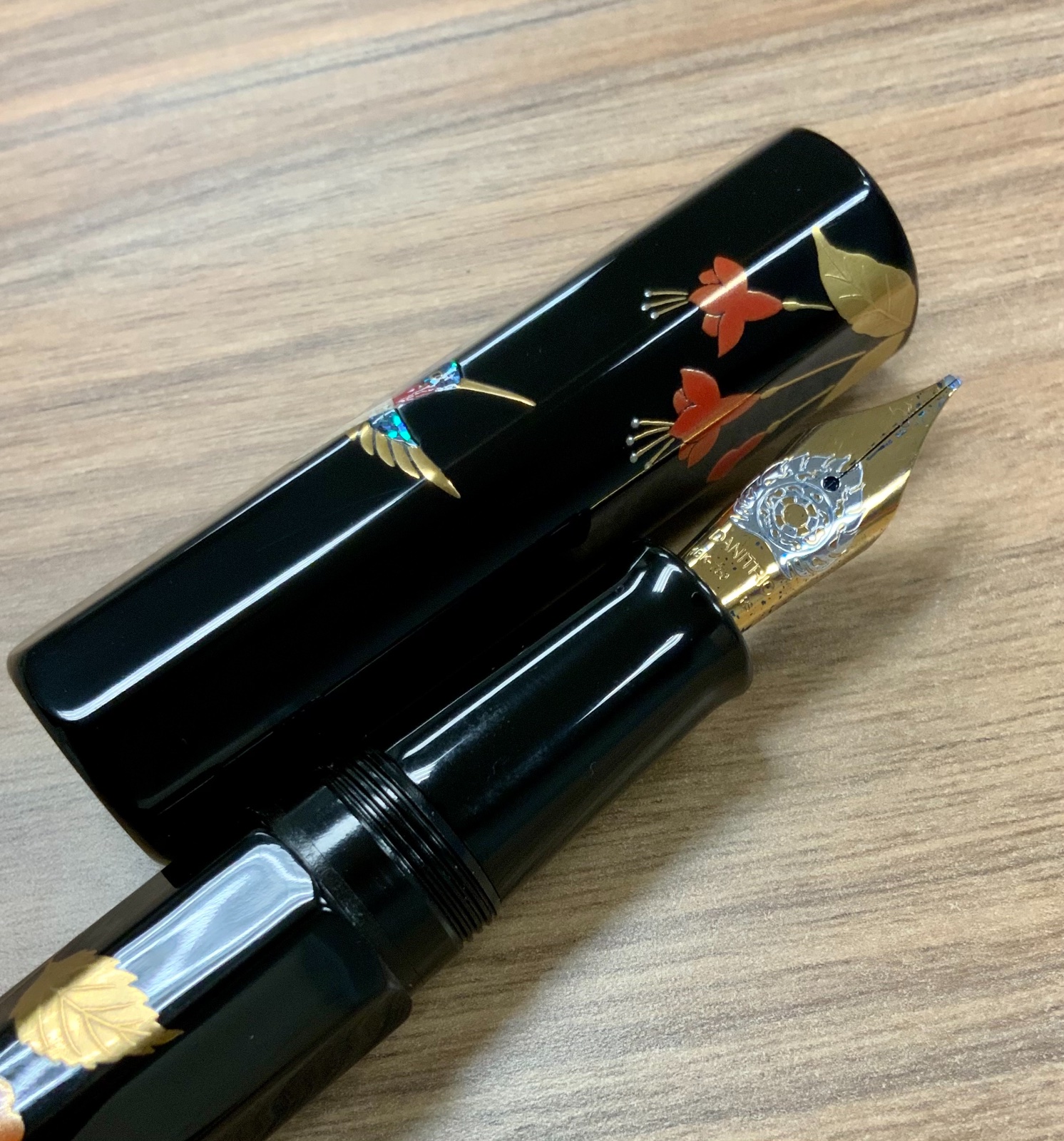
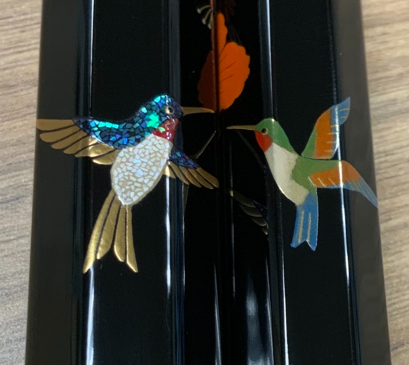
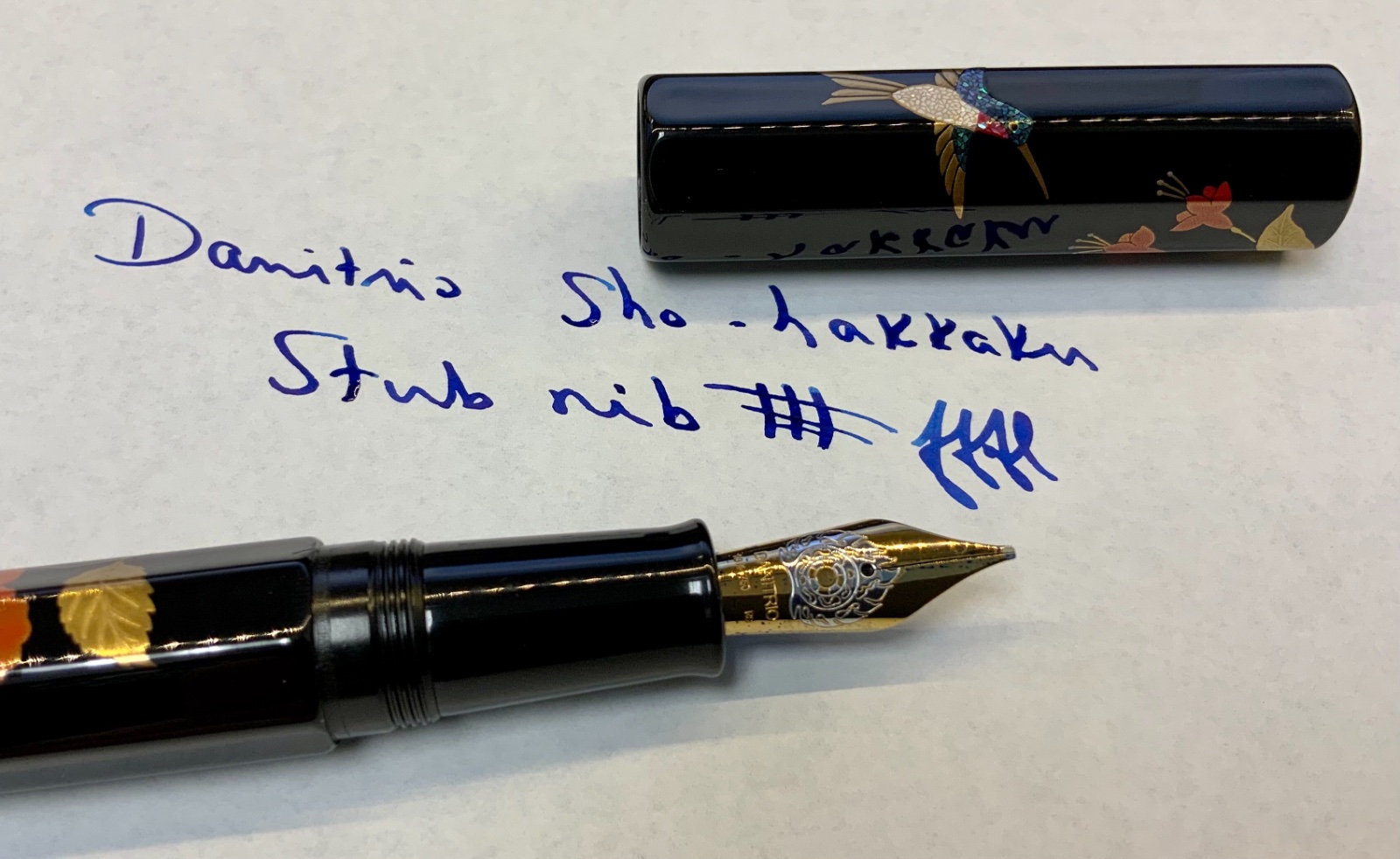
Sharing my new Danitrio Sho-Hakkaku Hummingbirds maki-e pen with stub nib. Danitrio made some major changes in 2020. That is, they pulled pens from most retailers in the USA and started selling exclusively (?) through urushipens.com. As a Danitrio collector with a favored brick and mortar AD this move was not welcome. It did, however, give me the opportunity to purchase many other urushi and maki-e pens from other companies such as Namiki, Taccia, and more. While I’ve enjoyed expanding my horizons I was hankering for another Danitrio. I previously had dialogue with Jason at urushipens.com, and had more or less resolved to one day purchase from them, but when I saw this pen on instagram I had to have it. For one thing it was made by one my most favorite Danitrio artists, Yusai, but I had narrowly missed out on a Hyotan model with similar artwork by the same artist and was always thinking about it. A message to Jason via instagram and I was able to snag this pen before it even hit the website. It’s worth mentioning that there are no hummingbirds in Japan, they are endemic only to the Americas. Nevertheless, they are depicted in the most animated and attractive fashion on an absolutely perfect black gloss background. The flowers are no less a feature than the hummingbirds but really, the birds steal the show. There are hummingbirds where I live and we love seeing them twice a year as they migrate. The mix of technique and and artistic rendering rises to the level of the sublime. If one were so inclined this could be an exit pen. Sometimes I wish I were so inclined. The nib is a stub, which is my wont on Danitrio pens and it characteristically writes a juicy line. While I do enjoy writing with this pen for me it is a work of art. I have more than enough pens that write well. I shall never stop adding art to my life. Danitrio now has a new website and more pens are being added to urushipens.com all the time. Personally, I do not prefer to buy these types of pens online sight unseen and nib untested. In my opinion it is a poor business choice and is damaging to relationships with collectors. Urushipens.com seems like good people so I will probably continue to support them but my Danitrio collecting will dramatically slow. There are other pens I can see and touch before buying from an AD I have a long-standing relationship with. The Danitrio pens, as always, satisfy.
-
This is the perfect pen. 10/10 Ok I am sure you want to know more. https://imgur.com/XJXW98V There you will find a written version of this review that might not have all the details. https://imgur.com/a/wz7784l And here is the rest of the album. So this is the Pilot Custom 845 Urushi. The finish is Vermilion and the nib is Pilot's 18kt gold two-tone. But you can see all that. The Custom 845 Urushi is the full-size brother of the over-sized (or really super oversized lol) and number-less named Custom Urushi. Pilot USA does not import this pen so you will have to import it yourself directly from a Japanese retailer. The Vermilion finish to this pen is, to the best of my knowledge, exclusive to Tokyo Pen Shop Quill. I am not 100% of that but it seems to be the only place you reliably purchase this pen if you're not in Japan anyway. Even then, the Vermilion is not in constant production and seems to restock around fall/winter of the year and sells out quickly. The price I paid for this pen was around 500 50000 yen and the experience in purchasing was amazing. Tokyo Pen Shop Quill only carries a very curated selection of Pilot/Namiki pens and thoroughly inspect the pen as well as tunes the nib before shipping it. The packaging could not have been better and included a lovely letter thanking me for my purchase as well as a nifty pen cleaning tool that according to my post purchase questions, the shop owner makes himself. So that brings us to the nib. Pilot nibs are very reliable writers, no matter what price point, but these 18kt nibs are just something else. The shop owner himself does some adjustments that takes the quality to the next level. This is the smoothest fine nib I own and have ever used because if anything was smoother than this I would have bought it or not have sold it. This pen is my first Urushi pen and I doubt it will be my last. The feel of the urushi (which is the red/vermilion sections) has a subtle warm/soft-feeling that is very unique compared to resin/plastic. It seems to be very scratch resistant as well. Size wish is is pretty much the same as Pelikan M800 but weights just slightly less. The body does have some lovely gold ring furniture and is just... ugh I love it lol. The filling system is C/C.. yes piston snobs, I know.. but trust me, this thing is so pretty you won't care. While it might be C/C, it does use the venerable Con-70 push-button vacuum converter. The pen is something special really. Pens sometimes reflect the personality of their owners and other times give something back to the writer. This definitely gives back in the form of confidence that you cannot help but feel as how hold the powerful vermilion hue in your hands. This is the first pen I have ever owned that as made me question the need to own anything else. 10/10
-
Recently picked up these two super cool Danitrio maki-e fountain pens. Where I shop, Dromgooles in Houston, I have a very large selection of urushi fountain pens. I considered the new and very well made Sailor tamenuri midore-dame King of Pen but rejected it for a variety of reasons. IMG_4295 by Ja Ja, on Flickr Among those reasons was the there were other pens I was more interested in. These pens I purchased were certainly among them! IMG_4296 by Ja Ja, on Flickr IMG_4297 by Ja Ja, on Flickr IMG_4298 by Ja Ja, on Flickr The first is a sho-hakkaku (short/small octogon) based maki-e piece by Hironobu, who is the son of Okazaki. Some of my favorite Danitrio pens are by Okazaki including my sublime shu tamenuri flat top Mikado so I was happy to collect the son's work too. The theme is Aka Fuji (red Mt. Fuji). It is really very beautiful and features many different finishes. The cap base is shu tamenuri whereas the body is kuro-roiro. There are at least 5 different metal powders and no less than 3 different colors of urushi in the maki-work. Then there is the rankaku or egg shells for the snowy peak. The nib is a medium flame decoration 18k piece with plastic feed. Ink is held in a CC. It is a smooth and consistent writer. IMG_4307 by Ja Ja, on Flickr IMG_4306 by Ja Ja, on Flickr The second pen is really something special in my collection. Sure, the maki-e work is very nice, but the colors are really very unusual. The base of the Hyotan (gourd) shaped pen is all of rose pink urushi. Not manly perhaps but I love it for its uniqueness and because my daughter really digs it. The colorful maki-e features a stylized mythical Asian phoenix. There is yellow, red, orange, black, and green colored urushi in the flamboyant bird. There appears to be only one type of gold powder used in the design. Wish there was some information on the design, there never is, but I'm interested and my searches thus far have not turned up any answers. Probably a very specific reference to a tale involving a particular phoenix. The artist is another new one to me and one I am very happy to collect, that is, Yuhaku. The nib is a broad 18k with plastic feed and CC filler. The flame design nib is spectacular, it's an amazing writer. IMG_4305 by Ja Ja, on Flickr IMG_4304 by Ja Ja, on Flickr Super happy to have these cool new Danitrio pens.
-
I've not posted here for a while on what I've done so far. But here is my latest one. I'm not sure how many times I have thoughts about abandoning this project but was finally able to get there! The pen that took around 6 months to completion due to long wait required for curing between each pieces of raden and the complex curves on the pen body which shaped like zeppelin. Pen is Oldwin classic oversize in ebonite completely covered with cracked raden technique where raden is broken on the pen body. Link to detailed pictures: (files are too big to be attached) https://www.instagram.com/p/CDHssMaD7Wl/?igshid=a6m5zh15t6zp
-
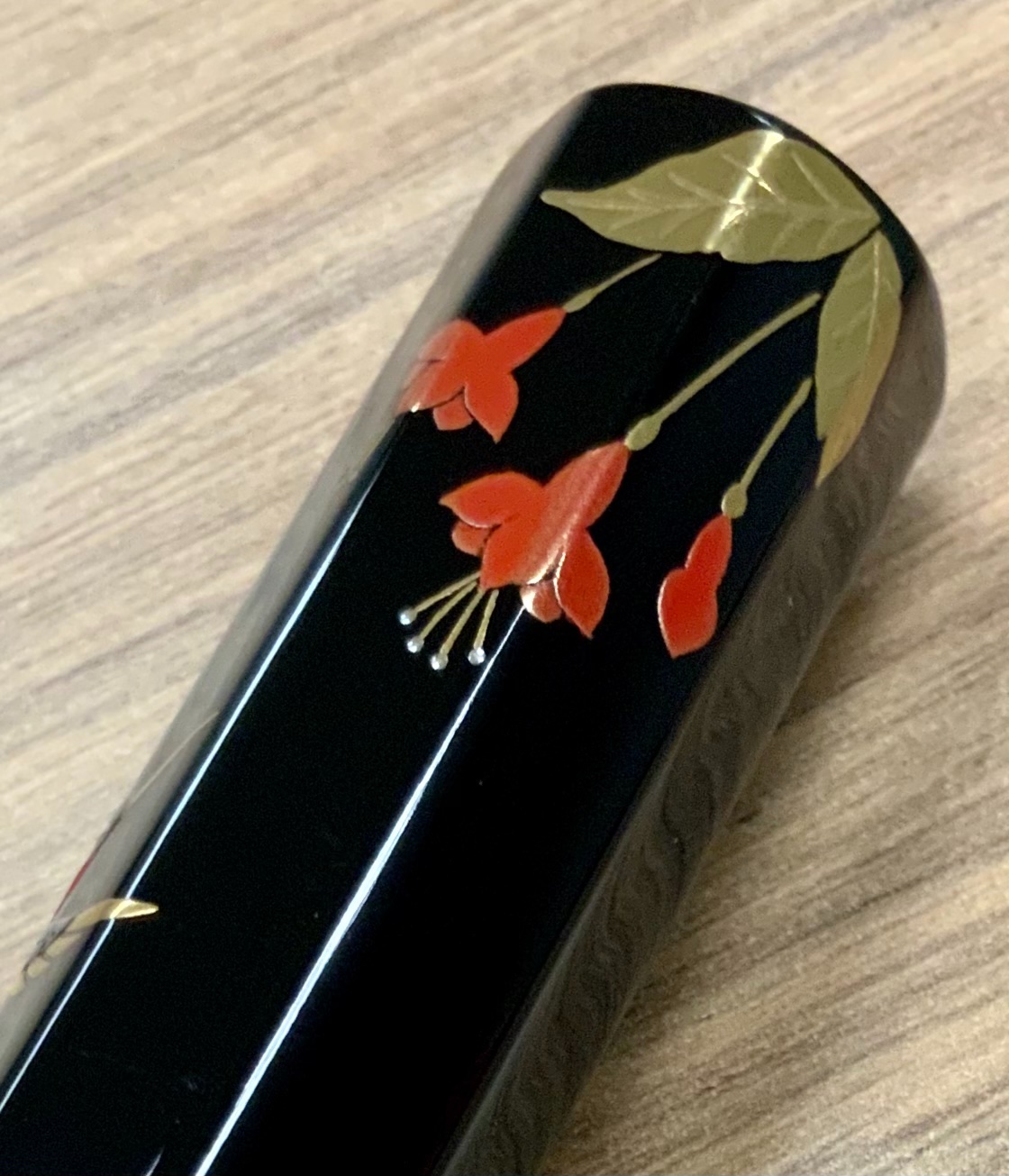
This is the Danitrio Hyotan special edition maki-e F-49 Blue Dragon LE. Hyotan refers to the water gourd and the pen clearly mimics the Calabash shape. Due to its curvaceous nature the Hyotan has been dubbed the “Mae West”. One might think the pen awkward to grip but that is not so, it settles nicely in the hand and is a good writer. Lots of pens write well though. The standout feature of this pen is clearly the large, detailed maki-e dragon and it’s a beauty. Normally, this dragon is featured on larger pens like the Mikado and Genkai along with a more involved maki-e design. This pen brings the central figure down to a more accessible price point. Relatively accessible that is. Dragons are common features of traditional Japanese (and Chinese etc.) artwork. Sometimes it is said that the number of toes or the horns has some meaning, and this may be so here, but for the most part one cannot distinguish Japanese and Chinese dragons by these features. Japanese dragons are often water dragons but can exist in the clouds. Unlike Chinese dragons, Japanese dragons can be good or bad. Chinese dragons are basically benevolent. I really wish I knew the back story on this dragon; there is definitely a story here, something cultured and cultural. Regardless, the multifold maki-e techniques are a joy to study and the sophisticated artistic sensibility is moving. It really is an impressive piece of work. For Danitrio this is a medium sized pen but fully qualifies as large. Since the base is ebonite it’s not heavy. I reckon one could force the pen to post but that would be foolish. Posting would eventually disfigure the maki-e finish and that would be a tragedy. The 18k #6 nib is supplied by a plastic feed and a cartridge converter. These Buddhist flame style nibs are a bit soft sometimes bordering on springy. This one is a little bit soft and while it writes a nice consistent line it tends to make some noise, kind of like a squeaky sound. Odd but not off putting. The artist is Yuji Ohkado and this is the only pen I have from him. I’d say it’s a pretty good start ha ha!
-

Nakaya Decapod Tw Kuro-Tamenuri, Slightly Different Review.
MichalK posted a topic in Fountain Pen Reviews
A slightly different review of Nakaya Decapod TW in kuro-tamenuri. Why are my reviews different? I focus on urushi aspect. On technique used, quality of finish, care tips, longevity etc. Watch the video, and please click the LIKE button - it helps me with Youtube algorithms, and to reach more interested people. Subscribe to my channel if you want more -
Hi, A story is quite typical for me. I get interested in something, the idea "cooks" for some time, and then blow and burns. And get another PhD in something, be it building a car, making DYI cosmetics, grinding nibs, and most recently - URUSHI. Instead of writing to much, I'll show some pictures. Below I'll try to explain what is it all about. My journey is being documented on my Instagram account : https://www.instagram.com/tamenuri_boru/ http://gakko.pl/piora/1.jpeg http://gakko.pl/piora/2.jpeg http://gakko.pl/piora/10.jpeghttp://gakko.pl/piora/11.jpeghttp://gakko.pl/piora/12.jpeg http://gakko.pl/piora/15.jpeghttp://gakko.pl/piora/24.jpeghttp://gakko.pl/piora/25.jpeghttp://gakko.pl/piora/8.jpeghttp://gakko.pl/piora/8.jpeghttp://gakko.pl/piora/7.jpeghttp://gakko.pl/piora/6.jpeghttp://gakko.pl/piora/3.jpeg
-
Mb 149 Calligraphy, Comparison With Other Mb, Pelikan M1000, Disassembly And Urushi
MichalK posted a topic in Montblanc
I'm cooling down after excitement of being featured by Stephen Brown in his channel so I got back to work Montblanc Meisterstuck 149 (including Calligraphy Special Edition) in my new video. I am lacquering three 149s with urushi right now so I decided to show the pen closer. Including a special edition with a flexible nib - Calligraphy. I compare it with 146, 144, 142 (celluloid from the 50s) and of course with the Pelikan M1000. I show how these pens write, how to take it apart, how to prepare it for lacquering with urushi, too. In writing sequences I have a "hand doubble" ;-) -
Here is my new Pelikan M1000 Raden Green Ray. This pen was announced to some fanfare. Certainly, the pen deserves some fanfare. As an M1000 it makes a statement as a flagship writing instrument and as a maki-e M1000 it becomes art. What is missing, however, is a story. There is no backstory, no narrative of the conceptualization. The artist remains obscure. The techniques a mystery. Much of that is not unusual for maki-e work, but this is 2020 and brands need to tell stories. Made in only 400 copies due to the nature of material and technique each is really a piece unique. My is 333 making it only half evil. IMG_4994 by Ja Ja, on Flickr IMG_4972 by Ja Ja, on Flickr IMG_4984 by Ja Ja, on Flickr What I believe is that Pelikan decided to make the definitive raden statement piece. A heavyweight knockout punch in Australian abalone shell. The tableau of the M1000 is large enough but Pelikan decided to inlay enormous, unbroken, mega wide (>2 mm) stripes of perfectly sharply cut shell the likes of which I've never seen. Pelikan and the aritst are screaming look what we've done! This pen lays down the raden law. IMG_4975 by Ja Ja, on Flickr IMG_4974 by Ja Ja, on Flickr Remarkably, the pen retains a feeling of smoothness despite the huge, wide raden inlay. The urushi is thick. You can see it rise up from the level of the ink window. This version of the M1000 has a diameter over 1 mm greater than a standard M1000, a difference that is seen and felt. It's a muscular M1000. Otherwise, it handles and writes like any other M1000. Mine has a Fine nib and writes the expected smooth, wet line. There is no babies bottom as is sometimes found on Pelikan nibs. IMG_4982 by Ja Ja, on Flickr IMG_4996 by Ja Ja, on Flickr IMG_4977 by Ja Ja, on Flickr IMG_4978 by Ja Ja, on Flickr Packaging is simple but nicely done. The Paulownia wood box is typical of Japanese craft art and is labeled with the name of pen in the center but the rest of the script could not be translated by my Google phone app. IMG_4989 by Ja Ja, on Flickr IMG_4991 by Ja Ja, on Flickr IMG_4993 by Ja Ja, on Flickr IMG_4995 by Ja Ja, on Flickr My other raden pens pale in comparison to this Green Ray. The Platinum Izumo Aurora also features super wide (~2 mm) raden inlay but the Green Ray stripes are wider and more perfectly cut. The Izumo is a superb pen, it just lacks the perfection of the M1000. My Bokumondoh custom M600 raden Aurora is lovely and eye catching but there is no comparison with the excellence of the M1000. With these pens as comparison pieces the artistry of the Green Ray shines brightly and the price, in comparison is justified. IMG_4997 by Ja Ja, on Flickr IMG_4998 by Ja Ja, on Flickr IMG_4999 by Ja Ja, on Flickr IMG_5001 by Ja Ja, on Flickr
-
Hello, everyone! I'm looking for the information on this Platinum (supposedly) pen, which I bought on eBay - it was advertised as "Urushi" and "Maki-e", and has a nib of 3776. But the cap is not screw-on (and on my other Platinum 3776 pens caps screwed on the barrel). I saw a similar pen (https://andersonpens.com/platinum-3776-urushi-maki-e-sakura/), but this similar pen also has a screw-on cap. I'm wondering if this pen is fake, and if it's not - I would be happy to know more about this pen. Thank you very much for any information. In the box: Without cap: Nib:
-
Dazzled by the resplendent allure of a Japanese ED (with the concept of a shut-off valve mechanism), the lust for an urushi lacquered pen vis-a-vis plain ebonite ones (seemingly susceptible to lose shine and colour over time) did keep growing on me for some time, before I took this plunge! I have come to know of an unfortunate experience with a Sailor KOP in Ebonite and have felt that without urushi, ebonite just fails to complete itself. These glamorous reviews from shuuemura and rubyeyespenlover should be banned and blamed altogether for pen-monetary crises, which I kept visiting again & again. These reviews did make me aware of huge dimensions of the Emperor more towards a ‘at rest desk-pen’, with a reassurance of writing comfort. I will keep this review unrated, since beautiful things in life do not need logic or mathematics to impart you with joy. So when I was dazzled for long enough, I asked Raul (Engeika/Pensindia) for an opinion regarding the Emperor vs Yukari Royale. Since most of our discussions these days refer to trade economics, Government taxation rather than any real pen discussions, he lazily took two to three days to check with Namiki and confirmed me back with the nib availability for both the pens. He gave me a discounted price (which I shall not discuss) for the Emperor model, more as a friend than a seller. I went ahead with it, because the production of Emperor pen without rings had been stopped by Namiki and it would become difficult to acquire a preferred nib-width. The beauty travelled from Japan and reached me via Pensindia Pune office in less than two weeks. Below links redirects to the same review on my blog with additional eye-candy The Namiki Emperor Review A JUMBO HISTORY OF 85 YEARS In early 1930’s, the Emperor existed in the form of No.50 Jumbo. It was decommissioned a few years later. On one rare occasion as referenced here, Nomura securities (estd 1925) had a specially commissioned No. 50 Jumbo pen made for itself, with Dunhill-Namiki engraved (with the classic M-shape logo) in 1936, for distribution among its employees to celebrate the 10th anniversary of the company. Wow! how many companies would do that today? http://1.bp.blogspot.com/-DOvvGuEJKqs/VpH7jevYvYI/AAAAAAAAFq0/CsZeYqgPhiI/s1600/1DNomuraEmperor.jpg Pilot reintroduced the pen in 1985 to tap the high margin market, as referenced here. The task was left to Sakai Eisuke to create a No. 50 Jumbo prototype based on the 1920s model. The initial model had a 14k nib with the 14 KARAT NAMIKI <NIB WIDTH> REGISTERED PATENT OFFICE 50 inscription, which later got replaced with a 18k nib carrying a similar engraving. http://4.bp.blogspot.com/-s6NfGjeSk8w/VpH7RGtu0QI/AAAAAAAAFqs/GB5ABo05-ZE/s1600/2Dkarat.jpg These days it comes with Namiki’s standard Mt. Fuji inscription. The finish of these Urushi lines is obtained by using non-oil lacquer for the final coat and a polishing method called Roiro Urushi Shiage (Non-oil lacquer finish) as per Namiki. It’s done by rubbing the pen in raw lacquer after a special charcoal polishing process. And if you look at the plain Urushi line of pens (vermillion & black), the artisan’s name would say Kokkokai. Kokkokai is a continuation of the original group of Maki-e artisans formed in 1931, under leadership of Maki-e master Gonroku Matsuda, who had joined Ryosuke Namiki back in 1926 as Chief Maki-e Designer. Matsuda is said to have designed for Montblanc too. URUSHI Urushi, as you know, is the poisonous sap of the urushi or lacquer tree (Toxicodendron Vernicifluum) which grows in Japan, China, and Korea and is primarily brown in colour. The sap of this tree polymerises to form a hard, durable, plastic-like substance, when exposed to moisture/air. Liquid urushi can be applied to multiple materials like wood, metal, cloth, resin, ceramics or ebonite as opposed to the best of synthetic lacquers. When it solidifies, Urushi turns into a very hard coating that is waterproof and protects the coated object from effects of fungus, ambient chemical reactions at surface due to heat or humidity or even from caustic acids. Colored urushi such as black or shu (red) are made by mixing pigments into cured urushi. With natural exposure to air and ultraviolet light (extended UV exposure ends up in discolouration), the urushi layers gradually increase in transparency and the material gradually unveils shades of original bright colours within. The birth of the maki-e decoration technique took place during the Nara period in Japan i.e from 710-794 AD, in which gold ''dust'' was decoratively sprinkled on the lacquer surface. So maki-e utensils, accessories and writing instruments have evolved to their present forms from thousands of years ago. Only direct and prolonged exposure to sunlight will cause urushi to deteriorate. Urushi's hardness and durability makes it an excellent protective coating for any object that will be used continously over a long period of time (Paraphrased from Kyotoguide). This all ends up with a versatile material and with a characteristic hardness, durability, imperviousness and resistance to abrasion. The elegance of ebonite is supposed to endure time and space with the urushi flair. PRESENTED BY NAMIKI The presentation is grand and velvety with a spacious wooden box, capable of packing your sneakers too, which is made out of traditional Paulownia wood. It is protectively packaged inside a cardboard box. The box has a violet thread running across two metal brackets to fasten the upper lid. http://4.bp.blogspot.com/-9i49GFleh2s/VpH8AAE7BbI/AAAAAAAAFrE/_zK1K3OQsuI/s1600/3presentation.jpg Resting inside is a bottle of Namiki Black Ink (Pilot Black Ink - 50 mL), an Ink dropper with a red bulb encased in a black cardboard box, a red velvety polishing cloth and finally the No#50 Jumbo resting on its bed. I did receive a nice surprise gift from Pensindia - it is a Pilot Somes single-pen pouch. Thank you! (PS : The Emperor would not fit inside this standard Pilot Pouch). http://2.bp.blogspot.com/-2WKlYSJpjtU/VpH8ERxDtzI/AAAAAAAAFrM/xbk5oAk0wI0/s1600/DSC_7536.jpg The model number of the pen, in this case FNF-148S-<R/B>-<F/FM/M/B> indicates the launch price and colour within it. The 148 refers to JPY 148,000 whereas the third digit R/B refers to the red/black urushi. DESIGN - CLASSIC This Lacquer No.#50 model comes in two standard colours - Black & Vermillion (Urushi) with gold plated clips. A newer No.#50 Urushi model is available with two concentric rings on the cap, carrying a different model number. The ebonite feels substantial in hand from dual perspectives of dimensions but at the same time the pen does not feel heavy. The classical cigar or rather torpedo shaped geometry with Vermillion hue adores itself with light, which when reflected through multiple layers of urushi takes on a electric red tinge on an otherwise conservative scarlet red hue. The work and finish is impeccable and it does not show any signs of being handmade, whatsoever. The simplistic yet elegant design comes with a single golden accent, provided deftly by the traditional triangular shaped tension fit clip with a sphere to anchor into your shirt pockets, if you have that big a pocket. A marked absence of any other decoration like a clip band or ring or anything else on the entire pen, imparts a continued infinity to modes of convergence. Vermillion is considered as an auspicious colour throughout East Asia, where it’s culturally imbibed. It has four synthetic & natural shades as of today: Red-Orange[sRGB (255, 83, 73)], Orange-Red[sRGB (255, 69, 0)], Plochere[sRGB (217, 96, 59)] and Chinese Red[sRGB (170, 56, 30)]. The shades/hue of the pens in red urushi might vary from one other. http://3.bp.blogspot.com/-0DjoRXVscp8/VpH8UHvolGI/AAAAAAAAFrU/oMSLVGdluQA/s1600/DSC_7544.jpg The cap unravels itself after one and a half turns. It reveals the beautiful nib with the modern Mt.Fuji inscription which is incidentally 1.1 cm longer than the section itself. The seamless grip goes through a fair amount of taper starting from the barrel and ends up with a smoothly carved out bumper, emphasising continuity. The cap threads on the barrel are carved out with sculpted finesse and the grip section ends up with a small but discernible gap between itself and the barrel (common across the Urushi models). The barrel at the other end leads leisurely to the tail where you have the ink-shutoff valve. This picture thankfully captured the tail end, which your eyes might fail to notice, unless you know where you are looking for it. http://1.bp.blogspot.com/-zDgaI9nQ92M/VpH9FEL4wWI/AAAAAAAAFr8/FYWgzXkUHw4/s1600/DSC_7558.jpg I feel, the cap is itself a subtle piece art made from a single ebonite blank. It carries the valour and brevity of the overall smooth curved design with remarkable panache. The finish is impeccable, with the colours varying between bright and dark with the play of light. The clip is traditional triangular Pilot with a sphere at the end, inscribed with Namiki with the Isosceles Triangle within a Pentagon logo. There is a alphanumeric code inscribed on the upper base of the clip, where it delves into the cap. http://3.bp.blogspot.com/-L1s1oI7rJsU/VpH8ms913sI/AAAAAAAAFrc/rv1zcJpmu6k/s1600/DSC_7559.jpg FILLING SYSTEM - The ‘Japanese’ Eyedropper A bit of history on it, there were these traditional non-self filling systems or NSF (without any filling mechanism - piston/button/plunger) and luckily enough fountain pens were compulsory during my junior school days. Since the squeeze converters/cartridges did not last long, we used to bank on fountain pens from Camlin & Chelpark which used to offer the capacity of the barrel itself. However, sometimes we did end up with ink inside the cap and sometimes a blue blot on pockets of our white shirts (our school uniform) due to ink burping & subsequent leakage. If I remember correctly, Surf made all the money those days, using this particular advertisement with an ink blot on white pockets in TV media. Seems the burping had mattered to the Japanese first, thanks to their costly Kimonos made of silk, when they had come up with an ink stop - plunger mechanism in early 1912. The term ED (Eyedropper) came into picture after advent of vacuum driven self filling pens with button, squeeze or plunger mechanisms. Now comes the ink-dropper with the red bulb to make an appearance. The section takes almost eternity (read seven complete turns) to reveal one of the most basic fountain pen filling systems. Most of the times, I fear the section would drop off due to my monotony and laziness during unscrewing the section. Once unscrewed, you can see the conical ink shutoff valve inside the barrel and a similar conical concavity with a crevice inside the section, to make the system work. The insides of the barrel & section are all black. With the dropper filled up with your favourite ink, you are supposed to be fill the barrel, until the visible internal threads. Leave the valve shut while filling the barrel, then unscrew one turn to allow air inside the chamber while writing and then close when finished. The entire rod is to be extracted completely, only when you are cleaning the barrel. It seems to be a delicate system, so one must avoid pulling the rod frequently. While using, you can unscrew the tail by 1 mm or so and start writing, although the feed might have a buffer comparable to a converter. After use, you can follow the instruction of screwing back the tail with the nib turned upside. http://4.bp.blogspot.com/-38ZntEubEJ0/VpH80L-G8JI/AAAAAAAAFrs/hHEZLBvClT4/s1600/DSC_7560.jpg NIB - LORD OF THE NIBS The nib with this Emperor is 18k which weighs more than 2 grams and it came in four stock widths earlier - F, FM, M & B according to the enclosed booklet. It seems F and B nibs have run out of stock for Namiki/Pilot Office in Japan. The nib isn't anything short of grand, but believe me it takes time to get used to it. It’s longer than the section by more than 1 cm. Inscribed is the symbol of Mt. Fuji (also found in #3776 nibs), the upper part symbolic of the snow caps. http://1.bp.blogspot.com/-2GOBuk35mhg/VpH8vZhUZeI/AAAAAAAAFrk/QfublMrzLU4/s1600/DSC_7572.jpg The oval breather hole rests within the snow caps. Below the snow, etched are the Namiki Logo (Isosceles triangle inside a Pentagon), Namiki, gold alloy specs (18k-75%) and Nib width <M>. The nib is sharply curved compared to usual flatter Pilot nibs, at its shoulders & tines, as a continuity of the precision followed by Kokkokai artists, while making the pen. http://3.bp.blogspot.com/-gldtXZdK_9M/VpH9DGm_ZQI/AAAAAAAAFr0/j0aGj4KseZM/s1600/DSC_7573.jpg On the left the #50 nib carries the Namiki Logo Ste PP-F hallmark and on the right it carries the date stamp. Mine is a707, “a” as I understand refers to the machine/plant where the pen was made and 707 as usual refers to July-2007 manufacturing. http://3.bp.blogspot.com/-iuwzbWJ4Bao/VpH9pwLIaLI/AAAAAAAAFsU/KsE1WGTuDXU/s1600/DSC_7584.jpg The semi-lacquered plastic feed (red urushi) converges majestically with the overall design of the pen. The big fins ensure levelling ambient air pressure and give you a really worthy buffer (from underside the nib). You can write a few A4 pages with the shut-off valve/tail closed. When I filled the pen for the first time, the feed took some time to respond, but when it did, it was with a nice and consistent flow, and after that it was pure performance. http://2.bp.blogspot.com/-yw2qJX8g6ns/VpH9YIKs1LI/AAAAAAAAFsM/SDTrU1vB4Z8/s1600/DSC_7585.jpg PHYSICS OF IT – RELATIVELY SPEAKING This is in no way a daily carry pen designed for extensive use as a travel companion. For a daily pen, I assume that a Yukari Royale would fit the bill well albeit with a smaller nib. I take special care and limit the pen to home use only. The ebonite body keeps the pen warm & comfortably balanced for writing. The pen is in fact quite comfortable to write with, even for an extended period of time. The grip is temperate and soothing, showcasing the better qualities of ebonite, with urushi sustaining its demeanour. Posting the pen is probably an impossibility for me, given the size, finish or value of the pen. I really do not have any pen to compare it with, though I strongly feel that the Emperor deserves a place of its own. A slight disadvantage in my experience occurs when I change back to a m605 or a 3776, and I have a funny feeling of missing a nib altogether, for the first few moments. Figures for weight and dimension run below in case you need to compare it with a familiar pen. Length closed ~ 17.3 cmLength open ~ 15.8 cmGrip Diameter ~ 1.4 cmNib Leverage ~ 3.3 cmWeight (without ink) ~ 46 gWeight (without cap) ~ 30 g Capped, uncapped Emperor poses with an MB149 and Izumo Tagayasan with an apparent disdain for their great magnitude. http://1.bp.blogspot.com/-P2lOtIuz804/VpH9wDlNEgI/AAAAAAAAFsc/A3AqaJNd29I/s1600/DSC_7612.jpg http://3.bp.blogspot.com/-_vhLzb4MxWQ/VpH928tQsvI/AAAAAAAAFsk/npW_61zR1go/s1600/DSC_7624.jpg ECONOMIC VALUE The Emperor retailed at around USD 1600 in the US, although you can find it at lower prices in Japan. Moreover, the production of Emperor without rings has been stopped now and Raul was kind enough to arrange one for me. Technically speaking, I bought the pen from Engeika’s Indian Arm - Pensindia. Logically the economic value should be equal to salvage value of the pen after a few years of use and I don't think the price will vary by much even after a few years use with proper care, given that someone decides to sell it off. Having said that, even though the pen is one of its kind and the lacquer finish is impeccable, you should give it a serious thought, before taking this kind of a plunge. It will result in a fair amount of money being locked up within the urushi layers! OVERALL The medium nib is graced with a wet flow. It’s neither butter smooth nor with any noticeable feedback, strictly speaking. You will right away know it’s a Pilot nib, in case you have used any of the Pilot pens with a Size#15 nib like a Custom 823 or Custom 845. And it does share its basic DNA with its cousins. I feel that some characteristic spring and softness comes naturally to the Emperor because of the size & shape of the nib, rather from its gold content. The verticals grow thicker even with a little bit of pressure. With a high buffer capacity of the plastic feed and its magnificent fins for pressure balance, the nib imparts a beautiful shading to the letters in Iroshizuku Tsuki-yo ink. The ink takes around 45 seconds to dry completely on Tomoe River paper. http://1.bp.blogspot.com/-VNBh6tN6-aM/VpH-L4gxzxI/AAAAAAAAFss/MRCp8CXFcjA/s1600/DSC_7656.jpg Thank you again for going through the review. Wish you a prosperous new year. You can find other pen and paraphernalia reviews here. SOME CAUTIONARY GUIDELINES FOR URUSHI LACQUER CARE I felt like including some pointers regarding care of urushi lacquered pens here, since it will help me more than the reader (most of whom are extremely knowledgeable). The points are derived from this FPN Thread. AVOID Ultraviolet light - direct sunlight, UV lamps, halogen lamps.AVOID Continuous exposure to visible light which can alter colour, transparency and appearance.Do NOT soak in water.Store in a dark place to prevent undesirable changes.Do NOT store the pen in an excessively dry or desiccating environment for long periods like inside the fridge, with silica gel etc.Do NOT use abrasive cleaners or polishes, use a soft cloth damp if necessary, to wipe the pen Do NOT have to apply anything to the surface of urushi: oils, stinky tofu, silicone or otherwise. REFERENCES Dunhill - Namiki Jumbo#1930s Gonroku Matsuda About Urushi FPN Thread on Care for Urushi lacquered pens

.PNG.937df358d340f31947777ac03068f116.PNG)
.jpg.830d3441941b7a2f1ee111f746b2ac14.jpg)
.jpg.73c2f366e4b1f34b79a391b8482cf0ae.jpg)
.jpg.0f1838836742d86faa1d93bd7f4cfb17.jpg)
.jpg.313aef7b2f476ca0b6bb075e68ba073e.jpg)
.jpg.ab5032637ea72107f1a9b981e4b9f4ee.jpg)
.jpg.76e4b0765b7fe12506ac457c3610fcf9.jpg)
.jpg.9c16d59f5ae8eea2afea317308e312ca.jpg)
.jpg.4e3a30765df0f21c190dde98b3940f04.jpg)