Search the Community
Showing results for tags 'urushi'.
-
Urushi Studio India Goldfish pen impressions and comparisons
jandrese posted a topic in India & Subcontinent (Asia)
I collect urushi and maki-e pens some of which are from India. Here is my Urushi Studio India Goldfish pen impressions and comparisons. First, I show below photos of the pen by itself then photos alongside Japanese pens with the same theme. 398CB59A-8CF7-4757-86E2-23AC7032FC21 by Ja Ja, on Flickr DDD9A3DA-A5A4-482E-87B8-EB2F9251CDF4 by Ja Ja, on Flickr 0AB601B8-1C2D-4B71-8201-AAB972792F21 by Ja Ja, on Flickr 2BE10825-8A09-4EE9-AE61-0F210CF727A9 by Ja Ja, on Flickr D0113742-49BC-4DC8-B125-F1D9C168B868 by Ja Ja, on Flickr Overall, the Urushi Studio India pen is an attractive and unique take on the traditional kingyo (goldfish) theme. The blue base color is remarkable for both the seeming obviousness of using blue when the Japanese use black, and for the difficulty of producing blue urushi. The rocks and goldfish are pleasantly raised urushi especially so the goldfish—the technique is subtle reminding one of the shishiai-togidashi maki-e oft used by Japanese artists when painting kingyo. Comparing the work to three examples of kingyo theme pens from Japanese manufacturers provides some informative contrasts. The three Japanese works are a Danitrio Hyotan by Yusai, a Stylo Art pen featuring Wajima-nuri, and a Namiki Emperor by Seiki. In ascending order of retail price the pens are Urushi Studio India, Stylo Art, Danitrio, and Namiki. The Stylo Art pen is priced only about 15% more than the Urushi Studio India pen whereas the Danitrio is ~2-fold the price and the Namiki tops the scales at nearly 10-fold. 1ED931C6-FA40-4F1A-B873-B8AC7EBE52B5 by Ja Ja, on Flickr The base color of all three Japanese pens is black, that is, polished black oil-free urushi (kuro roiro). The polished black base is highly traditional, glossy, and has a preternatural sense of depth. The Danitrio pen makes this finish a feature, which works well with the curvy shape of the pen, showcasing the perfection of the finish. The other two Japanese pens make use of the black surface more as backdrop for subsequent maki-e work. The black contrasts with the colorful maki-e work but being black does so equally for all colors. Black and gold can also combine to look brown-ish or form a stunningly rich contrast. The polished blue of the Indian pen immediately signals a non-traditional approach while the glossiness of the finish advances its quality. It is said that obtaining consistent blue urushi finishes are difficult so those in the know may appreciate some added difficulty in the preparing the base finish. There are, however, spots of inconsistency in color/gloss speed throughout the blue base coat that are apparent on close inspection. The blue color suggests a realistic depiction of an underwater scene although a more naturalistic color scheme would make use muted earth tones. Being opposite on the color wheel from orange the blue base forms a strong color contrast with the colors used on the goldfish. This is simultaneously attractive and sharply obvious. 21646BA8-3343-4208-9435-A29197FC664D by Ja Ja, on Flickr A bed of rocks are key elements on both the Urushi Studio India pen and the Namiki Emperor. On the Namiki the results are splendid with a multilayered, multicolored believably realistic depiction of a rocky bottom interspersed with foliage. Many maki-e techniques are on display including raised and polished work, multiple metal powder gradients, colored urushi, nashiji, and kirigane (inlaid gold foils). The Urushi Studio India pen also uses multi layered maki-e to depict the rocks yet has a comparative lack of details. The rocks are thickly layered rendered in black with a simple gradient of silver metal particles the texture of which can still be felt. The Namiki better integrates foliage amongst the rock and extends the subsurface to the very end of the pen with nashiji whereas the Urushi Studio India pen leaves a tip of blue at the end of the pen. 2A355D6C-A762-4827-8F2D-92AFAD973A7B by Ja Ja, on Flickr All four pens employ depictions of aquatic plants with the Namiki and Danitrio elevating the work to the highest levels. This is especially so on the Namiki but the clever placement of the plants on the Danitrio along with the the thickness of the lines as well as their subtle color shifts indicate high quality workmanship. The plants are more two dimensional on the Stylo Art pen but the shapes and colors are in keeping with the Namiki and Danitrio pens. The Urushi Studio India pen takes some liberties with its depiction of aquatic plants. The centerpiece looks more like a coral than a freshwater species and the overall color scheme is not as cohesive. The plant colors include silver, red, green, pink, and yellow that lack a sense of being clearly freshwater species that live in the same environment. Two of the pens use bubbles to enhance the underwater scene whereas the other two use gold particles. The bubbles on the Danitrio are rendered with raden, which adds to the visual and textural complexity. On the Urushi Studio India pen the bubbles are silver circles. Rendering the bubbles on the Danitrio is both a higher skill and a more time consuming process. On the Stylo Art and Namiki pens gold particles are used to indicate sand, texture, particles suspended in the water column, and light (the Namiki adds silver particles to enhance the sense of light). The maki-e work on these two pens adds a great deal of dimensionality and dynamism to the scene that is lacking on the less complex pens. 5A787263-2B46-4780-836B-A4F92E5238E5 by Ja Ja, on Flickr Now for the main attraction, the goldfish or kingyo. These pens depict Wakin kingyo, which is the most common kind of Japanese goldfish and the one that forms the basis for all the other types. Kingyo traditionally symbolize wealth, prosperity, and abundance. The red and shimmering gold colors of the goldfish are Summer colors as is green and blue. All four pens offer different depictions of the goldfish. Namiki’s is the most complex visually and artistically. The color scheme of the Danitrio goldfish matches that of the Namiki, and the artwork is similarly delicately raised but the overall approach on the Danitrio is less involved. The fish on the Stylo Art and Urushi Studio India pen are similar to each other although the Stylo Art proves the richer and more complex execution. FF8D6A9A-7FBF-4C15-8031-14E482642850 by Ja Ja, on Flickr Focusing just on the Urushi Studio India pen the goldfish are not shiny as they are on the other three pens. At the risk of anthropomorphizing the goldfish the expression is a frown on the Urushi Studio India pen whereas the others have a neutral expression. The scale lines and the lines on the fins are not regular, which affects the flow of the design causing the eye to wander. The Japanese work is typified by precise, regular, and delicate line work. The micro surface of the Urushi Studio India fish is uneven, which contrasts with the smoothly polished surface of the fish on the other pens. Diffuse and gradient gold particles are used on the Japanese pens to give texture and increase the color depth of the fish. The Urushi Studio India pen does not make use of gold particles except on the lines. The delicate flow of the goldfishes fins are rendered splendidly on the Namiki pen followed closely in effect by the Danitrio then the Stylo Art. The Urushi Studio India pen gives a large surface area to the fins, which is in keeping with the Namiki design but lacks the textural complexity and wispy sense of motion imparted by the Namiki and Danitrio depictions. Uniquely, the Stylo Art pen uses raden for the goldfish eyes, which is an inspired choice that elevates the artwork that otherwise lacks some of the complexity shown by the Danitrio and Namiki fish. In summary, Danitrio goes for simplicity and executes to perfection. Namiki uses complexity and executes to perfection. Neither are easy to accomplish. The Stylo Art and Urushi Studio India pens are in between those extremes although in design terms the Stylo Art is most akin to the Namiki whereas the Dantirio and the Urushi Studio India take a similar similar approach. That the Urushi Studio India pen can comfortably sit beside the Japanese works is impressive. Taken on its own, and seen with the eye not an unrelenting macro lens, the Urushi Studio India pen is a vibrant joy to behold. It has all the visual and textural appeal of good raised maki-e. Given time and increased experience no doubt the relative unevenness in design and execution will improve. It is exciting to see the development of new urushi and maki-e artists outside Japan that are creating new works in their own styles using these traditional techniques. -
-
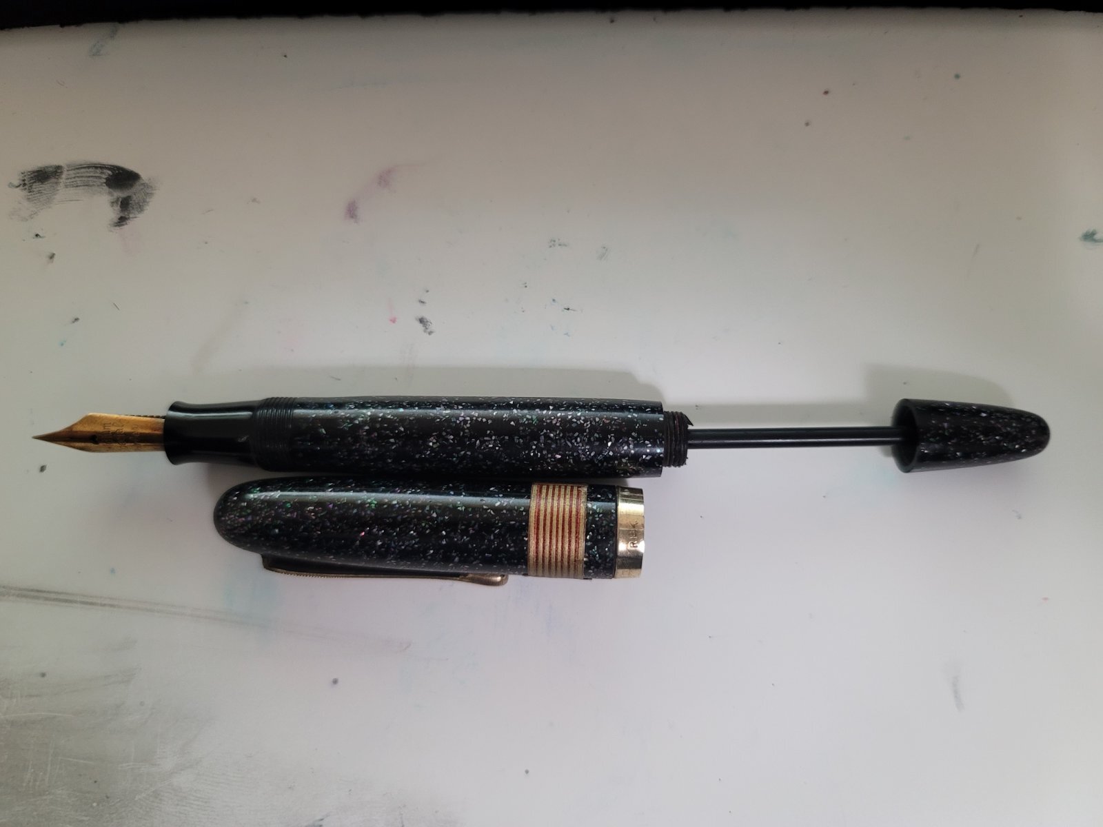
Hi everyone! I received a lot of old Japanese fountain pens that appear to be old plunger fillers, all of which appear to need new seals as they do not vacuum in any ink (the pen pictured leaked from the blind cap end when I syringed some water into the body). The blind cap unscrews, but the plunger has no resistance when pulled up and can be shifted around to various angles. I can see inside the pen with the section removed that there is a small bulb attached to the end of the rod with a small rubber washer not too far behind it. I did some looking around but had trouble finding a lot of information regarding how to fix these types of pens. Any help would be greatly appreciated! P.S. If anyone knows anything about what this pen is, I'd appreciate any help identifying it. The label reads "shiruba" or Silver

-
Here is the Pelikan M1000 Raden Sunrise LE from 2016. Difficult pen to photograph but a beauty to behold. Untitled-1-stacked-working-file-brightness-bosted by Ja Ja, on Flickr
-
Here is a focus stacked macro of the Platinum Izumo Kurikara-Ken in sumiko taka maki-e. This pen is subtly amazing. The mix of texture and contrasting finishes all in black is super cool. Best seen and felt to understand its intricacies. f2point8 stacked logo by Ja Ja, on Flickr
-
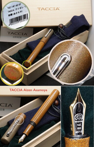
Here in full focus stacked macro glory is the limited edition Taccia Miyabi Imperial Koi. The background is, I think, byakudan-nuri whereas the fish are in rankaku with mother of pearl raden eyes. Usually, koi are not usually represented this large but Taccia made the specific choice to render them this way to good effect. Sailor nib so it writes well. focus stacked logo by Ja Ja, on Flickr focus stacked koi closeup logo by Ja Ja, on Flickr cap logo by Ja Ja, on Flickr
-
Sailor King of Pen Battle of Itsukushima LE pen and box details
jandrese posted a topic in Japan - Asia
This is the incredible Sailor King of Pen Battle of Itsukushima LE in full focus stacked macro glory. The artist is Ikki Moroiki and the total number of pens is 33. The presentation box is also incredible in black lacquer and maki-e. Details of the maki-e on the box are shown below. 8E7EBA7F-D2BE-4748-B5AF-EFB645A9EBC9 by Ja Ja, on Flickr 4FDBB95A-F8C8-4497-8026-D63CF7B90898 by Ja Ja, on Flickr 358CEAD5-FDD5-4C92-9B49-AE9CCEC83717 by Ja Ja, on Flickr -
Some Japanese pens (and a Montegrappa) with custom maki-e by Morgan Wisser
jandrese posted a topic in Japan - Asia
I shot focus stacked macros of all these pens for Dromgooles. As far as I know they are all still currently available. Good, high relief maki-e by the French craftsman, Morgan Wisser. I have several pens customized by him and have been happy with the work. Let me know what you think or if you have any questions. focus stacked yes logo by Ja Ja, on Flickr focus stacked yes logo by Ja Ja, on Flickr focus stacked yes logo by Ja Ja, on Flickr focus stacked yes logo by Ja Ja, on Flickr turtle side focus stack yes logo by Ja Ja, on Flickr shark side focus stack yes logo by Ja Ja, on Flickr -
This is the Namiki Yukari Royale Frog in full focus stacked macro glory. Namiki calls this motif Frog. There is more than one frog but more importantly the dynamism and joy of the piece jumps off the pen. Note the different colors of urushi and raden to depict the water. I'd call this pen Happy Frogs. Focus stacked curves up color shift yes logo by Ja Ja, on Flickr frogs focus stacked with logo by Ja Ja, on Flickr
-
Danitrio Mikado eyedropper pen leaked-a comparison with a Namiki Emperor
jandrese posted a topic in Japan - Asia
One of my Danitrio Mikado (eyedropper filling model) pens leaked on me at work. That is Noodler’s Navy you see on the section in the first image. I collect Danitrio and this sort of thing happens more often than I care to admit on their eyedropper filling pens. I still collect Danitrio but stopped buying eyedropper models a couple of years ago. At this point I know all the potential ways in which a Danitrio can leak. This one leaked at the junction between the section and the barrel. Naturally, with a leak like this you don’t know it’s happening until you look at your inky hand so that’s nice. There is no obvious reason for the leak, which led me to investigate further. To do so I thought a comparison to a Japanese eyedropping pen that has never leaked on me was in order. Thus, I cleaned out the Namiki Emperor I had with me at work and set about comparing the two pens. What have I learned? 1) That even compared to a Namiki Emperor the Danitrio Mikado is a big pen and looks great. Feels good to hold and to write with and that stub nib is extra nice. Seems to be on par with the Namiki on looks and feel but… 2) The section engineering and machining execution is different between the two pens. The concept is the same—eyedropper with shutoff valve—but the Namiki has some advantages. a. The Namiki threads are finer pitched and better machined inside the barrel and on the section. This can be felt when screwing in the section; there is a smoother feel and less play. b. The threaded portion of the section has a bigger diameter on the Namiki. The overall diameter is 10% greater and but the ratio between the diameter of the grip portion and the threading is also 10% greater on the Namiki. c. The o-ring on the Namiki is more precisely seated, that is, it has no room to move about. d. Both o-rings fit into a slot in the barrel that is flat and smooth before the threads start up. The slot on the Namiki is not as deep. I have a gang of Danitrio pens that fill by eyedropper. One or two have never leaked on me at the section. This pen used to be one of them. The problem is at the level of the o-ring. There is too much potential for the o-ring to move about, get twisted, or otherwise compressed in an uneven fashion. It only takes an infinitesimal gap for ink to leak. Water always finds the path of least resistance. A little side pressure from your grip and the heat from your hand is all it takes to set the leak in action. Part of loving Danitrio seems to be leak mitigation. Changing o-rings has helped in the past on other pens but o-rings that fit are not easy to come by. Danitrio themselves does not seem to have consistently sized, readily available replacement o-rings. That bit about consistently sized o-rings may make more sense knowing that there is more variability between Danitrio pens of the same model than Namiki pens of the same model. I reckon Namiki buys only one size of o-ring that always fits like it is supposed to. I admit that it all is a bit frustrating, but I press on. IMG_8517 by Ja Ja, on Flickr IMG_8529 by Ja Ja, on Flickr IMG_8535 by Ja Ja, on Flickr IMG_8539 by Ja Ja, on Flickr IMG_8541 by Ja Ja, on Flickr IMG_8543 by Ja Ja, on Flickr -
This is my Danitrio Hyotan Special edition Maki-e F-49 Blue Dragon LE. There are only 30 of these pens produced by the artist Yuji. This dragon does, however, appear on another pen, a Mikado model with more involved maki-e that retailed for far more than this pen. Untitled-1 yes logo by Ja Ja, on Flickr closeup yes logo by Ja Ja, on Flickr
-
Danitrio Maki-e Ancient Dragon with Flowers by Kogaku on Hyotan
jandrese posted a topic in Japan - Asia
I've had this pen for awhile. Since it's attractive I thought I'd capture a good picture of it. Danitrio really does tamenuri well and the curvy shape of this pen lets the light play off of the tamenuri. working image full yes logo by Ja Ja, on Flickr -
Here are two limited edition Taccia pens from the Hyakko-Hisho lineup. The Hyakko-Hisho is a compendium of craft techniques from the Edo period including lacquer styles. Taccia has been pulling from that for the past two or three years. Pictured first is the Hakumei or twilight from last year, which is primarily green. Second, is this year's Hakumei or starlight/star shine, which is primarily blue. Both make nice use of blended urushi colors and raden. I thought they made a nice pair. Untitled-1 with logo by Ja Ja, on Flickr Untitled-1 yes logo by Ja Ja, on Flickr together with logo by Ja Ja, on Flickr caps together with logo by Ja Ja, on Flickr tails together with logo by Ja Ja, on Flickr
-
I photographed these Sailor King of Pen pens for Dromgooles. Very interesting and unique urushi technique that I did not appreciate until I was able to study them. I especially like the color range in the green version. together yes logo by Ja Ja, on Flickr texture zoom crop yes logo by Ja Ja, on Flickr
-
Shooting the Sailor Bespoke KOP Chinkin Owl for Dromgoole’s inspired me to pull out my Namiki Emperor Chinkin Dragon and run it through the focus stacked macro ringer. I’d say it availed itself. F8B88398-F81A-4B6A-A5F5-C981F315526F by Ja Ja, on Flickr EE178EB1-23E4-4056-B7BB-80B3EDD2E062 by Ja Ja, on Flickr
-
The Taccia Hyakko-Hisho II collection Sango. The Hyakko-Hisho is a collection of 100 urushi styles, a type of reference work that artists have drawn on since the Edo period. Sango means coral and this pen in kawari-nuri captures the essence of coral. A unique addition to the collection. Fitted with a Sailor Zoom nib. AC7FC6BB-687B-4FAA-A81B-A3EAC71B0CB4 by Ja Ja, on Flickr 233884EA-F18B-4476-B23D-236FA60821C8 by Ja Ja, on Flickr
-
Wise old Sailor Bespoke KOP Chikin Owl--incredible pen and more incredible box
jandrese posted a topic in Japan - Asia
I shot this for Dromgooles. Gorgeous chinkin work on the pen but the box is superlative. Expensive but worth every penny. uncapped pen at rest yes logo by Ja Ja, on Flickr Owl pen closeup yes logo by Ja Ja, on Flickr Full capped yes logo 1st choice by Ja Ja, on Flickr box owl yes logo by Ja Ja, on Flickr box yes logo by Ja Ja, on Flickr -
This is the new LE from Sailor, the Bespoke Maki-e King of of Pen Shika to Gekkou or Deer in Moonlight. The artwork is amazing and emotive. Feast your eyes on this focus stacked macro capture of a wonder. Untitled-1 watermarked by Ja Ja, on Flickr
-
Here I present my newest pen, the Platinum Izumo Galaxy in full macro glory. The surface is smooth with dense raden. The raden particles are not of a uniform size and are densely packed with uniform distribution. While not the most challenging maki-e ever this pen was made by a skilled artist. _SON4648 by Ja Ja, on Flickr _SON4649 by Ja Ja, on Flickr _SON4650 by Ja Ja, on Flickr
-
Dantrio Hakkaku with dragon Maki-e and a 18k #6 size stub nib full macro glory
jandrese posted a topic in Japan - Asia
Here I present the Dantrio Hakkaku with dragon Maki-e and a 18k #6 size stub nib. I don't know anything about this pen other than I bought it in 2017. I've never seen the design on another Danitrio pen. Danitrio does not offer any story or explanation of the artwork. I posted about this pen in the fountain pen review pages back in 2017 but since then I've gained the ability to take good photos so I'm sharing again. Let me know what you think. I could be tricking myself but the tamenuri seems to be changing in a most enjoyable way. The artwork on this pen is rather nice and involved and also makes good use of the space on the pen. _SON4588 by Ja Ja, on Flickr _SON4593 by Ja Ja, on Flickr _SON4597 by Ja Ja, on Flickr _SON4598 by Ja Ja, on Flickr _SON4599 by Ja Ja, on Flickr -
Namiki Limited Edition 2021 Coral Emperor in full macro glory
jandrese posted a topic in Japan - Asia
This is the Namiki Limited Edition 2021 Coral Emperor in full macro glory. Drink it in. This pen is above and beyond in every way possible. _SON4578 by Ja Ja, on Flickr _SON4577 by Ja Ja, on Flickr _SON4580 by Ja Ja, on Flickr _SON4582 by Ja Ja, on Flickr _SON4584 by Ja Ja, on Flickr _SON4583 by Ja Ja, on Flickr _SON4585 by Ja Ja, on Flickr _SON4586 by Ja Ja, on Flickr -
Namiki Limited Edition 2021 Coral Emperor first look and writing sample
jandrese posted a topic in Japan - Asia
Here is the mighty No. 50 size Namiki Emperor in the 2021 Limited Edition Coral maki-e. Words cannot express the amazingly superlative incredibleness of this pen. I have some pretty awesome macros I can share in a followup post if anybody is interested. IMG_8256 by Ja Ja, on Flickr -

News from Chinese lacquer workshop to pen lovers all over the world
Zhizhai_Lacquer posted a topic in China, Korea and Others (Far East, Asia)
Hello, We are writing to inform you of the service of our Chinese lacquer workshop. Our workshop named "Zhizhai". Our lacquer workshop in Guangdong that introduces traditional Chinese lacquer techniques. At the end of this year, we plan to have a fun project for fountain pen lovers. We are professional lacquer ware craftsmen. Our main works are lacquer ware and furniture, interiors of hotels and luxury cars. From time to time, at the request of a friend, I apply natural lacquer to their private fountain pen. We don't know how to use this site at all. Should I write in this comment section if I have an event for this fountain pen lover? If you know how to effectively inform us of an event, please let us know. We started Instagram with the help of Japanese friends because of internet regulations in China. Because Chinese lacquer techniques are little known in the world. In the future, we will post many rare Chinese traditional patterns on Instagram. And although they are mainly samples of authentic lacquer ware, we can express the pattern with a fountain pen. This is our Instagram account. @zhizhai_lacquer This is our website. We have prepared a basic knowledge page for real lacquer. Chinese lacquer culture uses so many colors, all of which are real lacquer. https://www.zhizhai.shop/ We look forward to your support and advice. Thank you very much for your interest in lacquer culture. Zhizhai Xiao Guan
-
I have been thinking about acquiring a Nakaya in the Araishu (orangish) urushi lacquer for some time. Nibs dot com finally had one in stock when my resistance was low. I ordered it with a BB nib ground to crisp cursive italic. The color is a brownish-orange, which I like a lot more than I would a brighter orange. The aesthetics exceed my expectations. Here are some photos of the new pen, including side-by-side comparisons of the araishu, unpolished shu and shu urushi finishes. Orange you glad I shared this? Happy writing! David
-
Wanted to present my current stable of Stylo Art pens. 1. Akebono/bokashi chinkin butterflies 2. Dragon maki-e 3. Pine tree and cranes maki-e The pen bodies are exclusive to Stylo Art and are large pens being slightly bigger than a Namiki Yukari but are lightweight. I believe the base material is plastic. The akebono chinkin pen has an amazing Pilot #15 nib custom ground by Yukio Nagahara to what is called an N-point. It writes a super smooth and juicy fat line at about 45 degree that gets more narrow as the pen angle is steepened. It's kinda a cross between a Sailor Zoom and Naginata grind sort of, it's doing it's own thing really. The other two pens have stock (?) Pilot stub nibs, which be warned, are really more like cursive italics. Wonderful nibs but a little more demanding than a Western stub. All come with Paulowina wood boxes, pen sleeves, and CON-70 converters. Most excellent pens and more than fairly priced. Highly recommended. capped rotated_SON3728 by Ja Ja, on Flickr capped fan_SON3729 by Ja Ja, on Flickr uncapped_SON3731 by Ja Ja, on Flickr writing sampe by Ja Ja, on Flickr
desaturated.thumb.gif.5cb70ef1e977aa313d11eea3616aba7d.gif)


.PNG.937df358d340f31947777ac03068f116.PNG)
.jpg.830d3441941b7a2f1ee111f746b2ac14.jpg)
.jpg.73c2f366e4b1f34b79a391b8482cf0ae.jpg)
.jpg.0f1838836742d86faa1d93bd7f4cfb17.jpg)
.jpg.313aef7b2f476ca0b6bb075e68ba073e.jpg)
.jpg.ab5032637ea72107f1a9b981e4b9f4ee.jpg)
.jpg.76e4b0765b7fe12506ac457c3610fcf9.jpg)
.jpg.9c16d59f5ae8eea2afea317308e312ca.jpg)
.jpg.4e3a30765df0f21c190dde98b3940f04.jpg)


