Search the Community
Showing results for tags 'teal'.
-
I've just photographed a bunch of Col-O-Ring cards with darker blue-green inks, while comparing them to a custom-mixed ink discussed in Inky Recipes: https://www.fountainpennetwork.com/forum/topic/334121-masques-mix-black-swan-in-icelandic/ I thought I'd share the photographs here, in case they will be helpful for anyone. Since display calibration and general accuracy of representation varies, the main value of these is comparative between the shades. Though I did try to make the colors appear as I see them in person (at least on my devices). I think Fire& Ice should be slightly more saturated and a tad more green. Turquoise and Eau de Nil should be a bit less saturated, more matte. Diamine Asa Blue is a slightly turquoise medium blue. Birmingham Pen Co. Fountain Turquoise is a pale greenish turquoise. Lamy Petrol is similar to Noodler's Aircorp Blue Black in regular writing: both are quite green blue-blacks. ACBB has no sheen, Petrol has unique rose gold sheen. Sailor's Yama Dori was a disappointment to me: it's a dark teal-black that's got a kind of matte washed out appearance. Granted it does sheen easily, but I just didn't care for the lackluster base color. Robert Oster Fire & Ice: ranges from dark blue-teal to very vivid glowing turquoise, depending on the pen used (dry or wet). Sheen is pretty minimal unless you let the ink concentrate sitting in a pen for a few days. Diamine Eau de Nil: nice muted blue-teal, darker, not too vivid Robert Oster Tranquility: this is a green-teal Robert Oster Aqua: more green than Fire & Ice J. Herbin Emerald of Chivor: similar to Aqua in base color. Sheen and shimmer can be hit or miss, depending on paper and concentration Organics Studio Walden Pond "Blue" : definitely a misnomer, there is almost nothing blue about it. It's strongly green, though on the bluer green side. Sheens a vivid metallic magenta so easily, it can take over the whole writing. If you use a dip pen with it and low absorbent paper like Clairefontaine or greeting cards, the metallic sheen completely covers up the green-black, and the letters look like you wrote them with a metallic magenta ink.
-
J. Herbin - Vert de Gris La Société Herbin, Maître Cirier à Paris, was established in 1670. This makes J. Herbin probably the oldest name among European ink makers. Today, Herbin produces a range of beautiful fountain pen and calligraphy inks, writing instruments, gift sets and accessories. Herbin inks are made in France, and the finishing touches on the bottles are still done by hand in Paris. In 2018, J. Herbin introduced some new inks in their “La Perle des Encres” series. The one that caught my eye - thanks to visvamitra's review in this forum - is Vert de Gris. This ink looks to be right up my alley - a nice dark grey-leaning teal. This was later confirmed by one of Tas's famous ink ramblings. Vert de Gris is an ink that definitely deserves a place in my collection, so I went ahead and ordered a bottle. Upon arrival, I immediately started experimenting with the ink, and it really lived up to my high expectations. Vert de Gris has a gorgeous colour, definitely a dark teal, but with heavy grey undertones. This is an ink that's brewed for me! The ink looks beautiful on all types of paper, and is well saturated. As such it works great in the finer nibs I typically use. And it gets only better... even with fine nibs, there's tons of elegant shading present. You just have to love this ink! It went straight to my top three for 2018, just behind MB Swan Illusion Plume. The ink has quite satisfactory lubrication, even in drier pens like my Lamy Safari. With my wetter Pelikan pens the ink is heavily saturated, and writes like a dream. My only problem here is that I need to adapt my handwriting, and write a bit larger than the tiny scribbles I'm used to. Vert de Gris also has a wonderfully dynamic colour span. To illustrate this, I did a swab on Tomoe River paper where I really saturated portions of the paper with ink. This beautifully illustrates the ink's broad colour range. This J. Herbin ink moves effortlessly from a very light teal-grey to a very dark, almost black teal. On the smudge test - rubbing text with a moist Q-tip cotton swab - the ink behaved perfectly, with only minimal smearing. Water resistance is amazing - the ink effortlessly survived even longer exposures to water. Really well executed! This is also apparent from the lower part of the chromatography, which shows that the grey components of the ink remain on the paper. If you need a water-resistant ink, Vert de Gris certainly fits the bill. This is an ink that will be at home in the workplace. Vert de Gris is also a fast-drying ink - with typical drying times in the 5-10 second range with my Lamy Safari (M-nib). I was surprised at this, because it totally feels like a really wet ink. As such, this ink is also suitable for lefties. I've tested the ink on a wide variety of paper - from crappy Moleskine to high-end Tomoe River. On each scrap of paper I show you:An ink swab, made with a cotton Q-tip1-2-3 pass swab, to show increasing saturationAn ink scribble made with a Lamy Safari M-nib fountain penThe name of the paper used, written with a Lamy Safari B-nibA small text sample, written with an M-nibDrying times of the ink on the paper (with the M-nib)Vert de Gris looks really nice on both white and more yellow papers. On low-quality paper it exhibits a small amount of feathering, but all-in-all not too bad. With Moleskine paper, there is significant show-through and bleed-through - not unexpected for this fountain-pen unfriendly paper. Writing with different nib sizesThe picture below shows the effect of nib size on your writing. All samples were written with a Lamy Safari, which is typically a dry pen. I also added a visiting pen - my very wet Pelikan M101N Lizard with an M-nib that writes like a broad. Here the ink leaves a very saturated line (and I really need to write a few font-sizes bigger with this pen ;-) Related inksWith this review, I have changed my format for presenting related inks. My earlier presentations of related inks lacked enough information to be really useful. I therefore changed to a nine-grid format, with the currently reviewed ink at the center. The new format shows the name of related inks, a saturation sample, a 1-2-3 swab and a water resistance test - all in a very compact format. I hope that you'll find this way of presenting related inks more useful. It's a bit more work, but in my opinion worth the effort for the extra information you gain. Inkxperiment - Walk in the WoodsAs a personal challenge, I try to create interesting drawings using only the ink I'm reviewing. I find this to be a fun extension of the hobby, and these single-ink drawings often present a real challenge. It also gives you an idea of what the ink is capable of in a more artistic setting. For this drawing I used 300 gsm rough watercolour paper. For some reason, grey-leaning inks inspire me to draw winter landscapes, so that's what you get here. I started off with heavily water-diluted ink for the lighter tones, gradually adding more ink for the darker parts. For the horizon line, the main tree and the walking couple, I used pure Vert de Gris, heavily saturating these subjects. The end result gives you a good idea of the colour span that Vert de Gris is capable of. ConclusionJ. Herbin Vert de Gris is a wonderful ink, that pleasantly surprised me on all fronts: georgeous colour, beautiful shading, good saturation - and all this even in finer nibs. Even better, the ink is relatively fast-drying and shows great water resistance. Combine all this, and you've got a winner. This ink went straight to my top three for 2018 ! I heartily recommend it. Technical test results on Rhodia N° 16 notepad paper, written with Lamy Safari, M-nib Backside of writing samples on different paper types
- 21 replies
-
- j.herbin
- vert de gris
-
(and 2 more)
Tagged with:
-
L'Artisan Pastellier Callifolio - Ohlanga L'Artisan Pastellier is a small company in southern France that specialises in natural pigments, and offers customers authentic and reliable products in beautiful colours based on mineral or vegetable pigments. In a collaboration with Loic Rainouard from Styloplume.net, the chemist Didier Boinnard from L'Artisan Pastellier created the line of Callifolio fountain pen inks. These pastel-coloured inks are traditionally crafted, and can be freely mixed and matched. Overall these inks are only moderately saturated, and have low water-resistance. The inks were specifically designed to work well with all types of paper, and all types of fountain pens. Being pastel-tinted, these inks have a watercolour-like appearance, and are not only fine inks for journaling, but are also really excellent inks for doodling & drawing. I only recently discovered them, and they are already the inks I gravitate towards for personal journaling. In this review I take a closer look at Ohlanga, one of the many blue inks of the series. The Callifolio blues are typically named after bodies of water - this one takes its name from the Ohlanga river in South-Africa. This Callifolio ink is a nice teal - representing the blue-green water of its river namesake. In my opinion, teals are difficult to get right. Ohlanga has an interesting colour, but is not really special. I personally prefer the more green-heavy Pelikan Edelstein Aquamarine or the more blue-heavy iroshizuku ku-jaku (see the comparison chart later in this review). Ohlange looks good, but is not an ink that captured my attention. Technically, the ink feels well lubricated even in my rather dry Lamy Safari test pens. That's a welcome change from other Callifolio inks that often feel a bit dry on the nib, and work best with wetter pens. Ohlanga shows subtle shading with only minimal contrast between the light and darker parts. This shading is even visible with finer nibs, but more pronounced in broad or italic nibs. It certainly enhances the character of your writing. To show you the impact of saturation on the ink's look & feel on paper, I made some scribbles where I fully saturated portions of the paper with ink. This gives you a good idea of what the ink is capable of in terms of colour range. Ohlanga shows a broad dynamic range, ranging from a wispy light teal to a very dark and saturated colour. On the smudge test - rubbing text with a moist Q-tip cotton swab - Ohlanga showed a lot of smearing, but without impacting readability of the text which remains crisp and clear. Water resistance is remarkably good for a Callifolio ink. After a 15 minute soak in still water, the text remains perfectly readable. And even with running tap water, a purple-blue outline of your writing remains that is still readable. I wouldn't go so far as to say that Ohlanga is a water resistant ink, but your writing will be recoverable if you spill some fluids on it. I've tested the ink on a wide variety of paper - from crappy Moleskine to high-end Tomoe River. For the Callifolio reviews, I'm using small strips to show you the ink's appearance and behaviour on different paper types. On every band of paper I show you:An ink swab, made with a cotton Q-tip1-2-3 pass swab, to show increasing saturationAn ink scribble made with an M-nib fountain penThe name of the paper used, written with a B-nibA small text sample, written with an M-nibDrying times of the ink on the paper (with the M-nib)Ohlanga behaved perfectly on all the paper types, with no apparent feathering even on the lower quality papers in my test set. Only with the infamous Moleskine paper, a tiny bit of feathering is present. Drying times are mostly around the 5 to 10 second mark, making it a fast drying ink. Not really suited for lefties though, because it lays down a rather wet line, albeit one that dries super fast. The ink looks at its best on pure white paper. In my opinion, teal inks don't work well with more creamy / yellow paper - if you like your paper that way, Ohlanga might not be a good choice. At the end of this review, I also show the back-side of the different paper types, in the same order. With the low-end Moleskine there is some show-through and bleed-through. With the other papers, Ohlanga's behaviour is impeccable. The ink copes really well with a wide variety of paper types. Writing with different nib sizesThe picture below shows the effect of nib sizes on the writing. All samples were written with a Lamy Safari, which is typically a dry pen. I also added a visiting pen - a Kaweco Steel Sport with BB-nib. This pen shows a much more saturated line, with more pronounced shading. Related inksI have recently changed my format for presenting related inks to a nine-grid format, with the currently reviewed ink at the center. The new format shows the name of related inks, a saturation sample, a 1-2-3 swab and a water resistance test - all in a very compact format. I hope that you'll find this way of presenting related inks more useful. It's a bit more work, but in my opinion worth the effort for the extra information you gain. Inkxperiment - urban industryAs a personal experiment, I try to produce interesting drawings using only the ink I'm reviewing. I find this to be a fun extension of the hobby, and think of these single-ink drawings as a nice challenge to stretch my drawing skills. For this sketch I chose 300 gsm rough watercolour paper. For the lighter parts of the drawing I used water-diluted Ohlanga. The heavy industrial buildings were drawn in with a cotton Q-tip using pure ink. For the gritty industry dirt, I used a rough dishwashing sponge to apply the ink. The brick details were penciled in with my Lamy Safari test pen with M-nib. Overall I'm satisfied with the result, which gives you a good idea of the colour span that Ohlanga is capable of in a more artistic setting. ConclusionOhlange from L'Artisan Pastellier is a rather standard green-blue ink, that looks at its best on pure white paper. Technically, this is a good ink: it writes well on all paper types (even those of lower quality), dries fast and is quite water resistant. But overall, the ink failed to convince me. Teals are difficult to get right, and this one didn't totally nail it. Not a bad ink, but in my opinion definitely not an ink that is at the top of its class. Technical test results on Rhodia N° 16 notepad paper, written with Lamy Safari, M-nib Backside of writing samples on different paper types
- 6 replies
-
- lartisan pastellier
- ohlange
-
(and 2 more)
Tagged with:
-
L'Artisan Pastellier Callifolio - Equinoxe(6) L'Artisan Pastellier is a small company in southern France that specialises in natural pigments, and offers customers authentic and reliable products in beautiful colours based on mineral or vegetable pigments. In a collaboration with Loic Rainouard from Styloplume.net, the chemist Didier Boinnard from L'Artisan Pastellier created the line of Callifolio fountain pen inks. These pastel-coloured inks are traditionally crafted, and can be freely mixed and matched. Overall these inks are only moderately saturated, and have low water-resistance. The inks were specifically designed to work well with all types of paper, and all types of fountain pens. Being pastel-tinted, these inks have a watercolour-like appearance, and are not only fine inks for journaling, but are also really excellent inks for doodling & drawing. I only recently discovered them, and they are already the inks I gravitate towards for personal journaling. In this review I focus on Equinoxe(6), one of the many blue inks in the Callifolio line. Equinoxe(6) is best described as a dark teal, heavy in the dark blue component. It's a well-saturated blue ink, with lots of character and with quite a broad colour range. This ink is equally suitable for both writing and drawing. I quite enjoyed drafting the review for this ink. For a Callifolio ink, Equinoxe(6) is surprisingly well saturated, and lays down quite a wet line. As such, the ink provides excellent contrast with the paper - even with an EF nib, your writing stands out on the page. Because of the initial wetness, you have to be careful not to smudge your writing - this definitely is not an ink for lefties. The ink looks good on both white and more yellowish paper. Shading is present in all nib sizes, even the finer ones. It is really pronounced when using broader nibs - I would have preferred a bit more subdued shading, but as always such preferences are highly personal. To show you the impact of saturation on the ink's look & feel on paper, I made some scribbles where I fully saturated portions of the paper with ink. This gives you a good idea of what the ink is capable of in terms of colour range. Equinoxe(6) is capable of a broad range of teal shades - you might also notice a reddish sheen in places of high saturation. On the smudge test – rubbing text with a moist Q-tip cotton swab – Equinoxe(6) shows its greatest weakness. This ink smudges easily and in a very noticeable way. As such you need to take extra care while writing. Water resistance is generally low. A prolonged soak in water completely obliterates your writing, leaving only some undecipherable traces. With running tap water, the result is better: most of the colour drains away with the water, but a faint blue-grey residue remains that can be deciphered with some patience. Overall, not a good ink if water proofness is high on your list. I've tested the ink on a wide variety of paper - from crappy Moleskine to high-end Tomoe River. For the Callifolio reviews, I'm using a format that shows you the ink's appearance and behaviour on the different paper types. On every small band of paper I show you:An ink swab, made with a cotton Q-tip1-2-3 pass swab, to show increasing saturationAn ink scribble made with an M-nib Safari fountain penThe name of the paper used, written with a B-nibA small text sample, written with the M-nibDrying times of the ink on the paper (with the M-nib)Equinoxe(6) behaved perfectly on all paper types, with no apparent feathering even on the lower quality papers in my test set. Drying times are quite reasonable in the 10-15 second range, even lower on some of the more absorbent papers. The ink looks fabulous no matter what type of paper you are using - this really is an ink that is at home with all combinations of pen and paper. Impressive! I also show the back-side of the different paper types, in the same order. The ink behaved very good with almost all paper types. Only with the Moleskine and Graf von Faber-Castell paper there is noticeable bleed-through, which means you cannot use the backside of the paper. All in all a really well-behaving ink. Inkxperiment – mathematical universeI've recently started to experiment with ink drawings, keeping things simple and more-or-less abstract. I find it to be a fun extension of the hobby, and have found single-ink drawings a nice challenge. It also gives you an idea of what the ink is capable of in a more artistic setting. This drawing was done on OCM cotton paper. For the background I rolled up a kitchen-roll sheet, dipped it in ink, and used this as a stamp. The abstract spiky figure was drawn in with a B-nib fountain pen. I added the shading and mathematical symbols with a Q-tip dipped in Equinoxe(6). The end result gives you a good idea of the colour span that Equinoxe(6) is capable of. ConclusionCallifolio Equionoxe(6) from L'Artisan Pastellier is a lovely dark teal, that is equally at home with both writing and drawing. The ink has excellent contrast with the paper, and works well with all nib sizes and paper types. Just be aware that this ink smudges easily, so take extra care while writing or drawing. Personally, I really enjoyed this Callifolio ink, and I especially appreciate the consistent look it presents irrespective of nib and paper. Technical test results on Rhodia N° 16 notepad paper, written with Lamy Safari, M-nib Back-side of writing samples on different paper types
- 33 replies
-
- callifolio
- lartisan pastellier
-
(and 3 more)
Tagged with:
-
- 4 replies
-
- birmingham
- ink
- (and 8 more)
-
Robert Oster Signature - Blue Denim Robert Oster is an Australian ink maker that is well-known for its unique range of colours. On his website, he describes our shared love quite eloquently: “Robert Oster Signature originates from one of the most famous wine producing regions of the world, the Coonawarra district of South Australia, an idyllic setting with great influence on the senses. There is my inspiration. It’s a joy to share it with you.” Well, we are certainly fortunate to have inspiring ink makers like Robert Oster to satiate our thirst for glorious inks. In this review, the stage is taken by Blue Denim. Catherine from Sakura provided me with a sample of this ink to play around with – much appreciated! This particular Robert Oster creation is a nice teal ink that is a very close relative of both Pelikan Edelstein Aquamarine and iroshizuku ku-jaku. It’s a teal colour that leans towards the blue side of the spectrum, which I really appreciate. The ink contrasts nicely with the paper, and works well with all nib sizes. I found this ink to flow well with superb lubrication – a real pleasure to write with. The ink also offers lots of shading, even in finer nibs. To show you the impact of saturation on the ink’s look & feel on paper, I made some scribbles where I really saturated portions of the paper with ink. This gives you a good idea of what the ink is capable of in terms of colour range. What really wows here is the beautiful reddish sheen that the ink exhibits – quite nice! If you use broad & wet nibs, you’re in for a treat. Like most Robert Oster inks, Blue Denim has no water resistance. Short exposures to water completely obliterate the text. All that remains are some unreadable smudges. This is evident from the chromatography – the ink detaches easily from the paper, as can be seen in the bottom part of the chroma. The ink also smudges easily, with bluish smudges on the page. The text itself remains very readable though. I’ve tested the ink on a wide variety of paper – from crappy Moleskine to high-end Tomoe River. On every small band of paper I show you:An ink swab, made with a cotton Q-tip1-2-3 pass swab, to show increasing saturationAn ink scribble made with an M-nib fountain penThe name of the paper used, written with a B-nibA small text sample, written with an M-nibDrying times of the ink on the paper (with the M-nib)Blue Denim behaved perfectly on all paper types, with just a tiny bit of feathering on the Moleskine paper. The ink is equally at home on both white and more yellowish paper. While writing, the ink lays down a rather wet line, but still dries quickly within the 5 to 10 second range. The initial wetness means that you have to look out for smudging while writing – as such it’s not an ideal ink for lefties. I also show the back-side of the different paper types at the end of the review. No troubles there, except with the Moleskine paper, which shows a bit of bleed-through. All in all, a well-behaving ink. ConclusionRobert Oster Blue Denim is a beautiful teal ink, that is at home on all types of paper. The ink looks good in all nib sizes, and offers a very smooth writing experience. Unfortunately, the ink has zero water resistance – the briefest touch of water completely obliterates your writing. If you already own other teals like Aquamarine or ku-jaku, you might pass on this one. There is however that alluring reddish sheen, that might make it worth your while to get a bottle… Technical test results on Rhodia N° 16 notepad paper, written with Lamy Safari, M-nib Back-side of writing samples on different paper types
- 9 replies
-
- robert oster
- signature
-
(and 2 more)
Tagged with:
-
In December 2014, the Fountain Pen Network contributor "Masque" offered a recipe for a highly shading teal ink that he named "Black Swan in Icelandic Minty Bathwater." The mix is composed of three Noodler's Inks: Navajo Turquoise, Massachusetts 54th, and Old Manhattan Blackest Black (an exclusive to Fountain Pen Hospital). I enjoy Nathan Tardif's Black Swan inks, both the Australian Roses and English Roses versions, which embed a mysterious black shadow in a subtle, lovely color, as well as another mix by the FPN contributor "crunchmaster," called "Black Swan in North African Violets." It's entertaining and unexpectedly educational to watch Tardif incorporate economic and historical concepts within ink, of all things -- in this case, how economies and organizations should consider the dramatic and always unexpected impact of "unknown unknowns," described in Nassim Taleb's book, The Black Swan. Realizing recently that I owned each of these three inks, I mixed Masque's recipe. His proportions -- 15 parts Navajo Turquoise, 3 parts Massachusetts 54th and 1 part Old Manhattan Blackest Black -- produce a gorgeous, reliable, highly shading teal ink. A comparison with other inks reveals similarity with Sailor Jentle Yama Dori, though without the sheening properties. Other FPN ink mix developers in the "Icelandic Mint" thread attempted blends with other versions of black, with varying degrees of success. Masque's recipe is highly successful, as is another by the FPN contributor "Intellidepth," composed of 2.5mL Noodler's Navajo Turquoise, 2 drops Noodler's Yellow, and 2 drops Noodler's Black (bulletproof). With black swan versions of red, violet, and teal, likely next candidates include blue and brown. Black Swan in Chocolate Pansies? Black Swan in Blue Sage?
-
Noodler’S Prime Of The Commons And Air-Corp Blue-Black Comparison
truthpil posted a topic in Ink Comparisons
This was something I worked on a few months ago when trying to decide which blue-black ink to convince my wife to let me get myself for Christmas. I’ll let the images speak for themselves, but there are definite advantages to both inks. In the end, I got a bottle of Air-Corp and put Prime of the Commons at the top of my wishlist for the next time someone asks me what I want for a present. I prefer the color of ACBB, but also the absolute waterproofness of PotC. The main reason PotC came out second was its tendency to feather on most paper. Another major factor is that PotC costs about double the price of ACBB once shipping from the UK is taken into consideration. Third, my wife’s adverse reaction to the color (“It’s just blue”) also helped move PotC to the backseat. I spent a lot of time comparing these inks and didn’t put all my thoughts or photos in this post, so if there’s anything you want to know about them that I haven’t included please don’t hesitate to ask in the comments. J Pen Used: Pilot Plumix <--This is a dry writer, so both inks turned out lighter and with more shading than they would have in wetter pens. For all images, Prime of the Commons is on the left and Air-Corp Blue-Black is on the right. Cheap Legal Pad Rhodia 80gsm (Due to PotC’s tendency to feather and be hard to clean, I tried a 20% dilution [4 parts ink : 1 part water] and included it under the undiluted example.) Writing Sample (Legal Pad) Color Comparison (Rhodia) (From the top: lines 1, 3, 5 = PotC; lines 2, 4 = ACBB) Water Resistance 1. Drip test 5 minutes after writing 2. Soak test 30 minutes after writing 3. Soak test 24 hours after writing Of course a few weeks after doing all this I discovered Pelikan 4001 Blue-Black and was surprised to find myself preferring the traditional color over the funky tealish inks I had been so into previously. Pelikan BB has since duly fulfilled my quest for a perfect Blue-Black. Go figure.- 10 replies
-
- noodlers
- blue-black
-
(and 8 more)
Tagged with:
-
Again, an inky sample sent by an inky friend. Perhaps you've heard of the new ink maker from Down Under, Robert Oster. His inky wave crashing upon our shores has sent some inky tremors throughout the land. Vanness, Anderson Pens, and Goulet Pens all carry his inks now. He has a broad line of inks. They've received good responses for the most part. And some of them are just knock out winners. Robert Oster Marine is one of those. This ink is very "Sailor-like" in being very wet, richly saturated with dye, very smooth. I normally don't go for colors in this teal-like range, this color could be an exception. The handling is very good, flow and lubrication great. Fairly fast drying as well. I've only tried a few of these inks so I can't say whether this is representative of them all, but if it is, I hope Mr. Oster has a long life, because I know he'll be successful with these inks. As always, a sample may be the way to go if you want to check out an ink before you plunk down your money 💰 for a bottle. Not water-resistant at all. Dye goes everywhere making a big mess.
- 9 replies
-
- robert oster
- marine
-
(and 2 more)
Tagged with:
-
As per the request of Sailor Kenshin, a review of Noodler's Squeteague - on Rhodia dotPad N°16 paper - with a TWSBI Diamond 580, medium nib - from a 2 ml sample Moderate shading: Noodler's Black < Noodler's 54th Massachusetts < Noodler's Squeteague < Noodler's Navajo Turquoise front: http://farm8.staticflickr.com/7311/8975678076_e79efb00dc_o.jpg Noodler's Squeteague by jakoblwells, on Flickr back: http://farm6.staticflickr.com/5326/8975704972_9a0d4c4e11_c.jpg Noodler's Squeteague [back] by jakoblwells, on Flickr rough draft, front: http://farm4.staticflickr.com/3705/8977234977_1fc5cb4758_o.jpg Noodler's Squeteague, rough draft by jakoblwells, on Flickr rough draft, back: http://farm3.staticflickr.com/2854/8978428820_07de65b6fe_o.jpg Noodler's Squeteague, rough draft [back] by jakoblwells, on Flickr
-
INK REVIEWED: Franklin-Christoph Midnight Emerald PAPER: Tomoe River, cream color, journal Staples brand copy paper PEN #1: Franklin-Christoph Panther 40 with Masuyama medium stub nib PEN #2: Delta Horsepower with 1.1 Fusion Nib WRITING SAMPLE: See Attached Images: Attached Image 1: Sample on Tomoe River cream paper with F-C Panther 40 and Delta Horsepower pens Attached Image 2: Sample on Staples brand copy paper with Delta Horsepower pen CHARACTERISTICS: Flow: 4/5 excellent flow in each of the pens I have used it in. Lubrication: 4/5 Shading: 3.5/5 - nice shading in wet nibs and stub nibs Spread: 4/5 minimal spread even on copy paper Feathering: 4/5 minimal feathering even on copy paper Saturation: 4.5/5 - well saturated Showthrough: 4/5 minimal showthrough even on copy paper Bleedthrough: 4.5/5 minimal bleedthrough only on very inexpensive paper Smear: 4/5 no smearing after ink if fully dry Dry Time: Dries in moderate amount of time (10 seconds with medium nib) Waterfast: Very soluble with little ink remaining after water exposure Lightfast: Not tested Comparison with other inks: Similar to Waterman Mysterious Blue, Pilot Iroshizuku Ku-Jaku, and darker than DeAtramentis Mint Turquoise. OTHER OBSERVATIONS: I was pleasantly surprised when my bottle of Midnight Emerald arrived and I inked up F-C Panther with it. This is a nicely wet ink with great flow and lubrication. My pen glides across each type of paper I have written on with little to no feathering, bleeding or showthrough. The ink has a wonderfully professional demeanor to it in a fine/medium nib, but shows its wonderful color and shading in a thicker stub or broad nib. CONCLUSIONS: 4.5 out of 5; Franklin-Christoph Midnight Emerald has earned a permanent place in my ink depository.
- 6 replies
-
- ink
- midnight emerald
-
(and 2 more)
Tagged with:
-
http://i900.photobucket.com/albums/ac209/jasonchickerson/20160830_0007.jpg Emeraude on Rhodia Dotpad no. 16. Title drawn with a 1.5mm Brause no. 180 nib and plenty of gum arabic. http://i900.photobucket.com/albums/ac209/jasonchickerson/20160830_0008.jpg http://i900.photobucket.com/albums/ac209/jasonchickerson/20160830_0011.jpg Undiluted (left) and diluted (50%, right) splotches. http://i900.photobucket.com/albums/ac209/jasonchickerson/20160828_0001-2.jpg http://i900.photobucket.com/albums/ac209/jasonchickerson/20160828_0001.jpg Peacock painted with Emeraude de Chivor, Sailor Souten, and a hint of J. Herbin Cacao du Brésil on Stillman & Birn Gamma Series paper. This is a review that I thought I had already done. When I set out to do it again, I realized why I never finished the first time round. Emeraude de Chivor is one difficult ink. It is oversaturated, much too wet, stains everything, and threatens to clog my pen. It also refuses to work with a dipped without plenty of gum arabic, which removes the sheen (but adds gloss). Is anyone actually writing with this ink? I'll admit Emeraude looks pretty good coming out of my wife's mint Kaweco Sport, but I won't be putting it in any of my pens any time soon. Too staining, too clogging, and it smears when dry a la Rouge Hematite. So what on earth could I ever use this for? Well, that peacock looks pretty nice, for one. I love the way three distinct colors can be gotten through dilution: gold/red/black when laid down really thick, a dark emerald green at full volume, a brilliant turquoise when diluted. And it looks great alongside the pink-sheening Souten. Looks like this one is permanently relegated to the art shelf. Now I just have to find some subject matter that requires a glittery teal...
- 21 replies
-
- j herbin
- emeraude de chivor
-
(and 8 more)
Tagged with:
-
This is my new ink (from Tekker custom color 004444) in a new pen (Bahadur Qalam italic pen from Pakistan).
-
I received a bottle of De Atramentis Steel Blue as part of my prize in the renaming competition. There are not many reviews of this ink on FPN, so I thought I'd give it a try. It's a nice ink with lots of shading and a good amount of sheen as well. It fethers slightly on low quality paper. The colour is teal, but probably on the bluer half of the spectrum. Sometimes it looks quite blue, and sometimes it looks rather green. If it had been slightly blue, this would have been a top 3 colour, in my book. http://i666.photobucket.com/albums/vv27/AndyYNWA/Ink%20reviews/De%20Atrementis%20Inks/6375b17d-fa1e-4697-9c3a-a8d0b5b54483_zpsxrz0ymmq.jpg Water resistance is non-existant. At least on Oxford Optik paper. http://i666.photobucket.com/albums/vv27/AndyYNWA/Ink%20reviews/De%20Atrementis%20Inks/c1006f8a-50df-47ca-b1a0-fe77511c6b9a_zpsysj5lm1q.jpg The sheen is really nice. Sorry for the poor picture, my iPhone doesn't like the lighting in my office. http://i666.photobucket.com/albums/vv27/AndyYNWA/Ink%20reviews/De%20Atrementis%20Inks/9c95557c-4772-4ea0-84a3-97e2802d52f3_zpsmliosuvl.jpg
- 26 replies
-
- de atramentis
- steel blue
-
(and 2 more)
Tagged with:
-
http://i900.photobucket.com/albums/ac209/jasonchickerson/_FUJ0621.jpg http://i900.photobucket.com/albums/ac209/jasonchickerson/_FUJ0623-3.jpg Verdigris (unadulterated) and Zebra "G" nib on Original Crown Mill Pure Cotton paper http://i900.photobucket.com/albums/ac209/jasonchickerson/01626_PhthaloBlueGreenShd-l.jpg Old Holland Pthalo Blue, Green Shade acrylic color swatch (DickBlick) Verdigris was one of my early favorites when I became interested in inks. I quickly got over it, though, when I realized just how unresistant to water it is. Still, it's an interesting ink and looks good diluted, too. Care was taken to ensure color accuracy.
- 21 replies
-
- rohrer & klingner
- verdigris
-
(and 4 more)
Tagged with:
-
http://i900.photobucket.com/albums/ac209/jasonchickerson/_FUJ0620.jpg http://i900.photobucket.com/albums/ac209/jasonchickerson/_FUJ0623.jpg #27 (unadulterated) and Zebra "G" nib on Original Crown Mill Pure Cotton Paper http://i900.photobucket.com/albums/ac209/jasonchickerson/_FUJ0623-2.jpg #27 (diluted 1:1 w/ water, plus gum arabic) and Zebra "G" on OCM Pure Cotton Unfortunately, I don't have many inks in the color range for comparison. Care was taken to ensure color accuracy. I've had this on in my pen for a couple of days and I'm really enjoying it.
- 3 replies
-
- teal
- green-blue
-
(and 5 more)
Tagged with:
-
Hello, Everyone. About a 2 months ago, on a whim, I picked up a NOS 21 Super, in the original box (but missing the mechanical pencil, it appears) on ebay. I haven't had a chance to look at it until just today (it's been a rough 2 months!). The pen really does appear to be unused. Definitely never inked. It's possible that the cap was taken off and put back on, but there are no finger prints on it, and there were no finger prints on the squeeze filler, either. I paid a whopping $27.74, including shipping, for this pen. Now here's my dilemma: The pen was purchased so I could use it. I wanted an older pen to take with me to work and use with permanent inks (Noodler's Black or Polar Blue). But now that I have it, I'm wondering if it's worth more as a collectible unused than as a daily using pen. What's the opinion from Parker collectors? Keep it "like new", or use it?
-
Organics Studio isn't making inks anymore, but back when they did I was a big fan. Nickel was the first ink of theirs I purchased, and after some time I started getting more. The creative inks were my favorite, like the iron gall Aristotle and the chlorophyl-pigmented Mendel. When I heard OS was stopping ink production I bought almost $100 worth of OS ink from the Goulets. Imagine my surprise when half of them developed SITB a few months later… So far the bottles lost to SITB are Neon, Nickel, and two others that are at the bottom of a shame pile I don't care to dig through. Luckily I'd written this review already, so while reading it just remember that when I wrote the review it was a currently produced ink and also didn't have a colony growing in it. http://imagizer.imageshack.us/v2/xq90/537/6AdqZc.jpg
- 2 replies
-
- organics studio
- nickel
-
(and 7 more)
Tagged with:
-
http://www.rdwarf.com/users/wwonko/images/fpn/iro/08-Ku-jaku-header.jpg Iroshizuku - Ku-jaku (Peacock) - CRV - Group Review - 2015-05 The Iroshizuku Group Review color for May 2015 is Ku-jaku ”Peacock”. It is a blue-green, which seems to vary a lot in color based on pen and paper and even has sheen in the right combination - very like the flashy tail of the bird it is named for. Please post your reviews and scans of the ink in this thread. If you want to a partner for a Co-Razy View (CRV) of this ink, please write it up and mail it to Lou Erickson. (PM for the address.) If you want to do a Co-Razy View on your own, please do! Other reviews are welcome, too. NOTE: I have a new address as of January! If you have sent me things in the past, please PM for the new address - the old one will stop forwarding eventually. You can look at the full description of the Iroshizuku Group Review to see how this should work and what we’re doing.http://www.rdwarf.com/users/wwonko/images/fpn/iro/08-Ku-jaku-product.jpgThanks to Rachel Goulet, who gave permission to me to use their beautiful product photo and swab.More thanks to Amberlea who gives so much of her time to herding these inky kittens. Many apologies for the lateness of the post this month. It's been a busy time. I hope you've tried the ink out and have something to share!
- 7 replies
-
- co-razy view
- group review
-
(and 6 more)
Tagged with:
-
Hello, Today I found this on my local "fleabay" website: http://i.imgur.com/yLGZpy2.jpg and I immediately pulled the trigger, got it for $40...the guy described it as unused, and the sac does appear to look clear (or maybe it's an optical illusion...the photo is rather low quality)...but look at that cap, 12k plated converging lines ! And the nib looks really clean (maybe a fine?!)...all in all, I think it was a good deal, and I can't wait to see how it looks in person (and post a couple of better pictures of course ) Cheers! Edit: oh, and it also comes with a nice Parker "51" inscribed hardcase, sweet!
- 7 replies
-
- converging
- gf cap
-
(and 2 more)
Tagged with:
-
This is a nice minty color. Indeed halfway between a mint and a turquoise. It's a soft looking color. Definitely not an everyday color. But one of my wife's favorites. Has a good flow, feels nice to write with. Handled water fairly well.
- 6 replies
-
- de atramentis
- mint turquoise
-
(and 2 more)
Tagged with:
-
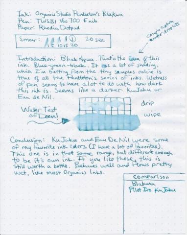
Here's BlaKWa. Really nice color. It's a teal sort of ink similar in color to Iroshizuku Ku Jaku or Diamine Eau De Nil. I think it's actually reaaallly close to Eau De Nil if memory serves. Eau de Nil was just a little darker than Ku Jaku, just a tiny bit less vibrant, which matches what I'm seeing here. Sadly, I ran out of my sample of Eau de Nil, so can't provide an explicit side-by-side right now. I have a bottle of Ku Jaku so I can compare those at least. Very good behavior. Could go on the list for an alternative to Ku Jaku for a lot of people who don't want to spend the $30 on Iroshizuku. Not sure what's up with the name.
- 2 replies
-
- organics studio
- pendleton
-
(and 3 more)
Tagged with:
-
http://yoonhalee.com/images-inks/iroshizuku-ku-jaku.png http://yoonhalee.com/images-inks/iroshizuku-ku-jaku-closeup.png
- 2 replies
-
- pilot iroshizuku
- teal
-
(and 1 more)
Tagged with:
-
http://yoonhalee.com/images-inks/iroshizuku-syo-ro.png http://yoonhalee.com/images-inks/iroshizuku-syo-ro-closeup.png I want a bottle of this like you wouldn't believe.
- 3 replies
-
- pilot iroshizuku
- teal
-
(and 2 more)
Tagged with:


