Search the Community
Showing results for tags 'stub'.
-
Hello all! This would be my first post here on the FPN, and my registration happily coincides my receipt of this pen. So, not finding very many reviews of it, I think I'll make one now to help others who are interested in this model. Pen: Nemosine Singularity 0.6mm italic stub demonstrator. Length: 136mm capped, 124mm uncapped, 145mm posted. Price: 14.99USD from xfountainpens.com Ink used: Unknown brand, reddish copper color. Paper used: National graph paper. First, some pictures! http://i.imgur.com/7WaqTNB.jpghttp://i.imgur.com/k95UkNk.jpghttp://i.imgur.com/35w3iXq.jpghttp://i.imgur.com/aVOebvW.jpg I think this is an attractive pen. Now, as far as demonstrators, there are certainly nicer pens; if you have the money, go a tier up and get a TWSBI Diamond. But this is still a good pen. The nib is a steel Bülow, and proudly declares that it is "Made in Germany", underneath that lovely etched design that resembles a butterfly. It's large, as Bülow nibs often are, and looks very nice. It's not THE nicest steel nib I've seen, but it looks good enough to fool someone into thinking that this is a better pen than it really it is, so if you're on a budget and trying to impress at work, that's a plus. While it is a plastic pen, the steel bands that serve to reinforce it keep it from looking like a cheap plastic pen, again making this a nice looking instrument for those who don't want to spend too much. But enough about the looks, they're for naught if it doesn't write well. After all, that's what a pen is really for, right? Let's talk pen. Pen is good. Here's a few samples of writing.http://i.imgur.com/EGa1CQJ.jpghttp://i.imgur.com/gr1sAlL.jpg Pardon my cursive, still learning. The paper is a National brand graph notebook dug out of an attic. I'm afraid it's no longer in production. The ink was a gift, and unfortunately the bottle has no branding on it, so I have no idea where to buy it. However, the color is not quite the same as these pictures, and I think that in person it very much resembles Diamine Ancient Copper. Apologies for the blue seeping through from the other side, I'm conservative with paper and didn't want to start a new page yet. As you can see, the stub adds a little bit of flair. Not a great deal of line variation, but enough that you can tell it's an italic if you look. I imagine the 0.8mm of the same line would provide a more dramatic effect. It's a bit scratchy and dry, so be prepared to modify it a bit. The scratching proved to be a bit of a problem, as this usually well-behaved paper began to feather due to the nib causing tiny tears as I wrote. It's not as bad with a light hand (which you should be using!) and roman scripts, but see here on this text where I have to pull down often: http://i.imgur.com/H6c9bZX.jpg?1 Gets pretty bad here, huh? I'm going to get out my 1200 grit Arkansas stone and have at it later, but I figured the review should be about as it is straight from the box. Speaking of out of the box, I commend the packaging. It's just a cardboard rectangle that fits the dimensions of the pen, nothing special, but the contents are above standard. It comes with a booklet on how to clean the pen, advising that one should do so before first use and when changing inks, as well as instructions on loading it with both cartridges and the included converter. Now this was not news to me, as I have already had pens before this one, and I'm sure it isn't news to most of you reading. But if this went to a newbie to fountain pens, the included info would be helpful. It comes with six (six!) of these black Jinhao cartridges (For those of you unaware, Bülow/Nemosine/Knox/Jinhao are all related companies and use parts from the same manufacturers), which was a shame because I do not use cartridges. I did however give these to my mother, who owns a Jinhao which these fit and prefers cartridges, so they did not go to waste. The converter was a nice surprise in terms of appearance. I expected the cheap international converters that come with Jinhao pens, but the Singularity's converter is sturdier. It has a very smooth plunger mechanism secured to the tube with a broad steel band. It tapers slightly towards the section, but it still has a decent ink volume at approximately 0.75ccs. The suction is not superb right off, I recommend adding some grease to this one. I realize that's standard for some of you, but you should still know that this is not a perfect converter in that regard. My verdict? I'd rate this at six out of ten. It's not a bad pen. On the contrary, if you're up for a few standard tweaks (open the tines, smooth the tip, grease the converter) for this price I recommend it. But it's not tip-top. It's pretty and it feels sturdy, so I'd carry it with me, but it's not a very enjoyable writing experience without changing the pen first. I hope this helped. Again, this is my first review, so if there's anything I should add or any questions about the pen, do tell!
-
Hi, folks! I just joined here and decided to make a small post which might act as an introduction. A month ago I finished off with my undergraduate studies and didn't have much to do before I go abroad for my Master's studies next January. My handwriting, which has always been cursive needed some serious improvement and hence I decided to do just that. The shop near my place had a pretty cheap fountain pen, the Flair Inky Executive which cost me Rs 50 ($ 0.75). It came with two cartridges and I decided to make the most out of them before trying out any other ink. As soon as I started writing, I realized the pen had a medium nib and my handwriting was never legible unless written with an extra fine nib. I couldn't return the pen so I decided to play along with it for a while. I tried to follow some of the rules of the Spencer script which resulted in a minor improvement in my handwriting. In my pursuit to improve my writing, I came to know about italic nibs and the line variations they have to offer. After a lot of fooling around on the internet, I decided that I should grind my round-nibbed Inky to an italic nib. I had a small block of granite laying around and began grinding the tip of the nib. I never really expected any results but it turns out, that I did manage to do something to the nib. Now as it stands, it's not an italic nib, but one could argue it's almost a stub and surprisingly enough, it isn't as scratchy as I imagined it would become. A stub nibbed FP here in my city would cost me around 4 times the cost of the Flair Inky that I used. I observed that after grinding, the lines have become much finer and I do get a bit of line variation. I am still trying to improve my handwriting every day (been at it for 4 days now). I am posting some images of the pen and a sample of my writing in it. This is the nib after grinding, not sure one can make out much of it since I took the pictures with my phone camera. Finally here is a sample of my ugly handwriting using the grounded nib. Comments, views and suggestions are most welcome! Cheers!
-
When I first started looking for and defining my signature pen, several people asked me, "Well, which of your pens is your favorite", or "Which pen do you use the most" almost always ending with "use THAT as your signature pen". I have a lot of pens, so I can definitely see why someone could question my need for another. So, at the risk of sounding pedantic, I am looking for a pen whose main job is to be used for my signature... not a pen this IS my signature piece. As horrible as it sounds, I don't know that I could make one of my current pens into a signature pen, because it would feel like I was picking a favorite child or something... gosh I hope my actual children never read this ... I love you guys :-) I am not a famous author... or a famous... anything... for that matter, nor am I just that vain. I have used fountain pens for over 20 years, but have only recently gotten back into calligraphy. While the broader pens make up most of my stable, I have never really gotten into crisp italics because they do not work with my cursive, I blame Zaner-Bloser. Enter the epic Pilot Parallels. These little pens are what made me dig out my dip pens. They are certainly not a replacement for dip pens, but they are sweet little things. BUT, their greatest act was making my signature look awesome... so maybe I am a little bit vain. I have spent the better part of the last decade as an educator, so signing my name is a common occurrence, and I did not really feel like it would be wise to carry around a Pilot Parallel all day. I can tell you what pens I used to sign our marriage certificate, birth certificates, Baptismal records, love letters to my Wife, letters to friends (particularly after they have past), and so, as I thought about having a pen that would be used to provide uniformity to my signature and link the things I have signed, I did want it to have some presence. While I have many pens, and have more than I should inked at any given time, I do not have any that serve only one purpose; even the pen that is filled with Iron Gall ink is not relegated to only address envelopes, it gets a turn to stretch its legs. For this reason, I did not want an italic nib. I decided on a classy stub. I toyed with a custom pen, I looked at several brands that had factory stub nibs, and (probably influenced by my recent love affair with the London Fog) I decided I wanted a Visconti to fill the void. I was almost swayed by a few beautiful MontBlancs, and an older Pelikan. So, whilst browsing Chatterley Luxuries to find a moderately priced stub nib, I came across the Visconti-Chatterley Desert Opera 10th Anniversary Limited Edition ST Fountain Pen. I really do love the Desert Springs material in the Divina, so this was not a hard sell. I messaged back and forth with Bryant about what I wanted with the pen, and he said he would find the prettiest one he had. As an afterthought, I sent a messaged him and told him that if no7 was nice, I would love to have it. The response I got from Bryant was wonderful... He said that when he went back to see if they had no7, his wife had already picked out the one that she thought had the best pattern, and it happened to be no7! What are the odds. The shipping was prompt, the pen had been tested and wrote beautifully. I was really surprised by two things, the first was the blue enamel in the clip and the second was how well the stub wrote. My experience, even with higher end brands, has been that when you get larger than a medium nib, they are prone to at least a little baby's bottom.... this had none. It is a cartridge/converter, but I am not horrible bothered by that. I felt a little better about putting Noodler's Liberty's Elysium in it because it is much easier to clean out. Also, it is the nicest converter I have ever used. It screws into the pen, and it aesthetically very pleasing, with the silver trim and subtle branding. The packaging is always nice from Visconti, a grey lacquer box. The silver grip does not get slippery for me... although as you can see... it attracts fingerprints like nothing else. The desert springs material is GORGEOUS!!! I wish I could take a picture that really captured it. In conclusion, I found a pen that not only suits my vanity and makes my signature beautiful, but is one that I genuinely like to write with. The price was great, and fit in my budget from other pens I had to sell. It is not my favorite pen, but I have no problem keeping it constantly inked and it will keep a place in my pen pouch. I was not disappointed in the least, but I still enjoy using a regular nib for general writing... I am not saying that this is the only stub nib I will ever buy, but even if it is, I am happy I have this one. Na Zdraví!
-
Hello everyone. I am new to this forum and this is my first review of a fountain pen. So, if I inadvertently commit any mistakes, kindly overlook those. Today I am going to review one Indian ebonite fountain pen with a special kind of nib. Many of us have heard about Butterline Stub nibs, but little information is available online, except that Mr. Pendleton Brown grinds those speciality nibs. It is from his site that I came across the definition of Butterline Stub nibs, which he states as “…….a hybrid between a Stub (very smooth with some variation) and a Cursive Italic (maximum line variation with crisper edge).” This pen is from Krishna pens, behind which there is Dr. Sreekumar, a one man army. He is an anesthesiologist by profession, an experienced nibmaster by passion- fountain pens remain his devotion despite all his busy schedules. As this is mostly a passionate endeavor rather than a commercial one, his products are not available online readily. He doesn’t maintain a separate website and produces one pen per week, so you are lucky if you can get hold of them. The specialty in most of his pens is the grinding of perfectly ordinary nibs into something extraordinary. His recent muse has been the butterline stub nibs and I was fortunate enough to be able to buy two pens from eBay from Krishnapens, where he lists his items from time to time. 1. Appearance & Design (8/10): His pens are rather well built and beautiful. The design varies from model to model, and mostly they are traditional cigar shaped pens with tapering at both ends. The nib is fitted rather healthily into the section and the nib-feed unit looks solid. The material is good quality ebonite. The colours vary according to the model, but they are bright and vibrant. The polish is good. Overall I would give the pen 8/10 for looks, considering the common traits of ebonite pens. They are large pens, but relatively light weight and well balanced. No pungent smell from any of the pens. Unfortunately I would be posting pics of only one pen as I have sent the other to him for tuning to my choice. The fountain pen The clip 2. Construction & Quality (8/10): These are solid pens. They feel compact in hand and the material looks impressive. I wouldn’t say the ebonite can compete with some 200$ custom made ebonite pen, but it’s not shabby at all. A decent looking pen available at a throwaway price. The clip is unlike something you have ever seen on any pen, it’s special. It is flat, broad piece of metal, very sturdy and effective. Dr Sreekumar states that these pens are made of Export quality ebonite. On close inspection, though there are impurities in the ebonite, that doesn’t diminish the impression of the pen at all. No company names embossed on my pens. 3. Weight & Dimensions (8/10): It’s a light weight pen. I don’t have a machine to tell the exact value. The dimensions are as follows Length Capped: 130 mm Length uncapped with nib: 120 mm Length posted: 165 mm Length of cap: 60 mm Cap Diameter: 14 mm Section diameter: 11 mm This pen feels very comfortable to hold; it slips easily into hand and writes right away. The balance is great unposted. Posted, this becomes uncomfortable as the cap doesn’t go much deep into the body. From left: Waterman Hemisphere deluxe, Pilot metropolitan, Krishna butterline stub, Jinhao X750 (all capped) From left: Waterman Hemisphere deluxe, Pilot metropolitan, Krishna butterline stub, Jinhao X750 (all posted) 4. Nib & Performance (9/10): The nib is the specialty of this pen. These nibs are ground by Dr. Sreekumar himself, with the help of his immense knowledge and experience about nibs. He fondly reminisces that he grinded his very first nib at class 7. It was a different time then with fountain pens being the symbol of education. Over the years his hand have become more and more adept at making different grinds, making ordinary medium or broad size nibs extraordinary in the process. Butterline stub nibs are in between a medium and true stub....line variations are there but the main attraction of these nibs are the smoothness and the experience while writing. It’s something you have to experience yourself. The writing surface is beveled upward. The nibs he uses for this conversion are Kanwrite nibs and Ambitious nibs. Both are Indian company. Kanwrite is the same company that produces nibs and body for Noodlers Company in US. Ambitious nibs are thinner than Kanwrite, but as they are grinded by same person the writing experience is much the same. The flow is appropriate, no feathering or blotting or burping, ink and paper remaining the same as other pens. The feed is made of ebonite and it maintains good flow as required by a stub nib. There is minimal flex, but its expected. The Kanwrite nib The pen with paper 5. Filling System & Maintenance (6/10): This is an eyedropper, no other systems available like ASA pens. Good seal between body and section ensures no leakage and the ebonite multi-finned feed ensures no burping. Ink amount inside body is about 2.5 ml. The pen remains light and well balanced even when fully inked. There may be some ebonite particles/ residues inside the barrel when you receive the pen, but it’s more of an outlook towards fountain pens than an error. Being such an avid pen lover, most fountain pen manufacturers from India just assume that a person would take some trouble to clean his pen before inking it. 6. Cost & Value (8/10): This pen is valued at INR 1500- 1800 (22$- 30$). It’s a good bargain considering the price of ebonite pens in general. This is a reliable fountain pen, in that you can always pick it up while going out, take it out in front of your colleagues, put it to paper and it will perform right away. The solid built and crisp line will invite awe and the writing experience will always please you. It’s not for the stylish line variations or calligraphy, but it’s a genuine daily workhorse. 7.Conclusion (Final score, 47/60): I ordered this pen just out of curiosity about butterline stub nibs, and I’m very impressed with this pen. It’s one of my daily pens these days. I would recommend this pen for anyone who come across them on ebay. The review on paper The shading. Thank you for reading. Bye.
-
A bunch of Omas that were offered at significantly (IMHO of course) reduced prices, have landed on my desk. I can afford to keep 3, so the rest would need to go back. The wish, of course is to keep all of them, but my banker vehemently disagrees. Do note that all of them were offered around the same price around 375 Euro equivalent, except for the c/c filler which is reduced further. All of them new/un-used/un-inked The question is : Which of these would you send back and why #1 Paragon - Art Deco Limited Edition - Piston fill - Gold Trim - Stub #2 Paragon - Art Deco Limited Edition - Piston fill -Gold Trim -Broad #3 Paragon - Art Deco Limited Edition - Piston fill -Gold Trim -Medium #4 Milord Dark Ebony Wood - Arte Italiana - Piston fill -Silver Trim - Stub #5 Paragon - Arte Italiana - Piston fill - HT trim - EF #6 Milord - Arte Italiana"mother of pearl maroon"/Bordeaux - C/C fill - Ruthenium Trim - Broad I've got a week to decide and I love ALL of em
-
Cool Pictures Of Handwriting For A Presentation?
TheYellowHobbit posted a topic in Handwriting & Handwriting Improvement
http://i.imgur.com/oxU3VRy.jpg http://i.imgur.com/BoTlQ1O.jpg P.S. Sorry for the bad lighting and hugeness of pictures. -
I managed to convince myself to try out nib grinding, following the procedure (more or less) from this Ludwig Tan article. I used a cheap Jinhao 250 and some micromesh pads I got from Anderson pens. I should have done before and after shots, but I didn't. I started with the 1500 grit for large scale shaping and then moved to 3200 and 6000, smoothing on 12000 and mylar. Pics of the nib, various angles, afterward: And here's a sample of the line variation (Diamine Sapphire cart on Rhodia): Any comments from those more experienced? It seems to write acceptably so far, but has a sort of dry-draggy feel, though not scratchy. I should learn more about smoothing/polishing perhaps? Also anyone else who grinds their own, feel free to jump in and show off!
-
Hi I need help identifying some Targa nibs that I have . The ones on the left and right came from an incomplete Targa set that I purcahsed through Ebay. I'm pretty sure the smallest one is the file but I'm not sure if the other one (the one on the left) is the medium or the borad. The nib in the centre was purchased NOS from a local pen dealer. He wasn't sure which it was. I also included a writing sample of each and one from a Targa medium and a Targa fine for reference. I greatly appreciate anyone's help!
-
I currently have a Lamy Safari and the Lamy 1.1, 1.5, and 1.9 mm stub nibs. I am interested in trying out the 1911 large Sailor with music nib and was looking for a photo comparison of writing samples vs that of the Lamy nibs but did not find any searching the web. If anyone has these nibs, could you please post a pic showing the line variation of the Sailor music nib vs the Lamy stubs (all 3 if you have them) - if possible, with the same ink and paper (I know - picky, picky, picky). I am especially interested in seeing how the line widths of the music nibs compare with the line widths of the Lamy's nibs. TIA, Bill
-
Hello fellow fountain pen users! I'm wanting to get a 1.1 stub nib. I currently have a Lamy Al-Star and a TWSBI Vac 700. I know I can buy stub nibs for them, but which is better? Do any of you have any experience with either of these stub nibs? I was also thinking about just getting a TWSBI Eco with a 1.1 stub because it's only a couple dollars more than getting the nib unit for the Vac 700. Any thoughts might help me to make a better informed decision. Thanks in advance!
-

Pilot Custom Heritage 912 Su (Stub) Vs. Platinum 3776 Ms (Music)
emceeATD posted a topic in Japan - Asia
Hi All, I'm a long-time reader and first-time contributor inquirer. I am fairly new to the fountain pen world, but since the beginning have been writing almost exclusively with stub/italic nibs. I have purchased several entry-level pens and am ready to take the plunge to the next tier. After countless hours of 'research' I have my selection narrowed down to the Pilot Custom Heritage 912 SU (stub) or the Platinum 3776 MS (music). This may seem like a strange two pens/nibs to be torn between, but please bear with me while I explain. I primarily write with a Pilot Prera fitted with one of the italic nibs from the Plumix set we have available here in Europe. I am constantly switching between the M (same as the American market Plumix and the Prera CM) and the B (same as the 78G broad). Pilot designates their tipping sizes as 0.58 mm and 0.7 mm, respectively. I've noticed that Pilot must measure their tips differently as the M creates a line similar to what you would find on most italic nibs with a 1.0 mm or 1.1 mm designation.* The only tipping sizes I could find for the Pilot SU nib and the Platinum MS nib are posted on nibs.com as 0.7 mm and 1.15 mm, respectively, but it's unclear whether they're using the same measurement system as Pilot, and the Goulet nib nook led to some curious results. Also, I've noticed a really intense variation of line widths based on nib angle (I hold mine fairly consistently at about 45 degrees). So, now that you're super bored, I would like to know if anyone has some side-by-side writing samples with either or both of the nibs in question to the steel Pilot italic M and B. I am slightly concerned that the SU might not have the crispness and line variation that I'm looking for, and worried that the MS might prove to be a bit too broad for my daily use (mostly journaling, letter-writing). I have posted a sample of my own showing my normal quick hand (which I'm still working on cleaning up ) with both the nibs I use regularly and on which I am basing the comparison. Any and all thoughts, advice, and opinions are more than welcome and very much appreciated. It is likely that I will end up purchasing both at some point, but it would be great to know where to start. Greetings from Germany. *As a tangential bit of help, it would be great if someone could explain this inconsistency. http://i393.photobucket.com/albums/pp16/emceeATD/image_zpsswa1xfmf.jpeg Paper is Rhodia no. 16. -
good morning everyone, i have a nakaya portable (cigar) with a broad stub nib (customized by john mottishaw). beside the yama-budo ink from pilot i also use the kiwaguro nano carbon black. but i have a few problems with it: as it is a thicker ink, it tends to stick in the back part of the converter and i therefore have to give it a shake before writing or even push the filling mechanism in order to get the ink to the feed. do some of you have the same problem? do you have a solution for this? i also have a problem with the filling, especially with the ink bottle. as instructed i turn it upside down and back to get the ink into the mold, but i have to do this multiple times as the mold hardly gets filled enough in order to cover the whole nib (and a small part of the grip section). therefore not enough ink is sucked into the converter. do you use seringes to avoid this problem? thank you in advance for your answers. cheers, nils
-
I've been a repeat customer of the Fountain Pen Revolution website for maybe a year now, and have purchased a number of their pens and nibs in that time. One of my frustrations with their earlier offerings was the #5 "Fine Stub" nib - I bought two or three pens with this nib on board, and always found it scratchy. When the new #5.5 nibs came out - a significant improvement in almost every way - my question of Kevin (the proprietor of FPR) was when he would be adding a stub nib to the line-up. I didn't get an answer at first - but in the past few weeks they've been listed as on their way, and last week (or was it the week before? - on March 26 2015), they were finally available for $7ea plus postage. I took advantage of the offer - which now seems to have disappeared from their website! - to buy a Serwex 1362 demonstrator with the new stub nib for $9. $2 extra, and you get a pen thrown in? I ordered two! The new pens arrived yesterday. I swapped the nib from one straight into a FPR Indus (burgundy coloured), inked it up with Diamine Red Dragon... and filled the other demonstrator with Noodler's Baystate Blue (it only cost me $2 - so why not?)... Appearance: Here's a picture of one of the nibs - with apologies for the lack of focus: http://i.imgur.com/CRFD5qR.jpg The first thing I noticed about these nibs was the tipping - unlike my JoWo nibs (which cost at least twice as much), these nibs are tipped with iridium. They're also, as the picture below demonstrates, somewhat smaller. The nibs shown, moving clockwise from top left: Goulet 1.1mm stub (JoWo #6), in a Jinhao 159 - inked with Pelikan 4001 Black Lamy 1.1 mm stub, in a Lamy Safari Neon Coral - inked with Diamine Hope Pink. FPR 1.0 mm stub, in a FPR Indus - inked with Diamine Red Dragon TWSBI 1.5mm stub (JoWo #5), in a TWSBI 540, inked with De Atramentis Sherlock Holmes. http://i.imgur.com/j8is7tF.jpg And here's an initial writing sample - beginning with a TWSBI M nib for comparison: http://i.imgur.com/5f9xvap.jpg Writing Experience I really enjoyed writing with these nibs. They definitely lay down a thinner down-stroke than the TWSBI 1.5mm and the Goulet 1.1mm - and marginally less than the Lamy 1.1mm. More significantly, the writing experience was much, MUCH smoother. The nibs glided over the page, and were more forgiving than their untipped counterparts. They also allowed me to write smaller - closer to my normal writing style. http://i.imgur.com/5f9xvap.jpg There was a trade-off for this improvement: not only are the downstrokes (thick lines) thinner than for my other stubs, but the side-strokes (thin lines) are just a little thicker - at least, that's the way it looks with my writing - so that the 'italic' look (line variation) is diminished. For mine, that's a very acceptable trade-off - especially given the smoothness of the writing experience - but it may not be everyone's cup of tea. Close-Up In the following two photos, I'm comparing just one FPR stub nib (left), to the TWSBI 1.5 mm nib (top), the Goulet 1.1mm (bottom) - while the nib to the right is a FPR Broad. The latter has a visibly rounder tip - gives little or no line variation when writing. http://i.imgur.com/QUSD6Yg.jpg http://i.imgur.com/ERF39t9.jpg Summing Up For the price, these stub nibs are an absolute steal - and a great pleasure to use. I'd be more than happy to recommend them. Though they're billed as a #5.5 nib (to differentiate them from the earlier #5 offerings), they'll fit onto pretty well any 5mm-diameter feed (i.e. #5 nib pens) - including (so I'm told) the TWSBI Diamond 580. The Serwex pens I ordered them on had gold-coloured furniture, so were installed with two-tone nibs to match - but you can also buy them as straight stainless steel. Standard Disclaimer: though I have previously received free review pens from FPR (the new Indus pen, in blue and Demonstrator), I purchased these nibs (and pens) with my own money - and have not been solicited or compensated in any way for this review.
-
Hello fpners! I am hoping to tap the brain trust about a couple of cranky calligraphy nibs, a TWSBI 1.5mm stub for my mini and a 1.9mm Kaweco sport calligraphy nib. I can't get either of them to behave. Both require a lot of pressure to get a solid downstroke (think particularly nasty ball point), and neither will produce reliable side strokes. I've flushed both thoroughly, flossed the tines, pulled the nibs and scrubbed the feeds with a toothbrush, and made sure the tines are properly aligned. I am using Herbin tea brown in the kaweco and Rouge Opera in the mini. I've never had any problems with either ink. I'm writing slowly and being very careful about the nib angle, so I don't think it's me. Also, I've used smaller stubs in the past, both custom ground and factory 1.1's, and had no problems. Any suggestions?
-
I ordered a Lamy 1.1mm stub italic, but upon receiving it I saw that despite being labeled "1.1" it is actually a 1.9mm stub. In the picture I've put it beside a 1.9mm stub that I already have for comparison. Has this every happened to anyone else or has anyone heard of this ever happening before? I can't believe I'd be the first to come across something like this.

-
A 2014 video on transforming an inexpensive standard steel nib into a cursive italic stub, produced by Nathan Tardif of Noodler's Ink, suggested a hacking experiment with the nibs of Jinhao 599 pens. The pens are currently available on eBay for $2 or less. I started with a Jinhao 599 with a Medium nib because this particular pen uses a more traditional nib with a slightly longer body and tines, unlike the more modern-looking nib on Fine versions of the 599. The investment in materials, tools, and equipment totals about $10, so there is very little risk involved. The question behind the experiment is: Can a rank amateur lop off the tip from a medium nib on a Jinhao 599 and make it write fairly well -- or, more ambitious -- make it write smoothly? To my great surprise, the answer is yes. Another contributor to the Fountain Pen Network, Ian the Jock, has confirmed the experiment with a $2 Baoer pen. I've tried this technique twice now -- the first time with a Jinhao x450, sometimes available for $1, shipped from China (!) I accidentally lopped off too much of the Jinhao x450 no. 6 nib, resulting in a 1.7 mm cursive italic stub. It was rather broad, but still wrote well. For people who like to learn on Chinese pens and try other types of nibs, there is very little stopping us. Resources and results of the experiment are posted below. Nathan Tardif's Nib Transformation Video The Method Using a pair of diagonal cutters, lop off the tip of the nib. In Tardif's video, he just does it by sight. Place 2000-grit wet-dry automotive abrasive paper on a hard surface and smooth off all the external sharp edges. It only takes a few strokes. Then pick up each tine and use the abrasive paper to make a couple of light passes on the inner surface of the tines. Ensure the tines are aligned, and the gap between tines is moderate. A 10x loupe is essential for this. A separate video, by Brian Gray of Edison Pen Company, is helpful here, as are notes available on Richard Binder's website. http://www.richardspens.com/pdf/workshop_notes.pdf Brian Gray's Nib Alignment Video The Nib and Pen A Writing Sample
-
I'm about to make my first foray into the world of customized nibs and I'm having trouble deciding whether to go with a Pendleton Brown butter-line stub or a Mike Masuyama round-nose cursive italic for a Pilot 823. I'm looking for a nib width of approximately 0.4mm on the downstroke for use as a daily writer - I write fairly small with lots of math (small subscripts/superscripts are an issue to me). This is a sample of my normal handwriting when note-taking (stock pilot M nib). Any perspective on which one to pick would be greatly appreciated. In particular, I'm wondering: how the two customizations compare in terms of line variation and forgivingness (I normally normally hold the pen at a 45-degree angle to the paper, with a little bit of inconsistent rotation as well)how controllable the thickness of a line put down by MM's RNCI is - this post mentions that the BLS's line width can be controlled by the amount of pressure put into it; is the RNCI capable of something similar? The ability to put down a finer line when necessary would be great for subscripts.how the BLS looks up close - there's a picture of the RNCI up-close here, but I haven't been able to find a similar pic for the BLS.Thanks!
-
Hi all: I am trying to understand the appeal of a stub but I am new to this and struggling a bit. I tend to write with steel nibs and I like them to be broad. Is a stub nib simply a broad that is cut at a different angle? I tried one at Levenger and was unable to determine if I liked it or not. It seemed a bit, ahh, different. Any help here greatly appreciated. I tend to print and take fast notes during the day and at night, I practice my cursive. (Not all that pretty at the moment. Pray for me...)
-
Hi folks, I used to write with a straight slant 'semi'-cursive. I used stubs, and left obliques. It gave me nice variation and compensated for my terrible hand writing. Lately, I practiced palmer cursive, where it is slanted to the right. I used noodelr's untipped nibs--I do not write using tipped nibs. I find it easier to write with right slant; where my primary gain now is speed! I wanted to get back to my stub/oblique nibs. But I do not find them suitable for my new writing slant, where I rotate the nib to the right when I write with slant. Should I get right oblique? left obliques are available at reasonable prices, but not right obliques. I do not want to take the chance and send a nib to a nibmister to find they do not fit my need. Any thoughts? Thanks.
-
Hello all, I was thinking of buying a new pen. After researching a bit, I settled on getting either a TWSBI 580 or a Vac700. The problem is deciding which one. I've read a lot of reviews and whatnot, but I want to hear from you guys on the topic. Any info/advice is much appreciated. Thanks!! -CJ
-
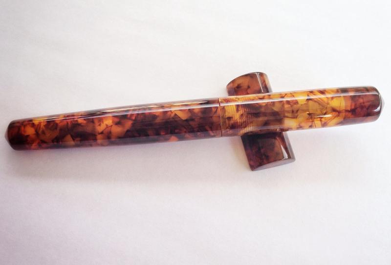
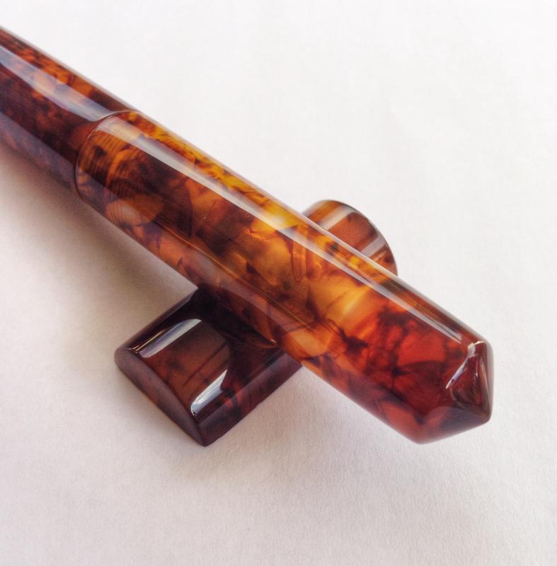
Scriptorium Pens Idyll In Illuminated Amber Tortoise
Zillaxila posted a topic in Fountain Pen Reviews
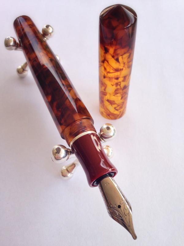
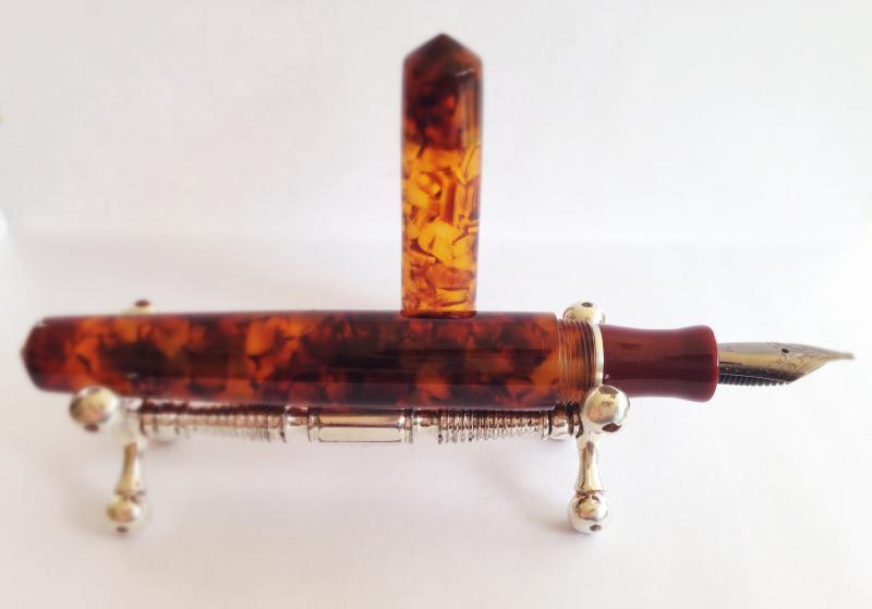
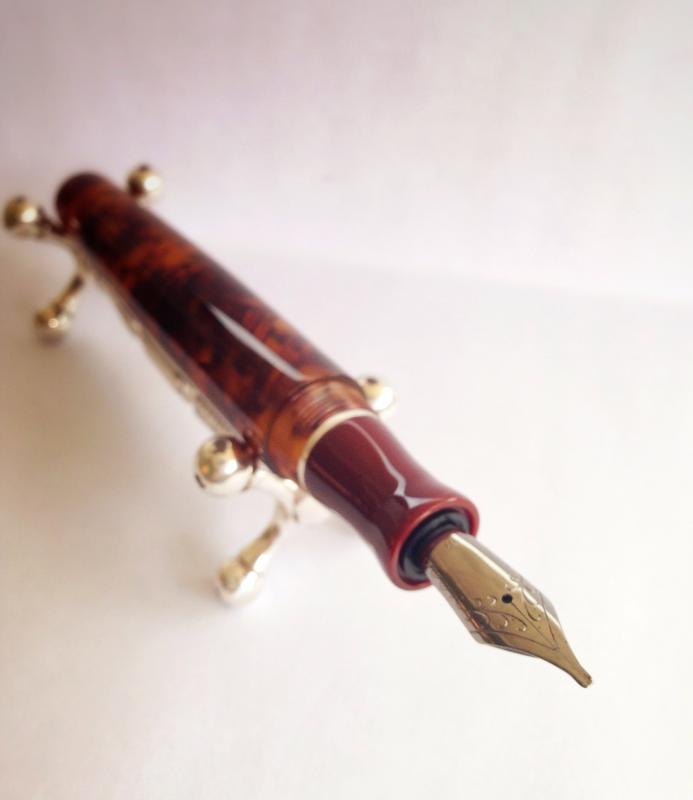
Hello Fountain Pen enthusiasts. Today I want to share a review of a recent aquisition I made from Scriptorium Pens. First of all I have to say that communicating and working with Renée, who is the wonderful person behind the lathe and who makes all these beautiful pens, was a joy. First we had to stablish what materials I wanted for the pen. This was not an easy task since there is hundreds and hundreds of different materials and colors to choose from. Well, I waited a month to think about what I wanted, and thank God I waited because in that time Renée did the first Idyll model. This was the model pen I wanted, and after all the thought I chose a beautiful German Lucite called Illuminated Amber. What sold it to me was a picture from the Scriptorium Pens website. Also, Renée told me that it was her favorite, and that sealed the deal. Then there was the choice of using another material for the section, which I decided to use an acrilic called Red Urushi. It gives the appereance of laquer, and it has a wonderful deep red color. I was sure that it was going to make a nice contrast with the translucency of the amber tortoise. The nib I chose is a 1.1 stub, and it is a German made Jowo nib with a Ruthenium coating. The detail that complements the pen and gives it an elegant look and feel is a Sterling Silver band that I decided to put between the barrel and the section. This way the different materials have a piece that separate them and gives them more character. The nice part of doing a Custom pen is the endless possibilities of shapes, sizes, nib types, materials, colors, etc. Renée leads you on what she thinks works best, but always tells you that is your pen and you should do whatever pleases your pen appetite. When Renée starts the pen she confirms you with an email, and this starts a wonderful experience looking at all the process of your pen beeing produced by hand on a lathe. All thanks to instagram and the wonderful pictures Renée puts in her feed. The pen was finnished and sent to me with insured shipping, very fast indeed. The pictures that Renée sent me to my email confirmed that what she made was what i visualized in the begining and exactly what I wanted. But still I had to get the pen on my hands to feel it and sense it in person. Well, I must say that it is a work of art. it is total perfection, and by far my favorite pen of my humble collection. The feel in the hand is incredible. The polished lucite and the texture is undiscribable, it is like wet but at the same time so smooth. The translucency of the material is gorgeous, you can see the nib through the cap. The threads are impecable, all the work is done to perfection. For size comparisons the pen is the size of a Montblanc 149. So it fits perfectly in my hands. The balance is just right. It is a light pen, but it has more weight on the front. The nib writes smoothly, they are inspected and tested before leaving, so it was no problem the first time I inked it and wrote right away. The section is just beautiful, and that band....cant give any more complements on this beauty. I hope you liked this review, and really the pictures dont do justice to the pen. You have to feel it in your hands to experience it. Fully recommend Scriptorium Pens. Thanks for looking!
-
Hello everybody! I'm planing to buy a double ended pearl from Edison, one nib is going to be a full flex from Richard Binder and the second one is a problem ... I know for sure, that I want a nib with line variation, but which one? For comparison I have only my Lamy nibs in 1,1 (which is just not broad enough for me and doesn't give the line variation I'd like), the 1,5 (which I like) and the 1,9 (which is my favorite). As far as I read, most compare the Lamy nibs to stubs, right? So I'd be intrigued to have a cursive italic for comparison. But that would leave me with 1,1 which sounds small. 1,5 sound better, but that would be a stub again ... Can anyone compare the line variations given by these two nibs? Which one gives more variation? Cause in the end that's more important to me (at least I think so) than the broadness. Thanks for the input, Tari
-
II think I can say with some assurance that people on this forum dedicate a fair bit of thought to the little bits of metal at the ends of their little bits of plastic. Personally, there's something about the process of making nibs that went away around the 1950s, and subsequent nibs, even if mechanically superior, lost their expressive quality, forcing my to spend untold hours counting down on eBay. I'd like to know how you think about your favorite nib; how does its width, pointiness, flexibility or lack of it, express the personal character of your writing? What is it about your best nib that floats your boat?
-

Fountain Pen Suggestion Please: 1 Mm Line Width Minimum
KamenRitter posted a topic in Fountain & Dip Pens - First Stop
I've been collecting fountain pens for a while, a small hobby that my friend had noticed. All of my fountain pens are in the thinnest side of fineness, ranging from Pilot's EF, Platinum's UEF, to Sailor's Saibi Togi. He's asking me if I could find a moderately priced fountain pen with at least a 1 mm nib. He made certain that it should be a fountain pen and not a calligraphic pen such as Pilot parallel, Lamy Joy, and Rotring Artpen. He had tried a Pilot Metropolitan with Broad nib, and he wants it to be that smooth. I've been looking at TWSBI for some time, with the 1.1 and 1.5 mm stub nib. I also noticed the more than usual comments of the pen acting up. I have no issues with that, since I know my way around fountain pen tinkering and adjustment, but I doubt he would like it if his pen is acting up. Also, Kaweco is out of question for the shape and Nemosine is 0.2 mm thinner than requested. So I hope this community could help me with finding the best fountain pen with a really broad nib priced under 80 USD that's just as fine as japanese fountain pens. Or at least tell if there's none in the market. -
Hi folks, my hand writing was horrible; that is why I started writing with fountain pens. It imporved well. However, lately, I used pencils for my assignments (I am grad student), and I found that I write "better" with pencils!!!!!! What puzzles me is I do not like tipped fountain pens becuase I can not control the tip on the paper. That is why I use narrow stubs, and they are good for me. Pencils, I would say, work similar to tipped nibs, where sweet spot is wide in tipped fountain pens. I keep asking myself why do I do well with pencils, and not able to replicate my style with tipped nibs, or even stubs? Any thoughts? Thanks.