Search the Community
Showing results for tags 'stub'.
-

Review: Sheaffer Legacy I Blue Gold Fountain Pen With Factory Stub *warning Picture Heavy
cellmatrix posted a topic in Fountain Pen Reviews
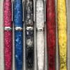
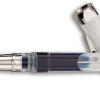
http://farm8.staticflickr.com/7331/11764292803_115a097a45_c.jpg http://farm4.staticflickr.com/3798/11765944553_9d24da7703_c.jpg http://farm8.staticflickr.com/7305/11766101454_1626696848_c.jpg http://farm8.staticflickr.com/7379/11765691675_81d178ee0b_c.jpg http://farm4.staticflickr.com/3771/11766458776_fec61eb9a1_c.jpg Appearance This is one beautiful pen. The deepness of the lacquer is striking. I have a kikyo nakaya and the shine and finish of the blue urushi is a bit better, but I would say the blue lacquer on this pen is not far behind in its depth of color and shine. The colors and the design of the pen seems reminiscent of the blue and gold Waterman Edson. As I suppose any Van Gogh aficionado would be, I find the combination of deep blue with gold particularly fascinating. The trim is gold plated: shiny on the clip and cap band, and brushed gold on the rest of the cap. It has a square PFM like cap head. The end of the pen body is also squared like the PFM. Nib I've included some closeups of the nib unit, definitely my favorite part. The nib gives line variation like a crisp cursive italic, only the difference is that it is super smooth. Its unique in being able to give so much line variation with so much smoothness. The only other factory italic that approaches it in my opinion is the Esterbrook 9312 nib and even so, it is not nearly as smooth as the Sheaffer. It should be kept in mind that unlike many italics, the Sheaffer factory stub is not a nail, but rather it has a little bit of give to it, and feels springy when you write. Design The touchdown lever makes a pleasant whooshing sound when it is depressed. Note gold plated touchdown converter in the case. I like to post the cap and the lacquer finish is strong and does not leave scratches. The posting is very smooth, and the pen feels perfectly balanced with or without the cap on. The nib section, the part of the pen you actually put your fingertips on when you write, is quite wide, its in the range of a montblanc 149. From the nice hefty feel of the pen in the hand to the substantial but not over done weight, you really feel like you are writing with something very solidly built. Its especially good for someone with large hands. Writing experienceThe pictures cannot portray how nice the writing experience is. Its so smooth with just a hint of feedback, just enough to help you navigate the paper. Its funny, but as long as you position it right, and it has a very tolerant sweet spot, it does not seem like you are writing with an italic, until you look at the line variation you are getting. Its a wet pen, so if you want to get really tight italic lines, you need a somewhat dry ink. I used Sheaffers Skrip Blue Black, but probably would do even better using an iron gall like Montblanc midnight blue old formula, or perhaps Pelikan Blue Black. Drawbacks The only thing I wish is that the touchdown worked. It just does not seem to draw up ink. The o rings seem ok on it, so I am a bit stumped. If anyone has any suggestions, please let me know. However, it works great with cartridges and a sheaffer squeeze converter is supposed to fit it too. So taking into account the other positive features of this pen, lack of touchdown is only a minor issue. Summary Its an amazing pen, something I feel very fortunate to have the chance to use. If you ever have an opportunity to buy one, especially with the hard to find factory stub nib, I would say do it, you will not be disappointed. -
Hi, I've recently become very interested in the thread "Stub of the Day"; however, I've noticed that most of the pens in that thread are vintage or high-end. For some time I've been searching for a stub-nibbed pen which is mid-range: up to £50. I'm not looking for an italic pen. I don't intend to do calligraphy. I just want something to add a little interest to my everyday writing. So please don't suggest a pen with an italic nib. Thanks.
-
Everyone is probably aware that Pelikan over last year have started dramatically reducing their nib range. After speaking to a contact who has been conversing with Pelikan, they will only be producing: EF F M B Stopping BB & All Oblique Nibs! The question that I would like to pose is, if Pelikan did a production run of 500 nibs for say the M800 & M600 range. The 500 nibs split into 250 of one type of nib & 250 of another. Which Nibs would you like to see production of: Italic: 1.1, 1.3, 1.5, 1.7, 1.9 Stub Nib. Please leave a choice of two nib types! & How many people would be interested in buying one of the pens with reproduction nibs...? Thank You Regards rrs
-
Broad,, Medium, Fine Nib Sir? NO THANKS! - will be the answer that follows. No longer will these nibs be looked at, due to John Hall(A true honor meeting this gentleman. Delightful & Outstanding customer service) here in the UK. At the recent North UK pen show I acquired a OMAS Arco Verde, hi trim with an italic nib. There lies the culprit, the OMAS Italic nib. I have not been able to put the pen down, by no means am I an expert on using this type of nib. But with practice have used this pen and can now write with certain amount of speed! Still little scratchy on paper but only when I mistakenly change angle of nib. My Question: The love affair has started hehe. I am currently deciding do I go for a OMAS Stub Nib OR Visconti Stub Nib? Any suggestions? Anyone with experience of both nibs? Could someone point in right direction to see writing samples for both nibs? Help! Thanks rrs.
-

Aurora Stub Experience With A Pelikan M800 Nib
Sach posted a topic in Fountain & Dip Pens - First Stop
Is it possible to re grind an M800 nib and get a similar experience as one would with an Aurora 88 with a factory stub? I recently bought an Aurora 88 from John Mottishaw, not customised but just a factory stub which he tuned, which has completely blown me away. I've been using M800s almost exclusively for work for about six years now and just wanted to see what all the fuss was about concerning feedback with Aurora nibs. I just find it a fantastic nib to write with, and seems to work with almost any kind of paper that I encounter (I work in a hospital, where paper quality varies a lot!). The trouble is I love the M800 in terms of design generally, but love the Aurora stub nib. Is it possible to regrind a Pelikan M800 to feel like an Aurora? I had a BB M800 nib reground to cursive italic by John Sorowka, and have been mightily impressed with the result. Just wanted to know if I can achive something more like the Aurora by having a regrind, and what would that be? Any help would be very much appreciated...! -
Dipping A Toe Into The World Of Stubs
thesunshine posted a topic in Fountain & Dip Pens - First Stop
Hi all, I'm interested in looking into stub nibs. I'd love to be able to try them out before buying any, but I live in Australia, which does not have a wide range of choice in FPs... and what is available is sold is 3x the price of buying a pen online. So given that trying stub nibs out in an actual store is unlikely to happen, I'd love to be able to buy a stub online and test it out before deciding to commit to a more expensive pen with a stub nib. So... where can I most cheaply source a pen with a stub nib? Bonus points if you can tell me where to find a range of cheap stubs - from M to BB so I can see what nibs I like best. Thanks! -
Hi everyone! I'm hoping to have a review of the Nakaya titanium Piccolo up sometime this weekend; until then, here's a shot of the pen with a writing sample from my Instagram feed. Note the stubbed tip - you can see a small amount of gold where John (Mottishaw) ground off a bit of the ruthenium plating to create the stub. It's an amazing writer!
-
Here are some short writing samples from pens ground into some form of italic nib. Unfortunately, one of my pens, ground by Greg Minuskin, is still in Italy for repair. I have to say, the colours aren't as vibrant as they are in real life. I hope you like it! http://i1279.photobucket.com/albums/y529/lovementos/001_zpsf0d7144d.jpg
-
Hi, I am looking for the best pen for signing documents. It should show better my signature. According to articles and advice that I read; ''Signature nibs should be Broad or BB, because a signature should never look tentative or weak - a signature should have visual impact, and convey strength and presence.'' (by yachtsilverswan) So I think EF, F (maybe M) aren't suitable for me? In my opinion the best way try them at pen shop, but I want to learn that which issues (nib, oblique, stub etc.) should I focus? What do you think about this? I am looking for a pen for beautiful signature. I have got a no idea about pens, nib, stub, ink etc. I want a pen for usually signing maybe sometimes take notes or writing. but my priority is signing. So what is the best pen (roller, ball-point, fountain) for you? Of course nib size, stub, oblique or straight etc. What are your suggestions? Thank you very much
-
Hi everyone from Turkey. As you know I am new here I am looking for a pen for good signature and I meet FPN while I was looking at information about my research at internet. I have got a no idea about pens, nib, stub, ink etc. I want a pen for usually signing maybe sometimes take notes or writing. but my priority is signing. So what is the best pen (roller, ball-point, fountain) for you? Of course nib size, stub, oblique or straight etc. Thank you very much
-
Levenger and their True Writer series presents a bit of a puzzle in their value proposition. On the one hand, I have a Kyoto True Writer, gotten for a cheap price on a deal, which is a wonderful pen: lovely writer, well balanced, and very pretty. So I thought about adding a stub nib to it, as a fun option. Visiting Levenger, I discovered that regular nib units run $30, not great but not horrible either. Stubs, however, cost double! That's about what I paid for the whole pen! And seems like a total ripoff. So what's the deal? Is there some justification for charging double the price for a stub? Do they really cost so much more to make? Or is this pure price discrimination on Levenger's part where normal people get the "good" price on fountain pens, but those of us who love them get killed on "specialty items" like the stub. More broadly, does Levenger represent legitimate value or is it a ripoff?
-
I have a Summit s160 with a 14k nib that writes superbly. It always starts first time, never skips, has a lovely sound and tactile feedback from the paper and writes with what I would describe as a mediumto fine italic/stubbish line. Neither nib nor feed has anything to describe the nib other than "Summit 14k Gold". My questions are: Has this nib been reground or did Summit produce a stock nib fitting this description? Are Summit nibs easily interchangeable? The latter question because the pen is in good condition except for the fact that the 'bung' is missing from the end of the barrel which makes me wary of carrying it around for fear of any stray ink sliding down the barrel and into my jacket pocket. If nibs can be easily swapped I could look out for another Summit and swap nibs. Any information would be most gratefully received.

-
Review of the Visconti Homo Sapiens Bronze 1.3mm stub Note: Higher-res photos available here This week I finally gave in and purchased a Visconti Homo Sapiens Bronze with a 1.3mm stub nib. Ever since I first saw photos of this stunning pen, I've been wanting to own one. Lava, bronze, palladium and titanium? Yes, please! This is my second fountain pen. This January I got myself a Waterman Carène with a fine nib, followed by a stub nib about two months later. While it is a very nice pen, I just couldn't resist the even wider nib, the unusual look and materials, and the supposedly very smooth and wet Dreamtouch nib of the HS. So a few days ago I finally went to a very nice store called La Couronne du Comte here in the Netherlands to get the pen, along with a metal traveling inkwell by Visconti. What I noticed when testing it out in the shop was that it took some effort to initiate the inkflow to the paper. Once it got going it wouldn't stop until the pen was lifted from the paper, but I found I had to push a little to get it to write. Not being sure if this was due to dipping the pen rather than actually filling it, I decided to go ahead and take it with me anyway. When I got home and filled the pen I got roughly the same results. It didn't take long to diagnose the nib with a mild case of baby-bottom, as applying no pressure when writing showed two ink trails from each of the tines. A small push down and the (copious) flow started and stayed intact for as long as the pen touched the paper. After tracing some figure eights on a fine nail file, the problem is virtually non-existent and the nib has retained its deliciously smooth operation. I am now truly delighted with the way it writes! ______________________________________________________________________ Appearance & Design (9) - Just plain awesome! This is about 90% of why I bought it. I absolutely loved the way it looked on photos and it does not disappoint in real life. The lava mixture is a very nice matte black, with many small pores and some even smaller reflective flakes. This contrasts in a very nice manner with the bronze parts of the pen. The two rings around the cap are significantly less shiny than the other parts and I guess that these also will look like that eventually. I like the font Visconti used for the text on the center band. The clip has a nice spring to it, but it will have to be lifted if you intend to use it as it runs flush with the barrel and there is no rounding going on to allow it to slip on by itself. The nib looks gorgeous! The two tones and the decorations match nicely. It says Visconti, 23k Pd 950, Firenze and 1.3 on the nib. The breather hole is crescent-shaped, with the tips pointing towards the barrel. This pen uses the Visconti My Pen system, which means that the Visconti logo shown above can be removed and replaced by two initials or gemstones for instance. I may at some point replace the logo but for the moment I'm happy with how it looks. The final aesthetic aspect I would like to point out are the indents between the grip and the section. These are part of the locking mechanism: you're supposed to push and twist simultaneously to uncap, but in practice you can simply twist without pushing and the cap will still come off. This doesn't bother me but it's something you should be aware of. Don't expect it to uncap by itself though, I can't see that happening at all. Visually, I really like the grooves as I find they resemble some kind of Greek pattern which fits right in with the general theme of the pen in my opinion. Construction & Quality (9) - Very good, but... Quality of construction is excellent for the most part, but I do have three issues I want to mention. Firstly, the fact that this nib required pressure to start writing is something that really bothered me and absolutely had to be remedied before I could enjoy using this pen. I applaud Visconti for wanting to give their users the smoothest experience possible, but having to deal with baby-bottom is not my idea of Dreamtouch. Fortunately I was able to resolve it but I think this should simply not happen to such a high-end pen. I have read that Visconti's stub nib is more prone to this defect than their other nibs. Secondly, and thirdly, Visconti needs to work on their printing/painting process as this leaves something to be desired: the black on the clip looks like it is printed using some kind of dot matrix, but on one side the entire printing is very slightly misaligned with where it's supposed to be, whereas on the other side some dots have not printed. Also some of the letters look a bit jagged because of this process when looked at closely. This should be clearly visible in the high-res photos on Flickr. Moreover, on the band that reads 'HOMO SAPIENS' the text is colored black, but the m is not entirely colored. This is also visible in this photo. Fortunately however, none of these issues affect my daily enjoyment of the pen: the nib problem has been cured, and the paint anomalies are too minor to notice without really inspecting the pen or looking for it. As a side note, I should add that the traveling inkwell I was first shown featured quite ugly misprintings and even some scratches, almost like it was a secondhand prototype or something. The seller said that this was the way the newer, plastic inkwells all looked and then offered me the metal one from a display case for the same price, an offer I gladly accepted! Weight & Dimensions (10) - Perfect! The size of the pen is perfect as far as I'm concerned. Capped it is as long as my Carène, uncapped it is slightly longer. The big difference is in the circumference of the pen. It is a much fatter pen, which I really appreciate. The section has a very comfortable shape and the fact that it is also fairly wide means it is a pleasure hold. This together with the smoothness and wetness of the nib are what constitutes the Dreamtouch I think. Nib & Performance (9) - Wet, smooth, some feedback Over the last few months I have learned that I like my nibs wet and smooth. The HS delivers in both respects, and when looking at the current performance it is all I hoped it would be! The wetness is there not just after filling the pen, it remains virtually constant afterwards contrary to my Carène which alternatively writes wetter and drier as I wait for for the feed to draw more ink from the converter. However, when considering only stock performance, I would give the nib about a 6: it would write, but only if I apply some pressure first. This would be a major issue for me, but perhaps you don't mind or wouldn't even notice. Filling System & Maintenance (8) - Power filler! The HS bronze uses a power filler mechanism to suck up ink. I love using it and think it's much cooler than a converter. Just unscrew the blind cap, pull the titanium rod back, submerge the pen up to the section and push the rod back in. Near the end of the travel, the vacuum will be released and the pen will suck up quite some ink. For optimal filling you should use the traveling inkwell as that allows for a full fill by inverting the pen whilst filling. The big downside of this mechanism is the fact that cleaning can not be carried out by using a bulb syringe, and thus is much slower than usual. This is especially annoying when using e.g. Rouge Hématite as all you can do is repeatedly suck up water and expel it again which can take ages! Given the fact that the pen is just so nice in virtually all other aspects, I can definitely live with this but you should consider it when buying this pen. The nib can only be removed using a special tool that I saw the seller use, I wouldn't risk trying to remove it without this tool. Cost & Value (8) - Alright, I guess.... Going for about €450 in the Netherlands, this is not a cheap pen. Whether or not it is worth it is as always a very subjective matter. For me it clearly was or I would have returned it, but I wouldn't be surprised if there were other cheaper pens that write (almost) equally smooth and wet. As for looks, you really don't have much of a choice but to pay up, or pay even more for the limited edition Mazzi version of the pen. Since I will be using this pen for just about any writing I will do, which, being a college student, can include quite a bit of note taking, I simply consider getting a pen that writes awesomely the same as any other time you buy a quality tool for something you do on a regular basis. The fact that I can couple this with the visual appeal of something like a wrist watch in one object and stand out from the herd of cheap ballpoint users just adds to my personal enjoyment! Conclusion (Final score [53/6]: 8.8) - Not perfect, but excellent The few issue that my specimen of this pen has have either been resolved or are too insignificant in the grand scheme to significantly affect my appreciation for it. When a pen can couple stunning looks and writing performance, that is a winning combination for me and I do not regret the purchase at all. I look forward to lots of writing with it and feel no desire to purchase any other pen after this one. Overall, I would definitely recommend the Homo Sapiens as well as the brand Visconti to anyone looking for a good looking, smooth writing pen. Do make sure to test it out at a shop though so you know what you're getting, especially in terms of nib performance.
-
I am frustrated with my new Visconti Demonstrator with the stub nib. It is a beautifully made pen, but it has never worked properly and I am wondering if I am doing something wrong. When I first took delivery, the vacuum loading system did not work, so the pen was sent back to Italy. Visconti repaired the pen and after several weeks I had it back. Now, however, it seems to have a problem with ink flow. When I try to write with it, the ink may flow for a letter or two and then dry up. Often when I pick up the pen and try to write with it, there is no ink flow from the nib at all. I have to shake the pen, or lick the nib, and after that the pen may work for a word or two at most before drying up again. This is my first stub nib, and perhaps I am doing something wrong, but I can't figure out what. It should not be so complicated. Any suggestions? Thanks.
-
This is a long-term review meaning that it is based on roughly 18 months experience with the particular pen. Pilot 78g Broad (stub): After enjoying playing with my 1.1mm Lamy Joy, I thought it would be nice to add some other italic pens to my collection. The Lamy 1.1mm nib is smooth and pleasant to write with, but lacks sharp line variation and is, perhaps, a touch too broad for extensive notetaking. Based on my experience with Japanese nibs running thinner than western, I gambled that the Pilot 78g might serve this purpose better. So I bought a green one from Speerbob (great eBay seller, no affiliation) for $20 hoping that I would be happy. The pen arrived in a Pilot labeled cardboard box enclosed in a ziploc bag, also labeled Pilot. This is about what I was expecting, so I was not fussed by the utilitarian packaging. The pen did not come with a cartridge but did come with a Con-20 converter--a very nice touch for a pen at this price point. The Con-20, as most know, is not one of the better converters on the market, but it works well enough. Rant: Why are western pen companies so stingy with converters? It drives me nuts that when I buy a Safari, Vista, or Joy I have to plunk down an extra $6 for a converter--more than the cost of many Chinese pens that come with converters. To me, a converter is an essential part of the pen. I want to use bottled ink and that requires a converter. It's like selling a car and not including headlights since, after all, you don't have to drive at night. Lamy is not the only company guilty of this. Pelikan provides no converters for their inexpensive pens, nor does Parker or Sheaffer. The worst offender is Cross: I recently bought their Special Edition Year of the Dragon pen. It's a beautiful pen and not especially cheap, but they didn't bother to include a converter!! End of Rant The moment of truth--inking the pen up and taking it for its maiden voyage--was something to look forward to. I filled it with Pelikan Konigsblau and gave it a go. The 78g broad is a wonderful pen. It produced a finer line than the 1.1mm Lamy and good variation. Smooth and effortless to use, it is a medium writer in terms of wetness and worked well for the cursive italic style that I favor. (Thank goodness for the Dubay and Getty book Write Now that taught me how to do this as my previous handwriting was spectacularly awful.) I also tried out foundational and half-uncial with good results as well. What I want out of italic pens is the ability to use them to liven up my everyday handwriting. This means they must work when writing at speed, and they cannot be too fussy about the location of the sweet spot nor too sharp that paper gets torn when writing quickly. In those terms, the 78g is masterful. Of course, the compromise is that the thin part of the line is not as thin as what one can achieve with dip pen nibs nor are the wedge serifs in half-uncial as crisp as they might be, but for someone looking to pretty up their basic handwriting, it is excellent. This pen took its place in the #1 slot of my travel rotation. These pens live in a small case in my backpack and travel with me wherever I go. To be effective in this role, a pen needs to be cheap enough that it can be replaced if lost, which occasionally happens. It needs to be tough enough to get bounced around. It also needs to be continent enough that it does not leak when jostled. An ideal pen for the role should also be able to fly without problems. The 78g has performed well in all of these dimensions. It does not leak when jostled and flies extremely well--I've never had an ink explosion while flying with it many times and at various levels of fullness. It does, however, have one drawback for traveling: because it uses proprietary Pilot cartridges, it requires its own supply of cartridges for long trips apart from the usual supply of international carts I regularly carry. Having used the pen for more than a year, it has acquitted itself extremely well. No signs of surface wear or other problems. The plating is still fine both on the furniture and on the nib itself. No functional problems with the nib or converter despite active use of both. The pen shows no tendency to dry out or become a hard starter even with weeklong periods of lack of use. For $20, the pen is an exceptional value for those looking for an easygoing italic/stub nib and some modicum of classiness. Cheaper italics, including the Pilot Pluminix can be had, though the weird shape and design of the Pluminix make it questionable for business use. The biggest drawback will be felt by those looking for extreme line variation, say running from EF to BBB. The 78g cannot supply this variation--it is more like F to BB (i.e. a stub). For those looking for the ultimate in fit and finish, the pen will also disappoint. The plastic is neither the most lustrous nor the highest grade. The furniture is functional but not spectacular. At its core, it is a utilitarian pen, comparable to the Lamy Safari and the like. Finally, for those who want their pens to have heft, it will disappoint, The all light-plastic construction makes the pen feather light. I find this to be perfectly fine and, indeed, a design plus for long writing sessions without fatigue. But others may prefer something a bit heavier.