Search the Community
Showing results for tags 'stub'.
-
I currently have a Lamy Safari and the Lamy 1.1, 1.5, and 1.9 mm stub nibs. I am interested in trying out the 1911 large Sailor with music nib and was looking for a photo comparison of writing samples vs that of the Lamy nibs but did not find any searching the web. If anyone has these nibs, could you please post a pic showing the line variation of the Sailor music nib vs the Lamy stubs (all 3 if you have them) - if possible, with the same ink and paper (I know - picky, picky, picky). I am especially interested in seeing how the line widths of the music nibs compare with the line widths of the Lamy's nibs. TIA, Bill
-
Hi I need help identifying some Targa nibs that I have . The ones on the left and right came from an incomplete Targa set that I purcahsed through Ebay. I'm pretty sure the smallest one is the file but I'm not sure if the other one (the one on the left) is the medium or the borad. The nib in the centre was purchased NOS from a local pen dealer. He wasn't sure which it was. I also included a writing sample of each and one from a Targa medium and a Targa fine for reference. I greatly appreciate anyone's help!
-

Pilot Custom Heritage 912 Su (Stub) Vs. Platinum 3776 Ms (Music)
emceeATD posted a topic in Japan - Asia
Hi All, I'm a long-time reader and first-time contributor inquirer. I am fairly new to the fountain pen world, but since the beginning have been writing almost exclusively with stub/italic nibs. I have purchased several entry-level pens and am ready to take the plunge to the next tier. After countless hours of 'research' I have my selection narrowed down to the Pilot Custom Heritage 912 SU (stub) or the Platinum 3776 MS (music). This may seem like a strange two pens/nibs to be torn between, but please bear with me while I explain. I primarily write with a Pilot Prera fitted with one of the italic nibs from the Plumix set we have available here in Europe. I am constantly switching between the M (same as the American market Plumix and the Prera CM) and the B (same as the 78G broad). Pilot designates their tipping sizes as 0.58 mm and 0.7 mm, respectively. I've noticed that Pilot must measure their tips differently as the M creates a line similar to what you would find on most italic nibs with a 1.0 mm or 1.1 mm designation.* The only tipping sizes I could find for the Pilot SU nib and the Platinum MS nib are posted on nibs.com as 0.7 mm and 1.15 mm, respectively, but it's unclear whether they're using the same measurement system as Pilot, and the Goulet nib nook led to some curious results. Also, I've noticed a really intense variation of line widths based on nib angle (I hold mine fairly consistently at about 45 degrees). So, now that you're super bored, I would like to know if anyone has some side-by-side writing samples with either or both of the nibs in question to the steel Pilot italic M and B. I am slightly concerned that the SU might not have the crispness and line variation that I'm looking for, and worried that the MS might prove to be a bit too broad for my daily use (mostly journaling, letter-writing). I have posted a sample of my own showing my normal quick hand (which I'm still working on cleaning up ) with both the nibs I use regularly and on which I am basing the comparison. Any and all thoughts, advice, and opinions are more than welcome and very much appreciated. It is likely that I will end up purchasing both at some point, but it would be great to know where to start. Greetings from Germany. *As a tangential bit of help, it would be great if someone could explain this inconsistency. http://i393.photobucket.com/albums/pp16/emceeATD/image_zpsswa1xfmf.jpeg Paper is Rhodia no. 16. -
Hello fellow fountain pen users! I'm wanting to get a 1.1 stub nib. I currently have a Lamy Al-Star and a TWSBI Vac 700. I know I can buy stub nibs for them, but which is better? Do any of you have any experience with either of these stub nibs? I was also thinking about just getting a TWSBI Eco with a 1.1 stub because it's only a couple dollars more than getting the nib unit for the Vac 700. Any thoughts might help me to make a better informed decision. Thanks in advance!
-
good morning everyone, i have a nakaya portable (cigar) with a broad stub nib (customized by john mottishaw). beside the yama-budo ink from pilot i also use the kiwaguro nano carbon black. but i have a few problems with it: as it is a thicker ink, it tends to stick in the back part of the converter and i therefore have to give it a shake before writing or even push the filling mechanism in order to get the ink to the feed. do some of you have the same problem? do you have a solution for this? i also have a problem with the filling, especially with the ink bottle. as instructed i turn it upside down and back to get the ink into the mold, but i have to do this multiple times as the mold hardly gets filled enough in order to cover the whole nib (and a small part of the grip section). therefore not enough ink is sucked into the converter. do you use seringes to avoid this problem? thank you in advance for your answers. cheers, nils
-
Hello fpners! I am hoping to tap the brain trust about a couple of cranky calligraphy nibs, a TWSBI 1.5mm stub for my mini and a 1.9mm Kaweco sport calligraphy nib. I can't get either of them to behave. Both require a lot of pressure to get a solid downstroke (think particularly nasty ball point), and neither will produce reliable side strokes. I've flushed both thoroughly, flossed the tines, pulled the nibs and scrubbed the feeds with a toothbrush, and made sure the tines are properly aligned. I am using Herbin tea brown in the kaweco and Rouge Opera in the mini. I've never had any problems with either ink. I'm writing slowly and being very careful about the nib angle, so I don't think it's me. Also, I've used smaller stubs in the past, both custom ground and factory 1.1's, and had no problems. Any suggestions?
-
A 2014 video on transforming an inexpensive standard steel nib into a cursive italic stub, produced by Nathan Tardif of Noodler's Ink, suggested a hacking experiment with the nibs of Jinhao 599 pens. The pens are currently available on eBay for $2 or less. I started with a Jinhao 599 with a Medium nib because this particular pen uses a more traditional nib with a slightly longer body and tines, unlike the more modern-looking nib on Fine versions of the 599. The investment in materials, tools, and equipment totals about $10, so there is very little risk involved. The question behind the experiment is: Can a rank amateur lop off the tip from a medium nib on a Jinhao 599 and make it write fairly well -- or, more ambitious -- make it write smoothly? To my great surprise, the answer is yes. Another contributor to the Fountain Pen Network, Ian the Jock, has confirmed the experiment with a $2 Baoer pen. I've tried this technique twice now -- the first time with a Jinhao x450, sometimes available for $1, shipped from China (!) I accidentally lopped off too much of the Jinhao x450 no. 6 nib, resulting in a 1.7 mm cursive italic stub. It was rather broad, but still wrote well. For people who like to learn on Chinese pens and try other types of nibs, there is very little stopping us. Resources and results of the experiment are posted below. Nathan Tardif's Nib Transformation Video The Method Using a pair of diagonal cutters, lop off the tip of the nib. In Tardif's video, he just does it by sight. Place 2000-grit wet-dry automotive abrasive paper on a hard surface and smooth off all the external sharp edges. It only takes a few strokes. Then pick up each tine and use the abrasive paper to make a couple of light passes on the inner surface of the tines. Ensure the tines are aligned, and the gap between tines is moderate. A 10x loupe is essential for this. A separate video, by Brian Gray of Edison Pen Company, is helpful here, as are notes available on Richard Binder's website. http://www.richardspens.com/pdf/workshop_notes.pdf Brian Gray's Nib Alignment Video The Nib and Pen A Writing Sample
-
Hello, I would like to pick a Pen from F-C and I have doubts between Medium Italic vs Stub in steel from Meister Masuyama. I would like to know your feedback if you have tried both. I would pick up an italic because it is supposed to have more line variation. But I am afraid it to be very scratchy, I don't mind if it has a bit of feedback, like a sailor or so, but not too much that it is bothering. Would an italic from Masuyama be smooth or scratchy? Or something in between? I am used to write in cursive, since in Spain print script it is not taught in school. Also it would be great to see writing samples. I have seen the white on black samples from the F-C site but they are not very clear to me. Thank you FPN people.
-
I'm about to make my first foray into the world of customized nibs and I'm having trouble deciding whether to go with a Pendleton Brown butter-line stub or a Mike Masuyama round-nose cursive italic for a Pilot 823. I'm looking for a nib width of approximately 0.4mm on the downstroke for use as a daily writer - I write fairly small with lots of math (small subscripts/superscripts are an issue to me). This is a sample of my normal handwriting when note-taking (stock pilot M nib). Any perspective on which one to pick would be greatly appreciated. In particular, I'm wondering: how the two customizations compare in terms of line variation and forgivingness (I normally normally hold the pen at a 45-degree angle to the paper, with a little bit of inconsistent rotation as well)how controllable the thickness of a line put down by MM's RNCI is - this post mentions that the BLS's line width can be controlled by the amount of pressure put into it; is the RNCI capable of something similar? The ability to put down a finer line when necessary would be great for subscripts.how the BLS looks up close - there's a picture of the RNCI up-close here, but I haven't been able to find a similar pic for the BLS.Thanks!
-
I ordered a Lamy 1.1mm stub italic, but upon receiving it I saw that despite being labeled "1.1" it is actually a 1.9mm stub. In the picture I've put it beside a 1.9mm stub that I already have for comparison. Has this every happened to anyone else or has anyone heard of this ever happening before? I can't believe I'd be the first to come across something like this.

-
Hi all: I am trying to understand the appeal of a stub but I am new to this and struggling a bit. I tend to write with steel nibs and I like them to be broad. Is a stub nib simply a broad that is cut at a different angle? I tried one at Levenger and was unable to determine if I liked it or not. It seemed a bit, ahh, different. Any help here greatly appreciated. I tend to print and take fast notes during the day and at night, I practice my cursive. (Not all that pretty at the moment. Pray for me...)
-
Hi folks, I used to write with a straight slant 'semi'-cursive. I used stubs, and left obliques. It gave me nice variation and compensated for my terrible hand writing. Lately, I practiced palmer cursive, where it is slanted to the right. I used noodelr's untipped nibs--I do not write using tipped nibs. I find it easier to write with right slant; where my primary gain now is speed! I wanted to get back to my stub/oblique nibs. But I do not find them suitable for my new writing slant, where I rotate the nib to the right when I write with slant. Should I get right oblique? left obliques are available at reasonable prices, but not right obliques. I do not want to take the chance and send a nib to a nibmister to find they do not fit my need. Any thoughts? Thanks.
-
A Note About My Ink Reviews: All of the images in my reviews are scanned at 1200dpi on a Brother MFC-J6720DW in TIFF format, converted to A4 at 300DPI in Photoshop CC, and saved as a compressed JPEG. All scans were edited on a color calibrated ASUS PA248Q with aΔE<3 to ensure maximum color accuracy. TL;DR: The colors should be as accurate as is possible. Not having a suitable green (well, any green at all) in my ink collection, and not having any Montblanc ink to speak of, I decided to pull the trigger on a full bottle of Irish Green from Amazon. Rarely do I ever feel like buying a full bottle sight unseen (aside from such reviews as I can find on the internet), but in this case I liked the color enough and the price wasn't awful, so I bought it, along with Lavender Purple (also Montblanc) at the same time. I usually prefer blues to anything else, with my go-to being Diamine ASA blue, with the backup of Noodler's Midway Blue for the times I need something more water resistant. I have a single black, Noodler's X-Feather, and then Noodler's Apache Sunset, J.Herbin Stormy Grey, and Diamine Oxblood, and those have been my only inks for ~18 months, and I felt like I needed something new and more exciting. Enter Irish Green. So let me delve into the properties of this ink for a moment. Scores, where applicable, are represented on a 10-point scale, with 10 being better/larger than 1. Flow: When I tested this in my Edison 1.1 Stub, which is quite the wet pen, I found the flow to be wet, as expected, but not so wet that I found it difficult to use on lesser papers. What I did find, however, on lesser paper, is that the ink loses some of this flow and becomes a bit dryer when writing, and this is a noticeable difference, but should not be troublesome to most potential users. 7.5/10 Saturation: This ink is what I'd describe as a very saturated shader, but this could be due to the properties of the test pen. Stubs (at the very least the ones which I have had the pleasure of using) seem to have both a darker, more saturated output, but also seem to encourage shading. Lubrication: Better than most of the ink I own, but I have tried a sample of the Noodler's eel series and can say that it is similar. Very smooth, very much like glass, but not uncontrollable like some I've tried in a stub. Show-through: Virtually none on any of the Clairefontaine paper's I've tried, but quite a lot (as expected in a wet stub) on cheaper paper. Rhodia 90gsm as well as 80gsm Rhodia and CF Triomphe etc. handle it very well. Copy paper (which is what I did the review on) shows significant show-through, and the back of cheaper papers is simply not usable. Shading: It varies with the nibs used (also tried this ink in a Visconti Rembrandt M, and got almost no shading), but is usually enough to be noticed, but not enough to qualify it as one of those inks that is nothing but shading. Also varies with the paper used, CF and Rhodia papers which are less absorbent exhibit more shading. Bleed-through: None, even on cheap papers. Spread: None noticed on any of the tested papers. (Rhodia, CF, and #22 copy paper) Smear (dry): None on any of the tested papers. (Rhodia, CF, and #22 copy paper) Feathering: Extremely slight (not noticeable unless you look for it) on less-than-FP friendly paper, but none on higher quality papers. Water resistance: While it wasn't sold to me as water proof or resistant, and I fully expected it to wash off the page, I could not get it to rinse off. *Dry time for the water test was roughly 12 hours after it was applied to the paper, if immediate water resistance is your primary concern. (In which case I recommend X-Feather, from personal experience.) Other: The color is nice, but not so vibrant to be in your face and scream at you, but rather it is more of a muted plant green. It reminds me of foliage, to be honest, which isn't a bad thing, but it isn't light like Gruene Cactus Eel or dark like Diamine Sherwood green. It has quickly become one of my favorite inks for annotations and some general notes, but I don't think it fits for general writing, simply due to the fact that it is green. I have experienced no startup issues or nib creep. On another note, I really like the bottles, as they are both a significant design departure from Noodler's, Diamine, and J.Herbin bottles that I've owned. Overall, I am highly impressed by my first Montblanc ink, Irish Green.
-
I've been a repeat customer of the Fountain Pen Revolution website for maybe a year now, and have purchased a number of their pens and nibs in that time. One of my frustrations with their earlier offerings was the #5 "Fine Stub" nib - I bought two or three pens with this nib on board, and always found it scratchy. When the new #5.5 nibs came out - a significant improvement in almost every way - my question of Kevin (the proprietor of FPR) was when he would be adding a stub nib to the line-up. I didn't get an answer at first - but in the past few weeks they've been listed as on their way, and last week (or was it the week before? - on March 26 2015), they were finally available for $7ea plus postage. I took advantage of the offer - which now seems to have disappeared from their website! - to buy a Serwex 1362 demonstrator with the new stub nib for $9. $2 extra, and you get a pen thrown in? I ordered two! The new pens arrived yesterday. I swapped the nib from one straight into a FPR Indus (burgundy coloured), inked it up with Diamine Red Dragon... and filled the other demonstrator with Noodler's Baystate Blue (it only cost me $2 - so why not?)... Appearance: Here's a picture of one of the nibs - with apologies for the lack of focus: http://i.imgur.com/CRFD5qR.jpg The first thing I noticed about these nibs was the tipping - unlike my JoWo nibs (which cost at least twice as much), these nibs are tipped with iridium. They're also, as the picture below demonstrates, somewhat smaller. The nibs shown, moving clockwise from top left: Goulet 1.1mm stub (JoWo #6), in a Jinhao 159 - inked with Pelikan 4001 Black Lamy 1.1 mm stub, in a Lamy Safari Neon Coral - inked with Diamine Hope Pink. FPR 1.0 mm stub, in a FPR Indus - inked with Diamine Red Dragon TWSBI 1.5mm stub (JoWo #5), in a TWSBI 540, inked with De Atramentis Sherlock Holmes. http://i.imgur.com/j8is7tF.jpg And here's an initial writing sample - beginning with a TWSBI M nib for comparison: http://i.imgur.com/5f9xvap.jpg Writing Experience I really enjoyed writing with these nibs. They definitely lay down a thinner down-stroke than the TWSBI 1.5mm and the Goulet 1.1mm - and marginally less than the Lamy 1.1mm. More significantly, the writing experience was much, MUCH smoother. The nibs glided over the page, and were more forgiving than their untipped counterparts. They also allowed me to write smaller - closer to my normal writing style. http://i.imgur.com/5f9xvap.jpg There was a trade-off for this improvement: not only are the downstrokes (thick lines) thinner than for my other stubs, but the side-strokes (thin lines) are just a little thicker - at least, that's the way it looks with my writing - so that the 'italic' look (line variation) is diminished. For mine, that's a very acceptable trade-off - especially given the smoothness of the writing experience - but it may not be everyone's cup of tea. Close-Up In the following two photos, I'm comparing just one FPR stub nib (left), to the TWSBI 1.5 mm nib (top), the Goulet 1.1mm (bottom) - while the nib to the right is a FPR Broad. The latter has a visibly rounder tip - gives little or no line variation when writing. http://i.imgur.com/QUSD6Yg.jpg http://i.imgur.com/ERF39t9.jpg Summing Up For the price, these stub nibs are an absolute steal - and a great pleasure to use. I'd be more than happy to recommend them. Though they're billed as a #5.5 nib (to differentiate them from the earlier #5 offerings), they'll fit onto pretty well any 5mm-diameter feed (i.e. #5 nib pens) - including (so I'm told) the TWSBI Diamond 580. The Serwex pens I ordered them on had gold-coloured furniture, so were installed with two-tone nibs to match - but you can also buy them as straight stainless steel. Standard Disclaimer: though I have previously received free review pens from FPR (the new Indus pen, in blue and Demonstrator), I purchased these nibs (and pens) with my own money - and have not been solicited or compensated in any way for this review.
-
Hello everybody! I'm planing to buy a double ended pearl from Edison, one nib is going to be a full flex from Richard Binder and the second one is a problem ... I know for sure, that I want a nib with line variation, but which one? For comparison I have only my Lamy nibs in 1,1 (which is just not broad enough for me and doesn't give the line variation I'd like), the 1,5 (which I like) and the 1,9 (which is my favorite). As far as I read, most compare the Lamy nibs to stubs, right? So I'd be intrigued to have a cursive italic for comparison. But that would leave me with 1,1 which sounds small. 1,5 sound better, but that would be a stub again ... Can anyone compare the line variations given by these two nibs? Which one gives more variation? Cause in the end that's more important to me (at least I think so) than the broadness. Thanks for the input, Tari
-
Hi folks, my hand writing was horrible; that is why I started writing with fountain pens. It imporved well. However, lately, I used pencils for my assignments (I am grad student), and I found that I write "better" with pencils!!!!!! What puzzles me is I do not like tipped fountain pens becuase I can not control the tip on the paper. That is why I use narrow stubs, and they are good for me. Pencils, I would say, work similar to tipped nibs, where sweet spot is wide in tipped fountain pens. I keep asking myself why do I do well with pencils, and not able to replicate my style with tipped nibs, or even stubs? Any thoughts? Thanks.
-
II think I can say with some assurance that people on this forum dedicate a fair bit of thought to the little bits of metal at the ends of their little bits of plastic. Personally, there's something about the process of making nibs that went away around the 1950s, and subsequent nibs, even if mechanically superior, lost their expressive quality, forcing my to spend untold hours counting down on eBay. I'd like to know how you think about your favorite nib; how does its width, pointiness, flexibility or lack of it, express the personal character of your writing? What is it about your best nib that floats your boat?
-
I need a highlighter pen. Tried the Lamy Safari with 1.1 nib route, but the converter is too small so I run empty very quickly. Now I am leaning towards a TWSBI Diamond Mini with a 1.5 stub. Is anyone using the TWSBI as a highlighter pen? How is the 1.5 nib out of the box? Having read about breakage, cracking plastic, and finnicky nibs in the TWSBI forum, I'd like to hear your experience with the Diamond Mini, particularly the 1.5 stub nib. Also, if your experience steered you away from TWSBI, please share if you found a better alternative. The highlighter ink will be Diamine, probably Yellow or Sunshine Yellow. Thanks, everyone!
-

Fountain Pen Suggestion Please: 1 Mm Line Width Minimum
KamenRitter posted a topic in Fountain & Dip Pens - First Stop
I've been collecting fountain pens for a while, a small hobby that my friend had noticed. All of my fountain pens are in the thinnest side of fineness, ranging from Pilot's EF, Platinum's UEF, to Sailor's Saibi Togi. He's asking me if I could find a moderately priced fountain pen with at least a 1 mm nib. He made certain that it should be a fountain pen and not a calligraphic pen such as Pilot parallel, Lamy Joy, and Rotring Artpen. He had tried a Pilot Metropolitan with Broad nib, and he wants it to be that smooth. I've been looking at TWSBI for some time, with the 1.1 and 1.5 mm stub nib. I also noticed the more than usual comments of the pen acting up. I have no issues with that, since I know my way around fountain pen tinkering and adjustment, but I doubt he would like it if his pen is acting up. Also, Kaweco is out of question for the shape and Nemosine is 0.2 mm thinner than requested. So I hope this community could help me with finding the best fountain pen with a really broad nib priced under 80 USD that's just as fine as japanese fountain pens. Or at least tell if there's none in the market. -
Hello there, fellow FPNers, This idea has been in my mind for a while, but I have had doubts: Is there enough tipping in a medium nib? Is the nib thick enough? Your opinion is very welcome! I don't own a Justus just yet, but this would definitely be a strong incentive. Thanks!
-
I started a thread here last year about Pelikan stopping the production of these nibs. The Pelikan website continues to display these nibs as options and has a whole section (pun intended) dedicated to "selecting the correct nib", with these nibs being options to choose from. Was reading a thread the other day, in which a post from a reliable German member stated that Pelikan may be considering a U-turn on this decision. Any news on this?
-

Chinese Pens And Cursive Italic/stub Nibs
Grape Bear posted a topic in China, Korea and Others (Far East, Asia)
Hi, guys! I have been bitten by the fountain pen bug recently, and have found out very early that I want to write using a stub/italic nib for the rest of my life. This poses a bit of a problem for a few reasons - my budget (and comfort level) doesn't quite reach the price threshold for pens with good CI or stub nibs (and grinds are even more expensive); I am a lefty with small handwriting, and so anything over 1.0 transforms by cursive into almost undecipherable squiggle. At the moment, I am using Lamy Safaris with 1.1 italic nibs (which are a touch too wide), a Pilot plumix (whose nib is earmarked for a Pilot Metropolitan or a Baoer 388 if I am brave enough), and a Jinhao x750 with a 1.1 Knox nib, and a Kaigelu 356, which was ground to a 0.6mm (too fine) that I got off ebay. I like the pricepoint and looks of the Chinese pens, as they look classy without the price tag and I can potentially get a few of them to play with without breaking the bank. I was wondering if any of you knew where I could get Chinese pens with italic nibs or stubs as a standard, as custom grinding would cost several times more than the pens cost? I would prefer not to go the route of putting frankenpens together (i.e. buying an italic nib and replacing the stock nib). Second, if I did go the frankenpen route, which of the good cursive italic or stub nibs (i.e. Edison, F-C Mayusama nibs, etc.) would potentially fit into what Chinese pen body? Has anyone ever done a hybrid Chinese pen using any of these nibs or nib+section before? Thanks heaps in advance! -
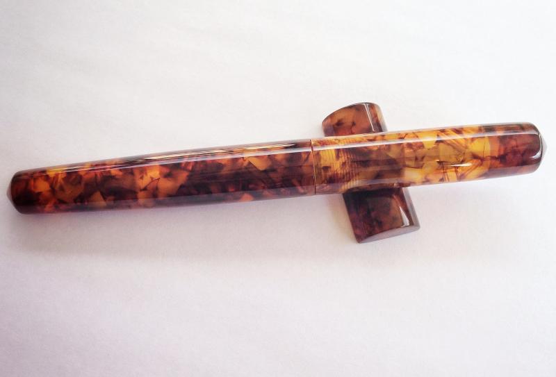
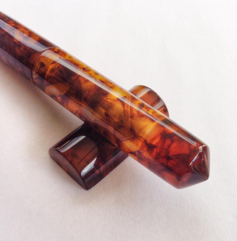
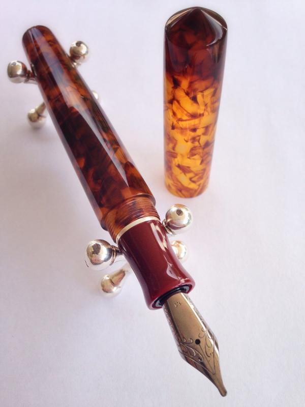
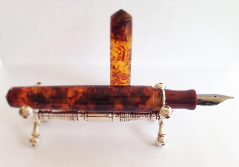
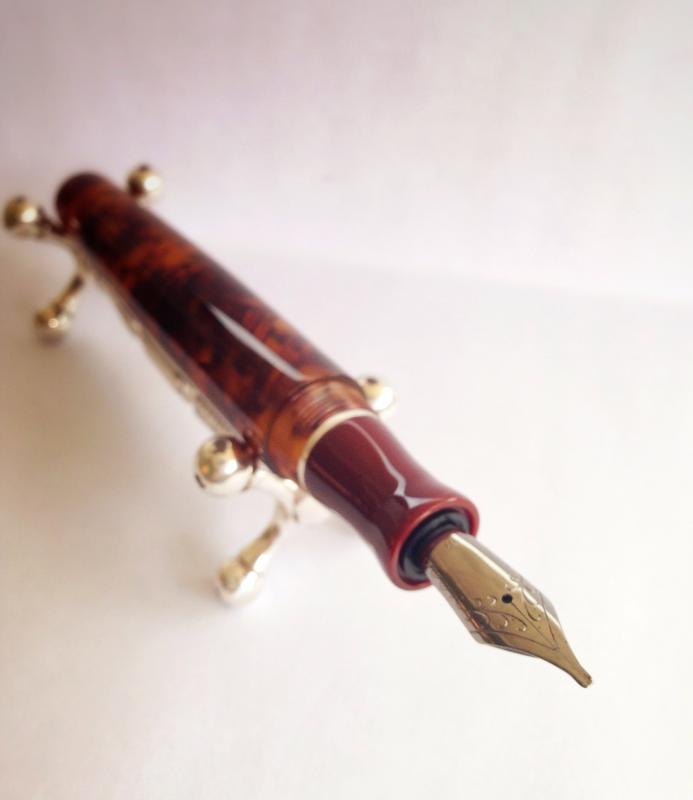
Scriptorium Pens Idyll In Illuminated Amber Tortoise
Zillaxila posted a topic in Fountain Pen Reviews
Hello Fountain Pen enthusiasts. Today I want to share a review of a recent aquisition I made from Scriptorium Pens. First of all I have to say that communicating and working with Renée, who is the wonderful person behind the lathe and who makes all these beautiful pens, was a joy. First we had to stablish what materials I wanted for the pen. This was not an easy task since there is hundreds and hundreds of different materials and colors to choose from. Well, I waited a month to think about what I wanted, and thank God I waited because in that time Renée did the first Idyll model. This was the model pen I wanted, and after all the thought I chose a beautiful German Lucite called Illuminated Amber. What sold it to me was a picture from the Scriptorium Pens website. Also, Renée told me that it was her favorite, and that sealed the deal. Then there was the choice of using another material for the section, which I decided to use an acrilic called Red Urushi. It gives the appereance of laquer, and it has a wonderful deep red color. I was sure that it was going to make a nice contrast with the translucency of the amber tortoise. The nib I chose is a 1.1 stub, and it is a German made Jowo nib with a Ruthenium coating. The detail that complements the pen and gives it an elegant look and feel is a Sterling Silver band that I decided to put between the barrel and the section. This way the different materials have a piece that separate them and gives them more character. The nice part of doing a Custom pen is the endless possibilities of shapes, sizes, nib types, materials, colors, etc. Renée leads you on what she thinks works best, but always tells you that is your pen and you should do whatever pleases your pen appetite. When Renée starts the pen she confirms you with an email, and this starts a wonderful experience looking at all the process of your pen beeing produced by hand on a lathe. All thanks to instagram and the wonderful pictures Renée puts in her feed. The pen was finnished and sent to me with insured shipping, very fast indeed. The pictures that Renée sent me to my email confirmed that what she made was what i visualized in the begining and exactly what I wanted. But still I had to get the pen on my hands to feel it and sense it in person. Well, I must say that it is a work of art. it is total perfection, and by far my favorite pen of my humble collection. The feel in the hand is incredible. The polished lucite and the texture is undiscribable, it is like wet but at the same time so smooth. The translucency of the material is gorgeous, you can see the nib through the cap. The threads are impecable, all the work is done to perfection. For size comparisons the pen is the size of a Montblanc 149. So it fits perfectly in my hands. The balance is just right. It is a light pen, but it has more weight on the front. The nib writes smoothly, they are inspected and tested before leaving, so it was no problem the first time I inked it and wrote right away. The section is just beautiful, and that band....cant give any more complements on this beauty. I hope you liked this review, and really the pictures dont do justice to the pen. You have to feel it in your hands to experience it. Fully recommend Scriptorium Pens. Thanks for looking!
-
Last time I visited my folks, I swapped my Silver metro F with dad's Charcoal Safari M. I can't live with a metro , so I bought a white MR M. However, this is not the place for my love for metropolitans or nib width of Western and Asian nibs. YOU have already taught me that. Thank YOU. The safari was bugging me for some time, yes it's a great pen (peace to safari haters), but it's pretty boring. So I thought about swapping the nib to an italic. But Lamy replacement nibs are rare here in India and costs almost half of a new pen (900 INR for the nib, ~1700 the pen). So that was not a very good option to try my hand at an italic. SO I kept looking and found a NOS 78g with a broad Stub. Now, what I know already from hanging around with you guys for over a year is that: 1. Stubs are slightly rounded (smoothed) at the corners, thus less scratchy. 2. Cursive Italics have sharper edges and can be a bit scratchy. The ebay listing for the 78g mentioned stub. But I still find it quite scratchy. I've added a writing sample to show off the "always awesome" 78g & my amazingly awkward handwriting. So here are my questions.. 1. Is this a stub or a CI nib ? 2. What can I do to make it a bit smoother ? The pen was dipped in pelikan RB.
-
Just been looking at Iguansell website. I came across the rather handsome M625, and when I scrolled down the nib options there was a stub and italic option, as well an OB option. Just wondering if anyone knows if this is indeed something that Pelikan have introduced, or, as I think, this might be the result of the unintentional misappropriation of the Aurora nib options to this line of Pelikans..