Search the Community
Showing results for tags 'stub'.
-
I first heard about Leonardo Officina Italiana pens from an Instagram posting by Glenn Marcus. His pen looked gorgeous, and he spoke very highly of it. Looking into this “new” company, I find it has been around for several decades, but, while they have made pens for a number of other well-known Italian pen companies, they only recently began making pens with their own branding. They call the first of their models “Momento Zero,” meaning for them “a new beginning.” Given the recent demise of several highly esteemed Italian pen makers and the rumored distress of some others, it is wonderful to see new Italian pen makers appearing, especially ones producing writing instruments of such high quality. But I’m getting ahead of myself. Leonardo Officina Italiana is making two lines of Momento Zero pens. One line has resin bodies, captive converter inking systems and steel nibs. It is priced in what I would regard as the middle range for a pen with these features. The other line is produced in very limited numbers. It has bodies either of celluloid or ebonite, a true piston filling system and 14 Ct gold nibs. It is priced in the lower range of top quality Italian pens - still rather expensive. The pen I chose was the Ebonite model. This was a limited edition of 10 pens. I found one at Stilograph Corsani in Rome. I had a lovely email exchange with the owner, Stefano Senatore. He had one ebonite pen left, but I wanted one with an italic nib. Stefano determined that he could obtain one from the manufacturer, but it would be outside of the limited edition. It would be numbered “00/10.” That was fine with me. The pen arrived today, and I inked it with OMAS sepia. General appearance/aesthetics The pen is made of a dark, reddish “Rosewood” ebonite. both the cap and barrel have a subtle taper. The ends of both the cap and barrel have slight points. There are two thin gold cap bands, another band between the barrel and the section and another between the barrel and the piston cap. Size/Ergonomics The Momento Zero is about the length of a Pelikan M800 or an old-style OMAS Paragon. Its barrel is significantly bigger around than the Paragon and just a bit bigger than the M800. There is a slight step off to the section, so the sections diameter is probably about 14 mm (my estimate). The ebonite pen is quite light, and it feels well balanced both posted and un-posted. Left to right: Leonardo Officina Italiana, OMAS Paragon, Pelikan M620, Pelikan M800 The gold clip has a roller at the end. It goes into and out of a dress shirt pocket smoothly and seems to keep securely in the pocket. Piston/filling The pen fills with 4 turns of the piston. The piston turns smoothly with a solid, positive feel. I have not measured the ink capacity. Stefano told me that the piston mechanism was modeled after the one used by OMAS. The nib, feed and writing experience The nib is a 14Ct gold, “semi-flexible” stub. I believe I read somewhere that the stub was 1.3 mm. However, it writes a line that is 0.8 mm wide. This is well within the practical range for my everyday italic handwriting. The nib is buttery smooth, but, with smooth Rhodia R paper and OMAS ink, it has very respectable thick/thin line variation. Together with the pen’s excellent balance, this makes for a very comfortable, fluid writing experience. When I looked at the feed, I remarked that it appeared identical to that on my OMAS pens. The nib itself is about the size of a vintage Paragon or 360 nib. Its shape is a bit different, with more flare in the shoulders. Top to bottom: OMAS Ogiva, Leonardo Officina Italiana, OMAS Paragon, OMAS old-style Milord General quality/fit and finish The fit and finish of this pen is flawless. It impresses me as being of very high quality but in no way flashy. This is clearly a pen to use, not one to merely display. That suits me fine! As a rather unique and certainly unanticipated bonus, the pen came with a little package of the swarf from it's turning. A cute touch! Last, a writing sample - my "thank you" note to Sr. Senatore. Happy writing! David
-
Hi. I'm planning on buying myself a Twsbi Eco just after Christmas, and I'm torn between which nib to get - A stub or a medium. Typically I write quite quickly, and reasonably small with a medium nib, but I really love the look of writing with a stub. There is a photograph of my handwriting written with a Waterman Gentleman with an 18k gold Medium nib, inked with Waterman Black ink. What do you think? Thanks!
-
Review of the Visconti Homo Sapiens Bronze 1.3mm stub Note: Higher-res photos available here This week I finally gave in and purchased a Visconti Homo Sapiens Bronze with a 1.3mm stub nib. Ever since I first saw photos of this stunning pen, I've been wanting to own one. Lava, bronze, palladium and titanium? Yes, please! This is my second fountain pen. This January I got myself a Waterman Carène with a fine nib, followed by a stub nib about two months later. While it is a very nice pen, I just couldn't resist the even wider nib, the unusual look and materials, and the supposedly very smooth and wet Dreamtouch nib of the HS. So a few days ago I finally went to a very nice store called La Couronne du Comte here in the Netherlands to get the pen, along with a metal traveling inkwell by Visconti. What I noticed when testing it out in the shop was that it took some effort to initiate the inkflow to the paper. Once it got going it wouldn't stop until the pen was lifted from the paper, but I found I had to push a little to get it to write. Not being sure if this was due to dipping the pen rather than actually filling it, I decided to go ahead and take it with me anyway. When I got home and filled the pen I got roughly the same results. It didn't take long to diagnose the nib with a mild case of baby-bottom, as applying no pressure when writing showed two ink trails from each of the tines. A small push down and the (copious) flow started and stayed intact for as long as the pen touched the paper. After tracing some figure eights on a fine nail file, the problem is virtually non-existent and the nib has retained its deliciously smooth operation. I am now truly delighted with the way it writes! ______________________________________________________________________ Appearance & Design (9) - Just plain awesome! This is about 90% of why I bought it. I absolutely loved the way it looked on photos and it does not disappoint in real life. The lava mixture is a very nice matte black, with many small pores and some even smaller reflective flakes. This contrasts in a very nice manner with the bronze parts of the pen. The two rings around the cap are significantly less shiny than the other parts and I guess that these also will look like that eventually. I like the font Visconti used for the text on the center band. The clip has a nice spring to it, but it will have to be lifted if you intend to use it as it runs flush with the barrel and there is no rounding going on to allow it to slip on by itself. The nib looks gorgeous! The two tones and the decorations match nicely. It says Visconti, 23k Pd 950, Firenze and 1.3 on the nib. The breather hole is crescent-shaped, with the tips pointing towards the barrel. This pen uses the Visconti My Pen system, which means that the Visconti logo shown above can be removed and replaced by two initials or gemstones for instance. I may at some point replace the logo but for the moment I'm happy with how it looks. The final aesthetic aspect I would like to point out are the indents between the grip and the section. These are part of the locking mechanism: you're supposed to push and twist simultaneously to uncap, but in practice you can simply twist without pushing and the cap will still come off. This doesn't bother me but it's something you should be aware of. Don't expect it to uncap by itself though, I can't see that happening at all. Visually, I really like the grooves as I find they resemble some kind of Greek pattern which fits right in with the general theme of the pen in my opinion. Construction & Quality (9) - Very good, but... Quality of construction is excellent for the most part, but I do have three issues I want to mention. Firstly, the fact that this nib required pressure to start writing is something that really bothered me and absolutely had to be remedied before I could enjoy using this pen. I applaud Visconti for wanting to give their users the smoothest experience possible, but having to deal with baby-bottom is not my idea of Dreamtouch. Fortunately I was able to resolve it but I think this should simply not happen to such a high-end pen. I have read that Visconti's stub nib is more prone to this defect than their other nibs. Secondly, and thirdly, Visconti needs to work on their printing/painting process as this leaves something to be desired: the black on the clip looks like it is printed using some kind of dot matrix, but on one side the entire printing is very slightly misaligned with where it's supposed to be, whereas on the other side some dots have not printed. Also some of the letters look a bit jagged because of this process when looked at closely. This should be clearly visible in the high-res photos on Flickr. Moreover, on the band that reads 'HOMO SAPIENS' the text is colored black, but the m is not entirely colored. This is also visible in this photo. Fortunately however, none of these issues affect my daily enjoyment of the pen: the nib problem has been cured, and the paint anomalies are too minor to notice without really inspecting the pen or looking for it. As a side note, I should add that the traveling inkwell I was first shown featured quite ugly misprintings and even some scratches, almost like it was a secondhand prototype or something. The seller said that this was the way the newer, plastic inkwells all looked and then offered me the metal one from a display case for the same price, an offer I gladly accepted! Weight & Dimensions (10) - Perfect! The size of the pen is perfect as far as I'm concerned. Capped it is as long as my Carène, uncapped it is slightly longer. The big difference is in the circumference of the pen. It is a much fatter pen, which I really appreciate. The section has a very comfortable shape and the fact that it is also fairly wide means it is a pleasure hold. This together with the smoothness and wetness of the nib are what constitutes the Dreamtouch I think. Nib & Performance (9) - Wet, smooth, some feedback Over the last few months I have learned that I like my nibs wet and smooth. The HS delivers in both respects, and when looking at the current performance it is all I hoped it would be! The wetness is there not just after filling the pen, it remains virtually constant afterwards contrary to my Carène which alternatively writes wetter and drier as I wait for for the feed to draw more ink from the converter. However, when considering only stock performance, I would give the nib about a 6: it would write, but only if I apply some pressure first. This would be a major issue for me, but perhaps you don't mind or wouldn't even notice. Filling System & Maintenance (8) - Power filler! The HS bronze uses a power filler mechanism to suck up ink. I love using it and think it's much cooler than a converter. Just unscrew the blind cap, pull the titanium rod back, submerge the pen up to the section and push the rod back in. Near the end of the travel, the vacuum will be released and the pen will suck up quite some ink. For optimal filling you should use the traveling inkwell as that allows for a full fill by inverting the pen whilst filling. The big downside of this mechanism is the fact that cleaning can not be carried out by using a bulb syringe, and thus is much slower than usual. This is especially annoying when using e.g. Rouge Hématite as all you can do is repeatedly suck up water and expel it again which can take ages! Given the fact that the pen is just so nice in virtually all other aspects, I can definitely live with this but you should consider it when buying this pen. The nib can only be removed using a special tool that I saw the seller use, I wouldn't risk trying to remove it without this tool. Cost & Value (8) - Alright, I guess.... Going for about €450 in the Netherlands, this is not a cheap pen. Whether or not it is worth it is as always a very subjective matter. For me it clearly was or I would have returned it, but I wouldn't be surprised if there were other cheaper pens that write (almost) equally smooth and wet. As for looks, you really don't have much of a choice but to pay up, or pay even more for the limited edition Mazzi version of the pen. Since I will be using this pen for just about any writing I will do, which, being a college student, can include quite a bit of note taking, I simply consider getting a pen that writes awesomely the same as any other time you buy a quality tool for something you do on a regular basis. The fact that I can couple this with the visual appeal of something like a wrist watch in one object and stand out from the herd of cheap ballpoint users just adds to my personal enjoyment! Conclusion (Final score [53/6]: 8.8) - Not perfect, but excellent The few issue that my specimen of this pen has have either been resolved or are too insignificant in the grand scheme to significantly affect my appreciation for it. When a pen can couple stunning looks and writing performance, that is a winning combination for me and I do not regret the purchase at all. I look forward to lots of writing with it and feel no desire to purchase any other pen after this one. Overall, I would definitely recommend the Homo Sapiens as well as the brand Visconti to anyone looking for a good looking, smooth writing pen. Do make sure to test it out at a shop though so you know what you're getting, especially in terms of nib performance.

-
Hello, I would like to pick a Pen from F-C and I have doubts between Medium Italic vs Stub in steel from Meister Masuyama. I would like to know your feedback if you have tried both. I would pick up an italic because it is supposed to have more line variation. But I am afraid it to be very scratchy, I don't mind if it has a bit of feedback, like a sailor or so, but not too much that it is bothering. Would an italic from Masuyama be smooth or scratchy? Or something in between? I am used to write in cursive, since in Spain print script it is not taught in school. Also it would be great to see writing samples. I have seen the white on black samples from the F-C site but they are not very clear to me. Thank you FPN people.
-
Hello, Can anyone please advise from experience if the Montegrappa Exta 1930 Broad nib is stubbish? I am aware that their medium nib runs slightly narrow, but I don't want a greater line width if it is devoid of character. Any advice or writing samples would be much appreciated
-
Hey Everyone, I've just sent back my Franklin-Christoph medium S.I.G grind in order to exchange for a broad Masuyama italic. Don't get me wrong: the SIG nib was great to write with and I liked it very much; but, since you can't buy Masuyama grinds separately like you can a sig, I've opted for the CI. I'm also interested in learning an italic handwriting script some time, so this makes sense long-term. Now, however, I'm hearing that Masuyama italic grinds are dry writers. One post I've come across was particularly bothersome in that the OP said their f-c Masuyama italic required loads of pressure to write with until they eventually sent it back for a flow adjustment. Moreover, the nib wasn't said to be defective by the F-C team, they just tuned it to what they'd call "wet". I'd imagine that an italic tuned on the drier side would maximize line variation and the integrity of the cross-stroke-- are there any other practical reasons for a CI to write dry? I'm particularly interested in hearing from those who regularly write with any form of italic or own steel F-C Masuyama italics. Have yours been dry compared to others? Do they write under their own weight? Having said all that, I'm really not too fond of nibs that are very dry, especially if they're broad. On the other hand, perhaps I should leave this to the expert Mr. Masuyama -- it is, after all, my first hand-ground cursive italic. Sorry for the long post and thanks in advance.
-
Got My New Omas Vision Stub Today But....
sub_bluesy posted a topic in Fountain & Dip Pens - First Stop
This one is a Milord Vision in green with a factory stub nib. Its my only Omas with a stub. I was always under the impression that their broad nib was considered a stub but this one is very different. I picked it up secondhand but the nib profile appears to be factory stub along with the engraving on the nib. I cant confirm or deny if someone besides Omas had worked on the nib but it looks and writes like it was ground by a drunken baby. It railroads at the drop of a hat and the grind on the bottom of the nib is super uneven and grainy. I can see the unevenness by eye. I cant believe this nib ever wrote well and whoever worked it must have been late to a lunch date. I did some work to it tonight and heat set the feed. Its ridiculously wet and there was a good gap from feed to nib when I received the pen. It still throws down so much ink that it will not completely dry on paper after a good amount of time though. I cant get a sheet of paper between nib and feed after heat setting so the gap is right but its still crazy wet. The tine spacing looks pretty even so its not like theyre spread out too far or anything. This one is kind of a mess! The rest of the pen looks great but the nib and feed is just ridiculous. The QC seal says the nib was originally in fine so I assume it was sent back for a nib exchange to a stub. God I hope this nib was not ground by Omas. Its just all kinds of screwed up. I worked on it for a while with a 10x loop but Im going to need to continue with a proper microscope to get it right. Im planning to sort it out next week. The problems with this nib/feed are new to me though so it should be interesting. Usually a heat set has sorted the super wet condition in the past but not this one. Its going to be a challenge! My other Omas Vision is super wet as well in medium so maybe this is a factory tune but its just silly wet. None of my other Milords are like this and that includes the wet rosewood/ebony models. Theyre wet but reasonable. Also even the clip tightness is different. I dare you to get a sheet of graphene between the clip and cap on this pen! Going to need to adjust that as well. Totally different than all of my other Omas pens. Im really baffled by all this. This pen was one of the last Omas made as well as my factory tuned Paragon Ludovico Einaudi Signature. The Signature Paragon is perfect. I mean really, its the best pen I have! This Milord though is 180 degrees out. Omas must have been an interesting place to be during the last days. All I can say is that I sincerely hope the nibsmith who built my Signature Paragon has picked up a great job at Montegrappa or the like. That one is an artist whos talents should not be wasted! -
Hello again to all my FP friends! I just wanted to share some writing samples of the 4 nibs I had custom ground by fpnibs.com (no affiliation, just a satisfied customer). Their work is fantastic, reasonably priced, and with excellent service. These nibs all write wonderfully. The 1.1 Oblique Cursive Italic is especially dreamy and now a daily user for me.
-
Hi All, Any suggestions on modifying a VP stub nib to fine/extra fine. I have successfully transformed a few standard medium nibs to a very smooth fine using a 4K, 8K and 10K honing stones, but the VP stub is a bit nonstandard. Any suggestions, tips, guides, examples etc... are greatly appreciated. Thanks in advance, .
-
Woweeeeee... Too bad it shot past my self imposed limit of £150 + S&H. All things considered the price it eventually went for wasn't so bad but too much for me atm. To be honest, I already have one 51 with a factory original 1.1-1.2 mm stub (juicy but would like it to be more crisp). It was just that that nib was... so achingly clean and shaped so nicely. I can almost see it leaving behind a beautiful wide, wet but crisp line with amazing line variation. Oh well, the hunt is still on, just lovely to see an outstanding specimen like that.
-

Anything I Need To Know Before Making My Own Stub Nib?
calvin_0 posted a topic in Fountain & Dip Pens - First Stop
I been looking for a cheap way to try stub nib... but so far it seems to cost me around 10 bucks minimum... however someone suggest that I should buy jinhou nib and make it myself... well i dont have any Jinhou nib, but I do have a Wing Sung nib that come with my 698.. and it seems like making stub nib is as easy as cutting it with a side cutter and sanding it down... so is there anything else I need to know before I start butchering my wing sung nib? www.youtube.com/watch?v=rG6_4GK8QCE&t -
I'm ready to try my luck at line variation. So I'm looking at mr. Pen's Italix range. Seems they have a lot of options to choose from. It was all a bit confusing to me, so I've made a list. Hopefully it's useful for someone.
-
I used to do multi colored notes with my uni ball vision pens. my friend showed me a stub pen and I absolutely love it. I cant go back to normal tips now. So i bought a lamy alstar with a 1.5 nib. I love it alot but I have a problem with it writing too big. I looked at amazon and got a nice 1.1 manuscript fountain pen. I think this one writes so much nicer and I can put more words in a page with this on. I tend to write for about 4-8 hours at a time small breaks every 2 hours but the manuscript really hurts my arm after writing with it for long periods of time. My lamy doesn't do that. plusthis pen hurts my finger as I hold the pen high. So while I want to buy a bunch of multi colored lamy pens I found that some of the colors I like are the special edition and I don't plan on paying about 100$ to get them. Do note one thing, I have used a jinhao x450 before I hold the pen too high and end up holding the nib. I saw the wing sung 6395 which is a lamy al star copy and that I can swap my lamy nibs into that pen. So I can buy a few 1.1mm and throw a small grind on them? I have yet to use the lamy 1.1 but I heard its basically round. Does anyone else have some suggestions cause i'm all out of ideas, and I dont really know what else I can do without spending over 200$ I want the colors dark purple, a nice teal, dark red and finally a black. I'm looking at a orange and a green.
-
Hi All, Even as I post this, I just sold out of the Online kits. However, I should receive my next re-stocking order tomorrow or Saturday! Here's the link to the newsletter, and the direct link to the video. BTW, the Monteverde Giant Sequoia and the Conklin Stylograph Matte are back in stock. Regards, Norman
-

Pen With Line Variation For Note Taking/everyday Use
Andr posted a topic in Fountain & Dip Pens - First Stop
I'm looking for a pen with line variation that I can use for taking notes.I want it to write fine and preferably not very wet I have a small budget ~$35. The only pens I've seen that I've seen that fit the criteria are Noodler's Ahab/Konrad, Nemosine Singularity and Pilot Plumix, which of these would be the best for note taking and are there any other pens that fit the criteria. -
Dear FPN people, I have a Waterman Charleston purchased in 2009. Mine is a "M" as marked on the feed. The small nib is stock - marked PARIS 18K-750" It flows/writes well. I found a Spanish-language video that demonstrated the pen. At the beginning (time mark 1:50) however, when the cap comes off we see a wide stub with the Waterman logo. At 3:50 approx the reviewer shows the somewhat flexible and free-flowing capabilities of this nib. No indication that there is a different feed. Please, if you have time, take a look at this video and tell me if you know how I can find the nib pictured. I love broad italics and stubs. My handwriting suits these nibs well; I just write letters, cards, and research notes. No calligraphy business or craft - just fun everyday stuff. Seen at 1:50 (not while writing) and then writing at 3:52 in a video (Spanish-language) posted here: https://www.youtube.com/watch?v=FnxEmLVcnM8 Be aware that on my computer I had to turn the volume WAY up to hear the commentator. Wish I understood Spanish! Thanks, in advance, for any comments. Jonathan7007
-
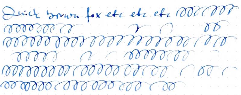
Hi all I was questioning the performance of my new pen (TWSBI Diamond 580, stub 1.1mm). Sometimes the ink just stops flowing during a couple of characters. Then everything goes normal again. When this happens, I have to stop and repeat the missing lines. The samples below illustrate the problem. On the first image, the same text is repeated several times: see how some characters (or sometimes whole words) are "skipped". The same with the spirals on the second image: a part of the line is missing. I was wondering if this should be considered normal behavior of a stub nib (I wouldn't believe it), or is there really a problem with this pen or nib? Any opinions/suggestions? EDIT: I forgot to say that the pen was flushed with distilled water before inking. Other pens with the same ink work normally on the same paper, so no problem with ink or paper.
-
I need a highlighter pen. Tried the Lamy Safari with 1.1 nib route, but the converter is too small so I run empty very quickly. Now I am leaning towards a TWSBI Diamond Mini with a 1.5 stub. Is anyone using the TWSBI as a highlighter pen? How is the 1.5 nib out of the box? Having read about breakage, cracking plastic, and finnicky nibs in the TWSBI forum, I'd like to hear your experience with the Diamond Mini, particularly the 1.5 stub nib. Also, if your experience steered you away from TWSBI, please share if you found a better alternative. The highlighter ink will be Diamine, probably Yellow or Sunshine Yellow. Thanks, everyone!
-
Hello Everyone, I received my Nakaya Decapod Writer with the EF Nib. I tend to write small and thought the EF Nib would be a perfect fit. Unfortunately it felt dry and very scratchy. I am going for a Nib change and wanted some suggestions if medium stub would be fine enough or should I specify the size while asking for the customization? What is the minimum size I can get in a medium stub such that it does not feel scratchy Please give me your suggestions on the nib.
-
I bought a Pilot Plumix a while ago as my first stub nib pen. Though initially I had a bit of fun with it, I find I don't use it much - even while I use my flex nibs quite a lot. I thought it was a little bit of money wasted, until today when i found out I could use it as a flat-head screwdriver. With reborn purpose, I think I'll be using this pen a lot more now. Has anyone else found alternative uses of/for stub nibs, or am I the sole madman here? (Embracing for hatemail. Don't worry, I do take proper care of my other pens.)
-
I am purchasing an Italix Parson's Essential and plan on getting it with a Stub Nib, however, Mr. Pen has slightly different wording than Goulet Pens blog post so I am bit confused. Mr. Pen calls the stub Cursive Stub and Italic (Medium Italic, Fine Italic, and Broad Italic). Goulet Pens calls the stub Stub and Italic Cursive Italic. Where I am getting confused is the word Cursive. Is a cursive stub the same as a stub? and is a cursive italic the same as the above italics? Of course, I know the size differences between medium, fine, and broad.
-
Hi guys, I've been using fp with EF, F and M. (MB 144, 149, Aurora Optima, Omas Extra and Rotring ArtPen) I am now considering getting fp with stub. Is there any pen with stub nib that you recommend? There is no specific criteria. I just wanted to hear what you like. Thank you! tgoto
-
I just bought a brand-new Ruby Red M320 and I couldn't be happier with a pen. Now, I must preface my totally subjective remarks by saying I have very small hands and I love miniature anything, especially mini fountain pens. But when I ordered it, I had no idea it was such a teeny-tiny, adorable slip of a pen! I opened the box and was totally floored by how cute it looked, lying there in its full-size Pelikan container. At the same time, the classic beauty of this pen took my breath away. The finish on this pen is GORGEOUS. (I'm trying to attach photos to this review.) When I hold the pen up to the light, the pinkish flakes in its depths sparkle and shimmer in layers. It gives the rich, beautiful, ruby-red resin real depth. While writing with this pen over the last few days, I have frequently sat with it open for as much as five minutes at a time. Every time, as soon as I put nib to paper, it started right up without hesitation. This diminutive pen performs every bit as well as my other Pelikans. I had my M320 reground to a stub by the seller, and I am very happy with the results. The nib has a sweet little spring to it that adds flair to my writing. When posted, it will be plenty long for most writers. For those with very large hands, it may be a little too slim. That will depend on individual preferences. As for the amount of ink it can hold, it's about what you would expect for such a tiny pen. However, it didn't run out so often that it became irritating. And besides, when are we really so far from a bottle of ink that we can't refill a pen on demand? If I plan to take it away from home, it is a very simple matter to carry some ink in a sample vial, if I really think I'll be running out. I've done some serious writing with it over the past few days, and it's taken several hours to run dry each time. I guess you can tell I'm a little biased and I absolutely love this pen. It was not an inexpensive pen; yet, I am so happy with it, I am considering buying the Pearl M320. That's not so unreasonable when you consider that my collection has lots of minis in it. The Ruby Red M320 is the most classically beautiful and adorable pen I own. I am finding every excuse to write with it. Actually, who needs an excuse, anyway?
-

Torelli "51" Fantasy Demonstrator With 1.3Mm Minuskin Stub
zaddick posted a topic in Fountain Pen Reviews
In the world of fountain pens, there are forgettable pens and famous pens…. and then there are the icons. Those are the pens that have a wide appeal and a cult like following. You may love them or not, but there is no denying their impact and the passion they generate amongst devotees. One of these icons is the Parker “51”. There is an abundance of information about these great pens, and I will make no attempt to repeat all the details. I will simply point out that there are two primary filling systems used in the life of the pen – the vacuumatic plunger filler and the aerometric filler. The vac filler was the first system used and I draw this distinction because the pen I am reviewing uses this method. Sometimes iconic pens inspire tributes or fantasy versions where people create a pen they want to see, but it never came from the factory. When this is done with the intention to add character or widen the scope of a pen, I think it has the potential to be a thing of beauty. (When it is done to deceive or to make a pen that is represented as a rare factory original, I find this despicable and blight on our hobby.) There are many folks who have created so called fantasy “51” pens including Ariel Kullock, Paul Rossi, Ralph Prather, and Brad Torelli. Each has their strengths and their products cover a wide range of prices, depending on materials, hours invested, and parts used. While I admire the work or all four men, the pens that appeal the most to me in general are those by Brad Torelli. Although he is a master of many pen skills, plastics are the area of expertise he focused on for this pen. He essentially took standard “51” vac parts and crafted a new barrel, hood and blind cap. In addition, he put new jewels on the top and bottom of the pen to make is a “double jewel” or DJ version of the pen. This particular pen is a demonstrator in a lovely transparent brown, almost the color of a refreshing root beer. I find the color pairs well with the gold cap. The transparency also gives one a real appreciation for the mechanics of these pens. Manually creating a vacuum to pull ink through the collector and breather tube in order to fill the ink chamber – simple but effective. One of the best things about Brad’s pens is the warranty. He likes to say he offers a lifetime guarantee on his work and his materials. The part that always amuses me is that he means his lifetime. I have no desire to publicly share his current age, but he has joked that he probably has 20 good years ahead and then maybe another 5 or 10 so so years (so get that warranty work done!). In all seriousness, I have personal experience with him standing behind his work and going above and beyond what any large manufacturer would do in support of their pens. Besides the giant pain in the rear it is to clean a “51” vac, the other issue for me personally is the limited range of nib widths available. To remedy this I turned to a custom retipped nib from Greg Minuskin. Greg sells a lot of “51” nibs that he retips and stubs in various widths. The one I picked was a fairly broad 1.3MM tip and Brad mounted in into his pen for me. Now I have a demo pen with a tip that is wide enough to suit my preferences. I’ll close by saying that if, like me, you found the Parker “51” a little lacking from the factory the good news is there are artists who can make your desires a reality. I have a soft spot for demo pens, wide stubs, and pens hand made by artisans. This pen met all these criteria in one slim, iconic form factor. -
I am frustrated with my new Visconti Demonstrator with the stub nib. It is a beautifully made pen, but it has never worked properly and I am wondering if I am doing something wrong. When I first took delivery, the vacuum loading system did not work, so the pen was sent back to Italy. Visconti repaired the pen and after several weeks I had it back. Now, however, it seems to have a problem with ink flow. When I try to write with it, the ink may flow for a letter or two and then dry up. Often when I pick up the pen and try to write with it, there is no ink flow from the nib at all. I have to shake the pen, or lick the nib, and after that the pen may work for a word or two at most before drying up again. This is my first stub nib, and perhaps I am doing something wrong, but I can't figure out what. It should not be so complicated. Any suggestions? Thanks.