Search the Community
Showing results for tags 'steel nib'.
-
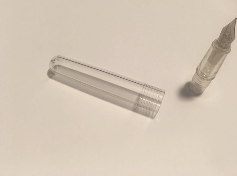
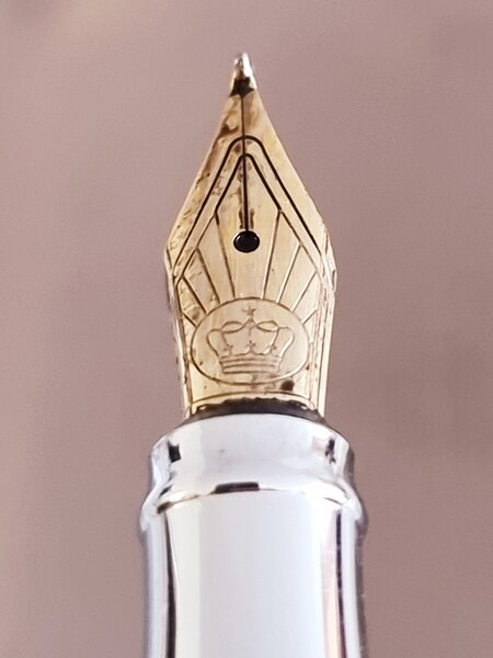
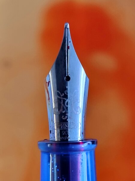
From the album: OldTravelingShoe's Random Pics of European Fountain Pens
© (c) 2022 OldTravelingShoe. All rights reserved.
- 0 B
- x
-

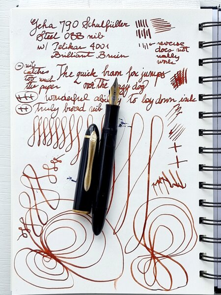
From the album: OldTravelingShoe's Random Pics of European Fountain Pens
© (c) 2022 OldTravelingShoe. All rights reserved.
- 0 B
- x
-
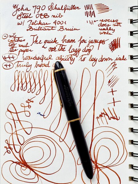
From the album: OldTravelingShoe's Random Pics of European Fountain Pens
© (c) 2022 OldTravelingShoe. All rights reserved.
- 0 B
- x
-
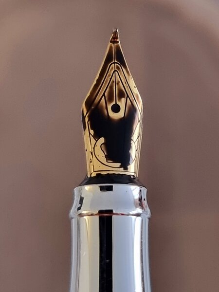
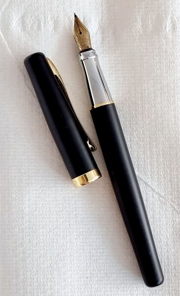
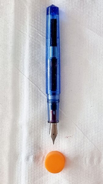
From the album: OldTravelingShoe's Random Pics of Fountain Pens
© (c) 2022 OldTravelingShoe. All rights reserved.
- 0 B
- x
-
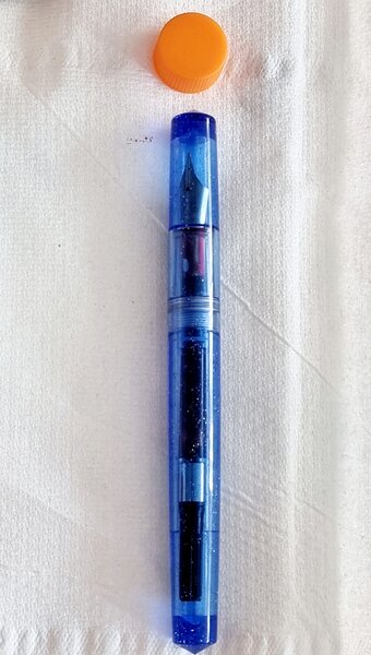
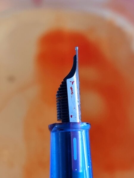
From the album: OldTravelingShoe's Random Pics of Fountain Pens
© (c) 2022 OldTravelingShoe. All rights reserved.
- 0 B
- x
-
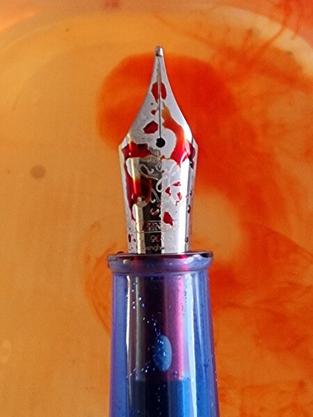
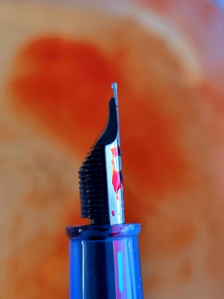
From the album: OldTravelingShoe's Random Pics of Fountain Pens
© (c) 2022 OldTravelingShoe. All rights reserved.
- 0 B
- x
-

From the album: OldTravelingShoe's Random Pics of Fountain Pens
© (c) 2022 OldTravelingShoe. All rights reserved.
- 0 B
- x
-
From the album: OldTravelingShoe's Random Pics of Fountain Pens
© (c) 2022 OldTravelingShoe. All rights reserved.
- 0 B
- x
-
From the album: OldTravelingShoe's Random Pics of Fountain Pens
© (c) 2022 OldTravelingShoe. All rights reserved.
- 0 B
- x
-
From the album: OldTravelingShoe's Random Pics of Fountain Pens
© (c) 2022 OldTravelingShoe. All rights reserved.
- 0 B
- x
-
From the album: OldTravelingShoe's Random Pics of Fountain Pens
© (c) 2022 OldTravelingShoe. All rights reserved.
- 0 B
- x
-
From the album: OldTravelingShoe's Random Pics of Fountain Pens
© (c) 2022 OldTravelingShoe. All rights reserved.
- 0 B
- x
-
From the album: OldTravelingShoe's Random Pics of Fountain Pens
© (c) 2022 OldTravelingShoe. All rights reserved.
- 0 B
- x
-
From the album: OldTravelingShoe's Random Pics of Fountain Pens
© (c) 2022 OldTravelingShoe. All rights reserved.
- 0 B
- x
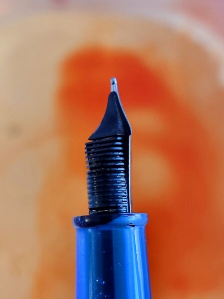
-
Visconti recently changed its small-size steel nibs, did you notice? All the Rembrandt and Van Gogh fountain pens they're selling, since the beginning of 2018, are equipped with the new model of steel nib. It's quite ugly to see, but it seems very smooth and pleasant to use. The bad news is that these new nibs are no longer compatible with the grips of the previous model. Not the whole nib group, nor the metal sheet only: they have different sizes, therefore also the slot in the grip changed. It's a pity, because the full compatibility and the interchange possibility of nibs, even among different pens, was a wonderful feature of Visconti, in my opinion. You could unscrew a calligraphic EF steel nib from a Giardino dell'Eden and screw it in a Homo Sapiens Medium, for example; even if this one mounts a small palladium nib with a different look. And vice-versa, because they were compatible. http://blog.giardino.it/wp-content/uploads/2018/03/PenniniConfronto.jpg Moreover, also the tip classification changed. The F, M, B mark is missing, there is a different unit of measurement, now. I explained all this in my blog: http://blog.giardino.it/2018/03/new-visconti-steel-nibs-not-compatible-with-older-ones/
-
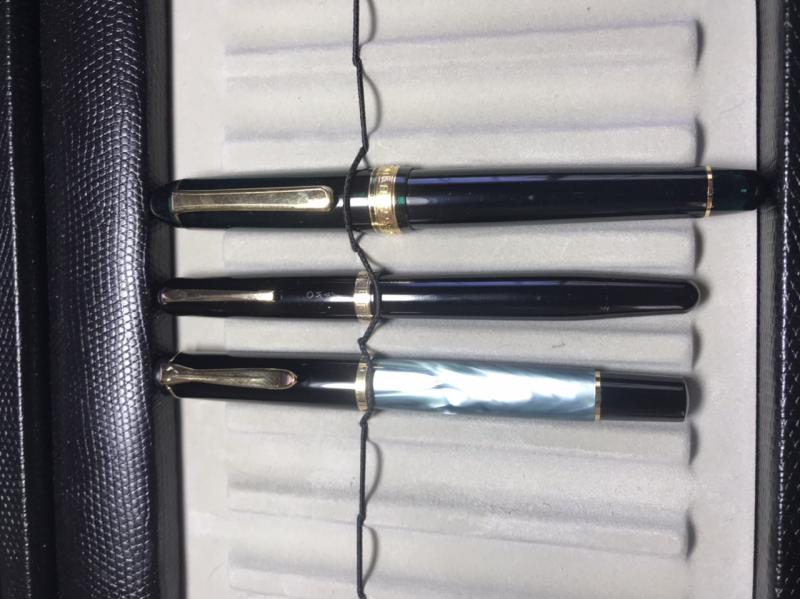
Hello, can anyone identify this Omas? I am thinking it is from the 60s and it is a piston filler with a steel nib. Pelikan and Platinum for size reference. Thanks!

-

Cartridge Pen For £0.59 In A Uk Bricks-And-Mortar Store!
Mercian posted a topic in Fountain & Dip Pens - First Stop
Hi all, today I was in my local branch of the UK chain of discount stores ‘Home Bargains’. I chanced to walk past their stationery section, where my eye lit upon a sales pack that contained a cartridge-fill fountain pen and two cartridges, for the price of 59p For those of you who do not live in the UK, that bricks-and-mortar store price of £0.59 includes my country's sales tax of 20%. At today's exchange rate, £0.59 = 0.69€ = $0.77. As a ‘purchasing power’ comparison, at the time of typing this the price of a 2-pint bottle of whole milk in my local supermarket is 80p. The ‘huge’ investment outlay gets you a "MADE IN CHINA" transparent plastic pen that has a completely-unmarked nib (which I assume is steel and ‘medium’), and also two cartridges of ink that the packaging describes as black. The cartridges are slightly shorter than standard ‘Short International’ cartridges (I measured them at 34mm long, whereas an SIC is 38mm long), but their nipples look like they might be the same size as those on a SIC. The pen's grip section looks as though it might be slightly too-small for my paws (I am 6'1" tall), but I am certainly curious enough about it to ‘risk’ the sum of 59p to find out Bon; after I have run some dish-cleaning water through it to remove any manufacturing residue, I shall run one of its cartridges through it, and then some Waterman ‘Serenity Blue’ for comparison, and a SIC of ‘WH Smith’ branded black ink too. Once I have collected and collated all this ‘data’, I shall post a review of it on the relevant board here. After all, I wouldn't want to inadvertently be the cause of any FPN user ‘wasting’ their hard-earned 59p on one of these if it turns out that the thing doesn't write very well Cheers, M. [Repeatedly edited to correct FFE's ]
-
I learned to write with a dip pen (basically, a 1/4" dowel with a nib holder and an inkwell) in Newcastle Upon Tyne and, scratchy as they were, I never fell out of love with writing with a fountain pen. My first real pen was a Parker 51. I now own several dozen pens and many (some might say too many) bottles of ink.
-
Hello everyone, Last time I reviewed the Gama Kuyil in detail, which is in the mid-price range for Gama products. Today I'll review one of their entry level fountain pens, the Gama Forever, which cost about half of Gama Kuyil, but functionally have similar usefulness and appeal. The history of Gem and Co., the producer of Gama brand of fountain pens is discussed in the review of Kuyil. The Forever is a smaller model from Gama, with minimal design elements. Why I like this pen- It’s a small but effective pen for everyday use. The price is very much affordable, even for a student. The built quality is very good and it will last long with proper care. Cons- It's an eye-dropper pen, so many things can go wrong. Eye-droppers are always for advanced users, as there might be occasional leakage, burping and other messy issues during initial handling and in some of the copies. The nib is a standard dual tone nib of Indian fine category, so limited nib choice. The ebonite looks good, but minute impurities and defects might be there. Also as these are hand turned pens, there might be some asymmetry in shape. 1. Appearance & Design: It's a Parker Duofold like pen, though much simpler in design. Parker Duofold was a very successful pen for the company. Basically Duofold was designed with the idea of changing the mundane black rubber design of fountain pens prevalent during that period, thus having a pen body of red rubber and making the section, clip screw and barrel end with standard black rubber. This contrast of red and black colour, coupled with a useful size, great ergonomics and balance, were instrumental to the success of Duofold design. Later more colours and material were introduced; other sizes and permutation-combination of different trims and design aspects were marketed as well. Interestingly the particular red rubber used to make Parker Duofold was termed "Pompeiian Brown" by the company. The success of Duofold in the 1920s inspired almost all major manufacturers like Waterman, Conklin, Sheaffer etc. to launch their own orange/ red / brown version of flat topped dual coloured 'Duofold' copies/inspired models. So it’s not surprising that even to this day, manufacturers don't look beyond this design when they want a relatively small, useful but attractive fountain pen. Gama Forever is no different in this respect. The Gama Forever It’s a flat topped cigar shaped medium sized pen with slight tapering towards both ends. The top of the cap is a bit thicker than the bottom of the body. I bought the light brown/yellow coloured ebonite with red ripples. As expected, both the ends have black coloured polished finial of about 7mm thickness and the section is black as well. The black portion at the bottom of the pen is flushed with body and there is no gap between them. The top black finial is acting as a screw to hold the clip ring,there is a minute gap between the top finial and the body of cap. Personally I like Kuyil like flushed finial which conceal the cap ring. The pen has gold coloured trims. The pen sports a simple ball end clip, made of brass. It's Gem's old stock, these clips are not made today and they'll be used till the stock lasts. There are two rings at the lip of the cap, each about 1mm. thick and separated by a distance of about 3 mm. The section gently tapers towards the nib, just before ending it has a flaring part for finger rest, which is a typical design feature among Gama pens. The body has Gama written on it, the letters have crisp margin. The nib is dual tones Indian fine nib with only ‘Iridium tipped’ and Germany imprinted on it along with some basic designs. It appears to be the same nib which have been branded ‘Gama’ in their latest models. Construction & Quality: The Gama forever is a well-made pen. The ebonite wall is quite thick, which is a common attribute of Gama pens. The polish of ebonite is good and the ripples look beautiful. On minute inspections, the ebonite has many impurities or small spots, but this being a low priced pen this is expected and these are not causing any problem with the overall look. There is no defect or rough area on the ebonite. The clip is sturdy and functional, but the gold colour fades with some usage. The trim is made of vintage brass material from their old stocks. The rings at the lip of the cap occasionally become loose and may require some effort to realign and re-position them, when these get dislodged. There is no leak from the junction of section and body. The cap easily sits with the body with about two and half rotations. The section screws on the body relatively easily without much tightness. Overall the construction is very good for the price; this pen will last long if proper care is taken. 3. Weight & Dimensions: It’s a lightweight medium sized pen. The dimensions are as follows Length of the pen: 145 mm Length of uncapped pen: 135 mm Posted length: Diameter of section: 11.5 mm Due to flaring up at the end of the section, the diameter at the end surface is 13 mm, but the area where fingers will grip the pen is 11.5 mm. Maximum Barrel diameter: 14-15 mm Section length: 18 mm Nib length: 25 mm. Ink capacity- about 3-3.5 ml I use the pen without posting. These pens typically don’t post deep, so the length increases disproportionately when posted. The balance is very good and long writing sessions with the pen is very comfortable. It’s basically an EDC pen for rough usage with some good looks of a hand turned Indian ebonite pen. From right to left: Pilot Metropolitan, Lamy Safari, Gama Forever and Gama Kuyil, all capped Lamy Safari and Gama Forever, uncapped 4. Nib & Performance: The nib is very good performer. Its Indian fine grade, meaning line width between Japanese fine and European fine, though I don’t think there is any strict criteria followed while making these nibs. It’s a smooth wet writer with some feedback. Burping issues might be there in some copies or in case of sudden temperature or pressure changes such as in flight. I didn’t face any issues as such till now. I would like to see them providing different nib grades with this pen. One can contact Mr. Subramanium of ASA pens or Mr. Pratap of Gem and Co. for customization. 5. Filling System & Maintenance: This pen is an eyedropper. Probably makers can modify to allow other filling systems, but for a cheap entry level pen, such efforts are not much fruitful. There are other much glamorous Gama models to go for customization. 6. Cost & Value: This pen is valued at INR 675 ($23, £18) in ASA website. It’s an affordable workhorse pen with great value on the long run. The build is solid, nib is a great performer in its default variety and ink capacity is good. 7. Conclusion: I would love to recommend this entry level ebonite pens to advanced fountain pen users for its looks, feel and usefulness. It’s a pen that would feel very comfortable in hand, appear as a quality product and would be a reliable everyday use pen. For those users who entered the fountain pen world recently with limited experience of eye droppers or hand turned ebonite pens, this might be a good first buy to experiment with an Indian ebonite pen. ASA website ASA Whatsapp no of Mr. Subramaniam - +91 9176607660 ASA email- asapens.in@gmail.com, unik.services@hotmail.com No of Mr. Pratap- +91 9884209055 my other reviews (In no particular order): 1. ASA Swan 2. ASA Writer 3. Ranga Thin Bamboo 4. Krishna Butterline Stub nib pen 5. Guider Egg- acrylic and ebonite 6. Kanwrite Desire 7. Kanwrite Heritage 8. Franklin Covey Lexincton Black 9. Gama Kuyil
-
Hi All! Here comes a new "ruthless review". My ruthless reviews have a few peculiar features: Concise;Very strict. If a pen costs hundred of euros, no faults are allowed. A good pen gets a 60/100, a great pen an 80/100, an almost perfect one a 90/100. Only a divine pen can have above 90. Don't care about the box,Add a few peculiar criteria:Nib appearance;Usability in shirt pockets;Out-of-the-boxness, meaning to what extent a nib was perfect right after leaving the seller. Jinhao 886 with M nib - red colour Fantastic pictures of this pen in this very same colour are available from Vaibav Mehandiratta's blog. His photos are far better than I'll ever manage to get, so... enjoy his effort! I bought this pen because it's one of the few Chinese ones with an original design (that is, it's not a copy of someone else's efforts). With this in mind, I thought it would be nice to encourage Jinhao's creative efforts, and I was not expecting much. Instead.... 1. Appearance and design: 10/10 This is really cool: the design is a sort of vintage/retro, reminds a bit of a FIAT 500 or a Smeg fridge. Very cute, absolutely awesome design work here! 2. Construction: 7/10 The metal looks sturdy, and tolerances are really tight. The section looks cheap, though, and so does the converter. 3. Quality of materials: 8/10 Everything looks OK, but the red and chrome coating is thin and seem likely to wear off very soon. I suggest to keep the pen in a pen holder. 4. Weight and dimensions: 7/10 Tiny, comfortable to use: the heft of the metal body makes the pen gravitate towards the paper. People with large hands will have issues, though. 5. Nib performance: 6/10 A no-nonsense M steel nib. Nothing special here: a bit of a hard starter and slightly on the dry side, and perhaps a bit "soulless", but it does its job. 6. Nib appearance: 7/10 Nice engravings, albeit banal. 7. "Out-of-the-boxness": 9/10 I expected much tweaking and fixing to get this to write: instead it wrote almost perfectly straight away! A little bit of tines spreading and it was good to go. 8. Filling system and maintenance: 2/10 Standard C/C system. The converter is a rip-off of a Lamy one, and this is unacceptable. Also, it leaks a tiny little bit... I guess I'll have to replace it soon. 9. Clip and usability with shirts: 8/10 The clip is maybe a bit too strong ( - 2 for this), but other than that, it's great, and the size makes it suitable for most shirt pockets. 10. Cost and value: 10/10 EUR 5 for the pen and shipping with registered mail?!?! This is incredible. If this is the "Chinese future", I'm very much looking forward to it! Final mark: 74/100 It was difficult to be ruthless with this: I highly recommend this pen to anyone who wants a nice, well-built, well-designed, tiny little pen For EUR 5 you get the pen shipped from China, inclusive of a converter, and it writes! That's more than you can say of some EUR 300 pens you get from Western manufacturers. I'm now officially a huge fan of Jinhao.
-

Pelikan M215 Or Diplomat Excellence A?
PranitSingh posted a topic in Fountain & Dip Pens - First Stop
Hey there, I'm going to buy a Lamy 2000 most probably (https://www.fountainpennetwork.com/forum/topic/326594-decent-capacity-first-gold-nib-fountain-pen/page-2?do=findComment&comment=3906816) and I have some extra money remaining with me. So I was wondering which pen should I get, the Pelikan M215 lozenge or the Diplomat Excellence A (steel nib). Both of them are used pens and both are in Medium nib. I am getting M215 for $61 (INR.4000) and Diplomat for $38 (INR.2500). Which one of them would have a smoother writing experience for everyday use? -
I've been recently looking at jumping from relatively cheaper (but still good) pens (like the Lamy Safari and Pilot Metropolitan) all the way to a gold nib pen, specifically the Pilot e95S. But should I get a gold nib pen? Is it a big difference and/or experience from a steel nib? Also, is there a difference between a 14k gold or an 18k gold nib?
-
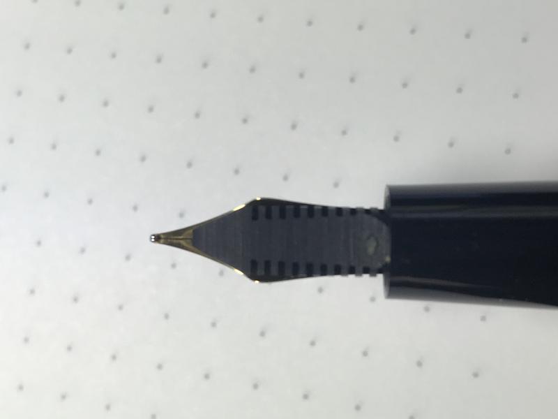
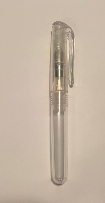
The Jetpens Chibi 2 is the second iteration of the pen marketplace’s homegrown fountain pen. It features a steel nib, a colorless demonstrator body, and a cartridge convertor filling system. The Chibi 2 retails for $2.99, and is available only at Jetpens. A view of the nib of Chibi. First Impressions (6/10) I bought this pen to push me over the free shipping limit on my Jetpens order, and I actually forgot that I had ordered it until it arrived. It is an unassuming pen, pretty much the definition of a “pocket pen”, and I set it aside for later. The pen came with a black ink cartridge in the barrel, which is always nice. The capped ChibiAppearance (7/10) The demonstrator pen is decently attractive for what it is, but it couldn’t compete with the likes of a TWISBI or a Pelikan demonstrator. The pen has a clear feed, so you can see the ink flow into it. The nib is small and steel, marked with “Iridium Point Germany.” The pen has a rounded, clear plastic clip with “Jetpens” written on it. The Chibi Posted Design/Size/Weight (10/10) Jetpens really nailed this in my opinion. In the second iteration of the Chibi, they were able to pin down exactly what a “pocket pen” should be. The pen is small, (3 7/8 inches uncapped, 4 1/2 inches capped, 5 3/8 inches posted) but easily usable when posted, and is so light you don’t even notice that you have something in your pocket. It is cheap enough to take anywhere, and feels sturdy enough to be taken anywhere. The barrel and section of the Chibi, separated. Nib (8/10) The nib is a fairly standard steel nib. The nib is marketed as Fine by Jetpens, but I found mine to be a little bit on the wide side, a barely noticeable amount wider than my Pilot Vanishing Point M Nib. The nib is a teensy bit dry, but there is still ample ink flow, and the pen does not skip at all when writing quickly. The nib is mostly smooth, but you can feel some feedback now and then. It’s a nail, so don’t expect anything in the flex department. Filling System (N/A) It’s a cartridge. It works. You can’t fit any convertor I tried into it. Not much else to say here. Cost and Value (10/10) This pen is a great value at $2.99, especially if you need to reach that free shipping line like I did. It compares favorably to pens like the Pilot Petit and the Platinum Preppy, its two main competitors, and unlike them accepts international cartridges. If you need a pocket pen, or a cheap pen to keep in your glove compartment, this one fits the bill nicely. Conclusion (8/10) The pen is a great value, but it has some flaws. It isn’t going to turn any heads when you pull it out, for instance, and it won’t accept a convertor. Despite this, it’s a neat little pen that’s well worth the price, and I would recommend trying it out. If you hate it, you could always give it away to a newcomer to the Fountain Pen world, it’ll still be many times better than the best ball-point. (In my opinion, obviously not a fact, don’t mean to insult any ball-point fans out there).
-

Faber Castell Ondoro Smoked Oak - Ruthless Review!
TassoBarbasso posted a topic in Fountain Pen Reviews
Hi All! Here comes a new "ruthless review". My ruthless reviews have a few peculiar features: Concise;Very strict. If a pen costs hundred of euros, no faults are allowed. - A good pen gets a 60/100, - A great pen an 80/100, - An almost perfect one a 90/100. - Only a divine pen can have above 90.Don't care about the box,Add a few peculiar criteria:Nib appearance;Usability in shirt pockets;Out-of-the-boxness, meaning to what extent a nib was perfect right after leaving the seller. Faber Castell Ondoro Smoked Oak with M nib Thanks to user dragon666, I can recycle his great review here and I don't need to upload pictures Mine is exactly the same. 1. Appearance and design: 10/10 I don't know who designed it, but this pen deserves a spot in the hall of fame of contemporary design. Here, for example. It's awesome. 2. Construction: 4/10 Ouch... a proof that "German quality" is often a stereotype: the cap doesn't perfectly fits the body, and moves in its place, leaving space for air to sneak through and dry the ink if unused for a couple of days. The clip is 1/5 of a millimeter off-centred, and the feeder doesn't always keep the ink inside the pen. The result: a big blue ink stain on a wooden pen. Impossible to clean Also, the pressure lock is not very secure: it wears out quickly and I already had to strengthen it a couple of times adding a thin layer of cyanoacrylate to make the plastic thicker. 3. Quality of materials: 10/10 The oak is tactile, beautiful, perfectly cut, in one word: amazing. The rhodium-plated metal is shiny and perfect. 4. Weight and dimensions: 8/10 Very good as well. It's 100% perfect for me, but the section might be too thin for some (-1) and it's perhaps a bit short for others (-1) 5. Nib performance: 8/10 Reliable, a bit on the dry side with some inks. No flex. A hard starter after a couple of days due to the poor design of the cap lock. 6. Nib appearance: 7/10 Minimalistic, indeed. Not bad, but they could have made it a bit larger! 7. "Out-of-the-boxness": 10/10 100% perfect in this field! 8. Filling system and maintenance: 5/10 The converter looks a bit cheap and sometimes there are minor leaks; the pen doesn't take all types of converters! 9. Clip and usability with shirts: 6/10 The length is great for any shirt, but the clip doesn't lock very tightly and can drop out. Too short for safe carrying in suit pockets. 10. Cost and value: 9/10 The pen is so breathtakingly beautiful that I'd gladly pay EUR 1.000 have one, Instead, it's around EUR 130. Too bad for the steel nib... Final mark: 77/100 This is a really great pen. Too bad it's not perfectly built, otherwise it would jump very close to my Visconti Van Gogh Maxi, so far the best pen I've reviewed, at 90/100. -
Visconti Rembrandt Calligraphy Set...sadly Very Disapointed
Zillaxila posted a topic in Italy - Europe
I have to talk about my dissapointed experience with my first Visconti. It is very sad for me because I had huge expectations for this brand, and for italian pens in general. First, I know it is the "cheapest" Visconti pen in their line, however for the price I paid ($200), I thought I was going to be pleased with my new pen. When I received the package from Fahrneys Pens I was very excited, only yo my surprise when I held the pen it is veeeery light, not what I was expecting at all. The cap is generously heavy because the magnet thing, but the barrell and section is too light overall. So light that when I opened the cap, there was NO nib section!!! The description says that the set comes with three nibs in total. I only got two, the 1.5 stub, and a flexy nib. The medium nib with the chromed section was not included in the box, very strange Fahrneys! Ok, so After my first dissapointment, looking close at the fit and finish of the pen I started to look at small imperfections that I was not expecting from an Italian manufacturer like Visconti. The small chromed button at the end of the barrell was not in place, I could see and feel a gap between the end of the resin and the chromed button or finial. Well, it was because the converter when installed was so large that it was pushing the button out. I had to cut part of the converter so it could fit correctly inside the barrell. The imprint "Visconti" on the clip is not well made, it has some blemishes and is not even. Nothing to be worried about, but still noticeble. Now to the nib perfomance. I first installed the so called flex nib. I know that Visconti uses Bock to make their nibs. Well, I am very disapointed with this particular nib. It is very dry, and veeeery scratchy. So scratchy that it tears the paper. I tried to smooth it with micromesh but no difference is noted. It has so much starting issues that it is very frustrating. It never writes the first time, and I have to tap the nib onto the paper so that the ink flows to the tip of the tines. Then I tried the 1.5 italic nib. It was also very dry, after some tweakings on the feed I was able to write with it with some skips now and then. Also it has starting up issues like the flex nib. In conclusion, it has only been one frustrating day with this pen. But I am really dissapointed with this pen. Maybe it was my high expectations. Hopefully it doesn't happen with my next huge expectations pen that I will buy next. The Pelikan M 800.