Search the Community
Showing results for tags 'special edition'.
-
Hey whats up guys, this is my first post. I just wanted to ask a stupid question about the Lamy Safari petrol colour, Is it matte or glossy? I'm about to buy my first fountain pen and I was going to buy either the matte charcoal or limited edition petrol colour and I usually prefer matte coloured things. Also let me know which colour you guys prefer as I am quite indecisive of what colour to choose. Thanks guys.
-
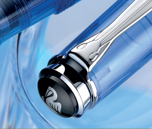
This is the very first I've seen of the m800 special edition, "Royal Gold" in raden. It was in my instagram feed today via a Dutch retailer: https://www.instagram.com/p/BThuwOgBW8x/?taken-by=penman_nl It looks great -- but eager to hear more. I'm guessing as this is a very limited edition, it is not the m805 hinted at in other posts and anticipated for the fall.
-
Dear all, I believe this colour will be a bestseller! Was not really as much excited when I first got the pen, because the colour is a bit darker than on the official pictures, but the more I look at it, the more I love it. Please note the new (updated) convertor. LAMY_SAFARI_2017_PETROL My FLICKR account Kind regards, Jan
-
Lamy just announced their special edition color this year for the AL-Star, Pacific Blue. It is a vibrant blue turquoise color and comes in an Al-star fountain pen, rollerball pen, ballpoint pen as well as a matching ink in both bottle and cartridges. Pen Chalet should have the pens and inks in stock in about a week and they are on sale now. Lamy Al-star Pacific Blue Fountain Pen Lamy Al-star Pacific Blue Rollerball Pen Lamy Al-star Pacific Blue Ballpoint Pen Lamy Pacific Blue Bottled Fountain Pen Ink Lamy Pacific Blue Cartridge Ink
-
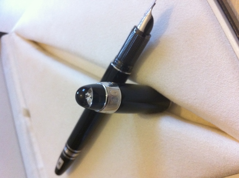
“Intense luminosity and a unique presence.” This is how Pelikan introduces the new M101N Bright Red Special Edition. The fountain pen, which is described as a “masterpiece of elegance” is a sensual continuance of successful models as M101N Tortoiseshell Brown, Lizard and Tortoiseshell Red. The vibrant red barrel cap and sleeve are made from high quality acrylic with a distinctive marbled pattern. The resin in both cap head and filling handle polishes as it is used making the Bright Red forever shiny. The elegant marbling makes the perfect combination with its 24K gold trims. Its 14K nib will be available in sizes EF, F, M and B. This Special Edition comes in a Limited Edition gift case including a 4001 ink in an historical design. The edition will be available in March 2017 but you can already make your pre-order in our website or reaching out at info@iguanasell.com

-
Dear all, I know, I know, this forum is about fountain pens, but a couple of weeks ago, I found this LAMY_Studio, which after some research turned out to be a 2007 Pearl White special edition BP. So, please don´t be mad that I had to post it here. There is also a matching fountain pen, and somebody already posted pictures of it somewhere around. All pictures are, if you are interested here: https://www.flickr.com/photos/lamy_fp/sets/ or: LAMY Studio - Pearl White 2007 Special Edition BP https://www.flickr.com/photos/lamy_fp/sets/72157677460581330 Kind regards, Jan My FLICKR account. Please see my collection here: C._Josef_Lamy_GmbH; LAMY_17_special; LAMY_18_special; LAMY_27/32; LAMY_27n; LAMY_42_Lady_-_set; LAMY_67P; LAMY_74_dialog3; LAMY_80_scala; LAMY_80_profil; LAMY_81;_281_profil_-_set; LAMY_Studio_2007_BP; Artus_BALLIT_-_pencil; Artus_EF; Akkerman_LAMY_27e; LAMY_Vintage_Advertisements; 1979_LAMY_Fachhandels_Katalog; 1997_LAMY_Fachhandels_Katalog; Montblanc_254; Plzeň_-_pen_display;_Feb._2,_2012; Pardubice_-_pen_display;_Nov._8,_2014;
-
The 2017 Colors have just been leaked on Amazon.co.jp and fontoplumo. The Safari is a dark teal with black accents (name translates to petrol), and the Al-Star is a light blue named "Pacifica". (images below) (links here: https://fontoplumo.nl/2016/12/12/lam-al-star-pacific-is-the-2017-special-color/, https://www.amazon.co.jp/dp/B01N1GQOFW)
-
The successful Special Edition collection that celebrates Waterman's french heritage is becoming discontinued soon! The elegant black and white design of this collection gets inspiration from Parisian mesmerising lights at night and expresses Paris' chicness. The line which was available in Carène, Expert, Perspective and Hémisphère is the perfect accessory to match a sophisticated style. Some of this Special Edition treasures still remain at Iguana Sell: Expert fountain pen: https://www.iguanasell.com/products/waterman-expert-ombres-lumieres-fountain-pen-lacquer-chrome-trim Carène ballpoint: https://www.iguanasell.com/products/waterman-carene-ombres-lumieres-ballpoint-pen-lacquer-special-edition For further information do not hesitate but contact us via info@iguanasell.com Get your chance to enjoy this Special Edition!
-
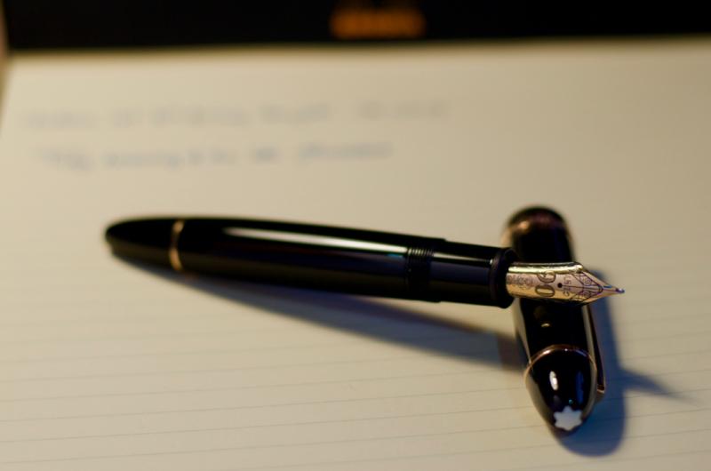
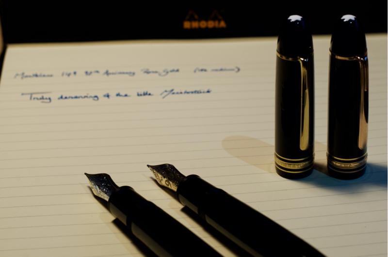
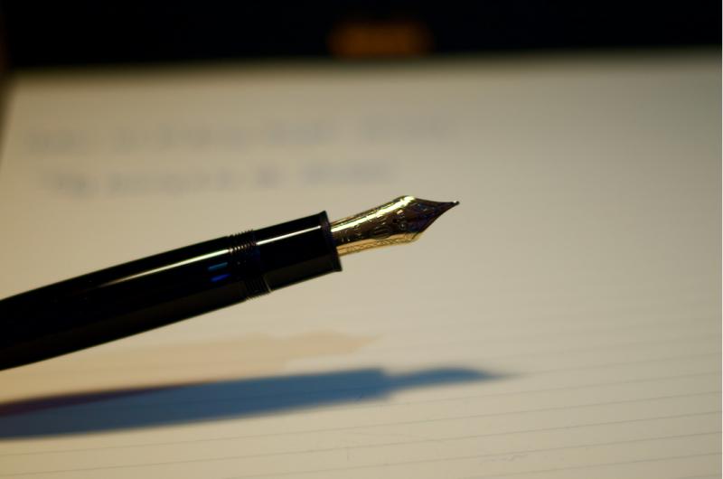
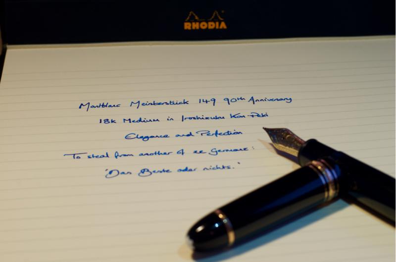
Hello again! This is my review of the 90th Anniversary Edition limited release of the Montblanc Meisterstuck 149 with a medium nib. I this was the third pen I purchased as part of my birthday splurge, and is also the third Montblanc that I own (second 149). Conventionally, I would never dream of buying a 149 in-store, as Montblanc decrees that no lower price than their dictated one be displayed on their new products. However, I was wandering around my local shopping centre, and saw a 149 with a sale tag on it in the window of Ernest Jones. Due to the lack of a box and it being a display piece, the price listed was but 40% of the usual list price for the pen, so I simply couldn't resist! As an aside, the images got butchered by the uploader somehow, so if you wish to see the intended images, I have a Flickr link at the end with the highest quality versions. Dimensions Presentation and appearance Fit and finish Filling system Ergonomics Nib performance Closing thoughts and conclusion Dimensions Length capped - 144mm Length uncapped - 130mm Nib length - 28mm Section length - 16mm Section diameter lo - 13.3mm Section diameter hi - 12.8mm Presentation and Appearance Having not come with the original box, I can't fully comment on this aspect of the pen (they gave me a standard 149 box for the pen to take it home). From what I have seen though, the 90th AE packaging is merely a standard 149 clamshell presentation box, but with a completely redone graphic set on the cardboard outer sleeve. Perhaps somewhat dissatisfying considering the price and significance of the pen, but it seems that sometimes 149s come with the large square box with an ink bottle, and others with the smaller-than-Pelikan's snap close box, so no comment there... I am sure you have all seen a 149 image before, and the majority of you will likely have watched a video or read about them somewhere, so forgive me if you have read this before (you are free to skip if you feel as though it sounds like a less catchy marketing dossier). In my opinion, and that of a great number of others, the 149 exudes 'presence', in that whilst it is not necessarily my largest pen (that goes to the OMAS Paragon) nor my most outwardly flashy pen (probably a title taken by the Homo Sapiens Crystal), but it is the one that you are aware is there, and more often than not the eye is drawn to. Whatever your opinion on the 149's appearance, whether you like it or loathe it, you will likely be hard-pressed to argue that it isn't a classic design, and at that, one which has remained so since its conception and will probably last long after this current peak in fountain pen interest we seem to have found ourselves in. There are three words that my friends and colleagues generally use to describe the pen; classy, elegant and stylish - even to the uninitiated this pen has an impact, moreso than others. Whilst I was not initially a huge fan of the 149 style, over the past year of owning my 149, then 146 Pt Line, and now this one, I have found myself increasingly appreciating the aesthetics and styling on the pen. To me it just looks right!? The 90th Anniversary Edition features a significantly different nib imprint to that of the usual 149 line. Instead of the bi-colour or tri-colour finish, the nib is wholly rose gold, and a large '90' dominates the surface, with the MB logo and 4810 being shifted down and up respectively to make way. The 90 is filled with tiny stipples, which really highlights the number, and works exceptionally well with the rest of the pen. Something that I believe is a major feature of the Montblanc design is their attention to detail. The subtle hatching in the letters of the cap band. The precise spacing of the gold bands. The stippling within the 90 on the nib to accentuate it. All these little things combine to form a beautifully well executed package. (My attempt at showing the difference between the standard yellow gold on the left and the anniversary rose gold on the right. Even in optimal conditions it is very difficult to fully capture) The key highlight of the pen which really differentiates it from the main line of Montblanc is the rose gold trim. Now, I would like to take a moment to say that I firmly believe this to be the best application of rose gold I have seen. Period. It is subdued without being overly subtle. It is still identifiable as gold without being garish. Lately, companies across all industries have been using 'rose gold' in their lineups, Apple probably being the main offender here. In many cases, the finish is almost pink, for whatever reason, and the result is a colour that looks more like a random pink metal than gold at all. Here though, the difference is very slight. The colour almost looks as though one has turned the shadows and exposure level down to 25% in a photo-editing suite. This has been the first pen where I feel the colour combination truly speaks to me, as opposed to just 'working well together'. I find myself toying with the pen in my hand and turning it around idly, admiring the 'muted' tones of the trim and its relationship with the main body. Although I wouldn't go so far as to say it is a work of art, I will say that it is about as close to perfection as I think I will find when it comes to matching two colours for impact, contrast and aesthetic appeal / draw. Fit and Finish As you might expect from a pen of this price range, the fit and finish is exemplary, with every edge and seam lining up perfectly and running flush against their respective face. The cap requires 1.5 rotations to be detached, and the threads are smooth with only marginal wiggle room. The piston knob sits fully flush with the barrel when totally done up, and is very easy to screw and unscrew, no hitches or sticking here! The only minor grip I have with the pen is that the snow cap on the finial is perhaps 20deg off from lining up with the clip, but this is something that isn't intended to fully line up (afaik), nor is it apparent enough to notice most of the time. Overall, I have nothing to complain about here. My experience with Montblanc and German pen brands in general has always been one living up to the joke about Ze Germanz and their manufacturing standards. Although there are exceptions, I will go out on a limb and say that compared to many other countries, these exceptions are few and far between when compared to some other regions...who we all know and love... Filling System Yeah, its another piston filler. For those of you who are returning to read my review having read my others (for which I am extremely grateful), you will be aware of my preference for pistons. I won't delve into that debate here, as countless others have covered it before. Suffice it to say, the 149's piston performs excellently; smooth, even and just 'the right' amount of resistance to ensure a pleasant operation. The ink window lies a fraction of a millimetre beneath the cap band when it is capped, which is another nice touch in my opinion, and being clear is very easy to tell remaining ink level. I have always preferred the Montblanc implementation of an ink window outside of demonstrators, as I think that the 50% clear 50% obscured effect they have keeps it out of sight when you want it, and easy to gauge when you need it. I am sure some care more than others about this, and there are likely those of you who couldn't care less, but its the little thing ya know! Ergonomics The 149 is famed for being a gigantic pen, whose size and power doth crush the will of lesser pens, Goliath himself wielded a 149 to reduce the armies of David to nothi- oh wait...yeah...nevermind. The 149 is large. Yes. Is it the largest? Not by a long shot. Length wise it is bested by the OMAS Paragon, Visconti Homo Sapiens, Sailor King of Pens, Custom 823 Demo, and many others I won't name. Girth wise, it is definitely up there, but again, probably not deserving of the belief that it is too big for a mortal to use comfortably for casual writing. Personally, I love the size. I have a quadropod grip, which is likely the reason for my enjoyment of the pen's size, but even when I force a 3 finger grip, it is still definitely usable. The length is very comfortable and sits very nicely against the webbing of the hand. Regarding threads, a factor that I am forced to consider more and more after ultimately having to sell the M805 because of this, the threads are not at all sharp, so even if you hold the pen highly, you will probably find this a non-issue. Balance wise, it is definitely biased toward the back end, though not at all uncomfortably, with the balance point being perhaps 2/3 of the way toward the piston end of the barrel. It feels as though you don't need to push with the pen, just guide it and it is capable of writing under its own weight. I never tend to post my pens, but you can definitely do it here, although should you wish to, you might find a shallow relaxed writing angle preferable due to the ungainly shift in weight introduced by the cap. Overall, whilst not my definitive most comfortable pen to use, it is definitely a tied second favourite for comfort and balance, switching places with the Homo Sapiens depending on my mood and preference on that given day. Aaaas usual, the YMMV disclaimer holds true, and this pen more than most should really be tried out in a store before committing to the purchase if you can do this. Nib Performance The nib is a very very nice 18k rose gold medium. Out of the box, the nib was pretty much exactly how it should be; tines aligned and converging at the tip without being too tight. I did flex the nib a teeny weeny bit at first to get the ink flowing just a tad more, but this was more a personal preference than a flaw. Someone mentioned once that Montblanc now polishes their nibs somewhat similarly to Aurora and Pilot; they are smooth, but with definite feedback. This nib is no exception. Being a medium I kind of expected a glass-like level of feedback -so basically none- but instead was given a pencil like experience. It is still smooth as silk with no hitches at all, but you feel every single change in direction and movement, something I am now strangely fond of. The line it puts down is what I would call a perfect 5 in wetness, making it ideal for any writing paper I am likely to encounter in my daily life. Flow is stunning, an area only my Japanese pens have ever managed to be truly up there in (maybe my OMAS as well?) and I can put the pen to paper after any break for it to work immediately. I have every confidence in this pen performing every time I go to use it, just as it should be. Closing Thoughts and Conclusion If you have lasted this long throughout all my rambling, my thanks. I went in with the intention of reducing the words used, but here I found I simply could not to fully convey my opinion. With this pen I have found myself in the fortunate / unfortunate position of seemingly having found my end game in pens. I have recently been able to try a KoP, Aurora, M1000, Divina Elegance and some other flagship pens in a shop, but each time I tried them I knew instantly that they were not for me, or were immediately uncomfortable to use for one reason or another (though it pained me greatly for the Divina and Sailor especially...maybe in time...). I might find myself getting a CONID or something customised eventually after this point, but as far as I can see it, I can't really go up from here. Though my dream pen is a 149 Blue Hour Skeleton, this is something I likely will never be able to reasonably afford, and similarly, other pens I have interest in, or lust for also fall into this category. Thus, for the first time since starting my collection, I find myself utterly content with that which I have. I paid £340 for this pen (I am pretty sure...), which is an absolute steal considering what I got; limited release of a flagship high end pen, months after it was discontinued. Would I have paid full price for it? No I would not, but if I had known how much pleasure it would bring me later down the line? Definitely yes. Is it worth the price? Again, for what I paid I think it is very difficult to argue that it wasn't, compared too the alternatives. Would it have been worth full price? Perhaps, but it depends on your ability to spend and whether you would value paying for the brand name as a significant portion of the price on top of a special edition. In this price range, there are many alternative purchases; M800 special editions, Pelikan M1000 if you are lucky, Sailor KoP editions, Homo Sapiens, etc. Given that this is a limited release special edition pen, for a not insignificant anniversary of one of the most famous of the pen companies, contesting the value of this pen over another in the price I paid is challenging, especially considering potential resale value down the line. At full listed price, you get into the Nakaya and special KoP range, where the workmanship and artisan value of the final piece is often much higher than a Montblanc, once more we find ourselves considering the point of whether it is worth paying the extra for the Montblanc due to the streetcred it gets, or whether you would rather buy it second hand for closer to its actual comparative value. With the unfortunate demise of my M805 and it passing on into the afterlife of another person's collection, after finally concluding that the discomfort in use just wasn't worth owning it, I found myself rotating less and less into my rotation. It got to the point where I was almost every day, for months, carrying this and the two other pens I have reviewed (HS Crystal and Paragon). I now operate two sets of 3 as my carries; my favourites, consisting of the aforementioned offenders, and my 'not-favourite-but-I-still-really-like' group, made of my Opera Elements, vintage Paragon, 146, L2k Stainless and M400 vintage tortoise. If I am not packing a bag, that trio is the set I will reach for each and every time no exception. Although it has taken a while, and many buys, sells and returns, I believe I have found my favourite three pens in these. Higher quality link: https://flic.kr/s/aHskATRPeG My Personal 'Grand Triad'
-
Conklin All American Review OLD GLORY SPECIAL EDITION Before I begin, I would like to tell all of you readers that I have decided to put a domain name that I have had for a while, evues.com, to good use as a FP review site. So, if you like what you see, please consider taking a look at it and if you really like it, please consider subscribing. Let me know what you think in the comments below! Thank you, Caleb Statistics: · Brand: Conklin · Model: All American · Color: Old Glory Special Edition (not numbered) · Nib: Fine, steel · MSRP: $99 · Street Price: $70-85 Introduction: At the height of the Great Depression, people were strapped for money. Whatever money the common man had, he spent on necessities, like food for his family or his rent. This meant that many people were not splurging on items which did not necessarily require—like pens. Seeing this, Conklin, the Ohio company made famous by Mark Twain, decided to make an inexpensive pen for the normal working man. The Conklin All American. The pen debuted in the late twenties and continued production throughout the thirties. It came in multiple sizes, filling mechanisms, and materials. However, the one thing that tied all All Americans together were their inexpensive prices. In the 1937 catalog, one of the most expensive models, the Vacuum filler, was priced at $2.95 (around $50 now), and the Sac Pens, the lever-filling models, retailed for $1.95 (~$32). The matching pencils were also made available for $1 (~$17). The pen became very popular. It was available for a low price compared to other pens of the era, such as the Parker Duofold, which sold for around $7 (~$116). The pens were also quite oversized (although certain smaller options were available), and had interesting designs. It also gave off a very nice aura of importance to the user as it did not look like anything else on the market. However, all things must come to a close, and due to precipitative sales following the end of the War and the coincidental rise of the Big Four (Eversharp, Parker, Sheaffer, and Waterman), Conklin paled in comparison to these companies’ technology, and as such shuttered its doors in 1948. Then, in 2009, the Yafa pen company purchased the rights to Conklin and relaunched the brand, selling the most common pens of the companies’ golden years, such as the Crescent (Rebranded as the Mark Twain, after the author who adored the instrument), and the Duragraph. Soon after, the All American was relaunched and revamped as a resin-only, oversized, C/C pen. And although it is not as well-known as some of the other pens in its segment, such as the Lamy Studio, it is still a pen everyone should use at least once. Since then it has been announced in four permanent colors: Yellowstone—a yellow, white, and brown swirl, Sunburst—a bright orange, Tortoiseshell, and Lapis blue (being announced most recently). However, the pen I have to review here today, is the 2015 special (non-numbered) edition: The Old Glory pen. From top to bottom: Tortoiseshell, Old Glory. Lapis Blue, Yellowstone, and Sunburst Orange Photo included with permission of http://www.hisnibs.com Part II: Packaging: 96/100 People have described Conklin packaging as having a very, very close resemblance to a coffin. When this pen was purchased, I had assured myself that I would not fall into that trap. But, unfortunately, once you see it, you do realize that it is likely to make a very fine final resting place for a pen. The combination of the dark external texture and the wavy fabric insert make the box look like a coffin no matter how you swing it. But, don’t think that a coffin cannot be nice. To this, I say that Conklin’s box is very well designed. It checks off all of what I look for in a box: 1. It comes with a protective sleeve. 2. It has a presentable exterior 3. It has a well-thought-out interior 4. It protects the pen 5. It has space for all components without needing to rearrange. The box comes in a blue sleeve, embossed on the top with Conklin’s logo in gold. The same logo is also on both side-flaps. It is also worth mentioning that the box is big—it measures 9 by 3.5 by 1.5 inches, which is about double the area of most of my other boxes. The box itself is covered in faux-navy-leather with Conklin’s logo (once again) embossed on top. This constancy is very nice to see between a box and its sleeve. Upon opening the box, you are greeted with the pen, sitting in a sea of wavy white fabric. In the top portion of the box is the Conklin logo (once again) embossed in gold lettering on a white-fabric cover. The box feels nice, and the wavy fabric does present the pen in a gorgeous fashion, albeit in a slightly sepulchral style. When you remove the insert, Conklin provides a pair of short international cartridges (blue and black), as well as a Yafa registration card, instruction/thank you letter, and am introduction to Conklin/Conklin Club/Warranty card. It is all very securely inset and will not rattle in the box. The packaging is very well thought out, besides the resemblance to a coffin, and assuming you don’t mind this, the presentation is very nice. You get a welcoming, large, and protective box that I daresay easily bests the offerings of Pilot and Platinum, which are also double the price (in the US market, anyway). Nonetheless, the box is stellar for its price range. The only reason I take away three points from it is because it lacks any sort of special, standout qualities that would make it worthy of an A+ grade. Part III: Design & Form Factor 167/200 The All American’s design exists exclusively for two purposes. The first is to show off the colors. From what photos which I’ve seen, all of the resins available on the All American look brilliant, and the Old Glory edition is no exception. The resin is made of red, translucent white, blue, and gold specks, which, in concert, look wonderful. According to Conklin, the pen is evocative of America, and I can see that—the pen is a very, very nice interpretation of the Star Spangled Banner. However, (unlike most American themed products that I, as an American have found), its design is not at all tasteless. Instead of starting with red, white, and blue and making a pen, it seems as if Conklin used the All American design, and tried to make an appealing pen; and they succeeded, it is very much so. As I was using turquoise ink, you can see the turquoise shading in the lower half of the section However, one thing worth noting is that the translucency of the plastic in the grip section allows for ink to become lodged between the feed section and grip section while filling. This does allow for the color of your ink to appear slightly in the grip’s translucent areas. However, it can be easily resolved by taking apart the section and rinsing it with water. Another point worth mentioning is the quality of the resin (plastic) itself. Unlike other resins I’ve encountered recently—granted that my experience with resins is limited as I am new to the pen hobby—the Old Glory resin has no lack of depth. Due to the translucent white specks, you can see through the layers of the pen and see how complicated the plastic actually is, and for me, it is quite visually appealing. However, the translucent white also makes some of the inset threads for the cap visible. Personally, I don’t mind it (I actually like it a bit), but for some people who prefer a more conservative, opaque pen, this may be an issue. The resin is also clearly the priority of this pen. The body and the cap are both barren of any other ornamentation with two exceptions. The first being the clip, which has the Conklin logo etched into it. The second is the manufacturing stamp on the body, harkening back to the twentieth century when manufacturers etched the make and model of each pen onto the body itself. In the case of the All American, the body reads: Beyond this etching, there is no further ornamentation, and the body is intentionally quite plain, lending the focus of the pen to the resin (deservedly), and I quite like this approach. The second major goal of the design of this pen is to very clearly communicate this pen’s size. In fact, when this pen was in rotation in the 30’s, this pen existed so that the working man could have a pen that looked as big and powerful as his boss’ Mont Blanc. This continues today, although it is barely comparable to a Mont Blanc, or any other traditional cigar shape pen, for that matter. To begin, the pen is gigantic in width: it measures 1.5 cm in diameter, roughly 125 or 150 percent industry standard (around 1.1-1.3 cm). As soon as you pick it up, you will realize the size of this pen. However, in comparison to the width, the All American’s length is rather unremarkable. Its length—14 cm capped—is very comparable to other pens in its segment, such as the Lamy Studio or the TWSBI Vac 700. It feels pretty comfortable in my medium/large sized hands, but people with rather large hands might have to use it posted. The pen is very well balanced unposted. However, once posted, it is quite back-heavy. I use it unposted for this reason, but if you don’t mind the feeling of a back-weighted pen, you shouldn’t have a problem. The pen friction-posts very securely and would not fall of without intent or some horrible mishap. The pen is also a good weight—at around 31g altogether (18g in the body and 13g in the cap). It feels comfortable, and is not particularly noticeable or taxing. The cap of the pen follows the same design principles of the rest of the pen: it is large and mostly nondescript and void of distractions. It screws on in one and three quarters rotations and stays on securely. The Rocker Clip The only noticeable part of the cap is the clip—Conklin’s trademarked Rocker clip. The clip on the All American is silver, and unlike most pens where the clip is bound to the pen at the top, the Rocker clip is bound to the pen roughly three quarters the way up the clip. This allows for you to open and close the clip by pushing the top of it (like a see-saw). It is similar to the clip of the Lamy 2000, if you’ve ever experienced it, only more pronounced. Once again, like the rest of the pen, the clip is rather featureless. It is flat, going from 5 mm in width to 4mm after a corner roughly halfway through the clip. This corner is placed at the beginning of the Conklin brand name, which is etched in a cursive font. All in all, the pen is very well designed. However, I have two major gripes that have forced me to downgrade this pen’s design to the B+ range. First, and most importantly, although it makes a statement, the pen’s width comes at a price—unless you have rather large hands, the pen is, quite frankly, uncomfortable for long use. After about a page of writing, my hand would feel fatigued. However, this is all completely subjective, and really a matter of personal preference. If you would like to try to get a feeling for the width of the pen at home, see if you can find a dry erase marker or highlighter. You can take the cap off of these pens and imagine that it is the section. If it is comfortable the pen will most likely be not that bad. The misaligned cap and imprint My other major gripe about this pen stems from a lack of quality control. My particular pen has a defect wherein the Conklin logo on the clip and the manufacturing stamp are never aligned—they always face the opposite direction. And for me, this is rather annoying, especially since it is something that should have been noticed in quality control, but wasn’t. In reading other reviews of Yafa products, I have learned that quality control is not their number one concern, so I would advise caution. I will attempt to contact Yafa support, and I will edit this accordingly (as an addendum, both here and on FPN). Part V: Nib, section, and writing experience 92/100 The section and the nib of the All American are both of decent size. The section (without the threading), measures just over 1.75 cm in length. Another centimeter is added when the threads are included, giving the pen a usable grip space of just under 3 mm. There is a slight step going from the section from the threads, but it is not bad. The threads are also not very sharp, so they can be used for grip space. However, there is a decent step that moves from the end of the threads to the body—this is very noticeable, however, whether or not this will bother you depends on your writing style. The nib is available in three options: fine, medium, and stub all of which seem to reflect the philosophy present throughout the entire design of this pen: it is tasteful, clear, and not ornamented too much (I am reviewing the fine nib here). The nib itself is a normal #6 Yafa steel nib, so it is interchangeable with other #6 nibs, such as Monteverde and Goulet steel replacement nibs as well as the Edison #6 18k gold replacement nibs. The design of the nib is plain, but appealing. The fine and medium are both two tone nibs with a crescent-shaped breather hole, while the stub is exclusively silver with a normal circular breather hole. Below the Conklin logo on all of the pens is the word ‘Toledo,’ and ‘USA,’ on the next line in clear block text. On the right shoulder of the nib is the size identification—mine reads F for fine. This non-remarkability, to me, is a theme omnipresent throughout the pen, certainly extending to the nib. The pen is not fancy, and it does not pretend to be—neither does the nib. It is a classic western fine—perhaps a little on the broad side, and it can produce a good amount of variation. It gives a comfortable amount of feedback that can be ignored if you choose to do so, or the feedback can be paid attention to and felt if you prefer it. The nib has a comfortable sweet spot that is decently sized and pretty easy to find. The feed does a decent job at keeping up with the pen, however, mine runs a little on the dry side, contrary to the nib, which when I dip the pen in ink, provides a consistent wet line. In this regard, I almost feel bad for the nib, almost as if the feed is letting it down a little. The nib has the potential to be a really great everyday nib, but it’s feed keeps it from being a desk EDC pen. Once I learn to play with the feed, I will try and make it run a little wetter. However, I have no experience in this, and will likely end up gouging the feed, so if you have any tips on feed modification, please leave your tips in the comments below. Writing Sample on 90gsm Rhodia. Ink: Pelikan 4001 Turquoise That brings me to the next point, the feed is fully removable by unscrewing the nib and feed unit from the section and then firmly pulling it out between your fingers. From here, you can swap nibs and feeds as you please. This, I feel is a great advantage as I feel like having which is easily accessible leads to both consumer and manufacturer satisfaction—the consumer can have fun with the pen fully knowing that if something were to happen, he or she could repair the pen with a decent amount of ease, and the manufacturer receives fewer complaints than it would if it used proprietary technology. However, it is worth noting that the pen’s warranty does not cover third party accessories, so play with the pen at your own risk. Something else that I feel is worth noting is the converter. Yafa brand converters are all threaded and of good quality. Never have I had an issue with one breaking—you can get a very nice fill, even on the first try, and, more importantly, the converter is threaded, so it is always securely in its section. No guessing required. This makes dipping the pen into ink a little easier on the mind as there is never an afterthought of the section falling in. The converter is also easy to twist and fill, and I highly recommend it. I also realize here that I have failed to identify the filling mechanism in detail, but as hinted above, it is a cartridge/converter pen, using standard international cartridges and converters—both of the long and short variety. I know there is wide debate over which filling mechanism is best, I admit that although there is a certain elegance in vacuum and piston fillers, but the ease of use in a c/c pen is of utmost importance to me. As a student, I often switch colors and inks, so having a pen that is easily disassembled and cleaned is very important and I applaud Conklin for making a pen that is so easily serviceable. All in all, I feel as if this is a really high quality steel nibbed pen. It does not aim to be flashy, and by doing that, it accomplishes something unique—it works as advertised. As it does not aim to be anything more than a normal steel nib, its variation and light springiness is a welcome surprise, and the overall high quality of the nib is commendable. However, the tines are malleable, so too much pressure will cause them to spread and not return to their normal position. Also, the tines do occasionally come out of alignment from my tilting the nib slightly to one side. However, this is easily remedied by a little pressure in the other direction. In conclusion, I feel as if this is a really great nib, but the dryness of the feed is holding it back from being an A+ nib for the price. Part VI: Value 45/50 The All American, unlike its pre-war counterpart, unfortunately, does not retail for less than $10. Instead, the suggested retail price of the pen is $99. However, like other pens in its range, its street price tends to hover between 70 and 85 dollars. This is comparable to pens like the Lamy Studio. Compared to that pens, I would say that this pen serves a very different role. It is not really designed as an EDC, instead, it is a much more of what I would call an EDP (Everyday Desk Pen). It is really not designed to be portable or svelte, instead it is supposed to make a statement in a meeting, classroom, or desk. And, in the price range, there are very few pens with that same capability. So, I feel like in the niche, the pen is a fine value—when dealing exclusively with the US Retail market. However, if you begin to look at the grey (import) market, there are a couple Japanese pens that begin to occupy the same space—namely the Pilot Custom 74, Platinum #3776 Century, and Sailor Professional Gear. When in comparison to these pens, the weaknesses of the All American tend to take full form. It is not a gold nib, and it is not portable. So, if you are looking for a pen to carry around in a pocket or to use on the go, I would urge you to take a look at any of the Japanese pens listed above (Also, cue self-promotion as I have reviewed two of those pens here and here). Honestly, in my opinion, when you pay for the All American, you’re paying for the size. People may comment on it and people may gawk, but all in all, the All American is simply a large pen in the same size range as the Pelikan Souverän M400 (and slightly smaller than the Sailor King of Pens), which retail for quadruple, quintuple, or even sextuple the list price of the All American. And, if you really want a gold nib, you can purchase an Edison #6 Replacement for ~$150, and still be well under the retail the aforementioned pen's prices. So, if you are looking for a large pen, the value of the All American is very good. However, if you are looking for an everyday pen, you may want to look elsewhere. Part VII: Conclusion 399 / 450 = 88 = B+ The Conklin All American pen is very, very unique. It may not be an EDC because of its size, or it may not be a long-writing pen, but it is certainly a pen that makes a statement. Between its size and its beautiful resin, the pen aims to call attention to itself. Not only this, but the pen is also equipped with a very capable steel nib that possesses just the right amount of springiness and feedback. The pen, although it is rather big, does not seek to be anything other than a capable, ordinary pen. And through its simplistic design and simple nature, I feel as if it accomplishes this with aplomb. However, as the pen only seeks to be ordinary (in my opinion), and as it has a few quality control and feed issues, I feel as if the pen almost makes the ‘A’, but the aforementioned problems hold it back just a little. However, by no means does this mean that it is a bad pen. On the contrary it is a beautiful instrument perfect for your desk, and I recommend it to anyone looking for an oversized pen. Thank you very much for reading! If you liked the review, please consider subscribing to updates here (I promise not to spam your inbox). Caleb
-
We have received a small amount of the lovely Pelikan Special Edition M800 Burnt Orange fountain pens. We offer these for € 440.- (including the German VAT) or € 369,75 without the German VAT. Should you have any questions please feel free to contact us at service@fritz-schimpf.de.
-
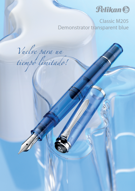
Newly Released Pelikan Classic M205 Demonstrator Transparent Blue
Iguana Sell posted a topic in The Mall
Dear Friends, We are pleased to present you ANOTHER novelty of our beloved Pelikan for this 2016! The newly released Pelikan Classic M205 Demonstrator Transparent Blue. Are you able to recognize this piece? If so, you are definitely a Pelikan Expert! This M205 Demonstrator transparent blue has been one of the most popular models of Pelikan's history. So that and after it's great success 5 years ago, the brand will re-launch this piece for a limited time this April of 2016. This Special Edition will keep the materials used at that time. It's transparent blue barrel will allow to a total vision of the inner motion of this piston fountain pen. The brand will introduce just one change: the ring at the top of the cap is now made of chromium plated, instead of black, matching the clip and the rings. This model will be available with EF, F, M and B nib from this April of 2016. At Iguana Sell we are already accepting preorders! Do not hesitate to contact us if you want to acquire yours! If you need any additional information about the product, it's price or availability, please feel free to ask! We'll be delighted to help you! Please contact us to info@iguanasell.com or at +34 91 441 50 41. Have a great day! Kind regards, Gabriela Iguana Sell
-
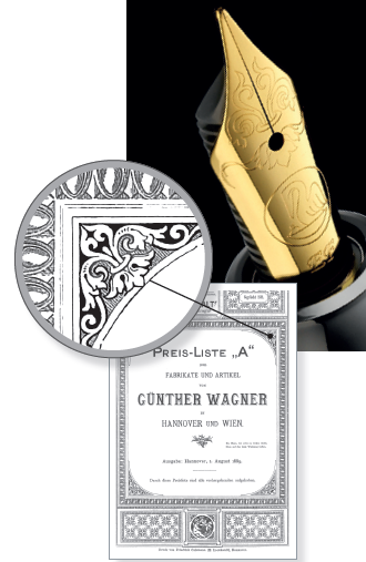
Dear Friends, I hope you are having an amazing time! At Iguana Sell we have news to share with you all again! We are pleased to announce the latest Special Edition that Pelikan will launch this March. Here it comes THE Pelikan M120 Green-Black! For the lovers of the retro style, the Pelikan M120 is based on the first model that the brand released the year 1955. This fountain pen keeps the traditional form and the same materials that Pelikan used at that time. The nib of this marvelous piece is made of stainless steel and gold plated. Moreover, it includes a very special engraving that represents one curlicue found in a Pelikan document dated 1889. As usual in this brand, the material of the barrel and the cap is made of high quality resin and the ornaments are gold plated. This special edition will be available in March of 2016 with EF, F, M and B nib. If you need any further information about the price or availability, do not hesitate to contact us. We'll be delighted to help you! Please contact us to info@iguanasell.com or at +34 91 441 50 41. Have a great day! Kind regards, Gabriela Iguana Sell
-
Dear Friends, I hope you had an amazing Christmas and new years holidays! At Iguana Sell we start the year sharing some news with you all ! We are honored to annonce some of the latest products that Pelikan will release this 2016! Here it comes THE Pelikan Souverän M800 Vibrant Blue ! After the great success of one of Pelikans star products, the M 800 serie, the brand introduce this next April this Special Edition made with material as acrylic, silver palladium and 18K gold. All the characteristics of this beautiful piece suggest it will be another triumph of the brand. The collection is constituted by fountain pens, ballpoint pens and rollers. The fountain pen will be available in EF, F, M and B nibs. If you need any further information about the price or availability, do not hesitate to contact us. We'll be delighted to help you! Please contact us to info@iguanasell.com or at +34 91 441 50 41. Have a great day! Kind regards, Marja Iguana Sell
-
Omas Paragon Signature Edition Ludovico Einaudi Review
Merackon posted a topic in Fountain Pen Reviews
Just as I said in the Milord review, this is the review of The Paragon edition of the Einaudi signature line from this year. I have spent a fair bit of time writing with the pen to make sure that the impressions I give are as good as I can give, especially regarding the ergonomics, which is the main reason I switched models in the first place. As always, I will put a plug in for Einaudi's music, it is calming and wonderful to listen to, and as I've said before, given how much I like his music, this was a must buy for me. Dimensions Length capped - 150mm Length uncapped - 135mm Nib length - 23mm Section length - 26.7mm Section diameter hi - 14mm Section diameter lo - 11mm Box and Contents The box for the Paragon edition of this fountain pen is nigh on identical to that of the Milord edition; medium sized box with a microfibre lining all throughout, the pen contained within a microfibre pen sleeve, and a tray covering the usual propaganda materials just as with the Milord. For photographs of this, please see my Milord review. Although objectively I cannot really fault the packaging, for it came with all the required pieces of information and clearly protects the pen well whilst in transit, thus fulfilling its required specification, I did find it somewhat disappointing that it was identical to its ‘younger sibling’ Milord. Considering the fairly significant price difference between the pens, as well as the name and stigma associated with a flagship pen, this one in particular, I would have been even happier with the overall presentation if the box had been slightly more grandiose and ‘flagship-esque’. Most disappointingly, I found, it did not include a complementary bottle of ink as other editions of the Paragon do. Though this is subjective in the extreme, and I know a lot of readers on here don’t care for packaging at all, given these are luxury items, it would be nice for the manufacturers to make the consumer feel more like this is the case through the inclusion of random items such as a bottle of ink. Regardless, I would say I am content with the packaging and contents, but again, slightly taken aback that it wasn’t a little more reflective of the item that it contains. The word ‘paragon’ does, after all, define something that is the ideal and ultimate example of whatever the subject matter is. Appearance The Paragon is definitely the largest pen that I own, greater in both length and circumference than my 149, which I feel is slightly accentuated by the geometric finish of the pen compared to the organic curves of the 149. Personally, I love the appearance of The Paragon and Milord, finding them to be both functional and attractive, for whilst they will roll, they are not as prone to rolling as a cylindrical alternative. The dark grey cotton resin works brilliantly with the medium grey ruthenium plating of the cap band, clip and section. Its subdued characteristics make this a very good EDC implement, I find, attracting less attention, if you like that kind of thing, and just as I said with the Milord, results in a ‘professional’ appearance that would fit in with any kind of surrounding. I make this point, because a tutor of mine remarked derogatorily on my old Vanishing Point Raden, saying it looked silly that I would carry around a glitter pen; in professional practice, this pen would be more at home than say a Burnt Orange M800 for example. This is again, subject to opinion. The ruthenium highlights are slightly shiny when in bright light, but maintain their colour, unlike silver and gold highlights that mirror their surroundings. The section, where you will find the main difference in appearance between the Milord and The Paragon, is a metal, with the same finish as the cap band and clip, which looks better than the shiny black plastic used in the Milord in my eyes, fitting in more neatly with the overall appearance of the pen. Again, I find the highlighting of Einaudi’s signature on the front of the cap band to be extremely well done. The nib is the same shiny ruthenium used in the Milord, and for details on this, I ask you again to look at my Milord review, so I don’t pollute this review with ‘old news’. There is a small difference in size between the Milord and Paragon nibs, but nowhere near as much as that which can be found between the 146 and 149 I would say. Fit and Finish The overall quality of construction on The Paragon edition is fantastic. Regarding the infamous facet alignment, I would say that the facets of the barrel and the cap align correctly, if you are not tightening the cap as far as it will go. I find that the cap will be a half turn off in my model if you use triple the force to tighten the cap all the way, but given the threads are fairly tight any way, I have no fears of the cap becoming undone at even halfway secured onto the barrel, if that makes sense. This is where a minor gripe I have comes up. When securing the cap to the barrel, the threads have a tendency to squeak unless I slightly pinch the cap. This is a risk that is always incurred when rubbing two materials of differing densities against each other, and I think its a shame that OMAS didn’t put a metal mate thread in the cap as some other companies have in the past. Other than the sound that sometimes occurs, the threads a exceptionally smooth, with very little in the way of slack, less than the 149’s and comparable to that found in Japanese pens. The cotton resin, as I said in the Milord review, is a very pleasant material, and is more tactile than the resin used in the 149, whilst also being less tacky than the celluloid like materials used on the Opera Elements and Pelikan Mxxx series. It is my favourite material next to the lava blende of the Homo Sapiens to hold in the hand, and wish that more companies used it. The tolerances and fit of components across the rest of the pen are great; seams are crisp and clean without any voids, logo settings are perfect, nib alignment to the facets is dead on. Generally, everything is as it should be; they are even where they need to be even. Filling System My main issue with the Milord was the filling system; the cartridge converter system made the pen feel less solid in my opinion, and introduced a number of issues like threads grinding against each and rattling. The piston of The Paragon is large in capacity, however, the performance of the piston mechanism doesn’t seem to be as good as it could be. Whilst The Paragon’s piston is certainly not bad, it is slightly ‘grindy’ in places during the filling process, put this up against the perfectly smooth, consistent and even mechanism on the German pistons, there is no comparison. This is not an especially large problem, but it is the main downside to the general experience of using the pen in my eyes, though whether my view has been tainted by using what are generally regarded as the finest pistons on the market I do not know, and whether someone else may think differently is something I cannot answer. Like everything written here, this is a subjective area that cannot really be quantified. The only real issue I have with the piston is the lack of a method of checking the remaining capacity. Even though the ‘translucent’ barrel of the M800 I have barely lives up to the name without a very bright light source, it still allows me to check the remaining capacity. It could be argued that an ink window would ruin the aesthetic of the pen, and personally, it is not a deal breaking point for me, but I certainly think that an ink window would have worked in between the metal section and the beginning of the barrel facets, especially if darkened like on the 149. Regardless, to some people this is going to be more of an issue to others, and for me, it is more a non-issue than it isn’t, I can live with it, but it is certainly a downside to the pen whichever way you look at it. Ergonomics I will just say it here. For me, this is THE perfect pen ergonomically. Weight, size, balance and feel, all of these are captured perfectly for me in this writing instrument. The section of the Milord was the primary reason for me not feeling comfortable using the pen, for someone with a quadropod grip as I have, I like larger sections, however, for me the 149 section is not a perfect fit due to no taper and sheer size, and I haven’t had the opportunity to try out an M1000 properly so cannot form an opinion. The taper on The Paragon allows me to hold it comfortably at any angle; in bed or at a desk, and the faceted flange at the front prevents me from losing my grip at any point. If you find Sailor, Pilot or other companies with smaller sections to be comfortable in your hand, I would not imagine that The Paragon’s section would be comfortable for you, unless you adjust your grip, but to those who enjoy larger pens, this is the best sized section I have found so far. Much as people like to complain that metal sections are too slippery and cause people to lose grip on their pens, I find that The Paragon’s section is not a victim of this as much as others due to the flange at the bottom. Without this, it might be more of an issue, but as it is, it is far less slippy than something like a Lamy Studio or Opera Elements. Weight wise, the pen is definitely on the upper end, mainly due to the internals rather than the materials. The piston does change the weight distribution and balance of the pen compared to the Milord, but in a highly positive way. The balance is almost perfectly central, indeed, hold the pen at either end and you would be challenged to distinguish between which is the heavier of the two, courtesy of the metal section offsetting the piston mechanism’s weight. Posting the pen massively shifts the balance, and I wouldn’t recommend it, seen as a lot of effort has obviously gone into making the pen as well evenly balanced as possible. Due to the clip being much larger than the Milord, it is a lot easier to lever it up, however, it is still on the stiff side, meaning that sliding it in and out of pockets, whilst secure, is still a little difficult to do with ease. It doesn’t travel all that far from the cap surface, and is stiffer than the flat clips of Montblanc and Pelikan by a fair margin, at least on those that I can compare it to. Nib Performance The nib of The Paragon is absolutely brilliant in my case. Perfectly tuned flow wise, and has a wonderfully smooth tip with just the right amount of feedback. It has started up every single time I have put it to paper, and puts down a very even line that is just on the wet side, but keeps colours true without saturating them beyond recognition. The version I have is a medium, but it seems to be a ‘finer’ medium than that which I am used to dealing with from Pelikan, Montblanc and Visconti, who’s pens either write on the wet side or have a different definition of what a medium nib’s line weight should be. Either way, I find it ideal for any kind of writing, and due to the slight bounce in the nib when applying pressure, accentuates any line variation you force into the script. On the subject of nib ‘firmness’, just as with the Milord as I discussed a month ago, the nib is definitely not a nail like that of Waterman or Parker pens, but cannot be compared to that of an M1000 or Visconti palladium nib, both of which had a lot more give when writing. As I usually never attempt to put expressiveness into my writing except when completing headers or demonstrating fonts to people, this is not a concern for me, but for those who prefer softer nibs, I would advise you to look elsewhere, for you will be far better off. Closing Thoughts and Conclusion Although aspects of this review may seem critical, I felt that if I spent the whole time lauding over just how much I love this pen, it would seem a little biased, and the points that I have criticised, for the most part, are minor and don’t influence the function of the pen 90% of the time. I could not be happier; it ticks all the boxes and was worth the long wait I had to endure to get my hands on one…I have a bad feeling that this is only the first of many Paragons I will find myself buying… As I said in the ergonomics section, this is pretty much my ultimate pen in hand, and I absolutely adore it. I have zero regrets about returning the Milord for this model, and imagine that this is going to be a pen that I will carry with me wherever I go. This makes the pen worth every penny for me, but to some, especially those who may not foresee themselves using this as a primary writer, the price tag may be a little steep. At the discounted price of ~£400 from La Couronne du Comte, this pen stands fractionally more expensive than the M1000, and in my opinion is a good buy. At full retail price of £500 however, I don’t know whether or not I would still feel so comfortable recommending it, for whilst it is a Special Edition, you have a smaller nib (have to hold the pen closer to the paper, which some people dislike), no ink window, and a nib without springiness. To some people these might be deal breakers, to others not so much of an issue. I think, therefore, I will conclude by saying that I would recommend this pen without hesitation, if you like larger pens, this is absolutely worth a look at. -edit- Pictures are not uploading now, but tomorrow I will put them up in here -

Coming In September: Pelikan Special Edition Classic 205 Amethyst Fountain Pen!
PenBoutique posted a topic in The Mall
Good morning all! Coming in September we will have the new Pelikan Special Edition Classic 205 Amethyst Fountain Pen!! Currently we have the Pelikan Eldestein Ink of the Year 2015 Amethyst 50ml Ink Bottle and the cartridges in stock!!! Thank you and have a great day!!! http://penboutique.com/p-14905-pelikan-classic-m205-amethyst-special-edition-fountain-pen-with-ink-set.aspx
-
Pelikan will release the Pelikan Special Edition Souverän 600 Pink fountain pen and ballpoint pen in September 2015. We offer a 20% discount on both pens.Pre-orders can now be placed. If you wish to pre-order please choose "Vorauskasse" (payment in advance) as payment option. This way you will be notified once we know the exact delivery date and then you can transfer the money). More information (this time also in English) is available here:http://www.fritz-schimpf.de/Schreibgeraete/Fuellhalter/Pelikan-Souveraen-Special-Edition-M600-Pink-Kolbenfuellhalter.html Please note that the prices in our webshop include the German VAT of 19% which is not applicable for shipments outside the European Union.
-
Dear friends, Due to the brand policies we are under an obligation to remove the pictures of this post. As soon as Pelikan let us, we will put it on again! Please receive our sincere apologies. Iguana Sell Team -------------------------------------------------------------------------------------- We are more than happy to present you the lastest Pelikan release! The new Pelikan Classic 205 Amethyst Special Edition. For the first time , Pelikan introduces this Special Edition of writing instruments that matches the color of the beautiful ink of the year Edelstein. The collection will be available as Fountain Pen and Ball Pen with a shiny silver-colored clip and rings. The Fountain Pen comes with a stainless steel nib in different sizes as EF, F, M, B. And, if you wish to match your Fountain Pen with the ink, please check out the beautiful and elegant set that includes the Edelstein on it. Official Prices Europe: Classic M 205 Amethyst Fountain Pen - 125€ Classic M 205 Amethyst Ball Pen - 115€ Amethyst Bottle Edelstein Ink of the year 2015, 50ml -14.90€ Set Classic M 205 Amethyst Fountain Pen + Amethyst Bottle Edelstein Ink of the year 2015 + gift box -145€ These pieces will be available at Iguana Sell this Autumn-Winter. If you would like to have further information, please contact us to info@iguanasell.com or at +34 91 441 50 41. Have a great day. Kind regards. Marja Iguana Sell
-
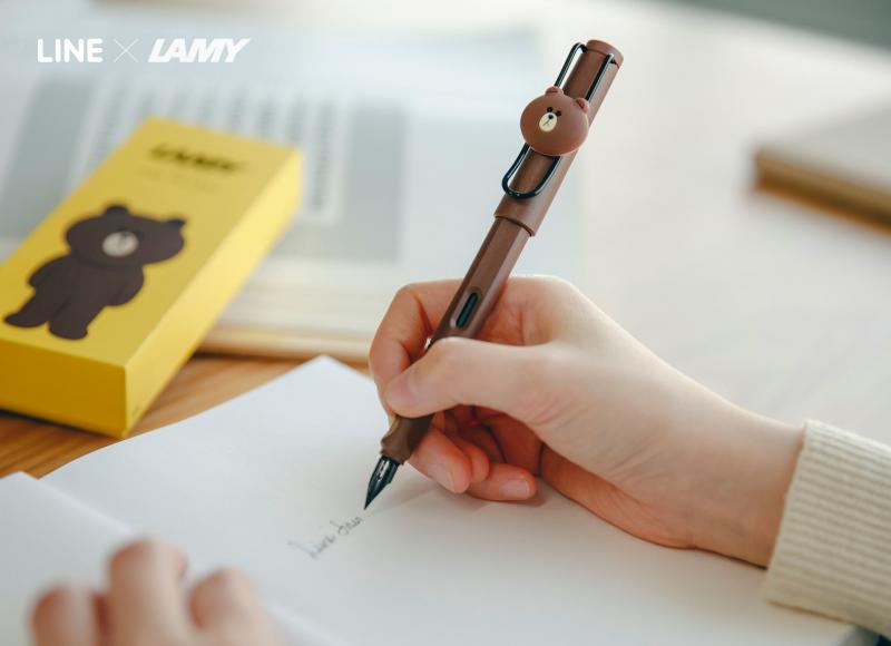
I am sort of hoping to keep this as a running topic. There are a lot of unusual Safari pens out there. For example Safari pens that have logos or are specially made for an occasion or are just limited editions. This year in Korea, Lamy is making a special pen in conjunction with the company LINE. I thought it would be good if folks posted what they have or have seen up here. Here is the one due out next month for LINE. Which was not Green as I predicted (to match their cell phone app icon) and is nothing like what I imagined. It is seemingly aimed for folks younger than me (heh).
-

Anyone See The Mountain Edition Summit Pens At La Pen Show?
cattar posted a topic in USA - North America
Company was to show special edition pens of Mount Rainier, Mount Hood, Tetons. There's not much else on the company website. US company, pens made by Stipula, Italy. I"m curious about the pens. Not sure where to ask this question. Not affiliated with either pen company. -
Well I've decided to start a petition requesting that Lamy makes a special edition purple Lamy safari. Every year when there speculation about what colour the next year's special edition Lamy safari will be and purple is always a popular request, and every year thus far Lamy has not made a purple one. Please help by signing this petition: http://www.ipetitions.com/petition/purple-lamy-safari-edition It is not really a demand like normal petitions, but a request and something to show that there is a lot of support behind this colour, in the end it is Lamy's choice as a business to whether they think it is something viable to produce. If there is enough of us maybe Lamy will take notice.
-

Very Limited Edition Pen - Delta Momo Special Edition Fountain Pen
PenChalet posted a topic in The Mall
Delta made a special run of the Delta Momo fountain pen and we bought all 5 of the rutherium trim. Only 5 of this pen with the demonstrator style cap and barrel and the rutherium trim exist. Each pen is numbered, 1/5, 2/5, 3/5, 4/5, or 5/5. We have already sold some so they wont last long. http://www.penchalet.com/images/specialedition/IMG_0602.jpg http://www.penchalet.com/images/specialedition/IMG_0608.jpg http://www.penchalet.com/images/specialedition/IMG_0610.jpg -

Starwalkers Fountain Pen Soulmakers 100 Years Special Edition With Diamond (2006) - Real Or Fake?
savvas4095 posted a topic in Montblanc
Hi I recently bought this pen from ebay. It cost 400GBP at an auction! Initially I thought this was a bargain. Now I have doubts, whether this is real or fake. 3 things basically that concern me: 1) Feels extremely light. What is the weight of this pen? 2) The tip of the barrel is "very black" slightly different to the remaining of the barrel. reminds me some of the cheap counterfeits you see of metal starwalker pens you see on eBay. I have tried to capture that on the photos. 3) The Instructions booklet has a lot of Chinese instructions and certificate is right at the end. Now having said that I tried to compare this pen with the few available images on the net and it is not far off the nib barrel cap and so on. It has a serial number next to clip and the words Germany metal and Pix under the clip (but nowadays many fake do so). Also when you put it in bright light you can see the red tinge of the resin. Also like my rest of the MB FP when you place a magnet next to the nib it repels it. Can someone help me solve my dilemma. Ideally someone who knows or has this pen. What's the length of this pen with and without the cap. Also what was the original price of this pen? Cheers in advance.
-
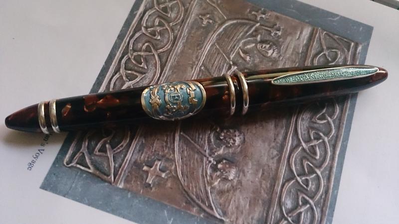
This is only my second review, so please excuse any mistakes or anything important that gets left out. This review is of the Stipula Orient Express Special Edition. I saw this pen on ebay not very long ago. It was in my watch list and I have no idea why, but I decided to chance an impulse buy (something I rarely do) even though I knew nothing of Stipula. As far as I know, Stipula are relatively new to the market, having only begun in 1973 in Italy. This pen is the Orient Express SE and was limited to 500, of which this one is pen 221. It is a piston filler with a T-flex titanium nib (one size fits all!). It came in a slightly naff red box with a cheap looking red cardboard sleeve. I've since looked at other Stipula pens, but their design doesn't really appeal to me much - I'm vain and stupid and I like shiny. DESIGN The pen has a deep and very rich celluloid in black and a reddish brown, a little like a tortoiseshell effect in flakes and it is very highly polished. It is very pleasing to the eye and the colour sets off the silver mounts very well. It has a vintage look to it which is carried through into the titanium nib which has dulled and tarnished - but I quite like the look. It reminds me of nibs on an old flex pen and it seems to me to work with the overall look of the pen. The pen barrel has almost tubular double silver mounts at the cap and then again at the cleverly concealed piston nob, and these double mounts are meant to represent the railway tracks. Set into the barrel of the pen is an enamelled escutcheon of the faux coat of arms associated with the Orient Express. It is two lions holding an 'O' with an "E' inside it and surrounded by a tied cloth swag. On the pen cap, opposite the clip is a smaller enamel escutcheon with a small suitcase with a "V' shape on it (for 'voiture' possibly?). The clip is firm with a tightness to the spring and is in silver with an inlaid foiled enamel in imperial blue - which is also the inlaid colour on the other two silver escutcheons. The escutcheons are just ever so slightly raised (almost completely flush inset) on the cap and barrel, making this a very tactile pen. The pen is in a torpedo shape, looking very like an unclipped cigar, and although to the eye in pictures it looks very thin and small, it is actually quite a large pen at just a touch under six inches capped, five and a quarter inches uncapped and at six and a half inches posted (it's posts reasonably securely). The piston filler is a marvel. It is sooooo smooth and it feels like it has been very well made. There is no rattling or looseness to it at all and the pen holds a seriously good fill of ink. When you look at it at first the grip section looks like it might be a bit difficult. The pen is actually very heavy, but quite well balanced (both posted and unposted, although I prefer posted). The grip looks very thin and tapers off quite dramatically towards the nib and at first I thought the threads would be an issue (it''s a screw cap). But here is the clever bit, the screw threads to place the cap are right at the very end of the grip, so where you hold the pen your fingers are not near them, unless of course you have a slightly unusual grip. It also means that when the pen is closed you have this little squished cushion of celluloid between the railway tracks that keeps the pen body looking tidy and neat. I find the grip surprisingly comfortable and can write holding at the silver mount or slightly further down the grip and both positions are very comfortable. NIB The nib on this pen is a T-Flex titanium nib. I knew nothing of these nibs and still have no idea what the advantage of a titanium nib is, but it does tarnish - a lot - so if you like bright shiny nibs, this is not for you. The nib is nicely engraved with six arrow head leaves and the brand name Stipula and the words 'titanio' and 't-flex'. These nibs don't come in sizes; they are a one size fits all. First thing to say about this is that it totally blew me away. I had read a few reviews of Stipula that suggested the nibs were slightly temperamental and I think someone on here felt it wasn't a great writers pen. Maybe I got lucky, but this pen writes like an absolute dream. The Pilot Custom 823 is the...scratch that, was the most butter smooth nib I had ever used, but this Stipula only requires the very lightest of touch to write. It glides across the page with no effort at all. Now a note on the T-Flex and its capabilities (or lack thereof). The T-Flex has a video on youtube that I watched (after I had bought the pen ) that demonstrates the extent of flex in the nib. When you write lightly the line is nice and thin, but with only a tiny bit of pressure it deepens and thickens; but only slightly. It doesn't have the same capabilities as the Ahab for instance, but it is a much more refined nib. It is truly a thing of wonder - I have never experienced anything so damn smooth. With normal writing - dependent on the lightness of touch - I would guess that the nib writes close to an F or an EF, so if you like big fat B's and BB's, this is definitely not a pen you will enjoy. If you like to be able to glide across a page with super thin lines with not even a hint of a scratch, then you will likely enjoy this very much. With a shading ink you can get some very beautiful results. PRICE I have absolutely no notion what this pen normally retails for or what price should be paid for a second hand version, but I bought this on a whim on ebay for €130 and on the basis of how much I like this pen, the surprising aspects of it and the build quality I think I probably paid a fair price. I do hope I haven't been ripped off and I am really hoping that someone doesn't come and tell me that you can buy one for €50 elsewhere. If that is the case, just don't tell me! Overall this pen is a bit surprising and very pleasing as it has very quickly become one of my favourite pens. I doubt that it will ever be left uninked. It's a big, weighty, yet beautiful and refined pen with very well thought out design touches. Despite all the imperial blue on fancy and florid escutcheons it still feels like quite a 'male' pen (if there is such a thing), but perhaps I only think that because when I look at it the pen reminds me of a cigar. It is also a very tactile pen with a nice weight; the celluloid is not cold to the touch and I find it hard to put it down and stop rubbing my thumb on the almost flush insets. A very dangerous thing to say I know, but I couldn't recommend it enough. SCORE There are very few pens I own that get this score (I can count them on one hand) and after a very long time pondering what I could possibly dislike about this pen to knock off a point and make this review look a little more realistic (and not make me look like a kid with a sugar rush in a candy store every time I get a new pen) I have to confess I struggled. I just love it, so it gets a 10/10 in my book.
-
Greetings followers! We are glad to introduce the new Pelikan Classic 200 Cognac Special Edition. http://cdn.shopify.com/s/files/1/0204/1770/files/Sales_Folder_Classic_M200_Cognac-1.jpghttp://cdn.shopify.com/s/files/1/0204/1770/files/Sales_Folder_Classic_M200_Cognac-6.jpg Not only it has a new shiny colour, which is transparent cognac, but also its harmonic structure, made of high-quality resin and gold plated trims. This is reinforced with its stainless steel nib, also gold plated. It is available in 5 different sizes, including the very popular italic nib. http://cdn.shopify.com/s/files/1/0204/1770/files/Sales_Folder_Classic_M200_Cognac-3.jpg http://cdn.shopify.com/s/files/1/0204/1770/files/Sales_Folder_Classic_M200_Cognac-4.jpg If you have any doubts or you wish to know something more about this new special edition, please do not hesitate and contact us! www.iguanasell.com info@iguanasell.com