Search the Community
Showing results for tags 'sheen'.
-
Sometimes inks are not made for being used at work, for taking notes, for normal correspondence... but they are so gorgeous that you simply don't mind what other people could think of you and keep using them like there's no tomorrow. The review which is going to follow is the complicated love story between me and Diamine Shimmertastic Sparkling Shadows. Diamine Shimmertastic Sparkling Shadow is a interesting grey ink, dark enough to be definitely usable, with high ammount of nice shading on every paper, and lots of nice gold glitters. Like most Diamine Inks, has really good characteristics: marvellous flow (despite the presence of glitter I've never experienced cloggings), well lubricated, smooth feeling when writing with every type of nib, no feathering, not a single bleedthrough (even under the third swab test). Dry times are fairly long, and it's not waterproof. But let's sto wandering around the main thing around this ink: It's a glittery ink. Glittery inks are not made for everyday based use, it's unlikely you'd be signing a paper with this kind of ink, it feels unprofessional and not respectful in front of the person you're writing to. I definitely agree, I respect the social convention by not using it if inappropiate, but I really cannot give a look to this ink without finding it gorgeous. It's a wonderful grey ink (and it's definitely not easy find a good grey ink) that gains a sort of third dimension by the adding of extremely thin gold particles. It ends to be an ink suitable only for drawing, for other artistic purposes, for signing holiday cards or doodling around... But the pleasure you feel while writing, the shining trace of ink you leave on the paper is something I find difficult to find in other inks. Ink with such glittery particles are usually known to be difficult to clean, I've to say that this particular one it's a little more difficult to clean and needs a little more mantainance, but just a little, cleaning is not a big issue in my opinion. So, the usual final question is : It is worth it? A bottle of 50 ml of this ink costs around 12€, and you acquire a huge ammount of a extremely well ingeneered ink. It's up to you, in my opinion this ink is worth every cent, but I like using it for different and personal reasons. If you want something you're like to use every day probably this is not made for you. If in doubt, buy it, for 12 € it's worth trying. COPY PAPER SCHIZZA & STRAPPA PAPER TRACING PAPER INKDROP CROMATOGRAPHY SHIMMER CLOSEUPS
-
http://i900.photobucket.com/albums/ac209/jasonchickerson/_FUJ0043-Edit.jpg http://i900.photobucket.com/albums/ac209/jasonchickerson/_FUJ0041-Edit-Edit.jpg Original Crown Mill Pure Cotton Paper, dipped (top) and Lamy 2000 F/M (bottom) http://i900.photobucket.com/albums/ac209/jasonchickerson/_FUJ0046.jpg Quick wash on Original Crown Mill Classic Laid Paper (envelope) This is the brown I've been looking for. Cigar is not perfect. It looks its best on high quality, absorbent paper and looks flat and everything else, including high-end vellum (sorry, Clairfontaine Triomphe lovers). It behaves perfectly in a dip pen, but it's dark enough to lack depth. I'll stick with Tokiwa-matsu for my go-to dipped green. This is such a strangely complex color. It is a dark, unsaturated (in the chroma sense) green with a unique satiny sheen that makes it appear brown. This has the result on aborbent paper of being both green and brown at once. Fantastic. FPN member Sandy might call this one indecisive. That's OK with me. It works so well with my new sketching brown (Yama-guri), and washes so beautifully, I think it may be my new sketch-worthy green, too. Time will tell. Because of the cost of importing this ink from Japan, I attempted to mix my own. I came very close with a 2:5 mix of Sailor Tokiwa-matsu and Iroshizuku Yama-guri. You can see from the first pass (q-tip/earbud) that the subdued green is similar. However, more ink gives red sheen that causes the ink to look brown in the Cigar, while no sheen arises with the faux Cigar. Strange, as Tokiwa-matsu and Yama-guri each have a nice red sheen on their own. So while I could mimick the color of the ink, the effect is not the same. This is special stuff. I will be buying two bottles. http://i900.photobucket.com/albums/ac209/jasonchickerson/_FUJ0044.jpg http://i900.photobucket.com/albums/ac209/jasonchickerson/_FUJ0056-2.jpg Iroshizuku Yama-guri (top), Sailor Cigar (middle), Sailor Tokiwa-matsu (bottom) http://i900.photobucket.com/albums/ac209/jasonchickerson/_FUJ0051.jpg For the sheen lovers, clockwise from left: Cigar, Sailor Oku-yama (sheen king), R&K Alt-Goldgrün, Sailor Tokiwa-matsu and Iroshikuzu Yama-budo (center) As always, reasonable care has been taken to ensure color accuracy. However, this is a complex ink, impossible to represent fully in photographs. If you can get a sample and try it for yourself, do it. A big THANK YOU to FPNer fire ant for providing me with this sample!
-
Initially, I wasn't much interested in sheening inks. My first exposure was seeing photos of Emerald of Chivor and I wasn't overly impressed (and I realize that's shimmery, in addition to sheeny, so not quite the same thing). I thought "yeah, that would be cool for, like, party invitations and such" but for everyday use? That'd be like RuPaul getting all done up just to take out the trash. Of course, when I finally got some decent paper (something better than the cheap copy I normally use) and experienced sheen for myself (Lamy Coral), my interest was piqued. I discovered that sheen is not always immediately apparent: you write with a pen you haven't used in a while and you say, "wow, look at that sheen! why haven't I noticed that before?" and, when you go back and look at your first tests of that ink, you see that you didn't notice it before because there's nothing there. It's like sheen just magically appeared. This happened to me with Levenger Claret. Other inks, the sheen is pretty subtle - shininess when it dries, shading that looks like a slighty different color; I find this usually with darker inks - Diamine Macassar, KWZI Grapefruit, Platinum Black, Sailor Miruai - as the darkness of the ink makes the sheen effects hard to see. Other inks, the sheen is not so subtle - Sailor Tokiwa-matsu and Yama-dori, for example; the red sheen on these two is pretty obvious as it is such a contrast with the inks' color. Then there are the inks with gold sheen. These are the ones I'm having a problem with - there's just too much darn sheen! There's such a heavy coating of gold on some inks (at least in the pens I'm using them in, and possibly to a lesser extent the paper I'm using) that the color is very dark, almost black in some cases. And using these inks on cheap paper makes them look even worse. Some darkening may be due to evaporation, of course, but I experience the same thing with a fresh inking, as some of the photos show, so it's more than that. First up, Lamy Dark Lilac. This is perhaps the most disappointing to me as the lovely lighter purple that the ink shades to is gone (the main reason I'm considering switching to Gummiberry or Majestic Purple), although testing it in a finer nib might give me the results I'm looking for. This is DL in a P67 medium, this pen has been inked for a couple months at least. Here is the sheen on that, pretty heavy coat. Here it is in a Parker Frontier fine, pen had gone dry so was freshly filled before this sample. And the sheen, coating looks even heavier than the P67. Here is Oku-yama, again freshly filled. And the sheen; again, a solid coating. The ink that started it all for me, Lamy Coral, in a P460. Couple shots of the sheen. Yet here is the Coral in my Pelikan M250 fine. What a lovely color, quite delicate. (Strangely enough, Coral is the only ink of the 5 or 6 I've tested in the 250 so far that actually looks decent.) So, anywho, this has been on my mind recently and just thought I'd share it.
-
Here's a quick written mini review of Sailor Clear Candy Pink ink cartridge. This is a bright, cheerful pink and, while the color in the scan is fairly close, it's a little too heavy - the actual color is more delicate. The line, also, is too heavy in the scan; even with such a fine line there's some really nice shading, much of which is lost in the scan. Flow is good, and on the cheap copy at work there was no feathering or show-through to speak of. What really surprised me, though, is that there is gold sheen, too, apparent even with this very fine nib. I was even more excited when I saw this. I've ordered more cartridges and another Sailor pen with, hopefully a slightly broader nib (F, as opposed to MF) to maybe bring out the sheen more; I could always try the fude nib again, on the good paper. I got my Montblanc Pink carts but am still waiting on the Pelikan pink carts (and a pen to use the MB in); when I get everything together, I'll do a comparison. Also have Shaeffer pinks coming, as well. Here's the pen, btw.
-
I periodically go through the pens on my desk and write a few lines with each, mainly to keep the flow going in the feeds since I don't use each pen every day. But also to see the pretty colors. I was doing this tonight using my new Black n' Red spiral when I noticed the Lamy Coral looked, well, kind of odd. Upon closer inspection ... omg, omg, omg! Gold sheen! Sparkly gold sheen! Oodles of it! Look! If I sound surprised, I am; neither yogalarva nor visvamitra said anything about sheen in their reviews and I saw nothing in the "Inks with a sheen" thread in my admittedly quick perusal, though Diamine Coral was mentioned. I'll add this pic there also. The pen was my Pelikano medium, btw
-
Recently, I stumbled across something called Emerald of Chivor by J. Herbin. media source: http://edjelley.com/2015/06/24/j-herbin-1670-emerald-of-chivor-ink-review-video/ Apparently this ink had a bluish base with a gold and red sheen (but seems to dry blue. correct me if im wrong about the drying) I have never used any ink like this (but I have the Sakura Gelly Roll Dual Color, which performs the same) http://56.media.tumblr.com/4a1b7c1c338b96a62e06398dbc2de56b/tumblr_o00tz27BCX1s6de78o1_1280.jpg This image is Pilot Iroshizuku Momiji, which I didn't know had a sheen. I'm curious about knowing how many of inks of this type are out there. If you know of a sheen ink, list it below! If you have any of them, how do they perform? Do you have a favorite?
-
Pilot Iroshizuku Konpeki[紺碧] in Nooler's "Creaper" flex nib http://blog-imgs-84-origin.fc2.com/c/h/i/chingdamosaic/02_20151030223804ef8.jpg On beige grid paper: http://blog-imgs-84-origin.fc2.com/c/h/i/chingdamosaic/08_201510302238244a7.jpg close-ups: http://blog-imgs-84-origin.fc2.com/c/h/i/chingdamosaic/09_20151030223826aa5.jpg http://blog-imgs-84-origin.fc2.com/c/h/i/chingdamosaic/10_201510302238265e1.jpg On AQUABEE 6075(sketch paper made in Canada):[/size] http://blog-imgs-84-origin.fc2.com/c/h/i/chingdamosaic/11_2015103022410580a.jpg[/size] With dip pen(Blue pumpkin):[/size] http://blog-imgs-84-origin.fc2.com/c/h/i/chingdamosaic/12_2015103022411070b.jpg[/size] Close-ups/sheen:[/size] http://blog-imgs-84-origin.fc2.com/c/h/i/chingdamosaic/13_20151030224109daa.jpg[/size] http://blog-imgs-84-origin.fc2.com/c/h/i/chingdamosaic/14_20151030224110417.jpg[/size]
-
I had seen reviews of J.Herbin's Chivor Emerald, with it's gold flecking and hints of red. It's the first of the J. Herbin inks that I have purchased and I must say I am underwhelmed. I loaded up my Edison Collier with a cursive italic nib with good flow and experienced just a nice blue green ink, but none of the gold sparkle. I jettisoned the first filling, noticed gold settled to the bottom of the bottle and shook the bottle before refilling......just the same, a nice blue green! I had purchased Sailor Jentle Ink yama-dori and had really enjoyed the red sheen. I had hoped to have some fireworks with Chivor Emerald, but nothing, not even a gold fleck! Perhaps I need to use a flex nib with lots of flow! For anyone that has used Chivor Emerald, what was your experience?
-
http://i900.photobucket.com/albums/ac209/jasonchickerson/_FUJ0651.jpg http://i900.photobucket.com/albums/ac209/jasonchickerson/_FUJ0651-2.jpg http://i900.photobucket.com/albums/ac209/jasonchickerson/_FUJ0650.jpg http://i900.photobucket.com/albums/ac209/jasonchickerson/_FUJ0650%20copy.jpg http://i900.photobucket.com/albums/ac209/jasonchickerson/_FUJ6440_1.jpg Valentine Card, Rouge Hematite with R&K Alt-goldgrün Card is OCM Pure Cotton paper, Envelopes are OCM Classic Laid paper In expectation of my bottle of Emeraude de Chivor arriving in the mail, I decided it was past time to review its sister, Rouge Hematite. Rouge Hematite is a really interesting ink that I use almost exclusively for card-making. It simply dips better than any other ink out there and the green-gold sheen looks magical when you lay down a lot of ink. It is very staining, though, and ink gets on fingers and transfers back to paper terribly easily. I've ruined more than a few attempts through smudgery. As mentioned in the review, it smears, too. I kept it in my daily carry Lamy 2000 for a few days while writing this review. Thankfully, the gold glitter does not come across strongly in that pen, so it can be used as any other red ink, and does a fine job at that. I have not had any problems with clogging. While I don't really enjoy using red on a daily basis, the performance of this one is quite good. Care was taken to ensure color accuracy, but with an ink like this, where view angle and light source matter a great deal (see second and third pics), what you see may not be what you get when you try it for yourself. EDIT TO ADD: I should point out that my bottle is the fourth iteration of Rouge Hematite, purchased from Goulet Pens toward the end of 2014.
-
Here's my review of the new version of J. Herbin Bleu Ocean 1670 that contains the long awaited gold pigment. As far as appearances go, the new version looks worlds better just with the inclusion of the gold, but it's still nowhere near as well behaved as Rouge Hematite. But it's definitely worth the money just based on its uniqueness! Here's my review of the original Bleu Ocean 1670 formula (please scroll all the way down for a more recent scan as the old scan has a horrible magenta color cast and isn't accurate), here's my review of the related Stormy Grey 1670, and here's my review of Rouge Hematite 1670 (the original formula—the most recent is the fourth version). I'll be adding some more pictures tomorrow. http://imagizer.imageshack.us/v2/xq90/537/GssLXb.jpg http://imagizer.imageshack.us/v2/xq90/540/mjHiMP.jpg http://imagizer.imageshack.us/v2/xq90/661/gn252A.jpg
-
I have always loved inks which had a sheen quality when dry. Not the gimmicky metal flake stuff we are seein with J Herbin's Rouge Hematite, Emerald of Chivor et al. or diamine's shimmertastic set, but the natural sheen that you get in darker/slower to dry regions. There was a huge, wonderful, picture heavy thread on sheen here https://www.fountainpennetwork.com/forum/topic/198510-inks-with-a-sheen/ if you are unsure what I am speaking of. One thing I am noticing, as I am amassing ridiculous numbers of beautiful inks, though, is that those of only one brand seem reliably not to show this quality. Specifically Noodler's. Noodlers has namy beautiful colors, and I have a pretty good pile of them already, (Liberty's Elysium, Blue, Blue Eel, Midnight Blue, Walnut, Golden Brown and Kiowa Pecan), but none of them dry with a sheen like I can get from say, Diamine Majestic Blue Private Reserve Electric DC Blue, Sailor Yama Dori and many (honestly most) others. Even on Tomoe River paper, which greatly facilitates the appearance of sheens due to the slow drying times of inks upon it. \ Instead Noodlers' inks seem to dry to a dull, sheenless state. Am I just having bad luck, or is this simply a particular quality of the brands' inks? I understand some (soulless monstersb ) aren't into sheen so this could be viewed as a feature but I am finding that while the colors are beautiful, in the right lighting conditions to see some gloss, shine or sheen on inks, Noodlers' are all more matte, which leaves me disappointed.
-
Hi FPN friends, I'm sure this question has probably been asked before so I appologize ahead of time if I'm raising this topic once again. I'm looking for a black ink (pure black), and one that exhibits a red sheen. Now I want to be very particular about what I mean when I say "sheen". I know about the matte characteristics exhibited by Sailor Kiwa Guro, but that's not what I'm after. And neither am I looking for a straight black ink mixed with a red ink to give a reddish hue to an otherwise black color. Thirdly, I also have tried J. Herbin 1670 Stormy Grey, and I would consider it a glittery ink, and not an ink with a sheen. Again not what I'm after. I want the writing to light up when viewed at an angle and light reflects off the surface of the ink. When you look at the ink straight on, it appears to be a straight black. The ink that I have in mind that does this is Diamine Sargasso Sea, or Sailor Jentle Sky High. I would like something like that only in black color. Are there any ink recipes that I can mix on my own to get this effect? Any help would be appreciated. Thanks.
-
Here is a quick review of Sailor Souten. I mainly wanted to show off its lovely sheen that I have been greatly enjoying on Tomoe River paper. So far I have had great behavior with this ink in each pen, nib, and paper combo I have tired. However, to get the fantastic sheen you really need Tomoe River to do it full justice!
-
My second Sailor Jentle Ink arrived today, and I couldn't wait to try it. This is Yama-dori, and it is loaded into an OMAS Ogiva Alba Green with an italic nib. This is kind of a "first look," so I didn't feel it belonged in the Reviews forum. So .... The nib on this pen writes very wet, but Yama-dori, while having excellent lubrication, also permits very good thick/thin line differentiation, which is very important to me. The big surprise was the sheen, although looking back at Saskia's 2010 review of this ink, one commenter ("Mother of Triplets?") remarked on its sheen. If this flow behavior is characteristic of all Sailor Jentle inks, I am in big trouble! David
-
Ink With Sheen For Marbled Marianas Noodler's Konrad Acrylic
Intellidepth posted a topic in Inky Thoughts
I have a very special Konrad in the two-blued marbled marianas acrylic coming and I'd like to give it its first trial run with a matching sheeny ink in the blue to aqua ranges. Any favourites you'd like to recommend? (The sheeny thread doesn't always show the 'normal' colour of inks as the shots are generally angled to capture the sheen.) -
I haven't written a review or posted a new review in a while, so I thought I'd go a little beyond what I used to do (and enjoy my new scanner I got for digitizing old Kodachrome slides, which happens to also scan about ten times faster than my old one …) http://imagizer.imageshack.us/v2/xq90/540/MtlGRx.jpg http://imagizer.imageshack.us/v2/xq90/537/BJ12xk.jpg http://imagizer.imageshack.us/v2/xq90/537/n7rYOT.jpg http://imagizer.imageshack.us/v2/xq90/909/MkBNqA.jpg http://imagizer.imageshack.us/v2/xq90/909/LhjoI7.jpg http://imagizer.imageshack.us/v2/xq90/661/wlUIP3.jpg http://imagizer.imageshack.us/v2/xq90/673/sjqrfx.jpg http://imagizer.imageshack.us/v2/xq90/540/OLx2q3.jpg http://imagizer.imageshack.us/v2/xq90/901/xZdVPz.jpg http://imagizer.imageshack.us/v2/xq90/674/Q7jTQe.jpg http://imagizer.imageshack.us/v2/xq90/674/D6K2gp.jpg http://imagizer.imageshack.us/v2/xq90/661/DhlZpO.jpg http://imagizer.imageshack.us/v2/xq90/538/lFZXhg.jpg http://imagizer.imageshack.us/v2/xq90/661/681l3g.jpg http://imagizer.imageshack.us/v2/xq90/661/kSPDNA.jpg http://imagizer.imageshack.us/v2/xq90/540/vVifeI.jpg http://imagizer.imageshack.us/v2/xq90/540/hGpCZO.jpg http://imagizer.imageshack.us/v2/xq90/674/cSdJfx.jpg http://imagizer.imageshack.us/v2/xq90/661/7S4aKx.jpg And some obligatory bottle shots. http://imagizer.imageshack.us/v2/xq90/631/WeE0Tx.jpg http://imagizer.imageshack.us/v2/xq90/538/K69BjR.jpg Stormy Grey's metallic component is much more mobile in the bottle, and as a consequence takes much less time to fully integrate by shaking the bottle. http://imagizer.imageshack.us/v2/xq90/746/ofYoGc.jpg http://imagizer.imageshack.us/v2/xq90/540/xWriyB.jpg http://imagizer.imageshack.us/v2/xq90/631/brfiaX.jpg http://imagizer.imageshack.us/v2/xq90/901/NXRtia.jpg There is some buildup in pens, but after a week of testing I haven't encountered one clog. http://imagizer.imageshack.us/v2/xq90/673/0lyll0.jpg http://imagizer.imageshack.us/v2/xq90/537/N9wYoS.jpg http://imagizer.imageshack.us/v2/xq90/538/ASpqS4.jpg While I think I still like Rouge Hematite more, this ink is a must buy. Well done to J. Herbin for making up for the disapopointment that was Bleu Ocean.
-
Which paper shows the best sheen in your experience?
-
Just had to let that out... carry on!
-
-
-
This isn't really a formal review, just a few minutes of video where I play around with this PHENOMENAL new ink. If this stuff doesn't change your life (once you can get your hands on it; this stuff is as hard to come by as asparagus during christmastime), you need a therapist. It's AMAZING. It's like, "why use any other ink?"
-
Recently started using a bottle of Private reserve ebony blue, that I've had for around six years or so. I'm really enjoying it actually, and really love the sheen it has. Works really well on the natural ivory colour of Tomoe river white paper which I normally use. I'm looking into buying more PR inks soon, and just wondered which others have that very saturated appearance, and also produce a sheen. Many thanks Sach
-
Here are some of my inks that give sheens. These samples are drawn with a very very wet line, which makes the sheen easier to come out. Pelikan's Brilliant Black is a surprise: I never expected it to sheen. Such a beautiful silver sheen it has... I seem to notice that for sheen-y inks, blue inks generally have a red or purple sheen, black inks a silvery sheen, red inks a green sheen. I wonder why...

-

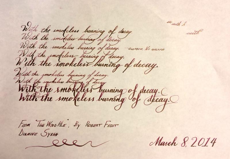
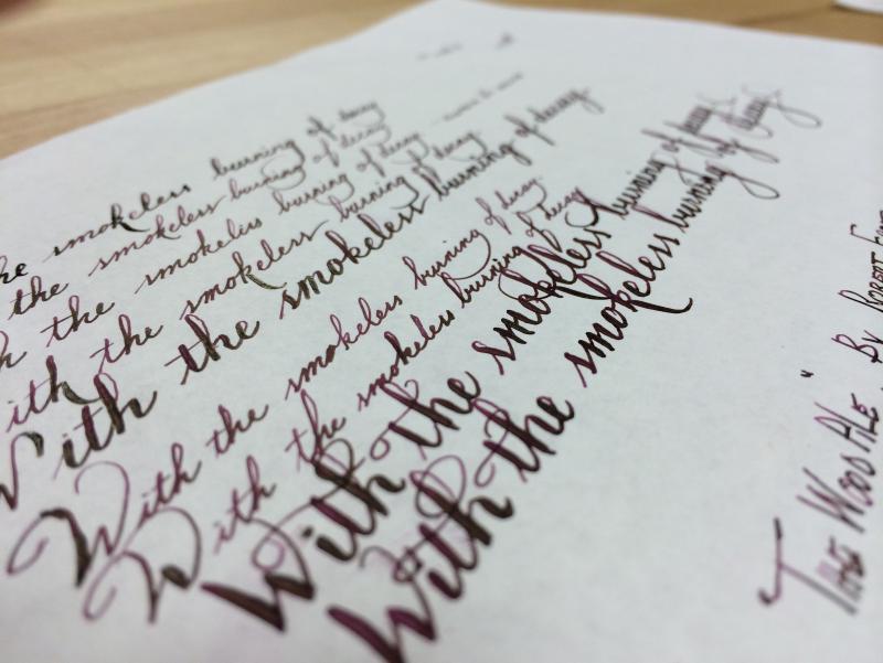
Diamine Syrah-Handwritten Review (Apologies To Mhphoto)
PrestoTenebroso posted a topic in Ink Reviews
Oh, and I'm producing a low cost, high performance flex pen, and need your input! Do you love flex? Please, if you haven't seen it already, complete this survey for one of seven chances to win a prototype! I had a sample of Diamine Syrah rattling around for ages. When I first tried it, I used it in a Leuchtturm1917, and a Lamy fine nib, and I was blown away, I was in love. A few days later I tried it in a Lamy broad, and I was…underwhelmed. I decided to do a thorough review in the hopes that I could make up my mind at last over whether I should invest in a bottle. This is me messing around with my Waterman frankenpen on some Tomoe River Paper with Syrah. Here are couple more close up pics so you can see the sheen and how it lays down on the paper.
-
A stunning colour from the collection! Ooh la la..