Search the Community
Showing results for tags 'sheaffer'.
-
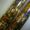
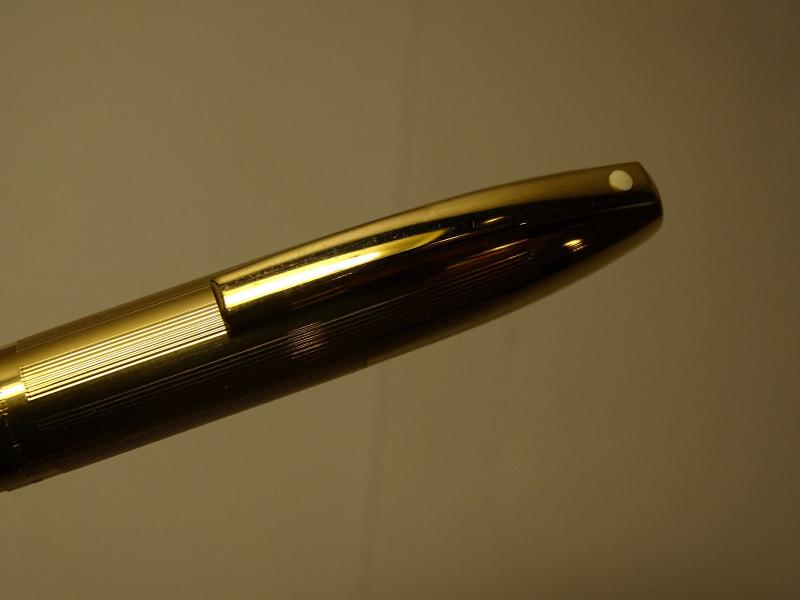
I'm no Sheaffer expert, I've come across this pen and would like anyone here help me identify it. Is it a modern pen, what model? when does it date back, approx? Thanks
-

50% Off On Vintage Sheaffer No Nonsense Fountain Pens - Kiwipens
sajiskumar posted a topic in Market Watch
50% off on Vintage Sheaffer NO NONSENSE Fountain Pens https://bit.ly/2z6fp9C
-
Hi Sheaffer's lovers, I recently noted a marked difference in style (and apparent quality) between two Lady Sheaffer's that I own, the number VI Paisley Periwinkle model. Attached are some photos in which I tried to give the best sense of the differences. One pen is slightly duller, and the pattern seems to be composed of "wave" forms with pointed crests and round troughs; the other pen seems to be brighter, but of less accurate milling perhaps, with more symmetric "sine wave" forms composing the pattern. The nibs also seem to have some *very* subtle differences; the nib on the left belongs to the pen of ostensibly lower quality, and the one on the right to the pen of higher quality. The nib on the right has an extra set of lines on either side of the registered trademark symbol, and the entire hallmark is shifted upward, with the slit a bit shorter than the one of the left. Would anyone care to indulge my obsessive attention to detail? My overall impression is that the slightly duller pen is of higher quality. I wonder if this represented an improvement, or a decline in manufacture over the run of this model? (sorry I haven't cleaned up the nibs yet; that gunk really is all just ink) Cheers! Matt
-
Hi all, I was recently given a fountain pen that belonged to my partners mum. I'd just bought a cartridge and put it in, went to test it and found the actual metal part of the nib very loose. Is there a way I can fix this myself?
-

Where Are Sheaffer Legacy Heritages Made?
pendrive123 posted a topic in Fountain & Dip Pens - First Stop
Hey everyone, I just bought a Sheaffer Legacy Heritage and I noticed it does not have any inscription as to where its made. This is different from my Sheaffer Prelude, which has the word USA written on the cap. Would anyone else know? -
Hi, I picked this up recently in amongst a load of other pens - having difficulty in tying down the model/date. In style (nib, barrel and cap) it appears a good match with the Imperial II Touchdowns of ca.1962. However its a cartridge filler and i haven't found any reference to Sheaffer marketing such a pen. Is there anyone out there who can enlighten me? With the conical nib it makes for a fine writer (even finer with the nib reversed). Thanks PS. I did find a reference to the Imperial models being reintroduced in 1969 with a cartridge filler option, but these had a new style cap with a white dot - I suppose its possible that over the years simply an old style cap has been paired up with a 1969 Imperial CT model.
-
30% Off On Vintage Sheaffer No Nonsense Fountain Pens - Kiwipens
sajiskumar posted a topic in Market Watch
30% off on Vintage Sheaffer NO NONSENSE Fountain Pens https://bit.ly/2z6fp9C -
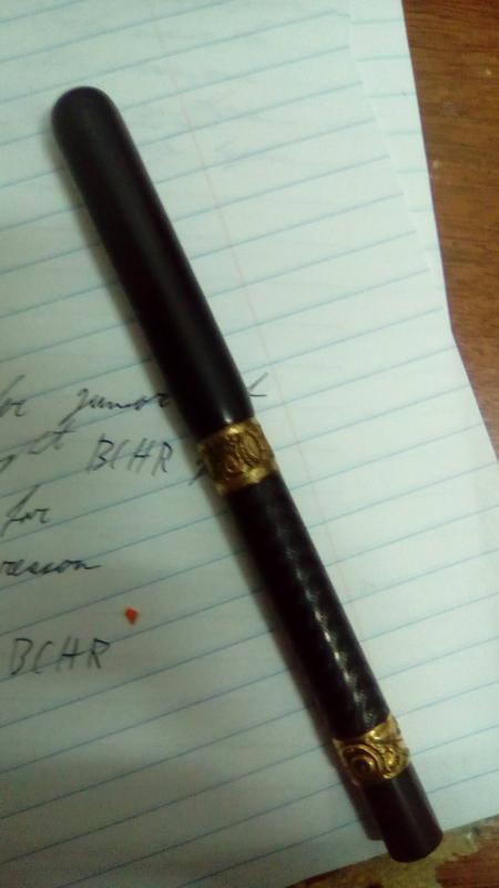
Hi all. I recently acquired a vintage BCHR pen on which the imprint has been worn clean away and which has a rather unique combination of elements I've never seen before. Firstly, it isn't a lever fuller as it has a hole in the back, which seems to indicate that it was either originally made as a blow filler or modified into one (though the hole looks very well-machined), yet the section unscrews like it would on an eyedropper. The pen also has a slip fit cap rather than a threaded one, and it's fitted with a nib marked "Sheaffer Junior, Made in USA". Is there any way of possibly identifying which Sheaffer model it might be, or how old it is? I'll try to link pictures of the pen as soon as possible if it helps.
-
Hi Sheaffer's lovers, I recently purchased a "repair box" that I will restore lightly to become a storage box for some of my collection, and in it was this fantastic manual and parts list. I figured I would make the images available. Enjoy! Matt
-
I just bought what to my eyes appears to be a Snorkel fountain pen, but am not sure what it really is. As of this moment the pen is awaiting to be shipped to me, so I have no way of verifying my suspicion. The seller just stated that the pen was an "Old Sheaffer Canada 14k Nib Suction Fountain Pen", but looking at the Snorkel photo thread on this forum, it looks quite similar in shape and nib. If this is jot the case, can you help me identify the pen and tell me if I got a good deal at $60? Thanks!
-
I found this in a local antique store for what might be a very good price. I'm rather new to Sheaffers, having grown up in a mainly Parker family, but am very impressed with the Snorkel and Vac-Fil that a friend gifted me last year. So I grabbed this pen when I saw it. I THINK it is a short slender Balance, but I am quite confused about nomenclature from my recent reading. In addition, this pen is clearly marked as Canadian, and has the fattest nib I have ever seen that isn't a music or italic nib. It needs a new sac so I haven't written with it yet to see the actual line thickness, and I am also confused about the proper sac size (after spending about 3 hours searching the topic). What is definite is this: 1. It's a Canadian Sheaffer as can be seen from the very good condition impression on the barrel, which says "W. A. Sheaffer Pen Co. | (of Canada, Ltd.) Malton, Ont. | Pat. 1936". 2. It is short, 120mm = 4.75". 3. It is slender, 0.423" at the widest part of the barrel. 4. It has a fairly wide sac nipple: 0.272". 5. it has a white dot and the nib is a Lifetime two-tone. 6. It's green 7. The clip is the flattened ball with Sheaffer inscription. 8 The nib looks very wide. Questions: 1. Is my general ID correct (short slender Balance)? Is there some other model name that goes with this pen? 2. What is the correct sac size? Pensac seems to suggest a #18 if I'm deciphering the model and chart correctly, and that fits the barrel and nipple, but the x/64 rule would imply a #17.5 for that nipple size. Richard Binder's site says to use a #15 for slender Balances if using the original lever. I have 16s and 18s on hand. What should I really use? 3. Is the proper color name Marine Green striped? 4. I've resacced a few Esterbrooks but and got this Balance apart easily with a variable temperature heat gun I have, but I am no expert on pen repair. I bought this pen to be a user, but other than some corrosion or dirt on the underside of the clip and ambering of the ink window it seem to be in very good condition. Roughly what would be the value of this pen? Is the value high enough that I should have it fully restored by a pro or should I continue to play with it? 5. I know the real test is how wide does the nib write, but I was wondering whether Sheaffer made a BB nib in the 1930s, or would this probably be a B? From certain angles it looks slightly stubby, but I suspect it really isn't. I appreciate any guidance those more knowledgeable about Sheaffer's can give me.
-
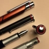
Hi, my first post here Recently I got second hand Sheaffer TRZ for cheap, it writes well and very smooth but have problem with ink leakage between gold trim and section near nib (check photo) Any suggestion to fix this leakage ?
-
This is the on that started it all for me. From my father, maybe from his father. 1960 Canadian Compact with pencil. I dont see too many shots of these sets so I thought Id share. I still use it occasionally. This started the addiction!
-
Dear friends. I'm trying to remove the inner cap of my on-going restoration Sheaffer PFM gold cap. First at all, I don't want to buy any special-task tool like the Inner cap extractor in http://www.penpractice.com/page3.html What I tried so far: I heated the inner cap with boiled water and ther I tried to use the DIY tool suggested by antonio ilmonaco in the post https://www.fountainpennetwork.com/forum/topic/93139-removing-inner-cap-from-sheaffer-tuckaway/ , with no results so far. Would you please give me some suggest about this? Any trick or tip? Regards, Jose
-

The Parker 75 “Cisele” & Sheaffer Silver Imperial
SimiaeParvus posted a topic in Fountain Pen Reviews
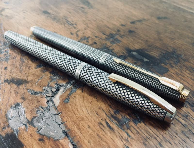
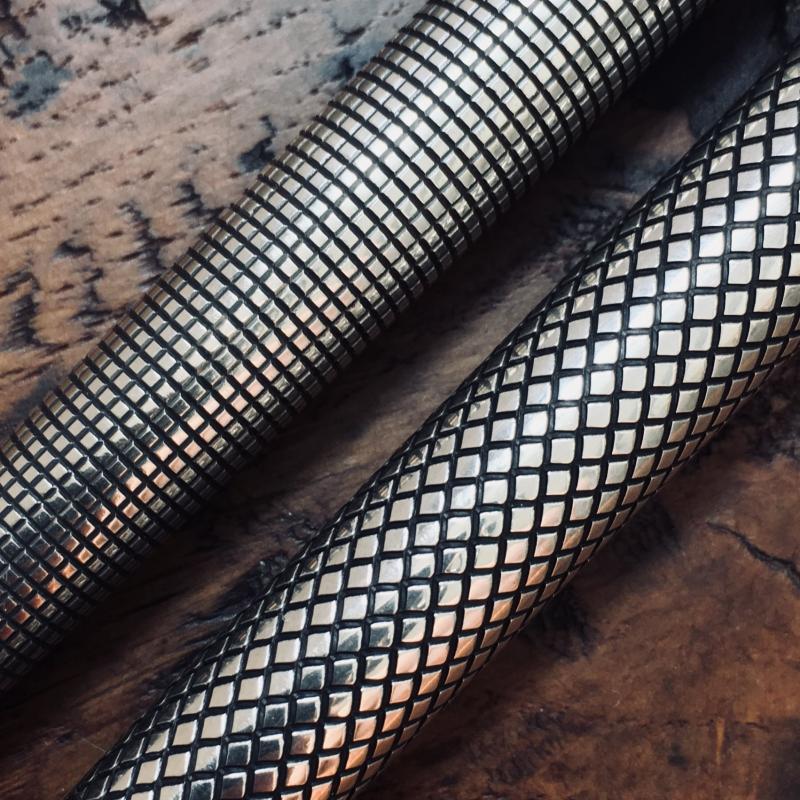
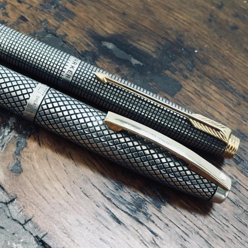
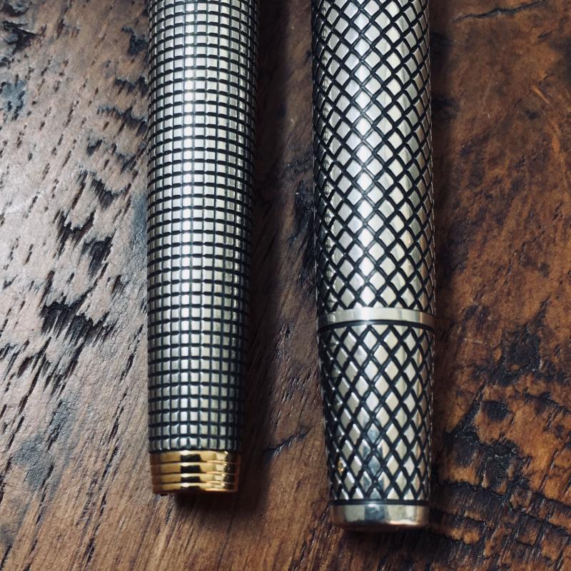
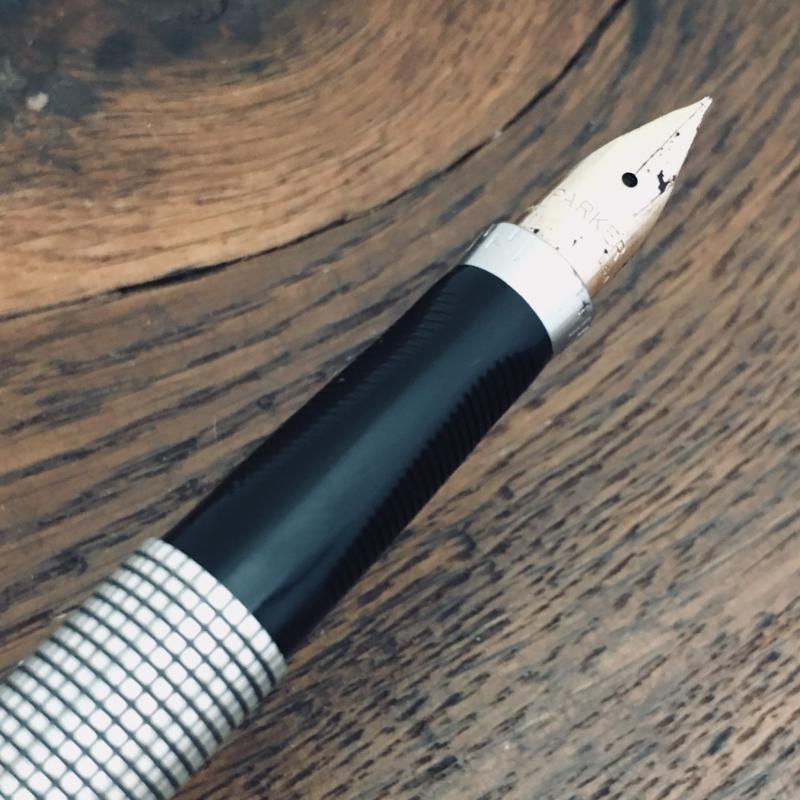
The Parker 75 “Cisele” & Sheaffer Silver Imperial After a few years in the hobby of collecting fountain pens I’ve reached a point, where my acquisition of pens gravitates towards a preferred style of pens. After some deliberation, I´ve come to the long term goal of acquiring a pen in sterling silver from each the “Big Four” American companies: Parker, Sheaffer, (Wahl-) Eversharp and Waterman. I´m currently halfway to that objective, having hunted down a Parker 75 in the “Cisele” (or “Cicelé”) pattern and a Sheaffer Silver Imperial in a diamond pattern. There’s no doubt that both represent the top-of-the-line in terms of design and materials. Aesthetically, they both share similar characteristics, being sterling silver pens sporting gold trim and a distinctive pattern engraved into the body of the pen. The Parker 75, released in the early 1960´s was a hit on the market. Since the ballpoints increase popularity and the eventual decline of the fountain pen, the purpose of the 75 was to be one of revival and prestige. The pen was aesthetically innovative attempt to catch the higher end. Earlier, Parker had tried to appeal to the broader market with pens such as the 21, 41 and 45 which was in the low end range.The 75 borrows design elements several other lines of Parkers pens. The idea of an adjustable nib had been tossed around since 1962 VP´s user-adjustable nib and the cartridge-converter was borrowed from the Parker "45". The Parker 75 Sterling Cisele hit the market in 1964, although being finished in 1963 for Parkers 75th anniversary. Decades later, the design is still as eye catching as when it was released and the quality shines through. It follows the basic design of the 75, which haven´t changed in decades. It´s a classy, conservative design that has aged well. Where it differs, is that the body of the pen is made of sterling silver, with a grid pattern. The body of the pen is rather slim, tapering from 11mm to 8mm. The cap is a “slip-on” which is solidly seated and post well. Because of it´s size and weight, posting is probably needed. The clip is simple but very distinctive and the details are simply beautiful. The tassies at either end is applied and is most likely gold plated. The black plastic section has a triangle-shaped grip and the nib can be rotated to different angles. That helps users which grip tend to rotate the pen. The upper part of the of the section, has several indices designating how much the nib is rotated. On earlier versions a “0” marked the center, but that was discontinued in 1968. Lacking that, this is probably made post-1968, just a few years before the introduction of the Sheaffer Silver Imperial. The nib is It writes really well, though it´s slightly dry and runs a nib gauge finer than the designated medium. The filling system is the simple and reliable cartridge-converter system. This system has been covered extensively elsewhere, so I won´t go over it here. Sheaffer did what any competitor would do. After the success of the Parker 75 they attempted to gain some of the market share, a few years later. The pen follows the design of the Imperial series, but instead of the typical it´s sterling silver in a lively diamond pattern. The pen is a classical, robust cigar shape with flat tops. It transitions with a slight taper from 12mm at the center of the barrel to 9 mm at either end. The body of the pen, is unibody with no particular step down from the cap. particularly the tapering section reminiscent to the Parker “51”. The shape of the body/section allow a variety of grips, which allows best writing angle for a wider group of users. The cap is a slip-on (“snap-cap”) is held on by friction. To keep it in place, there is three small tabs on the section, just between the section and barrel. It stays in place quite well, but doesn´t quite “click”. It can be posted, but I would not recommend it, as it throws off the balance and mar the finish. The gold filled clip has the white dot, indicating the lifetime guarantee. The clip is rather flat in colour, and seems slightly out of place. It is also is quite stiff. It seems poorly attached to the cap, so if you play with the clip a lot, be aware that it might snap off entirely with little to no force. The Touchdown filling system was introduced by Sheaffer in 1949, and is quite unique. It utilizes pneumatic air pressure created by down stroke of a cylindrical plunger to compress the sac inside the cylinder and fill the pen. For a proper fill, the entire nib and section must be immersed in the ink. Albeit for its innovativeness the Touchdown takes some getting used to, at it is slightly finicky. The system is quick to fill once you have the hang of it, but very slow to clean out. If you are a serial ink sampler, this might become slightly infuriating. But, if you like me, stick to the same inks it won´t be a problem if you stick to the same ink and the occasional maintenance cleaning. According to the sources, the pen is also available as a cartridge-converter, which should solve this disadvantage. Then there is Sheaffers infamous inlaid nib, unique to Sheaffer. Aesthetically, the design compliments the diamond pattern of the body quite well and is certainly anything but traditional. I suspect, although this is unfounded (I have done no work on this particular style of nib), that adjusting the nib shouldn´t be much trouble compared to a “standard-shaped” nib. Replacing it would another case though! The nib is where this pen really shines though: It´s a smooth experience with a slight bounce to it and the ink flow is almost perfect. Because of its wet nature, it runs slightly wider than the designated medium, bordering on a broad. In comparison, the 75 and Imperial are, albeit their similar aesthetics, quite different animals. Both pens have looks and the weight is pleasantly substantial because of the materials used, but where the 75 is slender and conservatively elegant, the Silver Imperial is slightly more hefty and bolder/flamboyant in its expression. In terms of construction, the Parker comes out slightly ahead, as the clip doesn´t seem as brittle and the Cartridge-Converter is more reliable in terms of use, maintenance and longevity. I´m aware that Silver Imperial is available in an C/C-incarnation, which nullifies this disadvantage. The diminutive size of the 75 and the forced tripod grip is too narrow for writing for more than a few minutes at a time before my hands cramp. The outcome is, a matter of preference. The Parker 75 isn´t quite as finicky or high maintenance as the Silver Imperial but the narrow, triangular grip is a minor but deciding gripe (No pun intended) for me although the adjustable nib angle a clear advantage as I have a tendency to rotate the pen. Parker 75 “Cisele”/ “Cicelé”, USA Production period: 1964-1966 Material: Sterling Silver in a crosshatch, cisele pattern Nib: 14k Medium Filling System: Cartridge-Converter Appointments: Gold Plated Length (Capped): 133mm Length (Uncapped): 122 mm Section Diameter: 9 mm Barrel Max Diameter: 11 mm Cap Max Diameter: 11 mm Weight, Uncapped (with ink and/or converter): 15 g Weight, Capped (with ink and/or converter): 24g Sheaffer Silver Imperial, USA Production period: 1970-197 Material: Sterling Silver in a crosshatch, diamond pattern. Nib: 14k Medium Filling System: Touchdown Appointments: Gold filled Length (Capped): 142 mm Length (Uncapped): 124 mm Section Diameter: 11 mm Barrel Max Diameter: 12 mm Cap Max Diameter: 12 mm Weight, Uncapped (with ink and/or converter): 18 g Weight, Capped (with ink and/or converter): 27 g Sources: Fischier. ”Parker 75”. www.Parkerpens.net. Web. 18.08-2018. <https://parkerpens.net/parker75.html> Mamoulides. “Sheaffer Touchdown Filling System”. www.Penhero.com. Web. 18.08-2018. <http://www.penhero.com/PenGallery/Sheaffer/SheafferTouchdownGuide.htm> Thomas. ”The Sheaffer Imperial Family of Fountain Pens”. www.Sheaffertarga.com. Web. 18.08-2018 <http://www.sheaffertarga.com/imperial%20and%20triumph/imperial%20write%20up.html> Wong. “FAQ”. www.Parker75.com. Web. 18.08-2018. <http://www.parker75.com/FAQ/FAQ.htm>
-
I've been interested in fountain pens for a little over two years now, but never had anyone to mail a letter to until now. Since I use my pens for school almost exclusively, I don't have a lot of inks; the two I use the most are a blue Parker quink ink I found at Office Depot, and a black Sheaffer skrip ink (I do not like this one, as it is a very shady black with brown undertones... I like strong black inks). The rest of my inks are Diamine Marine, Diamine Oxblood, Diamine Eclipse, and Diamine Cocoa Shimmer. To be honest, I like Cocoa Shimmer and Oxblood the best, specially Oxblood, but I worry that using a red ink might come off as rude. Do you think I should skip Oxblood or is it okay for it being "brown-ish"? I'd really like to read your thoughts on this, as I am very much inexperienced on the topic.
-
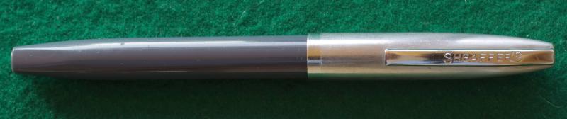
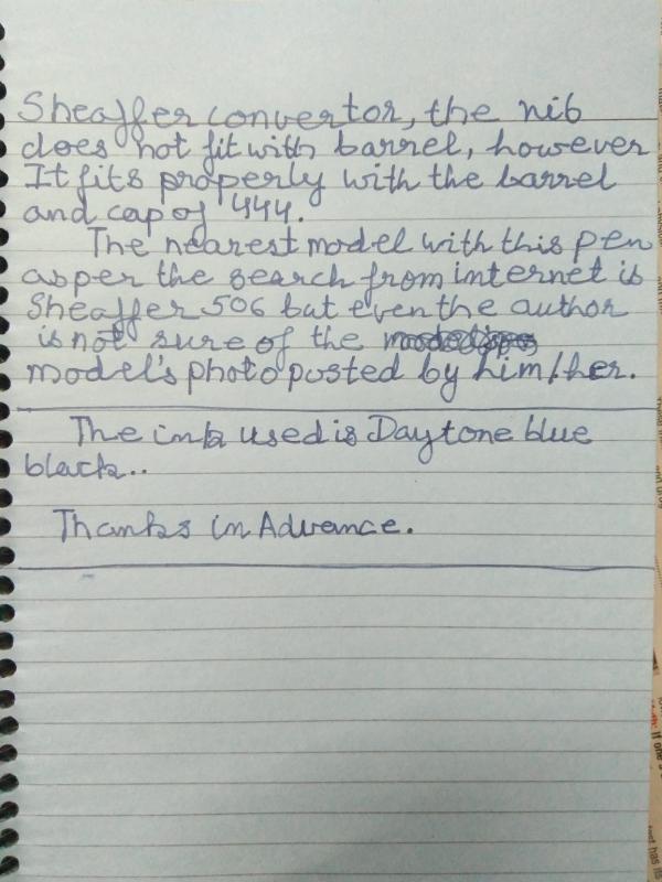
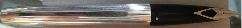
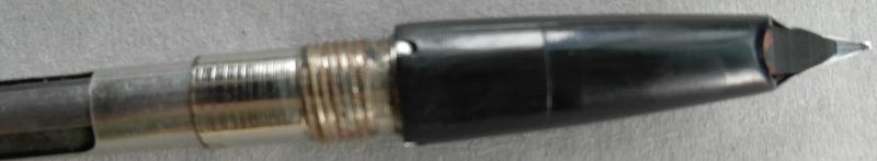
help me to identify the model of Pen
-
Hi guys, I got this Sheaffer pen from my uncle as he's not using it as often as he can. But what's the model? Hope to get some help. Thanks and Cheers!
-
Yesterday, I stopped at a shop I visit weekly that gets in pen related items every so often. They had 4 bottles of ink for me. I was not expecting the 32 oz. since when they said they had some ink I may be interested in. They offered them to me for a price which made it a no brainer to buy them. I plan on using the blue black at work (It could last me until I retire in 9 years) in my 1949 Sheaffer Sentinel. I really like the early bottle with the brown label ... and the others ... I have lots of time to figure that out. Original prices: Brown box ($1.25) and the yellow boxes ($1.50 each). Enjoy the pic!
-
I am a new member and thank you for letting me join the group. I would like to ask for an opinion of a Sheaffer ballpoint demo model. The second picture is similar to the pen I have at home. It is not a picture of my pen it is a picture I obtained off Google. My pen is in the first picture on it's own. I have done some more research and I believe it to be very early Sheaffer demo. any comments would be appreciated Thank you Maurice Burns
-
I am looking at a Sheaffer Snorkel catalog from the mid '50s (sorry, I can't remember which thread this came from), and I am having trouble distinguishing the Saratoga from the Admiral. The colors and descriptions in the catalog don't help. What's the difference between the two?
-
I recently bought a Sheaffer TM Touchdown TM for only $15, but the nib seems to have had its tipping material broken off. Is there any way to replace it or repair it?
-
I have a pen which looks like a Sheaffer Imperial Triumph, however as you can see in the pictures, the pen is tagged VIII. I've always thought that VIII was a top of the line of the plastic barrel Imperials which came in different colors; But this one is gold plated. So does anyone know what model is this and when it was manufactured?
-
Is It Sacrilegious To Remove The Label From An Old Sheaffer Skrip Bottle?
3nding posted a topic in Inky Thoughts
Hi everyone, I was wondering if I was about to commit what some of you might call a "crime against humanity", do you think it is sacrilegious to remove the label from an old Sheaffer Skrip Bottle that has an inkwell? I intend to use the bottle for storing different black inks and I mostly bought it for utilitarian purposes because it is great design and bottles like that just aren't made anymore. But I also know it's place in history and was wondering if I was about to ruin an object that has in some sense, historical significance even if it is still quite common... Here's what it looks like with the label still intact (the picture is badly framed, sorry): http://i65.tinypic.com/i19x6s.jpg -
http://inks.pencyklopedia.pl/wp-content/uploads/Sheaffer-Skrip-Blue-Black-kleks.png I present to test the ink Sheaffer Skrip Blue-Black. But as you can see the smeared drops, added must also be some other color responsible for specific luster. I bet bright green. Ink admittedly slightly dry in the pen, but this is not a problem. He writes nicely. Drying at a good level. Worth buying, but you should also look at other blue-black. Manufacturer: Sheaffer Series, colour: Skrip Blue-Black Pen: Waterman Hemisphere, nib "F" Paper: Image Volume (80 g / m2) Specifications: Flow rate: very good Lubrication: good Bleed through: unnoticeable Shading: noticeable Feathering: unnoticeable Saturation: good A drop of ink smeared with a nib http://inks.pencyklopedia.pl/wp-content/uploads/Sheaffer-Skrip-Blue-Black-kleks.jpg The ink smudged with a cotton pad http://inks.pencyklopedia.pl/wp-content/uploads/Sheaffer-Skrip-Blue-Black-wacik.jpg Lines http://inks.pencyklopedia.pl/wp-content/uploads/Sheaffer-Skrip-Blue-Black-kreski.jpg Water Resistance http://inks.pencyklopedia.pl/wp-content/uploads/Sheaffer-Skrip-Blue-Black-woda.jpg Ink drying time http://inks.pencyklopedia.pl/wp-content/uploads/Sheaffer-Skrip-Blue-Black-wysychanie.jpg Ink drops on a handkerchief http://inks.pencyklopedia.pl/wp-content/uploads/Sheaffer-Skrip-Blue-Black-chromatografia1.jpg Chromatography http://inks.pencyklopedia.pl/wp-content/uploads/Sheaffer-Skrip-Blue-Black-chromatografia2.jpg Sample text http://inks.pencyklopedia.pl/wp-content/uploads/Sheaffer-Skrip-Blue-Black-txt.jpg Sample text in an Oxford notebook A5 (90 g / m2) http://inks.pencyklopedia.pl/wp-content/uploads/Sheaffer-Skrip-Blue-Black-Oxford.jpg Sample letters in a Rhodia notebook No 16 (90 g / m2) http://inks.pencyklopedia.pl/wp-content/uploads/Sheaffer-Skrip-Blue-Black-Rhodia.jpg