Search the Community
Showing results for tags 'sailor'.
-
Sailor Manyo Inks are a line of inks inspired by flowers written about in the ancient Manyoshu poetic compilations. I recently obtained 5 of the 8 inks. I am hoping to obtain the last three in the near future. Shown below is a quick writing sample illustrating the colors. Excerpt written from "The Screwtape Letters" by C. S. Lewis Paper: Seven Seas Crossfield Notebook with Tomoe River 52gsm paper Pens (in order as written above): Haha: Italix Captain's Commission with stub nib Nekoyanagi: Pilot Metropolitan with 1.0 stub nib Sumire: Lamy Studio with medium nib Yonagi: Conklin Duragraph with 1.1 stub nib Akebi: Lamy Aion with medium nib Sailor Manyo Haha ^ Sailor Manyo Nekoyanagi ^ Sailor Manyo Sumire ^ Sailor Manyo Yonagi ^ Sailor Manyo Akebi ^ While Haha and Nekoyanagi have the wonderful multi-color shading, Sumire, Yonagi and Akebi have strong sheening abilities. Sumire has a lovely red sheen with some nice shading. Yonagi has a strong pinkish burgundy sheen and also shades nicely. Akebi has a strong yellowish-green sheen that is clearly evident on every paper I have used the ink on. Akebi also shades somewhat. Each of the inks behave very well in all the pens that I have tried them in. Overall, I am enjoying these inks and look forward to getting the others.
-
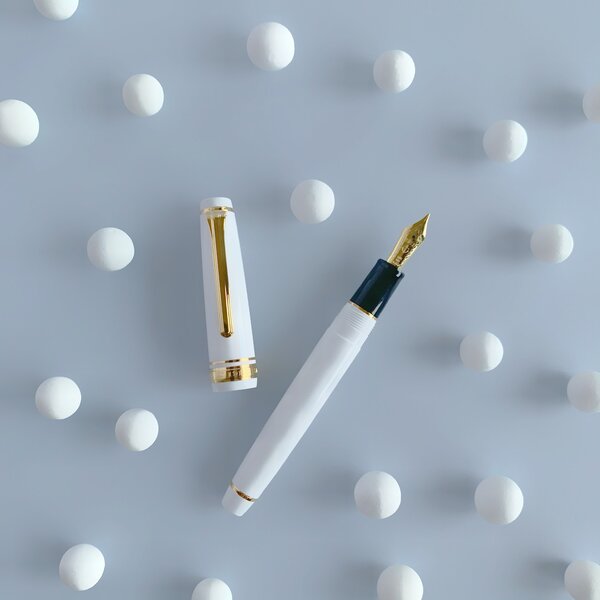
The Sailor Pro Gear Slim is one of those pens that I have wanted quite early on in the hobby. On paper ( no pun intended ), it has a lot of things going for it; it's attractive and well built, and for many, will probably be one of their first gold-nibbed pens ( my first modern one ). Was it worth the wait? Yes, it was worth the wait, but it was quite a long wait. When I got the pen, I rushed to clean it and ink it up, but there were a couple of problems. First, the nib tines were quite tight and the pen was far too dry to write properly. Obviously, you can adjust that yourself if you feel comfortable, however, the pen was also leaking ink from a gap between the section and the barrel, so right back to Anderson Pens it went. Since it came back, it's been smooth sailing (pun indeed intended). This just goes to show that probably no matter what pen you buy, something can always go wrong, so I recommend ordering from a place that will handle any issues you have. Back to the pen, what really won me over was this color combination; the reddish-orange and gold is really something that works for me. Sorry for the poor quality phone camera photos. I tried to do some color correction, so hopefully this is an accurate representation. There's also many more variants either with gold or rhodium trim, if you so desire. Design and Construction: Aesthetically, I find this a very attractive pen. The design may be conservative for some, but I think it's nice, and the color is certainly far from conservative. I think some of the smaller details such as the lettering on the cap band and the anchor on the finial help make the pen look more interesting. Holding the pen, you'll notice the quality feeling of the plastic, which has held up really well to scratches over the weeks I've been using it. The molding lines appear to have been sanded away on the barrel and cap, which helps make the pen feel like it's been turned out of a solid piece of resin. If only they sanded down the molding lines on the section, which, while mostly unobtrusive, are slightly annoying considering that's where you're intended to place your fingers. Aiding the feeling of quality however, is the exceptional balance, especially when posted. Unposted, the pen feels a little short. In general this is rather small pen, but luckily not too thin. A comparison of the capped, posted, and unposted lengths of a Kaweco Sport, Parker Duofold Junior, Sailor Pro Gear Slim, Sailor 1911s, Parker 21, Platinum Preppy, and Lamy Safari Dimensions wise, the Pro Gear Slim is identical to the 1911s except in length due to the rounded ends of the 1911 versus the flat ends of the Pro Gear. Filling System: Most Sailor pens ( except the Realo ) use Sailor's proprietary cartridge converter filling system. A converter is luckily included with the pen, but it isn't the best converter. It doesn't hold much ink, partially due to the air bubble that is always present (I've tried to expel the air out). It's enough ink to last through the day (for me), but it may be an issue. I've also heard that they sometimes leak. They do disassemble for cleaning and greasing, which is nice, but I think Sailor should really update their converter design. One oddity about filling is that it fills through the breather hole, and it's recommended by Sailor to do so. For this reason, although you can remove the nib and feed, you will break the seal and probably cause some problems ( It may also void the warranty). The Nib: The nib of any Sailor seems to be the most highly regarded part of the pen, it's practically the reason you buy one. While not perfect out the box, it's an absolutely spectacular nib. There's some feedback, but it's really smooth, definitely one of my favorite nibs. This single-tone 14k nib is also quite attractive as well ( the little things ). Sailor extra-fine versus medium I did the writing sample not long after receiving the pen, but after using it for a while with different inks, the feedback isn't as pronounced as I made it out to be. Conclusion: I think this is a wonderful pen for the $156 price. Honestly, while the gold nib is selling point for this pen, it's not the only one as this is, overall, a quality well-made pen. Do you need the gold nib? Not really since this nib produces no line variation, and a steel nib and a gold nib with the same tipping material can be almost indistinguishable. However, there is something wonderful about this nib ( which just so happens to be gold ). Not to mention that gold is an inert metal, and the alloy will resist ink staining. Some plain steel nibs can get stained rather easily from iron gall inks ( or just be harder to clean ), and some plated steel nibs I've used have had the plating come off really easily. For longevity, as far as I'm concerned, gold is a safe bet. It's also worth mentioning some of the other pens that you can get for around the same price such as the Lamy 2000, Platinum 3776, and Pilot 74, which are highly regarded by others although I have no experience with them ( yet ). If this pen appeals to you, also look at the Sailor 1911s which essentially the same pen except for the ends, which add some length. As always, your feedback is greatly appreciated.

-
This Sailor pocket fountain pen was manufactured in February 1965 (date code H. making it one of the first Sailor pocket pens to be produced. Although, once very common in Japan, they rarely come up for sale now. This is most likely due to the age and owners like to hang on to them. They are unusual which attracted me and they’re surprisingly good for writing. Pocket pens are still popular and make a revival every 15 years. Pocket pens are a rather unusual design (long cap, short barrel) and started by Platinum in the ‘60’s and due to the high demand both Pilot and Sailor soon entered the market with similar designs. As the name says, these pens are made specifically for shirt pockets. 1. Appearance & Design (8/10) This is one of Sailor’s earliest designs: jade coloured section and finial; gold clip; 14k gold nib; and decorative gold trim ring. The price, Y2,000 in 1965, wasn’t cheap which would account for the decorative trim ring which was reserved for more luxurious models. I was not particularly attracted to pocket pens at first but if you haven’t experienced them before, then you’re in for a surprise; very short when capped, yet full size posted; light; and excellent as an every-day-carry. It is sturdily built, uses a full-size Sailor cartridge with a strong clip that holds firmly. The cap has an inner liner to prevent drying and a steel clutch ring providing that snug fit capped or posted. Typical of Sailor, the quality and construction is very good. They came in many colours and I particularly like this Jade version. Personally, I find it difficult to use un-posted but luckily when posted it’s the length of the majority of fountain pens. I enjoy the convenience of a strong clip and that it easily fits in my shirt pocket or suite jacket. Overall, it's a simple design that works for me. 2. Construction & Quality (9/10) Having been protected in the box, the pen has aged well and almost as good as new. I’ve known Japanese quality control is very good, but this is commendable. I can understand why they were in high demand at the time. The pen is light, and excellent balance when posted. It's surprisingly sturdy with the brushed chrome look that will help it age gracefully. As it’s made to post, the cap fits snugly on both the section and the barrel, which is much better than some Pilots where the cap clutch grabs too soon. It has lasted 50 years and looks as good as new. Having used good quality materials, it should easily last another 50 years. 3. Weight & Dimensions (8/10) – Capped: 114mm; Uncapped: 100mm; Posted: 142mm; Diameter: 10mm; Weight: 10g. The pen is lighter than those I normally use. The cap is half the weight of the pen; it posts securely, well balanced and comfortable in the hand. It’s a pleasure to use. 4. Nib & Performance (7/10) – It has a 14k gold nib with no size indication on the nib but the price label has 細 which I’m told means fine. The nib is definitely springy almost semi-flex and writes quite smoothly, definitely not toothy or scratchy. Since it is such good condition I was reluctant to fill the pen and only dip tested for the writing sample with Sailor Souboku. It’s been subsequently cleaned and dried for storage. It had no difficulties laying a consistent fine line, an advantage of a nib matched to a good feed. The nib and section can be easily removed but not necessary since it’s NOS. The feed holds a surprising amount of ink. Given the age, if you prefer a wider nib then you may have difficulty but they are around. 5. Filling System & Maintenance (7/10) – The barrel takes a full sized proprietary cartridge. The earlier models came with a cartridge converter but I have never seen any. Luckily there are two cartridges provided which can be refilled. The nib and feed can be extracted by unscrewing the nipple, and pushing them up the section. 6. Cost & Value (8/10) –It’s a NOS vintage pen in very good condition with box and papers so would generally attract the attention of collectors, which artificially inflates the price. I have seen a few pocket pens even by Sailor but this is the first of the 1960’s luxurious pens that I’ve seen. A pen by itself, in average condition, sells for US$35-US$50. This pen including the box, instructions, and original cartridges may sell for US$50-US$70. Would I buy one for US$60? If I was looking for a pocket pen then why not pick the best. I was quite surprised how quickly I got used to the pen even if it does have a fine nib then of course it would be attractive and definitely a talking point, so for that price I would buy one. 7. Conclusion (Final score, 47/60) – Overall, there are a number of features that make this pen special: compact design; attractive appearance; springy semi-flex nib; and a good solid gold clip. The only negative is the lack of cartridge convertors so it will always be a cartridge-only pen. Initially, I wasn’t attracted to pocket pens but now I’ve tried one they will definitely be on my wish list. I like it, it’s different and looks quite attractive when capped and I love the jade colour when it’s posted. It makes a nice daily writer, built well and will survive the occasional knock without showing it. It’s such a good writer it would be a shame if this one goes to a collector but it’s understandable. With care this one will easily last another fifty years. It’s definitely a go-to pen for those that love fine nibs. Other pictures: https://imgur.com/a/qUgCtoh
-
Here is my new Sailor Bespoke King of Pen Ebonite Iro-Miyabi Fukaai with broad nib. A most excellent writer with a unique fine stone urushi finish aka ishime-nuri. Fine as in quality but more so in execution; its a fine grained pontilated finish that is pleasantly tactile and mercurial of color. Pictured along with the Sailor is a Nakaya with a much larger grained ishime-nuri finish. The name fukaai refers to dark blue, and it can look that way, but also light blue and greenish blue. Blue is an unusual and modern color for urushi. This pen is most unexpectedly interesting.
-
https://bungu.plus.co.jp/special/feature/yozakura_collabo/ Well, I think most people who's been paying attention to the Japanese market have heard about the new relation between PLUS and sailor. It's no secret that many are worried about what's going to emerge out of this integration. Perhaps too early to tell, but at least this stationary set combining a notebook, ink, and pen seems OK for the price charged - and definitely targeting female users or as a gift set.
-
I have owned this sailor king of pen for 4 years now with daily use, throughout the years I have done minor adjustments to the nib and the plating started to wear off gradually (some plating were also removed from the trim due to wear and tear). There were minor scratches on the nib too, so I decided to polish it (using micro jewelry polishing compound). This ended up by removing the whole plating. Is there a way to restore the two tone nib ? How much would it cost, any suggestions ?
-
okay. I might be crazy but I swear I have a Sailor H-B nib that was either mis-stamped or ground after the fact even though it came right off the shelf from Pen Chalet. It is a Professional Gear I (color series) and it, like I said is marked H-B on the side of the nib but it writes exactly like a Zoom nib and if you look at the nib under a loupe it looks just like what you would expect a zoom nib to look like it has the top part of the ball tipping faceted and angled off like /|\ but the bottom of the tipping is just regular round, bulbous and ball like. I have seen macro photos of zoom nibs and seen them with my own two eyes and this is what they look like. They give a thin line when the angle is increased and as the pen is lowered the line is broader. This is exactly what mine does. It goes from an F line approaching 90° angle and as you go down to, say, sub 45° angle it gets quite wide, wet and very smooth and glassy. This also jives with my limited zoom experience. You really do have to hold it low to get a wider line and in the usual position it is a tad scratchy because of the facets on iridium ball. Here is the problem. Sailor zoom nibs are marked Z on the side. Is it possible that I have a zoom nib before the Z was as a nib designation (did sailor start producing zoom nibs by grinding B nibs) or is it possible that the nib is mislabeled? Again this is an earlier Professional Gear I color series so has probably been on the shelf a few years. I feel like i am going crazy. Or is it that sailor B nibs are given a quasi-zoom treatment and they all write like this? (my first B nib purchase but I have tried and borrowed B nibs that were just regular round B nibs so really confused) Nib functions fine. Though I personally wanted a B nib and at normal angles it puts down a line slightly thinner than my H-M 1911L so that is a bummer. I also generally don’t like or have much use for a zoom nib. This is no way a straight B nib or I'll eat my hat. Or I am living in some parallel universe. Anyone else have an older H-B that writes exactly like a zoom nib?
-
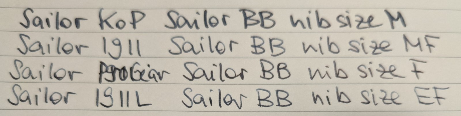
I did this comparison of Sailor nibs EF, F, MF and M for someone else and thought this might be helpful for others too. It seems like a big step between MF and M. I think I saw the same behaviour between Pilot M and F. My writing world is clearly below M. KoP Standard M, 1911 Std MF, ProGear F, 1911L: Sailor Blue-Black
-
-
After reading through this site quite extensively I have decided to finally drop in and say Hi. I have been enjoying writing with and reading about fountain pens after a long break of 15-20 years. Over the past few months I have been writing with a Lamy Safari f, a Lamy Al-star m, a Sailor Pro-Gear m, a Waterman Perspective m and a Pilot Metropolitan f. Of the lot my favourite has been the Sailor Pro Gear. My favourite ink is Montblanc Hadrian and Perle Noire. I use Kin-Mokusei to highlight. My favourite paper is Rhodia dot-grid. Though I also enjoy Rifle Paper Co.
-
(exhaling) OK ladies and gentleman. Right now I am compiling a list of my grail pens particularly from Japan and would really appreciate your input. I don't know how I got into this mindset but I really am researching seriously in determining a grail pen and it is between the four brands/pen type mentioned in the thread title. My plan is that IF sometimes in the future I visit Japan, I will be doing some pen hunting and pull the trigger on my grail pen (adjusting to future conditions of course). The price limit will be at max around $1100 so it will narrow down some of the model in the brands line up. I really wanted to include Namiki (Emperor) but $2000 is just too much of a stretch for me. I believe that most of them are similar in size (the Izumo being smallest out of the bunch) so I would not count them as a deciding factor. All are Urushi lacquered except the KoP at the price range although it is not a deciding factor for me. If you could provide the pros and cons of your preferred pens compared to the others in the list, please do share and thanks a lot!
-
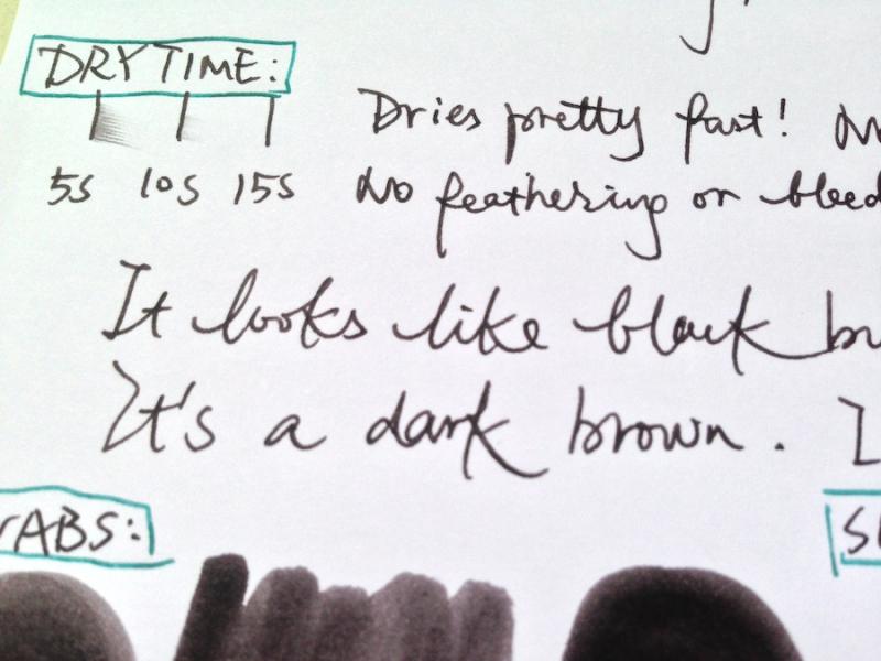
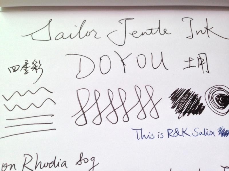
I've just purchased a bottle of Sailor Jentle Ink called "Doyou" which means mid-summer in Japanese. It's one of the eight inks of their "Colours of Four Seasons" line. Many people like Oku-yama and Yama-dori of this line, and this Doyou one is relatively rare and I was not able to find many reviews of it. I want a darker colour but not totally (boring) black, so I went for Doyou. This is my first review (here or anywhere). I hope I've done it right. It comes with a 50ml bottle with a "reservoir": flip the bottle upside-down before inking the pen and the ink will stay in a small "cone" which makes it easier to fill. When written with a finer nib, Doyou is a dark brown colour which could be mistaken as black without side-by-side comparison with a black ink. But if you look carefully you'll see it's a warm brown with a hint of red. This may refer to the colour of land in a hot summer day I guess? I think it's an understated colour suitable for work if you don't want to use a boring black. It dries fairly fast, no feathering or bleedthrough on Rhodia paper. With fine nibs there is virtually no shading though. It's a rather wet ink in my Pilot VP. The swabs show a less darker colour with a tiny bit shading. In the smear test I ran a wet finger across it twice. It leaves a red-brownish trace and you can still see the lines very clearly. The drip test shows that it has quite a decent waterproofness. All in all I think I quite like this ink. I don't have a black ink at hand for comparison, so I used the darkest (the least bright) colour available to me, which is R&K Salix, for a comparison. I have also a few words in R&K Scabiosa in my "ink journal" so I took a picture of it and put it side by side with Doyou as a comparison. Scabiosa has more of a purple hint to it. This is my first review and any suggestion or advice is welcomed! Some close-ups:
-
-
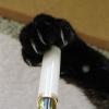
Hi everyone, I know that one the Sailor 1911S and the Sailor 1911L the finials can be unscrewed and the clips removed but I was wondering if some of their cheaper models can still have their finials, clips removed. The pens in question are the Sailor Compass and the Sailor Shikiori. The image I've attached is a closeup of the sailor compass demonstrator, I know sailor doesn't glue their finials but is the same true for their more affordable models? Thanks!
-
Sailor - Sou Boku - Mini Review And Comparison With Sei Boku
Intensity posted a topic in Ink Reviews
Sailor SouBoku is the latest nano-pigment ink from Sailor. It is a darker and more muted version of Sei Boku. Where Sei Boku has more vibrance and more noticeable green component to it, Sou Boku is a very somber classic blue-black. I reserve my personal judgement of this ink's color for now, but concede that it does look quite nice on ivory paper. Sei Boku is still my personal preference for its more cheerful hue. Being a nano-pigment ink, water resistance is fantastic. Drying time is very quick as well. This ink sheens quite readily, but the sheen is not at all distracting or very "in your face". It's just a subtle hue shift toward a red-black, giving the writing some character. I've added some super sheening splash samples, but you won't see that much sheen in normal writing. -
desaturated.thumb.gif.5cb70ef1e977aa313d11eea3616aba7d.gif)
Old retail packaging for Sailor Nano ink cartridges
A Smug Dill posted a gallery image in FPN Image Albums
.jpg.91bd353757a432edfe4510496217dc23.jpg)
-
Imagine me talking, ahem writing, with an Australian accent. Picture 1: That's not a pen. Picture 2: That's a pen. Pen 1 is only for kids having fun. 😁 (Picture 3: Comparison.) Pen1: Sailor 1911 MF Pen2: Manupropria Bo Raden from my IG account: https://www.instagram.com/mkepens/
-
My favorite fountain pens are Waterman Carene (medium) and Sailor Pro Gear (broad). I find my Pineider Avatar (medium) and Estie (medium and broad) fountain pens to be pretty/beautiful but not exceptional writers. I enjoy the metal weight/solidity of the Carene and love the lines laid down by my two Watermans (both mediums) and my Sailors (Pro Gear and 1911). Are steel nibs by nature boring (will the Diplomat nib be the same Jowo as my Estie?) or will a Diplomat Excellence nib be both smooth and have character? Would a Diplomat Excellence (Evergreen with broad steel nib) be a good choice for me? Something else? I grew up with Parker but in recent years have expanded and would be grateful for guidance. I joined today because participants are so insightful and generous with their knowledge.
-
A Japanese penshop shows detailed pictures of the recent high-priced Sailor pens - you can find more detailed pictures at LINK1, LINK2, LINK3 and LINK4: The last one is basically a nice-looking pen but I dislike the big characters that it is an LE and even the signature is oversized in my eyes - and on the front side. Have you ever seen a painter who signs his works in such huge characters (vs the whole size of the work) or in the middle of the picture? In my eyes this is bragging and can be found, unfortunately, in many recent "designs" of pen makers.
-

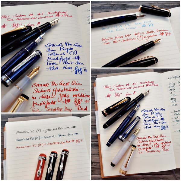
2020 12 29 new pens in 2020 Monte Rosa Moonman Pilot Sailor
JulieParadise posted a gallery image in FPN Image Albums
-
-
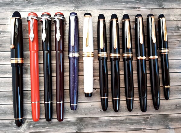
Sailor Procolor 500 and Profit Junior compared
A Smug Dill posted a gallery image in FPN Image Albums
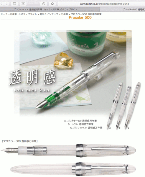
From the album: Size and shape comparisons
Same length. Same girth. Same weight. Same body material. Same nib material. Same limited choice of nib width (i.e. MF only). Different nib geometry. Different internal construction in the gripping section. Different cap ring. Different clip shape. Different price. Originally posted here: https://www.fountainpennetwork.com/forum/topic/355587-sailor-compass-aka-profit-jr/?do=findComment&comment=4358328 (The product page URLs shown in the image no longer work, after Sailor refreshed its Japanese website in late 2020. The replacement product pages are here for the transparent Profit Junior and the transparent Procolor 500.)© Sailor Pen
- 0 B
- x
-
To all who own the discontinued Pelikan 3B nib (on any model) AND the Sailor cross nib, i would like to know which one writes broader and which one is wetter. If you could please post a writing sample, it would mean so much !
-
This is sailor's 5-th release in less than a month! equipped with a black KOP nib . I wish they bring some exotic nibs to the KOP instead of colors! what are your thoughts ?
-
Sailor Limited Edition Battle of Ganryujima. Musashi and Kojiro were regarded as mighty Samurai warriors, and both were previously undefeated in battle. The Battle of Ganryujima was a fight to determine the strongest swordsman at that time. The great dual took place on April 13th, 1612. The two Samurai, both in their twenties, had agreed to meet at 8 am at the island, but Musashi arrived two hours late, intentionally, which seriously irritated Kojiro, who shouted, "You are too late," and drew his sword and angrily threw away his scabbard into the sea. Musashi responded "You have already lost, as, if you were to win, you would need your scabbard later." Musashi won the battle with one single blow to the head, which killed the samurai legend Kojiro Sasaki. Only 33 pcs for the world, we are holding #3/33. Triple luck? 😉 https://www.sakurafountainpengallery.com/en/boutique/detail/new-samurai-battle-of-ganryu-jima-sailor-limited-edition