Search the Community
Showing results for tags 'sailor'.
-
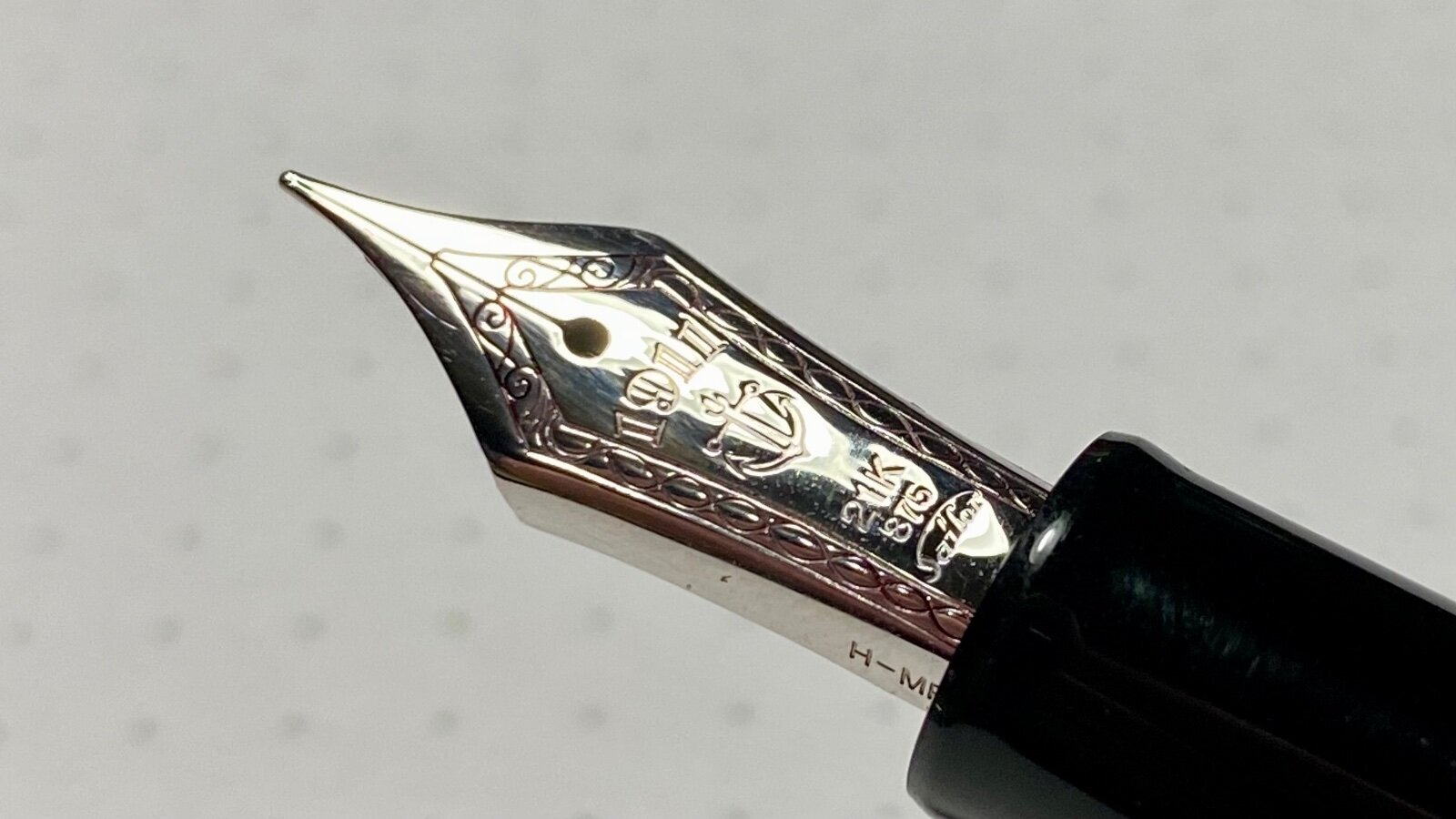
From the album: OldTravelingShoe's Random Pics of Japanese Fountain Pens
© (c) 2022 OldTravelingShoe. All rights reserved.
- 0 B
- x
-
Hello FPNers - I have a Sailor Pro Gear that originally came with a music nib. This nib wrote beautifully, but I don’t write music scores, so I wanted to convert it from a once-in-a-while writer to a daily writer. I hired a nibmeister to convert it to a medium nib, which turned out to be impossible because the ball tipping material wasn’t there. He reduced its size and made it smoother, but it’s not working for me at all. I’m open to suggestions, including nib replacement (is this possible on a Pro Gear?), alternate nibmeisters, etc. I don’t want to end up with a stub or anything unusual. I prefer standard medium or fine nibs, or perhaps a smooth cursive nib like Lamy offers. The Pro Gear is perfect for me ergonomically; I just need to get the nib right. Thanks, GNL
-
So, at one point of another... we have all said.. "Wow, I wish I could get THAT ink".. but is discontinue/expensive/unobtanium .. etc So, here is the place where you should come and check if "THAT" ink has a Doppelgänger (look-alike, double, one who nearly or completely resembles another).. I will start... I will remind you, that even the same ink looks different depending on nib/flow/paper .. so these are examples inks with the same/similar hue.. that depending on your nib/flow/paper it might look identical.. Have you heard of Sailor Tanna Japonensis (Evening Cicada).. what about Sailor Shin Zan (Deep in the Forest).. well if you can't get those, you can grab a bottle of Safari.. is cheaper, not exclusive, and easy to find. photo below... (in real person they look almost identical) Knowing how famous scanners and pictures are for not completely represent what your eyes perceived, you get both... and take my word for it.. With the right pen you can get the exact look. C.
-
Hello Fellow Sailor Lovers - I have a Sailor Pro Gear that originally came with a music nib. This nib wrote beautifully, but I loved the pen so much I wanted to convert it from a once-in-a-while writer to a daily writer. I hired a nibmeister to convert it to a medium nib, which turned out to be impossible because the ball tipping material wasn’t there. He reduced its size and made it smoother, but it’s not working for me at all. I’m open to suggestions, including nib replacement (is this possible on a Pro Gear?), alternate nibmeisters, etc. I don’t want to end up with a stub or anything unusual. I prefer standard medium or fine nibs, or perhaps a smooth cursive nib like Lamy offers. Thanks, GNL
-
I am relatively new to Fountain Pens (I started in early December 2020) and a little bit ago I got my first gold nib pen, which was my “grail pen” when I started, so now I am going to do a review! Design (9/10) I personally have small hands, so I don’t mind pocket pens. I understand how many don’t like pocket pens, but I personally love them. On this particular pen, it has a stair-step looking clip, which comes not out of but just under a gold band, and on the finial is the Sailor anchor. Below the cap, there is a thin gold band and right under that is a thicker gold band, which has stamped on it, “Sailor Japan Founded 1911”. There is a little more resin underneath and that is the end of the cap. At the end of the barrel there are some threads (will talk about later) and then another thin gold band. When you unscrew the cap (which takes about 1 and 7/8 turns) it reveals a beautiful 14k gold nib (which personally is my second favorite designed nib, right after the Pineider Quill Nib) that has “1911” on it, and underneath that the Sailor anchor, and then much smaller at the bottom of the nib is “14K”, “585” and the old Sailor logo that has the top of the S go all the way to the r. As far as I know, they only use it on their nibs now. It is surrounded by beautiful scrollwork. The grip section is a very, very dark gray with a flair at the end that tapers all the way up to a thin gold band, which goes back up to the threads which I don’t find sharp at all. There is a little space behind the threads and then there is a small step. The reason this is a 9/10 instead of a 10/10 is because it is a pocket pen, which not everyone loves, and then there is also threads on the back which I don’t like at all. I post most of my pens and I find this as just and extra step, which also just doesn’t look good when capped. This is the Stellar Blue model, and it looks at lot more blue on camera, it is more muted in real life. Nib and Writing Performance (10/10) This 14k medium-fine nib is absolutely wonderful. It does have the characteristic Sailor feedback, but I personally love that. It is very stiff, and gives just a little line variation. It is also quite wet, it’s not a gusher, but it is quite wet. Reverse Writing is surprisingly smooth. I have it filled with Jacques Herbin Terre d’Ombre and this is on 52 gsm Cream Tomoe River Paper. Overall (19/20) I think this pen is just wonderful, and I highly recommend it! This is my first review, so some constructive criticism would be great! Thank you for your time.

-
I recently purchased a 1911L with a 21k medium nib. The pen is on its way and I’m excited to try it out! However, I have heard a couple cases where the tines of the nib became misaligned after a while due to the characteristic of the 21k nib. Has this happened to anyone here and is it even an actual issue?
-
I saw this today on the reddit fountain pen sub. Link to the thread https://www.reddit.com/r/fountainpens/comments/hh8em6/sailor_may_be_getting_bought_out/ From this article (in Japanese) https://www.nikkei.com/article/DGXMZO60703660T20C20A6TJ2000/ Also talked about in this podcast https://podcast.tokyoinklings.com/ The above linked article says basically this (copied from the reddit thread above) "Financial news from last Tuesday. Sailor published convertible bond for Plus to get 2 billion Yen, which if converted to stock would give Plus over 57% ownership. Plus had been the largest holder before. Expectedly, their official stance about if they will convert that bond to stock is “no comment”. The article also said last year Sailor booked 21 million in the red, -1.4% sales year-over-year. The Nikkei article said Sailor is meeting difficulties with the Chinese fountain pen market, while in domestic market they are threatened by low birth rate and move to paperless business. Comparing companies, Plus is the level of Kokuyo, giant office supplies and stationery company. They won against Kokuyo in bidding for Pentel last year. Even if they won’t interfere with the high end fountain pens, maybe help in expanding the other Sailor stationeries like roller balls and markers ?" I don't fully understand this, red numbers are never great, but -1.4% isn't that bad? Besides, Sailor products are so popular and regularly sell out so quickly, how can they be on a decline? Or is that maybe more tied to their robot division (though I doubt that, as the article talks explicitily about stationery). How is Platinum doing? Pilot is flogging so many gel pens, I doubt they are in trouble, but then I never thought Sailor could be, though the decline of just 1.4% doesn't seem exactly terrible to me... On top of that "apparently they have a real problem getting the seal done correctly or something; there was a mention in the podcast that for each realo they successfully make that they have to trash one that is not successful."
-
Here in full focus stacked macro glory is the limited edition Taccia Miyabi Imperial Koi. The background is, I think, byakudan-nuri whereas the fish are in rankaku with mother of pearl raden eyes. Usually, koi are not usually represented this large but Taccia made the specific choice to render them this way to good effect. Sailor nib so it writes well. focus stacked logo by Ja Ja, on Flickr focus stacked koi closeup logo by Ja Ja, on Flickr cap logo by Ja Ja, on Flickr
-
Here are 10 blue-black(ish) inks and two “true” blue inks as a comparison. Just for the fun of it. I scanned the sheet and with that most of the inks don’t show their sheen (or it’s not that obvious in the scan) so here are some photos of the inks to showoff some sheen: And for those of you who care about water resistance of inks, here are the inks after 15 seconds water bath:
-
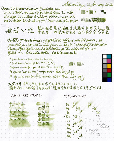
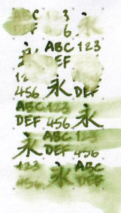
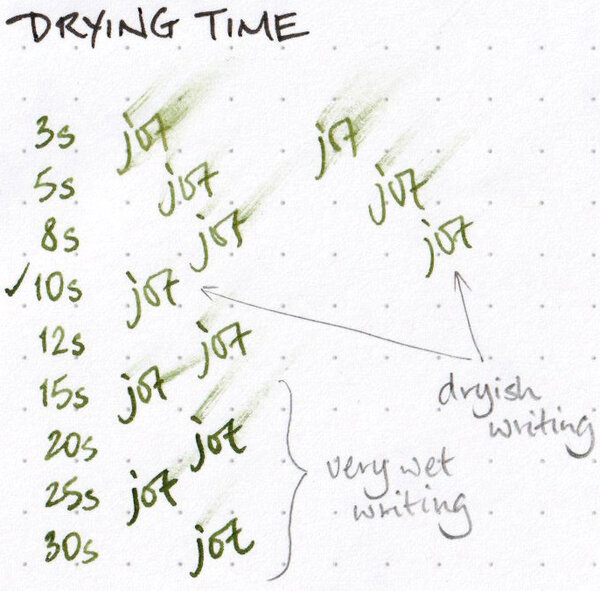
Colour: olive / murky green Flow: moderate, in that I haven't observed it flowing so dryly that it drew my attention, or so wetly that I needed to adjust what I was doing Feathering: Not observed on Rhodia DotPad 80g/m² paper, looking closely at the thinnest hatching lines, and words/glyphs ‘reverse-written’ with the nib upside-down (i.e. the bottom of the feed facing up) Show-through: Low to nil Bleed-through: Not observed Shading: This ink has a lot of range when it comes to shading, but it's unlikely that you'll get the full range along a single pen stroke. Shading is more apparent towards the drier side of the spectrum (i.e. in terms of how much ink per unit area has been deposited); the wetter the stroke, the more subtle the shading is. The shading effect tends to be well-blended, instead of clearly demarcated between light and dark, along a single pen stroke. Sheen: None observed Shimmer: None Drying time: Depends greatly on the wetness of the line or mark. Given the broad range of shades achievable with this ink, and the different colour intensities strongly reflect the wetness of the ink mark, a light-to-medium olive green mark dries completely under 10 seconds, whereas a dark murky green mark may take longer than 30 seconds to dry, on Rhodia DotPad 80g/m² paper. Smudging after fully dry: Didn't happen when I rubbed my thumb over the hatching/stippling panel and the largest Chinese hanzi chharacters Water resistance: Effectively nil My thoughts: A pretty ink for which I have little practical use. I can't ‘afford’ to use it in a wet pen to write in that dark murky green colour that can be achieved, on account of the long drying time; an ink such as Platinum Classic Ink Forest Green would be far more suitable for that, and being water-resistant to boot. This is probably a good drawing ink, but I don't draw in colour all that much at all. As a tester ink, it would be quite apt to tell me how dryly or wetly a pen writes, but then Sailor Shikiori inks are too expensive to use as tester inks.
-
Sailor King of Pen Battle of Itsukushima LE pen and box details
jandrese posted a topic in Japan - Asia
This is the incredible Sailor King of Pen Battle of Itsukushima LE in full focus stacked macro glory. The artist is Ikki Moroiki and the total number of pens is 33. The presentation box is also incredible in black lacquer and maki-e. Details of the maki-e on the box are shown below. 8E7EBA7F-D2BE-4748-B5AF-EFB645A9EBC9 by Ja Ja, on Flickr 4FDBB95A-F8C8-4497-8026-D63CF7B90898 by Ja Ja, on Flickr 358CEAD5-FDD5-4C92-9B49-AE9CCEC83717 by Ja Ja, on Flickr -
Sailor Bespoke King of Pen Ebonite Nagintata Togi 2022 LE Ryokko (and friends)
jandrese posted a topic in Japan - Asia
Featured here is the Sailor Bespoke King of Pen Ebonite Naginata Togi 2022 LE Ryokko or Green Echo. The design is based on a picture set in the Miskaka Pond of Shinshu, Nagano. The pen is rather attractive. The Green Echo was preceded by the Solar Prominence (Kouen) in 2021 and the Blue Wave (Kaiha) in 2020. All are excellent writers. ryokko by itself focus stacked yes logo by Ja Ja, on Flickr trio capped focus stacked yes logo by Ja Ja, on Flickr nib trio underside yes logo by Ja Ja, on Flickr nib trio topside yes logo by Ja Ja, on Flickr _SON6700 trio nibs out caps up b side by Ja Ja, on Flickr trio capped yes logo b side by Ja Ja, on Flickr -
I haven't done any ink reviews in a long time, but I also haven't acquired any inks in a long time. I wasn't really looking for any inks but was looking through the Taccia inks and noticed some new ones. Since Taccia was bought by Nakabayashi, it seems like the Taccia brand is being used to offer interesting special inks. There is a new series based on the Ukiyo-e printing of 17th century Japan. https://www.nakabayashi.co.jp/_files/EnProduct/0/82/pdf/TFPI-WD42-e.pdf The packaging is very nice as in the pics above and my own: Tested with two pens, a Sailor 1911 Std (M) and an Edison Premiere (M) on Mohawk via Linen and Tomoe River. The Edison pen is wetter and wider than the Sailor pen, and so a bit of of shading is lost. In the Sailor pen the shading is great. No sheen in the usual sense, but on the Tomoe River from the Sailor pen the ink appears as a silvery sheen when seen at just the proper angle. I'm very particular with red inks. Regular reds I don't like, I don't have any use for them. I was concerned whether this ink would be a standard red-leaning brown like MB Toffee Brown or Visconti Brown. I definitely wouldn't want just another ink like that. It is a red ink, but very muted, earthy. I like it a lot. A red that works like a brown. I didn't test water resistance as that's not a quality important to me. I presume it's not very water resistant. A reasonable price for a stealth Sailor ink. The Sailor 1911 Std on MvL; The Edison Premiere on MvL: Tomoe River:
-
Given the assertion often made by others that Sailor kiwaguro pigment ink is (totally, utterly, 100%, or some other adjective meaning absolutely) waterproof, which I know is not factually true, and the assertion I've often made about Sailor souboku and seiboku being completely waterproof (which I now know is also not factually true), I decided to put the nine pigment inks I have to the test. They are: Pelikan Fount India black inkPlatinum Black Carbon InkPlatinum Brun Sepia Pigment InkSailor kiwaguro black inkSailor souboku blue-black inkSailor seiboku blue-black inkSailor STORiA Night Blue inkSailor STORiA Magic Purple inkSailor STORiA Lion Light Brown ink These inks shed colour observably while the page was being soaked in a bath of clean water: and this photo of the page after drying attests that the three blue-black and blue inks are in fact not completely waterproof, even though they fared much better Pelikan Fount India and Sailor kiwaguro: Out of the black inks, only Platinum Black Carbon Ink is completely waterproof. I cannot see any colour come off either Sailor STORiA Lion Light Brown or Platinum Brun Sepia Pigment Ink with my naked eye during or after soaking, and it may take a new test with a full page of writing with one of those inks individually for me to know for sure, but for now I'll also assume that they're completely waterproof. Of course, writing in all of the pigment inks tested remained very legible. Here's the full page after drying. (Click to bring up a larger image.)
-
I am thinking about using lubricating ink on a 14k M nib 1911s model and Diamine inks is in my budget. What's your opinion? What about the shimmering inks Diamine offers?
-
-

-
desaturated.thumb.gif.5cb70ef1e977aa313d11eea3616aba7d.gif)
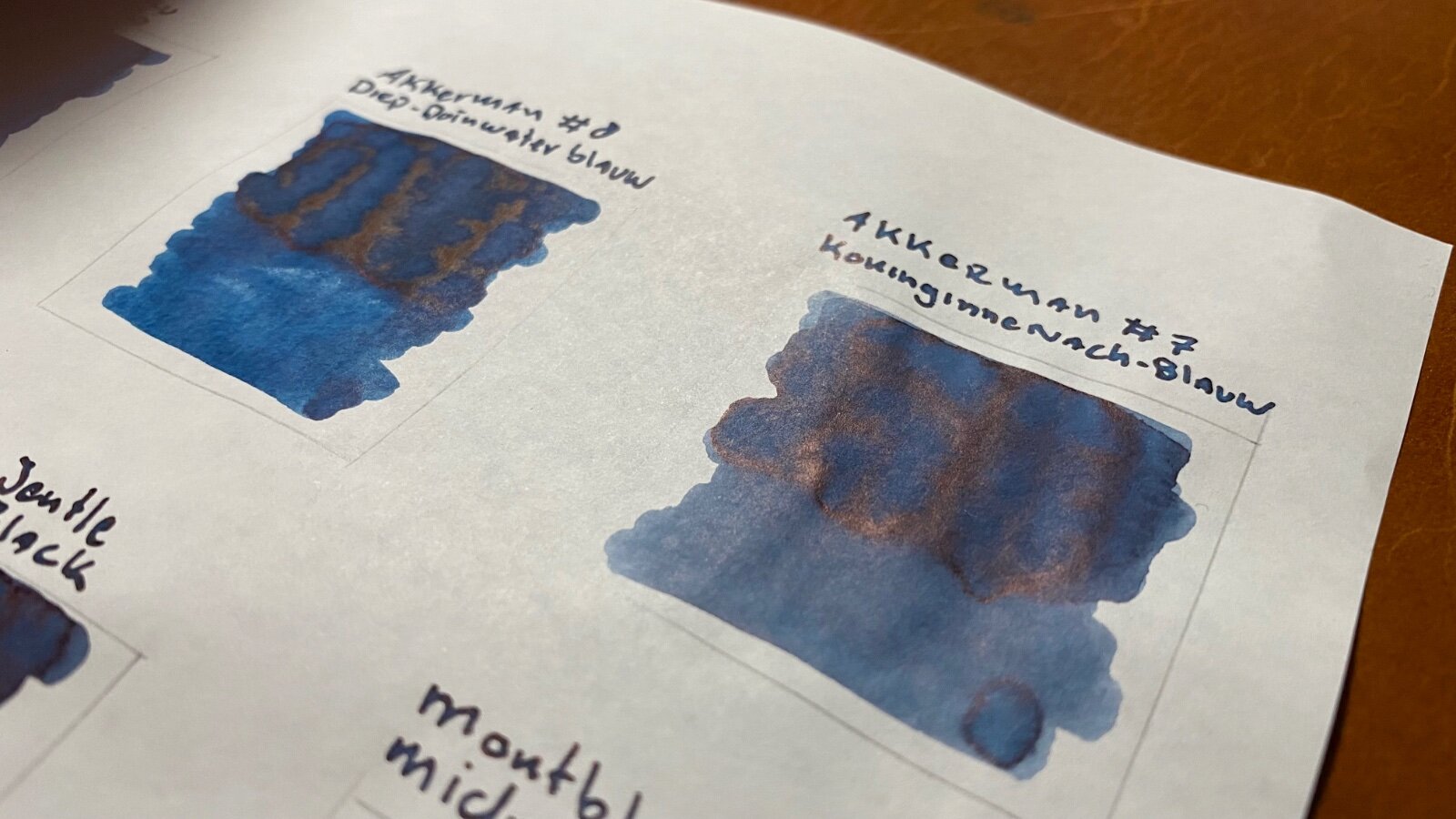
Sailor Shikiori Wakauguisu - water resistance
A Smug Dill posted a gallery image in FPN Image Albums
-
-
This is the new LE from Sailor, the Bespoke Maki-e King of of Pen Shika to Gekkou or Deer in Moonlight. The artwork is amazing and emotive. Feast your eyes on this focus stacked macro capture of a wonder. Untitled-1 watermarked by Ja Ja, on Flickr
-
This pen was ordered for me by a friend as a gift. It took almost 3 months to get to me as La Couronne du Comte (Dutch retailer) lists a lot of products on their site without actually having it in stock. But that aside as this is not a store review. I already had a Sailor Pro Gear Slim (the blue/green nebula) with a 14kt fine nib, this nib writes lovely and has the famous pencil like feedback. But alas this pen is way too small and finicky for my hands and writing style. So, I was curious how the bigger brother of the Pro Gear Slim would write, and I was lucky enough to be able to select this pen as a gift. So, the facts: Manufacturer: Sailor Model: 1911 Large Rhodium trim Material: Black acrylic (injection molded) Nib: Sailor 21kt Gold (H-MF) Filling system: Cartridge/converter Capped: 141 mm Uncapped: 123 mm Posted: 153 mm Section: 10 - 11 mm ______________________________________________________________________ Appearance & Design - Classic cigar-shaped design The pen has the same classic cigar-shaped design as so many others. I went for the rhodium trims as this fits a black pen better, in my opinion. The engraving on the cap band is crisp and unintrusive (unlike the engraving of e.g., the Platinum #3776). The clip has a nice 3 stepped design, and this gives it quite a classical look. The clip is quite springy and effortlessly slides in a shirt pocket. The nib has beautiful scrollwork and is a bit on the small site for this pen (more on this in the nib section). A good, understated design for in a business environment. Construction & Quality – Well build but has improving opportunities The threading on this pen (cap as well as barrel) is smooth. The glossy injection molded acrylic is a real fingerprint magnet and is surprisingly easily scratched. The pen posts very securely and is not back weighted. Writing with this pen posted for me it’s more balanced than unposted. The cap comes off with just over 2 full turns, which is not that great for quick note taking. Weight & Dimensions – Lightweight and on the smaller side. This pen is on the smaller side of things and unposted it’s almost too small for my hands. It’s ok to take a view quick notes with it unposted, but for longer writing I really need to post the pen. As I said before the pen has a very good balance when posted. The section could do with a bit more girth for my taste, but is not uncomfortably small (like e.g. a Pro Gear Slim). Although it has quite a view metal parts it’s still relatively light. Nib & Performance – Lovely and precise The 21kt gold hard medium-fine (H-MF) nib writes lovely and has the (in)famous pencil like feedback. It performs well, never had a hard start or any skipping. It is fitted with a plastic feed but still lays down a good amount of ink. The nib is not flexible but has enough bounce to it. The nib is decorated with lovely scrollwork and the Sailor anker logo. The nib is smaller than a standard #6 nib from let’s say Jowo or Bock. But still in proportion to the rest of the pen. But for my personal preferences it could be a bit bigger. Filling System & Maintenance – Cartridge/convertor?? This pen is fitted with a proprietary convertor (or cartridges if you want), the convertor is quite small and only holds a measly 0,45 ml of ink (if you fill it to the brim). That makes that I need to fill this pen quite often and it’s not ideal if I have a lot of meetings in a day. I can’t understand that a pen in this price class does not have a piston filling system of at least a convertor with a higher capacity. The nib lays down a decent amount of ink and this drains the pen quite quickly in my case. Maintaining this pen is as easy and quick as any other convertor fitted pen, the nib is friction fitted so you can disassemble the pen easily (even the convertor if you want). Here is the convertor compared to that of a Leonardo Momento Zero: Cost & Value – Well, it’s not cheap This pen retails for around € 295,- in the Netherlands and considering the size of the pen and the capacity of the convertor this is not a bang for your buck pen in my book. But then there is the quality of the nib that writes precise, reliable and with a smooth pencil like feeling. So yeah, there’s that. Would I replace this pen if it would break? Well, that is a mindboggling question but as I feel now I probably would not. Conclusion – Still one of my favourites The small size and measly ink capacity of this pen aside I really love how this pen writes. Especially on Tomoe River paper this nib really shines for me. Somehow that makes me overlook the “small” problems (pun intended) with this pen and focus on the joy of writing a long letter to a dear friend. And let’s be honest, that is what a writing instrument is for 😉
-
Here are two limited edition Taccia pens from the Hyakko-Hisho lineup. The Hyakko-Hisho is a compendium of craft techniques from the Edo period including lacquer styles. Taccia has been pulling from that for the past two or three years. Pictured first is the Hakumei or twilight from last year, which is primarily green. Second, is this year's Hakumei or starlight/star shine, which is primarily blue. Both make nice use of blended urushi colors and raden. I thought they made a nice pair. Untitled-1 with logo by Ja Ja, on Flickr Untitled-1 yes logo by Ja Ja, on Flickr together with logo by Ja Ja, on Flickr caps together with logo by Ja Ja, on Flickr tails together with logo by Ja Ja, on Flickr
-
I photographed these Sailor King of Pen pens for Dromgooles. Very interesting and unique urushi technique that I did not appreciate until I was able to study them. I especially like the color range in the green version. together yes logo by Ja Ja, on Flickr texture zoom crop yes logo by Ja Ja, on Flickr
-
Wise old Sailor Bespoke KOP Chikin Owl--incredible pen and more incredible box
jandrese posted a topic in Japan - Asia
I shot this for Dromgooles. Gorgeous chinkin work on the pen but the box is superlative. Expensive but worth every penny. uncapped pen at rest yes logo by Ja Ja, on Flickr Owl pen closeup yes logo by Ja Ja, on Flickr Full capped yes logo 1st choice by Ja Ja, on Flickr box owl yes logo by Ja Ja, on Flickr box yes logo by Ja Ja, on Flickr -
As many know from Visvamitra's epic review of the Kobe Nagasawa line of inks made by Sailor, these are the most extensive line of Sailor inks. Originally they were 50 inks. But they've been adding a new ink every now and then so the line is up to #55 or #56 now. This is #52. I love sepia inks, but as dpritch's epic review of Sepia inks shows, the color range on this ink is quite large. And this one is kind of over at the red-brown range which often gets called "sepia" in the labeling and marketing romance of inks. This is one of the few inks that when I received it and inked up, I was a bit disappointed. The color wasn't anything what I would call "vintage sepia". Now perhaps the folks at Kobe Nagasawa and Sailor have an example of a vintage sepia ink that appears now like this hue. And to it's credit the ink does have a nice golden-brown undertone instead of the typical red. But whenever I look I it I still see "red-brown". I have so many of these kinds of inks that I'm reluctant now to consider a new brown ink for the collection. There's nothing wrong with the handling of this ink. It's classic Sailor. Wet, lubricated, saturated. There is some nice subtle shading with the ink that probably isn't captured in the images. My typical test papers are: Mohawk via Linen=MvL, Tomoe River=TR, Hammermill 28 lb inkjet paper. The last is the driest of these papers in that an ink that feels nice on other papers can have some resistance there. Somewhat water resistant but a lot of ink washes way and that could obscure what one wants to save. A very interesting ink drop. There's possibilities here.