Search the Community
Showing results for tags 'rohrer & klingner'.
-
Rohrer & Klingner operates since 1892. At the moment it's the fifth generation of the family that manages the company. I guess that after 122 years they know what they are doing. R&K inks offer amazing quality for amazing price. In my country a bnottle of R&K ink costs 5-6 $. I know it's a bit more expensive in America, yet I believe the price is still reasonable. I find it interesting that Rohrer & Klingner seems to focus mainly on the content and not on the bottles. Inks come in industrial looking bottle taht is quite handy but there's just nothing fancy about it. It's surprising. http://www.rohrer-klingner.de/fileadmin/_migrated/pics/schreibtinte_top_03.jpg Anyway they offer eighteen colors, some stunning, some boring but all have good qualities and are easy to clean. Alt-bordeaux Alt-Goldgrun Blu Mare Blue Permanent Cassia Fernambuc Helianthus Leipziger-Schwarz Magenta Morinda Royal Blue Salix Scabiosa Sepia Smaragdgrun Solferino Verdigris Verdura It's time to re-review these inks. Rohrer and Klingner Magenta is quite vibrant color. The flow is very nice as in most R&K inks. The dry time is pretty fast, around 15 seconds on Oxford Optic paper. The water resistance is low, but the advantage of that is it cleans easily from the pen. The shading isn't potent, but it's present. Personally I prefer Solferino but Magenta may appeal to those of us who enjoy punch-me-in-the-eyes colors. Drops of ink on kitchen towel Software ID Color range Maruman, Lamy 2000, broad nib Leuchtturm1917, Kaweco Skyline Sport, double broad Oxford Optic, Kaweco Skyline Sport, broad
-
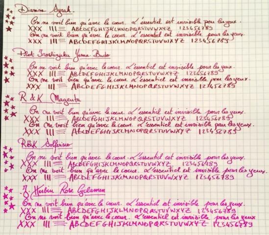
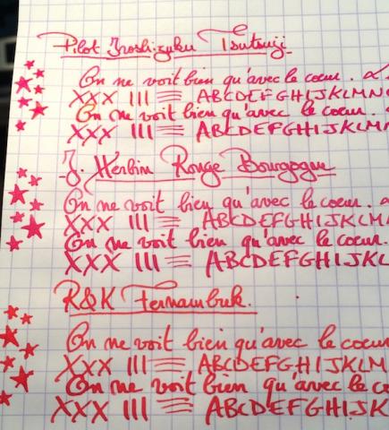
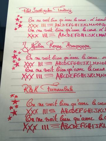
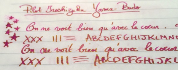
I've been wanting to try some kind of pinkish ink for a while. I didn’t want a pastel or cotton-candy pink, but other than that I was pretty open, so after going through the FPN boards and using the Goulet swatch tool, the eight finalists ranged from burgundy to magenta to purplish and reddish pinks: Diamine Syrah, Pilot Iroshizuku Yama-Budo, Rohrer & Klingner Magenta, Rohrer & Klingner Solferino, J. Herbin Rose Cyclamen, Pilot Iroshizuku Tsutsuji, J. Herbin Rouge Bourgogne, and Rohrer & Klingner Fernambuk. Although I liked some of the colors, I didn’t see myself using pink enough to warrant buying a full bottle (given that I am trying, though not very well , to stick to a stricter ink budget). I didn’t want the samples to go to waste though so I thought it might be helpful to post a comparison on here for anyone else who might also be thinking of going “pink.” The writing samples were done on Rhodia using a random steel nib pen (that I use as a dip pen) and a Pilot Custom 74 B nib ground down to a smooth stub by Mike Masuyama (also used as a dip pen to be able to test all the colors quickly). I’ve included a second set of samples on Tomoe River Paper, since some of these inks (especially given their sheen) could make for beautiful options for special letters, cards or notes on heavily "sheening" paper. PS I would need to ink a pen with it to accurately test its smoothness and flow, but if I had to pick one pink ink that I could see myself using often enough to purchase a full bottle it would be R&K Magenta. Which one of the eight would you pick? 1. On Rhodia: Closeups Ink Swabs 2. On Tomoe River Paper: Closeups Highest "Sheening" Ink Close-up Ink Swabs 3. Ink on Paper Towel: Top Row: Diamine Syrah, Pilot Iroshizuku Yama-Budo, Rohrer & Klingner Magenta, Rohrer & Klingner Solferino Bottom Row: J. Herbin Rose Cyclamen, Pilot Iroshizuku Tsutsuji, J. Herbin Rouge Bourgogne, Rohrer & Klingner Fernambuk
- 50 replies
-
Rohrer & Klingner operates since 1892. At the moment it's the fifth generation of the family that manages the company. I guess that after 122 years they know what they are doing. R&K inks offer amazing quality for amazing price. In my country a bnottle of R&K ink costs 5-6 $. I know it's a bit more expensive in America, yet I believe the price is still reasonable. I find it interesting that Rohrer & Klingner seems to focus mainly on the content and not on the bottles. Inks come in industrial looking bottle taht is quite handy but there's just nothing fancy about it. It's surprising. http://www.rohrer-klingner.de/fileadmin/_migrated/pics/schreibtinte_top_03.jpg Anyway they offer eighteen colors, some stunning, some boring but all have good qualities and are easy to clean. http://imageshack.com/a/img742/3085/WHCjxM.jpg Alt-bordeaux Alt-Goldgrun Blu Mare Blue Permanent Cassia Fernambuc Helianthus Leipziger-Schwarz Magenta Morinda Royal Blue Salix Scabiosa Sepia Smaragdgrun Solferino Verdigris Verdura It's time to re-review this inks. Cassia is rather bright and quite delightful purple ink. Recently I'm in purple faze and I use purple inks extensively. While Cassia isn't as rich as Lamy's Dark Lilac I still think it looks stunning, especially in broader nibs. The dry time is medium length, reaching 20 seconds when the ink is used in wet nib on paper like Rhodia. It lacks water resistance but cleans nicely from the pen. The shading is quite nice but not massive. On the other hand in Kaweco double broad nib it's significant. It flows nicely, towards the wet side. Some feathering may be experienced on crappy paper (Moleskine and alikes). Drops of ink on kitchen towel Software ID Color range Tomoe River, Kaweco Skyline Sport, double broad Leuchtturm1917, Kaweco Skyline Sport, double broad Maruman, Kaweco Skyline Sport, double broad Water resistance
- 11 replies
-
- rohrer & klingner
- purple
-
(and 1 more)
Tagged with:
-
Rohrer & Klingner operates since 1892. At the moment it's the fifth generation of the family that manages the company. I guess that after 122 years they know what they are doing. R&K inks offer amazing quality for amazing price. In my country a bnottle of R&K ink costs 5-6 $. I know it's a bit more expensive in America, yet I believe the price is still reasonable. I find it interesting that Rohrer & Klingner seems to focus mainly on the content and not on the bottles. Inks come in industrial looking bottle taht is quite handy but there's just nothing fancy about it. It's surprising. http://www.rohrer-klingner.de/fileadmin/_migrated/pics/schreibtinte_top_03.jpg Anyway they offer eighteen colors, some stunning, some boring but all have good qualities and are easy to clean. Alt-bordeaux Alt-Goldgrun Blu Mare Blue Permanent Cassia Fernambuc Helianthus Leipziger-Schwarz Magenta Morinda Royal Blue Salix Scabiosa Sepia Smaragdgrun Solferino Verdigris Verdura It's time to re-review this inks. I never liked Verdura and time didn't change it. I used to think it was ok ink and I guess it's still ok but I practically never use it. There's nothing wrong with the ink - it's well behaved and shades and all. It's just the hue doesn't appeal to me. The dry time is medium length, reaching 15 seconds when the ink is used in wet nib on paper like Rhodia. It lacks water resistance but cleans nicely from the pen. Some feathering may be experienced on crappy paper (Moleskine and alikes). Drops of ink on kitchen towel Software ID Color range Tomoe River, Lamy 2000, medium nib Leuchtturm1917, Kaweco Skyline Sport, double broad Clairefontaine, Kaweco Skyline Sport, broad Water resistance
-
Rohrer & Klingner operates since 1892. At the moment it's the fifth generation of the family that manages the company. I guess that after 122 years they know what they are doing. R&K inks offer amazing quality for amazing price. In my country a bnottle of R&K ink costs 5-6 $. I know it's a bit more expensive in America, yet I believe the price is still reasonable. I find it interesting that Rohrer & Klingner seems to focus mainly on the content and not on the bottles. Inks come in industrial looking bottle taht is quite handy but there's just nothing fancy about it. It's surprising. http://www.rohrer-klingner.de/fileadmin/_migrated/pics/schreibtinte_top_03.jpg Anyway they offer eighteen colors, some stunning, some boring but all have good qualities and are easy to clean. http://imageshack.com/a/img742/3085/WHCjxM.jpg Alt-bordeaux Alt-Goldgrun Blu Mare Blue Permanent Cassia Fernambuc Helianthus Leipziger-Schwarz Magenta Morinda Royal Blue Salix Scabiosa Sepia Smaragdgrun Solferino Verdigris Verdura It's time to re-review this inks. Morinda used to be one of my favourite red inks before I tried some Sailor reds. I still happen to use it but not too often. The color is rather pleasant to my eyes. It doesn't have any water resistance, but it cleans easier from the pen than most other red inks. It flows wet, shows a high degree of shading. It may cause feathering and bleedthrough on some papers. Drops of ink on kitchen towel Software ID Color Range Leuchtturm 1917, Kaweco Claasic Sport, B Ciak, St Dupont Fidelio, M
-
Like most people I like novelties, especially when it comes to inks and fountain pens. You know - I've been looking for grail ink for three years and there's always chance it's still ahead of me When I came across Super5 inks mention on Goulet's site, I thought the bottles looked cool and - in a way - familiar. http://papierlabor.de/wordpress/wp-content/uploads/2014/06/super5-ink-group-720x340.jpg The names of cities were cool as well. Colors looked really nice on swabs. My dear friend google helped me to investigate. Super5 inks are sold by Format-Darmstadt GmbH on papierlabor.desite. The company offers also calligraphy pen and converter and some papers. The inks are made by my second favourite ink maker - Rohrer & Klingner. Check their "regular" inks here. That's good news. Really. They know what they're doing and you can expect good quality from R&K. The quality they indeed deliver. So why Super5 inks are much more expensive than R&K inks. First of all - they're pigmented (I believe), then there need to be some margin for the distributor. At 20 euros / bottle yhey're not cheap. However unlike Caran d'Ache or Iroshizuku they offer not only more than satisfying quality, good flow and good lubrication but also added value of waterproofness and lightfastness. Last week I was given the whole set. I'm going to review it and post comparison of the full line. Soon. The colors are really great. Honestly. They're also extremely waterproof. Yesterday I've reviewed Delhi, check it out if you like oranges. Today let's take a look at Australia, nice red-brown ink. Bottle: http://imageshack.com/a/img538/79/H42D6r.jpg http://imageshack.com/a/img538/7148/L45wy5.jpg Abstract Expressionism (a.k.a. ink splash) on Mondi 120 g paper http://imageshack.com/a/img540/673/QReKwN.jpg Drops of ink on kitchen towel http://imageshack.com/a/img673/9049/eWr74Y.jpg Software ID http://imageshack.com/a/img912/4546/f1Mrba.jpg Color Range http://imageshack.com/a/img540/2751/taBaHS.jpg Oxford recycled, 90 g - Kaweco Sport Classic, eyedropper mode, Broad nib http://imageshack.com/a/img661/4849/one88Y.jpg http://imageshack.com/a/img537/3277/CEc56L.jpg http://imageshack.com/a/img538/7893/o7Je1I.jpg http://imageshack.com/a/img904/5014/u4bLci.jpg Rhodia in the water on the photo after five minutes of soaking http://imageshack.com/a/img673/9734/EIzmte.jpg
-
Hi All, Fountain pen newbie here with some questions on ink. I am experiencing bleeding on inks that most people do not have bleeding problems with. Specifically, Diamine Majestic Blue, De Atramentis Magenta Violet and Rohrer & Klingner Cassia. I am using a Leuchtturm 1917. I have read different articles about dilution but several ink reviews for these inks do not mention any bleeding problems. I have added a photo of the reverse side of a Majestic Blue list and a ink sample page. When I first started using Noodler's Black, I had problems with "ink transfer" (not sure if there is a term for this). Dried ink on one page A would transfer to another page B (Page A and B are faces of a notebook A|B where | is the spine) when I wrote on the reverse side of page B. A little dilution got rid of this problem but the problem comes back when the ink starts to dry. Using ink seems pretty intuitive... Take ink from bottle, put in pen, write. Am I doing this wrong? Why am I having so many problems? Should I be diluting all of these inks? I know Rhodia paper handles ink better but I would like to find a solution that works with the Leuchtturm -- which should still be able to handle fountain pens! Thank you!!!
- 23 replies
-
- diamine
- leuchtturm
-
(and 6 more)
Tagged with:
-
I am a huge fan of Chesterfield ink, and before I consider buying an ink from a different company I always look to see if I can purchase a similar color from Chesterfield first. (I realize that Chesterfield is just a repackaged and rebranded Diamine, but Chesterfield inks come in spiffy Nalgene bottles, cost far less than Diamine, and have more sizing options. They may be the same ink as Diamine, but I think of them as a separate entity.) The only other ink company that I use as often as Chesterfield is Rohrer & Klingner. With these two companies covering the vast majority of colors and options (both have iron gall inks, permanent document inks, and a wide variety of colors) I rarely see the need to go elsewhere for my inks. I have an ink or two from other companies and I have a hand full of samples from other companies, but to be perfectly honest I always end up coming right back to my big two. This realization really hit home when I realized that I will buy a full bottle from either Chesterfield or R&K without first sampling the color, but I will not even consider buying ink from another company without trying a sample first. As it turns out, I am a loyal user of these two inks and I didn't even know it. So, my question is: how many folks out there find themselves loyal to certain brands of ink? What is it about those inks that keep you coming back? I am curious to know if I am alone in sticking mostly to one or two brands or if there are others like me out there.
- 86 replies
-
- ink
- ink brands
-
(and 2 more)
Tagged with:
-
Rohrer & Klingner- China Blue (Taiwan limited edition, 2014) http://blog-imgs-84-origin.fc2.com/c/h/i/chingdamosaic/RK02.jpg http://blog-imgs-84-origin.fc2.com/c/h/i/chingdamosaic/RK03.jpg http://blog-imgs-84-origin.fc2.com/c/h/i/chingdamosaic/RK14.jpg bottle design- compared with RK Scabiosa http://blog-imgs-84-origin.fc2.com/c/h/i/chingdamosaic/RK13.jpg http://blog-imgs-84-origin.fc2.com/c/h/i/chingdamosaic/RK12.jpg Dip pen "Blue Pumpkin" on ROSSI paper: http://blog-imgs-84-origin.fc2.com/c/h/i/chingdamosaic/RK04.jpg Not waterproof. http://blog-imgs-84-origin.fc2.com/c/h/i/chingdamosaic/RK09.jpg http://blog-imgs-84-origin.fc2.com/c/h/i/chingdamosaic/RK06.jpg Comparison: with Blue Pumpkin/ glass dip pen/ Platinum 3776 14K EF nib R&K on Moleskine with Blue Pumpkin and red watercolor: http://blog-imgs-84-origin.fc2.com/c/h/i/chingdamosaic/RK10.jpg ------------------------------------------------------------------------------------------------------------------------ If you read Chinese, here's a more detailed review on my blog: http://chingdamosaic.blog.fc2.com/blog-entry-51.html Thanks:)
- 14 replies
-
- rohrer & klingner
- china blue
-
(and 1 more)
Tagged with:
-
Comparison: R&k China Blue(青花瓷) & Diamine China Blue
chingdamosaic posted a topic in Ink Comparisons
1. Rohrer & Klingner- China Blue (Taiwan limited edition, 2014) Dip pen "Blue Pumpkin" on ROSSI paper: http://blog-imgs-84-origin.fc2.com/c/h/i/chingdamosaic/RK04.jpg 2. Diamine- China Blue Also with Blue Pumpkin on ROSSI: http://blog-imgs-84-origin.fc2.com/c/h/i/chingdamosaic/RK05.jpg Shades of Diamine China Blue on calculating paper: http://blog-imgs-60-origin.fc2.com/c/h/i/chingdamosaic/jiahsin5.jpg Diamine China Blue fades REALLY FAST. This is how it's supposed to look when it's still wet: http://blog-imgs-84-origin.fc2.com/c/h/i/chingdamosaic/RK07.jpg Compared with R&K: http://blog-imgs-84-origin.fc2.com/c/h/i/chingdamosaic/RK08_20151102020452d92.jpg Diamine acquires a slightly greenish hue when it dries. And neither of the two inks is water resistant: http://blog-imgs-84-origin.fc2.com/c/h/i/chingdamosaic/RK09.jpg http://blog-imgs-84-origin.fc2.com/c/h/i/chingdamosaic/RK06.jpg Comparison: with Blue Pumpkin/ glass dip pen/ Platinum 3776 14K EF nib R&K on Moleskine with Blue Pumpkin and red watercolor: http://blog-imgs-84-origin.fc2.com/c/h/i/chingdamosaic/RK10.jpg ------------------------------------------------------------------------------------------------------------------------ If you read Chinese, here's a more detailed review on my blog: http://chingdamosaic.blog.fc2.com/blog-entry-51.html Thanks:)- 13 replies
-
- rohrer & klingner
- china blue
-
(and 2 more)
Tagged with:
-
One if the inks I used to like a few years ago was Diamine Teal. It was a nice alternative to my usual blue inks, especially for informal notes. When I got my bottle of Akkerman Diep-duinwaterblauw I decided to abandon Teal. The difference was not big enough to justify having both. Diep-duinwaterblauw was more on the blue side (my preferences are obvious) and it was moreover waterproof (not that I care much about this but it's good to have at least an ink that's waterproof, e.g. for writing on envelopes). For a green ink I already had and kept Diamine Green-Black, a nice enough colour in a medium nib (I have little use for fine ones with my clumsy writing). So I had a stable collection of inks, until one day in Tilburg, in a well-known specialist shop, I decided to get not just the bottle of Diamine Salamander I'd come for but also one of Rohrer & Klingner Verdigris just because I remembered I'd liked the colour in online reviews. I wasn't disappointed. It's a nice ink with decent behaviour. In the following pictures you can see a hastily written note (apologies for the poor handwriting) in Verdigris and Diep-duinwaterblauw, as well as Green-Black and Salamander for comparison purposes, a pairwise scribble comparison and the ubiquitous cotton bud traces on paper. Any conclusions? Firstly, that Salamander may seem a bit odd in the wrong company. It's one of those colours that depend on context. Secondly, that Verdigris is slightly lighter than Diep-duinwaterblauw but otherwise quite similar (except for water resistance). Am I going to keep Verdigris in addition to Diep-duinwaterblauw? I don't know yet but even if I stick with the Akkerman ink (it's a local product, just a tram trip away, after all), I can certainly recommend Verdigris as a first-rate ink. PS In addition to the apologies for the poor, hasty handwriting, I should add that in reality all inks seem slightly darker than the scans as I see them on my screen.
- 2 replies
-
- verdigris
- diep-duinwaterblauw
-
(and 2 more)
Tagged with:
-
http://i900.photobucket.com/albums/ac209/jasonchickerson/_FUJ0621.jpg http://i900.photobucket.com/albums/ac209/jasonchickerson/_FUJ0623-3.jpg Verdigris (unadulterated) and Zebra "G" nib on Original Crown Mill Pure Cotton paper http://i900.photobucket.com/albums/ac209/jasonchickerson/01626_PhthaloBlueGreenShd-l.jpg Old Holland Pthalo Blue, Green Shade acrylic color swatch (DickBlick) Verdigris was one of my early favorites when I became interested in inks. I quickly got over it, though, when I realized just how unresistant to water it is. Still, it's an interesting ink and looks good diluted, too. Care was taken to ensure color accuracy.
- 21 replies
-
- rohrer & klingner
- verdigris
-
(and 4 more)
Tagged with:
-
Rohrer & Klinger Inks (3-pack) is back on Massdrop. Lowest at $19.99 + shipping.
-
Goulet Pens announced today that they are reducing prices on de Atramentis and Rohrer & Klingner inks by 20% during the month of July. No affiliation, just a satisfied customer.
- 2 replies
-
- de atramentis
- rohrer & klingner
-
(and 1 more)
Tagged with:
-
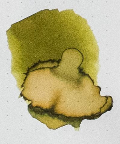
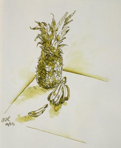
Here's another of my favorites. It is incredibly difficult to capture this incredible ink in photos. Forgive the comparison to Verdigris; I have too few green inks. Reasonable care was taken to ensure color accuracy. The Warbler was done with Alt-Goldgrün, J. Herbin Cacao du Bresil and a touch of J. Herbin Terre de Feu in a Stillman and Birn Gamma sketchbook. Any resemblance between the ink swab and le decolletage (or any other anatomical feature) was purely accidental.
- 18 replies
-
- rohrer & klingner
- rohrer and klingner
-
(and 3 more)
Tagged with:
-
Like most people I like novelties, especially when it comes to inks and fountain pens. You know - I've been looking for grail ink for three years and there's always chance it's still ahead of me When I came across Super5 inks mention on Goulet's site, I thought the bottles looked cool and - in a way - familiar. http://papierlabor.de/wordpress/wp-content/uploads/2014/06/super5-ink-group-720x340.jpg The names of cities were cool as well. Colors looked really nice on swabs. My dear friend google helped me to investigate. Super5 inks are sold by Format-Darmstadt GmbH on papierlabor.de site. The company offers also calligraphy pen and converter and some papers. The inks are made by my second favourite ink maker - Rohrer & Klingner. Check their "regular" inks here. That's good news. Really. They know what they're doing and you can expect good quality from R&K. The quality they indeed deliver. So why Super5 inks are much more expensive than R&K inks. First of all - they're pigmented (I believe), then there need to be some margin for the distributor. At 20 euros / bottle yhey're not cheap. However unlike Caran d'Ache or Iroshizuku they offer not only more than satisfying quality, good flow and good lubrication but also added value of waterproofness and lightfastness. Last week I was given the whole set. I'm going to review it and post comparison of the full line. Soon. The colors are really great. Honestly. They're also extremely waterproof. I've already reviewed Australia, Darmstadt, Dublin and Delhi, check them. Today let's take a look at Atlantic - Super5's blue. Nice stuff. Bottle http://imageshack.com/a/img540/7193/5nVVRE.jpg http://imageshack.com/a/img633/7141/BdJ9oq.jpg http://imageshack.com/a/img661/210/cX4Fcc.jpg Ink Splash Mondi 120 g http://imageshack.com/a/img540/295/zYQFuh.jpg Drops of ink on kitchen towel http://imageshack.com/a/img673/9753/M741f4.jpg Software ID http://imageshack.com/a/img538/974/8vKDv3.jpg Color Range http://imageshack.com/a/img673/1046/DInNN8.jpg Oxford recycled, 90 g - Kaweco Sport Classic, eyedropper mode, blaszka B http://imageshack.com/a/img540/1295/Ki1PwJ.jpg http://imageshack.com/a/img909/425/vxSWvZ.jpg http://imageshack.com/a/img661/4213/x9j3xK.jpg http://imageshack.com/a/img673/5777/cqS57T.jpg
-
Like most people I like novelties, especially when it comes to inks and fountain pens. You know - I've been looking for grail ink for three years and there's always chance it's still ahead of me When I came across Super5 inks mention on Goulet's site, I thought the bottles looked cool and - in a way - familiar. http://papierlabor.de/wordpress/wp-content/uploads/2014/06/super5-ink-group-720x340.jpg The names of cities were cool as well. Colors looked really nice on swabs. My dear friend google helped me to investigate. Super5 inks are sold by Format-Darmstadt GmbH on papierlabor.de site. The company offers also calligraphy pen and converter and some papers. The inks are made by my second favourite ink maker - Rohrer & Klingner. Check their "regular" inks here. That's good news. Really. They know what they're doing and you can expect good quality from R&K. The quality they indeed deliver. So why Super5 inks are much more expensive than R&K inks. First of all - they're pigmented (I believe), then there need to be some margin for the distributor. At 20 euros / bottle yhey're not cheap. However unlike Caran d'Ache or Iroshizuku they offer not only more than satisfying quality, good flow and good lubrication but also added value of waterproofness and lightfastness. Last week I was given the whole set. I'm going to review it and post comparison of the full line. Soon. The colors are really great. Honestly. They're also extremely waterproof. I've already reviewed Australia and Delhi, check them. Today is Dublin's day. http://imageshack.com/a/img538/2544/xrwxrE.jpg http://imageshack.com/a/img673/5836/GacEaW.jpg http://imageshack.com/a/img540/1975/dzg5Sp.jpg Ink splash Mondi 120 g http://imageshack.com/a/img911/8264/idFGjA.jpg Drops of ink on kitchen towel http://imageshack.com/a/img907/2540/wS3tpq.jpg Software ID http://imageshack.com/a/img537/3190/b6lFgw.jpg Color Range http://imageshack.com/a/img538/148/wYAkuG.jpg Oxford recycled, 90 g - Kaweco Sport Classic, eyedropper mode,B http://imageshack.com/a/img540/8219/xJIj9w.jpg http://imageshack.com/a/img909/3383/kqLFIk.jpg http://imageshack.com/a/img912/1272/XI9bXK.jpg http://imageshack.com/a/img673/8159/lRCOo7.jpg Rhodia http://imageshack.com/a/img633/3551/jOLw9L.jpg Rhodia after five minutes of soaking in the water http://imageshack.com/a/img540/5008/ic7qNu.jpg
-
I’ve had these photos on my phone for almost 2 weeks now and was excited to finally upload them last night, but couldn't get them on the site . After some experimenting, I'm happy it just worked with photobucket, so here it goes! I wanted to do this comparison for two reasons. First, because green olives are a big guilty pleasure of mine (I ate around 20-30 of them while writing this review last night ) and second, (and more importantly) I read in a couple threads that people were asking how the Montblanc Daniel Defoe Palm Green ink compared to other "olive-ish" greens. So, I thought I would add the samples I have to the wonderful comparisons that amberleadavis and dcroe05 already did! The inks tested are: Diamine Salamander, Stipula Verde Mushiato, Sailor Tokiwa-Matsu, Montblanc Daniel Defoe Palm Green, Rohrer and Klingner Alt-Goldgrun, and J. Herbin Vert Olive. The samples were done on Rhodia using a 1950s 146 and a Pilot Custom 74 B nib ground down to a smooth stub by Mike Masuyama. http://i45.photobucket.com/albums/f99/emrys1221/photo1-2copy_zps78c4ed9d.jpg http://i45.photobucket.com/albums/f99/emrys1221/photo1copy3_zpsf99fb482.jpg?t=1413835720 (group shot in indoor lighting) Closeups: (done in sunlight only - I find these photos truer to the color on paper) http://i45.photobucket.com/albums/f99/emrys1221/photo3-1_zps3186c004.jpg?t=1413835721 http://i45.photobucket.com/albums/f99/emrys1221/photo3-2_zpsdbc43397.jpg?t=1413835722 http://i45.photobucket.com/albums/f99/emrys1221/photo5-1_zpsdb35c6a5.jpg?t=1413835722 http://i45.photobucket.com/albums/f99/emrys1221/photo1-2_zps4dfa8c03.jpg http://i45.photobucket.com/albums/f99/emrys1221/photo1copy2_zpsdcfc475b.jpg http://i45.photobucket.com/albums/f99/emrys1221/photo4-1_zps2f6eade9.jpg?t=1413835721 Tokiwa-Matsu Sheen Closeup: (indoor lighting) http://i45.photobucket.com/albums/f99/emrys1221/photo1-1_zpsa96f77fd.jpg Ink Swabs: http://i45.photobucket.com/albums/f99/emrys1221/photo2copy_zps8039db56.jpg?t=1413838161 Ink on Paper Towel: http://i45.photobucket.com/albums/f99/emrys1221/photo3_zps34c025f5.jpg?t=1413838161 Top Row: Diamine Salamander, Stipula Verde Mushiato, Sailor Tokiwa-Matsu Bottom Row: Montblanc Daniel Defoe Palm Green, Rohrer and Klingner Alt-Goldgrun, J. Herbin Vert Olive Salamander is probably my favorite shade of “olive” in this group, because its color is difficult to pin down. It’s not a green, brown or grey (and maybe not even an olive) but all three combined and the mix makes for a unique shade that is great for someone looking for a more exciting alternative to black that could be used in an office environment. My biggest complaint with this ink is that I wish that the flow and smoothness were both stronger. (But, I should note that I like very wet and smooth inks, so please do not let that discourage you from trying it.) On a side note, if you’ve tried a smooth wet ink that is very close in color to Salamander please let me know! The Defoe ended up being my second favorite shade of olive from the bunch (another amazing Limited Edition color from MB!), but I have yet to pick up a bottle. I am on the fence about whether I will get one or not, because, although, I love its color, as with most of my MB inks I wish it felt a little smoother under a flexi nib and given the heavier pressure I use while writing. (Though it felt smoother to me than Salamander.) Tokiwa-Matsu is by far the most interesting ink of the ones compared because of its spectacular reddish sheen. It's not my favorite shade of "olive", but it is my favorite ink to use out of the 6. I highly recommend it if you are looking for an ink with that special factor that makes you do a double-take every time you use it. Alt-Goldgrun is the closest in color to the Defoe. I loved the shade and shading when I first got a bottle, but I find myself using it less and less. After testing the Defoe, I much prefer it for note-taking since it is less yellow and a little darker. Verde Mushiato is an ink that I’m on the fence about, because I wish that, in my pens, it looked closer to some of the writing samples I’ve seen where it has more green mixed into the brown. Don’t get me wrong; the ink is a beautiful color, but I just don’t enjoy using it for a full page of notes, so my bottle doesn’t get much use. Performance wise, the ink has a different but pleasant, slightly powdery-soft feel under the nib which makes for a pretty smooth writing experience. Vert Olive is another nice shade but too light for me to use as a daily ink. Which is your favorite of the six?
-
I'm big fan of Rohrer & Klingner's inks. I believe in Europe you won't find better ink for better price - in my country bottle of 50 ml R&K ink costs between 5 - 6 dollars. I know the prices are much higher in America so let's reserve my recommandation for europeans. In States you can have other inks of good quality for similar or better price. Alt-Goldgrun is - in my opinion - the most intriguing ink in R&K line. It has unique color and massive shading. INK SPLASH http://imagizer.imageshack.us/v2/640x480q90/540/X1qoLc.jpg DROPS OF INK ON KITCHEN TOWEL http://imageshack.com/a/img674/5779/SmYINr.jpg CHROMATOGRAPHY http://imageshack.com/a/img901/5431/V8cBmq.jpg SOFTWARE IDENTIFICATION / COLOR RANGE http://imageshack.com/a/img537/8471/ozHlae.jpg COLOR RANGE http://imageshack.com/a/img540/6600/5PfOmG.jpg Review written with Jinhao 599, medium nib http://imageshack.com/a/img909/1682/SNro46.jpg http://imagizer.imageshack.us/v2/640x480q90/540/MGr0Sy.jpg http://imageshack.com/a/img538/4346/vCVM1M.jpg HERO 5028, 1,9 stub http://imageshack.com/a/img540/8920/MANBpb.jpg http://imageshack.com/a/img674/3728/NLYh1R.jpg OXFORD PAPER http://imageshack.com/a/img661/5008/J1tw86.jpg http://imageshack.com/a/img537/6360/ROlcd5.jpg http://imageshack.com/a/img633/298/HpAQxs.jpg http://imageshack.com/a/img904/7418/msziFQ.jpg COPY PAPER (photo) http://imageshack.com/a/img673/9325/gWTk6F.jpg http://imageshack.com/a/img674/4853/kJtz90.jpg DRY TIME (1s, 5s, 10 s, 15s) http://imageshack.com/a/img540/9009/tU7Ko3.jpg
-
I'm big fan of Rohrer & Klingner's inks. I believe in Europe you won't find better ink for better price - in my country bottle of 50 ml R&K ink costs between 5 - 6 dollars. I know the prices are much higher in America so let's reserve my recommandation for europeans. In States you can have other inks of good quality for similar or better price. Alt-GBordeaux is strange ink. It looks pale and boring in dry nibs, especially in my everyday ink-testing Pilot 78G broad nib. Yet in wet iridium - tipped nibs it shows nice shading and juicy color similar to wine dregs. I kind of like it but bare in mind Alt-Bordeaux is fussy about the pens you choose. INK SPLASH http://imageshack.com/a/img540/3396/SFOT7z.jpg DROPS OF INK ON KITCHEN TOWEL http://imageshack.com/a/img674/6972/ZJQe2j.jpg CHROMATOGRAPHY http://imageshack.com/a/img904/7452/eHYBPl.jpg SOFTWARE IDENTIFICATION / COLOR RANGE http://imageshack.com/a/img538/6659/svE5Vt.jpg COLOR RANGE http://imageshack.com/a/img905/5096/c3nfJe.jpg Review written with Jinhao 599, medium nib http://imageshack.com/a/img540/2483/gcwByH.jpg http://imageshack.com/a/img673/7260/fntnfp.jpg OXFORD PAPER http://imageshack.com/a/img674/4046/UZgA1a.jpg http://imageshack.com/a/img537/139/z3ZkYj.jpg
-
I'm big fan of Rohrer & Klingner's inks. I believe in Europe you won't find better ink for better price - in my country bottle of 50 ml R&K ink costs between 5 - 6 dollars. I know the prices are much higher in America so let's reserve my recommandation for europeans. In States you can have other inks of good quality for similar or better price. Sepia is interesting ink. It's not flashy ink that pops out off pages. yet there is something calming and subtle about this color I really enjoy. INK SPLASH http://imagizer.imageshack.us/v2/800x600q90/674/d9HwcG.jpg DROPS OF INK ON KITCHEN TOWEL http://imageshack.com/a/img673/1861/kIZ1e1.jpg CHROMATOGRAPHY http://imageshack.com/a/img673/2872/Ogo4Uv.jpg SOFTWARE IDENTIFICATION / COLOR RANGE http://imageshack.com/a/img742/1517/F8bgo5.jpg http://imageshack.com/a/img673/6761/CGxu0h.jpg Review written witk Baoer 517 http://imageshack.com/a/img538/5836/CyPAbT.jpg http://imageshack.com/a/img537/2951/eFyAxt.jpg http://imageshack.com/a/img743/6488/JuOB0f.jpg Review written witk BAOER 517 on Rhodia http://imageshack.com/a/img538/8160/8mEAuE.jpg http://imageshack.com/a/img674/3204/0goh3i.jpg Review written witk Baoer 517 on copy paper paper http://imageshack.com/a/img902/2765/pqBlK2.jpg http://imageshack.com/a/img631/7484/f7DNC9.jpg http://imageshack.com/a/img540/8356/kaOF2K.jpg DRY TIME http://imageshack.com/a/img911/3393/S5t0pt.jpg WATERPROOFNESS http://imageshack.com/a/img633/4216/8aXbIW.jpg http://imageshack.com/a/img746/8858/7FKf7F.jpg
-
I have enjoyed experimenting with inks, but this year I find myself using the two R&K iron gall inks (Salix and Scabiosa) more than any others. I like the appearance and free-flowing characteristics of other inks more, but after losing writing that really mattered to me when a notebook became wet, waterproofness has become a primary concern. R&K Salix and Scabiosa are distinctive colors, yet still acceptable for work correspondence. They shade well, flow a bit dryly but without fuss or bother and dry to a dark, chalky hue that is easy on the eye upon re-reading. Best of all, your writing survives water spills and rain showers. Two inks that work, at least for me.
-
Actually it won't be about turquoises, not in encyclopedical understanding of what turquoise actually is. Pure turquoise looks like that http://imageshack.com/a/img404/7428/ei21.jpg www.barwy.net Blue turquoise like that: http://imageshack.com/a/img706/1729/22ng.jpg www.barwy.net Anyway I've tried to compare five inks whether called whether considered turquoises. Their colors are bright and quite saturated. To be honest I don't like pure turquoise - I like however to fill my fountain pen with vibrant shade of blue. I compared five inks: BLEU PERVENCHE (J. Herbin), BLU MARE (Rohrer & Klingner), HIMMELBLAU (Standardgraph), NIEBIESKI TURKUSOWY (Nicpoń*), TURQUOISE (Pelikan). * Nicpoń is chemistry PhD Student that's active on Polish fountain pen network. He'c created limited line of nice, saturated inks in many colors. 1. Swabs on Mondi 90 g paper http://imageshack.com/a/img811/6673/qy1b.jpg 2. Ellipses "cut" from swabs http://imageshack.com/a/img834/1497/m97z.jpg 3. Two drops of ink on kitchen towel http://imageshack.com/a/img607/7721/0zsu.jpg 4. Trace of ink left by the nib on the paper http://imageshack.com/a/img839/9781/sf31.jpg Left to right: Bleu Pervenche, Blu Mare, Himmelblau, Turquoise, Niebieski Turkusowy 5. Fast handwriting on Mondi paper http://imageshack.com/a/img844/8823/a9d5.jpg 6. Text written with Pilot 78 G with B nib on Oxford paper: http://imageshack.com/a/img138/5033/y4yv.jpg http://imageshack.com/a/img547/4792/rpob.jpg left to right: Bleu Pervenche, Blu Mare, Himmelblau, Turquoise, Niebieski Turkusowy 7. Text written on cheap notebook Famous polish tongue twister http://imageshack.com/a/img163/8350/obto.jpg http://imageshack.com/a/img716/7704/b3p2.jpg (Bleu Pervenche, Blu Mare, Himmelblau, Turquoise, Niebieski Turkusowy) http://imageshack.com/a/img607/8232/2kry.jpg (left to right: Bleu Pervenche, Blu Mare, Himmelblau, Turquoise, Niebieski Turkusowy) 8. Text written on cheap copy paper (Lyreco) printed with dots: http://imageshack.com/a/img30/6678/yivm.jpg 9. Text written in notebook http://imageshack.com/a/img812/6822/qk1c.jpg 10. Are they waterproof http://imageshack.com/a/img138/5731/mdva.jpg 11. Dry Times (Pilot 78 g witb B nib on copy paper): http://imageshack.com/a/img819/5915/flpn.jpg SUMMARY: I find it difficult to indicate the winner. I guess Pelikan Turquoise deserves to take this place - it's good ink, it has reasonable price and is easily accesible around the world. Blu Mare is really nice and intense though it's not easily seen on the scans. Niebieski Turkusowy looks really good and it behaves well in fountain pen. However it's not easy to buy this ink as it is not produced for mass market.
- 8 replies
-
- j.herbin
- rohrer & klingner
-
(and 2 more)
Tagged with:
-
http://yoonhalee.com/images-inks/rk-salix.png Note: this ink is a little pale in an XF nib (which is what I have in the Pelikan M200 demonstrator), although I'm guessing it would be darker on more absorbent paper or in a wider nib. Also, you can see on the water test where a bit of the ink washed out with lowercase "test" being fainter than the rest of the words.
- 7 replies
-
- rohrer & klingner
- blue-black
-
(and 1 more)
Tagged with:


