Search the Community
Showing results for tags 'robert oster'.
-

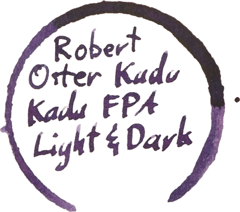
Ink Review: Robert Oster Signature Inks Kada Kada Fpa Light & Dark
yagankiely posted a topic in Ink Comparisons
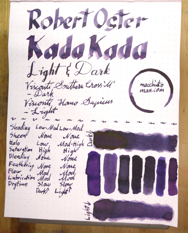
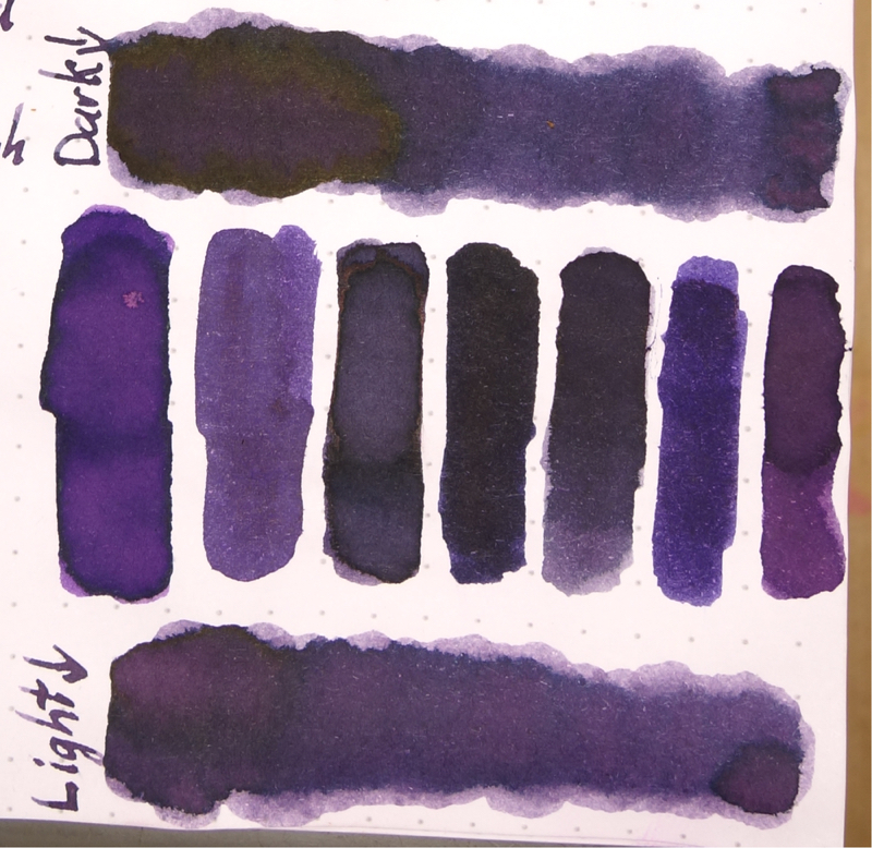
I've been doing ink reviews for a while now on my blog but this is the first time cross posting here. For the record, I'm the co-creator of the Fountain Pens Australia Facebook group and I worked with Rob to get this ink out there. Most of the pertinent images are included here but there is some extra stuff (chromatography, other paper) in the review. Robert Ostster's Kada Kada FPA Light & Dark are two ink made for the Fountain Pens Australia Facebook group. After two rounds of choosing colours that Robert would base the ink off, the group chose "Kada Kada" with the colour hash code of #270567 and after that I worked with Rob to come up with this ink. The name Kada Kada means "Story" in the local (to me in Fremantle, Western Australia) Noongar language. And the hash code was chosen because it is the date (27/05/1967) that Indigenous Australians were afforded constitutional rights. The ink can be bought exclusively from Pensive Pens in Australia. Kada Kada Light and Dark have high saturation but are not inks with high vibrancy. Their colour is a somewhat soft and dusty dark grey purple. The main difference between Dark and Light apart from the obvious is that Dark has a less red visible. The colours to separate a little on the page meaning that you can sometimes see parts where the line is redder or bluer. Kada Kada Light and Dark both have moderate lubrication and flow. They definitely aren't dry by any means but they aren't Sailor-level wetness either; the glide across the page nicely. The ink has good shading but it isn't extremely noticeable in wetter pens. There is some shading though to give it some character. Drytimes are on the slower end of the spectrum and the ink performs very well on Rhodia, Clairefontaine and Tomoe River but feathers pretty badly on cheap 80gsm copy paper. The colour also adopts more of a red look on copy paper and loses a lot of character. The dark characteristics of the ink wash away leaving a light pink glow behind so this ink is not very water resistant, as expected. Somewhat astonishingly, there is absolutely no sheen on Tomoe River (though there is quite a decent halo effect on good paper). Kada Kada FPA Dark has a deep dark green sheen on Rhodia, but not on Tomoe River. This sheen doesn't appear when in a pen, however, only in wet swatch form. Left to right: 1) Diamine Amazing Amethyst; 2) Noodler's La Reine Mauve; 3) Robert Oster Purple Rock; 4) Private Reserve Ebony Purple; 5) Bungubox Sakanamachi Horoyoi/Tipsy Purple; 6) Sailor Shigure; and 7) Papier Plume Mardi Gras Purple Bungubox Sakanamachi Horoyoi/Tipsy Purple is the closest of the inks I have to Kada Kada FPA Light while Private Reserve Ebony Purple is the closest to Kada Kada FPA Dark. Amazing Amethyst and Papier Plume Mardi Gras Purple are both too vibrant and red while Shigure has too much vibrant blue. Noodler's La Reine Maybe is fairly similar to Light, it lacks a lot of the shading and halo. Robert Oster Purple Rock is again similar but darker and with less shading. I do like this ink. It's a good professional colour with some character. The two versions are fairly similar so if you're on a budget my preference goes to the Light; I feel that the redder tone gives it an edge but I still recommend both if you can. I'm unsure as to whether this ink will be in Rob's rotation forever so I suggest buying it while you can! I'd like to thank Rob for taking the time to make an ink for our growing Australian community! I've listed all my inks (slightly outdated) and all my pens in their respective pages. Please let me know which inks you'd like to review next via the comments, Twitter, Instagram, or contact me directly. I received this ink free of charge for the purpose of giving an honest review. I was not otherwise compensated and everything here is my own honest opinion. There are no affiliate links. I do sell Robert Oster inks at my café but I am not allowed to sell the inks online, only in shop. P.S. I can only add 1.9mb of images to this and can't link images from my site? Is there anyway I can host larger images from my site (or Flickr) or is there a way I can upload more/larger files?
-
Robert Oster Signature - Grün-Schwarz Robert Oster is an Australian ink maker that is well-known for his unique range of colours. On his website he describes our shared love quite eloquently: “Robert Oster Signature originates from one of the most famous wine producing regions of the world, the Coonawarra district of South Australia, an idyllic setting wit great influence on the senses. There is my inspiration. It’s a joy to share it with you.” Well, we are certainly fortunate to have inspiring ink makers like Robert to satiate our thirst for glorious inks. In this review I take a closer look at Grün-Schwarz – my very first Robert Oster ink. And boy, am I impressed ! This is without question a very very interesting colour – green-black, a rather unusual combination. In swabs the green in the ink is very obvious, in writing the ink leans more towards the dark side (and I mean that in a good way, not in the sense of Darth Vader). The ink feels very “old vintage” to me. A colour that reminds me of ages past – when gentlemen were still wearing pocket watches, cars were little miracles on wheels, and television showed silent movies in black&white. This is a great colour that is sure to give that little extra oomph to your writing. The ink is equeally at home with personal journaling as within a business setting. The ink is also nicely saturated, and writes very well in all nib sizes. Shading is present but subdued – just as I like it. On the smudge test – rubbing text with a moist Q-tip cotton swab – Grün-Schwarz behaved acceptably. There is obvious smearing, but the text remains very legible. Water resistance is totally non-existent though – even short exposures to water completely obliterate your writing. On the droplet test, all that remained where some reddish blobs. In case you’re wondering – this green-black ink has a very complex composition with some reddish dyes included in the mix. As the chromatography shows, Robert Oster really is an ink magician – from the chroma, you would never guess that it derives from a green-black ink. I’ve tested the ink on a wide variety of paper types – from crappy Moleskine to high-end Tomoe River. On every small band of paper I show you: An ink swab, made with a cotton Q-tip1-2-3 pass swab, to show increasing saturationAn ink scribble made with an M-nib fountain penThe name of the paper used, written with a B-nibA small text sample, written with an M-nibDrying times of the ink on the paper (with the M-nib)Grün-Schwarz behaved perfectly on most paper types, with only a hint of feathering on the Moleskine paper and the Faber-Castell paper (which both showed significant show-through and a bit of bleed-through). Drying times are mostly around the 10 second mark. The ink looks beautiful both on the white and the more yellowish paper. The ink’s appearance differs widely across the paper types – from dirty green to almost black. In my opinion, it looks really nice on Tomoe River (very green) and on Original Crown Mill cotton paper (almost black). I also show the back-side of the different paper types, in the same order. Conclusion Robert Oster Grün-Schwarz has a very unusual colour with a strong vintage feel to it. It’s a nice wet and saturated ink, with good contrast on all types of paper. I immediately fell in love with the colour of this ink – a pity though about the total lack of water resistance. Nevertheless, I enjoyed the ink immensely, and will definitely try more of Robert’s creations. Technical test results on Rhodia N° 16 notepad paper, written with Lamy Safari, M-nib
-
Hello All, Well after a lot of staring at computer screens, we're delighted to announce that the new izods website is up and running. http://www.izods.ink The wonderful Robert Oster inks are available to order online and we'll be increasing our range of colours shortly... but I'm sure that the current selection will keep you going. We're also delighted to be the only UK stockists of the contemporary Tactile Turn Gist fountain pens. Already receiving fantastic reviews from customers around the world, the Gist is available in myriad selection of materials and finishes. Because the range is so big, if there's something that we haven't got, just let me know and we can include it on our next order. As if this wasn't enough, we've also got notepads covered with the range from Darkstar Collection... hugely fountain pen friendly and the perfect size for leaving on your desk or taking out to a meeting. We love what we do here at izods and we're absolutely thrilled to be working with such brilliant brands. Thanks and have a good weekend. Roy
-
Firstly, many thanks to Robert Oster for sending me these to test. All the hype about this new range of inks is certainly justified! Claudia - these are just great! The test piece was painted using Dark Chocolate, Pinky, Peach, Read Orange, Blue Sea and bleach on 200lb Bockingford watercolour paper. As you can see, the colours are vibrant and all react with bleach. They don’t readily mix with water but creep slowly revealing all their hidden hues at the outer edges of the swatch. One other bonus delight is that they all sheen beautifully in the more concentrated areas! I wasn’t really into sheening – but I am now. Check out that sheen colour on the Dark Chocolate! I can’t not like these – hidden hues, a positive bleach reaction and sheening! From a creative angle these are a wonderful range of colours. As handwriting inks, I can’t fault them either – even the Torquay writes and reads well. If there is one tiny drawback, it’s when blending the inks with water. Because they creep slowly you will need to agitate the paper to ensure movement down the swatch card! One thing I can confirm – these inks are consistent across the range. They are not watery like a Diamine but they are not too thick either. Interestingly, as writing inks they are all quite dark, so to see the range and intensity of colour they produce is a real joy. The Dark Chocolate is absolutely fabulous! Treat yourself! Check out the 26 Robert Oster swatch tests here: https://quinkandbleach.wordpress.com/2016/09/23/robert-oster-signature-inks-test-02/
-
With the demand for certain brands and colors at the DC Show, we had a sell out on most of these items! (We were the only Dealer for Robert Oster Inks at the DC Show- Thank You to Robert Oster for helping to have them rushed to the states in time for the show! Reviews should be coming soon (If not already posted!)- look for them at Fountain Pen Day, and The Well Appointed Desk whom were among first to acquire this ink...) NOW Back In Stock- Robert Oster Signature Ink (US Dealer- 20 Colors in Stock) $18 Each! We carry almost half of the Oster Ink Line- Browse/Buy here http://www.federalis...Inks_c_107.html http://fountainpenclassifieds.com/uploads/monthly_08_2016/post-52-0-51485100-1471717932.jpg Pelikan Edelstein Aquamarine- This is the 2016 Ink of The Year for Edelstein! $25 Each- Everyday! We carry most of the everyday colors, and this LE Ink for this year! Browse/Buy here http://www.federalis...50ml_p_217.html http://fountainpenclassifieds.com/uploads/monthly_08_2016/post-52-0-02828200-1471717893.jpg J. Herbin 1670 (Brown) Caroube de Chypre- The latest color from J. Herbin's Anniversary Line went fast! $25 Each- Everyday! All 1670 Anniversary Inks In Stock now! Browse/Buy here http://www.federalis...Inks_p_182.html (we also stock J. Herbin Inks in the famous 30ml "D" Bottles! Only $12 Each) http://fountainpenclassifieds.com/uploads/monthly_08_2016/post-52-0-81437700-1471717910.png Authorized Dealer
-
In her amazing review of Robert Oster inks, Cyber6 mentioned that they are very wet. I prefer rather dry inks in most of my pens, but I really like a number of the Robert Oster Ink colors. So, can those of you who have actually written with Robert Oster Inks semi-quantify their wetness? Let's propose a 10-point scale of wetness. Say Waterman inks score 8, and Pelikan inks score 2. Where would Robert Oster inks fall on this scale? Thanks. David
-
Robert Oster Signature Inks - Quick review of 11 lovely inks You can find Part 1 here. You can find Part 2 here. You can find Part 3 here. So we are doing Part 4 !!! http://www.sherv.net/cm/emo/happy/jumping-for-joy-smiley-emoticon.gif This time we'll take a look at the following inks.. Yellow SunriseDirect SunRed OrangeRuby (Exclusive to Sakura)AquaTorquayMarineBlue SeaViolaPurple RockSummer Storm (added at the last minute)BLACK nRED These inks flowed quite well on this paper… They get along quite well… no bleed thru, no show thru and no feathering whatsoever.. I use a wet flex broad, my pen dumps a bunch of ink and the behavior was flawless. Yellow Sunrise: Very BRIGHT.. Very Yellow!!!. Big Bird would be proud.. ... If you all remember, I am a big fan of Yellow Sunset… especially because it darkens inside the pen. If Yellow Sunrise does the same it will be fantastic. If not, well.. a full page of this is color is kind of hard on the eyes. For the BRIGHT and LOUD color lovers out there. Direct Sun: If Red-Orange is a reddish-orange, Direct Sun is an orangey-red.. LOL... … Interesting and definitely a handsome color. I much prefer this kind of hues on cream paper… it makes them look vintage. Red Orange: This is a lovely color.. I am an orange lover, so chances were I was going to like this.. This is a more subtle hue that I was expecting. Beside Peach, this one is more saturated… but not as bright as Orange. I can see a full page written with Red Orange on a cream paper… Heaven!! Ruby (Exclusive to Sakura): SO EXCITED to get a sample of this!!!… I’ve been harassing Robert to get a dark red… So I guess I will still be harassing him.. LOL… But this is (to me) his best red. Is bright, crisp and clean. If you want Blood… this is the Oxygenated type of Blood Red.. LOL Aqua: Gosh.. his blues are so nice. Aqua is a gorgeous ink. Sheen, shades and behaves lovely… Torquay: This one, at first I thought it was too close to Australian Sky… big mistake, Australian Sky is much bluer. Torquay is a lighter Turquoise. Still a beautiful color. Marine: There is something about having too much green in your blue… Marine is just at the border… I do enjoy those teal colors. But a tad more green and it doesn’t work for me. For the Teal lovers out there… this is your ink !!!. Blue Sea: WOW.. this is .. WOW…a gorgeous Blue. I do love his Blues and I will say this is one of his best Blues. Shades and Sheens like MAD!!.. Viola: I definitely like my purples more darker and murkier… this is a lovely lilac. Definitely for those who love gentle, delicate colors. For sketching, is fantastic. Purple Rock: Another WOW moment… this one reminds me of Kobe Tamon Grey and KWZI Grey Plum… Purple Rock.. really ROCKS!!!... Summer Storm: You can see below what this ink can do in very capable and artistic hands.. (my artist-in-residence).. Is lovely for sure..... For writing, I take Purple Rock.. Sketch - Summer Storm Mermaid 2016.. RHODIA DOT PAD No bleed thru, no show thru and no feathering. TOMOE RIVER No bleed thru, some show thru and no feathering. MUJI Notebook No bleed thru, no show thru and no feathering. Please note, not all MUJI paper is fountain pen friendly. This one is the “black cover” notebook. They do quite well with ink, wet pens and they do show sheen. Summary Guys.. There is nothing new I can say that I have not said before. These are great inks.. and the huge line up of colors means everyone can find their favorite.. I am still impressed with the amount of shading and sheen I get on regular paper. So excited that I was able to get a sample of Sakura… It still not the red I am looking for, but is a lovely red and it will get lots of use in my pens and in my daughters pens and brushes. The real winners for me (in this line up) in order of appearance: Red-Orange, Aqua, Marine, Blue Sea and Purple Rock. Both Viola and Summer Storm remind me of the Hydrangea Twins (Kobe #56 and #57).. Great for sketching.. not so for writing. The other exciting news.. is that NOW you can find Robert Oster in the US !!! YAY!!!! http://www.sherv.net/cm/emo/dancing/super-happy-dance-smiley-emoticon.gif ....... (Lucky yankees... ) Frank at Federalist Pens and the lovely people at Vanness are now carrying Robert Oster Signature Inks. For a distributor near you, check... www.robertoster.com.au I need to have a chat with WonderPens and TakeNote… we need them in Canada… Disclaimer: Not affiliated to Robert Oster.. yadda yadda…. C.
-
I recently got in an order of Robert Oster inks and decided to try out the new Summer Storm. I don't know much about it other than it was given to some Australian FP users as an "Unnamed Blue-Grey" for them to come up with a name. "Summer Storm" definitely evokes images of stormy rain clouds, but whether they appear only in Summer, I'm not sure Here is a quick writing sample using a Pelikan M800 B on white Tomoe River: http://imgur.com/TIbxco3.jpg Here on Maruman Report Pad paper and on Rhodia Dotgrid paper: http://imgur.com/wTk6Cg5.jpg The shading is good, and the ink is quite light and reminiscent of Iro Fuyu-Syogun. Lubrication is not the greatest, it feathers some on Maruman and Rhodia, but has nice shading. I like the look of it most on Tomoe River compared to the other 2 papers. It goes down leaning more towards blue, but as it dries a tinge of lilac comes out. Overall, I feel this is a nice ink, but not a must have. I'm a much bigger fan of some of the other inks from this line. As for blue-greys, I prefer other inks to this as well. This is my first review, apologies if it is lacking
-
Robert Oster is new player in fountain pen ink market. He operates through ebay shop. The inks are sold in 50 ml PET bottles with a tightly secure twist cap. I don't know who makes the inks for the shop, but the colors look interesting and fresh. At the moment Robert Oster inks are available in colors Aqua Australian Sky Blue Barossa Grape Black Blue Black Blue Denim Blue Night Blue Sea Bondi Blue Burgundy Chocolate Claret Copper Brown Deep Sea Emerald Green Ever Green Fire Engine Red Forest Green Graphite Green Green Green Lime Green Olive Jade Khakhi Light Green Marine Moss Orange Peach Pinky Red Orange Royal Red Ruby Red School Blue Spearmint Torquay Tranquility Turquoise Yellow Sunset On Robert Oster's shop website Barossa Grape is described as follows: " Flows on like a Cab Sauv, dries on like a light Shiraz with excellent shading" I enjoy this ink although in some pens it looks boring. In order to fully enjoy it - given that you like such hues - broader or really wet nib would help. In old Waterman Drops of ink on kitchen towel Software ID Tomoe River, Kaweco Classic Sport - eyedropper, B Leuchtturm 1917, Kaweco Classic Sport - eyedropper, B Oxford, Kaweco Classic Sport, B + Hero 5028, stub 1,9 Poljet, Waterman Commando, semi-flex nib Mini-comparison
-
Robert Oster is new player in fountain pen ink market. He operates through ebay shop. The inks are sold in 50 ml PET bottles with a tightly secure twist cap. I don't know who makes the inks for the shop, but the colors look interesting and fresh. At the moment Robert Oster inks are available in colors Aqua Australian Sky Blue Barossa Grape Black Blue Black Blue Denim Blue Night Blue Sea Bondi Blue Burgundy Chocolate Claret Copper Brown Deep Sea Emerald Green Ever Green Fire Engine Red Forest Green Graphite Green Green Green Lime Green Olive Jade Khakhi Light Green Marine Moss Orange Peach Pinky Red Orange Royal Red Ruby Red School Blue Spearmint Torquay Tranquility Turquoise Yellow Sunset On Robert Oster's shop website Blue Sea is described as follows: " ust as you imagined it. Good shading qualities." Well, I'm not sure it's the way I see blue sea but I think it's nice and well behaved ink. It shouldn't cause any troubles in vintage pens and behaves nicely on cheap paper. It's not water resistant. Drops of ink on kitchen towel Software ID Tomoe River, Kaweco Classic Sport - eyedropper, B Leuchtturm 1917, Kaweco Classic Sport - eyedropper, B Oxord Mini-comparison
-
Robert Oster Signature Inks - Quick review of 7 lovely inks You can find Part 1 here. You can find Part 2 here. You can find Part 4 here. I AM BAAACK !!!!!!!!!!!!!!.. And I have some more Robert Oster Inks for your pleasure… If this is the first time you are reading about Robert Oster Signature Inks, he is a lovely Australian gentleman and produces high quality Fountain Pen Ink. You can find it in eBay-AU: http://www.ebay.com.au/usr/osteralia For international orders, please use his email: Signature@RobertOster.com You can find more reviews of his inks in the links provided above. (Part 1 and Part 2) On Part 3, the list of inks reviewed will be: · Barosa Grape · Pinky · Peach · Ever Green · Spearmint · Tranquility · Dark Chocolate I have never mentioned the packaging... The inks come in wrapped in a gold foil paper... like the treasure they are. Is fun to remove the wrapping and unveiled the jewel inside. Now to the inks... BLACK nRED These inks flowed quite well on this paper… They get along quite well… no bleed thru, no show thru and no feathering whatsoever.. I use a wet flex broad, my pen dumps a bunch of ink and the behavior was flawless. Barosa Grape: (don’t confuse with Barbosa) LOL. Gorgeous Purple. A must have to any purple lover.. Shading, Sheen, … on a wet pen it looks like Ink of Witch.. very dark, Pinky: You can’t call me a pink lover….. but Pinky is really the kind of pink I don’t mind. Is not retina-searing (which I dislike) and it has a vintage look without being chalky. A lovely pink. Peach: Similar to Pinky, as in a more subdue color… with a vintage feel. Is not in your face Orange.. Is so soft and delicate, you almost want to touch the “fuzz”… Ever Green: This bright green will please all straight green lovers… (I am more of a “murky” green lover) .. reminds me of MB Irish Green. Bright and cheery. Spearmint: This one surprised me… I don’t know why I was expecting a more delicate green (you can tell I am no gardener..lol)…. Is a lovely green and more in my style of “dark” greens. Sheen is amazing on this one. Tranquility: YAY!!... Deep Sea younger sister…. Lol. The hue is the same, but this one is more delicate. The darker areas might look the same.. but Tranquility is lighter and you can tell in the lighter areas. The shading is spectacular. The sheen is not too shabby either… Dark Chocolate: Is very interesting… Is a chocolate with mauve undertones. I remember finding Rober Oster Chocolate with pink undertones… so not surprised this one (Dark Chocolate) has also some other tones. I personally love when ink looks different with different lighting. Nothing wrong with that. This makes it a lovely ink for sketching. RHODIA DOT PAD No bleed thru, no show thru and no feathering. TOMOE RIVER No bleed thru, no show thru and no feathering. MUJI Notebook No bleed thru, no show thru and no feathering. Please note, not all MUJI paper is fountain pen friendly. This one is the “black cover” notebook. They do quite well with ink, wet pens and they do show sheen. Summary What can I say, I am still very impressed with Robert Oster Signature Inks. Can’t say I am head over heels with all his colors, he still needs a DEEP RED… and a straight BROWN.. but the range and quality of Blues and Greens is just MAGNIFICENT…. I personally like his purples, oranges, amber… and odd colors (Copper for example) I’ve been told there is an exclusive Red (exclusive to SAKURA) .. and I am trying to get a sample of that for comparison sake. So, hopefully I am not done with Robert Oster anytime soon. Hope you guys have enjoyed another quick trip through Robert Oster Signature Ink heaven.. Disclaimer: Not affiliated to Robert Oster.. yadda yadda…. C. .
-
Robert Oster is new player in fountain pen ink market. He operates through ebay shop. The inks are sold in 50 ml PET bottles with a tightly secure twist cap. I don't know who makes the inks for the shop, but the colors look interesting and fresh. At the moment Robert Oster inks are available in colors Aqua Australian Sky Blue Barossa Grape Black Blue Black Blue Denim Blue Night Blue Sea Bondi Blue Burgundy Chocolate Claret Copper Brown Deep Sea Emerald Green Ever Green Fire Engine Red Forest Green Graphite Green Green Green Lime Green Olive Jade Khakhi Light Green Marine Moss Orange Peach Pinky Red Orange Royal Red Ruby Red School Blue Spearmint Torquay Tranquility Turquoise Yellow Sunset I received sixteen samples (marked in cursive) from well known ink enabler - Cyber6. Thank you Claudia You rock! On Robert Oster's shop website Blue Denim is described as follows: " Blue Denim is just like its namesake. Flows on in three shades of Blue, dries on like a favourite pair of denims.." The ink is well behaved. The color though wasn't made for me. Drops of ink on kitchen towel Software ID Tomoe River, Kaweco Classic Sport - eyedropper, B Leuchtturm 1917, Kaweco Classic Sport - eyedropper, B Oxford
-
I am sure you've seen several Robert Oster Signature Inks reviews... This one is more a drawing review. Khaki is a lovely color, and it washes beautifully... The line work was done with G nib (dip pen) and the paper is Bristol (Vellum finish). The ink is not waterproof, but is saturated enough to provide great shading. Dries quickly and overall is very easy to work with. The author of the drawing below is my artist-in-residence. DISCLAIMER: The portrait is not representative of Robert Oster's good looks... We haven't met the man. ................ (yet!!)
-
Vicarious geographic exploration is one of the underestimated joys of fountain pens. Fill a pen with Diamine Sunshine Yellow and you're not that far away from Liverpool, where the Beatles got started and Diamine still makes ink. Intrigued by the economic development of Germany after reunification? Use a pen by Cleo Skribent, made in Bad Wilsnack, a village northwest of Berlin, in the former DDR. A new ink brand, Robert Oster Signature, transports us to Naracoorte, just north of the Great Australian Bight, or open bay, midway between Melbourne and Adelaide. The name Naracoorte is apparently derived from Aboriginal words for place of running water, or waterhole, which is appropriate. Of the more than 40 inks offered by Oster, half are blues and greens. At least 20 shades of blue-green would be needed just to document the bay. Photograph of Great Australian Bight at Nullarbor Plain, by Flickr contributor Michael Middleton, used under Creative Commons license A sample of Oster aqua was given to me by Amberlea Davis, a prolific ink reviewer and moderator on the Fountain Pen Network. This appears to be the first review of aqua on FPN, though fellow FPN ink reviewer Cyber6 has reviewed two dozen Oster inks, and Visvamitra has reviewed more than a dozen. Color and Shading Aqua is what I would call a green-heavy version of teal, a color that I truly enjoy. It shades beautifully, and creates dark halos around a slightly lighter inner core. It's dark enough for many professional environments. Range In addition to blue and green, Oster offers other colors derived from Australian iconography, including Bondi Blue and Barossa Grape. The Coonawarra wine-growing region is nearby, home to Penfolds, Yalumba, and Wynns wineries. Performance The ink performs well with a Nemosine Singularity 1.1 mm italic. It flows adequately, is fairly well lubricated, and exhibits no signs of feather or show-through on Strathmore 24-pound, 25 percent cotton ivory paper. It dries in less than 10 seconds, which is probably influenced by the paper absorbency. I'm not detecting sheen, but the halo effect is gorgeous, and sheen may be obtainable on less absorbent papers. Presentation Oster inks are available in a 50 ml PET bottle. A plastic resin, PET is recyclable and commonly used in food and drink bottles and jars. The bottle is somewhat tall and narrow, and though the opening is wide enough for nibs, the bottle is a little tall for its diameter, which makes it fairly easy to tip over. Unlike glass, however, PET is lightweight, which is relevant to shipping costs from Australia. Price and Availability Oster ink sells for about US $7.50 for a 50-milliliter bottle, which is more than reasonable. Unfortunately, shipping from Australia to the USA is double that. Several bottles could probably be combined for a single shipping charge, however. The inks are currently sold on eBay, though the Sakura Fountain Pen Gallery in Belgium carries them, and I suspect that Oster is exploring other distribution options. In the United States, two other Australian inks Blackstone and Toucan are offered by Anderson Pens and Vanness Pens. Conclusions Robert Oster aqua is a lovely teal color, lighter than the English Diamine teal and the Dutch Akkerman No. 24 Zuiderpark blauw-groen, and greener than the American Noodlers Navajo turquoise. It is ever-so-slightly bluer than Black Swan in Icelandic minty bathwater, a mix of Noodlers inks created by FPN contributor Masque. But certainly close enough for highway work. Since this ink comes all the way from Naracoorte, we'll call it the Riddoch Highway, and we'll dream about a drive through vineyards, farmland, ranches, and timber, on our way to the great, blue-green bay of Australia. https://goo.gl/maps/SY5rGqJmh6q
-
Robert Oster is new player in fountain pen ink market. He operates through ebay shop. The inks are sold in 50 ml PET bottles with a tightly secure twist cap. I don't know who makes the inks for the shop, but the colors look interesting and fresh. At the moment Robert Oster inks are available in colors Aqua Australian Sky Blue Barossa Grape Black Blue Black Blue Denim Blue Night Blue Sea Bondi Blue Burgundy Chocolate Claret Copper Brown Deep Sea Emerald Green Ever Green Fire Engine Red Forest Green Graphite Green Green Green Lime Green Olive Jade Khakhi Light Green Marine Moss Orange Peach Pinky Red Orange Royal Red Ruby Red School Blue Spearmint Torquay Tranquility Turquoise Yellow Sunset I received sixteen samples (marked in cursive) from well known ink enabler - Cyber6. Thank you Claudia You rock! On Robert Oster's shop website Bondi Blue is described as follows: "Bondi Blue ~ Aqua's love child. Flows on Blue, dries on like a summery Bondi Beach sea view.". I believe this one may be popular - for me however it's rather boring. The flow is good, it doesn't cause any bleedthrough or feathering and behaves well, also after few days spent in unused pen. Drops of ink on kitchen towel Software ID Tomoe River, Kaweco Classic Sport - eyedropper, B Leuchtturm 1917, Kaweco Classic Sport - eyedropper, B Oxford Comparison
-
Robert Oster is new player in fountain pen ink market. He operates through ebay shop. The inks are sold in 50 ml PET bottles with a tightly secure twist cap. I don't know who makes the inks for the shop, but the colors look interesting and fresh. At the moment Robert Oster inks are available in colors Aqua Australian Sky Blue Barossa Grape Black Blue Black Blue Denim Blue Night Blue Sea Bondi Blue Burgundy Chocolate Claret Copper Brown Deep Sea Emerald Green Ever Green Fire Engine Red Forest Green Graphite Green Green Green Lime Green Olive Jade Khakhi Light Green Marine Moss Orange Peach Pinky Red Orange Royal Red Ruby Red School Blue Spearmint Torquay Tranquility Turquoise Yellow Sunset I received sixteen samples (marked in cursive) from well known ink enabler - Cyber6. Thank you Claudia You rock! On Robert Oster's shop website Turquoise is described as follows: "Turquoise Flows on like an Aqua, dries on with a shading of Emerald water". Personally I hate such hues. Even though the ink is probably good I couldn't stand looking at it, so forgive me I don't know and won't know how it behaves after longer time in a pen. After completing the review I've fluished the pen and I will never use this ink again. Drops of ink on kitchen towel Software ID Tomoe River, Kaweco Classic Sport - eyedropper, B Leuchtturm 1917, Kaweco Classic Sport - eyedropper, B Oxford Comparison
-
Robert Oster is new player in fountain pen ink market. He operates through ebay shop. The inks are sold in 50 ml PET bottles with a tightly secure twist cap. I don't know who makes the inks for the shop, but the colors look interesting and fresh. At the moment Robert Oster inks are available in colors Aqua Australian Sky Blue Barossa Grape Black Blue Black Blue Denim Blue Night Blue Sea Bondi Blue Burgundy Chocolate Claret Copper Brown Deep Sea Emerald Green Ever Green Fire Engine Red Forest Green Graphite Green Green Green Lime Green Olive Jade Khakhi Light Green Marine Moss Orange Peach Pinky Red Orange Royal Red Ruby Red School Blue Spearmint Torquay Tranquility Turquoise Yellow Sunset I received sixteen samples (marked in cursive) from well known ink enabler - Cyber6. Thank you Claudia You rock! On Robert Oster's shop website Deep Sea is described as follows: "Deep Sea is just that. A fabulously exact likeness of ocean deep waters. Flows on darkest Blue Green, dries on distinctly deep deep sea Turquose. If there ever was an edgy colour to display on your desk, this is one to be proud to own.". As some of you already know I dislike such hues and Deep Sea is no different - as most of them it causes some unpleasant sensation in my brain. On the other hand the ink is wet and well behaved so if you enjoy "teals" this one may really please you. Drops of ink on kitchen towel Software ID Tomoe River, Kaweco Classic Sport - eyedropper, B Leuchtturm 1917, Kaweco Classic Sport - eyedropper, B Oxford Comparison
-
Robert Oster is new player in fountain pen ink market. He operates through ebay shop. The inks are sold in 50 ml PET bottles with a tightly secure twist cap. I don't know who makes the inks for the shop, but the colors look interesting and fresh. At the moment Robert Oster inks are available in colors Aqua Australian Sky Blue Barossa Grape Black Blue Black Blue Denim Blue Night Blue Sea Bondi Blue Burgundy Chocolate Claret Copper Brown Deep Sea Emerald Green Ever Green Fire Engine Red Forest Green Graphite Green Green Green Lime Green Olive Jade Khakhi Light Green Marine Moss Orange Peach Pinky Red Orange Royal Red Ruby Red School Blue Spearmint Torquay Tranquility Turquoise Yellow Sunset I received sixteen samples (marked in cursive) from well known ink enabler - Cyber6. Thank you Claudia You rock! On Robert Oster's shop website Australian Sky Blue is described as follows: "Australian Sky Blue flows on like a turquoise, dries on with all of the character and beauty of the wide Australian sky". I'm not really into turquoises / bright blue turquoises so I dislike the color. The ink behaves well but I believe it may be too light, especially in drier pens. Drops of ink on kitchen towel Software ID Tomoe River, Kaweco Classic Sport - eyedropper, B Leuchtturm 1917, Kaweco Classic Sport - eyedropper, B Oxford Comparison (Sheaffer's bb sample was probably contaminated or deteriorated with time)
-
Robert Oster Signature Inks - Quick review of 7 lovely inks You can find Part 1 here. You can find Part 3 here. You can find Part 4 here. So I am back with some more Robert Oster Signature Inks !!!.. Yeah, Yeah.. I can’t seem to get enough of his inks… Those lucky Ozzies.. between Robert Oster and BlackStone… why would you buy anything else…. If this is the first time you are reading about Robert Oster Signature Inks, he is a lovely Australian gentleman and produces high quality Fountain Pen Ink. You can find it in eBay-AU: http://www.ebay.com.au/usr/osteralia For international orders, please use his email: Signature@RobertOster.com Ok so… this time I got: Blue BlackSchool BlueMossCopperOrangeClaretYeah, I totally forgot about Barossa Grape… but that one is currently on its way… Without further delay: BLACK nRED These inks flowed quite well on this paper… They get along quite well… no bleed thru, no show thru and no feathering whatsoever.. I use a wet flex broad, my pen dumps a bunch of ink and the behavior was flawless. Blue Black: This is a GORGEOUS Blue Black… Goes down wet and shiny and dries with a high saturation.. Lovely color School Blue: I like blues… I am NOT crazy about blues as most people seemed to be. I do LOVE dark blues. But Blues in general are just “Fine” by me. School Blue, is a “regular” blue that looks AMAZING on paper. The shading is quite dramatic.. and I don’t think it shows too well because of my wet pen. If you maximize the pic, you will see it goes from very light turquoise to a very dark blue (almost Blue Black). Really amazing looking color. And don’t forget the sheen. Robert Oster must have a very sheeny blue dye. All his blues sheen wonderfully. Moss Green: If you know anything about me, you know I like my greens very much. Especially the darker, mossy type… (the murkier the better). Moss green is not murky, but is a lovely “moss” green… lol. The name is quite right. I do love it. I also love that it does shift the hue depending on paper. It looks more olive on cram paper (Muji paper below) Copper: Now, this is a very interesting color. I think this is what people call “Puce”… Is brownish/pinkish.. very hard to describe. I do like it. It flows well and unless my eyes need adjusting (which I believe they do by the way.. I got my first pair of reading glasses three weeks ago) it seems to leave a “border” on each stroke. Not really sheen, but a darker border. I find this color very vintage looking and handsome. Not sure if copper is the correct name thou. Orange: NOW.. this IS ORANGE !!!... I think sometimes we think what orange is, and then this one comes an SMACK you in the face and says..” HEY .. I am the real ORANGE”.. Lol.. Honestly, I love my oranges, and this is a beautiful orange.. BRIGHT, but not NEON.. (which I dislike). Royal Red: This is a nice “subdue” red. I wish it was darker. Beside the Fire Engine Red it looks orangey. Robert.. if you are reading, we need a dark-blood-type red. Claret: OH WOW!!.. This goes down almost BLACK!!.. and dries to a WONDERFUL purplish /mauve color.. but is quite intriguing.. You need to see when is drying, it seems to change to grey/plum/purple/mauve.. Is almost like a chameleon… Amazing looking ink. RHODIA DOT PAD No bleed thru, no show thru and no feathering TOMOE RIVER No bleed thru, no show thru and no feathering MUJI Notebook No bleed thru, no show thru and no feathering. Please note, not all MUJI paper is fountain pen friendly. This one is the “black cover” notebook. They do quite well with ink, wet pens and they do show sheen. All the inks flowed well, and they seem quite wet. I am sure some are wetter than others, but in general.. they are on the wet side. While writing this, I went to his eBay site to grab the link, I just found out some newly release inks.. Blue Sea, Viola and Direct Sun !!!.. Should I go for more?... Is my birthday coming up?.. Well, yes.. in 2017.. LOL.. http://i.myniceprofile.com/478/47831.gif I guess is time to make a Toronto Posse Group Buy !!. C.
-
So I ordered a bottle of ink from Robert Oster, and this is what I received: The bottle of Barossa Grape I'd ordered A same-sized bottle of Claret Sample bottles of Burgundy, Sea Blue, Peach and something else that I can't recall A Jinhao pen A note, sealed with wax, expressing thanks for my purchase All wrapped nicely in gold foil. A beautiful package, which cost a packet to ship. If you want to have Christmas, order from this guy.
-
Robert Oster is new player in fountain pen ink market. He operates through ebay shop. The inks are sold in 50 ml PET bottles with a tightly secure twist cap. I don't know who makes the inks for the shop, but the colors look interesting and fresh. At the moment Robert Oster inks are available in colors Aqua Australian Sky Blue Barossa Grape Black Blue Black Blue Denim Blue Night Blue Sea Bondi Blue Burgundy Chocolate Claret Copper Brown Deep Sea Emerald Green Ever Green Fire Engine Red Forest Green Graphite Green Green Green Lime Green Olive Jade Khakhi Light Green Marine Moss Orange Peach Pinky Red Orange Royal Red Ruby Red School Blue Spearmint Torquay Tranquility Turquoise Yellow Sunset I received sixteen samples (marked in cursive) from well known ink enabler - Cyber6. Thank you Claudia You rock! On Robert Oster's shop website Blue Night is described as follows: "Flows on like a 1940s deep dark blue motor car duco, dries on Blue at Night with great day/night like shading". The color is great, shading decent, and the ink behaves very well. I'll consider getting a bottle. Drops of ink on kitchen towel Software ID Tomoe River, Kaweco Classic Sport - eyedropper, B Leuchtturm 1917, Kaweco Classic Sport - eyedropper, B Oxford Comparison (Sheaffer's bb sample was probably contaminated or deteriorated with time)
-
Robert Oster is new player in fountain pen ink market. He operates through ebay shop. The inks are sold in 50 ml PET bottles with a tightly secure twist cap. I don't know who makes the inks for the shop, but the colors look interesting and fresh. At the moment Robert Oster inks are available in colors Aqua Australian Sky Blue Barossa Grape Black Blue Black Blue Denim Blue Night Blue Sea Bondi Blue Burgundy Chocolate Claret Copper Brown Deep Sea Emerald Green Ever Green Fire Engine Red Forest Green Graphite Green Green Green Lime Green Olive Jade Khakhi Light Green Marine Moss Orange Peach Pinky Red Orange Royal Red Ruby Red School Blue Spearmint Torquay Tranquility Turquoise Yellow Sunset I received sixteen samples (marked in cursive) from well known ink enabler - Cyber6. Thank you Claudia You rock! On Robert Oster's shop website Chocolate is described as follows: "Flows on like cocoa milk, dries on like rich Chocolate". To be honest I would touch chocolate that would have this color. There's too much red in it and I dislike this hue. On the other hand the ink behaves very well so if you happen to enjoy red-browns, this one won't disdappoint you (reasonably wet, no feathering/bleedthrough). Drops of ink on kitchen towel Software ID Tomoe River, Kaweco Classic Sport - eyedropper, B Leuchtturm 1917, Kaweco Classic Sport - eyedropper, B Oxford Comparison
-
Robert Oster is new player in fountain pen ink market. He operates through ebay shop. The inks are sold in 50 ml PET bottles with a tightly secure twist cap. I don't know who makes the inks for the shop, but the colors look interesting and fresh. At the moment Robert Oster inks are available in colors Aqua Australian Sky Blue Barossa Grape Black Blue Black Blue Denim Blue Night Blue Sea Bondi Blue Burgundy Chocolate Claret Copper Brown Deep Sea Emerald Green Ever Green Fire Engine Red Forest Green Graphite Green Green Green Lime Green Olive Jade Khakhi Light Green Marine Moss Orange Peach Pinky Red Orange Royal Red Ruby Red School Blue Spearmint Torquay Tranquility Turquoise Yellow Sunset I received sixteen samples (marked in cursive) from well known ink enabler - Cyber6. Thank you Claudia You rock! On Robert Oster's shop website Yellow Sunset is described as follows: "Yellow Sunset has excellent shading, with a beautifully multi-toned palette. See by our photos the difference in the same sample under different light. You'll fall in love with Yellow Sunset too" The color looks nice in broad nibs but in finer ones it's flat and feels dry. If you use F / EF or dry M nibs you can pass on this one. If however you like yellows and have a flock of ink-hungdy double-broads / italics / flex nibs then you may finf it quite pleasing. Drops of ink on kitchen towel Software ID Tomoe River, Kaweco Classic Sport - eyedropper, B Leuchtturm 1917, Kaweco Classic Sport - eyedropper, B Oxford Comparison
-
Robert Oster is new player in fountain pen ink market. He operates through ebay shop. The inks are sold in 50 ml PET bottles with a tightly secure twist cap. I don't know who makes the inks for the shop, but the colors look interesting and fresh. At the moment Robert Oster inks are available in colors Aqua Australian Sky Blue Barossa Grape Black Blue Black Blue Denim Blue Night Blue Sea Bondi Blue Burgundy Chocolate Claret Copper Brown Deep Sea Emerald Green Ever Green Fire Engine Red Forest Green Graphite Green Green Green Lime Green Olive Jade Khakhi Light Green Marine Moss Orange Peach Pinky Red Orange Royal Red Ruby Red School Blue Spearmint Torquay Tranquility Turquoise Yellow Sunset I received sixteen samples (marked in cursive) from well known ink enabler - Cyber6. Thank you Claudia You rock! On Robert Oster's shop website Fire Engine Red is described as follows: "This beautiful shade of red is unique. Red has never looked this much like living, moving, coals of fire. Flows on bright Red, dries on like the sheen of a Fire Engine." The color is nice and it shades quite a lot. Some of the photos are oversaturated. I'll try to make some additional photos tomorrow. Drops of ink on kitchen towel Tomoe River, Kaweco Classic Sport - eyedropper, B Leuchtturm 1917, Kaweco Classic Sport - eyedropper, B Oxford Comparison
-
Taking just 5 of the Robert Oster colours: Khaki, Chocolate, Blue Night, Deep Sea and Aussy Sky.... Click here for full comment and images: https://quinkandbleach.wordpress.com/2016/06/10/robert-oster-test-art/