Search the Community
Showing results for tags 'robert oster'.
-
Robert Oster is new player in fountain pen ink market. He operates worldwide through distributors. The inks are sold in 50 ml PET bottles with a tightly secure twist cap. I don't know who makes the inks for the shop, but the colors look interesting and fresh. At the moment Robert Oster inks are available in billion colors - I lost track how many. Green Diamond is just another green. Not bad. Not exciting. The shading can be strong but there's way too many similar colors to impress me with this one. It's decent, well behaved ink. Drying time is reasonable, it doesn't feather on copy paper and doesn't cause any starting problems. Drops of ink on kitchen towel Software ID Color range Field Notes, Diplomat Excellence, M Copy paper, Diplomat Depeche, M Tomoe River, Kaweco Classic, broad Water resistance
-
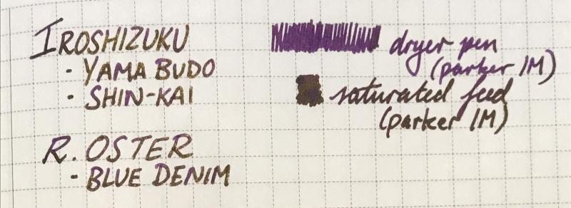
A saturated, slightly dusty purple with strong gold sheen(the writing samples below were from a fairly dry pen). Not much shading but diluting with water and using a wetter pen may bring it out. I've had it in my pen for 2 days and the ink doesn't seem to be doing anything strange, not too sure about staining but none of the inks used in the mix usually stains much. I don't have the exact ratio but it's mostly pilot iroshizuku Yama budo with some shin-Kai and blue denim(Robert oster), possibly 4:1:1. Lubrication:4/5 Flow:4/5 Dry time:4/5 Water resistance:3/5(runs but definitely readable) No bleedthrough or feathering, slight show through on the copier paper. Sorry for the sloppy photos, I did try to take them in different lighting situations. I might try diluting it or playing with the ratio if anyone's interested. 😊

-
Robert Oster is new player in fountain pen ink market. He operates through ebay shop. The inks are sold in 50 ml PET bottles with a tightly secure twist cap. I don't know who makes the inks for the shop, but the colors look interesting and fresh. At the moment Robert Oster inks are available in colors Aqua Australian Sky Blue Barossa Grape Black Blue Black Blue Denim Blue Night Blue Sea Bondi Blue Burgundy Chocolate Claret Copper Brown Deep Sea Emerald Green Ever Green Fire Engine Red Forest Green Graphite Green Green Green Lime Green Olive Jade Khakhi Light Green Marine Moss Orange Peach Pinky Red Orange Royal Red Ruby Red School Blue Spearmint Torquay Tranquility Turquoise Yellow Sunset I received sixteen samples (marked in cursive) from well known ink enabler - Cyber6. Thank you Claudia You rock! On Robert Oster's shop website Blue Night is described as follows: "Flows on like a 1940s deep dark blue motor car duco, dries on Blue at Night with great day/night like shading". The color is great, shading decent, and the ink behaves very well. I'll consider getting a bottle. Drops of ink on kitchen towel Software ID Tomoe River, Kaweco Classic Sport - eyedropper, B Leuchtturm 1917, Kaweco Classic Sport - eyedropper, B Oxford Comparison (Sheaffer's bb sample was probably contaminated or deteriorated with time)
-
Ink Review: Robert Oster River of Fire Robert Oster is an Australian ink manufacturer and has developed a large number of colors in recent years. I have tried several of these inks, and have found most of them to behave quite well. Some of the colors are unique, and have unique names. Overall I like the brand and the inks that I have tried. River of Fire is a lovely dark green ink with a very nice red sheen, especially when used on Tomoe River paper. I purchased a sample of this ink from Anderson Pens last fall during a period of time when I was trying many dark green inks. This ink does not disappoint. It behaves very nicely in every pen I have tried with it. It is deeply saturated and flows well. There are some not so positive issues with the ink. It does show through on lesser quality papers, and also bleeds through when pooled. While I would likely not use this ink to take notes at a conference (conference materials are generally printed on very cheap paper), I would not hesitate to use this ink at work on even good copy paper. While it does have a nice sheen, it does not shade well. Here is my handwritten review of the ink: This is a very nice ink which I do recommend.
-
Robert Oster Signature - Charcoal Robert Oster is an Australian ink maker that is well-known for its unique range of colours. On his website, he describes our shared love quite eloquently: “Robert Oster Signature originates from one of the most famous wine producing regions of the world, the Coonawarra district of South Australia, an idyllic setting with great influence on the senses. There is my inspiration. It’s a joy to share it with you.” Well, we are certainly fortunate to have inspiring ink makers like Robert Oster to satiate our thirst for glorious inks. In this review, the center stage is taken by Charcoal. Catherine from Sakura provided me with a sample of this ink to play around with – much appreciated! This particular incarnation of a Robert Oster ink is a purple-leaning grey. The ink provides good contrast with the paper, which is good. On the other hand, I found it to be quite dry in smaller nib sizes, which is not good (this with my Lamy Safari, which is itself on the dry side). Only with broader nibs did I achieve a pleasing writing experience. I liked the writing experience a lot when paired with a B-nib. Charcoal shows some heavy shading, with quite a bit of contrast between the light and darker parts. I prefer my shading to be more subtle though – for me personally, heavy shaders are less aesthetically pleasing. The ink itself is a complex mixture, with multiple undertones. When used for drawing, you can bring these blue, red and green undertones to the surface in washes. To show you the impact of saturation on the ink’s look & feel on paper, I made some scribbles where I really saturated portions of the paper with ink. This gives you a good idea of what the ink is capable of in terms of colour range. Like most Robert Oster inks, Charcoal has zero water resistance. Short exposures to water completely obliterate the text, leaving next to nothing on the page. This is evident from the chromatography – the ink detaches easily from the paper, as can be seen in the bottom part of the chroma. Smudge resistance is quite good though. I’ve tested the ink on a wide variety of paper – from crappy Moleskine to high-end Tomoe River. On every small band of paper I show you:An ink swab, made with a cotton Q-tip1-2-3 pass swab, to show increasing saturationAn ink scribble made with an M-nib fountain penThe name of the paper used, written with a B-nibA small text sample, written with an M-nibDrying times of the ink on the paper (with the M-nib)Charcoal behaved perfectly on all paper types, with no visible feathering – not even on Moleskine paper, which is quite a feat. On the other hand, the ink shows some unusual chemistry on Moleskine paper, resulting in a sickly greenish colour. Really strange, and something I also observed with Purple Rock, which is also an ink with purple components. Could it be something with the chemistry of Robert’s purple dyes that clashes with the Moleskine paper ??? The same occurred – to a lesser degree – with Tomoe River paper. Charcoal manages to look quite ugly on Tomoe River. Overall, the ink dries quickly near the 5-second range, with makes it a suitable ink for lefties. I also show the back-side of the different paper types at the end of the review. No troubles there, except with the Moleskine paper, which shows a bit of bleed-through. All in all, a very well-behaving ink. ConclusionRobert Oster Charcoal is a purple-grey ink, that is at its best in broader nibs, where it truly shows off its colour range and heavy shading. Unfortunately, the ink has no water resistance – the briefest touch of water completely obliterates your writing. The ink also has trouble with some types of paper – it looks horribly green on Moleskine paper, and looks rather sickly on Tomoe River. All things considered, I’m personally not impressed by this particular Robert Oster creation as a writing ink. For drawing, this ink has some potential, due to the complex undertones that easily surface in washes. Technical test results on Rhodia N° 16 notepad paper, written with Lamy Safari, M-nib Back-side of writing samples on different paper types
-
-
-
-
-
-
-
-
-
Sakura Fountain Pen Gallery generously sent me Robert Oster Red Clay. It is an ink in the inkArt.ink line ( http://www.inkartink.com/ ) They are available in 50 and 100 ml and have added UV protection. Red Clay is a a nice "muted" red. Clay can have a lot of different colors, but this looks for me like the red bricks used for building in the Netherlands. The ink shows shading and what I particularly like is the dark outline of the letters (see writing and dip pen). There is some black sheen. Behavior of the ink is good, like most Robert Oster inks, and especially the use with dip pen and for calligraphy is excellent, as expected for an Art ink The chromo shows three colors, 2 of them very distinct. Closest thing to the chromo is Shaeffer Skrip Red, but this red is far more brighter. I like the color and behavior of the ink, not only for art but also for writing.
-
Robert Oster Signature - Bronze Robert Oster is an Australian ink maker that is well-known for its unique range of colours. On his website, he describes our shared love quite eloquently: “Robert Oster Signature originates from one of the most famous wine producing regions of the world, the Coonawarra district of South Australia, an idyllic setting with great influence on the senses. There is my inspiration. It’s a joy to share it with you.” Well, we are certainly fortunate to have inspiring ink makers like Robert Oster to satiate our thirst for glorious inks. In this review, the center stage is taken by Bronze, a fascinating olive-green ink with a noticeable old-rose undertone that is present just behind the surface, and that gives the ink a really nice vintage look. The name “bronze” is spot-on for this Robert Oster creation – the colour reminds me of these ancient bronze pots with lovely patina you can find at your local museum. This is an ink that really stands out from the crowd – in a good way. The ink contrasts nicely with the paper, but – unfortunately – looks a bit flat when writing with an EF-nib. Starting with F-nibs though, the ink opens up and shows its character, with strong shading in the broader nibs. To show you the impact of saturation on the ink’s look & feel on paper, I made some scribbles where I really saturated portions of the paper with ink. This gives you a good idea of what the ink is capable of in terms of colour range. On heavily saturated parts, Bronze shifts from olive-green towards more of a brown-green colour, with those tantalizing old-rose undertones just beneath the surface (the scan seems to lose these old-rose undertones somewhat, but trust me – they are there, and they are what makes this ink so special). Like most Robert Oster inks, Bronze totally lacks any water resistance. Short exposures to water completely obliterate the text, leaving only some old-rose smudges. This is evident from the chromatography – the ink detaches easily from the paper, as can be seen in the bottom part of the chroma. The ink is reasonably smudge-resistant though… there are some greenish smudges when rubbing a line of text with a most Q-tip cotton swab, but the text itself remains perfectly readable. I’ve tested the ink on a wide variety of paper – from crappy Moleskine to high-end Tomoe River. On every small band of paper I show you:An ink swab, made with a cotton Q-tip1-2-3 pass swab, to show increasing saturationAn ink scribble made with an M-nib fountain penThe name of the paper used, written with a B-nibA small text sample, written with an M-nibDrying times of the ink on the paper (with the M-nib)Robert Oster Bronze behaved perfectly on all paper types, and even wrote surprisingly well on Moleskine paper (although with very noticeable show-through and bleed-through). The ink is equally at home on both white and more yellowish paper. While writing, the ink lays down a rather wet line, but still dries quickly within the 5 to 10 second range (with an M-nib). The initial wetness means that you have to look out for smudging while writing – as such it’s not an ideal ink for lefties. Inkxperiment - bronze landscape I’ve recently started to experiment with ink drawings, keeping things simple and more-or-less abstract due to my lack of drawing skills (which can use lots more practice). But I find it to be a fun extension of the hobby, and have found single-ink drawings a nice challenge. In this drawing I started with completely wet 300 gsm watercolour paper, and applied Bronze with a brush. For the sky I used lots of water while spreading the ink. The highlights in the sky were obtained by blending in some bleach (thank you Nick Stewart for pointing out the possibilities of using bleach on inks). With the background almost dry, I added in the trees, letting the ink spread a bit. When the paper was almost completely dry, I added the fence and some details to the trees. I wouldn’t call it a masterpiece ;-) , but the drawing does show what can be obtained with Bronze in a more artistic setting. ConclusionRobert Oster Bronze is a great olive-green ink with a strong vintage vibe – mostly due to the old-rose component that shimmers beneath the surface. The ink looks good in all nib types, and can handle even low-quality paper fairly well. Unfortunately, the ink has zero water resistance – but I can live with that. Overall, I liked Bronze a lot – it certainly stands out from the crowd. Recommended! Technical test results on Rhodia N° 16 notepad paper, written with Lamy Safari, M-nib Back-side of writing samples on different paper types
-
A fantastic write-up by the people at NoteMaker (an Australian Stationary with products as unique as you are..). It finally answers the question we have been asking ourselves.. Who is Robert Oster? http://blog.notemaker.com.au/meet-designer-robert-oster-signature-inks/ C.
-
Robert Oster is new player in fountain pen ink market. He operates through worldwide network of wholesalers. The inks are sold in 50 ml PET bottles with a tightly secure twist cap. I don't know who makes the inks for the shop, but the colors look interesting and fresh. At the moment Robert Oster inks are available in billion colors - I lost track how many. Sample of Lemon Grass was sent to me by Akszugor. The color is interestig. I like it. The ink feels dryish and lubrication could be better but, overall, it's not bad. Drops of ink on kitchen towel Software ID Color range Rhodia, Visconti van Gogh, fine nib Midori, Lamy Al-Star, Visconti van Gogh, fine nib Water resistance
-
Robert Oster is new player in fountain pen ink market. He operates through worldwide network of wholesalers. The inks are sold in 50 ml PET bottles with a tightly secure twist cap. I don't know who makes the inks for the shop, but the colors look interesting and fresh. At the moment Robert Oster inks are available in billion colors - I lost track how many. Sample of Torquay was sent to me by Akszugor. While the ink behaves well, I strongly dislike the color. Drops of ink on kitchen towel Software ID Color range Discovery copy paper, Kaweco Classic, medium nib Maruman, Lamy Al-Star, medium nib Midori, Lamy Al-Star, medium nib
-
October Newsletter/Blog at Fed Pens: http://www.federalistpensonline.com/October-Update_b_32.html -Inktober (Discount/Shipping!) -New Pelikan Products -Robert Oster Frankly Blue! -Columbus Pen Show- Nov 3rd- 5th! (Attending- same location!) Thank You! Frank
-
Robert Oster Signature - Blue Denim Robert Oster is an Australian ink maker that is well-known for its unique range of colours. On his website, he describes our shared love quite eloquently: “Robert Oster Signature originates from one of the most famous wine producing regions of the world, the Coonawarra district of South Australia, an idyllic setting with great influence on the senses. There is my inspiration. It’s a joy to share it with you.” Well, we are certainly fortunate to have inspiring ink makers like Robert Oster to satiate our thirst for glorious inks. In this review, the stage is taken by Blue Denim. Catherine from Sakura provided me with a sample of this ink to play around with – much appreciated! This particular Robert Oster creation is a nice teal ink that is a very close relative of both Pelikan Edelstein Aquamarine and iroshizuku ku-jaku. It’s a teal colour that leans towards the blue side of the spectrum, which I really appreciate. The ink contrasts nicely with the paper, and works well with all nib sizes. I found this ink to flow well with superb lubrication – a real pleasure to write with. The ink also offers lots of shading, even in finer nibs. To show you the impact of saturation on the ink’s look & feel on paper, I made some scribbles where I really saturated portions of the paper with ink. This gives you a good idea of what the ink is capable of in terms of colour range. What really wows here is the beautiful reddish sheen that the ink exhibits – quite nice! If you use broad & wet nibs, you’re in for a treat. Like most Robert Oster inks, Blue Denim has no water resistance. Short exposures to water completely obliterate the text. All that remains are some unreadable smudges. This is evident from the chromatography – the ink detaches easily from the paper, as can be seen in the bottom part of the chroma. The ink also smudges easily, with bluish smudges on the page. The text itself remains very readable though. I’ve tested the ink on a wide variety of paper – from crappy Moleskine to high-end Tomoe River. On every small band of paper I show you:An ink swab, made with a cotton Q-tip1-2-3 pass swab, to show increasing saturationAn ink scribble made with an M-nib fountain penThe name of the paper used, written with a B-nibA small text sample, written with an M-nibDrying times of the ink on the paper (with the M-nib)Blue Denim behaved perfectly on all paper types, with just a tiny bit of feathering on the Moleskine paper. The ink is equally at home on both white and more yellowish paper. While writing, the ink lays down a rather wet line, but still dries quickly within the 5 to 10 second range. The initial wetness means that you have to look out for smudging while writing – as such it’s not an ideal ink for lefties. I also show the back-side of the different paper types at the end of the review. No troubles there, except with the Moleskine paper, which shows a bit of bleed-through. All in all, a well-behaving ink. ConclusionRobert Oster Blue Denim is a beautiful teal ink, that is at home on all types of paper. The ink looks good in all nib sizes, and offers a very smooth writing experience. Unfortunately, the ink has zero water resistance – the briefest touch of water completely obliterates your writing. If you already own other teals like Aquamarine or ku-jaku, you might pass on this one. There is however that alluring reddish sheen, that might make it worth your while to get a bottle… Technical test results on Rhodia N° 16 notepad paper, written with Lamy Safari, M-nib Back-side of writing samples on different paper types
-
Robert Oster is new player in fountain pen ink market. He operates through worldwide network of wholesalers. The inks are sold in 50 ml PET bottles with a tightly secure twist cap. I don't know who makes the inks for the shop, but the colors look interesting and fresh. At the moment Robert Oster inks are available in billion colors - I lost track how many. Sample of Blue Black was sent to me by Akszugor. The color is rather generic, but I liked this ink. It feels wet in my Kaweco Sport and the flow is very good. Lubrication could be better but the level we get is sufficient to enjoy writing. I wouldn't mind having more of this one. Drops of ink on kitchen towel Software ID Color range Discovery copy paper, Kaweco Classic, medium nib Maruman, Lamy Al-Star, medium nib Midori, Lamy Al-Star, medium nib Water resistance
-
Robert Oster is new player in fountain pen ink market. He operates through worldwide network of wholesalers. The inks are sold in 50 ml PET bottles with a tightly secure twist cap. I don't know who makes the inks for the shop, but the colors look interesting and fresh. At the moment Robert Oster inks are available in billion colors - I lost track how many. Sample of Charcoal was sent to me by Akszugor. The color is dark purple. Don't expect true black. The flow is nice and other properties are satisfying. Drops of ink on kitchen towel Software ID Color range Oxford Optic, Hero, M nib Discovery 70 mgsm copy paper, Kaweco Sport Classic, BB Leuchtturm 1917, Kaweco Sport Classic, BB
-
Robert Oster is new player in fountain pen ink market. He operates through worldwide network of wholesalers. The inks are sold in 50 ml PET bottles with a tightly secure twist cap. I don't know who makes the inks for the shop, but the colors look interesting and fresh. At the moment Robert Oster inks are available in billion colors - I lost track how many. Sample of Viola was sent to me by Akszugor. The color is uninspiring, the ink flows rather well although it may feel dryish. Also it lacks lubrication. Basically nothing interesting. Drops of ink on kitchen towel Software ID Color range Oxford Optic, Lamy Al-Star, medium nib Leuchtturm 1917, Lamy Al-Star, medium nib
-
Robert Oster is new player in fountain pen ink market. He operates through worldwide network of wholesalers. The inks are sold in 50 ml PET bottles with a tightly secure twist cap. I don't know who makes the inks for the shop, but the colors look interesting and fresh. At the moment Robert Oster inks are available in billion colors - I lost track how many. Sample of Bronze was sent to me by Akszugor. I must admit I enjoy the color because of it's complexity. The ink has very good flow and feels wet. As most RO inks it lacks lubrication. All in all I enjoy this one. Drops of ink on kitchen towel Software ID Color range Oxford Optic, Kevin & Sasa Crafts, EF nib Discovery 70 mgsm copy paper, Kevin & Sasa Crafts, EF nib Leuchtturm 1917, Kaweco Sport Classic, BB
-
Robert Oster is new player in fountain pen ink market. He operates through worldwide network of wholesalers. The inks are sold in 50 ml PET bottles with a tightly secure twist cap. I don't know who makes the inks for the shop, but the colors look interesting and fresh. At the moment Robert Oster inks are available in billion colors - I lost track how many. Sample of Verde de Rio was sent to me by Akszugor. The color is fresh and nice. I like it a lot. The ink feels rather wet but, as most RO inks, lacks lubrication. There's no water resistance. Drops of ink on kitchen towel Software ID Color range Oxford Optic, Lamy Al-Star, medium nib Leuchtturm 1917, Lamy Al-Star, medium nib