Search the Community
Showing results for tags 'review'.
-
Initial Impressions: My first impressions were very good - this is a very solid, tough pen, that I’m sure will last a very long time if not forever. The cap doesn’t have an amazingly satisfying *click* but it’s secure and not too tight, although I’ve heard reports of them being too tight. Upon writing with it for the first time I found it to be very wet and very smooth, one of the smoothest I’ve tried. I got this for only £25 from CultPens, and for this price it seems to be a very good pen... Design: It’s a pretty slim pen - it has a long plain barrel, and a polished grip section. For a polished grip section I don’t actually find it too bad, it has a slight oval shape to it but doesn’t taper making it not very slippy at all. The clip on the cap is definitely on the tight side being almost unusable. The nib is, like the other lower-end Sheaffer’s rather small. I opted for the matt black finish and so far it hasn’t suffered from any scratches. The pen’s weight is a little on the high side having a metal construction but I don’t find it to be too heavy. By metal I mean all-metal, the barrel, the grip section and the cap making for a very solid pen and for a grip section that screws onto the barrel very nicely - if you’ve read any of my other reviews you may know I’m generally not a fan of a plastic grip section, metal body combination as they usually don’t “glide” very well when assembling the pen. Overall a nice design, the only thing I think could really be improve on is the cap. I have large hands so find it to be a little too slim for my taste but I can’t hold tht against it, it’s a very nice pen so earns a score for this part of the review of... 9/10 Nib and Performance: The nib is one of the smoothest I’ve ever used and I am very impressed by it. It has a little bit of feedback, just enough to be nice but not so much as to be a nuisance. In terms of line thickness it’s thinner than Lamy nibs, but thicker than Pilot nibs, I’ll upload a picture for comparison with various other medium nibs. In terms of flow it is definitely on the wetter side, not absolutely soaking but just right, and the feed always keeps up and there are never any false starts. As I said before it’s quite a small nib which I rather like - I generally find smaller nibs nicer to write with for some reason. It’s nicely decorated as well, with a big “M”, “Sheaffer” and some slight decoration, again I’ll upload a picture so you can see for yourself. Overall the nib gets an impressive... 10/10 Conclusion: For only £25 this pen is a steal, and perfect for anyone who’s more inclined towards the slimmer fountain pen. Personally I like bigger ones but I still find myself using is due to its almost perfect nib. If you’re looking for a tough pen for day to day use this would be perfect, I’m sure this pen could withstand quite a lot! Score: 19/20 Pics! http://farm8.staticflickr.com/7451/12254103865_f98be6dfbf_c.jpg http://farm6.staticflickr.com/5479/12254103005_b84cfb40bb_c.jpg http://farm3.staticflickr.com/2884/12254269963_f3fd8e3661_c.jpg http://farm6.staticflickr.com/5503/12254532144_25357d15b1_c.jpg Writing sample with comparisons to Lamy nibs and a Kaweco as well... http://farm8.staticflickr.com/7352/13166469415_2e3fa31e49_c.jpg http://farm8.staticflickr.com/7007/13166733314_51ccd3a148_c.jpg And a size comparison... http://farm3.staticflickr.com/2857/12254281983_82b552b578_c.jpg http://farm8.staticflickr.com/7440/12254281053_a872506103_c.jpg Sheaffer 300, Sheaffer 100, Sheaffer Prelude, Lamy Studio, TWSBI Diamond 580, Kaweco Allrounder, Pilot Prera
-
http://i.imgur.com/PBkXXAk.jpg Haven't logged on here for so long I forgot my username here was "GlennPen" not "PenGlenn". Interchangeable I suppose? EDIT: Also, I realized I should've put "Subjective" not "Objective". It's morning man. Anyway, a transcription for the "Objective Writing Experience" "You know on the Goulet site it says this ink is not 'Fast Drying', but I feel comfortable dragging my hand all over the paper. Feathering is non-existing unless you stick the nib to the wet paper (hence 'Oops'). Flow is wet but not so much, very smooth writing experience." I like this ink, and it's my first Green ink too. http://i.imgur.com/WED60Lf.jpg Behold, the sequel! I tested the ink again (except for it's water-resistance properties) on copier paper to address the ink's supposed feathering problem, well, I don't see it guys! Maybe yellow Legal pad paper or Wal-Mart leaf paper. Subjective Writing Experience transcript: "Perhaps not as smooth experience as on a fountain pen friendly paper like Rhodia but nonetheless the ink is behaving the same way; wet, quick-to-dry, and mostly likely the paper will be destroyed by water before the ink is." Also, I wiped the nib over with a napkin to see if there is nib creep for my Lamy Safari 1.1 nib; there is none.
-
I recently became the owner of a new Lamy 2000 in stainless steel. :-) I got a request on my blog to do a post about my thoughts on the pen, and here is a copy of it: In case you can’t read my handwriting, here is a transcription: Lamy 2000, Stainless Steel Nib: M Ink: R&K Salix + a few drops Verdura Bought from Goulet Pens I could not give this pen a score, because for me it is a grail pen. Thus, here are a few thoughts: * this pen is heavy! Not something I would use to write a novel, but I write unposted so it’s okay * the nib is smooth, once you get on the sweet spot… * speaking of the nib, this seems a bit fine for a M? * the legendary nubs happen to be right where I hold the pen, but they are so small and dull I barely notice * the pen can get a little slick if you have sweaty hands, but so do most pens (esp. metal ones). Gives you a chance to take a thoughtful pause and wipe off the moisture. :-) If you want a more technical review of the original (Makrolon) version of the Lamy 2000, you should probably read this one by FPGeeks. They also did a nice review of the stainless version, and if you are really ambitious you can start on this five part essay about the Lamy 2000… Overall, I really love the pen. I like that it writes fine enough so that I can use it for my classwork, and thus it has become my EDC. A bit pricey choice for an EDC, I know, but I personally think it would be ridiculous to spend a lot of money on a pen that I don’t want to use. The large ink capacity, indestructibility, and sleek design are everything I could hope for and more in a pen.

-
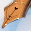
Introduction of the introduction: I’ve been a lurker for years, and own probably way too many pens for my own good. While there are certainly no shortage of reviews for a myriad of pens on this forum, when I am trying to decide on a pen (in Australia it’s difficult to try before you buy) I like to read as many reviews as possible, so I figured I should probably start reviewing them. Who knows, maybe someone will find them useful, so unless I get told how awful I am, I will continue to slowly review my collection. I’ve shamelessly copied some common aspects of reviews from others, as well as altering it slightly to my own format. Also, apologies for the photo quality, my dad “borrowed” my digital camera two years ago... Platinum - 3776 Shoji (Broad) http://farm4.staticflickr.com/3722/11044497224_8110355f6d.jpg Introduction Platinum are one of the big three manufacturers of Japan along with Pilot and Sailor, and like the other two are regarded as producing extremely high quality nibs. I would generally categorise Platinum as being the better value for money out of the other two (You could pick up a regular 3776 for around $100 if you look around) as well as being the most stylistically and technologically conservative. The 3776 series is quintessentially Platinum: cigar shaped, smooth gold nib, and a cartridge-converter only filling system. They generally sit in the middle of the road as far as size is concerned, although the century series bodies (which the Shoji is based on) are ever so slightly longer than the other versions. And just in case you’ve been living under a rock (or in Australia) since 1978, the namesake 3776 is the height of Mt Fuji, tallest mountain in Japan. In 2011, Platinum began producing yearly special edition pens based on the 3776, each appropriately named after the five lakes residing on the northern base of Mt Fuji. 2011 was Motosu, 2012 was Shoji, and as of writing 2013 is Sai. Unlike their other 3776 brethren, the five lakes series are unabashedly blingy demonstrators, each slightly different to reflect the different natures of the lakes they are named after. They are also significantly more expensive than the regular 3776 series, but then again they are limited edition (2011 units for Motosu, 2012 for Shoji, 2013 for... well you get the pattern.) This particular review is of the Shoji version, I wasn’t interested in the Motosu (Gold converters in silver trim bodies should be a crime) or the Sai (Too plain, and you can’t convert it to an eyedropper, despite looking almost perfect for it), so I only own the Shoji so far. Presentation It’s rare that I put much thought into a box after busting my loot out of its pen-prison, but the 3776 Shoji gave me pause to admire the packaging (looking at you and blowing kisses Visconti). The entire affair is large, plush and tastefully highlighted in silver. Take a look: http://farm4.staticflickr.com/3755/11044475896_a179ed6c4b.jpg In the canvas-covered box you get the pen itself, a spare gold coloured cartridge-converter (Please don’t put the gold coloured converter in a silver-highlighted pen. Seriously. Don’t make me come over there) a small #3776 brochure that showcases others in the series, a pair of 3776 Shoji demo cards, and interestingly a pair of carbon ink and pigment ink cartridges (more on that in a moment). And remember kids, the bottom of the box does not lift out, irrespective of how many times I forget and try to lift it up. Appearance A departure from the previous 3776 models I am familiar with, the 3776 Shoji has a clear body and cap with a faintly translucent light blue hue to it. The nature of the plastic is not captured well in pictures, particularly how the lighting in its surrounding environment can dramatically change its appearance: It can look completely clear: http://farm4.staticflickr.com/3779/11044503524_a0f135fe19.jpg But sometimes quite blue: http://farm3.staticflickr.com/2871/11044470716_f43a1c6aa7.jpg The Shoji like the rest of the 3776 series is cigar shaped. As you can see from the pictures, the pen is tastefully highlighted in silver. The most ostentatious aspects of the pen are its nib (coming up) the fat cap band that says “3776 PLATINUM MADE IN JAPAN” , and the interior surface of the slip and seal mechanism. If you’re not familiar with this feature, its a defining partof the 3776 series that prevents the nib drying out (I have a Sailor pen with this feature too with much less fanfare, but whatever), and on this particular model of 3776, written in silver are the names (in English mysteriously enough) of the five lakes, along with a small silver outline of each. It's nicely done, it matches the rest of the pen, and I like it. As far as Platinum is concerned, this is tantamount to an outrageous, drunken night out for their designers. http://farm6.staticflickr.com/5524/11044501804_0cffa4dc0d.jpg The slip and seal mechanism is also the reason why Platinum include a pigment and a carbon ink cartridge in the box. Both inks types are use at your own risk – they are suspended matter based, rather than the more familiar dye based liquid inks, which means if they dry in your pen, then the entire feed will need some pretty intense repair work, if it can be repared at all. Including these ink types is Platinum's way of asserting confidence over the slip and seal mechanism. It's a nice sentiment, but I am still not brave enough to try them out. Build Quality For me, the only area where the pen falls down slightly is the build quality. The cartridge-converter is the biggest casualty here – it's plasticky, unpleasantly stiff to use, has a very small ink capacity that invariably leaves a large air bubble when filled, and is generally cheap feeling. Luckily, you can always replace a catridge-converter if it breaks. The other area of concern is the barrel. On mine, it has interior scratching, the direction of the scratch marks indicate they occurred when the nib and feed were inserted. After some research this doesn't appear to be an isolated problem, but Platinum assured me that the issue is purely cosmetic, and after close inspection to determine that the rest of the plastic is just fine, I believe them. That's not to say I'm not delighted to see this kind of problem occur, if my $30 Lamy Vista can do it without scratching, why cant Platinum? The third and probably minor issue is that the pen damages itself when posted. This is necessary for me – the pen is not only too small, but way, way too light without the cap. To this end I've stuck sticky tape on the end where the posting damage occurs. http://farm4.staticflickr.com/3702/11044495994_ece2db86e6.jpg Nib http://farm6.staticflickr.com/5515/11044377245_f21eafce02.jpg Ah the nib. It wasn't my first love affair, and it certainly wont be my last, but in my current collection, this nib is my favourite. Belonging to a select group of pens that I own that I have never had to adjust, This particular one is rhodium plated, and roughly the size of a western #6 nib. It is relatively flat, and has a strangely cute heart-shaped breather hole. The nib on the whole looks mostly unassuming, yet the breather hole and lines tracing the sides and up the tines let you know that this nib has some serious attention to detail. After all, a slightly misaligned manufacturing would be instantly noticeable in the skewing of the nib detailing. I own a Sailor Reglus, Professional Gear Demonstrator (Yes I like Demonstrators. A lot.), a Pilot Custom Heritage 92 in bold and one in medium, a Prera and a Vanishing Point, and this nib beats all of them hands down. Despite use through two semesters and two sets of final exams, drawing a moustache on my dogs nose, and travelling in my backpack, the nib has *never* skipped. Ever. Nor have I pulled it out of my backpack to find a blob of ink in the bottom of the cap. And the only time it had a hard start was for a split second after leaving it uncovered for ten minutes - there are few nibs that can even pretend to be in the same category as this one. The nib is 14K gold, although as far as gold nibs are concerned this one is firmly on the stiff side (pun intended). Mine is bold , super smooth with the tiniest hint of feedback, and seems equivalent to a slightly larger western M, and is somewhat wet, which is just how I like it. Take a look at the beautiful shading you can get with a good ink: http://farm6.staticflickr.com/5528/11044498464_f6fca909d7.jpg Overall – 4.5/5 Despite its price, I refuse to leave it at home – I take it to Uni and write with it all day. This is the pen, when I get frustrated with another fountain pen, I use for a few minutes and it brings a smile back to my face. I've only used one other century and it had a similarly excellent nib (and similarly so-so body). Platinum completely deserve their reputation for their nib quality – If you find a 3776 on sale from a certain online japanese retailer, I highly recommend it - just remember to whack some sticky tape around the barrel. The Good: + A nib that veers dangerously close to perfection. + Beautiful. + Slip and seal does its job in my experience. + Limited edition, thus a somewhat unique addition to your collection. The Bad: - Converter - and a small capacity one at that. - Lightness can make it feel a little cheap. The Ugly: - Build quality, in particular the converter, for such an expensive pen is not up to scratch. Comparison Here I'll compare it to a fairly common pen so you can get an idea of it's size, a Lamy Safari. http://farm8.staticflickr.com/7389/11044554263_d83452cebd.jpg http://farm4.staticflickr.com/3758/11044371235_44b0fc96c7.jpg http://farm6.staticflickr.com/5523/11044462536_748a801d7b.jpg A note: I would like my reviews to be helpful, let me know what you'd like to see/what you hated.
-
First-time reviewer here - be gentle. Sorry about my atrocious handwriting! http://i.imgur.com/a22EdGJ.jpg?1
-
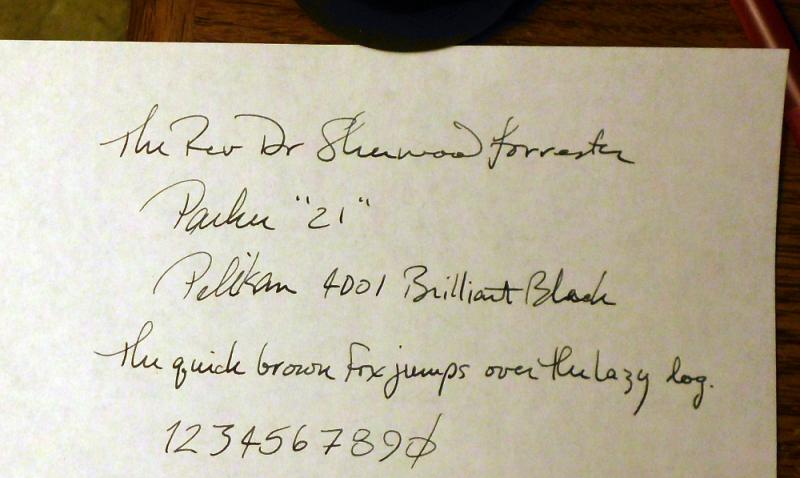
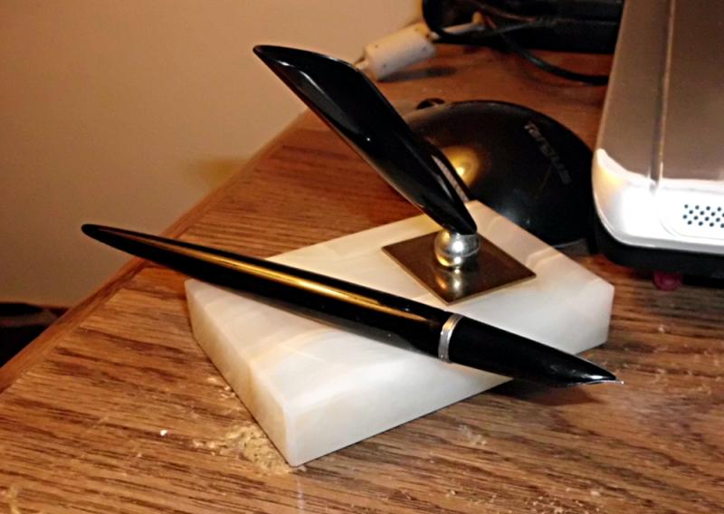
eBay has been kind to me; I picked up a lovely desk set, a Parker Model 110 which came with a Parker "21", thusly: Let me start with these impressions: I really like this desk set. I like the size of it, the weight of it, and the look of it. I like the magnetic holder, the color of the stone, everything -- the camera doesn't pick up the subtle greens and browns in the base. And this is before writing with the pen! I suspect that this piece lived in a smoker's house, because there was a light brown film on both the pen and the base, but it wiped off without having to resort to anything more than warmish water and a little elbow grease. First order of business was to see if the bladder would draw, so into the water it went; no leaks, filled nicely... of course, there was residual dried ink in there, a really remarkable shade of blue that I'd like to find. Rinsing out the holder itself revealed a mish-mash of inks that had evolved into a purply-black. So it had seen some use, although I wouldn't care to guess how recently. I filled and emptied it of water a few times, then left it to soak while I went to work. Upon my return, it was clean enough for me, so I fed it some Pelikan 4001 Brilliant Black and took it for a test run. There was no hesitation in the ink flow; I am really pleased with the line it lays down, and I think I'm going to really love it with a good blue-black, or maybe even just a rich blue. I have a large hand and like a longer pen, so it felt quite comfortable to hold. The nib glided quite smoothly over the paper (the sample above is on some plain white from the printer). This is going to be a really good stay-at-home pen, and inspires me to clean off my desk in the living room just so I can both display and use it there. This is my first Parker; my previous was an Esterbrook J that I miss bitterly. It's hard to say how much of this is the pen itself, and how much is the pleasure of finally having another working FP in hand again... first time since last June, when the Esterbrook went walkabout during a move. If nothing else, I can see my penmanship needs a little work! Even taking that into account, though, this is definitely a pen I already like and expect to use frequently.
-
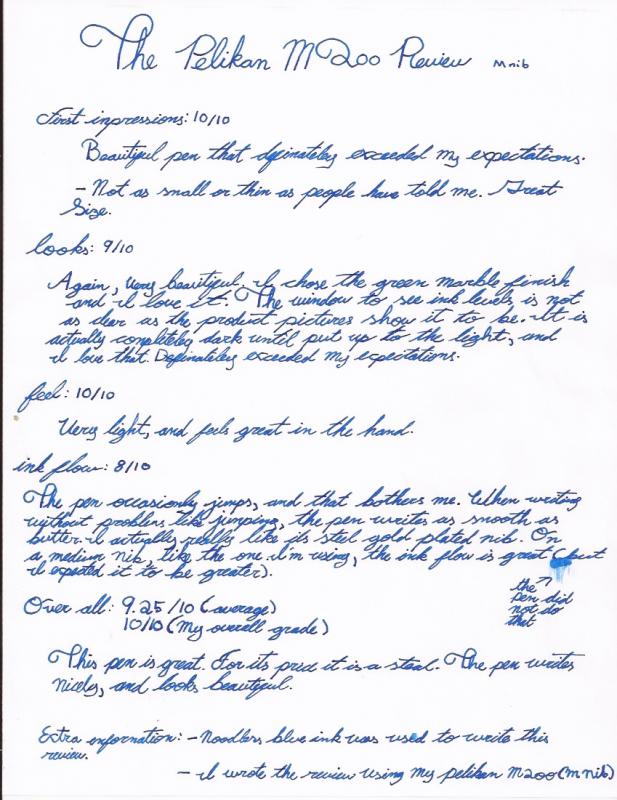
Hello everyone, I just got the Pelikan m200 yesterday in the mail, and am very happy about it. Here is a written review of the pen. I wrote the review with my Pelikan m200 filled with Noodlers Blue ink. I hope my messy handwriting does not get in the way of the review.
-
 Hello! This is a review of Tomoe River Paper It is my very first paper review, so I hope I'm addressing every possible issue. It is available from Jetpens.com (No affiliation) $15 for 100 sheets. My girlfriend was kind enough to buy some for me to try out. The following is my handwritten review and it's transcription: Overview:http://farm4.staticflickr.com/3665/12402196403_8ea52c6edc_c.jpgDSCF6583 by makey95, on Flickr Under Warmer Lighting:http://farm3.staticflickr.com/2816/12402049045_bab0699cff_c.jpgDSCF6602 by makey95, on Flickr The Pens Used (In No Particular Order, Capped):http://farm8.staticflickr.com/7320/12402502594_e68e63b59d_c.jpgDSCF6598 by makey95, on Flickr (Ordered Left to Right and Capped):http://farm6.staticflickr.com/5535/12402197043_d0aac890f0_c.jpgDSCF6601 by makey95, on Flickr Pens and Inks: Pen No. 1: Pick Pen Company; Pencil Pen Combo; Fine 14k; Diamine Monaco Redhttp://farm4.staticflickr.com/3785/12402197673_cd66a948d1_n.jpgDSCF6595 by makey95, on Flickrhttp://farm4.staticflickr.com/3829/12402504324_f601b4c874_n.jpgDSCF6588 by makey95, on Flickr Pen No. 2: Ranga; Ranga with Eversharp Flex; Flex Fine 14k; Diamine Monaco Redhttp://farm4.staticflickr.com/3686/12402502834_069b206c03_n.jpgDSCF6596 by makey95, on Flickrhttp://farm8.staticflickr.com/7408/12402051005_473b2196d2_n.jpgDSCF6589 by makey95, on Flickr Pen No. 3: Pilot; Parallel Pen; 2.4 mm Steel; Private Reserve Shoreline Goldhttp://farm4.staticflickr.com/3689/12402049865_d058a24fc5_n.jpgDSCF6597 by makey95, on Flickrhttp://farm8.staticflickr.com/7429/12402504054_30127f19d3_n.jpgDSCF6590 by makey95, on Flickr Transcription: Initial Observations: The paper is extraordinarily thin and has a very pleasing texture. Feathering/Bleedthrough: No noticeable feathering or bleed through but a fair amount of show through. May be annoying to some. Tactile Feedback/Drag/Toothiness: Very smooth but slightly more feedback than Clairefontaine. Unusual Dry times: Takes as long as Clairefontaine generally. Appearance/Design/Durability. Though thin, it feels durable and it looks lovely. Fountain Pen Friendly?: Yes! Other Media: _X_ Pencil X?_ Watercolour _X_Markers _X_India Ink Value/Comparison: A viable alternative to Rhodia, 15 cents a sheet. Definitely one of the best papers I have used. Overall Conclusion:Recommended for those who like this paper and don't mind a little show through. Smooth, lovely, and attractive. I will use this as stationery. Other Media Tests:http://farm8.staticflickr.com/7324/12402503854_2f763959a3_n.jpgDSCF6591 by makey95, on Flickrhttp://farm8.staticflickr.com/7443/12402050715_d898b05b99_n.jpgDSCF6592 by makey95, on Flickrhttp://farm4.staticflickr.com/3795/12402050425_1008da4fab_n.jpgDSCF6593 by makey95, on Flickrhttp://farm3.staticflickr.com/2813/12402503324_7f201c5374_n.jpgDSCF6594 by makey95, on Flickr Final Words:I really enjoyed this paper and I think it looks nice. Flex writing can deform the paper a little (where the tines dug in shows) and of course wetting the paper also deforms it slightly. It is prone to creasing. I am not sure if the watercolors would work very well, but I have put samples up so that others may judge for themselves. I don't think it would be a good idea to try and do anything wet on wet with watercolors on this paper. Not shown in this review are some of the cheaper pens that I used on a previous sheet of Tomoe River paper. It's not just the fountain pens I used for this review that make the paper seem smooth. Other than the permanent marker, there is no bleed through at all on this paper. I think everyone should at the very least have a chance to try this paper. It's very different from Clairefontaine in a good way. The closest thing that I have ever encountered to this paper are some old memo pads from my High School, which the librarians were kind enough to give me.
 -
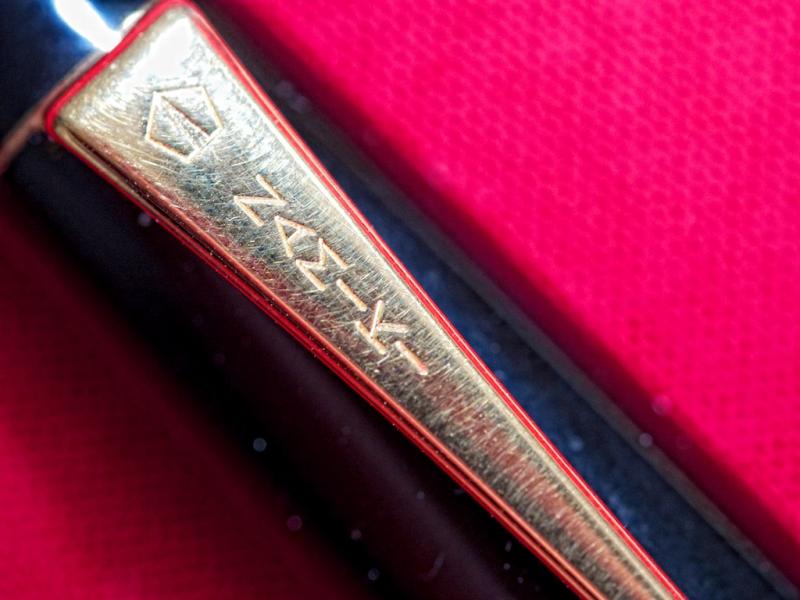
Review of the Pick Pen Company Combination Pen (ca. 1930?) I don't know much about this pen, or the pen company, but the pen seems to be of undeniably high quality. As a student, I always found the concept of combination pens to be very practical and as such I have always wanted one. I always forget to bring pencils to my exams, and this pen has helped me with that! I am no expert on the topic, but to the best of my knowledge combination pens were most common around the Great Depression where people wanted to save money by buying one instrument. Name brand (Sheaffer, Parker, etc.) combination pens often fetch absurd prices, but most other combination pens tend to be cheap and relatively poorly made. "Wearever" and "Arnold" made a good deal of the cheap combination pens that can currently be (relatively easily) found on ebay, but apparently they are poorly made and I didn't want to suffer through a bad pen. So I ended up hunting for gold nib combination pens, that were relatively reputable (Though I know this is not necessarily the case, I figured that gold nibs would generally be of higher quality when it comes to combination pens). The very first one that I had my eyes set on was a Newark Pen Company Secretary combination, but alas someone bought it before me. A month afterwards, I discover another seemingly high quality gold nib combination for $65. I bit the proverbial bullet and here I am. I'm very satisfied with the pen, and the following is my handwritten review of it and a transcription (for those who can't read my handwriting). Sadly, I got distracted by a room mate and before I realized it, some of the lines were crooked! The Handwritten Review: http://farm8.staticflickr.com/7389/12747529935_7d2ca1a718_b.jpgDSCF6614 by makey95, on Flickr Transcription: Pen: Pick Pen Company Combination Pen+Pencil (ca. 1930)Ink: Sheaffer Blue-BlackPaper: Tomoe River Paper Introduction: I have been looking for a combo pen for a very long time; to me they seemed very practical for a college student and fascinating as a piece of history! The pen made a great first impression on me. Though I do not care for the colour or the pattern, the pen felt well built in my hands and the pencil is working wonderfully. I have had the pen for a month or so now, before the review. Appearance and Design: 6As much as I have always wanted one, I have to admit that combo pens are fairly unattractive. The dull and slightly discoloured celluloid does not appeal to me. However, functionally, the design has proven to be functional [sic] and wonderful. Construction and Quality: 8.5The pen is very sturdy and very reliable. The only criticism is that the lever filler system feels a tad "loose." There are no problems with the pencil. Weight and Dimensions: 9It feels almost perfectly balanced regardless of the end that I am using. About 6" capped regardless of the end in use, about 5.25" uncapped. Nib and performance: 8.5Though a lovely nib, sometimes on cheaper paper upward strokes may skip. Otherwise the nib is quite smooth with surprising variation [Hasty Flex] Filling System: 5A lever filler with relatively low capacity (to make room for the pencil). Cost and Value: 9$65 on ebay for a lovely pen! I think it's a bargain. Conclusion:If you can find it, snatch it up! Highly recommended! (Out of ink! Right on time) Other Pictures/Thoughts: A Close-Up of the Nib:http://farm6.staticflickr.com/5499/12747660983_4c217f2a5f_c.jpgDSCF6612 by makey95, on Flickr Pencil Unscrewed:http://farm4.staticflickr.com/3676/12747661263_caa0a9182e_c.jpgDSCF6611 by makey95, on Flickr Full Body Shot of the Pen:http://farm4.staticflickr.com/3721/12747530735_8b48bbf169_c.jpgDSCF6610 by makey95, on Flickr Other Notes: The pen has an engraving on the nib that says: Pick/1/CintiO/USA The pen has an engraving on the body that says: THE PICK PEN CO./CINCINNATI O./MADE IN U.S.A. The nib seems to be bordering on being a flexible nib. I would say. . . semi flex? I have no railroading, or similar issues and can get some decent line variation with fair snapback. The mechanical pencil accepts .46" lead, or about 1.1 mm lead. This can be a pain to find, but certainly not impossible. Message me for links where to get said lead. An advantage to this lead thickness is that it doesn't break as easily, and it doesn't wear down as quickly. The mechanical pencil has to be filled from the front. Extra leads can be stored after pencil part is unscrewed (see pictures). Other Thoughts: Hope the review was helpful or at least informative to a few people. If anyone knows enough to correct me or fill me in more about the pen or history, I would appreciate it. Also if there is any way I could improve the way, do let me know. Finally, the sort of skipping that it has on some upwards strokes (like the returning loop on the g) is very strange and I wonder why it happens at all. If anyone knows why, please tell me what it is and how I could fix it. It's the only thing that's keeping the nib on this pen from being a 9 or higher.
-
Pilot Elite Pocket Pen (18k Gold Nib, Fine, Vintage) Review Ink: Diamine Monaco Red Paper: Rhodia No. 16 5x5 Grid I picked out this pen on ebay because I thought it looked very interesting. It was a used pen, and did not come with a box or converter, but it was in fairly good condition (it only had micro scratches). I fell in love with the design the moment I saw it, but to my horror I found that the pen did NOT write well. Thankfully, after a quick check with a loupe, I found that the tines did not have any space between them. I quickly fixed it and used it for a full day with several different inks. The following is my handwritten review of the pen: http://farm3.staticflickr.com/2868/11992561946_de01404a8b.jpg For those who can't read my handwriting, I took the liberty of typing up the review as well: 1. Appearance and Design: 10/10To me, the design is one of the most appealing aspsects of the pen. It looks sleek, modern and very classy both capped and posted. The integrated feed really drives the appearance home. It is a nice glossy black with elegant gold trim. http://farm4.staticflickr.com/3770/11992137344_6736e58fcb.jpg 2. Construction and Quality: 10/10 There is nothing that I can justify deducting points for. The pen is very solid, and the capping/posting mechanism process is wonderfully smooth but with just enough resistance. The pen does not feel cheap in the hand. It feels solid enough that I would not be afraid if I dropped it. http://farm6.staticflickr.com/5517/11992568796_29ebc49b8d.jpg 3. Weight and Dimensions: 8/10 The pen is a bit on the light side but not quite light. The section may be too thin for some but I find it to be close to ideal. It is about 4.5 inches capped and about 6 inches posted. The pocket pens are made to be posted. 4. Nib and Performance: 8/10 The nib is smooth with just the right amount of feedback. It is made of plain 18k gold, and is a nial, more or less. It's a great Japanese fine, and has average flow. http://farm8.staticflickr.com/7335/11992571766_b10391bd7c.jpg 5. Filling System and Maintenance: 5/10A standard cartridge/converter. Not much to say. Takes the con20. 6. Cost and Value: 7/10I got it on ebay for very cheap for a wonderful smooth gold nib. I don't see them very often, but I feel as though $90 was a fair price. 7. Conclusion: Recommended! A very pleasing vintage pen that I found to be functional and handy I would definitely recommend this pen. Addendum:I only rated the nib so low because I had problems initially and for a while I also had some problems with the occasional hard start. That has since been worked on and it is seemingly fixed. After that it has been a very pleasant experience and it is one of my favourite pens for everyday use. I would only rate my Sailor 1911 higher, and my flex nib Eversharp ties with it.
-
Hi there! So... I've not done this before. I couldn't find a review for this ink and thought it would be a good ink for my first try. I apologize in advance for both my handwriting and any mistakes. P.S. I am going to get this photo facing the correct direction if it kills me O.o
-
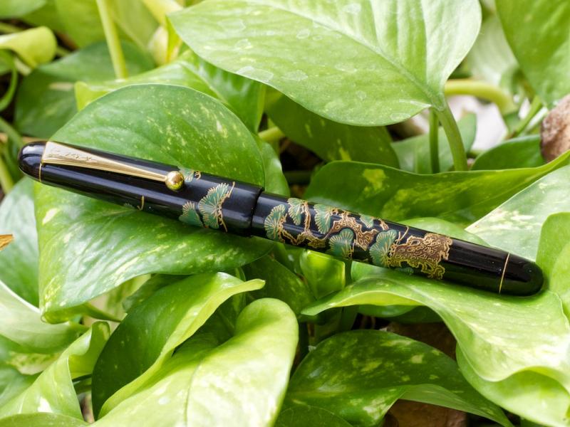
I bought my Namiki Maki-e Pine Tree Bonsai fountain pen from Classic Fountain Pens. It was among their "previously owned" pens, and I snatched it up after being very disappointed by the Pilot Falcon Resin I had bought a few weeks before. This Namiki came with a medium 14K nib that I had reground into an italic stub. Obviously, a Japanese medium isn't going to turn into a big italic with lots of line variation, but I definitely love the line I'm getting. My writing always benefits from an italic nib no matter what the size. The pen itself is gorgeous, with a gleaming black surface adorned with the Maki-e decoration. You can feel the Maki-e with your fingers, and the pine tree bonsai motif is beautiful yet subtle. The pen is comfortable in the hand and just the right weight for me (14mm x 142mm; 18 grams). The Namiki comes with the Pilot Con-70 converter which holds a good amount of ink (1 ml). I was disappointed with the tiny amount the Pilot Falcon held. With the Namiki converter, you can pump a sufficient amount of ink into the pen to last for days. And it is a pump converter, which I discovered only after several futile attempts at twisting the knob! I had to do a Google search and watch a video to learn that I was doing it wrong. Sigh. I have nothing negative to say about this pen. It writes beautifully thanks to the nib work done by Classic Pens. It sits perfectly in the hand and is neither too heavy nor too light. It exudes quality (unlike the Falcon)—it doesn't feel plasticky at all, but substantial. And it is gorgeous. It is on the costly side (you can find this particular design on eBay, but Namiki apparently no longer carries it). I personally never buy anything from eBay, and I probably paid more because I bought it from Classic Fountain Pens. But I trust them and know that I'm getting the real deal. I love my German Pelikans, but Japanese pens (Nakaya, Namiki, Platinum) are quickly out-numbering all my other fountain pens. Something about the quality and aesthetic draws me to these pens. Fountain Pen Network Rating System: Appearance and Design: 10 Construction and Quality: 10 Weight and Dimensions: 10 Nib and Performance: 10 (I don't know what the nib would be like right out of the box since I had my nib reground). Filling System and Maintenance: 10 (Once I figured it out!) Cost and Value: 10 Conclusion: 60/60
-

Monsieur Fountain Notebook Review
milanjuza posted a topic in Paper & Pen Paraphernalia Reviews and Articles
High res images available on my blog: Vertical Paper When I was recently contacted by Ed Harding and Tom Strickland, the duo behind Monsieur notebook with a question whether I would review their new notebook I was pleasantly surprised and after checking their website I said accepted immediately. A few days later one of the real leather Monsieur notebooks arrived by post. Monsieur notebooks are sold in a variety of colours, sizes and paper types. The one I received is, not surprisingly, the fountain version in brown. http://farm4.staticflickr.com/3830/9692479154_840354c839_c.jpg http://farm6.staticflickr.com/5511/9692476466_8919fec495_c.jpg http://farm4.staticflickr.com/3744/9692477758_fb1e2a2a98_c.jpg http://farm3.staticflickr.com/2844/9692483132_2df990b27d_c.jpg http://farm6.staticflickr.com/5331/9689241061_632aa437a4_c.jpg First impressions The notebook looks really nice. The leather cover is smooth, but has a kind of ‘rustic’ feel to it. And it smells great too! The binding is quite firm and it takes quite a bit of effort to open the notebook for the first time. Without “breaking” the binding a bit it is not easy to use the notebook comfortably. First two and last two pages are ivory, the rest of the paper is white. Pages are blank and are not numbered, but there are few lines on the third page for your name and a few other details. There is no internal pocket, which is not a big deal in my opinion as I hardly ever use it. You will notice though, that the first and last page are not glued to the leather cover centred i.e. the strip of leather you can see on top is slightly wider than the same strip at the bottom. It’s not something that would bother me too much, but I like when things are symmetrical. The notebook comes with a rubber band, which is well made, strong enough to hold the notebook closed, but not too tight to make putting the band on difficult. On the back of the notebook you can find an embossed Monsieur logo. On top of that, you can customise your notebook in a variety of ways including debossing, foiling, custom bands and wraps etc. as well as custom designs. I think that’s quite unique on the market and it could be a real selling point for people who like to make their notebook really special. Materials and build quality I really wanted to love this product, especially because it comes from a UK-based startup. Unfortunately, I found that Monsieur notebook suffers from a variety of quality issues some of which I consider quite fundamental. First of all the binding and stitching is too tight and too “stiff”. The binding does not provide enough flexibility and, as is visible on the pictures below, this causes various problems like stitches “cutting” into the paper and leather cover breaking away from the paper. What you see below is not a result of any excessive use or unusual handling as I took these pictures after less then ten minutes of use. It is, in my opinion, rather a sign of suboptimal manufacturing standards and/or quality control. http://farm4.staticflickr.com/3700/9689242827_79314cc8bf_c.jpg http://farm4.staticflickr.com/3758/9692482226_c323192943_c.jpg http://farm6.staticflickr.com/5550/9692484874_76e1f73d36_c.jpg http://farm4.staticflickr.com/3761/9692482574_153f672188_c.jpg The paper used in the fountain variant of Monsieur notebooks is unusually thick (100 gsm), smooth and white (but not too bright). I noticed that each pages also has a watermark that reads Royal Executive Bond. The position of the watermark changes from page to page — on some pages it is centred, on other pages it is on the side, at the bottom or at the top and is partly “cut” i.e. only part of of the watermark is visible. Initially, I thought I would not mind it but later I started to noticed the watermark more and more. Overall, I found it rather distracting and would much prefer to have a clean page without any watermarks at all. http://farm4.staticflickr.com/3721/9689245103_d3628fcfc7_c.jpg Due to the thickness of the paper, the way it is bound and the stiffness and thickness of the leather the notebook does not lie flat and it tends to be closing itself. That negatively affects the writing comfort as writing near the seams is kind of difficult. And because the notebook does not stay open on its own, you need use the provided yellow bookmark at all times. I also found that there are small colour spots on the paper. They are not on every page, appear to be randomly distributed and are part of the paper material. But they are frequent and prominent enough that you can easily find the spots just buy flipping through the notebook. Now, I don’t know if these spots are “meant” to be there or if they are down to poor quality control. But even though they are quite small (2–3mm) and may possibly be considered a part of the “rustic” and handmade feel, I would much prefer if all pages were perfectly clean and spotless. http://farm4.staticflickr.com/3696/9692484228_afbda31028_c.jpg http://farm3.staticflickr.com/2854/9689245507_1731fb75f4_c.jpg UsageSince this is a notebook specifically designed for use with fountain pens during my tests I focused predominantly on fountain pens. I used three different pens, three different nibs and three different inks as well as a rollerball and a felt tip pen with pigment ink. Here’s the complete list of tools I tested with: Fountain pens Lamy Vista, 1.5 mm italic nibTWSBI 580, 1.1 mm italic nibJinhao 159, M nibInks Diamine Green-BlackDiamine Red DragonDiamine Onyx BlackOther pens Faber-Castel Ecco Pigment 0.3 black (felt tip)Ohto Graphic Liner black (rollerball)And the results? Well, as with most things on this notebook, it’s a mixed bag. First the good news: the paper is smooth and is pleasant to write on. There is some show-through, but hardly any bleed-through, even with broad nibs. When using the felt-tip or rollerball, I did not observe any major issues. But now to the not so good news. There is a non negligible amount of feathering. Just look at the scans below and compare the feathering between Monsieur and Rhodia. Both tests were done at the same time (within 1 minute of each other) and using same pens and inks. Don’t get me wrong, feathering is a major problem on most papers, and Monsieur performance is not too bad, but for a notebook designedspecifically for use with fountain pens it is just not good enough. http://farm6.staticflickr.com/5521/9689236637_bf2a99ab24_c.jpg http://farm3.staticflickr.com/2876/9689236057_21f415a278_c.jpg http://farm6.staticflickr.com/5323/9689234619_3340d80bc6_c.jpg http://farm4.staticflickr.com/3714/9692473686_337dc95c1d_c.jpg http://farm3.staticflickr.com/2833/9689235245_5ea31366f1_c.jpg http://farm4.staticflickr.com/3783/9692474374_92731911a7_c.jpg More detailed scans: Monsiuer (Lamy Vista 1.5, TWSBI 580 1.1): http://farm4.staticflickr.com/3785/9704990384_ff25f3f06d_c.jpg Rhodia (Lamy Vista 1.5, TWSBI 580 1.1): http://farm6.staticflickr.com/5344/9704990358_8777d5c3a1_c.jpg\ Monsiuer (Jinhao 159 M, Faber-Castel Ecco Pigment 0.3): http://farm8.staticflickr.com/7450/9704990472_281322460b_c.jpg Rhodia (Jinhao 159 M, Faber-Castel Ecco Pigment 0.3): http://farm6.staticflickr.com/5448/9701755939_80e1d85069_c.jpg Monsiuer: http://farm4.staticflickr.com/3703/9701751031_d97572e9eb_c.jpg http://farm4.staticflickr.com/3731/9701754829_1ca9db7aa2_c.jpg Rhodia: http://farm6.staticflickr.com/5480/9704980882_04de3f72e5_c.jpg http://farm8.staticflickr.com/7286/9701742625_1b7c449883_c.jpg Wrap-up What I like: Real leather coverGreat rustic, yet clean lookHand-made feelSmells greatHardly any bleed-throughWide choice of colours and options (Monsieur range) What I don’t like: Noticeable featheringBinding and stitching too tightBinding can break rather easilyDoes not lie flatSpots on the paperWatermark on each page I applaud anyone who has the courage, energy and passion to bring a new product focused on fountain pen users to the market. It’s not easy in an age dominated by ballpoint and rollerball. Monsieur notebooks definitely brings new elements and concepts to the market, especially with regards to materials and the huge variety of options on offer. I was pleased with the lovely leather cover and I really like the rustic look. However, the fact that the notebook does not lie flat, that the binding tends to break and that the paper feathers quite a bit is disappointing. Having said that, I would love to try some of the other variants (dot grid and sketch look very interesting indeed) as they may not suffer from the same issues. I really believe Monsieur notebook and the whole concept around it has a great potential. I believe Tom and Ed will be able to address the build quality issues soon, because Monsieur Fountain could be a fantastic notebook. Monsieur Notebook Size: A5Dismensions: 213 x 148 x 20 mmPaper: plain whiteNumber of pages: 192Cover: real leatherBinding: glued and stitchedDesigned in the UK, manufactured in India -
Hi everyone ! Have you ever held the perfect pen, I mean the pen that is perfect for you, that suits all your needs. The first time you wrote with it, had something different that you cannot really explain perfectly. Well that is the case of the Montblanc Classic. It is pretty similar to the 221 and the Genreration, fitted with a medium 14 k semi-flexible nib. Here is my review, the more objective way possible. The look : Very classic, vintage look to it. Does not look like the modern Montblanc's and it is a good thing ! very original for a montblanc but if you step away from theses brand standards you see a beautiful pen, very classy. The nib section of the pen is absolutely amazing. I often get great comments about it ! "What montblanc is this" "I've never seen this before ? what is the model name ?" The nib : It is a VERY smooth nib ! very enjoyable. It is a 14k semi-flexible nib... When I bought it, the selle told me that the nib was flexible... well I can't say that the nib is "flexible"... Is is way more " semi-flexible" than flexible. Thus, It has a great feeling to it, pretty sprigny, the perfect everyday writer. Weight and balance : It is a pretty lightweight pen (about 16g), made of a plastic like material. However, it is perfectly balanced and does not feel cheap. It is very pleasant to hold and you can write for a long long time without being uncomfortable. Personally, I like heavier pens... but the classic is so well balanced and comfortable that it is not an issue at all. Feed : You have to love wet pens because it is flowing generously. It is incredible..... I mean it never stops or dries out : you could write at max speed for 5 hours and if there is ink in the converter, it will never stop or skip, it will be as wet as in the first minute. Conclusion : It is my favorite pen, I use it everyday and I like absolutely everything about this pen. The only thing that could be better is the weight and construction, since the pen is very light. Grab one if you can ! And once again, I don't like giving notes to the pens I review : writing is personal, so I let you make an idea with the information I give ! *** English is not my first language so please understand if I made some mistakes in the reveiw, I hope it is helpful and interesting and if you have any comments, I will be more than happy to read them
-
Sailor - Reglus/industrial Revolution Review (M, Blue)
NibSandwich posted a topic in Fountain Pen Reviews
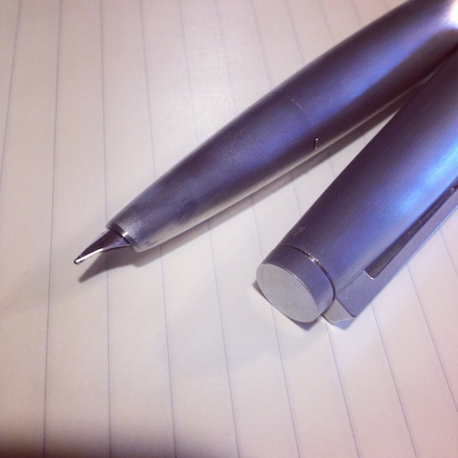
Sailor – Reglus/Industrial Revolution (Medium, Blue) http://farm3.staticflickr.com/2813/11184618253_43910900b8.jpg Specifications: Length (capped): 138mm Length (uncapped) 122mm Length (posted): 153mm Width at grip: 9mm Widest width: 11mm Nib material: Stainless Steel Nib length x width: 20mm x 7mm Introduction Sailor are one of the big three pen manufacturers of Japan along with Pilot and Platinum. Of the three, Sailor is the smallest and the oldest. I'd say Sailor is at the higher end of the price spectrum in comparison, and more willing to experiment with their pens than Platinum is – they are slowly introducing piston filling models in their range, and they have demonstrator versions in much of their range. On the other hand, Pilot has the greater range of interesting filling systems and models in general. The Reglus/Industrial Revolution (The name varies by region, here I will refer to it as the “Reglus”), while not at the very bottom of their range, is a lower-tier Sailor pen with a stainless steel nib. The Reglus itself was my very first Sailor (my next was a Professional Gear Demonstrator), and was purchased because I wanted to see in general how the pen wrote before I plonked down a great deal of cash for a higher end model. I chose it because unlike much of Sailor's relatively samey-samey-looking pens, the Reglus series stood out and wasn't super short - a genuine issue for my large hands, not helped by Sailor's generally stumpy selection. Presentation The Reglus came in Sailor's normal blue box. The box is solid feeling, soft to touch and has a professional-looking grey interior. http://farm6.staticflickr.com/5533/11184619303_a048772a5d.jpg Inside you get a small cartridge converter supplied (unlike some western and Italian pen companies I could name), a tiny multi-language booklet, and two ink catridges. From the smell, definitely Sailor ink. http://farm6.staticflickr.com/5548/11184457505_6792156ff9.jpg Overall it's well presented - I wouldn't have any qualms about giving this pen as a gift – there is no mistaking this for a cheap pen. Appearance Not that I would directly accuse sailor of churning out dozens of boring looking pens, but the strong family resemblance that runs through many of their models is undeniable. The Reglus is a pleasant change and actually, coming from Sailor, I would call it surprisingly modern: http://farm4.staticflickr.com/3806/11184507454_d61970c1a6.jpg The finish is a nice touch. If you've ever seen a car with a faint metallic sheen, then you'll be close to the mark on the finish of this pen. The metallic look is not noticeable unless you look at it directly - it's the sort of thing that Sailor could have just used a plain Jane blue finish on and no one would have cared, but they didn't. It's subtle, and it's nice. There are two immediately noticeable aspects of this pen appearance wise, the cap band and the clip: http://farm4.staticflickr.com/3760/11184457195_0ed9a26e67.jpg The clip is supposed to be reminiscent of a bronze age arrowhead. Personally, I don't think I'd have much success trying to take down a tasty animal with a two-and-a-half-inch blunt arrow, but your mileage may vary. Conversely, I don't know what the cap band is supposed to represent, a cog perhaps? (These are advanced bronze age people we are talking about here). Around the body band (which matches up nicely to the cap band) is the usual “Sailor Since 1911”. I guess you could say it's nicer than a plain cap band, but nothing spectacular. The body end is plain grey, and the cap end has the usual Sailor logo that begins to loose its surrounding black after a few months. Regarding the rest of the range, all models look equally alluring, in fact even the black one with it's dark accents looks great, and I usually dislike black pens (I try to avoid people associating my pen with “The pen my grandpa used to use!”). The only part I don't like is the end of the body, which is unfortunately grey on every model. It's not particularly noticeable on my blue one, but it was a large part of the reason why I chose it over the orange one, where it is definitely noticeable. Aside from that, this is one elegant looking pen. Build quality The build quality is generally good. The cap band and grip band/feed collar are both metal, the plastics are thick with no give when pressed or twisted, and the clip is firm but not difficult to use. There are not enough screw threads on the grip though – after a few times of removing and replacing the cap, the body would slowly begin to unscrew from the grip. I found myself unconsciously re-tightening the pair. While not a big issue yet, be aware that screw on parts get loser over time. The cap is an extremely firm snap on style, and has an inner cup that depresses when you push the cap onto the body - slip and seal anyone? Strangely, the noise the pen produces when closing the cap is astronomically loud. I stopped capping/uncapping my pen when I tried to take it to uni due to the looks of death I was starting to get in the middle of lectures. I guess it's screw-on pens from now on. Like Platinum, Sailor has a special place in its heart for low capacity, cheap plasticky converters (Aside: Why aren't these things wider if they can't be longer? The amount of space left in my Professional Gear and Prera is astonishing). The Reglus is no exception to this. What mystifies me however, is the design of the feed insert: http://farm3.staticflickr.com/2830/11184503056_de005fd164.jpg The feed collar is gigantic, and it obscures the vast majority of the ink window on the converter. The plastic of the converter also gives rise to another issue – unlike Lamy converters, the plastic of the converter wall does not appear to be particularly repellent of liquids. This means that on top of being difficult to ascertain the remaining ink you have, you must hold the pen and wait a few moments for the ink to slowly run down the walls of the converter. Combined with the tiny amount of ink window that pokes up past the feed collar, and having to unscrew the body and grip to check, it's all together annoying. Nib I can't quite explain why, but the feed ribbing that is exposed looks precisely made and just.. impressive. The sides of the nib do not flare out like a normal nib, the exposed section of the feed snugly fits against the sides. Once again difficult to explain, but it contributes to the overall impressively-made look of the nib. http://farm3.staticflickr.com/2878/11184501886_b1de40274a.jpg When I first got the pen out of the box, the nib itself was extraordinarily dry and scratchy (think of the nibs that originally came with the TWSBI Vacs). Upon closer inspection, there was actually a blob of solder stuck between the tines - not an auspicious start. Even after the blob was flossed out however, the nib was generally dry and unsatisfactory. This necessitated a large amount of flossing between the tines with brass shims – and trust me, getting the nib out of the Reglus is not an easy task (Or wasn't on mine at least). Writing with the nib after it was adjusted to be wetter was generally good, but if you're after a taste of what a higher end Sailor can offer you, then I'm afraid you need to look elsewhere. While generally good, the nib is not a patch on my Professional Gear's nib. That's not to say it's a bad nib – the nib never skips of has hard starts, and while not glass smooth, is nonetheless pleasant enough to write with. Like most stainless steel nibs, it's fairly stiff, but its certainly not nail stiff like a Lamy Safari nib. Drag/Writing test Passes: http://farm3.staticflickr.com/2878/11184507304_8fc83d801f.jpg Overall – 3/5 In some ways I'm conflicted about this pen- it's produced by a company that prides itself on its writing experience, looks good while not being too flashy and is solidly made - yet what's the point in placing so much emphasis and detail on your nibs when you're going to let the lower end models run around with anything less than great nibs too? http://farm3.staticflickr.com/2813/11184618253_43910900b8.jpg It's by no stretch of the term a bad pen, but it is difficult to recommend - with a street price of around $90, the Reglus simply isn't competitive against an entry level Pelikan (I may have an inappropriate relationship with my blue M205 demonstrator...) or even a TWSBI Vac. And for a little more, you can pick up Sailor's own Sopporo/1911, which have nibs that leave the Reglus in the dust. But the most important question – will it wake your sleeping dog? Nope: http://farm4.staticflickr.com/3763/11184503226_87f9f637e1.jpg The Good: + Looks modern, something you can't say about many Sailor pens. + Good quality. + After some adjusting, nib is wet and consistent. + Finish looks good. + Comes in a variety of colours and trims (The orange one nearly stole my heart). + Conservative enough for a work environment (As long as you don't annoy people with the cap noise) The Bad: - Nib needed adjustment out of the box, from a company that supposedly has the best nibs going. - Tiny converter, with an ink window that is obscured when inserted into the grip. - Grip may be too narrow for some. - Cap noise may irritate others. The Ugly: - RRP of $140? Puh-lease. I know a $60 pen when I use one. Comparison http://farm3.staticflickr.com/2842/11184618873_9c62315c68.jpg http://farm8.staticflickr.com/7428/11184457865_56e45ae3bc.jpg -
This is a review of the older Parker sonnet 18k medium nib (1994). To begin, I need to say that this pen, even if it is almost 20 years old, works perfectly! I am not the first owner of the pen but I can imagine that this pen is very durable and consistant through the years. The nib and feed unscrews very easily for cleaning which is very gret. One more thing before I begin : IT IS VERY WELL MADE.... I mean, all the parts very precisely fits in place, we can feel a certain quality. The look : To be honest, I really like this pen, it is very classy, very beautiful, although it is simple. The finish is pretty shiny and according to me, the dimensions of this pen are just perfect : does not look too slim, too big, to short etc. The nib : This is my favorite part of this pen. 18 k solid gold nib : quite flexible, sprigny and gives a good feedback. Not scratchy at all as you could expect from a pen like this one. In addition to this, it is beautiful with the small engravings and enough details. VERY pleasant to write with. The ink flow: My Sonnet is pretty wet I would say, not too wet but just how I like a pen to be. The flow keeps up very well. On the other side, there is one thing I really need to mention : when the nib flex, the ink flow, sometimes does not keep up, so it tends to RAILROAD which can be a litte bit disappointing sometimes. Weight and balance : The Sonnet, which weights about 27 g, is perfectly balanced and is very comfortable for long time writing. I personally like to use it posted. You don't have to worry about this aspect of the pen ! Finally, I would recommend this pen for everyone ! In my opinion, it is a very good pen that suits all my daily needs in terms of writing. Then it always depends of how much you pay for it... But if you can get it for cheap ( like me ) get it! I'm not saying that it is a bad thing to buy it at full price (the new version which is a little bit different) but in this category there is a lot of great pens too... But I hope this review will help to make a choice ! Sincerely, FAF ***** Please know that english is not my first lenguage and I am quite new to the fountain pen world... I don't know everything. But I am very open to all yours comments !
-
Hi, This is a quick review of one of my favourite inks: Diamine Delamere Green. I have been using it for several months and I am very happy with it. Delamere Green has a rich, mid to dark green colour, is well saturated and has a good flow. Drying times are not that great (especially if you like using broader nibs), but in practice it is not a major problem. It does not feather much at all (tested on Rhodia and Paperchase). Some bleed-through is visible even on Rhodia (which is generally very FP friendly), but that’s probably because I was using a stub nib and my Parker Duofold is quite wet. Overall, I like this ink a lot — it is well-behaved and looks great. Paper: Rhodia A4 notebook (90g)Pen: Vintage Parker Duofold 1.1mm stub nibWriting sample: J. K. Jerome: Three men in a boatWater test: drops left on the paper for 30 secsHigh res photos are available on my blog: verticalpaper.net
-
I saw a swab of Diamine Twilight on Goulet Pens website and I really liked the colour and decided to order it straightaway. Twilight is an amazing ink. It is i one of those that live up or even exceed your expectations. It's not the most well behaved ink in the world. But is has a very deep, noble grey-blue colour which makes is really nice to read and it also looks very elegant. I can see myself using it in almost any situation. With a broad nib, the colour comes across even more clearly. And, if you look closely, there is also a small amount of shading. I said it was not perfect, so here's what you need to expect: There is some feathering (even on Rhodia), but not to a degree that would bother me. You can also encounter bleed-through, but only with some broad and very wet nibs. For example, I had no problems with Lamy Vista 1.1 italic. On the positive note, compared to some other Diamine inks it dries quite quickly and while it is definitely not water resistant, it remains legible even after short water exposure and that's always nice. Diamine Twilight has become one of my favourite inks for daily use. And even though it is not perfect, I like the colour so much that I am prepared to forgive some of the shortcomings. You should give it a go too! ;-) Bigger pics are here available on my blog or my Flickr page.Paper: Rhodia A4 notebook (90 gsm)Pen: Vintage Parker Duofold 1.1mm stub nibWriting sample: J. K. Jerome: Three men in a boatWater test: drops left on the paper for 1 minute http://farm4.staticflickr.com/3814/9485796417_96f2989168_c_d.jpg http://farm4.staticflickr.com/3825/9485803005_e1f0e2af69_b.jpg http://farm6.staticflickr.com/5516/9485808243_eb6151ed94_b.jpg http://farm8.staticflickr.com/7285/9488612204_32179e86e3_b.jpg http://farm8.staticflickr.com/7421/9485821845_e5e571b055_b.jpg http://farm3.staticflickr.com/2853/9485753457_3269b46d0f_b.jpg
-

Midori Traveler's Notebook Review; Version 0.1
johnmetta posted a topic in Paper and Pen Paraphernalia
In the software world, we often designate version numbers starting with zero to mean "this is still beta, a work in progress, and not ready for release." This is a beta review. Today, I got my Midori Traveler's Notebook (MTN, Large size) refill #013– the ultra thin paper version. Why just a refill? I wasn't sure if the form factor of the Midori would work for me, because of all the comments of the narrowness, and because I couldn't really tell how wide it actually was from the plethora of pictures and videos available. So, to check things out, I bought a refill to try. The first thing I said to myself: "This will fit in my sport coat pocket!" (That made me happier than you realize) The second thing I said was: "But ewww, that's an even weirder shape than I thought!" So, I sat to write a few things in it, wondering if it was going to work. Very quickly, I realized something important: The Midori shape encourages self-honesty, realism, and discipline. I've been carrying around my Quo Vadis Habana as a "general notebook." It is blank, and used for more free-form note taking, jotting ideas, trying to remember phrases, etc. I'm used to a certain flow, a certain "space" (both literal and figurative) to jot ideas. The Habana is nearly twice as wide as this MTN– in the MTN, that space is, well, not there. It's tight. It's narrow. It's a very short walk to the edge of the page! How is it possible for someone to really use this. But then I look back at my Habana and realize that most of that "space" is just that: space. It's empty. I jot down notes in a way that I use maybe half of the space on each page. I scribble notes, but then rather than use the empty space on the page to fill things in, I go to a new page, because there's too much conceptual overlap otherwise. Things get lost and jumbled together like toys in my twins' nursery and you can never find what you're loo– DAMMIT! WHERE IS BUSY BEE?!?! So my Habana is a wide notebook with a hell of a lot of wasted paper in it. This makes me think that my use of the MTN should be approached from a different philosophical perspective. It seems to me that this notebook would be nearly useless if I continued to take notes in a scribble way, because there's no room. However, it also seems likely that I take notes that way because there is so much room. In software, we say that some languages encourage better programming because they make it easier to do things well than to do them poorly. This is the same thing I can see happening with the MTN. It seems as though the MTN will encourage denser note taking because of its narrowness. It doesn't provide me with a ton of room to be sloppy– room that I don't need and don't use anyway– so I'll either be denser and more organized, or not use this notebook. From a philosophical point of view, I love this. Okay, Midori, be my school mistress and beat me into an organized submission with the ruler of your narrowness. So, I'm socking away money right now so I can get a cover and some accessories for a MTN. I hope, and really believe, that this will probably replace two, if not three, of my current large notebooks, and simultaneously force me to be a wee bit more organized. When I get them and give them a spin, I'll do a release version of this review.
-

Docket Diamond Premium Writing Tablet
fncll posted a topic in Paper & Pen Paraphernalia Reviews and Articles
http://farm6.staticflickr.com/5536/9970635215_2283e03917_n.jpg Docket Diamond Fine Writing Tablet (box) by ChrisL_AK, on Flickr [As always, comments and suggestions for improvement are WELCOMED! Also blogged on inkProne] Verdict Buy it! The Docket Diamond Premium Writing Tablet handled every pen and ink I threw at it with basically no feathering or show/bleed-through. I'm pretty sure there isn't a legal-pad style tablet out there that comes close to it. If you have a need for a pad for a clipboard or similar application, this is practically paper porn. But that's not doing this paper justice: it's competitive with the best paper out there. The feel is substantial and the laid finish is a real laid finish, not the faux laid you'll see on some cheaper papers...enough, in fact, that your xxx-fine and sharp-as-a-razor italics might dig in a bit. Think G. Lalo Verge de France style finish and then add a bit more texture. I own a lot of paper. And I mean a lot: at least 80 varieties (in hundreds of different packs, tablets, pads and notebooks) from vintage onionskin and typewriter paper to all of the top fountain-pen lovers' favorites, and I keep coming back to this paper... Features 24lb; laid finish; ivory; watermarked50 micro-perforated sheets; 10mm (legal) rule (one side only)8.5 x 11.7 in. ; 8.5 x 10.75 in. finished sizeRigid backboard with blue marble headtape Performance (Scale 0-5, 0=none 5=like a mofo) Feathering: 1Show-through: 0Bleed-through: 0 (obviously, unless you use invisible ink)Dry Time: 1 As you can see, it even survived my patented KiSS---knife, swab, scribble---test with no show-through or bleeding. Cost Comparison Ampad Gold Fibre Retro Legal Pads: $31.50/600 sheets = .05/sheetAmpad Gold Fibre Retro Pad: $7.50/70 sheets = .11/sheetClairefontaine Wirebound Pad: $12/80 sheets = .15/sheetClairefontaine Triomphe Pads: $9/50 sheets = .18/sheetKokuyo Campus Loose Leaf Shikkari: $9/50 sheets = .18/sheetRhodia Premium Notepad: $13/70 sheets = .19/sheetDocket Diamond Premium Writing Tablet: $19/100 sheets = .19/sheet The Docket Diamond tablets really are premium tablets and they cost accordingly, though not particularly expensive compared to their real peers. Keep in mind that none of the competing tablets listed here have the laid finish or are watermarked...and most don't have an ivory-color option. The closest paper I know of is Southworth Antique Laid Business paper, which is only .06 sheet, but it comes in loose sheets and isn't lined. Similarly, G. Lalo Verge de France is similar, but better, except it also isn't lined and weighs in at a hefty .32 per sheet! Other Reviews, Threads, etc. Brief Review of the planning pad version (same paper)Paul Theroux likes it!Diamine Merlot on Docket Diamond? Why yes!Scans http://farm6.staticflickr.com/5473/9970630415_d4cd550d03.jpg Docket Diamond Fine Writing Tablet (writing sample) by ChrisL_AK, on Flickr http://farm4.staticflickr.com/3799/9970699046_5212750fe5.jpg Docket Diamond Fine Writing Tablet (writing sample, reverse) by ChrisL_AK, on Flickr http://farm8.staticflickr.com/7388/9970758543_cb6535db38.jpg Docket Diamond Fine Writing Tablet (KiSS test)) by ChrisL_AK, on Flickr http://farm6.staticflickr.com/5546/9970624125_506bc4fc4e.jpg Docket Diamond Fine Writing Tablet (KiSS test, reverse) by ChrisL_AK, on Flickr -
http://kaffehauz.com/wp-content/uploads/2013/03/pen.png The Pelikan M1000 is the largest fountain pen in Souveran range. It is a distinguished signature pen which features a flexible 18 carat gold nib with rhodium decoration. The M1000 has a brass internal mechanism, 24 carat gold plated trim on the Pelikan clip and rings. This model is Pelikan's signature Green striations with black cap and filler knob - the Black stripes are actually transparent, so when the pen is held up to light, you can see the level of remaining ink. Also, you can just about see the mechanism moving through the stripes when you turn the filler knob. Weight - 33g Length (closed) - 14.5cm Length (cap posted) - 17.7cm Holds 2.0ml of ink (a standard short cartridge holds 0.75ml and a standard large cartridge holds 1.45ml) Guillaume’s Review How do you go about reviewing a top-of-the-line pen like the Pelikan M1000? This is the top (well, maybe not the very top but close enough anyway) and so, what?, are you going to be disappointed? Will you relish the job of finding faults with the thing? My M1000 came after a long saga involving countless email messages over 4, no 5, continents. It was meant as a present for my 40th birthday, a gift of the best fountain pen my wife could find (we discovered a shared lack of interest in the Mont Blanc company), and damn the consequences. Even my parents, not the wealthiest folks you’ll meet, decided to contribute to make it all happen. My job was to find an M1000 at a price that would still make it possible for us to send our children to university some day. I played the Malaysian roulette for a while; very nice people, no M1000 to be had in the striped green version. I then looked into North American options; how can anyone afford anything in Canada? And finally ended up in Old Blighty, where a decent price and a smiley email service made it a reality. After a few other juggling acts involving friends travelling to Canada and back for Christmas…the M1000 was mine. So, what do I make of it? It feels like the top. It’s big, it’s loud, and you wonder if your hand is large enough to hold it, and if what you’re going to write with it will be worthy enough of the thing. Somehow I feel it’s going to criticize me if all I do is doodle on cheap paper. Like a friend of mine would say, this thing is made to sign international agreements, not take notes during a staff meeting. He calls it my MOU Pen. First things first. It comes in a nice enough cardboard box, wrapped in a small vinyl pouch. It’s all a bit tacky, especially the white vinyl pouch (white?) and you’d think that, for the price, they could put the pen in a decent box (the Chinese will sell $19,99 pens on eBay that come in a large wooden box actually worth more than the pen inside). Anyway, this is not the point. The point is the pen. Listen, I like my fountain pens to be straightforward. I like basic marbled celluloid or solid colours. I don’t buy pens with Kabuki figures etched on them or a reproduction of Churchill’s signature in gold appliqué. So, to me, the M1000 in striped green is absolutely perfect. It’s the same damn look the pen had 200 years ago and that’s exactly what I want. The celluloid is smooth like butter on a picnic table on a sunny day and the finishing job is Teutonically perfect. The nib is the two-tone steel and gold, which I find nicer looking than the gold-filled one. The cap has a nice Pelikan logo at its end. The pen holds well in the hand although, it must be said, someone with longer fingers than mine would probably enjoy it even more. I can’t believe that anyone would seriously want to use this pen posted since you get dangerously close to one foot of writing gear in your hand if you put the cap at the end of the body. It’s like writing with a plastic tent peg. But now…how does it write? Well, for one thing it’s a flex nib. Not a wet noodle but flex it is. I’m too much of a dilettante to truly appreciate the power of the flex but it sure is an experience in itself. Not knowing what I was getting myself into, I bought a medium size nib. Friends, medium for flex is like broad, XB even, for your regular hard-nibbed Lamy. And when your nib is about an inch long, that’s even broader stroke flex action for your writing pleasure. I was reading something on the net today where they were warning potential M1000 buyers that “most people prefer a fine-size nib given the flex nature of the nib”. Actually, the nib is excellent. Ink flow is superb, not a scratch will ever trouble your peace of mind as you are drafting your next MOU and, well, the pen is a foot long, what would you expect? XF? Chicken scratches, 500 words to a page? This is the M1000, for the love of God. The filling mechanism is the Pelikan trusted-and-loved pump action. I like the fact that you only unscrew the end of the body a bit and the piston inside goes all the way up. All inks I’ve tried have worked like a charm. Of course, with that much liquid squirting out on the paper, you’re bound to have some amount of feathering. Ink that takes ages to dry will obviously not improve after a ride in the M1000. Get a blotter. Altogether, the M1000 does exactly what it is supposed to do. It announces to the world that you wanted the top and someone loved you enough to give it to you. It pushes the other pens on the sidelines, turning your previous favourites into a bit of a disappointment: they’re too small, write too thinly, are just tepid. It’s like getting off the Harley and riding on the 125cc again. It was such a great little bike but now it’s so…pathetic. I wish I could say that, with the M1000, I’ve reached the end of my fountain pen obsession. It’s got everything and more. Nothing can top that. Nothing. And yet… Originally published at: http://kaffehauz.com/?p=205
-
http://seeorpostreview.host22.com/parkervectorctstandardfountainpen.html This pen is only available in India as far as I think, do look at my review on the above link. Also an option to buy....
-
Platinum Sheep, M nib (14 K gold). http://farm8.staticflickr.com/7379/9760961205_617343ecce_c.jpg http://farm4.staticflickr.com/3786/9760751041_e5cffdee5a_c.jpg http://farm4.staticflickr.com/3782/9760962734_974876e2a2_c.jpg http://farm4.staticflickr.com/3718/9761041803_38c9c839fc_c.jpg http://farm6.staticflickr.com/5488/9760971715_c454994d21_c.jpg http://farm6.staticflickr.com/5535/9760968916_dd16d575f5_c.jpg http://farm8.staticflickr.com/7329/9760970934_50c207225c_c.jpg http://farm4.staticflickr.com/3665/9724096681_d69ce0e3be_c.jpg
-
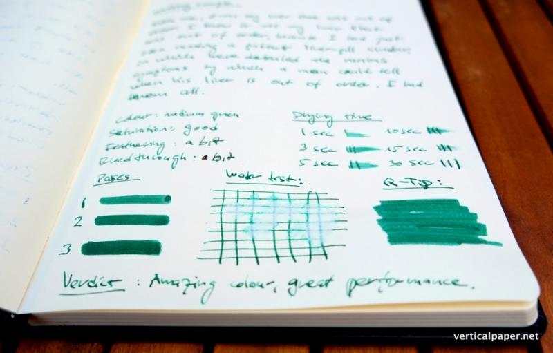
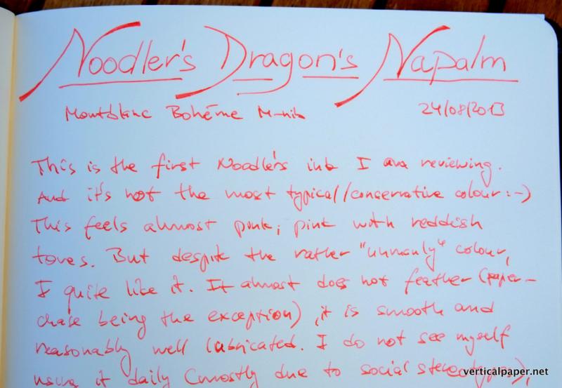
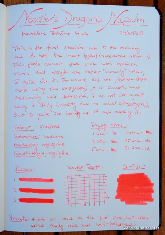
This is the first ever Noodler’s ink I tried. I got a sample as a part of Goulet Pen’s Ink Drop. It is hardly the most mainstream colour, but it turns out it is not as unusual as it seemed to me when I was making the hand-written notes below. When I was writing the notes, I used an artificial lighting and as I later found out the ink appears quite different on daylight. Under a typical incandescent or even fluorescent light, Dragon’s Napalm it appears almost pinkish. However, in daylight its colour is much closer to, in my opinion somewhat more universally usable, peach or light orange. Dragon’s Napalm behaved well in my tests. There was almost no feathering at all and only a very small amount of bleed-through. The ink even shows some shading as can be seen from the high res pics. It’s rather unlikely I would use this ink on a daily basis as I find the colour to be a rather too bright and, as mentioned above, ‘too pink’ under artificial lighting. But in terms of key characteristics, reliability and ease of use there is very little to complain about. Plus, I really love the name! Paper: Rhodia A4 notebook (90 gsm), tested also on 80 gsm Rhodia, Paperchase and MoleskinePen: Montblanc Boheme M nibWater test: drops left on the paper for 1 minuteHigh res images are available on Flickr or on my blog.
-
Knowing that there are many other reviews about first impressions, and tests in depth, I would like to add my general ideas after using this pen regularly for the last 6 months... I will not go into design, box, looks, etc. I liked them, obviously; otherwise I would not have bought it. I just focus on how it performs as what it is: a writing instrument. The excellent. (As in top of the class). Most intriguing feature that outperforms my expectations, is the material. That lava thingy. It is in feel and durability like a basaltic rock, yet very light. http://s21.postimg.org/autra6h47/2013_07_27_11_43_55.jpg Here you find the pen along a rock for massages. Not only the color is similar, the texture also is. Why does it matter? Because I have found it un-chippable, unscratchable, un-crackable. It can fall to the floor, and it will not show even a point. You can wear it in the jeans' back pocket and even if you sit on it, it will not bend or crack. I can't praise enough the engineers who came up with this material and I am actually finding myself thinking of many other uses for a material with these qualities. A subjective point would be the need of a bulletproof pen, but for a careless person such as me, it is reassuring to know that I don't need to think too much about its physical care... Second extraordinary thing: Its nib. http://s7.postimg.org/i397r8kej/nib.jpg The point it is not if it's buttery, smooth,, flexy or whatnot. The pen comes with a lame phrase like "don't push, the nib will follow your dreams" or something like that... Well. It's true. From all the pens I have used in my life, this one is the most adaptable to any paper. Even papers that other nibs can't perform, like slightly waxed paper, this one can (with the right ink). The nib doesn't care is the paper is super-rough, if it is absorbent, or if it is glossy. It will write there, evenly and without any hiccups. Just for curiosity, I bought it with an F nib, which is not as thin as others, but not a full medium. Both previous qualities makes the pen an amazing powerhorse. This is a pen you can take mountain climbing and writing the memories of it in a paper napkin at the top. Average qualities The closing mechanism Very praised, the HS comes with a short screwing thanks to a greca pattern. It allows to be unscrewed and screwed fast with one hand. Although it is commendable the innovation, I personally don't find it neither safer nor more convenient as a good "click" mechanism, and it actually comes with a prize, that I will comment later. The clip Another idea of visconti, it is an arc with a mechanism that allows to fix the pen to most things. But because it has no hook under the clip, it makes it super-easy to be stolen. Yes, it fastens on the cloth, but as easy is to take it out, that I can't allow myself to take it so reachable to others. Not such an important thing, but if your idea does not actually improve the existing designs, keep it simple. The lacking (As in "I've seen better") Writing comfort The greca pattern of the locking mechanism is in the way for the middle finger. It does not make it uncomfortable, but it is noticeable in long writing sessions. It will not http://s22.postimg.org/a1lqvc329/23_Kt_PALLADIUM_Nib800_close.jpg break your finger or mark you, but many other pens outperform this one in finger comfort when writing a lot. I have to hold it differently and rest the pen by the brass ring, which, again, is not perfectly comfortable. The ink management The pen uses a vaccuum filling mechanism, and that is all good and dandy. But be aware that you fill this pen blindly. You have no idea how much ink did you put in, and after a couple of days, how much is left. So to be safe you should empty and refill before any important writing day, such as an exam or a weekend trip. Once again, it's not so bad, but indeed improveable. The veredict Would I buy this pen again? Absolutely yes. Disregard the design and other secondary things. With its resiliance and all-terrain nib, this is a commando of a pen which is asking for action, take it out of the house, whatever you are dressing, and use it and use it. I would recommend it to... Anyone with experience and adaptability to finger positions in writing, and who are comfortable about filling it more often than needed. For those who disregard silky care of the pen, this is The One. It's as hard as you. I would not recommend it to... Students, who need to take notes for many hours and use a lot of ink in one session. I would also be concerned about people starting using FP with this one, because they would probably hold it too down, to avoid the pattern, and write with the fingers, not the arm.