Search the Community
Showing results for tags 'review'.
-

Birmingham Cathedral Of Learning Panther Blue - Compact Review
Jan2016 posted a topic in Ink Reviews
-
Very difficult color to "catch", scanner didn't succeed so it is a picture...
-
-
Been looking at getting a vintage Soviet pen for a bit. I finally found one I really liked the look of. Here is my review. Feel free to ask me any questions.
-

Review Of The Pilot Decimo - Fountain-Pens As Souvenirs?
stationeryblogger posted a topic in Fountain Pen Reviews
http://stationeryblogger.com/wp-content/uploads/2018/02/DSC_8042-768x512.jpg Note that this review was originally posted at my blog at www.stationeryblogger.com. During the summer of 2016 I went on a trip to Japan. Prior to setting of to my destination I was aware about the rich tradition the country had on stationery and in particular fountain-pens. I had therefore planned to start a new tradition of my own where I would purchase a locally produced writing instrument as a souvenir to mark my travels starting in Japan. I was not certain about which pen to choose but I was always attracted to the utility of a retractable nib pen. Even though initially the Pilot Vanishing Point did not catch my eye in terms of beauty, it slowly grew on me. It thus became my pen of choice when I finally visited the iconic Itoya stationery shop in Ginza, Tokyo. SIZE AND DESIGN The pen I purchased was the Pilot Vanishing Point (Capless in Japan) Decimo in the blue trim with silver furniture. Compared to the normal VP, the Decimo is slightly thinner and lighter. Naturally the clip is also thinner making it easy to grip and I have found to often use it as a marker in order to grip the pen consistently comfortably without looking. Another visual difference to the larger brother is that the two metal rings that connect the two sections of the barrel for refilling are not the same size. The one towards the nib is slightly smaller than the one on the back. While this is not a deal-breaker for me, I would have preferred for the rings to have been more proportionally sized as it does stand out a bit. The overall size is comfortable to use even though I would not mind the slightly heavier feeling of the classic. http://stationeryblogger.com/wp-content/uploads/2018/02/DSC_8040-768x512.jpg NIB One of the biggest selling points of the pen in my opinion is the nib. It is an 18K gold nib and writes like a dream. I chose the medium size which does write thinner than a European medium but its wonderfully calibrated wetness makes it the perfect daily writer size. Thankfully, if I wish to keep my current nib, if I purchase the larger size, the two sections are interchangeable. The nib is slightly soft however and taking into account its small footprint I feel that I have to treat it with a lot of care when I write to not spring the tines or damage it in any other way. Maybe this is just in my head but it keeps me from fully engaging with this pen as the daily workhorse it is designed to be. http://stationeryblogger.com/wp-content/uploads/2018/02/DSC_8035-768x512.jpg FILLING SYSTEM The decimo is a cartridge-converter pen. While it does not come with a converter in the box, I was able to easily purchase a CON-40 in a local stationary shop while in Japan. The converter however in my opinion is mediocre at best. It holds a tiny amount of ink and I find it extremely difficult to get a full fill as the piston stops almost an entire centimetre shy of the actual opening point. That one centimetre is a substantial amount of ink considering the small capacity and size of the converter. While I do sometimes try to flip the nib section upside-down to release the air and get a larger fill, it is far too messy and time consuming so I mostly stick to cartridges. Thankfully, the ink selection of the Pilot proprietary cartridges is good in terms of variety and quality but I do prefer using bottled ink. http://stationeryblogger.com/wp-content/uploads/2018/02/DSC_8046-768x512.jpg WRITING SAMPLE http://stationeryblogger.com/wp-content/uploads/2018/02/DSC_8048-768x768.jpg FINAL THOUGHTS While the pen does suffer from some negatives I think that the one-handed ease of use of the buttery smooth retractable nib make this pen an excellent purchase. For me, thanks to my new-born tradition, every time I write with the pen I day-dream about my trip to Japan making this pen have a special place in my heart. Note that this review was originally posted at my blog at www.stationeryblogger.com. http://stationeryblogger.com/wp-content/uploads/2018/02/DSC_5590-768x512.jpg ADDITIONAL RESOURCES Items mentioned*: Pen: Pilot Fountain Pen Capless DecimoInk: Pilot Namiki BluePaper: Rhodia Orange Dot PadConverter: Pilot CON-40 Photography equipment: Camera: Nikon D3300Lens: Nikon AF-S DX NIKKOR 18-55mm Other blogs about this topic: Other blogs about this topic: Goulet Pens Blog Decimo Review The Pen Addict Decimo Review The Well Appointed Desk Decimo Review -
Lamy 2000 Review - Excellent Customer Service
stationeryblogger posted a topic in Fountain Pen Reviews
The Lamy 2000 is probably my favourite pen of all time. I know, it is a big statement but my admiration for this pen is well founded. I first purchased this pen back in 2014 when I began my first year studying law at university. I can honestly say that since then it has been almost everyday on me, taking notes and writing exams. Note that this review was originally posted at my blog at www.stationeryblogger.com. http://stationeryblogger.com/wp-content/uploads/2018/02/DSC_7839-300x200.jpg DESIGN The pen looks and feels phenomenal. Its bauhaus inspired design makes it easy to look at with no extra bling. This makes it the perfect everyday pen when you do not want the entire room thinking you are trying to make a statement with your choice of writing instrument. In addition, the texture of the fibreglass-infused plastic gives a textured feel. Perfect for those with sleek hands constantly suffering from sticky-pen syndrome. The attention to detail and excellence of craftsmanship is evident from the fact that the brushed microscopic lines transition perfectly between the piston-knob and hand-section seams. http://stationeryblogger.com/wp-content/uploads/2018/02/DSC_7992-300x200.jpg SIZE Another great win for the pen is its size, measuring at 140mm caped. What is particularly outstanding however, is its centre of balance when posted. You can literally find the middle of the pen by simply balancing it on the tip of your finger. This is because the cap fits really deeply into the back of the barrel. That means that it will not only post securely but it will not stick out too much when writing. Moreover, the hand-section extends to cover a fair amount of the nib meaning that there are literally unlimited ways to hold the pen ensuring a comfortable grip. NIB The nib is fantastic to write with. I currently have the medium size but I have tried both the extra-fine and fine. They are all smooth, wet and always perform upon demand. I have had some issues in the past which I will go into more detail in the section below but I am more than happy overall. http://stationeryblogger.com/wp-content/uploads/2018/02/DSC_7994-300x200.jpg CUSTOMER SERVICE One of the biggest selling points however is the customer service of Lamy. A few years ago, after owning the pen for a few years, for some reason the extra-fine nib that I had started writing very dry. I had no idea why but I contacted Lamy with my problem and they immediately requested that I send the pen back for repair free of charge. A few weeks later, they had fixed the problem and also replaced my cap as the clip had become a bit wobbly. Moreover, a year ago, after owning the pen for three years, I emailed them asking whether they sold replacement nibs as I had outgrown my extra-fine size and wanted to change to a medium. They offered to replace it for free. I believe that this is how customer service should be and more companies should be striving towards such a high standard. OVERALL I believe that the Lamy 2000 is one of the best choices for a fountain pen out there. Whether you are a student or a seasoned professional the iconic look of the pen and quality are bound to make you smile every time you pick it up. As for negatives, I am struggling to think of any. Maybe if you like your fountain pens to be glossy and blingy you would not like this pen but it would be hard to argue it does not deserve a spot in everyone’s collection. http://stationeryblogger.com/wp-content/uploads/2018/02/DSC_7988-300x200.jpg You can read my other reviews, modifications and hacks at www.stationeryblogger.com -
-
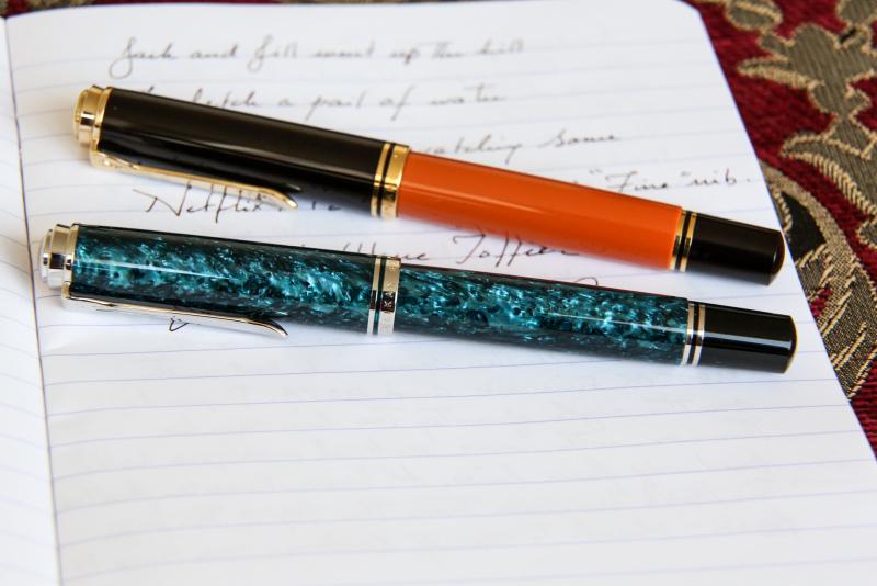
The M805 Ocean Swirl is a stunning yet controversial 2017 Special Edition from Pelikan. While my initial view was ambivalent, in actual use, the pen has moved into the same vaunted category as the understated, equally variable, City Series San Francisco. I was fortunate enough to see seven copies among the local DC/MD stores and two additional copies from Pen friends; 9 in total. Particular thanks goes to Pen Boutique for helping me land mine. Pattern and Color Distribution: Some posts seem to hint that some pen copies may have "nearly" 100% blue-green and others verging on total black. Not what I saw and may be due to range in perception. All 9 copies had clear bands of fluorescent blue-green swirls alternating with darker bands of shimmering deep blue-black occurring in approximate quarters as a constant. None of them were nearly one color, and certainly not pitch black (see a true black pen comparison side-by-side below). Granted, as a matter of degree, two copies leaned toward the darker side a tad more, but most were ~50/50 distribution, or close. The fluorescent bands are striking when light hits them and depending on the warmth there is a bit of green peaking through, but to me its a blue-leaning teal or brilliant turquoise in most instances (Yama Dori calls!). Pattern Alignment: Much has been made of the alignment or the lack there of between the fluorescent and darker bands in some copies. This is true. Not all the pens had aligned-patterns, but most seemed to have at least one vibrant band that aligned upon choosing the right cap-thread. I am sure there are some cap/body combos out there that do not align at all, along any thread. If this is important, seeing pens in person, or getting pics may help, but unaligned patterns look quite nice to my eye when in actual use. My copy does align, but when misaligned purposefully, the darker cap still looks elegant to me (pic below). YMMV. Work-appropriateness: almost black, but not quite My Ocean swirl saw more use simply because it was not a pen that immediately attracted attention, but still had a subdued elegance about it. In conservative settings, pulling out even a marginally showy pen, may go without comment but not without notice. This pen is work appropriate. In comparison, the Burnt Orange frequently invites comment (lovely nonetheless). Dr Jekyll and Mr Hyde Two's Company: Here's the Ocean Swirl next to the somewhat showy Burnt Orange Nib: I chose a Fine nib. Luckily, it turned out to be a true fine, not "Pelikan- Fine". My take on it: The color pattern is truly beautiful and unique. The pattern alignment issue can't be helped unless there is a way to nail down each body to a specific cap all the way through the supply chain and retail counters: fairly a tall order once it leaves the Pelikan factory given the number of hands that may handle them. Also when misaligned, the black cap contrast actually looks ok to me in actual use, YMMV. There are scores of pens out there that cover the whole pen with a single mosaic pattern from countless manufacturers including Pelikan (M620 Chicago anyone?). What's novel in that? This is more of a brave choice from Pelikan that is fairly subtle and renders a different look from one lighted room to another. Yet I doubt they will ever try this again. Cheers!

-
Hello again to all my FPN friends, Here is just a quick write up I did of my impressions on this lovely pen that I've been enjoying for the past few weeks. I found out about it from the hot tips here: https://www.fountainpennetwork.com/forum/topic/295491-chinese-pens-show-and-tell/page-50?do=findComment&comment=3957350 and here: https://www.fountainpennetwork.com/forum/topic/304037-hero-haifu-186-any-one-might-tell-me-how-is-the-pen/?hl=huafu&do=findComment&comment=3565597 Dimensions: - Capped = 137mm - Capless = 122mm - Posted = 152mm - Weight = 23g Photos From the Taobao seller I purchased mine from: [https://item.taobao.com/item.htm?spm=a1z09.2.0.0.3d59f006LXXAbr&id=549487132934&_u=52lkvpjhfc75] Review:
-
I purchased another of the new models introduced by the resuscitated Wing Sung brand. The 3003 type in a nutshell: Pilot-like nib, converter filling, slip-on cap, ridiculous price. I wrote in my previous review that the new models of Wing Sung are pretty impressive. This one is not so much. Appearance and Design Do not expect any revolution in this department. Wing Sung 3003 is a commonly designed flat-top pen without any extravagant features. There are various versions available - transparent ones with coloured finials and opaque ones in crazy highlighter-like colours. Construction and quality Fair. I purchased the transparent version which reveals various imperfections. But frankly speaking there is not much to reveal. I did not notice imperfections or problems worth noting. Regarding the price (about 1 USD), I bought a very nice product. Weight and Dimensions Wing Sung 3003 is a smaller pen. This applies especially to its length, the girth is average and very comfortable to hold at least for my hands which are a bit on the smaller side. Here you can see some comparison, left to right: Jinhao 992 (which has very similar dimensions and very different nib), Wing Sung 3003 a Pilot 78G (with the same nib): It is clear that there is not much difference in lengths. The Pilot is markedly slimmer than both Chinese pens, especially its section. Both Chinese pens are more comfortable to hold for me than the slim Pilot 78G. Dimensions: Capped: 135 mm Uncapped: 120 mm Posted: 152 mm. Weight: Capped: 18 g Uncapped: 10 g Cap: 8 g The cap can be posted securely but its weight is comparable to the pen so posting changes balance significantly. Nib and performance The only nib available is EF. I did not try it but the nib should be interchangeable with the Pilot 78G and some more Pilot pens. Here you can see a comparison with the original Pilot 78G M nib (right), Lamy EF nib (top), and Jinhao 992 nib (left) which is declared to be F but behaves more like M: The nib was a bit misaligned which is visible in this photo: When I tried to fix this, I realized that the nib material is very soft and easy to bend. After some tweaking, I was able to align the nib which decreased the nib feedback. I am afraid that the nib will be unstable due to the softness of its material and will require re-aligning. The writing experience is OK. When aligned, its smoothness is on the average of my EF nibs. The same can be said regarding the line width. As you can see in the photo, it is a bit thinner than Wing Sung 6359 EF and a bit thicker than Lamy EF. Jinhao 992 F is much wider (but the writing is very smooth). I wrote several pages and did not experience any remarkable problems. No hard starts, no drying, the ink flow is fair and stable. I have no complaints regarding its behaviour. Filling system and maintenance It is a converter-filled pen. The converter was included and it seems to be quite specific. On first glance, it looks similar to the Pilot CON-50. But the lip has a much smaller diameter so the converter is not compatible with Pilot pens. Cost and Value The prices start around 1 USD. Do I need to write more? Conclusion This is not a pen which beauty stuns you. It works well and its price is really low. It may serve as a workhorse for people loving the finer lines. And if you lose or break it, it is easy to replace. The most important weak point is the nib. I have a bad feeling from its soft material and I expect that it will require some care when used. I am thinking about mounting the original Pilot nib to this pen. I like the design much more than the Pilot 78G and swapping the nib would remove the main weakness of 3003.
-
-
-
-
-
-
The name means 'colour of mysterious beauty'; the beautiful, subtle light-green colour resembles the delicate colour of Celadon pottery.
-
A red-purple with some black sheen if there is a LOT of ink. The name means 'colour of red beans', and refers to the tradition of using red beans and rice as an essential part of Japanese religious ceremonies.
-
-
-
-
-
-
-
-