Search the Community
Showing results for tags 'review'.
-
the main review is below. This is an Indian notebook called ITC classmate which is dirt cheap and exceptionally fountain pen friendly - doesn't feather or spread with the worst offenders (in my case, Noodler's 54th Mass for spreading, Noodler's forest green for feathering); dry time is quick but inks retain their vibrancy and shade nicely. Only strikes against it is that it doesn't particularly help with sheen and its not bright-white (there's a slight red tinge to the pages). Anyway, enough about the paper. This review was written with a PenBBS 480 with a Mini fude F nib. Really its more like an M. Writes wetter than normal. Note: the color balance is off in the top 5th of the page - probably due to paper not being totally flat. The ink in that area looks murkier than in real life. Here are some comparisions to other browns (Kiowa Pecan is similar, Yama Guri, not really). Also how the inks looks on blobs, swatches, smudges and dry times. Overall thoughts: It is a very nice brown, rich color with shading variations and possibilities of sheen (and a nice ink even without the sheen); with good flow, quick-ish dry times and no major drawback as far as I can see, except the tendency to stain clear plastic (though not sure if it was just that one cartridge converter). Will be receiving some Clairefontaine and Tomoe River shortly (I am out of stock now and all but essentially deliveries are closed due to C-Virus). Will check on sheening then. The pooled ink drop shows some green sheen around the rim of the darker area.
-
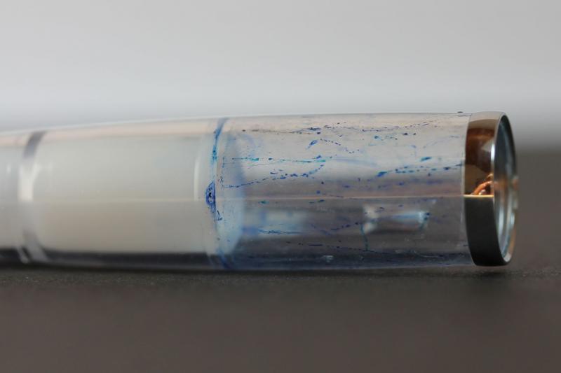
THE PINEIDER AVATAR- AMBER DEMONSTRATOR A review of the Pineider Avatar UltraResin (“UR”) amber demonstrator HISTORY In 2016, Dante del Vecchio ended 30 years of association with Visconti to join Pineider, a venerable Florentine stationery manufacturer whose history stretches back to 1774. In an interesting and candid interview, http://blog.giardino.it/2018/08/the-renaissance-of-pineider-with-dante-del-vecchio/ Del Vecchio explains that, at the time of his decision to leave Visconti, there were plans for Pineider to have pens produced for them by Visconti: when his decision to move became known, Pineider offered him an opportunity to join them and, as the saying goes, the rest is history. Four years on, Pineider pens designed by Dante del Vecchio have been a major international success comparable to the arrival of Leonardo Officina Italiana and their “Momento Zero” fountain pens. With his legendary flair for design, del Vecchio has produced a series of beautiful fountain pens including the “Avatar” line. I had the good fortune to be one a “city break” in Rome to escape the rain and gloom of London at the end of February and happened to spot the Pineider shop near the Spanish Steps at 68 Via dei due Marcelli while shopping with my wife. FPN readers will be familiar with the next sequence of events: a long look through the shop window, the spotting of the fine writing instruments section, the “negotiations” with the spouse with the assurance that this is “just to have a look” and finally the stepping into the emporium… Like a bee to a flower, I went straight to the display of the new Pineider Avatars where the gorgeous Amber demonstrator was on display. In the interest of complete disclosure, I had already marked it as a “target” on previous internet searches… I already own the earlier Avatar in the “lipstick red” colour, which I have used with great enjoyment this past year but the Amber demonstrator is different: I have a particular love for demonstrators which clearly indicate the remaining level of ink and the working mechanism of the pen. (For a fine review of the Avatar lipstick red, I would recommend https://rupertarzeian.com/2018/05/19/pineider-avatar-fountain-pen-review/) Sparing you readers the details, a few moments later I was the happy owner of the new Pineider Amber Avatar UR demonstrator with a medium nib… Overall, I am delighted with it and the pen will accompany my Leuchturm 1917 notebook, tucked in the pocket these wonderful notebooks provide at the back. In terms of writing experience and design it is a very good pen and excellent value at €160. Nevertheless, there are a couple of negative points which prevent me from awarding it “5 Stars”. I would recommend it as a daily writer and jotter but Pineider should address a number of issues in its presentation and design which I will discuss in this review. CONSTRUCTION Information on the construction of this new line of Pineider Avatars can be found on their website at: https://www.pineider.com/en/fountain-pens/1253-avatar-ur-fountain-pen-steel-nib.html Pineider have used a mother of pearl compound resin in a special formula they call “UltraResin” or “UR”. The compound is very strong and tough and Pineider claim on their website that it is “nearly like metal, incredibly resistant to hits, very close to call it unbreakable”. I have not tested this claim of indestructibility for obvious reasons… but it certainly feels sturdy in the hand. Goldspot Pens did do resistance/breakages tests of the Avatar which shows it can withstand drops onto hard floors and similar every day accidents without damage- they even ran one over with a car, which left markings from the gravel on which the pen was crushed by the wheels of a car, but otherwise it survived… However, it did not survive being shot at with a gun or snapped by a metallic bear trap (!). For the exciting if distressing experience of seeing a fountain pen really undergoing stress tests, see https://www.youtube.com/watch?v=o90-FLWDwok Another interesting fact is that these pens are manufactured without glue but instead by “3D engineering and high precision manufacturing”…” Every component precisely fit each other by simple framed parts.” I have no technical expertise to assess these claims, but they seem plausible in terms of toughness of the pen. So I would award 10/10 for construction. DESIGN The Pineider Avatar Amber demonstrator is a very stylish pen, as one would expect of anything produced by the great writing instrument maestro Dante del Vecchio. It is sleek, light in terms of weight but still with some heft so as to give the feeling that something substantial is in the hand, and it has a seductive warm amber transparent body that catches sunlight beautifully. Other versions of the new Pineider Avatar line are red, blue and clear transparent demonstrator: for me the first two are slightly predictable and boring colours while the clear demonstrator lacks the allure of the Amber version. A demonstrator, in my view, should do more than simply demonstrate: it should subtly attract the eye . In this Amber Avatar, I also like the choice of silver trimmings, especially the signature Pineider clip in the form of quill feather. Another nice touch is the steel cap at the end of the pen which matches very well the silver coloured central band. Here are a picture of the pen. An attractive feature of the Pineider Avatars is that they all have clips showing the skyline of Florence’s historical centre: the silhouette of the Duomo, the Brunelleschi Tower and the belfry of Santa Croce are clearly visible, next to the Pineider logo. This clip is, like all Avatars, a magnetic clip which is secure and reliable in closing. When I studied Italian at Florence University back in the early 1970s, I was incredibly fortunate to find a flat with frescoed ceilings right in the centre where these wonderful buildings are located: the band on the pen therefore brought a smile to me as I remembered the magical experience of living and studying in Dante Alighieri’s great city… The new Pineider Avatars also have a plastic sleeve to give the writer a firmer grip. In the earlier Pineider series, there was a steel section where the pen is gripped tapering down to the nib: I found this very acceptable and never had a problem of handling the pen but this new idea of adding a plastic sleeve to help grip more firmly is an agreeable new feature. In this Amber version, this is a golden sleeve that matches very well with the pen’s colouring. This is an excellent idea but there is a problem cleaning it after filling the pen- this is a drawback I’ll come to later. I write with this pen capped and uncapped; both are comfortable writing experiences. This is a very attractive and practical pen, with very imaginative standards of design. So 10/10 for design. WRITING EXPERIENCE Pineider Avatars use steel nibs of high quality, (produced by Bock). Pineider only offer fine or medium grades of the nib, which is a pity as they surely could expand the range to include extra fine, broad and stub/italic. If TWSBI can offer this, so should Pineider. I chose a medium nib and am happy with this decision as it has good flexy qualities. It keeps up well with writing at speed and is generally an excellent steel nib. The nib’s flow is a little dry for my taste but perfectly adequate. After several days of use, I found the pen’s nib very reliable with no skipping or hard starts. A writing sample is provided below. The scroll work decoration is pleasant to look at but nothing remarkable. Perhaps Pineider could be a little more imaginative with the decoration next time. So 9/10 for the nib and general writing experience, as it is limited to only two grades and a little dry. INK FILLING AND CAPACITY The Avatar is a cartridge converter pen, which accepts international/standard size cartridges. I believe its converter capacity is 0.86 ml which is quite sufficient for a sustained writing session. The converter Pineider supplies is stylish and it is nice to see the Pineider logo easily visible through the amber demonstrator body. It is not a threaded converter which I would have preferred. However, I rather dislike the way it has a sign in English stating “Ink level”. Why not write this in Italian? Surely there is no need to pander to the English-speaking market like this and the fine language of Dante, Boccacio and Petrarch should surely be celebrated and not be hidden… Instead, they could just as satisfactorily have only used the “notches” on the converter to mark the remaining supply. I do find this irritating and a sign of trying too hard to appeal to an Anglo-Saxon market. PRACTICALITY, INCLUDING CLEANING The pen is easy to clean as the converter can be extracted and cleaned, and the nib flushed clean. However, there is a problem with the result of inking the pen when filling the converter out of a bottle: some ink tends to seep under the plastic sleeve next to the nib (provided to give a more secure grip while writing). Here are a few photos of this happening: You can try to squeeze out the ink under the plastic cap manually, but this does not really work. The only solution (which is not suggested by the short booklet included in the box) is to take off the plastic “sleeve” and clean out the ink. This is not much of a bother, but it is not an entirely satisfactory process. I would therefore rate the converter and filling experience as 5/10. PRESENTATION AND PACKAGING (1/10) Unfortunately Pineider have decided to go cheap on the presentation of the new Avatars: instead of the lovely box that housed the earlier version (looking a bit like a mini écritoire in stylish black and fake white leather interior, including a sample of Pineider stationery), the new Avatars come in a cheap and rather tawdry looking cardboard box. This is a real shame, as one of the attractions of the first Avatar line was the presentation box with its free samples of stationery. Below is a picture of the box for the original Avatars (mine is a gorgeous “lipstick red” version of the pen): Instead, the new Pineider Avatar have this really cheap, poor quality box. This is real shame and I cannot give more than a 1/10 for presentation. Pineider really should do better than this! CONCLUSION This is a fine pen and I would recommend it for those looking for a reliable, attractive every day writer. It writes reliably and very comfortably and is sturdily built. For €160 it is good value and would make a very nice gift – or an affordable addition to a pen collection. Obviously, as the English saying goes, “You get what you pay for”. It does not write as wonderfully smoothly as a gold nib pen would, but then steel nibs can be very good long-term writing companions. Overall, my ratings would be: Rating (with 10 the maximum) Design 10 Construction 10 Nib/Writing experience 9 Practicality, including cleaning 5 Presentation and packaging 1 Overall 45/55 % 81%
-
Lamy is a well-known German writing utensils manufacturer, with products ranging from fountain pens and inks to mechanical pencils. Every year in the recent times Lamy has been releasing limited edition pens and inks themed after certain colors. Usually the limited edition inks are made to match a particular pen. For 2020, Lamy released a vivid, deep blue-green Al-Star fountain pen with a matching ink named Turmaline. Tourmaline is a mineral with a wide range of hues, ranging from pink to very green. Lamy's rendition is a blue-tinted green, or you might call it a very green teal. If I look at written text under diffuse daylight from my window, the color is decidedly green. Lamy Turmalin is significantly more green than J. Herbin Emerald of Chivor and Pilot Iroshizuku Ku-Jaku. It is not as green as Graf von Faber-Castell Moss Green, but it is more green than any of the teal inks I have personally tried to date. The ink sheens quite easily in a magenta-red color, especially around the edges of the letters. Saturation is very high. Depending on paper and how wet your pen writes, it will range from a more green-turquoise to a deeper teal. Flow and "feel" of the ink in writing is similar to other Lamy inks I've tried. That is moderate-to-dry, depending on pen used, and moderately lubricated. Water resistance is extremely low--almost all of the ink lifts off and smears away, not leaving a readable line. The blue component is the most transient, so if you use a water brush to draw with this ink, the wash will be more blue than the base color of this ink. If you like nuanced inks, like the more translucent low-number Sailor Ink Studio series or something like Pelikan Edelstein Aquamarine, this ink is the opposite -- punchy and saturated. Most of the nuance comes from the interesting variation from blue to green depending on illumination, and also from generous amount of sheen. As always, it's really difficult to show teal colors correctly, but hopefully showing this ink next to other well-known inks will be helpful for relative comparison. Photographs - the reason there are different tints on ivory paper is because I used a high quality multi-color-temperature lamp to enhance dull diffuse shade daylight from a nearby window to show off the colors better: Tomoe River 52g "white" : Scans: Fabriano Bioprima paper, comparing with Ku-Jaku. In person, Ku-Jaku is noticeably more blue and also more muted/grayed than Turmaline: Tomoe River 52g white: Nakabayashi Logical (/Swing) A-lined B5 size:
-
Right so I was looking through my drawer one day and found a bottle of Sheaffer Red, Black, Royal Blue and Brown. I thought I should attempt at making something like Diamine Oxblood from these inks. It turned out AMAZING. The ink shades beautifully and the colour is way too good. Hope you'll enjoy Right. So the ink is very smooth and it writes beautifully. It's got a good dry time and shades well as well, you can zoom in on the uploaded photo if you like. So overall, these are the scores I'd give it: Smoothness: 4/5 Wetness: 4/5 Shading: 5/5 Drying time: 3/5 That gives us 18/20, which is quite respectable IMO. Attaching the file so you can download it if you want to.

-
Hi folks, This year for the holidaysI decided to treat myself to a tiny Pelikan! There was a seller on amazon offering the 101N for less than $300. I'd been fancying one for a while, but of course they are usually pretty spendy. At that price, though, game on! The pen is not very large, being the same size as a vintage 100n. I like this size a lot, having a few 400s and other older pens. I have pretty big hands, but love the way the small pens balance and handle when they are posted. I also enjoy larger pens as well, such as my Scribo and M800. I can see the size would be an issue for people who like to write with a baseball bat, but I imagine most folks would enjoy the portability and elegance of one of these in the toolkit. It comes in a posh "I'm so fancy" sort of box: I worked out the box is actually 130 times the volume of the pen, which seems like a lot. Especially when it doesn't hold very much: Or, to put it another way: Hmmmm. One of the things I admire about Germany is the progress they have made on environmental matters. Not so much here. So, to the pen. Honestly, it's a beauty. Here it is sitting on its fancy box: Super styley hang-tag! Here are a couple of details. First the binde, which on mine is perhaps a slightly bluer blue-grey. A very pretty colour with a nice shimmery effect. I can't tell for sure if it's a binde or the body, by the way, but the construction looks really like a vintage Pelikan. If forced to guess, I'd say that it's a cellulose binde over a body made of the same stuff as the ink window. When you look "up" the body towards the piston it is really quite translucent and the binde has that slightly "draggy" feeling I associate with cellulose. Here is the top of the cap. I LOVE the engraving here (sorry about the fluff in the picture. That was me, not Pelikan!): Here are a couple of beauty shots! So how about filling and writing? The piston action is simply superb, smooth and positive. I know people say this all the time, but the Pelikan piston really is the best in the game. Here's a picture of the nib. It's a terrible picture, but I wanted to show the cool 1940s nib engraving! It looks like the nib is scratched in the picture, but it's not. Just needed a wipe! The nib was terrific right out the box. Not a lot of line variation, but a nice spring, very smooth, no hesitation, skips or any other naughtiness. It's one of the nicest nibs I've tried in a long time. Here's a writing sample, with apologies for the scrawl: So there you go. A very elegant, handy little pen, with rock solid construction and really impressive vintage references (and a "free" bottle of ink and a box your cat can live in after you take out the pen). The cat in the room is, of course, the price. At $500 or €500, this is not a bargain. It's cute, it's fun, it has a lovely nib, but really! For $300 or €300 it's a solid deal, with character, reliability and not a little flair. I'd say that if you were thinking of one, at any price up to $400 or €400 you will feel you got your money's worth and a wee bit more! Thanks for reading, and take care, Ralf
-
[Mini Review] Colorverse - Joy In The Ordinary - Brunch Date
Intensity posted a topic in Ink Reviews
Disclaimer: I enjoy doing mini ink reviews for my personal reference, and I'd like to share them with others if they might be of help to gain an insight into the ink's appearance and performance. I generally don't have time to put together super comprehensive reviews, like some of our fantastic reviewers here do (thank you so much for your hard work!), but hopefully these mini reviews will still be useful as another point of reference. My photographs are color-corrected and generally more accurate for color reference than the scans. Colorverse ~ Joy in the Ordinary ~ Brunch Date Colorverse, a Korean ink brand, is a fairly recent venture into fountain pen inks--as of the last few years. In that time, the brand has managed to quickly become quite popular with the on-line fountain pen community worldwide. Their color themes and naming are fun, generally Astronomy and Physics-inspired, with interesting colors and meticulous attention to detail with packaging. Normally, Colorverse inks come in 65mm round bottles with accompaying 15ml bottles, either of the same color, or the same color + shimmer, or a companion color. More recently colorverse started making oval-shaped 30ml bottles of some of the glistening companion inks as well as this new mini-line named "Joy in the Ordinary". Joy in the Ordinary celebrates mundane every-day-life things, like walking your dog in a park or, in this case, a brunch date/meeting. The colors in this line are soft and pastel-inspired, probably to further emphasize finding joy in nuances. I elected to try Brunch Date, as it seemed like a curious combination of brown-taupe and pink, which I found appealing and unusual. Looking at on-line reviews of this ink, it wasn't too clear just how brown-leaning this ink would be and how dark and legible. Now I've had the opportunity to test the ink myself. Fun packaging with great attention to detail: even the inside of the outer cardboard box has printed symbols on it--even the top cover flap edge did not go unadorned! This kind of ink color is difficult to represent correctly, but I'd like you to imagine a very translucent peachy pink that has been contaminated with gray-brown watercolor, mixed, et voila! In person, it's on the general pink spectrum, but very fashionable adult-pink or vintage faded pink rather than baby pink. You notice I have included J. Herbin's Rouille d'Ancre in the comparison -- that's because I immediately thought of that ink seeing Brunch Date. But the two are not the same. Rouille d'Ancre is a more pure color, Brunch Date has more gray-brown to tone it down. The ink layers and shades very well, going from super pale to fairly dark. There is a very visible dark outline effect in wet areas which aids with legibility. Water resistance is almost nonexistent: a highly faded yellowish line remains, but not necessarily enough of it to read what was left behind. Scans - not as accurate as the photographs above, imagine the scans slightly less vibrant pink and slightly peachy-brownish: Fabriano Brioprima 85g 4mm dot grid, ivory toned: Tomoe River 52g "white": Nakabayashi Logical Swing "A" loose leaf paper: Kokuyo A5 loose leaf paper: Some purple and pink-leaning inks for general reference: Comparison with PenBBS #178 "Rose Quartz" on Rhodia Dot Pad paper. "Rose Quartz" is super difficult to get right--it's more pink in person than on this scan. The Colorverse ink looks about right here: Conclusion: Fun ink. Whether you find it beautiful and enjoyable will be highly subjective to each individual. Personally, I like it a lot, and especially see it as being a beautiful ink for embellishing margins for main writing and also for drawing. It makes me think of dried flowers an dyed fabrics. Its lack of water resistance is disappointing to me, but it does seem to be a very safe and neutral ink of low saturation and neutral pH (Colorverse lists this one at pH of 6.9). -
Disclaimer: I enjoy doing mini ink reviews for my personal reference, and I'd like to share them with others if they might be of help to gain an insight into the ink's appearance and performance. I generally don't have time to put together super comprehensive reviews, like some of our fantastic reviewers here do (thank you so much for your hard work!), but hopefully these mini reviews will still be useful as another point of reference. Graf von Faber-Castell - Deep Sea Green Recently I became interested in GvFC inks. They seemed overpriced before, and I was severely disappointed with my first encounter with Deep Sea Green. I had bought a set of DSG cartridges for a trip, and when I popped one into a pen in my hotel room and saw the watery, pale tealy green, I thought "This is not what I expected". This is a very dry ink with low lubrication, so that did not predispose me toward it either. I went to a local fountain pen shop next day, bought a set of Visconti Sepia cartridges, and did not look back. That was over a year ago. Fast forward to a few months back. I kept looking at the writing made with this ink as well as at reviews. I have also since become more enamored with inks that 1. have a kind of watercolor look with color complexity (can see constituent dyes separate a bit) and 2. inks that are not so wet that they can provide high line definition with very thin hairlines. To that extent, high lubrication and wet flow are generally exclusive of good line definition and are more synonymous with increased line thickness. There was a good sale on GvFC inks around Black Friday, and so I ended up with 5 bottles of various colors, including this one. I'm very happy to own this ink and other Graf von Faber-Castell inks. It is true: the bottles are absolutely luxurious--the best I have experienced to date of any brand. The way the bottle cap opens so smoothly and is very heavy is just so pleasant. I even love the scent of color print dyes in the cardboard packaging. It's all just perfectly appealing and tactile. The inks themselves tend to be dry, with varying degrees of lubrication depending on color. Deep Sea Green in particular is not well lubricated. However, it is a sacrifice I am now willing to make given the aforementioned conditions. What's cool about this ink is that it is not monochromatic, and it really does look like watercolor. It can be more or less gray or blue, or green depending on concentration, paper, and illumination. Drying time is very fast to super slow--depends on whether you've let it sit and concentrate in a pen. At the end of this review, I am attaching a photograph of how this ink looks once it sits in a pen for a month and becomes fairly concentrated. The periods take close to half an hour to dry at that point (or even longer), until they stop smearing easily. That's an extreme case, but some inks do this more than others. Another ink that behaves like this in concentrated form is J. Herbin Lie de The, which can take multiple hours to fully dry in the dotted spots. Water resistance is quite good: well-defined gray line remains. This ink is an excellent candidate for watercolor-type drawings. While Deep Sea Green can look somewhat similar to J. Herbin Vert de Gris, the two are very different in details. Vert de Gris has a very chalky pastel finish with some watercolor wash, Deep Sea Green looks like watercolor with more in-line hue variation. Bottom line: A+ art and specialty ink. Beautiful and soothing for personal journaling for those who appreciate nuances of color and finish on good paper. I would not recommend it for note taking or professional environment due to lack of lubrication, dry flow, and rather pale appearance when fresh. If you let it concentrate, you will encounter long drying times, which is also not good on-the-go. Papers used in this review are: Fabriano Bioprima 4mm dot grid - a kind of ivory color, lightly textured, uncoated Kokuyo loose leaf A5 - lightly coated white Japanese paper Nakabayashi Logical Prime notebook - coated and super smooth ivory-toned Japanese paper, shows things like sheen and hue variation pretty well Photographs: Scans: Fabriano Bioprima, ivory: Highly concentrated version that took forever to dry in the "dots"; paper is Kokuyo Loose Leaf A5. Ignore the comment about using this for notes and professional environment -- that's before I realized just how long it takes to dry like this..
-
Disclaimer: I enjoy doing mini ink reviews for my personal reference, and I'd like to share them with others if they might be of help to gain an insight into the ink's appearance and performance. I generally don't have time to put together super comprehensive reviews, like some of our fantastic reviewers here do (thank you so much for your hard work!), but hopefully these mini reviews will still be useful as another point of reference. Lamy Petrol Lamy releases limited edition color inks and accompanying Safari or Al-Star pens annually. Petrol was a 2017 special edition color for textured Lamy Safari with black hardware and nib, and this ink. Because Lamy only made a fairly small amount of this ink, it quickly sold out and became somewhat of an unobtanium (in truth it is still available, but be prepared to pay 3-6 times the original $12-per-bottle price of this ink on eBay or classifieds boards). I hope Lamy will eventually bring this ink back. I have 3 bottles stocked up and sadly had to pay extra for each one, but I believe this is a great ink that should be made freely available to anyone who is interested--not only because of its color, but also because of its performance. This ink is a saturated green-teal-black with a matte finish on paper. It has some shading in broad or dry nibs, but mostly it is fairly uniform in fine nibs. There is a red-black color-shift where sheen develops, and the metallic component of the sheen is a kind of light pink in color. In practice, it is very difficult to see the metallic sheen from this ink, unless you are writing with a wet pen on Tomoe River, and even then you will not see it much. The red-black color shift is more readily apparent in larger concentrations. The degree to which this ink will look more or less green is highly dependent on illumination and paper used. This ink has moderate flow, one can produce fairly fine hairlines with this ink. It is well lubricated. In my experience it has tamed some difficult nibs and poor performing pens (generally they have something wrong with their nib grinds or alignment) that skip much less or not at all with this ink. One of the properties of this ink that I like is that it removes staining from converters and cleans ink windows, if you let it sit in a pen for a couple of weeks. Water resistance is moderate: a legible black-gray line remains, but there's some smeary wash of dyes that are lifted, so be careful to dab wet paper quickly. No feathering on good paper. I think this ink also makes a good candidate for water brush art. As you can see on the water test rectangle, there is some range of hues that the ink can produce in [more] capable [than mine] hands. Papers used in this review are: Fabriano Bioprima 4mm dot grid - a kind of ivory color, lightly textured, uncoated Rhodia Dot Pad 5mm dot grid #16 - bright white (perhaps with a slight lavender tinge) Nakabayashi Logical Prime notebook - coated and super smooth ivory-toned Japanese paper, shows things like sheen and hue variation pretty well Tomoe River 52g "white" - off-white slightly ivory Japanese paper which shows sheen and shading very well Col-o-Ring sample paper - bright white and thick Photographs: Scans: Fabriano Bioprima: Rhodia Dot Pad: Color comparison on Nakabayashi Logical Prime notebook paper:
-
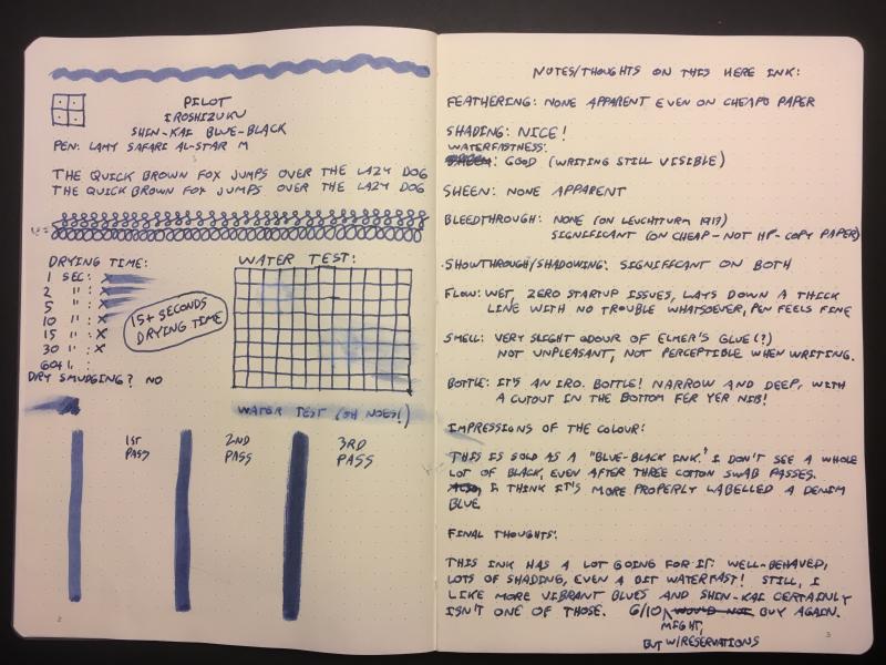
Disclaimer: I enjoy doing mini ink reviews for my personal reference, and I'd like to share them with others if they might be of help to gain an insight into the ink's appearance and performance. I generally don't have time to put together super comprehensive reviews, like some of our fantastic reviewers here do (thank you so much for your hard work!), but hopefully these mini reviews will still be useful as another point of reference. Pilot Iroshizuku Tsuki-Yo Much has been written about Pilot Iroshizuku inks. It is a highly popular line of Japanese inks that comes in [mostly] vibrant and saturated colors, with rather wet-flowing consistency, some translucence, a good deal of unobtrusive sheen for some colors, and generally some water resistance. Tsuki-Yo is a popular blue-black, and I probably won't add more than what's already been written and photographed, but better more than less information for prospective buyers. This is a rather vibrant blue-black. As opposed to more muted and vintage looking blue-blacks such as Sailor Jentle Blue-Black. There is a good deal of teal in this ink, but it's not necessarily jumping out at you from the page if you use bright white paper. Some paper makes it look less teal and more navy, and some paper enhances the green notes. I personally prefer the more teal look and like it on ivory toned paper more than on more neutral white paper. There is magenta-red sheen around the edges of wetter writing on good paper. The ink has some water resistance: a slightly fuzzy blue line remains and the text is still legible after dabbing a wet page with a paper towel. Water resistance increases slightly with time. In my experience, Iroshizuku Syo-Ro has the best water resistance and legibility of the three tealy Iroshizuku inks: Syo-Ro > Tsuki-Yo > Ku-Jaku. In terms of saturation and vibrance, Tsuki-Yo sits in between Ku-Jaku and Syo-Ro. Ku-Jaku dries a more bright turquoise-teal with red sheen, Tsuki-Yo has some gray and muted tinge to it but still saturated, and Syo-Ro is more green and even more muted and grayed than Tsuki-Yo. Because of how free-flowing Iroshizuku inks are, they might feather on some paper--even on fountain-pen-friendly paper if they are left to sit in a pen and concentrate. They will increase line thickness and will not give the finest hairlines. But they do provide pleasantly gliding experience for lower fatigue in long writing sessions. Tsuki-Yo is not a particularly exciting ink to use with a water brush. It's fairly monochromatic in practice. Papers used in this review are: Fabriano Bioprima 4mm dot grid - a kind of ivory color, lightly textured, uncoated Kokuyo Campus A5 lined - white Japanese paper, could be lightly coated as it's quite smooth Nakabayashi Logical Prime notebook - coated and super smooth ivory-toned Japanese paper, shows things like sheen and hue variation pretty well Nakabayashi Logical Swing "A" B5 paper - lightly coated(?) ivory-toned paper which shows sheen and hue variation pretty well but is also quite soft Photographs: Scans: Ivory toned Fabriano Bioprima: Kokuyo Loose Leaf A5: Nakabayashi Logical Prime A5 notebook: Nakabayashi Logical Prime A5 notebook: Further comparison with Syo-Ro and Ku-Jaku:
-
Disclaimer: I enjoy doing mini ink reviews for my personal reference, and I'd like to share them with others if they might be of help to gain an insight into the ink's appearance and performance. I generally don't have time to put together super comprehensive reviews, like some of our fantastic reviewers here do (thank you so much for your hard work!), but hopefully these mini reviews will still be useful as another point of reference. Maruzen Athena - Sepia Brown This ink comes in beautiful old-style bottles and is available for sale from Japanese "Maruzen" book stores. I believe at some point it was imported for sale in the U.S. by Nanami Paper, but it seems to have been out of stock for a while. I bought my bottle at Maruzen on my recent visit to Japan. Athena Sepia is a rich and dark red-toned brown. It is so saturated and dark that you will likely not see much of any shading with finer nibs, even on fountain pen-friendly paper. I personally like red-leaning browns, and this is my kind of dark brown--as opposed to more green-gray-leaning Pilot Iroshizuku Yama-Guri. I am not 100% sure if this ink is made for Maruzen by Sailor, but it might be. I remember reading something to that extent a while ago. It does have the typical Sailor Jentle ink behavior and consistency. Flow is good but not excessive (depends on your pen), lubrication is good, I have not observed any feathering on good paper. Drying time varies based on paper used and pen, but it's not very long (subjectively). Despite the lack of shading in writing with fine nibs and the darkness of the color, it's actually fairly interesting in its constituent dye colors. So if you like to do a bit of water brush drawing with your fountain pen inks, this is a good ink for that purpose. There's a kind of pink brown component, and a warm golden component. There's even some green, as can be seen on the edges of the paper towel drop "chromatography". The ink has moderately good water resistance--clearly legible lines remain and not too much smears off to obscure original writing. This ink doesn't sheen for all practical purpose. I have not observed any smearing after the ink has dried. I am posting photographs (color-corrected) and scans of this ink and other inks in the general brown color family for comparison. Papers used in this review are: Fabriano Bioprima 4mm dot grid - a kind of ivory color, lightly textured, uncoated Rhodia Dot Pad 5mm dot grid #16 - bright white (perhaps with a slight lavender tinge) Nakabayashi Logical Prime notebook - coated and super smooth ivory-toned Japanese paper, shows things like sheen and hue variation pretty well (Image source: http://www.nanamipaper.com/products/maruzen-athena-ink.html) Photographs in diffuse daylight shade: On Fabriano Bioprima: On Nakabayashi Logical Prime paper: Scans: Nakabayashi Logical Prime paper:
-
James Purdey & Sons Single Malt scented ink was released in 2018 by Montblanc as part of a series in collaboration with James A. Purdey, a gunmaker and hunting lifestyle brand. The ink surprised me! Single malt scented ink sounded at first like a (overpriced) gimmick and to some extend it is of course. But the color is a deep, beautiful orange-brown with amazing shading. Definitely a fall color which can be used in both a business environment (note taking) as well as for personal writing and correspondence. Be careful though, when opening the bottle or the pen cap the whisky scent is quite strong. It might be frowned upon at 830am when the meeting starts... The scent fades quickly though, within minutes. After 20-30 minutes the smell of the paper itself always wins. The ink behaves like most Montblanc inks I own. Perfect behavior in a broad, wide nib. A bit dry and with a strong dislike for TWSBI pens. The shading is wonderful, no feathering, and no show-through. Drying time is well below average at roughly 22 seconds. As can be seen, the ink doesn't really appreciate water. This ink is the most bright, orange-brown ink I have. SBRE brown (P.W. Akkerman) is not far off, Comte de l'Or (produced by Diamine) is much more gold (of course), Herbin's café des Îles and Caroube de Chypre have far less orange in them and are a more true brown. The ink will definitely gain some attention in the office, but I will use it for a while. I really like it. N.B. Review written on Original Crown Mill Vellum paper
-
This is a Parker 75 medium stub ciselé of around 1968-1971. Writing sample: The line thickness it produces is about 0.9 mm in width. This width is comfortable for writing characters of medium size (see also the writing comparison). The pen’s triangular section is thin, but it is very comfortable to hold. The pen as a whole is on the smaller side, but the nib is big. Since the pen is of some vintage it is a stub proper rather than cursive italic, i.e. the tipping is noticeably thick with the writing edge noticeably but not drastically rounded (see schematic). The side edges are not rounded so as to be visible with the naked eye; the Artpen is also like that whereas the bottom of the Dostoevsky’s tipping has no corners but only smooth curves. It will not tear paper however. All three pens are extremely forgiving with the Artpen being the one most able to be held entirely carefree as if it did not have a broad edge. The 75’s stub nib does not like very much smooth paper, either of the good (Rhodia) or of the cheaper (many modern notepads) variety. On Rhodia the 75 stub flies off the paper surface, often leaving no ink behind. Skipping on downstrokes is usual when writing at my usual speed, which is rather fast. By comparison, the Artpen iceskates on Rhodia leaving a thin film on ink behind and the Dostoevsky swims in its own ink. On school notebooks and on paper with cotton content the stub 75 performs consistently without problems and is definitely wet (the Dostoevsky and the Duofold are wetter, as can be seen on the comparison sheet). Some closeups of the nib: The pen feels light but with a perceptible substance in the hand. Overall, this is a gorgeous pen allowing some very expressive writing.
-
Dear fellow Montblanc fans, We made an overview video about the new Montblanc Great Masters Red Python edition which was recently launched by Montblanc. https://www.youtube.com/watch?v=UtUOv6iq8Oo What do you think of this new addition of the Great Masters series? Which one is your favorite in this series?
-
Has anyone tried CX Made ink, and if so what was your experience with it?
-
Love the shading in this ink. Very well behaved and vibrant color.
-
Nice, well behaved, ink from Diamine. Well lubricating, vivid blue-green closer to the green end of the spectrum. The significantly compressed scan is showing a greener and lighter tinge than it is. E.g. the Ku-Jaku comparison I have shows up bluer than on the scan.
-
Sailor Ink Studio is a relatively new line by Sailor, composed of 100 different hues! I will not attempt to classify and categorize the line, as it is done in great detail in this excellent overview of the full line: https://macchiatoman.com/blog/2019/1/23/sailor-ink-studio-overview-100-inks I had my first exposure to these inks only briefly on-line when I had seen the interesting multi-hue inks #123 and #162, which are probably the most popular two of the whole line so far. On my recent trip to Japan, I was very happy to find that most of the large stationery store departments had the full Sailor Ink Studio line; some even with pre-filled demonstrator tester pens and paper pads to test the inks! Thus I was able to try out most of the line (it did take multiple trips to try out all 100 inks from this line, not to mention inks by other brands). With that said, the downside of having prefilled pens was that many had been sitting and gradually concentrating the inks contained in them for a week or two. And so some of the more saturated inks to begin with were super-concentrated by the time I was testing them, quickly sheening over on paper. It was not easy to imagine what some of those inks would look like in normal use back at home. Thus I focused on the less concentrated inks that showed more complexity--something different. Please note: the colored stripes across bottle labels are NOT accurate representations of the inks (unlike, for example, Pilot Iroshizuku labels). Ink Stidio #573 caught my eye right away. It was actually quite a surprise, as I was initially going to buy #273 instead. It turned out that #273, while being very nice, is just not as complex in writing as I had expected it to be. #573, on the other hand, is interesting indeed! #573 is a relatively translucent ink of lower concentration, and so it has excellent shading properties, able to produce a wide range of hues from very pale faded terracotta to a deep off-black. There is a dark outline around dried ink lines which is readily visible and gives an extra oomph to the writing. For sheen lovers--you will not see this ink sheening in normal writing. You have to practically dump a lot of ink onto a page to finally see metallic green around the edges. But in all other circumstances, even writing on Tomoe River, you won't see this sheen. Instead, you will get a complex muted terracotta with an outline effect and a somewhat matte, chalky look. I seriously love this ink--it's simultaneously understated and very exciting. Drying time is fairly quick, feathering is very well controlled, and there is even a good degree of water resistance without obscuring smearing. My regular camera is having its sensor repaired, and unfortunately I don't know when I will get it back. I wanted to wait and do a more proper review, but my current fill of this ink was running low, and I decided it was better to put something together sooner rather than later. So this is a quick mini-presentation. I am certain this ink would be great for doing watercolor-style drawings because of it separating into very different colors in chromatography tests.
-
Red Fox is a Montblanc Limited Edition, based on their Le Petit Prince series. The ink is a dark brown orange, not unlike the fur of a fox. I wasn't sure what to expect of this ink to be honest, reviews are mixed, but in the past week I have been writing a lot with it. It's great for personal use and at the same time, despite being a dark orange, it's a color that you can easily use in an office environment to take down notes. For longer reads the color remains pleasant. The ink and its color surprised me and I must say, I really like this ink. At 35 euro for 50 ml the ink is expensive, but well worth it. It's a high quality ink. As expected, no feathering, no bleed-through on decent paper, shading is strong and excellent and the ink behaves extremely well in my Parker Duofold (medium nib). Lubrication is a bit better than most Montblanc inks I know but still, some pens have difficulties with it. TWSBI and Montblanc is not a good combination in my experience. This is a non permanent ink, water will severely damage your writing. Drying times are OK. To give an idea what the ink looks like, I have written several samples with both the Parker and a Lamy with a broad nib. The orange is very distinctive and quite different from other inks I own. At first I thought it would be closer to a red, but but the two colors that come closest are Orange Indien (J. Herbin) and Cornaline d'Egypte (Herbin 1798).
-
Has any member taken the time to review the 'own brand' cartridge pen offerings from W.H. Smith Ltd the well - known stationary chain-store. Apart from the Parker range and Lamy pens they have their 'own brand' that are obviously made in China. They all look to take a short International cartridge. But I wondered if any would take a converter.
-
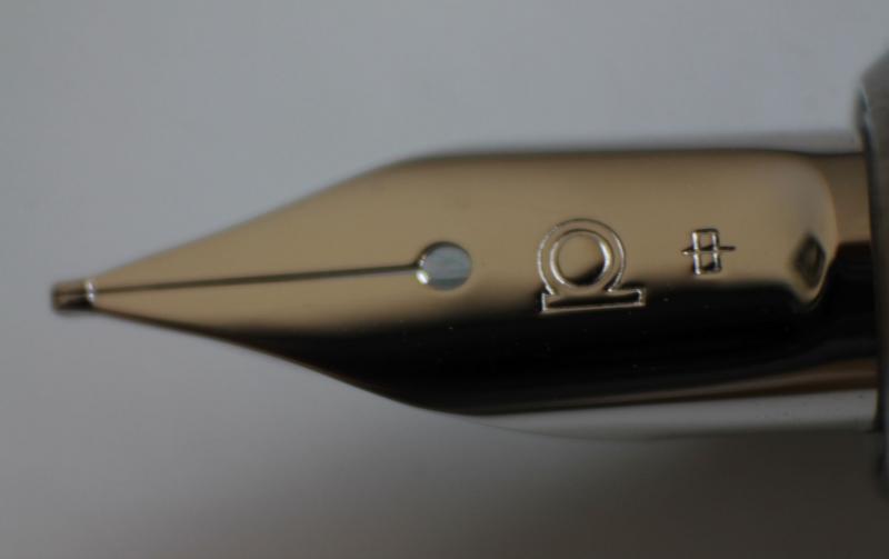
There are some reviews on the Platinum Cool, which is also known as Platinum Balance, on FPN and other places. Nevertheless I think adding one more might contribute some more information, another perspective, experience and pictures. I had this pen in fine and medium and now use the fine for more than a year. Introduction This review is meant to depict my personal opinion and valuation. I wont use points to rate aspects. While I dont intend to criticize those who do, I dont want to evoke the semblance of objectivity. I am neither an expert for standards used nor could I compare this pen to dozens of others. Due to these limitations to what might be an ideal review, I will simply try my best to describe my experience with this model in a way which allows you to contrast it to your own experience and preferences. Nonetheless I will offer a few comparisons which might be useful. Platinum officially calls this model PGB-3000A and categorises it as a member of its Balance-family on its website. The Cool features a relatively springy steel nib in fine or medium, an acrylic resin torpedo-shaped body of medium size and weight. First Impressions The pen came in a nice-looking cardboard box which also included a Platinum proprietary cartridge and an instruction manual. Unfortunately there was no converter included. I was pleasantly surprised with the box. I wouldnt be ashamed to have the box be part of a present even though it was probably not necessarily meant to be displayed. While to me this pen feels solid and well made it cant keep up with the clear Platinum 3776 versions if we dont consider the price. The clear plastic with chrome trim looks modern. Appearance and Construction The Cool is available in three different colours, shining crystal, crystal blue and crystal rose. The clear one is, well, clear, the coloured ones are highly translucent. As I mentioned this pen is torpedo shaped, having a cap which becomes slightly wider towards the cap band and a barrel which then tapers towards its end. The Cool is mostly made from plastic. I like its quality because it really is clear, not prone to scratching and the material is quite thick which gives it a more sturdy impression than a Platinum Preppy. A Preppys barrel can be deformed when a lot of pressure is applied by hand, this one seems much more robust. One plastic part I strongly dislike is its cap insert. While it doesnt feature Platinums sophisticated slip and seal mechanism it still works well - but looks ugly. Being opaque white it doesnt match the design in my eyes. The point, I assume, is to hide traces of ink inside the cap. Where the insert is it does its job, however to me this isnt worth the effort as I consider it flawed in two ways. On the one hand this white insert is far more noticeable than ink stains in the cap, on the other hand at least in my case the white now is covered in blue spots all around its upper part where it occasionally had contact with the nib and these are more visible due to the higher contrast than those in the cap which exist where the insert cant cover them up. I would prefer a clear cap insert or a cap sealing reasonably without an insert. I'm aware my focus on staining might cast a negative light on the Cool. Thus I want to point out I don't consider this a weakness or criticize it - other pens suffer similarly from my decision to use such ink. I knew that and am fine with it, I simply look at this pen from this angle based on my personal experience. I am sure if you use non permanent colours you can maintain its transparency. The clip is simple, functional and sturdy adorned by a subtly engraved line around its rim only. Similarly utilitarian the cap band is narrow. On the cap directly above it JAPAN PLATINUM and Platinums Logo are engraved. A big part of the body is faceted though in a different way than a TWSBI Diamond as the facets are inside the barrel making its outside round and smooth. Thus the facets only affect the appearance and light refraction. Being clear the section allows the transparent feed and metal threads to be seen which probably is the most attractive and promotional aspect this pen offers. This feature makes the feed adopt the colour of your ink. In general lighter colours come across better, more like they look on paper than darker colours. The effect is similar to ink in a bottle or converter, the more ink light travels through the darker the colour will look like. Pigment inks however are an exception to this rule behaving less like this. Speaking of pigment inks, I already mentioned traces of ink and stains in the cap and insert, ink of course can also stain the feed. If you want to keep the feed completely transparent, I recommend to have this in mind when choosing an ink. In my photos you can see the effect of using Platinum Pigment Blue and Sailor Sei Boku for months (with regular cleaning). Cleanings results are limited with pigment inks. I dont think they damage or penetrate the plastic used but once they dry they are hard to remove because water then wont do anything. Removing dried pigment ink mechanically is possible, gently rubbing is enough, but limited to accessible areas and areas like the body and inside of the cap which are smooth. I am not able to completely remove stains from the feed. If you tried it with an ultrasonic cleaner I would love to read about your experience. The sections circumference is on the narrow side, I would say. Wider than a Pilot Metropolitan section for example or a Waterman Hemispheres one, which for me is not comfortable. I recommend Goulets Pen Plaza for comparisons. Since the connection between section and barrel is made from metal the front part is heavier than the plastic back where only the converter adds weight. The section unfortunately comes with another downside as its threads are sharp enough to abrase material from the plastic threads on the barrel, at least in my case. Im sure this wont be more than an aesthetic problem for the next few years but it doesnt improve the experience either. Weight and Dimensions Length capped: 139,5mm 5,5in Length posted: ~154mm 6,1in Length uncapped: ~126mm 5in Weight body: 13g 0,46oz Weight cap: 5g 0,18oz The more subjective assessment: This model is section-heavy but works well. Posting for me adds too much weight to the back. The Cool is about as heavy/light as a Lamy Safari. Nib and Performance As already mentioned the nib is made from steel and available in fine and medium. The nib is rather small, normal sized for the pens overall size. In contrast to most Japanese and Platinum pens in this model the line width runs similar to an average European fountain pen. I also found both the medium and fine rather wet. Combined this results in rather wide lines, maybe even compared to some fine running European brands. How it feels writing is more congruent to other Platinum pens as mine write smoothly and with some even feedback. An interesting feature is the relatively springy nib. Following the logic of what Platinum says about the new Platinum Procyon this might be due to the pentagon-shaped nib. It offers more flexibility than a Lamy Safari or Pilot Metropolitan to which I compared it before, I wouldnt call it flex though. My experience is limited but considering what I have seen it also is much less flexible than a Pilot Falcon or FA nib. When pressure is applied the line width increases, more noticeable in the fine than the medium, as well as the ink flow. You can reasonably expect the line width to become 1,5 times as wide, maybe to double. During normal writing the effect is very small, writing feels springier than with a nail-like steel nib. But I wouldnt recommend to constantly apply (a lot of) pressure, to me this nib doesnt feel like it would like this. The ink flow is even, doesnt decrease over time and easily keeps up with fast writing. Edit: The symbol on the left means 'fine', the one on the right 'medium'. Both nibs are silver coloured, the ambient light affected the reflection. Filling System and Maintenance Platinum uses a proprietary cartridge/converter system. There was no converter included which is common at this price point. Buying one is worth it I think. The converter is very well made overall, feels sturdy and can be taken apart for cleaning if you wish so. Its mouth is made from plastic surrounded by a metal ring. The clear part stood up surprisingly well against staining being still clear. The shroud is from metal again. Take a look at the pictures to see the piston mechanism inside the converter. The knob is made from plastic and features grooves, turning it feels controlled. Platinums cartridges are smaller than large standard international ones, and close in size to Pilot's cartridges. Their body is fairly thick and they contain a metal ball agitator. Cost and Value The Platinum Cool retails for about 40 US-Dollar in the US. I havent seen it at European retailers and must admit I dont know much about other markets. Some companies offer it for around 25 Dollar/Euro. Customer care usually is limited if you would have to send it back to Japan from Europe for example but these shipping costs probably exceed their benefits anyway at this price. The Cool can be considered an entry-level pen, maybe an upgrade to a Preppy or Plaisir. There are a lot of good competitors. I can name the Safari and Metropolitan again, but there are many more. I think the Cool cannot surpass them in writing experience, construction quality or filling-system but neither lacks behind. A clearer reason to buy is its transparent body and feed. Conclusion The Platinum Cool is an affordable demonstrator which offers reliable and controlled writing. Its transparent feed makes it special. If you aim for a super-smooth entry-level pen, look elsewhere. If you like the design you probably wont be disappointed by its other features. Feedback, criticism and further questions or opinions are welcome. Feel free to point out language mistakes I might have made. Edit 1: removed my remark on what the symbol on the nib stands for. It indicates the nib size,but I probably mixed up fine and medium. Edit 2: added picture for comparison of the symbols adorning the nib which mean 'fine' and 'medium'. Thanks for pointing out my mistake, Pseudo88.
-
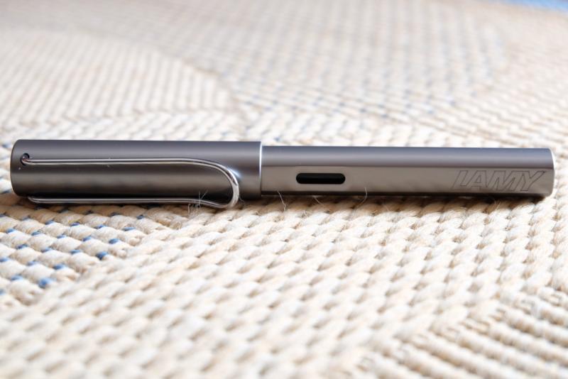
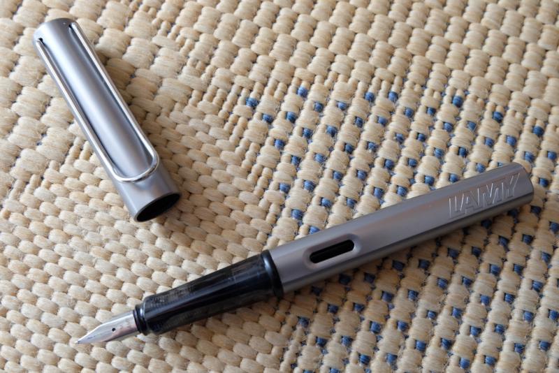
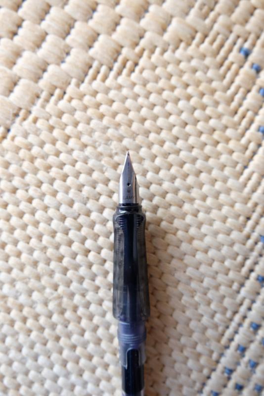
Lamy Al-Star Graphite I have been using this pen almost everyday for the last 6 months. This is an impartial review aiming at determining this pen's strenghts and weaknesses within its price range [sub €50 (euros)]. Packaging was a standard blister pack including a Lamy blue ink cartridge. Certainly not one of the strong points of this product, especially when compared to the Pilot Metropolitan metal casing. If this was an evaluation attribute, I would have rated it 5/10. 1) Appearance & Design – Graphite finish suits this model quite well by complementing the original ‘industrial’ look. All aluminum apart from the grip section, cap top and barrel top, which are made of good quality plastic. LAMY is engraved near the top of the barrel. The ink window looks nice and complements the overall design of the pen. I am not a big fan of the clip aesthetically speaking. The grip section will divide opinions. As a ‘forefinger up’ user, I can live with the grip, but it is not a favorite of mine. Overall, I prefer a classical fountain pen look. 8/10 2) Construction & Quality– Very sturdy. It has only minor scratching which is rather imperceptible in this finish. Body is quite slick though. 9/10 3) Weight & Dimensions – Medium sized, reasonable balance uncapped. Balance is improved quite a bit when posted, IMHO. Light to moderate weight (12g unposted, 22g posted). 9/10 4) Nib & Performance – M nib is quite reasonable. Dry writer but consistent flow. I do need to apply a small amount of pressure in order to write, which prevents me from writing in a lighter manner. F nib presents basically the same line thickness but is much worse when it comes to other parametres. It is scratchy and the sweet spot, besides being smaller, requires a different writing angle than the M nib. I believe this nib to be flawed. I had a lot of issues with ink flow when the pen was in new condition, even after flushing twice. Writing with it has seem to have solved the issue over time. The pen may still rarely run somewhat dry depending on the ink used though. 7/10 (M nib). 5) Filling System & Maintenance – Standard proprietary C/C system. I use the Z28 converter. It holds a good amount of ink (up to 0,8ml). I did not enjoy the included Lamy cartridge. The converter is hard to disassemble for cleaning behind the piston. 5/10 6) Cost & Value– I paid €28 at a technology store. I think that there are stronger competitors on the market for the price (some above, some below). 6/10 7) Conclusion – 7/10 It might look like that I am being quite harsh on the Lamy Al-Star. The pen certainly has its merits: an interesting design, solid construction quality, nice weight and balance. However, I believe Lamy’s nib QC is substandard or simply just insufficient. In addition, the packaging and the converter could be further refined. Rivals include the Pilot Metropolitan (which I prefer overall), the Faber-Castell Loom, the Pilot Kakuno, the Platinum Preppy and Plaisir, the Pelikan Stola and even the Lamy Safari itself, the latter competing internally at a lower price point. I do like my Al-Star and do not regret purchasing it but, if I had to replace my deceased Pilot Metropolitan today, I would have made a difference choice. I hope you enjoyed this review and hope that we can have a civilized and interesting interchange of ideas concerning this pen. Pictures follow (I would update these with better quality, but I do not know how to aside from attaching them to the post. Any input on this is greatly appreciated). Cheers P. S.: This was my first review so do not be shy and provide input so I may improve future reviews!
-
This is my first go at an ink review, and my first entry in my ink journal, so please be gentle. Also, sorry for iPhone photo.
-
Greetings, fountain friends, I’ve been an offline observer to this wonderful community for some time now, and it has influenced me in many of my pen decisions and handwriting expansions. I'm an Irish doctor working in England, and in my spare time, I am a keen German language user, chess player, philosophy and psychology enthusiast, and now beginning to dabble in the world of writing. I’d like to begin to give back with my own opinion regarding an undoubtedly biased view on my favourite fountain pen purchase to date – the Lamy 2000M Stainless Steel (my model is a fine nib, and I like to rotate between Diamine Oxblood, Teal, and Montblanc Toffee Brown). Excellent reviews for this well-known model – most prominently the original makrolon edition – already exist in this forum, and further afield. However, I would like to write something about the SS version of this pen, which has attracted mixed-to-negative reviews regarding it’s 1) weight, 2) similarity without difference, and 3) price. I do not pretend to be impartial regarding this particular piece, and I must suggest that this is an opinion primarily for those who are closer-than-not to a purchase regarding this model with the attributes I will discuss, later, and go some way to defend the model fit enough to be considered both distinct and worthy of purchase and recognition. 1). Weight. The most notable set of specifications is the weight of this pen – both in-and-of-itself, and in contrast to the lighter, original version. For convenience, the total (54g), body (34g), and cap (20g) weights are significantly heavier than the makrolon version (typically 25g, 15g, and 10g, respectively). Particularly when the cap is posted, this can be a considerable contributor to writing fatigue, back-heavy imbalance, and an uncomfortable writing experience with poor stamina for even those with larger hands. I think this is an unfair area of criticism, and rather, should be a binary factor for those who like heavy or light pens. Consider a fountain pen reviewer who takes on a ballpoint pen – by the very nature of the pen’s mechanism, this will be reviewed much more poorly than it’s capillary counterparts by the nature of what makes the pen a writing instrument. I believe that weight – as well as dimensional size – are factors in review that should be areas of distinction, rather than comparison, when considering models of pens (even when such models are within the same branding). Therefore, I think that those who favour heavier, metal pens should take interest in the Lamy 2000M as distinct in interest even from those who use the original makrolon Lamy 2000. Whereas the first example I provide is clearly an extreme version of the issue described, here, I think that the factors of size, weight, and filling system are considerable enough to be whittled down to pens that address those precise categories rather than having (e.g.) a Kaweco Liliput scolded by a user who’s daily driver is the MB 149. 2). Similarity without difference. Apart from the material use and the weight of the pen, criticism is offered by reviewers who perhaps borrow too much influence from these paradoxically drastic differences, by finding nothing new offered by this version once the novelties are stripped away. I believe this is an easy mistake that we all can make when we overanalyse versions with heavy influences in one area or another and seeing it as a simple marketing rehash. I’d like to offer the opinion that these two factors bring about differences in performance and suitability in preference that are drastic enough to address an entirely different audience to attract those that were perhaps failed or disappointed by the Lamy 2000 in its original format. The material and weight provide a unique writing experience that is (I’d argue) much more palpable than the difference between modern steel and gold nibs. It is difficult to capture the sensory, tactile, and phenomenological experience in the differences between both versions without robbing the reader of an hour’s time, but there is something tremendously satisfying about the gravity and industrial nature of this instrument. I think it more excellently captures the Bauhaus movement than it’s makrolon parent, but aesthetics aside, even the differences in brushing material and the lack of a two-tone/material compartment provide a different experience to those deliberately sensitive enough to notice a difference. Clearly, there are differences which I think are rather miniscule (the plating on the hinged clip, or the placement of the Lamy logo, for example), whereas others are perhaps discriminatory to those who prefer other attributes (the removal of the ink window seems to be a sore point for many consumers, as is the smoother metal finish of the grip). However, when it comes to the ultimate endpoint of a writing instrument – the writing – then this pen deserves a mention distinct from the original as being paradigmal in it’s feeling, experience, and output. Everything else is style and preference. 3). Price. Finally, the Lamy 2000M is noted as being approximately 50% more expensive than the original*. This is an area of criticism, compounded further when the two areas addressed, above, are neglected in final consideration. One could talk endlessly regarding the economics of price, but I believe there are a few more objective factors to consider before discussing the differences in the intangibles: Stainless steel is a difficult material to manufacture, and clear that it is at least a significant percentage of the pen that this instrument is fashioned with (I have yet to see a demonstrator video in which the pen is sliced in half at various angles for a more accurate opinion on this, though the innards are made from essentially plastic on disassembly). The weight specifications should be enough to reassure most to a reasonable standard of this. Lamy is also a brand of (at least in my experience) good and efficient quality – perhaps the Ikea of manufacturers when it comes to template design with the odd-revolutionary product. With this comes a certain level of brand investment, especially as an edition of an item that sits on permanent display in an art museum. More subjectively, those wishing to purchase something metal, heavy, and made by a manufacturer such as Lamy, will find themselves justifying this purchase (rightly or wrongly), as it is a widely-recognised and reliable model of a pen that has already been proven to survive over long periods of time, but utilises their preferred categories of material choice and weight. Stainless steel is also tremendously robust, and provided that the user is aware of the interplay between it and the more sensitive innards, then this pen should act as its own safeguard against wear, damage, and accidents that will inevitably creep up in the coming years and decades. C). A worthy purchase for those who can discern it. The conclusion may seem as weak as point 2) that I make above – clearly, this is a pen that will satisfy those who will be satisfied by it just as much as it is the same pen without its differences. But I write this piece (which is also my first – constructive feedback would be very much appreciated from the community) in biased defence and justification to what is a wonderful writing instrument that I believe has been treated unfairly even in favourable reviews (who towards the end may conclude that the makrolon version is better simply because it is essentially the same, and more affordable). I argue here that these are two distinct pens that should not be compared any more than a small and a large pen be reviewed by an individual who is more/less suited to one or the other. That is not to argue the Lamy 2000 out of hands who love it – I merely stress that there are differences that are more significant in the review of such pens than are given credit (some which are not even available in filters for online pen retailers, e.g., weight) that will eliminate certain pens from consideration even if they are identical in other superficial aspects. Furthermore, I wish to offer the opinion that such differences then go on to contribute meaningful changes both in hand and on paper, and that these should be noted as both distinct, and as incomparable to pens with category differences such as weight that are paradigmal. Lastly, this is a pen that will suit some, and not others. For those that it will suit, however, will depend more on attributes and qualities of pens that make it knowingly or unknowingly both more appealing and satisfying in acquisition and use than variants (Lamy 2000) and competitors (when considering weight, e.g., Faber-Castell Basic Metal). Clearly, other factors also play a role (i.e., price, availability, European nib sizes, etc.), and some which I have not noted, here. But for those who can discern their ideal pen yet find themselves a little underwhelmed by the community’s reaction despite its pedigree and performance, I hope this piece can help to explain some of the feeling on both sides. Thank you for your time. Schreiber *Thank you to 1nkulus, who corrected my original gross approximation as being double.
-
I have been searching for a review of FPR's blue-black ink, without much luck. Their inks do not have a spot in the ink review index.
-
I looking to buy a new pen and I'm tied between the TWSBI Vac 700r and the Pilot Custom 74. I know there quite a lot of differences between the two, but here's why I like them: I love the gold nib and smooth writing of the Custom 74, but I really want to try out a vacuum filler and a larger ink capacity is of great convenience to me, plus I like demonstrators. The Vac 700 sells for around 7,700 rupees whereas the Custom 74 sells for about 8000 rupees. Which one should I go for?