Search the Community
Showing results for tags 'review'.
-
Well, I can stand here and say never walk into a pen shop with the intent of "just looking". While trying out a variety of vintage pens I came across one nib I simply could not leave in the the display case, a Conklin 30 with an absolutely stunning nib. The body of the pen is similar to many vintage pens in its appearance, the standard BCHR material and in this case a very nice perfectly functional crescent filler. The pen fills full and holds enough ink to sustain this ink cannon for a while. The nib, did I mention the nib? This is where this pen truly shines, this is the kind of nib people, including me, dream of. The type of nib which simply cannot be matched today, a #3 size "Toledo" nib. A true wet noodle which will go from a medium/fine line to a BBB with little pressure, putting down ludicrous amounts of ink in the process. The only other type of nib I can compare this to is a dip nib really, the variation and responsiveness is amazingly fun. I attached some pics to try and give an idea of the nib and what it is capable of.

-
Does the sentence, "The five boxing wizards jump quickly." have any meaning to you? What if I said, "The quick brown fox jumps over a lazy dog." Well if you've ever made or seen an ink review you're probably familiar with this sentence. What I'd like to talk about is why- why do we use this particular sentence all the time? Some may say it's because it's just what you've always seen so you just picked up on the trend. Others vouch that it's the best sentence because it's a pangram. (a sentence containing all of the letters of the english alphabet at least once) My point is that it may be the most well-known pangram, but it certaintly isn't the best. There's so many more creative/fun pangrams out there that it's a shame no one ever uses them, such as: sphinx of black quartz, judge my vow; pack my box with five dozen liquor jugs; or jinxed wizards pluck ivy from the big quilt. All of which contain close to or fewer letters than the famous quick fox. You could even take it upon yourself to create your own pangrams. Here's an example of one of mine, "Quiz, what fox coveted big picky jackal mooners?" I was currious what you'd all think about it. Would you consider useing other sample sentences? Does this not even concern you? Let me know your thoughts. edit: spelling error
-
Hello! Having watched sbrebrown's video "Why aren't you doing reviews?" I decided that I would try my hand at doing YouTube reviews of fountain pens! Here is my review of the Lamy 2000 Medium Nib - if anyone has any suggestions/tips/tricks to help me improve my videos it would be really appreciated. A review of the Lamy 2000 Medium Nib Fountain Pen All the best, TheTechFish
-
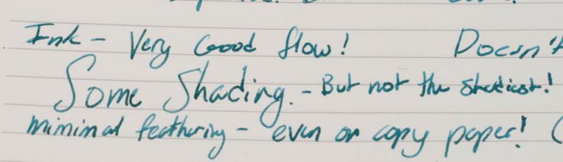
I originally posted this review on my blog. Please visit for more reviews like this one. http://2.bp.blogspot.com/-J1QERw11URM/U7TBjQIKxdI/AAAAAAAAAhQ/X6jBSI7FES4/s1600/DSC_0466.JPG Introduction This is the fourth review in my series on Levenger inks. Thus far I've noticed that their properties are very consistent: most dry quickly and perform well on low-quality, absorbent paper. Cardinal Red mostly continues the trend with the exception of its longer dry time. I decided to try this ink because I needed a bright red for editing documents by hand. The ink is perfect for that purpose, so a bottle may find its way into my ink drawer. If you're interested in this ink, it's often on sale for $10 with free shipping from Amazon, making it an excellent value for your money. I was in no way compensated for this review, and this review contains my honest opinions about the ink. Specifications: Manufacturer: Levenger Color: RedMSRP: $12Actual Price: $12Price I paid: I bought this as part of the Levenger Ink Sampler for $12 while it was on sale. I would highly recommend this ink sampler as it is the only way to try Levenger's inks without buying full bottles.Amount of Ink: 50 mlCost per ml: 24¢/ml at $12 Bottle: Glass; It includes a reservoir Where to Buy: All of Levenger's inks are exclusive to their website.* * All prices are the prices at the time of this review's writing on July 1, 2014 Properties: Sheen: NoneShading: Hardly noticeableWater Resistance: Somewhat water resistantFeathering: Minimal on copier paperBleed through: ModerateShow through/ Ghosting: HighDrying Time: FastWetness: AverageLubrication: Well lubricatedStaining: I haven't noticed any staining. Cleaning: The ink cleans out of a pen easily Nib Creep: Minimal- Nib creep doesn't bother me because it has no effect on the writing experience.Okay on Copier Paper?: If you're using the ink only for editing or grading papers, it performs very well. For more intensive writing, the show through may be bothersome. Writing Sample:Pen: Visconti Rembrandt FinePaper 1: Levenger Circa PaperPaper 2: Copier PaperPaper 3: Black n' Red NotebookPaper 4: Flashcard for the Extended Soak Test (2 hours) http://3.bp.blogspot.com/-5qqkp6xPpnA/U7eYuVKLogI/AAAAAAAAAiE/qoHRXpbSVyU/s1600/DSC_0509.JPG http://3.bp.blogspot.com/-IEyEnkxYUNA/U7TBbku4zwI/AAAAAAAAAhE/RZskYL-Rc9w/s1600/SCAN0048.JPG http://3.bp.blogspot.com/-x6RxEoNRN0s/U7eYyWlOzaI/AAAAAAAAAiU/XpNRpIxmIJA/s1600/DSC_0497.JPG http://2.bp.blogspot.com/-OH-ny79k3_A/U7TBlyh9-1I/AAAAAAAAAhk/ecCv5iZ9tlM/s1600/SCAN0050.JPG http://1.bp.blogspot.com/-MVOuWDP21zg/U7eY4vygZFI/AAAAAAAAAic/SLETRDqi_wk/s1600/DSC_0524.JPG http://1.bp.blogspot.com/-QI2Wav6KhuM/U7TBpzhlADI/AAAAAAAAAhw/s4YosBkRApI/s1600/SCAN0052.JPG http://1.bp.blogspot.com/-Kh8QYtH7kAg/U7TBW_FlboI/AAAAAAAAAg0/pgZ69Ek7Agk/s1600/SCAN0046.JPG http://4.bp.blogspot.com/-RXsJTvZ5rbw/U7TAdQ3sj2I/AAAAAAAAAgE/Wwgic6PBfdM/s1600/SCAN0053.JPG Levenger Cardinal Red is a fantastic red ink, but it isn't very water resistant. If this ink were water resistant, it would be perfect for my uses. When editing a document or grading something, a small spill would destroy everything written with this ink. This ink also takes more time to dry than Levenger's other inks. As a dextral writer myself, this doesn't trouble me at all. If you're left-handed and move your hand over freshly written words, the ink will smear and may cause issues. The redeeming quality of this ink is its color. Cardinal Red is a true red, and when diluted slightly with water, it becomes a nice pink. I may have to buy a bottle of it just for its color. Pros A great red color which could be used for editing or gradingMinimal feathering on average and nice paperDries quicklyLightfast according to Levenger's website (I haven't tested this yet.) Cons Moderate bleed through and show throughExtreme feathering on highly absorbent papers (e.g. the flashcard)Not very water resistant Possible Uses Editing, correcting, and grading papersChristmas cards and letters around that timeSending love letters (Cardinal Red is much better for this while diluted slightly.) I originally posted this review on my blog. Please visit for more reviews like this one.
-
Pierre Cardin Masterpiece Fp Review (With Pictures) A Mont Blanc For The Starters?!
cjpandya posted a topic in Fountain Pen Reviews
Hello there! Today i will be reviewing the pierre cardin "Masterpiece" fountain pen! It is a brand marketed by the Flair pens in India in associtation in design with the french fashion designer Pierre Cardin. First look at the pen and you will say "whoa!! is it a Mont blanc Meisterstuck 146 in there by mistake?!! :D" Well ofcourse not! but you will see what i mean as we get on with the review! (Also the name "Masterpiece" = "Meisterstuck") This is one of the most affordable good quality FPs in the market which also manages to give a hint of luxury of the higher end pens. Priced at around Rs 400 ($6.75) in India as in may 2014, It is a must-have for starters! So, lets move on, shall we?.... The pen comes with four standard short cartrideges in a nice tin box with a transparent plastic window. The red velvet plastic pen holder can be taken out and the case can be used as a pen box. Now you see what i meant by "Whoa! a Mont blanc?!" The design is clearly Mont blanc inspired with the pocket clip, the center band and the cigar shaped body. Which is a rather classical FP design anyway. The cap is a clip-on type cap and not screw type. The pen feels quite nice in the hand and the body plastic built quality is very nice with polished lacquer feel to it. The clip, the center band, the barrel threads, and all other golden accents are made of metal which adds a decent amount of weight and feel to the pen. The pen is well balanced even when posted and posts quite securely giving a robust feel. The clip and the center band. The pen posted (and yes! i am working on my handwriting! ) The two-tone steel nib too is quite impressive and smooth with nice engraveing on it. It is a M nib with consistent ink flow. Size-wise it is fairly big as well, giving a richer feel to the pen on the whole even while writing. This isnt one of those "creepy" iridium point germany nibs...it is indeed a quality one. And anyway not all IPG nibs are bad. The section has a smooth taper towards the nib with a mild concave curvature making it pleasant to hold. The pen also comes with a standard converter pre-fitted into it, making it a very user-friendly package on the whole (with 4 spare ink cartridges in the box). Now, moving to the final writing sample..The feathering seen on the paper is because it is a low quality paper and nothing to do with the ink. i tried the pen with diffrent inks and it did not have a single issue with the flow or writing! So, in the concluding statement, i would like to say it is a really good pen package on the whole for everyone! It gives the feeling of using a high end pen without the fear of loosing or damaging it in everyday use. Thats because of its price. Secondly, those who are starting out with FPs and want a really good, reliable writer...this is IT! No doubt about it! ofcourse there are other brands..but this is the complete pen package i have seen so far in this price range. With the classic design, the great looking pen case the 4 spare ink cartridges and the converter...you can never go wrong! So...just go and get it if you can! Simple as that! You will not be disappointed! Hope this review was useful!. Please share through comments and ask any question that you might have regarding the pen! I will be glad to know your views or suggestion! I will be coming up with other reviews for the FPs in my collection later....till then, HAVE A NICE DAY AND KEEP WRITING! -
Introducing the first PenFeed review! Created by two brothers, the Pen Feed is a new blog dedicated to the world of fountain pens. We will be reviewing pens, inks, notebooks, and fountain pen accessories. Check out our first review of the iconic Lamy Safari here: http://penfeed.blogspot.com/ and follow us on twitter @PenFeed We would also greatly appreciate any feedback so please feel free to comment! All the best, PenFeed
-

Field Notes Shelterwood Review
yogalarva posted a topic in Paper & Pen Paraphernalia Reviews and Articles
Just put this review up on my blog this afternoon, and figured I would post it here as well. :-) Even if you are not a pocket notebook user, I bet that pretty much everyone has heard of Field Notes and especially the Spring 2014 special edition, Shelterwood. Since I can’t really describe it better than they can, here’s the description from the website: The “Shelterwood” edition features covers made from actual American Cherry wood, sliced ever-so-thin and bonded to a substrate of kraft paper for durability. I really like that each cover is totally unique. The picture above is a scan of one of mine, and the grain pattern on the three I purchased are all different. The cover also seems very robust and I’m sure will take a thorough beating before looking too worn. The gold staples are also a nice touch. :-) Inside the cover is cream colored paper with green ruling. The ruling is a bit narrow, but it’s a pocket notebook, so it seems to be reasonable for what it is. Field Notes don’t have a great reputation for being fountain pen friendly, and this is true as well for the Shelterwood. The paper is decently thick and seems to resist feathering in most EDC type nibs (M and narrower). Sadly, bleed through is a thing that occurs. On the picture above, the right side is the back of the variety ink test page and the left side is the back of PIP #14. Obviously this is not the kind of notebook you would want to be using a wet noodle in, but I think that it’s not so bad as to be unusable. Overall, I really like this notebook. At first I couldn’t get past the bleeding issue, but I think the important thing was shifting my expectations. This is an EDC pocket notebook, and as such it’s not exactly like I’ll be writing my memoirs in it. I use it mostly to take quick notes in meetings, write out to do lists, and doodle. If something bleeds through too bad, I just don’t use the back of a page. If you really want super FP-friendly paper in a pocket notebook, I would suggest buying one of the Clairefontaine pocket notebooks. If the price turns you off ($10/3 notebooks), then there is nothing I will be able to say that will change your mind. In that case, make your own pocket notebooks or pick up something cheaper at the drug store. I don’t know that I would pay $10 for a pack of the basic Field Notes, but for the limited editions I feel like I get my money’s worth because of the fun covers and variety of papers available. So, those are my feelings about the Shelterwood Field Notes. I recommend them if you have the funds to spend on fun pocket notebooks and can look past a little bit of bleed through with broad nibs. :-) I purchased this notebook with my own money and I am in no way being compensated for this review. All opinions expressed above are my own and you can feel free to disagree with them if you like. -
Just posted this review over on my blog and figured I would put it up here too. :-) As a TA, I’m always on the lookout for a brightly colored ink for grading. Unlike at my brother’s school, we have no rules prohibiting us from grading in red but I usually try to avoid it purely for the sake of variety. Still, this was a good color for grading but otherwise it was just meh. Haha, please excuse my poor drawing skills! Like I wrote, this was overall a pretty well behaved ink. I would imagine that it doesn’t have much for water resistance (not many red inks I’ve seen do, unless they are Noodler’s), but for quickly jotting down a grade or annotating a manuscript, moisture might not be a huge threat. Unfortunately, there just wasn’t anything that special about this ink. It’s good, it behaves well, and it’s very red. Diamine inks are also pretty cheap both here in the States and in the UK, so if you have a need for a lot of red ink and you don’t need it to do anything special, I recommend this ink. For me, though, it’s not the one true red… This ink was generously provided to me by a reader as a gift and I am in no way being compensated for this review. All opinions above are my own and you are free to disagree with them if you like.
-
Some other things. The design for me gets a Solid A+. The Nib is an A- with some down marks for railroading under pressure. The cost is a C. It's an expensive pen. It is however a VERY solid pen. The nib is a joy to write with. It can be had for around 312 in the states and if you want to roll the dice on an japan ebay import, 270 to 290 shipped. You will not regret the purchase. Overall a Solid A-
-
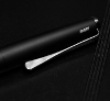
IntroI have lately been looking to add a few low cost everyday pens to my collection so when I saw the UK high street and online retailer "The Pen Shop" had launched a new range of low cost fountain pens I jumped at the opportunity to add something new to my collection. The new youth orientated pens are under the Brand Dex as a division of their existing Kingsley own brand pens. I’m not really sure what to think of the name Dex as a pen brand, but hey, I may be too old to appreciate it’s name appeal, perhaps they were trying to associate the name with the once popular 90's Dexter’s Laboratory cartoon. The range consist of two different pen styles, both in ink roller and fountain pen variants in various finishes (see here) they do appear to have done a good job with a number eye catching designs.I ended up going for the Compact pen in blue as it caught my eye in the store. Here are my thoughts after two weeks of use. Design Materials and aesthetics 7/10The pen has a modern, distinctive design with chrome accent opaque body and an ink window with a contoured rubber grip section. The pen is a little on the light side as all the components bar the clip and nib are made of plastic. Overall an interesting, unique design. Construction Quality 6/10 The quality of the materials used in the pen are reasonable at the price point, however the plastics do feel low cost and the pen overall feels relatively cheap. Ergonomics 6/10 For a compact fountain pen the ergonomics are quite good and the pen fits fine into smaller hands unposted however, it probably will be too short for larger hands unposted. However, if the pen is posted it becomes a similar size to a posted Safari. The grip section of the pen is fairly comfortable, however, I do think the positioning of the finger placements recesses are a little strange as they seem to be placed too widely apart for a comfortable grip. Nib performance 8/10 I was pleasantly surprised with the nib having only paid about £13 for the pen I wasn't expecting much from its “iridium point” nib. However, I found the nib to be one of the highlights of the pen as it delivers a firm, smooth, Medium line with a little bit of reassuring feedback. The nib isn't quite as smooth as my Parker Frontier nib however the nib is excellent for a sub £15 pen. Filling Mechanism, 6/10 The pen is a compact pen so is relegated to using only small international cartridges out of the box. However, I have successfully managed to convert mine into an eye-dropper pen with a touch of petroleum Jelly which has meant the ink capacity has been effectively tripled to approximately 3ml. The ink window is especially useful when the pen has been converted as it allows for a clear indication of the remaining ink. Cost and Value 7/10 Bought for £13 The pen isn't bad value, however it does feel a little on the cheap side and perhaps a price of just under the £10 may have been a bit more reasonable price. Final Thoughts Overall score 40/60 The Good Smooth nib.Compact Design.Can be converted to an eye dropper. The Bad Feels a little on the cheap side.Cartridge only out of the box.
-
Review of my Pelikan M200 So, after lurking around for quite some time, it's time for my first review (please be gentle with me... ) The Pelikan M200 was my first serious fountain pen, I got it from my mother as a gift when I switched schools. I went to school in Germany, so a fountain pen wasn't that big of a deal, but this black-golden piston filler sure was something different. This was about 22 years ago... The pen was my workhorse back then and it shows, clip broke off, cap has a few cracks, the barrel has scratches all over it. I dropped it a few months ago and that was the moment I decided to retire it and buy a new one. It arrived today and after a short flush and test it seems to has all the good things which made me love the first one. Good moment for a review, isn't it? My scanner isn't working like it should, so it's crappy photos.. ______________________________________________________________________ Appearance & Design (8/10) - A Timeless Classic A Pelikan piston filler in black with golden accents, it won't get any more stereotypical and classy than this. This M200 is nearly the same as my old one. On top of the cap is a small plastic nubbin with the Pelikan logo, then comes the golden clip which is shaped like a pelican bill. At the end of the cap is a golden band with the text "Pelikan Germany". The pen itself has a gold-plated nib, engraved with the Pelikan logo, the word "Pelikan" and a letter indicating the size. For the rest it's a simple black barrel with a green, translucent ink window and then the filler knob which is separated from the barrel with a gold band. Construction & Quality (8/10) - It's a Pelikan... This pen oozes quality, yeah it's small and light, but still manages to feel solid and like something which can stand some abuse. The barrel and ink window are seamlessly connected, like it's made from one block of the same material. I like the threading of the caps, there are 4 in there. I mean when turning the wrong way, the cap will 'click' 4 times with one turn. So when tightening the cap it always seems to go with the same short motion. … Weight & Dimensions (6/10) - Light & Small This is a very small and lightweight pen, similar to a TWSBI mini. I have small hands (at least for a 6.2" guy...) and the pen is just large enough when unposted. Posted it should be ok for most people and because of the lightweight cap it doesn't become top heavy. But for people in search of something substantial this isn't the right pen. … Nib & Performance (8/10) - Wet and Springy (for a steel nib) Both my M200's have medium nibs. The 200 has a gold-plated steel nib which has a bit spring to it. Springy-wise it feels similar to my Vanishing Point which has a 18k gold nib. Writing with a bit more pressure gives very slight line variation, but this doesn't feel right to me. The nib is pretty wet, at least with Waterman ink and smoothness is ok. I prefer really smooth nibs like the aforementioned (binderized) Vanishing Point and the Pelikan gives a bit more feedback than what I prefer. … Filling System & Maintenance (7/10) - A Classic Piston Filler... More or less my favourite filling system, the piston filler. Easy to fill, good capacity and for me it's a filling system I associate with quality. It's relatively easy to clean and the nib and feed unit unscrews which I find pretty amazing. The piston mechanism is clicked into the barrel and its not really possible to remove it without damaging the pen, so it's a far cry from the serviceability a TWSBI pen offers. … Cost & Value (7/10) - it's ok-ish.... I bought this pen for 64,- Euros from ebay, which is ok, but officially this is more like 90,-, which is quite a lot more than a TWSBI 580 or the TWSBI classic. Yeah, it's a Pelikan and everything, but the official retail price is bit much. For me it's worth it, I got more than twenty years of heavy (ab-)use out of the first one... … Conclusion (44/60) - A lovely small pen which won't disappoint you I think the M200 is a classic, nothing about it is spectacular, but it's more than just the sum of its parts. A steel-nibbed, plastic piston filler shouldn't be much to write home about, but this little guy has never let me down and I still love to pick it up and write with it, despite the Lamy's, TWSBI's, Pilot's, etc, which I also have available. I hope this was somewhat helpful and/or a nice read. If you have feedback, questions, criticisms please let me know. Other M200 users are welcome to give their experience.
-
Sailor 1911 Profit, Fine Nib, Ivory Body I realize there are several reviews of the Sailor 1911 Profit, but I don't seem to see many pictures of the ivory body. I decided to put in my two cents and also have some reference pictures available for anyone else who wants to check out the pen before buying. The pictures I have seen prior to receiving this pen made it difficult to determine whether or not the pen was a bright white or a true ivory. I can happily say that it's a lovely off white colour and that I am very pleased with it. What follows is my picture heavy mini review. I would highly recommend the pen, and it is honestly my favourite pen overall (I had a burgundy one that I have sadly misplaced). The pen came with a standard Sailor box, that seems price appropriate, a converter, two cartridges, and an instruction manual. The pen was a birthday present from my girlfriend, and I appreciate it a lot. She's far too kind to me and indulges my hobby. The Review: Appearance and Design: 8 The classic cigar shape of the pen is fitting, though admittedly uninspired. I very much like the ivory colour and I think it's a step up from white. It looks like a nice warm pen, and the gold trim only adds to the appeal. The clip is also classic and uninspired, but far from ugly. It fits with the pen and all in all it looks very classy. In my book, it does get bonus points for being ivory coloured. If you don't care for the colour as much as I do, I would say the design is a 7, since it's unoriginal but well executed. The Pen DSCF6769 by makey95, on Flickr The Trim DSCF6774 by makey95, on Flickr Construction and Quality: 9 The pen feels very well made, and is very sturdy. The threads where the cap screws on are smooth and rounded, and they never interfere with the grip. There's not a single loose part in the pen, and it seems sturdy enough to take drops while capped. The resin body feels durable, and nothing about the pen seems cheap. The nib and feed are friction fit, and they can easily be pulled out, but they're not loose at all and are a snug fit. Nib and Feed DSCF6777 by makey95, on Flickr Weight and Dimensions: 10 The pen feels like it's made to be posted, and once posted feels perfectly balanced. Unposted, it is a tad too short for my hands, and feels rather light. Capped the pen measures around 5.25" and uncapped it is about 4.625" unposted. Posted, the pen is about 6" long. The diameter of the grip seems to be around .375". It is a medium-light pen, but I can write with it for hours at a time without my hand tiring. Nib and Performance: 10 Honestly this is my favourite modern nib/favourite non-flex nib. I've tried a few flex nibs that come close to being the joy that this one is, but even they pale in comparison. It is honestly one of the most enjoyable writing experiences that I have experienced. For such a fine nib, it is extraordinarily smooth and has almost no feedback, but still enough to let you feel the paper enough to enjoy the ride. The feed does a superb job of keeping up and it never has any hard starts or skips. The nib wrote immediately, even after being left out to take the photographs. The Nib DSCF6783 by makey95, on Flickr The Feed DSCF6775 by makey95, on Flickr Filling System and Maintenance: 7 The pen uses a cartridge converter system, and despite that has great ink flow. The converter does not hold all that much, but it's certainly enough to last several days of note taking. Having a cartridge converter system makes maintenance easy enough, but the friction fit nib and feed makes cleaning out the pen a breeze. Just take it apart, wash it, dry it, and it's quick and easy to move from a black ink to say a light yellow-orange. Normally I would give cartridge converter pens a 5, utterly average, neither good nor bad, but the ease of maintenance warrants a higher grade. Cost and Value: 10 This tends to be highly subjective, but for a pen that I consider to be the best writing experience, with a marvelous fine nib, easy maintenance, and perfect balance, I would say that the $100 that my girlfriend paid for it was reasonable. I would be personally willing to pay the full U.S. price for this pen (with tax, around 180 dollars). Conclusion: Highly recommended, if you couldn't tell. A word of warning, every once in a while I do see a Sailor 1911/Pro Gear or two out of the box (I've worked with a few over the years) with misaligned tines, but that's usually a quick fix. I have never seen a Sailor 1911 Standard that, once aligned, does not write smoothly. The majority of Sailors that I have seen write perfectly out of the box. Writing Sample/First impression review (Muji Notebook) DSCF6787 by makey95, on Flickr Final Words: Thanks for reading, feel free to mention your own thoughts on the pen, the colour, or my pictures. I tried my best to accurately pick up the colour of the body. I cannot thank my girlfriend enough for the gift, and I know it will see a lot of use. The only thing that I'm worried about is staining the ivory body. I've been looking into leather pen slips/holders for this pen, and I would appreciate any cheap but durable recommendations. I would like around 10 dollars, 15 maximum for the holder. I hope the review was informative.
-
I got this pen in two colours; the black and stainless steel, as they were both on sale on the WHSmiths website for only £26 and £24 respectively (normally they’d be around £40), as I had been so impressed with the black version. Being from WHSmiths both initially had medium nibs but I got an extra-fine nib for the stainless steel version having tried a fine on it which was very similar to the medium - I’m guessing there can be quite a bit of variation between nibs with Lamy as it was definitely a lot broader than the fine nib I had on my Safari. Initial Impressions: When the black version arrived I was very impressed straight away, it feels bery well built, the cap clipping on very precisely with the satisfying click you always look for, both over the nib and when posting - it has a special ring on the back for posting. The nib seemed very smooth and wet as well. The matt black finish looked really good as well, the whole pen infact looks really sleek and cool. The grip section it polished steel, with a slight convex, which I think looks good with the black and didn’t seem slippery at all despite my hearing that it was and being afraid it would be! The stainless steel version was much the same, I didn’t think the stainless steel finish looked quite as good as the black, but it has a rubberised grip though that I think makes up for it and I definitely prefer the feel of over the polished steel grip of the black version. The polished grip section definitely suits the black version more though, I think a black rubberised grip with the black body would just be too much. Design: The pen has a bit of weight to it but I certainly wouldn’t call it an overly heavy pen, but I wouldn’t post it as it becomes a bit top-heavy. The clip has an interesting shape you’ll see in the pictures that actually works quite nicely, it’s a little springy and its shape helps it slide on easily. The grip section is relatively comfortable to hold but its shape isn’t very ergonomic. It isn’t that slippery, obviously it can be in certain situations (i.e. If you have particularly sweaty hands...) but usually I haven’t had a problem with it in that aspect. One thing it does do however is attract fingerprints quite a lot and it needs a quick wipe to clean them off every now and then. The body comes off the grip section nicely, there aren’t any plastic threads holding it on which is always a plus in my opinion, I’ve never liked pens that have a solid metal body that screws onto the grip section with delicate plastic threads. The finishes on the body of both versions are pretty tough and so far haven’t scratched at all after a couple of months use. Overall it’s a pretty well-built, sold feeling pen and looks awesome but I think they gave form priority over function. Score: 6/10 Nib and Performance: The nib is the same used on the cheaper Lamys like the Al Star, Safari, Nexx, etc. Not that I’m complaining though, it can be a very nice nib! The medium is ultra smooth with only a little feedback, just enough to let you know you’re touching the paper. One thing I did find though was that it seemed to have a bit of a sweet spot - it has to be at the right angle to get the most ink flow and smoothness. The medium Lamy nibs I’ve tried have definitely been the broadest I’ve used and this follows that trend, albeit being a little bit drier than the Al Star I had used before (although that is an incredibly wet pen!). The feed keeps up nicely but I’ve had a lot of false starts, although this may only be because I’m not quite on that sweet spot I mentioned before, it’s a bit of a nuisance at times. The extra-fine nib wasn’t quite as smooth obviously but it is a very fine nib. It’s perfectly usable though and I’ve found it perfectly pleasent to use. Please note however that I haven’t had that much experienced that many extra-fine nibs! 8/10 Conclusion: Overall it’s a nice, solid, smooth-writing pen, but I don’t feel it’s up there with the best. I can see it being ideal for those who don’t require it for lengthy writing, maybe a nice pen to keep in your pocket for quick notes here and there; however for someone who does a lot of writing it’s just not comfortable enough for me. Don’t get me wrong though, this is certainly a good pen and I’d recommend it, especially for anyone who’s a fan of the nibs they’ve had on the cheaper Lamy’s and want to try something a bit more expensive and higher-end. Score: 15/20 Pics! http://farm8.staticflickr.com/7366/12254538864_27597e9b57_c.jpg http://farm8.staticflickr.com/7417/12254537934_2cb83137ae_c.jpg http://farm4.staticflickr.com/3814/12254273883_331e828454_c.jpg http://farm8.staticflickr.com/7292/12254099685_ff953c63f6_c.jpg http://farm6.staticflickr.com/5527/12254271813_77ca20f2eb_c.jpg Finally, with the grip sections swapped out which I think looks a lot better... http://farm4.staticflickr.com/3722/12254271023_65ae3a76d5_c.jpg Writing sample with comparisons... http://farm8.staticflickr.com/7352/13166469415_2e3fa31e49_c.jpg http://farm8.staticflickr.com/7007/13166733314_51ccd3a148_c.jpg And a size comparison... http://farm3.staticflickr.com/2857/12254281983_82b552b578_c.jpg http://farm8.staticflickr.com/7440/12254281053_a872506103_c.jpg Sheaffer 300, Sheaffer 100, Sheaffer Prelude, Lamy Studio, TWSBI Diamond 580, Kaweco Allrounder, Pilot Prera
-
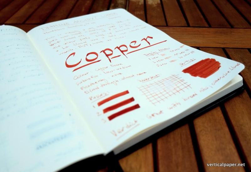
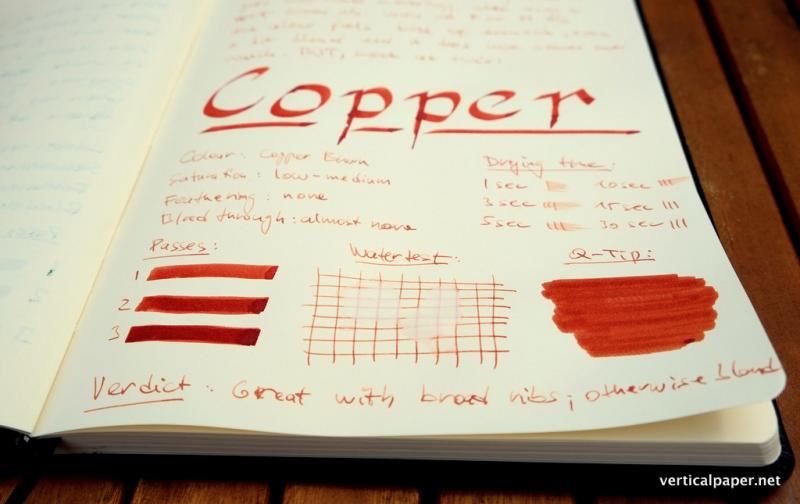
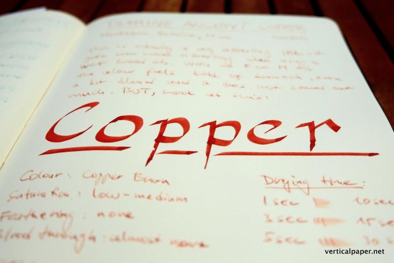
For high-res photos, feel free to visit to my blog. Diamine Ancient Copper is an unusual ink. In terms of colour richness/saturation, you are effectively presented with two very different experiences - all depends on the pen you are using. If you use a fine or medium nib, you get more or less a light brown, not very saturated and quite a bland colour that does not stand out much and may be difficult to read. However, the broader the nib, the more exciting it gets. With a broad or a stub nib (tried with Vintage Parker Duofold stub and TWSBI 580 1.1 italic) the ink really shines. The richness of the copper colour comes across very clearly, it is saturated, beautiful and fresh. Drying times are not very good (but that’s not unusual for Diamine inks), but it does not feather and there was hardly any bleedthrough at all which is always nice. Overall summary: It’s a great, well behaved, but rather slow drying ink for people who write with broad(er) nibs, but you may be disappointed if you use M/F/EF nibs as it is not saturated enough to stand out. Paper: Rhodia A4 notebook (90g)Pens: Montblanc Boheme (M nib) and Pilot Parallel (6mm nib)Water test: drops left on the paper for 1 minute
-
Please enjoy!
-
Rhodia Webnotebook Review
yogalarva posted a topic in Paper & Pen Paraphernalia Reviews and Articles
I purchased the large-size Webbie back in March. I’ve been hesitating to do a review because I just wasn’t sure what my final verdict was going to be, but now I think I know. In case you’ve been living under a rock or something, here’s a brief overview of the Webbie: Made by RhodiaContains 90g creamy Clairefontaine paperSewn binding, all encased in a soft-to-the-touch leatherette coverIncludes a ribbon bookmark and elastic closureAvailable in lined, dot-grid, and blankThis size sells for $22+ online, depending on retailer (I bought mine for $25 from Goulet Pens)That’s the infamous Webbie. Some people love them, some people hate them. I am going to do a bit different format today and list the things I like about this notebook, the things I don’t like but aren’t severe enough to keep me from using it, and the thing I didn’t like that ultimately delivered the death blow. Things I like: The hard cover is very sturdy and I enjoy the texture of it. Soft and supple to the touch but without seeming delicate - it’s a good balance of style and stability. The material also doesn’t seem to be prone to picking up an inappropriate amount of dirt, even when used as a daily carry. The paper is but-tah smooth. I started to say that it’s the smoothest paper I have ever used, but in reality it’s on the same level as the Tomoe River Paper in my Seven Seas journal and the Staples inkjet paper I write reviews on is of similar quality. There are different ruling styles available. Not all retailers seem to have all rulings, but they are out there and it nice to have choices. The only experience I have is with blank pages, but it’s nice to even have that option since a lot of notebooks seem to only be offered in lined and maybe grid.That might seem like a short list, but overall I have to say that the experience of using and writing in a Rhodia Webnotebook is very pleasant. The paper is some of the best you can buy and the build quality is excellent. If you are looking for a really nice notebook, I don’t think you can go wrong with trying out a Webbie. However, there are some things that I don’t like at all about the Webbie. Things I don’t like (minor): The notebook is only available in black and orange. While I do appreciate having choices, I only dislike the color orange slightly less than I dislike the color black, so there’s that. This is obviously a personal thing, so take it with a grain of salt. The Rhodia logo on the front cover is anything but discrete, at least on the orange version. I can see how it would be easier to miss on the black one, but the imprint is so deep that the shadows created on the orange cover means you will always be able to see the logo, unless of course it’s so dark that you probably won’t be doing much writing anyway. The paper, while fantastically smooth and able to handle most inks, is not perfect. I did have a few inks that started to bleed through the pages, which is something of a deal breaker for me. Granted, these were not the inks I used regularly, but I think I’ve been spoiled by Tomoe River Paper where nothing bleeds through the pages. I don’t mind a fair bit of ghosting, but bleeding is unacceptable. The elastic band is so tight that it leaves little indentations in the soft material of the cover. The flip side of that being that the elastic band starts off nice and tight, so the notebook is held closed very securely.All of those things are minor quibbles, and for the most part personal annoyances more than anything else. Not everyone has the same standards that I do, so these things might not bother you at all or they might be the ultimate deal breakers for you. For me, there was a single quality that has caused me to stop using the Webbie as my EDC: The paper is cream. It’s listed online as “ivory” but it’s darker than the color I consider ivory. It’s noticeably yellowed, and this will dramatically affect the appearance of your inks on the the page.Which is not a big deal unless you are using this as an ink journal. But, for me the color is too much. I absolutely love bright white paper. I like my writing to pop off the page. I’ve learned that I will probably not find a notebook with bright white paper that is also FP friendly, but the color of the paper in the Rhodia is too much for me. Thus, while the paper quality and build quality of the Rhodia Webnotebook is fantastic, it is ultimately not the notebook for me. I have recently shelved it and gone back to my Seven Seas journal, which is making me wonder why I ever left it. The issues that made me switch to the Webbie have turned out to not be something that I really took that much advantage of in the Webbie anyway, so I’m back to the wonderful Tomoe River Paper. Overall, I think the Webbie is a great notebook, and I would highly recommend it to anyone who needs a classy looking notebook filled with FP friendly paper that will hold up to a daily beating. All of the objections above are personal criteria I have used in my quest for the one true notebook and are in no way meant to bash on Rhodia. Yes, the Webbie is pricy, but there are few other notebooks out there that boast such nice paper and a sewn binding with hardcover. The only thing I can say is try it out if you are curious, since the only person who can tell you if a notebook will work for you, is you. :-) This notebook was purchased with my own money and I am in no way affiliated with any companies mentioned above and am not being compensated for this review in any way. The opinions expressed are entirely my own and you are free to disagree with them if you like.
-
Initial impressions: This was my second fountain pen I purchased after getting into them about a year ago, before this I had only used a Lamy Al Star on a regular basis. I got it from Cultpens for £36, with the medium nib. When it first arried it arrived in the usual Sheaffer gift box Sheaffer pens come in - a very nice box and I did use it for storing the pen when I wasn’t using it but have since grown my collection and now store them all in a display case so the box is not effectively useless. It would be nice if pens started coming in boxes that were either more useful as a box (i.e. Could be used to store more pens or different items entirely) or that could double as a pen case you could put in your pocket! I think this has been done before - I think Kaweco have poxes that can store multiple pens and one that’s even like a glasses case so could be used to store a pen in your pocket comfortably... Anyway, on with the review! The pen felt very solid, being made of laquered metal (I got the all black version) and having a very tough spring-loaded clip. The cap is help on securely but comes off with just the right amount of pressure and of course goes back on with a lovely *click* sound. The pen is definitely on the heavy side and admittedly this put me off the pen for a while but I have since grown more used to heavier pens and now it doesn’t feel nearly as heavy to me. Design: The clip as I said is spring-loaded which makes the pen feel of very high quality to me, maybe because the clip is made of a very thick piece of metal as a result. At the end of the body is a ring to hold onto the cap when it is posted making it post very securely, but alas the cap is too heavy to post (I don’t post usually but I’ve heard even those who do find it too top-heavy posted). The grip section tapers to the tip but is very broad which I like, having big hands and find it appriopriate for a pen of this weight. It is made of plastic which is comfortable to hold onto but unfortunately the threads that hold it onto the body are a little fine for my liking so I always feel I have to be careful screwing it onto the body and it doesn’t do so with as much ease as I’d like. The nib meanwhile is relatively small which I quite like as I find smaller nibs help my handwriting, not entirely sure why. It has some nice decoration but is overall not an overly flashy nib, just tasteful, solid, and well made! 9/10 Nib and Performance: The nib is quite smooth, the type that is smooth but has clear feedback that I find very satisfying to use. It’s also quite wet and lays quite a thick line on the thicker end of the scale of medium nibs I’ve used. However if you like a nib that has some springiness to it, this isn’t going to cut as it’s almost completely solid. Personally I don’t find this a problem and rather like but it may not be for everyone. It always starts, always, and keeps up with long-term writing just fine, not going dry one bit. The grip section makes it very comfortable for longer writing sessions as well, the large girth is very well-suited for the larger-handed like me. 10/10 Conclusion: A very nice pen indeed, not for everyone with its weight but a very classy-looking, functional and comfortable pen. I would recommend it to everyone especially at the price I paid for it, I would certainly pay a lot more for it! Score: 19/20 Pics! http://farm8.staticflickr.com/7354/12254268063_733fa3c06e_c.jpg http://farm4.staticflickr.com/3745/12254093545_c85d5eeeaa_c.jpg http://farm6.staticflickr.com/5527/12254666696_e84bccf076_c.jpg http://farm4.staticflickr.com/3708/12254264663_6c863e4402_c.jpg http://farm3.staticflickr.com/2811/12254526754_8898a79594_c.jpg Writing samples, with comparisons... http://farm8.staticflickr.com/7111/13166469895_cdd475c8b5_c.jpg http://farm4.staticflickr.com/3810/13166733894_12567bc433_c.jpg http://farm8.staticflickr.com/7007/13166733314_51ccd3a148_c.jpg And finally, size comparisons... http://farm3.staticflickr.com/2857/12254281983_82b552b578_c.jpg http://farm8.staticflickr.com/7440/12254281053_a872506103_c.jpg
-
A simple review of one of my favourite inks (I don't have a lot, so don't judge). Also, please ignore my messy handwriting and the fact i said the Namiki Falcon was a semi-flex.
-
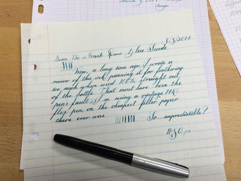
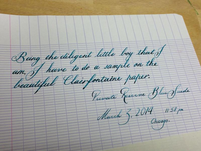
A while ago, I posted a pretty scathing review of Private Reserve Blue Suede, complaining about pretty severe feathering. Well, I want to revise that somewhat because I think those results were very pen-dependent. I just tried writing something with my new Waterman frankenpen, and the ink performed very well on the cheapest "99¢ for 200 sheets" American filler paper ever made. I bought this stuff ages ago. It's thin, uncoated, and everything but see-through, and the ink performed spectacularly. Of course, I had to try it on my best Clairefontaine, and the results…took my breath away.That's a money shot, people.
-
Just posted this review on my blog - figured someone here might want to read it too. :-) I guess I’ve been on a bit of a Noodler’s kick lately, but I feel like I’m not really doing it right if I don’t at least try some of the classic Noodler’s inks. Thus, here for your enjoyment today is Black Swan in English Roses, also known as BSiER: And, because my handwriting is a bit tough to read on this one, here is what I wrote: This ink is very interesting. Goes down a deep red, but dries to more of a rusty brown. Makes me think of writing with a pen full of blood (sorry if that’s too morbid)… No noticeable feathering or bleeding, though there is show-through because it is a bit on the thin side. This ink does have some shading, though I’m not sure that I’m seeing the “black swan” effect. Still, a very nice color and it seems dark enough to use in a professional setting while still having a touch of color. This ink claims to be at least partially bullet proof, so I will have to test the water resistance, but barring that and no cleaning problems, this would definitely be and ink I would recommend if you like the color. :-) This was a fun ink. My first one in the Vac 700 and I went through almost the full fill before I got bored and emptied it out. One bummer was that it practically looked black in the barrel, and I like to use inks that look fancy in demonstrators. But it cleaned out easily and had a good amount of water resistance, so I would say it was a very “user friendly” ink. Overall, I would recommend this ink if you like the color and want something with a bit of water resistance and otherwise good behavior. It wasn’t exactly a life changing ink, but I could see it being very nice if you are using it in a flex pen, which, alas, I do not have yet. This ink was purchased with my own money and I am in no way being compensated for this review. All opinions expressed above are my own and you are free to disagree with them if you like.
-
Dear all, I've bought this pen today and I have to share with you some photos / opinions: Looks - 8/10 - nice, with chrome cap / section / black leather grip on the barrel + a small black ABS stripe on the cap Quality of built - 6/10: - cap is the biggest problem - takes a lot force to cap / uncap it; after capping, the position's a bit flimsy... - barrel is all metal inside, but is not shallow on it's entire length, as a result the pen can be fed only with small cartridges. Nib - 8/10 - a bit springy, fairly wet (wrinting sample done normal 80 gsm paper + Pelikan Royal Blue ink), smooth enough. Feed - strange sape no wings / cuttings Price - interesting - less than 20 EUR I hope that this first pen description done here by me, on this website, will help somebody, sometimes.
-
This forum is so useful and helpful; this is my small contribution. I noticed a few posts of late comparing grey ink to the colour of writing with a pencil. So I decided to do an actual comparison (see the images below). Diamine Grey really does look quite close to the colour of a pencil lead (of course, this will depend as well on the pencil used and how hard you press - I used a 2B lead for my comparison). This is my only grey ink, but I'd be interested to see how other grey inks compare... after I've finished off this bottle first of course! I'm the type of person that uses a black ink more than any other colour, but I find this ink is a nice change for personal note-taking. All ink components of the review were written using a LAMY 2000 with a fine nib.
-
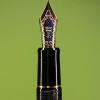
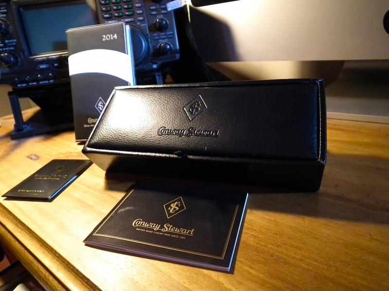
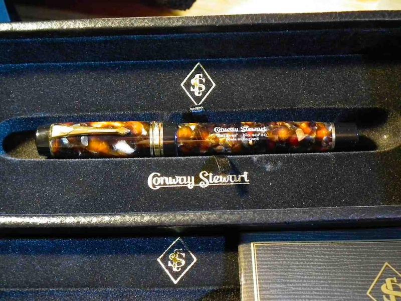
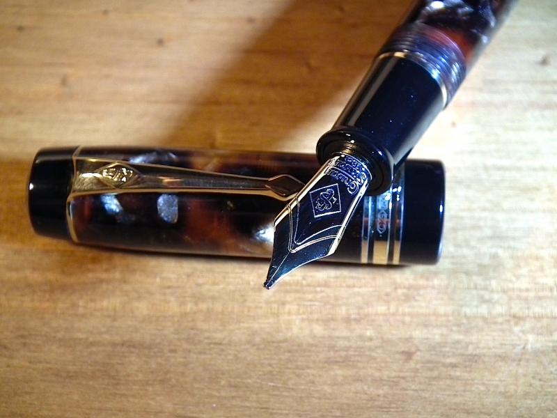
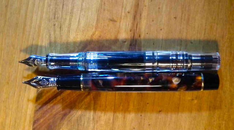
Good evening fellow FPN'ers. Having dipped my toes in a couple of posts so I am going to have a go at a review of a little pen I have just acquired, the new Conway Stewart Belliver in Bracket brown. Having looked at a lot of other reviews, they all seem to follow a similar formula so will "sort of" follow the same but with my own flavour. As with my writing, I will go off at tangents, nothing new from me then... :-) The post has a fair number of pictures to support my ramblings. I hope someone finds it of some value. Purchase Experience: 10/10 Purchased online from "Andy's Pens" based somewhere in Kent, England. Gave the guy a call to check stock, no problems, however, no nib available. CS apparently were awaiting new nibs, but was informed that if I still want one the whole pen/nib will come direct from the factory. Ok for me, no problemo. Three days later, It was delivered! Opening the box and first impressions: 10/10 Ok already getting cheesy, 10/10 again. But for real, it is an experience getting one of these. The box is perhaps a quarter size of the CS Winston box but no less plush. It was a box within a box within a box, plus a little surprise, a 2014 pocket diary from Conway Stewart. Nice touch, but will be saving it as a keepsake/memento. It has a nice signed booklet from the factory. In other words, a real person has made, assembled, packed and proudly signed their name to the final touch before boxing. That is a nice sign of assurance to me. Love it already. Time to see the pen. The pen itself (just looking at it): 9.5/10 At this point, after peeling back the multiple levels of security to get the the prize, there it is, sat nestled in it's felt groove shining. I mean REALLY shining. A sort of deep translucent multi hewed, oh hang on... It looks little smaller than I expected. Hmmmmm. Nope, stick with it, size IS deceiving and lets pick the thing up and have a proper look now shall we? The pen in the hand: 10/10 Well what can I say, it feels just perfect. Smaller than I expected, but I am starting to love it already so have marked it back up to 10. It is VERY shiny and the colours have a depth that is beyond belief. I expect the shine will wear off in time but for now I am enjoying it. I will compare the size later with a popular well known pen :-) The weight is just right as well. Anyone looking for a balanced pen, this is the one. Can't tell posted, I never post pens I always hold the cap in one hand. Sorreeee. Taking the cap off: 8/10 then 9/10 then.... Warning fellow CS pen addicts, warning. I mentioned awaiting a new nib from CS and they meant NEW nibs indeed. This is neither the standard all yellow gold nor the limited edition two tone gold but a BRAND NEW nib series from the look of it. This is NOT the nib in ANY of the CS advertisements that I can find. This is a two tome, looking very much like a MB149 nib but without the breather. It has grooves which may be stamped in that flow from the pen body to the nib and separates the two gold tone. It is also unbelievably shiny. This playmates is going to be a marmite experience for many, love it or hate it. It looks less mechanical and sort of flows. it gives a classic pen more of a vintage look and feel and to me it does enhance the overall vision. BUT. I don't like surprises. Size: 9/10 Sorry. I expected it being a tad longer and a tad wider in girth. Not measuring the pen or looking long and hard at the specs or size guide or doing a 300 mile round trip to handle one, I drooled and pressed the button. My fault, but I stand by it, it is gorgeous. I will ramble more later. How big IS it? About the same size as a TWSBI 540. (check my pictures). Ever so slightly thinner section, length, mmmm same-ish. I have largish hands, not panicking yet, but grumbling to myself. Stop rambling and fill the pen! 10/10 Cartridge/Converter. Screwed tight in place, will never drop out, love the design, simple and effective. Other Manufacturers please take note and think long and hard about it, this is the way to fit a converter properly. Easy to fill, so loaded it up with Waterman Havana brown to do some basic tests and see what this thing can do. Havana Brown in this pen: 2/10 Move on please. This is not for this pen. Ever. It put ink on the paper and that is ALL I will say on that matter. Inking the pen after a good clean: 10/10 That's better. Loaded up with Diamine Teal and offered the nib up to some cheap copy paper and scribbled some lines, did the "quick brown fox jumps over the lazy dog" thing (I bet that poor fox is getting tired of it) and it sort of just worked. No drama, the usual feathering and bleed thru as expected but in general, erm, nice.... Offering the pen up to some better paper: 10/10 Rhodia lined pad, the flip over type. Oh... Now we are in business. Will try and describe this. Nib touches paper, nib glides. REALLY glides. A little feedback, a slight spring (I have a light hand) almost imperceptible spring to be honest, a slight softness but ooooh so silky smooth. What did I say about the new colouring of these nibs and surprises? WHO CARES!!! Wow. Silky, butter, cheesy (oh thats me sorry). Pic with writing sample supplied is on Oxford Black n' Red The writing experience overall 10/10 This is where I just start writing glowing stuff about this (little pen). It is designed to write with this little fella. It is a no-nonsense, no frills writing instrument. It lays ink down with a little line variation, has enough feedback for a light writer AND fits quite comfortably in large hands just as the TWSBI does. I did some fast large signatures to try and defeat the flow. Not a chance. The Belliver kept up. This is a pen to write pages and pages with and will keep on going till the ink runs out. Sort of overall impressions after use: 10/10 For anyone put off by the usual high end monster pens, this is ideal, it is NOT an oversized behemoth. It is a REAL sized or realistic sized pen. For people with small hands. Perfect. For people with Huge hands. Please try before you buy. I am happy, others may not be. The nibs are new. See if CS publish any pics and see if you like them. I do, it is going to be a battle of taste on this one. They write amazingly, just amazing. Nib width. The nib is the italic medium. This is ALMOST the same as the TWSBI 1.1 or the Lamy 1.1 italic in width. Paper. It needs good paper to get the best out of it. Heck it deserves it. Don't spend £300+ for a pen and write on toilet paper, please go for the experience, it is worth it. Ink. Experiment. I have read multiple times on these forums how ink performance differs from pen to pen and vice versa. It really is true. Diamine performs badly in my CS Winston IF nib, but is tamed with Aurora black! The Belliver with the IM nib LOVES Diamine ink. It did not like Waterman brown, it turned the pen into a fire-hose and just threw inconsistent lines all over the page. Very messy. Yours might like a different tipple. Take your time and find the one that the pen likes. Urban Myth I have also read CS nibs have had flow issues and many people have had theirs tuned to suit them. Or the ink they like. I personally (thats me and nobody else) think that the nibs are just fine, just find an ink that works and enjoy. The nibs are damned good. True, some nibs may be in need of a tune or even a full swap. Ever seen a car costing £20,000 broke down on the hard shoulder? Yep, me too, it happens. Customer Service: 10/10 Ahhhh I had to slip this one in. It was delivered within the week. Can't fault that. Pictures: Please find attached a set of snaps to support my ramblings. They DO NOT convey the depth of colours or the weight and feel, the ones found on the CS site are far better. What the online marketing pictures DO NOT show is the real size of the pen. The size chart CS have online is great if you have another CS pen yourself to compare it to. I decided to pose the pen with a very popular modern pen the TWSBI 540 with a 1.1 nib to let people get a sense of the size comparison. I hope you guys find the review useful. D.
-
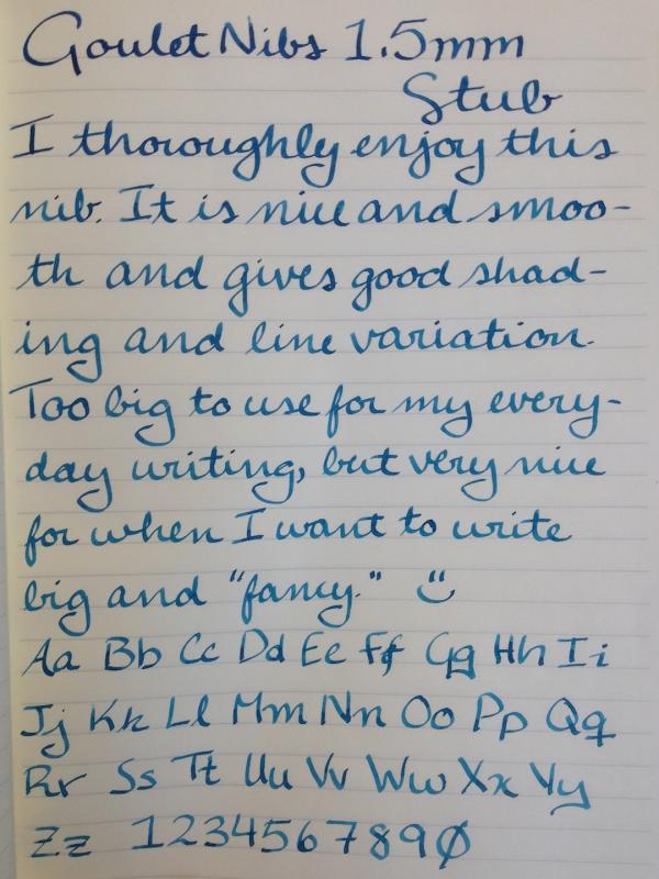
Quick review on my Goulet nib: Assuming that my nib is a good representative of all the others, I think these nibs are a great value for the money. I put mine on a Nemosine Singularity that was otherwise a great pen but had a super scratchy nib. Now it is beautiful, writes really smooth, and is a total joy to use. And, that two-tone is really classy looking. :-) I say that if you are looking to replace a #6 nib, this would be my first recommendation. Also, I really like the Goulets and I would rather have their logo on my pen than any other company. A few more writing examples: And some poorly done pictures of the nib itself: Btw, I bought this nib with my own money and I am in no way affiliated with Goulet Pens. All opinions expressed above are strictly my own and you are totally allowed to respectfully disagree with them.
-
Initial Impressions: Initial impressions were pretty good, the nib wrote very smoothly and rather wet, it felt pretty solid but overall a little on the cheap side. The grip section’s indentation similar to that found on the Lamy Safari, Al Star, etc didn’t really do it for me - they were set too far back to really be of any use for me. That being said however it did write very well and reliably with no hard starts or anything an came well presented in the usualy Sheaffer gift box and came with a decent converter. Design: The finish I opted for was the stainless steel finish as it was incredibly cheap on Amazon relative to the price of the other finishes - mine was only £22.50! The finish it pretty tough and hasn’t suffered from any scratches or anything so far. The cap seems to attach rather softly, the plastic ring seems to just be too soft to give it that satisfying click. It has indentations like that of the cheaper Lamy fountain pens but these, for me at least, are useless as they are set too far back and aren’t deep enough to be of any help. The plastic of the grip section feels rather cheap, and very smooth making grip a little slippery. The threads on the section are also very thin and there are far too many of them - it takes ages to screw it onto the barrel and when you do you feel the need to be careful not to wreck the threads. The end of the barrel is rather plain as well, being basically a round bulge at the end - you’ll see what I mean in the pictures. The pen is however as a result of these drawbacks very lightweight and, despite the parts feeling a bit cheap, would probably take quite a beating. At the end of the day I’m glad I didn’t spend the full £40 or so this pen would normally be for the other finishes, especially when you compare it to the other Sheaffer’s in the same price-range (well, cheaper than the full price for this pen), like the Sheaffer 100 and 300 which are both very solidly built pens, have (in my opinion) nicer nibs, and just generally feel much better buit and designs. Overall I give it... 5/10 Nib and Performance: The nib initially was a very good performer, but alas this soon deteriorated. The tines became very unalligned, and the it became very scratchy and dry. I thought this might be because of the angle I was using it at but it turned out that they were unalligned in the opposite direction you’d expect based on the angle I wrote at. After getting them alligned it was still not as smooth as before, and not quite as wet. After some smoothing and spreading the tines a little, it’s writing pretty well again, not an amazingly smooth write nor amazing wet, but good enough to be a perfectly nice pen again, albeit with a little too much feedback to be overly comfortable In terms of line width it write quite a fine line only a little broader than that of my Kaweco Allrounder that has a fine nib. I’m a little disappointed by the problems before, especially after such a good start but it’s now not too bad so it gets... 6/10 Conclusion: Overall not a bad pen at all, for the price I paid, if I spent anymore than what I did I would be very disappointed. It isn’t in my pen rotation very often these days, I don’t find it’s nib comfortable enough for quick writing of notes as it just has too much feedback but it’s alright for slow relaxed writing at home. The body is tough but very plain in appearence, the grip section looks and feels almost tacky for a pen of this price range. Score: 11/20 Update: Since writing this review I've tried the pen with new inks that have bought the best out of the nib, namely Diamine/Cult Pens Deep Dark Blue and Diamine Florida Blue that have somehow made it a very smooth nib - Overall I think this change boosts the nib/performance score up a mark or two Pics! http://farm4.staticflickr.com/3823/12254090225_7d952a141e_c.jpg http://farm3.staticflickr.com/2874/12254522644_7727222f22_c.jpg http://farm6.staticflickr.com/5536/12254521704_c24d0a1a9b_c.jpg http://farm3.staticflickr.com/2854/12254085755_74a7c63c99_c.jpg Writing samples, with comparisons... http://farm8.staticflickr.com/7066/13166733734_6932cc7790_c.jpg http://farm8.staticflickr.com/7007/13166733314_51ccd3a148_c.jpg http://farm4.staticflickr.com/3810/13166733894_12567bc433_c.jpg And a size comparison... http://farm3.staticflickr.com/2857/12254281983_82b552b578_c.jpg http://farm8.staticflickr.com/7440/12254281053_a872506103_c.jpg Sheaffer 300, Sheaffer 100, Sheaffer Prelude, Lamy Studio, TWSBI Diamond 580, Kaweco Allrounder, Pilot Prera