Search the Community
Showing results for tags 'review'.
-
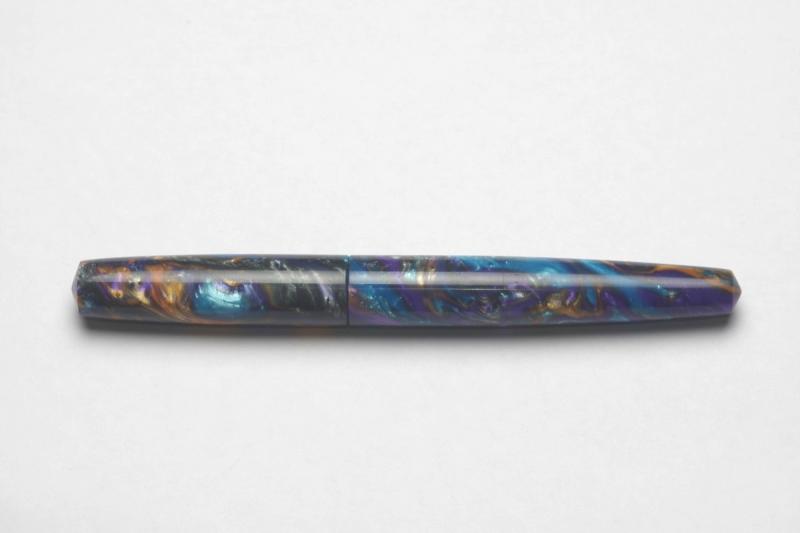
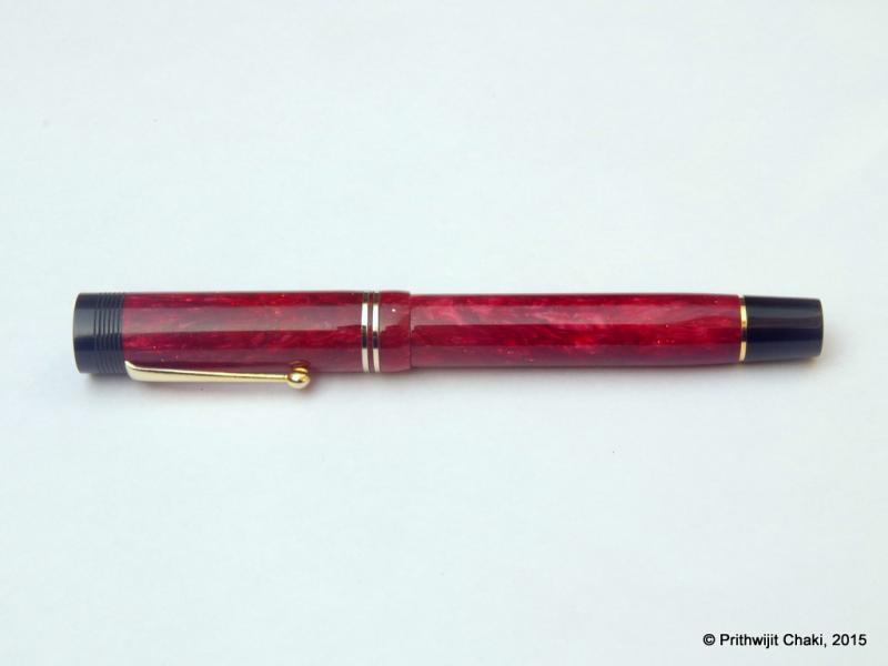
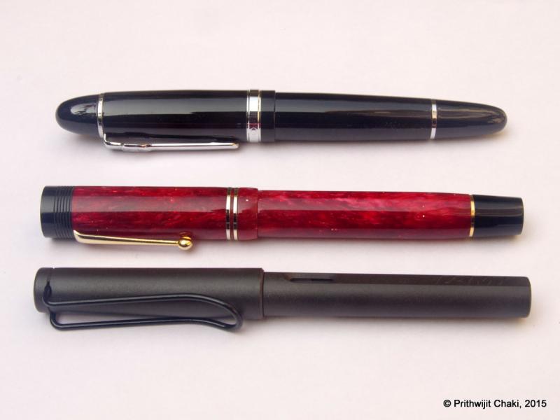
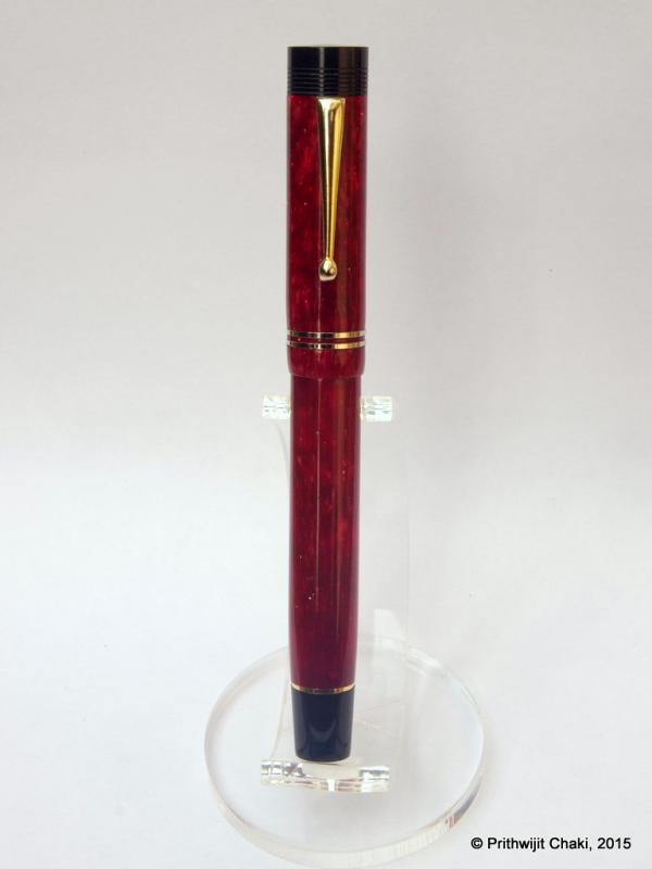
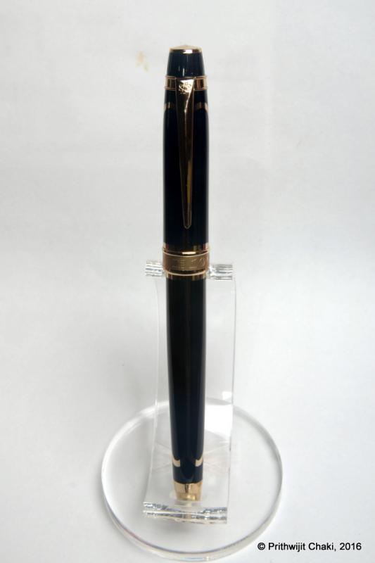
Hi everyone, this is my first attempt at a fountain pen review and I have decided to review the ASA Bheeshma which is a custom design that ASA pens has made based on my request. Since this is my first effort, please go easy on the brickbats. Constructive criticisms however are always welcome. Introduction The story of Bheeshma has to start with the discussion one day that we were having in the “Fountain Pen Pals India” WhatsApp group when someone introduced me to a picture of a Scriptorium pen in Lava Explosion blank. I was stunned as to how amazingly pretty the material was and how beautiful the pen looked. Without knowing it then, I was smitten and hooked. Days passed and my urge to possess one went up in leaps and bounds. Unable to resist any further, I reached out to Eugene Soto of muttblanks.com to enquire about blanks in larger than five inch sizes for kitless pens. He suggested using two five inch blanks or he could make seven inch blanks as a custom order. I am not sure why, but I chose the second option. Maybe, in my mind I thought since I am venturing into something new then why not stretch the envelope. Anyways, after 3 excruciating weeks of waiting, the blanks finally managed to pass through the hoops of transatlantic flight and customs clearance to land up in my mailbox. The next challenge was what pen to design for the blanks. Given that I had opted for small seven inch blanks, a large pen with clips and all paraphernalia was out of question since we simply didn’t have enough material. Fellow group members and FPNers Vaibhav (@mehandiratta) and Pradeep (@pdg84) chipped in and we decided to make an adaptation of the Onyx design that Pradeep had but with some modifications to the specifications. Vaibhav was kind enough to make a CAD based on the design ideas and the outline of the pen was ready. He even christened the concept Bheeshma based on the powerful thespian from the epic Mahabharata. When it came to the question of the pen being made, there was nobody else I could think of other than Mr. Subramaniam of ASA Pens. Not only had he helped me gain knowledge on all pen related matters, but I knew I could trust him to look after my dream and nurture it like as if it is his own. So off went the blocks to him to get turned (pun intended) into a pen. Design The design is inspired by the Onyx which in itself is inspired by the classic Nakaya Piccolo design. This is a classical design that starts as a cigar shape, tapering down towards the end filial and terminates with small conical end pieces at each side. The cap is flushed with the barrel with a small step down design where the cap and barrel meet. The section design has been patterned on the ASA I-Can / I-Will which in my experience is extremely comfortable. The section gradually tapers from the barrel towards the nib before starting to flare out about 7mm to 8mm before it ends. The design is clipless, i.e., doesn’t have a clip to put in your pocket and is also designed to be used unposted. This allows for a better control over determining the balance point and is set to provide comfortable writing for everyone. Without further ado, I will let the pictures do the talking about the design. . . . . Size and Balance By classical norms this is a large sized pen at 147mm capped. But those of you are familiar with Indian handmade pens would recognize the fact that it can almost be passed off as a medium sized pen amongst its peers. Since the material used is very light, the barrel could be made a bit thicker and stronger without compromising on the weight or balance. The pen is extremely well balanced and can easily provide comfortable writing for extended periods. The section design is the best in the business from ASA and that only adds to the pleasurable writing experience. Please note that the pen has been designed to be used uncapped and that is exactly how I have used it. Nib Originally the pen was designed to accommodate a #5 Jowo nib. But once it was made Mr. Subramaniam insisted that a #6 Jowo/WIN unit would be best fit for it. I am a sucker for large nibs and happily agreed to the recommendation. We finally paired the pen with a dual tone #6 Jowo steel nib with Medium tip. Filling Mechanism I am committed to using pens that accept standard international cartridges and compatible convertors. I find them to provide the best proposition around value, system longevity, convenience and widespread compatibility. Unless there is a compelling justification to do things differently, all my pens tend to have the cartridge convertor mechanism. The ASA Bheeshma is no exception to this rule and has the aforesaid filling mechanism. Build Quality The build quality of this pen is impeccable. The quality of polish is excellent. Given that it is a handmade pen, there are some fine traces of tool marks but they are only visible under minute inspection and the overall build is not much different from a normal injection moulded pen. I am given to understand that normally Lava Explosion or similar aluminite material benefits from a lacquer coating to highlight the shine. I had requested for no such coating and yet I am very happy with the lustre which is evident in the pictures. Writing Experience Mr Subramaniam doesn’t profess to be a nibmeister but on ample occasions he has given ample hints that he does tune some nibs. I am not sure what he has done here but this nib is magic. It is incredibly smooth yet not glassy and leaves a nice wet line on the paper. I had inked the pen with Bril Violet ink to match the ink colour with the pen colour and the combination has worked real well. There are no skips or false starts and the impression it leaves on the paper is of a nice smooth medium line rich in ink. Overall, a superb writer and amongst the better Jowo nibs that I have in my collection. Price and Value Since I had procured the blanks myself, Mr Subramaniam charged me just for the nib and for making the pen. The cost is comparable to the prices of recently launched pens of the ASA Stellar collection. Personally, I found that incredible value since he had to disrupt his normal production schedule and incur significant downtime to get this pen made. Specifications This section is for those of you who thrive on hard numbers. Unfortunately I do not have access to a Vernier calliper or other precision instruments. You would have to settle for the approximate measurements I made using a normal rules and my (admittedly weak) eyes. Length (capped) – 147 mm Length (uncapped) – 143 mm Length (cap) – 62 mm Length (section) – 27 mm Maximum width – 15.5 mm Minimum width – 12.5 mm Maximum section width – 12.5 mm Minimum section width – 9.5 mm Conclusion I am extremely happy with this pen. I started with an abstract desire and my friends and ASA have given it a concrete and excellent shape. Everybody who have written with it have only been impressed with it. It is an excellent design that is very balanced, comfortable, light and ideal for long writing sessions. It would be great if ASA considers bringing it to the market as a regular product.

-
Hey there.... After a long time, the two minute reviews guy has come up with a new video introducing us to a new Indian Fountain Pen company called Glare Pens. The above video is a hands of review of the following 3 pens... Glare 71 - which, according to me, in one word looks amazing. Its nib reminded me of Jinhao 450 and i have seen him write with it in the video and i think it writes very well.. and its a medium nib (not broad like Jinhao 450). Glate T7 looks like Lamy Safari and similar Chinese pens by Jinhao and Hero. But, according to him this one feels richer than even the Safari. Now, thats a tall claim but he has great things to say about the way it writes. He has just been using the pen for a couple of days, and it is already his favourite writer.. I really want to order it now. There is also a fountain pen with roller ball nib i.e. called T7 ( C ) that accepts cartridges and converter. Its very interesting and he seems to enjoy writing with it too. But i will wait for him to do a full review of the pen before thinking about whether i will purchase it or not. Anyways, all 3 pens look very nice. I agree with him that they look too beautiful and more like German pens than Indian. Feels proud to see new age Indian Fountain Pen manufacturers are coming up such exciting pens.
-
Hi, first time I post here, long time reader though... So I was watching a video Q and A the other day and I realised that there's a lot of misconception about lefties in the fountain pen world... So it got me thinking, I have been interested in putting up a video blog about fountain pens from my lefty perspective... So here I am, working on this blog and I thought I should ask the community what would you like to see on that blog other then pen reviews and such... So the address will be: https://inkylefty.wordpress.com and here's my email if you want to get in touch: inkylefty@gmail.com By the way I'm french-canadian so I was thinking doing my posts in English but French is also an option if there is some people interested, or Spanish too... Hope to hear from you guys.... InkyLefty
-
Introduction Recently my interest in all things fountain pen related has spawned a specific sub-genre - a fascination for experiencing nibs made of different materials such as gold, titanium, palladium, etc. Looking around, it seems that the Bock 250 triple system is the ideal platform for experiencing material differences since they seem to have the widest range of conceivable material options for this particular nib. It is thus hardly surprising that I have embarked on developing a collection of different Bock 250 nibs. To eradicate as many variables as possible, I am getting all of them in medium tip so as to focus solely on experiencing material differences. Amongst the earliest Bock 250 sets, I got a Titanium one thanks to the help of fellow FPNer Tervinder (@romee_win) and his brother Rajdilawar who got it for me from Germany. Just looking at the colour of the Titanium nib convinced me that it will go very well with oxidized silver trims. Since Manoj is the only Indian pen maker that I am aware of who is using silver accoutrements, I approached him with a request to get a pen made. To match the colour of silver trims and titanium nibs, I opted to use Conway Stewart Heather blanks and hence the moniker used for the pen. Design Instead of creating a design from scratch, I shared with Manoj one of the drafts I had of the Azaadi design. This was largely similar in concept except for being slightly larger and having only one broad ring in the cap instead of having two slimmer ones. It is a classic design with simple straight lines for the cap and with only a slight tapering of the barrel. The top of the cap and the bottom of the barrel are flat and polished. The body of the barrel and the cap are polished smooth and shiny. The broad silver hand crafted band on the cap with elaborate motifs add a touch of flair. Just like the Azaadi (and its muse the Churchill), this pen too has the concentric circles on the cap finial to give it a crown like look. The clip and trims used are all made of silver. The turquoise/teal base colour of the heather material and its pearlescent properties nicely complements the muted colour of the silver trims and the titanium nib. Size and Balance At 155mm capped, this is a card carrying member of the oversized pens club. But don’t let the length let you have misconceptions about its heft. Being a completely kitless pen with no metal other than in the nib, clip and bands means it is in-fact surprisingly light. Despite the length, it is nicely balanced and can easily provide comfortable writing for extended periods. The simply sublime section design adds to the comfort quotient. One can post the cap if so desired, but I prefer to use the pen unposted. The excellent Conway Stewart acrylic material is light and yet strong and hence the pen despite being oversize doesn’t compromise on the weight aspect and this contributes a lot towards the overall comfort. Nib The Bock 250 Titan nib in medium width is the heart and soul of the pen. As I had mentioned earlier, this pen exists for the sole purpose of allowing me to experience this nib. From an appearance perspective, this nib looks exactly like any other Bock 250 nib out there. Only the subdued matte grey colour and the Titan branding on the nib below the Bock logo gives you a hint that it is a wolf in sheep’s clothing. The clip nib and bands complement each other nicely thanks to their colour. Filling Mechanism The thing I like about European pens is how most of them use the standard international system for cartridges and compatible convertors. I like this system better than any other because of the wide compatibility, system life longevity, value and convenience. So I am not at all surprised and quite delighted that Bock 250 triple systems adopt the same standard. This pen has paired the nib unit with a Schmidt K5 converter to use bottled inks and can also accept cartridges from a host of brands. Build Quality Manoj is a master craftsman who is known to work on only one pen at a time with an eagle’s eye focus on the details. That naturally translates to hallmark of quality and the pen benefits from the same. The fit and finish and the tolerances are impeccable for a handmade pen. It is obvious that the pen has been made with care and a considerable amount of time has gone into polishing and buffing to ensure a very high quality product. Writing Experience I know all of you are interested about the writing experience more than anything else. I will keep it short and unambiguously state that this nib is simply awesome. The nib is super smooth, appropriately wet and glides over the paper laying down a nice wet line. There are no skips or false starts and overall the pen is a superb writer. The closest analogy I can think of is a couple of Visconti Dreamtouch nibs I have tried and this nib feels exactly the same. Just to ensure that I am not being prematurely exuberant, I have been using this pen in continuous rotation for over a month now all the time keeping it inked with Daytone Blue-Black. I am happy to say, a month of cohabitation has not changed my opinion a bit and I still smile at the prospect of putting the pen to use. Please note that I am well aware that there are likely to be significant unit to unit variations between nibs and your personal experience might vary. So while I am no authority on whether all Bock Titanium nibs are great, the one I have received certainly makes me very happy. Price and Value I will make a distinction between the value proposition of the pen as made by Fosfor and the overall pen’s cost including that of the Titanium nib which I had procured by myself. As far as the standalone pen is concerned, it is incredibly VFM. I may have mentioned this before but I will do it again that I am not aware of any other custom pen-makers who offer this level of quality and individualization at this price point other than Manoj and Mr. L Subramaniam of ASA Pens. They hear you out, try to understand what is it that you wish to achieve and the satisfaction persists long after the cost concerns have receded. Given how happy I am with the Titan nib, it is no wonder that I find the overall pen an amazing value for the quality and beauty that it offers. I am under no illusion however that part of the value perception comes into the picture because I wanted to experience something different in a Titanium nib. There may be quite a few steel nibs that can be tuned equally well (and I may have quite a few of them as well) and your perception of value is likely to be influenced by this fact. To Summarize, the pen is a great value with a properly tuned steel nib and an amazing value with the Titan nib if such a nib is what you are specifically seeking out. Specifications The measurements in this section have not been taken with any precision instrument or laboratory techniques but should suffice to give you a fair idea of the size of the instrument. Length (capped) – 154.5 mm Length (uncapped) – 137 mm Length (cap) – 71 mm Length (section) – 22 mm Maximum width – 14 mm Minimum width – 8.5 mm Maximum section width – 10 mm Minimum section width – 8.25 mm Conclusion I had commissioned this pen with a very specific objective and it has successfully delivered without an iota of doubt. Not only do I like this pen, it has managed to wriggle into my regular list. I rarely ink up the same pen for four successive weeks and this one is breaking all records. It is very comfortable, well balanced and an excellent writer thanks to the wonderful Bock Titan nib. The silver clip and band is a unique Fosfor signature lends the pen a degree of exclusivity. I have no hesitation in recommending this model to others. Useful Links Conway Stewart Heather blanks from www.theturnersworkshop.co.uk Bock 250 Titan nib from www.starbond-europa.de The nib is also available at www.beaufortink.co.uk Pen made by www.fosforpens.com
-
Patron of the Arts Lorenzo De Medici Octavian Louis XIV RedRob The Prince Regent Semiramis Catherine & Peter The Great Mainecoon Alexander the Great Fredrich II The Great Karl De Grosse, Charlemagne kaisede Marquise De Pompadour Andrew Carnegie Nicolaus Copernicus AndyW jamesgibby J.P. Morgan Pope Julius II Sir Henry Tate Bryant goodguy Joehek Yachtsilverswan (888) rinellatony (888) Alexander Von Humboldt Francois I Max Von Oppenheim Andy OngL Lamb South Mainecoon Elizabeth I Gaius Macenas Joseph II Maine Vintner sny Ludovico Sforza, Duke of Milan Henry Steinway Writers Edition Ernest Hemingway Agatha Christie Oscar Wilde goodguy goodguy jamesgibby goodguy Bryant goodguy Michael R. Volataire Alexandre Dumas Dostoevsky goodguy goodguy The Noble Savage Bryant Richard Bryant goodguy QM2 Sidestreaker Edgar Allan Poe Marcel Proust Fredrick Schiller Allan goodguy Bryant goodguy goodguy Charles Dickens F. Scott Fitzgerald Jules Verne QM2 goodguy sny goodguy elderberry Sidestreaker kaisede Bryant goodguy Sidestreaker Franz Kafka Miguel Cervantes Virginia Woolf davyr Sidestreaker Rubicon goodguy goodguy goodguy William Faulkner George Bernard Shaw Thomas Mann goodguy QM2 Sidestreaker goodguy Sidestreaker goodguy Shinchan Sidestreaker Mark Twain Carlo Collodi Jonathan Swift goodguy Sidestreaker kaisede troglokev Rubicon Sidestreaker jamesgibby Honore De Balzac Daniel Defoe Pen2009 KJY Pen2009 Great Characters Mahatma Ghandi Alfred Hitchcock Leonardo Ianmedium Albert Einstein John F. Kennedy Donation Pens Leonard Bernstein Yehudi Menuhin Johann Bach kaisede Herbert Von Karajan Sir Georg Solti Arturo Toscanini wil Brian Sidestreaker John Lennon Johannes Brahms Gary1952 de_pen_dent GRJP Montblanc 149 Tri-Colour Nibs 1950-1970's Sblakers signum1 goodguy Bi-Colour Nibs 1970-1990's georges zaslavsky perth Segel Malcy sirach ondine Modern Tri-Colour Nibs tanalasta acj27 inked declanh enlasombra ganzonomy asimplemaestro FP Writing Anniversary Editions 75th Anniversary 90th Anniversary jamesgibby (LE 1924) Bryan (SE) E0157H7 (SE)
-

Review Of Nuuna Blue Superstar L From Brandbook Germany
JohnSparegrave posted a topic in Paper & Pen Paraphernalia Reviews and Articles
hey there! Here is a link to my Youtube video about the Nuuna notebook Superstar design. I still have to find a way to post pics here but I will, promise. I really think it is quite FP friendly and though heavy and fairly expensive (around 27 euros here in France) it definitely is a nice support for a bullet journal type of thing! https://youtu.be/ZENgYFsr7gw Have yourself a very nice weekend! john -
Review Redux Lamy 2000 Fountain Pen Review Paper: Rhodia No. 18 Lined Pad Specs: Time Owned: 3 Years (since 12/25/2012)Nib: 14k platinum-coated goldMaterial: Makrolon and brushed stainless steelFilling Mechanism: Piston with nearly invisible tail knobWeight: 25 gramsMeasurements: 5.5″ closed, 6.0″ postedInk Capactiy: ~2ml Intro/About: I've mentioned throughout the site that the Lamy 2000 is my favorite pen...and well, three years later it still is. The initial excitement over getting the pen has long since worn off. The purpose of these Review Reduxs is to show how a pen has held up over time, if I still enjoy it, how much use it gets, and if I've gotten my moneys worth. This is the first entry in an ongoing series, so check back regularly for more extended-use pen reviews! Appearance: The 2000 has held up quite well over the last three years. The brushed Makrolon body does a reasonably well job of keeping scratches at bay, but it does show some scuffs. The matte finish has smoothed out a bit, being polished by my hand after constant use. The finish is still very much matte, but if you look at a new pen and a used pen side-by-side, there's a noticeable difference. Lamy 2000 Fountain Pen Review Redux 2015-4The clip has held up well, still springy as the day I got it. I'm happy with how the 2000's appearance has aged. It shows some wear, but by no means looks thrashed. I haven't been overly gentle with the pen, so it's good to see that something used so regularly can continue to do so for several years. Performance: A common complaint about the Lamy 2000 is the nib. There's a very apparently sweet spot, which can be easily confused for a scratchy nib. At first, the flow was a bit weak and the sweet spot was very small. I had the pen worked on by Richard Binder at the Long Island Pen Show, the pen is PERFECT. There are plenty of folks out there who work on nibs, so if you're not happy with yours, it may be worth sending it out. The pen is easy to disassemble, making cleaning and maintenance easy. Every piece of the pen is either fitted with threads or friction-fit (feed/nib into the grip) and everything goes back into place easily. Lamy 2000 Fountain Pen Review Redux 2015-20I've greased the piston barrel with a q-tip a few times, and it's kept the knob turning smoothly with little to no effort. Worth noting, I've lost a piece of the pen during a cleaning in the past. There's a small washer that has the two "ears" that keep the cap on, this piece is small and light, so it's easily misplaced. A quick email to Lamy's repair center, and a new one was on the way for $5. The pen is easy to maintain, parts are easily obtainable, and there really hasn't been any consistent problems with it. The workhorse Lamy 2000 has really lived up to its nickname. Usage/Opinion: The Lamy 2000 was on of the first pen over $100 I've added to my collection. It was a huge step into the hobby, and it's never an easy purchase decision when making that jump. I was extremely excited when I got the pen, and I can honestly say that I still am. The understated and utilitarian design, solid performance, great reliability, and writing performance result in a daily-use pen that I'm still happy to pick up every time I to write. In the three years I've owned the pen, it's barely gone un-inked. I'm still as excited to use it as I was when I first got it, which I've found to be rare in my collection. The Lamy 2000 has been in production since the 1960's, and it's gone relatively unchanged. There must be quite a few people out there who feel the same way I do to warrant this, and that's a great sign. Pros: Still looks greatInk CapacityReliability Cons: Nib needed some workSome very small parts are easily lost Does It Hold Up? Absolutely. The Lamy 2000 is a great value for a solid, dependable workhorse fountain pen. It never gets pushed aside, and for me, it's almost always in use. Several years later, I'm still just as excited to write with it as when I opened up the package for the first time. I've since purchased an all original 1960's Lamy 2000 and a new Stainless Steel model as well. This particular 2000 was my first, and I doubt it will be my last! For more photos of the pen, check out this link!
-
This is my first attempted ink review, so please let me know if there's anything unclear, and I apologize for imperfect scans and handwriting. Chesterfield is a line of inks sold through xfountainpens.com. They are understood to be made by Diamine, but their unit prices are significantly lower than I find for Diamine at most online retailers (I am in the US). Xfountainpens sells them in Nalgene bottles in volumes of 25, 50, or 100ml. Many of the Chesterfield inks are believed to be identical to inks in the regular Diamine line-up, but those with "Antique" in the name are believed to be unique to the Chesterfield label. Antique Jade had a nice sage-green-grey look in the sample online, so I ordered 50 ml. I've been using it in an uncommon pen (a Ranga Slim Bamboo with a custom ground broad cursive italic nib), so I inked up a more common pen (Jinhao 159) as well so people may have a better comparison. Here are some writing samples on a few different papers. Based on the comparison, I was starting to believe that Antique Jade was indeed the same ink as Diamine Graphite. But chromatography showed a surprise hiding! On a paper towel, with some water, a delicate cerulean halo comes out of the Antique Jade (and the central core is a warmer, slightly earth-toned grey), while the graphite looks more uniform in its pigment(s). So! Antique Jade does appear to be distinct from the regular Diamine line (but I will emphasize that in actual use it is nearly indistinguishable). Summary: Chesterfield Antique Jade is a wet-flowing, well-behaved, dark grey-green ink, extremely similar to Diamine Graphite. It is also very affordable. One downside not mentioned yet is the Nalgene bottles it is sold in: they are pretty unattractive if you like pretty bottles, but also they are too narrow-necked to be practical (~14mm inner diameter). So I'm currently pipetting my fills into a sample vial, and plan to decant the rest into a more usable spare bottle.
-
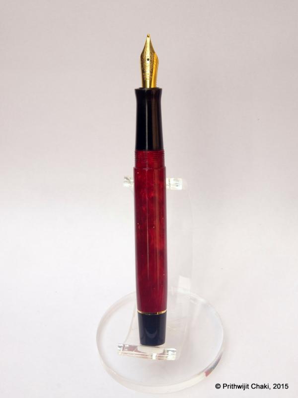
Hi All I have reviewed a custom made pen from ASA Pens on my blog. Below is an excerpt of the same _________________________________________________________________________________________________________ One fine day we, a group of fountain pen enthusiasts Vaibhav, Tervinder, Rakshit, Sulagno, Pradeep, Prithwijit, Kapil and myself were engaged in discussions to design a pen. The design was going through numerous iterations and me and a fellow fountain pen lover Sulagno liked one of the design prototypes very much. We approached ASA pens with the design and asked for help to make the design a reality. ASA pens took up the task and also procured the last pieces of a vintage acrylic material to be used to create the pen. Thus the ASA royal was born. The pen is based on the evergreen and classy cigar shaped design. The barrel and section are flush with each other and follow a straight line which is only disturbed by the treads for the cap and a flare at the end of section to aid the grip. Apart from the exquisite design of gold coloured clip the pen has a very minimalistic design. It follows the philosophy "Simplicity is the ultimate sophistication" and this worked very well in the pen's design. The construction of the pen is top class and there are no imperfections in the pen. As a result the pen is sheer beauty to look at. The quality of the finish of the pen is awesome too. It’s polished very well and speaks well for the workmanship carried out on the pen. This is large a pen. It is 16cm 6.23") when capped, 14.5cm(5.71") uncapped and 18.8cm(7.4’’) when posted. For my relatively smaller sized hands (17cm from top of index finger to the base of hand) I prefer to use it unposted. The section has a diameter of 12mm and its is very comfortable to hold The weight distribution of the pen also spot on and it’s easy to use the pen for long writing sessions at a stretch. I chose for the pen to be fitted with a gold coloured Medium grind No. 6 Schmidt Steel Nib unit. The nib is a very smooth writer and writes line width of around 0.5mm. The nib though not a flex one has a bit of give under pressure and gives line width of 1mm. The nib lays down a wet medium line. Writing Sample: _______________________________________________________________________________________________________________ Head over to my blog for a detailed review and more pictures. Link This is my first review for a pen so do let me know the feedback.
-
Public service announcement: for those who don't subscribe to his channel, Dan Smith (the Nibsmith) has just posted a YouTube 'first look' video for the TWSBI Eco. A concise but comprehensive and, I think, pretty fair summary of the pen's features. Take a look if you're interested (and/or feel free to make your own?!).
-
Introduction Often in life one learns to appreciate the value of something only after the object is long gone. In my case, something along the same lines happened for Conway Stewart pens. One fine evening in July of 2015 I chanced upon a store selling off the last few Conway Stewarts they had in stock and I was mesmerised by their beauty. One look at the price tag however quickly brought me back to my senses. Modern CS pens were never known to be on the value end of the price spectrum and the huge custom duties and other applicable taxes in India meant that they were well outside my grasp. I was however acutely aware that CS pens would soon not be available anywhere anymore and was desperate to get a piece of the pie. Once back home, I resorted to trawling the internet and found the source for last few CS blanks being made available from their liquidation sale by Vince Coates (www.theturnersworkshop.co.uk). With the help of fellow FPNer Kapil Apshankar (@springrainbow) I managed to source some materials in sufficient quantity to make a few pens. I did not bother receiving the material in hand and instead had those sent directly to Mr. Subramaniam of www.asapens.in with full faith that he would help me make something nice out of them. I also found out that CS essentially used Bock 250 nibs in their pens and grabbed a small collection of nib units as complete triple system from www.beaufortink.co.uk. We worked on a design that was original and yet paid homage to CS and especially their flagship model Churchill. Once the outline was worked out, we launched the pen in the “Fountain Pen Pals India” WhatsApp/Telegram group on August 15th where it was received with incredible enthusiasm. After some ups and downs, we stabilized at around 30 orders within the group. That’s quite an achievement considering the fact that at that point of time, the group has fewer number of members than 30. While everybody didn’t necessarily book one Azaadi, there were quite a few members who opted to get more than one. Since it was launched on 15th August which happens to be India’s Independence Day, it was only fitting to call the pen “Azaadi” which means “Independence” in Hindi. It was also a cheeky repartee to Churchill whose opinions about Indians and the notion of Indian Independence weren’t necessarily very appropriate. Design I knew that I wanted an original design which would not be a rip-off of any existing Conway Stewart model and yet should provide some kind of a homage to the brand. We all know that the concentric circles on the cap filial of Churchill gives it a distinctive crown like look and decided to incorporate a similar crown in black ebonite in the pen we designed as a homage element. Other than that, it is a solidly utilitarian design that combines the best of the breed in a number of areas. Size-wise, we designed it to be approximately the same size as a Lamy Safari and fitted it with the section design from ASA I-Can / I-Will in black ebonite which is a personal favourite for the comfort it offers. The end of the barrel is also made using black ebonite and the barrel end was also tapered a bit as another homage clue to the CS Churchill. The clip used was a special vintage ball clip made of brass which is quite unique in itself. Design wise it’s a classic with simple straight lines for the cap and with only a slight tapering of the barrel. The top of the cap and the bottom of the barrel are flat and polished. The body of the barrel and the cap are polished smooth and shiny. The concentric golden bands on the cap add a touch of flair. All in all the pen was designed to be regular sized, light and robust with the two ends having design cues that pay homage to CS. Final CAD drawing of the pen design that went into production Since we didn’t have CS blanks for all, the pen was launched with the option of using a broad set of acrylic materials. Unsurprisingly, the pearlescent acrylic blanks used in the ASA Rainbow turned out to be the most popular. We were pleasantly surprised how the shine of the acrylic blanks was nicely complemented by the muted colour of the ebonite components helping offset the monotony. The materials and colours complement each other and their interplay enriches the design whether posted or unposted. Size and Balance At 140mm capped, this is the perfect size for an EDC (Every Day Carry) pen. The shape of the pen and especially the section design is also meant to accentuate the feeling of comfort. But nothing beats the feeling in hand once you start writing with it and realise the comfortable. Needless to say, the pen is well balanced and provides comfortable writing for extended periods. Nib While I did get a set of different bock nibs, the quantity available wasn’t sufficient to satisfy 30 orders. Hence the pen was launched with two nib options excluding Bock. One could get a Schmidt (Model FH 452) nib in F/M/B or else go for a Jowo/WIN nib (Model 12-56) in EF/F/M/B/1.1/1.5 tip options. Since I already have a considerable collection of Jowo nibs, I opted to get the pen with a Schmidt nib with a broad tip in golden finish. From a design standpoint, the clip nib and bands complement each other quite nicely thanks to the golden colour. Filling Mechanism I am a stickler for pens that accept standard international cartridges and compatible convertors since in my opinion they the optimum combination of value, system longevity, convenience and widespread compatibility. It is therefore hardly a surprise that the ASA Azaadi supports the same and it comes with a Schmidt K5 convertor out of the box. Build Quality The Azaadi exudes the usual hallmark of quality from ASA pens. The fit and finish and the tolerances are fine for a handmade pen. The joints are seamless and only discernible due to colour variations. It is obvious that the pen has been made with care and a considerable amount of time has gone into polishing and buffing to ensure a very high quality of the finish. The only improvement area that I can think of are the bands used in the cap. It isn’t as if the bands aren’t fitted properly, but rather I wish ASA had access to better (read thicker) bands to go with this pen. Writing Experience Schmidt is a renowned maker of triple units and their systems have a large user base thanks to a number of brands that use them. Such widespread adoption wouldn’t have been possible if the nibs weren’t of top notch quality. It is little surprise then that I am very happy with how the pen writes. Being a broad tipped unit means that the nib appears extra smooth and glides over the paper laying down a nice wet line. This nib however isn’t soft or flexible and is quite rigid or nail-like. We have to accept that as a characteristic of the nib and be happy about the excellent writing experience that it provides. Price and Value The ASA Azaadi is poised to be one of the flagships within ASA’s line up and its price is currently perched as amongst the highest in the line. That however doesn’t mean much in cost terms since the entire ASA line is so affordable and the pens so wonderful. Personally to me the price reflects the effort that goes into making each pen and that no compromises were made in using components within the constraints of what’s available in Chennai. AT the end of the day, the pen represents great value at an affordable price point. Specifications Since I have the benefit of having access to the original CAD drawing, I will be quoting the specifications from that. Actual production pens are likely to have small piece to piece variances given the nature of making handmade pens. The measurements should suffice to give you a fair idea of the size of the instrument. Length (capped) – 140 mm Length (uncapped) – 135 mm Length (cap) – 65 mm Length (section) – 25 mm Maximum width – 16 mm Minimum width – 10 mm Maximum section width – 12 mm Minimum section width – 10.5 mm From top to Bottom - Jinhao 159, ASA Azaadi and Lamy Safari Conclusion It is not very often that one gets an opportunity to be involved in getting a fountain pen design. It is even rarer to get an opportunity to direct the design and see the pen getting launched as a regularly available product in the vendor’s catalogue. For that reason alone the Azaadi is very special to me. People who have got a chance to own this pen have been very positively impressed by it’s balance, comfort and writing experience. The pen has been designed from the ground up as an EDC (Every Day Carry) pen and in my opinion it fulfills that role in a fitting and stylist fashion. I have no hesitation in recommending this pen to others and I am sure you would enjoy it too.
-
Awesome But Unexplored?! The K-Nine Inventor Fp Review. (Article + Video Link)
cjpandya posted a topic in Fountain Pen Reviews
Well we have an interesting review today. It is a review of a pen brand unheard of by me at least. But before beginning, i would like to mention that I Have Uploaded a VIDEO REVIEW for the same pen, on YouTube. And as it is usually, Videos are always better! So CLICK for the video review HERE. http://youtu.be/jp8LG1BUhd0 P.S: It is also more detailed. Okay so that out of the way. Lets start with the review here. K-Nine is a new Indian company which, it claims, specializes in manufacturing of high precision writing instruments. Their product range includes Ball points, Roller Balls, Fountain pens and Mechanical pencils. And i must say, i am very impressed by the brand! The quality of the fountain pen i got is really really great! So, lets get started The pen comes in a beautiful tin box with a shimmering gold colour! Upon opening. It contains the usual stuff. 1 Year warranty, filling instructions and product range. The pen itself rests firmly in a velvety plastic holder. The box itself, screams quality quality quality! The pen is made up fully of steel and the gold accents are REAL GOLD PLATED. The overall construction of the pen is superb as well. Although it is relatively slim, the pen feels solid in hand and has a decent amount of weight to it. The section has Gold Plating on it as well! And what i really like about the design is that the grip area is roughened to just the right amount and it doe not impinge in your fingers while providing excellent grip! The nib performs nicely. Not exactly butter smooth but far from scratchy. The Filling mechanism is just a "standard international long" type, which is practical and easy to use and holds decent amount of ink. CONCLUSION: Well, this company, K-Nine has really impressed me! The built quality the packaging, everything is up to the mark and value for money! So i say that if you can lend your hands on one of these! Just buy it! You will not be disappointed!!! -
A Video Review Of 4 Of The Repunation Notebook Collection From Happily Ever Paper
JohnSparegrave posted a topic in Paper & Pen Paraphernalia Reviews and Articles
Hi notebook lovers and users! Here is my latest video review of 4 of the notebooks from the Repunation series by a Turkish maker called Happily Ever After (and they do make original stuff). Here is the link : https://www.youtube.com/watch?v=OQxIF6e_Ffk Hope you like it. John -
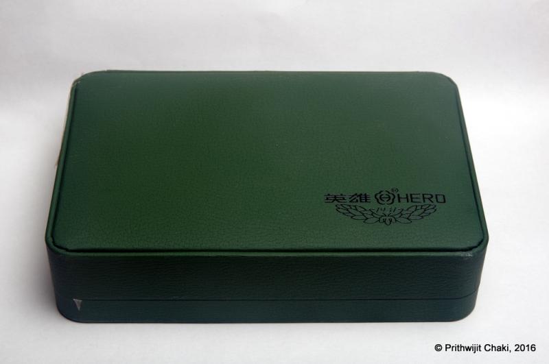
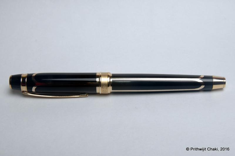
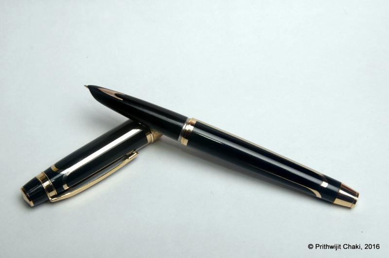
2015 New Model Hero Classic 100 (Aka Hero Glorious) Review
Prithwijit posted a topic in Fountain Pen Reviews
Introduction Why would anyone be mad enough to splurge $49 on a Hero 100 fountain pen, especially a Hero 100 variant that you have neither seen nor heard of? You do so because Soumitra Sanyal (@sanyalsoumitra) himself recommends it and offers to buy it for you from China during his visit there. For those of you who aren't familiar with his exploits, Soumitra-da is our resident walking and talking encyclopaedia on Chinese fountain pen matters. Just refer to his thread here to get a glimpse of his expertise and experience with the oriental pen makers and their instruments. That is how one fine day I find myself committing to buy a 2015 New Model Hero Classic 100 (aka Hero Glorious) and a few weeks later the pen lands on my desk. A big shout out to Soumitra-da, the anonymous kind-heart and L Subramaniam for taking the effort in ensuring that the pen reaches me from China. Packaging Usually I do not give too much emphasis on packaging since my interest lies with the pen rather than with the box. But I had to mention the packaging of the pen separately here since it is such a deviation from the normal Hero packaging that we are accustomed to seeing. The pen comes in a large green leatherette box enclosed within a white paper sleeve. The box has the Hero logo on the bottom right corner with 1931 (the year of founding) mentioned prominently. Once you open the box the pen is tastefully placed within a lovely green velvety bed. There is a small golden plaque with ‘Hero 100’ engraved in it. Pulling out the velvet bed, reveals a small cavity which contains the usual paperwork. Design Lately there seems to be a preference towards design that emphasize heft and a certain amount of chrome or other metallic reflective surfaces in the body of the pen. Parker IM, Sheaffer 300, Jinhao 159 or Duke Chaplin are representative of this trend. These pens are typically designed to cater to an entry/newcomer clientele base who equate weight and presence of metal with quality. The Hero Glorious squarely belongs to this club. Design wise the pen combines the traditional Hero 100 section and filling mechanism with a brass body which has been lacquered in black and inlaid with golden arches motif. The cap and body ends are fitted with golden flat ends and the cap band has a brushed metal finish. Engraved on the cap band is Hero 100 in a mix of Chinese letters and English numerals. There is a small logo engraved at the top of the clip. The black section has the traditional golden arrow inlay near the front-end. Aesthetically the pen is a mix of pleasing and over-done. The only visual mismatch that I could discern is the aluminium joint between the section and the barrel. I have no clue why they couldn’t take the extra effort and give it a golden finish as well. I suspect they were raiding the existing parts bin and did not really want to procure any new parts and fittings that this would have entailed. Size and Balance The design approach that Hero has taken for this pen unfortunately means that it is a heavy pen. While do not have a measuring scale of my own, the specifications state that it is a full 45 grams. This is a serious drawback that impacts the writing experience. There copious amount of heavy brass in the barrel and even more so in the cap. Any attempt at writing with it posted had to be immediately terminated. It was just not comfortable enough. Even writing unposted wasn’t as comfortable as the classic Hero 100 which had the weight and balance nailed down to the T. A light section and heavy barrel does throw the balance for a toss and the pen felt decidedly top heavy. The weight issue is a real pity because at 142mm capped, this is the perfect size for an EDC (Every Day Carry) pen. The section design is a classic and is known to accentuate the feeling of comfort. Nib The pen comes fitted with the classic Hero 100 nib which is made of solid 14K gold and fine in width (tip size 0.5mm). While the pen professes to be a fine, in my writing experience it was much closer to a western EF than a western F. The original Shanghai Hero company is known to make excellent nibs and this one is no different. The nib is very smooth and if you are the sort who likes EF nibs, you should have little reason to complain. The only aspect which I wasn’t too happy about was with the ink flow. I found it on the dryer side. Filling Mechanism Like any Hero 100, this pen too is an aerometric filler. It comes equipped with a long and slender pump style converter which is fixed. The brand name “hero” is inscribed in the pressbar in English while the converter itself has the pen model name inscribed in Chinese with English numerals. Since it has a fixed converter, the pen can only accept ink from bottles and cannot use any sort of cartridges. Build Quality On first glance the pen exudes the usual quality vibes that we are familiar with these days from the better Chinese pens. The fit and finish and the tolerances are nice and the pen seems built to last. I do however have some reservations with regards to the long term durability of the pen. The fact that it has a simple plastic section paired to a heavy brass barrel and the two are joined via an aluminium threaded joint seems to me a potential failure point. During use, the heavy metal is likely to put stress on the plastic. Assuming the section design is the same for the classic Hero 100, I do not expect the section to be designed to withstand such weight/stress. In fact, quite a few other reviews have reported sections developing cracks in the plastic section. Writing Experience The original Shanghai Hero company has been in existence for long and during the period it has developed quite an impressive following of its own. The fact that it seems to be the most faked pen in China means that the original pen has got something right and has a great writing experience. The Hero glorious obviously benefits from using the same ‘business side’ of the pen. The nib despite being extra thin is very smooth and glides on paper. There is no scratchiness even on coarse or cheap paper. It is however hard as a nail and any thought of softness or flex has to be summarily banished. Such a smooth nib is however let down by a feed that is too dry. I had loaded the pen with Pilot black ink and the pen was visibly having trouble keeping up the supply even for such a thin nib. This meant that the sensation of a well lubricated nib gliding on paper was sorely missing. Had that been there, it would have shot right at the top of my EF nib collection. The other drawback to writing pleasure is the sheer weight of the pen. You don’t buy this pen for a better writing experience than the original classic. Price and Value I have observed that the price of this pen seems to be fluctuating a lot. My pen was purchased from mainland china for $49 and at the time the same pen was being sold on Aliexpress for around $80 - $120. Currently there are a couple of listings available for as low as $20 but these pens don’t come with the box. That may mean any one three things - either I paid for a $29 box or counterfeits are coming into the market or the price of the pen is genuinely coming down after the initial period is over. Whether the pen is VFM or not depends a lot on what the final price comes to be. For a brass bodied solid pen with a genuine 14K nib, the sum of $20 seems very reasonable while $49 is stretching the case a bit. Any figure above $60 would in my opinion make the pen non VFM since QC is not known to be equivalent to western standards. Specifications The measurements mentioned in this section were not taken with any precision measurement instruments and you would have to settle for the approximate measurements I made using a normal ruler. However, the measurements I am providing should give you a clear indication of what to expect from the pen. Length (capped) – 142 mm Length (uncapped) – 121 mm Length (cap) – 63 mm Length (section) – 43 mm Maximum width – 12 mm Weight – 45 gm (Not measured and as per specifications) Conclusion This is the section where I usually summarize my findings and either recommend or reject the pen. Frankly speaking, I am a bit conflicted on this pen for a variety of reasons. Firstly because of the ongoing price fluctuations, I would advise a wait and watch approach to see it pans out. Secondly the design of the pen and the weight won’t suit everyone. I personally found it a bit too over the top for my taste and the weight a bit tiring. But if you are of the sort that such models, then you would be delighted by this pen. Nitpicking aside, it’s a relatively nice writer and the brand itself has an impressive legacy. The size is just ideal to make it an EDC (Every Day Carry) pen and it fulfills that role fabulously. Should you go for it, I have no doubt that you would enjoy it.
-
Review Of Fosfor Islander In Conway Stewart Flecked Amethyst
Prithwijit posted a topic in Fountain Pen Reviews
Introduction Manoj Deshmukh of Fosfor pens (http://www.fosforpens.com) is a master pen turner and I always wanted a pen made by him. Given that the Islander model is considered the flagship of his line, it is only natural that I would like to have one of those in my modest collection. Normally Islanders are made of exotic wood burls or hand cast resin that Manoj personally prepares based on individual preferences. Personally, I am not a big fan of wooden pens and didn’t have much faith in my aesthetic abilities in specifying the right colours to cast the resin. Instead I opted to use Conway Stewart Flecked Amethyst blanks that I had got from Vince Coates (http://www.theturnersworkshop.co.uk). I had always thought that the Flecked Amethyst material would be complemented nicely by the silver trims used in the Islander and decided to round off the look with a solid steel polished Jowo #6 nib in broad tipping. Design The Islander design is quite unique and distinct amongs't the India pen models. The cap portion is cylindrical while the barrel has a cigar like tapering towards the end filial. Both the cap and the barrel are ends are flat and polished. The body of the barrel and the cap are polished smooth and shiny. The cap is flushed with the barrel with no step down where the cap and barrel meet. The most important design element of the Islander and the raison d'être of this pen in my collection is the beautiful hand crafted silver band and clip combination. It is an artisanal product and I am not aware of any other pen with such and unique clip/band combination. The clip is springy and it is curved with a raised bottom for easy clipping. There is intricate hand-made design in the band above the clip and it is made of pure silver. One of the joys of getting a Fosfor pen is the customization in terms of section design that Manoj allows you to do to best suit your preferences and comfort. I opted for modified hourglass design which has proved to be extremely comfortable. In hindsight however, the design may have benefited is the edge at the end of the section was rounded off a bit. Size and Balance At 150mm capped, this is not a small pen. Despite it’s length, it is nicely balanced and can easily provide comfortable writing for extended periods. While the cap can be posted with some effort, I use it unposted as I find the length to be too long when you post the cap. The acrylic material is light and yet strong and hence the pen despite being oversize doesn’t compromise on weight or balance. Nib The standard Islander comes with a choice of Schmidt #6 nibs (Model FH 452) in either F/M/B. Schmidt nibs come with their logo embossed and I wanted a cleaner look on my pen. So I decided to go for a Jowo #6 polished steel nib instead which was devoid of any logo. Since I have many nibs with medium tipping, I opted for a broad tipping on this pen. Filling Mechanism My Islander is a non-proprietary cartridge/converter pen that accepts standard international cartridges and compatible converters and it comes with a Schmidt K5 converter out of the box. As I have mentioned in many of my earlier reviews, this is my favourite filling system since in my opinion it represent the optimum combination of value, system longevity, convenience and widespread compatibility. Build Quality Manoj has a reputation for focusing on the details and the pen clearly benefits from his focus and the resultant build quality is impeccable. One can easily appreciate that the pen has been made with care and a considerable amount of time has gone into producing it. Writing Experience Jowo is generally considered as being amongs't the top two or top three western nib OEMs and their nibs are widely used on a variety of pen brands. Their popularity itself is a testament to their general quality. Needless to say, I have been very satisfied with Jowo nibs in general and have quite a collection of them in different tipping. It is little surprise then that I am very happy with how the Islander performs. The broad Jowo unit is super smooth and glides over the paper laying down a nice wet line. There are no skips or false starts and overall the pen is a superb writer. Price and Value Currently as of December 2015, Islander pens are listed for a price that ranges between $75 and $99 based on the type of wood being used. These prices however are for pens with Schmidt nib units. If you opt for Jowo, then there is a slight price premium. I am not aware of any other custom pen-makers who offer this level of quality and individualization at this price point other than Manoj and Mr. L Subramaniam of ASA Pens. Needless to say, these pens are incredible value and the quality lingers in your hand long after the cost has left your mind. Specifications The measurements in this section have been taken with a simple ruler and may not be precise being subject to some amount of parallax error. Length (capped) – 156 mm Length (uncapped) – 141 mm Length (cap) – 70 mm Length (section) – 24 mm Maximum width – 16 mm Minimum width – 10 mm Maximum section width – 12.5 mm Minimum section width – 10.5 mm Conclusion This is my first Fosfor pen and I am very happy with what I have received. It is very comfortable, well balanced and an excellent writer thanks to its Broad tipped Jowo nib. The silver clip and band is unique and adds a touch of exclusivity. I have no hesitation in recommending this model to others.
-
I had gone dormant from the forum for a variety of reasons. Back in action now, and no reason why I should not keep going steadily from now. Here is a brief, one-page, hand-written review of my brand new Gama eyedropper fountain pen in red and black acrylic. Excuse the low quality photos of the pen and the scan, all taken with a low end tab camera. A copy of this is up on my fountain pen blog: https://fpensnme.wordpress.com/2016/02/06/a-one-page-review-of-an-acrylic-gama/; and a travelogue on my visit to Gem and Co this morning: https://viewwide.wordpress.com/2016/02/06/a-tradition-of-fountain-pens-in-chennai/
-
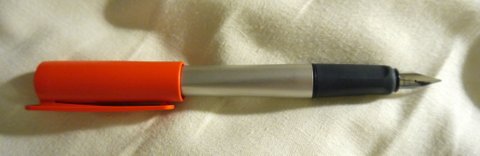
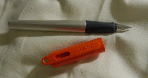
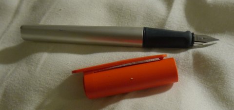
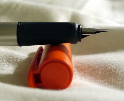
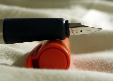
I recently picked up a Lamy Nexx while traveling through the Netherlands. The Nexx seems to a a substitute for those who do not like the Safari. It costs about the same and has, perhaps, a slightly younger vibe to it. Two things led me to buy it. First, it had a bright orange cap, the official color of the Netherlands, so I thought it would be a nice memory. Second, it features a left handed nib and, being a lefty, I'm a sucker for such things. The pen has the usual solid Lamy construction. The body of the pen features brushed aluminum. It looks like the same material as the Al Star. While it looks lovely now, the Al Star was definitely prone to scratches and marks. We'll see how the Nexx does in that department. Stay tuned here for updates. There is a thick ABS plastic liner beneath its aluminum outer skin. The section is made from solid plastic, but there it has more of a rubbery feel, like there is a bit of cushioning. Overall, it is much improved over the Safari. The cap is made from thick, bendable plastic. It has the peculiar feature. that the clip extends above the top of the cap and has an open ring. I presume this is so you could attach the pen to a lanyard of some sort and carry it around that way. All of these parts seem pretty close to unbreakable. The pen also has various self-preservation features to prevent it from rolling off of surfaces. The clip on the cap sticks out far enough that the cap will not roll. The body of the pen is triangular, so it too will not roll. Finally, the cap seems very securely attached to the body though it does not require excessive force to uncap the pen. I rather doubt that the cap and pen will part company unintentionally. All of this is to say that the pen is amazingly functional. Lamy has clearly put a lot of thought into all the little things that can go wrong with owning a pen and using it hard on a daily basis. This pen is designed to withstand those rigors. Indeed, this may be the most thoughtfully designed pens that Lamy has produced. One big issue many people have with the Safari is that it is "style challenged." It's not clear to me that the Nexx answers the call in that regard. The triangular brushed aluminum body is definitely a step up from the Safari, but I'm not sure the oversized plastic cap is going to be a crowd pleaser. If you appreciate design strongly influenced by the form follows function philosophy, the Nexx will be your cup of tea, but I suspect for many it will be too utilitarian. The nib is identical to the Safari. My left-handed nib is annotated as LH. It works flawlessly, writing between a fine and a medium. It's smooth and perfect. There is no line variation, but a bit of shading is possible with the correct inks. No hesitation, skipping, hard-starting, etc. Just a good, solid nib. I'm not sure what makes it left-handed. According to the person in the store where i bought it, pen manufacturers routinely sharpen one side of each nib asymmetrically where the side depends on handedness. Supposedly, lefty nibs are sharpened on the opposite side. First, I have no idea what good sharpening a nib might do. Second, I've never heard of such a practice, so it might be pure BS. Is any of this true? Taken as a whole, I'm very happy with my Nexx. I like the utilitarian aesthetic and I definitely appreciate all of the user oriented touches of the pen. The left-handed nib works extremely well for me and produces a line that is just the right width, MF. I prefer it to my Safaris though this could have more to do with its newness than anything else. A key question is whether the Nexx has solved the marking and scratch prone nature of the aluminum surface of the Al Star with this foray. If so, the pen will, in my eyes, be superior in every way to a Safari. We'll simply have to wait and see. If you're in the market for a cheap, dependable pen that has many thoughtful design features, the Nexx is definitely something to check out.
-
* originally posted on my Instagram. Ink Review: Noodler's Ink, 54th Massachusetts. Grade: 62.50%. Paper: Norcom Composition. My mother, when she first got into fountain pens, bought 54th Mass. because she thought it was going to be her 'go to' work horse ink. I don't she she wrote with it for even a day before she decided she hated it. She was expecting a blue black ink, but instead got what I call a blue gray. I think that the deep blue gray color makes it unique, but I can understand her sentiment. As I've used 54th Mass., I've both loved and hated this ink. I think the ink was aptly named; the color certainly brings to mind the uniforms the Union wore during the American Civil War. Not a pristine and clean museum piece, but rather a worn in and heavily used soldiers uniform. I can't help but think of the uniforms the Union army wore in The Good, The Bad and The Ugly when I see this ink in person. 54th Mass. is a Bulletproof/Eternal Noodler's ink. You may not be able to tell, but I decided to put this ink to the test. On the words WATER and HAND SANITIZER, I put drops of, you guessed it, water and hand sanitizer onto the ink. From what I can see, 54th Mass. didn't move an inch. However, I can also tell you that it will take some effort to clean this ink. I got some one hands last night and I'm still slightly gray almost 24 hours, and several hand washes, later. 54th makes up for its clean up issues in my mind by being a very fast drying and smooth writing ink. Just be aware that this also means that the pen will dry out quickly if you leave the cap off of your pen for too long. 54th Mass. may not be a very well rounded ink, but I think its Eternal properties, unique color, and resistance to bleeding through cheap paper make it a great office or EDC ink.
-

Maruman Mnemosyne 194 Review
fibmeister posted a topic in Paper & Pen Paraphernalia Reviews and Articles
My first review of anything pen related - hope y'all like it. Open to feedback and advice on how to improve! http://i.imgur.com/JolzY4f.jpg http://i.imgur.com/k21Csmf.jpg http://i.imgur.com/RuaL7qd.jpg http://i.imgur.com/IlBdaPc.jpg http://i.imgur.com/WrrLrvL.jpg -
So, over on another calligraphy-oriented forum I just posted a review of sorts I thought some here might also appreciate. It's my first attempt at comparing some of the vintage nibs I've collected accumulated. For my first group, I chose flexible nibs that all have something to do with School: either labeled as "school" or "college" or "university", or, in the case of the Palmer Method completely associated with something you do in school. These are all written using the same straight holder, using Diamine Registrar's ink, and are all vintage. I included a Spencerian no. 1 at the top as it's a pretty famous flexible pen and at least gives you an idea of the relative performance of these nibs compared to the Spencerian. I've also included a picture of the nibs themselves so you can then figure out that ones like the Palmer Method and the Esterbrook Business and College are too big for oblique holders, but work great in straight holders. Hope you enjoy! Andrew
-
Introduction “A lot can happen over coffee” screams the tagline of Café Coffee Day which is a renowned café chain in India. While I may not know much about what else can happen over coffee, I am about the narrate the story of a pen that came into being thanks to a little chit-chat over the brew. It all happened when I had a business trip to Chennai which necessitated a stay over on Friday night. I opted for a late morning flight back home on Saturday and called up Mr. Subramaniam of ASA pens to set up a meeting in the early morning. The gentleman that he is, he couldn’t refuse my intrusion into his serene morning and we caught up over delicious strong filter coffee at his place. We discussed a lot of pens and I showed him the picture of a few orange coloured pens with the suggestion that he consider them for production using the orange acrylic blank that he had recently procured. Unknown to me, his mind was already on the job and a week after the meeting he surprised everyone in the “Fountain Pen Pals India” WhatsApp/Telegram group with a picture of a new prototype pen using a combination of orange and deep navy blue coloured acrylic material. Needless to say the pen looked beautiful and all of us wanted him to ensure that the pen goes into production. There was one small hitch though. The deep navy blue acrylic material used was from some vintage material stock he had and he had exhausted all of them. Only bits and pieces were left and it was not possible to make more than ten pens of that design. A mad scramble ensued and within thirty minutes all ten were booked. Since this colour combination was unlikely to be ever repeated, we decided to brand it as a Limited Edition (LE) and number code each pen. A lottery was conducted and I was lucky to get pen number 01. A number of suggestions were made for naming the pen. Fellow FPNer Kapil Apshankar (@springrainbow) shared the picture of a tropical paradise with an extremely attractive model at the beach with a Macaw on her shoulders. The picture must have been really good since I have no recollection of noticing the Macaw. Other group members who had better control over their hormones noticed how closely the colour of the pen matched that of the Macaw and voted to name the pen after the bird. Design The Macaw has a classic design in terms of simple straight lines with only a slight tapering of the barrel and the cap towards the end filial. The top of the cap and the bottom of the barrel are flat and polished. The body of the barrel and the cap are polished smooth and shiny. The section design is a homage to the traditional sections made by Indian hand-made pen makers – a simple straight section tapering slightly towards the nib and ending with a small ridge where it ends. It’s not my favourite design but does the job nicely. The pen comes with a plated beak shaped clip which is only fitting for a pen called Macaw. The highlight of the design is obviously the colour combination of the material used and how the colours have been used. To the best of my knowledge there are not too many pens with Orange and Blue colour combinations out there. The Macaw has attempted to use this unique combination and in my opinion has come out brilliantly successful. Essentially, the pen has a solid orange body and a solid blue cap. The monotony is broken by the usage of contrasting colours in the end filial of both the body and the cap. The colours complement each other and harmonizes the design. Whether posted or unposted, the interplay of the colours comes out very nicely yet subtly. . . . Size and Balance There is no beating around the bush that it is a large pen at 151mm capped. The shape of the pen also seems to accentuate the feeling of heft. But once you take it in hand and start writing you realise just how comfortable the pen is. Maybe because the material used is so light, that despite the length and the diameter of the barrel, the pen hasn’t really been penalized in terms of weight or balance. Needless to say, the pen is well balanced and provides comfortable writing for extended periods. Nib The pen comes fitted with a #6 Schmidt steel nib with paired Schmidt feed and sleeve (Model FH 452). There was a choice to go for either polished steel or gold plated model and I chose the latter and opted for a medium tip. I must mention here that this is a design that I believe would have greatly benefitted from a larger #8 nib. There is enough clearance in the cap to accommodate such a nib and the relatively larger diameter of the pen and the section would have matched nicely with a large and wide nib. Unfortunately going for Bock or Jowo #8 in gold would have made the pen prohibitively expensive and using the Ambitious 40mm nib would have meant that the pen becomes an eyedropper. So in hindsight, I believe going with the #6 nib was the right choice although I wish that in the marketspace there were options for economical but good #8 sized steel nibs as triple systems with standard international cartridge and convertor support. . Filling Mechanism I prefer pens that accept standard international cartridges and compatible convertors. I find them to provide the best proposition around value, system longevity, convenience and widespread compatibility. The ASA Macaw has the aforesaid filling mechanism and comes with a Schmidt K5 convertor out of the box. . Build Quality This is definitely one of the better handmade pens I have received from ASA. The fit and finish and the tolerances are fine for a handmade pen. If you look closely where the end filial meet the barrel and the cap you can hardly make out that there is a joint there. Only the contrasting Orange-Blue colour gives it away. That’s a testament to the quality of finishing and the amount of time spent in polishing and buffing. This is one handmade pen where you can risk calling it an injection moulded pen based on exterior finishing as it appears to the naked eye. Only the design and shape gives an indication that it’s something different and has not come off an assembly line. . Writing Experience Schmidt FH 452 is a very well known, popular and renowned nib and its merits are well known. Out of the box it is a very smooth writer laying down a nice wet line. I won’t call this nib as soft or flexible however and it is a simple honest nail. This was my first Schmidt medium nib and compared to the many Jowo and Lamy medium nibs that I have, the line width on this one seems to be a tad bit thinner. That does not however take anything away from the quality of the pen but is just a characteristic of the nib design. Should you need a nice wet line like a good Jowo medium, I suggest you consider a Schmidt broad instead. Price and Value The ASA Macaw was sold to us for a price that is comparable to the prices of recently launched pens of the ASA Stellar collection. In my opinion that is amazing value since we are getting a quasi-custom pen offered at a price that is at the value spectrum of handmade pens. Specifications I will put in my usual disclaimers here. I don’t have access to precision measurement instruments such as Vernier calliper and you would have to settle for the approximate measurements I made using a normal ruler and my eyes which means there might be a little bit of deviation due to parallax effect. However, given these pens are handmade and there are small piece to piece variations anyway, the measurements I am providing should give you a clear indication of what to expect from the pen. Length (capped) – 151 mm Length (uncapped) – 137 mm Length (cap) – 69 mm Length (section) – 19 mm Maximum width – 16 mm Minimum width – 11 mm Maximum section width – 12.5 mm Minimum section width – 11 mm Conclusion I am extremely happy with this pen. It started as a coffee table discussion and ended as a limited edition. Everybody who has this pen have been extremely impressed with its balance, comfort and writing experience. I would request Mr. Subramaniam to consider launching the pen as a regular model with other colour combinations with an option of having an Ambitious 40mm nib in eyedropper combination or with a #6 nib in cartridge-convertor version.
-
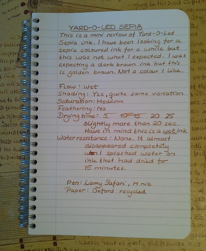
I have not found much on this ink on the webb so I decided to make a small review. I can not guarantee colour accuracy.
-
I originally posted the following review in a discussion thread on the TWSBI Eco. It was meant to be a very short review, but it turned out longer, and I now think it makes more sense to put it here. So I've copied and pasted the text from that post, subject to minor edits. No photos, but there are plenty available of this much-awaited pen. Please note the inclusion of a Bonus category. The TWSBI Eco comes in black and white. I got the white version, with EF nib. Thanks to The Writing Desk in the UK for an excellent service (no affiliation). Design: 8/10 Simple, well thought out. For those, like me, who like to post their pens, the rubber ring at the end makes a lot of sense. Well thought-out. The plastic feels a little cheap, but at this price point, that is no problem at all. Appearance: 6/10 Without the cap, the pen is quite pretty, with a clear demonstrator barrel and solid color at the back (white in my case). Not mad about the cap, though: my wife's blunt comment was that it is very ugly. To me, it seems disproportionately thick/massive, and it clearly marrs an otherwise pleasing appearance. That's why I gave a modest 6/10 score here. Filling system: 10/10 A piston filler at this price point puts the tools you need to maintain it? Couldn't be better. The piston mechanism works beautifully. Nib performanc: 9/10 The EF nib writes smoothly, with a hint of feedback. No scratchiness. Excellent flow. Nib is stiff, with no flexibility to speak of; you could get some line variation if you abuse the nib, but it's a pleasant writing experience without doing so. Wetness is about 6-7/10. It is by no means dry, but could hardly be called a gusher. (I've been using Diamond's Carnival, part of the anniversary collection.) Writing experience: 9/10 I have been pleasantly surprised by this pen. It writes smoothly and pleasantly. The balance is excellent. It is large enough to use unposted, but is even more pleasant a size when posted. The cap is too light to affect the balance. I would have preferred a slightly girthier pen, but that's a small gripe and means it will suit a wider range of hands. WOOTB? Bonus: 5 This pen gets a bonus for Writing Out Of The Box without any modifications or work needed to the nib or any other part of the pen. I have become very annoyed at the number of new pens that need some sort of adjustment before they can be used properly (including some high-end brands), so any review I do from now on will include this question. Note: I have tentatively decided to award 5 bonus points to pens that just WOOTB, and zero to those that need work: this privileges writing experience over aesthetics, which not everyone will agree with. But to me, a pen is a writing instrument first and an item of beauty second, and if it doesn't work from the start then the final score should reflect that. Overall: 42/50 + 5 Bonus = 47 This is an excellent pen and is well worth the money. It knocks the socks off several much more expensive pens in terms of performance (if not beauty). I think it has real potential to knock the Lamy Safari or the Pilot Metropolitan off their pedestal as go-to entry level pens. But it is also a good choice for someone with more experience looking for a good daily carry pen. If you're looking for a thoroughly beautiful pen, look elsewhere. If you're after a decent-looking pen with excellent performance, then you should definitely consider the Eco.
-
I agree with the reviewer. Although, its good and fun to write with the medium nib Platinum preppy but i use it more to mark things in my journal than actually writing with it. Which one is your favorite Platinum Preppy: the medium one or the fine one?
-
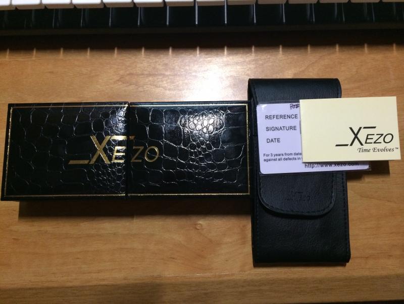
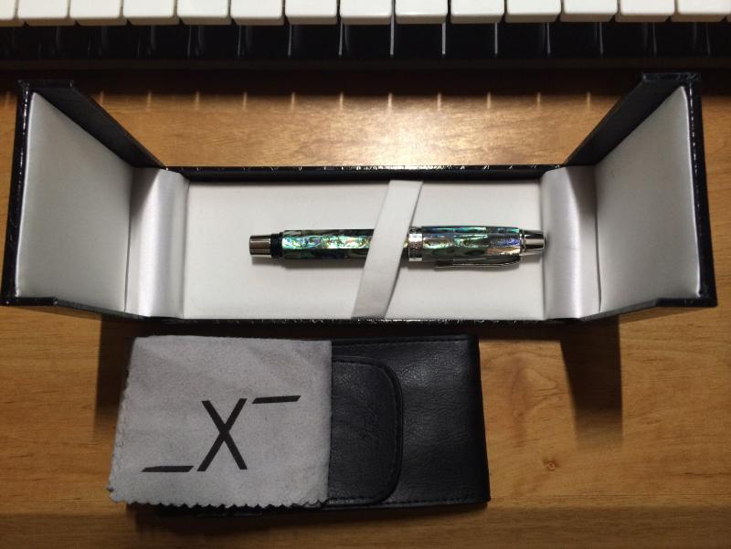
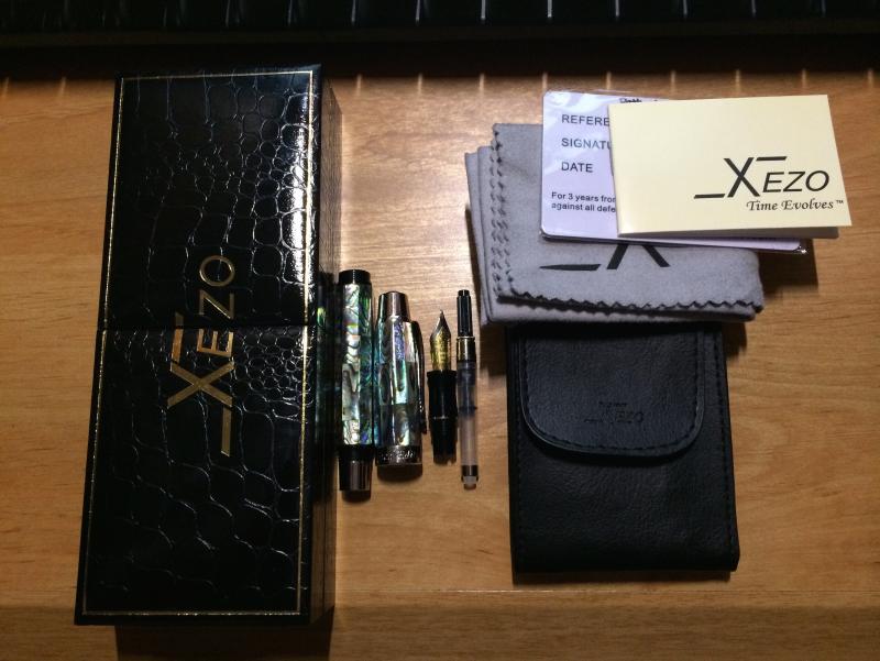
Hello all! After some lengthy mishaps with lost purchases online, I finally found this pen and ordered locally and I'm delighted to do a review of it. The pen under the spotlight is called the "Xezo Maestro" Limited Edition. When I was looking to purchase a new pen, I was looking for anything musical. Since I go to school for Orchestral Conducting, I thought this would be delightful. My only apprehension is that I have had no previous experience with the Xezo brand before. I will base everything from a 0-10 scale (10 being the best). Here we go! Appearance-Absolutely gorgeous. You'll notice the mother of pearl immediately; It is clearly high quality with gorgeous choices of MOP made for the pen body. The contrast of greens, blues, purples and black make it an adventure every time you look at the pen. The bottom of the cap has "Limited Edition" with the Xezo logo inscribed on it. The top has the production number this pen is (only 470 are made). The nib is a standard German Iridium-much wider and flatter than my other pens. The case it came in is a faux-alligator skin box which opens in the middle rather than one side. Very unique. Appearance: 10/10 Dimensions- Diameter-15 mm Posted Length-168 mm Capped Length-136 mm Weight-47 grams/1.66 ounces Performance-This thing is heavy. Heavier than any other pen I have. I love weight, but I will scrutinize the issue of balance. When the top is screwed onto the end of the pen for writing you must be careful not to let the cap-end fall from your hand. It's very off. On top of that, you must write quickly as this big guy delivers ink very quickly. When my pen rotation is nearing the Xezo, I know I must begin to get used to having to write faster with a different balance. It can almost be a chore-but for now just a quirky challenge. I think the issue of balance is the grip, which should be made of metal. The end of the pen, grip, and inside of the cap are all plastic which I am including in the performance aspect as this does affect balance. I love pens with screw-on caps, but plastic worries me due to durability. So far, no issues. The writing is wonderful once you're used to speed. The lines are medium fine and there is consistent ink delivery onto the page. I'd post some writing of it, but I just cleaned it out the other day not realizing I'd be doing a review. It'll be several months before my rotation is back to the Xezo. Performance-7/10 Cost/Value-The pen was roughly $160, and with the craftsmanship, leather case it comes with, cleaning cloth, signed/dated/certified international guarantee card with a 3 year warranty I am VERY pleased. Cost/Value-10/10 Maintenance-Quick and fairly easy clean, with a standard piston converter. The converter is not entirely sealed, and there is just a wee bit of water above the converter, which should be air-tight. Maintenance-8/10 Overall-8.5/10. I would absolutely recommend picking one up if you're interested in novelty work. I would not use this pen daily (I have other pens on rotation for that), but I am genuinely satisfied. Hopefully this review was helpful, and not too long. This is my first review, so if I missed something feel free to ask questions! Pictures Below!