Search the Community
Showing results for tags 'red'.
-
Indexed in fp-ink.info: http://www.fp-ink.info/colorcard/559.png Light fastness and nibcreep do take a while for measurement so they will be added here (picture replaced) later.
-
I recently purchased 1 oz. of Noodler's Red Fox ink use in an old Lamy Safari I haven't used in a while. I chose this ink due to it's crimson color, bulletproof qualities , and rave reviews on these forums. However, I was incredibly disappointed by the amount of feathering it produced. Granted, Lamy nibs are notoriously large (the EF writes like a M), but the ink is so watery and bleedy that I simply cannot use it. How can a universally praised ink perform so poorly? Is this the case for all red inks? Are there any reds that write tight, solid lines?
-
I'm not too happy about the quality of the first pic because by the time i (re)took it a BIG black cloud had hovered our house and made everything dark. (edit: I'll see if I can retake it when the sun comes out again). The close up pic is much more accurate to how it looks. Where it says "poppy red" is actually written in Diamine poppy red for a comparison. They look pretty similar but poppy red is more saturated. http://imgur.com/HrtZABG.jpg http://imgur.com/vK9K20S.jpg http://imgur.com/Bzr7TYS.jpg Bleedthrough? Yup http://imgur.com/7CCDQIk.jpg
-

Ink Mixing With Toucan (Australian) Inks - Crimson And Black
Jamerelbe posted a topic in Inky Recipes
In a recent thread on the Toucan ink range, someone asked a question about mixing the inks - specifically red (Crimson) with black. Somewhere or other I indicated I'd check it out if I found the time - but can't remember which thread, so thought I would post this here. A general comment, first of all: the designers of this ink specialise in paints and dyes of all kinds, and manufacture most of their products to allow mixing of colours. This extends to their inks - they've been intentionally designed to allow mixing. With my older daughter, I've created a 'peach' colour by mixing orange with magenta (which should be called pink) - she likes to use it in one of her cheap pens. I've also tried mixing crimson with violet (I think it was) to create a maroon or burgundy - though it's not as vibrant as the Platinum purple (Preppy) colour I was trying to mimic. I hadn't tried mixing with black before - so this is my first try. The picture first, then the explanation: http://i.imgur.com/Z0Bn0HF.jpg[Photographed with my Sony, at my desk, using 'Fill Flash' on my Sony xPeria Z1 phone - excuse the 'ghosting' from the other side of the page!] (1) I started with one of the pens I'd inked with Crimson on Friday (a 'Classic 626', as per previous post) - sample top-left. (2) I dumped the ink back into my sample vial of crimson ink, then drew out 2ml of Crimson (roughly) with a syringe - deposited into a fresh, clean vial. (3) I added roughly 0.2ml of Toucan Black ink with a 3ml syringe, agitated the mixture vigorously, then flushed the new ink colour in and out of the pen by turning the cartridge converter piston back and forth several times - then wrote the sample, top right. (4) I dumped the contents of the cartridge converter BACK into the vial, and added ANOTHER 0.2ml of ink (roughly), then flushed the ink back in and out repeatedly as per step (3), before writing the sample, bottom right. (5) Dumped ink back into vial, added another 1ml of Crimson, agitated, flushed repeatedly through nib, then wrote bottom left sample - unfortunately I omitted to wipe excess ink off the nib tip, so the top line was excessively saturated. All of the above was pretty unscientific (I should know, I used to BE a Research scientist ) - but hopefully this gives you some idea of how easy it is to mix these inks - and how effectively you can darken a base colour with small quantities of the black... Standard disclaimer: I have no affiliation with, and no financial interest in the JustWrite company (though I HAVE been given some pens by the proprietor, free in return for an impartial review); and I have no vested interest in this group buy, other than promoting some inks I enjoy using and maybe generating some business for an Australian company I enjoy dealing with! -
I originally posted this review on my blog. Please visit for more reviews like this one. http://2.bp.blogspot.com/-J1QERw11URM/U7TBjQIKxdI/AAAAAAAAAhQ/X6jBSI7FES4/s1600/DSC_0466.JPG Introduction This is the fourth review in my series on Levenger inks. Thus far I've noticed that their properties are very consistent: most dry quickly and perform well on low-quality, absorbent paper. Cardinal Red mostly continues the trend with the exception of its longer dry time. I decided to try this ink because I needed a bright red for editing documents by hand. The ink is perfect for that purpose, so a bottle may find its way into my ink drawer. If you're interested in this ink, it's often on sale for $10 with free shipping from Amazon, making it an excellent value for your money. I was in no way compensated for this review, and this review contains my honest opinions about the ink. Specifications: Manufacturer: Levenger Color: RedMSRP: $12Actual Price: $12Price I paid: I bought this as part of the Levenger Ink Sampler for $12 while it was on sale. I would highly recommend this ink sampler as it is the only way to try Levenger's inks without buying full bottles.Amount of Ink: 50 mlCost per ml: 24¢/ml at $12 Bottle: Glass; It includes a reservoir Where to Buy: All of Levenger's inks are exclusive to their website.* * All prices are the prices at the time of this review's writing on July 1, 2014 Properties: Sheen: NoneShading: Hardly noticeableWater Resistance: Somewhat water resistantFeathering: Minimal on copier paperBleed through: ModerateShow through/ Ghosting: HighDrying Time: FastWetness: AverageLubrication: Well lubricatedStaining: I haven't noticed any staining. Cleaning: The ink cleans out of a pen easily Nib Creep: Minimal- Nib creep doesn't bother me because it has no effect on the writing experience.Okay on Copier Paper?: If you're using the ink only for editing or grading papers, it performs very well. For more intensive writing, the show through may be bothersome. Writing Sample:Pen: Visconti Rembrandt FinePaper 1: Levenger Circa PaperPaper 2: Copier PaperPaper 3: Black n' Red NotebookPaper 4: Flashcard for the Extended Soak Test (2 hours) http://3.bp.blogspot.com/-5qqkp6xPpnA/U7eYuVKLogI/AAAAAAAAAiE/qoHRXpbSVyU/s1600/DSC_0509.JPG http://3.bp.blogspot.com/-IEyEnkxYUNA/U7TBbku4zwI/AAAAAAAAAhE/RZskYL-Rc9w/s1600/SCAN0048.JPG http://3.bp.blogspot.com/-x6RxEoNRN0s/U7eYyWlOzaI/AAAAAAAAAiU/XpNRpIxmIJA/s1600/DSC_0497.JPG http://2.bp.blogspot.com/-OH-ny79k3_A/U7TBlyh9-1I/AAAAAAAAAhk/ecCv5iZ9tlM/s1600/SCAN0050.JPG http://1.bp.blogspot.com/-MVOuWDP21zg/U7eY4vygZFI/AAAAAAAAAic/SLETRDqi_wk/s1600/DSC_0524.JPG http://1.bp.blogspot.com/-QI2Wav6KhuM/U7TBpzhlADI/AAAAAAAAAhw/s4YosBkRApI/s1600/SCAN0052.JPG http://1.bp.blogspot.com/-Kh8QYtH7kAg/U7TBW_FlboI/AAAAAAAAAg0/pgZ69Ek7Agk/s1600/SCAN0046.JPG http://4.bp.blogspot.com/-RXsJTvZ5rbw/U7TAdQ3sj2I/AAAAAAAAAgE/Wwgic6PBfdM/s1600/SCAN0053.JPG Levenger Cardinal Red is a fantastic red ink, but it isn't very water resistant. If this ink were water resistant, it would be perfect for my uses. When editing a document or grading something, a small spill would destroy everything written with this ink. This ink also takes more time to dry than Levenger's other inks. As a dextral writer myself, this doesn't trouble me at all. If you're left-handed and move your hand over freshly written words, the ink will smear and may cause issues. The redeeming quality of this ink is its color. Cardinal Red is a true red, and when diluted slightly with water, it becomes a nice pink. I may have to buy a bottle of it just for its color. Pros A great red color which could be used for editing or gradingMinimal feathering on average and nice paperDries quicklyLightfast according to Levenger's website (I haven't tested this yet.) Cons Moderate bleed through and show throughExtreme feathering on highly absorbent papers (e.g. the flashcard)Not very water resistant Possible Uses Editing, correcting, and grading papersChristmas cards and letters around that timeSending love letters (Cardinal Red is much better for this while diluted slightly.) I originally posted this review on my blog. Please visit for more reviews like this one.
-
Here are 8 reds written with a TWSBI 580 Rosegold Bold. The only different pen used is the first Red Dragon which was written with a Jinhao 159 Bold. The bottom 3 are on the same paper (cheap office pad), but closer to the end of the pad. The first ones are written from a top page of a new pad. I think the ink absorbed well into the paper which is why dry times are so fast on the first ones. The three lines are progressively more forcefully drawn. The swab is 3 bled drops on a q-tip.

-
Hello all. Just received some red IC50 cartridges for my 78g - I've given up on both the Con 20 and 50 converters as only the black cartridges seem to give anything like decent flow. However, the ink in them appears very light indeed and they write in something I'd consider closer to pink than red. Have I got a watered-down batch, or is this just the colour they are? I actually quite like it and it's very smooth to write with, so won't be complaining if this is what they're meant to do. FYI the paper is a Paperblanks notebook, so reasonable quality. http://i.imgur.com/jmyPekE.jpg?1
-
I finally happened to have red ink in my fountain pen when I had grading to do, which means I was able to use it to grade papers. Next year, I will also be grading and the red I'm using right now (Diamine Red Dragon) is merely a sample and I'm looking to purchase a bottle of red to use full time next year. My question is, which red to pick? I like the Diamine Red Dragon, but I do think that it has a slight pinkish/magenta tinge to it that doesn't make me all that excited about it. Also, it tends to write much wetter on cheaper paper. Since the students hand in a wide variety of papers, the ink chosen needs to behave well on cheap paper. Also, I much prefer inks that do not smear much because I am left handed and cursed with sweaty/oily hands... anyways, my list of things I want out of this ink (in order of importance): -Well behaved (no feathering, not super wet) on cheaper paper -Non-smearing/relatively quick drying time -Nice color. More red, less pink/magenta -No to very little shading. While I enjoy shading most of the time, I find it distracting on grading papers (although, the cheap paper shouldn't have much shading...) I'm also up to suggestions to other colors, but I'm primarily interested in red. I apologize if this question was asked already, I didn't get around to researching it much first. Thanks!
-
http://sheismylawyer.com/She_Thinks_In_Ink/Inklings/slides/2013-Ink_736.jpg http://sheismylawyer.com/She_Thinks_In_Ink/Inklings/slides/2013-Ink_736b.jpg
-
Please take a moment to adjust your gear to accurately depict the Grey Scale below. As the patches are neutral grey, that is what you should see. Mac http://www.computer-darkroom.com/colorsync-display/colorsync_1.htmWintel PC http://www.calibrize.com/http://i783.photobucket.com/albums/yy116/Sandy1-1/FPN_2013/27ddb717.jpg ]:[ Fidelity The ink I used may be compared to the depiction of the Diamine site: diamineinks dot co dot ukWiki: http://en.wikipedia.org/wiki/SyrahFigure 1. Swabs & Swatch Paper: HPJ1124 24 lb. http://i783.photobucket.com/albums/yy116/Sandy1-1/FPN_2012/Ink%20Review%20-%20Diamine%20Syrah/e6710dd5.jpg Figure 2. NIB-ism ✑ Paper: HPJ1124. Depicts nibs' line-width and pens' relative wetness. http://i783.photobucket.com/albums/yy116/Sandy1-1/FPN_2012/Ink%20Review%20-%20Diamine%20Syrah/9fd045d2.jpg Pens, L → R: Estie, M400, 1745, Waterman, Slimfold, C74. WRITTEN SAMPLES - Moby Dick Ruling: 8mm. Figure 3. Paper: HPJ1124. http://i783.photobucket.com/albums/yy116/Sandy1-1/FPN_2012/Ink%20Review%20-%20Diamine%20Syrah/408ec68d.jpg Figure 4. Paper: Rhodia. http://i783.photobucket.com/albums/yy116/Sandy1-1/FPN_2012/Ink%20Review%20-%20Diamine%20Syrah/c166ced5.jpg Figure 5. Paper: G Lalo. http://i783.photobucket.com/albums/yy116/Sandy1-1/FPN_2012/Ink%20Review%20-%20Diamine%20Syrah/a84ea9e5.jpg Figure 6. Paper: Royal. http://i783.photobucket.com/albums/yy116/Sandy1-1/FPN_2012/Ink%20Review%20-%20Diamine%20Syrah/aa8f8765.jpg Figure 7. Paper: Staples. http://i783.photobucket.com/albums/yy116/Sandy1-1/FPN_2012/Ink%20Review%20-%20Diamine%20Syrah/e51c0d6f.jpg OTHER STUFF Figure 8. Smear/Dry Times & Wet Tests. Pen: Waterman. http://i783.photobucket.com/albums/yy116/Sandy1-1/FPN_2012/Ink%20Review%20-%20Diamine%20Syrah/4839836f.jpg Figure 9. Bleed- Show-Through on Staples. (Reverse of Figure 7.) http://i783.photobucket.com/albums/yy116/Sandy1-1/FPN_2012/Ink%20Review%20-%20Diamine%20Syrah/7c080314.jpg Hi-Res Scans: Originals are approximately 60x30 mm. Estie on HPJ1124: http://i783.photobucket.com/albums/yy116/Sandy1-1/FPN_2012/Ink%20Review%20-%20Diamine%20Syrah/7725b144.jpg 1745 on Rhodia: http://i783.photobucket.com/albums/yy116/Sandy1-1/FPN_2012/Ink%20Review%20-%20Diamine%20Syrah/9250425a.jpg Waterman on G Lalo: http://i783.photobucket.com/albums/yy116/Sandy1-1/FPN_2012/Ink%20Review%20-%20Diamine%20Syrah/ead739b8.jpg C74 on Royal: http://i783.photobucket.com/albums/yy116/Sandy1-1/FPN_2012/Ink%20Review%20-%20Diamine%20Syrah/36029da5.jpg GENERAL DESCRIPTION Type: Dye-based fountain pen ink.Presentation: Bottle.Availability: Available when Topic posted.Daily writer? Not so much.USE Kindly note that Red is a colour with many connotations, which vary according to the context and cultures in which it is used. These sources provide great insight into the use of Red ink: Wiki: http://en.wikipedia.org/wiki/RedInky Thoughts Forum - this Topic from 2012 seems wide ranging: https://www.fountainpennetwork.com/forum/index.php/topic/218278-the-significance-of-red-ink/?p=2299348. Business: (From the office of Ms Blue-Black.) As ever, in Western cultures the use of Red in business seems to be limited to an alt/aux ink, or colour-coded work, so I cannot envisage use for general correspondence.For personal work product, it does offer a pleasant enough writing experience, though for longer reading sessions, I would find the colour far too vibrant - even from narrow nibs when the % coverage on the page is low. (I look forward to hearing from those who use Syrah on a routine basis.)Two-sided use of common copy/printer papers may not be a reasonable expectation.Line quality might not be sufficient for tiny marginalia & annotation, but that will depend greatly on pen+paper. (The Estie + XF did well on HPJ1124.)As Red-centric inks may often be used for indicating errors / corrections and grading, and marking / underlining content of high importance, I'd not use Syrah for editing, forms work, etc.Illustrations / Graphics: A good pick for extending the Red palette, giving a respite from the brilliant Reds, especially when applied to large areas / blocks. Has just enough snap to be used for narrow lines & labels.As a watercolour, it can appear a bit 'rosy' at pale values, but avoids flashing Pink. When overworked with wet media, there is a distinct remnant which is of a similar colour, so sponging / stippling may create results of some appeal.Students: As for business, we seem to have an alt/aux ink that won't go about screaming its head off, and can survive a dunking.Personal: Another welcome addition to my small array of warm inks.As ever, I tend to approach such warm inks with a bit of reserve, so typically use my narrow nibs and smaller format sheets, and only for the shorter letter or note or sentiment enclosed with a greeting card.As these things sometimes go, I've taken to pairing Syrah with papers of low brilliance without optical brightening agents, yet there is nothing that precludes papers that glow in the dark.PHYSICAL PERFORMANCE & CHARACTERISTICS Flow Rate: Somewhat wet.Nib Dry-out: Not seen.Start-up: Immediate.With confidence.Lubricity: High.All pens ran quite smoothly on the textured papers.Greater lubricity might've caused problems on the Rhodia.Nib Creep: Not seen.Staining (pen): Not seen after three days contact.Clogging: Not seen.Seems unlikelyBleed- Show-Through: HPJ1124: Waterman, Slimfold, C74.Royal: All.Staples 20lb: Waterman.Feathering / Wooly Line: HPJ1124: C74.Royal: All.Aroma: A bit sharp on the nose.Hand oil sensitivity: Not evident.Clean Up: Quick and thorough with plain water.Mixing: No stated prohibitions.Archival: Not claimed.THE LOOK Presence: Firm.Ripe.Saturation: Middling.Shading Potential: Quite possible, even from narrow nibs.Prime driver seems to be choice of paper.Line Quality: Very dependent on paper - more so than most other Diamine inks.Variability: Pen+nib combos used:About as expected.Papers used:About as expected - other than shading.Malleability: Moderate.The wily practitioner may need to juggle pen and paper to get the desired appearance.The performance envelope isn't generous; and Syrah seems to require dry-ish writers to be used with confidence on most mid-range papers. PAPERS Lovely papers: Those that resist bleed- show-through.Trip-wire Papers: ☠ Those that cannot suppress bleed- show-through.Tinted Papers: Hmm.I really wouldn't go too far from White, though a pale Creme might be OK, as might the most pale Powder Blue.Is high-end paper 'worth it'? Yes.The smooth coated papers seem to be required to compensate for ink's wetness and propensity for bleed-show-through and sometimes wooly line; and if shading and higher line quality are desired.Others to consider are the textured G Lalo Velin de France and and MK Papier Exquisit, but only if accompanied by a rather wet pen to overcome those papers' somewhat hard textured surface, hence keep the line quality from becoming too coarse.ETC. Majik: Not so much - the performance profile is a bit snug for conjuring.Billets Doux: Oh yes.(My 30ml bottle may last quite some time.)Personal Pen & Paper Pick: M400 on G Lalo.An understated warmth comes from the wet narrow nib that keeps the line quality high, and % coverage rather low.The Natural White of the paper gently trims the simultaneous contrast, keeping the narrow line close to the surface of laid sheet.The combo gives an interesting tactile experience of the heavy somewhat stiff sheet carrying a light load of ink.Yickity Yackity: Syrah has taken its time rising to the top of my bottomless To Do list, but its time had come at last. And I'm glad I waited to get more experience with this ink before doing this IR. Ah kushbaby, can this lure you away from Binder Burgundy?===⧺=== NUTS BOLTS & BOILERPLATE Pens: Written Samples: A. Estie + 9550 EF steel nib. B. Pelikan M400 + g-p steel EF nib. C. Reform 1745 + g-p steel nib. D. Waterman + steel M nib. E. Parker Slimfold (Black) + 14K Bodacious nib. F. Pilot Custom 74 + № 5 14K MS nib. Lines & labels: Waterman Havana from a Pilot Penmanship + XF. Papers: HPJ1124: Hewlett-Packard laser copy/print, 24lb.Rhodia: satin finish vellum, 80gsm.G. Lalo Verge de France: natural white, laid, 100gsm.Royal: 25% cotton, laser/inkjet copy/print, 'letterhead', 90gsm.Staples: house brand multi-use copy/print, USD4/ream, bears FSC logo, 20lb.Imaging An Epson V600 scanner was used with the bundled Epson s/w at factory default settings to produce low-loss jpg files.No post-capture manipulation of scanner output was done, other than dumb-down by Epson, Photo*ucket, IP.Board s/w, and your viewing gear.Other Inks This Review uses the same Written Sample format, atrocious handwriting and some pen+paper combos common to most of my previous Reviews of Red-centric inks. Consequently, ad hoc comparisons through manipulation of browser windows is supported. Should that functionality not meet your requirements, I welcome your PM requesting a specific comparison. Additional scans may be produced as time & tides allow, but the likelihood of additional inky work is quite low. Fine Print The accuracy and relevance of this Review depends in great part upon consistency and reliability of matériel used. Ink does not require labelling/notice to indicate (changes in) formulation, non-hazardous ingredients, batch ID, date of manufacture, etc. As always, YMMV, not only from materials, methods, environment, etc., but also due to differences between the stuff I used, and that you may have. Also, I entrust readers to separate opinion from fact; to evaluate inferences and conclusions as to their merit; and to be amused by whatever tickles your fancy. -30- Tags: Fountain Pen Ink Review Sandy1 Diamine Syrah Bordeaux Red 2013
-

Is One Of These White Lamy Safari With Red Clip And Dot Cap (For Japan) Is A Fake? (Pictures Inside)
Cali_Girl posted a topic in Lamy
Hi ! I recently purchased two white Lamy Safari with red clip and dot cap (for Japan) from two different sellers (both of them are in Japan). After I got the pens, I noticed that one of them has a little bit darker red clip and the pen itself as well. The one with the brighter red clip also a little bit brighter on the white. Is it because it was made in a different year? Would that be possible? Or is one of them a fake? Everything else looks pretty much the same. Please help! Thank you so much! http://imageshack.com/a/img577/2944/4rmd.jpg These are the boxes and everything. http://imageshack.com/a/img196/104/lrfl.jpg The other slight different is the barcode sticker. One of them has the code for this model while the other doesn't. http://imageshack.com/a/img577/4097/kqbl.jpg Now, for the clip, as you can see that the clip on the left is a little bit darker than the one on the right. It might not be so obvious here but it actually tells in the natural light that it's a different color. http://imageshack.com/a/img30/6896/ka0k.jpg It's a little bit more obvious in this picture that the one on the left has a darker red clip. http://imageshack.com/a/img691/6365/5uu3.jpg http://imageshack.com/a/img822/7689/q5yc.jpg http://imageshack.com/a/img89/6615/iasy.jpg Also the pen itself. If look closely, the one with the brighter red also brighter on the white. -
At the beginning, I was not supposed to make a review of the safari. I thought there was too many already out there. But, after a long time, after buying a montblanc, a parker sonnet 18k nib, and many other pens, I decided to re-ink my safari, as a reminder of the good old times ! I almost fell off my chair. Now I was finally able to fully appreciate this pen, after using a lot more : 14k nibs, 18k nibs, cheap stainless steel nibs, good stainless steel nibs ect ect.... So finally I decided to make this review because this pen is just too good for the price. The look : Personnaly, I am not a huge fan of this design. But it is very special and original. Some like this some don't but the pen still have a very interesting look. The construction : Bullet proof. It is made of plastic, but nothing that will crack of break with "normal" use. Some will say that it is plastic.. and it is crackable ... and .. and .... But listen, I don't know what those people do with theirs pens and I don't want to know. I used and carried the safari around for a long time and it is still in very good shape. The nib : SMOOTH, it is very very very smooth for a pen in that price range ! I used a lot of pens and I can tell that it is a very good nib for a pen that I got for 22 $ on Amazon. The nib is very stiff, so don't expect any flex "play" with this but for a beginner and even an expert, is is very very enjoyable. Mine is also very wet. Shape, weight and balence : The pen is well balenced, you can use it for a long without any pain. But I need to talk about the grip section, it is quite special. I personally find it awesome and incredibly conformable but it is not everybody's opinion. For example, my father tried it and he did not liked it. I would say it is a good thing to try it to figure it out. But I think it fits to a lot of people hand. RELIABILITY : It is one of the most reliable pen of my collection. I can let it inked on my desk for a month not using it and it will start up the first time. You know this pen is not gonna let you down. Conclusion : The Lamy Safari is a pen everybody should own. In my opinion, It is the best pen for beginners. So if you are looking for a first fountain pen : this one is the one you should get. Even if you are an expert or a collector, it is a great pen to own. *** English is not my first lenguage, please understand. Your comments are more than welcomed !
-
A while ago I saw a pen - I'm fairly sure it was on here - that was red and black (as far as memory serves) with a hexagonal (?) body, possibly called a 'shogun' or something similar (although memory may be betraying me). I've been searching for the thread for this pen and the picture that went with it, but with no luck. Unfortunately I can't remember the make of the pen. If anyone can help I would be most appreciative.
-

Looking To Buy A Namiki Emperor Red Vermillion Urushi Fountainpen, Anyone Help?
dior523 posted a topic in Japan - Asia
Hi everyone, I am looking to buy a Namiki Emperor Red Vermillion Urushi Fountain pen, Anyone help? Please recommand any on line shop and personal seller is fine. Thank you for your help! -
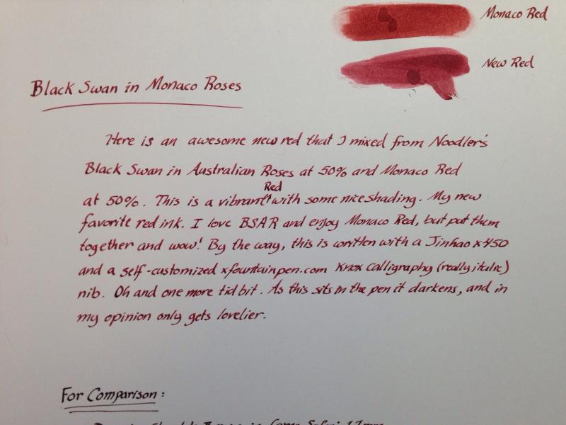
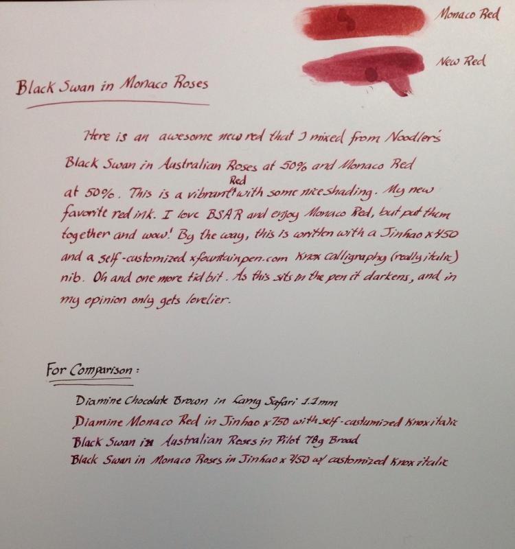
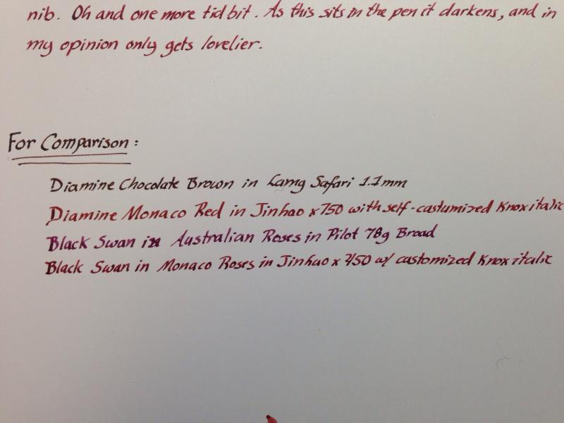
So here is my new creation and my new go to red. I wanted something with a little more vibrancy them my Monaco Red for this years Christmas cards, and this was perfect. It is what I have always wanted a red to look like. By the way, the paper is HP 32# Premium. Hope you enjoy it.
-
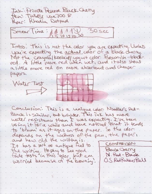
You think you're buying black cherry ink. But what you're really buying is...black cherry ink. You're probably expecting with a name like black cherry that this will look like that dark red color from the kool-aid packets or the soda can. But the thing is, this is the color of actual black cherries, if you've ever eaten them off the tree. So this is probably a bit more brown than you're thinking it'll be. This ink will vary, depending on the paper and on your pen. In a wet pen, or on more absorbent paper, the red color shows up a little stronger. Otherwise, you're looking at a sort of continuum up to a barely red-tinted brown. One thing to note, is as the ink ages on the paper, it will tend to brown a little bit, so that some of the red will disappear. I've seen this happen when looking at my scribblings months or weeks later. I have heard some reports about the actual bottles turning a little brown with time and age. This and Orange Crush. But I haven't seen anything too recent, so I'm thinking Private Reserve may have gotten it under control. Also, it seems if you do have this happen and contact them, they are pretty responsive. I really like this color, personally. It's unique and has character. I've been using this color for a while, one of my first inks, and I was honestly surprised at the amount of water resistance it had. I hadn't actually had any liquid disasters hit anything with this ink, fortunately, but it appears things would smear, but be readable if they did.
-
hello everyone! I am encountering a problem with my pelikan brilliant red ink..i see some white debris floating around inside the ink which sediment at the bottom after about an hour of stagnation. i am not sure whether it is some pigment issue or is it really contaminated. i bought the ink about 4-5 months ago and have used it once. http://farm6.staticflickr.com/5518/9327962522_75aaacf99c_z.jpg C360_2013-07-20-18-23-13-037 by deathadder_44, on Flickr
-
http://sheismylawyer.com/She_Thinks_In_Ink/Inklings/slides/2013-Ink_721.jpg http://sheismylawyer.com/She_Thinks_In_Ink/Inklings/slides/2013-Ink_721b.jpg
-
I recently came across these pens at a thrift store and they were only 99 cents so i bought them thinking that they may be worth something since i have made a lot of profit off of doing this before with other fountain pens that i found. The one is a fountain pen with a rooster and feather/flowery design. On the tip it says "Genius Iridium Germany" The box which has an Asian type of design on it also has another pen in it. But this one is a ballpoint pen with what looks to be a giraffe and feather/flowery design. Here are some pictures. I appreciate the feedback.
-
So this is my first try at mixing. I wanted a darker red black so i mixed 3 ml of diamine poppy red and 2/3 ml of noodlers bulletproof black. Or 2 parts noodlers black to 9 parts diamine poppy red. I apologize about the quality of the picture. Nice color. When water hits tge red starts to wash away but the black stays. http://i282.photobucket.com/albums/kk245/WIKKID85/me/pen%20stuff/CAM00340-1.jpg
-
Now this is an Edgar Allan Poe ink! (Take notes De Atramentis!) In my opinion, this one's probably the best of the writer's series. This is a great red ink. It's not waterproof. But again, could probably handle a few splashes. And really nice flow. It's got great shading, from bright true red to a deep red. It's a rich color with depth. It doesn't look like just a standard everyday red. This isn't a color that only works for marking up corrections on paper. You could probably use this for normal writing, especially if you're into writing horror stories. Or ransom notes.
-
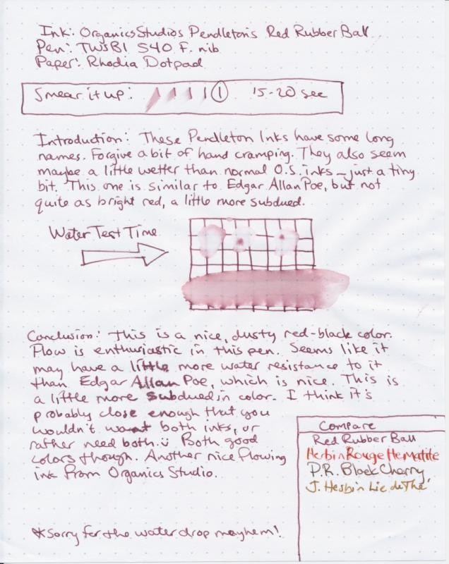
Another great red from Organics Studio. It's a tough choice for me between this and Poe. They've both got depth. The Poe is a little brighter. This one is more subtle, and maybe even further afield from typical markup red ink. Not really water resistant. Flow is nice and smooth. The Pendleton's inks in particular seem to be smooth and have nice shading. Very nice color and appropriate name
-
Dear fellow pen appreciators, I have managed to score a couple of rather old pelikan and rotring fountain pen inks, and though I read numerous topics about the decades long shelf life of Scheaffer inks and a few bad experiences with PR inks, does anyone have any experience with these specific brands? I think they are 20 years old or older(they have the older pelikan logo wit the 2 schematic nestlings, plus they are marked as made in west germany...), and the rotring is probably the same age as well. Should I be worried about using them? Apart from slime and mold is there sth else I should look for? Also would anyone recommend putting i na drop of phenol into the bottles, even yet unopened ones which might sit on the shelf for another year or so? There are no visible problems, but I'm particularly worried since they have 60ml in them which won't be used up too fast. Also colours like violet will be used once every 2 months or so. That means it won't stay closed, but won't be used up too fast either. Since the rotring ones don't seem to be common I'll try to post reviews and examples of the colours I have sometime next week
-
EDIT: AFTER SOME TESTING, THIS PAPER RESPONDS TO FOUNTAIN INK THE SAME AS WALMART COPY PAPER (GEORGIA PACIFIC) This is the same paper I saw the Baystate Blue tested on and thus means I may get this ink for the blue) STILL EDIT: Contrary to what I typed in this post, I care more about fading and bleed-through than water resistance (though that would be nice) Bleed-through being my major requirement. Hello- I'm wondering if anyone knows of any inks that are surefire to behave and not feather and bleed-through the cheap toner paper that are common in highschools. NOTE: i AM TRYING TO AVOID A CLUTTERED POST SO I APOLOGIZE IF THIS LOOKS A LITTLE RUDE...it's also 1:00 in the morning and I am brain dead...OH look! a fly! ~Fly away little buzzy~ I will fix this tomorrow and probably make it half length... I just pulled out a sheet from last year and noticed that it's like a sponge to my Noodler's Heart of Darkness (Which I regret getting and I believe also was contaminated by my well water...go figure...last time I dilute) I know that different colors may behave differently within a brand. So I am very well willing to look at more Noodler's inks. Info on specifics: Paper: W.B.Mason Toner paper Pen: Lamy F nib pen Pens I plan to get in the future -Kaweco Sport Classic; Noodler's nib creeper flex. >> I use about 1oz+ of ink per month...and It might get higher as I start school...(omg) (Noodler's 4.5oz is over a quarter gone) Brands I was looking into: Noodler's -I prefer the 3oz as it is cheaper in general but I may look into getting another 4.5 Lamy -Came with my pen and I like the blue :)c Pelikan (4001) Private Reserve -I've read bad things about this brand so I don't really look at this brand...I may take post regarding these with much less than a grain of salt. Waterman I chose these brands as they appear to be some of the lowest cost ones... Colors: Mainly Black, Blue, and red but I was looking as others as possibilities...except blue-black -------------------- I want to use these inks For school use AND for drawing as I don't really get why people use separate inks for both- I am simply looking for inks that generally don't fade much over long times and are still visible after getting wet(smearing is okay as long as the ink doesn't get totally obliterated...but this is not my priority as I won't be erasing this ink.) <- I don't need to erase the ink. Uh...It seems the Lamy and Pelikan blues are made to be eradicated...they don't seems to mind Alcohol based markers though...(sharpies and the like)...I guess the black doesn't do this as much? I was looking at Lamy because I have used it and I like it's flow and I was already familiar with the blue...I have yet to smear it so that's nice. ...I read ONCE that it fades yellow in about a year(the black) I read that Pelikan 4001 was about the same, but it is slightly more prone to feather? I guess that Waterman inks are just Waterman...A bit wetter...but I fear that it would feather more due to the higher degree of ink that would be laid down...There red looks good and I read that the ink had a glossy look? And then Noodler's... the HoD was like a water fall...but I read that the plain black is nice. I was looking at these inks: X-feather -For obvious reasons Black -apparently the normal black behaves well with cheaper papers? Blue (If only there was a n-feather like blue...jk) Bay State Blue ...I saw this stuff used on cheap walmart printer paper on a video...while not toner paper...it was nice. ________________________________ I am asking on what those who read this have to say...I'm in a little of a rut...I DON'T want to head about other brands as I want to try to stay cheap...I use a lot of ink it seems...I do sometimes color my drawings with sharpie markers to get in some vague stuff and it seems that the Lamy ink doesn't mind too much...It is something to consider I suppose... I'm not going to get every ink know to dolphins of course but I just need a few necessary colors. THANK YOU! (and I will thank you again afterwards too Cx ) Now if you excuse me... I'm going to go pass out for the night...morning...-face desk-
-
http://yoonhalee.com/images-inks/diamine-oxblood.png