Search the Community
Showing results for tags 'red'.
-
What a great color! I had to send for it. Great sushi, too.
-
I'm planning on purchasing a Cross Townsend fountain pen, but I can't seem to make up my mind on the finish. I'm considering the following: Quartz Blue LacquerGarnetRuby LacquerOpinions are more than welcome. Any information regarding your experience with a Townsend is appreciated. I would love to see a writing sample for the fine and medium nib (two-tone 18-karat/rhodium-plated). Thanks in advance.
-
Hello all, This is my first post on the FPN. I am looking for an opaque or at least very saturated with little to no shading red ink. This is mainly for use in a 6mm Pilot Parallel calligraphy pen. I've tried several colors but to no avail. I've highlighted the problem exemplars in yellow in the images below. Diamine Red Dragon is my favorite red ink, and it almost gets the job done, but it still looks blotchy in the 6mm PP: Here is Noodler's Park Red: I prefer the shade of the Red Dragon, but I need something that doesn't look splotchy when going over the same area with multiple strokes. Also, don't cringe too badly at the letter forms here, they were part of my practice . Any suggestions are very much appreciated. Also, I'm looking for a rich red pigmented ink for dip pens. I'd like something akin to sumi-e, the best I've found in that family is an orangish red though.
-
I have a few fountain pens, but, most are empty because tend to dry out before I use them. I don't write as often as I use to. I do have a pair of LAMY pens that I'm enjoying... a black one with Noodler's Black (Bulletproof) and a red LAMY with a sample of Noodler's Rattler Red Eel, which, I'm not liking as much. It's a nice ink, but not 'red' enough... dries too dark for me, not enough contrast between it and the black to stand out. I'd like to get an ink that's almost the same colour as the pen itself. I saw a few reviews for Diamine Wild Strawberry, which seems more towards what I'm after. Does Noodler's make a red ink similar to this colour?
-
I'm looking at/for an orange that is almost red: how does Pelikan Edelstein Mandarine compare to, say, Mont Blanc Ink of Joy, or Ghandi? Any suggestions? (Am in the UK) Alex
-

20 Red Inks Scanned (Or, The Next Chapter In The Continuing Saga Of Klundtasaur's Obsession About Color)
klundtasaur posted a topic in Ink Comparisons
The harrowing adventures of ink journal scanning continue. This time, we find our intrepid (obsessive) character considering the chromatic characteristics of crimson, cardinal, claret, cherry and carmine. Previously: Black, and Blue/Teal What's all this on the page? Why are some pages a little different? Why are some of the pangrams not pangrammatic at all? My obsessive processes, detailed: I hope these are helpful to those of you looking for red inks. http://i.imgur.com/n1oFHBy.jpghttp://i.imgur.com/xpkIKYz.jpghttp://i.imgur.com/M0ULOQ6.jpghttp://i.imgur.com/e5Zrwhh.jpghttp://i.imgur.com/BRMR7RG.jpghttp://i.imgur.com/xrusJuV.jpghttp://i.imgur.com/Nulnxkw.jpghttp://i.imgur.com/qRrT7ik.jpghttp://i.imgur.com/Hve24l9.jpghttp://i.imgur.com/dJHi8vu.jpghttp://i.imgur.com/lIFyhPc.jpghttp://i.imgur.com/yaxe190.jpghttp://i.imgur.com/BySaZk8.jpghttp://i.imgur.com/ImtX3QQ.jpghttp://i.imgur.com/yxulJNS.jpghttp://i.imgur.com/DPPLlCL.jpghttp://i.imgur.com/AEWl495.jpghttp://i.imgur.com/7WZEVVo.jpghttp://i.imgur.com/RlwgFLL.jpghttp://i.imgur.com/4aAbQT0.jpg -
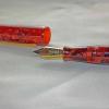
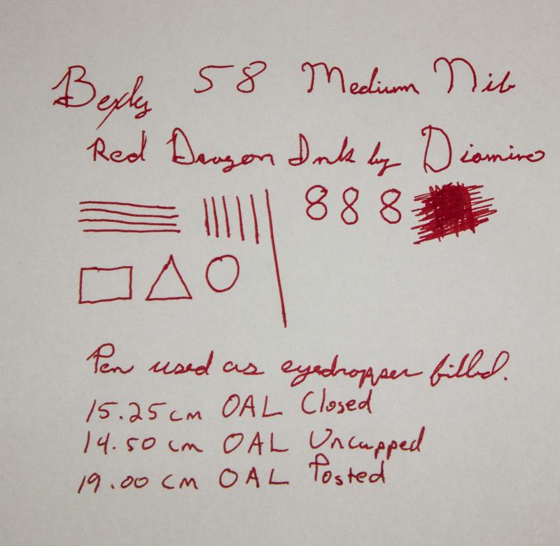
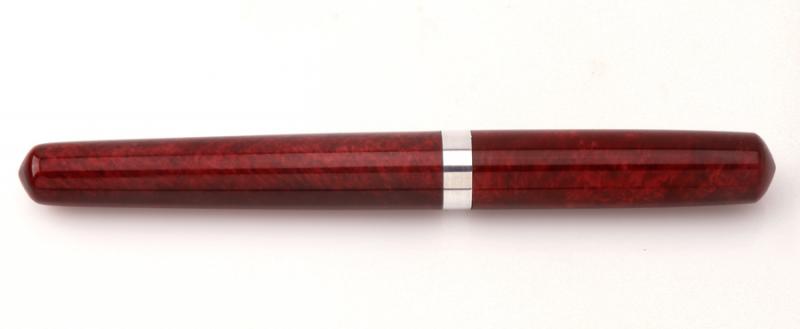
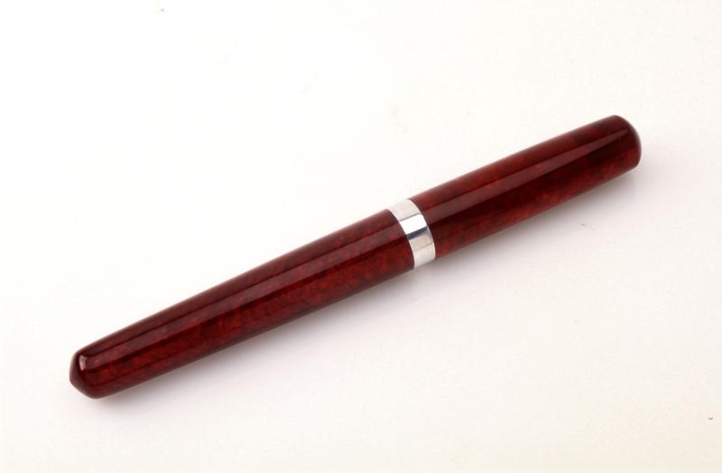
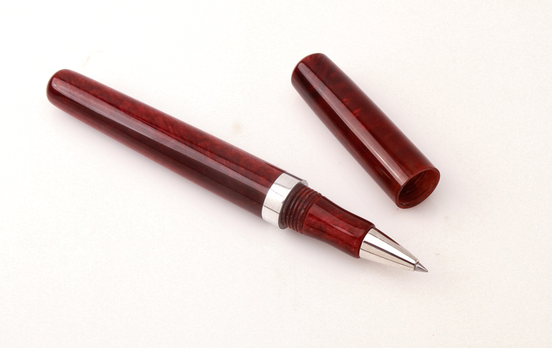
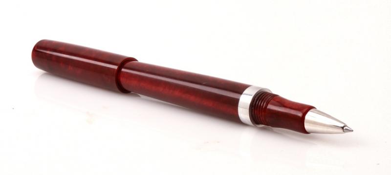
Bexley 58 Fire Engine Red, Medium Stainless Two-Tone Nib
boybacon posted a topic in Fountain Pen Reviews
This is my Bexley 58 in Fire Engine Red. This pen was purchased on eBay as an NOS Bexley from a discontinued line. This is the second pen that I purchased after my Edison, and my second "Made in the USA" pen. The pen arrived well packaged with a larger sized box in a sleeve. Good thing that the box was larger than the Edison...because this is a big pen! 15.25cm / 6 inches when closed/capped. The box was very nice, again in contrast to the box that Conklin uses. Generally speaking, I take a pen out of it's box and keep it in a cigar box with pen trays, then put the box in storage. I know that some people store their pens in boxes, so I try and leave a review of the box as well. This pen is a pretty red acrylic, described as Fire Engine Red. It came with a cartridge converter, and also an o-ring so it could be used as an eyedropper. Originally I had planned on doing the review using the converter, but due to circumstances beyond my control, you get the eyedropper review (with a different ink than intended, also!). The cap fits well, and the overall look is nice. For some reason, the gold band looks a little "meh". Not sure why, or what it is about the band, but, to me, it just looks a little chintzy (hard to explain, and probably a personal preference). Maybe it's too wide for my tastes. The clip is nice, and holds the pen in the pocket. It's a tight clip, so it is usable with a thinner dress shirt...with one caveat. There is about 1.75cm / .67 inches of pen cap that stick up above the pocket line. It's a little more than I like peaking up out of the pocket. If your pockets have flaps, then it's an awkward pen to to carry, as it props the pocket flap open. For as big as this pen is, it's not a heavyweight. It's fairly light, and if you write unposted it's nimble, as well. Posting the pen while writing makes it a little unbalanced (in my hand). The nib is nice, and lays down a wet line. This is noticeably wetter as an eyedropper with the Diamine ink than with the converter and Noodler's Purple. With the Noodler's ink, I had some dry starts and a little skipping until it settled down. Not the case with the Diamine ink. I let the pen sit capped for 5 days, and it started without even hesitating. The medium is smooth and writes well for me. I would put it on par with my Edison nib but a bit wetter. It fits well in my hand unposted and you definitely notice the pen's girth. It's not uncomfortable to write with, and it mimics the old Waterman pens of yore, according to the Bexley website. I don't have an old Waterman pen, so I cannot speak to that. The writing sample in the photo was done in a hurry, due to the dreaded disease called "lack of time". In summary: Appearance: 8/10 - The gold band isn't quite right for my tastes. Not sure why. Clip is nice, but there is a fair amount of cap above the clip. Wetness: 9/10 - It writes wet. Noticeably wetter with the Diamine ink as an eyedropper than the Noodler's with a cartridge converter. Smothness of nib: 9/10 - It's a JoWo nib, I think, like the Edison nibs. I'm guessing that it gets tuned before it leaves the Bexley factory, though. Very nice. Ergonomics: 9/10 unposted, 8/10 posted: Posted this pen is too long. Unposted, it's about right and fits my hand without any issues. Sealing: 10/10 as an eyedropper. Cap keeps the pen sealed against drying, no issues. Weight: 10/10 - For it's size, it's not a heavy pen. My Conklin Duragraph is a heavier pen. Overall: 8.75/10 - Because I wear casual clothing to the office, many of them have pocket flaps, and the cap is just too long for those. It's a nice, big pen and would probably be better in a desk drawer, or on a desk display than in the pocket. The red color is nice, and the gold clip goes good with the two-toned nib. It's in my regular pen rotation, that's for sure.
-
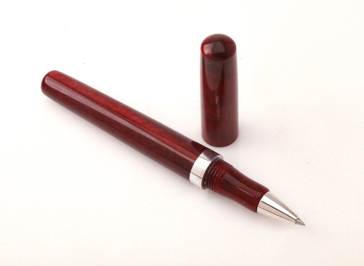
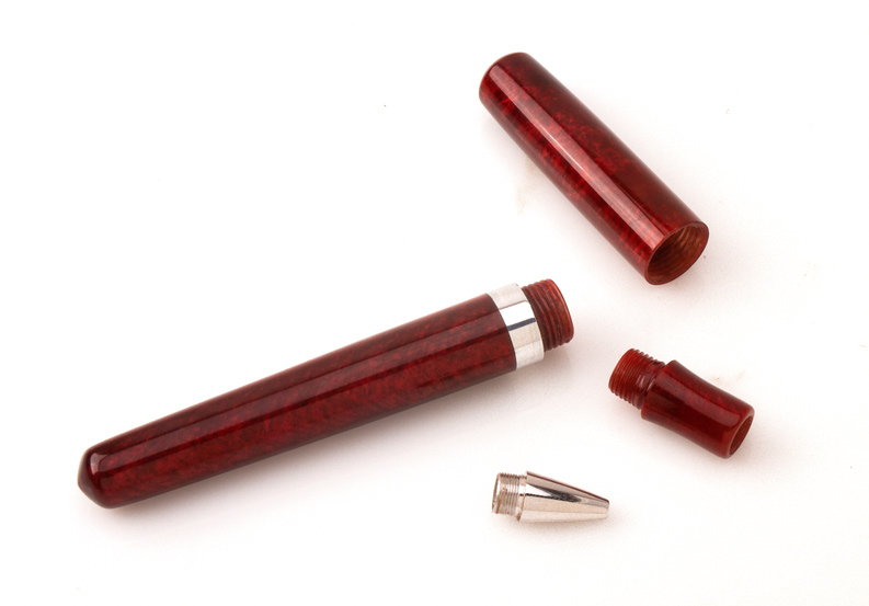
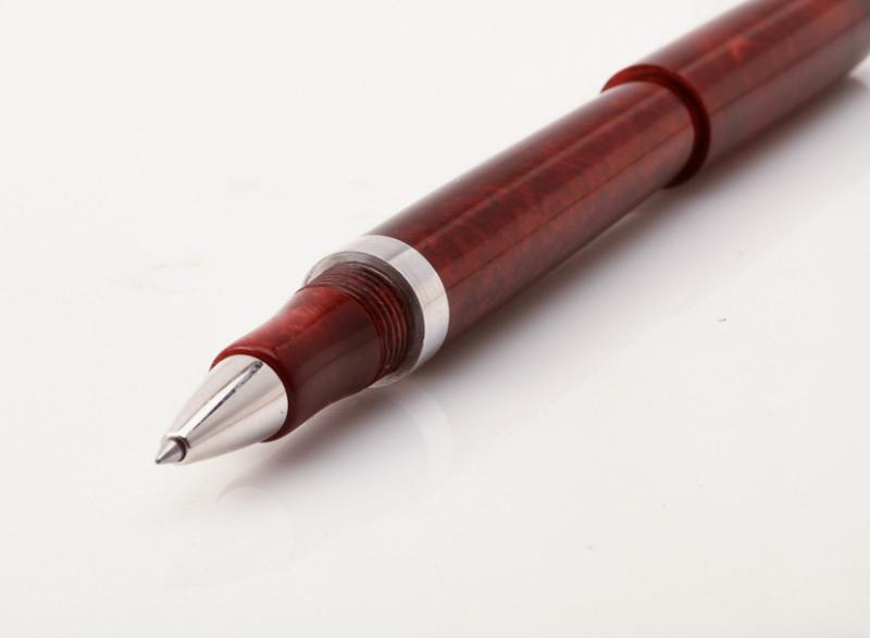
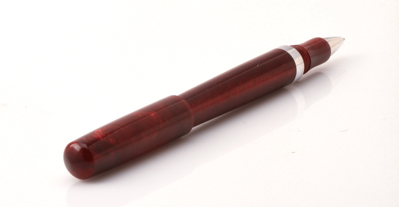
my first 99% kitless
-
My recent short trip to Texas led me to Dromgoole's Pen Shop, which received rave reviews about the service and selection. Naturally, once I got there, I headed straight to their ink selection, which had a large assortment of Noodler's inks. This is my first Noodler's surprisingly, so I didn't know what to pick up. But I remember watching this ( ), so I decided it would be an interesting choice to play with. Needless to say, I was pleasantly surprised by the color of it! This review will be in my normal format, with a picture following a short description of it, above it. Another note, this is a VERY hard ink to photograph, so I have done my best to ensure color accuracy. We will start with a preview of the ink. It's a really interesting and bright color at first look. http://files.goviralforyou.com/Inks/Reviews/Noodlers/Dragon's%20Napalm/Ink.JPG For the pen, I used my go-to Nemosine Singularity Demonstrator with a TWSBI B nib. The B nib is a bit thinner than the western B, but nothing major. It's really smooth and awesome. http://files.goviralforyou.com/Inks/Reviews/Noodlers/Dragon's%20Napalm/Nib.JPG The review is written on what is now discontinued, HP 28lb Copy paper. It's my go-to paper as well, at least till I run out of it. HP 32lb is also nice! http://files.goviralforyou.com/Inks/Reviews/Noodlers/Dragon's%20Napalm/Paper.JPG Here is a swab of the ink, showing some color variation. The label says that it is the only "Sepia shading, carmine ink." I beg to differ. I see no sepia, nor carmine, which I expect to be a dark-ish red. Still, I like the color very much! http://files.goviralforyou.com/Inks/Reviews/Noodlers/Dragon's%20Napalm/Swab.JPG Onto the characteristics of the ink. The ink is very well behaved, and does not exhibit any noticeable feathering, or bleed through. Also, the color shifts between a bright orange, and a noticeable pink, under different types of lighting. Also, the color is highly saturated, but does not stain any converters, or barrels of demonstrators. Very minimal shading is present, contrary to what the label would have you believe. It flows well, and provides decent lubrication. http://files.goviralforyou.com/Inks/Reviews/Noodlers/Dragon's%20Napalm/Characteristics.JPG http://files.goviralforyou.com/Inks/Reviews/Noodlers/Dragon's%20Napalm/Characteristics%202.JPG The ink does not have an overly long dry time, but it is definitely not the fastest. I don't mind the current dry time, the way I write, so its not a problem. http://files.goviralforyou.com/Inks/Reviews/Noodlers/Dragon's%20Napalm/Dry%20Time.JPG Here is a small comparison to my other ink colors which I happen to have loaded. Use these as a calibration for the pictures, and your monitor. I didn't intend them to compare similar inks. http://files.goviralforyou.com/Inks/Reviews/Noodlers/Dragon's%20Napalm/Comparison.JPG Lastly, here is the water test. The top grid of the test had water drops placed on them for 10 seconds, then vigorously wiped downwards. The bottom text did not receive any drops and was only wiped, to show ink smearing. The test showed noticeable lifting of the ink, but still leaving a little on the page. The ink has a medium amount of smear. I would not consider it waterproof. http://files.goviralforyou.com/Inks/Reviews/Noodlers/Dragon's%20Napalm/Water.JPG http://files.goviralforyou.com/Inks/Reviews/Noodlers/Dragon's%20Napalm/Water%20After.jpg Almost forgot! Here is a scan of the ink. Use it to read the review, and not for color accuracy. It is very far off. The pictures are a better representation. http://files.goviralforyou.com/Inks/Reviews/Noodlers/Dragon's%20Napalm/Scan.jpg That's all folks! I would give the ink a decent 8/10, due to the lack of waterproofness. If you like this review, stay tuned for many more!
-
Im in search of red which looks as red as it is when you see a drop on a tissue....just tried Momiji Irshizuku; it looked perfect on a tissue, but disappointed when writing. I want one which looks like fresh blood( I know hat a horrible description tht is, but it's the only way I can think to describe it: a dep, blood red, but without the blue crimson overtones. I've got several reds but have yet to find the shade I want. id prefer nt to start trying to mix anything, as I get messy enough just filling....and am still looking.....any suggestions? Thanks Alex
-
I love this ink; it jumps off the page, full of drama. It turns a shopping list into a suicide note.
-
New Noodlers....
-
These three dark reds compared. I think I'm getting colour-blind... http://s0.homezz.com/201501/5915/49137_o.jpg [Edit: Splashes added.] http://s1.homezz.com/201412/5915/49052_z.jpg http://s1.homezz.com/201501/5915/49139_z.jpg http://s0.homezz.com/201501/5915/49138_z.jpg
-
This is one of the White Box inks. I think there are a few bottles left at Anderson Pens. Still no scanner, so you get bad photos instead. Genghis is a strange ink. It is wetter than the other White Box inks, thank goodness, though the flow was uneven - if I paused, the next word was way darker. The color is a kind of a weathered coral-rose color that is weird. I keep going back and forth on whether I like it. If you drip a little in water, it doesn't disperse normally. Instead it forms little filamentous drops. These don't seem to be actually filaments, nor did I have any trouble washing it out of my nib. That color. I keep going back to it. It does have a gold sheen to it. I am terrible at finding sheen, even with classically sheeny inks on sheeny paper, so it must be pretty strong. It isn't a Stormy Grey-style glitter, but an old-school sheen. I like that part, though I am not sure how well it accompanies the main shade. It washes pretty. I think I would love a softer version of this color, and a bold, deep version. Like many of Organics Studio's inks, I wonder if I did something wrong. I expected a bold red-red. (Didn't you?) This is more of a old-sweater-washed-80,000-times red, or a weather-beaten barn red, or a yarn-dyed-with-natural-roots red. I do like it better tonight than last night, for sure. Like most inks, it has zero water resistance.
-
So here's a comparison of my two Montblanc reds. CPR is red, whereas AH has a purple tone. AH fares better in water dripping test. I think I like the colour of CPR more. http://s0.homezz.com/201412/5915/49037_o.jpg
-

De Atramentis - Red Wines - Merlot, Saint Laurent, Fruhburgunder (Early Burgundy)
amberleadavis posted a topic in Ink Comparisons
http://sheismylawyer.com/She_Thinks_In_Ink/2014-Inklings/slides/2014-Ink_1920.jpghttp://sheismylawyer.com/She_Thinks_In_Ink/Inked_Today/slides/20141025_005303.jpg -
I wanted to extol the virtues of an ink not commercially available that I received in a 2 ml sample from a well-known and much-beloved FPN member, amberleadavis. This is one of the most well-behaved inks I have used in my time as a relative newbie, its resistance to water is moderate to high, and it is a very easy red to work with, not drying out or causing hard starts/ skipping at all. In normal writing with my fine nibbed Kaweco Sport (which is on the drier side), the hue was a vermillion color, almost a ringer for Iroshizuku Fuyu-gaki, but when writing more deliberately, I got a color almost matching Diamine Poppy Red. In my opinion, this ink deserves a wetter/ broader nib to bring out its true robustness.
-
http://yoonhalee.com/images-inks/diamine-matador.png http://yoonhalee.com/images-inks/diamine-matator-closeup.png
-
K W Z I - Konrad - #81 - Iron Gall - Ig Cherry
amberleadavis posted a topic in Th-INKing Outside the Bottle
http://sheismylawyer.com/She_Thinks_In_Ink/2014-Inklings/slides/2014-Ink_2068.jpg -
A comparison of: Diamine Monaco Red, Private Reserve Fiesta Red, Sheaffer Skrip Red, Diamine Poppy Red, Rohrer & Klingner Morinda, Sailor Oku-Yama, Iroshizuku Fuyu-gaki (more like orange, not red), and J. Herbin Rouge Hématite. The samples are all written with a Platinum Century 3776 M nib. The paper is Rhodia Pad No. 16. In fact it's a comparison I've made two or three months ago. Please forgive the smudges. I've just purchased a scanner so I think I'd scan this comparison. It's better than taking photos with a phone. Monaco Red and Fiesta Red look barely distinguishable. If I have to tell them apart I'd say that Monaco Red is a bit more 'earthly' coloured, while Fiesta Red is a bit redder. Skrip Red and Poppy Red are what I'd consider a true red, the former one being a tiny bit darker than the latter. Compared to these two, Morinda is a duller colour with some blue undertone. Oku-yama is a reddish purple/violet. Rouge Hématite is also a good red, though maybe somewhat bluish or pinkish (compared to Skrip Red or Poppy Red)? I don't know... The scan failed to capture the gold sheen. Water-resistence-wise (forgive my made-up term), the Sailor fares the best. Morinda and Fuyu-gaki don't stand a chance against water. http://f.cl.ly/items/023y223b0z1b2b2F1q1j/img004.jpg
-
I have treated myself to my first-ever uroshi pen, a Nakaya from nibs.com with the kuro-tamenuri finish (black over red). I haven't received the pen yet, so I won't make any final decisions until I see it in person, but I'm pondering inks that would suit the pen. My ideas so far: Black (I have some Iroshizuku Take-Sumi) Dark Brown (I have Iroshizuku Yama-Guri, and I'm also looking at the Maruzen Sepia available from Nanami paper) Dark Red (Sailor Oku-Yama, Diamine Oxblood, ?) I don't need it to be matchy-matchy but I want it to harmonize with the pen. I don't want to match the red of the undercoat since I don't write with bright red very often. Any thoughts?
-
Hi everyone! I collegue of mine is looking for a red ink that dries as quick as posible and that can be marked with a highligther without smeareing. I am not cappable of giving him any sugestion so.... Thanks a lot for your answers!!!
-
I was in a ramshackle old stationery shop in a small town in Germany recently and decided to buy a Lamy Safari for a friend. The seller had only the one model left, so I bought it, at the standard retail price. But earlier today I was in a different shop with a wide range of Safaris and noticed that the one I bought is unusual: it's a red model, with a clip that is black instead of silver, and it came fitted with a black nib. I guess it's a special issue of some sort, or perhaps an older model, and my search on FPN threads suggests it is not all that easy to find. Actually, given the age of a lot of the stock I saw lying around the shop, I'd be inclined to think it's an older model rather than a limited edition; but I just don't know. I don't really need to know, but it would be nice to be fully-informed: so, can anyone tell me anything more about it?
-
http://www.fp-ink.info/colorcard/536.png As always, light resistance will follow in about one month, images will be replaced:
-
http://www.fp-ink.info/colorcard/370.png Nib creep and light fastness will come after a while as they take a while to measure. As long as they are unrated (0 stars) they are not measured yet.