Search the Community
Showing results for tags 'purple'.
-
These are my first ink reviews so I'd like to hear all suggestions how to improve them. I've got quite some inks in my collection already (most of them are samples but it's a start) and I will review some more in the future.

-
Hey there. I just bought my first fountain pen (Lamy Vista with a fine nib) and haven't invested in my first bottled ink yet. I would need some suggestions on buying inks. I'm a middle school math teacher. I plan to use my fountain pen to grade papers. I'm looking for inks that are suitable to write on office copy paper or regular school notebook paper, doesn't bleed through too much, and affordable since I'll using a lot daily. I'm looking in the range of turquoise, purple, green and orange. I usually don't like grading in red ink. Does anyone or any teachers here have some good suggestions for me? Or maybe other colors that are not red? Thank you so much.
-
I just wanted to share this since I love pinks and purples but sometimes it is hard to find just the right light shade of pink or purple ink. I don't have an exact formula for this. It is mostly water with a few drops of DMP. I just test it in the pen and use a syringe to add another drop of ink or water as needed. If you want to try this I highly recommend starting with a very small batch. Either a sample vial or directly into the converter is what I like to do. http://media-cache-ak0.pinimg.com/736x/ff/94/17/ff9417c09223d961e5c487f399e59ded.jpg
-
http://sheismylawyer.com/She_Thinks_In_Ink/2014-Inklings/slides/2014-Ink_325.jpghttp://sheismylawyer.com/She_Thinks_In_Ink/2014-Inklings/slides/2014-Ink_325b.jpg
-
http://sheismylawyer.com/She_Thinks_In_Ink/2014-Inklings/slides/2014-Ink_259-viola.jpg http://sheismylawyer.com/She_Thinks_In_Ink/2014-Inklings/slides/2014-Ink_259d.jpg
-
Toucan Violet - the third-last in the range (not sure whether I'll bother with #14). The review below may seem a bit harsh - but honestly, the only thing I don't love about this ink is its colour (!). It's well-behaved, reasonably saturated, washes well out of my pens... I just, well, prefer a more 'brightly coloured' purple (or violet). The ink in the Platinum Preppy (see sample) is just about perfect for me - this colour seems 'flatter' by comparison. That said, Toucan Violet is a 'legitimate' colour in its own right - it reminds me of the flowers on a spray of lavender. You know the drill: manufactured by Tintex, only available for purchase in Australia and NZ (at least for now), but an amazing price - kind of makes up for the extra we have to pay on every stinkin' pen and ink and paper that has to be imported Down Under and sold at a ridiculous mark-up to boot ('Pardon my potty mouth'!, as Fix-It Felix Jr would say...). Here it is - scan only (unless someone asks for a photo), but I think this is reasonably accurate: http://i.imgur.com/prgY6Ct.jpg
-

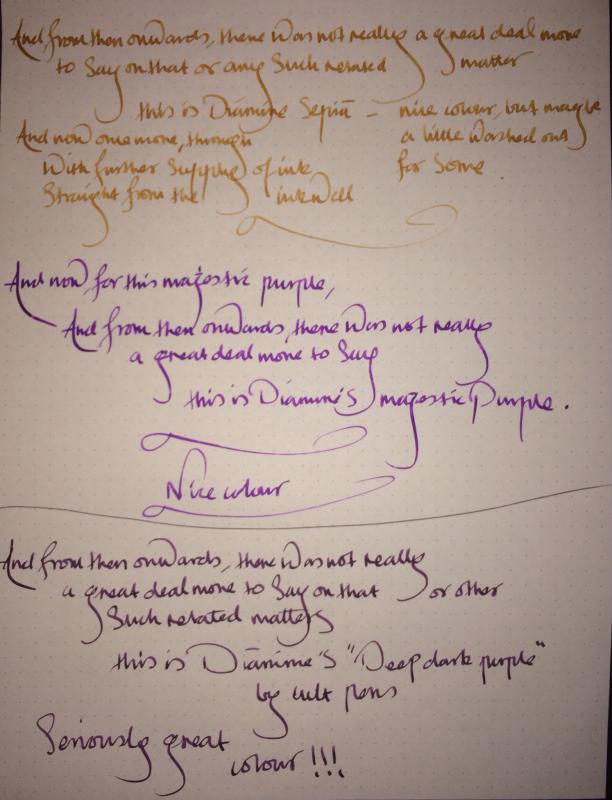
Diamine Sepia, Diamine Majestic Purple, And Cult Pens Special; Deep Dark Purple
Sach posted a topic in Ink Comparisons
New delivery if around twenty colours from Cult Pens today. Thought I'd share first three that I've tested tonight!
-
possibly a bit ambitious with that name! This is a mix made from an unknown proportion (probably about 3+:1 though, mixed it by eye/feel in the pen itself when drawing the ink up) of Waterman's Purple and Cross Black (rebranded Pelikan, according to the internet) It seems to be a dark purple, with some (a lot? not a lot? i have no clue! tell me about it) shading here are some images (click for hi res) All done with a Nooder's Creaper, with a cameo from a Pilot Parallel, my ackermann pump pen has been slightly stolen by a close friend for now I don't think the proportion actually matters that much, since there is a pretty wildly different one in the Parallel than the Creaper but it seems to have the pretty much the same colour and response paper was from 80gsm cheap staples notebook thing aman x
-
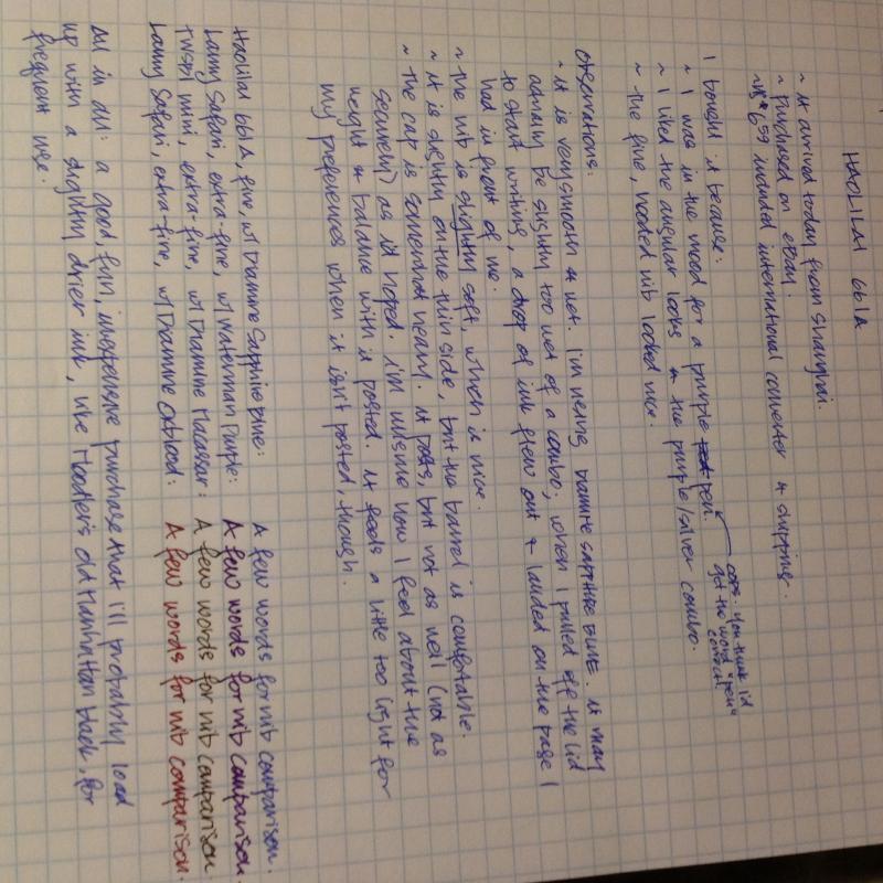
I just received a Haolilai 661A, which I ordered from eBay. Since there is little about this brand on FPN, I thought I'd post this very informal, handwritten review.The pen I purchased was http://www.ebay.com/itm/FOUNTAIN-PEN-HAOLILAI-661-FINE-NIB-SILVERY-PURPLE-H055-/121127212869. The photo posted here of the pen is is from the eBay listing. My review is in the attached image, though I can't seem to modify the orientation of the photo.
-
Hi there! So... I've not done this before. I couldn't find a review for this ink and thought it would be a good ink for my first try. I apologize in advance for both my handwriting and any mistakes. P.S. I am going to get this photo facing the correct direction if it kills me O.o
-

Noodler's Violet Vote Periwinkle Edition - Pendemonium Exclusive
nomadhacker posted a topic in Ink Reviews
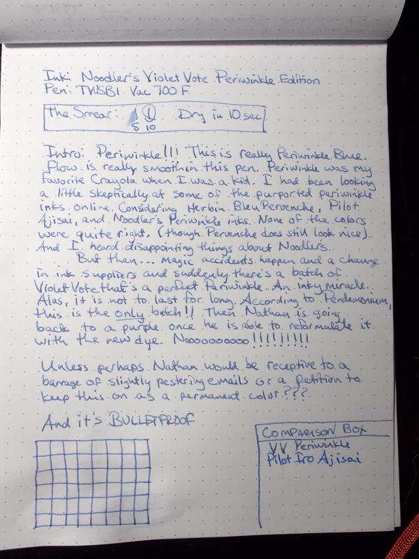
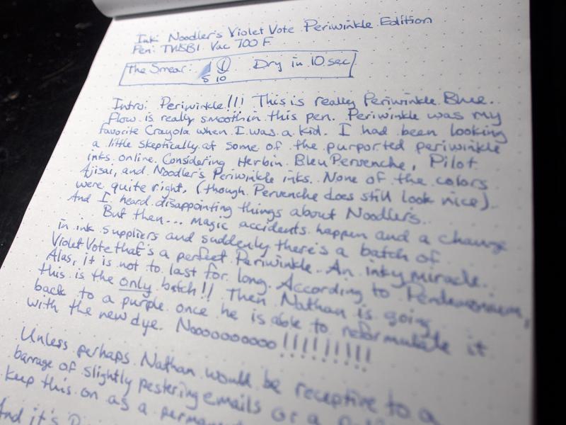
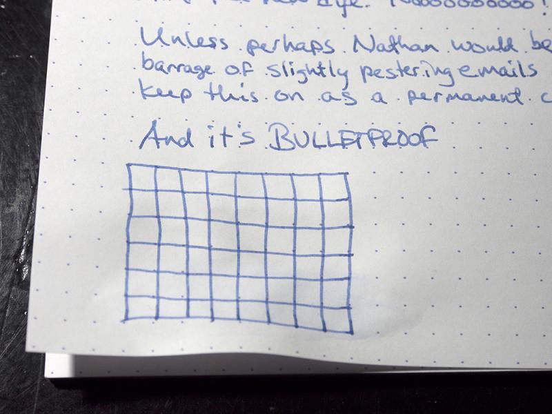
Ok. I'm probably unreasonably excited about this ink. Growing up, Periwinkle was my absolute favorite color from the Crayola box. I had hoped to find a good periwinkle color of ink when I got into fountain pens. But most of them don't look quite there. And Noodler's Eternal Periwinkle, I've heard doesn't really behave itself well. This ink was an accident as a result of a dye supplier change for one of the dyes in Pendemonium exclusive Violet Vote. Resulting in an almost perfect Crayola periwinkle blue. Sadly, according to Pendemonium, Nathan isn't going to make any more of this and it's just gone when gone, as he's working on getting his color reformulated back for regular Violet Vote. This ink flows smoothly on the paper. It's not what I'd call a wet ink. Rather a more thick feeling smooth ink. Not really a shading ink either. At least, not in the fine nib I was using. It may have some in a stub. Completely unmoved by the water. In fact, if the paper weren't a little wrinkly where it got wet, I couldn't be able to tell. Dries fast. Under 10 sec on Rhodia. No feathering or bleeding on the Rhodia pad at least. Nathan, tell me again why this isn't going to be a regular issue? Please? I took pictures of the ink review under my Ott Light last night to try and get as close colors as I could. I'll add a scan later. In the comparisons box I only had Iroshizuku Ajisai on hand of the other erstwhile periwinkles. I do plan on adding the Herbin Bleu Pervenche to my ink stable pretty soon, but a quick image search will show that while it's a nice enough color, it's different. And the reference
-
My suitemate kind of got me interested into fountain pens about a month ago. So I caught the buying virus and after getting a few inks and some fountain pens in a month, I decided to spend my weekend mixing some inks together. I think my first try turned out decent right? I'd love to hear any tips and pointers for future mixing http://imgur.com/wsmXYKR (I posted it on Reddit first) So I took that picture on HDR mode on my Nexus 5, so it's probably not as accurate as a scan. But I can do some if people really want. I'm just interested to see if this color resembles anything? I'm not sure as I don't really have purple ink and I found this purple to be pretty satisfactory for me.
-
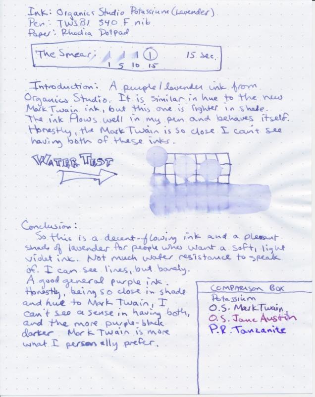
This one really goes hand-in-hand with the review I had posted of OS Mark Twain. They are color-cousins. Maybe more like siblings. This color looks to my eyes to be a very similar hue as Mark Twain, just lighter and with less shading. Overall Impressions: It's a light dusty purple color. Appropriately titled a lavender. It has a good flow in the pen. There's some decent shading. Not much water resistance. Since Mark Twain came out, though, I can't see someone needing both inks. I like Mark Twain better, but that'd be personal preference. My suggestion, figure out which of these you like better, and pick one of them. One nice thing, is most of the normal run Organics Studio inks, this one included, clean up really nice and easy.
-
I am looking for a nice, formal and warm purple. A purple that is composed, but at the same time personal. I don't want something that pops out and is hard to read. Maybe something on a darker side, but nothing bright or light. Shading is not really necessary. I will be using Goulet Sampling (no affiliation). Thanks for the recommendations!!!!! And Merry Christmas!!!!
-
Taizo managed to get this to me in the UK from Japan in three days: amazing. This ink's advertised as being made especially for demonstrators. It's the same price as regular Sailor Jentle inks, and is available in Purple, Pink, Blue and Mint; all the colours are pastel shades. I only bought the Purple; I already have a couple of low-saturation pinks, and didn't fancy the Blue or the Mint. The saturation is so low that the finger I used in the smear test at the bottom of the page has no visible evidence of ink on it! I wrote this page last night, and looked at it then under halogen lights. It appeared much lighter than it does today, in daylight (which I had to wait for to take pictures). It's actually more readable in daylight, and I like it more. It's a very soft and pretty colour; if my Grandma was still around I bet she'd have loved to receive notes written in it. Here it is in the pen. I was a bit disappointed here: I'd been expecting that it'd be much more jewel-like and transparent in a demonstrator than other purples, but it turns out to be surprisingly dark-looking in the pen. I'll report back when it's empty on whether it's easier to clean than other purples; I suspect it will be. I haven't seen many places stocking this ink, which has been available for less than a month, yet. I got mine from Engeika. There are bottle pics and a picture of Sailor's swatch card at Crónicas Estilográficas. In summary, this ink is not something I'll be using daily, but I'm sure I can find applications for it; I won't be buying its siblings, though.
-
Ok. This is another really good one. I officially like all four of the Pendleton's inks series. Good shading, wet flow. Really nice colors. This one is a dark purple color with nice shading. A purple-black. I wish I had Diamine Eclipse to compare it to. Looks like I really dig dark purple inks. Much more than lighter violet colors. This is going to join my top inks in regular rotation.
-
A stunning colour from the collection! Ooh la la..
-
Another Akkerman. Another nice ink. And another shout out to amberleadavis as thanks! This one has nice shading. It's a saturated, deep purple. Still a bright color. Has some nice shading. And good flow. A wet flowy ink. If Akkerman is indeed the same as Diamine ink -- which is still in the mystery closet for now -- this one looks close to Amethyst, Lavender, or my guess would be Imperial Purple.
-
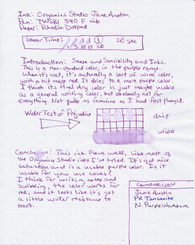
Here's another purple ink from Organics Studio. This one seems a little bit more on the red side of violet when it's going down, but it quickly changes to a more medium purple. It's still a bit more red than most purple/violet inks I have. It's not quite as pinkish seeming in real life (once it's dried) as the scan shows. Has the same good flow as the rest of Organics Studio's main line. Not really water resistant, but can handle small splashes. Not my color. But if you like bright flowery colors, this could be a good one for you.
-
This ink goes down a little lighter purple, and dries a little grayer. On some papers, it looks like a gray-purple. It's a pretty and unusual color. A fairly unique color. It's got good flow and water resistance. No feathering. It's on my list to get a bottle. Not the top of the list, but I like it.
-
There's been a bit of a dearth of Organics Studio reviews on this site yet. Especially for the newer colors that I was particularly interested in. Given that, I ordered a bunch of ink samples last month. Well, this month Tyler's been holding a contest for reviews. So, you know, extra incentive to get these up without lollygagging too much. This was one of the inks I was most excited to try out first. Especially since even those sites that sell it haven't all gotten sample images up. Overall impressions: It's a dark blue, but it's got more than traces of purple. Sort of a purple-black range I suppose. It does tend to get just a little more blue when it dries, sort of like PR Tanzanite. Great shading. Love the color. Good smooth flow. It bleeds a good deal in water but it's got enough water resistence to see where your pen has been. *Forgive the clumsy splatters from my other ink testing I'm getting a bottle!
-
Caran d'Ache in an unknown German firm pen on Clairefontaine paper.
-
So I decided to compare the EF nibs I possess right now, with inks on hand, since I got a replacement Lamy EF nib. I wrote out both Japanese vertically and horizontally, and English, to compare alphabet and oriental script. Here are the combinations: MontBlanc Meisterstuck LeGrand, 14K EF nib, with Pelikan 4001 Royal Blue Lamy Safari EF nib with Lamy Blue Platinum Plaisir with J Herbin Encre Violette Platinum Preppy with Platinum Black Vertical Verdict: Platinum Plaisir wrote the smoothest, then Preppy, and the grand loser was MB. Lamy did fine, but not spectacularly. MB was VERY scratchy. Also, the MB width is so thicker than the other three that it looks like a medium. What gives?! Order: Plaisir, Preppy, Lamy, MB. Horizontal verdict: Platinum Plaisir wins again. Preppy lost out to Lamy; MB is a little smoother, but still scratchy. MB must hate this paper. Order: Plaisir, Lamy, Preppy, MB. English: MB wins, hands down, despite the "this is so not EF" thickness, then Plaisir, then Lamy, and Preppy decided to scratch. Order: MB, Plaisir, Lamy, Preppy. Conclusion: Lamy can do fine vertically and horizontally, but fares better with loops and curves. MontBlanc abhors vertical strokes and corners, period. Plaisir is smooth both ways, but loses an oomph when writing in English, and tends to glide too much. Preppy is acceptable in all situations, but will never, ever stand out. Considering that Japanese has a lot of vertical and horizontal strokes, as well as angles, and significantly less loops than English, it makes sense for Platinum to make pens suited for that purpose, rather than Lamy or MB making nibs that suite cursive loops more. Also, thinner the nib, easier to write Japanese, because we have sudden upward strokes. The red? Pilot VRAZOR EF point. The pink is Varsity (nib is bent for some reason). http://i1332.photobucket.com/albums/w614/GabrielleduVent/DSC_02562_zpsd09521e5.jpg
-
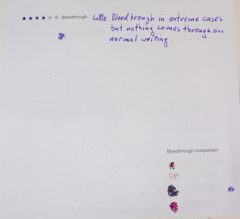
Noodler's La Couleur Royale - on Rhodia dotPad N°16 paper - with a TWSBI Diamond 580, medium nib - from a 2 ml sample Ink characteristics Flow? Good flow. Lubrication? Above average. Shading? Just below moderate. Spread? No complaints. (none?) Feathering? None observed on Rhodia paper. Saturation? Medium-high; well-saturated. Show-through? Some on Rhodia paper. Bleed-through? None on Rhodia paper. Smear (dry)? No. Waterproof? No. http://farm8.staticflickr.com/7365/9052004336_b5805cab4a_o.jpgNoodler's La Couleur Royale by jakoblwells, on Flickr http://farm8.staticflickr.com/7303/9052005732_9f7446ae06_b.jpgNoodler's La Couleur Royale [back] by jakoblwells, on Flickr http://farm4.staticflickr.com/3832/9049773315_912e9c3b58_o.jpgNoodler's La Couleur Royale [extra] by jakoblwells, on Flickr
-
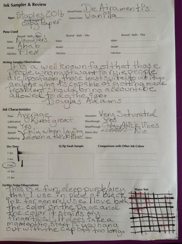
This is my review for De Atramentis Vanilla. Before I start to talk about the ink I would like to apologize for the kitten paw prints on the review itself. On the other hand, my current batch of foster kitties highly recommend this ink This ink is just a wee bit dry with an extra fine nib, but I didn't notice that until I finished my written review.