Search the Community
Showing results for tags 'purple'.
-
Diamine is a well known, very long time ink maker based in the UK. Many pen repair folks, at least in the US, advise their customers to use Diamine inks as they consider them safe for fountain pens. And their line of inks is extensive. Some of my earliest ink purchases included some Diamine inks. Unfortunately, my purchase decisions were based on what others raved about (Oxblood! Ancient Copper!) rather than inks I myself might actually like. And I never really investigated the Diamine line after that. Recently I received this ink as a "thank you" from a retailer where I'd purchased a pen. So I decided to give it a try. The ink is a soft purple or red-violet. It has decent handling. It's not especially bright, rich, or dark. Perhaps a bit of a vintage feel to it. Maybe with a wider nib you'd get more color. The ink probably has normal wetness and flow, but since I typically use wet inks (Sailor, KWZ) this felt a bit drier. I don't want to give the impression that this is a dry ink, it's not. Just relative to what I've used in the past in this pen. Pen: Edison Premiere (F-steel) Papers: MvL=Mohawk via Linen, TR=Tomoe River, Hij=Hammermill 28lb inkjet. The MvL and Hij had a little bit of show through, these are more absorbent papers, so perhaps that was a factor. It wasn't anything that would prevent writing on the verso.
-
Hello all! I am new here but I have been lurking for quite some time trying to gather as much information as I could about pens and ink! I am a nun from the US so I don't have a lot of money to spend on pens, but I do love the art and the beauty that is found in the fountain pen world! I am looking for a workhorse pen, something I am use at work as a nurse, and something for personal writing. I was looking at the lamy safari dark lilac and the twsbi eco... I am a huge fan of anything purple ( you know that lovely shade of blue purple!) What is a good work purple ( dark enough to use at work but rebellious enough to be purple ) and a good journaling purple? ( I have to admit I am intrigued by the diamond shimmertastic lilac satin but I don't want any clogging or pen problems! I am so grateful to this community for the resource and inspiration you are and have been to me! Be back soon!
-
Hey guys, I recently tried a sample of Diamine Grape and really loved the color. However, the ink is a bit weird and gets a little cloggy if left for a couple days in a pen. I have been looking at Lamy Dark Lilac swatches online and I really love the color as well. I am considering getting the ink, then making my own mixes to achieve a darker purple when I am in the mood for it. Does anyone have any experience with making grayish purples like Diamine Damson or a dark purple like Diamine Grape? I don't want to purchase two bottles of purple ink - as I am likely never going to use them up. I think getting the lilac ink will let me play with both - bright and dark purples if things go to plan. I look forward to hearing your experiences! Thanks!
-
I'm looking for a waterproof ink that is not a black nor a blue (exception: turquoise works for me). Double points if it shades well with flex (or otherwise!) I like snazzy inks and I'm getting really into flexing but I also a) like to use my inks to address envelopes so need water resistant or proof and I do color-wash and "calligraphy" greeting cards and postcards and I'd like them to be waterproof when going through the mails, but I need non, neutral colors and I'm just sick of deep and dark blues. Basically, I like pinks, purples, reds, bright blues like turquoise, kelly and other bright greens, and so on... BUT: please don't recommend anything that is Eternal or Bulletproof... basically if soap can't clean it off my hands, I'm not interested (plus I tend to spill a little). So to sum up, what's a water-proof (or resistant) ink that's a color you would NEVER use at work? Extra points for good shading! THANKS! -Miss Inky Fingers- aka Jocelyn
-

Sailor Kingdom Note "jellyfish Series" Thysanostoma Thysanura
white_lotus posted a topic in Ink Reviews
Some time last year Kingdom Note came out with two new lineups of bespoke inks from Sailor. They were the "Jellyfish" and "Crustaceans" lines and these pretty much replaced their previous collections of "Wild Birds," "Mushrooms," and "Insects". This was at a time when obtaining these Sailor inks became difficult for even those living in Japan. Some stores discontinued selling online, or even began limiting purchasers to just one or two bottles of ink, and another chose to raise prices over 100%. Kingdom Note is not one of those stores, but availability of their inks has been quite limited, and some have simply remained "SOLD OUT", perhaps seemingly forever. That's the way the sushi roll falls apart. The five inks in the "Jellyfish" series were/are: Chrysaora helvola "Yanagikurage" — an orange ink Porpita porpita — a blue ink Thysanostoma thysanura "Purple jellyfish" — a purple/red-violet ink Mastigias papua "Kite jellyfish"— a pink ink Aequorea victoria — a light green ink Recently I decided to check the Kingdom Note site, and found a few of these inks and their Crustacean cousins available. The writing samples shown there are decidedly unimpressive, seemingly using a XF nib. This would probably be fine if you were going to write Japanese characters, but many chasers of ink seem to want to use it in medium to broad to stub nibs and go to town with it. So there were few takers here when they came out. But I decided to take the plunge. The orange, blue, and purple inks were available. This is a review of the purple/red-violet ink. Just fyi, the stash of this ink KN had is sold out, but it is listed as "in negotiations". Perhaps that means they're trying to have Sailor make more. One can always hope so. The ink now comes in a standard Sailor Jentle box with a custom sticker pasted on the front. The bottle is standard Sailor Jentle with the dumb insert. The images of the box and bottle taken with iPhone4. As always, I test inks on papers I use and these are Mohawk via Linen=MvL, Hammermill 28 lb inkjet paper=Hij, and Tomoe River=TR. The images of the reviews taken with a Nikon Coolpix P50, so a bit dated, but it seems to do better than the iPhone in representing the ink color. My basic view is I liked this ink and was pleasantly surprised. But some people are probably going to hate this color. It's not really a purple as in a blue with a lot of red in it, but a magenta pushed towards violet. This ink didn't seem to be "less saturated" per se than other Sailor inks, in fact it seemed quite saturated. On the MvL the blue shows up more, but on the other papers the magenta dominates. In fact, it's almost identical to KWZI Violet #2. It's certainly a very reasonable good ink with very good flow and lubrication, some shading from light to darker orange. A bit slow drying on the MvL, but quite fast on the inkjet paper. I didn't notice any problems with hard starts, and the like, and it cleaned out of the syringe-filler pen I used quite easily. So I'm glad I got this ink and am not disappointed. The ink seems made up of two dyes, a turquoise/light blue, and a magenta. It's quite possible that under the right conditions you may see some sheen. The papers and pens I use don't typically bring that out. A lot of ink was laid down and while some washed away, there was much that stayed in place. The ink seems to be water resistant to some degree, more so than many other Sailor inks. -
Well hello, and welcome to this review of Noodler's American Aristocracy ink. This ink was recently released in the UK and the US, apparently at just two shops: PurePens in the UK and Goulet Pen Company in the US. The Goulet shop is sold out. Apparently the Brits weren't too keen on the ink as PurePens seems to have it in stock. I was one of those brave enough to take a chance on the ink. I'm quite happy that I did as I like the ink, though honestly I couldn't tell you which of the three "flavors" it could possibly be. But then again, I couldn't tell the different between Madeira, sherry, or port either. In appearance, the inks is a muted burgundy. When I compare it directly against a brown ink, you can clearly see it's not brown. So I didn't get one of the purple bottles. But that's OK as it didn't matter to me which I received. The ink does dry quickly due to sinking into the paper and that can be a problem on absorbent papers, such as the inkjet paper used as one test case. The paper is too absorbent and you get quite a bit of showthrough, and ghosts of bleedthrough. But on better paper there was no problem. I tested on my usual papers Mohawk via Linen (MvL), Tomoe River (TR), and Hammermill 28 lb inkjet (Hij). The ink is somewhat water resistant since it gets into the paper so quickly. Washing 4 ounces of water over the writing left a solid ghost that was easily legible. The bottle/label which I did get ink on due to the bottle being so full. But that is a Noodler's benefit. The ink can easily appear brownish, muted red-violet, or muted purple/violet depending on paper and lighting. And it has a pleasant vintage look to it. So definitely not a supersaturated ink. My fiddling with the color adjustment probably made this appear too purple-y. The drops on a wet paper towel show red, green, and black dyes. Didn't expand so much and that could be due to the quick-drying ingredient. This should be a little more muted looking here, but you get the idea. And here you get an idea of the showthrough and bleedthrough on the inkjet paper. And here is a close-up.
-
L'Artisan Pastellier Callifolio - Bourgogne L’Artisan Pastellier is a small company in southern France that specialises in natural pigments, and offers customers authentic and reliable products in beautiful colours based on mineral or vegetable pigments. In a collaboration with Loic Rainouard from Styloplume.net, the chemist Didier Boinnard from L’Artisan Pastellier created the line of Callifolio fountain pen inks. These pastel-colored inks are traditionally crafted, and can be freely mixed and matched. Overall these inks are only moderately saturated, and have low water-resistance. The inks were specifically designed to work well with all types of paper, and all types of fountain pens. Being pastel-tinted, these inks have a watercolor-like appearance, and are not only fine inks for journaling, but are also really excellent inks for doodling & drawing. I only recently discovered them, and they are already the inks I gravitate towards for personal journaling. In this review I take a closer look at Bourgogne – one of the purples of the ink collection. Bourgogne is presumably named after its namesake French wine – reflecting the colour of this delicious produce of red grapes. Capturing the wine’s colour really well, Bourgogne is a dark dusty purple, with a classic vintage feel. There is some subtle shading present. Due to the darker colour of this ink, the shading is more subdued, less obviously present, but nevertheless it’s there and it enhances the character of the ink. This is a moderately saturated ink, with good flow, and one that works well even in the finer nibs. With the broader nibs the ink shows more of its character. With fine nibs the ink’s appearance is ok, but it doesn’t have enough breathing room to show its potential. A good wine deserves a large wine glass where the liquid can breath – this ink deserves a broader nib to make it shine: use an M-nib or broader to enjoy it. Bourgogne is relatively smudge-resistant – the colour spreads, but the words remain legible. The ink is only minimally water-resistant, as is apparent from the chromatography – only a greyish-purple residue remains. With the 15 minute droplet test, what remains on the paper are illegible smudges. Don’t count on being able to reconstruct your writing. With shorter exposures - as illustrated with the 10 to 30 second exposures to running tap water - the ink is more forgiving. A greyish-purple outline of the text remains, which is still readable with some effort. On the other hand – the low water-resistance is a big plus when doodling & drawing. With a water-brush you can easily spread out the ink, and obtain some nice shading effects. I’ve tested the ink on a wide variety of paper – from crappy Moleskine to high-end Tomoe River. For the Callifolio reviews, I’m using a new format to show you the ink’s appearance and behaviour on the different paper types. On every small band of paper I show you: An ink swab, made with a cotton Q-tip1-2-3 pass swab, to show increasing saturationAn ink scribble made with an M-nib fountain penThe name of the paper used, written with a B-nibA small text sample, written with an M-nibDrying times of the ink on the paper (with the M-nib)Bourgogne behaved perfectly on all the paper types, with no apparent feathering even on the lower quality papers in my test set. Drying times are in the 10 second range, so this is a fast-drying ink. On the Original Crown Mill cotton paper, there was noticeable feedback while writing –the ink is drawn straight down into the paper, the effect of which translates into a reduction of nib size. The text that I’ve written with an M-nib looks as though its written with an F-nib. The ink contrasts very nicely with white and off-white paper. In my opinion this purple ink is no good match for more yellowish paper – like Noble Note. I also show the back-side of the different paper types, in the same order. With the low-end Moleskine paper, there is significant show-through and bleed-through. With the other papers, Bourgogne’s behaviour is impeccable. This ink copes really well with all paper types ! Conclusion Callifolio Bourgogne is a very well-behaving ink on all types of paper, but one with only minimal water resistance. I really love the dusty vintage look of this purple ink, and the subdued shading it exhibits. In my opinion though, you need broader nibs to make this ink look at its best. With fine nibs the ink remains fully functional but looses some of its beauty. Overall I find Bourgogne to be a beautiful-looking purple that I enjoy using. If you’re looking for a purple ink, this is definitely one to consider. Technical test results on Rhodia N°16 notepad paper, written with Lamy Safari, M-nib
-
Franklin-Christoph is a pen maker in North Carolina, USA that also has some inks. I'm not sure who makes those inks for them, but they are usually quite good. This one is a dusky, dark purple that I find very nice. The papers used were MvL=Mohawk via Linen, Hij=Hammermill 28 lb inkjet, TR=Tomoe River. On the Tomoe River paper I just couldn't get a good photo. The ink definitely appears as a dusky purple but multiple tries only captured a dark grey. Not much special in this ink blot. This is the other review that has the corresponding Republican candidates over the same time frame as that listed in my Noodler's The Violet Vote review. The ink is not terribly water-resistant. The red washes away leaving some of the blue behind.
-
A pretty cool ink: Close-up of the sheen: Swatch: On Rhodia and Life:
-
This is another review for an ink in the Gunma Joyful 2 shop special series by Sailor. 四万ライラック Shima Lilac. It is a bright purple with lots of shading. Text (spelling corrected) starting on Graphilo A5 notebook paper: Shima Lilac Sailor Joyful 2, Gunma series This is a nice, bright, summer purple that certainly lives up to its lilac name. It is a Sailor "Jentle" ink and as such has good flow and lubrication. It is easy to clean out of pens. There is no feathering on any paper quality and only some ghosting on thin paper. No bleed-through has been observed. It is not very saturated. This leads to a lighter base color with lots of shading, especially with wet pens. It is not very water resistant. Text is still legible after a spill, barely, but the paper will be purple. It drys in around 5 to 10 seconds dependent on the paper absorbency. Final thoughts, on Tomoe River cream. This is a fun ink. It is much too light to be used professionally, at least for me. But the shading makes it wonderful for letters. Some may be turned off by its light color, especially if you use it in a dry pen on non-absorbent paper. But in a wet pen, it is a blast to use. -Kanayama P.S. If you write in print or in Japanese (or any pen lifting script) the shading is much more prevalent. 群馬から世界へ Here are some other inks for color comparison on Graphilo A5 notebook paper. I apologize that I don't really have access to many purple inks. To compensate I tried to include some inks that others might have access to for reference. My scanning situation is such that I can't really set any color correction. You may have noticed that "Tomoe River cream" comes out as white. The scanner I have access to automatically white balances and I haven't found a way to stop it yet. The name for this ink, Shima, comes from Shima Onsen. Shima onsen is a small hotsprings town in the mountains of Gunma. It is a very small town and as such has avoided the large block-concrete hotels that dominate most other hot-springs towns. It is a very beautiful place and is my favorite hot spring in Gunma. if you have a chance I highly recommend visiting. It is not so popular recently so you should be able to find a good rate at a hot spring hotel there. Once again, this ink is available at the Nitta Joyful Honda 2 store in Ota-shi, Gunm-ken, Japan. It is also available on the Joyful 2 Rakuten website. I welcome any questions or comments. Thanks you!
-
Amethyst Two Tone Kitless Fountain Pen Here is the new member of Kilk Custom Pen Studio Alumilite Resin with two tones. Sterling silver bands, steel clip and Jowo #6 Ruthenium plated nib unit. Pour casted silver cap finial is Ottoman Pattern called Mudavver Rumi Naksh designed in our studio (Limited stock: 6pcs).Converter/cartridge filling system, cap is slightly postable (not recommended to post). With alumimite pen rest. Dimensions:Length: 141mm Capped, 130mm uncappedDia: 13mm barrel threads, 14,5mm thickest point of barrel, 16,2mm Cap http://i392.photobucket.com/albums/pp3/KilkPens/Amethyst/Ameth_8_zpszha7mdii.jpghttp://i392.photobucket.com/albums/pp3/KilkPens/Amethyst/Ameth_7_zps9qm9fqoa.jpghttp://i392.photobucket.com/albums/pp3/KilkPens/Amethyst/Ameth_12_zps96kzp3nh.jpghttp://i392.photobucket.com/albums/pp3/KilkPens/Amethyst/Ameth_11_zpscdv81fla.jpg
-
I have a large collection of ink, but only one purple must be remedied! . The purple I have is waterman, can anyone recommend something with a touch more red? Has anyone used diamine imperial or MB violet? If so do you think these might fit the bill. Any suggestions welcome I'm in the UK so noodlers and PR are harder to procure. Thank ye all
-
Received Wancher Ebine last week, loaded it into a Baoer 388 fine and have been using it off and on since then; now it's time for the review. As you can see, Ebine is a dark-ish red-violet color. It's somewhat similar to Yama-budo, except lighter and redder and, of course, no sheen at all. I came across Sandy1's review of Ebine after having bought YB based on dizzypen's comparison of it and Saguaro Wine. Ebine seems to fall squarely between those two - lighter & less purple than YB, darker & less pink than Saguaro. The color itself is pleasant enough (if you like red-violet), bold yet slightly understated and not as in-your-face as Rose Cyclamen. OK for casual inter-office use, not for client-side. Same for school, ok for taking notes but not for turned-in assignments. Definitely fine for personal use. Pretty well-behaved, overall. Flows pretty well once it's started; took a couple minutes to get going after the pen sat for a couple days. Ever so slight nib creep but no evidence of nib crud after eight days. Seems fairly water resistant (that was probably 15-20 secs on the water test). Shading appears pretty minimal, the line looks fairly consistent. As you can see from the next scan, show-through is very slight on the 24 lb copy paper, better than both YB and Cyclamen; bleed-through also more apparent on the Rose. So, any reason to use this particular ink over something else? Well, it's a pretty color and it's pretty well-behaved. And it's also really cheap inexpensive. The color is somewhat similar to Yama-budo but my Yama-budo cost $18.50 with free ship for 25 ml while Ebine cost $7 + $5.50 ship for 100 ml, so 4x as much ink for 2/3 the price. Now, am I saying Ebine is as nice as YB? Um ... no. There's no sheen, for one thing, and the purple color of YB is a little more appealing. But for casual everyday use where you might go through a lot of ink it's a good alternative. I think that's about it; if I think of anything else, I'll add it.
-
Monteverde Purple Ink http://media-cache-ak0.pinimg.com/originals/58/7a/1d/587a1d93a66aa54d0cc75973e3695a73.jpg I love this beautiful ink! The color is a unique shade of pink and purple united in a lively lilac with a nice variation and shading depending on the pen, nib and paper. This ink is very well behaved for my needs* and performs reasonably well even on cheap printer paper. There is no bleed through, only a light ghosting on cheap notebook paper. It performs perfectly on good papers such as Rhodia, Clairefontaine and G Lalo. My favorite thing about this ink (as with all my inks) is the exact color, shade, or hue. Now this color is unique, I have not seen anything else duplicated nor near matches for this color. The closest in color in my opinion, is Noodler’s Tchaikovsky. However, Tchaikovsky is grainy, thick, and is a very difficult ink; I love the color but hate the consistency and flow problems and I cannot stand the grainy texture. Monteverde Purple is similar in shade as Tchaikovsky; it has that puplish-pink-bright lilac shade that I love. But Monteverde Purple is perfectly well behaved, has great flow, and has a nice smooth texture. This ink is not watery like J Herbin (which sometimes I like) but does not write dry either. It seems to be perfectly balanced and well lubricated without staining my fingers. (Of course this will also vary greatly depending on your pen, feed, nib and writing style.) I highly recommend Monteverde Purple if you enjoy purple or pink inks. This has become my favorite ink and I cannot resist the lovely lively lilac shade! This ink tends to start darker purple then move into its lighter purple pink shade as I write. This is especially true in the Artista Crystal. *My personal preferences regarding inks: I am a stay at home mom and a writer, so I can write with whatever colors and style ink I like on any paper I choose. I have total freedom in that arena – yay for fun colors! Also, I do not perform any water tests. I do not like the “water-proof” inks as they are a huge pain to clean out. This is just my personal preference (although I still have some inks that I consider water resistant – as I am reminded every time I go to clean it out of a pen). I know that some people care a lot about water-proof and light steadfastness. Sorry, I am not one of them. I care inordinately about the exact color, and some people will say this ink and that ink are the same and I can see differences others do not notice. Good flow is important to me too, I don’t like dry writers in pens nor inks. I also prefer broader nibs and stubs. I hope understanding my ink preferences and peculiarities will help you as you read and take into consideration my reviews and how the inks will fit or not fit your personal preferences. http://media-cache-ak0.pinimg.com/originals/54/1c/c7/541cc7b1d3d23d35f2a5bfbe4b1e78c5.jpg Ink Review by Tessy Moon Brand: Monteverde Name: Purple/Violet Paper: Rhodia 80 gm Pen One: Monteverde Artista Crystal Nib - #5 Medium Pen Two: Hero 5028 Calligraphy Pen Nib – 1.1 Stub Flow: Good; not gushing or watery, not dry; perfect. Shading: Moderate shading; offers lovely variations depending on nib, paper, etc. Shading is not distracting or over done. Saturation: Medium; it is not like a Noodler’s ink with an overload of saturation, but it is more saturated then J Herbin inks. Feathering: None Show Through: Slight ghosting in broad 1.5 wet nibs (such as the Ahab – which is a really wet writer). Bleed Through: None Dry Time: Reasonable http://media-cache-ak0.pinimg.com/originals/d3/55/f6/d355f690d92eaa7d365417a31e926fa8.jpg
-
Well I've decided to start a petition requesting that Lamy makes a special edition purple Lamy safari. Every year when there speculation about what colour the next year's special edition Lamy safari will be and purple is always a popular request, and every year thus far Lamy has not made a purple one. Please help by signing this petition: http://www.ipetitions.com/petition/purple-lamy-safari-edition It is not really a demand like normal petitions, but a request and something to show that there is a lot of support behind this colour, in the end it is Lamy's choice as a business to whether they think it is something viable to produce. If there is enough of us maybe Lamy will take notice.
-
Greetings All, I love the color and waterproofness of Noodler's La Reine Mauve, but would like to get some shading with it in a flex pen. Has anyone come up with a perfect ink:water ratio to produce a little shading with this ink? Before I experiment with this rather pricey ink, I wanted to see if someone had already done the work. Thanks!
-
Hi folks, I've done some snooping around reviews and threads and can't seem to find the info. for which I'm looking. Basically, I'm looking for the perfect (or 'pur'-fect purple) ink. I know what works for me, but I can't seem to find one ink that comes close on enough of the characteristics. I figured I'd throw this out to the ink-brain trust and see what y'all think. Here's the short version: I like the properties of NAV and the color of Diamine Majestic Purple. Here's the long version: For many of its properties, Noodler's North African Violet feels great to me: limited feathering and bleed through, water resistant, relatively fast drying and a great flow. But (there's always a but) ... once it's dry it's hard for me to tell the difference (at a glance) between it and BSB in terms of color. This is relevant to me because I color-code my notes, lists and various other scribblings. Sparingly, I love using BSB - there's no other blue quite like it. Here's the rub: I've found a purple with a great color for me: Diamine Majestic Purple. But I'm not a big fan of its properties. If I want to use cheaper paper, it's great if I want to make bleeding art (pun intended). Dry time is okay, but it feels like the very definition of NOT water resistant. The nice part about that is that it's easier to clean but if my hand is even damp, my nearly illegible writing will be completely unreadable - even to me. A friend of mine, before leaving the country, gave me what was left of her bottle of Purple Martin. I have plenty of that - almost a half-bottle - but smudges like crazy on ink-resistant paper, seems to take a while to dry and (again) lacks much water resistance. I'm not sure what to do with the rest of my bottle of that. For now, I've just set it aside - might do a PIF of Purple Martin samples at some point. I buy ink twice a year. Usually, it's purchase ... test ... purchase again ... wait for next year. Now is one of those times and I'm stuck on my purple conundrum. I'm putting in an order to replenish some of my dwindling stock. It's not that I don't have an ink acquisition disorder. It's more that I simply can't afford one, so I set aside money as I use at a rate a little faster than I use. Oh yeah, that's the other thing. I'm on a shoestring budget. Really. I thought about buying a bottle of NAV and then adding some pink to it, but I've never tried anything like that and would hate to buy a bottle for naught. My current thinking is including a small bottle of (Diamine) imperial purple with my semi-annual order to GPC. It's properties are closer to what I need (not as good as NAV) and the color stands out a bit more (compared to NAV) but it's still a little dark. Or maybe try a few more samples. But which ones? What say you? This topic may have been covered before in another thread. If so, point me in the right direction and away I'll go. Thanks to all. ps. Apologies for the typos, rambling narrative, etc.
-
Like the Pelikan Brown that I reviewed long ago, this ink was a solid performer. Good flow, no troubles with bleeding, skipping, or feathering. Not too saturated so that we can see some decent shading, but not so unsaturated that it becomes pale and hard to read. However, I am not a fan of this ink. For me it’s a purely personal thing in regards to the color - this shade has too much red for my liking. I like blue-violets vs. pure violets. Like the Pelikan Brown, there was not enough water resistance that I would trust important writing to this ink. Though I didn’t expect much since none of the Pelikan inks I have encountered to date have shown this characteristic. (Wow, I need to work on gluing my papers on straight!) Like I said before, this ink is a solid performer and handled a variety of papers well. However, it seemed to react in a funny way to my highlighter. At first it looked fine, but then it did that weird thing that you see above. I’m not sure if it’s because of the water resistance issue or a chemical in the highlighter I’m using (I use the Sharpie highlighter with “Smear Guard” for all my reviews), but it is worth noting. Overall, I think this is a well-behaved ink that is available for a pretty low price, ~$12/62 mL. Like I said, I don’t personally care for the color, but if you like the color and don’t need water-resistance, I’m not sure you could do much better for the price save perhaps a Noodler’s ink. For me, I have found my new favorite purple that you will see in my next purple ink review. :-) This ink was purchased with my own money and I am not being compensated for this review in any way. All opinions above are my own and you are free to disagree with them if you like. Full page scan of the review:
-
okay, ive experienced some issues with waterman purple, and i would like to ask the collective experience on this one. I had a bottle of waterman purple, and adored it. It was the second bottle of ink i had ever purchased (after quink black). In the last few weeks i started to see a green tinge when writing, and a little in the bottle. i stored it away in quarantine as it were, and purchased another bottle, same ink, same issue. My question is this. Does this ink have a green tinge at all that anyone has experienced, or do you think that its a mould issue?. There may be some very small particles in the bottle, but no particularly visible growth.
-
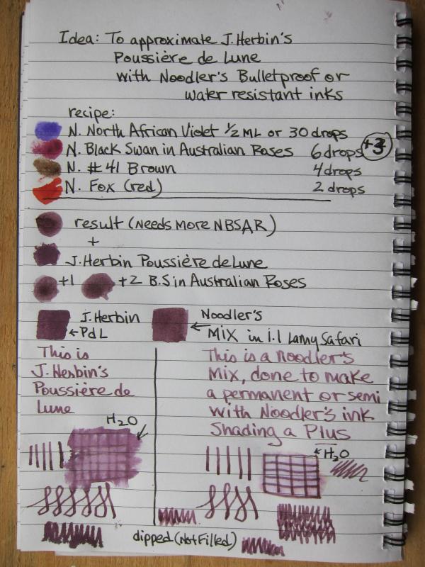
Hi there. This is my first post and effort, so please excuse any mistakes or errors. It is on the cheapest notebook paper. Like many, I've been seduced by J. Herbin's Poussiere de Lune, but was disappointed with its lack of waterproofness. Having a selection of Noodler's bulletproof, waterproof and semi-waterproof inks on hand as well as a painter's eye, I thought, why not? Here is my first effort at trying to replicate JHPDL with 4 Noodler's inks, a sample vial and blunt tipped syringe. the recipe (ALL Noodler's): North African Violet - 30 drops (or 1/2 ml) Black Swan In Australian Roses 9 drops #41 Brown 4 drops Fox (red) 2 drops It appears to be nice and shady, nearly waterproof, and no problems with the mixture itself. All can be done with a syringe, empty sample bottle and the four colors (in sample form) I think it's pretty close. (please note: I used a Lamy Safari with a 1.1 nib, dipped, not filled) What say you?

-

King Phillips Requiem, Saguaro Wine, Solforino, Yama Budo And Other Vibrant Inks
amberleadavis posted a topic in Co-Razy-Views
Thank you to MHosea and others who have sent me inks. I'll be sending these sheets out shortly. http://sheismylawyer.com/album/Ink/slides/2015-10-08-17-15-48.jpg -
I love anything purple, and naturally this extends to fountain pens and inks! However, from my limited exposure (mostly Goulet Pen's selection), I can't seem to find a true lavender ink. Even Private Reserve's Purple Haze, the lightest purple Goulet carries, ends up being a standard medium purple in my EF Pilot Penmanship. I know Diamine and J. Herbin make "lavender" inks, but it seems from from my limited experience that they're actually closer to a regular purple rather than the pastel-like shade you'd expect a lavender to be. Short of diluting my purple inks, are there any truly lavender inks any of you can recommend?
-
http://inks.pencyklopedia.pl/wp-content/uploads/Sheaffer-Skrip-Purple-kleks.png I present to test the ink Sheaffer Skrip Purple an interesting and almost pure shade of purple. Many people are looking for good inks among the exotic brands, and here under the very noses we have a very good ink in an equally good price. Technically also anything you can not accuse him. Tested and you wont be dissapointed... Manufacturer: Sheaffer Series, colour: Skrip Purple Pen: Waterman Hemisphere, nib "F" Paper: Image Volume (80 g / m2) Specifications: Flow rate: good Lubrication: good Bleed through: possible point Shading: noticeable Feathering: unnoticeable Saturation: very good A drop of ink smeared with a nib http://inks.pencyklopedia.pl/wp-content/uploads/Sheaffer-Skrip-Purple-kleks.jpg The ink smudged with a cotton pad http://inks.pencyklopedia.pl/wp-content/uploads/Sheaffer-Skrip-Purple-wacik.jpg Lines http://inks.pencyklopedia.pl/wp-content/uploads/Sheaffer-Skrip-Purple-kreski.jpg Water Resistance http://inks.pencyklopedia.pl/wp-content/uploads/Sheaffer-Skrip-Purple-woda.jpg Ink drying time http://inks.pencyklopedia.pl/wp-content/uploads/Sheaffer-Skrip-Purple-wysychanie.jpg Ink drops on a handkerchief http://inks.pencyklopedia.pl/wp-content/uploads/Sheaffer-Skrip-Purple-chromatografia.jpg Chromatography http://inks.pencyklopedia.pl/wp-content/uploads/Sheaffer-Skrip-Purple-chromatografia2.jpg Sample text http://inks.pencyklopedia.pl/wp-content/uploads/Sheaffer-Skrip-Purple-txt.jpg Sample text in an Oxford notebook A5 (90 g / m2) http://inks.pencyklopedia.pl/wp-content/uploads/Sheaffer-Skrip-Purple-Oxford.jpg Sample letters in a Rhodia notebook No 16 (90 g / m2) http://inks.pencyklopedia.pl/wp-content/uploads/Sheaffer-Skrip-Purple-Rhodia.jpg
-
Hello everyone, I absolutely love the Shigure colour from sailor seasons ink, perfect blend of purple, blue, and black for everyday writing. Unfortunately, for some odd reason (and very un-sailor like) the ink misbehaves allot! Firstly, the ink does not have have good flow at all, and often causes skipping when writing long sessions. (tried it on 4 different pens: 3 wet and juicy flow, 1 drier flow pen) Second, the ink seems to dry up really quick when at the nib+feed. It has difficulty starting in many of my pens if left uncapped, even for a very short period of time. Anyone else experiencing this? Or is this just the bottle of ink I received? I really love this colour but due to its misbehavior, I end up not using it at all...
-
A really nice color, and beautiful shading, but I still don't love how thin these inks are...