Search the Community
Showing results for tags 'purple'.
-
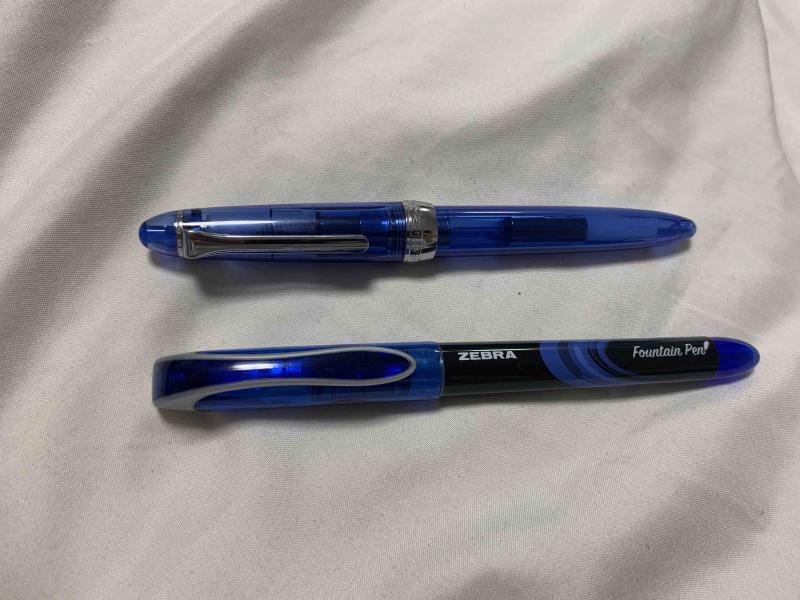
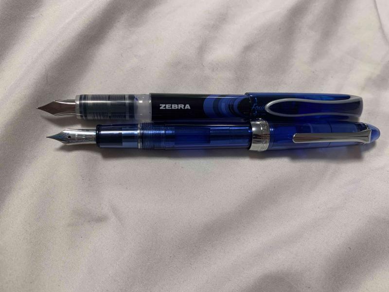
Hello people of FPN! It’s been over a year since I’ve last posted here, I’ve been busy with my first year and a half of college. In the last month or so, though, I’ve started lurking around reading the forums again, and I’ve been wanting to write another review. I just needed to find a pen that was the right balance of inexpensive and interesting, and luckily I found just the thing. As I was browsing the shelves of my college’s bookstore, procrastinating studying for my final exams, the blister pack these pens came in caught my eye. Zebra fountain pens. “An easier fountain pen” the box proudly states. I wasn’t aware that writing with pens was difficult, but that’s neither here nor there. I bought them (obviously, who wouldn’t buy a pack of 4 fountain pens you’ve never seen before for $8), and rushed them home to see what was in store. The single most important and obvious thing about these pens is that they were clearly designed to be a direct competitor to the pilot varsity. They’re made of the same materials with even the same shaped nib. They come in the same colors, and they’re sold on adjacent shelves. Zebra wanted to have a product in the disposable fountain pen market, so they emulated the most popular example of that market. Personally, I’m a huge fan of the varsity, so I’ll always be happy to see more Varsity-style pens enter the market as simple starter pens to help people make the switch and understand what fountain pens are all about. Because these pens were clearly designed to emulate the varsity, and most people have used a Varsity at some point, I’ll be comparing the pens to Varsities for the majority of this review. First off, in terms of appearance these pens aren’t terrible, but they fall short of the Varsity’s design in my opinion. There’s certainly nothing hideously ugly about them, and beauty is subjective so you’ll be able to see the pictures and make your own conclusions about the appearance, but for me the design on the Zebra’s just seems cheap. They are cheap, so that’s fine, but it would have been nice to have a design that’s a bit more clean and polished. The pen compared to a sailor procolor as a reference for size. The pens come in at least four colors (they were only offered in a four pack of purple, pink, blue, and black where I bought them, I’m not sure if more colors exist). The black is a fairly standard black, reminiscent of Parker Quink in shade. It’s not particularly dark, but it is definitely a black. The blue ink is very reminiscent of the typical blue ink you’d find in the average blue ballpoint pen. At first glance of writing with the blue pen, you might expect that it came from a ballpoint. I’m not familiar enough with pink inks to make a good comparison, but it’s what I would call a fairly standard, not too bright but not too pastel pink. As someone who doesn’t usually like pink things, I actually really like this ink color, and I plan on using it in the future. The fourth color, purple, is a pretty dark purple. It’s not so dark that it could be considered a purple-black, but it is definitely a very deep color, and in poor light conditions it can even look black. By now, you may have noticed that I’ve used a lot of words and still haven’t mentioned the most important part of any pen: how it writes. It’s complicated. Pilot Varsities are, in my experience, remarkably consistent. Especially within a particular color, every pen is exactly the same in how it writes and feels. Throughout my freshman year of college, I worked through a box of 12 Varsities, and all 12 felt exactly identical. These pens are not that. Don’t get me wrong, they all write well, and none of them are bad pens by any means, but the nibs on the four pens from the same blister pack offer vastly different writing experiences. Here is a writing sample with the four pens. Please excuse my horrific handwriting and cursive. The black and pink pens are the most similar to each other, and I have the least to say about them. They are pretty much a drier version of a Varsity. Slightly less smooth (probably because they’re more dry) but around the same width and writing behavior. The width is marked on the box as 0.6mm, and I’d call it around a Western Fine / Japanese Medium. The purple pen is wildly different from the black and pink pens. It is a very wet nib, more than a pilot varsity, and the thickness is equivalent to a western medium. Additionally, the purple pen came out of the box with ink on the inside of the cap and some ink on the grip, which may be due to a mix of the pens wetness and being moved around during shipping, but none of the other pens had that happen. There is some texture to the way it writes, it is not perfectly smooth, but the wetness makes up for any scratchiness in the nib itself and offers an enjoyable writing experience. The purple pen arrived with ink on the inside of the cap, the nib, and the grip. The blue pen is again, wildly different. This time, though, it is absolutely exceptional. The width of the pen is what pretty much every manufacturer would call an Extra Fine, and it’s incredibly smooth. I own a number of pilots with 14k fine nibs, and a number of western pens with extra fines of around the same width. This is unequivocally the best writing pen I’ve ever seen at this width. The problem is, these pens are so inconsistent that I don’t think I’d ever find another pen like it from them, no matter how many packs I opened. Still, I plan on using this pen for as long as I can (which I think will be a while with how thin the nib is and how large the ink reservoir is), and then hoping I can find another nib like it sometime in the years to come. All in all, I would recommend these pens. I would have paid the full $8 (and then some) for just the blue pen, but even without that likely fluke, these pens are a solid disposable pen. I plan on buying another pack at some point, and if the blue is like the blue in this pack then I would recommend these pens 100 times out of ten over the Varsity. That being said, if the blue I got really was a fluke, and you have a choice between these and some Varsities for around the same price, I’d probably take the Pilots.

-
A new calligraphy ink by Manuscript with extreme shimmer. Definitely not something to use in the office but it looked interesting to write some cards with in the upcoming holiday season. This ink is clearly not meant for long notes or letters. A very dark violet or purple with heavy gold shimmer. I find it a hard to use ink. OK to use in a fountain pen like the TWSBI ECO with a stub nib, but a dip pen made the ink feather and spread, even on Clairefontaine or Crown Mill Vellum paper. On Lalo Vergé it was much better. The ink is very wet, causing considerable show-through and even some bleed-through. The drying time wasn't too bad though with 35 seconds. The shimmer smears easily for a bit longer. As can be seen even on this scan, shimmer is gold and very high. A bit of water will keep the ink readable, enough to rewrite. The violet or purple is comparable to Herbin's Améthyste de l'Oural. Diamine's Imperial Purple (no shimmer) is brighter and lighter. All in all this is a nice ink to have and it will have its use for greeting, holidays, or birthday cards.
-
Rohrer & Klingner is an old German company, established in Leipzig in 1907, reputed to be one of the best ink manufacturers in the world(yet at the same time keeping a low profile....or at least seems so IMO). Most of their inks are well-behaved, relatively cheap, and with steady quality. Among their 18 regular colors, two are iron-gall inks, and Scabiosa is one of them. The word "Scabiosa" refers to a genus in the honeysuckle family of flowering plants. FIY, here are some beautiful Scabiosa flowers( picture credits: google search) http://i651.photobucket.com/albums/uu239/chingdamosaic/Scabiosa_02_zpsvpuxdlmx.jpg http://i651.photobucket.com/albums/uu239/chingdamosaic/Scabiosa_01_zpssjt0kwrh.jpg http://i651.photobucket.com/albums/uu239/chingdamosaic/Scabiosa_03_zpspniucpuj.jpg Botanically/Academically, "Scabiosa" in Chinese should be translated as 山蘿蔔, literally meaning "Mountain Radish." However, because "Mountain Radish" sounds so NOT commercially appealing, when R&K's Taiwanese agent first introduced this ink, they renamed it 埃及玫瑰---"Egyptian Rose." Many FP users(yes, including me) fell for this exotic name, and purchased a bottle before learning more about the ink itself. Well, salute this ingenious marketing strategy! lol Now back to the theme.... First, let's take a look at the bottle (Scabiosa on the right): http://i651.photobucket.com/albums/uu239/chingdamosaic/Scabiosa_00_zpspgsmbuca.jpg R&K's trademark is their uniform bottle design: dark brown glass bottle (in order to protect the ink from light exposure) and metal cap. We often joke about it resembling cough syrup, or any other thing that you'd more likely find in a pharmacy instead of a FP shop. Here are some writing samples: http://i651.photobucket.com/albums/uu239/chingdamosaic/Scabiosa_04_zps8q1p4sdi.jpg It's dark purple with tints of gray and blue. Close-up 1 (sorry for fuzzy picture) http://i651.photobucket.com/albums/uu239/chingdamosaic/Scabiosa_05_zps7rfwp8bn.jpg The purple color is lighter and more visible in a finer nib (in this example: LAMY Safari EF). You can see that even in a rather dry pen, on some random cheap paper, this ink still shows a rich shading. Close-up 2 http://i651.photobucket.com/albums/uu239/chingdamosaic/Scabiosa_07_zpsh1gk062y.jpg If you use a broader/wetter pen(in this example: Brause no.361 dip pen), it gets darker and can almost pass for black. Close-up 3 http://i651.photobucket.com/albums/uu239/chingdamosaic/Scabiosa_06_zpsoxg21um6.jpg If you apply water to the writing while the ink is still wet, the purple/pink dye would be washed away, leaving a light gray trace. And since iron-gall inks feature being permanent/waterproof/light fast, here is a water-resistance test done after the ink is fully dry: http://i651.photobucket.com/albums/uu239/chingdamosaic/Scabiosa_08_zpshqfgs90x.jpg I dripped some water on the paper and left it for hours. Outcome: http://i651.photobucket.com/albums/uu239/chingdamosaic/Scabiosa_09_zpseaj0fub3.jpg Pink dye dissolved after a few minutes, but the lines remain as clear and dark as before. Thus, if you quickly dab away the water while it's still wet, there will hardly leave any trace(shown below ). Here are some other writing sample I did with other pen/paper combination: 1. LAMY Safari EF on yellow ROSSI paper (English subtitle edited on Photoshop) http://i651.photobucket.com/albums/uu239/chingdamosaic/Scabiosa_10_zpsesiucz0s.jpg 2. Dip pen on yellow ROSSI paper http://i651.photobucket.com/albums/uu239/chingdamosaic/Scabiosa_11_zpsnqs3nvug.jpg When I did the smearing(bottom right), the ink wasn't fully dry yet, and some black particle dissolved... This doesn't happen all the time, though. 3. LAMY Safari EF on MUJI white grid paper http://i651.photobucket.com/albums/uu239/chingdamosaic/Scabiosa_12_zpsauwa479x.jpg Usually the color of iron-gall inks fades and becomes darker and darker over time, but sometimes there will be exceptions, due to the paper and humidity( I guess....) This is a doodle I did with Scabiosa, dip pen, on some cheap scratch paper, in June 2013: (wet) http://i651.photobucket.com/albums/uu239/chingdamosaic/Scabiosa_13_zpscsimvun9.jpg (dry) http://i651.photobucket.com/albums/uu239/chingdamosaic/Scabiosa_14_zpsoe9yozdt.jpg And then I re-discovered it lately when tidying up my room: http://i651.photobucket.com/albums/uu239/chingdamosaic/Scabiosa_15_zpsvwfwc7up.jpg It's not purple anymore! More like a lighter wine-color, or rusty red(because of the iron in it?). .......I kind of like this surprise : ) Conclusion Saturation: high, but low chroma( they don't contradict, right?) Shading: rich Sheen: not observed so far. It's a rather "matte" ink. Flow: relatively dry, but still writes smoothly even in extra fine nib. Feathering: none (performs nicely even on cheap paper) Bleed-through: none (performs nicely even on cheap paper) Show-through: very little (performs nicely even on cheap paper) Cleaning: if you always clean the pen right after using, some soaking and flushing with water will easily do the job. None of my pens has been stained or damaged after two years of constant usage. Waterproof: yes Other features: light fast; pH neutral. Other notes: the pink that shows after water application is lovely. Overall, I not only like this ink/color, I feel like I can TRUST it like an old loyal friend. This is my all-time favorite for secret diary, especially when I'm writing something really personal/emotional/confessional. I am ambitious to try as many different inks as possible in my limited life, but R&K Scabiosa is, so far, the only one I would empty a whole bottle and get a second one.
-
I love dark purple ink. Currently I have my Pilot Custom 823 inked up with Poussière de Lune but I almost run out. Im looking into Montblanc Lavender Purple now. I wonder whats the difference? Herbin Poussière de Lune is great for me. Since its dark enough but still have some shade. It is quite nice to take academic notes with. I have the following questions: 1. Is Montblanc darker or lighter? 2. How does the inkflow compare? 3. Saturation? 4. Any side by side comparison? 5. Anything else you would like to elaborate on. Thank you all!
-

Papier Plume - Mardi Gras Indians Purple (New Orleans Collection)
namrehsnoom posted a topic in Ink Reviews
Papier Plume - Mardi Gras Indians Purple (New Orleans Collection) Papier Plume is a stationary shop in New Orleans, that's been getting some attention lately on this forum with their "New Orleans Inks", that celebrate the rich colours and history of the city. One of their inks in this series is Mardi Gras Indians Purple, a very nice grey-puple ink that I immediately took a liking to. Mardi Gras Indians Purple is a dark purple ink that looks surprisingly good on paper. Sometimes an ink instinctively appeals to you on first use ... that's what happened to me with this Papier Plume colour. I really like it. It's a purple ink, but not of the vibrant kind. Its greyish tones make for a more subdued look, that will work quite well when used as an office ink. Shading is definitely there, but without too much contrast between the light and darker parts, just as I like it. A very classy ink ! And what a cool name! This ink is modelled after the purplish colours that are often present in the elaborate costumes of Mardi Gras Indians in New Orleans. As such, the ink has links to the colourful history of the city. Be sure to read Jackokun’s excellent review that has tons of historical background - highly recommended ! The ink differs from other Papier Plume inks in this series: this one is much wetter and quite well lubricated. It's by no means a wet ink, but it still pleasantly surprised me since it is definitely the wettest ink from Papier Plume that I have used so far. Another good point in its favour! The ink has a medium dynamic colour span. To illustrate this, I did a swab where I really saturated portions of the paper with ink, pooling it on. This illustrates the dynamics of Mardi Gras Indians Purple, with moves from a light violet to a dark grey-purple colour. On the smudge test - rubbing text with a moist Q-tip cotton swab - the ink behaved very well . There is very little smearing, and the text remains perfectly readable. Water resistance is remarkably good - both with a 15 minute soak test with still water, and when running tap water over the writing. The ink smudges, but the text itself remains clearly readable - even after 30 seconds under running tap water. A welcome plus if you'll be using this as an office ink. This is also apparent from the lower part of the chromatography, which shows that that greyish components of the ink remain firmly attached to the paper. I've tested the ink on a wide variety of paper - from crappy Moleskine to high-end Tomoe River. On each scrap of paper I show you: An ink swab, made with a cotton Q-tip 1-2-3 pass swab, to show increasing saturation An ink scribble made with a Lamy Safari M-nib fountain pen The name of the paper used, written with a Lamy Safari B-nib A small text sample, written with an M-nib Drying times of the ink on the paper (with the M-nib) Mardi Gras Indians Purple behaved perfectly with most papers in my test set. Drying times are very acceptable in the 10-15 second range with the M-nib. With the low-quality papers I noticed a tiny amount of feathering, especially with the broad nib. You also get a bit of bleed-through with these papers. With better quality paper, the ink works flawlessly. The ink has a very consistent appearance across paper types, and looks good on both the white and off-white paper. My personal opinion: a sophisticated and good-looking ink. Writing with different nib sizes The picture below shows the effect of nib sizes on the writing. All samples were written with a Lamy Safari, which is typically a dry pen. I also added a visiting pen - my wet Pelikan M400 White Tortoise with an M-nib. With all these combinations, the ink writes very pleasantly and leaves a nicely saturated line. Related inks To show off related inks, I recently switched to a nine-grid format, with the currently reviewed ink at the center. The new format shows the name of related inks, a saturation sample, a 1-2-3 swab and a water resistance test - all in a very compact format. This format makes it easy to compare the ink with its eight direct neighbours, which I hope will be useful to you. Inkxperiment – Lighthouse For some time now I've been experimenting with ink drawings, keeping things simple and more-or-less abstract. I find this to be a fun extension of the hobby, and these single-ink drawings often present quite a nice challenge. It also gives you an idea of what the ink is capable of in a more artistic setting. Recently I've been using HP photo paper as a drawing medium. I'm quite fascinated by the vibrancy that inks achieve on this type of paper. For this drawing, I started by submerging the paper in water to which I added a few drops of ink. This gives a light-purple background that forms the starting point for this little 10 by 15 cm drawing. Next I painted in the horizon lines and the lighthouse, using different mixes of ink & water. I then painted in the sky and the water. Finally I added the trees, and darkened up the horizon line and lighthouse with pure Mardi Gras Indians Purple. The end result gives you a good idea of the way the ink expresses itself when used for drawing. Conclusion Mardi Gras Indians Purple from Papier Plume is a gem of an ink: a classy dark-purple colour, that leaves a saturated nicely-shaded line, and that is quite water-resistant. As such, it's an excellent ink for use at the office. This ink immediately appealed to me with its subdued grey-purple tones - it went straight to my top three for 2019 (but the year still has nine months to go, so this may change... we’ll see). I you like your purples, this is an ink that you will almost certainly appreciate. I recommend giving it a try! Technical test results on Rhodia N° 16 notepad paper, written with Lamy Safari, M-nib Backside of writing samples on different paper types -
Inky folks: Looking for advice on choosing an ink. Your help will be greatly appreciated, and *will* result in a purchase! I’m nuts for purple inks. I’ve got way more of the stuff than is rational. And, until recently, I’d sworn off buying any more, because, really, I’m unlikely to go through my current stock in my lifetime. It’s that bad. But, now, I’ve decided to break my self-imposed prohibition, because I’m dying to try one (or more) of the super-sheeny inks that have come available in recent years. Other than a few conventional inks that had some sheen as an incidental property, I have never bought an ink with particular sheen. I have recently been seduced by photos on social media – mostly here and Reddit – that show some marvellous effects from inks designed for sheen. Because of my addiction to purple inks, I’m drawn particularly to the blue/red inks. The ones I’m most familiar with are: Diamine MaureenDiamine Skull & RosesOrganics NitrogenOrganics EmersonI’ve read reviews of these inks, and all seem to have puts and takes. But I’m not going to buy four inks to find out for myself. I’m going to buy one…ok, maybe two. Can you gurus weigh in on which one you’d choose if you applied the following criteria? Most noticeable sheen in normal writing, with a med or broad stub nibDominant apparent colour is purple-y – regardless of the tone of the sheenFlows well – preferring wet and lubricious to dry and finicky. No hard startsDries *reasonably* quickly. Notably slow-drying inks are off the table. I’m looking for a normal drying time.…or just let me know what your experience of any one of these inks has been, in relation to these criteria. Based on the reviews over at mountainofink, I'm leaning toward the Diamine Maureen. If there's an extant thread that addresses these questions, I apologise for doubling up, and would be grateful for a pointer to it. So many thanks, in advance. -- Houston
-
Rohrer & Klingner has recently released a "2018 limited edition" ink called Aubergine. As a big fan of their inks, I think they deserve more recognition for their wonderful inks. Solferino remains my top purple/magenta/violet ink with its retina-searing brightness and vibrancy. I've bought a bottle of this new Aubergine and I like it very much. Aubergine comes in a cardboard tube packaging and their regular understated bottle. I like their bottles because they are functional. The ink itself is a low-key yet gorgeous purple that leans to the blue side but never so much as to become a blurple. It shows quite a lot of shading. A slight golden-red sheen could sometimes be observed but is really subtle. The inks writes very wet, and the lubrication is medium to good. It's not water resistant but it leaves a visible dark trace. Packaging Splash Sample (Rhodia) (Tomoe River) Comparison (Maruman loose leaf. I think it could be quite close to the non-accessible Sailor Pen & Message Sanyasou but with less sheen. However I don't have that one (sample) anymore for a comparison.) Miscellaneous (For my November "Clash of the colours" ink combo I matched up Aubergine and KWZI Menthol Green. I think a purple and a cyan-turquoise colour combo is quite ugly LOL. What do you think?)
-
This is a limited edition ink from Nagasawa Kobe, Monet Violet, to celebrate a Zurich Museum exhibition in Japan. One of the painting exhibited is a Monet's Water Lily Pond. Obviously the ink is violet, to replicate the colour of water lilies. PACKAGING This ink comes in a gorgeous box. http://s1.homezz.com/201503/5915/50375_z.jpg I unfolded the box and scanned it (and joined the two parts with software): http://s2.homezz.com/201503/5915/50369_o.jpg As you can see it's the box that attracts me and motivated my purchase. And the bottle, very pretty as well: http://s1.homezz.com/201503/5915/50374_z.jpg It comes with a piece of paper introducing the ink. http://s2.homezz.com/201503/5915/50370_z.jpg SPLASH Photo and scan. The scan is bluer than it actually is. http://s2.homezz.com/201503/5915/50371_o.jpg SAMPLE The colour, however, is not so special as the box. It's a moderately saturated violet. The shading is very nice. It doesn't sheen in normal writing (quite a letdown considering it's a Sailor). It's well behaved as other Sailors. In terms of water resistence, the darker part actually holds up quite well to water. http://s0.homezz.com/201503/5915/50373_o.jpg COMPARISON In case the handwriting is not easy to read, these are: (left) Monet Violet, Iroshizuku Murasaki-shikibu, Sailor Kingdom Note Sasakia charonda, Private Reserve Tanzanite, Sailor Nioi-sumire. (right) Diamine Pansy, R&K Solferino, R&K Magenta, R&K Cassia, Iroshizuku Yama-budo. Monet Violet and Murasaki-shikibu are quite close in terms of saturation, MS being more red and MV more blue. The rest are more saturated. If you really like the colour of Monet Violet, I think you can mix Iroshizuku Murasaki-shikibu with Ajisai and get a similar colour. I might try that myself sometime. http://s2.homezz.com/201503/5915/50372_o.jpg CONCLUSION Don't get me wrong. I do like this ink. I like the colour. It's quite beautiful. However it just lacks that little something special to be limited edition and to match the nice box. And normally I like more saturated inks. I like this ink, a lot. Maybe I'll love it the more I use it. And the more I look at the box.
-
L'Artisan Pastellier Callifolio - Bordeaux L'Artisan Pastellier is a small company in southern France that specialises in natural pigments, and offers customers authentic and reliable products in beautiful colours based on mineral or vegetable pigments. In a collaboration with Loic Rainouard from Styloplume.net, the chemist Didier Boinnard from L’Artisan Pastellier created the line of Callifolio fountain pen inks. These pastel-coloured inks are traditionally crafted, and can be freely mixed and matched. Overall these inks are only moderately saturated, and have low water-resistance. The inks were specifically designed to work well with all types of paper, and all types of fountain pens. Being pastel-tinted, these inks have a watercolour-like appearance, and are not only fine inks for journaling, but are also really excellent inks for doodling & drawing. I only recently discovered them, and they are already the inks I gravitate towards for personal journaling. In this review the spotlight is in Bordeaux, one of the purples of the Callifolio collection. Bordeaux is presumably named after its namesake French wine - capturing the colour of this delicious produce of red grapes. The ink captures the wine's colour really well, but as an ink it is underwhelming. The ink has low saturation, and fails to give an "acte de présence" on the paper. Colourwise, I consider the ink to be too light a purple, leaning towards the pink side. I prefer my purples a lot darker. The ink also suffers from sub-par lubrication, giving it a scratchy feel while writing. Shading is present, but only in broader nibs (starting at M). With fine nibs the shading is almost absent, giving the ink a flat look on the paper. With broader nibs, I find the shading a bit too aggressive, with a tad too much contrast between light and darker parts. Overall, the looks of Bordeaux failed to wow me. To show you the impact of saturation on the ink's look & feel on paper, I made some scribbles where I fully saturated portions of the paper with ink. This gives you a good idea of what the ink is capable of in terms of colour range. Bordeaux shows an average dynamic range. The image shows that this is an ink with low saturation - even the heavily saturated part remains rather underwhelming. For me, this ink lacks personality, and did not impress me. On the smudge test - rubbing text with a moist Q-tip cotton swab - Bordeux behaved very well, with limited smearing and without impacting readability of the text, which remains crisp and clear. Water resistance is almost totally absent though. Both still and running water quickly obliterate all colour, leaving only a faint brownish ghost image on the page, which is barely decipherable. I've tested the ink on a wide variety of paper - from crappy Moleskine to high-end Tomoe River. For the Callifolio reviews, I'm using small strips to show you the ink's appearance and behaviour on different paper types. On every band of paper I show you: An ink swab, made with a cotton Q-tip 1-2-3 pass swab, to show increasing saturation An ink scribble made with an M-nib fountain pen The name of the paper used, written with a B-nib A small text sample, written with an M-nib Drying times of the ink on the paper (with the M-nib) Bordeaux behaved perfectly on all the paper types, with no apparent feathering even on the lower quality papers in my test set. Only with the infamous Moleskine paper, a tiny bit of feathering is present. Drying times are mostly around the 10 second mark, making it a fast drying ink. Not really suited for lefties though, because it lays down a rather wet line, albeit one that dries relatively fast. The ink looks at its best on pure white paper. On more yellowish paper, I quite dislike the colour. Overall, the ink fails to impress me... it looks too much like writing with wine, leaving low saturated wine stains on the paper. Writing with different nib sizes The picture below shows the effect of nib sizes on the writing. All samples were written with a Lamy Safari, which is typically a dry pen. I also added a wet visiting pen - a Pelikan M101N Lizard with M-nib. This pen shows a much more saturated line, but loses most of the shading. Related inks I have recently changed my format for presenting related inks to a nine-grid format, with the currently reviewed ink at the center. The new format shows the name of related inks, a saturation sample, a 1-2-3 swab and a water resistance test - all in a very compact format. I hope that you'll find this way of presenting related inks more useful. It's a bit more work, but in my opinion worth the effort for the extra information you gain. Inkxperiment - cabin in the woods As a personal experiment, I try to produce interesting drawings using only the ink I'm reviewing. I find this to be a fun extension of the hobby, and think of these single-ink drawings as a nice challenge to stretch my drawing skills. Lately I have been experimenting with painting on photo paper. I find this to be a terrific medium for small drawings, making the ink look much more vibrant than on traditional watercolour paper. For this drawing I used HP Advanced photo paper. I started by outlining the horizon line and the cabin. Next I painted in the foreground and the treeline, using different mixtures of water and ink. Once dry, I painted in the tree details with pure Bordeaux, and added detail to the cabin using a fountain pen with M-nib. The birds in the sky are the finishing touch for this small 10x15cm drawing. The end result gives you a good idea of what can be obtained with Callifolio Bordeaux in a more artistic setting. Conclusion Bordeaux from L'Artisan Pastellier is a wine-coloured purple ink with low saturation. I find this to be a rather dull ink, without much character. Technically, the ink worked fine with all the papers in my test set, albeit with sub-par lubrication. Overall, not an ink I'm impressed with. I like the wine a lot better! Technical test results on Rhodia N° 16 notepad paper, written with Lamy Safari, M-nib Backside of writing samples on different paper types
-
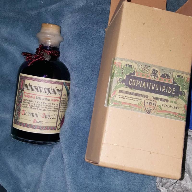
Hello! I'm pretty much a beginner in the world of fountain pens and ink, and could use a bit of help. I have two bottles of ink from Giovanni Gnocchi. Both are 'new'/unopened. The smaller one, with red ink, has a few tiny bits floating in it. Is it still usable? The other bottle is a 250ml glass bottle with a cork stopper, still sealed with wax. I'm really eager to try the purple ink in it, but am worried about whether the ink will stay okay in there once opened. Would it be better to put it in a glass bottle with screw cap? Any info you might have about these inks in general would be appreciated, thank you! ❤ kind regards, Janine
-
Ink Shoot-Out : J. Herbin Poussière De Lune Vs Callifolio Bourgogne
namrehsnoom posted a topic in Ink Comparisons
Ink Shoot-Out : J.Herbin Poussière de Lune vs L'Artisan Pastellier Callifolio Bourgogne Over the course of the past few years I have developed a taste for dusty, murky inks. Excellent colours for gloomy autumns and dark winter evenings... Two of the inks I love very much are J. Herbin’s Poussière de Lune and L’Artisan Pastellier Callifolio’s Bourgogne. Both are nice dusty purples that fit very well with the autumn season. A perfect time to do a detailed comparison, and find out which of these inks I like the most. Enter... the Ink Shoot-Out. A brutal fight spanning five rounds, where heavyweight inks do battle to determine who is the winner. In the left corner - the well-known J. Herbin champion – Poussière de Lune. In the right corner, also from France, the challenger from L’Artisan Pastellier – Bourgogne. Which champion will remain standing at the end of the fight ? Let's find out... Round 1 - First Impressions Both inks are wonderful murky purples. These are dark and moody inks, well suited to writing on gloomy autumn evenings. Count Vladimir Dracula would have loved them both, and so do I. There are some differences though: Poussière de Lune is much more saturated and lubricated – the pen flows over the paper and leaves a very well saturated line. Bourgogne writes drier with noticeable feedback from the paper. As a result, Bourgogne leaves a finer line with less saturation.Bourgogne is a darker purple with more grey-black undertones. This is a matter of personal taste, but I definitely prefer the darker purple of Bourgogne.Both inks appeal to me. Poussière de Lune is technically the better ink for writing, but colour-wise I really consider Bourgogne to have the edge. For this round, both champions are on par with each other. Let’s call it a draw. Round 2 - Writing Sample The writing sample was done on Rhodia N°16 Notepad with 80 gsm paper. Both inks behaved flawlessly, with no feathering and no show-through or bleed-through. J. Herbin’s Poussière de Lune wrote wonderfully, with very good ink-flow, and leaving a well saturated line. In contrast, Callifolio Bourgogne is much less lubricated, and leaves a consistenly thinner line on the paper. With normal writing, the colour difference between both inks is less apparent. Although Callifolio has more grey-black undertones, in everyday writing this is not immediately obvious. You need to look carefully to see the difference. Both inks also exhibit an aesthetically pleasing shading. Being dark inks, the shading is not very prominent – from dark to darker purple – but it is there, and gives extra character to the writing. For this round, Poussière de Lune clearly has the upper hand, and showed the best technique. A clear and definite win. Round 3 - Pen on Paper I added this round to indicate how the battling inks behave on a range of fine writing papers. From top to bottom, we have : FantasticPaper, Life Noble, Tomoe River and Original Crown Mill cotton paper. All scribbling and writing was done with a Lamy Safari M-nib. Both champions did well, with no show-through nor bleed-through. But this round is not about technicalities, it is about aesthetics and beauty. Are the fighters able to make the paper shine ? In my opinion, Callifolio Bourgogne is the more able of the champions – It’s dustier and murkier on a wider variety of paper. The only exception is with Tomoe River paper, where I like the result of Poussière de Lune better. For this round, Bourgogne gets the upper hand and gets a win on points. Round 4 - Ink Properties Both inks have drying times in the 15-20 second range on the Rhodia paper. Both inks also do fine on the smudge test, where a moist Q-tip cotton swab is drawn across the text lines. There is some smearing, but the text remains perfectly legible. For the droplet test, I dripped water onto the grid and let it sit there for 15 minutes, after which I removed the water droplets with a paper kitchen towel. Neither of the champions exhibits good water resistance – although with some patience you might be able to reconstruct the written word. Also Poussière de Lune leaves more of a purple mess on the page. The chromatography shows that both inks leave a greyish residue, with Poussière de Lune leaving more purple smearing. You can also see that Bourgogne is the darker of the two, with more grey-black undertones in the ink. Overall though – the chroma’s look very similar. In this round, both inks show more or less the same behavior, resulting in a draw. Round 5 - The Fun Factor Welcome to the final round. Here I give you a purely personal impression of both inks, where I judge which of them I like most when doing some fun stuff like doodling and drawing. Both inks do well, and the lack of water resistance allows for nice effects when using a water brush. But I must admit that I like L’Artisan Pastellier Callifolio Bourgogne a lot better than J. Herbin Poussière de Lune. Bourgogne is much nicer to draw with, and has a much more pleasing dark dusty purple colour. The dark grey in this ink is what really makes it shine. In comparison, Poussière de Lune is too purple in appearance. This is of course a personal decision, but it is the judge’s conclusion that this round is clearly won by the more artistic ink – Callifolio Bourgogne. The Verdict Both inks find a proud place in my collection, and both are suitably gloomy inks for the dark autumn season. If you are in search of some dusty dark purples – no need to look any further. But counting the points, I find that L’Artisan Pastellier Callifolio Bourgogne has a slight edge over J. Herbin Poussière de Lune. A fight needs a winner, and in this fight I grant the victory to Callifolio Bourgogne. -
Any one mixed Platinum Pigmented inks to get a nice dusky or voilet purple? Thinking 2:1 Rose Red and Blue. But know subtle hues can throw off color to a gray. Wanting to research before spending 40 (or 60 if need add Carbon Black to darken) plus dollars. Thanks, Madak
-
As some of you may know Poland is one of biggest exporters of cosmetics, furniture and fruits. But we also have inks. Or, to be more precise, one ink maker – KWZI. Konrad offers handmade inks in more than sixty colors. You can check his website here. Liquid Words is LE ink brewed for participants of polish Pen Show 2017. The ink is heavily saturated and was available for short time and in limited quantity. Flow: This ink is wet and dense. It flows well, I haven't experienced any hard starts or skipping.. Saturation: well saturated ink. There are stronger purples on the market, but for me, this level of saturation works fine. Lubrication: good and pleasant. Drying time: It can take a while, depending on the nib you use. 15-20 seconds on Rhodia, 5 – 8 seconds on absorbent paper. Feathering: present on bad quality papers. Bleedthrough: experienced only on Moleskine (crappiest paper ever) Water resistance: nope. Drops of ink on kitchen towel Color ID Color range Fabriano, Kaweco Classic Sport, medium nib Field Notes, Lamy Al-Star, medium nib Velin Paper, Lamy Al-Star, medium nib Water resistance
-
MONTEVERDE MULBERRY NOIR Monteverde Mulberry Noir is part of the new series of Monteverde inks called the "Noir" series. It is a nice dark purple shade which leans towards blue without being over-saturated. The ink is well behaved in the pens that I have used it in and flowed nicely from the nib. It does have some lubrication. It is reasonably quick drying, yet seems to have a bit of water resistance (I unintentionally soaked the page in water for 30 minutes. The letters were quite readable although blurred. The page fell apart when taking it out of the water). This first review is a scan which really brings out the purple. The next is a photo taken under LED lighting. I think this is more consistent with the actual color. This is written on Tomoe River paper: This is written on Rhodia paper:
-
These inks will be part of the fade test. Here are the current inks compared. http://www.sheismylawyer.com/2018-Ink/2018-05/slides/2018-05-03_Ink_1.jpg Much to my surprise, you can see some bleed through. http://www.sheismylawyer.com/2018-Ink/2018-05/slides/2018-05-03_Ink_2.jpg
-
DEATRAMENTIS PEARL VIOLET This lovely ink is one of my top 5 favorite inks ever. This is made by DeAtramentis inks. They are hand-made in Hachenburg, German by Dr. Franz-Josef. The inks are completely hand-made, with all aspects done manually in their manufacturing center. The dyes used are high quality from well established European companies that include BASF and Bayer, meeting high European standards. The inks could be considered traditional, although DeAtramentis does make scented and other kinds of special inks including permanent inks and most recently "shimmer-types", and makes a variety of ink colors resembling great European beverages including fine wines, whiskeys and beer. DeAtramentis has a wide selection of colors to please every eye, although not all colors are sold in every country. The bottles are heavy dark glass which contain 35 ml of ink, deep enough and with a large enough opening for large pens. Prices for the standard ink are about $12.95 in the U.S. When I made my return to fountain pens several years ago, DeAtramentis inks were some of the first inks that I tried. Ever since then, they make up a significant portion of my ink collection. But of all the DeAtramentis inks, Pearl Violet is probably my favorite. It is a lovely shade of purple, leaning toward pink on the light side and grey on the dark side. I love the shading variation of this ink on the various papers that I use it on. On cream color paper, it has almost an antique feel, evocative of Victorian times - of lovely ladies with parasols and gentlemen with top hats. On bright white it is a joyful color reminding me of the first tulips of spring. I love the color of this ink. But what I love most about the ink is the way it behaves. In almost every pen that I own, this ink helps the pen perform to its very best - whether it be a very dry Chinese pen or my wet and wild Italix oblique italic pen. Most recently, I filled my Montblanc 144 with this ink for the first time. This Montblanc is a bit finicky in many respects, like you would expect from a fine Parisian lady. In fact, I had not found a really good ink for this pen . . . until I filled it with Pearl Violet. That's it . . . end of story. This is the ink for this pen. And just in the nick of time. I was seriously contemplating selling the pen because it seemed too fussy about inks and paper. Well, now this pen hums . . . yes hums. You know what I mean . . . when a pen is just happy with life. And that makes me happy as well. O.K. . . . o.k... here are the scans. Water Test: Right was treated with water drops left on the page for 5 minutes, then blotted. The scan above is the closest to the real color. This is made on my portable ScanSnap which is the best of my scanners in terms of color accuracy. The following two scans are done on my HP printer/scanner, which does a moderately reasonable job. Note the differences of the ink on the Rhodia paper, which is not as bright white as the HP copy paper above. But also notice the beauty of this ink on the cream colored Tomoe River paper. As you can see, this is not a heavily saturated ink. But it behaves very well on all papers that I have used it on, with little feathering, bleedthrough or showthrough except when the ink is used in really wet pens and pools. I can not say enough good things about this ink. BUT, it does have a couple of things against it. It is not water resistant. It does have some water resistance, leaving some remnants of readable letters behind. And it does not sheen... not even on Tomoe River paper. While I like sheen in some inks, for me it is not an important feature for an everyday ink. This is likely not an ink that you would in a formal business setting. I do use it for my business for markups, note taking, etc. But I don't use it for meetings with clients and signing documents. I have noted that in much older reviews, the reviewers stated that this ink is dry. I have not found that to be the case with my last two bottles, which were purchased in the last couple of years. I would consider it to be a moderately wet ink in most of my pens.
-
Akkerman #14: Parkpop Purper Akkerman inks are made by P.W. Akkerman in The Hague. Akkerman inks have unique bottles that make filling pens very easy. This review is based off a sample that I purchased several months ago and I am just now getting around to trying. My overall impression is very favorable. The ink is not lubricated, but flows nicely and behaves well overall. But what really sets this ink apart is the sheen! I had seen some sheen when I wrote in my journal (MD Midori) and really saw sheen when I wrote a letter today. But I was hugely surprised to see so much sheen on the HP copy paper that I wrote this review on. My overall score is 8/10, with such great sheen! Thank you, KaB and lapis for your assistance to correct my typing blunders! I do appreciate it!
-
-
Who is William Henry Perkin? The discoverer of Mauveine - the first synthetic organic dye. Made from aniline. Guess what? Most inks today are made from aniline dyes. What color is Mauveine? Purple. I thought this was pretty cool. Serendipity. Kind of like Sir William Henry Perkin's discovery. https://en.wikipedia.org/wiki/William_Henry_Perkin https://www.forbes.com/sites/kionasmith/2018/03/12/mondays-google-doodle-celebrates-chemist-sir-william-henry-perkin/
-
Please feel free to read my ink review: https://drpenfection.tumblr.com/post/170472057950/ink-review-franklin-christoph-ink-18-philly Also, please let me know if you have any problems with the above link. Is this inconvenient? I would appreciate your thoughts. I decided to post this on Tumbler as I thought it might be easier for photo posting. Your comments would be appreciated.
-
Noodler's Baystate Blue - Does It Change Color Depending On Paper?
RichardR posted a topic in Inky Thoughts
Hey, I really hate to open another topic on Baystate Blue. But I really don't know how to find ALL the BSB threads that are available, and check whether this has already been comented on (For what is worth, I have searched as best I could via Google, here and elsewhere, but I couldn't find an appropriate thread about this). So then, I thought I might ask everybody a question: Does YOUR (sample of) Baystate Blue turn purple on plain, white, copy paper (80-90 gsm), and predominantly on such paper? I don't mean a hint or a tinge of purple - rather bright, saturated, vibrant ... purple. To put a bit more context into it, I must say I just received my 3 oz. bottle of THE ink (ordered on Amazon, shipped by the manufacturer) a few days ago. I made sure to clean the pen extra well (flushed until water ran clear, THEN flushed with minor concentration dish-soap solution and left it in for 24hrs., THEN flushed until water ran clear of bubbles, and left another 24 hrs. with clean water in it, AND finally flushed dry, and left another 24hrs. to ... well, dry out, with nib resting on absorbent tissue paper - so, I guess the pen was .. clean), then loaded it with THE stuff. In case anybody is wondering, the pen is a black HERO 616 mini version with an M nib - I had well researched this ink beforehand (but apparently, still not well enough), so I knew well enough to choose a cheap pen. So far (3 days after) the pen behaves perfectly (with no melted plastic/feeder, or flow modification; it actually behaves better than with Diamine Blue Velvet in it; I do expect the rubber sac of the aerometric filler to be stained, but I couldn't care less; we'll see about the rest). And then I tried it on for size. First, on a glossy paper notebook - white (don't know what paper the supplier used, because the notebook is internal stationery at the HR firm I work at). And it came out ... purple. I felt my throat going dry. Secondly, on plain/cheap A4, 75gsm, ECF (Elementary Chlorine Free), Unpunched, Ecolabel copy paper - obviously, white (generic brand, nothing to do with printer manufacturers). And it came out ... purple. I was gutted. Not far from crying (not really, but still...), considering how many inconvenient properties and risks I am ready to put up with, just for this color. As in this BLUE color, not purple color! Then I needed to scribble something really quick, and the first paper that came to hand was the back of a store receipt (so thin, thermal paper, I would say, and also white), and the closest instrument at hand was the BSB pen. And what do you know - it came out as the perfect, pure, intense and bright cobalt blue I had thought I was buying. Exactly that! Amazed at my discovery, I started scribbling "Test Color" on every paper I had at hand - which means that now I have quite a few books and book covers scribbled on their last page in BSB. And the color stayed blue (albeit with some hints of purple in some cases, but which are BARELY discernible). Also, I checked ALL my results the following day, in plain daylight (on a beautiful sunny day, around noon). And they were unchanged: my (sample of) ink is purple on some papers, and the proper blue on others. And some papers are white, others are cream, and others plain yellow. Thus, it seems that my BSB reacts with the paper and changes hue, for I can think of no other explanations. Now, I know what many will say: Rhodia, Clairefontaine, Tomoe River, etc. And that's all fine - to each his own, but I am not really a fountain pen afficionado, nor do I plan on becoming one (I have only 3 inks, and ... let's see, erm... 7 fountain pens, and I really want to stay at this level). I really place practicality above tastes, and I consider it dandy enough to be using a fountain pen (in spite of the extinct-species/wolly-mammoth looks I get from some...), that I most certainly won't carry Tomoe River pads with me to the meeting room. Nothing wrong with those that will, as I was saying above. My point, however, to anybody reading this, is that performance on plain copy paper is THE deal breaker for ME, as I won't change paper except entirely accidentally. So it doesn't really help me to know how the ink performs on those FP dedicated papers (actually, I already do considering how much research I put into this color), and/or that I should change stationery. And the color is the deal-breaker part of the performance - as I was saying previously, I will put up with many things, but not with a different hue/color, because that makes it a different ink, actually. I have also read about reports that Noodler's inks have some relatively looser Q.C.s (i.e.quality controls), in that performance can vary from one batch to the another, within the same product line (for instance, different batches of BSB might behave differently). So then, I am well aware this could be a batch-related rather than a product-related problem. Being thus aware if that as well, I dare (after a mammoth post) phrase my question anew: Does YOUR (sample of) Baystate Blue turn purple on plain, white, copy paper (80-90 gsm), and predominantly on such paper? N.B.: for those who don't know/don't remember, would you be so kind as to test it a bit on some copy paper, if possible? I know it doesn't really do much for you, but I would really appreciate it, and it would mean A LOT to me to know whether I could still like this ink (that otherwise, I have to confess it, I would love in spite of all its other shortcomings... eh, true love i guess they call it, lol) -
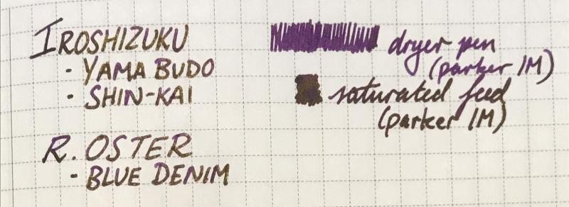
A saturated, slightly dusty purple with strong gold sheen(the writing samples below were from a fairly dry pen). Not much shading but diluting with water and using a wetter pen may bring it out. I've had it in my pen for 2 days and the ink doesn't seem to be doing anything strange, not too sure about staining but none of the inks used in the mix usually stains much. I don't have the exact ratio but it's mostly pilot iroshizuku Yama budo with some shin-Kai and blue denim(Robert oster), possibly 4:1:1. Lubrication:4/5 Flow:4/5 Dry time:4/5 Water resistance:3/5(runs but definitely readable) No bleedthrough or feathering, slight show through on the copier paper. Sorry for the sloppy photos, I did try to take them in different lighting situations. I might try diluting it or playing with the ratio if anyone's interested. 😊
-
Hello again to all my FP friends, [This review has been sitting on my desk for months and I finally got around to posting it. Stay tuned for a comparison of Diamine Cornflower and Penbbs #116 Cornflower.] Diamine needs no introduction on this board. Suffice it to say that they have been making inks for over a century and produce many, many beautiful hues, a lot of which are prone to feathering and bleed through on everyday office paper. This ink up for review is from Diamine’s Flower Series. It is named after the cornflower (centaurea cyanus) which can be various shades of blue or lavender. I’ve never seen the flower in person, but by just comparing with various photographs online, the ink looks like a pretty good match to the flower. Diamine Cornflower is a deep and very saturated blue with a dash of purple. This ink dries quickly on absorbent paper, but has an average dry time on nicer papers. Sheening is nice and shading possible with wet nibs on good paper. It can be quite a stunning color with the write combination. Unfortunately, this ink’s downfall as a daily work ink is its tendency to feather and bleed through. Although feathering with finer nibs wasn’t too bad on copy paper, even the Japanese fine nib produced noticeable bleed. Water resistance is passible; a dark purplish line remains legible. This is a lovely vibrant color that reminds me of a dark counterpart to Noodler’s Baystate Blue. The color is also standard enough that it could be used in most professional environments. They only thing that keeps me from buying a bottle is that the feathering and bleed through make it impossible to use on any paper I would run into outside the house. However, if you like saturated, slightly purplish dark blues and mostly use good paper, then this is not an ink you’ll want to miss. *A special thanks to lapis for sending a sample of this ink to me! Pens used (in order): 1. Pilot 78G Fine 2. Lamy Safari Broad 3. Pilot Plumix Italic 4. Noodler’s Nib Creaper Flex 5. Hero 5028 1.9mm Stub Swab Paper Towel Drop 80gsm Rhodia Tomoe River *Many thanks to Lord Epic for kindly sending me some of this paper! Check out that subtle sheen! 70gms Deli Copy Paper Moleskine Water Resistance Comparison (More blues to be added later) Thanks for reading! SDG
-
Hello all! I am looking for suggestions for my first ink in my Lamy safari Dark lilac medium nib. I am looking for something that I can use professionally but something that has character! I looked at Diamine eclipse but it seems too black, then I looked at PR ebony purple but it seems to have mixed reviews...I was hoping for something with a little more purple. I prefer the bluish purple, not the ones that tend toward red. I am just reaching out to you because you have so much more experience than I do! Hoping someone can offer me some advise! So grateful!!
-
I have been endlessly searching for the perfect blurple ink.I want an ink that when dry looks blue but is also purplish. I live in an area where there are sadly no pen stores that sell fountain pen ink. I have tried relying on samples shown online but when I receive an ink it is either too blue or too purple. The closest to what I want is Private Reserve Tanzanite. Tanzanite is a shade or two too purple. Does anyone have any suggestions of an ink that is slightly more blue, barely more blue, than Tanzanite? Inks that I am looking at online are: J. Herbin Eclat de Saphir(seems too blue in some pictures and too purple in others) De Atramentis Sapphire(seems close but maybe slightly too blue) Diamine Imperial Blue(same problem as with pictures of Eclat de Saphir) Diamine Sapphire Blue(seems too blue in pictures that I have found) Of course screen color calibration could show the wrong color as my screen has been off with the inks that I have tried which all looked perfect until I got them and used them. I have tried Private Reserve Cosmic Cobalt(too blue) and Private Reserve Electric DC Blue(too blue), Pilot Iroshizuku Asa-Gao(once again too blue), Private Reserve Tanzanite(close but slightly too purple). Thank you in advance.