Search the Community
Showing results for tags 'purple'.
-
I got this ink a while back. Belatedly worked a review, and only recently took photos. I switched camera apps on the iPhone and I think the color here is better. But at last, I review an ink that everyone can buy! DeAtramentis inks are readily available. They have a wide selection made even wider by customizing the labels representing famous and infamous figures. The Alexander Hamilton ink is the exact same ink as DeAtramentis Aubergine, so it says on the bottle. This is a popular ink due to the resurgence of interest in its namesake due to a certain Broadway play. So it sometimes is out of stock depending upon your source. But the ink itself is really nice. It's a great color. I don't know how water resistant this color might be. My test was on a fairly absorbent paper, but water allowed some seepage of color to the verso. And it tends to spread and bleed. The ink held up fairly well to running 4 oz of water over it. But my general rule is that unless an ink is stated as being "permanent" or "waterproof" it probably isn't though some inks have more water resistance than others. This could be one such under the right circumstances. The color isn't quite as muted as in the pics. It was difficult to get images where the ink didn't just show as black. It's not a bright purple at all, definitely muted. Also quite dark, almost as dark as Sailor Bungbox Ink or Witch, but it doesn't go to black. This pen is very wet, and so some show through and a little bit of bleed through was experienced on more absorbent papers. A finer nib, less wet, may not have these minor issues. Buy it for the great color though. Pen: Edison Premiere (F-steel) Papers: MvL=Mohawk via Linen, TR=Tomoe River, Rhodia=Rhodia 90g ivory. Camera: iPhone 7 using Camera+ app
-
-
Hi all, Just looking for a few ideas on a new purple ink so I thought I'd ask the pros! I've been using the Visconti Purple lately however I am finding that, in my eyes at least, it's fading out rather quickly after drying to an almost blue-tinged violet. Any suggestions on something that might hold the colour a little better? I'm looking for something more along the lines of what I would call a rich, royal purple (interestingly enough - pretty much exactly the colour of the Visconti purple as it comes out of the nib!). I do the vast majority of my writing on Rhodia or Clairfontaine paper. Thanks in advance for the help all - hope everyone is having a great start to the new year! Cheers, Mike
-
I'm not really a purple fan. I do think this ink looks fantastic though, especially the green sheen and the texture from my Pilot Parallel 6mm. http://2.bp.blogspot.com/-4IujqLCENIk/UtrBCchdV8I/AAAAAAAABR0/MeIXGI3DKIA/s1600/purple+2.jpg http://4.bp.blogspot.com/-7Ow0aBk5fBI/UtrBBfo4g-I/AAAAAAAABRo/_IQxuVQwhfU/s1600/purple+1.jpg No complaints with flow or lubrication. Water resistance is not great, but could leave something legible behind. Time will tell whether it's a pain to clean... Images from my blog.
-

Pif - Vintage Skrip Washable Purple Giveaway
richofthetower posted a topic in Pay It Forward, Loaner Programs & Group Buys
Hello All, A little while ago, I bought a vintage Sheaffer's Skrip bottle of #82 washable purple ink. I purchased it more for the bottle's built-in inkwell, and thought the remaining ink would be a nice bonus. After I tried it I realized that, although nice, it just wasn't a shade of purple that I liked. But, that might be your gain! Details on the ink characteristics are below. But first, the rules: - TWO lucky folks will win ink. I'll be giving each person 15ml of washable purple ink (5 vials with 3ml each) - Open to Continental US only, free first-class shipping. - Enter by simply posting a reply from now until the night of Sunday, March 12, 2017, 8pm Eastern Standard Time. I'll post again when the deadline is passed. - After the deadline, I'll choose two winners via random.org, announce them here and PM them. - If 7 days passes with no reply from a winner, I'll repeat the drawing. I must say that the ink is surprsingly well-behaved (using my medium nib on Apica notepaper). When on the paper wet, it is a dark purple, but dries to what I would say is more of a medium lilac/grey. Some shading, not heavily saturated. It does have strong-ish chemical odor. Here is a snapshot of it. Good luck, all! Rich
-
Here are a couple scans of some pink and purple ink comparisons. All these were written with a glass dip pen on a Rhodia dot pad. I did my best to represent the colors of the inks but as always please remember that what I see on my screen is probably a little different than what you see. I hope that this will at least give an idea of where each of these inks stand next to similar ones I have listed here. I will list the inks in the text also so it will be searchable. Enjoy and I hope these are helpful! http://media-cache-ec0.pinimg.com/originals/f0/d9/29/f0d92944248bba04d46040abc53d79fa.jpg Pink Inks De Atramentis Heather Violet Monteverde Pink J Herbin Rose Tendresse J Herbin Bouquet D'Antan Sailor Jentle Peche Pilot Iroshizuku Kosumosu Pilot Iroshizuku Tsutsuji J Herbin Rose Cyclamen Organics Studio Emily Dickinson Private Reserve Plum Diamine Deep Magenta Noodler's Cactus Fruit Eel Pilot Iroshizuku Yama Budo Organics Studio Lithium Organics Studio Lewis Carroll Levenger Shiraz Noodler's Ottoman Rose Noodler's Black Swan in Australian Roses (Old) Montegrappa Bordeaux http://media-cache-ec0.pinimg.com/originals/dd/f4/6e/ddf46ef824d6c1de85f67e946d81c5d2.jpg Purple Inks J Herbin Larmes de Cassis Private Reserve Arabian Rose Organics Studio Jane Austen Pelikan Violet De Atramentis Pearl Violet Rohrer and Klingner Scabiosa J Herbin Poussiere de Lune Noodler's Black Swan in Australian Roses (New) De Atramentis Aubergine De Atramentis Alexander Hamilton De Atramentis Lilac De Atramentis Magenta Violet Diamine Majestic Purple Diamine Lavender J Herbin Violet Pensee Pilot Iroshizuku Muraski Shikibu Organics Studio Vanadium Nostalgic Impressions Purple Monteverde Purple
-
Being a huge sci-fi and space buff, when Nemosine launched a line of ten inks all with space themes, I couldn't help but buy them all. Unfortunately, Goulet sold out of this particular ink (they have at the time of this writing, restocked it today) so I was forced to buy from Nemosine directly. They billed me immediately but never shipped. I sent two emails, both going unresponded, but two full weeks later they shipped (I presume they were simply out of stock, but a simple email letting me know would have been great when I had contacted them twice) and I was pleased to see that they tossed in a free M nib singularity! So delay and poor communication aside, I am happy with my order. I'm even more happy with this ink. It's GORGEOUS. A lovely, dusky purple with some moderate, yet very present gold sheen, good manners on awful paper, moderate shading, good flow, and some water resistance. I have yet to get to the rest of the inks beyond the Aeolis Palus Red and Blue Snowball Nebula twinkle, but thusfar, they're all winners, and this in particular is just fantastic. Dry times seem a little long for rhodia, but on anything more absorbant, dry times are near-instant. The boxes are simple, with a small sticker mentioning the name of the ink, which is made in Slovenia. The nemosine name is present in raised letters. Not the most interesting box, but for $8/bottle and a really lovely bottle itself, I'm not complaining. The geographical coordinates of Nemosine's bottling location is indicated on the bottle (a street in Pittsburgh, PA), along with a nice, clean bottle with a wide mouth and a great, simple label. I give the bottle design high marks, it's thin enough to be quite usable until it gets low, and I enjoy the shape, giving the ink the appearance of floating. It's no mont blanc or iroshizuku bottle, but it's quite high up on my list of favorite bottle designs. The lid screws securely and doesn't get the inner seal stuck like a sailor or pilot bottle. 35ml of ink is a somewhat small amount, but I do appreciate the low price of $8 per bottle, and I'll probably pick up a second bottle of the colors I like most. Now on to the ink - all of my Nemosine reviews will have some sort of space or sci-fi theme. First I thought of was Apollo 13 and Tom Hanks's propensity for calamity while traveling. This is a great everyday ink, saturated enough to be clearly visible, well behaved in all the nibs of my CP-1. I was quite surprised at the water resistance. the water sat there for a good 20-30 seconds and the lines are very legible. I like how the sheen kind of permeates all of the letter in a very subtle manner. it's absolutely lovely, without being over the top. The color honestly reminds me of a duskier version of Lamy Dark Lilac. I love vivid, bright colors, but this slightly muted lavender is just perfect for me. When you're printing with a wet nib, the sheen is much more pronounced. Another shot of that lovely, pervasive and mild gold sheen showing up all through the ink, not just the edges. And a sample of the absolute worst paper I've ever been able to find. It's a few steps above toilet paper, and yet the feathering is quite controlled in the very wet EF nib. Showthrough was minimal and slight bleedthrough. Bear in mind this paper is INSANELY thin and very, very bad. Highly, highly recommended. Thusfar all three I've tested have been knocked right out of the ballpark and will be used regularly.
-

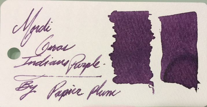
Ink View: Margi Gras Indians Purple: An Ink Homage To One Of Many Mardi Gras Secrecies!
Jackokun posted a topic in Ink Reviews
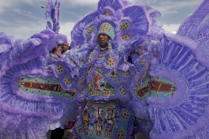
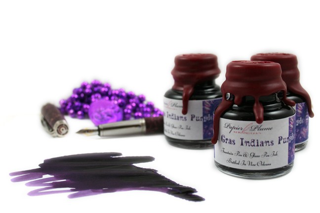
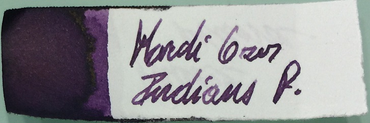
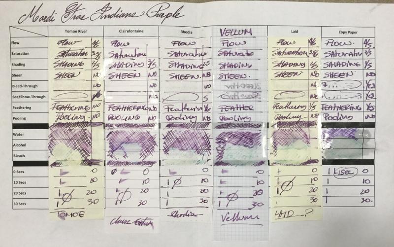
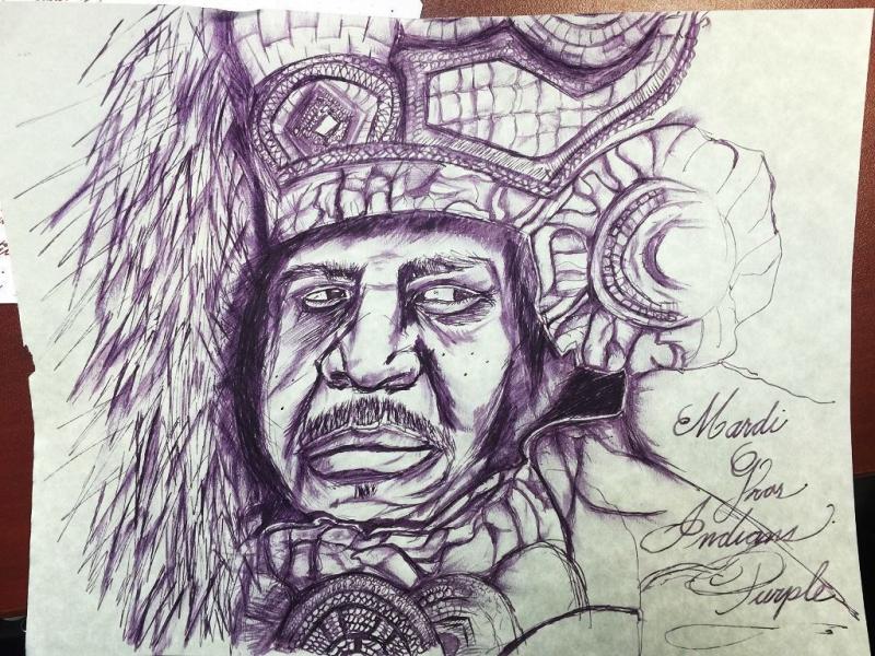
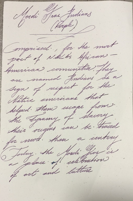
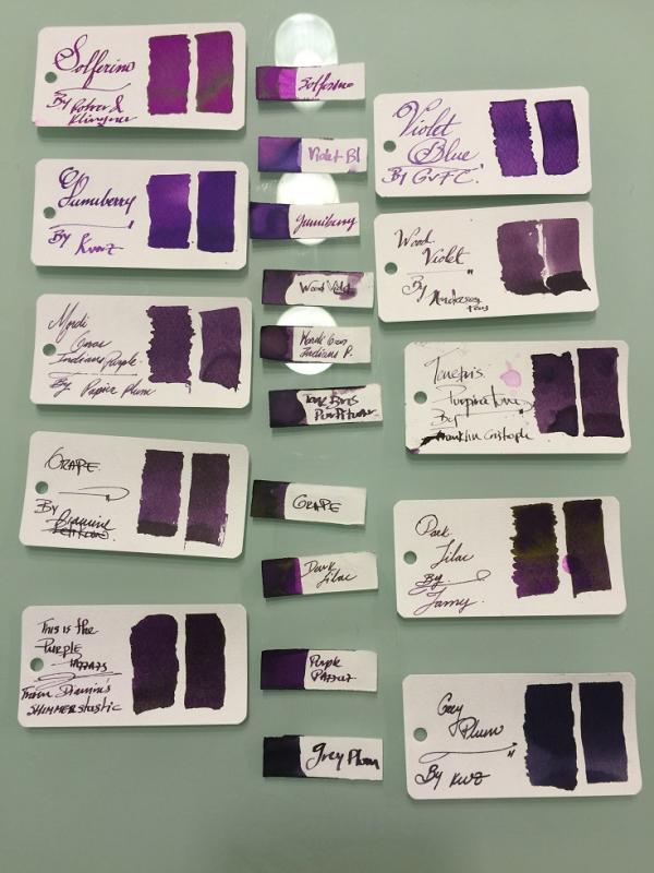
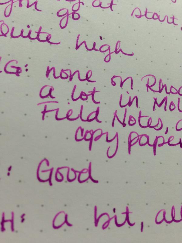
Ink View: Margi Gras Indians Purple: An Ink homage to one of MANY Mardi Gras Secrecies! So here we have the 4th installation of the limited edition inks. I would have liked this to be ready to go before the launch of the ink (gone by now) a couple of weeks ago, but the mail system here in Canada hasn’t been that kind, however it is picking up now J and as I am putting this up I will be getting the sample of the next one up Garden District Azalea, so look for my view on this one in a couple of days! PS: A quick peek is at the end ! Once again a big thanks to Papier Plume for sending me this sample, this is a really nice purple and one named after another good piece of history. And off we go! The Mardi Gras Indians (The brief – brief history) The Mardi Gras Indians is one of many New Orleans secrecies, and one of that surrounds the Mardi Gras festival. The Indians are made of African-American communities that had taken the name Indians in honor of the native Americans who during the time of oppression and slavery assisted in their freedom. Sounds nice and all, but at the beginning (and it seems that it was around a century ago, the different Indian organizations (tribes) had their disputes, and these were often violent and used the Mardi Gras to “settle” those scores as the police would have had a difficult time to do their enforcement as a result of the overly crowed city and busy streets that the Mardi Gras festival would bring. Now all is in the past. Today seeing Mardi Gras Indians are one of those things that if you go attend the Mardi Gras, and you are not attentive, you’ll miss. Their parades are not scheduled, happen at odd times and at random locations. The tribes will form a krewe – a group task with the parade – who will then give themselves a name for that moment. There will be a leader – The Big Chief who will guide and decide where the parade will go, and if the tribe meets another tribe there is an exchange between the tribes, this is reflected in dance (based on traditional African dance movement), singing and a little taunting of their suits. Their suits (not costumes) , and this is where our purple will be coming from, are full of vibrant colors resembling Native American ceremonial apparel. This apparel is made out of elaborate intrinsic designs, using a variety of materials, including feathers, beads and sequins. Some of the suits will take months and months to prepare, and will include a hefty amount of symbolism embedded within. So what does Indians’ suits look like? Something like this: This is just one of the many and unique expressions of a Mardi Gras Indian’s suit, as each suit is particular to that Indian. Would this then mean that there are many expressions of colors including the purple? and that may vary from suit to suit, correct? Correct. So what about PP’s ink? Well let’s just say that it falls (in my opinion) in that middle part of the spectrum of purple. But let’s see more in detail! The Mardi Gras Indians (The ink view) – Purple The 4th installment, out of five, that were intended to commemorate the city of New Orleans. Mardi G-P (for short ) follows the previous inks of this line: Street Car Green , Calle Real and Sazerac. A purple ink that reflects the color found on that of Mardi Gras Indians’ suits (see pic above). Here is how the production bottles looked like And here is the Swab From a first glance you will notice a couple of things: some degree in shading , looks like this is a little more saturated that it’s previous counterparts, and some feathering! Let’s look at this more in depth So how I looked at this view? Pens: I used three pens this time One fine/EF (Platinum President – Fine Nib ) , One Medium ( Faber Castell Emotion – Medium) and one BROAD – modified Mnemosyne, with a custom Broad Waverly Nib ! Paper: Tomoe River, Rhodia, Clairefountaine Thriomphe (CF), traditional copy paper , laid paper and Vellum ß this one courtesy of Barkingpig , thank you Sir! . Tests: Flow, saturation, shading, sheen, bleed-through, see-through/show-through, feathering and pooling. With other tests such as water, bleach and alcohol and dry times. Sometimes it will be a yes/no answer, sometimes 1-5 (1 being poor, 5 being excellent) Crossover Card My way to see all the papers and how the ink behaves across. You can see that each column is representative of the paper used. Thoughts on the ink-paper behavior Flow: Flow is good, very fluid, consistent across all papers and pens usedSaturation: Medium/High, sometimes it looked more saturated depending on the paper, there is definitely less shading on this ink than in the other releases..Sheen: None, Zip, Nada.Shade: There I shading on this ink, again no as drastic as with the other inks in this collection, but there is shading, the shading on this ink is more gradual. Bleed-through: On copy paper , now I was using a very wet nib, but it went through quickly.Show-through: There is some slight, very slight on most papers, I’ve circled the ones where this happened, more intense on the vellum, but that is expected. You would be able to write on both sides on most quality papers .Feathering: Now, I was using a wet nib and that might have contributed to some of the feathering, but I’ll say that this ink in wet-heavy pens will leave a lot of ink on the paper and will feather – not much but it will. Please take note that you the paper you are using is sensitive to the oils of your hand this ink will feather where the oils mix with the paper.Pooling: (This is not the shading but more on the pooling on the edges of the letters, I enjoy when the inks provide this). There was none that I could observe in any of the papersWater Resistance: The tests shown on the card were done using an eyedropper, leaving it a few seconds then using a tissue paper to retrieve the excess. But offline I did a more smear/spread test. Tests show that the ink has some waterproofness, however it is not a WP ink. You would be able recover the writing if need you need to. Big shout to Tomoe river as the ink just held on to the paper, for a paper that rejects ink by nature it is a bit odd. Alcohol Resistance: Very consistent across. You would be able to recover from this one – almost no effect. Where it shows that the ink has gone from the comparison is where the bleach spread to.Bleach Resistance: None, Zip , nada. Dry Times: As noted this is a wet ink and the drying times were there to support it with drying times that were around the 20sec mark and on some papers longer than that. On copy paper it is almost immediate, I’ll say this is because the ink is so watery that goes through quickly between the fibers One thing I had mentioned before, it is how easy is to clean any of PP’s inks from the pens. I would attribute this to the fact that they are not meant to be waterproof, as well as that they are not viscose and not too saturated. Ink Comparison Ink NameMakerOverall notesSolferinoR&KVery bright – lots of sheen (gold) – on the high of being the most violet of them allViolet BlueGvFCNew of GvFC a light Violet blue ink with good shading on moderate to heavy wet pens – see the middle sample on the two big shades this ink gives.Gummy berryKWZBig shout to Barkingpig for this one as well, more purple than blue ,very fruit like – good shadingWood VioletAnderson PensVery dry ink – good shading – the spectrum for this on is middle to darkMardi Gras Indians PurplePapier PlumeThe featured InkTenebris PurpiratumFCSomehow dry ink with good shading – however starts on the darker portion of the spectrumGrapeDiamineOn the Mnemosyne looked VERY similar to Mardi G-P, but on the sketch paper (the one in the middle) you can see that the grape is darker in all senses.Dark LilacLamySuper saturated, golden sheen, shading ink from dark to darker!Purple PazzazzDiamineInk with sparkles, good shading, and nice sparkles Grey PlumKWZDark, dark – however still manages to shade I realized now, that I had more purples that I imagined and I didn’t even show them all. But hopefully you can see that the Mardi G-P is indeed a medium hue purple, which is good in terms of shading since it can go from light to dark on that range. And here is a (quick) sketch of a Mardi Gars Indian using Mardi G-P - wasn’t as quick this time Here is some Cursive and Block writing for reference. Opinion This is a good purple, is subtle and has some fun to it, it is a wet ink, but this is very characteristic of the PP inks, so you should handle it with care on wet nibs. This is an ink that shows waterproof-ness. On finer nibs It is pleasant to read but as it is a wet ink will also be looking a slightly more than average dry times, again it all depends on the paper and how wet you nib is. To my later point be careful with possible feathering. This is not the more friendly ink you might want to use on copy paper. I’m very grateful that I got this sample, and happy to have this ink as part of the – now that I see – seemingly long list of purples. Availability As noted at the beginning of this view this is now sold out. For this release Papier Plume did 60 1 Oz / 30ml bottles. There is one more ink of this series and this one will have the same number of bottles. The name of the ink is Garden District Azalea – On sale September 16, 2016 (sample at the end of the View). Papier Plume notifies their ink availability through their newsletter first (link), then Instagram, then Facebook, and finally twitter (in that order). AND Here is a not so known story about this ink and why was purple and not another of the equally deserved colors of the Indians’ suits : “After the first one was released someone called about the green. While talking he asked if we were going to make a purple. At the time we only had 4 of the 5 colors. But I told him that it wasn't likely. He gave me his email address anyway to get on the mailing list. His email address had the word Tribe in it and he told me that he was a Cleveland Indians fan. So after I hung up I decided that the next color would be named after the Mardi Gras Indians and would be purple.” This is in my opinion a great story and another example of the influence we each carry (if you are not a fan of the Cleveland Indians, please don’t get mad). Now, how do I get to influence someone to do a likeness of me on an ink…. Still thinking And Now Garden District AZALEA!!! The (re)View on this will be up Monday/Tuesday! Remember the release is Friday the 16thJ Thanks for reading until the end!
-
L'Artisan Pastellier Callifolio - Violet L'Artisan Pastellier is a small company in southern France that specialises in natural pigments, and offers customers authentic and reliable products in beautiful colours based on mineral or vegetable pigments. In a collaboration with Loic Rainouard from Styloplume.net, the chemist Didier Boinnard from L'Artisan Pastellier created the line of Callifolio fountain pen inks. These pastel-coloured inks are traditionally crafted, and can be freely mixed and matched. Overall these inks are only moderately saturated, and have low water-resistance. The inks were specifically designed to work well with all types of paper, and all types of fountain pens. Being pastel-tinted, these inks have a watercolour-like appearance, and are not only fine inks for journaling, but are also really excellent inks for doodling & drawing. I only recently discovered them, and they are already the inks I gravitate towards for personal journaling. In this review, Callifolio Violet takes center stage: a springtime light-purple ink obviously named after the violet flower (aka viola of the Violaceae family of flowering plants). You can also think of the colour of lavender if you prefer. Violet is a fresh, lively and primarily beautiful looking ink. The ink gives me a playful feeling - perfectly suited for this late spring / early summer season. It is not too intrusive though, and in my opinion not only suited for personal journaling but also well adapted for notetaking at work. Be aware that this is a reformulated version of the older Callifolio Violet, and a totally different ink than the one previously reviewed by visvamitra (no golden glitter in this incarnation of the ink!). As far as I'm concerned, this ink doesn't need a golden shimmer to shine. It's a beauty in its own right. The ink works well in all nib sizes but is a bit undersaturated in drier fine nibs. It shows some really nice shading in the broader nibs, from light to dark violet. I'm not a fan of too bold a shading (with a large difference between light and dark) - here the contrast between the light & dark portions of the text is obviously present, but remains subdued with an aesthetically pleasing look. I really like it ! This flowery ink really blossoms in wetter nibs where it leaves a much more saturated and darker-looking line, which looks amazing. Be sure to find a wet pen to use with this ink - you'll be well rewarded with the eye-pleasing result. Below you'll find a writing sample with my drier Safari M and B nib, compared to the wet golden M-nib of my Lamy Dialog 3. The difference is obvious On the smudge test - rubbing text with a moist Q-tip cotton swab - Violet behaved perfectly with almost no smearing. Water resistance is remarkably good ! This is the first Callifolio ink I've used that is nearly water-proof. A 15-minute soak in still water posed no problem at all. Running tap water caused some purplish smudging, but the text remained perfectly readable. This water resistance makes Callifolio Violet all the more suited for the workplace, earning an extra plus from me. The ink's water resistance is demonstrated clearly in the chromatography, which shows that most of the ink remains in place when coming into contact with water. It also clearly shows that this is a one-pigment ink. I've tested the ink on a wide variety of paper - from crappy Moleskine to high-end Tomoe River. For the Callifolio reviews, I'm using a new format to show you the ink's appearance and behaviour on the different paper types. On every small band of paper I show you: An ink swab, made with a cotton Q-tip1-2-3 pass swab, to show increasing saturationAn ink scribble made with an M-nib fountain penThe name of the paper used, written with a B-nibA small text sample, written with an M-nibDrying times of the ink on the paper (with the M-nib)Callifolio Violet behaved perfectly on all the paper types I used, without any feathering even on the lower quality papers in my test set. Drying times are fairly short in the 5-10 second range on most papers. In my opinion, the ink looks best on true white paper, and is a bit less eye-pleasing on more yellow paper. I find it great-looking on the readily available Rhodia paper. At the end of the review, I also show the back-side of the different paper types, in the same order. The ink behaved superbly on all paper types. Only with Moleskine there was a tiny bit of bleed-through - given that Moleskine is a notoriously bad paper for fountain pens, this was really surprising (in a good way). Violet is a really well-behaving ink. Conclusion Callifolio Violet from L'Artisan Pastellier is a wonderful ink, perfectly suited for late spring / early summer. I am really impressed by the ink's performance on different paper types, as well as its near-perfect water resistance. But primarily I am totally charmed by the ink's colour, which looks fresh & beautiful, but is still not too out-of-bounds for an office setting. A great-looking ink for any occasion ! You should really try it out for yourself ! Technical test results on Rhodia N° 16 notepad paper, written with Lamy Safari, M-nib Backside of writing samples on different paper types
-
There are more formal, and better reviews already posted, but as I have found the Purple I was looking for, here are a few thoughts: Note, that I'm not one of those weird people who like dry pens. I like pens that gush - both pens used are pretty wet writers. There's a reasonable amount of shading under that gold. Comes in a 50ml bottle. Not an expensive ink, but a little dearer than the excellent value standard Diamine Inks. Dry times are very paper and pen dependent, but I was getting smudging on most papers up to the 20 second mark (and beyond on less absorbent papers). Do a search - there are better reviews on here. I love it, and with a fine nib would happily use at work even with the odd sparkle. My fingers look like I've spent the day blackberry picking.
-
Not so long ago a message appeared in my inbox offering some inks from Japan. Of course this excited me, as these were re-issues of previous Limited Edition inks made for the Maruzen department store in the Nihombashi district of Tokyo. These inks are only available at the store, so they are very difficult to obtain, even more so than the usual Sailor shop-exclusive inks. This particular ink is a rich, deep purple or deep grape hue. It has a heavy dye load, so it's not really very shady. But it has quite a bit of sheen on Tomoe River paper. The ink dries fairly quickly. The reason to have this ink is for it's color. It's just very rich. The flow and lubrication were very good. While taking more effort than usual to completely flush out the pen, there did not appear to be any staining on the converter. The ink is not waterproof, and really doesn't have any water resistance other than the fact of a lot of dye. This spreads everywhere when wet. I have no idea if this ink is actually available even though it was only released perhaps a month ago or so. I don't know how many bottles were produced and available, whether any announcements were made about the release, or if any bottles were left at the end of the day. The Sailor "vase" bottle was packaged in a tall Sailor box with a nice, heavy label. There was no label on the bottle itself or the cap. Apparently, only some bottles had hand-written labels. Pen: Edison Premiere (F-steel) Papers: MvL=Mohawk via Linen, TR=Tomoe River, Hij=Hammermill 28 lb inkjet, Rhodia=Rhodia 90g ivory. Camera: iPhone 7
-
With great help from this group I think I have my ink choices down the the final three and appreciate your opinions. For starters I write with an M800 fine nib and this is mostly business notecards. I am currently writing with Iroshizuku Ken-peki and Tsuki-yo. The goal is to find something that can be used for biz but with a little more character that standard blues. 😊 The finalists are: Cara d'ache Ullra Violet Sailor Shigure (one reviewer said this clogged his pens but only one person made that comment) Diamine Damson Thoughts, opinions, hearsay and gossip are all invited. TIA!
-
I've been lurking here for a long time but joined today as I saw Noodler's Tchaikovsky and Rachmaninov did not have ink reviews but are both in my possession. I love looking at ink reviews, even the rubbish ones, so I was inspired to make my own modest contribution. This ink is probably not a good choice for lefties, as it takes a really long time to dry (still smearing at 20 seconds), it's also not a good choice for non-FP papers as it feathers like a beast. BUT - it is oh, so, so very pretty. It shades so incredibly richly - like Apache Sunset where it's one colour at the top of a stroke, a completely different one at the base - and my pen seems to really like it. Also, it is freakishly water resistant. Even after 15 seconds and rubbing, the q-tip sample stayed squarely intact. Full page is a scan, close-ups are iPhone photos in natural light on Rhodia dotpad and Field Notes. You guys, the shading. http://images4-e.ravelrycache.com/uploads/MrsDrG/440305860/_medium2.jpeg
-
L'Artisan Pastellier Callifolio - Grenat L’Artisan Pastellier is a small company in southern France that specialises in natural pigments, and offers customers authentic and reliable products in beautiful colours based on mineral or vegetable pigments. In a collaboration with Loic Rainouard from Styloplume.net, the chemist Didier Boinnard from L’Artisan Pastellier created the line of Callifolio fountain pen inks. These pastel-coloured inks are traditionally crafted, and can be freely mixed and matched. Overall these inks are only moderately saturated, and have low water-resistance. The inks were specifically designed to work well with all types of paper, and all types of fountain pens. Being pastel-tinted, these inks have a watercolour-like appearance, and are not only fine inks for journaling, but are also really excellent inks for doodling & drawing. I only recently discovered them, and they are already the inks I gravitate towards for personal journaling. In this review I take a closer look at Grenat, one of several purple inks of the Callifolio series. You might think that this colour gets its name from the gemstone. But this is no Edelstein, and the other purple Callifolio inks are named after elegant wines, so my guess is that this colour is also named after the produce of grapes. Grenat is a nicely saturated dark purple, that is at home both with fine and broad nibs. It writes well, and is nicely saturated for a Callifolio ink. Grenat also shows some fancy shading, but you need broader nibs to get the full effect. With fine nibs the shading is almost absent – you need to look closely to notice it’s still there. I personally like dark purple inks, and Grenat is one that doesn’t disappoint. This is an ink that stands out, and that is “conventional” enough to be used at work without getting strange looks. It also helps that the ink can handle cheaper paper well –no high quality journals to be found at the IT department where I work, only printing paper ;-) Like all Callifolio inks, this one is also great for doodling & drawing. On the smudge test – rubbing text with a moist Q-tip cotton swab – Grenat behaved really well. There is some smudging, but nothing that impacts readability. Water resistance is very low though. Only a faint purple-grey residue remains, as is also shown in the chromatography. What is left on the paper is still decipherable, but will require some detective work. This is not an ink to use when water resistance is high on your list. I’ve tested the ink on a wide variety of paper – from crappy Moleskine to high-end Tomoe River. For the Callifolio reviews, I’m using a new format to show you the ink’s appearance and behaviour on the different paper types. On every small band of paper I show you: An ink swab, made with a cotton Q-tip1-2-3 pass swab, to show increasing saturationAn ink scribble made with an M-nib fountain penThe name of the paper used, written with a B-nibA small text sample, written with an M-nibDrying times of the ink on the paper (with the M-nib)Callifolio Grenat behaved perfectly on all the paper types, with no apparent feathering even on the lower quality papers in my test set. Drying times with an M-nib are mostly in the 10-15 second range, even less on the very absorbent paper. I like the ink best on white paper, and it looks absolutely fantastic on Fantasticpaper (pun intended). If you haven’t tried this paper yet, you owe it yourself to hunt around for this notebook. That fantastic paper really brings out the best from a fountain pen ink ! I also show the back-side of the different paper types, in the same order. The ink behaved perfectly with almost all paper types. Only with the Moleskine paper, there was significant show-trough and some minor bleed-through. All in all a really well-behaving ink. Conclusion Grenat from L’Artisan Pastellier is a fine dark purple ink, that is suited for all occasions, and works with any paper you care to use it on. The ink writes nicely saturated even in finer nibs, and shows some pleasant shading in broader nibs. A great ink for note-taking at work – dark purples are conventional enough to be used in such a setting. I really enjoyed using this ink, and can heartily recommend it. Technical test results on Rhodia N° 16 notepad paper, written with Lamy Safari, M-nib
-
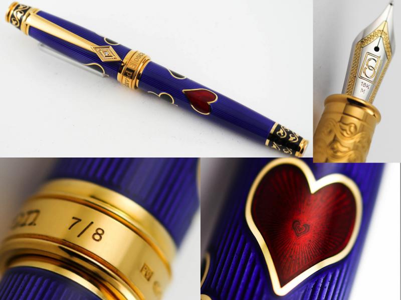
David Oscarson Les Quatre Couleurs The four suits now used in most of the world – Spades, Hearts, Diamonds and Clubs – originated in France about 1480. The Spade represents nobility or aristocracy; the Heart represents the Church or Clergy; the Diamond represents merchants or the wealthy and the Club represents peasantry with its reference to clover, or the food of swine. The Quatre Couleurs Collection incorporates multiple levels of guilloché engraving and a combination of translucent and opaque hard enamel. The entire body of each pen is first cut down to the level of the background, leaving the outer and inner lines of the four suits and decorative filigree motif in high relief. Translucent and opaque enamels are repeatedly kiln-fired and filed by hand, resulting in the beautiful and enduring finish of true Hard Enamel. For inquiries email us at orders@airlineintl.com
-
-
Penbbs No.152 Mix Set Violet Penbbs is a Chinese online fountain pen community similar to FPN. They not only talk about inks but also produce their own inks every year. Each series consists of ten to fifteen inks and 2017 marks the release of Penbbs’ fifteenth ink series. Due to Chinese postal restrictions, these inks are virtually impossible to obtain outside of China. Within China they are extremely affordable (21 RMB or about US$3 per 60ml bottle) and can easily be purchased through the Chinese online shopping giant Taobao. This ink up for review is from Penbbs’ twelfth series. It is one of seven “Mix Set” inks in this series that are designed to “mix to create miracle.” The color is true to its name, giving a nice deep violet. This ink is rich and deeply saturated with virtually no shading. It’s a beautiful vibrant hue that I enjoy seeing on the page. Judging purely from scans in other reviews, I have a feeling that Penbbs No. 152 may be a good contender for a Lamy Dark Lilac substitute. [bTW, If anyone is interested in selling me their bottle of that precious elixir please let me know!! :puddle: ] It also seems to be darker and more saturated than Pelikan 4001 Violet, but I don’t have any on hand to compare. No. 152 also has some great writing properties. There is a little feathering and bleed through on copy paper and Moleskine, but it isn’t significant. This ink also dries quickly and has good water resistance. When exposed to water the red component will lift, but the remaining dark purple line is still very legible. This is the first of the Penbbs inks I’ve reviewed so far that has actually impressed me. It’s a nice color that behaves well and is a joy to write with. If you like purples/violets and are able to get a bottle of this, you won’t be disappointed! Pens used (in order): 1. Pilot 78G Fine 2. Lamy Safari Broad 3. Pilot Plumix Italic 4. Noodler’s Nib Creaper Flex 5. Hero 5028 1.9mm Stub Swab Paper Towel Drop 80gsm Rhodia 73gsm Chinese Tomoe River Wannabe (brand unknown) 70gms Deli Copy Paper Moleskine Water Resistance Comparison Here is Penbbs’ image of the bottle and label for reference: SDG
-
Penbbs is a Chinese online fountain pen community similar to FPN. They not only talk about inks but also produce their own inks every year. Each series consists of ten to fifteen inks and 2017 marks the release of Penbbs’ fifteenth ink series. Due to Chinese postal restrictions, these inks are virtually impossible to obtain outside of China. Within China they are extremely affordable (21 RMB or about US$3 per 60ml bottle) and can easily be purchased through the Chinese online shopping giant Taobao. This ink up for review is from Penbbs’ eighth series. It is named after Chinese architect Lin Huiyin (known as Phyllis Lin in the West). She is famous in China for being the first female architect in modern China and for her involvement in designing the flag and national emblem of the People’s Republic of China. You can read more about her here. I love my purples, and this one doesn’t disappoint. No. 95 is a deep purple very similar in color to Noodler’s La Reine Mauve but much better behaved. To my eye it looks like a pure purple, leaning neither red nor blue. It is quite saturated but does shade a tad with wet nibs on non-absorbent paper. This ink dries quickly, but also displays some feathering and bleed through. However, it doesn’t feather or bleed nearly as much as the other two Penbbs inks I’ve reviewed (Nos. 132 and 157). Also unlike those inks it has passable water resistance. Penbbs No. 95 could be someone’s perfect dark purple for daily use with a fine nib on regular paper. My conclusion is that this is a decent ink I can live without and we could all use a little more Waterman Tender Purple in our lives. Pens used (in order): 1. Pilot 78G Fine 2. Lamy Safari Broad 3. Pilot Plumix Italic 4. Noodler’s Nib Creaper Flex 5. Hero 5028 1.9mm Stub Swab Paper Towel Drop 80gsm Rhodia 73gsm Chinese Tomoe River Wannabe (brand unknown) 70gms Deli Copy Paper Moleskine Water Resistance Comparison Because I ordered so many samples, the Taobao seller kindly gave me a free empty ink bottle that just happened to be for this ink. Chinese inks bottles are usually quite ugly and impractical, but this one is neither. The octagonal shape and decent-sized opening allow for you to trap the last drop of ink in a corner to suck up with a pipette. The full color label is also a nice change from the typical boring design. You can tell these inks were made by and for fountain pen enthusiasts.
-
Sailor Style Dee Delta "Water City" Tsuyuten Murasame (Purple Rain) I have to say I'm not completely sure of the English translation for the name of this ink. Perhaps one of our Japanese FPN friends can illuminate us. Recently one of our Japanese FPN members pointed out some Sailor bespoke inks from a shop called STYLE DEE in Osaka with a brand called DELTA Original Ink. I was confused because there is also an Italian pen maker called Delta with a few inks available. But these are real Sailor inks. The inks seem to go along with an inexpensive demonstrator pen ¥4,300, and unfortunately I didn’t put one in my shopping cart. There were originally four inks, based on the seasons of Osaka. “Water City” Umeda Yasei (Umeda Night Blue, a deep blue, perhaps a blue-violet) “Water City” Doujima Ryokkin (Doujima Green-gold) “Water City” Nakanoshima Shunryoku (Nakanoshima spring green) “Mizuho” Kitashinchi Beniya (Kitashinchi Red Sea, a burgundy or wine hue) The two latest inks released August 2016 are “Water City” Sonezaki Teuteu (Sonezaki Orange, a burnt orange) “Water City” Tsuyuten Murasame (Purple Rain, a purple or violet) These inks are the same price as other standard Sailor bespoke inks at ¥2,160 per bottle, which is about $19.10 US as of today (2/11/2017). This price doesn't include shipping to the destination or any charges incurred using a forwarding service. Each person is limited to purchasing one bottle of each ink. Recently I was able to obtain three of these inks: the burnt orange, the purple, and the green-gold. I was very lucky with the Doujima as the shop said this ink was sold out, but when the purchaser went to buy the inks, there was one available. I don’t know the availability of the earlier inks, so there’s no guarantee that any of them are available, but I think the two latest inks released may be available. Pen: Gate City Belmont (M-steel) Papers: MvL=Mohawk via Linen, TR=Tomoe River, Hij=Hammermill 28 lb inkjet, Rhodia=Rhodia 90g ivory. Camera: iPhone 7 In my handwritten review I note this ink seems similar to PV19, Quinacridone violet. This is a very lovely purple color, not super bright per se, but not at all dark like Ink of Witch, or other purple-blacks. I don't have anything like this, but I'm certain there must be something similar. There is green sheen on Tomoe River in artificial light. I was a little worried that the ink might stain the barrel of my Belmont but that didn't seem to be the case at least after a few days. I'm pretty happy with the way the ink wrote, no problems at all. Don't trust it to be water resistant if that's important for you.
-
Rohrer & Klingner operates since 1892. At the moment it's the fifth generation of the family that manages the company. I guess that after 122 years they know what they are doing. R&K inks offer amazing quality for amazing price. In my country a bnottle of R&K ink costs 5-6 $. I know it's a bit more expensive in America, yet I believe the price is still reasonable. I find it interesting that Rohrer & Klingner seems to focus mainly on the content and not on the bottles. Inks come in industrial looking bottle taht is quite handy but there's just nothing fancy about it. It's surprising. http://www.rohrer-klingner.de/fileadmin/_migrated/pics/schreibtinte_top_03.jpg Anyway they offer eighteen colors, some stunning, some boring but all have good qualities and are easy to clean. http://imageshack.com/a/img742/3085/WHCjxM.jpg Alt-bordeaux Alt-Goldgrun Blu Mare Blue Permanent Cassia Fernambuc Helianthus Leipziger-Schwarz Magenta Morinda Royal Blue Salix Scabiosa Sepia Smaragdgrun Solferino Verdigris Verdura It's time to re-review this inks. Cassia is rather bright and quite delightful purple ink. Recently I'm in purple faze and I use purple inks extensively. While Cassia isn't as rich as Lamy's Dark Lilac I still think it looks stunning, especially in broader nibs. The dry time is medium length, reaching 20 seconds when the ink is used in wet nib on paper like Rhodia. It lacks water resistance but cleans nicely from the pen. The shading is quite nice but not massive. On the other hand in Kaweco double broad nib it's significant. It flows nicely, towards the wet side. Some feathering may be experienced on crappy paper (Moleskine and alikes). Drops of ink on kitchen towel Software ID Color range Tomoe River, Kaweco Skyline Sport, double broad Leuchtturm1917, Kaweco Skyline Sport, double broad Maruman, Kaweco Skyline Sport, double broad Water resistance
-
The following recipe is a recipe for Lilac Colored fountain pen ink manufactured using water-based dyes. I have not tested this recipe yet, but I have ordered all the materials and plan on testing it as soon as they arrive. I will then update the recipe with the results. The recipe was created by me, using my knowledge about fountain pens, other FPN users' experiences, and my knowledge about chemistry from my AP Chemistry Course. I chose to make Lilac ink to match my Dark Lilac Lamy Safari that will be arriving shortly. Materials: Procion MX Lilac Cold Water Fabric Dye- The main source of color for the ink and the major dye in the ink. Pure Glycerin- To increase the viscosity of the ink and make it better able to flow like normal pen ink. Germall Preservative- To prevent the formation of SITB and increase the shelf life of the ink. Polysorbate Tween 80 Surfactant- To make the ink flow more easily. Distilled or De-Ionized Water- The main solvent of the ink. Funnel- For easier pouring. Filter Paper- To remove accidental sediments that could clog pens. Cheap Sacrificial Test Pen (I'll be using a Jetpens Chibi)- To run initial tests of the ink. Lots of Paper- To write on with the above pen. Empty 30 mL Ink Bottle(s)- To store your new ink. Blunt Tip Syringe- For the measurement and addition of glycerin. Gloves- In case you have a dinner party later and can't have inky fingers. 50 mL Graduated Cylinder- To measure the water. Centigram Scale- To measure the dyes and glycerin. Safety Goggles- Standard Lab Procedure. Lab Apron- Same as above. 50 mL Beaker- For the initial mixing of the ink. Ring Stand- For the final filtration. Glass Stirring Rods- To mix the parts of the ink. Graduated Pipettes- For the measurement and insertion of the surfactant and biocide. Procedure: 1. Measure out 30 mL of distilled water in a graduated cylinder. Add the water to the 50 mL Beaker using a funnel. 2. Use the Centigram Scale to measure out 2.00g of Procion Dye. Add the dye to the Beaker. Stir until the dye has dissolved in the water using a glass stirring rod. 3. Zero the Centigram scale with the blunt tip syringe on it. Then, use the syringe to pick up 1g of glycerin. Add the glycerin to the beaker, and stir until dissolved using a glass stirring rod. 4.Using Graduated Pipettes, add one drop of Polysorbate Surfactant and one drop of Germall Preservative to the beaker. Use a glass stirring rod to stir until dissolved. 5. Using the beaker, filter paper, and ring stand, filter the contents of the beaker into the Empty Ink Bottle. Ideally and theoretically, there will be no remaining sediment on the filter paper, but this step adds an extra level of security to protect our pens. 6. Ink up a pen and try out the ink, adjusting levels of Surfactant and Dye to match your ideal properties of flow and color saturation. Be gradual, as you can always add more, but if you add too much surfactant the batch is essentially ruined. This recipe is still untested, so I wouldn't go trying it in your pens just yet, but I intend to have the ink made by at the latest June 8th, and will post the results then.
-
Penbbs is a Chinese online fountain pen community similar to FPN. They not only talk about inks but also produce their own inks every year. Each series consists of ten to fifteen inks and 2017 marks the release of Penbbs’ fifteenth ink series. Due to Chinese postal restrictions, these inks are virtually impossible to obtain outside of China. Within China they are extremely affordable (21 RMB or about US$3 per 60ml bottle) and can easily be purchased through the Chinese online shopping giant Taobao. This ink up for review is from Penbbs’ tenth series. It is named after the cornflower (centaurea cyanus) which can be various shades of blue or lavender. Personally, I think this ink is too dark and too purple to match the flower, but it’s a nice purple nonetheless. No. 116 is noticeably bluer than No. 95. It is very saturated (more so in person than in the photos) and has virtually no shading. This ink dries quickly and only shows a little feathering and bleed through with wet nibs. There is slight water resistance as well; the blue and purple components separate and leave a feint line. This is the best performing ink of the four Penbbs inks I’ve reviewed and is the only one I’d be comfortable using regularly on average paper. Penbbs No. 116 is a nice, vibrant blue-leaning purple that behaves itself, but doesn’t stand out as particularly interesting or exciting to me. Pens used (in order): 1. Pilot 78G Fine 2. Lamy Safari Broad 3. Pilot Plumix Italic 4. Noodler’s Nib Creaper Flex 5. Hero 5028 1.9mm Stub Swab Paper Towel Drop 80gsm Rhodia 73gsm Chinese Tomoe River Wannabe (brand unknown) 70gms Deli Copy Paper Moleskine Water Resistance Comparison Note: The comparison shows the ink's color more accurately than the other photos. It really is this dark. Here is Penbbs’ image of the bottle and label for reference: SDG
-
Hey all you ink lovers, My wife is a big, big fan of purple. Even our wedding had lots of purple accents in it. But, personally, I've never thought too much about the color. Until, I got into fountain pens. And furthermore, until I recently chowed down on an ube. Allow me to explain: the Filipino ube (Dioscorea Alata, local pron. "OOH-beh") is a yam with a sweet-ish purple/indigo flesh indigenous to Southeast Asia. In the Philippines, it is prized as the essential ingredient of various sweets, and that is how I, being of Filipino extraction, am most familiar with it. However, it is also very nice after a simple boiling. Behold, plain-looking spud on the outside, tuber royalty within: I haven't eaten one of these in months - before my pen obsession began. Mid-bite, I gazed into its deep indigo insides, stopped chewing and thought, "If only I could find an ink of that hue!". It would be gorgeous and serve as a nostalgic reminder of a childhood stuffing my face with sweetened, creamy cakes and tarts. Now, I've seen various posts on the FPN and elsewhere in regards to purple inks, but I think the subject could stand a bump. What inks do you think would match this vibrant veggie? Or simply, what is your favorite indigo ink? Regards, Rich
-

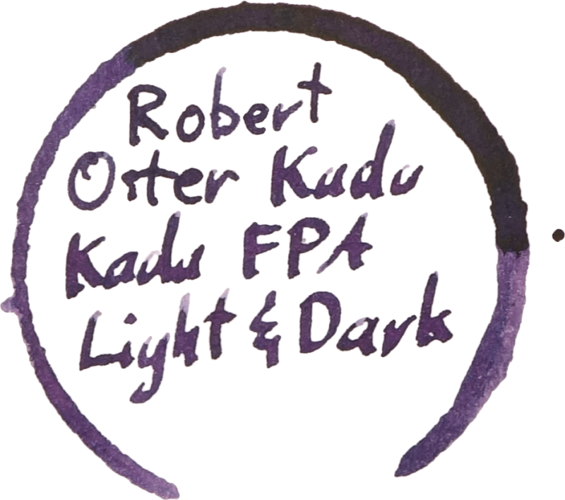
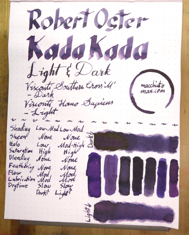
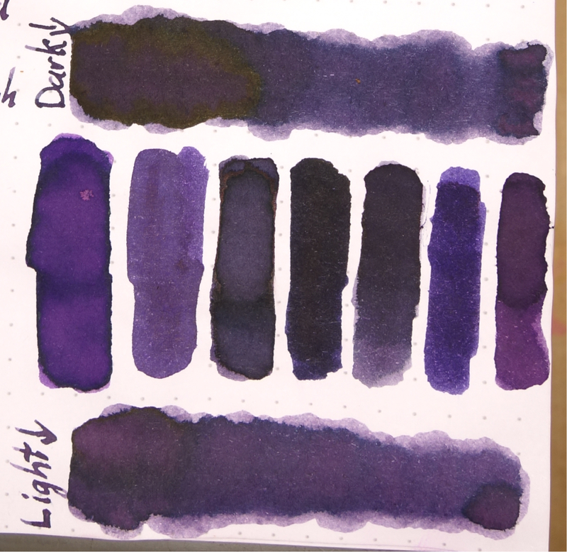
Ink Review: Robert Oster Signature Inks Kada Kada Fpa Light & Dark
yagankiely posted a topic in Ink Comparisons
I've been doing ink reviews for a while now on my blog but this is the first time cross posting here. For the record, I'm the co-creator of the Fountain Pens Australia Facebook group and I worked with Rob to get this ink out there. Most of the pertinent images are included here but there is some extra stuff (chromatography, other paper) in the review. Robert Ostster's Kada Kada FPA Light & Dark are two ink made for the Fountain Pens Australia Facebook group. After two rounds of choosing colours that Robert would base the ink off, the group chose "Kada Kada" with the colour hash code of #270567 and after that I worked with Rob to come up with this ink. The name Kada Kada means "Story" in the local (to me in Fremantle, Western Australia) Noongar language. And the hash code was chosen because it is the date (27/05/1967) that Indigenous Australians were afforded constitutional rights. The ink can be bought exclusively from Pensive Pens in Australia. Kada Kada Light and Dark have high saturation but are not inks with high vibrancy. Their colour is a somewhat soft and dusty dark grey purple. The main difference between Dark and Light apart from the obvious is that Dark has a less red visible. The colours to separate a little on the page meaning that you can sometimes see parts where the line is redder or bluer. Kada Kada Light and Dark both have moderate lubrication and flow. They definitely aren't dry by any means but they aren't Sailor-level wetness either; the glide across the page nicely. The ink has good shading but it isn't extremely noticeable in wetter pens. There is some shading though to give it some character. Drytimes are on the slower end of the spectrum and the ink performs very well on Rhodia, Clairefontaine and Tomoe River but feathers pretty badly on cheap 80gsm copy paper. The colour also adopts more of a red look on copy paper and loses a lot of character. The dark characteristics of the ink wash away leaving a light pink glow behind so this ink is not very water resistant, as expected. Somewhat astonishingly, there is absolutely no sheen on Tomoe River (though there is quite a decent halo effect on good paper). Kada Kada FPA Dark has a deep dark green sheen on Rhodia, but not on Tomoe River. This sheen doesn't appear when in a pen, however, only in wet swatch form. Left to right: 1) Diamine Amazing Amethyst; 2) Noodler's La Reine Mauve; 3) Robert Oster Purple Rock; 4) Private Reserve Ebony Purple; 5) Bungubox Sakanamachi Horoyoi/Tipsy Purple; 6) Sailor Shigure; and 7) Papier Plume Mardi Gras Purple Bungubox Sakanamachi Horoyoi/Tipsy Purple is the closest of the inks I have to Kada Kada FPA Light while Private Reserve Ebony Purple is the closest to Kada Kada FPA Dark. Amazing Amethyst and Papier Plume Mardi Gras Purple are both too vibrant and red while Shigure has too much vibrant blue. Noodler's La Reine Maybe is fairly similar to Light, it lacks a lot of the shading and halo. Robert Oster Purple Rock is again similar but darker and with less shading. I do like this ink. It's a good professional colour with some character. The two versions are fairly similar so if you're on a budget my preference goes to the Light; I feel that the redder tone gives it an edge but I still recommend both if you can. I'm unsure as to whether this ink will be in Rob's rotation forever so I suggest buying it while you can! I'd like to thank Rob for taking the time to make an ink for our growing Australian community! I've listed all my inks (slightly outdated) and all my pens in their respective pages. Please let me know which inks you'd like to review next via the comments, Twitter, Instagram, or contact me directly. I received this ink free of charge for the purpose of giving an honest review. I was not otherwise compensated and everything here is my own honest opinion. There are no affiliate links. I do sell Robert Oster inks at my café but I am not allowed to sell the inks online, only in shop. P.S. I can only add 1.9mb of images to this and can't link images from my site? Is there anyway I can host larger images from my site (or Flickr) or is there a way I can upload more/larger files?