Search the Community
Showing results for tags 'private reserve'.
-

Sandy1 review Pelikan Edelstein Topaz - similar colours.jpeg
Mercian posted a gallery image in FPN Image Albums
From the album: Sandy1
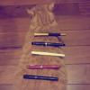
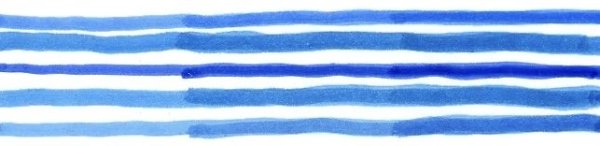
Sandy1’s scan of Pelikan Edelstein Topaz in comparison with inks of similar colours. We have five 3-stage swabs; from top to bottom: Private Reserve Tropical Blue Pelikan Edelstein Topaz Private Reserve American Blue Pelikan Edelstein Topaz Diamine Kensington Blue.© Sandy1
- 0 B
- x
-
Sandy1 review Pelikan Edelstein Topaz - similar colours.webp
Mercian posted a gallery image in FPN Image Albums

From the album: Sandy1
Sandy1’s scan comparing Pelikan Edelstein Topaz to inks of similar colours.© Sandy1
- 0 B
- x
-
Any thoughts what could be the concept behind slow evaporating inks, like e.g. Private Reserve Infinity? Some ideas: use > 20% glycerol. Downside: Ink will smudge other humectants sorbitol, urea, LiCl If it is too hygroscopic, the ink will never dry. LiCl will dissolve in its own water. use 2 separate humectants, e.g. glycerol + urea. Not sure why this doesn't smudge patent here: https://patents.google.com/patent/JP4722462B2/en Evaporation suppressing monolayers, e.g. octadecan-1-ol (stearyl alcohol, very common in hair conditioners) will slow down evaporation by about 50%. Ethylene glycol monooctadecyl ether will slow down the evaporation by 10x. These would be ideal, if one could get them through the feed. Downside is they have very low water solubility. Maybe it doesn't matter, as only tiny amounts are required Commercial products for pools are WaterSavr, AquaGuard, CoverFree, which is supposed to reduce evaporation by 85% Could disperse in ink, potentially together with surfactant Use a water-soluble polymer that might concentrate near the surface and act similarly to the monolayer Does PEG have such an effect? PVA, PVP, ... Combination of polymer + surfactant This patent shows a drawing of polyacrylic acid acting together with one of the monolayers above. Other polymers mentioned: soluble polymer may include a homopolymer or copolymer derived from at least one compound selected from the group consisting of acrylic acid, methacrylic acid, acrylamide, N-alkyl acrylamide, glycerol, ethyleneimine, ethylene oxide, vinyl pyrrolidone, vinyl acetate, the hydrolysis products of vinyl acetate, 2-hydroxyethyl acrylate, maleic acid, maleic anhydride and dimethylaminoethylacrylate. Nonionic surfactants might have a good balance between solubility and forming a layer on the surface some compounds to try: Ethoxylates, such as octaethylene glycol monododecyl ether, laureth-4, ... Triton X
-
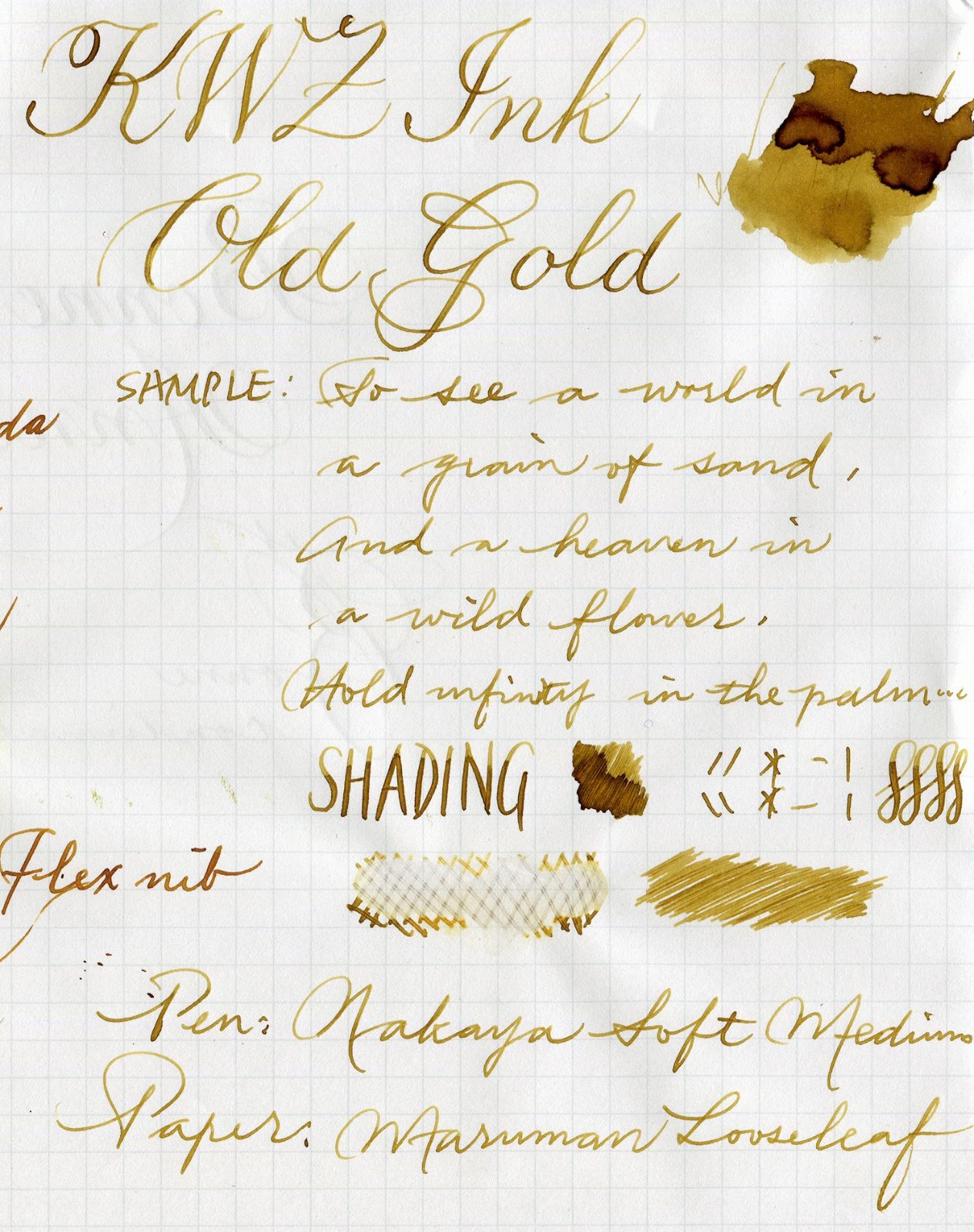
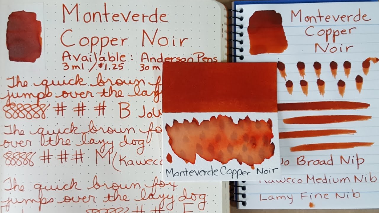
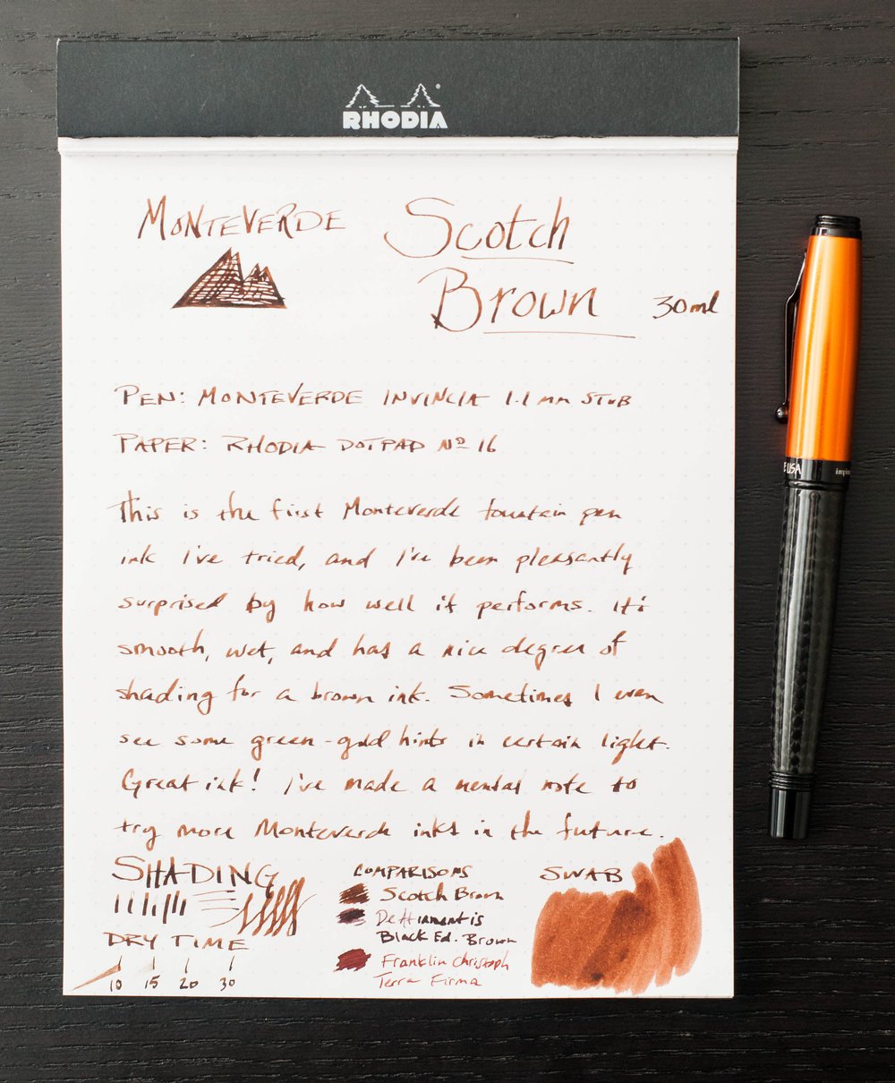
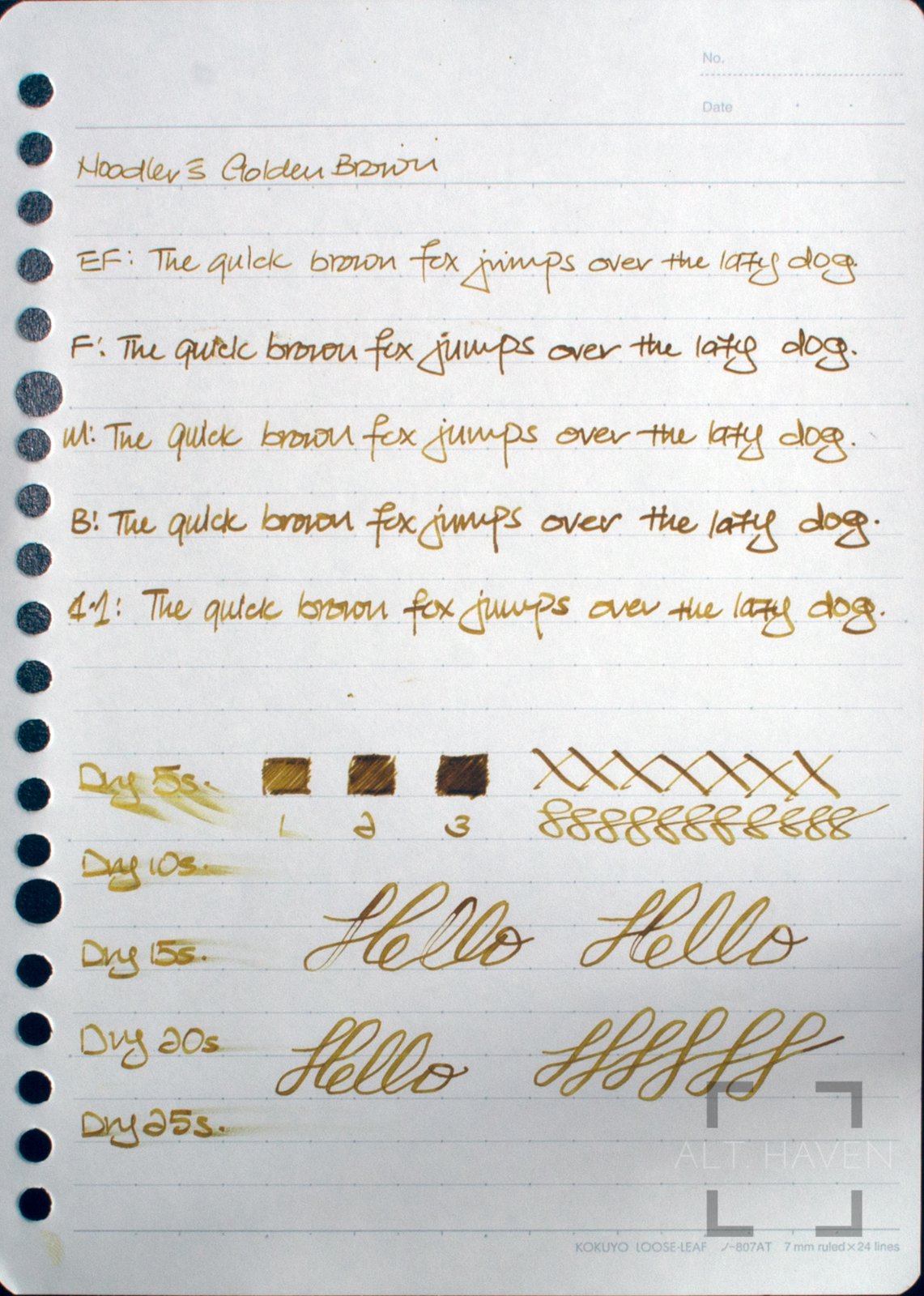
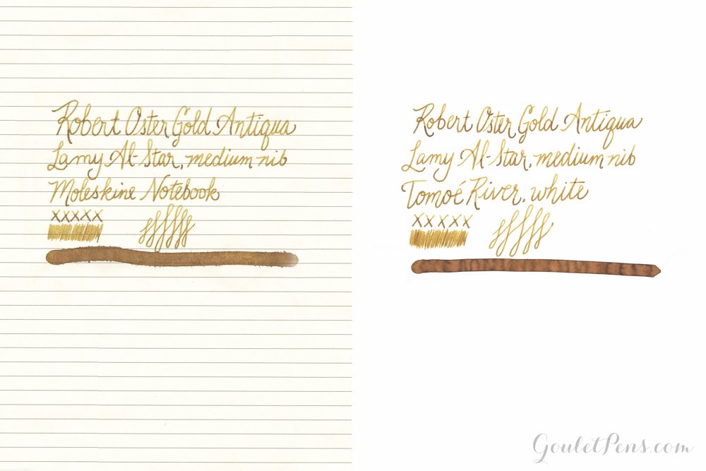
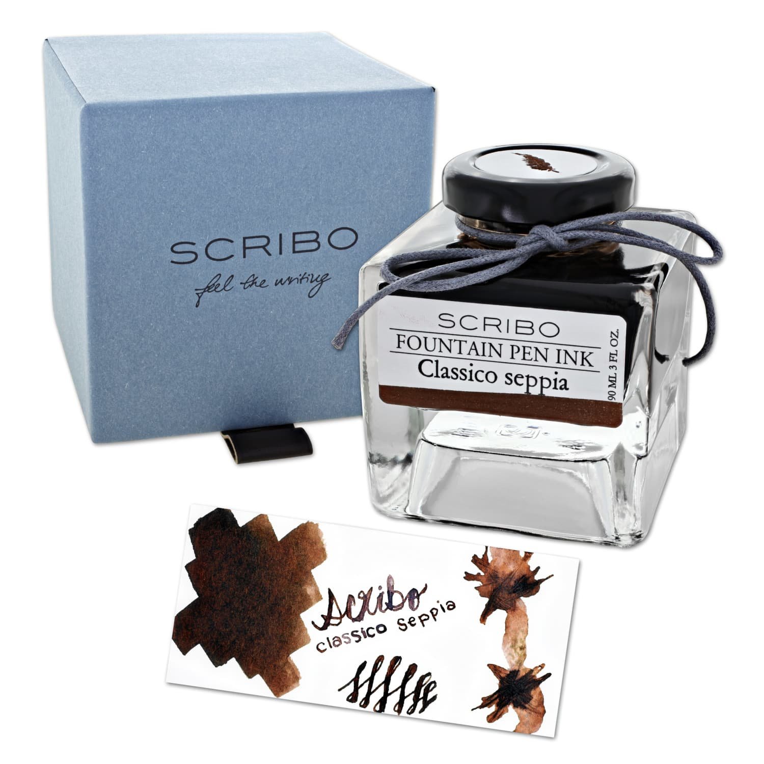
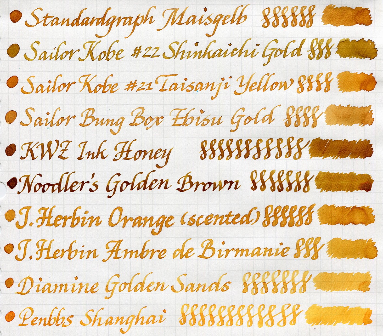
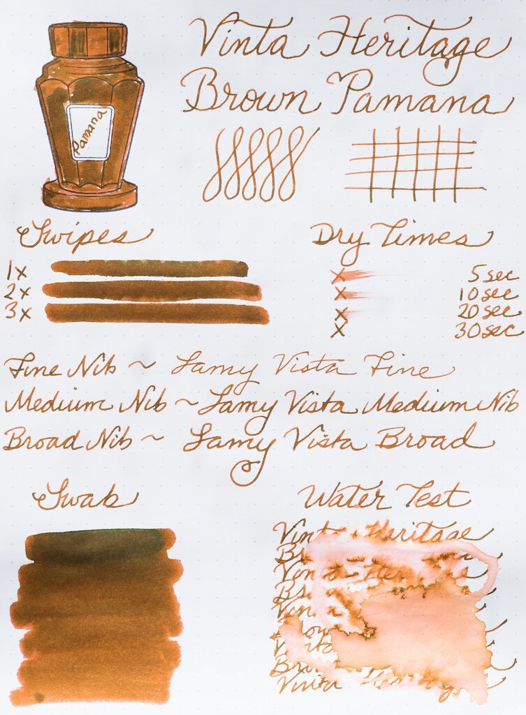
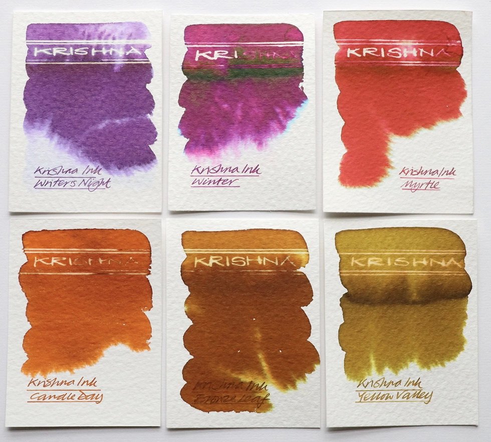
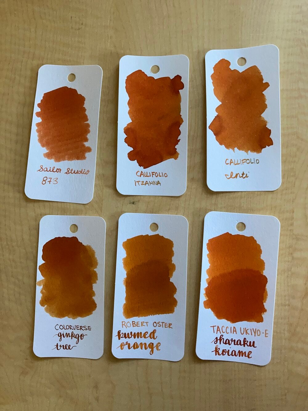
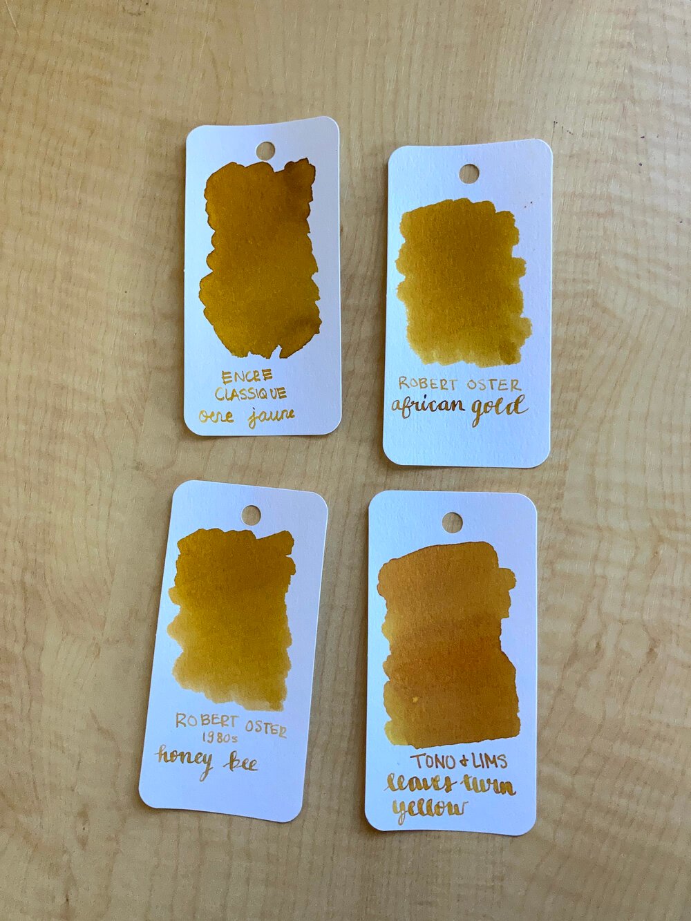
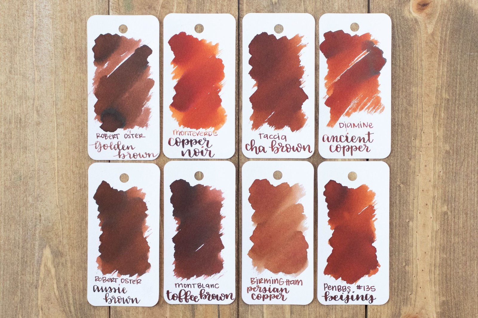
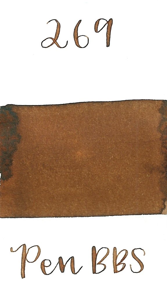
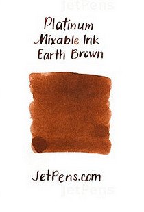
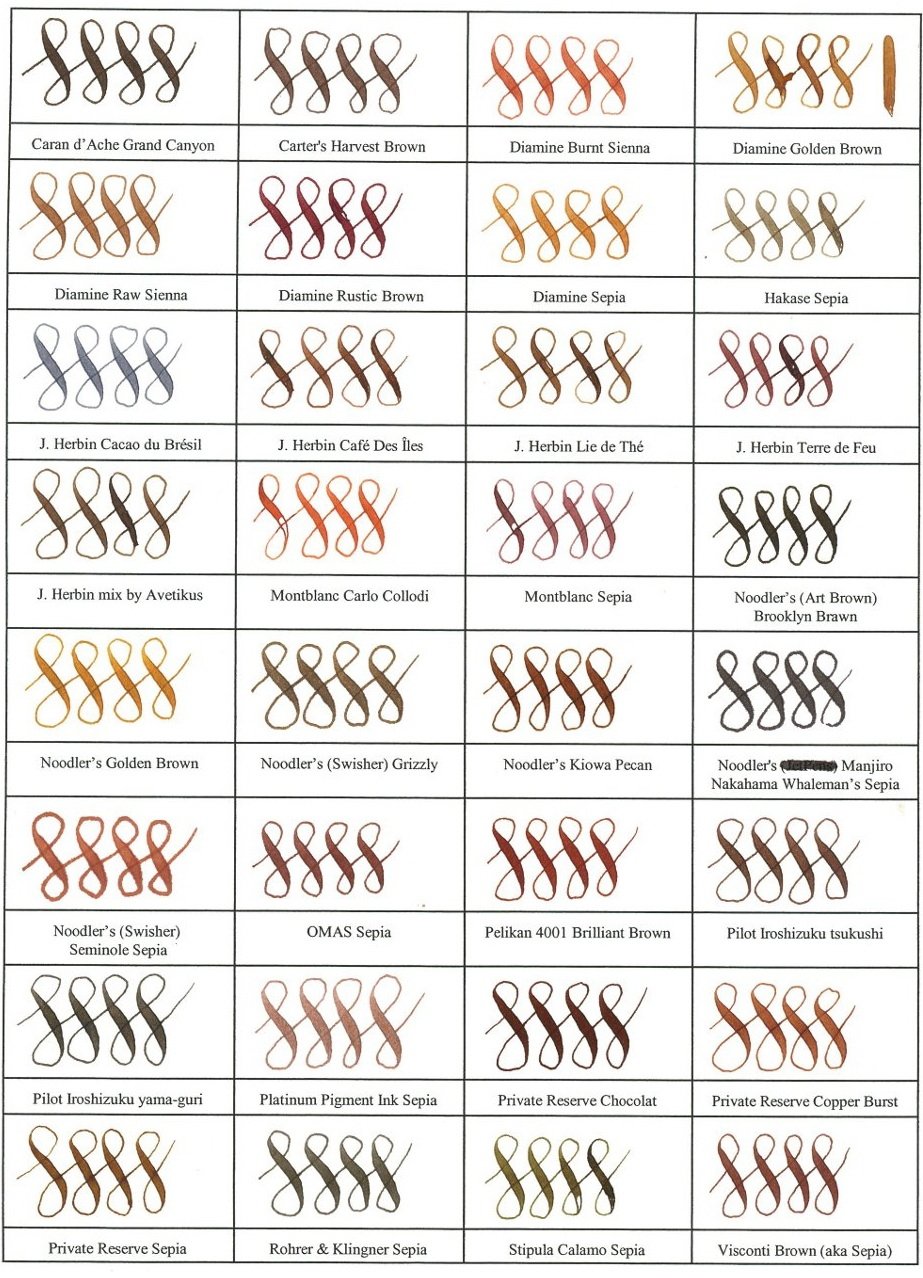
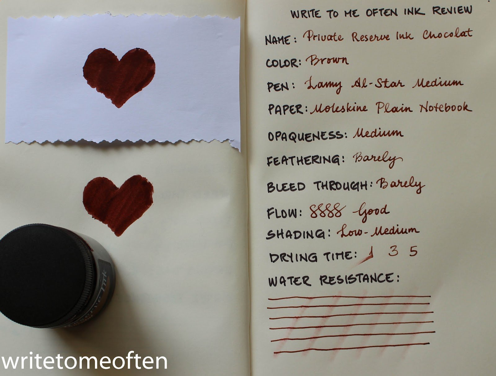
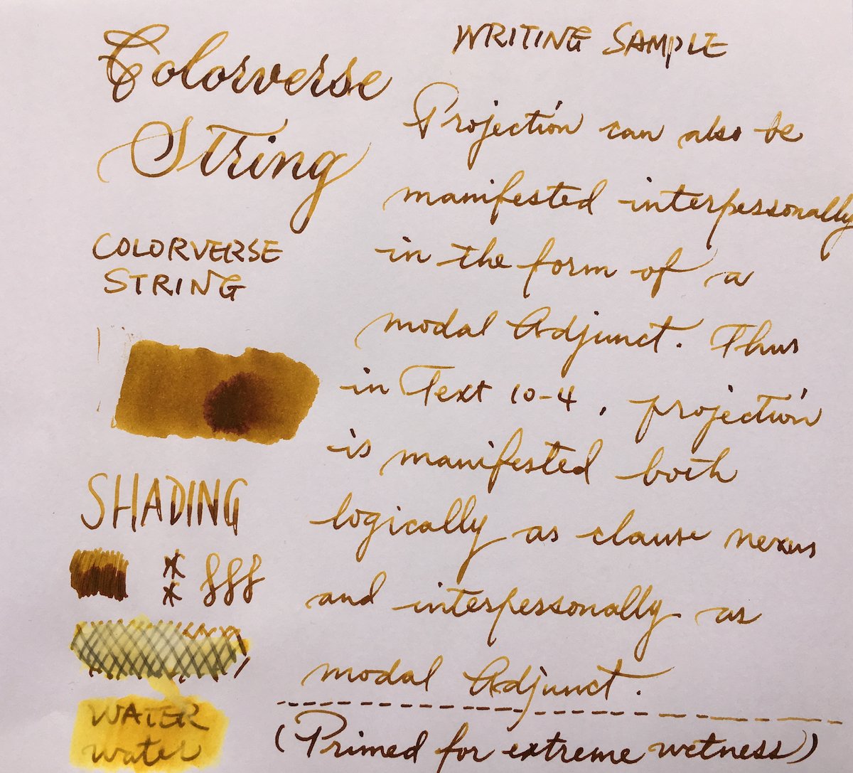
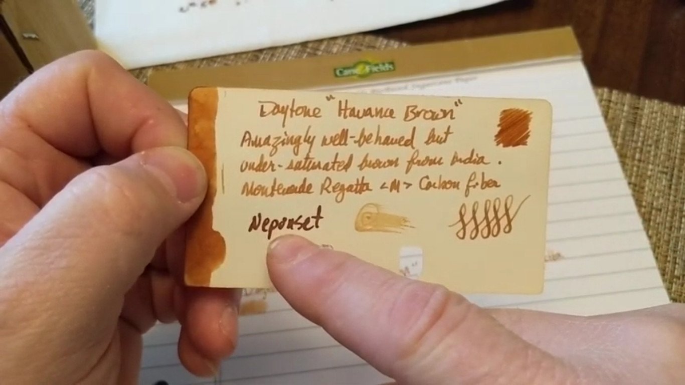
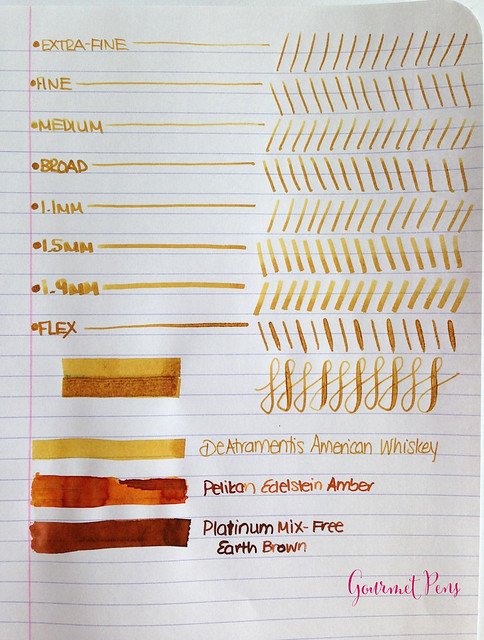
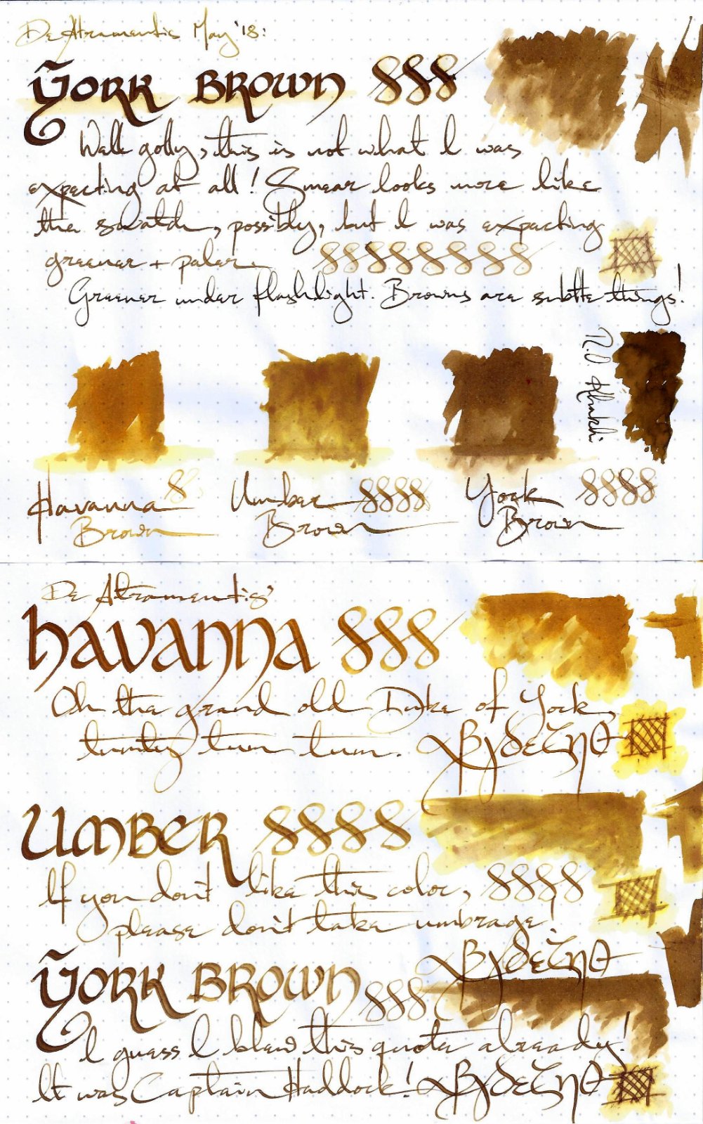
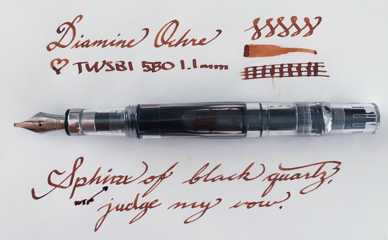
This collection has been made in an intensive attempt to find the most ideal and complete shades of brown color fountain pen inks over the internet and as long as writing with a medium size fountain pen is what I'm concerned of, the "infinity symbol" on a regular paper is the thing I've considered saving these samples. I've also benchmarked the index card samples for those which were not available in infinity sample. All the top-rated fountain pen inks – even those which are not mentioned here probably for the lack of a quality brown ink – have been taken into account. ~ Here's the list ~ Akkerman Hals Oud Bruin Akkerman SBRE Brown Chesterfield Antique Copper Colorverse #25 String Colorverse Coffee Break Daytone Havana Brown De Atramentis American Whisky Brown Gold De Atramentis Havanna De Atramentis Scottish Whiskey Diamine Ancient Copper Diamine Chocolate Brown Diamine Desert Burst Diamine Golden Brown, Carter's Harvest Brown, Diamine Raw Sienna Diamine Ochre Diamine Terracotta Diamine Tobacco Sunburst Faber Castell Hazelnut Brown J. Herbin Café Des Iles J. Herbin Caroube De Chypre J. Herbin Lie de The J. Herbin Terre d'Ombre KWZ Honey KWZ Iron-gall Aztec Gold KWZ Iron-gall Mandarin (Corrected Version) KWZ Old Gold L'Artisan Pastellier Callifolio Cannelle Leonardo Sepia Classico Monteverde Copper Noir Monteverde Joy Sepia Monteverde Scotch Brown Noodler's Golden Brown Noodler's Kiowa Pecan OMAS Sepia Private Reserve Chocolate Private Reserve Copper Burst Private Reserve Sepia Robert Oster African Gold Robert Oster Antelope Canyon Robert Oster Caffe Crema Robert Oster Gold Antique Robert Oster Toffee Sailor Kobe #22 Shinkaichi Gold Sailor Storia Lion Light Brown Scribo Classico Seppia Standardgraph Maisgelb by @lgsoltek Taccia Tsuchi Golden Wheat Vinta Heritage Brown Vinta La Paz Diplomat Caramel Krishna Bronze Leaf, Krishna Yellow Valley L'Artisan Pastellier Callifolio Anahuac L'Artisan Pastellier Callifolio Itzamna L'Artisan Pastellier Encre Classique Ocre Jaune Maruzen Athena Kinkan PenBBS #135 Beijing PenBBS #269 45th POTUS PenBBS #504 Vernal Equinox Platinum Mix-Free Earth Brown Taccia Ukiyo-e Hokusai Benitsuchi Tono & Lims Kela Nuts Vinta Terracotta Vinta Ochre Note: the absorption of the ink to the paper could vary. Before purchasing any of the inks above be aware some of them are dry while the others are wet. Plus, based on the fountain pen model and paper you use, the colors could look different. Make sure to use fountain pen inks only, otherwise your fountain pen will clog. Stay away from drawing, calligraphy, lawyer, and India inks. They are not designed for the fountain pens. Platinum and Sailor have some pigmented-based inks; avoid them. Take all these into account.

-
Reportedly, Private Reserve is one of the companies that paved the way to the overabundance of ink colors we have now, as early on there were mostly the basic inks available, such as basic blue-black, red, green, turquoise, brown, black, and blue. PR inks come in a multitude of different hues. The original creator and owner of the ink company passed away, and the company is now under new ownership and management. Ebony Blue has been on my radar for a while. I love dark teal inks, but I'm usually pretty picky about them in person. Ebony Blue is a kind of turquoise mixed with black, and possibly some other hues in between, which results in a dark but more "clean" hue teal-black. What I mean by clean is that it's not muddy, brown-tinged like, say, Sailor Jentle Miruai. Depending on pen, paper, and illumination this ink can look more blue-teal or more green-teal. The flow is one of the interesting characteristics of this ink: it feels "creamy" to write with. I like this tactility of the ink. It does not feather nor bleed through any of the decent-to-good paper I've used it with. It has pretty decent water resistance too: while it won't look neat if you splash water on your writing, a clear, dark gray line remains behind to salvage content. There is metallic magenta sheen. This ink will work in all types of nibs: from ultra extra fine to broad. Shading becomes increasingly more prominent with broader nibs. If you use broad nibs with this ink, I recommend uncoated and more absorbent paper. It's more smear-prone on Tomoe River with broad nibs. Scan: on Fabriano Bioprima 85g ivory-toned paper with 4mm dot grid Scan: on Tomoe River 52g White Scan: on a 100g A6 uncoated paper (the first GvFC Gulf Blue should read "Cobalt Blue" instead) Scan: on Tomoe River 52g Cream paper (the first GvFC Gulf Blue should read Cobalt Blue instead) Close-up photographs:
-
Reportedly, Private Reserve is one of the companies that paved the way to the overabundance of ink colors we have now, as early on there were mostly the basic inks available, such as basic blue-black, red, green, turquoise, brown, black, and blue. PR inks come in a multitude of different hues. The original creator and owner of the ink company passed away, and the company is now under new ownership and management. I personally became very interested in Private Reserve Avocado a while ago, after seeing its fantastic color range on some others' reviews when used for drawing. Behind its very slightly olive green exterior hide many other hues! The brick-terracotta red color is one of them, and it is the most water-resistant component of this ink. So when you use a water brush over Avocado, a red color is revealed! This ink is very well-behaved in writing. The ink flow is moderate to creamy, and lubrication is good. This ink is really good for maintaining fine lines for drawing and for hairlines. It's well-saturated, but not too much. There is no sheen. Instead the ink has an attractive matte appearance that works well on all paper types. This ink is great for any nib type: from super extra fine to broad. Shading is fairly low, and the lines are solid and well-defined, dark enough even when very fine. In writing, this ink is a pleasant hue of fresh, botanical green. Very restful on the eyes and also imparts an uplifting feeling for me personally. Scan: Fabriano Bioprima 85g ivory-tooned paper with 4mm grid: Scan: Tomoe River 52g White Scan: Nakabayashi Logical Prime notebook, coated ivory-cream-toned paper: (Totally misspelled Rikyu-Cha) Close-up photographs: Look at that "chromatography"! Personally I like this ink a lot; glad I have a large bottle.
-

Private Reserve Lake Placid Blue Vs. Pilot Iroshizuku Asa-Gao
Antenociticus posted a topic in Ink Comparisons
I've been testing both ink samples and inexpensive Chinese pens. Yesterday I put some Private Reserve Lake Placid Blue into a Wing Sung 6359, and today I inked a Moonman 600S with some Pilot Iroshizuku Asa-Gao. I wasn't really thinking about them being similar colours. I've been working my way through the various Private Reserve blues, and today something reminded me that I'd been meaning to look at Asa-Gao. I was amazed to find the product of these two pen-and-ink combos to be virtually identical. And so I did an off-the-cuff side-by-side comparison on a page in an A6 Leuchtturm 1917. You can see some differences at the top of the page, but nothing that couldn't be explained by the Moonman laying down more ink. Both pens have F nibs, but they're different nibs from different makers. The lines of text at the bottom were written alternately with one pen and the other. I find it hard to see any difference at all. Nothing remotely scientific about this. Just a doodle for my own amusement, but I thought the result was interesting. The image is an iPhone snap under artificial light after some rudimentary photoshopping.
-
Private Reserve Spearmint This is my first review of anything and I am excited to do more!
-
Private Reserve Ink was founded by Terry W. Johnson and Susan Schube in the workroom of Avalon Jewelers/Gallery in Zionsville, IN, as an addition to the fountain pen department. Terry's vision was simple... "Why not have fountain pen ink in a rainbow of colors to expand the bounds of writing beyond standard black, blue, red and green." That's what's written on their internet site. My experience with their inks is ambigous: I like most colors, but the inks I've tried weren't best behaved (Orange Crush, Shoreline Gold caused nib crud; Hor Bubble Gum is PINK and it stains everything). Bottle Most of PR inks can be bought in cartridges and ugly 66ml bottles. Blue inks are a bit hit and miss for me; I'm usually not keen on anything that reminds me of the blue ballpoint color that I used at school. Some blue inks, though, have an appeal that's hard to resist. Electric DC Blue has strong saturation and red sheen that make it loud but also quite interesting. The colour is deep, highly saturated and quite dark. It is rather well behaved on paper with limited to no feathering (depending on the paper) and it dries in a reasonable length of time. Nice shading is available even with finer nibs. Flow is fine. Ink Splash Drops of ink on kitchen towel Software ID Color range Tsubame, Diplomat Depeche, broad nib Munken Pure Rough 100g, Diplomat Depeche, broad nib Tomoe River, Diplomat Depeche, broad nib Water resistance Water resistance
-
You can catch up with my final two reviews and swatch tests of the Private Reserve ink range at https://quinkandbleach.wordpress.com
-
Here are the next batch of 20 bleach swatch tested Private Reserve inks in the blues and purples range. Of note, there are 2 Mindnight Blues with the second one being the fast dry option. Since my my first post I have done some digging on this particular brand. This a quote from Jordan, posted in August 2016, who is a member of the Fountain Pen Network: “The man (Terry W. Johnson) behind Private Reserve passed away recently, and he failed to properly document his knowledge before passing. His family has tried their best to keep the business running, but has had persistent quality issues, causing customer complaints. If we can learn a life lesson from this, it is: if others depend on your specific knowledge, write it down somewhere. You never know what tomorrow holds.” I also had a chat with another very knowledgeable character within the industry who confirmed the info in the above quote and also divulged that ink contamination (bacteria) has been a big problem with this brand which may explain the gloopy consistency I found with some of the samples. Didn’t feel great after hearing this I sometimes lick my paint brushes and may well have done so during these tests! Well, as you can see apart from one colour there is not a lot to get too excited about here. They all blend with water and gradate out. There is some reaction with bleach, Sonic Blue and Purple Haze were the most dramatic. Chromatically, there is nothing noteworthy and even from a sheen perspective there’s not much happening. I don’t enjoy bad mouthing, but when a brand claims to be the Number 1 and it evidently isn’t, well…. That said, the samples I have could ALL be rotten and maybe you should ignore my post? However you look at this, if Private Reserve want to live up to their claim of being the premier brand – they need to pull their fingers out and do something about it! This brand can be summed up as lack lustre – at best – and I’m being kind. Inks tested: Ebony Purple, Midnight Blue, Midnight Blue (Fast), Sonic Blue, Electric Blue, Supershow Blue, American Blue, Naples Blue, Tropical Blue, Daphne Blue, Black Magic Blue, Cosmic Cobalt, Tanzanite, Purple Mojo and Purple Haze. Full report here: https://quinkandbleach.wordpress.com/2017/04/06/private-reserve-bluepurple-inks-test/
-
Hi. I just want to share my ink comparison. Maybe it will be helpful for somebody. Here is a list of my tested inks: Pelikan 4001 Brilliant Black, KWZ Ink IG Gummiberry, KWZ Ink IG Red 3, KWZ Ink Maroon, KWZ Ink Red 1, KWZ Ink IG Green 1, KWZ Ink IG Green 3, Private Rserve Ebony Blue, KWZ Ink IG Turquoise, KWZ Ink Azure 4, KWZ Ink Azure 5, Private Reserve Electric DC Blue, KWZ Ink IG Blue 2, KWZ Ink Blue Black, KWZ Ink IG Blue Black. Chris
-
Hello FPN I was going through my inventory of ink that I bought and never used and decided to give them away instead of pouring them down the sink. I would like to find a new home for the below inks since I will probably never use them since I have way to many. Just to let you know, you must pick up the ink/s since I will not ship them. Also, you must bring your own containers to hold the ink since I transferred all my inks to empty Iroshizuku ink bottles. Here is what I have so far: (1) Diamine Majestic Blue (2) Diamine Washable Blue (2) Diamine Florida Blue (2) Private Reserve DC Supershow Blue PM if you are interested. Andy
-
I have noticed some retailers are no longer stocking Private Reserve, and several members are concerned where to get their favorite colors. A&D Penworx is going to continue stocking Private Reserve. We do not have all of their colors in stock. If there is a color you would like to see us carry, I will be placing an order for more ink at the end of January. I am asking the community to take a look at my website, and let me know if you have a special request. Please indicate bottle or cartridge in your request. Please reply to this thread or PM me your request. I will let you know when it is available.
-
Private Reserve Ink was founded by Terry W. Johnson and Susan Schube in the workroom of Avalon Jewelers/Gallery in Zionsville, IN, as an addition to the fountain pen department. Terry's vision was simple... "Why not have fountain pen ink in a rainbow of colors to expand the bounds of writing beyond standard black, blue, red and green." That's what's written on their internet site. My experience with their inks is ambigous: I like most colors, but the inks I've tried weren't best behaved (Orange Crush, Shoreline Gold caused nib crud; Hor Bubble Gum is PINK and it stains everything). Vampire Red is, probably, one of the driest inks I've tried in a long time. I expected it will be similar to most Private Rerve's inks and will produce wet, smooth line. It doesn't. Not only this ink feels dry - it also causes strong nib crud. For me it's intolerable. This ink goes to my black list of worst inks ever. Ink Splash Drops of ink on kitchen towel Software ID Color range Leuchtturm1917, Kaweco Classic Sport, broad nib
-
Do you ever find yourself in awe of a particular pen and ink combination? As if the ink was made for the pen and is the only thing that brings out its full potential. In my experience it's not a very common happen stance. Even rarer still is the perfect pen ink combo that seems to write well on just about any kind of paper. For me I found this combination in a full size black aerometric Parker 51 made in Canada. After doing a full restoration the pen came out looking like new. Moving on to the ink. The ink is Private Reserve DC Super Show Blue. I have tons of ink both new and vintage but I had never tried Private Reserve. Let me tell you the two are perfect for each other. The pen has never written better. The color, shading, and saturation were perfect not to mention the exceptional ink flow. I encourage you to describe your perfect pen ink combo that just seems to blow all your other pens out of the water.
-
Private Reserve Buttercup Review (And Election Week Giveaway) Note: this review is also available on my personal reviews site with more pictures and better formatting. If you'd like to take a look, click here. The giveaway is also only available through that site. Click here for more details. Yellow just happens to be my favorite color. However, it is also notoriously hard to read under light, and therefore is not often used for pen ink; although, given that yellow is my favorite color, I had to try it out. So, I decided to pick up a bottle of Private Reserve Buttercup, and I was certainly not disappointed. The ink itself comes in the standard Private Reserve 2.2 ounce (66 mL) bottle. A lot of people don’t love the bottle because it’s not very ornate—It’s a simply a glass cylinder with two stickers on it to denote color. However, the shape of the bottle does happen to allow for it to have an extremely wide mouth. This is both a positive and a negative as the large opening allows for any pen to fill, however, the large top also allows for a lot of ink to gather inside the cap and spill down the sides while opening. Because of this, I’d recommend keeping the bottle on top of something while you’re opening it so that nothing spills out onto fabric. All in all, the shape is simple, and effective. It does not want to stand out, but it gets the job done just fine. Buttercups are beautiful flowers—they are bright, yellow, almost cheerful in nature, and extremely (if not overly) abundant. And at least for me, the ink makes me feel the same way. The color is extremely saturated and very deep. It also shades extremely well. (Although, the light shade of the color obscures these effects a great deal.) The ink runs a tiny bit on the dry side, but it flows well, and it is also quite easy to clean and does not stain. However, It also has decently low water resistance—the ink begins to run even after one drop of water and will fade entirely under continued exposure. On quality papers, the ink dries in about 20 to 30 seconds; it also does not feather or bleed through or ghost at all. However, on poorer quality papers, the result is quite different. It dries immediately, but, it feathers quite a bit and bleeds all the way through the paper. All in all, I think that this ink is well worth it for the color alone. It is intensely saturated and looks really nice in demonstrator pens (I have it in my ECO). It also looks very nice inside of the bottle. (As the bottle is pure glass, the ink looks like a sort of very beautiful amber color.) The ink goes from lighter yellow to a more saturated and legible yellow in broad nibs. (I tried it in my broad Pelikan M200 and the ink was a fantastic color and was quite easy to read. I enjoyed this ink quite a bit, and I recommend it to anyone looking for a yellow color. If you liked this review, please subscribe (it helps quite a bit). I will also be giving one of the four election-day ink colors away at the end of the week. If you would like to enter, please subscribe and you will receive the link to sign up.
-
Are Diamine Eclipse and Private Reserve Ebony Purple close in colour and tendency to look like black ink? I'm thinking of getting the latter but Eclipse, for me, looks black way too often (not a fan of black ink) but that close-to-black-but-clearly-not-black is so good when it shows up though.
-
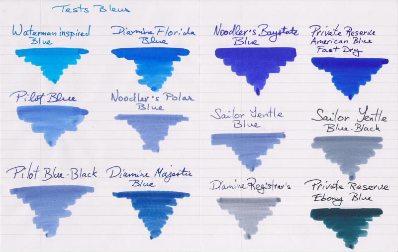
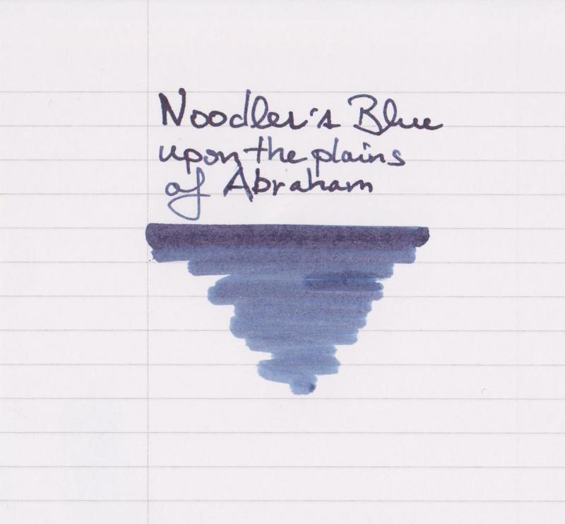
Hello all, I felt like comparing my blue inks after acquiring Noodler's Baystate Blue yesterday, so here they are : - Waterman Inspired Blue - Diamine Florida Blue - Noodler's Baystate Blue - Private Reserve American Blue Fast Dry - Pilot Blue - Noodler's Polar Blue - Sailor Jentle Blue - Saior Jentle Blue-Black - Pilot Blue-Black - Diamine Majestic Blue - Diamine Registrar's - Private Reserve Ebony Blue All names are written with a J. Herbin glass pen. The swabs are done with Q-tips. For each swab, the upper line is 3-pass and the bottom is only one with what is left of ink on the q-tip. The paper is Rhodia 80 g/m2. This is my first post, but I read FPN posts since 2012. Thank you everyone for creating and feeding such an amazing source of information! Edit : ... And I initially forgot a newly acquired Noodler's Blue Upon The Plains of Abraham :
-
Hello all, Now thru 8/20/2016 all ink and paper is on sale at A&D Penworx! 15% off all ink 10% off all Rhodia and Clairefontaine Paper No coupon code required. Thank you! David Tipton
-
Private Reserve Ink was founded by Terry W. Johnson and Susan Schube in the workroom of Avalon Jewelers/Gallery in Zionsville, IN, as an addition to the fountain pen department. Terry's vision was simple... "Why not have fountain pen ink in a rainbow of colors to expand the bounds of writing beyond standard black, blue, red and green." That's what's written on their internet site. My experience with their inks is ambigous: I like most colors, but the inks I've tried weren't best behaved (Orange Crush, Shoreline Gold caused nib crud; Hor Bubble Gum is PINK and it stains everything). I've received Dakota Red sample in a package I've received some time ago from Amberlea. I know other FPNers had added some samples for me, so thank you guys! Dakota Red is nice medium red. I really like the color. However, as many PR inks, this one is not free from some issues. It's prone to smudging as you see on Tomoe River. I haven't done it on purpose od course, yet I've moved my hand and touched the text about twenty seconds after finishing it. Dry time, especially on Tomoe is crazy long. Also some people mentioned that Dakota Red may cause some pen clogging. I've put in in one of my cheap pens (Jinhao). I'll check the behaviour after one week of not using the pen. In Kaweco Sport used as eyedropper there was no such issues and flow was good. Ink Splash Drops of ink on kitchen towel Software ID Tomoe River, Kaweco Sport Classic, B CIAK, Kaweco Sport Classic, B Comparison
-
Private Reserve is a US-based artisan ink company, originally an addition to the fountain pen department of Avalon Jewelers/Gallery. Most PR inks feature being highly saturated/concentrated, neutral pH, lubricated, drying crazily slow, of reasonable price and with a cheap looking(IMO...). Ebony Blue is one of the PR ink that is inaccurately named and labeled---the name suggests it being "blue" and the label is also a grayish Prussian blue. However, its color is in no way, blue. Box & Bottle compared with Velvet Black http://i651.photobucket.com/albums/uu239/chingdamosaic/PREB01_zpsonpiizqs.jpg Writing Sample: dip pen on cheap copy paper http://i651.photobucket.com/albums/uu239/chingdamosaic/PREB02_zpsqhitqyri.jpg The color of Ebony Blue is actually GREEN--- a dark green that can almost pass for black even in EF nib. When diluted, it varies from teal to mint green depending on the amount of water added. Only when smeared with water and the dye being washed out, does it start to look blue. Close up: original ink/ diluted in different ratios/ smeared with water http://i651.photobucket.com/albums/uu239/chingdamosaic/PREB03_zpsmdqdbtai.jpg http://i651.photobucket.com/albums/uu239/chingdamosaic/PREB04_zpswbvzsa0r.jpg As mentioned before, PR inks are all highly saturated. The above pic shows the effect you will get if you drip water on the writing and blow on it. The green and blue dye is washed out, leaving the words dark bistre, still very legible. (So this ink is basically water-resistant, unless you dilute it too much) Writing sample: with Noodler's Creaper, on FP-friendly creamy paper http://i651.photobucket.com/albums/uu239/chingdamosaic/PREB05_zpson0p6wbu.jpg http://i651.photobucket.com/albums/uu239/chingdamosaic/PREB06_zpshxohgtpw.jpg With a broader nib Ebony Blue(or Green, but PR also has another ink named Ebony Green...) shows rich shading and red sheen. Chromatography http://i651.photobucket.com/albums/uu239/chingdamosaic/PREB01-1_zpsmwrrrtro.jpg Comparison with J. Herbin 1670 Emerald of Chivor http://i651.photobucket.com/albums/uu239/chingdamosaic/PREB07_zpsuoaiknvr.jpg Ebony Blue: darker, greener, with brown undertone and wine-red sheen. Emerald of Chivor: lighter, bluer, with copper-red sheen Although I generally like this color and its various performance, it is too saturated and dries too slow for daily use, so eventually I only use it for sketching. Here are some sketches done with different kinds of pens/ paper/ techniques, all with diluted or undiluted Ebony Blue. Ebony Blue + 3776 14K EF + copy paper http://i651.photobucket.com/albums/uu239/chingdamosaic/PREB08_zpswzjaouxs.jpg Ebony Blue(diluted) + LAMY Safari EF + copy paper http://i651.photobucket.com/albums/uu239/chingdamosaic/PREB09_zpsfxpiqpew.jpg Ebony Blue(diluted) + dip pen + copy paper http://i651.photobucket.com/albums/uu239/chingdamosaic/PREB10_zpsthi0xd5r.jpg Backside---so blue! Why? http://i651.photobucket.com/albums/uu239/chingdamosaic/PREB11_zpsfrbs2fq7.jpg Ebony Blue + dip pen + copy paper + smeared with water http://i651.photobucket.com/albums/uu239/chingdamosaic/PREB12_zpsvqqzloog.jpg Ebony Blue + Dip pen + ROSSI paper http://i651.photobucket.com/albums/uu239/chingdamosaic/PREB13_zpstlmssqlv.jpg Smeared with water, with a Chinese paint brush http://i651.photobucket.com/albums/uu239/chingdamosaic/PREB14_zpslagmybaq.jpg When dried (added some lines with Aladin gold ink) http://i651.photobucket.com/albums/uu239/chingdamosaic/PREB15_zpsbfgccr2q.jpg With only one ink and water, you can get green, blue, black, red(sheen) all at once! http://i651.photobucket.com/albums/uu239/chingdamosaic/PREB16_zpsute2qhfu.jpg Overview Color description: saturated deep dark green with brown undertone. Looks bluer when smeared with water. Shading: rich Sheen: red sheen shows easily. Feathering/ Bleed through: only a little on cheap paper Flow: medium Lubrication: good Water resistance: good Cleaning: requires extra soaking and flushing (but no staining observed so far) Dry speed: slow Conclusion A generally well-behaved ink that can always give you surprise, especially when use for sketching and painting. If you like its color and want it as a daily-use ink, a little dilution is recommended--- to help improve the dry speed and decrease the sheen. I love this ink! Just finished one 50ml bottle(well, I've probably given away about 15~20ml, but still)! ----- Thank you for reading this review : )
-
Private Reserve is a US-based artisan ink company, originally an addition to the fountain pen department of Avalon Jewelers/Gallery. Most PR inks feature being highly saturated/concentrated, neutral pH, lubricated, drying crazily slow, of reasonable price and with a cheap looking(IMO...). First, let's take a look at it's box and bottle: http://i651.photobucket.com/albums/uu239/chingdamosaic/PRVB01_zpsx6nbka7v.jpg The bottle shape reminds me of that of acrylic paint here in Taiwan. At first glance, it doesn't look like something you'd expect to find in a gallery/ FP store, but in an art supply store, maybe? It's at the opposite end on the spectrum compared with the fancy design like Iroshizuku's. However, the practical broad brim is growing on me, especially when I try to fill/dip my pen and the J.H 1670 bottle wouldn't cooperate. Tag/Label http://i651.photobucket.com/albums/uu239/chingdamosaic/PRVB02_zpspqvo2gd7.jpg With all due respect, this low-resolution and unevenly glued tag looks like something done with a home use printer. And Private Reserve seems to make some of the least accurate color tags. In this case, Velvet Black is actually a purplish black but is given a greenish label. Writing Samples http://i651.photobucket.com/albums/uu239/chingdamosaic/PRVB05_zpsgvhuhpwz.jpg http://i651.photobucket.com/albums/uu239/chingdamosaic/PRVB03_zpsqtienqq7.jpg I'm never a fan of color black, nor have I tried any other black inks before, so I am genuinely surprised at the darkness and saturation of this ink---- it is so BLACK that it has no shading at all. Most inks tend to look lighter in a fine/dry nib, but PRVB remains as black in Sailor PG HF and LAMY Safari EF. IMO, it can almost pass for a ballpoint pen. http://i651.photobucket.com/albums/uu239/chingdamosaic/PRVB04_zpsoe3sxnrg.jpg And it's a very lustrous ink. Not sure if this should be called "sheen", though. Under yellow light http://i651.photobucket.com/albums/uu239/chingdamosaic/PRVB07_zpsk8t8e4al.jpg http://i651.photobucket.com/albums/uu239/chingdamosaic/PRVB06_zps5mbetejw.jpg http://i651.photobucket.com/albums/uu239/chingdamosaic/PRVB07-1_zps6g1pgpsi.jpg (Oops, wrong spelling...) Under white light http://i651.photobucket.com/albums/uu239/chingdamosaic/PRVB08_zpsv12nhk7o.jpg Looks like HB pencil. I find this ink very suitable to play with in a dip pen; the words look like print. http://i651.photobucket.com/albums/uu239/chingdamosaic/PRVB12_zpsytcism0f.jpg On the other hand, if you find the luster/sheen disturbing, you can dilute it a bit(also helps the ink dry faster). This ink looks almost the same even if you add of water 1:1. 1/3 Dilution http://i651.photobucket.com/albums/uu239/chingdamosaic/PRVB09_zpsr5qt5s8c.jpg Only now does it start looking gray... Chromatography http://i651.photobucket.com/albums/uu239/chingdamosaic/PRVB10_zps5tajrczq.jpg (1 min) http://i651.photobucket.com/albums/uu239/chingdamosaic/PRVB11_zpschphrvwz.jpg (15 min) http://i651.photobucket.com/albums/uu239/chingdamosaic/PRVB11-1_zps2dj7ngmp.jpg (dried/ backside) OOOoooOoOOooooohhh......... Overview Saturation: Extremely high Flow: medium Lubrication: good Shading: too dark to observe Sheen: lustrous Bleed-through& Feathering: on cheap paper Water resistance: to some extent Cleaning: requires extra soaking and flushing Dry speed: Extremely slow Conclusion This is the only black ink I have ever tried so I don't have much to say/compare. It's a pleasure to write with in a dip pen/ flex nib, but considering its dry speed it probably isn't the best choice for daily/official use, unless you dilute it. Thank you for taking the time to read this review: )
-
Private Reserve Ink was founded by Terry W. Johnson and Susan Schube in the workroom of Avalon Jewelers/Gallery in Zionsville, IN, as an addition to the fountain pen department. Terry's vision was simple... "Why not have fountain pen ink in a rainbow of colors to expand the bounds of writing beyond standard black, blue, red and green." That's what's written on their internet site. My experience with their inks is ambigous: I like most colors, but the inks I've tried weren't best behaved (Orange Crush, Shoreline Gold caused nib crud; Hor Bubble Gum is PINK and it stains everything). Midnight Blues is is nice and well behaved and nice dark blue to blue/black depending on paper and nib size. Under some light conditions it has slight hint of green in it. It bleeds on the cheapest papers. Bottle Ink Splash Drops of ink on kitchen towel Tomoe River, Lamy 2000, medium nib Lyreco, TWSBI 580, stub 1,1 Oxford, Lamy 2000, medium nib Water resistance Quote MultiQuote
-
Private Reserve Ink was founded by Terry W. Johnson and Susan Schube in the workroom of Avalon Jewelers/Gallery in Zionsville, IN, as an addition to the fountain pen department. Terry's vision was simple... "Why not have fountain pen ink in a rainbow of colors to expand the bounds of writing beyond standard black, blue, red and green." That's what's written on their internet site. My experience with their inks is ambigous: I like most colors, but the inks I've tried weren't best behaved (Orange Crush, Shoreline Gold caused nib crud; Hor Bubble Gum is PINK and it stains everything). Avocado is nice and well behaved green ink. The color can be described as a rich, leafy green, It feels smooth and lubricates the nib well. While I'm not biggest Private Reserve fan I believe Avocado is their best ink (from the ones I've tried so far. It's highly subjective statement though). Bottle Ink Splash Drops of ink on kitchen towel Software ID Lyreco Budget, TWSBI 580, stub 1,1 Poljet, TWSBI 580, stub 1,1 Leuchtturm1917, TWSBI 580, stub 1,1 Oxford, TWSBI 580, stub 1,1 Water resistance


.jpg.e953d46aa30a670f20d0ff630c1e945c.jpg)